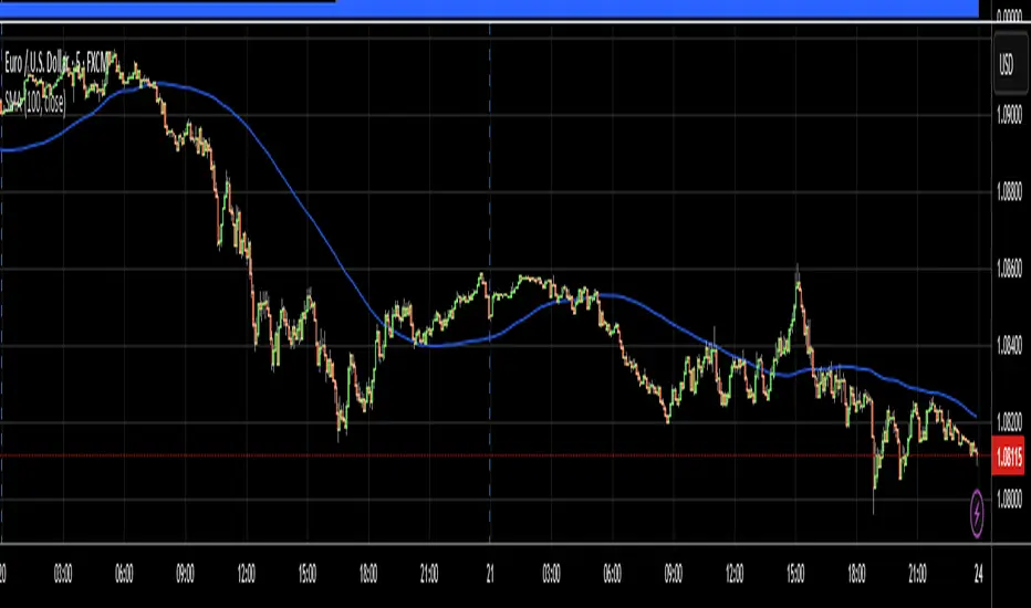
Daily OHLC from 8:00 UTCDisplays Daily Open, High, and Low price levels, resetting at 8:00 AM UTC each day. Ideal for intraday trading reference points.
Cerca negli script per "daily"

Daily Range %The Daily Range % Indicator calculates and plots a percentage of the daily range (high to low) based on a custom lookback period. It identifies outside bars from past daily data, prioritizing the most recent unbroken range. If no outside bar is found, it defaults to yesterday's range. The selected percentage of this range is then displayed on the chart, updating once per 5-minute bar (or the chosen resolution).
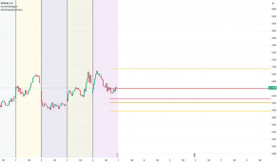
Daily & Multi-Day High/LowDaily & Multi-Candle High/Low Indicator
This indicator clearly highlights essential price levels directly on your chart, significantly improving your trading decisions:
First Candle High/Low (Session Open):
Quickly identify the high and low of the first candle each trading day, ideal for session-open traders.
Previous Day's High/Low:
Automatically plots the highest and lowest prices from the previous trading day, crucial for daily breakout or reversal strategies.
Multi-Candle High/Low (Customizable Period):
Easily track the highest and lowest points of the last X candles (default: 108 candles). Perfect for spotting key support and resistance zones.
Customization Options:
Adjust colors, line styles (solid, dashed, dotted), and line thickness directly from the settings for personalized visibility.
Ideal for day traders, swing traders, and price-action traders looking for clear and actionable daily levels on their charts.
Daily Price LevelsTrack daily price action like a pro with instant visibility of key levels, percentages, and P&L values - all in one clean view."
Bullet points:
• Shows Daily Open, High, Low & Median levels
• Dynamic color-coding: green above open, red below
• Real-time price labels with:
Exact price levels
% distance between levels
Point values
Dollar values per contract
• Auto-repaints on timeframe changes
• 30min alerts for median crosses

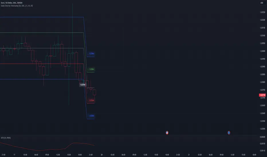
Daily Time MarkerThis TradingView indicator draws thin, white, dashed vertical lines on the chart at a user-defined time each day. The indicator takes into account Daylight Saving Time (DST) adjustments, ensuring the correct time is displayed throughout the year.
Key Features:
✅ Daily Vertical Markers:
Displays vertical dashed lines from Monday to Friday at the selected time.
The lines extend infinitely in both directions.
✅ Historical & Future Projection:
Shows lines 15 days into the past and 5 days into the future for better visualization of key time levels.
✅ DST Adjustment:
Automatically adjusts between summer and winter time , ensuring the correct hour is displayed.
This indicator is useful for traders who rely on specific time-based events, such as market opens or key trading sessions.
Daily Bias IndicatorThe Daily Bias Indicator is a TradingView script designed to help traders identify bullish and bearish biases based on price action from the last two daily candles. It highlights market sentiment by checking whether price breaks key levels and reacts accordingly.
How It Works:
Bullish Bias:
The price breaks above the previous high and closes above it.
The price breaks below the previous low but fails to close lower.
Bearish Bias:
The price breaks below the previous low and closes below it.
The price breaks above the previous high but fails to close higher.
Labels appear red at the bottom for bearish bias on the next day and green for bullish bias on the next day.

Daily Bias IndicatorBasic ICT Daily Bias Indicator
When yesterday's price breaks above and closes above the high of the day before yesterday, it indicates a bullish bias.
When yesterday's price tests the low of the day before yesterday but does not break below it, it indicates a bullish bias.
When yesterday's price breaks below and closes below the low of the day before yesterday, it indicates a bearish bias.
When yesterday's price tests the high of the day before yesterday but does not break above it, it indicates a bearish bias.

Daily COC Strategy with SHERLOCK WAVESThis indicator implements a unique trading strategy known as the "Daily COC (Candle Over Candle) Strategy" enhanced with "SHERLOCK WAVES" for pattern recognition. It's designed for traders looking to capitalize on specific candlestick formations with a negative risk-reward ratio, with the aim of achieving a high win rate (over 70%) through numerous trading opportunities, despite each trade having a higher risk relative to the reward.
Key Features:
Pattern Recognition: Identifies a setup based on three consecutive candles - a red candle followed by a shooting star, then an entry candle that does not break below the shooting star's low.
Negative Risk/Reward Trade Selection: Focuses on entries where the potential stop loss is greater than the take profit, banking on a high win rate to offset the individual trade's negative risk-reward ratio.
Visual Signals:
Green Label: Marks potential entry points at the high of the candle before the entry.
Green Dot: Indicates a winning trade closure.
Red Dot: Signals a losing trade closure.
Blue Circle: Warns when the current candle is within 2% of breaking above the previous candle's high, suggesting a potential setup is developing.
Green Circle: Plots the take profit level.
Red Circle: Plots the stop loss level.
Dynamic Statistics: A live updating label showing the number of trades, wins, losses, open trades, current account balance, and win percentage.
Customizable Parameters:
Risk % per Trade: Adjust the percentage of your account balance you're willing to risk on each trade.
Initial Account Balance: Set your starting balance for tracking performance.
Start Date for Strategy: Define when the strategy should start calculating from, allowing for backtesting.
Alerts:
An alert condition is set for when a potential trade setup is developing, helping traders prepare for entries.
Usage Tips:
This strategy is predicated on the idea that a high win rate can compensate for the negative risk-reward ratio of individual trades. It might not suit all market conditions or traders' risk profiles.
Use this strategy in conjunction with other analysis methods to validate trade setups.
Note: Always backtest thoroughly before applying to live markets. Consider this tool as part of a broader trading strategy, not a standalone solution. Monitor your win rate and adjust your risk management accordingly to ensure the strategy remains profitable over time.
This description now correctly explains the purpose behind the negative risk-reward ratio in the context of your trading strategy.

Daily Buy/Sell Volumeindicator that The Daily Buy/Sell Volume Indicator is a custom-built tool that helps traders track and visualize the buying and selling volumes throughout a trading day. This indicator separates the total volume into two categories:
1. Buy Volume: Calculated when the closing price is higher than the opening price for a given candle. This represents the volume of bullish (buy) activity for the day.
2. Sell Volume: Calculated when the closing price is lower than the opening price for a given candle. This represents the volume of bearish (sell) activity for the day.
Key Features:
• Buy/Sell Volume Calculation: The indicator tracks the buying and selling volumes based on the relationship between the open and close prices of each candle.
• Daily Reset: The indicator resets at the start of each trading day, providing fresh calculations for the daily buy and sell volumes.
• Visual Representation: The buy volume is shown with a green line, while the sell volume is displayed with a red line, making it easy to identify bullish and bearish activity over the course of the day.

Daily Session DividerThis script draws vertical lines showing the new daily sessions. These will only be displayed when it's on an intraday timeframe (lower than daily timeframe).
Settings:
Line Color: Choose the color you want and change the opacity
Line Width: If you want a thicc line. Defaults to 1 (recommended setting)
Line Style: Choose between solid (default), dashed, or dotted

Daily Close Levels with ATR and Custom OffsetsDescription:
This Pine Script visualizes daily close levels, calculates key price zones based on custom offsets and ATR (Average True Range), and is an essential tool for traders analyzing support and resistance zones.
Features
Close Value Line: Displays the daily close value as a line on the chart.
ATR Values: Shows the ATR value in both price and tick format.
Custom Offsets:
Calculates positive and negative price levels based on a user-defined tick offset.
Supports multipliers for extended zones (e.g., 2x offset).
Labels:
Displays the close value and ATR on the chart.
Annotates calculated price levels directly on the corresponding lines.
Time Control: Calculates levels at a user-defined hour (e.g., 20:00).
Customizable Parameters:
Close Time (Hour): Choose the specific hour for analyzing the close price.
Custom Line Offset: Define the price offset in ticks.
ATR Length: Adjust the ATR calculation length.
Timezone Offset: Supports time adjustments for different time zones.
Enable/Disable Labels and Values: Toggle the display of labels and values on the chart.
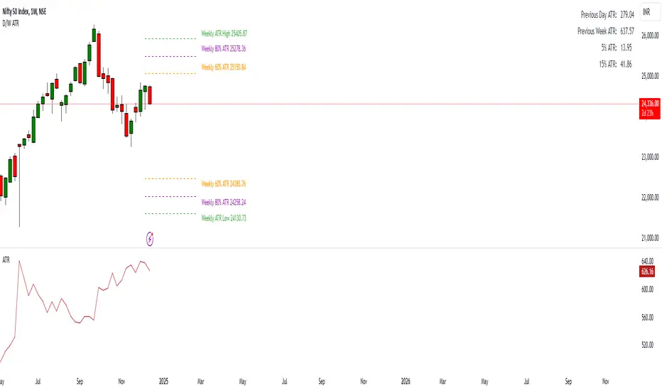
Daily ATR Levels - Vishal SubandhThe following script visualizes the ATR High and ATR Low levels based on the previous day’s closing price. The Average True Range (ATR) indicates how much a stock is likely to move—upward or downward—on a given day, providing insight into its intraday volatility. Additionally, the script calculates and displays the daily ATR as a percentage, with specific levels marked at 60% and 80%.
These percentage levels are plotted for both the high and low ranges, offering a framework to analyze potential price movements. In the context of a strong trend, prices often extend to the 80% or even 100% ATR level before showing signs of reversal. Such behavior is observed during pronounced uptrends or downtrends. Conversely, during weaker trends, price reversals may occur at the 60% ATR levels.
It is recommended to use this analysis in conjunction with other tools, such as support and resistance levels or demand and supply zones, for a more comprehensive approach to trading.
Daily Single Trade [SMRT Algo]The Daily Single Trade Indicator by SMRT Algo is a powerful yet simple tool designed for traders who value precision, discipline, and a focus on high-quality trade setups. With a unique approach, this indicator identifies just one signal daily, making it ideal for traders who prefer a structured and stress-free trading routine.
Please note that this indicator only works for timeframes below 1H.
Key Features:
Market Open & Pre-Market Analysis: The indicator focuses on the market’s opening range and identifies breakout opportunities based on price action during these critical periods.
Customizable Risk-Reward Ratio: Plan your trades with precision by setting your desired RR, ensuring that your take-profit (TP) levels are multiples of your stop-loss (SL). Stop loss is not shown with this indicator.
Price Offset for SL: Add a customizable buffer to your SL and TP levels. This offset accounts for market volatility, reducing the chances of premature stop-outs while maintaining alignment with your trading plan.
Increasing this value will lead to a greater invisible stop loss, which will increase the TP size. The opposite is occurs when decreasing this value (less than 0). If you set it as 2.5 for example for TSLA: price is 340 and SL is 330 for example, SL becomes 327.5. This calculation will then be applied to calculate the TP.
In simple terms, if the offset is positive, SL becomes larger, TP becomes larger as well.
Exit Point Visibility: Display exit points on your chart to better visualize trade targets and stop levels.
Adjustable Market Open Time: Easily modify the market open hour and minute to suit your asset’s trading session. For example, U.S. stock traders can set the market open time to 9:30 AM EST (UTC-5).
By providing a single signal each day, the indicator minimizes overtrading and keeps your focus on the best opportunities.
With predefined SL, TP, and RR settings, the indicator fosters disciplined trading, reducing the influence of emotional decision-making. Whether you’re trading stocks, indices, or forex, the customizable market open time and RR ratio make this indicator versatile and adaptable.
The combination of precise SL and TP calculations with offset pip adjustments helps protect your trades from market noise while maintaining a favorable RR.
Perfect for those who can’t monitor markets all day, the single-signal approach allows you to execute a high-quality trade and move on with your day.
How to Use:
Set the Market Open Time: Adjust the open time to align with your asset’s session. For example, set 9:30 AM EST for U.S. stocks.
Define Your Risk-Reward Ratio: Choose an RR multiple (e.g., 1:2 or 1:3) that aligns with your risk tolerance and trading goals.
Apply Pip Offset: Add a buffer to your SL and TP to account for market volatility and reduce false stops.
The Daily Single Trade Indicator simplifies trading by focusing on one high-probability setup per day. It’s perfect for traders looking to maintain consistency, improve risk management, and reduce the stress of overanalyzing the markets.
How Alerts Work:
Individual Alerts: Set separate notifications for specific actions, such as breakout signals, take-profit levels, or stop-loss activations.
Master Alert: Manage all notifications with one streamlined setting, ensuring you never miss an opportunity while keeping your setup simple and efficient.
Take control of your trading with a strategy built for clarity, precision, and success!

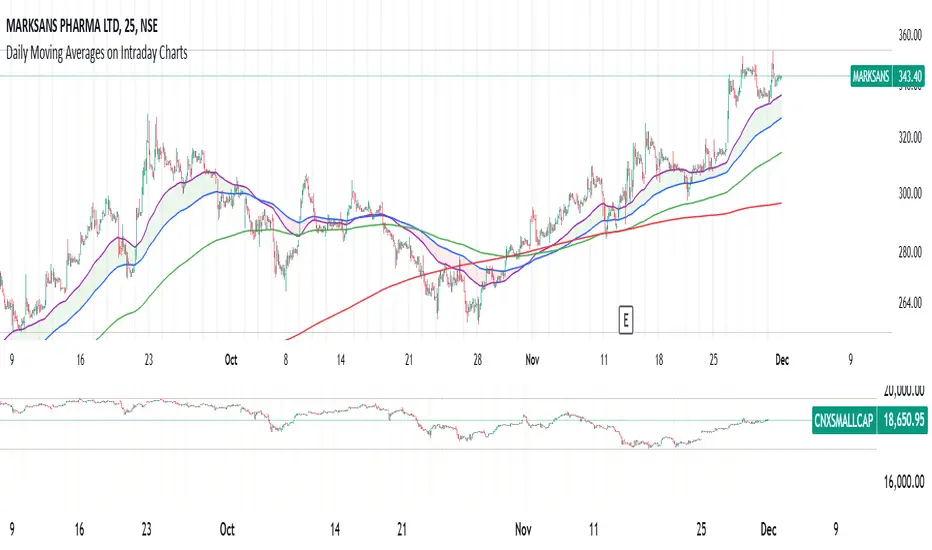
Daily Moving Averages on Intraday ChartsThis moving average script displays the chosen 5 daily moving averages on intraday (minute) charts. It automatically adjusts the intervals to show the proper moving averages.
In a day there are 375 trading minutes from 9:15 AM to 3:30PM in Indian market. In 5 days there are 1875 minutes. For other markets adjust this data accordingly.
If 5DMA is chosen on a five minute chart the moving average will use 375 interval values (1875/5 = 375) of 5minute chart to calculate moving average. Same 5DMA on 25minute chart will use 75 interval values (1875/25 = 75).
On a 1minute chart the 5DMA plot will use 1875 interval values to arrive at the moving average.
Since tradingview only allows 5000 intervals to lookback, if a particular daily moving average on intraday chart needs more than 5000 candle data it won't be shown. E.g 200DMA on 5minute chart needs 15000 candles data to plot a correct 200DMA line. Anything less than that would give incorrect moving average and hence it won't be shown on the chart.
MA crossover for the first two MAs is provided. If you want to use that option, make sure you give the moving averages in the correct order.
You can enhance this script and use it in any way you please as long as you make it opensource on TradingView. Feedback and improvement suggestions are welcome.
Special thanks to @JohnMuchow for his moving averages script for all timeframes.
Daily DividerWhat does this script do?
The “Daily Divider” script provides a visual tool for traders who need to divide their daily charts into clear intervals and label the days of the week. This is especially useful for identifying time-based patterns or conducting technical analysis on charts with timeframes lower than a day.
Key Features:
1. Customizable Day Dividers:
• Draws vertical lines on the chart to mark the start of each new day.
• Lines are fully customizable in terms of color, style (solid, dotted, or dashed), and visibility.
2. Day Name Labels:
• Displays labels on the chart indicating the day of the week.
• Day names can be fully customized with user-defined abbreviations.
3. Advanced Customization Options:
• Adjust the color and size of the label text.
• Configure a margin to position the labels above the highest price of the day.
• Enable or disable the labels and dividers as needed.
4. Ease of Use:
• Designed for daily or lower timeframes.
• Ideal for traders operating intraday strategies, scalping, or analyzing specific intra-day movements.
How does it work?
• Detects day changes using the built-in dayofweek function.
• Draws a vertical line on the chart when a new day is detected.
• Uses labels to display the day name with a clean and clear design, automatically positioned above the highest price.
Why is it useful?
• Enhances visual clarity on intraday charts by separating trading days.
• Helps traders quickly identify time-based patterns or recurring events associated with specific days of the week.
• Increases customization to fit individual trading styles and preferences.
Practical Use Case:
An intraday trader can use this script to divide the chart into days and observe how the price of an asset evolves on specific days, such as Mondays or Fridays. Additionally, with labels, it becomes easy to correlate these movements with weekly recurring events.

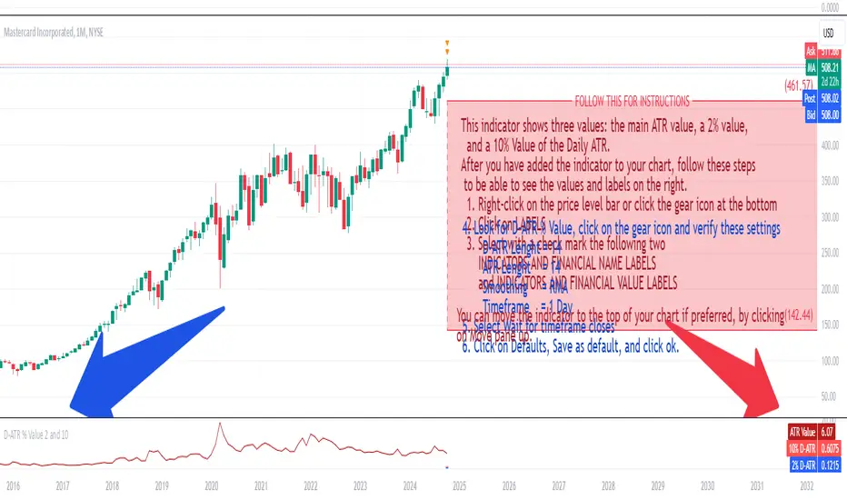
Daily ATR 2 and 10 Percent Value
This indicator shows three values: the main ATR value, a 2% value,
and a 10% Value of the Daily ATR.
After you have added the indicator to your chart, follow these steps
to be able to see the values and labels on the right.
1. Right-click on the price level bar or click the gear icon at the bottom
2. Click on LABELS
3. Select with a check mark the following two
INDICATORS AND FINANCIAL NAME LABELS
and INDICATORS AND FINANCIAL VALUE LABELS
4. Look for D-ATR % Value, click on the gear icon and verify these settings
- D-ATR Lenght = 14
- ATR Lenght = 14
- Smoothing = RMA
- Timeframe = 1 Day
5. Select Wait for timeframe closes
6. Click on Defaults, Save as default, and click ok.
You can move the indicator to the top of your chart if preferred, by clicking
on Move pane up.
Slightly modifications from other indicators.
Daily Engulfing Pattern DetectorThis indicator identifies bullish and bearish engulfing patterns on daily timeframes.
A bullish engulfing pattern occurs when a green candle completely engulfs the previous red candle,
taking out its low and closing above both its open and close prices. This suggests a potential trend reversal from bearish to bullish.
A bearish engulfing pattern occurs when a red candle completely engulfs the previous green candle,
taking out its high and closing below both its open and close prices. This suggests a potential trend reversal from bullish to bearish.
Features:
- Works on daily timeframe by default (customizable)
- Displays visual markers: green triangles for bullish patterns, red triangles for bearish patterns
- Includes built-in alerts for both pattern types
Set up alerts by right-clicking the indicator and selecting "Create Alert"
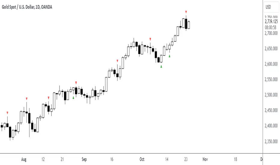
Futures Daily Settlement PricesDaily settlement prices reflect the fair market value of the underlying commodity or financial instrument, as determined by buyers and sellers during the settlement period or “close”. The price quoted in the evening news for items like a bush of corn, a barrel of crude oil, or a 10-year U.S. Treasury note frequently use the settlement price for the corresponding futures product that day.
Settlement prices are used to mark traders’ positions to market daily, determining profits or losses. Daily settlement prices play a key role in facilitating price discovery, risk management, and market integrity.
This indicator plots up to 30 settlement prices as well as the date of settlement on your chart, on time frames under 1 hour.
Customizable line types, colors, and label colors.

Daily Seasonality [YuL]This indicator calculates average returns for trading days across specified number of years in the past and displays this as a histogram. In addition, it displays EMA of these values as filled area plot.
Indicator uses ordinal number of trading day in a year, i.e. January 3rd may be 1st trading day, January 4th - 2nd trading day, etc.
Large green or red areas may mean that there is a strong seasonal factor at these dates that may support, launch, or break a trend.
It only works on daily timeframe at the moment. Maximum number of years it can look back is 15.

Daily, Weekly, Monthly, and Quarterly High/Low LinesDescription:
This indicator draws the high and low lines for the previous day, week, month, and quarter on any timeframe chart, including lower timeframes such as minutes and hours. It allows traders to visualize key levels from higher timeframes directly on intraday charts, helping them identify potential support and resistance areas.
You can customize which lines to display—whether daily, weekly, monthly, or quarterly—and choose custom colors for each of these lines for better chart clarity. The lines are drawn using higher timeframe data, meaning that even when viewing minute or hourly charts, the lines will accurately represent the high and low of previous periods.
Features:
Customizable display: Choose whether to display Daily, Weekly, Monthly, or Quarterly lines.
Custom colors: Select colors for each timeframe’s lines for better visual clarity.
Works on all timeframes: Displays higher timeframe lines even on lower timeframes like minute and hourly charts.
Supports multiple strategies: Ideal for identifying key levels of support and resistance across multiple timeframes, whether you're a day trader or a swing trader.
How to Use:
Add the script to your chart.
Customize which lines (Daily, Weekly, Monthly, Quarterly) you want to display.
Pick custom colors for each timeframe to match your chart preferences.
Use the lines to identify potential areas of interest where the price may react based on previous high and low levels.
Ideal for:
Day traders looking for higher timeframe support and resistance on lower timeframes.
Swing traders who want to visualize important levels from multiple timeframes.
Traders of all experience levels who prefer customizable charts.
Tags:
Multi-timeframe
Support and Resistance
Day Trading
Swing Trading
Key Levels
Customizable Indicator
Technical Analysis
Intraday Trading
Higher Timeframes
Multi-timeframe Analysis

Daily High and Low Levels IndicatorThis Pine Script indicator displays horizontal lines representing the high and low levels of the previous trading day, extending them to the right side of the chart for better visibility. It updates automatically at the start of each new trading day.
Features:
Daily High and Low Levels: Marks the high and low levels of the previous day with horizontal lines.
Customization:
Adjust the color, style, and thickness of the lines to fit your preferences.
High Level Line Color: Customize to your preferred color (default: gray).
Low Level Line Color: Customize to your preferred color (default: white).
Line Style Options: Choose between solid, dashed, or dotted lines.
Line Thickness: Adjust the width of the lines.
Extended Lines: Extend the lines to the right side of the chart for enhanced visibility.
Labeling: Shows clear labels "Previous High" and "Previous Low" next to the lines for easy reference.
Usage :
Add this indicator to your chart to visualize the previous day's high and low levels.
Customize the appearance of the lines and labels using the input options.
The indicator will automatically update these levels at the beginning of each trading day.
This indicator is designed to help traders quickly identify significant price levels from the previous day and make informed trading decisions.
License: This script is provided under the Attribution-NonCommercial-ShareAlike 4.0 International (CC BY-NC-SA 4.0) License. For more information, visit Creative Commons License.

Daily Range - KaffienThis shows the daily range for the live chart and 4 other selectable ones. This travels back over 5 days and does the average. It provides the current week, previous week, current month and previous month averages.
You can use this to identify how much the ticker has moved already in the day and how much it may have left to move or if it is exhausted and looking for pull back.

Daily Chess Puzzles [LuxAlgo]Play Chess Puzzles right on your Chart!
Daily Chess Puzzles brings you a new 1-Move chess puzzle straight to your chart every day.
🔶 USAGE
Submit your answer to see if your solution is correct! For quick access to the settings, Double-Click on the Chess board to open the settings interface.
The current active color (Who's move it is) is represented by the color of the information bar, and the corner board squares.
This game uses long algebraic notation without pieces names for submitting moves.
This method for determining moves is perfect for simplicity and clarity, and is standard for the Universal Chess Interface (UCI).
🔹 How to Notate
Long algebraic notation (without pieces name) is simple to understand. This notation does not use capture symbols or check/checkmate symbols; it uses only the squares involved in the move and any promotion occurring.
{Starting Square}{Ending Square}{Promotion Piece(if needed)}
Locate the starting square and the ending square of the piece being moved, without mentioning the piece itself.
Identify the column letters (a-h) and row numbers (1-8) that align with your desired move.
If a pawn reaches the opposite end of the board the pawn gets promoted, add the letter representing the piece it is promoted to at the end of the move.
Put it all together and you've got your notation!
Piece Notations for Pawn Promotions:
'n' for Knight ('k' is reserved for the King in chess notation)
'b' for Bishop
'r' for Rook
'q' for Queen
Normal Move Example: Moving a piece from e2 to e4 is notated as "e2e4".
Pawn Promotion Example: Promoting a pawn to a queen is notated as "e7e8q".
🔶 DETAILS
Miss a day? Yesterday's puzzle can be re-played, check the box for 'View Yesterday's Puzzle' in the settings.
This indicator makes use of Tooltips! . Hover over a square to see that square's notation.
This script makes use of 5 libraries, each storing 2 years worth of daily chess puzzles amounting to 10 years of unique daily chess puzzles.
"timenow" is used to determine which day it is, so even on a closed ticker or weekend or holiday a new chess puzzle will be displayed.
Users have the option to choose from 5 different board themes.
