OFM Key LevelsDaily and Weekly Levels Only
Daily Levels Calculated from RTH Sessions
Weekly Levels Calculated ETH
Cerca negli script per "daily"

Renko SR VolumeDaily ATR Renko SR Levels with Volume Analysis is a technical indicator that combines Renko-based support/resistance levels with volume analysis. It dynamically calculates Renko boxes using the ATR (Average True Range) of daily data and identifies key price levels. The indicator:
- Uses daily ATR to determine Renko box size.
- Draws support/resistance levels based on Renko price structure.
- Analyzes volume between levels to assess their strength.
- Colors levels based on relative volume activity:
- Red – strongest level (high volume activity).
- Orange – strong level.
- Yellow – moderate level.
- Green – weakest level (low volume activity).
- Detects daily Renko-based trends.
This tool helps traders visualize key price zones with volume confirmation, improving decision-making in trend and range markets.

AP Index - Geomagnetic disturbancesDaily AP index back to 2015-01-01.
Geomagnetic disturbances can be monitored by ground-based magnetic observatories recording the three magnetic field components. The global Kp index is obtained as the mean value of the disturbance levels in the two horizontal field components, observed at 13 selected, subauroral stations . The name Kp originates from "planetarische Kennziffer" ( = planetary index).
The three-hour index ap and the daily indices Ap, Cp and C9 are directly related to the Kp index. In order to obtain a linear scale from Kp, J. Bartels gave the following table to derive a three-hour equivalent range, named ap index.
Geomagnetic Ap Index: The daily index Ap is obtained by averaging the eight values of ap for each day.
Based on the data from Helmholtz Centre Potsdam GFZ German Research Centre for Geosciences.

daily_pivots_beta_persistenttraderDaily central pivots for today and tomorrow are plotted. This is strictly BETA version.
Irrespective of timeframe chosen for the charts, it's DAILY pivots that are plotted.
Pls note that this is made available as-is and I make it clear that I am not responsible for any profilt or loss or any other outcome directly or indirectly arising out of use of this formula.
Trader X BotDaily Trend Strategy by Trader X
This bot should be used on the Daily timeframe in order to reveal the macro trend of the market. It is advisable to take swing trades in the direction that the bot is showing. In order to achieve maximum results set alerts to identify the shift in trend and find entries when the alert goes off.
Ideal Take Profit areas are the areas that the previous signal was given. Stop should be adjusted bellow major swing lows or above major swing highs.
Trade with cautious
-Trader X

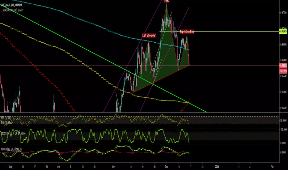
3 MA(50,100,200)_DAILYDaily Moving Average (50, 100, 200) in one code, indicates daily MA values in all time frames
Daily Vertical Linesadjust the time hour and minute base on ur timeframe.
please note that for asian beijing time you will need to deduct 1 hour

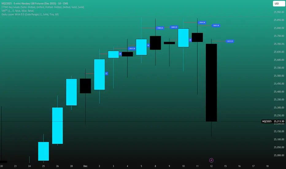
Daily Upper Wick 0.5 (Date Range)Appearance settings modified: Extend lines OFF, level color, Date Range filter, line thickness, Prices labeled and resized tiny, plot lines OFF.
Daily Lower Wick 0.5 (Date Range)Appearance settings modified: Extend lines OFF, level color, Date Range filter, line thickness, Prices labeled and resized tiny, plot lines OFF.

Daily Upper Wick 0.5 (10 Trading Days + Today)Adjust appearance in settings. (Line thickness, color, price labels, extended lines, line plot option.)
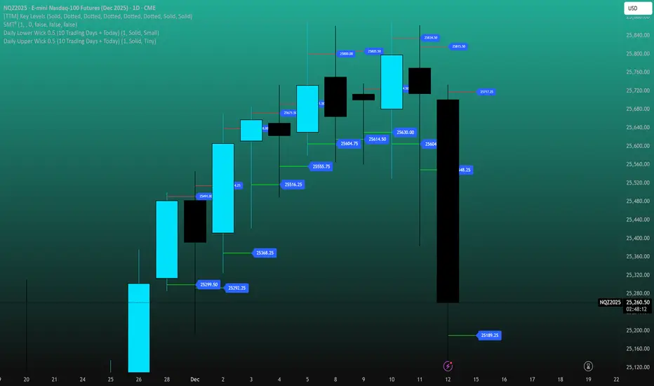
Daily Lower Wick 0.5 (10 Trading Days + Today)Adjust appearance in settings. (Line thickness, color, price labels, extended lines, line plot option.)

S.Trade Trend LinesDaily, 1h and Horizontal Trend Lines with strong support and resistance consideration

SBT LEVELS with CR Daily time frame levels PDH/ PDL/ PDC. I managed to code day count directly into the indicator complete with a table to show you the trigger day as well as current day. Im measuring higher and lower closes. that being said it is up to the trader to realize when a FRD/FGD is a A+/A++/A+++ setup. BO is the designation to show when breakout traders are triggered into the market. CIB (close in breakout). FB- FALSE BREAK- INSIDE - inside day.

Daily Range Box (RIC)This indicator draws a blue-bordered box for each trading day, visible across all timeframes without alteration. The box's upper boundary is the day's highest price, the lower boundary is the day's lowest price, starting from the first trade of the day and ending at the last trade (including extended trading hours). A dashed horizontal line is drawn at the midpoint between the high and low within the box.

Daily Gann Box — Prev Day H/L (1, 0.5, 0) — Gift Idea for trading within the previous days range as described by The Rumers on Youtube. Since it wasn't uploaded and I wanted it. I made basic script and am sharing for free with them.
I will delete once they upload theirs. I don't want any credit or follows from this.

Daily Dual Pivots (Std + Fib) Extended by Jackel
簡介: 這個指標旨在為日內交易者提供最強大的支撐與阻力參考。它將市場上最常用的兩種 Pivot Points 計算方式——標準 (Standard) 與 斐波那契 (Fibonacci)——結合在同一個圖表中,讓你一眼就能看出關鍵的價格匯聚點 (Confluence Areas)。
主要特色:
雙重系統並存:
標準 Pivot (Standard):以 實線 (Solid Lines) 顯示。這是機構與大部分交易者使用的傳統支撐阻力位。
斐波那契 Pivot (Fibonacci):以 圓點/虛線 (Dotted Lines) 顯示。利用 Fib 黃金比例 (0.382, 0.618) 計算出的潛在反轉位。
清晰的視覺區分:標準版使用暖色系 (紅/綠/橙),Fib 版使用冷色系 (藍/紫),互不干擾,清晰易讀。
可選擴展關卡 (S4-S5 / R4-R5):預設顯示 P, R1-R3, S1-S3。如果市場波動劇烈,你可以在設定中開啟 "Show Extra Levels" 來顯示 R4/R5 及 S4/S5。
自動隱藏歷史:預設只顯示「當日」的線條,保持圖表整潔。如需回測,可開啟「顯示歷史數據」選項。
如何使用:
當 實線 (Standard) 與 虛線 (Fib) 重疊或非常接近時,該區域通常具有更強的支撐或阻力效力。
適用於 15分鐘、1小時或 4小時圖表操作日內交易。
Introduction: This indicator is designed for intraday traders who need precise Support & Resistance levels. It combines the two most popular Pivot Point calculation methods—Standard (Traditional) and Fibonacci—into a single chart, allowing you to easily identify key areas of confluence.
Key Features:
Dual System Strategy:
Standard Pivots: Displayed as Solid Lines. These represent the traditional structural levels used by most traders and institutions.
Fibonacci Pivots: Displayed as Dotted/Circle Lines. These use key Fibonacci ratios (0.382, 0.618) to identify potential reversal zones.
Visual Clarity: Different line styles and color groups allow you to distinguish between Standard and Fib levels instantly without chart clutter.
Extended Levels (Optional): By default, it shows P, R1-R3, and S1-S3. In highly volatile markets, you can enable "Show Extra Levels" in the settings to reveal S4/S5 and R4/R5.
Clean Chart: By default, it only shows levels for the current day. You can enable "Show History" in the settings if you need to backtest.
How to Use:
Look for Confluence: When a Solid Line (Standard) and a Dotted Line (Fib) overlap or are very close to each other, it indicates a very strong Support or Resistance zone.
Best used on 15m, 1H, or 4H charts for intraday analysis.

Daily Anchored VWAPAnchors VWAP to whatever time you want instead of the usual start of session. I use it for BTC so that I can anchor around NY open instead of the night before.

Daily RDR (Prev Day H/L, Intraday)This indicator identifies intraday Range-Deviation Reversal (RDR) signals using the previous day’s high and low. At each new session, it stores yesterday’s levels and resets today’s range tracking. During the day, it detects when price first breaks above the prior high or below the prior low, then waits for a reversal: a bearish RDR triggers when price exceeds yesterday’s high and then closes back below it, while a bullish RDR triggers when price undercuts yesterday’s low and then closes back above it. The script plots the previous day’s levels and marks RDR reversals with small up/down triangles.

Daily Weekly Highs & LowsOverview
This indicator automatically plots the previous day’s and previous week’s Highs and Lows, giving you instant clarity on the most important market liquidity levels. These levels often act as magnets for price and serve as key decision zones for intraday and swing traders.
Whether you're looking for liquidity sweeps, breakout confirmations, or simple bias alignment — this tool gives you an immediate visual edge.
Features
Precise anchoring from HH/LL
Lines begin exactly at the previous High/Low with no delays or offsets, ensuring clean and accurate structure visualization.
Visual breakout detection
The indicator highlights where price has broken above or below the previous day/week levels, helping you instantly spot liquidity grabs and market intent.
How It Works
Automatically detects the previous day’s High/Low.
Automatically detects the previous week’s High/Low.
Plots clean horizontal levels starting from the original HH/LL point.
Monitors price in real time and marks the exact candle that breaks the level.
Optionally highlights sweeps or simple breaks, depending on your trading style.
How to Use
Use previous day High/Low for intraday bias, liquidity sweeps, and breakout plays.
Use previous week High/Low for swing bias and higher-timeframe liquidity targets.
Combine breaks with your entry model (FVG, BOS/CHOCH, displacement, etc.).
Watch for fakeouts (liquidity sweeps) followed by reversal signals on lower timeframes.
Monitor alert notifications to avoid staring at the chart all day.
Alerts
Receive notifications the moment price interacts with key levels:
Previous Day High Break
Previous Day Low Break
Previous Week High Break
Previous Week Low Break
(Alerts trigger exactly at the level break — no repainting.)

Daily 4H LevelsThis indicator will automatically demarcate the 4H openings for NQ1!. Please give me feedback if you find anything as its a work in progress.
Expsoure Guide by Tradewith_GaryDaily Guide for exposure building. Use this Indicator to improve your profitability by avoiding over-trading and picking the best days to initiate new trades. Valid only for swing trading format.

Daily Vertical LineToggle to draw a vertical line through the start of each day. E.g. a dotted vertical line appears through the first candle of the day on any candle scale (up to around 2months prior)

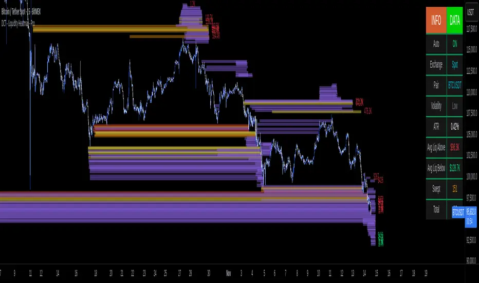
DCT - Liquidity Heatmap - ProOVERVIEW
This indicator visualizes liquidity levels by analyzing volume intensity, order flow structure, and price interaction. It highlights areas where buy-side and sell-side liquidity builds up, showing potential zones of interest.
WHAT IT DOES
- Detects buy-side and sell-side liquidity levels
- Tracks swept zones
- Displays volume intensity using a color-graded system
- Optional CVD mode showing directional volume bias
- Adapts automatically to different market types and volatility states
- Extends active levels forward
- Cleans up old data automatically
- Includes optional alert conditions
KEY FEATURES
- Automatic market and volatility identification
- Smart spacing and level management
- Optional CVD tracking
- Forward level projection
- Swept level preservation
- Imbalance markers
- Real-time info table with liquidity stats, volatility state, and level counts
- Memory-optimized handling for long charts
IMPORTANT NOTES
- Not a predictive tool
- Not a standalone trading system
- Effectiveness varies by timeframe and data quality
- Optimized for crypto markets
- Historical visualization shows past detected levels
HOW TO USE
- Add indicator to your chart
- Adjust spacing to widen or tighten clusters
- Enable CVD if directional pressure is needed
- Configure alerts if desired
- Use Compact mode on smaller screens
TECHNICAL DETAILS
- Pine v6
- Overlay: true
- Max boxes: 500
- Memory optimized
- Works on Perpetual and Spot crypto markets
DISCLAIMER
For analysis and educational use only. No financial advice. Markets can behave unpredictably. Use your own judgment and risk management.