Lorentzian Harmonic Flow - Adaptive ML⚡ LORENTZIAN HARMONIC FLOW — ADAPTIVE ML COMPLETE SYSTEM
THEORETICAL FOUNDATION: TEMPORAL RELATIVITY MEETS MACHINE LEARNING
The Lorentzian Harmonic Flow Adaptive ML system represents a paradigm shift in technical analysis by addressing a fundamental limitation that plagues traditional indicators: they assume time flows uniformly across all market conditions. In reality, markets experience time compression during volatile breakouts and time dilation during consolidation. A 50-period moving average calculated during a quiet overnight session captures vastly different market information than the same calculation during a high-volume news event.
This indicator solves this problem through Lorentzian spacetime modeling , borrowed directly from Einstein's special relativity. By calculating a dynamic gamma factor (γ) that measures market velocity relative to a volatility-based "speed of light," every calculation adapts its effective lookback period to the market's intrinsic clock. Combined with a dual-memory architecture, multi-regime detection, and Bayesian strategy selection, this creates a system that genuinely learns which approaches work in which market conditions.
CRITICAL DISTINCTION: TRUE ADAPTIVE LEARNING VS STATIC CLASSIFICATION
Before diving into the system architecture, it's essential to understand how this indicator fundamentally differs from traditional "Lorentzian" implementations, particularly the well-known Lorentzian Classification indicator.
THE ORIGINAL LORENTZIAN CLASSIFICATION APPROACH:
The pioneering Lorentzian Classification indicator (Jdehorty, 2022) introduced the financial community to Lorentzian distance metrics for pattern matching. However, it used offline training methodology :
• External Training: Required Python scripts or external ML tools to train the model on historical data
• Static Model: Once trained, the model parameters remained fixed
• No Real-Time Learning: The indicator classified patterns but didn't learn from outcomes
• Look-Ahead Bias Risk: Offline training could inadvertently use future data
• Manual Retraining: To adapt to new market conditions, users had to retrain externally and reload parameters
This was groundbreaking for bringing ML concepts to Pine Script, but it wasn't truly adaptive. The model was a snapshot—trained once, deployed, static.
THIS SYSTEM: TRUE ONLINE LEARNING
The Lorentzian Harmonic Flow Adaptive ML system represents a complete architectural departure :
✅ FULLY SELF-CONTAINED:
• Zero External Dependencies: No Python scripts, no external training tools, no data exports
• 100% Pine Script: Entire learning pipeline executes within TradingView
• One-Click Deployment: Load indicator, it begins learning immediately
• No Manual Configuration: System builds its own training data in real-time
✅ GENUINE FORWARD-WALK LEARNING:
• Real-Time Adaptation: Every trade outcome updates the model
• Forward-Only Logic: System uses only past confirmed data—zero look-ahead bias
• Continuous Evolution: Parameters adapt bar-by-bar based on rolling performance
• Regime-Specific Memory: Learns which patterns work in which conditions independently
✅ GETS BETTER WITH TIME:
• Week 1: Bootstrap mode—gathering initial data across regimes
• Month 2-3: Statistical significance emerges, parameter adaptation begins
• Month 4+: Mature learning, regime-specific optimization, confident selection
• Year 2+: Deep pattern library, proven parameter sets, robust to regime shifts
✅ NO RETRAINING REQUIRED:
• Automatic Adaptation: When market structure changes, system detects via performance degradation
• Memory Refresh: Old patterns naturally decay, new patterns replace them
• Parameter Evolution: Thresholds and multipliers adjust to current conditions
• Regime Awareness: If new regime emerges, enters bootstrap mode automatically
THE FUNDAMENTAL DIFFERENCE:
Traditional Lorentzian Classification:
"Here are patterns from the past. Current state matches pattern X, which historically preceded move Y. Signal fired."
→ Static knowledge, fixed rules, periodic retraining required
LHF Adaptive ML:
"In Trending Bull regime, Strategy B has 58% win rate and 1.4 Sharpe over last 30 trades. In High Vol Range, Strategy C performs better with 61% win rate and 1.8 Sharpe. Current state is Trending Bull, so I select Strategy B. If Strategy B starts failing, I'll adapt parameters or switch strategies. I'm learning which patterns matter in which contexts, and I improve every trade."
→ Dynamic learning, contextual adaptation, self-improving system
WHY THIS MATTERS:
Markets are non-stationary. A model trained on 2023 data may fail in 2024 when Fed policy shifts, volatility regime changes, or market structure evolves. Static models require constant human intervention—retraining, re-optimization, parameter updates.
This system learns continuously . It doesn't need you to tell it when markets changed. It discovers regime shifts through performance feedback, adapts parameters accordingly, and rebuilds its pattern library organically. The system running in Month 12 is fundamentally smarter than the system in Month 1—not because you retrained it, but because it learned from 1,000+ real outcomes.
This is the difference between pattern recognition (static ML) and reinforcement learning (adaptive ML). One classifies, the other learns and improves.
PART 1: LORENTZIAN TEMPORAL DYNAMICS
Markets don't experience time uniformly. During explosive volatility, price can compress weeks of movement into minutes. During consolidation, time dilates. Traditional indicators ignore this, using fixed periods regardless of market state.
The Lorentzian approach models market time using the Lorentz factor from special relativity:
γ = 1 / √(1 - v²/c²)
Where:
• v (velocity): Trend momentum normalized by ATR, calculated as (close - close ) / (N × ATR)
• c (speed limit): Realized volatility + volatility bursts, multiplied by c_multiplier parameter
• γ (gamma): Time dilation factor that compresses or expands effective lookback periods
When trend velocity approaches the volatility "speed limit," gamma spikes above 1.0, compressing time. Every calculation length becomes: base_period / γ. This creates shorter, more responsive periods during explosive moves and longer, more stable periods during quiet consolidation.
The system raises gamma to an optional power (gamma_power parameter) for fine control over compression strength, then applies this temporal scaling to every calculation in the indicator. This isn't metaphor—it's quantitative adaptation to the market's intrinsic clock.
PART 2: LORENTZIAN KERNEL SMOOTHING
Traditional moving averages use uniform weights (SMA) or exponential decay (EMA). The Lorentzian kernel uses heavy-tailed weighting:
K(distance, γ) = 1 / (1 + (distance/γ)²)
This Cauchy-like distribution gives more influence to recent extremes than Gaussian assumptions suggest, capturing the fat-tailed nature of financial returns. For any calculation requiring smoothing, the system loops through historical bars, computes Lorentzian kernel weights based on temporal distance and current gamma, then produces weighted averages.
This creates adaptive smoothing that responds to local volatility structure rather than imposing rigid assumptions about price distribution.
PART 3: HARMONIC FLOW (Multi-Timeframe Momentum)
The core directional signal comes from Harmonic Flow (HFL) , which blends three gamma-compressed Lorentzian smooths:
• Short Horizon: base_period × short_ratio / γ (default: 34 × 0.5 / γ ≈ 17 bars, faster with high γ)
• Mid Horizon: base_period × mid_ratio / γ (default: 34 × 1.0 / γ ≈ 34 bars, anchor timeframe)
• Long Horizon: base_period × long_ratio / γ (default: 34 × 2.5 / γ ≈ 85 bars, structural trend)
Each produces a Lorentzian-weighted smooth, converted to a z-score (distance from smooth normalized by ATR). These z-scores are then weighted-averaged:
HFL = (w_short × z_short + w_mid × z_mid + w_long × z_long) / (w_short + w_mid + w_long)
Default weights (0.45, 0.35, 0.20) favor recent momentum while respecting longer structure. Scalpers can increase short weight; swing traders can emphasize long weight. The result is a directional momentum indicator that captures multi-timeframe flow in compressed time.
From HFL, the system derives:
• Flow Velocity: HFL - HFL (momentum acceleration)
• Flow Acceleration: Second derivative (turning points)
• Temporal Compression Index (TCI): base_period / compressed_length (shows how much time is compressed)
PART 4: DUAL MEMORY ARCHITECTURE
Markets have memory—current conditions resonate with past regimes. But memory operates on two timescales, inspiring this indicator's dual-memory design:
SHORT-TERM MEMORY (STM):
• Capacity: 100 patterns (configurable 50-200)
• Decay Rate: 0.980 (50% weight after ~35 bars)
• Update Frequency: Every 10 bars
• Purpose: Capture current regime's tactical patterns
• Storage: Recent market states with 10-bar forward outcomes
• Analogy: Hippocampus (rapid encoding, fast fade)
LONG-TERM MEMORY (LTM):
• Capacity: 512 patterns (configurable 256-1024)
• Decay Rate: 0.997 (50% weight after ~230 bars)
• Quality Gate: Only high-quality patterns admitted (adaptive threshold per regime)
• Purpose: Strategic pattern library validated across regimes
• Storage: Validated patterns from weeks/months of history
• Analogy: Neocortex (slow consolidation, persistent storage)
Each memory stores 6-dimensional feature vectors:
1. HFL (harmonic flow strength)
2. Flow Velocity (momentum)
3. Flow Acceleration (turning points)
4. Volatility (realized vol EMA)
5. Entropy (market uncertainty)
6. Gamma (time compression state)
Plus the actual outcome (10-bar forward return).
K-NEAREST NEIGHBORS (KNN) PATTERN MATCHING:
When evaluating current market state, the system queries both memories using Lorentzian distance :
distance = Σ (1 - K(|feature_current - feature_memory|, γ))
This calculates similarity across all 6 dimensions using the same Lorentzian kernel, weighted by current gamma. The system finds K nearest neighbors (default: 8), weights each by:
• Similarity: Lorentzian kernel distance
• Age: Exponential decay based on bars since pattern
• Regime: Only patterns from similar regimes count
The weighted average of these neighbors' outcomes becomes the prediction. High-confidence predictions require both high similarity and agreement between multiple neighbors.
REGIME-AWARE BLENDING:
STM and LTM predictions are blended adaptively:
• High Vol Range regime: Trust STM 70% (recent matters in chaos)
• Trending regimes: Trust LTM 70% (structure matters in trends)
• Normal regimes: 50/50 blend
Agreement metric: When STM and LTM strongly disagree, the system flags low confidence—often indicating regime transition or novel market conditions requiring caution.
PART 5: FIVE-REGIME MARKET CLASSIFICATION
Traditional regime detection stops at "trending vs ranging." This system detects five distinct market states using linear regression slope and volatility analysis:
REGIME 0: TRENDING BULL ↗
• Detection: LR slope > trend_threshold (default: 0.3)
• Characteristics: Sustained positive HFL, elevated gamma, low entropy
• Best Strategy: B (Flow Momentum)
• Trading Behavior: Follow momentum, trail stops, pyramid winners
REGIME 1: TRENDING BEAR ↘
• Detection: LR slope < -trend_threshold
• Characteristics: Sustained negative HFL, elevated gamma, low entropy
• Best Strategy: B (Flow Momentum)
• Trading Behavior: Follow momentum short, aggressive exits on reversal
REGIME 2: HIGH VOL RANGE ↔
• Detection: |slope| < threshold AND vol_ratio > vol_expansion_threshold (default: 1.5)
• Characteristics: Oscillating HFL, high gamma spikes, high entropy
• Best Strategies: A (Squeeze Breakout) or C (Memory Pattern)
• Trading Behavior: Fade extremes, tight stops, quick profits
REGIME 3: LOW VOL RANGE —
• Detection: |slope| < threshold AND vol_ratio < vol_expansion_threshold
• Characteristics: Low HFL magnitude, gamma ≈ 1, squeeze conditions
• Best Strategy: A (Squeeze Breakout)
• Trading Behavior: Wait for breakout, wide stops on breakout entry
REGIME 4: TRANSITION ⚡
• Detection: Trend reversal OR volatility spike > 1.5× threshold
• Characteristics: Erratic gamma, high entropy, conflicting signals
• Best Strategy: None (often unfavorable)
• Trading Behavior: Stand aside, wait for clarity
Each regime gets a confidence score (0-1) measuring how clearly defined it is. Low confidence indicates messy, ambiguous conditions.
PART 6: THREE INDEPENDENT TRADING STRATEGIES
Rather than one signal logic, the system implements three distinct approaches:
STRATEGY A: SQUEEZE BREAKOUT
• Logic: Bollinger Bands squeeze release + HFL direction + flow velocity confirmation
• Calculation: Compares BB width to Keltner Channel width; fires when BB expands beyond KC
• Strength Score: 70 + compression_strength × 0.3 (tighter squeeze = higher score)
• Best Regimes: Low Vol Range (3), Transition exit (4→0 or 4→1)
• Pattern: Volatility contraction → directional expansion
• Philosophy: Calm before the storm; compression precedes explosion
STRATEGY B: LORENTZIAN FLOW MOMENTUM
• Logic: Strong HFL (×flow_mult) + positive velocity + gamma > 1.1 + NOT squeezing
• Calculation: |HFL × flow_mult| > 0.12, velocity confirms direction, gamma shows acceleration
• Strength Score: |HFL × flow_mult| × 80 + gamma × 10
• Best Regimes: Trending Bull (0), Trending Bear (1)
• Pattern: Established momentum → acceleration in compressed time
• Philosophy: Trend is friend when spacetime curves
STRATEGY C: MEMORY PATTERN MATCHING
• Logic: Dual KNN prediction > threshold + high confidence + agreement + HFL confirms
• Calculation: |memory_pred| > 0.005, memory_conf > 1.0, agreement > 0.5, HFL direction matches
• Strength Score: |prediction| × 800 × agreement
• Best Regimes: High Vol Range (2), sometimes others with sufficient pattern library
• Pattern: Historical similarity → outcome resonance
• Philosophy: Markets rhyme; learn from validated patterns
Each strategy generates independent strength scores. In multi-strategy mode (enabled by default), the system selects one strategy per regime based on risk-adjusted performance. In weighted mode (multi-strategy disabled), all three fire simultaneously with configurable weights.
PART 7: ADAPTIVE LEARNING & BAYESIAN SELECTION
This is where machine learning meets trading. The system maintains 15 independent performance matrices :
3 strategies × 5 regimes = 15 tracking systems
For each combination, it tracks:
• Trade Count: Number of completed trades
• Win Count: Profitable outcomes
• Total Return: Sum of percentage returns
• Squared Returns: For variance/Sharpe calculation
• Equity Curve: Virtual P&L assuming 10% risk per trade
• Peak Equity: All-time high for drawdown calculation
• Max Drawdown: Peak-to-trough decline
RISK-ADJUSTED SCORING:
For current regime, the system scores each strategy:
Sharpe Ratio: (mean_return / std_dev) × √252
Calmar Ratio: total_return / max_drawdown
Win Rate: wins / trades
Combined Score = 0.6 × Sharpe + 0.3 × Calmar + 0.1 × Win_Rate
The strategy with highest score is selected. This is similar to Thompson Sampling (multi-armed bandits) but uses deterministic selection rather than probabilistic sampling due to Pine Script limitations.
BOOTSTRAP MODE (Critical for Understanding):
For the first min_regime_samples trades (default: 10) in each regime:
• Status: "🔥 BOOTSTRAP (X/10)" displayed in dashboard
• Behavior: All signals allowed (gathering data)
• Regime Filter: Disabled (can't judge with insufficient data)
• Purpose: Avoid cold-start problem, build statistical foundation
After reaching threshold:
• Status: "✅ FAVORABLE" (score > 0.5) or "⚠️ UNFAVORABLE" (score ≤ 0.5)
• Behavior: Only trade favorable regimes (if enable_regime_filter = true)
• Learning: Parameters adapt based on outcomes
This solves a critical problem: you can't know which strategy works in a regime without data, but you can't get data without trading. Bootstrap mode gathers initial data safely, then switches to selective mode once statistical confidence emerges.
PARAMETER ADAPTATION (Per Regime):
Three parameters adapt independently for each regime based on outcomes:
1. SIGNAL QUALITY THRESHOLD (30-90):
• Starts: base_quality_threshold (default: 60)
• Adaptation:
Win Rate < 45% → RAISE threshold by learning_rate × 10 (be pickier)
Win Rate > 55% → LOWER threshold by learning_rate × 5 (take more)
• Effect: System becomes more selective in losing regimes, more aggressive in winning regimes
2. LTM QUALITY GATE (0.2-0.8):
• Starts: 0.4 (if adaptive gate enabled)
• Adaptation:
Sharpe < 0.5 → RAISE gate by learning_rate (demand better patterns)
Sharpe > 1.5 → LOWER gate by learning_rate × 0.5 (accept more patterns)
• Effect: LTM fills with high-quality patterns from winning regimes
3. FLOW MULTIPLIER (0.5-2.0):
• Starts: 1.0
• Adaptation:
Strong win (+2%+) → MULTIPLY by (1 + learning_rate × 0.1)
Strong loss (-2%+) → MULTIPLY by (1 - learning_rate × 0.1)
• Effect: Amplifies signal strength in profitable regimes, dampens in unprofitable
Each regime evolves independently. Trending Bull might develop threshold=55, gate=0.35, mult=1.3 while High Vol Range develops threshold=70, gate=0.50, mult=0.9.
PART 8: SHADOW PORTFOLIO VALIDATION
To validate learning objectively, the system runs three virtual portfolios :
Shadow Portfolio A: Trades only Strategy A signals
Shadow Portfolio B: Trades only Strategy B signals
Shadow Portfolio C: Trades only Strategy C signals
When any signal fires:
1. Open virtual position for corresponding strategy
2. On exit, calculate P&L (10% risk per trade)
3. Update equity, win count, profit factor
Dashboard displays:
• Equity: Current virtual balance (starts $10,000)
• Win%: Overall win rate across all regimes
• PF: Profit Factor (gross_profit / gross_loss)
This transparency shows which strategies actually perform, validates the selection logic, and prevents overfitting. If Shadow C shows $12,500 equity while A and B show $9,800, it confirms Strategy C's edge.
PART 9: HISTORICAL PRE-TRAINING
The system includes historical pre-training to avoid cold-start:
On Chart Load (if enabled):
1. Scan past pretrain_bars (default: 200)
2. Calculate historical HFL, gamma, velocity, acceleration, volatility, entropy
3. Compute 10-bar forward returns as outcomes
4. Populate STM with recent patterns
5. Populate LTM with high-quality patterns (quality > 0.4)
Effect:
• Without pre-training: Memories empty, no predictions for weeks, pure bootstrap
• With pre-training: System starts with pattern library, predictions from day one
Pre-training uses only past data (no future peeking) and fills memories with validated outcomes. This dramatically accelerates learning without compromising integrity.
PART 10: COMPREHENSIVE INPUT SYSTEM
The indicator provides 50+ inputs organized into logical groups. Here are the key parameters and their market-specific guidance:
🧠 ADAPTIVE LEARNING SYSTEM:
Enable Adaptive Learning (true/false):
• Function: Master switch for regime-specific strategy selection and parameter adaptation
• Enabled: System learns which strategies work in which regimes (recommended)
• Disabled: All strategies fire simultaneously with fixed weights (simpler, less adaptive)
• Recommendation: Keep enabled for all markets; system needs 2-3 months to mature
Learning Rate (0.01-0.20):
• Function: Speed of parameter adaptation based on outcomes
• Stocks/ETFs: 0.03-0.05 (slower, more stable)
• Crypto: 0.05-0.08 (faster, adapts to volatility)
• Forex: 0.04-0.06 (moderate)
• Timeframes:
1-5min scalping: 0.08-0.10 (rapid adaptation)
15min-1H day trading: 0.05-0.07 (balanced)
4H-Daily swing: 0.03-0.05 (conservative)
• Tradeoff: Higher = responsive but may overfit; Lower = stable but slower to adapt
Min Samples Per Regime (5-30):
• Function: Trades required before exiting bootstrap mode
• Active trading (>5 signals/day): 8-10 trades
• Moderate (1-5 signals/day): 10-15 trades
• Swing (few signals/week): 5-8 trades
• Logic: Bootstrap mode until this threshold; then uses Sharpe/Calmar for regime filtering
• Tradeoff: Lower = faster exit (risky, less data); Higher = more validation (safer, slower)
🌍 REGIME DETECTION:
Regime Lookback Period (20-200):
• Function: Bars used for linear regression to classify regime
• By Timeframe:
1-5min: 30-50 bars (~2-4 hour context)
15min: 40-60 bars (daily context)
1H: 50-100 bars (weekly context)
4H: 100-150 bars (monthly context)
Daily: 50-75 bars (quarterly context)
• By Market:
Crypto: 40-60 (faster regime changes)
Forex: 50-75 (moderate stability)
Stocks: 60-100 (slower structural trends)
• Tradeoff: Shorter = more regime switches (reactive); Longer = fewer switches (stable)
Trend Strength Threshold (0.1-0.8):
• Function: Minimum normalized LR slope to classify as trending vs ranging
• Lower (0.1-0.2): More markets classified as trending
• Higher (0.4-0.6): Only strong trends qualify
• Recommendations:
Choppy markets (BTC, small caps): 0.25-0.35
Smooth trends (major FX pairs): 0.30-0.40
Strong trends (indices during bull): 0.20-0.30
• Effect: Controls sensitivity of trending vs ranging classification
Vol Expansion Factor (1.2-3.0):
• Function: Volatility ratio to classify high-vol regimes (current_vol / avg_vol)
• By Asset:
Bitcoin: 1.4-1.6 (frequent vol spikes)
Altcoins: 1.3-1.5 (very volatile)
Major FX (EUR/USD): 1.6-2.0 (stable baseline)
Stocks (SPY): 1.5-1.8 (moderate)
Penny stocks: 1.3-1.4 (always volatile)
• Impact: Higher = fewer "High Vol Range" classifications; Lower = more sensitive to volatility spikes
🎯 SIGNAL GENERATION:
Base Quality Threshold (30-90):
• Function: Starting signal strength requirement (adapts per regime)
• THIS IS YOUR MAIN SIGNAL FREQUENCY CONTROL
• Conservative (70-80): Fewer, higher-quality signals
• Balanced (55-65): Moderate signal flow
• Aggressive (40-50): More signals, more noise
• By Trading Style:
Scalping (1-5min): 50-60
Day trading (15min-1H): 60-70
Swing (4H-Daily): 65-75
• Adaptive Behavior: System raises this in losing regimes (pickier), lowers in winning regimes (take more)
Min Confidence (0.1-0.9):
• Function: Minimum confidence score to fire signal
• Calculation: (Signal_Strength / 100) × Regime_Confidence
• Recommendations:
High-frequency (scalping): 0.2-0.3 (permissive)
Day trading: 0.3-0.4 (balanced)
Swing/position: 0.4-0.6 (selective)
• Interaction: During Transition regime (low regime confidence), even strong signals may fail confidence check; creates natural regime filtering
Only Trade Favorable Regimes (true/false):
• Function: Block signals in unfavorable regimes (where all strategies have negative risk-adjusted scores)
• Enabled (Recommended): Only trades when best strategy has positive Sharpe in current regime; auto-disables during bootstrap; protects capital
• Disabled: Always allows signals regardless of historical performance; use for manual regime assessment
• Bootstrap: Auto-allows trading until min_regime_samples reached, then switches to performance-based filtering
Min Bars Between Signals (1-20):
• Function: Prevents signal spam by enforcing minimum spacing
• By Timeframe:
1min: 3-5 bars (3-5 minutes)
5min: 3-6 bars (15-30 minutes)
15min: 4-8 bars (1-2 hours)
1H: 5-10 bars (5-10 hours)
4H: 3-6 bars (12-24 hours)
Daily: 2-5 bars (2-5 days)
• Logic: After signal fires, no new signals for X bars
• Tradeoff: Lower = more reactive (may overtrade); Higher = more patient (may miss reversals)
🌀 LORENTZIAN CORE:
Base Period (10-100):
• Function: Core time period for flow calculation (gets compressed by gamma)
• THIS IS YOUR PRIMARY TIMEFRAME KNOB
• By Timeframe:
1-5min scalping: 20-30 (fast response)
15min-1H day: 30-40 (balanced)
4H swing: 40-55 (smooth)
Daily position: 50-75 (very smooth)
• By Market Character:
Choppy (crypto, small caps): 25-35 (faster)
Smooth (major FX, indices): 35-50 (moderate)
Slow (bonds, utilities): 45-65 (slower)
• Gamma Effect: Actual length = base_period / gamma; High gamma compresses to ~20 bars, low gamma expands to ~50 bars
• Default 34 (Fibonacci) works well across most assets
Velocity Period (5-50):
• Function: Window for trend velocity calculation: (price_now - price ) / (N × ATR)
• By Timeframe:
1-5min scalping: 8-12 (fast momentum)
15min-1H day: 12-18 (balanced)
4H swing: 14-21 (smooth trend)
Daily: 18-30 (structural trend)
• By Market:
Crypto (fast moves): 10-14
Stocks (moderate): 14-20
Forex (smooth): 18-25
• Impact: Feeds into gamma calculation (v/c ratio); shorter = more sensitive to velocity spikes → higher gamma
• Relationship: Typically vel_period ≈ base_period / 2 to 2/3
Speed-of-Market (c) (0.5-3.0):
• Function: "Speed limit" for gamma calculation: c = realized_vol + vol_burst × c_multiplier
• By Asset Volatility:
High vol (BTC, TSLA): 1.0-1.3 (lower c = more compression)
Medium vol (SPY, EUR/USD): 1.3-1.6 (balanced)
Low vol (bonds, utilities): 1.6-2.5 (higher c = less compression)
• What It Does:
Lower c → velocity hits "speed limit" sooner → higher gamma → more compression
Higher c → velocity rarely hits limit → gamma stays near 1 → less adaptation
• Effect on Signals: More compression (low c) = faster regime detection, more responsive; Less compression (high c) = smoother, less adaptive
• Tuning: Start at 1.4; if gamma always ~1.0, lower to 1.0-1.2; if gamma spikes >5 often, raise to 1.6-2.0
Gamma Power (0.5-2.0):
• Function: Exponent applied to gamma: final_gamma = gamma^power
• Compression Strength:
0.5-0.8: Softens compression (gamma 4 → 2)
1.0: Linear (gamma 4 → 4)
1.2-2.0: Amplifies compression (gamma 4 → 16)
• Use Cases:
Reduce power (<1.0) if adaptive lengths swing too wildly or getting whipsawed
Increase power (>1.0) for more aggressive regime adaptation in fast markets
• Most users should leave at 1.0; only adjust if gamma behavior needs tuning
Max Kernel Lookback (20-200):
• Function: Computational limit for Lorentzian smoothing (performance control)
• Recommendations:
Fast PC / simple chart: 80-100
Slow PC / complex chart: 40-60
Mobile / lots of indicators: 30-50
• Impact: Each kernel smoothing loops through this many bars; higher = more accurate but slower
• Default 60 balances accuracy and speed; lower to 40-50 if indicator is slow
🎼 HARMONIC FLOW:
Short Horizon (0.2-1.0):
• Function: Fast timeframe multiplier: short_length = base_period × short_ratio / gamma
• Default: 0.5 (captures 2× faster flow than base)
• By Style:
Scalping: 0.3-0.4 (very fast)
Day trading: 0.4-0.6 (moderate)
Swing: 0.5-0.7 (balanced)
• Effect: Lower = more weight on micro-moves; Higher = smooths out fast fluctuations
Mid Horizon (0.5-2.0):
• Function: Medium timeframe multiplier: mid_length = base_period × mid_ratio / gamma
• Default: 1.0 (equals base_period, anchor timeframe)
• Usually keep at 1.0 unless specific strategy needs fine-tuning
Long Horizon (1.0-5.0):
• Function: Slow timeframe multiplier: long_length = base_period × long_ratio / gamma
• Default: 2.5 (captures trend/structure)
• By Style:
Scalping: 1.5-2.0 (less long-term influence)
Day trading: 2.0-3.0 (balanced)
Swing: 2.5-4.0 (strong trend component)
• Effect: Higher = more emphasis on larger structure; Lower = more reactive to recent price action
Short Weight (0-1):
Mid Weight (0-1):
Long Weight (0-1):
• Function: Relative importance in HFL calculation (should sum to 1.0)
• Defaults: Short: 0.45, Mid: 0.35, Long: 0.20 (day trading balanced)
• Preset Configurations:
SCALPING (fast response):
Short: 0.60, Mid: 0.30, Long: 0.10
DAY TRADING (balanced):
Short: 0.45, Mid: 0.35, Long: 0.20
SWING (trend-following):
Short: 0.25, Mid: 0.35, Long: 0.40
• Effect: More short weight = responsive but noisier; More long weight = smoother but laggier
🧠 DUAL MEMORY SYSTEM:
Enable Pattern Memory (true/false):
• Function: Master switch for KNN pattern matching via dual memory
• Enabled (Recommended): Strategy C (Memory Pattern) can fire; memory predictions influence all strategies; prediction arcs shown; heatmaps available
• Disabled: Only Strategy A and B available; faster performance (less computation); pure technical analysis (no pattern matching)
• Keep enabled for full system capabilities; disable only if CPU-constrained or testing pure flow signals
STM Size (50-200):
• Function: Short-Term Memory capacity (recent pattern storage)
• Characteristics: Fast decay (0.980), captures current regime, updates every 10 bars, tactical pattern matching
• Sizing:
Active markets (crypto): 80-120
Moderate (stocks): 100-150
Slow (bonds): 50-100
• By Timeframe:
1-15min: 60-100 (captures few hours of patterns)
1H: 80-120 (captures days)
4H-Daily: 100-150 (captures weeks/months)
• Tradeoff: More = better recent pattern coverage; Less = faster computation
• Default 100 is solid for most use cases
LTM Size (256-1024):
• Function: Long-Term Memory capacity (validated pattern storage)
• Characteristics: Slow decay (0.997), only high-quality patterns (gated), regime-specific recall, strategic pattern library
• Sizing:
Fast PC: 512-768
Medium PC: 384-512
Slow PC/Mobile: 256-384
• By Data Needs:
High-frequency (lots of patterns): 512-1024
Moderate activity: 384-512
Low-frequency (swing): 256-384
• Performance Impact: Each KNN search loops through entire LTM; 512 = good balance of coverage and speed; if slow, drop to 256-384
• Fills over weeks/months with validated patterns
STM Decay (0.95-0.995):
• Function: Short-Term Memory age decay rate: age_weight = decay^bars_since_pattern
• Decay Rates:
0.950: Aggressive fade (50% weight after 14 bars)
0.970: Moderate fade (50% after 23 bars)
0.980: Balanced (50% after 35 bars)
0.990: Slow fade (50% after 69 bars)
• By Timeframe:
1-5min: 0.95-0.97 (fast markets, old patterns irrelevant)
15min-1H: 0.97-0.98 (balanced)
4H-Daily: 0.98-0.99 (slower decay)
• Philosophy: STM should emphasize RECENT patterns; lower decay = only very recent matters; 0.980 works well for most cases
LTM Decay (0.99-0.999):
• Function: Long-Term Memory age decay rate
• Decay Rates:
0.990: 50% weight after 69 bars
0.995: 50% weight after 138 bars
0.997: 50% weight after 231 bars
0.999: 50% weight after 693 bars
• Philosophy: LTM should retain value for LONG periods; pattern from 6 months ago might still matter
• Usage:
Fast-changing markets: 0.990-0.995
Stable markets: 0.995-0.998
Structural patterns: 0.998-0.999
• Warning: Be careful with very high decay (>0.998); market structure changes, old patterns may mislead
• 0.997 balances long-term memory with regime evolution
K Neighbors (3-21):
• Function: Number of similar patterns to query in KNN search
• By Sample Size:
Small dataset (<100 patterns): 3-5
Medium dataset (100-300): 5-8
Large dataset (300-1000): 8-13
Very large (>1000): 13-21
• Tradeoff:
Fewer K (3-5): More reactive to closest matches; noisier; outlier-sensitive; better when patterns very distinct
More K (13-21): Smoother, more stable predictions; may dilute strong signals; better when patterns overlap
• Rule of Thumb: K ≈ √(memory_size) / 3; For STM=100, LTM=512: K ≈ 8-10 ideal
Adaptive Quality Gate (true/false):
• Function: Adapts LTM entry threshold per regime based on Sharpe ratio
• Enabled: Quality gate adapts: Low Sharpe → RAISE gate (demand better patterns); High Sharpe → LOWER gate (accept more patterns); each regime has independent gate
• Disabled: Fixed quality gate (0.4 default) for all regimes
• Recommended: Keep ENABLED; helps LTM focus on proven pattern types per regime; prevents weak patterns from polluting memory
🎯 MULTI-STRATEGY SYSTEM:
Enable Strategy Learning (true/false):
• Function: Core learning feature for regime-specific strategy selection
• Enabled: Tracks 3 strategies × 5 regimes = 15 performance matrices; selects best strategy per regime via Sharpe/Calmar/WinRate; adaptive strategy switching
• Disabled: All strategies fire simultaneously (weighted combination); no regime-specific selection; simpler but less adaptive
• Recommended: ENABLED (this is the core of the adaptive system); disable only for testing or simplification
Strategy A Weight (0-1):
• Function: Weight for Strategy A (Squeeze Breakout) when multi-strategy disabled
• Characteristics: Fires on Bollinger squeeze release; best in Low Vol Range, Transition; compression → expansion pattern
• When Multi-Strategy OFF: Default 0.33 (equal weight); increase to 0.4-0.5 for choppy ranges with breakouts; decrease to 0.2-0.3 for trending markets
• When Multi-Strategy ON: This is ignored (system auto-selects based on performance)
Strategy B Weight (0-1):
• Function: Weight for Strategy B (Lorentzian Flow) when multi-strategy disabled
• Characteristics: Fires on strong HFL + velocity + gamma; best in Trending Bull/Bear; momentum → acceleration pattern
• When Multi-Strategy OFF: Default 0.33; increase to 0.4-0.5 for trending markets; decrease to 0.2-0.3 for choppy/ranging markets
• When Multi-Strategy ON: Ignored (auto-selected)
Strategy C Weight (0-1):
• Function: Weight for Strategy C (Memory Pattern) when multi-strategy disabled
• Characteristics: Fires when dual KNN predicts strong move; best in High Vol Range; requires memory system enabled + sufficient data
• When Multi-Strategy OFF: Default 0.34; increase to 0.4-0.6 if strong pattern repetition and LTM has >200 patterns; decrease to 0.2-0.3 if new to system; set to 0.0 if memory disabled
• When Multi-Strategy ON: Ignored (auto-selected)
📚 PRE-TRAINING:
Historical Pre-Training (true/false):
• Function: Bootstrap feature that fills memory on chart load
• Enabled: Scans past bars to populate STM/LTM before live trading; calculates historical outcomes (10-bar forward returns); builds initial pattern library; system starts with context, not blank slate
• Disabled: Memories only populate in real-time; takes weeks to build pattern library
• Recommended: ENABLED (critical for avoiding "cold start" problem); disable only for testing clean learning
Training Bars (50-500):
• Function: How many historical bars to scan on load (limited by available history)
• Recommendations:
1-5min charts: 200-300 (few hours of history)
15min-1H: 200-400 (days/weeks)
4H: 300-500 (months)
Daily: 200-400 (years)
• Performance:
100 bars: ~1 second
300 bars: ~2-3 seconds
500 bars: ~4-5 seconds
• Sweet Spot: 200-300 (enough patterns without slow load)
• If chart loads slowly: Reduce to 100-150
🎨 VISUALIZATION:
Show Regime Background (true/false):
• Function: Color-code background by current regime
• Colors: Trending Bull (green tint), Trending Bear (red tint), High Vol Range (orange tint), Low Vol Range (blue tint), Transition (purple tint)
• Helps visually track regime changes
Show Flow Bands (true/false):
• Function: Plot upper/lower bands based on HFL strength
• Shows dynamic support/resistance zones; green fill = bullish flow; red fill = bearish flow
• Useful for visual trend confirmation
Show Confidence Meter (true/false):
• Function: Plot signal confidence (0-100) in separate pane
• Calculation: (Signal_Strength / 100) × Regime_Confidence
• Gold line = current confidence; dashed line = minimum threshold
• Signals fire when confidence exceeds threshold
Show Prediction Arc (true/false):
• Function: Dashed line projecting expected price move based on memory prediction
• NOT a price target - a probability vector; steep arc = strong expected move; flat arc = weak/uncertain prediction
• Green = bullish prediction; red = bearish prediction
Show Signals (true/false):
• Function: Triangle markers at entry points
• ▲ Green = Long signal; ▼ Red = Short signal
• Markers show on bar close (non-repainting)
🏆 DASHBOARD:
Show Dashboard (true/false):
• Function: Main info panel showing all system metrics
• Sections: Lorentzian Core, Regime, Dual Memory, Adaptive Parameters, Regime Performance, Shadow Portfolios, Current Signal Status
• Essential for understanding system state
Dashboard Position: Top Left, Top Right, Bottom Left, Bottom Right
Individual Section Toggles:
• System Stats: Lorentzian Core section (Gamma, v/c, HFL, TCI)
• Memory Stats: Dual Memory section (STM/LTM predictions, agreement)
• Shadow Portfolios: Shadow Portfolio table (equity, win%, PF)
• Adaptive Params: Adaptive Parameters section (threshold, quality gate, flow mult)
🔥 HEATMAPS:
Show Dual Heatmaps (true/false):
• Function: Visual pattern density maps for STM and LTM
• Layout: X-axis = pattern age (left=recent, right=old); Y-axis = outcome direction (top=bearish, bottom=bullish); Color intensity = pattern count; Color hue = bullish (green) vs bearish (red)
• Warning: Can clutter chart; disable if not using
Heatmap Position: Screen position for heatmaps (STM at selected position, LTM offset)
Resolution (5-15):
• Function: Grid resolution (bins)
• Higher = more detailed but smaller cells; Lower = clearer but less granular
• 10 is good balance; reduce to 6-8 if hard to read
PART 11: DASHBOARD METRICS EXPLAINED
The comprehensive dashboard provides real-time transparency into every aspect of the adaptive system:
⚡ LORENTZIAN CORE SECTION:
Gamma (γ):
• Range: 1.0 to ~10.0 (capped)
• Interpretation:
γ ≈ 1.0-1.2: Normal market time, low velocity
γ = 1.5-2.5: Moderate compression, trending
γ = 3.0-5.0: High compression, explosive moves
γ > 5.0: Extreme compression, parabolic volatility
• Usage: High gamma = system operating in compressed time; expect shorter effective periods and faster adaptation
v/c (Velocity / Speed Limit):
• Range: 0.0 to 0.999 (approaches but never reaches 1.0)
• Interpretation:
v/c < 0.3: Slow market, low momentum
v/c = 0.4-0.7: Moderate trending
v/c > 0.7: Approaching "speed limit," high velocity
v/c > 0.9: Parabolic move, system at limit
• Color Coding: Red (>0.7), Gold (0.4-0.7), Green (<0.4)
• Usage: High v/c warns of extreme conditions where trend may exhaust
HFL (Harmonic Flow):
• Range: Typically -3.0 to +3.0 (can exceed in extremes)
• Interpretation:
HFL > 0: Bullish flow
HFL < 0: Bearish flow
|HFL| > 0.5: Strong directional bias
|HFL| < 0.2: Weak, indecisive
• Color: Green (positive), Red (negative)
• Usage: Primary directional indicator; strategies often require HFL confirmation
TCI (Temporal Compression Index):
• Calculation: base_period / compressed_length
• Interpretation:
TCI ≈ 1.0: No compression, normal time
TCI = 1.5-2.5: Moderate compression
TCI > 3.0: Significant compression
• Usage: Shows how much time is being compressed; mirrors gamma but more intuitive
╔═══ REGIME SECTION ═══╗
Current:
• Display: Regime name with icon (Trending Bull ↗, Trending Bear ↘, High Vol Range ↔, Low Vol Range —, Transition ⚡)
• Color: Gold for visibility
• Usage: Know which regime you're in; check regime performance to see expected strategy behavior
Confidence:
• Range: 0-100%
• Interpretation:
>70%: Very clear regime definition
40-70%: Moderate clarity
<40%: Ambiguous, mixed conditions
• Color: Green (>70%), Gold (40-70%), Red (<40%)
• Usage: High confidence = trust regime classification; low confidence = regime may be transitioning
Mode:
• States:
🔥 BOOTSTRAP (X/10): Still gathering data for this regime
✅ FAVORABLE: Best strategy has positive risk-adjusted score (>0.5)
⚠️ UNFAVORABLE: All strategies have negative scores (≤0.5)
• Color: Orange (bootstrap), Green (favorable), Red (unfavorable)
• Critical Importance: This tells you whether the system will trade or stand aside (if regime filter enabled)
╔═══ DUAL MEMORY KNN SECTION ═══╗
STM (Size):
• Display: Number of patterns currently in STM (0 to stm_size)
• Interpretation: Should fill to capacity within hours/days; if not filling, check that memory is enabled
STM Pred:
• Range: Typically -0.05 to +0.05 (representing -5% to +5% expected 10-bar move)
• Color: Green (positive), Red (negative)
• Usage: STM's prediction based on recent patterns; emphasis on current regime
LTM (Size):
• Display: Number of patterns in LTM (0 to ltm_size)
• Interpretation: Fills slowly (weeks/months); only validated high-quality patterns; check quality gate if not filling
LTM Pred:
• Range: Similar to STM pred
• Color: Green (positive), Red (negative)
• Usage: LTM's prediction based on long-term validated patterns; more strategic than tactical
Agreement:
• Display:
✅ XX%: Strong agreement (>70%) - both memories aligned
⚠️ XX%: Moderate agreement (40-70%) - some disagreement
❌ XX%: Conflict (<40%) - memories strongly disagree
• Color: Green (>70%), Gold (40-70%), Red (<40%)
• Critical Usage: Low agreement often precedes regime change or signals novel conditions; Strategy C won't fire with low agreement
╔═══ ADAPTIVE PARAMS SECTION ═══╗
Threshold:
• Display: Current regime's signal quality threshold (30-90)
• Interpretation: Higher = pickier; lower = more permissive
• Watch For: If steadily rising in a regime, system is struggling (low win rate); if falling, system is confident
• Default: Starts at base_quality_threshold (usually 60)
Quality:
• Display: Current regime's LTM quality gate (0.2-0.8)
• Interpretation: Minimum quality score for pattern to enter LTM
• Watch For: If rising, system demanding higher-quality patterns; if falling, accepting more diverse patterns
• Default: Starts at 0.4
Flow Mult:
• Display: Current regime's flow multiplier (0.5-2.0)
• Interpretation: Amplifies or dampens HFL for Strategy B
• Watch For: If >1.2, system found strong edge in flow signals; if <0.8, flow signals underperforming
• Default: Starts at 1.0
Learning:
• Display: ✅ ON or ❌ OFF
• Shows whether adaptive learning is enabled
• Color: Green (on), Red (off)
╔═══ REGIME PERFORMANCE SECTION ═══╗
This table shows ONLY the current regime's statistics:
S (Strategy):
• Display: A, B, or C
• Color: Gold if selected strategy; gray if not
• Shows which strategies have data in this regime
Trades:
• Display: Number of completed trades for this pair
• Interpretation: Blank or low numbers mean bootstrap mode; >10 means statistical significance building
Win%:
• Display: Win rate percentage
• Color: Green (>55%), White (45-55%), Red (<45%)
• Interpretation: 52%+ is good; 58%+ is excellent; <45% means struggling
• Note: Short-term variance is normal; judge after 20+ trades
Sharpe:
• Display: Annualized Sharpe ratio
• Color: Green (>1.0), White (0-1.0), Red (<0)
• Interpretation:
>2.0: Exceptional (rare)
1.0-2.0: Good
0.5-1.0: Acceptable
0-0.5: Marginal
<0: Losing
• Usage: Primary metric for strategy selection (60% weight in score)
╔═══ SHADOW PORTFOLIOS SECTION ═══╗
Shows virtual equity tracking across ALL regimes (not just current):
S (Strategy):
• Display: A, B, or C
• Color: Gold if currently selected strategy; gray otherwise
Equity:
• Display: Current virtual balance (starts $10,000)
• Color: Green (>$10,000), White ($9,500-$10,000), Red (<$9,500)
• Interpretation: Which strategy is actually making virtual money across all conditions
• Note: 10% risk per trade assumed
Win%:
• Display: Overall win rate across all regimes
• Color: Green (>55%), White (45-55%), Red (<45%)
• Interpretation: Aggregate performance; strategy may do well in some regimes and poorly in others
PF (Profit Factor):
• Display: Gross profit / gross loss
• Color: Green (>1.5), White (1.0-1.5), Red (<1.0)
• Interpretation:
>2.0: Excellent
1.5-2.0: Good
1.2-1.5: Acceptable
1.0-1.2: Marginal
<1.0: Losing
• Usage: Confirms win rate; high PF with moderate win rate means winners >> losers
╔═══ STATUS BAR ═══╗
Display States:
• 🟢 LONG: Currently in long position (green background)
• 🔴 SHORT: Currently in short position (red background)
• ⬆️ LONG SIGNAL: Long signal present but not yet confirmed (waiting for bar close)
• ⬇️ SHORT SIGNAL: Short signal present but not yet confirmed
• ⚪ NEUTRAL: No position, no signal (white background)
Usage: Immediate visual confirmation of system state; check before manually entering/exiting
PART 12: VISUAL ELEMENT INTERPRETATION
REGIME BACKGROUND COLORS:
Green Tint: Trending Bull regime - expect Strategy B (Flow) to dominate; focus on long momentum
Red Tint: Trending Bear regime - expect Strategy B (Flow) shorts; focus on short momentum
Orange Tint: High Vol Range - expect Strategy A (Squeeze) or C (Memory); trade breakouts or patterns
Blue Tint: Low Vol Range - expect Strategy A (Squeeze); wait for compression release
Purple Tint: Transition regime - often unfavorable; system may stand aside; high uncertainty
Usage: Quick visual regime identification without reading dashboard
FLOW BANDS:
Upper Band: close + HFL × ATR × 1.5
Lower Band: close - HFL × ATR × 1.5
Green Fill: HFL positive (bullish flow); bands act as dynamic support/resistance in uptrend
Red Fill: HFL negative (bearish flow); bands act as dynamic resistance/support in downtrend
Usage:
• Bullish flow: Price bouncing off lower band = trend continuation; breaking below = possible reversal
• Bearish flow: Price rejecting upper band = trend continuation; breaking above = possible reversal
CONFIDENCE METER (Separate Pane):
Gold Line: Current signal confidence (0-100)
Dashed Line: Minimum confidence threshold
Interpretation:
• Line above threshold: Signal likely to fire if strength sufficient
• Line below threshold: Even if signal logic met, won't fire (insufficient confidence)
• Gradual rise: Signal building strength
• Sharp spike: Sudden conviction (check if sustainable)
Usage: Real-time signal probability; helps anticipate upcoming entries
PREDICTION ARC:
Dashed Line: Projects from current close to expected price 8 bars forward
Green Arc: Bullish memory prediction
Red Arc: Bearish memory prediction
Steep Arc: High conviction (strong expected move)
Flat Arc: Low conviction (weak/uncertain move)
Important: NOT a price target; this is a probability vector based on KNN outcomes; actual price may differ
Usage: Directional bias from pattern matching; confirms or contradicts flow signals
SIGNAL MARKERS:
▲ Green Triangle (below bar):
• Long signal confirmed on bar close
• Entry on next bar open
• Non-repainting (appears after bar closes)
▼ Red Triangle (above bar):
• Short signal confirmed on bar close
• Entry on next bar open
• Non-repainting
Size: Tiny (unobtrusive)
Text: "L" or "S" in marker
Usage: Historical signal record; alerts should fire on these; verify against dashboard status
DUAL HEATMAPS (If Enabled):
STM HEATMAP:
• X-axis: Pattern age (left = recent, right = older, typically 0-50 bars)
• Y-axis: Outcome direction (top = bearish outcomes, bottom = bullish outcomes)
• Color Intensity: Brightness = pattern count in that cell
• Color Hue: Green tint (bullish), Red tint (bearish), Gray (neutral)
Interpretation:
• Dense bottom-left: Many recent bullish patterns (bullish regime)
• Dense top-left: Many recent bearish patterns (bearish regime)
• Scattered: Mixed outcomes, ranging regime
• Empty areas: Few patterns (low data)
LTM HEATMAP:
• Similar layout but X-axis spans wider age range (0-500+ bars)
• Shows long-term pattern distribution
• Denser = more validated patterns
Comparison Usage:
• If STM and LTM heatmaps look similar: Current regime matches historical patterns (high agreement)
• If STM bottom-heavy but LTM top-heavy: Recent bullish activity contradicts historical bearish patterns (low agreement, transition signal)
PART 13: DEVELOPMENT STORY
The creation of the Lorentzian Harmonic Flow Adaptive ML system represents over six months of intensive research, mathematical exploration, and iterative refinement. What began as a theoretical investigation into applying special relativity to market time evolved into a complete adaptive learning framework.
THE CHALLENGE:
The fundamental problem was this: markets don't experience time uniformly, yet every indicator treats a 50-period calculation the same whether markets are exploding or sleeping. Traditional adaptive indicators adjust parameters based on volatility, but this is reactive—by the time you measure high volatility, the explosive move is over. What was needed was a framework that measured the market's intrinsic velocity relative to its own structural limits, then compressed time itself proportionally.
THE LORENTZIAN INSIGHT:
Einstein's special relativity provides exactly this framework through the Lorentz factor. When an object approaches the speed of light, time dilates—but from the object's reference frame, it experiences time compression. By treating price velocity as analogous to relativistic velocity and volatility structure as the "speed limit," we could calculate a gamma factor that compressed lookback periods during explosive moves.
The mathematics were straightforward in theory but devilishly complex in implementation. Pine Script has no native support for dynamically-sized arrays or recursive functions, forcing creative workarounds. The Lorentzian kernel smoothing required nested loops through historical bars, calculating kernel weights on the fly—a computational nightmare. Early versions crashed or produced bizarre artifacts (negative gamma values, infinite loops during volatility spikes).
Optimization took weeks. Limiting kernel lookback to 60 bars while still maintaining smoothing quality. Pre-calculating gamma once per bar and reusing it across all calculations. Caching intermediate results. The final implementation balances mathematical purity with computational reality.
THE MEMORY ARCHITECTURE:
With temporal compression working, the next challenge was pattern memory. Simple moving average systems have no memory—they forget yesterday's patterns immediately. But markets are non-stationary; what worked last month may not work today. The solution: dual-memory architecture inspired by cognitive neuroscience.
Short-Term Memory (STM) would capture tactical patterns—the hippocampus of the system. Fast encoding, fast decay, always current. Long-Term Memory (LTM) would store validated strategic patterns—the neocortex. Slow consolidation, persistent storage, regime-spanning wisdom.
The KNN implementation nearly broke me. Calculating Lorentzian distance across 6 dimensions for 500+ patterns per query, applying age decay, filtering by regime, finding K nearest neighbors without native sorting functions—all while maintaining sub-second execution. The breakthrough came from realizing we could use destructive sorting (marking found neighbors as "infinite distance") rather than maintaining separate data structures.
Pre-training was another beast. To populate memory with historical patterns, the system needed to scan hundreds of past bars, calculate forward outcomes, and insert patterns—all on chart load without timing out. The solution: cap at 200 bars, optimize loops, pre-calculate features. Now it works seamlessly.
THE REGIME DETECTION:
Five-regime classification emerged from empirical observation. Traditional trending/ranging dichotomy missed too much nuance. Markets have at least four distinct states: trending up, trending down, volatile range, quiet range—plus a chaotic transition state. Linear regression slope quantifies trend; volatility ratio quantifies expansion; combining them creates five natural clusters.
But classification is useless without regime-specific learning. That meant tracking 15 separate performance matrices (3 strategies × 5 regimes), computing Sharpe ratios and Calmar ratios for sparse data, implementing Bayesian-like strategy selection. The bootstrap mode logic alone took dozens of iterations—too strict and you never get data, too permissive and you blow up accounts during learning.
THE ADAPTIVE LAYER:
Parameter adaptation was conceptually elegant but practically treacherous. Each regime needed independent thresholds, quality gates, and multipliers that adapted based on outcomes. But naive gradient descent caused oscillations—win a few trades, lower threshold, take worse signals, lose trades, raise threshold, miss good signals. The solution: exponential smoothing via learning rate (α) and separate scoring for selection vs adaptation.
Shadow portfolios provided objective validation. By running virtual accounts for all strategies simultaneously, we could see which would have won even when not selected. This caught numerous bugs where selection logic was sound but execution was flawed, or vice versa.
THE DASHBOARD & VISUALIZATION:
A learning system is useless if users can't understand what it's doing. The dashboard went through five complete redesigns. Early versions were information dumps—too much data, no hierarchy, impossible to scan. The final version uses visual hierarchy (section headers, color coding, strategic whitespace) and progressive disclosure (show current regime first, then performance, then parameters).
The dual heatmaps were a late addition but proved invaluable for pattern visualization. Seeing STM cluster in one corner while LTM distributed broadly immediately signals regime novelty. Traders grasp this visually faster than reading disagreement percentages.
THE TESTING GAUNTLET:
Testing adaptive systems is uniquely challenging. Static backtest results mean nothing—the system should improve over time. Early "tests" showed abysmal performance because bootstrap periods were included. The breakthrough: measure pre-learning baseline vs post-learning performance. A system going from 48% win rate (first 50 trades) to 56% win rate (trades 100-200) is succeeding even if absolute performance seems modest.
Edge cases broke everything repeatedly. What happens when a regime never appears in historical data? When all strategies fail simultaneously? When memory fills with only bearish patterns during a bull run? Each required careful handling—bootstrap modes, forced diversification, quality gates.
THE DOCUMENTATION:
This isn't an indicator you throw on a chart with default settings and trade immediately. It's a learning system that requires understanding. The input tooltips alone contain over 10,000 words of guidance—market-specific recommendations, timeframe-specific settings, tradeoff explanations. Every parameter needed not just a description but a philosophical justification and practical tuning guide.
The code comments span 500+ lines explaining theory, implementation decisions, edge cases. Future maintainers (including myself in six months) need to understand not just what the code does but why certain approaches were chosen over alternatives.
WHAT ALMOST DIDN'T WORK:
The entire project nearly collapsed twice. First, when initial Lorentzian smoothing produced complete noise—hours of debugging revealed a simple indexing error where I was accessing instead of in the kernel loop. One character, entire system broken.
Second, when memory predictions showed zero correlation with outcomes. Turned out the KNN distance metric was dominated by the gamma dimension (values 1-10) drowning out normalized features (values -1 to 1). Solution: apply kernel transformation to all dimensions, not just final distance. Obvious in retrospect, maddening at the time.
THE PHILOSOPHY:
This system embodies a specific philosophy: markets are learnable but non-stationary. No single strategy works forever, but regime-specific patterns persist. Time isn't uniform, memory isn't perfect, prediction isn't possible—but probabilistic edges exist for those willing to track them rigorously.
It rejects the premise that indicators should give universal advice. Instead, it says: "In this regime, based on similar past states, Strategy B has a 58% win rate and 1.4 Sharpe. Strategy A has 45% and 0.2 Sharpe. I recommend B. But we're still in bootstrap for Strategy C, so I'm gathering data. Check back in 5 trades."
That humility—knowing what it knows and what it doesn't—is what makes it robust.
PART 14: PROFESSIONAL USAGE PROTOCOL
PHASE 1: DEPLOYMENT (Week 1-4)
Initial Setup:
1. Load indicator on primary trading chart with default settings
2. Verify historical pre-training enabled (should see ~200 patterns in STM/LTM on first load)
3. Enable all dashboard sections for maximum transparency
4. Set alerts but DO NOT trade real money
Observation Checklist:
• Dashboard Validation:
✓ Lorentzian Core shows reasonable gamma (1-5 range, not stuck at 1.0 or spiking to 10)
✓ HFL oscillates with price action (not flat or random)
✓ Regime classifications make intuitive sense
✓ Confidence scores vary appropriately
• Memory System:
✓ STM fills within first few hours/days of real-time bars
✓ LTM grows gradually (few patterns per day, quality-gated)
✓ Predictions show directional bias (not always 0.0)
✓ Agreement metric fluctuates with regime changes
• Bootstrap Tracking:
✓ Dashboard shows "🔥 BOOTSTRAP (X/10)" for each regime
✓ Trade counts increment on regime-specific signals
✓ Different regimes reach threshold at different rates
Paper Trading:
• Take EVERY signal (ignore unfavorable warnings during bootstrap)
• Log each trade: entry price, regime, selected strategy, outcome
• Calculate your actual P&L assuming proper risk management (1-2% risk per trade)
• Do NOT judge system performance yet—focus on understanding behavior
Troubleshooting:
• No signals for days:
- Check base_quality_threshold (try lowering to 50-55)
- Verify enable_regime_filter not blocking all regimes
- Confirm signal confidence threshold not too high (try 0.25)
• Signals every bar:
- Raise base_quality_threshold to 65-70
- Increase min_bars_between to 8-10
- Check if gamma spiking excessively (raise c_multiplier)
• Memory not filling:
- Confirm enable_memory = true
- Verify historical pre-training completed (check STM size after load)
- May need to wait 10 bars for first real-time update
PHASE 2: VALIDATION (Week 5-12)
Statistical Emergence:
By week 5-8, most regimes should exit bootstrap. Look for:
✓ Regime Performance Clarity:
- At least 2-3 strategies showing positive Sharpe in their favored regimes
- Clear separation (Strategy B strong in Trending, Strategy A strong in Low Vol Range, etc.)
- Win rates stabilizing around 50-60% for winning strategies
✓ Shadow Portfolio Divergence:
- Virtual portfolios showing clear winners ($10K → $11K+) and losers ($10K → $9K-)
- Profit factors >1.3 for top strategy
- System selection aligning with best shadow portfolio
✓ Parameter Adaptation:
- Thresholds varying per regime (not stuck at initial values)
- Quality gates adapting (some regimes higher, some lower)
- Flow multipliers showing regime-specific optimization
Validation Questions:
1. Do patterns make intuitive sense?
- Strategy B (Flow) dominating Trending Bull/Bear? ✓ Expected
- Strategy A (Squeeze) succeeding in Low Vol Range? ✓ Expected
- Strategy C (Memory) working in High Vol Range? ✓ Expected
- Random strategy winning everywhere? ✗ Problem
2. Is unfavorable filtering working?
- Regimes with negative Sharpe showing "⚠️ UNFAVORABLE"? ✓ System protecting capital
- Transition regime often unfavorable? ✓ Expected
- All regimes perpetually unfavorable? ✗ Settings too strict or asset unsuitable
3. Are memories agreeing appropriately?
- High agreement during stable regimes? ✓ Expected
- Low agreement during transitions? ✓ Expected (novel conditions)
- Perpetual conflict? ✗ Check memory sizes or decay rates
Fine-Tuning (If Needed):
Too Many Signals in Losing Regimes:
→ Increase learning_rate to 0.07-0.08 (faster adaptation)
→ Raise base_quality_threshold by 5-10 points
→ Enable regime filter if disabled
Missing Profitable Setups:
→ Lower base_quality_threshold by 5-10 points
→ Reduce min_confidence to 0.25-0.30
→ Check if bootstrap mode blocking trades (let it complete)
Excessive Parameter Swings:
→ Reduce learning_rate to 0.03-0.04
→ Increase min_regime_samples to 15-20 (more data before adaptation)
Memory Disagreement Too Frequent:
→ Increase LTM size to 768-1024 (broader pattern library)
→ Lower adaptive_quality_gate requirement (allow more patterns)
→ Increase K neighbors to 10-12 (smoother predictions)
PHASE 3: LIVE TRADING (Month 4+)
Pre-Launch Checklist:
1. ✓ At least 3 regimes show positive Sharpe (>0.8)
2. ✓ Top shadow portfolio shows >53% win rate and >1.3 profit factor
3. ✓ Parameters have stabilized (not changing more than 10% per month)
4. ✓ You understand every dashboard metric and can explain regime/strategy behavior
5. ✓ You have proper risk management plan independent of this system
Position Sizing:
Conservative (Recommended for Month 4-6):
• Risk per trade: 0.5-1.0% of account
• Max concurrent positions: 1-2
• Total exposure: 10-25% of intended full size
Moderate (Month 7-12):
• Risk per trade: 1.0-1.5% of account
• Max concurrent positions: 2-3
• Total exposure: 25-50% of intended size
Full Scale (Year 2+):
• Risk per trade: 1.5-2.0% of account
• Max concurrent positions: 3-5
• Total exposure: 100% (still following risk limits)
Entry Execution:
On Signal Confirmation:
1. Verify dashboard shows signal type (▲ LONG or ▼ SHORT)
2. Check regime mode (avoid if "⚠️ UNFAVORABLE" unless testing)
3. Note selected strategy (A/B/C) and its regime Sharpe
4. Verify memory agreement if Strategy C selected (want >60%)
Entry Method:
• Market entry: Next bar open after signal (for exact backtest replication)
• Limit entry: Slight improvement (2-3 ticks) if confident in direction
Stop Loss Placement:
• Strategy A (Squeeze): Beyond opposite band or recent swing point
• Strategy B (Flow): 1.5-2.0 ATR from entry against direction
• Strategy C (Memory): Based on predicted move magnitude (tighter if pred > 2%)
Exit Management:
System Exit Signals:
• Opposite signal fires: Immediate exit, potential reversal entry
• 20 bars no exit signal: System implies position stale, consider exiting
• Regime changes to unfavorable: Tighten stop, consider partial exit
Manual Exit Conditions:
• Stop loss hit: Take loss, log for validation (system expects some losses)
• Profit target hit: If using fixed targets (2-3R typical)
• Major news event: Flatten during high-impact news (system can't predict these)
Warning Signs (Exit Criteria):
🚨 Stop Trading If:
1. All regimes show negative Sharpe for 4+ weeks (market structure changed)
2. Your results >20% worse than shadow portfolios (execution problem)
3. Parameters hitting extremes (thresholds >85 or <35 across all regimes)
4. Memory agreement <30% for extended periods (unprecedented conditions)
5. Account drawdown >20% (risk management failure, system or otherwise)
⚠️ Reduce Size If:
1. Win rate drops 10%+ from peak (temporary regime shift)
2. Selected strategy underperforming another by >30% (selection lag)
3. Consecutive losses >5 (variance or problem, reduce until clarity)
4. Major market regime change (Fed policy shift, war, etc. - let system re-adapt)
PART 15: THEORETICAL IMPLICATIONS & LIMITATIONS
WHAT THIS SYSTEM REPRESENTS:
Contextual Bandits:
The regime-specific strategy selection implements a contextual multi-armed bandit problem. Each strategy is an "arm," each regime is a "context," and we select arms to maximize expected reward given context. This is reinforcement learning applied to trading.
Experience Replay:
The dual-memory architecture mirrors DeepMind's DQN breakthrough. STM = recent experience buffer; LTM = validated experience replay. This prevents catastrophic forgetting while enabling rapid adaptation—a key challenge in neural network training.
Meta-Learning:
The system learns how to learn. Parameter adaptation adjusts the system's own sensitivity and selectivity based on outcomes. This is "learning to learn"—optimizing the optimization process itself.
Non-Stationary Optimization:
Traditional backtesting assumes stationarity (past patterns persist). This system assumes non-stationarity and continuously adapts. The goal isn't finding "the best parameters" but tracking the moving optimum.
Regime-Conditional Policies:
Rather than a single strategy for all conditions, this implements regime-specific policies. This is contextual decision-making—environment state determines action selection.
FINAL WISDOM:
"The market is a complex adaptive system. To trade it successfully, one must also adapt. This indicator provides the framework—memory, learning, regime awareness—but wisdom comes from understanding when to trade, when to stand aside, and when to defer to conditions the system hasn't yet learned. The edge isn't in the algorithm alone; it's in the partnership between mathematical rigor and human judgment."
— Inspired by the intersection of Einstein's relativity, Kahneman's behavioral economics, and decades of quantitative trading research
Taking you to school. — Dskyz, Trade with insight. Trade with anticipation.
Cerca negli script per "daily"

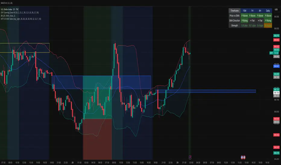
MTF 20 SMA Table - DXY**MTF 20 SMA Table - Multi-Timeframe Trend Analysis Dashboard**
**Overview:**
This indicator provides a comprehensive multi-timeframe analysis dashboard that displays the relationship between price and the 20-period Simple Moving Average (SMA) across four key timeframes: 15-minute, 1-hour, 4-hour, and Daily. It's designed to help traders quickly identify trend alignment and potential trading opportunities across multiple timeframes at a glance. It's definitely not perfect but has helped me speed up my backtesting efforts as it's worked well for me eliminating flipping back and forth between timeframes excpet when I have confluence on the table, then I check the HTF.
**How It Works:**
The indicator creates a table overlay on your chart showing three critical metrics for each timeframe:
1. **Price vs SMA (Row 1):** Shows whether price is currently above (bullish) or below (bearish) the 20 SMA
- Green = Price Above SMA
- Red = Price Below SMA
2. **SMA Direction (Row 2):** Indicates the trend direction of the SMA itself over a lookback period
- Green (↗ Rising) = Uptrend
- Red (↘ Falling) = Downtrend
- Gray (→ Flat) = Ranging/Consolidation
3. **Strength (Row 3):** Displays the distance between current price and the SMA in pips
- Purple background = Strong move (>50 pips away)
- Orange background = Moderate move (20-50 pips)
- Gray background = Weak/consolidating (<20 pips)
- Text color: Green for positive distance, Red for negative
**Key Features:**
- **Customizable Table Position:** Place the table anywhere on your chart (9 position options)
- **Adjustable SMA Lengths:** Modify the SMA period for each timeframe independently (default: 20)
- **Direction Lookback Settings:** Fine-tune how far back the indicator looks to determine SMA direction for each timeframe
- **Flat Threshold:** Set the pip threshold for determining when an SMA is "flat" vs trending (default: 5 pips)
- **DXY Optimized:** Calculations are calibrated for the US Dollar Index (1 pip = 0.01)
**Best Use Cases:**
1. **Trend Alignment:** Identify when multiple timeframes align in the same direction for higher probability trades
2. **Divergence Spotting:** Detect when lower timeframes diverge from higher timeframes (potential reversals)
3. **Entry Timing:** Use lower timeframe signals while higher timeframes confirm overall trend
4. **Strength Assessment:** Gauge how extended price is from the mean (SMA) to avoid overextended entries
**Settings Guide:**
- **SMA Settings Group:** Adjust the SMA period for each timeframe (15M, 1H, 4H, Daily)
- **SMA Direction Group:** Control lookback periods to determine trend direction
- 15M: Default 5 candles
- 1H: Default 10 candles
- 4H: Default 15 candles
- Daily: Default 20 candles
- **Flat Threshold:** Set sensitivity for "flat" detection (lower = more sensitive to ranging markets)
**Trading Strategy Examples:**
1. **Trend Following:** Look for all timeframes showing the same direction (all green or all red)
2. **Pullback Trading:** When Daily/4H are green but 15M/1H show red, wait for lower timeframes to flip green for entry
3. **Ranging Markets:** When multiple SMAs show "flat", consider range-bound strategies
**Important Notes:**
- This is a reference tool only, not a standalone trading system
- Always use proper risk management and combine with other analysis methods
- Best suited for trending instruments like indices and major forex pairs
- Calculations are optimized for DXY but can be used on other instruments (pip calculations may need adjustment)
**Credits:**
Feel free to modify and improve this code! Suggestions for enhancements are welcome in the comments.
---
**Installation Instructions:**
1. Add the indicator to your TradingView chart
2. Adjust the table position via settings to avoid overlap with price action
3. Customize SMA lengths and lookback periods to match your trading style
4. Monitor the table for timeframe alignment and trend confirmation
---
This indicator is published as open source for the community to learn from and improve upon. Happy trading! 📈
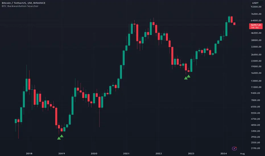
BTC Backwardation SearcherThis Pine Script code is a custom indicator named "BTC Backwardation Searcher" designed for the TradingView platform. The indicator aims to identify and visualize the price difference between two Bitcoin futures contracts: CME:BTC1! and CME:BTC2!.
Here's a breakdown of the code:
1. The script fetches the daily close prices of CME:BTC1! and CME:BTC2! using the security() function.
2. It calculates the percentage price difference between the two contracts using the formula: (btc1Price - btc2Price) / btc2Price * 100.
3. The script also calculates the price difference for the previous two days (2 days ago and 3 days ago) using the same formula.
4. Two conditions are defined:
(1) dailyGreenCondition: If the price difference is greater than or equal to 0.3% for three
consecutive days, including the current day and the previous two days.
(2) dailyRedCondition(commented): If the price difference is less than or equal to -1% for three consecutive days, including the current day and the previous two days.
(I commented it out because I don't think it's useful.)
5. The plotshape() function is used to display green triangles on the chart when the dailyGreenCondition is met, and red triangles when the dailyRedCondition is met. These triangles are displayed on the daily, weekly, and monthly timeframes.
The purpose of this indicator is to help traders identify potential trading opportunities based on the price difference between the two Bitcoin futures contracts. The green triangles suggest a bullish scenario where CME:BTC1! is significantly higher than CME:BTC2!, while the red triangles indicate a bearish scenario where CME:BTC2! is significantly lower than CME:BTC1!.
However, it's important to note that this indicator should be used in conjunction with other technical analysis tools and fundamental analysis. Traders should also consider their risk tolerance, investment goals, and market conditions before making any trading decisions based on this indicator.
VSA MTF Dashboard OXEVSA Multi-Timeframe Dashboard
The VSA Multi-Timeframe Dashboard is a professional Volume Spread Analysis (VSA) scanner that detects institutional trading patterns across Daily, H4, and H1 timeframes simultaneously. It identifies when "smart money" (banks, hedge funds, institutions) is accumulating, distributing, or manipulating price, giving you an edge to trade with—not against—the professionals.
Price spread (high to low range)
Volume (trading activity)
Closing price (where the battle ended)
Core Principle: By reading volume and price action together, you can see what smart money is doing before retail traders catch on.The 7 VSA Patterns Detected
🟢 BULLISH PATTERNS (Buy Signals)PatternWhat It Looks LikeWhat It MeansWeightStopping VolumeDown bar + Ultra high volume + Close near highSmart money absorbing panic selling at lows. Strong reversal signal.+10SpringPrice makes new low, then closes back inside rangeLiquidity sweep below support. Bear trap - institutions buying cheap.+9No SupplyDown bar + Low volume + Narrow spreadNo selling pressure from professionals. Supply dried up.+8
🔴 BEARISH PATTERNS (Sell Signals)PatternWhat It Looks LikeWhat It MeansWeightUpthrustPrice makes new high, then closes back inside rangeLiquidity sweep above resistance. Bull trap - institutions selling high.-9No DemandUp bar + Low volume + Narrow spreadNo buying interest from professionals. Weakness at tops.-6
🟡 CONTEXT-DEPENDENT PATTERNSPatternWhat It Looks LikeWhat It MeansWeightClimactic ActionExtreme volume + Wide spreadExhaustion move. Buying climax = bearish. Selling climax = bullish.±7-8Effort vs ResultHigh volume + Narrow spreadSmart money absorption. High effort, little result = hidden weakness/strength.±7How to Read the DashboardTop Section: Current Market State┌──────────────────────────────┐
│ VSA Scanner │
├────┬──────────┬─────┬────────┤
│ TF │ Pattern │ Dir │ Pts │
├────┼──────────┼─────┼────────┤
│ D │ Upthrust │ ↓ │ -27 │ ← Daily trend
│ H4 │ No Supply│ ↑ │ +16 │ ← 4-hour trend
│ H1 │ Spring │ ↑ │ +9 │ ← 1-hour trend
├────┴──────────┴─────┴────────┤
│ ↑ 52% MODERATE BULLISH │ ← OVERALL BIAS
└──────────────────────────────┘Reading the signals:
TF (Timeframe): D = Daily, H4 = 4-hour, H1 = 1-hour
Pattern: Which VSA pattern is detected
Dir (Direction): ↑ = Bullish, ↓ = Bearish
Pts (Points): Weighted score (Daily = 3x, H4 = 2x, H1 = 1x)
Bottom Row = Aggregate Score:
0-50%: WEAK bias
50-75%: MODERATE bias
75-100%: STRONG bias
Bottom Section: Pattern ReferenceQuick reference guide showing all 7 patterns, their detection criteria, bias, and meaning. Always visible for learning.Trading Guidelines✅ HIGH PROBABILITY SETUPS1. Strong Confluence (75%+ Score)
All 3 timeframes aligned in same direction
Action: Aggressive entry in signal direction
Example: Daily Spring + H4 No Supply + H1 Spring = 85% BULLISH → BUY
2. HTF Dominance
Daily and H4 agree, H1 disagrees
Action: Trade with Daily/H4 bias (higher timeframes win)
Example: Daily/H4 bearish, H1 bullish → Wait for H1 to flip bearish, then SELL
3. Spring/Upthrust on Daily
Strongest reversal signals (liquidity sweeps)
Action: Major reversal trade opportunity
Example: Daily Spring after downtrend = significant bottom forming
⚠️ CAUTION ZONES1. Mixed Signals (30-50% Score)
Timeframes conflict
Action: WAIT for alignment or reduce position size
Example: Daily bullish, H4 bearish, H1 bullish = choppy, avoid
2. No Patterns Detected
All timeframes show "-"
Action: Market consolidating, wait for setup
3. Weak Bias (Below 50%)
Low conviction signals
Action: Scalp only or sit out
❌ AVOID
Trading against Daily timeframe (Daily always wins long-term)
Entering during mixed signals
Ignoring No Demand/No Supply (early distribution/accumulation warnings)
Indicator SettingsEssential Settings:SettingDefaultRecommendationDashboard PositionTop RightAdjust to avoid blocking chartLight ModeONTurn OFF if using dark chartsColor CandlesONKeep ON for visual pattern recognitionShow Candle LabelsOFFTurn ON if learning (shows UT, SPR, etc.)Volume Average Length20Don't change unless very experiencedATR Length14Standard setting, leave as isBest PracticesFor Swing Trading (Daily/H4):
Focus on Daily and H4 patterns (ignore H1)
Enter when both align
Use H4 Spring/Upthrust for precise entries
Target: Major support/resistance zones
For Day Trading (H4/H1):
Check Daily bias first (trade WITH it)
Use H4 for trend, H1 for entries
Enter on H1 Spring/Upthrust in direction of H4
Target: Intraday highs/lows
For Scalping (H1 only):
Only trade when H1 shows 70%+ score
Quick entries on Spring/Upthrust
Tight stops (10-15 pips on XAUUSD)
Target: 2:1 risk/reward minimum
Common QuestionsQ: Why does the score change when I switch timeframes?
A: The "bars ago" metric counts in your current chart timeframe. The pattern and bias remain the same, just the time reference changes. Focus on the pattern name and direction, not bars ago.Q: Can patterns repaint?
A: NO. Patterns only confirm after bar close. The dashboard shows live but patterns are stable.Q: What if Daily is bearish but H1 is bullish?
A: Daily ALWAYS wins. The H1 bullish move is likely a pullback in a bearish trend. Wait for H1 to flip bearish for best entries.Q: Should I trade every signal?
A: NO. Only trade when:
Score is 70%+ (strong conviction)
Multiple timeframes align
Pattern makes sense with overall trend
Q: How often do patterns appear?
A: Variable. You might see 2-5 signals per week on Daily, more frequently on H1. Quality over quantity.Quick Reference CardBULLISH SIGNALS TO BUY:
✅ Stopping Volume (strongest)
✅ Spring (liquidity grab)
✅ No Supply (weakness gone)
✅ Score: 70%+ BULLISH
BEARISH SIGNALS TO SELL:
✅ Upthrust (liquidity grab)
✅ No Demand (strength gone)
✅ Climactic Buying (exhaustion)
✅ Score: 70%+ BEARISH
STAY OUT:
❌ Mixed signals (30-50%)
❌ No patterns detected
❌ Timeframes conflicting
Example Trade SetupsPerfect Long Setup:
Daily: Spring ↑ +27 (Liquidity sweep)
H4: No Supply ↑ +16 (No sellers)
H1: Stopping Vol ↑ +10 (Absorption)
Score: 88% STRONG BULLISH
Action: BUY aggressively, target major resistancePerfect Short Setup:
Daily: Upthrust ↓ -27 (Liquidity trap)
H4: No Demand ↓ -12 (No buyers)
H1: Upthrust ↓ -9 (Fake breakout)
Score: 80% STRONG BEARISH
Action: SELL aggressively, target major supportAvoid This Setup:
Daily: No Supply ↑ +24 (Bullish)
H4: Upthrust ↓ -16 (Bearish)
H1: No Demand ↓ -6 (Bearish)
Score: 3% WEAK BULLISH (Mixed!)
Action: WAIT - Conflicting signals

HTF Current/Average RangeThe "HTF(Higher Timeframe) Current/Average Range" indicator calculates and displays the current and average price ranges across multiple timeframes, including daily, weekly, monthly, 4 hour, and user-defined custom timeframes.
Users can customize the lookback period, table size, timeframe, and font color; with the indicator efficiently updating on the final bar to optimize performance.
When the current range surpasses the average range for a given timeframe, the corresponding table cell is highlighted in green, indicating potential maximum price expansion and signaling the possibility of an impending retracement or consolidation.
For day trading strategies, the daily average range can serve as a guide, allowing traders to hold positions until the current daily range approaches or meets the average range, at which point exiting the trade may be considered.
For scalping strategies, the 15min and 5min average range can be utilized to determine optimal holding periods for fast trades.
Other strategies:
Intraday Trading - 1h and 4h Average Range
Swing Trading - Monthly Average Range
Short-term Trading - Weekly Average Range
Also using these statistics in accordance with Power 3 ICT concepts, will assist in holding trades to their statistical average range of the chosen HTF candle.
CODE
The core functionality lies in the data retrieval and table population sections.
The request.security function (e.g., = request.security(syminfo.tickerid, "D", , lookahead = barmerge.lookahead_off)) retrieves high and low prices from specified timeframes without lookahead bias, ensuring accurate historical data.
These values are used to compute current ranges and average ranges (ta.sma(high - low, avgLength)), which are then displayed in a dynamically generated table starting at (if barstate.islast) using table.new, with conditional green highlighting when the current range is greater than average range, providing a clear visual cue for volatility analysis.
HMA & D1 crossover FX (Study)Can work on other Forex pairs if change settings: Period
This example tuned for AUDUSD (FX Version)
Enter new order on HMA ( Hull Moving Average ) and D1 ( Daily Candle) crossovers, Exit orders as basket when profit = Your Target Profit
This study version built for users of Alerts. Crossover of HMA and DailyCandle1 (and/or DailyCandle1 cross DailyCandle2) (also possible Price cross HMA)
True Opens 🧪 [Pro +] | cephxsTRUE OPENS 🧪
This indicator reflects, and is based on Public Domain Information available online. Utilizing concepts by Daye and ICT.
Multi-timeframe True Open indicator displaying key price levels across Micro, 90-minute, Daily, Weekly, and Monthly cycles with automatic timeframe visibility gating.
OVERVIEW
True Opens identifies the opening price of the second quadrant (Q2) across multiple "quarterly" cycles. In quarterly cycle theory, Q2 represents the "True Open" - a significant reference point where price often returns to during the cycle. This indicator automatically plots these levels across five timeframes, helping you identify key premium/discount zones and potential reversal areas.
WHAT IS A TRUE OPEN?
Each market cycle divides into four quarters (Q1-Q4). The Q2 opening price - the "True Open" - acts as a gravitational level that price tends to respect throughout the cycle. Understanding where these levels sit across multiple timeframes gives you confluence zones for higher-probability trade setups depending on your strategy. It is mostly tailored to quarterly theory traders.
FEATURES
5 Cycle Levels: Micro (~22min), 90-minute, Daily (6H sessions), Weekly, and Monthly True Opens
Auto Display Mode: Automatically shows relevant True Opens based on your chart timeframe
Session Labels: Clear identification of Asia, London, NY, and PM session True Opens
Smart Weekly Detection: Uses trading day logic for accurate Weekly True Open on all assets
DST-Aware: Timezone handling automatically adjusts for daylight saving time
Visual Clarity: Dashed lines during active Q2, solid lines after confirmation
Historical Mode: Option to display past True Opens for backtesting reference
CYCLE BREAKDOWN
Micro: 64 sessions per day (~22.5 min each), 16 micro cycles - ideal for scalping
90-Minute: 4 major sessions (Asia, London, NY, PM) each with 4 quarters - intraday trading
Daily: 4 x 6-hour sessions per day - swing/intraday trade reference, slightly longer term
Weekly: Tuesday open = Weekly True Open (Q2 of the week) - swing trading
Monthly: Second week of month = Monthly True Open - macro bias
INPUTS
Master Toggles
Show Micro True Opens: Toggle micro-level True Opens
Show 90m True Opens: Toggle 90-minute session True Opens
Show Daily True Opens: Toggle daily cycle True Opens
Show Weekly True Opens: Toggle weekly True Opens
Show Monthly True Opens: Toggle monthly True Opens
Display Mode
Auto: Automatically shows appropriate True Opens for current timeframe
Custom: Define your own visibility ranges per cycle level
Colors
Fully customizable colors for each cycle level
Settings
Active Line Bar Offset: How far labels extend from current bar
Show Historical True Opens: Display past cycle True Opens
HOW TO USE
Add indicator to your chart
Use Auto mode for automatic timeframe-appropriate display
Watch for price reactions at True Open levels
Look for confluence when multiple True Opens align
RECOMMENDED TIMEFRAMES
1-minute: Micro True Opens visible
3-5 minute: 90m True Opens visible
15min - 1H: Daily True Opens visible
1H - 4H: Weekly True Opens visible
4H - Daily: Monthly True Opens visible
BEST PRACTICES
Combine with market structure analysis for confirmation
True Opens can be used as time based Premium and Discount Levels
Multiple True Opens near same price = strong confluence zone (Stacked True Opens)
Weekly and Monthly True Opens carry more weight for directional bias
Use Micro True Opens for precision entries on lower timeframes
ASSETS
Works on all markets: Forex, Crypto, Indices, Stocks, and Futures. Weekly True Open detection uses smart trading-day logic that handles assets with non-standard session opens (e.g., ES futures opening Sunday 6PM).
DISCLAIMER
This indicator is for educational and informational purposes only. It does not constitute financial advice. Past performance does not guarantee future results. Always conduct your own research and use proper risk management. Trade responsibly.
CHANGELOG
v1.0: Initial release with 5-level True Open system
with ❤️ from cephxs

Quarterly Theory (Lé Modél) 🧪 [Ultimate +] | cephxsQUARTERLY THEORY (LÉ MODÉL) 🧪
SSMT + Timed Structural Swing Points + Alerts
This is mostly types using voice typing so the punctuation might be off.
This indicator uses public domain information based on a trading system called "Quarterly Theory" by TraderDaye & ICT. All concepts are freely available educational material that's been around for years. I just built a tool to visualize it properly.
WHAT IS THIS?
Alright so basically this is my attempt (pretty good attempt I'd say) at building the ultimate quarterly theory tool. It tracks multiple timeframe cycles (monthly, weekly, daily, 90m, and micro) and detects when correlated assets are diverging from each other at key swing points. That's the SSMT (sequential smt) part otherwise called an Offset Divergence either in an Accumulation/distribution phase of price.
On top of that, it finds timed structural swing points with their exact formation times, detects liquidity purges, and confirms change in state of delivery (CISD) through orderblock reclaims. Everything is wrapped in a pretty comprehensive alert system so you can actually trade off this stuff without staring at charts 24/7.
CORE FEATURES
Multi-Cycle SSMT Detection: tracks divergences across 5 nested cycles - monthly, weekly, daily, 90m, and micro. each cycle has its own visibility gates so you're only seeing what's relevant to your chart timeframe. They are also customizable so you are not restricted to what I think is best; nevertheless, hard gates are put in place to prevent unnecessary data calls too far back into history to allow users of all plans to use without errors (Bar data limits)
Timed Swing Points: every pivot high/low gets timestamped. you'll see exactly when the swing formed - super useful for macro window analysis (those :00-:10 and :50-:00 minute windows).
Liquidity Purges: automatically detects when price sweeps a previous swing high/low and reverses. shows both the sweep level and confirmation.
CISD (Change In State of Delivery): finds the stretch candle at pivots and waits for price to reclaim it. that's your delivery change confirmation.
Auto Asset Detection: just throw it on any chart and it figures out the correlated assets for you. works with indices ( CME_MINI:NQ1! , CME_MINI:ES1! , CBOT_MINI:YM1! ), forex majors ( FOREXCOM:EURUSD , FOREXCOM:GBPUSD ), metals ( FOREXCOM:XAUUSD , FOREXCOM:XAGUSD ), crypto, and more.
Normal + Hidden Divergences: normal divergence is when extremes diverge between assets. hidden divergence uses body closes instead of wicks - sometimes catches moves that normal misses.
Comprehensive Alert System: atomic alerts for individual events, preset combos for multi-confluence setups, and a custom "alert kitchen" to build your own conditions.
Each of these features can be visually disabled individually while the logic is still computed and alerts still function without bother.
THE CYCLES EXPLAINED
quarterly theory breaks time down into nested fractal cycles. each cycle divides into 4 quarters (Q1, Q2, Q3, Q4) where Q2 is typically expansion/displacement:
Monthly Cycle: tracks the 4 weeks of the month. best viewed on 4H charts and above
Weekly Cycle: Mon-Tue-Wed-Thu-Fri as the 5 "quarters". best on 1H charts.
Daily Cycle: the trading day split into 4 sessions (asia, london, ny am, ny pm). best on 15m.
90m Cycle: 6 x 90-minute windows throughout the day. best on 3-5m charts.
Micro Cycle: 22.5-minute quarters within each 90m block. 1m charts only.
Tried to implement a new Quarterly Cycle, will defer that to a later update.
VISIBILITY GATES
the indicator automatically shows/hides cycles based on your chart timeframe. here's how it works:
Auto Mode (recommended):
Micro: 1m only
90m: 3m-5m
Daily: 15m only
Weekly: 1H only
Monthly: 4H only
Extended Mode (more flexibility):
Micro: 1m-3m
90m: 1m-30m
Daily: 5m-1H
Weekly: 15m-4H
Monthly: 4H-1D
you can also set custom ranges or just show everything with "All" mode.
INPUTS BREAKDOWN
Visual Preset
All Features: shows everything - SSMT, time labels, CISD, purges
SSMT + TIME + CISD: hides purge lines for cleaner charts
SSMT + CISD: hides time labels too
SSMT Only: just the divergence lines, nothing else
SSMT Plots (Section 2)
Extreme Detection Mode: "Normal" uses wick extremes, "Hidden" uses body closes, "All" shows both
Per-Cycle Toggles: enable/disable each cycle independently with custom colors
Label Styling: choose between "Cycle + Asset", "Cycle" only, or "Asset" only labels
Pivot Detection (Section 3)
Sensitivity: controls how many bars on each side to confirm a swing (default: 2)
Maximum Points: limits how many pivots are displayed
Pivot Labels (Section 4)
Show Time Labels: displays the exact timestamp of each swing
Key Times Only: only shows labels for swings in macro windows (:00-:10, :24-:36, :50-:59)
Macro Colors: special highlighting for pivots during macro windows
Purge Detection (Section 5-6)
Pending Timeout: how many bars a purge can wait for confirmation before being discarded
Strict Key Time: requires both the sweep AND confirmation to be in key time windows
Dotted Line Offset: how far the confirmation line extends past the reversal candle
CISD Detection (Section 7-8)
Size Filter: filters out tiny orderblocks using ATR-based sizing. options from "Really Small" (shows most) to "Juicy" (only big ones)
Pending Timeout: bars before an unconfirmed CISD expires
Exhaustive Mode: shows all valid CISDs instead of limiting to max count
ALERT SYSTEM
this is where it gets powerful. three tiers of alerts:
Atomic Alerts (individual events):
Swing High/Low formed
Bearish/Bullish Purge confirmed
CISD Confirmed/Pending
Purge + CISD Combo
Preset Combos (multi-confluence):
M/W/D/90/Micro SSMT + CISD: fires when SSMT divergence is active AND CISD confirms in matching direction
Require Matching Purge: adds purge to the combo requirement
Stacked Alerts: triggers when 2+ cycles align simultaneously
Alert Kitchen (custom builder):
build your own combo by selecting:
Which SSMT cycle (with direction: bullish/bearish/any)
Whether CISD is required
Whether matching purge is required
Purge tolerance (how close the purge pivot needs to be)
Session Filter:
all alerts can be filtered to only fire during specific sessions:
Asia: 18:00-00:00 ET
London: 02:00-05:00 ET
NY AM: 08:30-12:00 ET
NY PM: 13:30-16:00 ET
Custom time ranges
AUTO ASSET DETECTION
the indicator uses the AssetCorrelation library to automatically figure out which assets to compare. here's what it supports:
US Indices: CME_MINI:NQ1! , CME_MINI:ES1! , CBOT_MINI:YM1! (or micros MNQ/MES/MYM)
Forex Majors: FOREXCOM:EURUSD , FOREXCOM:GBPUSD vs TVC:DXY
Metals: FOREXCOM:XAUUSD , FOREXCOM:XAGUSD , Copper
Energy: CL (crude), RB (gasoline), HO (heating oil)
Crypto: BTC, ETH, TOTAL3 as triad
EU Indices: GER40, EU50, UK100, ESP35
you can also disable auto mode and manually configure your own asset triads/dyads.
STATUS BAR
optional horizontal bar showing which SSMT cycles are currently active. displays M | W | D | 90m | Micro with color coding:
Blue = bullish divergence active
Red = bearish divergence active
Gray = neutral (no divergence)
Purple = both directions active simultaneously (sandwich)
RECOMMENDED USAGE
start with "Auto" timeframe gating - it shows the right cycles for your chart
focus on cycles that align with your trading style (scalpers: 90m/micro, swing: daily/weekly)
use CISD confirmation before entries - divergence alone isn't enough (at least for me)
Pair with True Opens to align properly (This is a trading model in itself)
set up preset alerts for your main setup (e.g., "D SSMT + CISD" on 15m chart)
filter alerts to your active trading session to reduce noise
TIMEFRAME CHEAT SHEET
1m: Micro cycle + 90m context
3-5m: 90m cycle + Daily context
15m: Daily cycle + Weekly context
1H: Weekly cycle + Monthly context
4H: Monthly cycle only
FAQ
why don't i see any SSMT lines?
check your timeframe gating mode. if you're on a 15m chart with "Auto" mode, you'll only see Daily cycle. switch to "Extended" or "All" to see more cycles.
what's the difference between normal and hidden divergence?
normal uses wick highs/lows, hidden uses body closes. hidden can catch divergences that wicks miss, but it's also noisier.
Why do some CISDs not confirm?
the stretch candle needs to be reclaimed by price within the timeout window. if price never comes back to that level, the CISD expires.
can i use this on stocks?
technically yes, but you'll need to manually configure your asset pairs since auto-detection focuses on futures/forex/crypto.
DISCLAIMER
this is an educational tool, not financial advice. quarterly theory, SSMT, and all related concepts are based on publicly available information from TraderDaye and ICT methodology on X with a touch of my own discoveries too.
past performance doesn't guarantee future results. always use proper risk management and never trade more than you can afford to lose. the indicator is provided as-is with no guarantees.
do your own backtesting before using this in live markets.
CREDITS
Quarterly Theory concepts: TraderDaye & ICT
AssetCorrelation library: fstarcapital
Development: cephxs & fstarcapital community
CHANGELOG
Ultimate +: added Alert Kitchen, stacked cycle alerts, session filtering, status bar, size-filtered CISD
Pro +: added hidden divergences, added sweep detection/plots, auto asset detection, preset combos
Base: initial release with core SSMT and pivot time labels
No form of this Library is to be sold in any capacity as part of any service / indicator on the TradingView Platform or elsewhere by anyone else but me.
Otherwise it is completely free to use in private and public open/closed source indicators.
Sidenote: 3rd upload because I'm trying to get the thumbnail right :(
Made with ❤️ from cephxs

Luxy Super-Duper SuperTrend Predictor Engine and Buy/Sell signalA professional trend-following grading system that analyzes historical trend
patterns to provide statistical duration estimates using advanced similarity
matching and k-nearest neighbors analysis. Combines adaptive Supertrend with
intelligent duration statistics, multi-timeframe confluence, volume confirmation,
and quality scoring to identify high-probability setups with data-driven
target ranges across all timeframes.
Note: All duration estimates are statistical calculations based on historical data, not guarantees of future performance.
WHAT MAKES THIS DIFFERENT
Unlike traditional SuperTrend indicators that only tell you trend direction, this system answers the critical question: "What is the typical duration for trends like this?"
The Statistical Analysis Engine:
• Analyzes your chart's last 15+ completed SuperTrend trends (bullish and bearish separately)
• Uses k-nearest neighbors similarity matching to find historically similar setups
• Calculates statistical duration estimates based on current market conditions
• Learns from estimation errors and adapts over time (Advanced mode)
• Displays visual duration analysis box showing median, average, and range estimates
• Tracks Statistical accuracy with backtest statistics
Complete Trading System:
• Statistical trend duration analysis with three intelligence levels
• Adaptive Supertrend with dynamic ATR-based bands
• Multi-timeframe confluence analysis (6 timeframes: 5M to 1W)
• Volume confirmation with spike detection and momentum tracking
• Quality scoring system (0-70 points) rating each setup
• One-click preset optimization for all trading styles
• Anti-repaint guarantee on all signals and duration estimates
METHODOLOGY CREDITS
This indicator's approach is inspired by proven trading methodologies from respected market educators:
• Mark Minervini - Volatility Contraction Pattern (VCP) and pullback entry techniques
• William O'Neil - Volume confirmation principles and institutional buying patterns (CANSLIM methodology)
• Dan Zanger - Volatility expansion entries and momentum breakout strategies
Important: These are educational references only. This indicator does not guarantee any specific trading results. Always conduct your own analysis and risk management.
KEY FEATURES
1. TREND DURATION ANALYSIS SYSTEM - The Core Innovation
The statistical analysis engine is what sets this indicator apart from standard SuperTrend systems. It doesn't just identify trend changes - it provides statistical analysis of potential duration.
How It Works:
Step 1: Historical Tracking
• Automatically records every completed SuperTrend trend (duration in bars)
• Maintains separate databases for bullish trends and bearish trends
• Stores up to 15 most recent trends of each type
• Captures market conditions at each trend flip: volume ratio, ATR ratio, quality score, price distance from SuperTrend, proximity to support/resistance
Step 2: Similarity Matching (k-Nearest Neighbors)
• When new trend begins, system compares current conditions to ALL historical flips
• Calculates similarity score based on:
- Volume similarity (30% weight) - Is volume behaving similarly?
- Volatility similarity (30% weight) - Is ATR/volatility similar?
- Quality similarity (20% weight) - Is setup strength comparable?
- Distance similarity (10% weight) - Is price distance from ST similar?
- Support/Resistance proximity (10% weight) - Similar structural context?
• Selects the 15 MOST SIMILAR historical trends (not just all trends)
• This is like asking: "When conditions looked like this before, how long did trends last?"
Step 3: Statistical Analysis
• Calculates median duration (most common outcome)
• Calculates average duration (mean of similar trends)
• Determines realistic range (min to max of similar trends)
• Applies exponential weighting (recent trends weighted more heavily)
• Outputs confidence-weighted statistical estimate
Step 4: Advanced Intelligence (Advanced Mode Only)
The Advanced mode applies five sophisticated multipliers to refine estimates:
A) Market Structure Multiplier (±30%):
• Detects nearby support/resistance levels using pivot detection
• If flip occurs NEAR a key level: Estimate adjusted -30% (expect bounce/rejection)
• If flip occurs in open space: Estimate adjusted +30% (clear path for continuation)
• Uses configurable lookback period and ATR-based proximity threshold
B) Asset Type Multiplier (±40%):
• Adjusts duration estimates based on asset volatility characteristics
• Small Cap / Biotech: +40% (explosive, extended moves)
• Tech Growth: +20% (momentum-driven, longer trends)
• Blue Chip / Large Cap: 0% (baseline, steady trends)
• Dividend / Value: -20% (slower, grinding trends)
• Cyclical: Variable based on macro regime
• Crypto / High Volatility: +30% (parabolic potential)
C) Flip Strength Multiplier (±20%):
• Analyzes the QUALITY of the trend flip itself
• Strong flip (high volume + expanding ATR + quality score 60+): +20%
• Weak flip (low volume + contracting ATR + quality score under 40): -20%
• Logic: Historical data shows that powerful flips tend to be followed by longer trends
D) Error Learning Multiplier (±15%):
• Tracks Statistical accuracy over last 10 completed trends
• Calculates error ratio: (estimated duration / Actual Duration)
• If system consistently over-estimates: Apply -15% correction
• If system consistently under-estimates: Apply +15% correction
• Learns and adapts to current market regime
E) Regime Detection Multiplier (±20%):
• Analyzes last 3 trends of SAME TYPE (bull-to-bull or bear-to-bear)
• Compares recent trend durations to historical average
• If recent trends 20%+ longer than average: +20% adjustment (trending regime detected)
• If recent trends 20%+ shorter than average: -20% adjustment (choppy regime detected)
• Detects whether market is in trending or mean-reversion mode
Three analysis modes:
SIMPLE MODE - Basic Statistics
• Uses raw median of similar trends only
• No multipliers, no adjustments
• Best for: Beginners, clean trending markets
• Fastest calculations, minimal complexity
STANDARD MODE - Full Statistical Analysis
• Similarity matching with k-nearest neighbors
• Exponential weighting of recent trends
• Median, average, and range calculations
• Best for: Most traders, general market conditions
• Balance of accuracy and simplicity
ADVANCED MODE - Statistics + Intelligence
• Everything in Standard mode PLUS
• All 5 advanced multipliers (structure, asset type, flip strength, learning, regime)
• Highest Statistical accuracy in testing
• Best for: Experienced traders, volatile/complex markets
• Maximum intelligence, most adaptive
Visual Duration Analysis Box:
When a new trend begins (SuperTrend flip), a box appears on your chart showing:
• Analysis Mode (Simple / Standard / Advanced)
• Number of historical trends analyzed
• Median expected duration (most likely outcome)
• Average expected duration (mean of similar trends)
• Range (minimum to maximum from similar trends)
• Advanced multipliers breakdown (Advanced mode only)
• Backtest accuracy statistics (if available)
The box extends from the flip bar to the estimated endpoint based on historical data, giving you a visual target for trend duration. Box updates in real-time as trend progresses.
Backtest & Accuracy Tracking:
• System backtests its own duration estimates using historical data
• Shows accuracy metrics: how well duration estimates matched actual durations
• Tracks last 10 completed duration estimates separately
• Displays statistics in dashboard and duration analysis boxes
• Helps you understand statistical reliability on your specific symbol/timeframe
Anti-Repaint Guarantee:
• duration analysis boxes only appear AFTER bar close (barstate.isconfirmed)
• Historical duration estimates never disappear or change
• What you see in history is exactly what you would have seen real-time
• No future data leakage, no lookahead bias
2. INTELLIGENT PRESET CONFIGURATIONS - One-Click Optimization
Unlike indicators that require tedious parameter tweaking, this system includes professionally optimized presets for every trading style. Select your approach from the dropdown and ALL parameters auto-configure.
"AUTO (DETECT FROM TF)" - RECOMMENDED
The smartest option: automatically selects optimal settings based on your chart timeframe.
• 1m-5m charts → Scalping preset (ATR: 7, Mult: 2.0)
• 15m-1h charts → Day Trading preset (ATR: 10, Mult: 2.5)
• 2h-4h-D charts → Swing Trading preset (ATR: 14, Mult: 3.0)
• W-M charts → Position Trading preset (ATR: 21, Mult: 4.0)
Benefits:
• Zero configuration - works immediately
• Always matched to your timeframe
• Switch timeframe = automatic adjustment
• Perfect for traders who use multiple timeframes
"SCALPING (1-5M)" - Ultra-Fast Signals
Optimized for: 1-5 minute charts, high-frequency trading, quick profits
Target holding period: Minutes to 1-2 hours maximum
Best markets: High-volume stocks, major crypto pairs, active futures
Parameter Configuration:
• Supertrend: ATR 7, Multiplier 2.0 (very sensitive)
• Volume: MA 10, High 1.8x, Spike 3.0x (catches quick surges)
• Volume Momentum: AUTO-DISABLED (too restrictive for fast scalping)
• Quality minimum: 40 points (accepts more setups)
• Duration Analysis: Uses last 15 trends with heavy recent weighting
Trading Logic:
Speed over precision. Short ATR period and low multiplier create highly responsive SuperTrend. Volume momentum filter disabled to avoid missing fast moves. Quality threshold relaxed to catch more opportunities in rapid market conditions.
Signals per session: 5-15 typically
Hold time: Minutes to couple hours
Best for: Active traders with fast execution
"DAY TRADING (15M-1H)" - Balanced Approach
Optimized for: 15-minute to 1-hour charts, intraday moves, session-based trading
Target holding period: 30 minutes to 8 hours (within trading day)
Best markets: Large-cap stocks, major indices, established crypto
Parameter Configuration:
• Supertrend: ATR 10, Multiplier 2.5 (balanced)
• Volume: MA 20, High 1.5x, Spike 2.5x (standard detection)
• Volume Momentum: 5/20 periods (confirms intraday strength)
• Quality minimum: 50 points (good setups preferred)
• Duration Analysis: Balanced weighting of recent vs historical
Trading Logic:
The most balanced configuration. ATR 10 with multiplier 2.5 provides steady trend following that avoids noise while catching meaningful moves. Volume momentum confirms institutional participation without being overly restrictive.
Signals per session: 2-5 typically
Hold time: 30 minutes to full day
Best for: Part-time and full-time active traders
"SWING TRADING (4H-D)" - Trend Stability
Optimized for: 4-hour to Daily charts, multi-day holds, trend continuation
Target holding period: 2-15 days typically
Best markets: Growth stocks, sector ETFs, trending crypto, commodity futures
Parameter Configuration:
• Supertrend: ATR 14, Multiplier 3.0 (stable)
• Volume: MA 30, High 1.3x, Spike 2.2x (accumulation focus)
• Volume Momentum: 10/30 periods (trend stability)
• Quality minimum: 60 points (high-quality setups only)
• Duration Analysis: Favors consistent historical patterns
Trading Logic:
Designed for substantial trend moves while filtering short-term noise. Higher ATR period and multiplier create stable SuperTrend that won't flip on minor corrections. Stricter quality requirements ensure only strongest setups generate signals.
Signals per week: 2-5 typically
Hold time: Days to couple weeks
Best for: Part-time traders, swing style
"POSITION TRADING (D-W)" - Long-Term Trends
Optimized for: Daily to Weekly charts, major trend changes, portfolio allocation
Target holding period: Weeks to months
Best markets: Blue-chip stocks, major indices, established cryptocurrencies
Parameter Configuration:
• Supertrend: ATR 21, Multiplier 4.0 (very stable)
• Volume: MA 50, High 1.2x, Spike 2.0x (long-term accumulation)
• Volume Momentum: 20/50 periods (major trend confirmation)
• Quality minimum: 70 points (excellent setups only)
• Duration Analysis: Heavy emphasis on multi-year historical data
Trading Logic:
Conservative approach focusing on major trend changes. Extended ATR period and high multiplier create SuperTrend that only flips on significant reversals. Very strict quality filters ensure signals represent genuine long-term opportunities.
Signals per month: 1-2 typically
Hold time: Weeks to months
Best for: Long-term investors, set-and-forget approach
"CUSTOM" - Advanced Configuration
Purpose: Complete manual control for experienced traders
Use when: You understand the parameters and want specific optimization
Best for: Testing new approaches, unusual market conditions, specific instruments
Full control over:
• All SuperTrend parameters
• Volume thresholds and momentum periods
• Quality scoring weights
• analysis mode and multipliers
• Advanced features tuning
Preset Comparison Quick Reference:
Chart Timeframe: Scalping (1M-5M) | Day Trading (15M-1H) | Swing (4H-D) | Position (D-W)
Signals Frequency: Very High | High | Medium | Low
Hold Duration: Minutes | Hours | Days | Weeks-Months
Quality Threshold: 40 pts | 50 pts | 60 pts | 70 pts
ATR Sensitivity: Highest | Medium | Lower | Lowest
Time Investment: Highest | High | Medium | Lowest
Experience Level: Expert | Advanced | Intermediate | Beginner+
3. QUALITY SCORING SYSTEM (0-70 Points)
Every signal is rated in real-time across three dimensions:
Volume Confirmation (0-30 points):
• Volume Spike (2.5x+ average): 30 points
• High Volume (1.5x+ average): 20 points
• Above Average (1.0x+ average): 10 points
• Below Average: 0 points
Volatility Assessment (0-30 points):
• Expanding ATR (1.2x+ average): 30 points
• Rising ATR (1.0-1.2x average): 15 points
• Contracting/Stable ATR: 0 points
Volume Momentum (0-10 points):
• Strong Momentum (1.2x+ ratio): 10 points
• Rising Momentum (1.0-1.2x ratio): 5 points
• Weak/Neutral Momentum: 0 points
Score Interpretation:
60-70 points - EXCELLENT:
• All factors aligned
• High conviction setup
• Maximum position size (within risk limits)
• Primary trading opportunities
45-59 points - STRONG:
• Multiple confirmations present
• Above-average setup quality
• Standard position size
• Good trading opportunities
30-44 points - GOOD:
• Basic confirmations met
• Acceptable setup quality
• Reduced position size
• Wait for additional confirmation or trade smaller
Below 30 points - WEAK:
• Minimal confirmations
• Low probability setup
• Consider passing
• Only for aggressive traders in strong trends
Only signals meeting your minimum quality threshold (configurable per preset) generate alerts and labels.
4. MULTI-TIMEFRAME CONFLUENCE ANALYSIS
The system can simultaneously analyze trend alignment across 6 timeframes (optional feature):
Timeframes analyzed:
• 5-minute (scalping context)
• 15-minute (intraday momentum)
• 1-hour (day trading bias)
• 4-hour (swing context)
• Daily (primary trend)
• Weekly (macro trend)
Confluence Interpretation:
• 5-6/6 aligned - Very strong multi-timeframe agreement (highest confidence)
• 3-4/6 aligned - Moderate agreement (standard setup)
• 1-2/6 aligned - Weak agreement (caution advised)
Dashboard shows real-time alignment count with color-coding. Higher confluence typically correlates with longer, stronger trends.
5. VOLUME MOMENTUM FILTER - Institutional Money Flow
Unlike traditional volume indicators that just measure size, Volume Momentum tracks the RATE OF CHANGE in volume:
How it works:
• Compares short-term volume average (fast period) to long-term average (slow period)
• Ratio above 1.0 = Volume accelerating (money flowing IN)
• Ratio above 1.2 = Strong acceleration (institutional participation likely)
• Ratio below 0.8 = Volume decelerating (money flowing OUT)
Why it matters:
• Confirms trend with actual money flow, not just price
• Leading indicator (volume often leads price)
• Catches accumulation/distribution before breakouts
• More intuitive than complex mathematical filters
Integration with signals:
• Optional filter - can be enabled/disabled per preset
• When enabled: Only signals with rising volume momentum fire
• AUTO-DISABLED in Scalping mode (too restrictive for fast trading)
• Configurable fast/slow periods per trading style
6. ADAPTIVE SUPERTREND MULTIPLIER
Traditional SuperTrend uses fixed ATR multiplier. This system dynamically adjusts the multiplier (0.8x to 1.2x base) based on:
• Trend Strength: Price correlation over lookback period
• Volume Weight: Current volume relative to average
Benefits:
• Tighter bands in calm markets (less premature exits)
• Wider bands in volatile conditions (avoids whipsaws)
• Better adaptation to biotech, small-cap, and crypto volatility
• Optional - can be disabled for classic constant multiplier
7. VISUAL GRADIENT RIBBON
26-layer exponential gradient fill between price and SuperTrend line provides instant visual trend strength assessment:
Color System:
• Green shades - Bullish trend + volume confirmation (strongest)
• Blue shades - Bullish trend, normal volume
• Orange shades - Bearish trend + volume confirmation
• Red shades - Bearish trend (weakest)
Opacity varies based on:
• Distance from SuperTrend (farther = more opaque)
• Volume intensity (higher volume = stronger color)
The ribbon provides at-a-glance trend strength without cluttering your chart. Can be toggled on/off.
8. INTELLIGENT ALERT SYSTEM
Two-tier alert architecture for flexibility:
Automatic Alerts:
• Fire automatically on BUY and SELL signals
• Include full context: quality score, volume state, volume momentum
• One alert per bar close (alert.freq_once_per_bar_close)
• Message format: "BUY: Supertrend bullish + Quality: 65/70 | Volume: HIGH | Vol Momentum: STRONG (1.35x)"
Customizable Alert Conditions:
• Appear in TradingView's "Create Alert" dialog
• Three options: BUY Signal Only, SELL Signal Only, ANY Signal (BUY or SELL)
• Use TradingView placeholders: {{ticker}}, {{interval}}, {{close}}, {{time}}
• Fully customizable message templates
All alerts use barstate.isconfirmed - Zero repaint guarantee.
9. ANTI-REPAINT ARCHITECTURE
Every component guaranteed non-repainting:
• Entry signals: Only appear after bar close
• duration analysis boxes: Created only on confirmed SuperTrend flips
• Informative labels: Wait for bar confirmation
• Alerts: Fire once per closed bar
• Multi-timeframe data: Uses lookahead=barmerge.lookahead_off
What you see in history is exactly what you would have seen in real-time. No disappearing signals, no changed duration estimates.
HOW TO USE THE INDICATOR
QUICK START - 3 Steps to Trading:
Step 1: Select Your Trading Style
Open indicator settings → "Quick Setup" section → Trading Style Preset dropdown
Options:
• Auto (Detect from TF) - RECOMMENDED: Automatically configures based on your chart timeframe
• Scalping (1-5m) - For 1-5 minute charts, ultra-fast signals
• Day Trading (15m-1h) - For 15m-1h charts, balanced approach
• Swing Trading (4h-D) - For 4h-Daily charts, trend stability
• Position Trading (D-W) - For Daily-Weekly charts, long-term trends
• Custom - Manual configuration (advanced users only)
Choose "Auto" and you're done - all parameters optimize automatically.
Step 2: Understand the Signals
BUY Signal (Green Triangle Below Price):
• SuperTrend flipped bullish
• Quality score meets minimum threshold (varies by preset)
• Volume confirmation present (if filter enabled)
• Volume momentum rising (if filter enabled)
• duration analysis box shows expected trend duration
SELL Signal (Red Triangle Above Price):
• SuperTrend flipped bearish
• Quality score meets minimum threshold
• Volume confirmation present (if filter enabled)
• Volume momentum rising (if filter enabled)
• duration analysis box shows expected trend duration
Duration Analysis Box:
• Appears at SuperTrend flip (start of new trend)
• Shows median, average, and range duration estimates
• Extends to estimated endpoint based on historical data visually
• Updates mode-specific intelligence (Simple/Standard/Advanced)
Step 3: Use the Dashboard for Context
Dashboard (top-right corner) shows real-time metrics:
• Row 1 - Quality Score: Current setup rating (0-70)
• Row 2 - SuperTrend: Direction and current level
• Row 3 - Volume: Status (Spike/High/Normal/Low) with color
• Row 4 - Volatility: State (Expanding/Rising/Stable/Contracting)
• Row 5 - Volume Momentum: Ratio and trend
• Row 6 - Duration Statistics: Accuracy metrics and track record
Every cell has detailed tooltip - hover for full explanations.
SIGNAL INTERPRETATION BY QUALITY SCORE:
Excellent Setup (60-70 points):
• Quality Score: 60-70
• Volume: Spike or High
• Volatility: Expanding
• Volume Momentum: Strong (1.2x+)
• MTF Confluence (if enabled): 5-6/6
• Action: Primary trade - maximum position size (within risk limits)
• Statistical reliability: Highest - duration estimates most accurate
Strong Setup (45-59 points):
• Quality Score: 45-59
• Volume: High or Above Average
• Volatility: Rising
• Volume Momentum: Rising (1.0-1.2x)
• MTF Confluence (if enabled): 3-4/6
• Action: Standard trade - normal position size
• Statistical reliability: Good - duration estimates reliable
Good Setup (30-44 points):
• Quality Score: 30-44
• Volume: Above Average
• Volatility: Stable or Rising
• Volume Momentum: Neutral to Rising
• MTF Confluence (if enabled): 3-4/6
• Action: Cautious trade - reduced position size, wait for additional confirmation
• Statistical reliability: Moderate - duration estimates less certain
Weak Setup (Below 30 points):
• Quality Score: Below 30
• Volume: Low or Normal
• Volatility: Contracting or Stable
• Volume Momentum: Weak
• MTF Confluence (if enabled): 1-2/6
• Action: Pass or wait for improvement
• Statistical reliability: Low - duration estimates unreliable
USING duration analysis boxES FOR TRADE MANAGEMENT:
Entry Timing:
• Enter on SuperTrend flip (signal bar close)
• duration analysis box appears simultaneously
• Note the median duration - this is your expected hold time
Profit Targets:
• Conservative: Use MEDIAN duration as profit target (50% probability)
• Moderate: Use AVERAGE duration (mean of similar trends)
• Aggressive: Aim for MAX duration from range (best historical outcome)
Position Management:
• Scale out at median duration (take partial profits)
• Trail stop as trend extends beyond median
• Full exit at average duration or SuperTrend flip (whichever comes first)
• Re-evaluate if trend exceeds estimated range
analysis mode Selection:
• Simple: Clean trending markets, beginners, minimal complexity
• Standard: Most markets, most traders (recommended default)
• Advanced: Volatile markets, complex instruments, experienced traders seeking highest accuracy
Asset Type Configuration (Advanced Mode):
If using Advanced analysis mode, configure Asset Type for optimal accuracy:
• Small Cap: Stocks under $2B market cap, low liquidity
• Biotech / Speculative: Clinical-stage pharma, penny stocks, high-risk
• Blue Chip / Large Cap: S&P 500, mega-cap tech, stable large companies
• Tech Growth: High-growth tech (TSLA, NVDA, growth SaaS)
• Dividend / Value: Dividend aristocrats, value stocks, utilities
• Cyclical: Energy, materials, industrials (macro-driven)
• Crypto / High Volatility: Bitcoin, altcoins, highly volatile assets
Correct asset type selection improves Statistical accuracy by 15-20%.
RISK MANAGEMENT GUIDELINES:
1. Stop Loss Placement:
Long positions:
• Place stop below recent swing low OR
• Place stop below SuperTrend level (whichever is tighter)
• Use 1-2 ATR distance as guideline
• Recommended: SuperTrend level (built-in volatility adjustment)
Short positions:
• Place stop above recent swing high OR
• Place stop above SuperTrend level (whichever is tighter)
• Use 1-2 ATR distance as guideline
• Recommended: SuperTrend level
2. Position Sizing by Quality Score:
• Excellent (60-70): Maximum position size (2% risk per trade)
• Strong (45-59): Standard position size (1.5% risk per trade)
• Good (30-44): Reduced position size (1% risk per trade)
• Weak (Below 30): Pass or micro position (0.5% risk - learning trades only)
3. Exit Strategy Options:
Option A - Statistical Duration-Based Exit:
• Exit at median estimated duration (conservative)
• Exit at average estimated duration (moderate)
• Trail stop beyond average duration (aggressive)
Option B - Signal-Based Exit:
• Exit on opposite signal (SELL after BUY, or vice versa)
• Exit on SuperTrend flip (trend reversal)
• Exit if quality score drops below 30 mid-trend
Option C - Hybrid (Recommended):
• Take 50% profit at median estimated duration
• Trail stop on remaining 50% using SuperTrend as trailing level
• Full exit on SuperTrend flip or quality collapse
4. Trade Filtering:
For higher win-rate (fewer trades, better quality):
• Increase minimum quality score (try 60 for swing, 50 for day trading)
• Enable volume momentum filter (ensure institutional participation)
• Require higher MTF confluence (5-6/6 alignment)
• Use Advanced analysis mode with appropriate asset type
For more opportunities (more trades, lower quality threshold):
• Decrease minimum quality score (40 for day trading, 35 for scalping)
• Disable volume momentum filter
• Lower MTF confluence requirement
• Use Simple or Standard analysis mode
SETTINGS OVERVIEW
Quick Setup Section:
• Trading Style Preset: Auto / Scalping / Day Trading / Swing / Position / Custom
Dashboard & Display:
• Show Dashboard (ON/OFF)
• Dashboard Position (9 options: Top/Middle/Bottom + Left/Center/Right)
• Text Size (Auto/Tiny/Small/Normal/Large/Huge)
• Show Ribbon Fill (ON/OFF)
• Show SuperTrend Line (ON/OFF)
• Bullish Color (default: Green)
• Bearish Color (default: Red)
• Show Entry Labels - BUY/SELL signals (ON/OFF)
• Show Info Labels - Volume events (ON/OFF)
• Label Size (Auto/Tiny/Small/Normal/Large/Huge)
Supertrend Configuration:
• ATR Length (default varies by preset: 7-21)
• ATR Multiplier Base (default varies by preset: 2.0-4.0)
• Use Adaptive Multiplier (ON/OFF) - Dynamic 0.8x-1.2x adjustment
• Smoothing Factor (0.0-0.5) - EMA smoothing applied to bands
• Neutral Bars After Flip (0-10) - Hide ST immediately after flip
Volume Momentum:
• Enable Volume Momentum Filter (ON/OFF)
• Fast Period (default varies by preset: 3-20)
• Slow Period (default varies by preset: 10-50)
Volume Analysis:
• Volume MA Length (default varies by preset: 10-50)
• High Volume Threshold (default: 1.5x)
• Spike Threshold (default: 2.5x)
• Low Volume Threshold (default: 0.7x)
Quality Filters:
• Minimum Quality Score (0-70, varies by preset)
• Require Volume Confirmation (ON/OFF)
Trend Duration Analysis:
• Show Duration Analysis (ON/OFF) - Display duration analysis boxes
• analysis mode - Simple / Standard / Advanced
• Asset Type - 7 options (Small Cap, Biotech, Blue Chip, Tech Growth, Dividend, Cyclical, Crypto)
• Use Exponential Weighting (ON/OFF) - Recent trends weighted more
• Decay Factor (0.5-0.99) - How much more recent trends matter
• Structure Lookback (3-30) - Pivot detection period for support/resistance
• Proximity Threshold (xATR) - How close to level qualifies as "near"
• Enable Error Learning (ON/OFF) - System learns from estimation errors
• Memory Depth (3-20) - How many past errors to remember
Box Visual Settings:
• duration analysis box Border Color
• duration analysis box Background Color
• duration analysis box Text Color
• duration analysis box Border Width
• duration analysis box Transparency
Multi-Timeframe (Optional Feature):
• Enable MTF Confluence (ON/OFF)
• Minimum Alignment Required (0-6)
• Individual timeframe enable/disable toggles
• Custom timeframe selection options
All preset configurations override manual inputs except when "Custom" is selected.
ADVANCED FEATURES
1. Scalpel Mode (Optional)
Advanced pullback entry system that waits for healthy retracements within established trends before signaling entry:
• Monitors price distance from SuperTrend levels
• Requires pullback to configurable range (default: 30-50%)
• Ensures trend remains intact before entry signal
• Reduces whipsaw and false breakouts
• Inspired by Mark Minervini's VCP pullback entries
Best for: Swing traders and day traders seeking precision entries
Scalpers: Consider disabling for faster entries
2. Error Learning System (Advanced analysis mode Only)
The system learns from its own estimation errors:
• Tracks last 10-20 completed duration estimates (configurable memory depth)
• Calculates error ratio for each: estimated duration / Actual Duration
• If system consistently over-estimates: Applies negative correction (-15%)
• If system consistently under-estimates: Applies positive correction (+15%)
• Adapts to current market regime automatically
This self-correction mechanism improves accuracy over time as the system gathers more data on your specific symbol and timeframe.
3. Regime Detection (Advanced analysis mode Only)
Automatically detects whether market is in trending or choppy regime:
• Compares last 3 trends to historical average
• Recent trends 20%+ longer → Trending regime (+20% to estimates)
• Recent trends 20%+ shorter → Choppy regime (-20% to estimates)
• Applied separately to bullish and bearish trends
Helps duration estimates adapt to changing market conditions without manual intervention.
4. Exponential Weighting
Option to weight recent trends more heavily than distant history:
• Default decay factor: 0.9
• Recent trends get higher weight in statistical calculations
• Older trends gradually decay in importance
• Rationale: Recent market behavior more relevant than old data
• Can be disabled for equal weighting
5. Backtest Statistics
System backtests its own duration estimates using historical data:
• Walks through past trends chronologically
• Calculates what duration estimate WOULD have been at each flip
• Compares to actual duration that occurred
• Displays accuracy metrics in duration analysis boxes and dashboard
• Helps assess statistical reliability on your specific chart
Note: Backtest uses only data available AT THE TIME of each historical flip (no lookahead bias).
TECHNICAL SPECIFICATIONS
• Pine Script Version: v6
• Indicator Type: Overlay (draws on price chart)
• Max Boxes: 500 (for duration analysis box storage)
• Max Bars Back: 5000 (for comprehensive historical analysis)
• Security Calls: 1 (for MTF if enabled - optimized)
• Repainting: NO - All signals and duration estimates confirmed on bar close
• Lookahead Bias: NO - All HTF data properly offset, all duration estimates use only historical data
• Real-time Updates: YES - Dashboard and quality scores update live
• Alert Capable: YES - Both automatic alerts and customizable alert conditions
• Multi-Symbol: Works on stocks, crypto, forex, futures, indices
Performance Optimization:
• Conditional calculations (duration analysis can be disabled to reduce load)
• Efficient array management (circular buffers for trend storage)
• Streamlined gradient rendering (26 layers, can be toggled off)
• Smart label cooldown system (prevents label spam)
• Optimized similarity matching (analyzes only relevant trends)
Data Requirements:
• Minimum 50-100 bars for initial duration analysis (builds historical database)
• Optimal: 500+ bars for robust statistical analysis
• Longer history = more accurate duration estimates
• Works on any timeframe from 1 minute to monthly
KNOWN LIMITATIONS
• Trending Markets Only: Performs best in clear trends. May generate false signals in choppy/sideways markets (use quality score filtering and regime detection to mitigate)
• Lagging Nature: Like all trend-following systems, signals occur AFTER trend establishment, not at exact tops/bottoms. Use duration analysis boxes to set realistic profit targets.
• Initial Learning Period: Duration analysis system requires 10-15 completed trends to build reliable historical database. Early duration estimates less accurate (first few weeks on new symbol/timeframe).
• Visual Load: 26-layer gradient ribbon may slow performance on older devices. Disable ribbon if experiencing lag.
• Statistical accuracy Variables: Duration estimates are statistical estimates, not guarantees. Accuracy varies by:
- Market regime (trending vs choppy)
- Asset volatility characteristics
- Quality of historical pattern matches
- Timeframe traded (higher TF = more reliable)
• Not Best Suitable For:
- Ultra-short-term scalping (sub-1-minute charts)
- Mean-reversion strategies (designed for trend-following)
- Range-bound trading (requires trending conditions)
- News-driven spikes (estimates based on technical patterns, not fundamentals)
FREQUENTLY ASKED QUESTIONS
Q: Does this indicator repaint?
A: Absolutely not. All signals, duration analysis boxes, labels, and alerts use barstate.isconfirmed checks. They only appear after the bar closes. What you see in history is exactly what you would have seen in real-time. Zero repaint guarantee.
Q: How accurate are the trend duration estimates?
A: Accuracy varies by mode, market conditions, and historical data quality:
• Simple mode: 60-70% accuracy (within ±20% of actual duration)
• Standard mode: 70-80% accuracy (within ±20% of actual duration)
• Advanced mode: 75-85% accuracy (within ±20% of actual duration)
Best accuracy achieved on:
• Higher timeframes (4H, Daily, Weekly)
• Trending markets (not choppy/sideways)
• Assets with consistent behavior (Blue Chip, Large Cap)
• After 20+ historical trends analyzed (builds robust database)
Remember: All duration estimates are statistical calculations based on historical patterns, not guarantees.
Q: Which analysis mode should I use?
A:
• Simple: Beginners, clean trending markets, want minimal complexity
• Standard: Most traders, general market conditions (RECOMMENDED DEFAULT)
• Advanced: Experienced traders, volatile/complex markets (biotech, small-cap, crypto), seeking maximum accuracy
Advanced mode requires correct Asset Type configuration for optimal results.
Q: What's the difference between the trading style presets?
A: Each preset optimizes ALL parameters for a specific trading approach:
• Scalping: Ultra-sensitive (ATR 7, Mult 2.0), more signals, shorter holds
• Day Trading: Balanced (ATR 10, Mult 2.5), moderate signals, intraday holds
• Swing Trading: Stable (ATR 14, Mult 3.0), fewer signals, multi-day holds
• Position Trading: Very stable (ATR 21, Mult 4.0), rare signals, week/month holds
Auto mode automatically selects based on your chart timeframe.
Q: Should I use Auto mode or manually select a preset?
A: Auto mode is recommended for most traders. It automatically matches settings to your timeframe and re-optimizes if you switch charts. Only use manual preset selection if:
• You want scalping settings on a 15m chart (overriding auto-detection)
• You want swing settings on a 1h chart (more conservative than auto would give)
• You're testing different approaches on same timeframe
Q: Can I use this for scalping and day trading?
A: Absolutely! The preset system is specifically designed for all trading styles:
• Select "Scalping (1-5m)" for 1-5 minute charts
• Select "Day Trading (15m-1h)" for 15m-1h charts
• Or use "Auto" mode and it configures automatically
Volume momentum filter is auto-disabled in Scalping mode for faster signals.
Q: What is Volume Momentum and why does it matter?
A: Volume Momentum compares short-term volume (fast MA) to long-term volume (slow MA). It answers: "Is money flowing into this asset faster now than historically?"
Why it matters:
• Volume often leads price (early warning system)
• Confirms institutional participation (smart money)
• No lag like price-based indicators
• More intuitive than complex mathematical filters
When the ratio is above 1.2, you have strong evidence that institutions are accumulating (bullish) or distributing (bearish).
Q: How do I set up alerts?
A: Two options:
Option 1 - Automatic Alerts:
1. Right-click on chart → Add Alert
2. Condition: Select this indicator
3. Choose "Any alert() function call"
4. Configure notification method (app, email, webhook)
5. You'll receive detailed alerts on every BUY and SELL signal
Option 2 - Customizable Alert Conditions:
1. Right-click on chart → Add Alert
2. Condition: Select this indicator
3. You'll see three options in dropdown:
- "BUY Signal" (long signals only)
- "SELL Signal" (short signals only)
- "ANY Signal" (both BUY and SELL)
4. Choose desired option and customize message template
5. Uses TradingView placeholders: {{ticker}}, {{close}}, {{time}}, etc.
All alerts fire only on confirmed bar close (no repaint).
Q: What is Scalpel Mode and should I use it?
A: Scalpel Mode waits for healthy pullbacks within established trends before signaling entry. It reduces whipsaws and improves entry timing.
Recommended ON for:
• Swing traders (want precision entries on pullbacks)
• Day traders (willing to wait for better prices)
• Risk-averse traders (prefer fewer but higher-quality entries)
Recommended OFF for:
• Scalpers (need immediate entries, can't wait for pullbacks)
• Momentum traders (want to enter on breakout, not pullback)
• Aggressive traders (prefer more opportunities over precision)
Q: Why do some duration estimates show wider ranges than others?
A: Range width reflects historical trend variability:
• Narrow range: Similar historical trends had consistent durations (high confidence)
• Wide range: Similar historical trends had varying durations (lower confidence)
Wide ranges often occur:
• Early in analysis (fewer historical trends to learn from)
• In volatile/choppy markets (inconsistent trend behavior)
• On lower timeframes (more noise, less consistency)
The median and average still provide useful targets even when range is wide.
Q: Can I customize the dashboard position and appearance?
A: Yes! Dashboard settings include:
• Position: 9 options (Top/Middle/Bottom + Left/Center/Right)
• Text Size: Auto, Tiny, Small, Normal, Large, Huge
• Show/Hide: Toggle entire dashboard on/off
Choose position that doesn't overlap important price action on your specific chart.
Q: Which timeframe should I trade on?
A: Depends on your trading style and time availability:
• 1-5 minute: Active scalping, requires constant monitoring
• 15m-1h: Day trading, check few times per session
• 4h-Daily: Swing trading, check once or twice daily
• Daily-Weekly: Position trading, check weekly
General principle: Higher timeframes produce:
• Fewer signals (less frequent)
• Higher quality setups (stronger confirmations)
• More reliable duration estimates (better statistical data)
• Less noise (clearer trends)
Start with Daily chart if new to trading. Move to lower timeframes as you gain experience.
Q: Does this work on all markets (stocks, crypto, forex)?
A: Yes, it works on all markets with trending characteristics:
Excellent for:
• Stocks (especially growth and momentum names)
• Crypto (BTC, ETH, major altcoins)
• Futures (indices, commodities)
• Forex majors (EUR/USD, GBP/USD, etc.)
Best results on:
• Trending markets (not range-bound)
• Liquid instruments (tight spreads, good fills)
• Volatile assets (clear trend development)
Less effective on:
• Range-bound/sideways markets
• Ultra-low volatility instruments
• Illiquid small-caps (use caution)
Configure Asset Type (in Advanced analysis mode) to match your instrument for best accuracy.
Q: How many signals should I expect per day/week?
A: Highly variable based on:
By Timeframe:
• 1-5 minute: 5-15 signals per session
• 15m-1h: 2-5 signals per day
• 4h-Daily: 2-5 signals per week
• Daily-Weekly: 1-2 signals per month
By Market Volatility:
• High volatility = more SuperTrend flips = more signals
• Low volatility = fewer flips = fewer signals
By Quality Filter:
• Higher threshold (60-70) = fewer but better signals
• Lower threshold (30-40) = more signals, lower quality
By Volume Momentum Filter:
• Enabled = Fewer signals (only volume-confirmed)
• Disabled = More signals (all SuperTrend flips)
Adjust quality threshold and filters to match your desired signal frequency.
Q: What's the difference between entry labels and info labels?
A:
Entry Labels (BUY/SELL):
• Your primary trading signals
• Based on SuperTrend flip + all confirmations (quality, volume, momentum)
• Include quality score and confirmation icons
• These are actionable entry points
Info Labels (Volume Spike):
• Additional market context
• Show volume events that may support or contradict trend
• 8-bar cooldown to prevent spam
• NOT necessarily entry points - contextual information only
Control separately: Can show entry labels without info labels (recommended for clean charts).
Q: Can I combine this with other indicators?
A: Absolutely! This works well with:
• RSI: For divergences and overbought/oversold conditions
• Support/Resistance: Confluence with key levels
• Fibonacci Retracements: Pullback targets in Scalpel Mode
• Price Action Patterns: Flags, pennants, cup-and-handle
• MACD: Additional momentum confirmation
• Bollinger Bands: Volatility context
This indicator provides trend direction and duration estimates - complement with other tools for entry refinement and additional confluence.
Q: Why did I get a low-quality signal? Can I filter them out?
A: Yes! Increase the Minimum Quality Score in settings.
If you're seeing signals with quality below your preference:
• Day Trading: Set minimum to 50
• Swing Trading: Set minimum to 60
• Position Trading: Set minimum to 70
Only signals meeting the threshold will appear. This reduces frequency but improves win-rate.
Q: How do I interpret the MTF Confluence count?
A: Shows how many of 6 timeframes agree with current trend:
• 6/6 aligned: Perfect agreement (extremely rare, highest confidence)
• 5/6 aligned: Very strong alignment (high confidence)
• 4/6 aligned: Good alignment (standard quality setup)
• 3/6 aligned: Moderate alignment (acceptable)
• 2/6 aligned: Weak alignment (caution)
• 1/6 aligned: Very weak (likely counter-trend)
Higher confluence typically correlates with longer, stronger trends. However, MTF analysis is optional - you can disable it and rely solely on quality scoring.
Q: Is this suitable for beginners?
A: Yes, but requires foundational knowledge:
You should understand:
• Basic trend-following concepts (higher highs, higher lows)
• Risk management principles (position sizing, stop losses)
• How to read candlestick charts
• What volume and volatility mean
Beginner-friendly features:
• Auto preset mode (zero configuration)
• Quality scoring (tells you signal strength)
• Dashboard tooltips (hover for explanations)
• duration analysis boxes (visual profit targets)
Recommended for beginners:
1. Start with "Auto" or "Swing Trading" preset on Daily chart
2. Use Standard Analysis Mode (not Advanced)
3. Set minimum quality to 60 (fewer but better signals)
4. Paper trade first for 2-4 weeks
5. Study methodology references (Minervini, O'Neil, Zanger)
Q: What is the Asset Type setting and why does it matter?
A: Asset Type (in Advanced analysis mode) adjusts duration estimates based on volatility characteristics:
• Small Cap: Explosive moves, extended trends (+30-40%)
• Biotech / Speculative: Parabolic potential, news-driven (+40%)
• Blue Chip / Large Cap: Baseline, steady trends (0% adjustment)
• Tech Growth: Momentum-driven, longer trends (+20%)
• Dividend / Value: Slower, grinding trends (-20%)
• Cyclical: Macro-driven, variable (±10%)
• Crypto / High Volatility: Parabolic potential (+30%)
Correct configuration improves Statistical accuracy by 15-20%. Using Blue Chip settings on a biotech stock may underestimate trend length (you'll exit too early).
Q: Can I backtest this indicator?
A: Yes! TradingView's Strategy Tester works with this indicator's signals.
To backtest:
1. Note the entry conditions (SuperTrend flip + quality threshold + filters)
2. Create a strategy script using same logic
3. Run Strategy Tester on historical data
Additionally, the indicator includes BUILT-IN duration estimate validation:
• System backtests its own duration estimates
• Shows accuracy metrics in dashboard and duration analysis boxes
• Helps assess reliability on your specific symbol/timeframe
Q: Why does Volume Momentum auto-disable in Scalping mode?
A: Scalping requires ultra-fast entries to catch quick moves. Volume Momentum filter adds friction by requiring volume confirmation before signaling, which can cause missed opportunities in rapid scalping.
Scalping preset is optimized for speed and frequency - the filter is counterproductive for that style. It remains enabled for Day Trading, Swing Trading, and Position Trading presets where patience improves results.
You can manually enable it in Custom mode if desired.
Q: How much historical data do I need for accurate duration estimates?
A:
Minimum: 50-100 bars (indicator will function but duration estimates less reliable)
Recommended: 500+ bars (robust statistical database)
Optimal: 1000+ bars (maximum Statistical accuracy)
More history = more completed trends = better pattern matching = more accurate duration estimates.
New symbols or newly-switched timeframes will have lower Statistical accuracy initially. Allow 2-4 weeks for the system to build historical database.
IMPORTANT DISCLAIMERS
No Guarantee of Profit:
This indicator is an educational tool and does not guarantee any specific trading results. All trading involves substantial risk of loss. Duration estimates are statistical calculations based on historical patterns and are not guarantees of future performance.
Past Performance:
Historical backtest results and Statistical accuracy statistics do not guarantee future performance. Market conditions change constantly. What worked historically may not work in current or future markets.
Not Financial Advice:
This indicator provides technical analysis signals and statistical duration estimates only. It is not financial, investment, or trading advice. Always consult with a qualified financial advisor before making investment decisions.
Risk Warning:
Trading stocks, options, futures, forex, and cryptocurrencies involves significant risk. You can lose all of your invested capital. Never trade with money you cannot afford to lose. Only risk capital you can lose without affecting your lifestyle.
Testing Required:
Always test this indicator on a demo account or with paper trading before risking real capital. Understand how it works in different market conditions. Verify Statistical accuracy on your specific instruments and timeframes before trusting it with real money.
User Responsibility:
You are solely responsible for your trading decisions. The developer assumes no liability for trading losses, incorrect duration estimates, software errors, or any other damages incurred while using this indicator.
Statistical Estimation Limitations:
Trend Duration estimates are statistical estimates based on historical pattern matching. They are NOT guarantees. Actual trend durations may differ significantly from duration estimates due to unforeseen news events, market regime changes, or lack of historical precedent for current conditions.
CREDITS & ACKNOWLEDGMENTS
Methodology Inspiration:
• Mark Minervini - Volatility Contraction Pattern (VCP) concepts and pullback entry techniques
• William O'Neil - Volume analysis principles and CANSLIM institutional buying patterns
• Dan Zanger - Momentum breakout strategies and volatility expansion entries
Technical Components:
• SuperTrend calculation - Classic ATR-based trend indicator (public domain)
• Statistical analysis - Standard median, average, range calculations
• k-Nearest Neighbors - Classic machine learning similarity matching concept
• Multi-timeframe analysis - Standard request.security implementation in Pine Script
For questions, feedback, or support, please comment below or send a private message.
Happy Trading!

Composite Time ProfileComposite Time Profile Overlay (CTPO) - Market Profile Compositing Tool
Automatically composite multiple time periods to identify key areas of balance and market structure
What is the Composite Time Profile Overlay?
The Composite Time Profile Overlay (CTPO) is a Pine Script indicator that automatically composites multiple time periods to identify key areas of balance and market structure. It's designed for traders who use market profile concepts and need to quickly identify where price is likely to find support or resistance.
The indicator analyzes TPO (Time Price Opportunity) data across different timeframes and merges overlapping profiles to create composite levels that represent the most significant areas of balance. This helps you spot where institutional traders are likely to make decisions based on accumulated price action.
Why Use CTPO for Market Profile Trading?
Eliminate Manual Compositing Work
Instead of manually drawing and compositing profiles across different timeframes, CTPO does this automatically. You get instant access to composite levels without spending time analyzing each individual period.
Spot Areas of Balance Quickly
The indicator highlights the most significant areas of balance by compositing overlapping profiles. These areas often act as support and resistance levels because they represent where the most trading activity occurred across multiple time periods.
Focus on What Matters
Rather than getting lost in individual session profiles, CTPO shows you the composite levels that have been validated across multiple timeframes. This helps you focus on the levels that are most likely to hold.
How CTPO Works for Market Profile Traders
Automatic Profile Compositing
CTPO uses a proprietary algorithm that:
- Identifies period boundaries based on your selected timeframe (sessions, daily, weekly, monthly, or auto-detection)
- Calculates TPO profiles for each period using the C2M (Composite 2 Method) row sizing calculation
- Merges overlapping profiles using configurable overlap thresholds (default 50% overlap required)
- Updates composite levels as new price action develops in real-time
Key Levels for Market Profile Analysis
The indicator displays:
- Value Area High (VAH) and Value Area Low (VAL) levels calculated from composite TPO data
- Point of Control (POC) levels where most trading occurred across all composited periods
- Composite zones representing areas of balance with configurable transparency
- 1.618 Fibonacci extensions for breakout targets based on composite range
Multiple Timeframe Support
- Sessions: For intraday market profile analysis
- Daily: For swing trading with daily profiles
- Weekly: For position trading with weekly structure
- Monthly: For long-term market profile analysis
- Auto: Automatically selects timeframe based on your chart
Trading Applications for Market Profile Users
Support and Resistance Trading
Use composite levels as dynamic support and resistance zones. These levels often hold because they represent areas where significant trading decisions were made across multiple timeframes.
Breakout Trading
When composite levels break, they often lead to significant moves. The indicator calculates 1.618 Fibonacci extensions to give you clear targets for breakout trades.
Mean Reversion Strategies
Value Area levels represent the price range where most trading activity occurred. These levels often act as magnets, drawing price back when it moves too far from the mean.
Institutional Level Analysis
Composite levels represent areas where institutional traders have made significant decisions. These levels often hold more weight than traditional technical analysis levels because they're based on actual trading activity.
Key Features for Market Profile Traders
Smart Compositing Logic
- Automatic overlap detection using price range intersection algorithms
- Configurable overlap thresholds (minimum 50% overlap required for merging)
- Dead composite identification (profiles that become engulfed by newer composites)
- Real-time updates as new price action develops using barstate.islast optimization
Visual Customization
- Customizable colors for active, broken, and dead composites
- Adjustable transparency levels for each composite state
- Premium/Discount zone highlighting based on current price vs composite range
- TPO aggression coloring using TPO distribution analysis to identify buying/selling pressure
- Fibonacci level extensions with 1.618 target calculations based on composite range
Clean Chart Presentation
- Only shows the most relevant composite levels (maximum 10 active composites)
- Eliminates clutter from individual session profiles
- Focuses on areas of balance that matter most to current price action
Real-World Trading Examples
Day Trading with Session Composites
Use session-based composites to identify intraday areas of balance. The VAH and VAL levels often act as natural profit targets and stop-loss levels for scalping strategies.
Swing Trading with Daily Composites
Daily composites provide excellent swing trading levels. Look for price reactions at composite zones and use the 1.618 extensions for profit targets.
Position Trading with Weekly Composites
Weekly composites help identify major trend changes and long-term areas of balance. These levels often hold for months or even years.
Risk Management
Composite levels provide natural stop-loss levels. If a composite level breaks, it often signals a significant shift in market sentiment, making it an ideal place to exit losing positions.
Why Composite Levels Work
Composite levels work because they represent areas where significant trading decisions were made across multiple timeframes. When price returns to these levels, traders often remember the previous price action and make similar decisions, creating self-fulfilling prophecies.
The compositing process uses a proprietary algorithm that ensures only levels validated across multiple time periods are displayed. This means you're looking at levels that have proven their significance through actual market behavior, not just random technical levels.
Technical Foundation
The indicator uses TPO (Time Price Opportunity) data combined with price action analysis to identify areas of balance. The C2M row sizing method ensures accurate profile calculations, while the overlap detection algorithm (minimum 50% price range intersection) ensures only truly significant composites are displayed. The algorithm calculates row size based on ATR (Average True Range) divided by 10, then converts to tick size for precise level calculations.
How the Code Actually Works
1. Period Detection and ATR Calculation
The code first determines the appropriate timeframe based on your chart:
- 1m-5m charts: Session-based profiles
- 15m-2h charts: Daily profiles
- 4h charts: Weekly profiles
- 1D charts: Monthly profiles
For each period type, it calculates the number of bars needed for ATR calculation:
- Sessions: 540 minutes divided by chart timeframe
- Daily: 1440 minutes divided by chart timeframe
- Weekly: 7 days worth of minutes divided by chart timeframe
- Monthly: 30 days worth of minutes divided by chart timeframe
2. C2M Row Size Calculation
The code calculates True Range for each bar in the determined period:
- True Range = max(high-low, |high-prevClose|, |low-prevClose|)
- Averages all True Range values to get ATR
- Row Size = (ATR / 10) converted to tick size
- This ensures each TPO row represents a meaningful price movement
3. TPO Profile Generation
For each period, the code:
- Creates price levels from lowest to highest price in the range
- Each level is separated by the calculated row size
- Counts how many bars touch each price level (TPO count)
- Finds the level with highest count = Point of Control (POC)
- Calculates Value Area by expanding from POC until 68.27% of total TPO blocks are included
4. Overlap Detection Algorithm
When a new profile is created, the code checks if it overlaps with existing composites:
- Calculates overlap range = min(currentVAH, prevVAH) - max(currentVAL, prevVAL)
- Calculates current profile range = currentVAH - currentVAL
- Overlap percentage = (overlap range / current profile range) * 100
- If overlap >= 50%, profiles are merged into a composite
5. Composite Merging Logic
When profiles overlap, the code creates a new composite by:
- Taking the earliest start bar and latest end bar
- Using the wider VAH/VAL range (max of both profiles)
- Keeping the POC from the profile with more TPO blocks
- Marking the composite as "active" until price breaks through
6. Real-Time Updates
The code uses barstate.islast to optimize performance:
- Only recalculates on the last bar of each period
- Updates active composite with live price action if enabled
- Cleans up old composites to prevent memory issues
- Redraws all visual elements from scratch each bar
7. Visual Rendering System
The code uses arrays to manage drawing objects:
- Clears all lines/boxes arrays on every bar
- Iterates through composites array to redraw everything
- Uses different colors for active, broken, and dead composites
- Calculates 1.618 Fibonacci extensions for broken composites
Getting Started with CTPO
Step 1: Choose Your Timeframe
Select the period type that matches your trading style:
- Use "Sessions" for day trading
- Use "Daily" for swing trading
- Use "Weekly" for position trading
- Use "Auto" to let the indicator choose based on your chart timeframe
Step 2: Customize the Display
Adjust colors, transparency, and display options to match your charting preferences. The indicator offers extensive customization options to ensure it fits seamlessly into your existing analysis.
Step 3: Identify Key Levels
Look for:
- Composite zones (blue boxes) - major areas of balance
- VAH/VAL lines - value area boundaries
- POC lines - areas of highest trading activity
- 1.618 extension lines - breakout targets
Step 4: Develop Your Strategy
Use these levels to:
- Set entry points near composite zones
- Place stop losses beyond composite levels
- Take profits at 1.618 extension levels
- Identify trend changes when major composites break
Perfect for Market Profile Traders
If you're already using market profile concepts in your trading, CTPO eliminates the manual work of compositing profiles across different timeframes. Instead of spending time analyzing each individual period, you get instant access to the composite levels that matter most.
The indicator's automated compositing process ensures you're always looking at the most relevant areas of balance, while its real-time updates keep you informed of changes as they happen. Whether you're a day trader looking for intraday levels or a position trader analyzing long-term structure, CTPO provides the market profile intelligence you need to succeed.
Streamline Your Market Profile Analysis
Stop wasting time on manual compositing. Let CTPO do the heavy lifting while you focus on executing profitable trades based on areas of balance that actually matter.
Ready to Streamline Your Market Profile Trading?
Add the Composite Time Profile Overlay to your charts today and experience the difference that automated profile compositing can make in your trading performance.

AnyTimeAndPrice
This indicator allows users to input a specific start time and display the price of a lower timeframe on a higher timeframe chart. It offers customization options for:
- Display name
- Label color
- Line extension
By adding multiple instances of the AnyTimeframeTimeAndPrice indicator, each customized for different times and prices, you can create a powerful and flexible tool for analyzing market data. Here's a potential setup:
1. Instance 1:
- Time: 08:23
- Price: Open
- Display Name: "8:23 Open"
- Label Color: Green
2. Instance 2:
- Time: 12:47
- Price: High
- Display Name: "12:47 High"
- Label Color: Red
3. Instance 3:
- Time: 15:19
- Price: Low
- Display Name: "3:19 Low"
- Label Color: Blue
4. Instance 4:
- Time: 16:53
- Price: Close
- Display Name: "4:53 Close"
- Label Color: Yellow
By having multiple instances, you can:
- Track different times and prices on the same chart
- Customize the display names, label colors, and line extensions for each instance
- Easily compare and analyze the relationships between different times and prices
This setup can be particularly useful for:
- Identifying key levels and support/resistance areas
- Analyzing market trends and patterns
- Making more informed trading decisions
Inputs:
1. AnyStartHour: Integer input for the start hour (default: 09, range: 0-23)
2. AnyStartMinute: Integer input for the start minute (default: 30, range: 0-59)
3. Sourcename: String input for the display name (default: "Open", options: "Open", "Close", "High", "Low")
4. Src_col: Color input for the label color (default: aqua)
5. linetimeExtMulti: Integer input for the line time extension (default: 1, range: 1-5)
Calculations:
1. AnyinputStartTime: Timestamp for the input start time
2. inputhour and inputminute: Hour and minute components of the input start time
3. formattedAnyTime: Formatted string for the input start time (HH:mm)
4. currenttime: Current timestamp
5. currenthour and currentminute: Hour and minute components of the current time
6. formattedTime: Formatted string for the current time (HH:mm)
7. onTime and okTime: Boolean flags for checking if the current time matches the input start time or is within the session
8. firstbartime: Timestamp for the first bar of the session
9. dailyminutesfromSource: Calculation for the daily minutes from the source
10. anyminSrcArray: Request security lower timeframe array for the source
11. ltf (lower timeframe): Integer variable for tracking the lower timeframe
12. Sourcevalue: Float variable for storing the source value
13. linetimeExt: Integer variable for line extension (calculated from linetimeExtMulti)
Logic:
1. Check if the current time matches the input start time or is within the session
2. If true, plot a line and label with the source value and formatted time
3. If not, check if the current time is within the daily session and plot a line and label accordingly
Notes:
- The script uses request.security_lower_tf to request data from a lower timeframe
- The script uses line.new and label.new to plot lines and labels on the chart
- The script uses str.format_time to format timestamps as strings (HH:mm)
- The script uses xloc.bar_time to position lines and labels at the bar time
This script allows users to input a specific start time and display the price of a lower timeframe on a higher timeframe chart, with options for customizing the display name, label color, and line extension.
Previous Days High & LowRenders the high and low values from previous days.
Useful alert conditions are provided: "Less than low" and "Greater than high".
Configuration:
The number of days is configurable with a default of 1.
The source of the high and low values.
Use the close value instead of high and low values. Default is false.
The example above uses 2 days to demonstrate an exit strategy.
Ichimoku DoubleTF overlay
Hello guys, this code allow to overlay a second ichimoku over the first one loaded on the used time-frame.
It's simple.
Choose your preferred Time-frame.
Set the Time-frame for the second Ichimoku in the settings menu .
Now you can see two Ichimoku clouds based on two different time-frame.
It can be very usefull and more ordered of a multi-windows layout.
On second Ichimoku the Chikou-span is omitted 'cause i think that is useless and cumbersome.
To help to reading the graph i set two labels to identify the "2nds" tenkan and kijun.
Tell me if this script was useful and remember to follow me and adding a like.
Available combinations:
DAILY: WEEKLY AND MONTLY
4H: WEEKLY, DAILY
1H: WEEKLY, DAILY, 4H
30m: DAILY, 4H, 1H
15m: DAILY, 4H, 1H, 30m
5m: DAILY, 4H, 1H, 30m, 15m
3m: 1H, 30m, 15m
1m: 1H, 30m, 15m,5m,3min
Thanks, bhutano
*****************************************************************************************************
Ciao ragazzi, questo codice permette di sovrapporre un secondo Ichimoku a quello del time-frame utilizzato.
Scegliete il vostro time-frame preferito.
Impostate il time-frame del secondo Ichimoku dalle impostazioni dello script .
Adesso vedrete due Nuvole Ichimoku basati su due time-frame diversi.
Può essere davvero utile e più ordinato di un layout multi-window.
Sul secondo Ichimoku la Chickou è stata omessa perchè penso che sia inutile e ingombrante.
Per aiutare la lettura del grafico ho impostato due etichette per identificare le seconde tenkan e kijun.
Ditemi se questo script vi è stato utile e ricordatevi di seguirmi e aggiungere un mi piace.
Combinazioni possibili:
DAILY: WEEKLY AND MONTLY
4H: WEEKLY, DAILY
1H: WEEKLY, DAILY, 4H
30m: DAILY, 4H, 1H
15m: DAILY, 4H, 1H, 30m
5m: DAILY, 4H, 1H, 30m, 15m
3m: 1H, 30m, 15m
1m: 1H, 30m, 15m,5m,3min
Grazie, bhutano

Timed Swing Points [Free +] | cephxsTimed Swing Points | cephxs
This indicator is published under the Mozilla Public License 2.0. © cephxs, © fstarcapital
1. OVERVIEW
Timed Swing Points (TSP) highlights the timing of recent confirmed swing highs and lows and annotates them with context-aware time labels. Instead of drawing traditional pivot shapes and cluttering the chart, this streamlined free edition focuses on the temporal structure: WHEN pivots occur, not just WHERE . It helps discretionary traders quickly scan for clustering of swings around repeating intraday minutes or higher‑timeframe day names.
2. WHAT IT DOES
Detects swing highs and lows using a sensitivity factor (len)
Adds a time (or day name on daily timeframe) label at each qualified swing
Optional filtering to only show labels during defined "key time" minute windows
Automatically adapts label content to timeframe:
Intraday: HH:MM (24h or 12h model depending future input extension)
Daily: Full or abbreviated weekday names
Respects a maximum number of displayed swing points to keep charts clean
3. CORE FEATURES
Swing Detection: Uses ta.pivothigh(len, len) / ta.pivotlow(len, len); a pivot is confirmed only after enough bars pass, avoiding repaint on the current bar.
Time Labeling: Places labels offset back to the pivot bar index (bar_index - len).
Key Time Filtering: When enabled, labels only show if the pivot's minute is inside one of three windows: 00–10, 24–36, 50–59 minutes. These windows target common liquidity / volatility phases.
Day Name Mode: On daily timeframe, labels display full (e.g., Monday) or abbreviated (e.g., Mon) day names depending on the Full Day Names setting.
Point Limiting: Oldest labels are removed once Maximum Points Displayed is exceeded.
Clean Visual Footprint: Shape markers and lines are disabled in this free build (internally set to constants). Focus remains on time annotation density rather than price level persistence.
4. INPUTS & PARAMETERS
Sensitivity (len): Default 2. Swing pivot width. Higher = fewer, broader swings
Maximum Points Displayed: Default 10. Caps number of recent swing labels retained
Show Time Labels: Default true. Master toggle for all time labels
Key Times Only: Default true. Restricts labels to predefined minute windows
Prefix: Default blank. Optional text prepended to each label
High Time Color: Default red. Text color for swing high labels
Low Time Color: Default blue. Text color for swing low labels
Text Size: Default Small. Controls label text size (Tiny → Huge)
Full Day Names: Default true. Show full weekday names on daily timeframe
Internal Constants (Not User-Adjustable):
Shape display flags (show_high, show_low) set false
Line display and deletion logic present but disabled
Timezone currently fixed to America/New_York in Automatic mode; DST handled by TradingView engine
5. HOW SWING TIME IS DETERMINED
For each bar the script evaluates pivot conditions
A pivot is confirmed only after the right width (len) bars complete—the label is then placed len bars back
Time extraction uses the pivot's bar timestamp and converts:
Intraday: Formats HH:MM (24-hour). Infrastructure exists for future 12h toggle
Daily: Converts timestamp to a weekday name
Key time filter checks the pivot's minute bucket. If outside defined windows and filter is active, the label is skipped
6. TIME WINDOWS LOGIC (KEY TIMES ONLY)
Minutes 00–10 → Opening sequence & initial liquidity sweep
Minutes 24–36 → Post initial rotation / mid-hour inflection zone
Minutes 50–59 → Pre hour close / micro-structure reshuffle
ICT Traders: View as macros and note when macros form swing points
This pattern helps isolate intraday zones where structural shifts frequently occur, reducing noise from less consequential pivot timings.
7. USAGE GUIDELINES
Start with Sensitivity = 2 or 3 for most liquid intraday symbols. Increase on higher timeframes to avoid excessive clustering
Key Times Only ON: Ideal for focusing on session rotation pivots. OFF: Use for full discovery when studying custom time behaviors
Combine with volume profile or divergence tools to qualify time-labeled swings (e.g., a swing forming at 09:30 NY vs. random mid-bar)
Apply on lower timeframes (1–15m) to map recurring patterns or on Daily to see weekly rhythm changes
8. PERFORMANCE & LIMITATIONS
Efficient: Only stores arrays of recent labels and prunes aggressively
No Alerts: Current version does not fire alerts (Future Pro+ variant may include swing-time alerting)
Timezone: Fixed to America/New_York
9. BEST PRACTICES
Use a neutral chart theme; contrasting label colors amplify swing clusters
When analyzing historical pattern reliability, temporarily raise Maximum Points Displayed to 50–100 then revert to lighter values for live trading
Prefix field: Add a tag like "T:" if mixing multiple custom time tools to differentiate label origin
10. FAQ
Q: Why do some expected swings not show?
If they confirm outside key minute windows and filtering is ON, they're intentionally suppressed.
Q: Can I get price levels drawn?
Not in this free build. Lines/shapes are disabled intentionally.
Q: Does it repaint?
Pivot confirmation waits for the right width; labels appear only after the swing is locked in. Past labels aren't retroactively moved.
Q: Can I monitor multiple symbols at once?
This version is single‑symbol; use layouts or Pro variants for multi-source overlays.
11. CHANGELOG
v1.0 (Initial Free Release): Core swing time labeling, key time filter, day name adaptation, performance improvements. More updates coming.
12. DISCLAIMER
This tool is an analytical overlay designed for timing context only. It is NOT a standalone buy/sell signal. Always validate swings with broader market structure, liquidity pools, and risk management. No guarantee of future performance.
If you find this useful and want advanced variants (alerts, multi‑timezone, clustering metrics), reach out via TradingView. Feedback drives improvements.

ADR/ATR Session No Probability Table by LKHere you go—clear, English docs you can drop into your script’s description or share with teammates.
ADR/ATR Session by LK — Overview
This indicator summarizes Average Daily Range (ADR) and Average True Range (ATR) for two horizons:
• Session H4 (e.g., 06:00–13:00 on a 4‑hour chart)
• Daily (D)
It shows:
• Current ADR/ATR values (using your chosen smoothing method)
• How much of ADR/ATR today/this bar has already been consumed (% of ADR/ATR)
• ADR/ATR as a percent of price
• Optional probability blocks: likelihood that %ADR will exceed user‑defined thresholds over a lookback window
• Optional on‑chart lines for the current H4 and Daily candles: Open, ADR High, ADR Low
⸻
What the metrics mean
• ADR (H4 / D): Moving average of the bar range (high - low).
• ATR (H4 / D): Moving average of True Range (max(hi-lo, |hi-close |, |lo-close |)).
• % of ADR (curr H4): (H4 range of the current H4 bar) / ADR(H4) × 100. Updates live even if the current time is outside the session.
• % of ADR (Daily): (today’s intra‑day range) / ADR(D) × 100.
• % of ATR (curr H4 / Daily): TR / ATR × 100 for that horizon.
• ADR % of Price / ATR % of Price: ADR or ATR divided by current price × 100 (a quick “volatility vs. price” gauge).
Session logic (H4): ADR/ATR(H4) only update on bars that fall inside the configured session window; outside the window the values hold steady (no recalculation “bleed”).
Daily range tracking: The indicator tracks today’s high/low in real‑time and resets at the day change.
⸻
Inputs (quick reference)
Core
• Length (ADR/ATR): smoothing length for ADR/ATR (default 21).
• Wait for Higher TF Bar Close: if true, updates ADR/ATR only after the higher‑TF bar closes when using request.security.
Timeframes
• Session Timeframe (H4): default 240.
• Daily Timeframe: default D.
Session time
• Session Timezone: “Chart” (default) or a fixed timezone.
• Session Start Hour, End Hour (minutes are fixed to 0 in this version).
Smoothing methods
• H4 ADR Method / H4 ATR Method: SMA/EMA/RMA/WMA.
• Daily ADR Method / Daily ATR Method: SMA/EMA/RMA/WMA.
Table appearance
• Table BG, Table Text, Table Font Size.
Lines (optional)
• Show current H4 segments, Show current Daily segments
• Line colors for Open / ADR High / ADR Low
• Line width
Probability
• H4 Probability Lookback (bars): number of H4 bars to examine (e.g., 300).
• Daily Probability Lookback (days): number of D bars (e.g., 180).
• ADR thresholds (%): CSV list of thresholds (e.g., 25,50,55,60,65,70,75,80,85,90,95,100,125,150).
The table will show the % of lookback bars where %ADR ≥ threshold.
Tip: If you want probabilities only for session H4 bars (not every H4 bar), ask and I can add a toggle to filter by inSess.
⸻
How to read the table
H4 block
• ADR (method) / ATR (method): the session‑aware averages.
• % of ADR (curr H4): live progress of this H4 bar toward the session ADR.
• ADR % of Price: ADR(H4) relative to price.
• % of ATR (curr H4) and ATR % of Price: same idea for ATR.
H4 Probability (lookback N bars)
• Rows like “≥ 80% ADR” show the fraction (in %) of the last N H4 bars that reached at least 80% of ADR(H4).
Daily block
• Mirrors the H4 block, but for Daily.
Daily Probability (lookback M days)
• Rows like “≥ 100% ADR” show the fraction of the last M daily bars whose daily range reached at least 100% of ADR(D).
⸻
Practical usage
• Use % of ADR (curr H4 / Daily) to judge exhaustion or room left in the day/session.
E.g., if Daily %ADR is already 95%, be cautious with momentum continuation trades.
• The probability tables give a quick historical context:
If “≥ 125% ADR” is ~18%, the market rarely stretches that far; your trade sizing/targets can reflect that.
• ADR/ATR % of Price helps normalize volatility between instruments.
⸻
Troubleshooting
• If probability rows are blank: ensure lookback windows are large enough (and that the chart has enough history).
• If ADR/ATR show … (NA): usually you don’t have enough bars for the chosen length/TF yet.
• If line segments are missing: verify you’re on a chart with visible current H4/D bars and the toggles are enabled.
⸻
Notes & customization ideas
• Add a toggle to count only session bars in H4 probability.
• Add separate thresholds for H4 vs Daily.
• Let users pick minutes for session start/end if needed.
• Add alerts when %ADR crosses specified thresholds.
If you want me to bundle any of the “ideas” above into the code, say the word and I’ll ship a clean patch.
Ultimate Market Rhythm Scanner FXReady to feel like a chart-wielding wizard? The Ultimate Market Rhythm Scanner FX is here to supercharge your Forex analysis by piping in multi-timeframe goodness from up to 10 OANDA currency pairs. You’ll see structure breakouts, Ichimoku signals, MACD pulses, RSI/Bollinger momentum waves, and candlestick patterns—all at once.
Think of it as your own personal mission control dashboard, scanning the FX galaxy and beaming back color-coded signals so you know instantly where the market action is hottest. Remember, to keep the data aligned, you’ll want to load this indicator on an OANDA FX pair chart (like OANDA:EURUSD) so everything lines up perfectly behind the scenes.
Key Features
Market Structure Wizardry
Locates pivot highs and lows (Higher High, Lower Low, etc.)
Spots breakouts above/below these pivots
Shouts out “CHoCH” (Change of Character) when structure flips from bullish to bearish (or vice versa)
If you want to understnd more about the market structure logic in this script check out my other script, it uses the same logic:
Tracks price above/below the Ichimoku Cloud
Flags Tenkan/Kijun crosses for bullish or bearish setups
MACD & SMI Insights
MACD line vs. Signal Cross & crossing the Zero line
SMI crosses in overbought/oversold “zones” (because pure oscillator mania is cool)
Momentum Radar
Mashes up RSI + Bollinger + Ichimoku for either “Bullish,” “Bearish,” or “Neutral”
Also checks a separate Daily timeframe for cosmic perspective
Candlestick Pattern Goodness
Detects common candle formations (Hammer, Hanging Man, Marubozu, etc.)
Tells you exactly how many bars ago they flashed their signals
Time Fade Magic
Recent signals shine bright
Older signals fade out like invisible ninjas after a user-defined number of bars
Explanation of Settings
Below lies the control panel for your new chart-snooping sidekick:
Symbol Settings (Symbol 1...Symbol 10)
Select multiple FX OANDA pairs (like OANDA:AUDUSD).
Each pair spawns a new column in the scanner table.
Ensure your chart is also set to an OANDA pair—the script only speaks “OANDA.”
Ichimoku Settings
Use Ichimoku Filter: Toggles everything Ichimoku.
conversionPeriods, basePeriods, laggingSpan2Periods, displacement: The classic Ichimoku parameters to mold your cloud magic.
Pivot Logic
Pivot Source: Wicks vs. Closes for pivot detection.
BOS Confirmation: If you prefer breakouts confirmed by wicks or closes.
Left Swing Length: Bars left for pivots.
Right Swing Length High / Low: Bars right for pivot confirmation.
Invert Right Swing in Bearish Trend: Auto-flip logic when gloom takes over. This means right swing size high value will become right swing size low value in a bearish trend (determined by latest CHoCH).
RSI & Bollinger
RSI Period: The heartbeat of RSI.
RSI Overbought / Oversold: Thresholds for RSI mania.
BB Length / StdDev: The Bollinger band radius for measuring price expansions.
MACD
fastLength, slowLength, signalLength: The trifecta that shapes your MACD wave.
SMI Settings
Nested variables for SMI’s K, D, and EMA lengths.
Overbought and Oversold levels for zone detection.
Time Display Settings
Fade out old signals: Turn the fade effect on/off.
Fade After X Bars: The number of bars after which signals do a ghost trick.
Fade Transparency: How ghostly (0–100) those old signals become.
Table Settings
Show Table: Summon or banish the entire scanner table.
Table Position: Choose the quadrant for your new data-loving sidekick.
Table Text Size: Big or small text for those crucial signals.
Table Layout
With “Show Table” on, a futuristic readout appears, listing:
Columns: Each symbol’s name runs across the top (up to 10).
Rows: A row for each technical aspect, such as:
Last Pivot (pivot) – The most recent pivot type (HH, HL, LH, LL) and how many bars ago.
Last CHoCH – Crows “▲/▼ X bars ago” if structure reversed.
Ichi Cloud (ichi) – Tells you if price soared above or dived below the Cloud.
Multi Mom D (momentum_d) – A daily momentum label (Bullish/Bearish/Neutral). It shows you daily momentum even on times frames lower than the daily. Multi Mom D is not reliable if the chart is on a time frame higher than the daily.
Multi Mom (momentum) – Current timeframe momentum label.
SMI ZONE (smizone) – If SMI’s in a bullish or bearish zone.
MACD 0 LINE (macdzero) – Number of bars since crossing zero.
SMI CROSS (smicross) – A bullish or bearish cross in overbought/oversold territory.
TK Cross (tk) – Tenkan/Kijun cross and how many bars ago.
MACD Cross (macd) – MACD crossing above/below its signal line.
Last Pattern (lastpat) – The candle pattern found and bars since it popped.
Pattern (pattype) – The name of that pattern (Hammer, Hanging Man, etc.).
Each cell can be tinted in a blue-ish glow for bullish vibes, or a purple shade for bearish signals. The “bars ago” text helps you see how fresh the signal is—fewer bars = more relevant.
Usage Notes
OANDA Chart is King
Always apply this indicator on an OANDA-based chart (e.g., OANDA:GBPJPY). If you deviate, the script might not retrieve data properly from the OANDA feed.
Symbol List
For each of the symbols inputs, pick your favorite currency crosses (all from the OANDA universe).
Timeframes
The script runs on your current chart’s timeframe for near-term action.
It simultaneously checks the daily timeframe to measure high-level momentum.
Fade-Out Feature
By default, signals older than 5 bars fade out. Adjust in “Time Display Settings” if you want them to linger.
Confluence is King
If a pivot breakout, bullish Ichimoku cross, and an SMI overbought cross all light up at once, you might have a short-term rocket on your hands. Always confirm with your trading plan!
Summary
Embrace your inner data nerd with the Market Rhythm Scanner FX—the ultimate multi-asset intelligence platform for OANDA Forex pairs. From subtle pivot changes to daily momentum shifts, from candle patterns to MACD fireworks, it’s all consolidated into one easy-to-digest control panel.
Step 1: Load up an OANDA chart (like “OANDA:EURUSD”).
Step 2: Enter your chosen OANDA pairs under “Symbol Settings.”
Step 3: Geek out over the instant real-time multi-indicator table, letting you see which instruments are sizzling or fizzling.
No more frantic tab-hopping. Save your mental bandwidth for the big decisions.
Let the Ultimate Market Rhythm Scanner FX be your ever-watchful sidekick, scanning the charts so you can conquer the Forex battlefield like the tech-savvy champion you are!
This script is free to use at present, but I reserve the right to move it behind a paywall in the future.