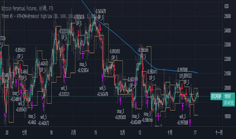
Trend Breakout high/low #1What is the Trend Breakout high/low #1?
This script uses the high/low of each fixed time period as a conditional judgment, and when the high/low is broken as a buy/sell signal, trying to capture a trend.
How to use this script?
Start date and Stop date: You can choose the date of the test.
Trading cycle: Selected time period is used as the basis for determining the high/low and is limited to one trade only.
Stop range: This value will calculate the stop loss range. Set 50-100 that is better
Fixed mode: Fixed of lots per transaction.
---Additional Functions---
Reversal mode: Reversing the buy and sell signals, may be useful in certain situations.
Wighted mode: Increased profitability under certain conditions
When win & When lose:Judgment when there is an ongoing loss/profit as a condition, may be useful in certain situations.
Use closing price: Use the closing price breakout high/low as a conditional judgment, but this function sometimes fails.
Notes:
Trading cycle and your chart time period can't be set too close,that will result repainting.
Stop range can't be set too small,that will result repainting either.
Cerca negli script per "donchian"
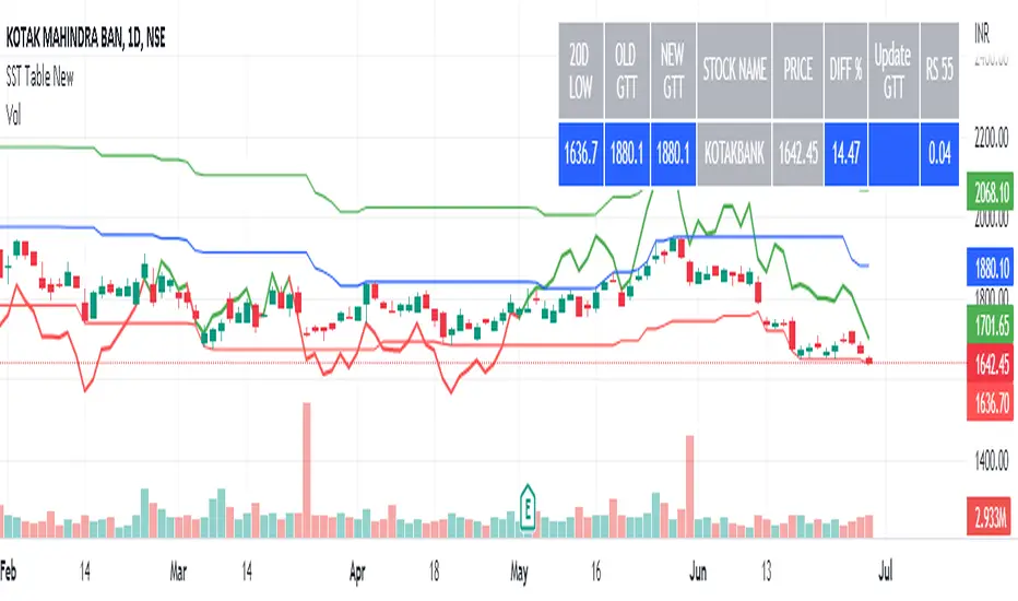
SST Table NewData Table for Update GTT Orders in Stocks....
Updated GTT Order details for SST , also added Relative Strength of Stock compared with NIFTY Index for 55 Days (3 Months) period.
RS line plotted on chart… taken reference of close price of day candle… just a bigger picture of actual RS indicator plotted on chart itself... RS line in red color means below zero line (negative) and green color means above zero line (positive).
Added code for checking RS value on chart for any previous day.
Trade Helper [Trading Nerd]Position Size Calculator / Lot Size Calculator
Disclaimer: I do my best to avoid wrong calculations and bugs. I provide this indicator without warranties of any kind. You bear all risks associated with the use of this indicator.
Inputs:
Market: Adds a name tag to the Table to keep track of the trades.
Entry Price: The entry Price of the Position.
Entry Time: The entry Time/Candle of the Position. If Stop Loss Type is 'ATR' or 'HH/LL' the Value for this is calculated by this Candle.
Stop Loss Type: Changes the Stop Loss Type.
Direction: Define if the trade direction is 'Long' or 'Short'. Has no effect on Stop Loss Type 'Custom'. For this you can just set the Stop Loss below/above the Entry Price .
ATR Multiplier: Multiplies the ATR Value by this number. Has only an effect on Stop Loss Type 'ATR'.
HH/LL Lookback Length: Lookback length for determine Highest High/Lowest Low value. Has only an effect on Stop Loss Type 'HH/LL'.
Custom SL Price: The Stop Loss Price if the Stop Loss Type is set to 'Custom'.
Risk Reward Ratio: The Risk is multiplied by this number to determine the Take Profit Price.
Balance: Balance Amount and Currency
Contract Size: The Position Size is divided by this number. E.G. in Forex one Lot is 100.000 Contracts. Change this Value depending on your Broker and Market.
Risk in %: Percent that is risked of the Balance for one Trade.

HiLo Extension This Strategy is finding high and low breaks of the day and enter into the trader based on RSI value and time value
1) This strategy is created for Indian Index like Nifty, Bank Nifty and so...
2) Trades are initiate only after 10:15 AM and before 3:10PM
3) High and Low of the day break will be check during the above time frame
4) RSI value will be check (RSI 50)
5) and trade will be initiate
6) Stop loss set as vwma 20...
Note: This Script will work fine in Index future chart not index spot chart...
This is just my idea only... Please back test yourselve, before using it..
Your comments are welcome!

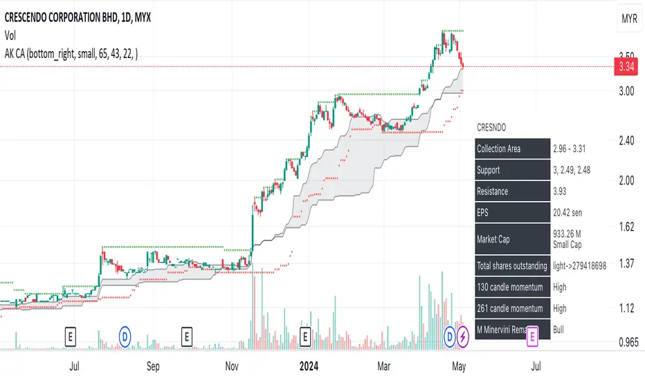
AK collection area- Based on Coach AK formula of determining collection area of retracement stock.
- If price below collection area, collect in tranches.
2HLA very simple, almost naive strategy, in which you buy on the lowest of the two previous candles and sell at the highest of the two previous candles. You can configure these highest and lowest lenght, in some assets two is too small of a number to make profit. You can also configure to exit the position after X, and I found that 7 (which is a week of working days) is a good number for that.
This is strategy is intended to be used as a swing trade. Your capital needs to be high enough so that it can pay the operaitonal costs, and reach it's target with a reasonable profit.
Since this is a volatility based strategy, assets that are more liquid won't work properly.

[RS]Standardized Trend Mapnothing excessively new here..
a map of standardized trend over multiple lengths, extra parameter for smoothing the input source(close) will remove noise.

Adaptive ChannelThis indicator uses KAMA to adjust the length of a channel according to volatility.
A set up is generated when a candle closes below/above the mid point line; this is indicated via the background color.
Buy/sell on the break of the high/low of the signal candle.
Use the channel top/bottom as a stop (or a close above/below the mid pint line)


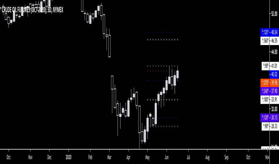
Gann Square Of 9 LevelsThis script uses the last hlc3 value of 1H, 4H, D and/or W and rotates it 360º up/down with four increments of 90º to find out potential support and resistance areas. Can be used as a dynamic support & resistance tool or just to gauge how overbought/oversold the market is. Special thanks to @Nv56 for his assistance in writing this script.
Donochian CCISo this indicator have the following:
1. MTF CCI
2. donochian channel MTF both non repaint mode
buliish and bearish zone determine by ratio of the the donochian cahnnel
enter or exit can be either the bullish or bearish change of color or by cross over or under of the CCI
or combination of both
The high max and low max of the donochian channel show in hilated bar

Session RangeSimple script for showing the high/low/midrange of a session. By default configured to do the Daily range using the "regular" session. But it's configurable. For example on this chart I am showing the Weekly range.

fibgameI have no power to finish it so who ever want to continue is welcome, exit point are good but still need work on entry points
have fun

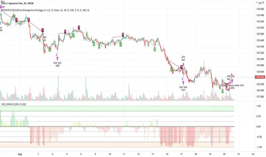
[STRATEGY][UL]Price Divergence Strategy v1.0Created by Request: This is a trend trading strategy that uses Price Divergence detection signals that are confirmed by the "Murrey's Math Oscillator" (Donchanin Channel based).
Strategy Code Based on:
Price Divergence Detector V2 by RicardoSantos
UCS_Murrey's Math Oscillator by Ucsgears
Strategy Risk Management Based on:
Strategy Code Example by JayRogers
Information on Divergence Trading:
- www.babypips.com
*** USE AT YOUR OWN RISK ***

DayTradeMind Combined High Win Rate StrategyThe DayTradeMind Combined High Win Rate Strategy is a trend-following system that relies on confluence—the idea that a trade signal is stronger when multiple independent indicators agree. Instead of entering on a single indicator's whim, it uses a "voting" system to qualify entries and a strict risk-to-reward ratio to manage exits.Here is a breakdown of the three main layers of this strategy:1. The Voting Engine (Confluence Model)The strategy tracks four indicators and assigns a "point" for a bullish or bearish bias. It requires a minimum number of points (set by minConfirmations, usually 2/4) before it even considers a trade.IndicatorBullish Condition (1 point)Bearish Condition (1 point)PurposeMACDMACD Line > Signal LineMACD Line < Signal LineMeasures short-term momentum.DonchianPrice > 20-period MedianPrice < 20-period MedianIdentifies price relative to recent range.SuperTrendPrice above trend linePrice below trend lineFilters for the "Macro" trend direction.%B (Bollinger)Price in lower-mid range (0.2–0.5)Price in upper-mid range (0.5–0.8)Prevents buying when overextended.2. The Entry TriggerHaving enough "votes" (confirmations) isn't enough to enter. The strategy waits for a trigger event to ensure you aren't entering a stale trend. An entry only occurs if the minimum confirmations are met AND one of the following happens on the current bar:MACD Cross: The MACD line crosses over the signal line.Structural Break: The price crosses over the Donchian Middle (Median) line.This "Confirmation + Trigger" approach is designed to catch the start of a momentum push rather than buying a flat market.3. Mathematical Risk ManagementThe performance you see in your backtest (like the 46.86% return) is largely driven by the 2:1 Reward-to-Risk (RR) Ratio.Stop Loss (SL): Fixed at 2% below entry.Take Profit (TP): Fixed at 4% above entry.By aiming for a target twice as large as the risk, the strategy can remain profitable even with a win rate as low as 35%–40%. Mathematically, your winning trades compensate for more than two losing trades.Visualizing the SystemTriangles: Small green (up) and red (down) triangles appear on your chart only when the Votes + Trigger align perfectly.Background Shading: Faint green or red bands show you exactly when the "Confluence" is active. If the background is gray, the indicators are in conflict.Dashboard: The table in the top-right summarizes the current "score" for each indicator, letting you know how close you are to a potential trade signal.

Neeson bitcoin Dynamic ATR Trailing SystemNeeson bitcoin Dynamic ATR Trailing System: A Comprehensive Guide to Volatility-Adaptive Trend Following
Introduction
The Dynamic ATR Trailing System (DATR-TS) represents a sophisticated approach to trend following that transcends conventional moving average or breakout-based methodologies. Unlike standard trend-following systems that rely on price pattern recognition or fixed parameter oscillators, this system operates on the principle of volatility-adjusted position management—a nuanced approach that dynamically adapts to changing market conditions rather than imposing rigid rules on market behavior.
Originality and Innovation
Distinct Methodological Approach
What sets DATR-TS apart from hundreds of existing trend-following systems is its dual-layered conditional execution framework. While most trend-following systems fall into one of three broad categories—moving average crossovers, channel breakouts, or momentum oscillators—this system belongs to the more specialized category of volatility-normalized trailing stop systems.
Key Original Contributions:
Volatility-Threshold Signal Filtering: Most trend systems generate signals continuously, leading to overtrading during low-volatility periods. DATR-TS implements a proprietary volatility filter that requires minimum market movement before generating signals, effectively separating high-probatility trend opportunities from market noise.
Self-Contained Position State Management: Unlike traditional systems that require external position tracking, DATR-TS maintains an internal position state that prevents contradictory signals and creates a closed-loop decision framework.
Dynamic Risk Parameter Adjustment: The system doesn't use fixed percentage stops or rigid ATR multiples. Instead, it implements a responsive adjustment mechanism that widens stops during high volatility and tightens them during low volatility, creating an optimal balance between risk protection and opportunity capture.
Trader-Centric Visualization Philosophy: Beyond mere signal generation, the system provides a comprehensive visual feedback system designed to align with human cognitive patterns, reducing emotional decision-making through consistent color coding and information hierarchy.
Technical Implementation and Functionality
Core Operational Mechanism
DATR-TS implements a volatility-adjusted trend persistence model that operates on the principle that trending markets exhibit characteristic volatility signatures. The system specifically targets medium-term directional movements (typically lasting 5-20 days) rather than short-term scalping opportunities or long-term position trades.
The Four-Pillar Architecture:
Volatility Measurement and Normalization
Calculates Average True Range (ATR) over a user-defined period
Converts absolute volatility to percentage terms relative to price
Compares current volatility against user-defined thresholds to filter suboptimal conditions
Dynamic Trailing Stop Algorithm
Establishes an initial stop distance based on current volatility
Implements a four-state adjustment mechanism that responds to price action
Maintains stop position during trend continuation while allowing for trend reversal detection
Conditional Signal Generation
Generates entry signals only when price action meets both directional and volatility criteria
Produces exit signals based on trailing stop penetration
Incorporates position state awareness to prevent conflicting signals
Comprehensive Feedback System
Provides multi-layer visual information including dynamic stop lines, signal labels, and color-coded price action
Displays real-time metrics through an integrated dashboard
Offers configurable visualization options for different trading styles
Specific Trend-Following Methodology
DATR-TS employs a volatility-normalized trailing stop breakout approach, which differs significantly from common trend identification methods:
Not a moving average crossover system (like MACD or traditional MA crosses)
Not a channel breakout system (like Bollinger Band or Donchian Channel breaks)
Not a momentum oscillator system (like RSI or Stochastic trend following)
Not a price pattern recognition system (like head-and-shoulders or triangle breaks)
Instead, it belongs to the more specialized category of volatility-adjusted stop-and-reverse systems that:
Wait for market volatility to reach actionable levels
Establish positions when price confirms directional bias through stop penetration
Manage risk dynamically based on evolving market conditions
Exit positions when the trend exhausts itself through stop violation
Practical Application and Usage
Market Environment Optimization
Ideal Conditions:
Trending markets with sustained directional movement
Medium volatility environments (neither excessively calm nor chaotic)
Timeframes: 4-hour to daily charts for optimal signal quality
Instruments: Forex majors, commodity futures, equity indices
Suboptimal Conditions:
Ranging or consolidating markets
Extreme volatility events or news-driven spikes
Very short timeframes (below 1-hour)
Illiquid or highly manipulated instruments
Parameter Configuration Strategy
Core Parameter Philosophy:
ATR Length (Default: 21 periods)
Controls the system's memory of volatility
Shorter lengths increase sensitivity but may cause overtrading
Longer lengths provide smoother signals but may lag during volatility shifts
ATR Multiplier (Default: 6.3x)
Determines the initial risk buffer
Lower values (4-5x) create tighter stops for conservative trading
Higher values (6-8x) allow for larger trends but increase drawdown risk
Volatility Threshold (Default: 1.5%)
Filters out low-quality trading environments
Adjust based on market characteristics (higher for volatile markets)
Acts as a quality control mechanism for signals
Trading Workflow and Execution
Signal Interpretation and Action:
Entry Protocol:
Wait for BLUE "BUY" signal label appearance
Confirm volatility conditions meet threshold requirements
Enter long position at market or next reasonable opportunity
Set initial stop at displayed dynamic stop level
Position Management:
Monitor dynamic stop line for position adjustment
Allow profits to run while stop protects capital
No manual adjustment required—system manages stop automatically
Exit Protocol:
Exit on ORANGE "SELL" signal label appearance
Alternative exit if price hits dynamic stop level
System will generate new entry signal if conditions warrant re-entry
Risk Management Integration:
Position sizing based on distance to dynamic stop
Volatility filter prevents trades during unfavorable conditions
Clear visual feedback on current risk exposure
Built-in protection against overtrading
Philosophical Foundation and Market Theory
Core Trading Principles
DATR-TS embodies several foundational market principles:
Volatility Defines Opportunity
Markets don't trend continuously—they alternate between trending and ranging phases
Volatility provides the energy for trends to develop and sustain
By measuring and filtering volatility, we can focus on high-probability trend phases
Risk Should Be Proportional
Fixed percentage stops ignore market context
Dynamic stops that adjust with volatility provide more appropriate risk management
Position sizing should reflect current market conditions, not arbitrary rules
Simplicity Through Sophistication
Complex systems often fail in real-world conditions
A simple core algorithm with intelligent filtering outperforms complex multi-indicator approaches
Clear visual feedback reduces cognitive load and emotional interference
Trends Persist Until Proven Otherwise
Markets exhibit momentum characteristics
Once a trend establishes itself, it tends to continue
The trailing stop methodology captures this persistence while providing exit mechanisms
Mathematical and Statistical Foundation
The system operates on several statistical market observations:
Volatility Clustering Phenomenon
High volatility periods tend to follow high volatility periods
Low volatility periods tend to follow low volatility periods
By filtering for adequate volatility, we increase the probability of capturing meaningful trends
Trend Magnitude Distribution
Most trends are small to medium in magnitude
Very large trends are rare but account for disproportionate returns
The dynamic stop methodology allows capture of varying trend magnitudes
Autocorrelation in Price Movements
Price movements exhibit short-term positive autocorrelation during trends
This persistence allows trailing stops to capture continued movement
The system leverages this characteristic without requiring explicit autocorrelation calculation
Performance Characteristics and Expectations
Typical System Behavior
Signal Frequency:
Low to moderate signal generation (prevents overtrading)
Signals concentrated during trending market phases
Extended periods without signals during ranging conditions
Risk-Reward Profile:
Win rate typically 40-60% in trending conditions
Average win larger than average loss
Risk-reward ratios of 1:2 to 1:3 achievable
Drawdown Patterns:
Controlled through volatility adjustment
Larger drawdowns during extended ranging periods
Recovery typically follows when trending conditions resume
Comparison with Alternative Approaches
Versus Moving Average Systems:
Less prone to whipsaws during ranging markets
Better adaptation to changing volatility conditions
Clearer exit signals through stop levels
Versus Channel Breakout Systems:
More responsive to emerging trends
Lower false breakout probability
Dynamic risk adjustment rather than fixed parameters
Versus Momentum Oscillator Systems:
Better trend persistence capture
Less susceptible to overbought/oversold false signals
Clearer position management rules
Educational Value and Skill Development
Learning Opportunities
DATR-TS serves as more than just a trading tool—it provides educational value through:
Market Condition Awareness
Teaches traders to distinguish between trending and ranging markets
Develops understanding of volatility's role in trading opportunities
Encourages patience and selectivity in trade execution
Risk Management Discipline
Demonstrates dynamic position sizing principles
Illustrates the importance of adaptive stops
Reinforces the concept of risk-adjusted returns
Psychological Skill Development
Reduces emotional trading through clear rules
Builds patience through conditional execution
Develops discipline through systematic approach
Customization and Evolution
The system provides a foundation for further development:
Beginner Level:
Use default parameters for initial learning
Focus on signal recognition and execution discipline
Develop understanding of system behavior across market conditions
Intermediate Level:
Adjust parameters based on specific market characteristics
Combine with complementary analysis techniques
Develop personal variations based on trading style
Advanced Level:
Integrate with portfolio management systems
Develop automated execution frameworks
Create derivative systems for specialized applications
Conclusion: The Modern Trend-Following Paradigm
The Dynamic ATR Trailing System represents a significant evolution in trend-following methodology. By moving beyond simple price pattern recognition or fixed parameter oscillators, it embraces the complex reality of financial markets where volatility, trend persistence, and risk management interact dynamically.
This system doesn't claim to predict market direction or identify tops and bottoms. Instead, it provides a systematic framework for participating in trends when they emerge, managing risk appropriately as conditions change, and preserving capital during unfavorable environments.
For traders seeking a methodology that combines mathematical rigor with practical execution, adapts to changing market conditions rather than fighting against them, and provides clear, actionable information without cognitive overload, DATR-TS offers a sophisticated yet accessible approach to modern trend following.
The true value lies not in any single signal or parameter setting, but in the comprehensive philosophy of volatility-aware, risk-adjusted, conditionally-executed trend participation that the system embodies—a philosophy that aligns with how markets actually behave rather than how we might wish them to behave.

Evil's Two Legged IndicatorA pullback strategy indicator designed for scalping. This attempts to Identify classic 2-leg pullback patterns and filters out signals during choppy market conditions for better signals.
How It Works:
The indicator detects when price forms two pullback legs (swing lows in an uptrend or swing highs in a downtrend) near key support/resistance zones, then signals when reversal confirmation occurs. Equal-level pullbacks (double bottoms/tops) are marked as stronger signals.
Features:
Channel Options: Donchian (default), Linear Regression, or ATR Bands
Configurable EMA: For trend confirmation (default 21)
Adjustable Leg Detection: Swing lookback period for different timeframes
Equal Level Detection: Highlights stronger setups where both legs terminate at similar prices
Three Chop Filters (can be combined):
ADX Filter — suppresses signals when ADX is below threshold (default 25)
EMA Slope Filter — suppresses signals when EMA is flat
Chop Index Filter — suppresses signals when Chop Index indicates ranging conditions
Signal Types:
Standard signals: 2-leg pullback detected with trend confirmation
Strong signals (highlighted): 2-leg pullback with equal highs/lows — higher probability setup
Recommended Use:
Best suited for scalping on 1-5 minute chart. Designed for 1.5:1 risk/reward setups.
Settings Guide:
Increase "Swing Lookback" for fewer, higher-quality signals
Adjust "Equal Level Threshold" to fine-tune what counts as a double bottom/top
Enable/disable chop filters based on your market and timeframe
Use "Show Strong Signals Only" to filter for highest conviction setups

Xbirch_Turtle_ Crypto_CalcМодернизированная стратегия Черепах.
Вход/выход по каналу Дончиана, стопы по величине ATR, возможность выбора лонг/шорт/всё. Имеется пирамидинг - добавление по +0,5ATR от первого бая, не более 4х входов. Модернизированный стоп - по ATR от первого бая.
Не финансовый совет.
A modernized Turtle strategy.
Entry/exit based on the Donchian Channel, stops based on the ATR value, and the ability to choose long/short/all options. Pyramiding is available – adding +0.5 ATR from the first buy, with a maximum of four entries. The modernized stop is based on the ATR value from the first buy.
This is not financial advice.

Trend Consensus Engine [TCE]The Trend Consensus Engine (TCE) is a comprehensive market analysis system designed to filter out noise and provide a quantifiable "Trend Score" (0-100). Instead of relying on a single indicator, this script aggregates data from multiple market factors—volatility, momentum, and trend structure—to generate high-probability entry signals based on a consensus logic.
This tool is particularly optimized for Crypto (with specific time-gated logic) and BIST (Borsa Istanbul) markets, allowing traders to see the overall health of the trend at a glance via a dashboard.
How It Works
The engine calculates a composite "Total Score" (0-100) derived from four weighted components:
Trend Structure (AlphaTrend & Guppy):
Analyzes the slope and position relative to the AlphaTrend (Credit to @KivancOzbilgic) and Guppy Multiple Moving Averages (GMMA).
Positive slopes and price action above key levels add points to the score.
Volatility & Momentum (Squeeze & ADX):
Incorporates the Squeeze Momentum logic (Credit to @LazyBear) to detect explosive moves.
ADX Filter: Filters out chopping/ranging markets. If the ADX is too low, the score is penalized or the signal is blocked.
Dynamic Resistance (MA Channels):
Uses a combination of Donchian Mid-Lines and SMAs to determine if the price is in a "safe zone" or hitting resistance.
Price Action Filters (Pinbar Veto):
Automatically detects bearish "Shooting Star" or weak candles at highs. If a bearish pinbar is detected, the entry signal is vetoed regardless of the trend score.
Features & Settings
Smart Scoring Dashboard: Displays the realtime Score, Instant Decision, and confirmed Close Decision on the chart.
Market Profiles:
Crypto Mode: Includes a "Time Gate" feature (07:00 UTC+3 check) to prevent fakeouts during low-liquidity hours.
BIST Mode: Optimized parameters for the Turkish stock market logic (14:00 session checks).
Score Threshold: Users can adjust the minimum score required (Default: 70) to trigger a "BUY" signal.
Visual Guidance: The background of the dashboard changes color (Green/Red/Yellow) based on the consensus.
How to Use
Check the Dashboard: Look at the "SONUÇ" (Result) row.
GİRİŞ ✅ (ENTRY): The Score is above 70, Momentum is positive, and no Bearish Pinbars are present.
BEKLE ⏳ (WAIT): The trend is weak, or a filter (like ADX or Squeeze) is blocking the trade.
Confirm with Price Action: Use the AlphaTrend lines (Blue/Red) as dynamic support/stop-loss levels.
Credits:
AlphaTrend by KivancOzbilgic
Squeeze Momentum Indicator by LazyBear
VuManChu Cipher concepts for inspiration.
Custom Logic: Scoring algorithm and Time-Gating mechanisms are original custom developments.
Disclaimer: This tool is for educational purposes only and does not constitute financial advice.

Future Ichimoku Cloud - HorizonIchimoku Horizon is an advanced Ichimoku indicator that projects future cloud formations and component lines, giving traders unprecedented visibility into potential support/resistance zones before they form.
1. Future Ichimoku Projections
Project Ichimoku components forward in time using simulated price evolution based on rolling Tenkan/Kijun windows
Manual forecast periods up to 125 bars (all 4 components) or 500 bars (cloud only)
Smart limit management automatically adjusts to TradingView's drawing object limits while maximizing visible projections
2. Preset & Custom Ichimoku Configurations
Choose from multiple common Ichimoku presets or fully customize your own
3. Multi-Timeframe Display & Projections
Display Ichimoku from higher/lower timeframes directly on your current timeframe chart
Automatic scaling adjusts Ichimoku periods correctly across timeframes
Intelligent handling of 24/7 markets (crypto/forex) vs traditional session-based markets
Built-in detection of problematic timeframe combinations with optional MTF cloud fetching for accuracy
Automatic notifications when future projections are unavailable due to MTF constraints
4. Tenkan & Kijun Range Windows
Visual range windows that display the exact high/low range used for Tenkan and Kijun calculations
Optional High/Low markers placed at the exact bars they occur
Optional countdown labels show how many bars remain until the current High/Low expires from the rolling window
Range windows scale up and down dynamically to match display timeframe
5. Comprehensive Alert Suite
Built-in alerts for all major Ichimoku events: TK crosses, E2E entires, Kumo breakouts, etc.
All alerts are cloud-aware and displacement-correct.
How It Works
The indicator uses the traditional Donchian channel method to calculate Ichimoku components, then extends this logic forward by simulating future price action within the calculation windows (no new highs or lows). This creates a forward-looking projection of where support and resistance zones will form.
The range display feature helps traders understand why the lines are where they are by showing the exact high/low points and countdown timers for when these points will expire from the calculation.
Who This Indicator Is For:
Ichimoku traders who want future-aware context
Multi-timeframe analysts seeking correctly aligned clouds
Traders who want to understand Tenkan/Kijun mechanics
Users who need precision without manual recalculation
Notes:
Maximum 500 drawing objects limit managed automatically
Due to Pinescript/TradingView limitations, future Tenkan/Kijun line width is only modifiable in the source code.

Rating for each momentMoment Score Labels is a Pine v5 overlay indicator that shows momentum “ratings” (0–100) directly on the chart. It prints a vertical score label on every candle (rolling window to avoid label limits) and adds vertical SETUP/ENTRY/EXIT markers for both long and short signals. Signals are based on a weighted mix of trend (MA alignment + slope), momentum (RSI + MACD histogram), breakout (Donchian high/low), and volatility contraction, with an optional Daily regime filter and optional volume/breakout confirmations.
