Next Candle Predictor with Auto HedgingThe "Next Candle Predictor with Auto Hedging" is a Pine Script indicator designed for use on TradingView. It combines predictive analysis and basic hedging techniques to assist traders in making informed decisions. Here's a detailed explanation suitable for public sharing on TradingView:
Overview
This script predicts the closing price of the next candle based on the current candle's open and close prices. It also includes an auto hedging feature that suggests potential hedging levels to mitigate risk based on the predicted price movement. The indicator is particularly useful for traders looking to enhance their trading strategies with predictive analytics.
Key Features
Next Candle Prediction:
The indicator analyzes the current candle's data (open and close prices) to predict whether the next candle will close higher or lower.
If the current candle is bullish (close > open), it predicts a higher close for the next candle. Conversely, if the candle is bearish, it predicts a lower close.
Auto Hedging:
The script calculates a hedging level based on the predicted close price.
If the predicted close indicates a bullish move, the hedge level is set slightly below the predicted close, suggesting where a trader might consider placing a hedge. If the prediction indicates a bearish move, the hedge level is set above the predicted close.
Elliott Wave Analysis:
The script includes a basic implementation of identifying significant price movements, akin to Elliott Wave analysis, by detecting peaks and troughs over a specified number of bars (wave length).
This can help traders identify potential trend reversals or continuations.
How It Works
Input Parameters: Users can customize the waveLength parameter, which determines how many bars back the script looks to identify significant highs and lows.
Peak and Trough Detection: The script identifies the highest high and lowest low within the specified wave length, plotting these points on the chart for visual reference.
Prediction Logic: The predicted close is calculated based on the current candle's behavior, allowing traders to anticipate price movements.
Hedging Level Calculation: The script dynamically calculates a hedging level based on the predicted close, providing a visual cue for potential risk management strategies.
Visual Representation
The indicator plots:
Elliott Wave Highs: Marked in green.
Elliott Wave Lows: Marked in red.
Predicted Close: Shown as a blue step line.
Hedge Level: Displayed as an orange step line.
Benefits
Enhanced Decision-Making: By providing predictions and potential hedging levels, traders can make more informed decisions about entering or exiting positions.
Risk Management: The auto hedging feature helps traders manage risk by suggesting levels where they might place hedges against adverse price movements.
Customizable: The script allows for user-defined parameters, making it adaptable to different trading strategies and market conditions.
Conclusion
The "Next Candle Predictor with Auto Hedging" indicator is a powerful tool for traders seeking to enhance their trading strategies with predictive analytics and risk management techniques. By utilizing this indicator, traders can gain insights into potential price movements and make more informed trading decisions.
Feel free to explore the script, customize it to fit your trading style, and engage with the TradingView community for further insights and improvements!
Related
Cerca negli script per "elliott"
Luxmi AI Filtered Option Scalping Signals (INDEX)Introduction:
Luxmi AI Filtered Option Scalping Signals (INDEX) is an enhanced iteration of the Luxmi AI Directional Option Buying (Long Only) indicator. It's designed for use on index charts alongside the Luxmi AI Smart Sentimeter (INDEX) indicator to enhance performance. This indicator aims to provide refined signals for option scalping strategies, optimizing trading decisions within index markets.
Understanding directional bias is crucial when trading index and index options because it helps traders align their strategies with the expected movement of the underlying index.
The Luxmi AI Filtered Option Scalping Signals (INDEX) indicator aims to simplify and expedite decision-making through comprehensive technical analysis of various data points on a chart. By leveraging advanced analysis of data points, this indicator scrutinizes multiple factors simultaneously to offer traders clear and rapid insights into market dynamics.
The indicator is specifically designed for option scalping, a trading strategy that aims to profit from short-term price fluctuations. It prioritizes signals that are conducive to quick execution and capitalizes on rapid market movements typical of scalping strategies.
Major Features:
Trend Cloud:
Working Principle:
The script utilizes the Relative Strength Index (RSI) to assess market momentum, identifying bullish and bearish phases based on RSI readings. It calculates two boolean variables, bullmove and bearmove, which signal shifts in momentum direction by considering changes in the Exponential Moving Average (EMA) of the closing price. When RSI indicates bullish momentum and the closing price's EMA exhibits positive changes, bullmove is triggered, signifying the start of a bullish phase. Conversely, when RSI suggests bearish momentum and the closing price's EMA shows negative changes, bearmove is activated, marking the beginning of a bearish phase. This systematic approach helps in understanding the current trend of the price. The script visually emphasizes these phases on the chart using plot shape markers, providing traders with clear indications of trend shifts.
Benefits of Using Trend Cloud:
Comprehensive Momentum Assessment: The script offers a holistic view of market momentum by incorporating RSI readings and changes in the closing price's EMA, enabling traders to identify both bullish and bearish phases effectively.
Structured Trend Recognition: With the calculation of boolean variables, the script provides a structured approach to recognizing shifts in momentum direction, enhancing traders' ability to interpret market dynamics.
Visual Clarity: Plotshape markers visually highlight the start and end of bullish and bearish phases on the chart, facilitating easy identification of trend shifts and helping traders to stay informed.
Prompt Response: Traders can promptly react to changing market conditions as the script triggers alerts when bullish or bearish phases begin, allowing them to seize potential trading opportunities swiftly.
Informed Decision-Making: By integrating various indicators and visual cues, the script enables traders to make well-informed decisions and adapt their strategies according to prevailing market sentiment, ultimately enhancing their trading performance.
How to use this feature:
The most effective way to maximize the benefits of this feature is to use it in conjunction with other key indicators and visual cues. By combining the color-coded clouds, which indicate bullish and bearish sentiment, with other features such as IS candles, microtrend candles, volume candles, and sentimeter candles, traders can gain a comprehensive understanding of market dynamics. For instance, aligning the color of the clouds with the trend direction indicated by IS candles, microtrend candles, and sentimeter candles can provide confirmation of trend strength or potential reversals.
Furthermore, traders can leverage the trend cloud as a trailing stop-loss tool for long entries, enhancing risk management strategies. By adjusting the stop-loss level based on the color of the cloud, traders can trail their positions to capture potential profits while minimizing losses. For long entries, maintaining the position as long as the cloud remains green can help traders stay aligned with the prevailing bullish sentiment. Conversely, a shift in color from green to red serves as a signal to exit the position, indicating a potential reversal in market sentiment and minimizing potential losses. This integration of the trend cloud as a trailing stop-loss mechanism adds an additional layer of risk management to trading strategies, increasing the likelihood of successful trades while reducing exposure to adverse market movements.
Moreover, the red cloud serves as an indicator of decay in option premiums and potential theta effect, particularly relevant for options traders. When the cloud turns red, it suggests a decline in option prices and an increase in theta decay, highlighting the importance of managing options positions accordingly. Traders may consider adjusting their options strategies, such as rolling positions or closing out contracts, to mitigate the impact of theta decay and preserve capital. By incorporating this insight into options pricing dynamics, traders can make more informed decisions about their options trades.
Scalping Cloud:
The scalping cloud serves as a specialized component within the trend cloud feature, specifically designed to pinpoint potential long and short entry points within the overarching trend cloud. Here's how it works:
Trend Identification: The trend cloud feature typically highlights the prevailing trend direction based on various technical indicators, price action, or other criteria. It visually represents the momentum and direction of the market over a given period.
Refined Entry Signals: Within this broader trend context, the scalping cloud narrows its focus to identify shorter-term trading opportunities. It does this by analyzing more granular price movements and shorter timeframes, seeking out potential entry points that align with the larger trend.
Long and Short Entries: The scalping cloud distinguishes between potential long (buy) and short (sell) entry opportunities within the trend cloud. For instance, within an uptrend indicated by the trend cloud, the scalping cloud might identify brief retracements or pullbacks as potential long entry points. Conversely, in a downtrend, it may signal short entry opportunities during temporary upward corrections.
Risk Management: By identifying potential entry points within the context of the trend, the scalping cloud also aids in risk management. Traders can use these signals to place stop-loss orders and manage their positions effectively, reducing the risk of adverse price movements.
The scalping cloud operates by analyzing the crossover and crossunder events between two key indicators: the Double Exponential Moving Average (DEMA) and a Weighted Average. Here's how it works:
Double Exponential Moving Average (DEMA): DEMA is a type of moving average that seeks to reduce lag by applying a double smoothing technique to price data. It responds more quickly to price changes compared to traditional moving averages, making it suitable for identifying short-term trends and potential trading opportunities.
Weighted Average: The weighted average calculates the average price of an asset over a specified period. However, it incorporates a weighting scheme that assigns more significance to recent price data, resulting in a more responsive indicator that closely tracks current market trends.
CE and NO CE Signals:
CE signals typically represent a Long Scalping Opportunity, suggesting that conditions are favorable for entering a long position. These signals indicate a strong upward momentum in the market, which traders can exploit for short-term gains through scalping strategies.
On the other hand, when there are no CE signals present, it doesn't necessarily mean that the trend has reversed or turned bearish. Instead, it indicates that the trend is still bullish, but the market is experiencing an active pullback. During a pullback, prices may temporarily retreat from recent highs as traders take profits or reevaluate their positions. While the overall trend remains upward, the pullback introduces a degree of uncertainty, making it less favorable for entering new long positions.
In such a scenario, traders may opt to exercise caution and refrain from entering new long positions until the pullback phase has concluded. Instead, they might consider waiting for confirmation signals, such as the resumption of CE signals or other bullish indications, before reengaging in long positions.
PE and NO PE Signals:
PE signals typically indicate a Short Entry opportunity, signaling that market conditions are conducive to entering a short position.
Conversely, when there are no PE signals present, it signifies that while the trend remains bearish, the market is currently in an active phase of consolidation or pullback. During such periods, prices may temporarily rise from recent lows, reflecting a pause in the downward momentum. While the overall trend remains downward, the absence of PE signals suggests that it may not be an optimal time to enter new short positions.
In this context, traders may exercise caution and wait for clearer signals before initiating new short positions. They might monitor the market closely for signs of a resumption in bearish momentum, such as the emergence of PE signals or other bearish indications. Alternatively, traders may choose to wait on the sidelines until market conditions stabilize or provide clearer directional signals.
Working Principle Of CE and PE Signals:
The feature calculates candlestick values based on the open, high, low, and close prices of each bar. By comparing these derived candlestick values, it determines whether the current candlestick is bullish or bearish. Additionally, it signals when there is a change in the color (bullish or bearish) of the derived candlesticks compared to the previous bar, enabling traders to identify potential shifts in market sentiment.
Micro Trend Candles:
Working Principle:
This feature begins by initializing variables to determine trend channel width and track price movements. Average True Range (ATR) is then calculated to measure market volatility, influencing the channel's size. Highs and lows are identified within a specified range, and trends are assessed based on price breaches, with potential changes signaled accordingly. The price channel is continually updated to adapt to market shifts, and arrows are placed to indicate potential entry points. Colors are assigned to represent bullish and bearish trends, dynamically adjusting based on current market conditions. Finally, candles on the chart are colored to visually depict the identified micro trend, offering traders an intuitive way to interpret market sentiment and potential entry opportunities.
Benefits of using Micro Trend Candles:
Traders can use these identified micro trends to spot potential short-term trading opportunities. For example:
Trend Following: Traders may decide to enter trades aligned with the prevailing micro trend. If the candles are consistently colored in a certain direction, traders may consider entering positions in that direction.
Reversals: Conversely, if the script signals a potential reversal by changing the candle colors, traders may anticipate trend reversals and adjust their trading strategies accordingly. For instance, they might close existing positions or enter new positions in anticipation of a trend reversal.
It's important to note that these micro trends are short-term in nature and may not always align with broader market trends. Therefore, traders utilizing this script should consider their trading timeframes and adjust their strategies accordingly.
How to use this feature:
This feature assigns colors to candles to represent bullish and bearish trends, with adjustments made based on current market conditions. Green candles accompanied by a green trend cloud signal a potential long entry, while red candles suggest caution, indicating a bearish trend. This visual representation allows traders to interpret market sentiment intuitively, identifying optimal entry points and exercising caution during potential downtrends.
Scalping Candles (Inspired by Elliott Wave and Open Interest Concepts):
Working Principle:
This feature draws inspiration from the Elliot Wave method, utilizing technical analysis techniques to discern potential market trends and sentiment shifts. It begins by calculating the variance between two Exponential Moving Averages (EMAs) of closing prices, mimicking Elliot Wave's focus on wave and trend analysis. The shorter-term EMA captures immediate price momentum, while the longer-term EMA reflects broader market trends. A smoother Exponential Moving Average (EMA) line, derived from the difference between these EMAs, aids in identifying short-term trend shifts or momentum reversals.
Benefits of using Scalping Candles Inspired by Elliott Wave:
The Elliott Wave principle is a form of technical analysis that attempts to predict future price movements by identifying patterns in market charts. It suggests that markets move in repetitive waves or cycles, and traders can potentially profit by recognizing these patterns.
While this script does not explicitly analyze Elliot Wave patterns, it is inspired by the principle's emphasis on trend analysis and market sentiment. By calculating and visualizing the difference between EMAs and assigning colors to candles based on this analysis, the script aims to provide traders with insights into potential market sentiment shifts, which can align with the broader philosophy of Elliott Wave analysis.
How to use this feature:
Candlestick colors are assigned based on the relationship between the EMA line and the variance. When the variance is below or equal to the EMA line, candles are colored red, suggesting a bearish sentiment. Conversely, when the variance is above the EMA line, candles are tinted green, indicating a bullish outlook. Though not explicitly analyzing Elliot Wave patterns, the script aligns with its principles of trend analysis and market sentiment interpretation. By offering visual cues on sentiment shifts, it provides traders with insights into potential trading opportunities, echoing Elliot Wave's emphasis on pattern recognition and trend analysis.
Chart Timeframe Support and Resistance:
Working Principle:
This feature serves to identify and visualize support and resistance levels on the chart, primarily based on the chosen Chart Timeframe (CTF). It allows users to specify parameters such as the number of bars considered on the left and right sides of each pivot point, as well as line width and label color. Moreover, users have the option to enable or disable the display of these levels. By utilizing functions to calculate pivot highs and lows within the specified timeframe, the script determines the highest high and lowest low surrounding each pivot point.
Additionally, it defines functions to create lines and labels for each detected support and resistance level. Notably, this feature incorporates a trading method that emphasizes the concept of resistance turning into support after breakouts, thereby providing valuable insights for traders employing such strategies. These lines are drawn on the chart, with colors indicating whether the level is above or below the current close price, aiding traders in visualizing key levels and making informed trading decisions.
Benefits of Chart Timeframe Support and Resistance:
Identification of Price Levels: Support and resistance levels help traders identify significant price levels where buying (support) and selling (resistance) pressure may intensify. These levels are often formed based on historical price movements and are regarded as areas of interest for traders.
Decision Making: Support and resistance levels assist traders in making informed trading decisions. By observing price reactions near these levels, traders can gauge market sentiment and adjust their strategies accordingly. For example, traders may choose to enter or exit positions, set stop-loss orders, or take profit targets based on price behavior around these levels.
Risk Management: Support and resistance levels aid in risk management by providing reference points for setting stop-loss orders. Traders often place stop-loss orders below support levels for long positions and above resistance levels for short positions to limit potential losses if the market moves against them.
How to use this feature:
Planning Long Positions: When considering long positions, it's advantageous to strategize when the price is in proximity to a support level identified by the script. This suggests a potential area of buying interest where traders may expect a bounce or reversal in price. Additionally, confirm the bullish bias by ensuring that the trend cloud is green, indicating favorable market conditions for long trades.
Waiting for Breakout: If long signals are generated near resistance levels detected by the script, exercise patience and wait for a breakout above the resistance. A breakout above resistance signifies potential strength in the upward momentum and may present a more opportune moment to enter long positions. This approach aligns with trading methodologies that emphasize confirmation of bullish momentum before initiating trades.
StopLoss and Target Lines:
In addition to generating entry signals, this indicator also incorporates predefined stop-loss ray lines and configurable risk-reward (R:R) target lines to enhance risk management and profit-taking strategies. Here's how these features work:
Predefined Stop-loss Ray Lines: The indicator automatically plots stop-loss ray lines on the chart, serving as visual guidelines for setting stop-loss levels. These stop-loss lines are predetermined based on specific criteria, such as volatility levels, support and resistance zones, or predefined risk parameters. Traders can use these lines as reference points to place their stop-loss orders, aiming to limit potential losses if the market moves against their position.
Configurable Risk-Reward (R:R) Target Lines: In addition to stop-loss lines, the indicator allows traders to set configurable risk-reward (R:R) target lines on the chart. These target lines represent predefined price levels where traders intend to take profits based on their desired risk-reward ratio. By adjusting the placement of these lines, traders can customize their risk-reward ratios according to their trading preferences and risk tolerance.
Risk Management: The predefined stop-loss ray lines help traders manage risk by providing clear exit points if the trade goes against their expectations. By adhering to these predetermined stop-loss levels, traders can minimize potential losses and protect their trading capital, thereby enhancing overall risk management.
Profit-taking Strategy: On the other hand, the configurable R:R target lines assist traders in establishing profit-taking strategies. By setting target levels based on their desired risk-reward ratio, traders can aim to capture profits at predefined price levels that offer favorable risk-reward profiles. This allows traders to systematically take profits while ensuring that potential gains outweigh potential losses over the long term.
The stop-loss and target lines incorporated in this indicator are dynamic in nature, providing traders with the flexibility to utilize them as trailing stop-loss and extended take-profit targets. Here's how these dynamic features work:
Trailing Stop-loss: Traders can employ the stop-loss lines as trailing stop-loss levels, allowing them to adjust their stop-loss orders as the market moves in their favor. As the price continues to move in the desired direction, indicator can dynamically adjust the stop-loss line to lock in profits while still allowing room for potential further gains. This trailing stop-loss mechanism helps traders secure profits while allowing their winning trades to continue running as long as the market remains favorable.
Extended Take Profit Targets: Similarly, traders can utilize the target lines as extended take-profit targets, enabling them to capture additional profits beyond their initial profit targets. By adjusting the placement of these target lines based on evolving market conditions or technical signals, traders can extend their profit-taking strategy to capitalize on potential price extensions or trend continuations. This flexibility allows traders to maximize their profit potential by capturing larger price movements while managing their risk effectively.
Rangebound Bars:
When the Rangebound Bars feature is enabled, the indicator represents candles in a distinct purple color to visually denote periods of sideways or range-bound price action. This visual cue helps traders easily identify when the market is consolidating and lacking clear directional momentum. Here's how it works:
Purple Candle Color: When the Rangebound Bars feature is active, the indicator displays candlesticks in a purple color to highlight periods of sideways price movement. This color differentiation stands out against the usual colors used for bullish (e.g., green or white) and bearish (e.g., red or black) candles, making it easier for traders to recognize range-bound conditions at a glance.
Signaling Sideways Price Action: The purple coloration of candles indicates that price movements are confined within a relatively narrow range and lack a clear upward or downward trend. This may occur when the market is consolidating, experiencing indecision, or undergoing a period of accumulation or distribution.
Working Principle:
The Rangebound Bars feature of this indicator is designed to assist traders in identifying and navigating consolidating market conditions, where price movements are confined within a relatively narrow range. This feature utilizes Pivot levels and the Average True Range (ATR) concept to determine when the market is range-bound and provides signals to stay out of such price action. Here's how it works:
Pivot Levels: Pivot levels are key price levels derived from the previous period's high, low, and closing prices. They serve as potential support and resistance levels and are widely used by traders to identify significant price levels where price action may stall or reverse. The Rangebound Bars feature incorporates Pivot levels into its analysis to identify ranges where price tends to consolidate.
Average True Range (ATR): The Average True Range is a measure of market volatility that calculates the average range between the high and low prices over a specified period. It provides traders with insights into the level of price volatility and helps set appropriate stop-loss and take-profit levels. In the context of the Rangebound Bars feature, ATR is used to gauge the extent of price fluctuations within the identified range.

Luxmi AI Directional Option Buying (Long Only)Introduction:
"Option premium charts typically exhibit a predisposition towards bearish sentiment in higher timeframes"
In the dynamic world of options trading, navigating through the complexities of market trends and price movements is essential for making informed decisions. Among the arsenal of tools available to traders, option premium charts stand out as a pivotal source of insight, particularly in higher timeframes. However, their inherent bearish inclination in such timeframes necessitates a keen eye for identifying bullish pullbacks, especially in lower timeframes, to optimize buying strategies effectively.
Understanding the interplay between different data points becomes paramount in this endeavor. Traders embark on a journey of analysis, delving into metrics such as Implementation Shortfall, the performance of underlying index constituents, and bullish trends observed in lower timeframes like the 1-minute and 3-minute charts. These data points serve as guiding beacons, illuminating potential opportunities amidst the market's ever-shifting landscape.
Using this indicator, we will dissect the significance of option premium charts and their nuanced portrayal of market sentiment. Furthermore, we will unveil the art of discerning bullish pullbacks in lower timeframes, leveraging a multifaceted approach that amalgamates quantitative analysis with qualitative insights. Through this holistic perspective, traders can refine their decision-making processes, striving towards efficiency and efficacy in their options trading endeavors.
Major Features:
Implementation Shortfall (IS) Candles:
Working Principle:
TWAP (Time-Weighted Average Price) and EMA (Exponential Moving Average) are both commonly used in calculating Implementation Shortfall, a metric that measures the difference between the actual execution price of a trade and the benchmark price.
TWAP calculates the average price of a security over a specified time period, giving equal weight to each interval. On the other hand, EMA places more weight on recent prices, making it more responsive to current market conditions.
To calculate Implementation Shortfall using TWAP, the difference between the average execution price and the benchmark price is determined over the trading period. Similarly, with EMA, the difference is calculated using the exponential moving average price instead of a simple average.
By employing TWAP and EMA, traders can gauge the effectiveness of their trading strategies and identify areas for improvement in executing trades relative to a benchmark.
Benefits of using Implementation Shortfall:
By visualizing the implementation shortfall and its comparison with the EMA on the chart, traders can quickly assess whether current trading activity is deviating from recent trends.
Green bars suggest potential buying opportunities or bullish sentiment, while red bars suggest potential selling opportunities or bearish sentiment.
Traders can use this visualization to make more informed decisions about their trading strategies, such as adjusting position sizes, entering or exiting trades, or managing risk based on the observed deviations from the moving average.
How to use this feature:
This feature calculates Implementation Shortfall (IS) and visually represents it by coloring the candles in either bullish (green) or bearish (red) hues. This color-coding system provides traders with a quick and intuitive way to assess market sentiment and potential entry points. Specifically, a long entry is signaled when both the candle color and the trend cloud color align as green, indicating a bullish market outlook. This integrated approach enables traders to make informed decisions, leveraging IS insights alongside visual cues for more effective trading strategies.
Micro Trend Candles:
Working Principle:
This feature begins by initializing variables to determine trend channel width and track price movements. Average True Range (ATR) is then calculated to measure market volatility, influencing the channel's size. Highs and lows are identified within a specified range, and trends are assessed based on price breaches, with potential changes signaled accordingly. The price channel is continually updated to adapt to market shifts, and arrows are placed to indicate potential entry points. Colors are assigned to represent bullish and bearish trends, dynamically adjusting based on current market conditions. Finally, candles on the chart are colored to visually depict the identified micro trend, offering traders an intuitive way to interpret market sentiment and potential entry opportunities.
Benefits of using Micro Trend Candles:
Traders can use these identified micro trends to spot potential short-term trading opportunities. For example:
Trend Following: Traders may decide to enter trades aligned with the prevailing micro trend. If the candles are consistently colored in a certain direction, traders may consider entering positions in that direction.
Reversals: Conversely, if the script signals a potential reversal by changing the candle colors, traders may anticipate trend reversals and adjust their trading strategies accordingly. For instance, they might close existing positions or enter new positions in anticipation of a trend reversal.
It's important to note that these micro trends are short-term in nature and may not always align with broader market trends. Therefore, traders utilizing this script should consider their trading timeframes and adjust their strategies accordingly.
How to use this feature:
This feature assigns colors to candles to represent bullish and bearish trends, with adjustments made based on current market conditions. Green candles accompanied by a green trend cloud signal a potential long entry, while red candles suggest caution, indicating a bearish trend. This visual representation allows traders to interpret market sentiment intuitively, identifying optimal entry points and exercising caution during potential downtrends.
Scalping Candles (Inspired by Elliott Wave):
Working Principle:
This feature draws inspiration from the Elliot Wave method, utilizing technical analysis techniques to discern potential market trends and sentiment shifts. It begins by calculating the variance between two Exponential Moving Averages (EMAs) of closing prices, mimicking Elliot Wave's focus on wave and trend analysis. The shorter-term EMA captures immediate price momentum, while the longer-term EMA reflects broader market trends. A smoother Exponential Moving Average (EMA) line, derived from the difference between these EMAs, aids in identifying short-term trend shifts or momentum reversals.
Benefits of using Scalping Candles Inspired by Elliott Wave:
The Elliott Wave principle is a form of technical analysis that attempts to predict future price movements by identifying patterns in market charts. It suggests that markets move in repetitive waves or cycles, and traders can potentially profit by recognizing these patterns.
While this script does not explicitly analyze Elliot Wave patterns, it is inspired by the principle's emphasis on trend analysis and market sentiment. By calculating and visualizing the difference between EMAs and assigning colors to candles based on this analysis, the script aims to provide traders with insights into potential market sentiment shifts, which can align with the broader philosophy of Elliott Wave analysis.
How to use this feature:
Candlestick colors are assigned based on the relationship between the EMA line and the variance. When the variance is below or equal to the EMA line, candles are colored red, suggesting a bearish sentiment. Conversely, when the variance is above the EMA line, candles are tinted green, indicating a bullish outlook. Though not explicitly analyzing Elliot Wave patterns, the script aligns with its principles of trend analysis and market sentiment interpretation. By offering visual cues on sentiment shifts, it provides traders with insights into potential trading opportunities, echoing Elliot Wave's emphasis on pattern recognition and trend analysis.
Volume Candles:
Working Principle:
This feature introduces a custom volume calculation method tailored for bullish and bearish bars, enabling a granular analysis of volume dynamics specific to different price movements. By summing volumes over specified periods for bullish and bearish bars, traders gain insights into the intensity of buying and selling pressures during these periods, facilitating a deeper understanding of market sentiment. Subsequently, the script computes the net volume, revealing the overall balance between buying and selling pressures. Positive net volume signifies prevailing bullish sentiment, while negative net volume indicates bearish sentiment.
Benefits of Using Volume candles:
Enhanced Volume Analysis: Traders gain a deeper understanding of volume dynamics specific to bullish and bearish price movements, allowing them to assess the intensity of buying and selling pressures with greater precision.
Insight into Market Sentiment: By computing net volume and analyzing its relationship with the Exponential Moving Average (EMA), traders obtain valuable insights into prevailing market sentiment. This helps in identifying potential shifts in sentiment and anticipating market movements.
Visual Representation of Sentiment: The color-coded candle bodies based on volume dynamics provide traders with a visual representation of market sentiment. This intuitive visualization helps in quickly interpreting sentiment shifts and making timely trading decisions.
How to use this feature:
This visual representation allows traders to quickly interpret market sentiment based on volume dynamics. Green candles indicate potential bullish sentiment, while red candles suggest bearish sentiment. The color-coded candle bodies help traders identify shifts in market sentiment and make informed trading decisions.
Smart Sentimeter Candles:
Working Principle:
The "Smart Sentimeter Candles" feature is a tool designed for market sentiment analysis using technical indicators. It begins by defining stock symbols from various sectors, allowing traders to select specific indices for sentiment analysis. The script then calculates the difference between two Exponential Moving Averages (EMAs) of the High-Low midpoint, capturing short-term momentum changes in the market. It computes the difference between current and previous values to capture momentum shifts over time.
Additionally, it calculates the Exponential Moving Average (EMA) of this difference to provide a smoothed representation of the prevailing trend in market momentum. Another EMA of this difference is calculated to offer an alternative perspective on longer-term momentum trends. Bar colors are determined based on the difference between current and previous values, with bullish and bearish sentiment represented by custom colors. Finally, sentiment candles are visualized on the chart, providing traders with a clear representation of market sentiment changes.
Benefits of Using Sentimeter Candles:
By analyzing index constituents, traders gain insights into the individual stocks that collectively influence the index's performance. This understanding is crucial for trading options as it helps traders tailor their strategies to specific sectors or stocks within the index.
Sector-Specific Analysis: Traders can focus on specific sectors by selecting relevant indices for sentiment analysis.
Momentum Identification: The script identifies short-term momentum changes in the market, aiding traders in spotting potential trend reversals or continuations.
Clear Visualization: Sentiment candles visually represent market sentiment changes, making it easier for traders to interpret and act upon sentiment trends.
How to use this feature:
Select Indices: Toggle the inputs to choose which indices (e.g., NIFTY, BANKNIFTY, FINNIFTY) to analyze.
Interpret Sentiment Candles: Monitor the color of sentiment candles on the chart. Green candles indicate bullish sentiment, while red candles suggest bearish sentiment.
Observe Momentum Changes: Pay attention to momentum changes identified by the difference between EMAs and their respective EMAs. Increasing bullish momentum may present buying opportunities, while increasing bearish momentum could signal potential sell-offs.
Trend Cloud:
Working Principle:
The script utilizes the Relative Strength Index (RSI) to assess market momentum, identifying bullish and bearish phases based on RSI readings. It calculates two boolean variables, bullmove and bearmove, which signal shifts in momentum direction by considering changes in the Exponential Moving Average (EMA) of the closing price. When RSI indicates bullish momentum and the closing price's EMA exhibits positive changes, bullmove is triggered, signifying the start of a bullish phase. Conversely, when RSI suggests bearish momentum and the closing price's EMA shows negative changes, bearmove is activated, marking the beginning of a bearish phase. This systematic approach helps in understanding the current trend of the price. The script visually emphasizes these phases on the chart using plot shape markers, providing traders with clear indications of trend shifts.
Benefits of Using Trend Cloud:
Comprehensive Momentum Assessment: The script offers a holistic view of market momentum by incorporating RSI readings and changes in the closing price's EMA, enabling traders to identify both bullish and bearish phases effectively.
Structured Trend Recognition: With the calculation of boolean variables, the script provides a structured approach to recognizing shifts in momentum direction, enhancing traders' ability to interpret market dynamics.
Visual Clarity: Plotshape markers visually highlight the start and end of bullish and bearish phases on the chart, facilitating easy identification of trend shifts and helping traders to stay informed.
Prompt Response: Traders can promptly react to changing market conditions as the script triggers alerts when bullish or bearish phases begin, allowing them to seize potential trading opportunities swiftly.
Informed Decision-Making: By integrating various indicators and visual cues, the script enables traders to make well-informed decisions and adapt their strategies according to prevailing market sentiment, ultimately enhancing their trading performance.
How to use this feature:
The most effective way to maximize the benefits of this feature is to use it in conjunction with other key indicators and visual cues. By combining the color-coded clouds, which indicate bullish and bearish sentiment, with other features such as IS candles, microtrend candles, volume candles, and sentimeter candles, traders can gain a comprehensive understanding of market dynamics. For instance, aligning the color of the clouds with the trend direction indicated by IS candles, microtrend candles, and sentimeter candles can provide confirmation of trend strength or potential reversals.
Furthermore, traders can leverage the trend cloud as a trailing stop-loss tool for long entries, enhancing risk management strategies. By adjusting the stop-loss level based on the color of the cloud, traders can trail their positions to capture potential profits while minimizing losses. For long entries, maintaining the position as long as the cloud remains green can help traders stay aligned with the prevailing bullish sentiment. Conversely, a shift in color from green to red serves as a signal to exit the position, indicating a potential reversal in market sentiment and minimizing potential losses. This integration of the trend cloud as a trailing stop-loss mechanism adds an additional layer of risk management to trading strategies, increasing the likelihood of successful trades while reducing exposure to adverse market movements.
Moreover, the red cloud serves as an indicator of decay in option premiums and potential theta effect, particularly relevant for options traders. When the cloud turns red, it suggests a decline in option prices and an increase in theta decay, highlighting the importance of managing options positions accordingly. Traders may consider adjusting their options strategies, such as rolling positions or closing out contracts, to mitigate the impact of theta decay and preserve capital. By incorporating this insight into options pricing dynamics, traders can make more informed decisions about their options trades.
Scalping Opportunities (UpArrow and DownArrow):
Working Principle:
The feature calculates candlestick values based on the open, high, low, and close prices of each bar. By comparing these derived candlestick values, it determines whether the current candlestick is bullish or bearish. Additionally, it signals when there is a change in the color (bullish or bearish) of the derived candlesticks compared to the previous bar, enabling traders to identify potential shifts in market sentiment. This is a long only strategy, hence the signals are plotted only when the Trend Cloud is Green (Bullish).
Benefits of using UpArrow and DownArrow:
Clear Visualization: By employing color-coded candlesticks, the script offers traders a visually intuitive representation of market sentiment, enabling quick interpretation of prevailing conditions.
Signal Identification: Its capability to detect shifts in market sentiment serves as a valuable tool for identifying potential trading opportunities, facilitating timely decision-making and execution.
Long-Only Strategy: The script selectively plots signals only when the trend cloud is green, aligning with a bullish bias and enabling traders to focus on long positions during favorable market conditions.
Up arrows indicate potential long entry points, complementing the bullish bias of the trend cloud. Conversely, down arrows signify an active pullback in progress, signaling caution and prompting traders to refrain from entering long positions during such periods.
How to use this feature:
Confirmation: Confirm bullish market conditions with the Trend Cloud indicator. Ensure alignment between trend cloud signals, candlestick colors, and arrow indicators for confident trading decisions.
Entry Signals: Look for buy signals within a green trend cloud, indicated by bullish candlestick color changes and up arrows, suggesting potential long entry points aligned with the prevailing bullish sentiment.
Wait Signals: Exercise caution when encountering down arrows, which signify wait signals or active pullbacks in progress. Avoid entering long positions during these periods to avoid potential losses.
Exit Strategy: Use trend cloud color changes as signals to exit long positions. When the trend cloud shifts color, consider closing out long positions to lock in profits or minimize losses.
Profit Management: It's important to book or lock in some profits early on in option buying. Consider taking partial profits when the trade is in your favor and trail the remaining position to maximize gains on favorable trades.
Risk Management: Implement stop-loss orders or trailing stops to manage risk effectively. Exit positions promptly if sentiment shifts or if price movements deviate from the established trend, safeguarding capital.
Up and Down Signals:
Working Principle:
This feature calculates Trailing Stoploss (TSL) using the Average True Range (ATR) to dynamically adjust the stop level based on price movements. It generates buy signals when the price crosses above the trailing stop and sell signals when it crosses below. These signals are plotted on the chart and trigger alerts, signaling potential trading opportunities. Additionally, the script selectively plots Up and Down signals only when the Implementation Shortfall Calculation identifies scalp opportunities, independent of the prevailing price trend.
Benefits of using Up and Down Signals:
Trailing Stoploss: The script employs an ATR-based trailing stop, allowing traders to adjust stop levels dynamically in response to changing market conditions, thereby maximizing profit potential and minimizing losses.
Clear Signal Generation: Buy and sell signals are generated based on price interactions with the trailing stop, providing clear indications of entry and exit points for traders to act upon.
Alert Notifications: The script triggers alerts when buy or sell signals are generated, ensuring traders remain informed of potential trading opportunities even when not actively monitoring the charts.
Scalping Opportunities: By incorporating Implementation Shortfall Calculation, the script identifies scalp opportunities, enabling traders to capitalize on short-term price movements irrespective of the prevailing trend.
How to use this feature:
Signal Interpretation: Interpret Up signals as opportunities to enter long positions when the price crosses above the trailing stop, and Down signals as cues to exit.
Alert Monitoring: Pay attention to alert notifications triggered by the script, indicating potential trading opportunities based on signal generation.
Scalping Strategy: When Up and Down signals are plotted alongside scalp opportunities identified by the Implementation Shortfall Calculation, consider scalping trades aligned with these signals for short-term profit-taking, regardless of the overall market trend.
Consideration of Trend Cloud: Remember that this feature does not account for the underlying trend provided by the Trend Cloud feature. Consequently, the take profit levels generated by the trailing stop may be smaller than those derived from trend-following strategies. It's advisable to supplement this feature with additional trend analysis to optimize profit-taking levels and enhance overall trading performance.
Chart Timeframe Support and Resistance:
Working Principle:
This feature serves to identify and visualize support and resistance levels on the chart, primarily based on the chosen Chart Timeframe (CTF). It allows users to specify parameters such as the number of bars considered on the left and right sides of each pivot point, as well as line width and label color. Moreover, users have the option to enable or disable the display of these levels. By utilizing functions to calculate pivot highs and lows within the specified timeframe, the script determines the highest high and lowest low surrounding each pivot point.
Additionally, it defines functions to create lines and labels for each detected support and resistance level. Notably, this feature incorporates a trading method that emphasizes the concept of resistance turning into support after breakouts, thereby providing valuable insights for traders employing such strategies. These lines are drawn on the chart, with colors indicating whether the level is above or below the current close price, aiding traders in visualizing key levels and making informed trading decisions.
Benefits of Chart Timeframe Support and Resistance:
Identification of Price Levels: Support and resistance levels help traders identify significant price levels where buying (support) and selling (resistance) pressure may intensify. These levels are often formed based on historical price movements and are regarded as areas of interest for traders.
Decision Making: Support and resistance levels assist traders in making informed trading decisions. By observing price reactions near these levels, traders can gauge market sentiment and adjust their strategies accordingly. For example, traders may choose to enter or exit positions, set stop-loss orders, or take profit targets based on price behavior around these levels.
Risk Management: Support and resistance levels aid in risk management by providing reference points for setting stop-loss orders. Traders often place stop-loss orders below support levels for long positions and above resistance levels for short positions to limit potential losses if the market moves against them.
How to use this feature:
Planning Long Positions: When considering long positions, it's advantageous to strategize when the price is in proximity to a support level identified by the script. This suggests a potential area of buying interest where traders may expect a bounce or reversal in price. Additionally, confirm the bullish bias by ensuring that the trend cloud is green, indicating favorable market conditions for long trades.
Waiting for Breakout: If long signals are generated near resistance levels detected by the script, exercise patience and wait for a breakout above the resistance. A breakout above resistance signifies potential strength in the upward momentum and may present a more opportune moment to enter long positions. This approach aligns with trading methodologies that emphasize confirmation of bullish momentum before initiating trades.
Settings:
The Index Constituent Analysis setting empowers users to input the constituents of a specific index, facilitating the analysis of market sentiments based on the performance of these individual components. An index serves as a statistical measure of changes in a portfolio of securities representing a particular market or sector, with constituents representing the individual assets or securities comprising the index.
By providing the constituent list, users gain insights into market sentiments by observing how each constituent performs within the broader index. This analysis aids traders and investors in understanding the underlying dynamics driving the index's movements, identifying trends or anomalies, and making informed decisions regarding their investment strategies.
This setting empowers users to customize their analysis based on specific indexes relevant to their trading or investment objectives, whether tracking a benchmark index, sector-specific index, or custom index. Analyzing constituent performance offers a valuable tool for market assessment and decision-making.
Example: BankNifty Index and Its Constituents
Illustratively, the BankNifty index represents the performance of the banking sector in India and includes major banks and financial institutions listed on the National Stock Exchange of India (NSE). Prominent constituents of the BankNifty index include:
State Bank of India (SBIN)
HDFC Bank
ICICI Bank
Kotak Mahindra Bank
Axis Bank
IndusInd Bank
Punjab National Bank (PNB)
Yes Bank
Federal Bank
IDFC First Bank
By utilizing the Index Constituent Analysis setting and inputting these constituent stocks of the BankNifty index, traders and investors can assess the individual performance of these banking stocks within the broader banking sector index. This analysis enables them to gauge market sentiments, identify trends, and make well-informed decisions regarding their trading or investment strategies in the banking sector.
Example: NAS100 Index and Its Constituents
Similarly, the NAS100 index, known as the NASDAQ-100, tracks the performance of the largest non-financial companies listed on the NASDAQ stock exchange. Prominent constituents of the NAS100 index include technology and consumer discretionary stocks such as:
Apple Inc. (AAPL)
Microsoft Corporation (MSFT)
Amazon.com Inc. (AMZN)
Alphabet Inc. (GOOGL)
Facebook Inc. (FB)
Tesla Inc. (TSLA)
NVIDIA Corporation (NVDA)
PayPal Holdings Inc. (PYPL)
Netflix Inc. (NFLX)
Adobe Inc. (ADBE)
By inputting these constituent stocks of the NAS100 index into the Index Constituent Analysis setting, traders and investors can analyze the individual performance of these technology and consumer discretionary stocks within the broader NASDAQ-100 index. This analysis facilitates the evaluation of market sentiments, identification of trends, and informed decision-making regarding trading or investment strategies in the technology and consumer sectors.
Example: FTSE 100 Index and Its Constituents
The FTSE 100 index represents the performance of the 100 largest companies listed on the London Stock Exchange (LSE) by market capitalization. Some notable constituents of the FTSE 100 index include:
HSBC Holdings plc
BP plc
GlaxoSmithKline plc
Unilever plc
Royal Dutch Shell plc
AstraZeneca plc
Diageo plc
Rio Tinto plc
British American Tobacco plc
Reckitt Benckiser Group plc
By inputting these constituent stocks of the FTSE 100 index into the Index Constituent Analysis setting, traders and investors can analyze the individual performance of these diverse companies within the broader UK market index. This analysis facilitates the evaluation of market sentiments, identification of trends, and informed decision-making regarding trading or investment strategies in the UK market.
This comprehensive approach enables users to dissect index performance effectively, providing valuable insights for investors and traders across different markets and sectors.
Index Selection - Index Selection allows traders to specify the index for Sentimeter calculations, enabling customization for Call and Put Option charts corresponding to the chosen index.
Support and Resistance Levels - Set the left and right bars to consider pivot high and low to draw Support and resistance lines. Linewidth setting to help increase the width of the Support and Resistance lines. Label Color to change the color of the labels.
Style Section Colors to allow users to customize the color scheme to their liking.
Trend & Pullback Toolkit (Expo)█ Overview
The Trend & Pullback Trading Toolkit is an all-encompassing suite of tools designed for serious traders who want a comprehensive trend approach. It empowers traders to align their strategies with prevailing market trends, thereby mitigating risk while maximizing profit potential.
The Toolkit helps traders spot, analyze, and react to market trends, pullbacks, and significant trends. It combines multiple trading methodologies, such as the Elliott Wave theory, cyclical analysis, retracement analysis, strength analysis, volatility analysis, and pivot analysis, to provide a thorough understanding of the market. All these tools can help traders detect trends, pullbacks, and major shifts in the overall trend. By integrating different methodologies, this toolkit offers a multifaceted approach to analyzing market trends.
In essence, the Trend & Pullback Toolkit is the complete package for traders seeking to detect, evaluate, and act upon market trends and pullbacks while being prepared for major trend shifts.
The Trend & Pullback Toolkit works in any market and timeframe for discretionary analysis and includes many oscillators and features, but first, let us define what a cycle is:
█ What is a cycle
This involves the analysis of recurring patterns or events in the market that repeat over a specific period. Cycles can exist in various time frames and can be identified and analyzed with various tools, including some types of oscillators or time-based analysis methods.
Traders must also be aware that cycles do not always repeat perfectly and can often shift, evolve, or disappear entirely.
█ Features & How They Work
Elliott Wave Cycles: This is a method of technical analysis that traders use to analyze financial market cycles and forecast market trends. Elliott Wave theory asserts that markets move in repetitive cycles, which traders can analyze to predict future price movement. The core principle behind the theory is that market prices alternate between an impulsive, or driving phase, and a corrective phase on all time scales of trend. This pattern forms a fractal, meaning it's a self-similar pattern that repeats regardless of the degree or size of the waves.
The Elliott Wave Cycle Feature uses the principle of the Elliott Wave to identify trends and pullbacks in real-time.
Ratio Wave Cycle: This method elaborates on the concept of how negative volatility, or the degree of variation in the negative returns of a financial instrument, influences the effectiveness of a relative price move. Essentially, it delves into the relationship between the negative fluctuations in the market and the resulting relative price change, exploring how the two aspects interact with each other.
The central concept is that trends are generally more stable and predictable than rapid retracements. Therefore, the indicator calculates the relationship between these two market movements. By doing so, it establishes a trend-based identification system. This system aids in forecasting future market movements, allowing traders to make informed decisions based on these predictions. Essentially, it uses the calculated relationship to discern the overall direction (trend) of the market despite temporary counter-movements (retracements), thereby providing a more robust trading signal.
Periodic Wave Cycle: Thi refers to patterns or events in price action that recur over a specific time period. Periodic cycles can range from short-term intraday cycles (like the tendency for stock market volatility to be high at the opening and close of trading) to long-term cycles trend cycles. Traders use this to predict future price movements and trends.
By identifying the phases of a cycle, traders can predict key turning points in the market.
Retracement Cycles: Retracements are temporary price reversals that occur within a larger trend. These retracements are a common occurrence in all markets and timeframes, representing a pause or counter-move within a larger prevailing trend. Retracements can be driven by a variety of factors, including profit-taking, market uncertainty, or a change in market fundamentals. Despite these periodic reversals, the overall trend (upwards or downwards) often continues after the retracement is complete.
Fibonacci retracement functions are primarily used to identify potential retracement levels.
Volatility Cycle: A volatility cycle refers to the periodic changes in the degree of dispersion or variability of a security's returns, expressed as a standard deviation or variance. This feature uses both measures.
Strength Cycle: Gauges the power of a market trend and its inherent impulses. This feature offers a broad perspective on the cyclical nature of markets, which alternate between periods of strength, often referred to as bull markets, and periods of weakness, known as bear markets. It effectively tracks the direction, intensity, and cyclic patterns of market behavior.
Let us define the difference between strength and impulse:
Strength: This refers to the power or force behind a price move. In trading, this refers to the momentum or volume supporting a price move.
Impulse: In the context of trading, an impulse usually refers to a strong move in price. Impulse moves are typically followed by corrective moves against the trend.
Pivot Cycles: Pivot cycles refer to the observation of recurring price patterns or turning points in the market. Pivots can be defined as significant highs or lows that act as potential reversal or support/resistance points. Pivot point analysis helps traders understand the prevailing market sentiment. Overall, pivot cycles provide traders with a framework to identify potential market turning points and price levels of interest.
█ How to use the Trend & Pullback Toolkit
Elliott Wave Cycles
Ratio Wave Cycle
Periodic Wave Cycle
Retracement Cycles
Volatility Cycle:
Strength Cycle
Pivot Cycles
█ Why is this Trend & Pullback Toolkit Needed?
The core philosophy of this toolkit revolves around the popular adage in trading circles: "The trend is your friend." This toolkit ensures that you are always in sync with the trend, thereby increasing the chances of successful trades.
Here's an overview of the key benefits:
Trend Identification: The toolkit includes sophisticated algorithms and indicators that help identify the prevailing trend in the market. These algorithms analyze price patterns, momentum, volume, and other factors to determine the direction and strength of the trend.
Risk Reduction: By enabling traders to trade with the trend, this toolkit reduces the risk of betting against market momentum.
Profit Maximization: Trading with the trend increases the likelihood of successful trades.
Advanced Analysis Tools: The toolkit includes tools that provide a deeper insight into market dynamics. These tools enable a multi-dimensional analysis of market trends, from Elliott Wave cycles and period cycles to retracement cycles, ratio wave cycles, pivot cycles, and strength cycles.
User-friendly Interface: Despite its sophistication, the toolkit is designed with user-friendliness in mind. It allows for customization and presents data in easy-to-understand formats.
Versatility: The toolkit is versatile and can be used across different markets - stocks, forex, commodities, and cryptocurrencies. This makes it a valuable resource for all types of traders.
█ Any Alert Function Call
This function allows traders to combine any feature and create customized alerts. These alerts can be set for various conditions and customized according to the trader's strategy or preferences.
█ In conclusion, The Trading Toolkit is a powerful ally for any trader, offering the capabilities to navigate the complexities of the market with ease. Whether you're a novice or an experienced trader, this toolkit provides a structured and systematic approach to trading.
-----------------
Disclaimer
The information contained in my Scripts/Indicators/Ideas/Algos/Systems does not constitute financial advice or a solicitation to buy or sell any securities of any type. I will not accept liability for any loss or damage, including without limitation any loss of profit, which may arise directly or indirectly from the use of or reliance on such information.
All investments involve risk, and the past performance of a security, industry, sector, market, financial product, trading strategy, backtest, or individual's trading does not guarantee future results or returns. Investors are fully responsible for any investment decisions they make. Such decisions should be based solely on an evaluation of their financial circumstances, investment objectives, risk tolerance, and liquidity needs.
My Scripts/Indicators/Ideas/Algos/Systems are only for educational purposes!
Script a pagamento
Descending Elliot Wave Patterns [theEccentricTrader]█ OVERVIEW
This indicator automatically draws descending Elliot Wave patterns and price projections derived from the ranges that constitute the patterns.
█ CONCEPTS
Green and Red Candles
• A green candle is one that closes with a close price equal to or above the price it opened.
• A red candle is one that closes with a close price that is lower than the price it opened.
Swing Highs and Swing Lows
• A swing high is a green candle or series of consecutive green candles followed by a single red candle to complete the swing and form the peak.
• A swing low is a red candle or series of consecutive red candles followed by a single green candle to complete the swing and form the trough.
Peak and Trough Prices (Basic)
• The peak price of a complete swing high is the high price of either the red candle that completes the swing high or the high price of the preceding green candle, depending on which is higher.
• The trough price of a complete swing low is the low price of either the green candle that completes the swing low or the low price of the preceding red candle, depending on which is lower.
Historic Peaks and Troughs
The current, or most recent, peak and trough occurrences are referred to as occurrence zero. Previous peak and trough occurrences are referred to as historic and ordered numerically from right to left, with the most recent historic peak and trough occurrences being occurrence one.
Range
The range is simply the difference between the current peak and current trough prices, generally expressed in terms of points or pips.
Support and Resistance
• Support refers to a price level where the demand for an asset is strong enough to prevent the price from falling further.
• Resistance refers to a price level where the supply of an asset is strong enough to prevent the price from rising further.
Support and resistance levels are important because they can help traders identify where the price of an asset might pause or reverse its direction, offering potential entry and exit points. For example, a trader might look to buy an asset when it approaches a support level , with the expectation that the price will bounce back up. Alternatively, a trader might look to sell an asset when it approaches a resistance level , with the expectation that the price will drop back down.
It's important to note that support and resistance levels are not always relevant, and the price of an asset can also break through these levels and continue moving in the same direction.
Upper Trends
• A return line uptrend is formed when the current peak price is higher than the preceding peak price.
• A downtrend is formed when the current peak price is lower than the preceding peak price.
• A double-top is formed when the current peak price is equal to the preceding peak price.
Lower Trends
• An uptrend is formed when the current trough price is higher than the preceding trough price.
• A return line downtrend is formed when the current trough price is lower than the preceding trough price.
• A double-bottom is formed when the current trough price is equal to the preceding trough price.
Muti-Part Upper and Lower Trends
• A multi-part return line uptrend begins with the formation of a new return line uptrend, or higher peak, and continues until a new downtrend, or lower peak, completes the trend.
• A multi-part downtrend begins with the formation of a new downtrend, or lower peak, and continues until a new return line uptrend, or higher peak, completes the trend.
• A multi-part uptrend begins with the formation of a new uptrend, or higher trough, and continues until a new return line downtrend, or lower trough, completes the trend.
• A multi-part return line downtrend begins with the formation of a new return line downtrend, or lower trough, and continues until a new uptrend, or higher trough, completes the trend.
Double Trends
• A double uptrend is formed when the current trough price is higher than the preceding trough price and the current peak price is higher than the preceding peak price.
• A double downtrend is formed when the current peak price is lower than the preceding peak price and the current trough price is lower than the preceding trough price.
Muti-Part Double Trends
• A multi-part double uptrend begins with the formation of a new uptrend that proceeds a new return line uptrend, and continues until a new downtrend or return line downtrend ends the trend.
• A multi-part double downtrend begins with the formation of a new downtrend that proceeds a new return line downtrend, and continues until a new uptrend or return line uptrend ends the trend.
Wave Cycles
A wave cycle is here defined as a complete two-part move between a swing high and a swing low, or a swing low and a swing high. The first swing high or swing low will set the course for the sequence of wave cycles that follow; for example a chart that begins with a swing low will form its first complete wave cycle upon the formation of the first complete swing high and vice versa.
Figure 1.
Fibonacci Retracement and Extension Ratios
The Fibonacci sequence is a series of numbers in which each number is the sum of the two preceding numbers, starting with 0 and 1. For example 0 + 1 = 1, 1 + 1 = 2, 1 + 2 = 3, and so on. Ultimately, we could go on forever but the first few numbers in the sequence are as follows: 0 , 1, 1, 2, 3, 5, 8, 13, 21, 34, 55, 89, 144.
The extension ratios are calculated by dividing each number in the sequence by the number preceding it. For example 0/1 = 0, 1/1 = 1, 2/1 = 2, 3/2 = 1.5, 5/3 = 1.6666..., 8/5 = 1.6, 13/8 = 1.625, 21/13 = 1.6153..., 34/21 = 1.6190..., 55/34 = 1.6176..., 89/55 = 1.6181..., 144/89 = 1.6179..., and so on. The retracement ratios are calculated by inverting this process and dividing each number in the sequence by the number proceeding it. For example 0/1 = 0, 1/1 = 1, 1/2 = 0.5, 2/3 = 0.666..., 3/5 = 0.6, 5/8 = 0.625, 8/13 = 0.6153..., 13/21 = 0.6190..., 21/34 = 0.6176..., 34/55 = 0.6181..., 55/89 = 0.6179..., 89/144 = 0.6180..., and so on.
1.618 is considered to be the 'golden ratio', found in many natural phenomena such as the growth of seashells and the branching of trees. Some now speculate the universe oscillates at a frequency of 0,618 Hz, which could help to explain such phenomena, but this theory has yet to be proven.
Traders and analysts use Fibonacci retracement and extension indicators, consisting of horizontal lines representing different Fibonacci ratios, for identifying potential levels of support and resistance. Fibonacci ranges are typically drawn from left to right, with retracement levels representing ratios inside of the current range and extension levels representing ratios extended outside of the current range. If the current wave cycle ends on a swing low, the Fibonacci range is drawn from peak to trough. If the current wave cycle ends on a swing high the Fibonacci range is drawn from trough to peak.
Elliot Wave Patterns
Ralph Nelson Elliott, authored his book on Elliott wave theory titled "The Wave Principle" in 1938. In this book, Elliott presented his theory of market behaviour, which he believed reflected the natural laws that govern human behaviour.
The Elliott Wave Theory is based on the principle that waves have a tendency to unfold in a specific sequence of five waves in the direction of the trend, followed by three waves leading in the opposite direction. This pattern is called a 5-3 wave pattern and is the foundation of Elliott's theory.
The five waves in the direction of the trend are labelled 1, 2, 3, 4, and 5, while the three waves in the opposite direction are labelled A, B, and C. Waves 1, 3, and 5 are impulse waves, while waves 2 and 4 are corrective waves. Waves A and C are also corrective waves, while wave B is an impulse wave.
According to Elliott, the pattern of waves is fractal in nature, meaning that it occurs on all time frames, from the smallest to the largest.
In Elliott Wave Theory, the distance that waves move from each other depends on the specific market conditions and the amplitude of the waves involved. There is no fixed rule or limit for how far waves should move from each other, however, there are several guidelines to help identify and measure wave distances. One of the most common guidelines is the Fibonacci ratios, which can be used to describe the relationships between wave lengths. For example, Elliott identified that wave 3 is typically the strongest and longest wave, and it tends to be 1.618 times the length of wave 1. Meanwhile, wave 2 tends to retrace between 50% and 78.6% of wave 1, and wave 4 tends to retrace between 38.2% and 78.6% of wave 3.
In general, the patterns are quite rare and the distances that the waves move in relation to one another is subject to interpretation. For such reasons, I have simply included the ratios of the current ranges as ratios of the preceding ranges in the wave labels and it will, ultimately, be up to the user to decide whether or not the patterns qualify as valid.
█ FEATURES
Inputs
• Show Projections
• Pattern Color
• Label Color
• Extend Current Projection Lines
█ LIMITATIONS
All green and red candle calculations are based on differences between open and close prices, as such I have made no attempt to account for green candles that gap lower and close below the close price of the preceding candle, or red candles that gap higher and close above the close price of the preceding candle. This may cause some unexpected behaviour on some markets and timeframes. I can only recommend using 24-hour markets, if and where possible, as there are far fewer gaps and, generally, more data to work with.

Ascending Elliot Wave Patterns [theEccentricTrader]█ OVERVIEW
This indicator automatically draws ascending Elliot Wave patterns and price projections derived from the ranges that constitute the patterns.
█ CONCEPTS
Green and Red Candles
• A green candle is one that closes with a close price equal to or above the price it opened.
• A red candle is one that closes with a close price that is lower than the price it opened.
Swing Highs and Swing Lows
• A swing high is a green candle or series of consecutive green candles followed by a single red candle to complete the swing and form the peak.
• A swing low is a red candle or series of consecutive red candles followed by a single green candle to complete the swing and form the trough.
Peak and Trough Prices (Basic)
• The peak price of a complete swing high is the high price of either the red candle that completes the swing high or the high price of the preceding green candle, depending on which is higher.
• The trough price of a complete swing low is the low price of either the green candle that completes the swing low or the low price of the preceding red candle, depending on which is lower.
Historic Peaks and Troughs
The current, or most recent, peak and trough occurrences are referred to as occurrence zero. Previous peak and trough occurrences are referred to as historic and ordered numerically from right to left, with the most recent historic peak and trough occurrences being occurrence one.
Range
The range is simply the difference between the current peak and current trough prices, generally expressed in terms of points or pips.
Support and Resistance
• Support refers to a price level where the demand for an asset is strong enough to prevent the price from falling further.
• Resistance refers to a price level where the supply of an asset is strong enough to prevent the price from rising further.
Support and resistance levels are important because they can help traders identify where the price of an asset might pause or reverse its direction, offering potential entry and exit points. For example, a trader might look to buy an asset when it approaches a support level , with the expectation that the price will bounce back up. Alternatively, a trader might look to sell an asset when it approaches a resistance level , with the expectation that the price will drop back down.
It's important to note that support and resistance levels are not always relevant, and the price of an asset can also break through these levels and continue moving in the same direction.
Upper Trends
• A return line uptrend is formed when the current peak price is higher than the preceding peak price.
• A downtrend is formed when the current peak price is lower than the preceding peak price.
• A double-top is formed when the current peak price is equal to the preceding peak price.
Lower Trends
• An uptrend is formed when the current trough price is higher than the preceding trough price.
• A return line downtrend is formed when the current trough price is lower than the preceding trough price.
• A double-bottom is formed when the current trough price is equal to the preceding trough price.
Muti-Part Upper and Lower Trends
• A multi-part return line uptrend begins with the formation of a new return line uptrend, or higher peak, and continues until a new downtrend, or lower peak, completes the trend.
• A multi-part downtrend begins with the formation of a new downtrend, or lower peak, and continues until a new return line uptrend, or higher peak, completes the trend.
• A multi-part uptrend begins with the formation of a new uptrend, or higher trough, and continues until a new return line downtrend, or lower trough, completes the trend.
• A multi-part return line downtrend begins with the formation of a new return line downtrend, or lower trough, and continues until a new uptrend, or higher trough, completes the trend.
Double Trends
• A double uptrend is formed when the current trough price is higher than the preceding trough price and the current peak price is higher than the preceding peak price.
• A double downtrend is formed when the current peak price is lower than the preceding peak price and the current trough price is lower than the preceding trough price.
Muti-Part Double Trends
• A multi-part double uptrend begins with the formation of a new uptrend that proceeds a new return line uptrend, and continues until a new downtrend or return line downtrend ends the trend.
• A multi-part double downtrend begins with the formation of a new downtrend that proceeds a new return line downtrend, and continues until a new uptrend or return line uptrend ends the trend.
Wave Cycles
A wave cycle is here defined as a complete two-part move between a swing high and a swing low, or a swing low and a swing high. The first swing high or swing low will set the course for the sequence of wave cycles that follow; for example a chart that begins with a swing low will form its first complete wave cycle upon the formation of the first complete swing high and vice versa.
Figure 1.
Fibonacci Retracement and Extension Ratios
The Fibonacci sequence is a series of numbers in which each number is the sum of the two preceding numbers, starting with 0 and 1. For example 0 + 1 = 1, 1 + 1 = 2, 1 + 2 = 3, and so on. Ultimately, we could go on forever but the first few numbers in the sequence are as follows: 0 , 1, 1, 2, 3, 5, 8, 13, 21, 34, 55, 89, 144.
The extension ratios are calculated by dividing each number in the sequence by the number preceding it. For example 0/1 = 0, 1/1 = 1, 2/1 = 2, 3/2 = 1.5, 5/3 = 1.6666..., 8/5 = 1.6, 13/8 = 1.625, 21/13 = 1.6153..., 34/21 = 1.6190..., 55/34 = 1.6176..., 89/55 = 1.6181..., 144/89 = 1.6179..., and so on. The retracement ratios are calculated by inverting this process and dividing each number in the sequence by the number proceeding it. For example 0/1 = 0, 1/1 = 1, 1/2 = 0.5, 2/3 = 0.666..., 3/5 = 0.6, 5/8 = 0.625, 8/13 = 0.6153..., 13/21 = 0.6190..., 21/34 = 0.6176..., 34/55 = 0.6181..., 55/89 = 0.6179..., 89/144 = 0.6180..., and so on.
1.618 is considered to be the 'golden ratio', found in many natural phenomena such as the growth of seashells and the branching of trees. Some now speculate the universe oscillates at a frequency of 0,618 Hz, which could help to explain such phenomena, but this theory has yet to be proven.
Traders and analysts use Fibonacci retracement and extension indicators, consisting of horizontal lines representing different Fibonacci ratios, for identifying potential levels of support and resistance. Fibonacci ranges are typically drawn from left to right, with retracement levels representing ratios inside of the current range and extension levels representing ratios extended outside of the current range. If the current wave cycle ends on a swing low, the Fibonacci range is drawn from peak to trough. If the current wave cycle ends on a swing high the Fibonacci range is drawn from trough to peak.
Elliot Wave Patterns
Ralph Nelson Elliott, authored his book on Elliott wave theory titled "The Wave Principle" in 1938. In this book, Elliott presented his theory of market behaviour, which he believed reflected the natural laws that govern human behaviour.
The Elliott Wave Theory is based on the principle that waves have a tendency to unfold in a specific sequence of five waves in the direction of the trend, followed by three waves leading in the opposite direction. This pattern is called a 5-3 wave pattern and is the foundation of Elliott's theory.
The five waves in the direction of the trend are labelled 1, 2, 3, 4, and 5, while the three waves in the opposite direction are labelled A, B, and C. Waves 1, 3, and 5 are impulse waves, while waves 2 and 4 are corrective waves. Waves A and C are also corrective waves, while wave B is an impulse wave.
According to Elliott, the pattern of waves is fractal in nature, meaning that it occurs on all time frames, from the smallest to the largest.
In Elliott Wave Theory, the distance that waves move from each other depends on the specific market conditions and the amplitude of the waves involved. There is no fixed rule or limit for how far waves should move from each other, however, there are several guidelines to help identify and measure wave distances. One of the most common guidelines is the Fibonacci ratios, which can be used to describe the relationships between wave lengths. For example, Elliott identified that wave 3 is typically the strongest and longest wave, and it tends to be 1.618 times the length of wave 1. Meanwhile, wave 2 tends to retrace between 50% and 78.6% of wave 1, and wave 4 tends to retrace between 38.2% and 78.6% of wave 3.
In general, the patterns are quite rare and the distances that the waves move in relation to one another is subject to interpretation. For such reasons, I have simply included the ratios of the current ranges as ratios of the preceding ranges in the wave labels and it will, ultimately, be up to the user to decide whether or not the patterns qualify as valid.
█ FEATURES
Inputs
• Show Projections
• Pattern Color
• Label Color
• Extend Current Projection Lines
█ LIMITATIONS
All green and red candle calculations are based on differences between open and close prices, as such I have made no attempt to account for green candles that gap lower and close below the close price of the preceding candle, or red candles that gap higher and close above the close price of the preceding candle. This may cause some unexpected behaviour on some markets and timeframes. I can only recommend using 24-hour markets, if and where possible, as there are far fewer gaps and, generally, more data to work with.
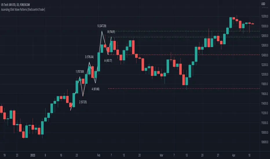
NEoWave Chart Free VersionAn automated wave chart for NEoWave wave analysis. This is an automated wave chart plotter that help you to find the current psychological trend and forecast the next one. This Indicator uses the concept of plotting wave charts as per the NeoWave method invented by Glenn Neely in 1990 in the “Mastering Elliott Wave” book. NEoWave is a advanced version of elliott wave theory, which solve the lots of drawback's and issues' of elliott wave theory.
The Logic and Concept used in Indicator
This indictor uses the logic of plotting wave chart as discussed in “Mastering Elliott Wave” book, According to “Mastering Elliott Wave” book to draw a wave chart draw a line from high to low or low to high in order that they occurred, and this indicator plot the line accurately from high to low or low to high in order they occurred.
Some Important Features
1. This indicator can draw wave chart from 5 Seconds to 5 Year or use any custom timeframe of your choice.
2. Use any timeframe wave chart on any timeframe cash data, like use monthly cash data to draw 2.5 years or 5 years wave chart.
3. Do the easy back testing with easy drag tool.
4. Customize wave chart settings based on your requirement.
5. Wave chart will be plotted on any type of charts like candlestick or bar chart.
6. Custom settings to hide other charts, like you can hide bar or candlestick chart, while using wave analysis.
7. Realtime plotting of wave chart from 5 seconds to 5 year.
Features to be added in future update
1. Show Monowave Counts.
2. Show Complexity levels.
3. Show Price and Time.
4. Show Starting point of patterns.
How to use this wave chart?
1. Use the log scale on wave chart. Use Alt + L to use logarithmic scale on chart.
2. Use log Fibonacci on wave chart, just open the settings of Fibonacci channel and check on "Fib channel based on log scale"
3. Find the correct starting point to mark the neowave patterns.
4. Apply the neowave rules as discussed in “Mastering Elliott Wave” book and forecast the market.
Note
If you want to check Daily or any higher timeframe wave chart use cash chart and if you want to check any other timeframe from 5 seconds to any intraday timeframe then use future's data as suggested by Mr. Glen Neely.

NEoWave Cash Data Pro by ArshiaRahimiNEoWave Cash Data Pro by ArshiaRahimi (Cash Data Display Indicator)
By using this indicator, you can see cash data in the Trading View Charts. Cash Data is NEoWave approach data and is used for wave counting of this type. Analysts of Elliot Wave approach can also benefit from this data.
In Cash Data, the state of high and low of the candles or in other words their chronology will be determined and the path of price movement will be indicated clearly.
You will have no limit to view cash data using this indicator and you will be able to view the cash data of any part of the chart you would like with a 100 percent precision. By default, Indicator shows MonoWave 500 in the ending part of the chart but in order to view the cash data of other parts, you only need to activate the option “ Custom Start” and by adjusting the date of drawing the cash data, you can make the cash data of the part you want to be displayed.
The cash data of each chart is displayed in 20 different timeframes including:
• Annual timeframe
• Monthly, 3month, 6 month timeframe
• weekly, 2 week timeframe
• daily, 2 day, 3 day timeframe
• 6 hour, 12 hour timeframe
• 4 hour, 8 hour timeframe
• 1 hour, 2 hour, 3 hour timeframe
• 5 minute, 10 minute, 15 minute, 30 minute timeframe
Other features are also incorporated in this indicator including:
• determination of cash data thickness
• determination of ascending MonoWaves color
• determination of descending MonoWaves color
• determination of connecting MonoWaves color
• displaying the MonoWaves which might be in question (when high and low occur in a candle)
• determination of the questionable MonoWaves color
• determination of the date and starting time of cash data drawing
• Drawing of the last cash data live and the possibility of determining its drawing delay.
• Displaying time slot separator lines
• Determination of separator lines color and transparency
• Displaying Fade Chart behind cash data
• determination of fade chart candles color and transparency
• displaying information table of cash data in the corner of the chart which include displaying time frame of the cash data and the number of MonoWaves that exist in the chart.
This indicator is designed by Arshia Rahimi of Iran NEoWave Institute. You can be in touch through “ArshiaRahimi” ID.
The Indicator will continuously receive its new updates. after publishing, each update will replace the previous version by trading view.

RSI or MACD + Tendance Kijun LTThis script is an update of my previous script "RSI + Tendance Kijun LT", I will not explain it here, if needed have a look at it :
I made a new script (and not update the previous one) because some people may not be interested by MACD and for performance perspective they may be interested to only have RSI (since you can't have both but only switch from RSI and MACD)
So now, you can choose to have MACD instead of RSI with long term trend based on Kijun still dispaying. Why am I adding MACD even if most of the time I never use it ? It's for Elliott Wave purpose and principaly for triangle. With MACD, you can easily identify if you're forming a triangle or not in an Elliott Wave perspective (I'm not speaking about chartist triangle).
As an example, you can see ETHUSD in daily and something looking similar to a triangle. We can trade it with many possibility (breakout, support/resistance) but I'm interested in to identify if it's a triangle with an EW count (not chartist) and if it's the case I will consider different scenario (triangle are most of the time wave 4 so we could have one more push leg down on this ticker)
So, in my daytrading I'm still always using RSI except when I want to verify if we have a triangle :) and I need to switch to MACD for that to check the following things :
- am I able to draw a triangle as the price did
- may I able to join A to C and B to D and still have a triangle on MACD
- If Yes, I will take care of E point because it's the start of the 5th wave (E point may be a truncated wave of the triangle and not join the line of points A to C)
By adding this in my strategy, I can anticipate different scenarios and invalidate them if I didn't get the triangle on MACD (by having a D point on MACD not respecting the triangle form). Don't forget, we can decide to don't trade a triangle as an EW count but still trade it as a chartist form (breakout or anything else).
In summary for the next days/weeks, on ETHUSD in daily time unit I will therefore wait and see if the price goes up to point D by being validated on the MACD. If so, then I will look at the possible formation of point E around prices 141$ and 156$, if at these prices I have short signals then it will be interesting to go back in short position
--------------------------------------------------------
Ce script est une mise à jour de mon script précédent "RSI + Tendance Kijun LT", je ne l'expliquerai pas ici, si besoin jetez-y un oeil :
J'ai fait un nouveau script (sans forcer la mise à jour du précédent) parce que certaines personnes peuvent ne pas être intéressées par MACD et pour des raisons de performance, elles peuvent être intéressées à n'avoir que RSI (puisque vous ne pouvez pas avoir les deux en même temps mais seulement passer de RSI et MACD)
Donc maintenant, vous pouvez choisir d'avoir MACD au lieu de RSI avec une tendance à long terme basée sur Kijun qui s'affiche toujours. Pourquoi est-ce que j'ajoute MACD même si la plupart du temps je ne l'utilise jamais ? C'est pour Elliott Wave et surtout pour le triangle. Avec MACD, vous pouvez facilement identifier si vous formez un triangle ou non dans une perspective Elliott Wave (je ne parle pas de triangle chartiste).
Par exemple, vous pouvez voir que sur ETHUSD en unité de temps journalière nous avons quelque chose qui ressemble à un triangle. Nous pouvons faire des trade de pleins de manières différentes (cassure d'oblique, support/résistance) mais je suis intéressé d'identifier si c'est un triangle avec un compte EW (pas chartiste) et si c'est le cas, je vais envisager un scénario différent (sachant que les triangles sont la plupart du temps la vague 4 et donc envisager à la sortie une dernière poussée baissière type vague 5 sur ETHUSD)
Donc, dans mon daytrading, j'utilise toujours RSI sauf quand je veux vérifier si nous avons un triangle :) et j'ai besoin de passer à MACD afin de vérifier les éléments suivantes :
- Suis-je capable de dessiner un triangle comme le prix le dessine
- puis-je joindre A à C et B à D et toujours avoir un triangle sur MACD ?
- Si oui, je m'occupe du point E car c'est le début de la 5ème vague (le point E peut être une onde tronquée du triangle et ne pas joindre la ligne des points A à C).
En ajoutant cela dans ma stratégie, je peux anticiper différents scénarios et les invalider si je n'ai pas obtenu le triangle sur MACD (en ayant un point D sur MACD ne respectant pas la forme du triangle). N'oubliez pas, nous pouvons décider de ne pas le trade comme un triangle d'un décompte EW mais de le trade simplement comme un triangle chartiste (breakout ou autre chose).
En résumé pour les prochains jours/semaines, sur ETHUSD en unité de temps journalière je vais donc patienter et voir si le prix va jusqu'au point D en étant validé sur le MACD. Si oui, alors je regarderai l'éventuelle formation du point E autour des prix 141$ et 156$, si à ces prix j'ai des signaux vendeurs alors il sera intéressant de rentrer en position short

qEMA 3 LineMy scenario consists of 3 ema lines which are ema 34, ema89, ema 144.
3 ema lines are important in elliott waves:
- A complete elliott wave of 144 waves
- An eliott wave has 89 waves
- In wave with wave, in wave 89 again wave 34 waves
I used to find the waves in elliott, know where the cycle elliott will end up (when the price hit ema144)

Auto 5-Wave Fixed Channel + Wave 5 Top / Wave 2-ABC BottomAuto 5-Wave Fixed Channel + Wave 5 Top / Wave 2-ABC Bottom
by Ron999
1. What this indicator does
This tool automatically hunts for bullish 5-wave impulse structures and then:
Labels the waves: W1, W2, W3, W4, W5
Draws a fixed “acceleration” channel based on the wave structure
Projects a Wave-5 target zone using a 1.618 extension
Marks the Wave-2 level as an ABC correction target
Triggers optional alerts when:
A new Wave-5 top completes
An ABC bottom forms back near the Wave-2 low
It’s designed as a mechanical, rule-based approximation of Elliott 5-wave impulses – built for traders who like the idea of wave structure but want something objective and programmable.
2. How the wave logic works
The script continuously scans for pivot highs and lows using a user-defined Pivot Length.
It only keeps the last 5 alternating pivots (high → low → high → low → high).
When those last 5 pivots form this pattern:
Pivot 1 → High (W1)
Pivot 2 → Low (W2)
Pivot 3 → High (W3)
Pivot 4 → Low (W4)
Pivot 5 → High (W5)
…the indicator treats this as a bullish 5-wave impulse.
When such a structure is detected, it “locks in” the wave prices and bars and draws the channels and labels.
Note: Pivots are only confirmed after Pivot Length bars, so swings are slightly delayed by design (standard pivot logic).
3. Channels & levels
Once a valid bullish 5-wave structure is found, the script builds three key pieces:
a) Base Acceleration Channel (Blue)
Anchored from Wave-2 low toward Wave-3 high.
This forms a rising acceleration channel that represents the impulse leg.
The channel extends to the right, so you can see how price interacts with it after W3–W5.
b) Wave-5 Target Line (Red, dashed)
Uses the height from Wave-2 low to Wave-3 high.
Projects a 1.618 extension of that height above Wave-3.
This line acts as a potential Wave-5 exhaustion zone (take-profit / reversal watch area).
c) Wave-2 / ABC Bottom Level (Green, dotted)
Horizontal line drawn at the Wave-2 low.
This acts as a retest / corrective target for the ABC correction after the impulse completes.
When price later revisits this area (within a tolerance), the script can mark it as a potential ABC bottom.
4. Labels & signals
If labels are enabled:
W1, W2, W3, W4, W5 are plotted directly on their corresponding pivot bars.
When an ABC-style retest is detected near the Wave-2 level, an “ABC” label is printed at that low.
Wave-5 Top Event
Triggered when a new valid bullish 5-wave structure is completed.
The last pivot high in the pattern is flagged as Wave-5.
ABC Bottom Event
After a Wave-5 impulse, the script watches for new low pivots.
If a new low forms within ABC Bottom Proximity (%) of the Wave-2 price, it is treated as an ABC bottom near Wave-2 and marked on the chart.
5. Inputs & customization
Show Fixed Channels
Toggle all channel drawing on/off.
Label Waves
Toggle plotting of W1–W5 and ABC labels.
Alerts: Wave-5 Top & ABC Bottom
Master switch for enabling the script’s alert conditions.
Pivot Length
Controls how “swingy” the detection is.
Smaller values → more frequent, smaller waves
Larger values → fewer, larger structural waves
ABC Bottom Proximity (%)
Allowed percentage distance between the ABC low and the Wave-2 price.
Example: 5% means any ABC low within ±5% of Wave-2 is considered valid.
6. Alerts (how to use them)
The script exposes two alertcondition() events:
Wave-5 Top (Bullish Impulse)
Fires when a new 5-wave bullish structure completes.
Use this to watch for potential exhaustion tops or to tighten stops.
ABC Bottom near Wave-2 Low
Fires when an ABC-style correction prints a low near the Wave-2 level.
Use this to stalk potential end-of-correction entries in the direction of the original impulse.
On TradingView, add an alert to the script and choose the desired condition from the dropdown.
7. How to use it in your trading
This tool is best used as a structural context layer, not a standalone system:
Identify bullish impulsive trends when a Wave-5 structure completes.
Use the Wave-5 target line as a potential area for:
Scaling out
Watching for exhaustion / divergences / reversal patterns
Use the Wave-2/ABC level and ABC Bottom signal:
To look for end of correction entries back in the trend direction
To align with your own confluence (support/resistance, volume, RSI, etc.)
It works well on crypto, FX, indices, and stocks, especially on higher timeframes where structure is cleaner.
8. Limitations & notes
This is a mechanical approximation of Elliott 5-wave theory — it will not match every analyst’s discretionary count.
Pivots are confirmed after Pivot Length bars, so signals are not instant; they’re based on completed swings.
The indicator currently focuses on bullish impulses (upward 5-wave structures).
As always, this is not financial advice. Combine it with your own strategy, risk management, and confirmation tools.
Created & coded by: Ron999
Built for traders who want wave structure + fixed channels, without the subjective Elliott argument on every chart. files.catbox.moe

CS Ultimate OscillatorCS Ultimate Oscillator (Composite Indicator)
General Overview
The CS Ultimate Oscillator is an advanced "Composite" technical indicator. Unlike traditional oscillators that only look at one dimension of the market, this script mathematically fuses four of the most powerful indicators in trading (RSI, MACD, Elliott Waves, and MFI) into a single normalized signal.
Its primary objective is to eliminate market noise and provide high-probability entry signals by confirming price action with volume.
Under the Hood (Mathematical Logic)
The indicator calculates four components separately, normalizes their values to a common scale (approximately -1 to +1), and then sums them up to create the "Composite Value."
RSI (14): Measures the speed and change of price movements. Detects overbought and oversold conditions.
Elliott Wave Oscillator (EWO - 5/35): Measures the difference between a fast and a slow EMA. Helps identify the current wave cycle.
MACD (12, 26, 9): Provides trend direction and momentum.
MFI (Money Flow Index - 14): The key component. It incorporates VOLUME into the equation. If price rises but volume does not support the move, the MFI will drag the oscillator down, filtering out false breakouts.
Visual Guide: What are you seeing?
The Background Area (Soft Red/Green): This represents the total sum of all indicators (the "Composite").
Green (10% Opacity): The sum of forces is positive (Bullish Trend).
Red (10% Opacity): The sum of forces is negative (Bearish Trend).
Note: It is configured with high transparency to act as a non-distracting background "heatmap."
The White Line (Trend EMA): An Exponential Moving Average (default 9 periods) applied to the composite value. It acts as the "Main Signal" or trigger line, smoothing out the noise of the composite oscillator.
The Thin Colored Line (MACD Signal Component): This is the normalized MACD signal line. It changes color (Lime/Red) based on its own internal trend.
Trading Strategy and Signals
The indicator generates visual signals based on the crossover of the smoothed trend (White Line) against the MACD signal component.
1. BUY Signal (Green Triangle ▲)
Logic: The White Line (EMA 9) crosses UP over the Thin Line (MACD Signal).
Interpretation: The average market momentum, backed by volume and RSI, is exceeding its previous average and gaining bullish strength.
2. SELL Signal (Red Triangle ▼)
Logic: The White Line (EMA 9) crosses DOWN under the Thin Line (MACD Signal).
Interpretation: Buying momentum has been exhausted, and the confluence of indicators suggests the start of a bearish move.
3. Divergences (Advanced Usage)
Since this indicator includes volume (MFI), it is excellent for detecting divergences:
If Price makes a Higher High, but the CS Ultimate Area makes a Lower High, it is a very strong sell signal (volume is not supporting the rise).
Recommended Settings
Timeframes: Works best on 15m, 1H, and 4H.
EMA Length: Defaults to 9.
Lower it to 5-7 for Scalping (more signals, more false alarms).
Raise it to 14-21 for Swing Trading (fewer signals, more confirmation).
Conclusion
The CS Ultimate Oscillator is not just a "line cross" indicator. It is an automatic confluence tool. When you wait for a signal from this indicator, you aren't just waiting for a moving average cross; you are waiting for the RSI, MACD, Waves, and Volume to all agree on a direction.

Trading Mastery Indicator# Trading Mastery Indicator - Complete User Guide
## Overview
The Trading Mastery Indicator is a professional-grade technical analysis tool that provides high-probability trading signals with complete trade management information including entry, stop loss, and take profit levels.
## Key Features
- High-Quality Signal Detection: Identifies strong, medium, and weak trading opportunities
- Complete Trade Setup: Provides entry, stop loss, and take profit for every signal
- Risk Management: Calculates risk-to-reward ratios automatically
- Elliott Wave Analysis: Integrated wave pattern and position analysis
- Active Signal Tracking: Shows when you're currently in a trade
- Professional Alerts: Detailed notifications with all trade parameters
## Signal Quality Classification
### STRONG Signals (Premium Quality)
- Reliability: Highest probability setups
- Market Conditions: Strong trending environments
- Color: Teal for buys, Red for sells
- When to Trade: These are your primary trading opportunities
- Risk Profile: Lowest risk, highest reward potential
### MEDIUM Signals (Standard Quality)
- Reliability: Good probability setups
- Market Conditions: Moderate trend or consolidation breakouts
- Color: Gold for buys, Purple for sells (Change to Blue Gray)
- When to Trade: Secondary opportunities when strong signals are scarce
- Risk Profile: Moderate risk, good reward potential
### WEAK Signals (Entry Quality)
- Reliability: Lower probability setups
- Market Conditions: Counter-trend or unclear market structure
- Color: Coral for buys, Pink for sells
- When to Trade: Only for experienced traders in specific market conditions
- Risk Profile: Higher risk, variable reward
## How to Use the Indicator
### 1. Signal Settings Configuration
Signal Filter Options:
- All Signals: Shows every trading opportunity (strong, medium, weak)
- High Quality Only: Shows only the highest probability setups
- High + Medium Quality**: Balanced approach filtering out weak signals
Recommended Settings by Experience:
- Beginner: Use "High Quality Only"
- Intermediate: Use "High + Medium Quality"
- Advanced: Use "All Signals" with proper risk management
Label Controls:
- Label Position: Adjust how close labels appear to candles
- Label Text Size: Choose based on screen size and preference
- Maximum Labels: Control chart clutter (recommended: 20)
### 2. Understanding the Professional Panel
The panel provides real-time market intelligence:
Primary Trend: Market direction analysis
- BULLISH TREND: Look for buy opportunities only
- BEARISH TREND: Look for sell opportunities only
- CONSOLIDATION: Market indecision, trade with caution
Wave Pattern: Elliott Wave structure analysis
- IMPULSE UP: Strong bullish momentum
- IMPULSE DOWN: Strong bearish momentum
- CORRECTION: Sideways/corrective movement
Wave Position: Current Elliott Wave position
- WAVE 3 (STRONG): Most powerful moves, best for trend following
- WAVE 1 OR 5: Beginning or ending waves
- WAVE 2 OR 4: Corrective phases, lower probability
- CORRECTIVE ABC: Wait for pattern completion
Signal Grade: Current signal status
- SIGNAL ACTIVE: You're currently in a trade
- PREMIUM/STANDARD/SPECULATIVE: New signal quality
- NO SIGNAL: No current opportunities
Trading Bias: Overall market direction
- LONG BIAS: Focus on buy opportunities
- SHORT BIAS: Focus on sell opportunities
- NEUTRAL: No clear directional bias
### 3. Reading Signal Labels
Each signal provides complete trade setup information:
```
STRONG BUY
━━━━━━━━━━━━━━━━━━━━
💰 Entry: 1875.50
🛡️ SL: 1860.25
🎯 TP: 1905.75
📈 R:R = 1:2.0
━━━━━━━━━━━━━━━━━━━━
```
Understanding the Information:
- Entry: Exact price level to enter the trade
- SL: Stop loss level (risk management)
- TP: Take profit level (profit target)
- R:R: Risk-to-reward ratio (1:2.0 means you risk 1 to make 2)
### 4. Entry/TP/SL Level Lines
Visual trade management aids:
- Blue Solid Line: Entry level
- Red Dashed Line: Stop loss level
- Green Dashed Line: Take profit level
- Small Labels: "ENTRY", "SL", "TP" markers
## Trading Strategy Guidelines
### Trend Following Strategy
1. Check Panel: Ensure trend aligns with your trade direction
2. Wait for Signals: Only trade in the direction of the primary trend
3. Quality First: Focus on STRONG signals during trending markets
4. Wave Timing: WAVE 3 positions offer the best trending opportunities
### Reversal Strategy
1. Look for Divergence: Panel shows trend change signals
2. Wait for Confirmation: Don't jump early on potential reversals
3. Use MEDIUM Signals: Often good for catching early trend changes
4. Watch Wave Position: CORRECTIVE ABC patterns may signal trend completion
### Risk Management Rules
Position Sizing:
- Risk no more than 1-2% of account per trade
- Use the provided R:R ratios to calculate position sizes
- Stronger signals can justify slightly larger positions
Stop Loss Management:
- Always use the provided stop loss levels
- Never move stops against your position
- Consider trailing stops once trade moves in your favor
Take Profit Strategy:
- Use provided TP levels as minimum targets
- Consider taking partial profits at TP level
- Let strong trends run beyond TP in trending markets
## Best Practices by Timeframe
### Scalping (M1-M5)
- Use "High Quality Only" filter
- Focus on STRONG signals only
- Quick entry and exit
- Expect more false signals due to market noise
### Intraday Trading (M15-H1)
- Use "High + Medium Quality" filter
- Good balance of opportunity and reliability
- Hold trades for several hours
- Most versatile timeframe for the indicator
### Swing Trading (H4-Daily)
- Use "All Signals" with proper analysis
- Hold trades for days to weeks
- Most reliable signals on higher timeframes
- Best for beginners due to less noise
## Panel Customization
Position Options:
- Top Right: Default, doesn't interfere with price action
- Top Left: Good for wide screens
- Bottom corners: Keeps important info visible while analyzing tops
- Middle positions: Central reference, good for multi-monitor setups
Size Options:
- Small: Minimal screen space, good for small screens
- Normal: Balanced visibility and space usage
- Large: Easy reading, good for detailed analysis
Transparency: Adjust 0-95% based on preference and chart background
## Common Mistakes to Avoid
### Signal Interpretation Errors
- Don't ignore the trend: Trading against primary trend reduces success
- Don't chase weak signals: Focus on quality over quantity
- Don't ignore wave position: WAVE 2/4 corrections are lower probability
### Risk Management Errors
- Don't skip stop losses: Every signal includes SL for a reason
- Don't risk too much: Even strong signals can fail
- Don't move stops against position: Stick to the plan
### Psychological Errors
- Don't overtrade: Wait for quality setups
- Don't second-guess strong signals: Trust the analysis
- Don't panic on normal drawdowns: Expect some losing trades
## Alert Configuration
Enable alerts for:
- Strong signals: Primary trading opportunities
- Medium signals: Secondary opportunities (optional)
- Signal active status: Know when you're in trades
Alert messages include complete trade information for easy execution.
## Performance Optimization
### For Best Results:
1. Combine with price action: Look for confluence with support/resistance
2. Consider market sessions: Different sessions have different characteristics
3. Monitor news events: Avoid trading during high-impact news
4. Keep a trading journal: Track which signals work best for your style
### Regular Review:
- Weekly analysis: Review which signal types performed best
- Timeframe assessment: Determine your most profitable timeframes
- Strategy refinement: Adjust filters based on performance data
## Troubleshooting
If you're not seeing signals:
- Check that "Show Buy/Sell Signals" is enabled
- Verify your signal filter isn't too restrictive
- Market may be in a consolidation phase
If labels are cluttered:
- Reduce "Maximum Labels to Show"
- Change label position to "Far from Candle"
- Use smaller label text size
If panel is in the way:
- Change panel position
- Increase transparency
- Reduce panel size
- Toggle panel off temporarily
Remember: This indicator provides analysis and signals, but successful trading also requires proper risk management, emotional discipline, and understanding of market conditions. Always practice with demo accounts before risking real capital, and never risk more than you can afford to lose.
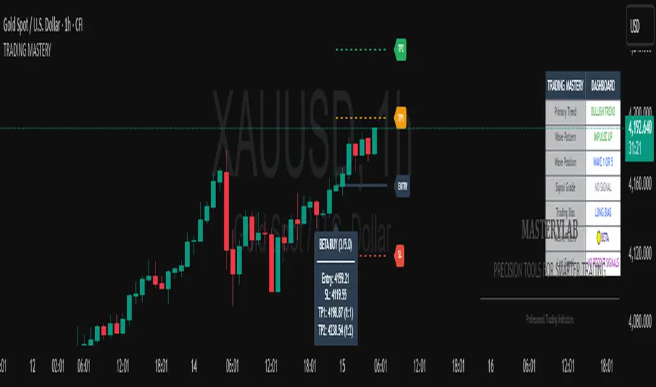
FlowThe indicator attempts to capture the volatility within a range and apply a set of Fibonacci calculations to display a range of bands of varying degrees which represents zones where exhaustion may occur on both sides.
So if price gets in to the yellow or pink zones then the script author is on high alert for a reversal. It must be noted that the user of the script should be fluent in Elliott Wave Analysis as the script was developed to help the author determine if a wave sequence may have ended.
When the indicator glides along one of the green, yellow or pink bands, then the instrument is likely in a 3rd wave, in Elliott wave speak, as such the user of the script would wait and not try to fade the move up or down as continuation is likely. Instead a move away from one of the bands should indicate another attempt at reaching the band after moving away. Thus, this move back in should be a 5th wave of some degree within the timeframe.
The indicator is not bound to any timeframe, as such it works on a 1 minute chart as it does on a weekly timeframe.
One of the observations the author makes is the use of the indicator within a sideways market. The indicator performs very well within these lower volatility environments by indicating exhaustion within these range bound markets.
So in essence, within the framework of Elliott wave analysis and respective time frames. Watch several higher and lower time frames.
1) Once wave 1 has completed
2) Look for a move down to the lower green / yellow zone to identify a wave 2 zone.
3) Once wave 3 starts, do not attempt to fade or short the first touch on the pink zone. Wait for price to move away and then come back in to the pink zone before considering a top and any attempts to fade.
4) Wave 4 should find support on the lower yellow or green band. Where it may be considered that price may change direction.
5) Depending on the time frame and any expected/unexpected extensions, Wave 5 may find resistance in to the pink zone.
A question that the author often asks is "where will wave 3 end?" - Will it end at the 1.618% extension of wave 1 & 2, the 176.4 or higher and perhaps lower. Using the pink zones the author has found it useful and quite accurate to make such a judgement based on the current position of the bands - Pink for exhaustion in an uptrend and green for exhaustion in a down trending market.
EW Convergence HUD (Pane) — v2.2.5📖 Description
The EW Convergence Suite is a dual-component Elliott-Wave inspired tool designed to help traders spot multi-timeframe convergence points — the places where waves across different timeframes terminate together and trend changes often ignite.
It contains two parts:
🔹 HUD (Pane)
Lives in the lower pane, one horizontal row per timeframe (1m → 1M).
Colors represent phase classification:
Lime = Impulse Up (+2)
Red = Impulse Down (−2)
Teal = Corrective Up (+1)
Orange = Corrective Down (−1)
Gray = Neutral/Unclear
Rows shift slightly up/down depending on impulse vs. corrective, so you can see transitions as diagonal “jumps.”
HUD ticker (top-right) shows current convergence state:
Example: IMP▲ = impulse up alignment on 3 TFs.
Example: ★ COR▼ = 4 TF corrective down alignment (special event).
🔹 Overlay Labels (on price chart)
Prints labels directly on the chart when convergence events meet your thresholds.
Shows which phases and which TFs are aligned at that moment.
Optional pivot confirmation:
Early mode → labels fire as soon as TFs align (onlyOnPivot=false).
Confirmed mode → labels fire only when convergence + a fresh pivot confirmation occur (onlyOnPivot=true + pivot lines on).
Can also draw multi-TF pivot lines to visually connect swing highs/lows across your chosen timeframes.
⚙️ Inputs & Customization
Timeframe Toggles → select which TFs to include in the convergence counts.
EMA Trend Stack (9/21/55/233/987 by default) → defines trend alignment for impulse vs. corrective classification.
Pivot left/right → sensitivity of swing highs/lows (2/2 = fast, 5/5 = smoother, 10/10+ = major swings).
MinN / SpecialN → thresholds for convergence events (regular vs. ★ special highlight).
Label Controls →
Only on pivot confirmations
Only on confirmed bars
Only when content changes
Minimum bar gap between labels
Wave Line Controls → toggle pivot-connecting lines per TF, with adjustable opacity and max lines stored.
🎯 How to Use
Scan the HUD for clusters of rows with the same color/phase. Flat plateaus across multiple TFs = strong alignment.
Wait for convergence counts (MinN or SpecialN) to be reached. HUD ticker will show IMP▲ or COR▼ with the TF list.
Watch the Overlay Labels on the price chart for where that convergence “hits” — optionally tied to fresh pivot confirmations.
Best practice:
Use lower TFs (1m/5m/15m) as entry triggers.
Use higher TFs (1h/4h/1D) as bias anchors.
Look for termination zones where both HUD alignment and Overlay labels agree.
🔑 Why it works
This indicator combines objective pivot detection with EMA-based trend structure to classify legs as impulsive or corrective. By watching multiple TFs simultaneously, it highlights the rare and powerful moments where waves across scales converge. These are often the cleanest points for entry, exit, or scaling.
Impulse convergence → continuation or breakout potential.
Corrective convergence → likely end of a pullback and resumption of higher-TF trend.
Pivot-gated mode → confirmation that the move is not just alignment, but a structural turn.
✅ Notes
This script does not attempt to count Elliott Waves strictly (1-2-3-4-5, A-B-C). Instead it provides a framework for convergence and context, letting you apply your own EW interpretation on top.
Works best when combined with your own risk management rules (stops, partials, capital buffer).
Default EMAs (9/21/55/233/987) and pivot lookbacks (3/3) are optimized for intraday trading; adjust for your style (scalp, swing, position).
⚡ Bottom line:
The EW Convergence Suite is like having a multi-timeframe radar + price-level marker that alerts you when Elliott-style phases across several TFs line up. It cuts through noise and helps you focus on the moments of real structural confluence.
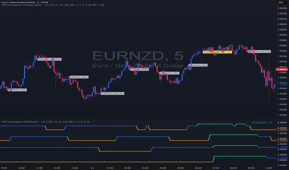

Wave1234 Flip tp Betawave1234 flip tp
A Trend-Following Indicator Powered by Elliott Wave & SMC – Know Where the Price Will Rise, Peak, and Reverse
Wave1234 Flip TP is a technical indicator built on the foundations of Elliott Wave Theory combined with insights from Smart Money Concepts (SMC). It's designed to help traders clearly identify:
✅ Where the price will start rising (precise entry after a confirmed reversal)
✅ Where the rally is likely to end (shows psychological Take Profit zones after Wave 4)
✅ And where the price is most likely to reverse down (based on key structural resistance)
🧠 How It Works:
The core mechanism of Wave1234 Flip TP is simple but powerful.
📈 Once a Buy signal appears — this marks the beginning of a new uptrend (confirmed by structure and reversal patterns).
➡️ From there, the system lets the trend run naturally, tracking the price through its impulsive movement (Wave 1 to 3) and its first meaningful correction (Wave 4).
✅ After Wave 4 forms, the indicator begins tracking potential reversal zones — based on both market psychology and institutional order flow.
🔹 This is when the green TP line appears — a projected take-profit zone where the rally may end.
💥 When price hits this zone and confirms exhaustion, the green TP line turns blue, signaling:
✅ Success – the trend has completed its cycle
🚨 Caution – momentum may reverse soon
This allows traders to exit at strength, or prepare for a potential short when structure shifts again.
หลักการของ Wave1234 Flip TP คือ “ปล่อยให้เทรนด์รันอย่างเป็นธรรมชาติ แล้วไปโฟกัสจุดกลับตัวที่สำคัญที่สุด”
📈 เมื่อเกิดสัญญาณ Buy — นั่นคือจุดเริ่มต้นของเทรนด์ขาขึ้นรอบใหม่ (ยืนยันโดยโครงสร้างราคาและแท่งกลับตัว)
จากนั้นเราจะ ปล่อยให้เทรนด์วิ่งไป โดยไม่ต้องรีบทำอะไร
…รอจนเข้าสู่ช่วงคลื่น 3 → 4 (Wave 3-4)
เพราะนั่นคือช่วงที่ “แรงซื้อเริ่มหมด”
✅ หลังจาก Wave 4 จบลง
อินดิเคเตอร์จะเริ่ม “คาดการณ์จุดกลับตัว” โดยใช้ทั้งพฤติกรรมจิตวิทยาตลาด และระดับราคาเชิงโครงสร้างที่สถาบันมองเห็น
🟩 เส้น TP สีเขียวจะปรากฏขึ้น — นี่คือโซนที่ควร เริ่มทยอยปิดกำไร
📉 และถ้าราคาวิ่ง ชนเส้นนี้จริง พร้อมมีสัญญาณยืนยัน
เส้นเขียวจะ เปลี่ยนเป็นสีฟ้า ทันที
💡 แปลว่า:
เทรนด์รอบนี้ “ไปถึงเป้าหมายแล้ว”
ความเสี่ยงที่จะกลับทิศกำลังสูงขึ้น
ถึงเวลาที่ต้อง “หยุดโลภ แล้วป้องกันกำไร”

Enhanced Neowave Wave 1 Finder with ZigZagThis script is an advanced technical analysis indicator for the TradingView platform, written in Pine Script version 5. Its primary goal is to identify potential Elliott Wave "Wave 1" patterns, enhanced with principles from Neowave theory and a custom ZigZag indicator for more accurate pivot detection. The script is designed to be overlaid on the main price chart.
Core Functionality: Blending ZigZag and Neowave
The indicator's methodology is a two-part process. First, it identifies significant price swings using a robust ZigZag indicator. Then, it analyzes these swings based on a set of rules derived from Neowave and classic technical analysis to validate them as potential Wave 1 patterns.
Part 1: ZigZag Integration
The first major component is a comprehensive ZigZag indicator that forms the foundation for all subsequent analysis.
Pivot Detection: The pivots() function is the engine of the ZigZag. It scans the historical price data for significant high and low points (pivots) over a user-defined Length.
Segment Drawing: Once pivots are identified, the script draws lines connecting them, creating the classic ZigZag pattern on the chart.
Extended Direction & Ratios: This is an enhanced feature. The script doesn't just identify highs and lows; it categorizes them as:
Higher High (HH) or Lower High (LH)
Lower Low (LL) or Higher Low (HL)
This classification is crucial for understanding the market structure. It also calculates the price ratio of the most recent ZigZag leg relative to the previous one, which is used later for pattern validation.
Dynamic Updates: The ZigZag is not static. On each new bar, it can update its most recent pivot point if a new, more extreme price (a higher high or a lower low) is printed before the direction officially changes. This ensures the ZigZag is always reflecting the most current and significant price action.
Part 2: Neowave Wave 1 Finder
With the market structure defined by the ZigZag, the second part of the script applies a rigorous set of rules to identify potential Wave 1 patterns. A Wave 1 is the initial move of a new trend in Elliott Wave theory.
Key Validation Criteria
For a price move between two ZigZag pivots to be considered a valid Wave 1, it must pass a series of checks:
Significance: The move must have a minimum percentage change (Minimum Wave Length) and last for a minimum number of bars, filtering out insignificant noise.
Volume Confirmation: A genuine impulse wave is typically supported by increasing volume. The script checks if the volume during the potential Wave 1 is significantly higher than the recent average (Volume Increase Threshold).
Momentum Alignment: The direction of the wave must be confirmed by momentum indicators.
For a bullish (upward) Wave 1, the Relative Strength Index (RSI) must be in a bullish regime (above 50) and the MACD line must be above its signal line.
For a bearish (downward) Wave 1, the RSI must be below 50 and the MACD line must be below its signal line.
Structural Analysis (Impulse vs. Diagonal): The script attempts to differentiate between two types of Wave 1:
Impulse Wave: A strong, clean, and direct move.
Diagonal Wave: A more complex, overlapping, and often wedge-shaped pattern. This is identified by analyzing the time and price complexity of the move, along with the ZigZag leg ratios.
Wave 2 Retracement Check: A critical Neowave rule is that a valid Wave 1 must be followed by a valid Wave 2 retracement. The script looks at the next ZigZag leg to ensure it doesn't retrace more than 100% of the potential Wave 1. It also uses the ZigZag ratios to confirm the retracement falls within typical Fibonacci levels (e.g., 38.2% to 78.6%).
Display and User Interface
The script provides a rich visual experience to aid the trader in their analysis.
Wave Labels and Boxes: When a valid Wave 1 is detected, it is highlighted with a colored line (green for bullish, red for bearish) and a shaded background box. A label clearly marks it as "Wave 1 IMPULSE" or "Wave 1 DIAGONAL".
Fibonacci Retracement Levels: Upon detection of a Wave 1, the script automatically draws key Fibonacci retracement levels (38.2%, 50%, 61.8%, 78.6%). These levels are potential targets for the end of the subsequent Wave 2, offering potential entry points for a Wave 3 trade.
Information Labels: Additional labels provide at-a-glance confirmation of the conditions, showing whether volume and momentum criteria were met.
Customizable Inputs: Users have extensive control over the indicator's parameters, including the ZigZag length, volume thresholds, RSI levels, and the colors of all visual elements.
Alerts: The indicator can be configured to generate an alert whenever a new bullish or bearish Wave 1 pattern is confirmed, allowing traders to be notified of potential opportunities in real-time.

Bullish Auto FibsBullish Auto Fibs Indicator
Description
The Bullish Auto Fibs indicator is a sophisticated tool designed for traders on the TradingView platform, specifically tailored for analyzing bullish price movements on XRP and other assets. It automatically plots Fibonacci retracement, B Wave, and extension levels based on a customizable ZigZag pattern, providing clear visual cues for potential support, resistance, and price targets. With a focus on the 15-minute timeframe, this indicator enhances technical analysis by dynamically updating Fibonacci levels as new pivot highs and lows are detected, ensuring traders stay aligned with evolving market trends.
Key Features:
Automatic Fibonacci Levels: Plots retracement (23.6%, 38.2%, 50%, 61.8%, 78.6%), B Wave (23.6% to 161.8%), and extension (100%, 161.8%, 261.8%) levels.
Dynamic ZigZag Detection: Identifies pivot highs and lows with an adjustable length (1–100 bars, default 20).
Real-Time Updates: Adjusts Fibonacci levels when new highs (for retracements) or lows (for B Wave and extensions) are detected, preserving key reference points like the B Wave pivot high.
Customizable Display: Toggle visibility for retracement, B Wave, and extension levels to suit your analysis needs.
Visual Clarity: Uses distinct colors (gray for retracements, yellow for B Wave, green for extensions) and labels for easy interpretation.
This indicator is ideal for traders employing Elliott Wave theory, Fibonacci-based strategies, or trend-following approaches, offering a robust framework for identifying key price levels in bullish markets.
User Manual
Configuration
The indicator’s settings can be adjusted via the “Settings” panel in TradingView:
Yellow ZigZag Length (default: 20, range: 1–100): Controls the sensitivity of pivot detection. Higher values detect more significant pivots; lower values increase sensitivity for shorter-term swings.
Show Retracement Fibs (default: true): Enable/disable retracement levels (low to high, 0% at high, 100% at low).
Show B Wave Fibs (default: true): Enable/disable B Wave levels (high to low, 100% at high, 0% at low, with extensions up to 161.8%).
Show Extension Fibs (default: true): Enable/disable extension levels (pivot low as 0%, projecting upward).
How It Works
ZigZag Pattern:
The indicator identifies pivot highs and lows using the ta.pivothigh and ta.pivotlow functions, with the specified yellowLength.
Pivots are marked with “H” (high) or “L” (low) labels in yellow.
Fibonacci Levels:
Retracement Fibs: Drawn from a pivot low (100%) to a pivot high (0%). Updates to a new high if detected, maintaining the original low.
B Wave Fibs: Drawn from a pivot high (100%) to a pivot low (0%), with extensions above 100%. Updates to a new low if detected, preserving the original high.
Extension Fibs: Drawn from a pivot low (0%) upward, based on the prior low-to-high wave length. Updates to a new low if detected.
Dynamic Updates:
Lines and labels extend to the current bar for active Fibonacci levels, ensuring real-time relevance.
When a new pivot is detected, previous levels are cleared, and new levels are drawn to reflect the latest price structure.
Usage Tips
Trend Confirmation: Use retracement levels to identify potential support zones during pullbacks in a bullish trend.
B Wave Analysis: Leverage B Wave levels for corrective wave targets, especially in Elliott Wave strategies.
Price Targets: Extension levels highlight potential bullish continuation zones.
Timeframe Flexibility: While optimized for 15-minute charts, adjust yellowLength for higher (e.g., 50–100) or lower (e.g., 5–10) timeframes.
Combine with Other Tools: Pair with trend indicators (e.g., moving averages) or oscillators (e.g., RSI) for enhanced decision-making.
Troubleshooting
No Levels Displayed: Ensure at least two pivots (high and low) are detected. Increase yellowLength if pivots are sparse.
Overlapping Labels: Reduce chart zoom or toggle off unnecessary Fibonacci types to declutter.
Performance Issues: The indicator limits arrays to 500 entries to prevent slowdowns. Older pivots are automatically removed.
Notes
The indicator is optimized for bullish markets but can be adapted for other assets by adjusting the ZigZag length.
For best results, test settings on historical data to align with your trading style.
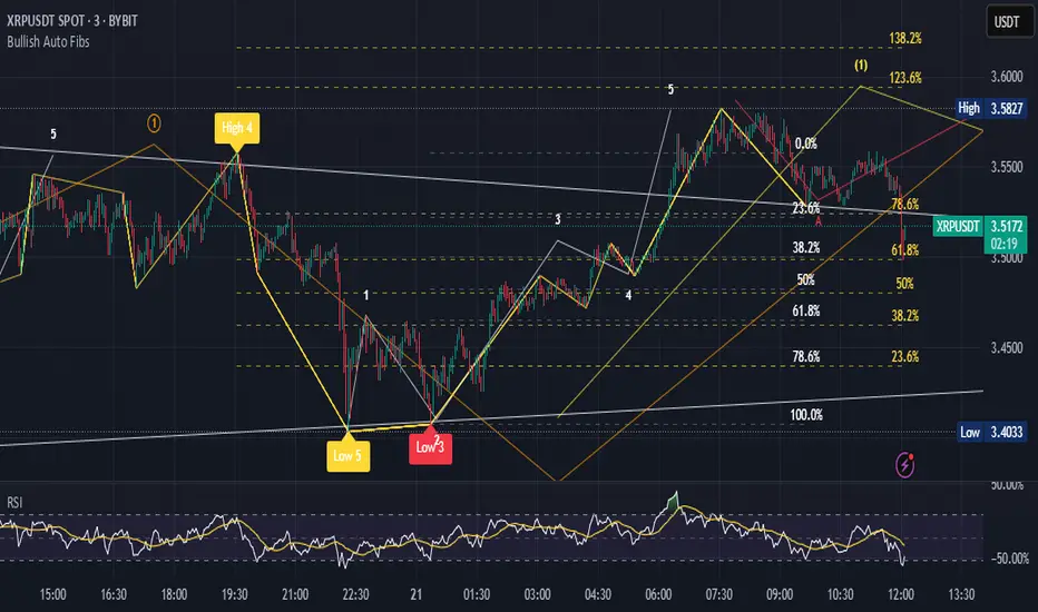
Single Line Fibs with Strict Overlap CheckSingle Line Fibs with Strict Overlap Check
Overview:
The "Single Line Fibs with Strict Overlap Check" indicator is a sophisticated tool designed for technical analysts and traders focusing on Elliott Wave theory. This indicator overlays Fibonacci retracement and extension levels on a price chart, specifically tailored for a single zigzag line (Line 2), to identify potential support, resistance, and impulse wave targets. It incorporates a strict overlap check to ensure valid impulse waves, adhering to Elliott Wave principles.
Key Features:
Zigzag Detection: Utilizes pivot highs and lows based on customizable lengths (White ZigZag: 2 bars, Yellow ZigZag: 15 bars) to construct a zigzag pattern.
Fibonacci Levels:
Retracements: 0.236, 0.382, 0.5, 0.618, 0.786 (gray, 50% transparency).
B Wave Extensions: 1.236, 1.386 (orange, 50% transparency).
Impulse Extensions: 1.0, 1.236, 1.386, 1.618 (green, 50% transparency), drawn from the next pivot low if valid.
Wave Count Filter: Displays Fibonacci levels only when the internal wave count from Line 1 reaches or exceeds a user-defined threshold (default: 5).
Overlap Validation: Implements a strict overlap check per Elliott Wave rules. If the next pivot low overlaps the previous high, no Impulse extensions are drawn, and a red 'X' (50% transparency) marks the invalid pivot low.
Customization:
White ZigZag Length: Adjusts the sensitivity of the initial pivot detection.
Yellow ZigZag Length: Sets the primary zigzag length.
Min Line 1 Waves for Line 2 Fib: Defines the minimum wave count threshold.
Enable Overlap Removal: Toggles the overlap validation feature.
Usage:
Apply the indicator to your chart (e.g., 30-minute timeframe).
Adjust input parameters to match your trading strategy (e.g., length2 = 15, waveThreshold12 = 5).
Observe Fibonacci levels appearing at pivot highs when the wave count threshold is met. Impulse extensions will only plot after a valid pivot low below the previous high.
Use the red 'X' as an alert for invalid impulse waves, indicating potential trend reversals or corrections.
Interpretation:
Retracements: Identify potential support levels within the upwave.
B Wave Extensions: Highlight extended correction targets.
Impulse Extensions: Project potential price targets for the next wave, valid only if the overlap check passes.
Red 'X': Signals an invalid impulse wave, suggesting a review of wave structure.
Limitations:
Designed for a single zigzag line; multi-line analysis requires additional customization.
Performance may vary with highly volatile instruments or short timeframes due to pivot sensitivity.
Author: Developed by ScottDog for TradingView users, this indicator leverages advanced Pine Script v6 features for precise wave analysis.
Version: 1.0 (Fail-Safe)
Last Updated: June 24, 2025

Grothendieck-Teichmüller Geometric SynthesisDskyz's Grothendieck-Teichmüller Geometric Synthesis (GTGS)
THEORETICAL FOUNDATION: A SYMPHONY OF GEOMETRIES
The 🎓 GTGS is built upon a revolutionary premise: that market dynamics can be modeled as geometric and topological structures. While not a literal academic implementation—such a task would demand computational power far beyond current trading platforms—it leverages core ideas from advanced mathematical theories as powerful analogies and frameworks for its algorithms. Each component translates an abstract concept into a practical market calculation, distinguishing GTGS by identifying deeper structural patterns rather than relying on standard statistical measures.
1. Grothendieck-Teichmüller Theory: Deforming Market Structure
The Theory : Studies symmetries and deformations of geometric objects, focusing on the "absolute" structure of mathematical spaces.
Indicator Analogy : The calculate_grothendieck_field function models price action as a "deformation" from its immediate state. Using the nth root of price ratios (math.pow(price_ratio, 1.0/prime)), it measures market "shape" stretching or compression, revealing underlying tensions and potential shifts.
2. Topos Theory & Sheaf Cohomology: From Local to Global Patterns
The Theory : A framework for assembling local properties into a global picture, with cohomology measuring "obstructions" to consistency.
Indicator Analogy : The calculate_topos_coherence function uses sine waves (math.sin) to represent local price "sections." Summing these yields a "cohomology" value, quantifying price action consistency. High values indicate coherent trends; low values signal conflict and uncertainty.
3. Tropical Geometry: Simplifying Complexity
The Theory : Transforms complex multiplicative problems into simpler, additive, piecewise-linear ones using min(a, b) for addition and a + b for multiplication.
Indicator Analogy : The calculate_tropical_metric function applies tropical_add(a, b) => math.min(a, b) to identify the "lowest energy" state among recent price points, pinpointing critical support levels non-linearly.
4. Motivic Cohomology & Non-Commutative Geometry
The Theory : Studies deep arithmetic and quantum-like properties of geometric spaces.
Indicator Analogy : The motivic_rank and spectral_triple functions compute weighted sums of historical prices to capture market "arithmetic complexity" and "spectral signature." Higher values reflect structured, harmonic price movements.
5. Perfectoid Spaces & Homotopy Type Theory
The Theory : Abstract fields dealing with p-adic numbers and logical foundations of mathematics.
Indicator Analogy : The perfectoid_conv and type_coherence functions analyze price convergence and path identity, assessing the "fractal dust" of price differences and price path cohesion, adding fractal and logical analysis.
The Combination is Key : No single theory dominates. GTGS ’s Unified Field synthesizes all seven perspectives into a comprehensive score, ensuring signals reflect deep structural alignment across mathematical domains.
🎛️ INPUTS: CONFIGURING THE GEOMETRIC ENGINE
The GTGS offers a suite of customizable inputs, allowing traders to tailor its behavior to specific timeframes, market sectors, and trading styles. Below is a detailed breakdown of key input groups, their functionality, and optimization strategies, leveraging provided tooltips for precision.
Grothendieck-Teichmüller Theory Inputs
🧬 Deformation Depth (Absolute Galois) :
What It Is : Controls the depth of Galois group deformations analyzed in market structure.
How It Works : Measures price action deformations under automorphisms of the absolute Galois group, capturing market symmetries.
Optimization :
Higher Values (15-20) : Captures deeper symmetries, ideal for major trends in swing trading (4H-1D).
Lower Values (3-8) : Responsive to local deformations, suited for scalping (1-5min).
Timeframes :
Scalping (1-5min) : 3-6 for quick local shifts.
Day Trading (15min-1H) : 8-12 for balanced analysis.
Swing Trading (4H-1D) : 12-20 for deep structural trends.
Sectors :
Stocks : Use 8-12 for stable trends.
Crypto : 3-8 for volatile, short-term moves.
Forex : 12-15 for smooth, cyclical patterns.
Pro Tip : Increase in trending markets to filter noise; decrease in choppy markets for sensitivity.
🗼 Teichmüller Tower Height :
What It Is : Determines the height of the Teichmüller modular tower for hierarchical pattern detection.
How It Works : Builds modular levels to identify nested market patterns.
Optimization :
Higher Values (6-8) : Detects complex fractals, ideal for swing trading.
Lower Values (2-4) : Focuses on primary patterns, faster for scalping.
Timeframes :
Scalping : 2-3 for speed.
Day Trading : 4-5 for balanced patterns.
Swing Trading : 5-8 for deep fractals.
Sectors :
Indices : 5-8 for robust, long-term patterns.
Crypto : 2-4 for rapid shifts.
Commodities : 4-6 for cyclical trends.
Pro Tip : Higher towers reveal hidden fractals but may slow computation; adjust based on hardware.
🔢 Galois Prime Base :
What It Is : Sets the prime base for Galois field computations.
How It Works : Defines the field extension characteristic for market analysis.
Optimization :
Prime Characteristics :
2 : Binary markets (up/down).
3 : Ternary states (bull/bear/neutral).
5 : Pentagonal symmetry (Elliott waves).
7 : Heptagonal cycles (weekly patterns).
11,13,17,19 : Higher-order patterns.
Timeframes :
Scalping/Day Trading : 2 or 3 for simplicity.
Swing Trading : 5 or 7 for wave or cycle detection.
Sectors :
Forex : 5 for Elliott wave alignment.
Stocks : 7 for weekly cycle consistency.
Crypto : 3 for volatile state shifts.
Pro Tip : Use 7 for most markets; 5 for Elliott wave traders.
Topos Theory & Sheaf Cohomology Inputs
🏛️ Temporal Site Size :
What It Is : Defines the number of time points in the topological site.
How It Works : Sets the local neighborhood for sheaf computations, affecting cohomology smoothness.
Optimization :
Higher Values (30-50) : Smoother cohomology, better for trends in swing trading.
Lower Values (5-15) : Responsive, ideal for reversals in scalping.
Timeframes :
Scalping : 5-10 for quick responses.
Day Trading : 15-25 for balanced analysis.
Swing Trading : 25-50 for smooth trends.
Sectors :
Stocks : 25-35 for stable trends.
Crypto : 5-15 for volatility.
Forex : 20-30 for smooth cycles.
Pro Tip : Match site size to your average holding period in bars for optimal coherence.
📐 Sheaf Cohomology Degree :
What It Is : Sets the maximum degree of cohomology groups computed.
How It Works : Higher degrees capture complex topological obstructions.
Optimization :
Degree Meanings :
1 : Simple obstructions (basic support/resistance).
2 : Cohomological pairs (double tops/bottoms).
3 : Triple intersections (complex patterns).
4-5 : Higher-order structures (rare events).
Timeframes :
Scalping/Day Trading : 1-2 for simplicity.
Swing Trading : 3 for complex patterns.
Sectors :
Indices : 2-3 for robust patterns.
Crypto : 1-2 for rapid shifts.
Commodities : 3-4 for cyclical events.
Pro Tip : Degree 3 is optimal for most trading; higher degrees for research or rare event detection.
🌐 Grothendieck Topology :
What It Is : Chooses the Grothendieck topology for the site.
How It Works : Affects how local data integrates into global patterns.
Optimization :
Topology Characteristics :
Étale : Finest topology, captures local-global principles.
Nisnevich : A1-invariant, good for trends.
Zariski : Coarse but robust, filters noise.
Fpqc : Faithfully flat, highly sensitive.
Sectors :
Stocks : Zariski for stability.
Crypto : Étale for sensitivity.
Forex : Nisnevich for smooth trends.
Indices : Zariski for robustness.
Timeframes :
Scalping : Étale for precision.
Swing Trading : Nisnevich or Zariski for reliability.
Pro Tip : Start with Étale for precision; switch to Zariski in noisy markets.
Unified Field Configuration Inputs
⚛️ Field Coupling Constant :
What It Is : Sets the interaction strength between geometric components.
How It Works : Controls signal amplification in the unified field equation.
Optimization :
Higher Values (0.5-1.0) : Strong coupling, amplified signals for ranging markets.
Lower Values (0.001-0.1) : Subtle signals for trending markets.
Timeframes :
Scalping : 0.5-0.8 for quick, strong signals.
Swing Trading : 0.1-0.3 for trend confirmation.
Sectors :
Crypto : 0.5-1.0 for volatility.
Stocks : 0.1-0.3 for stability.
Forex : 0.3-0.5 for balance.
Pro Tip : Default 0.137 (fine structure constant) is a balanced starting point; adjust up in choppy markets.
📐 Geometric Weighting Scheme :
What It Is : Determines the framework for combining geometric components.
How It Works : Adjusts emphasis on different mathematical structures.
Optimization :
Scheme Characteristics :
Canonical : Equal weighting, balanced.
Derived : Emphasizes higher-order structures.
Motivic : Prioritizes arithmetic properties.
Spectral : Focuses on frequency domain.
Sectors :
Stocks : Canonical for balance.
Crypto : Spectral for volatility.
Forex : Derived for structured moves.
Indices : Motivic for arithmetic cycles.
Timeframes :
Day Trading : Canonical or Derived for flexibility.
Swing Trading : Motivic for long-term cycles.
Pro Tip : Start with Canonical; experiment with Spectral in volatile markets.
Dashboard and Visual Configuration Inputs
📋 Show Enhanced Dashboard, 📏 Size, 📍 Position :
What They Are : Control dashboard visibility, size, and placement.
How They Work : Display key metrics like Unified Field , Resonance , and Signal Quality .
Optimization :
Scalping : Small size, Bottom Right for minimal chart obstruction.
Swing Trading : Large size, Top Right for detailed analysis.
Sectors : Universal across markets; adjust size based on screen setup.
Pro Tip : Use Large for analysis, Small for live trading.
📐 Show Motivic Cohomology Bands, 🌊 Morphism Flow, 🔮 Future Projection, 🔷 Holographic Mesh, ⚛️ Spectral Flow :
What They Are : Toggle visual elements representing mathematical calculations.
How They Work : Provide intuitive representations of market dynamics.
Optimization :
Timeframes :
Scalping : Enable Morphism Flow and Spectral Flow for momentum.
Swing Trading : Enable all for comprehensive analysis.
Sectors :
Crypto : Emphasize Morphism Flow and Future Projection for volatility.
Stocks : Focus on Cohomology Bands for stable trends.
Pro Tip : Disable non-essential visuals in fast markets to reduce clutter.
🌫️ Field Transparency, 🔄 Web Recursion Depth, 🎨 Mesh Color Scheme :
What They Are : Adjust visual clarity, complexity, and color.
How They Work : Enhance interpretability of visual elements.
Optimization :
Transparency : 30-50 for balanced visibility; lower for analysis.
Recursion Depth : 6-8 for balanced detail; lower for older hardware.
Color Scheme :
Purple/Blue : Analytical focus.
Green/Orange : Trading momentum.
Pro Tip : Use Neon Purple for deep analysis; Neon Green for active trading.
⏱️ Minimum Bars Between Signals :
What It Is : Minimum number of bars required between consecutive signals.
How It Works : Prevents signal clustering by enforcing a cooldown period.
Optimization :
Higher Values (10-20) : Fewer signals, avoids whipsaws, suited for swing trading.
Lower Values (0-5) : More responsive, allows quick reversals, ideal for scalping.
Timeframes :
Scalping : 0-2 bars for rapid signals.
Day Trading : 3-5 bars for balance.
Swing Trading : 5-10 bars for stability.
Sectors :
Crypto : 0-3 for volatility.
Stocks : 5-10 for trend clarity.
Forex : 3-7 for cyclical moves.
Pro Tip : Increase in choppy markets to filter noise.
Hardcoded Parameters
Tropical, Motivic, Spectral, Perfectoid, Homotopy Inputs : Fixed to optimize performance but influence calculations (e.g., tropical_degree=4 for support levels, perfectoid_prime=5 for convergence).
Optimization : Experiment with codebase modifications if advanced customization is needed, but defaults are robust across markets.
🎨 ADVANCED VISUAL SYSTEM: TRADING IN A GEOMETRIC UNIVERSE
The GTTMTSF ’s visuals are direct representations of its mathematics, designed for intuitive and precise trading decisions.
Motivic Cohomology Bands :
What They Are : Dynamic bands ( H⁰ , H¹ , H² ) representing cohomological support/resistance.
Color & Meaning : Colors reflect energy levels ( H⁰ tightest, H² widest). Breaks into H¹ signal momentum; H² touches suggest reversals.
How to Trade : Use for stop-loss/profit-taking. Band bounces with Dashboard confirmation are high-probability setups.
Morphism Flow (Webbing) :
What It Is : White particle streams visualizing market momentum.
Interpretation : Dense flows indicate strong trends; sparse flows signal consolidation.
How to Trade : Follow dominant flow direction; new flows post-consolidation signal trend starts.
Future Projection Web (Fractal Grid) :
What It Is : Fibonacci-period fractal projections of support/resistance.
Color & Meaning : Three-layer lines (white shadow, glow, colored quantum) with labels showing price, topological class, anomaly strength (φ), resonance (ρ), and obstruction ( H¹ ). ⚡ marks extreme anomalies.
How to Trade : Target ⚡/● levels for entries/exits. High-anomaly levels with weakening Unified Field are reversal setups.
Holographic Mesh & Spectral Flow :
What They Are : Visuals of harmonic interference and spectral energy.
How to Trade : Bright mesh nodes or strong Spectral Flow warn of building pressure before price movement.
📊 THE GEOMETRIC DASHBOARD: YOUR MISSION CONTROL
The Dashboard translates complex mathematics into actionable intelligence.
Unified Field & Signals :
FIELD : Master value (-10 to +10), synthesizing all geometric components. Extreme readings (>5 or <-5) signal structural limits, often preceding reversals or continuations.
RESONANCE : Measures harmony between geometric field and price-volume momentum. Positive amplifies bullish moves; negative amplifies bearish moves.
SIGNAL QUALITY : Confidence meter rating alignment. Trade only STRONG or EXCEPTIONAL signals for high-probability setups.
Geometric Components :
What They Are : Breakdown of seven mathematical engines.
How to Use : Watch for convergence. A strong Unified Field is reliable when components (e.g., Grothendieck , Topos , Motivic ) align. Divergence warns of trend weakening.
Signal Performance :
What It Is : Tracks indicator signal performance.
How to Use : Assesses real-time performance to build confidence and understand system behavior.
🚀 DEVELOPMENT & UNIQUENESS: BEYOND CONVENTIONAL ANALYSIS
The GTTMTSF was developed to analyze markets as evolving geometric objects, not statistical time-series.
Why This Is Unlike Anything Else :
Theoretical Depth : Uses geometry and topology, identifying patterns invisible to statistical tools.
Holistic Synthesis : Integrates seven deep mathematical frameworks into a cohesive Unified Field .
Creative Implementation : Translates PhD-level mathematics into functional Pine Script , blending theory and practice.
Immersive Visualization : Transforms charts into dynamic geometric landscapes for intuitive market understanding.
The GTTMTSF is more than an indicator; it’s a new lens for viewing markets, for traders seeking deeper insight into hidden order within chaos.
" Where there is matter, there is geometry. " - Johannes Kepler
— Dskyz , Trade with insight. Trade with anticipation.

Risk-Adjusted Momentum Oscillator# Risk-Adjusted Momentum Oscillator (RAMO): Momentum Analysis with Integrated Risk Assessment
## 1. Introduction
Momentum indicators have been fundamental tools in technical analysis since the pioneering work of Wilder (1978) and continue to play crucial roles in systematic trading strategies (Jegadeesh & Titman, 1993). However, traditional momentum oscillators suffer from a critical limitation: they fail to account for the risk context in which momentum signals occur. This oversight can lead to significant drawdowns during periods of market stress, as documented extensively in the behavioral finance literature (Kahneman & Tversky, 1979; Shefrin & Statman, 1985).
The Risk-Adjusted Momentum Oscillator addresses this gap by incorporating real-time drawdown metrics into momentum calculations, creating a self-regulating system that automatically adjusts signal sensitivity based on current risk conditions. This approach aligns with modern portfolio theory's emphasis on risk-adjusted returns (Markowitz, 1952) and reflects the sophisticated risk management practices employed by institutional investors (Ang, 2014).
## 2. Theoretical Foundation
### 2.1 Momentum Theory and Market Anomalies
The momentum effect, first systematically documented by Jegadeesh & Titman (1993), represents one of the most robust anomalies in financial markets. Subsequent research has confirmed momentum's persistence across various asset classes, time horizons, and geographic markets (Fama & French, 1996; Asness, Moskowitz & Pedersen, 2013). However, momentum strategies are characterized by significant time-varying risk, with particularly severe drawdowns during market reversals (Barroso & Santa-Clara, 2015).
### 2.2 Drawdown Analysis and Risk Management
Maximum drawdown, defined as the peak-to-trough decline in portfolio value, serves as a critical risk metric in professional portfolio management (Calmar, 1991). Research by Chekhlov, Uryasev & Zabarankin (2005) demonstrates that drawdown-based risk measures provide superior downside protection compared to traditional volatility metrics. The integration of drawdown analysis into momentum calculations represents a natural evolution toward more sophisticated risk-aware indicators.
### 2.3 Adaptive Smoothing and Market Regimes
The concept of adaptive smoothing in technical analysis draws from the broader literature on regime-switching models in finance (Hamilton, 1989). Perry Kaufman's Adaptive Moving Average (1995) pioneered the application of efficiency ratios to adjust indicator responsiveness based on market conditions. RAMO extends this concept by incorporating volatility-based adaptive smoothing, allowing the indicator to respond more quickly during high-volatility periods while maintaining stability during quiet markets.
## 3. Methodology
### 3.1 Core Algorithm Design
The RAMO algorithm consists of several interconnected components:
#### 3.1.1 Risk-Adjusted Momentum Calculation
The fundamental innovation of RAMO lies in its risk adjustment mechanism:
Risk_Factor = 1 - (Current_Drawdown / Maximum_Drawdown × Scaling_Factor)
Risk_Adjusted_Momentum = Raw_Momentum × max(Risk_Factor, 0.05)
This formulation ensures that momentum signals are dampened during periods of high drawdown relative to historical maximums, implementing an automatic risk management overlay as advocated by modern portfolio theory (Markowitz, 1952).
#### 3.1.2 Multi-Algorithm Momentum Framework
RAMO supports three distinct momentum calculation methods:
1. Rate of Change: Traditional percentage-based momentum (Pring, 2002)
2. Price Momentum: Absolute price differences
3. Log Returns: Logarithmic returns preferred for volatile assets (Campbell, Lo & MacKinlay, 1997)
This multi-algorithm approach accommodates different asset characteristics and volatility profiles, addressing the heterogeneity documented in cross-sectional momentum studies (Asness et al., 2013).
### 3.2 Leading Indicator Components
#### 3.2.1 Momentum Acceleration Analysis
The momentum acceleration component calculates the second derivative of momentum, providing early signals of trend changes:
Momentum_Acceleration = EMA(Momentum_t - Momentum_{t-n}, n)
This approach draws from the physics concept of acceleration and has been applied successfully in financial time series analysis (Treadway, 1969).
#### 3.2.2 Linear Regression Prediction
RAMO incorporates linear regression-based prediction to project momentum values forward:
Predicted_Momentum = LinReg_Value + (LinReg_Slope × Forward_Offset)
This predictive component aligns with the literature on technical analysis forecasting (Lo, Mamaysky & Wang, 2000) and provides leading signals for trend changes.
#### 3.2.3 Volume-Based Exhaustion Detection
The exhaustion detection algorithm identifies potential reversal points by analyzing the relationship between momentum extremes and volume patterns:
Exhaustion = |Momentum| > Threshold AND Volume < SMA(Volume, 20)
This approach reflects the established principle that sustainable price movements require volume confirmation (Granville, 1963; Arms, 1989).
### 3.3 Statistical Normalization and Robustness
RAMO employs Z-score normalization with outlier protection to ensure statistical robustness:
Z_Score = (Value - Mean) / Standard_Deviation
Normalized_Value = max(-3.5, min(3.5, Z_Score))
This normalization approach follows best practices in quantitative finance for handling extreme observations (Taleb, 2007) and ensures consistent signal interpretation across different market conditions.
### 3.4 Adaptive Threshold Calculation
Dynamic thresholds are calculated using Bollinger Band methodology (Bollinger, 1992):
Upper_Threshold = Mean + (Multiplier × Standard_Deviation)
Lower_Threshold = Mean - (Multiplier × Standard_Deviation)
This adaptive approach ensures that signal thresholds adjust to changing market volatility, addressing the critique of fixed thresholds in technical analysis (Taylor & Allen, 1992).
## 4. Implementation Details
### 4.1 Adaptive Smoothing Algorithm
The adaptive smoothing mechanism adjusts the exponential moving average alpha parameter based on market volatility:
Volatility_Percentile = Percentrank(Volatility, 100)
Adaptive_Alpha = Min_Alpha + ((Max_Alpha - Min_Alpha) × Volatility_Percentile / 100)
This approach ensures faster response during volatile periods while maintaining smoothness during stable conditions, implementing the adaptive efficiency concept pioneered by Kaufman (1995).
### 4.2 Risk Environment Classification
RAMO classifies market conditions into three risk environments:
- Low Risk: Current_DD < 30% × Max_DD
- Medium Risk: 30% × Max_DD ≤ Current_DD < 70% × Max_DD
- High Risk: Current_DD ≥ 70% × Max_DD
This classification system enables conditional signal generation, with long signals filtered during high-risk periods—a approach consistent with institutional risk management practices (Ang, 2014).
## 5. Signal Generation and Interpretation
### 5.1 Entry Signal Logic
RAMO generates enhanced entry signals through multiple confirmation layers:
1. Primary Signal: Crossover between indicator and signal line
2. Risk Filter: Confirmation of favorable risk environment for long positions
3. Leading Component: Early warning signals via acceleration analysis
4. Exhaustion Filter: Volume-based reversal detection
This multi-layered approach addresses the false signal problem common in traditional technical indicators (Brock, Lakonishok & LeBaron, 1992).
### 5.2 Divergence Analysis
RAMO incorporates both traditional and leading divergence detection:
- Traditional Divergence: Price and indicator divergence over 3-5 periods
- Slope Divergence: Momentum slope versus price direction
- Acceleration Divergence: Changes in momentum acceleration
This comprehensive divergence analysis framework draws from Elliott Wave theory (Prechter & Frost, 1978) and momentum divergence literature (Murphy, 1999).
## 6. Empirical Advantages and Applications
### 6.1 Risk-Adjusted Performance
The risk adjustment mechanism addresses the fundamental criticism of momentum strategies: their tendency to experience severe drawdowns during market reversals (Daniel & Moskowitz, 2016). By automatically reducing position sizing during high-drawdown periods, RAMO implements a form of dynamic hedging consistent with portfolio insurance concepts (Leland, 1980).
### 6.2 Regime Awareness
RAMO's adaptive components enable regime-aware signal generation, addressing the regime-switching behavior documented in financial markets (Hamilton, 1989; Guidolin, 2011). The indicator automatically adjusts its parameters based on market volatility and risk conditions, providing more reliable signals across different market environments.
### 6.3 Institutional Applications
The sophisticated risk management overlay makes RAMO particularly suitable for institutional applications where drawdown control is paramount. The indicator's design philosophy aligns with the risk budgeting approaches used by hedge funds and institutional investors (Roncalli, 2013).
## 7. Limitations and Future Research
### 7.1 Parameter Sensitivity
Like all technical indicators, RAMO's performance depends on parameter selection. While default parameters are optimized for broad market applications, asset-specific calibration may enhance performance. Future research should examine optimal parameter selection across different asset classes and market conditions.
### 7.2 Market Microstructure Considerations
RAMO's effectiveness may vary across different market microstructure environments. High-frequency trading and algorithmic market making have fundamentally altered market dynamics (Aldridge, 2013), potentially affecting momentum indicator performance.
### 7.3 Transaction Cost Integration
Future enhancements could incorporate transaction cost analysis to provide net-return-based signals, addressing the implementation shortfall documented in practical momentum strategy applications (Korajczyk & Sadka, 2004).
## References
Aldridge, I. (2013). *High-Frequency Trading: A Practical Guide to Algorithmic Strategies and Trading Systems*. 2nd ed. Hoboken, NJ: John Wiley & Sons.
Ang, A. (2014). *Asset Management: A Systematic Approach to Factor Investing*. New York: Oxford University Press.
Arms, R. W. (1989). *The Arms Index (TRIN): An Introduction to the Volume Analysis of Stock and Bond Markets*. Homewood, IL: Dow Jones-Irwin.
Asness, C. S., Moskowitz, T. J., & Pedersen, L. H. (2013). Value and momentum everywhere. *Journal of Finance*, 68(3), 929-985.
Barroso, P., & Santa-Clara, P. (2015). Momentum has its moments. *Journal of Financial Economics*, 116(1), 111-120.
Bollinger, J. (1992). *Bollinger on Bollinger Bands*. New York: McGraw-Hill.
Brock, W., Lakonishok, J., & LeBaron, B. (1992). Simple technical trading rules and the stochastic properties of stock returns. *Journal of Finance*, 47(5), 1731-1764.
Calmar, T. (1991). The Calmar ratio: A smoother tool. *Futures*, 20(1), 40.
Campbell, J. Y., Lo, A. W., & MacKinlay, A. C. (1997). *The Econometrics of Financial Markets*. Princeton, NJ: Princeton University Press.
Chekhlov, A., Uryasev, S., & Zabarankin, M. (2005). Drawdown measure in portfolio optimization. *International Journal of Theoretical and Applied Finance*, 8(1), 13-58.
Daniel, K., & Moskowitz, T. J. (2016). Momentum crashes. *Journal of Financial Economics*, 122(2), 221-247.
Fama, E. F., & French, K. R. (1996). Multifactor explanations of asset pricing anomalies. *Journal of Finance*, 51(1), 55-84.
Granville, J. E. (1963). *Granville's New Key to Stock Market Profits*. Englewood Cliffs, NJ: Prentice-Hall.
Guidolin, M. (2011). Markov switching models in empirical finance. In D. N. Drukker (Ed.), *Missing Data Methods: Time-Series Methods and Applications* (pp. 1-86). Bingley: Emerald Group Publishing.
Hamilton, J. D. (1989). A new approach to the economic analysis of nonstationary time series and the business cycle. *Econometrica*, 57(2), 357-384.
Jegadeesh, N., & Titman, S. (1993). Returns to buying winners and selling losers: Implications for stock market efficiency. *Journal of Finance*, 48(1), 65-91.
Kahneman, D., & Tversky, A. (1979). Prospect theory: An analysis of decision under risk. *Econometrica*, 47(2), 263-291.
Kaufman, P. J. (1995). *Smarter Trading: Improving Performance in Changing Markets*. New York: McGraw-Hill.
Korajczyk, R. A., & Sadka, R. (2004). Are momentum profits robust to trading costs? *Journal of Finance*, 59(3), 1039-1082.
Leland, H. E. (1980). Who should buy portfolio insurance? *Journal of Finance*, 35(2), 581-594.
Lo, A. W., Mamaysky, H., & Wang, J. (2000). Foundations of technical analysis: Computational algorithms, statistical inference, and empirical implementation. *Journal of Finance*, 55(4), 1705-1765.
Markowitz, H. (1952). Portfolio selection. *Journal of Finance*, 7(1), 77-91.
Murphy, J. J. (1999). *Technical Analysis of the Financial Markets: A Comprehensive Guide to Trading Methods and Applications*. New York: New York Institute of Finance.
Prechter, R. R., & Frost, A. J. (1978). *Elliott Wave Principle: Key to Market Behavior*. Gainesville, GA: New Classics Library.
Pring, M. J. (2002). *Technical Analysis Explained: The Successful Investor's Guide to Spotting Investment Trends and Turning Points*. 4th ed. New York: McGraw-Hill.
Roncalli, T. (2013). *Introduction to Risk Parity and Budgeting*. Boca Raton, FL: CRC Press.
Shefrin, H., & Statman, M. (1985). The disposition to sell winners too early and ride losers too long: Theory and evidence. *Journal of Finance*, 40(3), 777-790.
Taleb, N. N. (2007). *The Black Swan: The Impact of the Highly Improbable*. New York: Random House.
Taylor, M. P., & Allen, H. (1992). The use of technical analysis in the foreign exchange market. *Journal of International Money and Finance*, 11(3), 304-314.
Treadway, A. B. (1969). On rational entrepreneurial behavior and the demand for investment. *Review of Economic Studies*, 36(2), 227-239.
Wilder, J. W. (1978). *New Concepts in Technical Trading Systems*. Greensboro, NC: Trend Research.
NEoWave Chart Cash Data The NEoWave Chart Cash Data indicator is an efficient tool for generating wave charts or cash data based on the NeoWave method, benefiting not only NeoWave analysts but also Elliott Wave practitioners. This indicator produces cash data with exceptional precision.
Developed by Glenn Neely, NeoWave is considered a more complete, scientific, and innovative iteration of the Elliott Wave theory. This method relies on a specialized chart known as a "wave chart" or "cash data," which, when drawn manually by recording the highest and lowest prices in their order of occurrence, is a complex and time-consuming process. However, this indicator automatically and in real-time identifies the highest and lowest prices for any symbol and time frame, plotting them in sequence. For instance, in a daily time frame, it separates each month's data and prepares a "monthly cash data chart" for analysis using the NeoWave method.
Fully compatible with all account types, this tool enables the creation of cash data across various time frames (from minutes to years) and customizable scales. Its standout features include real-time updates, watermarking capabilities, display of useful data in tables, detection of suspicious monowaves (where the highest and lowest prices occur within the same candlestick), simultaneous display of two cash data charts with different time frames, and the ability to view cash data for any desired time period.
CASH DATA TIMEFRAMES
The core feature of this indicator is CASH DATA TIMEFRAMES, which generates and displays Cash Data based on your base timeframe. Here’s how it works:
.1 Minute ("1"): Cash Data: 5, 10, 15, 30, 60, 120, 180 minutes
.3 Minutes ("3"): Cash Data: 30, 60, 120, 180, 240 minutes
.5 Minutes ("5"): Cash Data: 30, 60, 120, 180, 240 minutes, 1 day (1D)
.15 Minutes ("15"): Cash Data: 120, 180, 240 minutes, 1 day (1D), 2 days (2D), 3 days (3D)
.30 Minutes ("30"): Cash Data: 180, 240 minutes, 1 day (1D), 2 days (2D), 3 days (3D), 1 week (1W)
.1 Hour ("60"): Cash Data: 1 day (1D), 2 days (2D), 3 days (3D), 1 week (1W), 2 weeks (2W)
.2 Hours ("120"): Cash Data: 1 day (1D), 2 days (2D), 3 days (3D), 1 week (1W), 2 weeks (2W), 1 month (1M)
.3 Hours ("180"): Cash Data: 1 day (1D), 2 days (2D), 3 days (3D), 1 week (1W), 2 weeks (2W), 1 month (1M)
.4 Hours ("240"): Cash Data: 2 days (2D), 3 days (3D), 1 week (1W), 2 weeks (2W), 1 month (1M), 2 months (2M)
.Daily ("D"): Cash Data: 1 week (1W), 2 weeks (2W), 1 month (1M), 2 months (2M), 3 months (3M), 6 months (6M), 12 months (12M)
.Weekly ("W"): Cash Data: 2 months (2M), 3 months (3M), 6 months (6M)
.Monthly ("M"): Cash Data: 6 months (6M), 12 months (12M)
Suspicious monowaves
Suspicious monowaves, visible in the "Inputs" section under the label "Sus Monowaves," are highlighted in red upon detection. This occurs when the highest and lowest prices within a given time period appear in a single candlestick. As illustrated, suspicious monowaves are marked with red squares, and the candlestick indicated by a red arrow is the trigger for identifying these monowaves.
In such instances, our indicator automatically plots the monowaves with high precision. This feature is tailored for users seeking cash data of the utmost accuracy. Whenever these monowaves appear on the chart, it is recommended that users examine the suspicious monowaves in a lower time frame for further analysis.
Other Cash Data TF
One of the key features of this indicator is the "Other Cash Data TF" option, which, when enabled, allows you to create two cash data charts with different time frames within your base time frame. This feature becomes particularly useful when, for example, your base time frame is daily, and you’ve identified a pattern like a zigzag in the monthly cash data. To confirm this pattern, you need to examine the internal waves A and C to determine whether they are impulsive. By activating this option and setting "Other TF" to a weekly time frame, you can easily analyze the internal waves of your chosen wave without altering the base time frame.
When this option is activated, a column is added to the table, indicating that the "Base TF" is daily, "Cash Data TF" is monthly, and "Other Cash Data TF" is weekly (as shown in the image below).
Other features of the indicator include:
.A Table providing useful information such as the symbol, base time frame, cash data time frame (Cash Data TF), number of monowaves, and live price.
.Customizable options for the table (including color, size, and column removal), watermark, cash data lines, suspicious monowaves, and more.
.A Time Separator that divides the chart into equal periods.
.The ability to add a watermark.