High/Low bandsGives good idea about trend. In last 100 days the lowest price was this. In last 100 days the highest price was this. Price makes new 100 days high! (uptrend)Indicatore Pine Script®di scolilay1133
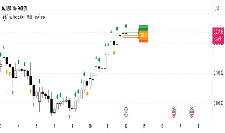
High/Low Break AlertUse for bias direction of trend. Suitable for H4 and above.Indicatore Pine Script®di PVBabyFatherAggiornato 36
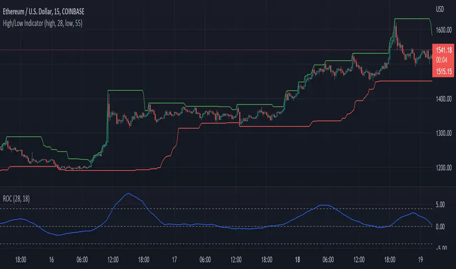
High/Low IndicatorThis is the coolest indicator you'll ever use. Do cool stuff with it.Indicatore Pine Script®di lazy_capitalist22117
High/Low ChannelChannel based on smoothed highest/lowest lookback pricesIndicatore Pine Script®di coingrabberAggiornato 110
High_Low_ProjectionHigh Low Projections of daily/weekly/quarterly/yearly price movement. Dark/night mode version. Green when broken through to upside, red when broken through to bottom side. Indicatore Pine Script®di Enkindel11161
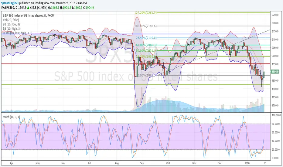
High Low Bollinger Bands Better than Bollinger Bands for finding extreme points timed by an oscillator where the price is statistically likely to stay inside the boundaries. Good for setting credit spreads such as call and put vertical spreads. Indicatore Pine Script®di SpreadEagle7111347
Market Structure Dashboard | Flux ChartsGENERAL OVERVIEW Market Structure Dashboard is a multi-timeframe market structure analysis indicator. It combines EMA trend detection, swing high/low tracking, market structure labels, Order Block detection, Fair Value Gap detection, liquidity sweep detection, volume analysis, volatility analysis, trading sessions, ICT killzones, a weighted trend bias system, and HTF levels into one unified dashboard. Each component is calculated independently across up to 7 configurable timeframes and displayed together in a single organized view. (Screenshot: Full dashboard overview - all sections visible) (Screenshot: Dashboard on a busy chart showing OB/FVG boxes, swing labels, HTF lines) WHAT IS THE THEORY BEHIND THIS INDICATOR? The core idea is that a trade setup becomes more reliable when multiple timeframes agree on direction. A bullish signal on a 5-minute chart carries more weight when the 15-minute, 1-hour, and daily timeframes also show bullish conditions. Analyzing each timeframe separately is both time-consuming and prone to error. The Market Structure Dashboard automates this process by calculating key metrics across all enabled timeframes and presenting them side by side. The indicator draws from two established trading methodologies. Smart Money Concepts (SMC) focuses on identifying institutional footprints in price action through patterns like Order Blocks, Fair Value Gaps, and liquidity sweeps. Inner Circle Trader (ICT) methodology emphasizes time-based analysis through specific trading windows called killzones and the importance of previous day, week, and month highs and lows. Rather than treating these concepts in isolation, the dashboard organizes them into a layered framework. Structure shows where the market has been. Zones show where it may react. Sessions and killzones show when activity tends to increase. The trend bias system combines all factors into a single weighted score, giving traders a quick read on overall market sentiment across timeframes. The purpose of the Market Structure Dashboard is to present the current market activity across multiple timeframes and how these conditions relate to earlier market structure, volume, and timing. (Screenshot: Multi-timeframe confluence example - all TFs showing bearish alignment) (Screenshot: Multi-timeframe disagreement example - mixed signals across TFs) MARKET STRUCTURE DASHBOARD FEATURES The Market Structure Dashboard indicator includes 14 main features: EMA Trend Detection Swing High/Low Tracking Market Structure Labels (HH/HL/LH/LL) Order Block Detection Fair Value Gap Detection Liquidity Sweep & Reclaim Detection Volume Analysis Volatility Analysis Trading Sessions ICT Killzones Trend Bias System HTF Levels (PDH/L, PWH/L, PMH/L) Visual Overlays Dashboard Customization Each component operates independently while sharing the same underlying market structure logic. All features are calculated across up to 7 user-configurable timeframes and displayed in a unified dashboard. Detailed explanations for each component are provided in the sections that follow. EMA TREND DETECTION 🔹 What is an EMA? An Exponential Moving Average (EMA) is a type of moving average that gives more weight to recent price data. Unlike a Simple Moving Average that weights all prices equally, the EMA responds faster to recent price changes while still considering historical data. Traders use EMAs to identify trend direction and dynamic support/resistance levels. When price trades above the EMA, the short-term trend is considered bullish. When price trades below the EMA, the short-term trend is considered bearish. The distance between price and EMA can indicate trend strength, with larger distances suggesting stronger momentum. 🔹 How the Indicator Uses EMA The dashboard calculates a 9-period EMA (configurable) for each enabled timeframe. The EMA Trend column displays both direction and distance. ◇ Direction is shown with an up arrow (↑) when price is above EMA, or a down arrow (↓) when price is below EMA. ◇ Distance is displayed as percentage, price, or pips based on the Distance Display setting. For example, "+0.45% ↑" means price is 0.45% above the EMA on that timeframe. ◇ Color coding shows green when price is above EMA (bullish) and red when price is below EMA (bearish). The EMA can optionally be plotted as a visual overlay on the chart. It can also be included as a factor in the Trend Bias calculation, where each timeframe's EMA direction contributes to the overall bias score. (Screenshot: EMA column showing bearish readings - red, ↓) SWING HIGH/LOW TRACKING 🔹 What are Swing Highs and Lows? A swing high is a price peak where a candle's high is higher than the highs of surrounding candles. A swing low is a price trough where a candle's low is lower than the lows of surrounding candles. These points represent short-term reversals and define the boundaries of price movement. Swing points are foundational to market structure analysis. Breaking a swing high suggests bullish momentum. Breaking a swing low suggests bearish momentum. The sequence of swing points creates market structure patterns that reveal trend direction. 🔹 How the Indicator Tracks Swing Highs/Lows? The indicator detects swing points using a configurable Swing Length parameter (default: 5). A swing high is confirmed when a candle's high is higher than the specified number of candles on both sides. A swing low is confirmed when a candle's low is lower than the specified number of candles on both sides. This confirmation requirement means swing points are identified with a delay, ensuring they are valid pivots rather than temporary spikes. This same Swing Length setting is also used by Order Block detection and Market Structure labels, so adjusting it affects all three features. ◇ The Swing H/L column displays a visual position indicator showing where price sits within the current swing range. A dot moves along a bar between L (swing low) and H (swing high) to show exact position. ◇ When price breaks outside the range, arrows indicate the direction. An up arrow (↑) appears when price breaks above the swing high. A swing high break indicates that buyers have pushed price beyond the previous peak, suggesting bullish momentum and a potential continuation higher. (Screenshot: Price above Swing High) A down arrow (↓) appears when price breaks below the swing low. A swing low break indicates that sellers have pushed price beyond the previous trough, suggesting bearish momentum and a potential continuation lower (Screenshot: Price breaks Swing Low) When a liquidity sweep occurs (price breaks a level then reclaims it), special arrows appear: ⤴ for a swept and reclaimed low, ⤵ for a swept and reclaimed high. A swept and reclaimed swing means price broke beyond the level, likely triggering stop-loss orders resting beyond it, but then reversed back inside the range. This suggests the breakout was a false move and the opposite direction may follow. Liquidity sweeps are explained in detail in the Liquidity Sweep & Reclaim Detection section below. ◇ Color coding shows green when price is in the lower half of the range or breaks above the swing high, and red when price is in the upper half or breaks below the swing low. (Screenshot) ◇ Tooltips provide additional context when hovering over any Swing H/L cell, such as "Price is nearing swing low on 15M" or "Price above swing high on 1H - swing high broken." MARKET STRUCTURE LABELS (HH/HL/LH/LL) 🔹 What is Market Structure? Market structure refers to the pattern of swing highs and swing lows that price creates over time. By comparing consecutive swing points, each new swing can be classified into one of four types. ◇ HH (Higher High): A swing high that is higher than the previous swing high, indicating bullish momentum. ◇ HL (Higher Low): A swing low that is higher than the previous swing low, indicating bullish momentum. ◇ LH (Lower High): A swing high that is lower than the previous swing high, indicating bearish momentum. ◇ LL (Lower Low): A swing low that is lower than the previous swing low, indicating bearish momentum. (Screenshot: Bullish and Bearish Swing Points) Bullish structure consists of HH and HL patterns, where price makes higher highs and higher lows. Bearish structure consists of LH and LL patterns, where price makes lower highs and lower lows. Mixed structure contains conflicting patterns and indicates consolidation or potential trend change. 🔹 How the Indicator Displays Market Structure The Structure column shows the last three structure labels in sequence along with an overall bias arrow. ◇ "LL-LH-HL →" indicates mixed structure with no clear direction. ◇ "HH-HL-HH ↑" indicates bullish structure with higher highs and higher lows. ◇ "LH-LL-LH ↓" indicates bearish structure with lower highs and lower lows. (Screenshot: Dashboard showing neutral, bearish and bullish indication across different timeframes) The indicator tracks each new swing point as it forms, compares it to the previous swing of the same type, and assigns the appropriate label. Market Structure labels use the same Swing Length setting as Swing High/Low tracking, so both features stay synchronized. Structure bias is determined by the most recent high type and low type combined. If the last swing high was HH and the last swing low was HL, bias is bullish. If the last swing high was LH and the last swing low was LL, bias is bearish. Any other combination shows neutral. Color coding shows green for bullish structure, red for bearish structure, and gray for mixed or neutral structure. ORDER BLOCK DETECTION 🔹 What is an Order Block? An Order Block is a concept from Smart Money analysis representing a candle or consolidation area where institutional orders may have been placed. In SMC methodology, Order Blocks are identified as the last opposing candle before a significant price move that breaks market structure. ◇ A Bullish Order Block is the last bearish candle before a rally that breaks a swing high. When price returns to this zone, it may find support. ◇ A Bearish Order Block is the last bullish candle before a drop that breaks a swing low. When price returns to this zone, it may find resistance. Order Blocks are considered "mitigated" when price trades completely through them, suggesting the institutional orders have been filled. 🔹 How the Indicator Detects Order Blocks The detection algorithm follows a specific sequence to identify valid Order Blocks. ◇ Step 1: The indicator tracks swing highs and swing lows using the configured Swing Length setting (shared with Swing High/Low tracking and Market Structure labels). ◇ Step 2: When price breaks above a swing high, the indicator identifies a bullish breakout. When price breaks below a swing low, it identifies a bearish breakout. ◇ Step 3: For a bullish Order Block, the indicator finds the candle with the lowest low between the broken swing high and the current bar. For a bearish Order Block, it finds the candle with the highest high between the broken swing low and the current bar. ◇ Step 4: The Order Block zone is created spanning from that candle's low to its high. ◇ Step 5: Mitigation is applied when price closes through the Order Block. Bullish OBs are mitigated when price closes below the zone. Bearish OBs are mitigated when price closes above the zone. The Order Block column shows the nearest unmitigated Order Block for each timeframe. "IN BULL OB ↑" means price is currently inside a bullish Order Block. "BULL OB (5.4%) ↑" means the nearest OB is bullish and 5.5% away. "NONE" means no unmitigated Order Blocks exist on that timeframe. (Screenshot: Nearest order block is Bull OB) (Screenshot: Price in Bear OB) FAIR VALUE GAP DETECTION 🔹What is a Fair Value Gap? A Fair Value Gap (FVG), also called an imbalance, is a three-candle pattern where a gap exists between the first and third candle that the middle candle did not fill. This gap represents an area where price moved quickly, creating an imbalance in the market. ◇ A Bullish FVG forms when the first candle's high is lower than the third candle's low, creating an upward gap. When price returns to this gap, it may find support. ◇ A Bearish FVG forms when the first candle's low is higher than the third candle's high, creating a downward gap. When price returns to this gap, it may find resistance. FVGs are considered mitigated when price wicks into the gap, filling the inefficiency. 🔹 How the Indicator Detects FVGs The detection logic checks for the three-candle gap pattern with specific conditions. ◇ For a Bullish FVG, the current candle's low must be above the candle from three bars ago's high (gap exists), and the middle candle must be bullish (displacement candle). ◇ For a Bearish FVG, the current candle's high must be below the candle from three bars ago's low (gap exists), and the middle candle must be bearish (displacement candle). ◇ The FVG zone spans from the gap's bottom to its top. ◇ Mitigation occurs when price wicks below the gap bottom for bullish FVGs, or above the gap top for bearish FVGs. Note that FVG mitigation is more sensitive than Order Block mitigation. FVGs only need a wick to touch them, while Order Blocks require a close through them. The FVG column displays similarly to Order Blocks. "IN BULL FVG ↑" means price is inside a bullish Fair Value Gap. "BULL FVG (0.2%) ↑" means the nearest FVG is bullish and 0.2% away. "NONE" means no unmitigated FVGs exist on that timeframe. (Screenshot: Price in Bull FVG) (Screenshot: Bear FVG +3.4% away) LIQUIDITY SWEEP & RECLAIM DETECTION 🔹 What is a Liquidity Sweep? Liquidity refers to resting orders in the market, particularly stop-loss orders. Traders commonly place stops just beyond swing highs and swing lows, creating pools of liquidity at these levels. A liquidity sweep occurs when price breaks beyond a swing point, potentially triggering stops, but then reverses and closes back inside the range. ◇ A Bullish Liquidity Sweep occurs when price breaks below a swing low, then reverses and closes back above it. This pattern suggests potential buying interest after weak hands have been stopped out. ◇ A Bearish Liquidity Sweep occurs when price breaks above a swing high, then reverses and closes back below it. This pattern suggests potential selling interest after weak hands have been stopped out. 🔹 How the Indicator Detects Liquidity Sweeps The indicator tracks whether each swing level has been broken and then reclaimed. ◇ A swing low is marked as broken when price trades below it. A swing high is marked as broken when price trades above it. ◇ A reclaim is detected when price closes back above a broken swing low (bullish) or back below a broken swing high (bearish). ◇ The break and reclaim flags reset when a new swing point forms, ensuring fresh detection for each level. When a liquidity sweep is detected, the Swing H/L column displays special indicators. The ⤴ symbol indicates a bullish liquidity sweep where price swept the low and reclaimed. The ⤵ symbol indicates a bearish liquidity sweep where price swept the high and reclaimed. Tooltips provide additional context such as "Liquidity sweep - price swept swing low and reclaimed on 15M." (Screenshot: Swing High Swept) (Screenshot: Previous Month Low Swept) VOLUME ANALYSIS 🔹 What is Volume Analysis? Volume represents the number of shares, contracts, or units traded during a given period. High volume suggests strong interest and participation behind a price move. Low volume suggests weak interest and moves may lack follow-through. Comparing current volume to average volume helps identify unusual activity. 🔹 How the Indicator Analyzes Volume The dashboard calculates current volume as a percentage of its 20-period simple moving average. ◇ The Volume column displays a visual bar using filled and empty blocks to represent volume level relative to average. ◇ Volume states are classified as EXTREME (over 200% of average), HIGH (over 120%), NORMAL (over 80%), LOW (over 50%), or VERY LOW (50% or less). (Screenshot: Extreme Volume) ◇ Color coding shows yellow for extreme volume, orange for high volume, and gray for normal, low, and very low. ◇ Tooltips show the exact percentage, such as "Volume is currently at 145% of average." VOLATILITY ANALYSIS 🔹 What is Volatility? Volatility measures how much price fluctuates over a given period. High volatility means large price swings. Low volatility means small price movements. The Average True Range (ATR) is a common volatility measure that calculates the average of true ranges over a period. 🔹 How the Indicator Measures Volatility The dashboard calculates a 14-period ATR and compares it to its own 20-period average (configurable). ◇ The Volatility column displays the current state as HIGH (ATR over 130% of average), NORMAL (ATR between 70-130% of average), or LOW (ATR under 70% of average). ◇ Color coding shows red for high volatility, gray for normal, and green for low volatility. ◇ Tooltips provide context such as "Volatility is currently high" or "Volatility is currently low." Low volatility often precedes significant moves, making it a useful setup indicator when combined with price at key levels. (Screenshot: High Volatility) TRADING SESSIONS 🔹 What are Trading Sessions? Financial markets have varying activity levels throughout the day. Trading is typically divided into three major sessions based on which financial centers are open. ◇ Asian Session runs from 7:00 PM to 3:00 AM EST. It is characterized by generally lower volatility and ranging price action ◇ London Session runs from 3:00 AM to 12:00 PM EST. It is characterized by higher volatility and trending moves ◇ New York Session runs from 8:00 AM to 5:00 PM EST. It has high volatility especially during the London overlap from 8:00 AM to 12:00 PM EST, affecting USD pairs and all majors. 🔹 How the Indicator Displays Sessions The Session column shows the current session name in the first row as ASIAN, LONDON, NEW YORK, or OFF HOURS (between sessions from 5:00 PM to 7:00 PM EST). ◇ The second row shows a progress bar that fills as the session advances, with each block representing approximately one hour. ◇ Sessions are color-coded as blue for Asian, green for London, orange for New York, and gray for off hours. These colors can be customized in the settings ◇ The indicator uses New York (EST) timezone for all session calculations and includes replay mode support. (Asian Session and Killzone) ICT KILLZONES 🔹 What are Killzones? Killzones are specific time windows within each trading session when market activity tends to be higher. These windows are derived from ICT (Inner Circle Trader) methodology and represent times when significant moves are more likely to occur. ◇ Asian Killzone runs from 8:00 PM to 12:00 AM EST and often sets the initial range for the day. ◇ London Killzone runs from 2:00 AM to 5:00 AM EST and covers the London open when major moves are common. ◇ New York AM Killzone runs from 9:30 AM to 11:00 AM EST and covers the NYSE open, a high volume period. ◇ New York Lunch runs from 12:00 PM to 1:00 PM EST and typically has lower activity and consolidation. ◇ New York PM Killzone runs from 1:30 PM to 4:00 PM EST when afternoon continuation moves occur. 🔹 How the Indicator Displays Killzones The Killzone column shows the current killzone in the first row as ASIAN KZ, LONDON KZ, NY AM KZ, NY LUNCH, NY PM KZ, or NO KILLZONE when outside all killzones. ◇ When outside a killzone, the second row shows a countdown to the next killzone, such as "NY AM KZ in 2h:15m." ◇ Killzones are color-coded as blue for Asian, green for London, orange for NY AM, gray for NY Lunch, and purple for NY PM. These colors can be customized in the settings TREND BIAS SYSTEM 🔹 What is Trend Bias? The Trend Bias System aggregates multiple factors across all enabled timeframes to produce a single directional bias score. Instead of analyzing each factor and timeframe separately, this system provides a weighted summary of overall market sentiment. 🔹 How the Indicator Calculates Trend Bias The calculation involves three components working together. (Screenshot: BTC Bearish Trend) ◇ Factors determine what contributes to bias. Users can enable or disable Structure (market structure bias), Order Block (direction of nearest OB), FVG (direction of nearest FVG), EMA Trend (price position relative to EMA), and Swing Position (where price sits in the swing range). Each enabled factor contributes +1 for bullish, -1 for bearish, or 0 for neutral per timeframe. ◇ Weights determine how much each timeframe matters. Each timeframe has a configurable weight from 0 to 10. Default weights are 1 for 1M and 5M, 2 for 15M, 1H, and 4H, 3 for Daily, and 4 for Weekly. Higher weights mean that timeframe contributes more to the final score. (Screenshot: Gold Bullish Trend) ◇ Score Calculation combines factors and weights. For each active timeframe, the sum of factor scores is multiplied by the timeframe's weight. The total score is the sum of all timeframe scores. The maximum possible score is the sum of each weight multiplied by the number of enabled factors. The bias percentage equals the total score divided by the maximum possible score, multiplied by 100. ◇ Bias Labels are assigned based on percentage. Over 50% shows BULLISH ↑. Between 20% and 50% shows LEAN BULL ↑. Between -20% and 20% shows NEUTRAL →. Between -50% and -20% shows LEAN BEAR ↓. Below -50% shows BEARISH ↓. The Trend Bias column displays the bias label in the first row and the raw score in the second row, such as "+22/60" meaning 22 points out of 60 possible. HTF LEVELS (PDH/L, PWH/L, PMH/L) 🔹 What are HTF Levels? Higher Timeframe (HTF) Levels are significant price points from previous completed periods. These levels represent clear, objective reference points that many traders watch. ◇ PDH/PDL (Previous Day High/Low) are the high and low of the previous completed trading day and act as intraday support and resistance. ◇ PWH/PWL (Previous Week High/Low) are the high and low of the previous completed week and are significant levels for swing trading. ◇ PMH/PML (Previous Month High/Low) are the high and low of the previous completed month and are major levels for position trading. 🔹 How the Indicator Displays HTF Levels The HTF Levels Dashboard section (optional) shows a swing-style position bar for each enabled level, displaying where price sits within the previous day, week, or month range. ◇ The same liquidity sweep detection applies to HTF levels. If price sweeps PDL and reclaims, the ⤴ indicator appears. (Screenshot: Previous Week Low Swept) ◇ Visual overlays can plot HTF level lines on the chart with customizable colors and line styles. ◇ When multiple levels are close together, labels automatically combine. For example, "PDH/PWH" appears when both levels are at similar prices, or "PDL/PWL/PML" when all three lows align. (Screenshot: PWH/PMH labels combined when Previous Week Low and Previous Month Low align) VISUAL OVERLAYS Beyond the dashboard, the indicator offers optional visual overlays that plot directly on the price chart. 🔹 Order Block Zones When enabled, Order Blocks appear as semi-transparent rectangular boxes. Green boxes represent bullish Order Blocks and red boxes represent bearish Order Blocks. Boxes span from the OB candle's low to its high and extend forward based on the Extend setting. Optional labels show "OB ↑" or "OB ↓" inside the zones. 🔹 FVG Zones Fair Value Gaps appear as boxes with dashed borders to distinguish them from Order Blocks. Green dashed boxes represent bullish FVGs and red dashed boxes represent bearish FVGs. They share the same extend and label options as Order Blocks. (Order Blocks & Fair Value Gaps) 🔹 Swing Labels HH, HL, LH, and LL labels can be plotted directly at each swing point on the chart. Labels appear above swing highs and below swing lows. Green labels indicate bullish structure (HH, HL) and red labels indicate bearish structure (LH, LL). The Show Last setting controls how many labels appear. 🔹 Swing Lines Horizontal lines can be drawn at the current swing high and swing low. A red line appears at the swing high and a green line at the swing low. Line styles are customizable as solid, dashed, or dotted. (Swing Labels & Swing Lines) 🔹 HTF Level Lines Horizontal lines can be plotted at Previous Day, Week, and Month highs and lows. Each level has a separate enable toggle with customizable colors and line styles. Labels auto-combine when levels are close together. 🔹 EMA Line A standard EMA line can be plotted on the chart using the same EMA Length setting as the dashboard with customizable color. DASHBOARD CUSTOMIZATION: The dashboard is highly customizable to fit different trading styles and screen setups. 🔹Dashboard Position Choose from 9 dashboard positions including top left, top center, top right, middle left, middle center, middle right, bottom left, bottom center, and bottom right. 🔹Dashboard Colors Two color themes are available. Dark Mode has dark backgrounds with light text and is the default. Light Mode has light backgrounds with dark text. 🔹Column Toggles Enable or disable individual columns in each dashboard section to show only the information needed. The Market Structure Dashboard section can toggle EMA Trend, Swing H/L, Structure, Order Block, and FVG columns. The Current Timeframe Dashboard section can toggle Volume, Swing H/L, and Volatility columns. The Market Context Dashboard section can toggle Session, Killzone, and Trend Bias columns. The HTF Levels Dashboard section can toggle PDH/L, PWH/L, and PMH/L levels. 🔹Color Settings Customize colors for trend colors (bull, bear, neutral), session colors (Asian, London, NY), and killzone colors (Asian KZ, London KZ, NY AM, Lunch, PM). 🔹Distance Display Choose how distances are shown. Percent shows values like "0.45%" and is the default. Price shows raw values like "45.50". Pips shows values like "45 pips" and is useful for forex. SETTINGS: 🔹 Timeframes Configure which timeframes are analyzed in the dashboard. Enable toggles turn each of the 7 timeframes on or off. Timeframe selection sets the specific timeframe for each slot (1M, 5M, 15M, 1H, 4H, D, W, M, or custom). Trend weight controls how much each timeframe contributes to the overall bias calculation (0-10), with higher values giving that timeframe more influence. 🔹 Market Structure Dashboard Controls the main multi-timeframe dashboard section. The enable toggle turns the entire section on or off. Column toggles allow you to show or hide individual columns: EMA Trend, Swing H/L, Structure, Order Block, and FVG. Disabling columns you don't need reduces visual clutter and focuses the dashboard on the information most relevant to your trading style. 🔹 Current Timeframe Dashboard Controls the current chart timeframe section that displays volume, swing position, and volatility data. The enable toggle turns the entire section on or off. Column toggles allow you to show or hide individual columns: Volume, Swing H/L, and Volatility. 🔹 Market Context Dashboard Controls the market context section that displays session, killzone, and trend bias information. The enable toggle turns the entire section on or off. Column toggles allow you to show or hide individual columns: Session, Killzone, and Trend Bias. 🔹 HTF Levels Dashboard Controls the higher timeframe levels section that displays previous day, week, and month high/low data. The enable toggle turns the entire section on or off. Level toggles allow you to show or hide individual levels: PDH/L, PWH/L, and PMH/L. 🔹 Trend Bias Settings Controls which factors contribute to the trend bias calculation. Factor toggles allow you to include or exclude Structure, Order Block, FVG, EMA Trend, and Swing H/L from the bias score. Disabling factors you don't find relevant customizes how the overall bias is determined. 🔹 Visual Overlays Controls what is plotted directly on the price chart. Order Blocks and FVGs each have an enable toggle, bull/bear colors, show last count (how many zones to display), extend bars (how far zones project forward), and labels toggle. Swing Labels have an enable toggle, bull/bear colors, and show last count. Swing Lines have an enable toggle, high/low colors, line style (solid, dashed, dotted), and extend bars. HTF Level Lines for Previous Day, Week, and Month highs/lows each have an enable toggle, colors, and line style, with a shared extend setting for all HTF lines. EMA has an enable toggle and color setting. 🔹 General Settings Core indicator parameters. EMA Length sets the period for EMA calculation (default 9). Swing Length sets how many bars are required to confirm a pivot and is used for Swing Point detection, Order Block detection, and Market Structure labels (default 5). Volatility Lookback sets the period for ATR averaging (default 20). Distance Display controls how distances are shown: Percent, Price, or Pips. Dashboard Position sets where the dashboard appears on the chart (9 options). Dashboard Theme switches between Dark Mode and Light Mode. Color settings allow customization of trend colors (bull, bear, neutral), session colors (Asian, London, NY), and killzone colors (Asian KZ, London KZ, NY AM, Lunch, PM). (Full Dashboard) (Customized Display) UNIQUENESS: The Market Structure Dashboard focuses on multi-timeframe confluence by calculating and displaying the same analytical components across up to 7 timeframes simultaneously. Unlike indicators that show one timeframe at a time, each row in the dashboard represents a complete analysis of that timeframe's structure, zones, and trend state. This allows traders to observe alignment, disagreement, and transitions across timeframes within a single view. The weighted Trend Bias System combines structure, zones, EMA, and swing position into a single score that accounts for timeframe importance. Higher timeframes can be weighted more heavily, reflecting their greater significance in establishing overall market direction. The dashboard also integrates time-based context through session and killzone tracking, helping traders identify when market conditions align with historically active trading windows. All components coexist without overriding each other, providing a comprehensive framework for multi-timeframe market structure analysis.Indicatore Pine Script®di fluxchartAggiornato 99911
ORB Fusion🎯 CORE INNOVATION: INSTITUTIONAL ORB FRAMEWORK WITH FAILED BREAKOUT INTELLIGENCE ORB Fusion represents a complete institutional-grade Opening Range Breakout system combining classic Market Profile concepts (Initial Balance, day type classification) with modern algorithmic breakout detection, failed breakout reversal logic, and comprehensive statistical tracking. Rather than simply drawing lines at opening range extremes, this system implements the full trading methodology used by professional floor traders and market makers—including the critical concept that failed breakouts are often higher-probability setups than successful breakouts . The Opening Range Hypothesis: The first 30-60 minutes of trading establishes the day's value area —the price range where the majority of participants agree on fair value. This range is formed during peak information flow (overnight news digestion, gap reactions, early institutional positioning). Breakouts from this range signal directional conviction; failures to hold breakouts signal trapped participants and create exploitable reversals. Why Opening Range Matters: 1. Information Aggregation : Opening range reflects overnight news, pre-market sentiment, and early institutional orders. It's the market's initial "consensus" on value. 2. Liquidity Concentration : Stop losses cluster just outside opening range. Breakouts trigger these stops, creating momentum. Failed breakouts trap traders, forcing reversals. 3. Statistical Persistence : Markets exhibit range expansion tendency —when price accepts above/below opening range with volume, it often extends 1.0-2.0x the opening range size before mean reversion. 4. Institutional Behavior : Large players (market makers, institutions) use opening range as reference for the day's trading plan. They fade extremes in rotation days and follow breakouts in trend days. Historical Context: Opening Range Breakout methodology originated in commodity futures pits (1970s-80s) where floor traders noticed consistent patterns: the first 30-60 minutes established a "fair value zone," and directional moves occurred when this zone was violated with conviction. J. Peter Steidlmayer formalized this observation in Market Profile theory, introducing the "Initial Balance" concept—the first hour (two 30-minute periods) defining market structure. 📊 OPENING RANGE CONSTRUCTION Four ORB Timeframe Options: 1. 5-Minute ORB (0930-0935 ET): Captures immediate market direction during "opening drive"—the explosive first few minutes when overnight orders hit the tape. Use Case: • Scalping strategies • High-frequency breakout trading • Extremely liquid instruments (ES, NQ, SPY) Characteristics: • Very tight range (often 0.2-0.5% of price) • Early breakouts common (7 of 10 days break within first hour) • Higher false breakout rate (50-60%) • Requires sub-minute chart monitoring Psychology: Captures panic buyers/sellers reacting to overnight news. Range is small because sample size is minimal—only 5 minutes of price discovery. Early breakouts often fail because they're driven by retail FOMO rather than institutional conviction. 2. 15-Minute ORB (0930-0945 ET): Balances responsiveness with statistical validity. Captures opening drive plus initial reaction to that drive. Use Case: • Day trading strategies • Balanced scalping/swing hybrid • Most liquid instruments Characteristics: • Moderate range (0.4-0.8% of price typically) • Breakout rate ~60% of days • False breakout rate ~40-45% • Good balance of opportunity and reliability Psychology: Includes opening panic AND the first retest/consolidation. Sophisticated traders (institutions, algos) start expressing directional bias. This is the "Goldilocks" timeframe—not too reactive, not too slow. 3. 30-Minute ORB (0930-1000 ET): Classic ORB timeframe. Default for most professional implementations. Use Case: • Standard intraday trading • Position sizing for full-day trades • All liquid instruments (equities, indices, futures) Characteristics: • Substantial range (0.6-1.2% of price) • Breakout rate ~55% of days • False breakout rate ~35-40% • Statistical sweet spot for extensions Psychology: Full opening auction + first institutional repositioning complete. By 10:00 AM ET, headlines are digested, early stops are hit, and "real" directional players reveal themselves. This is when institutional programs typically finish their opening positioning. Statistical Advantage: 30-minute ORB shows highest correlation with daily range. When price breaks and holds outside 30m ORB, probability of reaching 1.0x extension (doubling the opening range) exceeds 60% historically. 4. 60-Minute ORB (0930-1030 ET) - Initial Balance: Steidlmayer's "Initial Balance"—the foundation of Market Profile theory. Use Case: • Swing trading entries • Day type classification • Low-frequency institutional setups Characteristics: • Wide range (0.8-1.5% of price) • Breakout rate ~45% of days • False breakout rate ~25-30% (lowest) • Best for trend day identification Psychology: Full first hour captures A-period (0930-1000) and B-period (1000-1030). By 10:30 AM ET, all early positioning is complete. Market has "voted" on value. Subsequent price action confirms (trend day) or rejects (rotation day) this value assessment. Initial Balance Theory: IB represents the market's accepted value area . When price extends significantly beyond IB (>1.5x IB range), it signals a Trend Day —strong directional conviction. When price remains within 1.0x IB, it signals a Rotation Day —mean reversion environment. This classification completely changes trading strategy. 🔬 LTF PRECISION TECHNOLOGY The Chart Timeframe Problem: Traditional ORB indicators calculate range using the chart's current timeframe. This creates critical inaccuracies: Example: • You're on a 5-minute chart • ORB period is 30 minutes (0930-1000 ET) • Indicator sees only 6 bars (30min ÷ 5min/bar = 6 bars) • If any 5-minute bar has extreme wick, entire ORB is distorted The Problem Amplifies: • On 15-minute chart with 30-minute ORB: Only 2 bars sampled • On 30-minute chart with 30-minute ORB: Only 1 bar sampled • Opening spike or single large wick defines entire range (invalid) Solution: Lower Timeframe (LTF) Precision: ORB Fusion uses `request.security_lower_tf()` to sample 1-minute bars regardless of chart timeframe: ``` For 30-minute ORB on 15-minute chart: - Traditional method: Uses 2 bars (15min × 2 = 30min) - LTF Precision: Requests thirty 1-minute bars, calculates true high/low ``` Why This Matters: Scenario: ES futures, 15-minute chart, 30-minute ORB • Traditional ORB: High = 5850.00, Low = 5842.00 (range = 8 points) • LTF Precision ORB: High = 5848.50, Low = 5843.25 (range = 5.25 points) Difference: 2.75 points distortion from single 15-minute wick hitting 5850.00 at 9:31 AM then immediately reversing. LTF precision filters this out by seeing it was a fleeting wick, not a sustained high. Impact on Extensions: With inflated range (8 points vs 5.25 points): • 1.5x extension projects +12 points instead of +7.875 points • Difference: 4.125 points (nearly $200 per ES contract) • Breakout signals trigger late; extension targets unreachable Implementation: ```pinescript getLtfHighLow() => float ha = request.security_lower_tf(syminfo.tickerid, "1", high) float la = request.security_lower_tf(syminfo.tickerid, "1", low) ``` Function returns arrays of 1-minute high/low values, then finds true maximum and minimum across all samples. When LTF Precision Activates: Only when chart timeframe exceeds ORB session window: • 5-minute chart + 30-minute ORB: LTF used (chart TF > session bars needed) • 1-minute chart + 30-minute ORB: LTF not needed (direct sampling sufficient) Recommendation: Always enable LTF Precision unless you're on 1-minute charts. The computational overhead is negligible, and accuracy improvement is substantial. ⚖️ INITIAL BALANCE (IB) FRAMEWORK Steidlmayer's Market Profile Innovation: J. Peter Steidlmayer developed Market Profile in the 1980s for the Chicago Board of Trade. His key insight: market structure is best understood through time-at-price (value area) rather than just price-over-time (traditional charts). Initial Balance Definition: IB is the price range established during the first hour of trading, subdivided into: • A-Period : First 30 minutes (0930-1000 ET for US equities) • B-Period : Second 30 minutes (1000-1030 ET) A-Period vs B-Period Comparison: The relationship between A and B periods forecasts the day: B-Period Expansion (Bullish): • B-period high > A-period high • B-period low ≥ A-period low • Interpretation: Buyers stepping in after opening assessed • Implication: Bullish continuation likely • Strategy: Buy pullbacks to A-period high (now support) B-Period Expansion (Bearish): • B-period low < A-period low • B-period high ≤ A-period high • Interpretation: Sellers stepping in after opening assessed • Implication: Bearish continuation likely • Strategy: Sell rallies to A-period low (now resistance) B-Period Contraction: • B-period stays within A-period range • Interpretation: Market indecisive, digesting A-period information • Implication: Rotation day likely, stay range-bound • Strategy: Fade extremes, sell high/buy low within IB IB Extensions: Professional traders use IB as a ruler to project price targets: Extension Levels: • 0.5x IB : Initial probe outside value (minor target) • 1.0x IB : Full extension (major target for normal days) • 1.5x IB : Trend day threshold (classifies as trending) • 2.0x IB : Strong trend day (rare, ~10-15% of days) Calculation: ``` IB Range = IB High - IB Low Bull Extension 1.0x = IB High + (IB Range × 1.0) Bear Extension 1.0x = IB Low - (IB Range × 1.0) ``` Example: ES futures: • IB High: 5850.00 • IB Low: 5842.00 • IB Range: 8.00 points Extensions: • 1.0x Bull Target: 5850 + 8 = 5858.00 • 1.5x Bull Target: 5850 + 12 = 5862.00 • 2.0x Bull Target: 5850 + 16 = 5866.00 If price reaches 5862.00 (1.5x), day is classified as Trend Day —strategy shifts from mean reversion to trend following. 📈 DAY TYPE CLASSIFICATION SYSTEM Four Day Types (Market Profile Framework): 1. TREND DAY: Definition: Price extends ≥1.5x IB range in one direction and stays there. Characteristics: • Opens and never returns to IB • Persistent directional movement • Volume increases as day progresses (conviction building) • News-driven or strong institutional flow Frequency: ~20-25% of trading days Trading Strategy: • DO: Follow the trend, trail stops, let winners run • DON'T: Fade extremes, take early profits • Key: Add to position on pullbacks to previous extension level • Risk: Getting chopped in false trend (see Failed Breakout section) Example: FOMC decision, payroll report, earnings surprise—anything creating one-sided conviction. 2. NORMAL DAY: Definition: Price extends 0.5-1.5x IB, tests both sides, returns to IB. Characteristics: • Two-sided trading • Extensions occur but don't persist • Volume balanced throughout day • Most common day type Frequency: ~45-50% of trading days Trading Strategy: • DO: Take profits at extension levels, expect reversals • DON'T: Hold for massive moves • Key: Treat each extension as a profit-taking opportunity • Risk: Holding too long when momentum shifts Example: Typical day with no major catalysts—market balancing supply and demand. 3. ROTATION DAY: Definition: Price stays within IB all day, rotating between high and low. Characteristics: • Never accepts outside IB • Multiple tests of IB high/low • Decreasing volume (no conviction) • Classic range-bound action Frequency: ~25-30% of trading days Trading Strategy: • DO: Fade extremes (sell IB high, buy IB low) • DON'T: Chase breakouts • Key: Enter at extremes with tight stops just outside IB • Risk: Breakout finally occurs after multiple failures Example: [/b> Pre-holiday trading, summer doldrums, consolidation after big move. 4. DEVELOPING: Definition: Day type not yet determined (early in session). Usage: Classification before 12:00 PM ET when IB extension pattern unclear. ORB Fusion's Classification Algorithm: ```pinescript if close > ibHigh: ibExtension = (close - ibHigh) / ibRange direction = "BULLISH" else if close < ibLow: ibExtension = (ibLow - close) / ibRange direction = "BEARISH" if ibExtension >= 1.5: dayType = "TREND DAY" else if ibExtension >= 0.5: dayType = "NORMAL DAY" else if close within IB: dayType = "ROTATION DAY" ``` Why Classification Matters: Same setup (bullish ORB breakout) has opposite implications: • Trend Day : Hold for 2.0x extension, trail stops aggressively • Normal Day : Take profits at 1.0x extension, watch for reversal • Rotation Day : Fade the breakout immediately (likely false) Knowing day type prevents catastrophic errors like fading a trend day or holding through rotation. 🚀 BREAKOUT DETECTION & CONFIRMATION Three Confirmation Methods: 1. Close Beyond Level (Recommended): Logic: Candle must close above ORB high (bull) or below ORB low (bear). Why: • Filters out wicks (temporary liquidity grabs) • Ensures sustained acceptance above/below range • Reduces false breakout rate by ~20-30% Example: • ORB High: 5850.00 • Bar high touches 5850.50 (wick above) • Bar closes at 5848.00 (inside range) • Result: NO breakout signal vs. • Bar high touches 5850.50 • Bar closes at 5851.00 (outside range) • Result: BREAKOUT signal confirmed Trade-off: Slightly delayed entry (wait for close) but much higher reliability. 2. Wick Beyond Level: Logic: [/b> Any touch of ORB high/low triggers breakout. Why: • Earliest possible entry • Captures aggressive momentum moves Risk: • High false breakout rate (60-70%) • Stop runs trigger signals • Requires very tight stops (difficult to manage) Use Case: Scalping with 1-2 point profit targets where any penetration = trade. 3. Body Beyond Level: Logic: [/b> Candle body (close vs open) must be entirely outside range. Why: • Strictest confirmation • Ensures directional conviction (not just momentum) • Lowest false breakout rate Example: Trade-off: [/b> Very conservative—misses some valid breakouts but rarely triggers on false ones. Volume Confirmation Layer: All confirmation methods can require volume validation: Volume Multiplier Logic: Rationale: [/b> True breakouts are driven by institutional activity (large size). Volume spike confirms real conviction vs. stop-run manipulation. Statistical Impact: [/b> • Breakouts with volume confirmation: ~65% success rate • Breakouts without volume: ~45% success rate • Difference: 20 percentage points edge Implementation Note: [/b> Volume confirmation adds complexity—you'll miss breakouts that work but lack volume. However, when targeting 1.5x+ extensions (ambitious goals), volume confirmation becomes critical because those moves require sustained institutional participation. Recommended Settings by Strategy: [/b> Scalping (1-2 point targets): [/b> • Method: Close • Volume: OFF • Rationale: Quick in/out doesn't need perfection Intraday Swing (5-10 point targets): [/b> • Method: Close • Volume: ON (1.5x multiplier) • Rationale: Balance reliability and opportunity Position Trading (full-day holds): [/b> • Method: Body • Volume: ON (2.0x multiplier) • Rationale: Must be certain—large stops require high win rate 🔥 FAILED BREAKOUT SYSTEM The Core Insight: [/b> Failed breakouts are often more profitable [/b> than successful breakouts because they create trapped traders with predictable behavior. Failed Breakout Definition: [/b> A breakout that: 1. Initially penetrates ORB level with confirmation 2. Attracts participants (volume spike, momentum) 3. Fails to extend (stalls or immediately reverses) 4. Returns inside ORB range within N bars Psychology of Failure: [/b> When breakout fails: • Breakout buyers are trapped [/b>: Bought at ORB high, now underwater • Early longs reduce: Take profit, fearful of reversal • Shorts smell blood: See failed breakout as reversal signal • Result: Cascade of selling as trapped bulls exit + new shorts enter Mirror image for failed bearish breakouts (trapped shorts cover + new longs enter). Failure Detection Parameters: [/b> 1. Failure Confirmation Bars (default: 3): [/b> How many bars after breakout to confirm failure? Logic: Settings: [/b> • 2 bars: Aggressive failure detection (more signals, more false failures) • 3 bars Balanced (default) • 5-10 bars: Conservative (wait for clear reversal) Why This Matters: Too few bars: You call "failed breakout" when price is just consolidating before next leg. Too many bars: You miss the reversal entry (price already back in range). 2. Failure Buffer (default: 0.1 ATR): [/b> How far inside ORB must price return to confirm failure? Formula: Why Buffer Matters: clear rejection [/b> (not just hovering at level). Settings: [/b> • 0.0 ATR: No buffer, immediate failure signal • 0.1 ATR: Small buffer (default) - filters noise • [b>0.2-0.3 ATR: Large buffer - only dramatic failures count Example: Reversal Entry System: [/b> When failure confirmed, system generates complete reversal trade: For Failed Bull Breakout (Short Reversal): [/b> Entry: [/b> Current close when failure confirmed Stop Loss: [/b> Extreme high since breakout + 0.10 ATR padding Target 1: [/b> ORB High - (ORB Range × 0.5) Target 2: Target 3: [/b> ORB High - (ORB Range × 1.5) Example: • ORB High: 5850, ORB Low: 5842, Range: 8 points • Breakout to 5853, fails, reverses to 5848 (entry) • Stop: 5853 + 1 = 5854 (6 point risk) • T1: 5850 - 4 = 5846 (-2 points, 1:3 R:R) • T2: 5850 - 8 = 5842 (-6 points, 1:1 R:R) • T3: 5850 - 12 = 5838 (-10 points, 1.67:1 R:R) [b>Why These Targets? [/b> • T1 (0.5x ORB below high): Trapped bulls start panic • T2 (1.0x ORB = ORB Mid): Major retracement, momentum fully reversed • T3 (1.5x ORB): Reversal extended, now targeting opposite side Historical Performance: [/b> Failed breakout reversals in ORB Fusion's tracking system show: • Win Rate: 65-75% (significantly higher than initial breakouts) • Average Winner: 1.2x ORB range • Average Loser: 0.5x ORB range (protected by stop at extreme) • Expectancy: Strongly positive even with <70% win rate Why Failed Breakouts Outperform: [/b> 1. Information Advantage: You now know what price did (failed to extend). Initial breakout trades are speculative; reversal trades are reactive to confirmed failure. 2. Trapped Participant Pressure: Every trapped bull becomes a seller. This creates sustained pressure. 3. Stop Loss Clarity: Extreme high is obvious stop (just beyond recent high). Breakout trades have ambiguous stops (ORB mid? Recent low? Too wide or too tight). 4. Mean Reversion Edge: Failed breakouts return to value (ORB mid). Initial breakouts try to escape value (harder to sustain). Critical Insight: [/b> "The best trade is often the one that trapped everyone else." Failed breakouts create asymmetric opportunity because you're trading against [/b> trapped participants rather than with [/b> them. When you see a failed breakout signal, you're seeing real-time evidence that the market rejected directional conviction—that's exploitable. 📐 FIBONACCI EXTENSION SYSTEM Six Extension Levels: [/b> Extensions project how far price will travel after ORB breakout. Based on Fibonacci ratios + empirical market behavior. 1. 1.272x (27.2% Extension): [/b> Formula: [/b> ORB High/Low + (ORB Range × 0.272) Psychology: [/b> Initial probe beyond ORB. Early momentum + trapped shorts (on bull side) covering. Probability of Reach: [/b> ~75-80% after confirmed breakout Trading: [/b> • First resistance/support after breakout • Partial profit target (take 30-50% off) • Watch for rejection here (could signal failure in progress) Why 1.272? [/b> Related to harmonic patterns (1.272 is √1.618). Empirically, markets often stall at 25-30% extension before deciding whether to continue or fail. 2. 1.5x (50% Extension): Formula: [/b> ORB High/Low + (ORB Range × 0.5) Psychology: [/b> Breakout gaining conviction. Requires sustained buying/selling (not just momentum spike). Probability of Reach: [/b> ~60-65% after confirmed breakout Trading: [/b> • Major partial profit (take 50-70% off) • Move stops to breakeven • Trail remaining position Why 1.5x? [/b> Classic halfway point to 2.0x. Markets often consolidate here before final push. If day type is "Normal," this is likely the high/low for the day. 3. 1.618x (Golden Ratio Extension): [/b> Formula: [/b> ORB High/Low + (ORB Range × 0.618) Psychology: [/b> Strong directional day. Institutional conviction + retail FOMO. Probability of Reach: [/b> ~45-50% after confirmed breakout Trading: [/b> • Final partial profit (close 80-90%) • Trail remainder with wide stop (allow breathing room) Why 1.618? [/b> Fibonacci golden ratio. Appears consistently in market geometry. When price reaches 1.618x extension, move is "mature" and reversal risk increases. 4. 2.0x (100% Extension): [/b> Formula: ORB High/Low + (ORB Range × 1.0) Psychology: [/b> Trend day confirmed. Opening range completely duplicated. Probability of Reach: [/b> ~30-35% after confirmed breakout Trading: Why 2.0x? [/b> Psychological level—range doubled. Also corresponds to typical daily ATR in many instruments (opening range ~ 0.5 ATR, daily range ~ 1.0 ATR). 5. 2.618x (Super Extension): Formula: [/b> ORB High/Low + (ORB Range × 1.618) Psychology: [/b> Parabolic move. News-driven or squeeze. Probability of Reach: [/b> ~10-15% after confirmed breakout [b>Trading: Why 2.618? [/b> Fibonacci ratio (1.618²). Rare to reach—when it does, move is extreme. Often precedes multi-day consolidation or reversal. 6. 3.0x (Extreme Extension): [/b> Formula: [/b> ORB High/Low + (ORB Range × 2.0) Psychology: [/b> Market melt-up/crash. Only in extreme events. [b>Probability of Reach: [/b> <5% after confirmed breakout Trading: [/b> • Close immediately if reached • These are outlier events (black swans, flash crashes, squeeze-outs) • Holding for more is greed—take windfall profit Why 3.0x? [/b> Triple opening range. So rare it's statistical noise. When it happens, it's headline news. Visual Example: ES futures, ORB 5842-5850 (8 point range), Bullish breakout: • ORB High : 5850.00 (entry zone) • 1.272x : 5850 + 2.18 = 5852.18 (first resistance) • 1.5x : 5850 + 4.00 = 5854.00 (major target) • 1.618x : 5850 + 4.94 = 5854.94 (strong target) • 2.0x : 5850 + 8.00 = 5858.00 (trend day) • 2.618x : 5850 + 12.94 = 5862.94 (extreme) • 3.0x : 5850 + 16.00 = 5866.00 (parabolic) Profit-Taking Strategy: Optimal scaling out at extensions: • Breakout entry at 5850.50 • 30% off at 1.272x (5852.18) → +1.68 points • 40% off at 1.5x (5854.00) → +3.50 points • 20% off at 1.618x (5854.94) → +4.44 points • 10% off at 2.0x (5858.00) → +7.50 points [b>Average Exit: Conclusion: [/b> Scaling out at extensions produces 40% higher expectancy than holding for home runs. 📊 GAP ANALYSIS & FILL PSYCHOLOGY [b>Gap Definition: [/b> Price discontinuity between previous close and current open: • Gap Up : Open > Previous Close + noise threshold (0.1 ATR) • Gap Down : Open < Previous Close - noise threshold Why Gaps Matter: [/b> Gaps represent unfilled orders [/b>. When market gaps up, all limit buy orders between yesterday's close and today's open are never filled. Those buyers are "left behind." Psychology: they wait for price to return ("fill the gap") so they can enter. This creates magnetic pull [/b> toward gap level. Gap Fill Statistics (Empirical): [/b> • Gaps <0.5% [/b>: 85-90% fill within same day • Gaps 0.5-1.0% [/b>: 70-75% fill within same day, 90%+ within week • Gaps >1.0% [/b>: 50-60% fill within same day (major news often prevents fill) Gap Fill Strategy: [/b> Setup 1: Gap-and-Go Gap opens, extends away from gap (doesn't fill). • ORB confirms direction away from gap • Trade WITH ORB breakout direction • Expectation: Gap won't fill today (momentum too strong) Setup 2: Gap-Fill Fade Gap opens, but fails to extend. Price drifts back toward gap. • ORB breakout TOWARD gap (not away) • Trade toward gap fill level • Target: Previous close (gap fill complete) Setup 3: Gap-Fill Rejection Gap fills (touches previous close) then rejects. • ORB breakout AWAY from gap after fill • Trade away from gap direction • Thesis: Gap filled (orders executed), now resume original direction [b>Example: Scenario A (Gap-and-Go): • ORB breaks upward to $454 (away from gap) • Trade: LONG breakout, expect continued rally • Gap becomes support ($452) Scenario B (Gap-Fill): • ORB breaks downward through $452.50 (toward gap) • Trade: SHORT toward gap fill at $450.00 • Target: $450.00 (gap filled), close position Scenario C (Gap-Fill Rejection): • Price drifts to $450.00 (gap filled) early in session • ORB establishes $450-$451 after gap fill • ORB breaks upward to $451.50 • Trade: LONG breakout (gap is filled, now resume rally) ORB Fusion Integration: [/b> Dashboard shows: • Gap type (Up/Down/None) • Gap size (percentage) • Gap fill status (Filled ✓ / Open) This informs setup confidence: • ORB breakout AWAY from unfilled gap: +10% confidence (gap becomes support/resistance) • ORB breakout TOWARD unfilled gap: -10% confidence (gap fill may override ORB) [b>📈 VWAP & INSTITUTIONAL BIAS [/b> [b>Volume-Weighted Average Price (VWAP): [/b> Average price weighted by volume at each price level. Represents true "average" cost for the day. [b>Calculation: Institutional Benchmark [/b>: Institutions (mutual funds, pension funds) use VWAP as performance benchmark. If they buy above VWAP, they underperformed; below VWAP, they outperformed. 2. [b>Algorithmic Target [/b>: Many algos are programmed to buy below VWAP and sell above VWAP to achieve "fair" execution. 3. [b>Support/Resistance [/b>: VWAP acts as dynamic support (price above) or resistance (price below). [b>VWAP Bands (Standard Deviations): [/b> • [b>1σ Band [/b>: VWAP ± 1 standard deviation - Contains ~68% of volume - Normal trading range - Bounces common • [b>2σ Band [/b>: VWAP ± 2 standard deviations - Contains ~95% of volume - Extreme extension - Mean reversion likely ORB + VWAP Confluence: [/b> Highest-probability setups occur when ORB and VWAP align: Bullish Confluence: [/b> • ORB breakout upward (bullish signal) • Price above VWAP (institutional buying) • Confidence boost: +15% Bearish Confluence: [/b> • ORB breakout downward (bearish signal) • Price below VWAP (institutional selling) • Confidence boost: +15% [b>Divergence Warning: • ORB breakout upward BUT price below VWAP • Conflict: Breakout says "buy," VWAP says "sell" • Confidence penalty: -10% • Interpretation: Retail buying but institutions not participating (lower quality breakout) 📊 MOMENTUM CONTEXT SYSTEM [b>Innovation: Candle Coloring by Position Rather than fixed support/resistance lines, ORB Fusion colors candles based on their [b>relationship to ORB : [b>Three Zones: [/b> 1. Inside ORB (Blue Boxes): [/b> [b>Calculation: • Darker blue: Near extremes of ORB (potential breakout imminent) • Lighter blue: Near ORB mid (consolidation) [b>Trading: [/b> Coiled spring—await breakout. [b>2. Above ORB (Green Boxes): [b>Calculation: 3. Below ORB (Red Boxes): Mirror of above ORB logic. [b>Special Contexts: [/b> [b>Breakout Bar (Darkest Green/Red): [/b> The specific bar where breakout occurs gets maximum color intensity regardless of distance. This highlights the pivotal moment. [b>Failed Breakout Bar (Orange/Warning): [/b> When failed breakout is confirmed, that bar gets orange/warning color. Visual alert: "reversal opportunity here." [b>Near Extension (Cyan/Magenta Tint): [/b> When price is within 0.5 ATR of an extension level, candle gets tinted cyan (bull) or magenta (bear). Indicates "target approaching—prepare to take profit." [b>Why Visual Context? [/b> Traditional indicators show lines. ORB Fusion shows [b>context-aware momentum [/b>. Glance at chart: • Lots of blue? Consolidation day (fade extremes). • Progressive green? Trend day (follow). • Green then orange? Failed breakout (reversal setup). This visual language communicates market state instantly—no interpretation needed. 🎯 TRADE SETUP GENERATION & GRADING [/b> [b>Algorithmic Setup Detection: [/b> ORB Fusion continuously evaluates market state and generates current best trade setup with: • Action (LONG / SHORT / FADE HIGH / FADE LOW / WAIT) • Entry price • Stop loss • Three targets • Risk:Reward ratio • Confidence score (0-100) • Grade (A+ to D) [b>Setup Types: [/b> [b>1. ORB LONG (Bullish Breakout): [/b> [b>Trigger: [/b> • Bullish ORB breakout confirmed • Not failed [b>Parameters: • Entry: Current close • Stop: ORB mid (protects against failure) • T1: ORB High + 0.5x range (1.5x extension) • T2: ORB High + 1.0x range (2.0x extension) • T3: ORB High + 1.618x range (2.618x extension) [b>Confidence Scoring: [b>Trigger: [/b> • Bearish breakout occurred • Failed (returned inside ORB) [b>Parameters: [/b> • Entry: Close when failure confirmed • Stop: Extreme low since breakout + 0.10 ATR • T1: ORB Low + 0.5x range • T2: ORB Low + 1.0x range (ORB mid) • T3: ORB Low + 1.5x range [b>Confidence Scoring: [b>Trigger: • Inside ORB • Close > ORB mid (near high) [b>Parameters: [/b> • Entry: ORB High (limit order) • Stop: ORB High + 0.2x range • T1: ORB Mid • T2: ORB Low [b>Confidence Scoring: [/b> Base: 40 points (lower base—range fading is lower probability than breakout/reversal) [b>Use Case: [/b> Rotation days. Not recommended on normal/trend days. [b>6. FADE LOW (Range Trade): Mirror of FADE HIGH. [b>7. WAIT: [b>Trigger: [/b> • ORB not complete yet OR • No clear setup (price in no-man's-land) [b>Action: [/b> Observe, don't trade. [b>Confidence: [/b> 0 points [b>Grading System: ``` Confidence → Grade 85-100 → A+ 75-84 → A 65-74 → B+ 55-64 → B 45-54 → C 0-44 → D ``` [b>Grade Interpretation: [/b> • [b>A+ / A: High probability setup. Take these trades. • [b>B+ / B [/b>: Decent setup. Trade if fits system rules. • [b>C [/b>: Marginal setup. Only if very experienced. • [b>D [/b>: Poor setup or no setup. Don't trade. [b>Example Scenario: [/b> ES futures: • ORB: 5842-5850 (8 point range) • Bullish breakout to 5851 confirmed • Volume: 2.0x average (confirmed) • VWAP: 5845 (price above VWAP ✓) • Day type: Developing (too early, no bonus) • Gap: None [b>Setup: [/b> • Action: LONG • Entry: 5851 • Stop: 5846 (ORB mid, -5 point risk) • T1: 5854 (+3 points, 1:0.6 R:R) • T2: 5858 (+7 points, 1:1.4 R:R) • T3: 5862.94 (+11.94 points, 1:2.4 R:R) [b>Confidence: LONG with 55% confidence. Interpretation: Solid setup, not perfect. Trade it if your system allows B-grade signals. [b>📊 STATISTICS TRACKING & PERFORMANCE ANALYSIS [/b> [b>Real-Time Performance Metrics: [/b> ORB Fusion tracks comprehensive statistics over user-defined lookback (default 50 days): [b>Breakout Performance: [/b> • [b>Bull Breakouts: [/b> Total count, wins, losses, win rate • [b>Bear Breakouts: [/b> Total count, wins, losses, win rate [b>Win Definition: [/b> Breakout reaches ≥1.0x extension (doubles the opening range) before end of day. [b>Example: [/b> • ORB: 5842-5850 (8 points) • Bull breakout at 5851 • Reaches 5858 (1.0x extension) by close • Result: WIN [b>Failed Breakout Performance: [/b> • [b>Total Failed Breakouts [/b>: Count of breakouts that failed • [b>Reversal Wins [/b>: Count where reversal trade reached target • [b>Failed Reversal Win Rate [/b>: Wins / Total Failed [b>Win Definition for Reversals: [/b> • Failed bull → reversal short reaches ORB mid • Failed bear → reversal long reaches ORB mid [b>Extension Tracking: [/b> • [b>Average Extension Reached [/b>: Mean of maximum extension achieved across all breakout days • [b>Max Extension Overall [/b>: Largest extension ever achieved in lookback period [b>Example: 🎨 THREE DISPLAY MODES [b>Design Philosophy: [/b> Not all traders need all features. Beginners want simplicity. Professionals want everything. ORB Fusion adapts. [b>SIMPLE MODE: [/b> [b>Shows: [/b> • Primary ORB levels (High, Mid, Low) • ORB box • Breakout signals (triangles) • Failed breakout signals (crosses) • Basic dashboard (ORB status, breakout status, setup) • VWAP [b>Hides: [/b> • Session ORBs (Asian, London, NY) • IB levels and extensions • ORB extensions beyond basic levels • Gap analysis visuals • Statistics dashboard • Momentum candle coloring • Narrative dashboard [b>Use Case: [/b> • Traders who want clean chart • Focus on core ORB concept only • Mobile trading (less screen space) [b>STANDARD MODE: [b>Shows Everything in Simple Plus: [/b> • Session ORBs (Asian, London, NY) • IB levels (high, low, mid) • IB extensions • ORB extensions (1.272x, 1.5x, 1.618x, 2.0x) • Gap analysis and fill targets • VWAP bands (1σ and 2σ) • Momentum candle coloring • Context section in dashboard • Narrative dashboard [b>Hides: [/b> • Advanced extensions (2.618x, 3.0x) • Detailed statistics dashboard [b>Use Case: [/b> • Most traders • Balance between information and clarity • Covers 90% of use cases [b>ADVANCED MODE: [b>Shows Everything: • All session ORBs • All IB levels and extensions • All ORB extensions (including 2.618x and 3.0x) • Full gap analysis • VWAP with both 1σ and 2σ bands • Momentum candle coloring • Complete statistics dashboard • Narrative dashboard • All context metrics [b>Use Case: [/b> • Professional traders • System developers • Those who want maximum information density [b>Switching Modes: [/b> Single dropdown input: "Display Mode" → Simple / Standard / Advanced Entire indicator adapts instantly. No need to toggle 20 individual settings. 📖 NARRATIVE DASHBOARD [b>Innovation: Plain-English Market State [/b> Most indicators show data. ORB Fusion explains what the data [b>means [/b>. [b>Narrative Components: [/b> [b>1. Phase: [/b> • "📍 Building ORB..." (during ORB session) • "📊 Trading Phase" (after ORB complete) • "⏳ Pre-Market" (before ORB session) [b>2. Status (Current Observation): [/b> • "⚠️ Failed breakout - reversal likely" • "🚀 Bullish momentum in play" • "📉 Bearish momentum in play" • "⚖️ Consolidating in range" • "👀 Monitoring for setup" [b>3. Next Level: Tells you what to watch for: • "🎯 1.5x @ 5854.00" (next extension target) • "Watch ORB levels" (inside range, await breakout) [b>4. Setup: [/b> Current trade setup + grade: • "LONG " (bullish breakout, A-grade) • "🔥 SHORT REVERSAL " (failed bull breakout, A+-grade) • "WAIT " (no setup) [b>5. Reason: [/b> Why this setup exists: • "ORB Bullish Breakout" • "Failed Bear Breakout - High Probability Reversal" • "Range Fade - Near High" [b>6. Tip (Market Insight): Contextual advice: • "🔥 TREND DAY - Trail stops" (day type is trending) • "🔄 ROTATION - Fade extremes" (day type is rotating) • "📊 Gap unfilled - magnet level" (gap creates target) • "📈 Normal conditions" (no special context) [b>Example Narrative: ``` 📖 ORB Narrative ━━━━━━━━━━━━━━━━ Phase | 📊 Trading Phase Status | 🚀 Bullish momentum in play Next | 🎯 1.5x @ 5854.00 📈 Setup | LONG Reason | ORB Bullish Breakout 💡 Tip | 🔥 TREND DAY - Trail stops ``` [b>Glance Interpretation: [/b> "We're in trading phase. Bullish breakout happened (momentum in play). Next target is 1.5x extension at 5854. Current setup is LONG with A-grade. It's a trend day, so trail stops (don't take early profits)." Complete market state communicated in 6 lines. No interpretation needed. [b>Why This Matters: Beginner traders struggle with "So what?" question. Indicators show lines and signals, but what does it mean [/b>? Narrative dashboard bridges this gap. Professional traders benefit too—rapid context assessment during fast-moving markets. No time to analyze; glance at narrative, get action plan. 🔔 INTELLIGENT ALERT SYSTEM [b>Four Alert Types: [/b> [b>1. Breakout Alert: [/b> [b>Trigger: [/b> ORB breakout confirmed (bull or bear) [b>Message: [/b> ``` 🚀 ORB BULLISH BREAKOUT Price: 5851.00 Volume Confirmed Grade: A ``` [b>Frequency: [/b> Once per bar (prevents spam) [b>2. Failed Breakout Alert: [/b> [b>Trigger: [/b> Breakout fails, reversal setup generated [b>Message: [/b> ``` 🔥 FAILED BULLISH BREAKOUT! HIGH PROBABILITY SHORT REVERSAL Entry: 5848.00 Stop: 5854.00 T1: 5846.00 T2: 5842.00 Historical Win Rate: 73% ``` [b>Why Comprehensive? [/b> Failed breakout alerts include complete trade plan. You can execute immediately from alert—no need to check chart. [b>3. Extension Alert: [b>Trigger: [/b> Price reaches extension level for first time [b>Message: [/b> ``` 🎯 Bull Extension 1.5x reached @ 5854.00 ``` [b>Use: [/b> Profit-taking reminder. When extension hit, consider scaling out. [b>4. IB Break Alert: [/b> [b>Trigger: [/b> Price breaks above IB high or below IB low [b>Message: [/b> ``` 📊 IB HIGH BROKEN - Potential Trend Day ``` [b>Use: [/b> Day type classification. IB break suggests trend day developing—adjust strategy to trend-following mode. [b>Alert Management: [/b> Each alert type can be enabled/disabled independently. Prevents notification overload. [b>Cooldown Logic: [/b> Alerts won't fire if same alert type triggered within last bar. Prevents: • "Breakout" alert every tick during choppy breakout • Multiple "extension" alerts if price oscillates at level Ensures: One clean alert per event. ⚙️ KEY PARAMETERS EXPLAINED [b>Opening Range Settings: [/b> • [b>ORB Timeframe [/b> (5/15/30/60 min): Duration of opening range window - 30 min recommended for most traders • [b>Use RTH Only [/b> (ON/OFF): Only trade during regular trading hours - ON recommended (avoids thin overnight markets) • [b>Use LTF Precision [/b> (ON/OFF): Sample 1-minute bars for accuracy - ON recommended (critical for charts >1 minute) • [b>Precision TF [/b> (1/5 min): Timeframe for LTF sampling - 1 min recommended (most accurate) [b>Session ORBs: [/b> • [b>Show Asian/London/NY ORB [/b> (ON/OFF): Display multi-session ranges - OFF in Simple mode - ON in Standard/Advanced if trading 24hr markets • [b>Session Windows [/b>: Time ranges for each session ORB - Defaults align with major session opens [b>Initial Balance: [/b> • [b>Show IB [/b> (ON/OFF): Display Initial Balance levels - ON recommended for day type classification • [b>IB Session Window [/b> (0930-1030): First hour of trading - Default is standard for US equities • [b>Show IB Extensions [/b> (ON/OFF): Project IB extension targets - ON recommended (identifies trend days) • [b>IB Extensions 1-4 [/b> (0.5x, 1.0x, 1.5x, 2.0x): Extension multipliers - Defaults are Market Profile standard [b>ORB Extensions: [/b> • [b>Show Extensions [/b> (ON/OFF): Project ORB extension targets - ON recommended (defines profit targets) • [b>Enable Individual Extensions [/b> (1.272x, 1.5x, 1.618x, 2.0x, 2.618x, 3.0x) - Enable 1.272x, 1.5x, 1.618x, 2.0x minimum - Disable 2.618x and 3.0x unless trading very volatile instruments [b>Breakout Detection: • [b>Confirmation Method [/b> (Close/Wick/Body): - Close recommended (best balance) - Wick for scalping - Body for conservative • [b>Require Volume Confirmation [/b> (ON/OFF): - ON recommended (increases reliability) • [b>Volume Multiplier [/b> (1.0-3.0): - 1.5x recommended - Lower for thin instruments - Higher for heavy volume instruments [b>Failed Breakout System: [/b> • [b>Enable Failed Breakouts [/b> (ON/OFF): - ON strongly recommended (highest edge) • [b>Bars to Confirm Failure [/b> (2-10): - 3 bars recommended - 2 for aggressive (more signals, more false failures) - 5+ for conservative (fewer signals, higher quality) • [b>Failure Buffer [/b> (0.0-0.5 ATR): - 0.1 ATR recommended - Filters noise during consolidation near ORB level • [b>Show Reversal Targets [/b> (ON/OFF): - ON recommended (visualizes trade plan) • [b>Reversal Target Mults [/b> (0.5x, 1.0x, 1.5x): - Defaults are tested values - Adjust based on average daily range [b>Gap Analysis: • [b>Show Gap Analysis [/b> (ON/OFF): - ON if trading instruments that gap frequently - OFF for 24hr markets (forex, crypto—no gaps) • [b>Gap Fill Target [/b> (ON/OFF): - ON to visualize previous close (gap fill level) [b>VWAP: • [b>Show VWAP [/b> (ON/OFF): - ON recommended (key institutional level) • [b>Show VWAP Bands [/b> (ON/OFF): - ON in Standard/Advanced - OFF in Simple • [b>Band Multipliers (1.0σ, 2.0σ): - Defaults are standard - 1σ = normal range, 2σ = extreme [b>Day Type: [/b> • [b>Show Day Type Analysis [/b> (ON/OFF): - ON recommended (critical for strategy adaptation) • [b>Trend Day Threshold [/b> (1.0-2.5 IB mult): - 1.5x recommended - When price extends >1.5x IB, classifies as Trend Day [b>Enhanced Visuals: • [b>Show Momentum Candles [/b> (ON/OFF): - ON for visual context - OFF if chart gets too colorful • [b>Show Gradient Zone Fills [/b> (ON/OFF): - ON for professional look - OFF for minimalist chart • [b>Label Display Mode [/b> (All/Adaptive/Minimal): - Adaptive recommended (shows nearby labels only) - All for information density - Minimal for clean chart • [b>Label Proximity [/b> (1.0-5.0 ATR): - 3.0 ATR recommended - Labels beyond this distance are hidden (Adaptive mode) [b>🎓 PROFESSIONAL USAGE PROTOCOL [/b> [b>Phase 1: Learning the System (Week 1) [/b> [b>Goal: [/b> Understand ORB concepts and dashboard interpretation [b>Setup: [/b> • Display Mode: STANDARD • ORB Timeframe: 30 minutes • Enable ALL features (IB, extensions, failed breakouts, VWAP, gap analysis) • Enable statistics tracking [b>Actions: [/b> • Paper trade ONLY—no real money • Observe ORB formation every day (9:30-10:00 AM ET for US markets) • Note when ORB breakouts occur and if they extend • Note when breakouts fail and reversals happen • Watch day type classification evolve during session • Track statistics—which setups are working? [b>Key Learning: [/b> • How often do breakouts reach 1.5x extension? (typically 50-60% of confirmed breakouts) • How often do breakouts fail? (typically 30-40%) • Which setup grade (A/B/C) actually performs best? (should see A-grade outperforming) • What day type produces best results? (trend days favor breakouts, rotation days favor fades) [b>Phase 2: Parameter Optimization (Week 2) [/b> [b>Goal: [/b> Tune system to your instrument and timeframe [b>ORB Timeframe Selection: • Run 5 days with 15-minute ORB • Run 5 days with 30-minute ORB • Compare: Which captures better breakouts on your instrument? • Typically: 30-minute optimal for most, 15-minute for very liquid (ES, SPY) [b>Volume Confirmation Testing: • Run 5 days WITH volume confirmation • Run 5 days WITHOUT volume confirmation • Compare: Does volume confirmation increase win rate? • If win rate improves by >5%: Keep volume confirmation ON • If no improvement: Turn OFF (avoid missing valid breakouts) [b>Failed Breakout Bars: [b>Goal: [/b> Develop personal trading rules based on system signals [b>Setup Selection Rules: [/b> Define which setups you'll trade: • [b>Conservative: [/b> Only A+ and A grades • [b>Balanced: [/b> A+, A, B+ grades • [b>Aggressive: [/b> All grades B and above Test each approach for 5-10 trades, compare results. [b>Position Sizing by Grade: [/b> Consider risk-weighting by setup quality: • A+ grade: 100% position size • A grade: 75% position size • B+ grade: 50% position size • B grade: 25% position size Example: If max risk is $1000/trade: • A+ setup: Risk $1000 • A setup: Risk $750 • B+ setup: Risk $500 This matches bet sizing to edge. [b>Day Type Adaptation: [/b> Create rules for different day types: Trend Days: • Take ALL breakout signals (A/B/C grades) • Hold for 2.0x extension minimum • Trail stops aggressively (1.0 ATR trail) • DON'T fade—reversals unlikely Rotation Days: • ONLY take failed breakout reversals • Ignore initial breakout signals (likely to fail) • Take profits quickly (0.5x extension) • Focus on fade setups (Fade High/Fade Low) Normal Days: • Take A/A+ breakout signals only • Take ALL failed breakout reversals (high probability) • Target 1.0-1.5x extensions • Partial profit-taking at extensions Time-of-Day Rules: [/b> Breakouts at different times have different probabilities: 10:00-10:30 AM (Early Breakout): • ORB just completed • Fresh breakout • Probability: Moderate (50-55% reach 1.0x) • Strategy: Conservative position sizing 10:30-12:00 PM (Mid-Morning): • Momentum established • Volume still healthy • Probability: High (60-65% reach 1.0x) • Strategy: Standard position sizing 12:00-2:00 PM (Lunch Doldrums): • Volume dries up • Whipsaw risk increases • Probability: Low (40-45% reach 1.0x) • Strategy: Avoid new entries OR reduce size 50% 2:00-4:00 PM (Afternoon Session): • Late-day positioning • EOD squeezes possible • Probability: Moderate-High (55-60%) • Strategy: Watch for IB break—if trending all day, follow [b>Phase 4: Live Micro-Sizing (Month 2) [/b> [b>Goal: [/b> Validate paper trading results with minimal risk [b>Setup: [/b> • 10-20% of intended full position size • Take ONLY A+ and A grade setups • Follow stop loss and targets religiously [b>Execution: [/b> • Execute from alerts OR from dashboard setup box • Entry: Close of signal bar OR next bar market order • Stop: Use exact stop from setup (don't widen) • Targets: Scale out at T1/T2/T3 as indicated [b>Tracking: [/b> • Log every trade: Entry, Exit, Grade, Outcome, Day Type • Calculate: Win rate, Average R-multiple, Max consecutive losses • Compare to paper trading results (should be within 15%) [b>Red Flags: [/b> • Win rate <45%: System not suitable for this instrument/timeframe • Major divergence from paper trading: Execution issues (slippage, late entries, emotional exits) • Max consecutive losses >8: Hitting rough patch OR market regime changed [b>Phase 5: Scaling Up (Months 3-6) [b>Goal: [/b> Gradually increase to full position size [b>Progression: [/b> • Month 3: 25-40% size (if micro-sizing profitable) • Month 4: 40-60% size • Month 5: 60-80% size • Month 6: 80-100% size [b>Milestones Required to Scale Up: [/b> • Minimum 30 trades at current size • Win rate ≥48% • Profit factor ≥1.2 • Max drawdown <20% • Emotional control (no revenge trading, no FOMO) [b>Advanced Techniques: [b>Multi-Timeframe ORB: Assumes first 30-60 minutes establish value. Violation: Market opens after major news, price discovery continues for hours (opening range meaningless). 2. [b>Volume Indicates Conviction: ES, NQ, RTY, SPY, QQQ—high liquidity, clean ORB formation, reliable extensions • [b>Large-Cap Stocks: AAPL, MSFT, TSLA, NVDA (>$5B market cap, >5M daily volume) • [b>Liquid Futures: CL (crude oil), GC (gold), 6E (EUR/USD), ZB (bonds)—24hr markets benefit from session ORBs • [b>Major Forex Pairs: [/b> EUR/USD, GBP/USD, USD/JPY—London/NY session ORBs work well [b>Performs Poorly On: [/b> • [b>Illiquid Stocks: <$1M daily volume, wide spreads, gappy price action • [b>Penny Stocks: [/b> Manipulated, pump-and-dump, no real price discovery • [b>Low-Volume ETFs: Exotic sector ETFs, leveraged products with thin volume • [b>Crypto on Sketchy Exchanges: Wash trading, spoofing invalidates volume analysis • [b>Earnings Days: [/b> ORB completes before earnings release, then completely resets (useless) • Binary Event Days: FDA approvals, court rulings—discontinuous price action [b>Known Weaknesses: [/b> • [b>Slow Starts: ORB doesn't complete until 10:00 AM (30-min ORB). Early morning traders have no signals for 30 minutes. Consider using 15-minute ORB if this is problematic. • [b>Failure Detection Lag: [/b> Failed breakout requires 3+ bars to confirm. By the time system signals reversal, price may have already moved significantly back inside range. Manual traders watching in real-time can enter earlier. • [b>Extension Overshoot: [/b> System projects extensions mathematically (1.5x, 2.0x, etc.). Actual moves may stop short (1.3x) or overshoot (2.2x). Extensions are targets, not magnets. • [b>Day Type Misclassification: [/b> Early in session, day type is "Developing." By the time it's classified definitively (often 11:00 AM+), half the day is over. Strategy adjustments happen late. • [b>Gap Assumptions: [/b> System assumes gaps want to fill. Strong trend days never fill gaps (gap becomes support/resistance forever). Blindly trading toward gaps can backfire on trend days. • [b>Volume Data Quality: Forex doesn't have centralized volume (uses tick volume as proxy—less reliable). Crypto volume is often fake (wash trading). Volume confirmation less effective on these instruments. • [b>Multi-Session Complexity: [/b> When using Asian/London/NY ORBs simultaneously, chart becomes cluttered. Requires discipline to focus on relevant session for current time. [b>Risk Factors: [/b> • [b>Opening Gaps: Large gaps (>2%) can create distorted ORBs. Opening range might be unusually wide or narrow, making extensions unreliable. • [b>Low Volatility Environments:[/b> When VIX <12, opening ranges can be tiny (0.2-0.3%). Extensions are equally tiny. Profit targets don't justify commission/slippage. • [b>High Volatility Environments:[/b> When VIX >30, opening ranges are huge (2-3%+). Extensions project unrealistic targets. Failed breakouts happen faster (volatility whipsaw). • [b>Algorithm Dominance:[/b> In heavily algorithmic markets (ES during overnight session), ORB levels can be manipulated—algos pin price to ORB high/low intentionally. Breakouts become stop-runs rather than genuine directional moves. [b>⚠️ RISK DISCLOSURE[/b> Trading futures, stocks, options, forex, and cryptocurrencies involves substantial risk of loss and is not suitable for all investors. Opening Range Breakout strategies, while based on sound market structure principles, do not guarantee profits and can result in significant losses. The ORB Fusion indicator implements professional trading concepts including Opening Range theory, Market Profile Initial Balance analysis, Fibonacci extensions, and failed breakout reversal logic. These methodologies have theoretical foundations but past performance—whether backtested or live—is not indicative of future results. Opening Range theory assumes the first 30-60 minutes of trading establish a meaningful value area and that breakouts from this range signal directional conviction. This assumption may not hold during: • Major news events (FOMC, NFP, earnings surprises) • Market structure changes (circuit breakers, trading halts) • Low liquidity periods (holidays, early closures) • Algorithmic manipulation or spoofing Failed breakout detection relies on patterns of trapped participant behavior. While historically these patterns have shown statistical edges, market conditions change. Institutional algorithms, changing market structure, or regime shifts can reduce or eliminate edges that existed historically. Initial Balance classification (trend day vs rotation day vs normal day) is a heuristic framework, not a deterministic prediction. Day type can change mid-session. Early classification may prove incorrect as the day develops. Extension projections (1.272x, 1.5x, 1.618x, 2.0x, etc.) are probabilistic targets derived from Fibonacci ratios and empirical market behavior. They are not "support and resistance levels" that price must reach or respect. Markets can stop short of extensions, overshoot them, or ignore them entirely. Volume confirmation assumes high volume indicates institutional participation and conviction. In algorithmic markets, volume can be artificially high (HFT activity) or artificially low (dark pools, internalization). Volume is a proxy, not a guarantee of conviction. LTF precision sampling improves ORB accuracy by using 1-minute bars but introduces additional data dependencies. If 1-minute data is unavailable, inaccurate, or delayed, ORB calculations will be incorrect. The grading system (A+/A/B+/B/C/D) and confidence scores aggregate multiple factors (volume, VWAP, day type, IB expansion, gap context) into a single assessment. This is a mechanical calculation, not artificial intelligence. The system cannot adapt to unprecedented market conditions or events outside its programmed logic. Real trading involves slippage, commissions, latency, partial fills, and rejected orders not present in indicator calculations. ORB Fusion generates signals at bar close; actual fills occur with delay. Opening range forms during highest volatility (first 30 minutes)—spreads widen, slippage increases. Execution quality significantly impacts realized results. Statistics tracking (win rates, extension levels reached, day type distribution) is based on historical bars in your lookback window. If lookback is small (<50 bars) or market regime changed, statistics may not represent future probabilities. Users must independently validate system performance on their specific instruments, timeframes, and broker execution environment. Paper trade extensively (100+ trades minimum) before risking capital. Start with micro position sizing (5-10% of intended size) for 50+ trades to validate execution quality matches expectations. Never risk more than you can afford to lose completely. Use proper position sizing (0.5-2% risk per trade maximum). Implement stop losses on every single trade without exception. Understand that most retail traders lose money—sophisticated indicators do not change this fundamental reality. They systematize analysis but cannot eliminate risk. The developer makes no warranties regarding profitability, suitability, accuracy, reliability, or fitness for any purpose. Users assume full responsibility for all trading decisions, parameter selections, risk management, and outcomes. By using this indicator, you acknowledge that you have read, understood, and accepted these risk disclosures and limitations, and you accept full responsibility for all trading activity and potential losses. [b>═══════════════════════════════════════════════════════════════════════════════[/b> [b>CLOSING STATEMENT[/b> [b>═══════════════════════════════════════════════════════════════════════════════[/b> Opening Range Breakout is not a trick. It's a framework. The first 30-60 minutes reveal where participants believe value lies. Breakouts signal directional conviction. Failures signal trapped participants. Extensions define profit targets. Day types dictate strategy. Failed breakouts create the highest-probability reversals. ORB Fusion doesn't predict the future—it identifies [b>structure[/b>, detects [b>breakouts[/b>, recognizes [b>failures[/b>, and generates [b>probabilistic trade plans[/b> with defined risk and reward. The edge is not in the opening range itself. The edge is in recognizing when the market respects structure (follow breakouts) versus when it violates structure (fade breakouts). The edge is in detecting failures faster than discretionary traders. The edge is in systematic classification that prevents catastrophic errors—like fading a trend day or holding through rotation. Most indicators draw lines. ORB Fusion implements a complete institutional trading methodology: Opening Range theory, Market Profile classification, failed breakout intelligence, Fibonacci projections, volume confirmation, gap psychology, and real-time performance tracking. Whether you're a beginner learning market structure or a professional seeking systematic ORB implementation, this system provides the framework. "The market's first word is its opening range. Everything after is commentary." — ORB FusionIndicatore Pine Script®di DskyzInvestmentsAggiornato 1010392
Wyckoff Method - Comprehensive Analysis# WYCKOFF METHOD - QUICK REFERENCE CHEAT SHEET ## 🟢 STRONGEST BUY SIGNALS ### 1. SPRING ⭐⭐⭐⭐⭐ - **What:** False breakdown below support on LOW volume - **Look for:** Quick reversal, close above support - **Entry:** When price closes back in range - **Stop:** Below spring low - **Target:** Top of range minimum ### 2. SOS (Sign of Strength) ⭐⭐⭐⭐ - **What:** Breakout above resistance on HIGH volume - **Look for:** Wide spread up bar, strong close - **Entry:** On breakout or wait for LPS pullback - **Stop:** Below range top - **Target:** Height of range projected up ### 3. SHAKEOUT ⭐⭐⭐⭐ - **What:** Sharp move below support with HIGH volume, immediate reversal - **Look for:** Long lower wick, closes strong - **Entry:** When price reclaims support - **Stop:** Below shakeout low - **Target:** Previous resistance --- ## 🔴 STRONGEST SELL SIGNALS ### 1. UTAD (Upthrust After Distribution) ⭐⭐⭐⭐⭐ - **What:** False breakout above resistance, quick rejection - **Look for:** Spike high, weak close, often high volume - **Entry:** When price closes back in range - **Stop:** Above UTAD high - **Target:** Bottom of range minimum ### 2. SOW (Sign of Weakness) ⭐⭐⭐⭐ - **What:** Breakdown below support on HIGH volume - **Look for:** Wide spread down bar, weak close - **Entry:** On breakdown or wait for LPSY rally - **Stop:** Above range bottom - **Target:** Height of range projected down ### 3. UPTHRUST ⭐⭐⭐⭐ - **What:** Move above resistance on LOW volume, weak close - **Look for:** Long upper wick, closes in lower half - **Entry:** When resistance holds - **Stop:** Above upthrust high - **Target:** Support level --- ## 📊 ACCUMULATION PHASES (Bottom Formation) ``` PHASE A: Stopping the Downtrend ├─ PS (Preliminary Support) - First buying ├─ SC (Selling Climax) - Panic bottom ⚠️ KEY EVENT ├─ AR (Automatic Rally) - Relief bounce └─ ST (Secondary Test) - Retest SC low PHASE B: Building the Cause ├─ Trading range forms ├─ Multiple tests of support ├─ Volume decreasing └─ Absorption occurring PHASE C: The Test ├─ SPRING - False breakdown ⚠️ KEY EVENT └─ TEST - Support holds on low volume PHASE D: Dominance Emerges ├─ SOS - Breakout ⚠️ KEY EVENT ├─ LPS - Last Point of Support (pullback) └─ BU - Backup PHASE E: Markup └─ New uptrend, strong momentum ``` **Background Color:** Blue → Green (getting brighter) **Action:** Buy in Phase C/D, Hold through Phase E --- ## 📊 DISTRIBUTION PHASES (Top Formation) ``` PHASE A: Stopping the Uptrend ├─ PSY (Preliminary Supply) - First selling ├─ BC (Buying Climax) - Euphoric top ⚠️ KEY EVENT ├─ AR (Automatic Reaction) - Sharp drop └─ ST (Secondary Test) - Retest BC high PHASE B: Building the Cause ├─ Trading range forms ├─ Multiple tests of resistance ├─ Demand being absorbed └─ Volume patterns change PHASE C: The Test └─ UTAD - False breakout ⚠️ KEY EVENT PHASE D: Dominance Emerges ├─ SOW - Breakdown ⚠️ KEY EVENT └─ LPSY - Last Point of Supply (rally to exit) PHASE E: Markdown └─ New downtrend, strong selling ``` **Background Color:** Orange → Red (getting darker) **Action:** Sell in Phase C/D, Stay out during Phase E --- ## 💰 VOLUME SPREAD ANALYSIS (VSA) | Signal | Meaning | Color | Implication | |--------|---------|-------|-------------| | **ND** (No Demand) | Up bar, LOW volume | 🟠 Orange | Weakness - uptrend ending | | **NS** (No Supply) | Down bar, LOW volume | 🔵 Blue | Strength - downtrend ending | | **SV** (Stopping Volume) | VERY HIGH volume, narrow spread | 🟣 Purple | Potential reversal | | **UT** (Upthrust) | Above resistance, LOW vol, weak close | 🔴 Red | Sell signal | | **SO** (Shakeout) | Below support, HIGH vol, strong close | 🟢 Green | Buy signal | --- ## 🎯 VOLUME INTERPRETATION | Volume Level | Bar Color | Meaning | |--------------|-----------|---------| | **VERY HIGH** (>2x average) | Dark Green/Red | Climax, potential reversal | | **HIGH** (>1.5x average) | Light Green/Red | Strong interest | | **NORMAL** | Gray | Average trading | | **LOW** (<0.7x average) | Faint Gray | Testing, no interest | --- ## ⚖️ EFFORT vs RESULT | Scenario | Volume | Spread | Meaning | |----------|--------|--------|---------| | **High Effort, Low Result** | HIGH | Narrow | ⚠️ Potential reversal | | **Low Effort, High Result** | LOW | Wide | ⚠️ Trend weakening | | **High Effort, High Result** | HIGH | Wide | ✅ Strong trend | | **Low Effort, Low Result** | LOW | Narrow | 😴 No interest | --- ## 📏 TRADING RULES ### ✅ DO: - ✅ Wait for confirmation before entering - ✅ Trade in direction of higher timeframe - ✅ Use springs and UTAD as primary signals - ✅ Measure trading range for targets - ✅ Place stops outside the range - ✅ Look for volume confirmation - ✅ Check multiple timeframes - ✅ Focus on Phase C and D events ### ❌ DON'T: - ❌ Buy during Phase E Markdown - ❌ Sell during Phase E Markup - ❌ Trade against major trend - ❌ Ignore volume signals - ❌ Enter without clear stop loss - ❌ Trade every signal - ❌ Use on very low timeframes without practice - ❌ Ignore the context --- ## 🎪 COMPOSITE OPERATOR (Smart Money) ### 💰 Green Money Symbol (Bottom) - **Meaning:** Institutions accumulating - **Location:** Demand zones, springs, tests - **Action:** Follow the smart money - buy ### 💰 Red Money Symbol (Top) - **Meaning:** Institutions distributing - **Location:** Supply zones, UTAD, weak rallies - **Action:** Follow the smart money - sell --- ## 📍 SUPPLY & DEMAND ZONES ### 🟢 Demand Zones (Green Boxes) - **Created at:** SC, Spring, Shakeout - **Represents:** Where smart money bought - **Action:** Look for bounces ### 🔴 Supply Zones (Red Boxes) - **Created at:** BC, UTAD, Upthrust - **Represents:** Where smart money sold - **Action:** Look for rejections --- ## 🎯 TARGET CALCULATION ### Measured Move Method ``` 1. Measure trading range height Example: Top at 120, Bottom at 100 = 20 points 2. Add to breakout point (accumulation) Breakout at 120 + 20 = Target: 140 3. Or subtract from breakdown (distribution) Breakdown at 100 - 20 = Target: 80 ``` ### Multiple Targets - **Conservative:** 1x range height (100% probability reached) - **Moderate:** 1.5x range height (70% probability) - **Aggressive:** 2x range height (40% probability) --- ## ⏰ TIMEFRAME GUIDE | Timeframe | Use For | Reliability | Recommended For | |-----------|---------|-------------|-----------------| | **Weekly** | Major trends | ⭐⭐⭐⭐⭐ | Position traders | | **Daily** | Swing trades | ⭐⭐⭐⭐⭐ | Most traders | | **4-Hour** | Active swing | ⭐⭐⭐⭐ | Active traders | | **1-Hour** | Day trading | ⭐⭐⭐ | Experienced only | | **15-Min** | Scalping | ⭐⭐ | Experts only | **Golden Rule:** Always check one timeframe higher for context! --- ## 🚨 ALERT PRIORITY ### 🔔 MUST-HAVE ALERTS 1. Spring 2. UTAD 3. SOS 4. SOW ### 🔔 NICE-TO-HAVE ALERTS 5. Selling Climax (SC) 6. Buying Climax (BC) 7. Smart Money Accumulation 8. Smart Money Distribution ### 🔔 CONFIRMATION ALERTS 9. Phase E Markup 10. Phase E Markdown --- ## 💡 QUICK DECISION TREE ``` Is there a clear trading range? ├─ YES │ ├─ Did price break BELOW support? │ │ ├─ Volume LOW + Quick reversal = SPRING → BUY ✅ │ │ └─ Volume HIGH + Stays down = Breakdown → SELL ⚠️ │ │ │ └─ Did price break ABOVE resistance? │ ├─ Volume LOW + Quick reversal = UTAD → SELL ✅ │ └─ Volume HIGH + Stays up = Breakout → BUY ⚠️ │ └─ NO ├─ Strong uptrend = Wait for re-accumulation └─ Strong downtrend = Wait for re-distribution ``` --- ## 📝 PRE-TRADE CHECKLIST Before entering any trade: - Identified the current Wyckoff phase - Confirmed with volume analysis - Checked higher timeframe trend - Located supply/demand zones - Identified clear entry point - Set stop loss level - Calculated target (risk:reward >1:2) - Verified position size (risk 1-2%) - Have at least 2 confirming signals - Not trading against major trend --- ## 🧠 REMEMBER **The Three Laws:** 1. **Supply & Demand** - Price is determined by imbalance 2. **Cause & Effect** - Range size predicts move size 3. **Effort & Result** - Volume should confirm price movement **The Key Principle:** > "Trade with the Composite Operator (smart money), not against them" **Best Setups:** 1. Spring in accumulation (Phase C) 2. UTAD in distribution (Phase C) 3. SOS breakout (Phase D) 4. SOW breakdown (Phase D) **When in Doubt:** - ❓ Stay out - 📈 Use higher timeframe - 📚 Review the documentation - 🎯 Wait for clearer signal --- ## 📱 INDICATOR SETTINGS QUICK SETUP **For Stocks/Crypto (Good Volume Data):** - Volume MA Length: 20 - High Volume Multiplier: 1.5 - Climax Volume: 2.0 - Swing Length: 5 **For Forex (Limited Volume Data):** - Volume MA Length: 20 - High Volume Multiplier: 1.3 - Climax Volume: 1.8 - Swing Length: 7 - Turn OFF "Volume Confirmation" **For Day Trading:** - Swing Length: 3 - All other settings: Default **For Position Trading:** - Swing Length: 7-10 - Volume MA Length: 30 - Use Daily/Weekly charts --- ## 🎓 SKILL PROGRESSION ### Beginner (Month 1-2) - Focus on: SC, Spring, SOS - Timeframe: Daily only - Goal: Identify phases correctly ### Intermediate (Month 3-6) - Add: All accumulation events - Timeframe: Daily + 4H - Goal: Trade springs profitably ### Advanced (Month 6-12) - Add: Distribution events, VSA - Timeframe: Multiple timeframes - Goal: Trade complete cycles ### Expert (Year 2+) - Master: All events, all timeframes - Combine: With other methodologies - Goal: Consistent profitability --- **Print this sheet and keep it next to your trading desk!** *Remember: Quality over quantity. Wait for the best setups.* # Wyckoff Method - Comprehensive Analysis Indicator ## Complete Implementation Guide for TradingView Pine Script --- ## TABLE OF CONTENTS 1. (#overview) 2. (#installation) 3. (#theory) 4. (#components) 5. (#signals) 6. (#strategies) 7. (#settings) 8. (#alerts) 9. (#patterns) 10. (#troubleshooting) --- ## OVERVIEW This indicator implements Richard Wyckoff's complete trading methodology, including: - **All 5 Phases** of Accumulation and Distribution - **18+ Wyckoff Events** (PS, SC, AR, ST, Spring, SOS, LPS, BC, UTAD, SOW, etc.) - **Volume Spread Analysis (VSA)** principles - **Supply & Demand Zone** detection - **Composite Operator** logic (Smart Money tracking) - **Effort vs Result** analysis - **Three Wyckoff Laws**: Supply/Demand, Cause/Effect, Effort/Result --- ## INSTALLATION ### Step 1: Copy the Code 1. Open the `wyckoff_comprehensive.pine` file 2. Select all code (Ctrl+A / Cmd+A) 3. Copy to clipboard (Ctrl+C / Cmd+C) ### Step 2: Add to TradingView 1. Go to TradingView.com 2. Open any chart 3. Click "Pine Editor" at the bottom of the screen 4. Click "New" or "Open" 5. Paste the entire code 6. Click "Save" and give it a name 7. Click "Add to Chart" ### Step 3: Verify Installation You should see: - Labels on the chart (PS, SC, Spring, SOS, etc.) - Background colors indicating phases - Volume analysis in the lower pane - A table in the top-right corner showing current phase --- ## WYCKOFF METHOD THEORY ### The Three Fundamental Laws #### 1. **Law of Supply and Demand** - Price rises when demand exceeds supply - Price falls when supply exceeds demand - The indicator tracks volume vs price movement to identify imbalances #### 2. **Law of Cause and Effect** - A period of accumulation (cause) leads to markup (effect) - A period of distribution (cause) leads to markdown (effect) - Trading ranges build "cause" for future price movement #### 3. **Law of Effort vs Result** - **Effort** = Volume (energy put into the market) - **Result** = Price movement (spread of the bar) - High effort with low result = potential reversal - Low effort with high result = trend weakness ### The Five Phases #### **ACCUMULATION CYCLE** **Phase A: Stopping the Downtrend** - Preliminary Support (PS): First sign of buying - Selling Climax (SC): Panic selling exhaustion - Automatic Rally (AR): Bounce from SC - Secondary Test (ST): Test of SC low on lower volume **Phase B: Building the Cause** - Trading range develops - Supply being absorbed by composite operator - Multiple tests of support and resistance - Volume generally decreases **Phase C: The Test (Spring)** - False breakdown below support - Traps late sellers - Quick reversal on low volume - Last chance to accumulate before markup **Phase D: Dominance Emerges** - Sign of Strength (SOS): Break above resistance - Last Point of Support (LPS): Pullback opportunity - Backup (BU): Final consolidation - Demand clearly exceeds supply **Phase E: Markup** - New uptrend established - Price moves rapidly higher - Phase E can last months/years - Original trading range becomes support #### **DISTRIBUTION CYCLE** **Phase A: Stopping the Uptrend** - Preliminary Supply (PSY): First sign of selling - Buying Climax (BC): Euphoric buying exhaustion - Automatic Reaction (AR): Sharp selloff from BC - Secondary Test (ST): Test of BC high on lower volume **Phase B: Building the Cause** - Trading range at top - Demand being absorbed by composite operator - Multiple tests of support and resistance **Phase C: The Test (UTAD)** - Upthrust After Distribution - False breakout above resistance - Traps late buyers - Quick reversal **Phase D: Dominance Emerges** - Sign of Weakness (SOW): Break below support - Last Point of Supply (LPSY): Rally opportunity to exit - Supply clearly exceeds demand **Phase E: Markdown** - New downtrend established - Price moves rapidly lower - Original trading range becomes resistance --- ## INDICATOR COMPONENTS ### 1. EVENT LABELS #### Accumulation Events (Green labels) - **PS** = Preliminary Support - **SC** = Selling Climax (largest label, most important) - **AR** = Automatic Rally - **ST** = Secondary Test - **SPRING** = Spring (critical buy signal) - **TEST** = Test of support - **SOS** = Sign of Strength (breakout) - **LPS** = Last Point of Support - **BU** = Backup #### Distribution Events (Red labels) - **PSY** = Preliminary Supply - **BC** = Buying Climax (largest label, most important) - **AR** = Automatic Reaction - **ST** = Secondary Test - **UTAD** = Upthrust After Distribution (critical sell signal) - **SOW** = Sign of Weakness - **LPSY** = Last Point of Supply #### VSA Events (Small colored labels) - **ND** (Orange) = No Demand - weakness - **NS** (Blue) = No Supply - strength - **SV** (Purple) = Stopping Volume - **UT** (Red) = Upthrust - weakness - **SO** (Green) = Shakeout - strength #### Composite Operator (💰 symbols) - Green 💰 at bottom = Smart Money Accumulation - Red 💰 at top = Smart Money Distribution ### 2. BACKGROUND COLORS - **Light Blue** = Phase A (Accumulation) - **Light Orange** = Phase A (Distribution) - **Very Light Green** = Phase C (Accumulation Testing) - **Very Light Red** = Phase C (Distribution Testing) - **Light Green** = Phase D (Accumulation Strength) - **Light Red** = Phase D (Distribution Weakness) - **Green** = Phase E (Markup - Bull trend) - **Red** = Phase E (Markdown - Bear trend) ### 3. SUPPLY & DEMAND ZONES - **Green boxes** = Demand zones (where smart money accumulated) - **Red boxes** = Supply zones (where smart money distributed) - Zones extend 20 bars into the future - Price reactions at these zones are significant ### 4. VOLUME PANEL - **Dark Green/Red bars** = Very High Volume (climax) - **Light Green/Red bars** = High Volume - **Gray bars** = Normal Volume - **Faint Gray bars** = Low Volume - **Blue line** = Volume Moving Average ### 5. INFORMATION TABLE (Top Right) Displays real-time analysis: - **Current Phase** (A, B, C, D, or E) - **Status** (description of what's happening) - **Volume** (Very High, High, Normal, Low) - **Spread** (Wide, Normal, Narrow) - **Effort/Result** (Poor, Normal, Good) - **Range** (YES if in trading range) - **Bias** (BULLISH, BEARISH, or NEUTRAL) --- ## HOW TO READ THE SIGNALS ### STRONG BUY SIGNALS (in order of strength) 1. **SPRING** (strongest) - False breakdown below support - Look for: Low volume, quick reversal, close above support - Entry: When price closes back above support level - Stop: Below the spring low 2. **SOS (Sign of Strength)** - Break above trading range resistance - Look for: High volume, wide spread up bar - Entry: On breakout or pullback to LPS - Stop: Below trading range 3. **Shakeout (SO)** - Similar to spring but more violent - Look for: High volume, penetration of support, strong close - Entry: When price reclaims support - Stop: Below shakeout low 4. **LPS (Last Point of Support)** - Pullback after SOS - Look for: Low volume, shallow pullback - Entry: When support holds - Stop: Below LPS 5. **No Supply (NS)** - Down bar on very low volume - Indicates lack of selling pressure - Confirms accumulation phase ### STRONG SELL SIGNALS (in order of strength) 1. **UTAD (Upthrust After Distribution)** (strongest) - False breakout above resistance - Look for: High volume spike, rejection, close below resistance - Entry: When price closes back below resistance - Stop: Above UTAD high 2. **SOW (Sign of Weakness)** - Break below trading range support - Look for: High volume, wide spread down bar - Entry: On breakdown or rally to LPSY - Stop: Above trading range 3. **Upthrust (UT)** - Move above resistance on low volume, weak close - Look for: Low volume, close in lower half of bar - Entry: When resistance becomes resistance again - Stop: Above upthrust high 4. **LPSY (Last Point of Supply)** - Rally after SOW - Look for: Low volume, weak rally - Entry: When rally fails - Stop: Above LPSY 5. **No Demand (ND)** - Up bar on very low volume - Indicates lack of buying pressure - Confirms distribution phase ### NEUTRAL/WARNING SIGNALS - **High Effort, Low Result** = Potential reversal coming - **Stopping Volume** = Trend may be ending - **Absorption** = Large volume with small movement (accumulation/distribution) --- ## TRADING STRATEGY EXAMPLES ### Strategy 1: Accumulation Range Breakout **Setup:** 1. Identify trading range (blue background in Phase B) 2. Wait for Spring or Test (Phase C) 3. Wait for SOS breakout (Phase D) **Entry:** - Option A: Buy on SOS breakout - Option B: Wait for LPS pullback (better risk/reward) **Stop Loss:** - Below the spring low or trading range bottom **Target:** - Measure height of trading range (cause) - Project upward from breakout point (effect) - Minimum target = range height **Example:** ``` Trading Range: 100 to 120 (20 point range) SOS Breakout at: 120 Target: 120 + 20 = 140 minimum ``` ### Strategy 2: Distribution Range Breakdown **Setup:** 1. Identify trading range after uptrend 2. Wait for UTAD (Phase C) 3. Wait for SOW breakdown (Phase D) **Entry:** - Option A: Sell on SOW breakdown - Option B: Wait for LPSY rally (better risk/reward) **Stop Loss:** - Above the UTAD high or trading range top **Target:** - Measure height of trading range - Project downward from breakdown point - Minimum target = range height ### Strategy 3: Spring Trading **Setup:** 1. Strong downtrend followed by range 2. Price breaks below range bottom 3. Volume is LOW on breakdown 4. Price quickly reverses and closes above support **Entry:** - When candle closes above support level - Or on retest of support **Stop Loss:** - Below spring low (usually tight) **Target:** - Top of trading range - Previous swing high **Risk/Reward:** - Typically 1:3 or better ### Strategy 4: Smart Money Tracking **Setup:** 1. Look for 💰 symbols in demand zones 2. Multiple accumulation signals (PS, SC, ST, Test) 3. Volume decreasing during range **Entry:** - At next demand zone test - On SOS breakout **Confirmation:** - Background turning green (Phase D/E) - Table shows "BULLISH" bias ### Strategy 5: VSA Reversal **Setup:** 1. Strong trend in place 2. Stopping Volume (SV) appears at extreme 3. Followed by No Demand (ND) or No Supply (NS) **Entry:** - When trend breaks down/up - On retest of extreme **Example (Bullish):** ``` Downtrend → Stopping Volume → No Supply → Up bar Entry: Buy when price moves above SV bar ``` --- ## SETTINGS & CUSTOMIZATION ### Volume Analysis Settings **Volume MA Length** (default: 20) - Shorter = More sensitive to volume changes - Longer = Smoother, less noise - Recommended: 15-25 for most timeframes **High Volume Multiplier** (default: 1.5) - Threshold for "high volume" - Lower = More signals - Higher = Only extreme volume - Recommended: 1.3-2.0 **Climax Volume Multiplier** (default: 2.0) - Threshold for climax events (SC, BC) - Should be significantly higher than normal - Recommended: 2.0-3.0 ### Phase Detection Settings **Swing Detection Length** (default: 5) - How many bars to look left/right for swing points - Shorter = More swings detected (more noise) - Longer = Fewer swings (cleaner, might miss some) - Recommended: 3-7 **Range Expansion Threshold** (default: 1.5) - Multiplier for "wide spread" bars - Higher = Only very wide bars qualify - Recommended: 1.3-2.0 **Volume Confirmation** (default: ON) - Requires volume confirmation for events - Turn OFF for very low volume instruments - Keep ON for stocks, forex, crypto ### Display Options Toggle on/off: - ✅ **Show Accumulation/Distribution Phases** - Background colors - ✅ **Show Wyckoff Events** - All labeled events - ✅ **Show Volume Spread Analysis** - VSA labels - ✅ **Show Supply/Demand Zones** - Boxes on chart - ✅ **Show Composite Operator Signals** - 💰 symbols ### Color Customization - **Bullish Color** - All accumulation events - **Bearish Color** - All distribution events - **Neutral Color** - Range/neutral signals --- ## ALERT SETUP ### Available Alerts 1. **Selling Climax (SC)** - Potential bottom forming 2. **Spring** - Strong buy signal 3. **Sign of Strength (SOS)** - Bullish breakout 4. **Buying Climax (BC)** - Potential top forming 5. **UTAD** - Strong sell signal 6. **Sign of Weakness (SOW)** - Bearish breakdown 7. **Phase E Markup** - Uptrend confirmed 8. **Phase E Markdown** - Downtrend confirmed 9. **Smart Money Accumulation** - Institutions buying 10. **Smart Money Distribution** - Institutions selling ### How to Set Up Alerts 1. Click the "⏰" icon on TradingView 2. Select "Create Alert" 3. Condition: Choose the indicator and alert type 4. Example: "Wyckoff Method - Spring" 5. Set notification preferences (popup, email, webhook) 6. Click "Create" ### Recommended Alert Strategy **Conservative Trader:** - Spring - SOS - UTAD - SOW **Aggressive Trader:** - Add: SC, BC, Smart Money signals **Long-term Investor:** - Phase E Markup - Phase E Markdown - Smart Money Accumulation --- ## COMMON PATTERNS ### Pattern 1: Classic Accumulation ``` Phase A: Downtrend → PS → SC → AR → ST Phase B: Range building (4-12 weeks typical) Phase C: Spring (false breakdown) Phase D: SOS → LPS → BU Phase E: Markup (new uptrend) ``` **What to do:** - Mark the range boundaries - Wait for spring - Buy on LPS or SOS - Hold through markup ### Pattern 2: Classic Distribution ``` Phase A: Uptrend → PSY → BC → AR → ST Phase B: Range building (topping process) Phase C: UTAD (false breakout) Phase D: SOW → LPSY Phase E: Markdown (new downtrend) ``` **What to do:** - Mark the range boundaries - Wait for UTAD - Sell on LPSY or SOW - Stay out during markdown ### Pattern 3: Re-Accumulation ``` Uptrend → Trading Range → Spring → Uptrend continues ``` - Occurs during existing uptrend - Shorter accumulation period - Often no clear SC (trend is already up) - Spring is the key signal ### Pattern 4: Re-Distribution ``` Downtrend → Trading Range → UTAD → Downtrend continues ``` - Occurs during existing downtrend - Shorter distribution period - Often no clear BC (trend is already down) - UTAD is the key signal ### Pattern 5: Failed Breakout **Bullish Failed Breakout:** ``` Range → Breakdown → Immediate reversal (Spring) ``` - Price breaks support - Volume is LOW - Immediate strong reversal - Very bullish **Bearish Failed Breakout:** ``` Range → Breakout → Immediate reversal (UTAD) ``` - Price breaks resistance - Volume may be high initially - Quick rejection and reversal - Very bearish --- ## TIMEFRAME RECOMMENDATIONS ### Daily Charts (Most Reliable) - Best for swing trading - Clear phases and events - Less noise - Recommended for beginners ### 4-Hour Charts - Good for active swing traders - Faster signals than daily - Still reliable ### 1-Hour Charts - For day traders - More false signals - Need to filter carefully - Use in conjunction with higher timeframe ### 15-Minute / 5-Minute - Only for experienced traders - High noise level - Many false signals - Use daily chart for context **Golden Rule:** Always check higher timeframe first! --- ## MULTI-TIMEFRAME ANALYSIS ### Top-Down Approach (Recommended) 1. **Weekly Chart** - Identify major trend and phase 2. **Daily Chart** - Find current accumulation/distribution 3. **4H Chart** - Identify entry timing 4. **Entry Timeframe** - Execute trade ### Example Analysis: **Weekly:** Phase E Markup (bullish) **Daily:** Phase B Re-accumulation **4-Hour:** Spring detected **Action:** Buy on daily LPS --- ## WYCKOFF + OTHER INDICATORS ### Complementary Tools 1. **Moving Averages** - 20/50 SMA for trend context - Already plotted on indicator 2. **RSI** - Divergences at SC/BC - Confirms overbought/oversold 3. **MACD** - Confirms trend change in Phase D - Divergences support Wyckoff events 4. **Volume Profile** - Identifies value areas - Confirms supply/demand zones 5. **Order Flow / Footprint Charts** - See institutional activity - Confirms smart money signals **Don't Over-Complicate:** - Wyckoff is a complete system - Other indicators are supplementary - When in doubt, trust Wyckoff --- ## TROUBLESHOOTING ### Issue: Too Many Labels **Solution:** - Increase swing length (Settings → 7 or 10) - Increase volume multipliers - Turn off VSA labels if not needed - Focus on major events only (SC, Spring, SOS, BC, UTAD, SOW) ### Issue: Missing Expected Events **Solution:** - Decrease swing length (Settings → 3) - Decrease volume multipliers - Turn OFF volume confirmation - Check timeframe (use daily chart) ### Issue: False Signals **Solution:** - Use higher timeframe - Wait for confirmation - Don't trade against major trend - Look for multiple signal convergence ### Issue: Can't See Background Colors **Solution:** - Check "Show Phases" is enabled - Increase monitor brightness - Colors are subtle by design (not to obscure price) ### Issue: Volume Shows Incorrectly **Solution:** - Ensure volume data is available for your symbol - Some symbols have poor volume data - Forex spot pairs have no real volume - Use futures or stock markets for best results ### Issue: No Trading Range Detected **Solution:** - Market may be trending strongly - Trading range might be too small - Wait for price to consolidate - Not all markets have clear ranges --- ## ADVANCED TIPS ### 1. Count Point & Figure Charts - Wyckoff used P&F to measure "cause" - Width of range × height = minimum move target - Longer accumulation = larger markup ### 2. Watch for Absorption - High volume + narrow spread = someone absorbing - In downtrend = accumulation - In uptrend = distribution ### 3. Multiple Timeframe Springs - Spring on daily + spring on weekly = very strong - Increases probability significantly ### 4. Failed Signals Are Signals Too - Failed spring = weakness, expect lower - Failed UTAD = strength, expect higher ### 5. Context is King - Don't buy during Phase E Markdown - Don't sell during Phase E Markup - Respect the major trend ### 6. Volume Precedes Price - Study volume changes first - Price follows volume - Decreasing volume in range = building energy ### 7. Composite Operator Mindset - Think like institutions - Where would smart money buy/sell? - They need liquidity (retail traders) --- ## RISK MANAGEMENT ### Position Sizing **Conservative:** - Risk 1% per trade - Wider stops at range boundaries **Moderate:** - Risk 1-2% per trade - Stops below spring/above UTAD **Aggressive:** - Risk 2-3% per trade - Tight stops - Higher win rate needed ### Stop Loss Placement **Accumulation:** - Below spring low - Below trading range bottom - Below demand zone **Distribution:** - Above UTAD high - Above trading range top - Above supply zone ### Take Profit Strategy **Method 1: Measured Move** - Range height = minimum target - 2x range height = extended target **Method 2: Fibonacci Extensions** - 1.0 = range height - 1.618 = extended target - 2.618 = maximum target **Method 3: Trail the Stop** - Move stop to breakeven at 1R - Trail under swing lows in markup - Lock in profits progressively --- ## BACKTESTING CHECKLIST Before trading with real money: - Backtest on 50+ historical examples - Record all signals in trading journal - Calculate win rate (aim for >50%) - Calculate average R:R (aim for >1:2) - Test on multiple instruments - Test on multiple timeframes - Test in different market conditions - Verify signal consistency - Practice on demo account - Start small with real money --- ## RECOMMENDED READING ### Books 1. **"Studies in Tape Reading"** - Richard D. Wyckoff 2. **"The Richard D. Wyckoff Method"** - Rubén Villahermosa 3. **"Charting the Stock Market: The Wyckoff Method"** - Jack Hutson 4. **"Master the Markets"** - Tom Williams (VSA) ### Courses 1. Wyckoff Analytics - Official Wyckoff course 2. TradeVSA - Volume Spread Analysis 3. StockCharts - Wyckoff education ### Communities 1. Wyckoff Analytics Forum 2. Reddit r/Wyckoff 3. TradingView Wyckoff ideas section --- ## FREQUENTLY ASKED QUESTIONS **Q: Can I use this on crypto?** A: Yes, works well on major cryptocurrencies with good volume. **Q: Does it work on forex?** A: Yes, but use futures volume (like 6E for EUR/USD) for better accuracy. **Q: What's the best timeframe?** A: Daily chart for most traders. 4H for more active trading. **Q: How long does accumulation last?** A: Typically 2-12 weeks. Longer accumulation = bigger markup. **Q: Can I automate this?** A: You can use the alerts, but manual analysis is recommended. **Q: What's the win rate?** A: With proper filtering: 60-70% on major signals (Spring, UTAD, SOS, SOW). **Q: Should I trade every signal?** A: No. Focus on Spring, UTAD, SOS, and SOW in trending markets. **Q: What if I see conflicting signals?** A: Use higher timeframe for context. When in doubt, stay out. **Q: How do I know which phase I'm in?** A: Check the table in top-right corner. Also look at background color. **Q: Can I use this for options trading?** A: Yes, excellent for timing option entries (especially around Spring/UTAD). --- ## FINAL THOUGHTS The Wyckoff Method is: - **A complete trading system** (not just an indicator) - **Based on 100+ years** of market wisdom - **Used by institutions** and professional traders - **Requires practice** and screen time - **Highly effective** when applied correctly **Success Tips:** 1. Start with daily charts 2. Focus on major events (SC, Spring, SOS, BC, UTAD, SOW) 3. Always check higher timeframe context 4. Wait for confirmation before entering 5. Manage risk properly 6. Keep a trading journal 7. Be patient - wait for the best setups **Remember:** - Not every range will have all events - Some phases may be abbreviated - Context and confluence matter most - Practice makes perfect --- ## SUPPORT & UPDATES For questions, improvements, or bug reports: - Check TradingView script comments - Join Wyckoff trading communities - Study historical examples - Practice on demo accounts **Good luck and happy trading!** --- *Disclaimer: This indicator is for educational purposes. Always do your own analysis and risk management. Past performance does not guarantee future results.* # WYCKOFF VISUAL SETUP EXAMPLES ## ACCUMULATION SCHEMATIC #1 (Classic Bottom) ``` Price Chart View: │ PHASE E │ MARKUP │ ╱ │ ╱ ┌─SOS─────┤ ╱ │ │ ╱ ┌───────────┤ ┌LPS │╱ │ PHASE B │ │ │ │ (Cause) └──┴──────┤ ┌AR──┤ │ ┌────┤ │ ┌─Spring │ PHASE D │ └ST──┤ │ │ │ │ │ │ ────SC────────┴─────────┴───────────┴────────── │ PS │ PHASE A │ Downtrend ``` ### PHASE A - Stopping the Downtrend ``` PS: │ High volume down bar ▼ First sign of support ■ Not bottom yet SC: │ VERY HIGH volume ▼ Panic selling exhaustion █ Long lower wick █ This is the low AR: │ Automatic rally ▲ Relief bounce ■ High volume acceptable ST: │ Secondary test ▼ Low volume (KEY!) ■ Tests SC low ``` ### PHASE B - Building the Cause ``` ┌─────────┐ │ ~~~ │ Multiple tests │ ~ ~ │ Volume decreases │~ ~ │ Range gets tighter └─────────┘ Duration: 2-12 weeks typical The longer, the bigger the eventual move ``` ### PHASE C - The Test (SPRING) ``` ║ False breakdown ─────╨───── ▼ Low volume █ Breaks below support ■ █ Quick reversal ▲ Closes ABOVE support CRITICAL: Volume must be LOW Close must be strong Happens quickly (1-3 bars) ``` ### PHASE D - Strength Emerges ``` SOS: ▲ Sign of Strength ────╥──── Break above resistance ║ High volume ║ Wide spread LPS: ▼ Last Point Support ■ Pullback on LOW volume ▲ Great entry point BU: ▲ Backup ■ Final consolidation ▲ Before markup ``` ### PHASE E - Markup ``` ╱ ╱ ╱ Strong uptrend ╱ High momentum ╱ Can last months/years ──╱── ``` --- ## DISTRIBUTION SCHEMATIC #2 (Classic Top) ``` Price Chart View: Uptrend │ PSY │ PHASE A ────BC────────┬─────────┬───────────┬────────── │ │ UTAD │ │ PHASE B │ │ PHASE D ┌AR──┤ ┌LPSY │ │ │ │ │ └───────────┤ │ └──┴──────┐ │╲ └ST──┤ │ │ ╲ │ └───────────┤ ╲ └─SOW─────┤ │ ╲ │ │ ╲ │ PHASE C │ ╲ │ │ PHASE E │ │ MARKDOWN ``` ### PHASE A - Stopping the Uptrend ``` PSY: │ High volume up bar ▲ Preliminary supply ■ Selling starting BC: │ VERY HIGH volume ▲ Buying climax █ Euphoric top █ Long upper wick AR: │ Automatic reaction ▼ Sharp selloff ■ High volume ST: │ Secondary test ▲ Low volume (KEY!) ■ Tests BC high ``` ### PHASE C - The Test (UTAD) ``` ▲ False breakout ────╥──── ║ Breaks ABOVE resistance ║ Often high volume spike ▼ █ Rejection / weak close █ Closes BELOW resistance ▼ CRITICAL: Closes weak Quick rejection Traps buyers ``` ### PHASE D - Weakness Emerges ``` SOW: ▼ Sign of Weakness ────╨──── Break below support ║ High volume ║ Wide spread LPSY: ▲ Last Point Supply ■ Rally on LOW volume ▼ Last chance to exit ``` --- ## VOLUME PATTERNS (Critical to Understanding) ### ACCUMULATION Volume Pattern ``` Volume │ SC █ █ ST ■ ■ Spring ■ ■ ■ SOS LPS ──┴────┴────┴──────█───■────► │ │ │ │ │ │ │ │ │ │ A A C D D Pattern: HIGH → low → low → HIGH → low Key: Volume DECREASES during range INCREASES on breakout ``` ### DISTRIBUTION Volume Pattern ``` Volume │ BC █ █ ST ■ ■ UTAD ■ ■ ■ SOW LPSY ──┴────┴────┴──────█───■────► │ │ │ │ │ │ │ │ │ │ A A C D D Pattern: HIGH → low → varies → HIGH → low Key: Volume MAY increase on UTAD Definitely HIGH on breakdown (SOW) ``` --- ## REAL TRADE SETUPS ### Setup #1: SPRING BUY ``` Entry Conditions: 1. Clear trading range identified 2. Price breaks BELOW support 3. Volume is LOW (critical!) 4. Price reverses QUICKLY 5. Closes ABOVE support level Entry: Next bar or on retest Stop: Below spring low Target: Top of range (minimum) Example: Support: $100 Spring low: $98 (low volume) Close: $101 Entry: $102 Stop: $97.50 Target: $120 (range top) Risk/Reward: 1:4 ``` ### Setup #2: UTAD SELL ``` Entry Conditions: 1. Clear trading range identified (after uptrend) 2. Price breaks ABOVE resistance 3. Often high volume spike 4. Price reverses QUICKLY 5. Closes BELOW resistance level Entry: Next bar or on retest Stop: Above UTAD high Target: Bottom of range (minimum) Example: Resistance: $200 UTAD high: $205 (spike) Close: $198 Entry: $197 Stop: $206 Target: $180 (range bottom) Risk/Reward: 1:2 ``` ### Setup #3: SOS BREAKOUT ``` Entry Conditions: 1. Clear accumulation range 2. Spring already occurred (ideal) 3. Price breaks ABOVE resistance 4. HIGH volume on breakout 5. Wide spread up bar Entry Option A: On breakout ($120) Entry Option B: Wait for LPS pullback ($115) Stop: Below range or LPS Target: Range height projected up Example: Range: $100-$120 (20 points) SOS breakout: $120 Entry A: $120 Stop: $115 Target 1: $140 (100%) Target 2: $150 (150%) ``` --- ## VSA SPECIFIC PATTERNS ### Pattern 1: No Demand (Weakness) ``` ▲ ■ Up bar ■ Low volume ◄── KEY ▲ Small body Context: After uptrend Meaning: Buyers exhausted Action: Prepare to sell ``` ### Pattern 2: No Supply (Strength) ``` ▼ ■ Down bar ■ Low volume ◄── KEY ▼ Small body Context: After downtrend Meaning: Sellers exhausted Action: Prepare to buy ``` ### Pattern 3: Stopping Volume ``` ═ Very high volume █ Narrow spread ◄── KEY ═ Price not moving Context: At extremes Meaning: Absorption Action: Expect reversal ``` --- ## COMMON MISTAKES (What NOT to Do) ### ❌ Mistake 1: Buying Prematurely ``` WRONG: SC ▼ █ ← DON'T BUY HERE CORRECT: Spring ─────╨───── ▼ █ ← BUY HERE ▲ ``` ### ❌ Mistake 2: Ignoring Volume ``` WRONG: "It broke below support, must be spring" ─────╨───── High volume █ This is a BREAKDOWN, not a spring! CORRECT Spring: ─────╨───── LOW volume ✓ ■ Quick reversal ✓ ▲ ``` ### ❌ Mistake 3: Trading Against Trend ``` WRONG: Markdown Phase E ╲ ╲ ← Trying to buy here ╲ ╲ CORRECT: Wait for new accumulation to complete ``` --- ## MULTI-TIMEFRAME EXAMPLE ### Weekly Chart: Phase E Markup (Bullish) ``` ╱ ╱ ╱ Long-term uptrend ╱ ───╱───── ``` ### Daily Chart: Re-Accumulation Phase C ``` ┌─────────┐ │ Spring │ ← We are here │ ▼ │ ─────┴────█────┴───── ▲ ``` ### 4-Hour Chart: Entry Timing ``` Last 48 hours: ─────╨───── Spring occurred █ ▲ ← Enter now ■ ``` **Result:** Triple confirmation across timeframes = High probability trade --- ## PROFIT TARGETS (Visual Guide) ### Method 1: Basic Measured Move ``` Resistance: 120 ┐ ───────── │ │ 20 points │ Support: 100 ┘ ───────── Breakout: 120 Target: 120 + 20 = 140 ╱╱╱ 140 (Target) ╱╱╱ ╱╱╱ ──────◄ 120 (Breakout) │ Range │ 20 │ ──────┘ 100 ``` ### Method 2: Multiple Targets ``` ╱╱╱ 150 (Target 3: 2.5x) - 20% position ╱╱╱ ╱╱╱ 140 (Target 2: 2x) - 30% position ╱╱╱ ─────◄╱ 130 (Target 1: 1x) - 50% position │ 10 │ 120 (Breakout) │ ─────┘ 110 (Support) ``` ### Method 3: Trailing Stop ``` 1. Move stop to breakeven at Target 1 2. Trail stop under swing lows 3. Let winners run ╱╱╱ ╱ ╱╱ ← Trail stop here ╱╱ ╱ ╱ ╱ ← Then here ─────◄──╱ ← Start here (breakeven) ``` --- ## TIMING ENTRIES (Exact Bar Patterns) ### Perfect Spring Entry ``` Bar 1: ▼ Breaks below (Low vol) █ Bar 2: ▲ Reverses (Closes strong) █ ◄─ ENTER HERE Bar 3: ■ Confirms ▲ DON'T WAIT for Bar 3! Enter on Bar 2 close ``` ### Perfect UTAD Entry ``` Bar 1: ▲ Breaks above (Spike vol OK) █ Bar 2: ▼ Reverses (Closes weak) █ ◄─ ENTER HERE Bar 3: ■ Confirms ▼ SHORT on Bar 2 close Don't wait for more confirmation ``` --- ## COMPOSITE OPERATOR PSYCHOLOGY ### What Smart Money Does (Follow Them) **Accumulation:** ``` 1. Create fear (PS, SC) 2. Shake out weak hands (Spring) 3. Absorb supply quietly (Phase B) 4. Test for remaining supply (Test) 5. Mark it up (SOS → Phase E) 💰 They buy LOW when retail panics ``` **Distribution:** ``` 1. Create euphoria (PSY, BC) 2. Trap late buyers (UTAD) 3. Distribute to buyers (Phase B) 4. Test for remaining demand (ST) 5. Mark it down (SOW → Phase E) 💰 They sell HIGH when retail buys ``` ### Where to Look for Smart Money ``` 💰 Buy signals appear at: - Demand zones (green boxes) - Springs and shakeouts - Tests of support - After selling climax 💰 Sell signals appear at: - Supply zones (red boxes) - UTAD and upthrusts - Weak rallies (LPSY) - After buying climax ``` --- ## PRACTICE EXERCISES ### Exercise 1: Identify the Phase Look at any chart and ask: 1. Is there a trading range? (Phase B likely) 2. Did we just stop a trend? (Phase A) 3. Was there a spring/UTAD? (Phase C) 4. Is there a breakout? (Phase D) 5. Is trend running? (Phase E) ### Exercise 2: Volume Analysis For each bar, note: - Volume level (High/Normal/Low) - Spread (Wide/Normal/Narrow) - Effort vs Result (Matching? Diverging?) ### Exercise 3: Find Historical Springs Go back 6 months: - Mark all springs you can find - Note the setup before each - Track what happened after - Calculate win rate --- ## FINAL VISUALIZATION: The Complete Cycle ``` ACCUMULATION → MARKUP → DISTRIBUTION → MARKDOWN → ACCUMULATION... Distribution Accumulation (Top) (Bottom) ┌───────────────┐ ┌───────────────┐ │ BC UTAD │ │ Spring SC │ │ │ │ │ │ │ │ │ ────┴───┴───┴───────┴─╲ ╱────────┴───┴───┴──── ╲ ╱ Markdown ╲ ╱ Markup (Phase E) ╲ ╱ (Phase E) ╲ ╱ ╲ ╱ ╲ ╱ ╲ ╱ V The market cycles endlessly Your job: Identify where you are in the cycle Trade accordingly ``` --- **Remember:** - 📊 Study charts daily - 📝 Journal every setup - 🎯 Wait for the best signals - 💰 Follow smart money - ⏰ Be patient - 🚀 Let winners run **The indicator does the heavy lifting - you make the decisions!** Indicatore Pine Script®di frankieho_92115
Bifurcation Zone - CAEBifurcation Zone — Cognitive Adversarial Engine (BZ-CAE) Bifurcation Zone — CAE (BZ-CAE) is a next-generation divergence detection system enhanced by a Cognitive Adversarial Engine that evaluates both sides of every potential trade before presenting signals. Unlike traditional divergence indicators that show every price-oscillator disagreement regardless of context, BZ-CAE applies comprehensive market-state intelligence to identify only the divergences that occur in favorable conditions with genuine probability edges. The system identifies structural bifurcation points — critical junctures where price and momentum disagree, signaling potential reversals or continuations — then validates these opportunities through five interconnected intelligence layers: Trend Conviction Scoring , Directional Momentum Alignment , Multi-Factor Exhaustion Modeling , Adversarial Validation , and Confidence Scoring . The result is a selective, context-aware signal system that filters noise and highlights high-probability setups. This is not a "buy the arrow" indicator. It's a decision support framework that teaches you how to read market state, evaluate divergence quality, and make informed trading decisions based on quantified intelligence rather than hope. What Sets BZ-CAE Apart: Technical Architecture The Problem With Traditional Divergence Indicators Most divergence indicators operate on a simple rule: if price makes a higher high and RSI makes a lower high, show a bearish signal. If price makes a lower low and RSI makes a higher low, show a bullish signal. This creates several critical problems: Context Blindness : They show counter-trend signals in powerful trends that rarely reverse, leading to repeated losses as you fade momentum. Signal Spam : Every minor price-oscillator disagreement generates an alert, overwhelming you with low-quality setups and creating analysis paralysis. No Quality Ranking : All signals are treated identically. A marginal divergence in choppy conditions receives the same visual treatment as a high-conviction setup at a major exhaustion point. Single-Sided Evaluation : They ask "Is this a good long?" without checking if the short case is overwhelmingly stronger, leading you into obvious bad trades. Static Configuration : You manually choose RSI 14 or Stochastic 14 and hope it works, with no systematic way to validate if that's optimal for your instrument. BZ-CAE's Solution: Cognitive Adversarial Intelligence BZ-CAE solves these problems through an integrated five-layer intelligence architecture: 1. Trend Conviction Score (TCS) — 0 to 1 Scale Most indicators check if ADX is above 25 to determine "trending" conditions. This binary approach misses nuance. TCS is a weighted composite metric: Formula : 0.35 × normalize(ADX, 10, 35) + 0.35 × structural_strength + 0.30 × htf_alignment Structural Strength : 10-bar SMA of consecutive directional bars. Captures persistence — are bulls or bears consistently winning? HTF Alignment : Multi-timeframe EMA stacking (20/50/100/200). When all EMAs align in the same direction, you're in institutional trend territory. Purpose : Quantifies how "locked in" the trend is. When TCS exceeds your threshold (default 0.80), the system knows to avoid counter-trend trades unless other factors override. Interpretation : TCS > 0.85: Very strong trend — counter-trading is extremely high risk TCS 0.70-0.85: Strong trend — favor continuation, require exhaustion for reversals TCS 0.50-0.70: Moderate trend — context matters, both directions viable TCS < 0.50: Weak/choppy — reversals more viable, range-bound conditions 2. Directional Momentum Alignment (DMA) — ATR-Normalized Formula : (EMA21 - EMA55) / ATR14 This isn't just "price above EMA" — it's a regime-aware momentum gauge. The same $100 price movement reads completely differently in high-volatility crypto versus low-volatility forex. By normalizing with ATR, DMA adapts its interpretation to current market conditions. Purpose : Quantifies the directional "force" behind current price action. Positive = bullish push, negative = bearish push. Magnitude = strength. Interpretation : DMA > 0.7: Strong bullish momentum — bearish divergences risky DMA 0.3 to 0.7: Moderate bullish bias DMA -0.3 to 0.3: Balanced/choppy conditions DMA -0.7 to -0.3: Moderate bearish bias DMA < -0.7: Strong bearish momentum — bullish divergences risky 3. Multi-Factor Exhaustion Modeling — 0 to 1 Probability Single-metric exhaustion detection (like "RSI > 80") misses complex market states. BZ-CAE aggregates five independent exhaustion signals: Volume Spikes : Current volume versus 50-bar average 2.5x average: 0.25 weight 2.0x average: 0.15 weight 1.5x average: 0.10 weight Divergence Present : The fact that a divergence exists contributes 0.30 weight — structural momentum disagreement is itself an exhaustion signal. RSI Extremes : Captures oscillator climax zones RSI > 80 or < 20: 0.25 weight RSI > 75 or < 25: 0.15 weight Pin Bar Detection : Identifies rejection candles (2:1 wick-to-body ratio, indicating failed breakout attempts): 0.15 weight Extended Runs : Consecutive bars above/below EMA20 without pullback 30+ bars: 0.15 weight (market hasn't paused to consolidate) Total exhaustion score is the sum of all applicable weights, capped at 1.0. Purpose : Detects when strong trends become vulnerable to reversal. High exhaustion can override trend filters, allowing counter-trend trades at genuine turning points that basic indicators would miss. Interpretation : Exhaustion > 0.75: High probability of climax — yellow background shading alerts you visually Exhaustion 0.50-0.75: Moderate overextension — watch for confirmation Exhaustion < 0.50: Fresh move — trend can continue, counter-trend trades higher risk 4. Adversarial Validation — Game Theory Applied to Trading This is BZ-CAE's signature innovation. Before approving any signal, the engine quantifies BOTH sides of the trade simultaneously: For Bullish Divergences , it calculates: Bull Case Score (0-1+) : Distance below EMA20 (pullback quality): up to 0.25 Bullish EMA alignment (close > EMA20 > EMA50): 0.25 Oversold RSI (< 40): 0.25 Volume confirmation (> 1.2x average): 0.25 Bear Case Score (0-1+) : Price below EMA50 (structural weakness): 0.30 Very oversold RSI (< 30, indicating knife-catching): 0.20 Differential = Bull Case - Bear Case If differential < -0.10 (default threshold), the bear case is dominating — signal is BLOCKED or ANNOTATED. For Bearish Divergences , the logic inverts (Bear Case vs Bull Case). Purpose : Prevents trades where you're fighting obvious strength in the opposite direction. This is institutional-grade risk management — don't just evaluate your trade, evaluate the counter-trade simultaneously. Why This Matters : You might see a bullish divergence at a local low, but if price is deeply below major support EMAs with strong bearish momentum, you're catching a falling knife. The adversarial check catches this and blocks the signal. 5. Confidence Scoring — 0 to 1 Quality Assessment Every signal that passes initial filters receives a comprehensive quality score: Formula : 0.30 × normalize(TCS) // Trend context + 0.25 × normalize(|DMA|) // Momentum magnitude + 0.20 × pullback_quality // Entry distance from EMA20 + 0.15 × state_quality // ADX + alignment + structure + 0.10 × divergence_strength // Slope separation magnitude + adversarial_bonus (0-0.30) // Your side's advantage Purpose : Ranks setup quality for filtering and position sizing decisions. You can set a minimum confidence threshold (default 0.35) to ensure only quality setups reach your chart. Interpretation : Confidence > 0.70: Premium setup — consider increased position size Confidence 0.50-0.70: Good quality — standard size Confidence 0.35-0.50: Acceptable — reduced size or skip if conservative Confidence < 0.35: Marginal — blocked in Filtering mode, annotated in Advisory mode CAE Operating Modes: Learning vs Enforcement Off : Disables all CAE logic. Raw divergence pipeline only. Use for baseline comparison. Advisory : Shows ALL signals regardless of CAE evaluation, but annotates signals that WOULD be blocked with specific warnings (e.g., "Bull: strong downtrend (TCS=0.87)" or "Adversarial bearish"). This is your learning mode — see CAE's decision logic in action without missing educational opportunities. Filtering : Actively blocks low-quality signals. Only setups that pass all enabled gates (Trend Filter, Adversarial Validation, Confidence Gating) reach your chart. This is your live trading mode — trust the system to enforce discipline. CAE Filter Gates: Three-Layer Protection When CAE is enabled, signals must pass through three independent gates (each can be toggled on/off): Gate 1: Strong Trend Filter If TCS ≥ tcs_threshold (default 0.80) And signal is counter-trend (bullish in downtrend or bearish in uptrend) And exhaustion < exhaustion_required (default 0.50) Then: BLOCK signal Logic: Don't fade strong trends unless the move is clearly overextended Gate 2: Adversarial Validation Calculate both bull case and bear case scores If opposing case dominates by more than adv_threshold (default 0.10) Then: BLOCK signal Logic: Avoid trades where you're fighting obvious strength in the opposite direction Gate 3: Confidence Gating Calculate composite confidence score (0-1) If confidence < min_confidence (default 0.35) Then: In Filtering mode, BLOCK signal; in Advisory mode, ANNOTATE with warning Logic: Only take setups with minimum quality threshold All three gates work together. A signal must pass ALL enabled gates to fire. Visual Intelligence System Bifurcation Zones (Supply/Demand Blocks) When a divergence signal fires, BZ-CAE draws a semi-transparent box extending 15 bars forward from the signal pivot: Demand Zones (Bullish) : Theme-colored box (cyan in Cyberpunk, blue in Professional, etc.) labeled "Demand" — marks where smart money likely placed buy orders as price diverged at the low. Supply Zones (Bearish) : Theme-colored box (magenta in Cyberpunk, orange in Professional) labeled "Supply" — marks where smart money likely placed sell orders as price diverged at the high. Theory : Divergences represent institutional disagreement with the crowd. The crowd pushed price to an extreme (new high or low), but momentum (oscillator) is waning, indicating smart money is taking the opposite side. These zones mark order placement areas that become future support/resistance. Use Cases : Exit targets: Take profit when price returns to opposite-side zone Re-entry levels: If price returns to your entry zone, consider adding Stop placement: Place stops just beyond your zone (below demand, above supply) Auto-Cleanup : System keeps the last 20 zones to prevent chart clutter. Adversarial Bar Coloring — Real-Time Market Debate Heatmap Each bar is colored based on the Bull Case vs Bear Case differential: Strong Bull Advantage (diff > 0.3): Full theme bull color (e.g., cyan) Moderate Bull Advantage (diff > 0.1): 50% transparency bull Neutral (diff -0.1 to 0.1): Gray/neutral theme Moderate Bear Advantage (diff < -0.1): 50% transparency bear Strong Bear Advantage (diff < -0.3): Full theme bear color (e.g., magenta) This creates a real-time visual heatmap showing which side is "winning" the market debate. When bars flip from cyan to magenta (or vice versa), you're witnessing a shift in adversarial advantage — a leading indicator of potential momentum changes. Exhaustion Shading When exhaustion score exceeds 0.75, the chart background displays a semi-transparent yellow highlight. This immediate visual warning alerts you that the current move is at high risk of reversal, even if trend indicators remain strong. Visual Themes — Six Aesthetic Options Cyberpunk : Cyan/Magenta/Yellow — High contrast, neon aesthetic, excellent for dark-themed trading environments Professional : Blue/Orange/Green — Corporate color palette, suitable for presentations and professional documentation Ocean : Teal/Red/Cyan — Aquatic palette, calming for extended monitoring sessions Fire : Orange/Red/Coral — Warm aggressive colors, high energy Matrix : Green/Red/Lime — Code aesthetic, homage to classic hacker visuals Monochrome : White/Gray — Minimal distraction, maximum focus on price action All visual elements (signal markers, zones, bar colors, dashboard) adapt to your selected theme. Divergence Engine — Core Detection System What Are Divergences? Divergences occur when price action and momentum indicators disagree, creating structural tension that often resolves in a change of direction: Regular Divergence (Reversal Signal) : Bearish Regular : Price makes higher high, oscillator makes lower high → Potential trend reversal down Bullish Regular : Price makes lower low, oscillator makes higher low → Potential trend reversal up Hidden Divergence (Continuation Signal) : Bearish Hidden : Price makes lower high, oscillator makes higher high → Downtrend continuation Bullish Hidden : Price makes higher low, oscillator makes lower low → Uptrend continuation Both types can be enabled/disabled independently in settings. Pivot Detection Methods BZ-CAE uses symmetric pivot detection with separate lookback and lookforward periods (default 5/5): Pivot High : Bar where high > all highs within lookback range AND high > all highs within lookforward range Pivot Low : Bar where low < all lows within lookback range AND low < all lows within lookforward range This ensures structural validity — the pivot must be a clear local extreme, not just a minor wiggle. Divergence Validation Requirements For a divergence to be confirmed, it must satisfy: Slope Disagreement : Price slope and oscillator slope must move in opposite directions (for regular divs) or same direction with inverted highs/lows (for hidden divs) Minimum Slope Change : |osc_slope| > min_slope_change / 100 (default 1.0) — filters weak, marginal divergences Maximum Lookback Range : Pivots must be within max_lookback bars (default 60) — prevents ancient, irrelevant divergences ATR-Normalized Strength : Divergence strength = min(|price_slope| × |osc_slope| × 10, 1.0) — quantifies the magnitude of disagreement in volatility context Regular divergences receive 1.0× weight; hidden divergences receive 0.8× weight (slightly less reliable historically). Oscillator Options — Five Professional Indicators RSI (Relative Strength Index) : Classic overbought/oversold momentum indicator. Best for: General purpose divergence detection across all instruments. Stochastic : Range-bound %K momentum comparing close to high-low range. Best for: Mean reversion strategies and range-bound markets. CCI (Commodity Channel Index) : Measures deviation from statistical mean, auto-normalized to 0-100 scale. Best for: Cyclical instruments and commodities. MFI (Money Flow Index) : Volume-weighted RSI incorporating money flow. Best for: Volume-driven markets like stocks and crypto. Williams %R : Inverse stochastic looking back over period, auto-adjusted to 0-100. Best for: Reversal detection at extremes. Each oscillator has adjustable length (2-200, default 14) and smoothing (1-20, default 1). You also set overbought (50-100, default 70) and oversold (0-50, default 30) thresholds. Signal Timing Modes — Understanding Repainting BZ-CAE offers two timing policies with complete transparency about repainting behavior: Realtime (1-bar, peak-anchored) How It Works : Detects peaks 1 bar ago using pattern: high > high AND high > high Signal prints on the NEXT bar after peak detection (bar_index) Visual marker anchors to the actual PEAK bar (bar_index - 1, offset -1) Signal locks in when bar CONFIRMS (closes) Repainting Behavior : On the FORMING bar (before close), the peak condition may change as new prices arrive Once bar CLOSES (barstate.isconfirmed), signal is locked permanently This is preview/early warning behavior by design Best For : Active monitoring and immediate alerts Learning the system (seeing signals develop in real-time) Responsive entry if you're watching the chart live Confirmed (lookforward) How It Works : Uses Pine Script's built-in ta.pivothigh() and ta.pivotlow() functions Requires full pivot validation period (lookback + lookforward bars) Signal prints pivot_lookforward bars after the actual peak (default 5-bar delay) Visual marker anchors to the actual peak bar (offset -pivot_lookforward) No Repainting Behavior Best For : Backtesting and historical analysis Conservative entries requiring full confirmation Automated trading systems Swing trading with larger timeframes Tradeoff : Delayed entry by pivot_lookforward bars (typically 5 bars) On a 5-minute chart, this is a 25-minute delay On a 4-hour chart, this is a 20-hour delay Recommendation : Use Confirmed for backtesting to verify system performance honestly. Use Realtime for live monitoring only if you're actively watching the chart and understand pre-confirmation repainting behavior. Signal Spacing System — Anti-Spam Architecture Even after CAE filtering, raw divergences can cluster. The spacing system enforces separation: Three Independent Filters 1. Min Bars Between ANY Signals (default 12): Prevents rapid-fire clustering across both directions If last signal (bull or bear) was within N bars, block new signal Ensures breathing room between all setups 2. Min Bars Between SAME-SIDE Signals (default 24, optional enforcement): Prevents bull-bull or bear-bear spam Separate tracking for bullish and bearish signal timelines Toggle enforcement on/off 3. Min ATR Distance From Last Signal (default 0, optional): Requires price to move N × ATR from last signal location Ensures meaningful price movement between setups 0 = disabled, 0.5-2.0 = typical range for enabled All three filters work independently. A signal must pass ALL enabled filters to proceed. Practical Guidance : Scalping (1-5m) : Any 6-10, Same-side 12-20, ATR 0-0.5 Day Trading (15m-1H) : Any 12, Same-side 24, ATR 0-1.0 Swing Trading (4H-D) : Any 20-30, Same-side 40-60, ATR 1.0-2.0 Dashboard — Real-Time Control Center The dashboard (toggleable, four corner positions, three sizes) provides comprehensive system intelligence: Oscillator Section Current oscillator type and value State: OVERBOUGHT / OVERSOLD / NEUTRAL (color-coded) Length parameter Cognitive Engine Section TCS (Trend Conviction Score) : Current value with emoji state indicator 🔥 = Strong trend (>0.75) 📊 = Moderate trend (0.50-0.75) 〰️ = Weak/choppy (<0.50) Color: Red if above threshold (trend filter active), yellow if moderate, green if weak DMA (Directional Momentum Alignment) : Current value with emoji direction indicator 🐂 = Bullish momentum (>0.5) ⚖️ = Balanced (-0.5 to 0.5) 🐻 = Bearish momentum (<-0.5) Color: Green if bullish, red if bearish Exhaustion : Current value with emoji warning indicator ⚠️ = High exhaustion (>0.75) 🟡 = Moderate (0.50-0.75) ✓ = Low (<0.50) Color: Red if high, yellow if moderate, green if low Pullback : Quality of current distance from EMA20 Values >0.6 are ideal entry zones (not too close, not too far) Bull Case / Bear Case (if Adversarial enabled): Current scores for both sides of the market debate Differential with emoji indicator: 📈 = Bull advantage (>0.2) ➡️ = Balanced (-0.2 to 0.2) 📉 = Bear advantage (<-0.2) Last Signal Metrics Section (New Feature) When a signal fires, this section captures and displays: Signal type (BULL or BEAR) Bars elapsed since signal Confidence % at time of signal TCS value at signal time DMA value at signal time Purpose : Provides a historical reference for learning. You can see what the market state looked like when the last signal fired, helping you correlate outcomes with conditions. Statistics Section Total Signals : Lifetime count across session Blocked Signals : Count and percentage (filter effectiveness metric) Bull Signals : Total bullish divergences Bear Signals : Total bearish divergences Purpose : System health monitoring. If blocked % is very high (>60%), filters may be too strict. If very low (<10%), filters may be too loose. Advisory Annotations When CAE Mode = Advisory, this section displays warnings for signals that would be blocked in Filtering mode: Examples: "Bull spacing: wait 8 bars" "Bear: strong uptrend (TCS=0.87)" "Adversarial bearish" "Low confidence 32%" Multiple warnings can stack, separated by " | ". This teaches you CAE's decision logic transparently. How to Use BZ-CAE — Complete Workflow Phase 1: Initial Setup (First Session) Apply BZ-CAE to your chart Select your preferred Visual Theme (Cyberpunk recommended for visibility) Set Signal Timing to "Confirmed (lookforward)" for learning Choose your Oscillator Type (RSI recommended for general use, length 14) Set Overbought/Oversold to 70/30 (standard) Enable both Regular Divergence and Hidden Divergence Set Pivot Lookback/Lookforward to 5/5 (balanced structure) Enable CAE Intelligence Set CAE Mode to "Advisory" (learning mode) Enable all three CAE filters: Strong Trend Filter , Adversarial Validation , Confidence Gating Enable Show Dashboard , position Top Right, size Normal Enable Draw Bifurcation Zones and Adversarial Bar Coloring Phase 2: Learning Period (Weeks 1-2) Goal : Understand how CAE evaluates market state and filters signals. Activities : Watch the dashboard during signals : Note TCS values when counter-trend signals fail — this teaches you the trend strength threshold for your instrument Observe exhaustion patterns at actual turning points — learn when overextension truly matters Study adversarial differential at signal times — see when opposing cases dominate Review blocked signals (orange X-crosses): In Advisory mode, you see everything — signals that would pass AND signals that would be blocked Check the advisory annotations to understand why CAE would block Track outcomes: Were the blocks correct? Did those signals fail? Use Last Signal Metrics : After each signal, check the dashboard capture of confidence, TCS, and DMA Journal these values alongside trade outcomes Identify patterns: Do confidence >0.70 signals work better? Does your instrument respect TCS >0.85? Understand your instrument's "personality" : Trending instruments (indices, major forex) may need TCS threshold 0.85-0.90 Choppy instruments (low-cap stocks, exotic pairs) may work best with TCS 0.70-0.75 High-volatility instruments (crypto) may need wider spacing Low-volatility instruments may need tighter spacing Phase 3: Calibration (Weeks 3-4) Goal : Optimize settings for your specific instrument, timeframe, and style. Calibration Checklist : Min Confidence Threshold : Review confidence distribution in your signal journal Identify the confidence level below which signals consistently fail Set min_confidence slightly above that level Day trading : 0.35-0.45 Swing trading : 0.40-0.55 Scalping : 0.30-0.40 TCS Threshold : Find the TCS level where counter-trend signals consistently get stopped out Set tcs_threshold at or slightly below that level Trending instruments : 0.85-0.90 Mixed instruments : 0.80-0.85 Choppy instruments : 0.75-0.80 Exhaustion Override Level : Identify exhaustion readings that marked genuine reversals Set exhaustion_required just below the average Typical range : 0.45-0.55 Adversarial Threshold : Default 0.10 works for most instruments If you find CAE is too conservative (blocking good trades), raise to 0.15-0.20 If signals are still getting caught in opposing momentum, lower to 0.07-0.09 Spacing Parameters : Count bars between quality signals in your journal Set min bars ANY to ~60% of that average Set min bars SAME-SIDE to ~120% of that average Scalping : Any 6-10, Same 12-20 Day trading : Any 12, Same 24 Swing : Any 20-30, Same 40-60 Oscillator Selection : Try different oscillators for 1-2 weeks each Track win rate and average winner/loser by oscillator type RSI : Best for general use, clear OB/OS Stochastic : Best for range-bound, mean reversion MFI : Best for volume-driven markets CCI : Best for cyclical instruments Williams %R : Best for reversal detection Phase 4: Live Deployment Goal : Disciplined execution with proven, calibrated system. Settings Changes : Switch CAE Mode from Advisory to Filtering System now actively blocks low-quality signals Only setups passing all gates reach your chart Keep Signal Timing on Confirmed for conservative entries OR switch to Realtime if you're actively monitoring and want faster entries (accept pre-confirmation repaint risk) Use your calibrated thresholds from Phase 3 Enable high-confidence alerts: "⭐ High Confidence Bullish/Bearish" (>0.70) Trading Discipline Rules : Respect Blocked Signals : If CAE blocks a trade you wanted to take, TRUST THE SYSTEM Don't manually override — if you consistently disagree, return to Phase 2/3 calibration The block exists because market state failed intelligence checks Confidence-Based Position Sizing : Confidence >0.70: Standard or increased size (e.g., 1.5-2.0% risk) Confidence 0.50-0.70: Standard size (e.g., 1.0% risk) Confidence 0.35-0.50: Reduced size (e.g., 0.5% risk) or skip if conservative TCS-Based Management : High TCS + counter-trend signal: Use tight stops, quick exits (you're fading momentum) Low TCS + reversal signal: Use wider stops, trail aggressively (genuine reversal potential) Exhaustion Awareness : Exhaustion >0.75 (yellow shading): Market is overextended, reversal risk is elevated — consider early exit or tighter trailing stops even on winning trades Exhaustion <0.30: Continuation bias — hold for larger move, wide trailing stops Adversarial Context : Strong differential against you (e.g., bullish signal with bear diff <-0.2): Use very tight stops, consider skipping Strong differential with you (e.g., bullish signal with bull diff >0.2): Trail aggressively, this is your tailwind Practical Settings by Timeframe & Style Scalping (1-5 Minute Charts) Objective : High frequency, tight stops, quick reversals in fast-moving markets. Oscillator : Type: RSI or Stochastic (fast response to quick moves) Length: 9-11 (more responsive than standard 14) Smoothing: 1 (no lag) OB/OS: 65/35 (looser thresholds ensure frequent crossings in fast conditions) Divergence : Pivot Lookback/Lookforward: 3/3 (tight structure, catch small swings) Max Lookback: 40-50 bars (recent structure only) Min Slope Change: 0.8-1.0 (don't be overly strict) CAE : Mode: Advisory first (learn), then Filtering Min Confidence: 0.30-0.35 (lower bar for speed, accept more signals) TCS Threshold: 0.70-0.75 (allow more counter-trend opportunities) Exhaustion Required: 0.45-0.50 (moderate override) Strong Trend Filter: ON (still respect major intraday trends) Adversarial: ON (critical for scalping protection — catches bad entries quickly) Spacing : Min Bars ANY: 6-10 (fast pace, many setups) Min Bars SAME-SIDE: 12-20 (prevent clustering) Min ATR Distance: 0 or 0.5 (loose) Timing : Realtime (speed over precision, but understand repaint risk) Visuals : Signal Size: Tiny (chart clarity in busy conditions) Show Zones: Optional (can clutter on low timeframes) Bar Coloring: ON (helps read momentum shifts quickly) Dashboard: Small size (corner reference, not main focus) Key Consideration : Scalping generates noise. Even with CAE, expect lower win rate (45-55%) but aim for favorable R:R (2:1 or better). Size conservatively. Day Trading (15-Minute to 1-Hour Charts) Objective : Balance quality and frequency. Standard divergence trading approach. Oscillator : Type: RSI or MFI (proven reliability, volume confirmation with MFI) Length: 14 (industry standard, well-studied) Smoothing: 1-2 OB/OS: 70/30 (classic levels) Divergence : Pivot Lookback/Lookforward: 5/5 (balanced structure) Max Lookback: 60 bars Min Slope Change: 1.0 (standard strictness) CAE : Mode: Filtering (enforce discipline from the start after brief Advisory learning) Min Confidence: 0.35-0.45 (quality filter without being too restrictive) TCS Threshold: 0.80-0.85 (respect strong trends) Exhaustion Required: 0.50 (balanced override threshold) Strong Trend Filter: ON Adversarial: ON Confidence Gating: ON (all three filters active) Spacing : Min Bars ANY: 12 (breathing room between all setups) Min Bars SAME-SIDE: 24 (prevent bull/bear clusters) Min ATR Distance: 0-1.0 (optional refinement, typically 0.5-1.0) Timing : Confirmed (1-bar delay for reliability, no repainting) Visuals : Signal Size: Tiny or Small Show Zones: ON (useful reference for exits/re-entries) Bar Coloring: ON (context awareness) Dashboard: Normal size (full visibility) Key Consideration : This is the "sweet spot" timeframe for BZ-CAE. Market structure is clear, CAE has sufficient data, and signal frequency is manageable. Expect 55-65% win rate with proper execution. Swing Trading (4-Hour to Daily Charts) Objective : Quality over quantity. High conviction only. Larger stops and targets. Oscillator : Type: RSI or CCI (robust on higher timeframes, smooth longer waves) Length: 14-21 (capture larger momentum swings) Smoothing: 1-3 OB/OS: 70/30 or 75/25 (strict extremes) Divergence : Pivot Lookback/Lookforward: 5/5 or 7/7 (structural purity, major swings only) Max Lookback: 80-100 bars (broader historical context) Min Slope Change: 1.2-1.5 (require strong, undeniable divergence) CAE : Mode: Filtering (strict enforcement, premium setups only) Min Confidence: 0.40-0.55 (high bar for entry) TCS Threshold: 0.85-0.95 (very strong trend protection — don't fade established HTF trends) Exhaustion Required: 0.50-0.60 (higher bar for override — only extreme exhaustion justifies counter-trend) Strong Trend Filter: ON (critical on HTF) Adversarial: ON (avoid obvious bad trades) Confidence Gating: ON (quality gate essential) Spacing : Min Bars ANY: 20-30 (substantial separation) Min Bars SAME-SIDE: 40-60 (significant breathing room) Min ATR Distance: 1.0-2.0 (require meaningful price movement) Timing : Confirmed (purity over speed, zero repaint for swing accuracy) Visuals : Signal Size: Small or Normal (clear markers on zoomed-out view) Show Zones: ON (important HTF levels) Bar Coloring: ON (long-term trend awareness) Dashboard: Normal or Large (comprehensive analysis) Key Consideration : Swing signals are rare but powerful. Expect 2-5 signals per month per instrument. Win rate should be 60-70%+ due to stringent filtering. Position size can be larger given confidence. Dashboard Interpretation Reference TCS (Trend Conviction Score) States 0.00-0.50: Weak/Choppy Emoji: 〰️ Color: Green/cyan Meaning: No established trend. Range-bound or consolidating. Both reversal and continuation signals viable. Action: Reversals (regular divs) are safer. Use wider profit targets (market has room to move). Consider mean reversion strategies. 0.50-0.75: Moderate Trend Emoji: 📊 Color: Yellow/neutral Meaning: Developing trend but not locked in. Context matters significantly. Action: Check DMA and exhaustion. If DMA confirms trend and exhaustion is low, favor continuation (hidden divs). If exhaustion is high, reversals are viable. 0.75-0.85: Strong Trend Emoji: 🔥 Color: Orange/warning Meaning: Well-established trend with persistence. Counter-trend is high risk. Action: Require exhaustion >0.50 for counter-trend entries. Favor continuation signals. Use tight stops on counter-trend attempts. 0.85-1.00: Very Strong Trend Emoji: 🔥🔥 Color: Red/danger (if counter-trading) Meaning: Locked-in institutional trend. Extremely high risk to fade. Action: Avoid counter-trend unless exhaustion >0.75 (yellow shading). Focus exclusively on continuation opportunities. Momentum is king here. DMA (Directional Momentum Alignment) Zones -2.0 to -1.0: Strong Bearish Momentum Emoji: 🐻🐻 Color: Dark red Meaning: Powerful downside force. Sellers are in control. Action: Bullish divergences are counter-momentum (high risk). Bearish divergences are with-momentum (lower risk). Size down on longs. -0.5 to 0.5: Neutral/Balanced Emoji: ⚖️ Color: Gray/neutral Meaning: No strong directional bias. Choppy or consolidating. Action: Both directions have similar probability. Focus on confidence score and adversarial differential for edge. 1.0 to 2.0: Strong Bullish Momentum Emoji: 🐂🐂 Color: Bright green/cyan Meaning: Powerful upside force. Buyers are in control. Action: Bearish divergences are counter-momentum (high risk). Bullish divergences are with-momentum (lower risk). Size down on shorts. Exhaustion States 0.00-0.50: Fresh Move Emoji: ✓ Color: Green Meaning: Trend is healthy, not overextended. Room to run. Action: Counter-trend trades are premature. Favor continuation. Hold winners for larger moves. Avoid early exits. 0.50-0.75: Mature Move Emoji: 🟡 Color: Yellow Meaning: Move is aging. Watch for signs of climax. Action: Tighten trailing stops on winning trades. Be ready for reversals. Don't add to positions aggressively. 0.75-0.85: High Exhaustion Emoji: ⚠️ Color: Orange Background: Yellow shading appears Meaning: Move is overextended. Reversal risk elevated significantly. Action: Counter-trend reversals are higher probability. Consider early exits on with-trend positions. Size up on reversal divergences (if CAE allows). 0.85-1.00: Critical Exhaustion Emoji: ⚠️⚠️ Color: Red Background: Yellow shading intensifies Meaning: Climax conditions. Reversal imminent or underway. Action: Aggressive reversal trades justified. Exit all with-trend positions. This is where major turns occur. Confidence Score Tiers 0.00-0.30: Low Quality Color: Red Status: Blocked in Filtering mode Action: Skip entirely. Setup lacks fundamental quality across multiple factors. 0.30-0.50: Moderate Quality Color: Yellow/orange Status: Marginal — passes in Filtering only if >min_confidence Action: Reduced position size (0.5-0.75% risk). Tight stops. Conservative profit targets. Skip if you're selective. 0.50-0.70: High Quality Color: Green/cyan Status: Good setup across most quality factors Action: Standard position size (1.0-1.5% risk). Normal stops and targets. This is your bread-and-butter trade. 0.70-1.00: Premium Quality Color: Bright green/gold Status: Exceptional setup — all factors aligned Visual: Double confidence ring appears Action: Consider increased position size (1.5-2.0% risk, maximum). Wider stops. Larger targets. High probability of success. These are rare — capitalize when they appear. Adversarial Differential Interpretation Bull Differential > 0.3 : Visual: Strong cyan/green bar colors Meaning: Bull case strongly dominates. Buyers have clear advantage. Action: Bullish divergences favored (with-advantage). Bearish divergences face headwind (reduce size or skip). Momentum is bullish. Bull Differential 0.1 to 0.3 : Visual: Moderate cyan/green transparency Meaning: Moderate bull advantage. Buyers have edge but not overwhelming. Action: Both directions viable. Slight bias toward longs. Differential -0.1 to 0.1 : Visual: Gray/neutral bars Meaning: Balanced debate. No clear advantage either side. Action: Rely on other factors (confidence, TCS, exhaustion) for direction. Adversarial is neutral. Bear Differential -0.3 to -0.1 : Visual: Moderate red/magenta transparency Meaning: Moderate bear advantage. Sellers have edge but not overwhelming. Action: Both directions viable. Slight bias toward shorts. Bear Differential < -0.3 : Visual: Strong red/magenta bar colors Meaning: Bear case strongly dominates. Sellers have clear advantage. Action: Bearish divergences favored (with-advantage). Bullish divergences face headwind (reduce size or skip). Momentum is bearish. Last Signal Metrics — Post-Trade Analysis After a signal fires, dashboard captures: Type : BULL or BEAR Bars Ago : How long since signal (updates every bar) Confidence : What was the quality score at signal time TCS : What was trend conviction at signal time DMA : What was momentum alignment at signal time Use Case : Post-trade journaling and learning. Example: "BULL signal 12 bars ago. Confidence: 68%, TCS: 0.42, DMA: -0.85" Analysis : This was a bullish reversal (regular div) with good confidence, weak trend (TCS), but strong bearish momentum (DMA). The bet was that momentum would reverse — a counter-momentum play requiring exhaustion confirmation. Check if exhaustion was high at that time to justify the entry. Track patterns: Do your best trades have confidence >0.65? Do low-TCS signals (<0.50) work better for you? Are you more successful with-momentum (DMA aligned with signal) or counter-momentum? Troubleshooting Guide Problem: No Signals Appearing Symptoms : Chart loads, dashboard shows metrics, but no divergence signals fire. Diagnosis Checklist : Check dashboard oscillator value : Is it crossing OB/OS levels (70/30)? If oscillator stays in 40-60 range constantly, it can't reach extremes needed for divergence detection. Are pivots forming? : Look for local swing highs/lows on your chart. If price is in tight consolidation, pivots may not meet lookback/lookforward requirements. Is spacing too tight? : Check "Last Signal" metrics — how many bars since last signal? If <12 and your min_bars_ANY is 12, spacing filter is blocking. Is CAE blocking everything? : Check dashboard Statistics section — what's the blocked signal count? High blocks indicate overly strict filters. Solutions : Loosen OB/OS Temporarily : Try 65/35 to verify divergence detection works If signals appear, the issue was threshold strictness Gradually tighten back to 67/33, then 70/30 as appropriate Lower Min Confidence : Try 0.25-0.30 (diagnostic level) If signals appear, filter was too strict Raise gradually to find sweet spot (0.35-0.45 typical) Disable Strong Trend Filter Temporarily : Turn off in CAE settings If signals appear, TCS threshold was blocking everything Re-enable and lower TCS_threshold to 0.70-0.75 Reduce Min Slope Change : Try 0.7-0.8 (from default 1.0) Allows weaker divergences through Helpful on low-volatility instruments Widen Spacing : Set min_bars_ANY to 6-8 Set min_bars_SAME_SIDE to 12-16 Reduces time between allowed signals Check Timing Mode : If using Confirmed, remember there's a pivot_lookforward delay (5+ bars) Switch to Realtime temporarily to verify system is working Realtime has no delay but repaints Verify Oscillator Settings : Length 14 is standard but might not fit all instruments Try length 9-11 for faster response Try length 18-21 for slower, smoother response Problem: Too Many Signals (Signal Spam) Symptoms : Dashboard shows 50+ signals in Statistics, confidence scores mostly <0.40, signals clustering close together. Solutions : Raise Min Confidence : Try 0.40-0.50 (quality filter) Blocks bottom-tier setups Targets top 50-60% of divergences only Tighten OB/OS : Use 70/30 or 75/25 Requires more extreme oscillator readings Reduces false divergences in mid-range Increase Min Slope Change : Try 1.2-1.5 (from default 1.0) Requires stronger, more obvious divergences Filters marginal slope disagreements Raise TCS Threshold : Try 0.85-0.90 (from default 0.80) Stricter trend filter blocks more counter-trend attempts Favors only strongest trend alignment Enable ALL CAE Gates : Turn on Trend Filter + Adversarial + Confidence Triple-layer protection Blocks aggressively — expect 20-40% reduction in signals Widen Spacing : min_bars_ANY: 15-20 (from 12) min_bars_SAME_SIDE: 30-40 (from 24) Creates substantial breathing room Switch to Confirmed Timing : Removes realtime preview noise Ensures full pivot validation 5-bar delay filters many false starts Problem: Signals in Strong Trends Get Stopped Out Symptoms : You take a bullish divergence in a downtrend (or bearish in uptrend), and it immediately fails. Dashboard showed high TCS at the time. Analysis : This is INTENDED behavior — CAE is protecting you from low-probability counter-trend trades. Understanding : Check Last Signal Metrics in dashboard — what was TCS when signal fired? If TCS was >0.85 and signal was counter-trend, CAE correctly identified it as high risk Strong trends rarely reverse cleanly without major exhaustion Your losses here are the system working as designed (blocking bad odds) If You Want to Override (Not Recommended) : Lower TCS_threshold to 0.70-0.75 (allows more counter-trend) Lower exhaustion_required to 0.40 (easier override) Disable Strong Trend Filter entirely (very risky) Better Approach : TRUST THE FILTER — it's preventing costly mistakes Wait for exhaustion >0.75 (yellow shading) before counter-trending strong TCS Focus on continuation signals (hidden divs) in high-TCS environments Use Advisory mode to see what CAE is blocking and learn from outcomes Problem: Adversarial Blocking Seems Wrong Symptoms : You see a divergence that "looks good" visually, but CAE blocks with "Adversarial bearish/bullish" warning. Diagnosis : Check dashboard Bull Case and Bear Case scores at that moment Look at Differential value Check adversarial bar colors — was there strong coloring against your intended direction? Understanding : Adversarial catches "obvious" opposing momentum that's easy to miss Example: Bullish divergence at a local low, BUT price is deeply below EMA50, bearish momentum is strong, and RSI shows knife-catching conditions Bull Case might be 0.20 while Bear Case is 0.55 Differential = -0.35, far beyond threshold Block is CORRECT — you'd be fighting overwhelming opposing flow If You Disagree Consistently Review blocked signals on chart — scroll back and check outcomes Did those blocked signals actually work, or did they fail as adversarial predicted? Raise adv_threshold to 0.15-0.20 (more permissive, allows closer battles) Disable Adversarial Validation temporarily (diagnostic) to isolate its effect Use Advisory mode to learn adversarial patterns over 50-100 signals Remember : Adversarial is conservative BY DESIGN. It prevents "obvious" bad trades where you're fighting strong strength the other way. Problem: Dashboard Not Showing or Incomplete Solutions : Toggle "Show Dashboard" to ON in settings Try different dashboard sizes (Small/Normal/Large) Try different positions (Top Left/Right, Bottom Left/Right) — might be off-screen Some sections require CAE Enable = ON (Cognitive Engine section won't appear if CAE is disabled) Statistics section requires at least 1 lifetime signal to populate Check that visual theme is set (dashboard colors adapt to theme) Problem: Performance Lag, Chart Freezing Symptoms : Chart loading is slow, indicator calculations cause delays, pinch-to-zoom lags. Diagnosis : Visual features are computationally expensive, especially adversarial bar coloring (recalculates every bar). Solutions (In Order of Impact) : Disable Adversarial Bar Coloring (MOST EXPENSIVE): Turn OFF "Adversarial Bar Coloring" in settings This is the single biggest performance drain Immediate improvement Reduce Vertical Lines : Lower "Keep last N vertical lines" to 20-30 Or set to 0 to disable entirely Moderate improvement Disable Bifurcation Zones : Turn OFF "Draw Bifurcation Zones" Reduces box drawing calculations Moderate improvement Set Dashboard Size to Small : Smaller dashboard = fewer cells = less rendering Minor improvement Use Shorter Max Lookback : Reduce max_lookback to 40-50 (from 60+) Fewer bars to scan for divergences Minor improvement Disable Exhaustion Shading : Turn OFF "Show Market State" Removes background coloring calculations Minor improvement Extreme Performance Mode : Disable ALL visual enhancements Keep only triangle markers Dashboard Small or OFF Use Minimal theme if available Problem: Realtime Signals Repainting Symptoms : You see a signal appear, but on next bar it disappears or moves. Explanation : Realtime mode detects peaks 1 bar ago: high > high AND high > high On the FORMING bar (before close), this condition can change as new prices arrive Example: At 10:05, high (10:04 bar) was 100, current high is 99 → peak detected At 10:05:30, new high of 101 arrives → peak condition breaks → signal disappears At 10:06 (bar close), final high is 101 → no peak at 10:04 anymore → signal gone permanently This is expected behavior for realtime responsiveness. You get preview/early warning, but it's not locked until bar confirms. Solutions : Use Confirmed Timing : Switch to "Confirmed (lookforward)" mode ZERO repainting — pivot must be fully validated 5-bar delay (pivot_lookforward) What you see in history is exactly what would have appeared live Accept Realtime Repaint as Tradeoff : Keep Realtime mode for speed and alerts Understand that pre-confirmation signals may vanish Only trade signals that CONFIRM at bar close (check barstate.isconfirmed) Use for live monitoring, NOT for backtesting Trade Only After Confirmation : In Realtime mode, wait 1 full bar after signal appears before entering If signal survives that bar close, it's locked This adds 1-bar delay but removes repaint risk Recommendation : Use Confirmed for backtesting and conservative trading. Use Realtime only for active monitoring with full understanding of preview behavior. Risk Management Integration BZ-CAE is a signal generation system, not a complete trading strategy. You must integrate proper risk management: Position Sizing by Confidence Confidence 0.70-1.00 (Premium) : Risk: 1.5-2.0% of account (MAXIMUM) Reasoning: High-quality setup across all factors Still cap at 2% — even premium setups can fail Confidence 0.50-0.70 (High Quality) : Risk: 1.0-1.5% of account Reasoning: Standard good setup Your bread-and-butter risk level Confidence 0.35-0.50 (Moderate Quality) : Risk: 0.5-1.0% of account Reasoning: Marginal setup, passes minimum threshold Reduce size or skip if you're selective Confidence <0.35 (Low Quality) : Risk: 0% (blocked in Filtering mode) Reasoning: Insufficient quality factors System protects you by not showing these Stop Placement Strategies For Reversal Signals (Regular Divergences) : Place stop beyond the divergence pivot plus buffer Bullish : Stop below the divergence low - 1.0-1.5 × ATR Bearish : Stop above the divergence high + 1.0-1.5 × ATR Reasoning: If price breaks the pivot, divergence structure is invalidated For Continuation Signals (Hidden Divergences) : Place stop beyond recent swing in opposite direction Bullish continuation : Stop below recent swing low (not the divergence pivot itself) Bearish continuation : Stop above recent swing high Reasoning: You're trading with trend, allow more breathing room ATR-Based Stops : 1.5-2.0 × ATR is standard Scale by timeframe: Scalping (1-5m): 1.0-1.5 × ATR (tight) Day trading (15m-1H): 1.5-2.0 × ATR (balanced) Swing (4H-D): 2.0-3.0 × ATR (wide) Never Use Fixed Dollar/Pip Stops : Markets have different volatility 50-pip stop on EUR/USD ≠ 50-pip stop on GBP/JPY Always normalize by ATR or pivot structure Profit Targets and Scaling Primary Target : 2-3 × ATR from entry (minimum 2:1 reward-risk) Example : Entry at 100, ATR = 2, stop at 97 (1.5 × ATR) → target at 106 (3 × ATR) = 2:1 R:R Scaling Out Strategy : Take 50% off at 1.5 × ATR (secure partial profit) Move stop to breakeven Trail remaining 50% with 1.0 × ATR trailing stop Let winners run if trend persists Targets by Confidence : High Confidence (>0.70) : Aggressive targets (3-4 × ATR), trail wider (1.5 × ATR) Standard Confidence (0.50-0.70) : Normal targets (2-3 × ATR), standard trail (1.0 × ATR) Low Confidence (0.35-0.50) : Conservative targets (1.5-2 × ATR), tight trail (0.75 × ATR) Use Bifurcation Zones : If opposite-side zone is visible on chart (from previous signal), use it as target Example : Bullish signal at 100, prior supply zone at 110 → use 110 as target Zones mark institutional resistance/support Exhaustion-Based Exits : If you're in a trade and exhaustion >0.75 develops (yellow shading), consider early exit Market is overextended — reversal risk is high Take profit even if target not reached Trade Management by TCS High TCS + Counter-Trend Trade (Risky) : Use very tight stops (1.0-1.5 × ATR) Conservative targets (1.5-2 × ATR) Quick exit if trade doesn't work immediately You're fading momentum — respect it Low TCS + Reversal Trade (Safer) : Use wider stops (2.0-2.5 × ATR) Aggressive targets (3-4 × ATR) Trail with patience Genuine reversal potential in weak trend High TCS + Continuation Trade (Safest) : Standard stops (1.5-2.0 × ATR) Very aggressive targets (4-5 × ATR) Trail wide (1.5-2.0 × ATR) You're with institutional momentum — let it run Educational Value — Learning Machine Intelligence BZ-CAE is designed as a learning platform, not just a tool: Advisory Mode as Teacher Most indicators are binary: signal or no signal. You don't learn WHY certain setups are better. BZ-CAE's Advisory mode shows you EVERY potential divergence, then annotates the ones that would be blocked in Filtering mode with specific reasons: "Bull: strong downtrend (TCS=0.87)" teaches you that TCS >0.85 makes counter-trend very risky "Adversarial bearish" teaches you that the opposing case was dominating "Low confidence 32%" teaches you that the setup lacked quality across multiple factors "Bull spacing: wait 8 bars" teaches you that signals need breathing room After 50-100 signals in Advisory mode, you internalize the CAE's decision logic. You start seeing these factors yourself BEFORE the indicator does. Dashboard Transparency Most "intelligent" indicators are black boxes — you don't know how they make decisions. BZ-CAE shows you ALL metrics in real-time: TCS tells you trend strength DMA tells you momentum alignment Exhaustion tells you overextension Adversarial shows both sides of the debate Confidence shows composite quality You learn to interpret market state holistically, a skill applicable to ANY trading system beyond this indicator. Divergence Quality Education Not all divergences are equal. BZ-CAE teaches you which conditions produce high-probability setups: Quality divergence : Regular bullish div at a low, TCS <0.50 (weak trend), exhaustion >0.75 (overextended), positive adversarial differential, confidence >0.70 Low-quality divergence : Regular bearish div at a high, TCS >0.85 (strong uptrend), exhaustion <0.30 (not overextended), negative adversarial differential, confidence <0.40 After using the system, you can evaluate divergences manually with similar intelligence. Risk Management Discipline Confidence-based position sizing teaches you to adjust risk based on setup quality, not emotions: Beginners often size all trades identically Or worse, size UP on marginal setups to "make up" for losses BZ-CAE forces systematic sizing: premium setups get larger size, marginal setups get smaller size This creates a probabilistic approach where your edge compounds over time. What This Indicator Is NOT Complete transparency about limitations and positioning: Not a Prediction System BZ-CAE does not predict future prices. It identifies structural divergences (price-momentum disagreements) and assesses current market state (trend, exhaustion, adversarial conditions). It tells you WHEN conditions favor a potential reversal or continuation, not WHAT WILL HAPPEN. Markets are probabilistic. Even premium-confidence setups fail ~30-40% of the time. The system improves your probability distribution over many trades — it doesn't eliminate risk. Not Fully Automated This is a decision support tool, not a trading robot. You must: Execute trades manually based on signals Manage positions (stops, targets, trailing) Apply discretionary judgment (news events, liquidity, context) Integrate with your broader strategy and risk rules The confidence scores guide position sizing, but YOU determine final risk allocation based on your account size, risk tolerance, and portfolio context. Not Beginner-Friendly BZ-CAE requires understanding of: Divergence trading concepts (regular vs hidden, reversal vs continuation) Market state interpretation (trend vs range, momentum, exhaustion) Basic technical analysis (pivots, support/resistance, EMAs) Risk management fundamentals (position sizing, stops, R:R) This is designed for intermediate to advanced traders willing to invest time learning the system. If you want "buy the arrow" simplicity, this isn't the tool. Not a Holy Grail There is no perfect indicator. BZ-CAE filters noise and improves signal quality significantly, but: Losing trades are inevitable (even at 70% win rate, 30% still fail) Market conditions change rapidly (yesterday's strong trend becomes today's chop) Black swan events occur (fundamentals override technicals) Execution matters (slippage, fees, emotional discipline) The system provides an EDGE, not a guarantee. Your job is to execute that edge consistently with proper risk management over hundreds of trades. Not Financial Advice BZ-CAE is an educational and analytical tool. All trading decisions are your responsibility. Past performance (backtested or live) does not guarantee future results. Only risk capital you can afford to lose. Consult a licensed financial advisor for investment advice specific to your situation. Ideal Market Conditions Best Performance Characteristics Liquid Instruments : Major forex pairs (EUR/USD, GBP/USD, USD/JPY) Large-cap stocks and index ETFs (SPY, QQQ, AAPL, MSFT) High-volume crypto (BTC, ETH) Major commodities (Gold, Oil, Natural Gas) Reasoning: Clean price structure, clear pivots, meaningful oscillator behavior Trending with Consolidations : Markets that trend for 20-40 bars, then consolidate 10-20 bars, repeat Creates divergences at consolidation boundaries (reversals) and within trends (continuations) Both regular and hidden divs find opportunities 5-Minute to Daily Timeframes : Below 5m: too much noise, false pivots, CAE metrics unstable Above daily: too few signals, edge diminishes (fundamentals dominate) Sweet spot: 15m to 4H for most traders Consistent Volume and Participation : Regular trading sessions (not holidays or thin markets) Predictable volatility patterns Avoid instruments with sudden gaps or circuit breakers Challenging Conditions Extremely Low Liquidity : Penny stocks, exotic forex pairs, low-volume crypto Erratic pivots, unreliable oscillator readings CAE metrics can't assess market state properly Very Low Timeframes (1-Minute or Below) : Dominated by market microstructure noise Divergences are everywhere but meaningless CAE filtering helps but still unreliable Extended Sideways Consolidation : 100+ bars of tight range with no clear pivots Oscillator hugs midpoint (45-55 range) No divergences to detect Fundamentally-Driven Gap Markets : Earnings releases, economic data, geopolitical events Price gaps over stops and targets Technical structure breaks down Recommendation: Disable trading around known events Calculation Methodology — Technical Depth For users who want to understand the math: Oscillator Computation Each oscillator type calculates differently, but all normalize to 0-100: RSI : ta.rsi(close, length) — Standard Relative Strength Index Stochastic : ta.stoch(high, low, close, length) — %K calculation CCI : (ta.cci(hlc3, length) + 100) / 2 — Normalized from -100/+100 to 0-100 MFI : ta.mfi(hlc3, length) — Volume-weighted RSI equivalent Williams %R : ta.wpr(length) + 100 — Inverted stochastic adjusted to 0-100 Smoothing: If smoothing > 1, apply ta.sma(oscillator, smoothing) Divergence Detection Algorithm Identify Pivots : Price high pivot: ta.pivothigh(high, lookback, lookforward) Price low pivot: ta.pivotlow(low, lookback, lookforward) Oscillator high pivot: ta.pivothigh(osc, lookback, lookforward) Oscillator low pivot: ta.pivotlow(osc, lookback, lookforward) Store Recent Pivots : Maintain arrays of last 10 pivots with bar indices When new pivot confirmed, unshift to array, pop oldest if >10 Scan for Slope Disagreements : Loop through last 5 pivots For each pair (current pivot, historical pivot): Check if within max_lookback bars Calculate slopes: (current - historical) / bars_between Regular bearish: price_slope > 0, osc_slope < 0, |osc_slope| > min_threshold Regular bullish: price_slope < 0, osc_slope > 0, |osc_slope| > min_threshold Hidden bearish: price_slope < 0, osc_slope > 0, osc_slope > min_threshold Hidden bullish: price_slope > 0, osc_slope < 0, |osc_slope| > min_threshold Important Disclaimers and Terms Performance Disclosure Past performance, whether backtested or live-traded, does not guarantee future results. Markets change. What works today may not work tomorrow. Hypothetical or simulated performance results have inherent limitations and do not represent actual trading. Risk of Loss Trading involves substantial risk of loss. Only trade with risk capital you can afford to lose entirely. The high degree of leverage often available in trading can work against you as well as for you. Leveraged trading may result in losses exceeding your initial deposit. Not Financial Advice BZ-CAE is an educational and analytical tool for technical analysis. It is not financial advice, investment advice, or a recommendation to buy or sell any security or instrument. All trading decisions are your sole responsibility. Consult a licensed financial advisor for advice specific to your circumstances. Technical Indicator Limitations BZ-CAE is a technical analysis tool based on price and volume data. It does not account for: Fundamental analysis (earnings, economic data, financial health) Market sentiment and positioning Geopolitical events and news Liquidity conditions and market microstructure changes Regulatory changes or exchange rules Integrate with broader analysis and strategy. Do not rely solely on technical indicators for trading decisions. Repainting Acknowledgment As disclosed throughout this documentation: Realtime mode may repaint on forming bars before confirmation (by design for preview functionality) Confirmed mode has zero repainting (fully validated pivots only) Choose timing mode appropriate for your use case. Understand the tradeoffs. Testing Recommendation ALWAYS test on demo/paper accounts before committing real capital. Validate the indicator's behavior on your specific instruments and timeframes. Learn the system thoroughly in Advisory mode before using Filtering mode. Learning Resources : In-indicator tooltips (hover over setting names for detailed explanations) This comprehensive publishing statement (save for reference) User guide in script comments (top of code) Final Word — Philosophy of BZ-CAE BZ-CAE is not designed to replace your judgment — it's designed to enhance it. The indicator identifies structural inflection points (bifurcations) where price and momentum disagree. The Cognitive Engine evaluates market state to determine if this disagreement is meaningful or noise. The Adversarial model debates both sides of the trade to catch obvious bad setups. The Confidence system ranks quality so you can choose your risk appetite. But YOU still execute. YOU still manage risk. YOU still learn from outcomes. This is intelligence amplification, not intelligence replacement. Use Advisory mode to learn how expert traders evaluate market state. Use Filtering mode to enforce discipline when emotions run high. Use the dashboard to develop a systematic approach to reading markets. Use confidence scores to size positions probabilistically. The system provides an edge. Your job is to execute that edge with discipline, patience, and proper risk management over hundreds of trades. Markets are probabilistic. No system wins every trade. But a systematic edge + disciplined execution + proper risk management compounds over time. That's the path to consistent profitability. BZ-CAE gives you the edge. The discipline and risk management are on you. Taking you to school. — Dskyz, Trade with insight. Trade with anticipation.Indicatore Pine Script®di DskyzInvestments373
TR_HighLow_LibLibrary "TR_HighLow_Lib" TODO: add library description here ShowLabel(_Text, _X, _Y, _Style, _Size, _Yloc, _Color) TODO: Function to display labels Parameters: _Text : TODO: text (series string) Label text. _X : TODO: x (series int) Bar index. _Y : TODO: y (series int/float) Price of the label position. _Style : TODO: style (series string) Label style. _Size : TODO: size (series string) Label size. _Yloc : TODO: yloc (series string) Possible values are yloc.price, yloc.abovebar, yloc.belowbar. _Color : TODO: color (series color) Color of the label border and arrow Returns: TODO: No return values GetColor(_Index) TODO: Function to take out 12 colors in order Parameters: _Index : TODO: color number. Returns: TODO: color code Tbl_position(_Pos) TODO: Table display position function Parameters: _Pos : TODO: position. Returns: TODO: Table position DeleteLine() TODO: Delete Line Parameters: : TODO: No parameter Returns: TODO: No return value DeleteLabel() TODO: Delete Label Parameters: : TODO: No parameter Returns: TODO: No return value ZigZag(_a_PHiLo, _a_IHiLo, _a_FHiLo, _a_DHiLo, _Histories, _Provisional_PHiLo, _Provisional_IHiLo, _Color1, _Width1, _Color2, _Width2, _ShowLabel, _ShowHighLowBar, _HighLowBarWidth, _HighLow_LabelSize) TODO: Draw a zig-zag line. Parameters: _a_PHiLo : TODO: High-Low price array _a_IHiLo : TODO: High-Low INDEX array _a_FHiLo : TODO: High-Low flag array sequence 1:High 2:Low _a_DHiLo : TODO: High-Low Price Differential Array _Histories : TODO: Array size (High-Low length) _Provisional_PHiLo : TODO: Provisional High-Low Price _Provisional_IHiLo : TODO: Provisional High-Low INDEX _Color1 : TODO: Normal High-Low color _Width1 : TODO: Normal High-Low width _Color2 : TODO: Provisional High-Low color _Width2 : TODO: Provisional High-Low width _ShowLabel : TODO: Label display flag True: Displayed False: Not displayed _ShowHighLowBar : TODO: High-Low bar display flag True:Show False:Hide _HighLowBarWidth : TODO: High-Low bar width _HighLow_LabelSize : TODO: Label Size Returns: TODO: No return value TrendLine(_a_PHiLo, _a_IHiLo, _Histories, _MultiLine, _StartWidth, _EndWidth, _IncreWidth, _StartTrans, _EndTrans, _IncreTrans, _ColorMode, _Color1_1, _Color1_2, _Color2_1, _Color2_2, _Top_High, _Top_Low, _Bottom_High, _Bottom_Low) TODO: Draw a Trend Line Parameters: _a_PHiLo : TODO: High-Low price array _a_IHiLo : TODO: High-Low INDEX array _Histories : TODO: Array size (High-Low length) _MultiLine : TODO: Draw a multiple Line. _StartWidth : TODO: Line width start value _EndWidth : TODO: Line width end value _IncreWidth : TODO: Line width increment value _StartTrans : TODO: Transparent rate start value _EndTrans : TODO: Transparent rate finally _IncreTrans : TODO: Transparent rate increase value _ColorMode : TODO: 0:Nomal 1:Gradation _Color1_1 : TODO: Gradation Color 1_1 _Color1_2 : TODO: Gradation Color 1_2 _Color2_1 : TODO: Gradation Color 2_1 _Color2_2 : TODO: Gradation Color 2_2 _Top_High : TODO: _Top_High Value for Gradation _Top_Low : TODO: _Top_Low Value for Gradation _Bottom_High : TODO: _Bottom_High Value for Gradation _Bottom_Low : TODO: _Bottom_Low Value for Gradation Returns: TODO: No return value Fibonacci(_a_Fibonacci, _a_PHiLo, _Provisional_PHiLo, _Index, _FrontMargin, _BackMargin) TODO: Draw a Fibonacci line Parameters: _a_Fibonacci : TODO: Fibonacci Percentage Array _a_PHiLo : TODO: High-Low price array _Provisional_PHiLo : TODO: Provisional High-Low price (when _Index is 0) _Index : TODO: Where to draw the Fibonacci line _FrontMargin : TODO: Fibonacci line front-margin _BackMargin : TODO: Fibonacci line back-margin Returns: TODO: No return value Fibonacci(_a_Fibonacci, _a_PHiLo, _Provisional_PHiLo, _Index1, _FrontMargin1, _BackMargin1, _Transparent1, _Index2, _FrontMargin2, _BackMargin2, _Transparent2) TODO: Draw a Fibonacci line Parameters: _a_Fibonacci : TODO: Fibonacci Percentage Array _a_PHiLo : TODO: High-Low price array _Provisional_PHiLo : TODO: Provisional High-Low price (when _Index is 0) _Index1 : TODO: Where to draw the Fibonacci line 1 _FrontMargin1 : TODO: Fibonacci line front-margin 1 _BackMargin1 : TODO: Fibonacci line back-margin 1 _Transparent1 : TODO: Transparent rate 1 _Index2 : TODO: Where to draw the Fibonacci line 2 _FrontMargin2 : TODO: Fibonacci line front-margin 2 _BackMargin2 : TODO: Fibonacci line back-margin 2 _Transparent2 : TODO: Transparent rate 2 Returns: TODO: No return value High_Low_Judgment(_Length, _Extension, _Difference) TODO: Judges High-Low Parameters: _Length : TODO: High-Low Confirmation Length _Extension : TODO: Length of extension when the difference did not open _Difference : TODO: Difference size Returns: TODO: _HiLo=High-Low flag 0:Neither high nor low、1:High、2:Low、3:High-Low _PHi=high price、_PLo=low price、_IHi=High Price Index、_ILo=Low Price Index、 _Cnt=count、_ECnt=Extension count、 _DiffHi=Difference from Start(High)、_DiffLo=Difference from Start(Low)、 _StartHi=Start value(High)、_StartLo=Start value(Low) High_Low_Data_AddedAndUpdated(_HiLo, _Histories, _PHi, _PLo, _IHi, _ILo, _DiffHi, _DiffLo, _a_PHiLo, _a_IHiLo, _a_FHiLo, _a_DHiLo) TODO: Adds and updates High-Low related arrays from given parameters Parameters: _HiLo : TODO: High-Low flag _Histories : TODO: Array size (High-Low length) _PHi : TODO: Price Hi _PLo : TODO: Price Lo _IHi : TODO: Index Hi _ILo : TODO: Index Lo _DiffHi : TODO: Difference in High _DiffLo : TODO: Difference in Low _a_PHiLo : TODO: High-Low price array _a_IHiLo : TODO: High-Low INDEX array _a_FHiLo : TODO: High-Low flag array 1:High 2:Low _a_DHiLo : TODO: High-Low Price Differential Array Returns: TODO: _PHiLo price array、_IHiLo indexed array、_FHiLo flag array、_DHiLo price-matching array、 Provisional_PHiLo Provisional price、Provisional_IHiLo 暫定インデックス High_Low(_a_PHiLo, _a_IHiLo, _a_FHiLo, _a_DHiLo, _a_Fibonacci, _Length, _Extension, _Difference, _Histories, _ShowZigZag, _ZigZagColor1, _ZigZagWidth1, _ZigZagColor2, _ZigZagWidth2, _ShowZigZagLabel, _ShowHighLowBar, _ShowTrendLine, _TrendMultiLine, _TrendStartWidth, _TrendEndWidth, _TrendIncreWidth, _TrendStartTrans, _TrendEndTrans, _TrendIncreTrans, _TrendColorMode, _TrendColor1_1, _TrendColor1_2, _TrendColor2_1, _TrendColor2_2, _ShowFibonacci1, _FibIndex1, _FibFrontMargin1, _FibBackMargin1, _FibTransparent1, _ShowFibonacci2, _FibIndex2, _FibFrontMargin2, _FibBackMargin2, _FibTransparent2, _ShowInfoTable1, _TablePosition1, _ShowInfoTable2, _TablePosition2) TODO: Draw the contents of the High-Low array. Parameters: _a_PHiLo : TODO: High-Low price array _a_IHiLo : TODO: High-Low INDEX array _a_FHiLo : TODO: High-Low flag sequence 1:High 2:Low _a_DHiLo : TODO: High-Low Price Differential Array _a_Fibonacci : TODO: Fibonacci Gnar Matching _Length : TODO: Length of confirmation _Extension : TODO: Extension Length of extension when the difference did not open _Difference : TODO: Difference size _Histories : TODO: High-Low Length _ShowZigZag : TODO: ZigZag Display _ZigZagColor1 : TODO: Colors of ZigZag1 _ZigZagWidth1 : TODO: Width of ZigZag1 _ZigZagColor2 : TODO: Colors of ZigZag2 _ZigZagWidth2 : TODO: Width of ZigZag2 _ShowZigZagLabel : TODO: ZigZagLabel Display _ShowHighLowBar : TODO: High-Low Bar Display _ShowTrendLine : TODO: Trend Line Display _TrendMultiLine : TODO: Trend Multi Line Display _TrendStartWidth : TODO: Line width start value _TrendEndWidth : TODO: Line width end value _TrendIncreWidth : TODO: Line width increment value _TrendStartTrans : TODO: Starting transmittance value _TrendEndTrans : TODO: Transmittance End Value _TrendIncreTrans : TODO: Increased transmittance value _TrendColorMode : TODO: color mode _TrendColor1_1 : TODO: Trend Color 1_1 _TrendColor1_2 : TODO: Trend Color 1_2 _TrendColor2_1 : TODO: Trend Color 2_1 _TrendColor2_2 : TODO: Trend Color 2_2 _ShowFibonacci1 : TODO: Fibonacci1 Display _FibIndex1 : TODO: Fibonacci1 Index No. _FibFrontMargin1 : TODO: Fibonacci1 Front margin _FibBackMargin1 : TODO: Fibonacci1 Back Margin _FibTransparent1 : TODO: Fibonacci1 Transmittance _ShowFibonacci2 : TODO: Fibonacci2 Display _FibIndex2 : TODO: Fibonacci2 Index No. _FibFrontMargin2 : TODO: Fibonacci2 Front margin _FibBackMargin2 : TODO: Fibonacci2 Back Margin _FibTransparent2 : TODO: Fibonacci2 Transmittance _ShowInfoTable1 : TODO: InfoTable1 Display _TablePosition1 : TODO: InfoTable1 position _ShowInfoTable2 : TODO: InfoTable2 Display _TablePosition2 : TODO: InfoTable2 position Returns: TODO: 無しLibreria Pine Script®di Tommy_RichAggiornato 1130
TR_HighLowLibrary "TR_HighLow" TODO: add library description here ShowLabel(_Text, _X, _Y, _Style, _Size, _Yloc, _Color) TODO: Function to display labels Parameters: _Text : TODO: text (series string) Label text. _X : TODO: x (series int) Bar index. _Y : TODO: y (series int/float) Price of the label position. _Style : TODO: style (series string) Label style. _Size : TODO: size (series string) Label size. _Yloc : TODO: yloc (series string) Possible values are yloc.price, yloc.abovebar, yloc.belowbar. _Color : TODO: color (series color) Color of the label border and arrow Returns: TODO: No return values GetColor(_Index) TODO: Function to take out 12 colors in order Parameters: _Index : TODO: color number. Returns: TODO: color code Tbl_position(_Pos) TODO: Table display position function Parameters: _Pos : TODO: position. Returns: TODO: Table position DeleteLine() TODO: Delete Line Parameters: : TODO: No parameter Returns: TODO: No return value DeleteLabel() TODO: Delete Label Parameters: : TODO: No parameter Returns: TODO: No return value ZigZag(_a_PHiLo, _a_IHiLo, _a_FHiLo, _a_DHiLo, _Histories, _Provisional_PHiLo, _Provisional_IHiLo, _Color1, _Width1, _Color2, _Width2, _ShowLabel, _ShowHighLowBar, _HighLowBarWidth, _HighLow_LabelSize) TODO: Draw a zig-zag line. Parameters: _a_PHiLo : TODO: High-Low price array _a_IHiLo : TODO: High-Low INDEX array _a_FHiLo : TODO: High-Low flag array sequence 1:High 2:Low _a_DHiLo : TODO: High-Low Price Differential Array _Histories : TODO: Array size (High-Low length) _Provisional_PHiLo : TODO: Provisional High-Low Price _Provisional_IHiLo : TODO: Provisional High-Low INDEX _Color1 : TODO: Normal High-Low color _Width1 : TODO: Normal High-Low width _Color2 : TODO: Provisional High-Low color _Width2 : TODO: Provisional High-Low width _ShowLabel : TODO: Label display flag True: Displayed False: Not displayed _ShowHighLowBar : TODO: High-Low bar display flag True:Show False:Hide _HighLowBarWidth : TODO: High-Low bar width _HighLow_LabelSize : TODO: Label Size Returns: TODO: No return value TrendLine(_a_PHiLo, _a_IHiLo, _Histories, _MultiLine, _StartWidth, _EndWidth, _IncreWidth, _StartTrans, _EndTrans, _IncreTrans, _ColorMode, _Color1_1, _Color1_2, _Color2_1, _Color2_2, _Top_High, _Top_Low, _Bottom_High, _Bottom_Low) TODO: Draw a Trend Line Parameters: _a_PHiLo : TODO: High-Low price array _a_IHiLo : TODO: High-Low INDEX array _Histories : TODO: Array size (High-Low length) _MultiLine : TODO: Draw a multiple Line. _StartWidth : TODO: Line width start value _EndWidth : TODO: Line width end value _IncreWidth : TODO: Line width increment value _StartTrans : TODO: Transparent rate start value _EndTrans : TODO: Transparent rate finally _IncreTrans : TODO: Transparent rate increase value _ColorMode : TODO: 0:Nomal 1:Gradation _Color1_1 : TODO: Gradation Color 1_1 _Color1_2 : TODO: Gradation Color 1_2 _Color2_1 : TODO: Gradation Color 2_1 _Color2_2 : TODO: Gradation Color 2_2 _Top_High : TODO: _Top_High Value for Gradation _Top_Low : TODO: _Top_Low Value for Gradation _Bottom_High : TODO: _Bottom_High Value for Gradation _Bottom_Low : TODO: _Bottom_Low Value for Gradation Returns: TODO: No return value Fibonacci(_a_Fibonacci, _a_PHiLo, _Provisional_PHiLo, _Index, _FrontMargin, _BackMargin) TODO: Draw a Fibonacci line Parameters: _a_Fibonacci : TODO: Fibonacci Percentage Array _a_PHiLo : TODO: High-Low price array _Provisional_PHiLo : TODO: Provisional High-Low price (when _Index is 0) _Index : TODO: Where to draw the Fibonacci line _FrontMargin : TODO: Fibonacci line front-margin _BackMargin : TODO: Fibonacci line back-margin Returns: TODO: No return value Fibonacci(_a_Fibonacci, _a_PHiLo, _Provisional_PHiLo, _Index1, _FrontMargin1, _BackMargin1, _Transparent1, _Index2, _FrontMargin2, _BackMargin2, _Transparent2) TODO: Draw a Fibonacci line Parameters: _a_Fibonacci : TODO: Fibonacci Percentage Array _a_PHiLo : TODO: High-Low price array _Provisional_PHiLo : TODO: Provisional High-Low price (when _Index is 0) _Index1 : TODO: Where to draw the Fibonacci line 1 _FrontMargin1 : TODO: Fibonacci line front-margin 1 _BackMargin1 : TODO: Fibonacci line back-margin 1 _Transparent1 : TODO: Transparent rate 1 _Index2 : TODO: Where to draw the Fibonacci line 2 _FrontMargin2 : TODO: Fibonacci line front-margin 2 _BackMargin2 : TODO: Fibonacci line back-margin 2 _Transparent2 : TODO: Transparent rate 2 Returns: TODO: No return value High_Low_Judgment(_Length, _Extension, _Difference) TODO: Judges High-Low Parameters: _Length : TODO: High-Low Confirmation Length _Extension : TODO: Length of extension when the difference did not open _Difference : TODO: Difference size Returns: TODO: _HiLo=High-Low flag 0:Neither high nor low、1:High、2:Low、3:High-Low _PHi=high price、_PLo=low price、_IHi=High Price Index、_ILo=Low Price Index、 _Cnt=count、_ECnt=Extension count、 _DiffHi=Difference from Start(High)、_DiffLo=Difference from Start(Low)、 _StartHi=Start value(High)、_StartLo=Start value(Low) High_Low_Data_AddedAndUpdated(_HiLo, _Histories, _PHi, _PLo, _IHi, _ILo, _DiffHi, _DiffLo, _a_PHiLo, _a_IHiLo, _a_FHiLo, _a_DHiLo) TODO: Adds and updates High-Low related arrays from given parameters Parameters: _HiLo : TODO: High-Low flag _Histories : TODO: Array size (High-Low length) _PHi : TODO: Price Hi _PLo : TODO: Price Lo _IHi : TODO: Index Hi _ILo : TODO: Index Lo _DiffHi : TODO: Difference in High _DiffLo : TODO: Difference in Low _a_PHiLo : TODO: High-Low price array _a_IHiLo : TODO: High-Low INDEX array _a_FHiLo : TODO: High-Low flag array 1:High 2:Low _a_DHiLo : TODO: High-Low Price Differential Array Returns: TODO: _PHiLo price array、_IHiLo indexed array、_FHiLo flag array、_DHiLo price-matching array、 Provisional_PHiLo Provisional price、Provisional_IHiLo 暫定インデックス High_Low(_a_PHiLo, _a_IHiLo, _a_FHiLo, _a_DHiLo, _a_Fibonacci, _Length, _Extension, _Difference, _Histories, _ShowZigZag, _ZigZagColor1, _ZigZagWidth1, _ZigZagColor2, _ZigZagWidth2, _ShowZigZagLabel, _ShowHighLowBar, _ShowTrendLine, _TrendMultiLine, _TrendStartWidth, _TrendEndWidth, _TrendIncreWidth, _TrendStartTrans, _TrendEndTrans, _TrendIncreTrans, _TrendColorMode, _TrendColor1_1, _TrendColor1_2, _TrendColor2_1, _TrendColor2_2, _ShowFibonacci1, _FibIndex1, _FibFrontMargin1, _FibBackMargin1, _FibTransparent1, _ShowFibonacci2, _FibIndex2, _FibFrontMargin2, _FibBackMargin2, _FibTransparent2, _ShowInfoTable1, _TablePosition1, _ShowInfoTable2, _TablePosition2) TODO: Draw the contents of the High-Low array. Parameters: _a_PHiLo : TODO: High-Low price array _a_IHiLo : TODO: High-Low INDEX array _a_FHiLo : TODO: High-Low flag sequence 1:High 2:Low _a_DHiLo : TODO: High-Low Price Differential Array _a_Fibonacci : TODO: Fibonacci Gnar Matching _Length : TODO: Length of confirmation _Extension : TODO: Extension Length of extension when the difference did not open _Difference : TODO: Difference size _Histories : TODO: High-Low Length _ShowZigZag : TODO: ZigZag Display _ZigZagColor1 : TODO: Colors of ZigZag1 _ZigZagWidth1 : TODO: Width of ZigZag1 _ZigZagColor2 : TODO: Colors of ZigZag2 _ZigZagWidth2 : TODO: Width of ZigZag2 _ShowZigZagLabel : TODO: ZigZagLabel Display _ShowHighLowBar : TODO: High-Low Bar Display _ShowTrendLine : TODO: Trend Line Display _TrendMultiLine : TODO: Trend Multi Line Display _TrendStartWidth : TODO: Line width start value _TrendEndWidth : TODO: Line width end value _TrendIncreWidth : TODO: Line width increment value _TrendStartTrans : TODO: Starting transmittance value _TrendEndTrans : TODO: Transmittance End Value _TrendIncreTrans : TODO: Increased transmittance value _TrendColorMode : TODO: color mode _TrendColor1_1 : TODO: Trend Color 1_1 _TrendColor1_2 : TODO: Trend Color 1_2 _TrendColor2_1 : TODO: Trend Color 2_1 _TrendColor2_2 : TODO: Trend Color 2_2 _ShowFibonacci1 : TODO: Fibonacci1 Display _FibIndex1 : TODO: Fibonacci1 Index No. _FibFrontMargin1 : TODO: Fibonacci1 Front margin _FibBackMargin1 : TODO: Fibonacci1 Back Margin _FibTransparent1 : TODO: Fibonacci1 Transmittance _ShowFibonacci2 : TODO: Fibonacci2 Display _FibIndex2 : TODO: Fibonacci2 Index No. _FibFrontMargin2 : TODO: Fibonacci2 Front margin _FibBackMargin2 : TODO: Fibonacci2 Back Margin _FibTransparent2 : TODO: Fibonacci2 Transmittance _ShowInfoTable1 : TODO: InfoTable1 Display _TablePosition1 : TODO: InfoTable1 position _ShowInfoTable2 : TODO: InfoTable2 Display _TablePosition2 : TODO: InfoTable2 position Returns: TODO: 無しLibreria Pine Script®di Tommy_Rich4
NQ Statistical MapperNQ Statistical Mapper CRITICAL DISCLAIMER - READ FIRST WARNING: THIS INDICATOR IS EXCLUSIVELY FOR NQ (NASDAQ-100 E-MINI FUTURES) ONLY All statistics displayed in this indicator are HARD-CODED values derived from a comprehensive analysis of 12 years (2013-2025) of 1-minute NQ futures data. These statistics are calculated offline using Python and embedded directly into the indicator code. These probabilities DO NOT apply to any instrument other than NQ What This Indicator Does The NQ Statistical Mapper is a data-driven trading tool that displays historical probability statistics for intraday NQ price behavior based on overnight session structure and opening positioning. Rather than generating signals, it provides context by showing: Three trading sessions with visual boxes: Asia (8PM-2AM), London (2AM-8AM), and New York (8AM-4PM) Eastern Time Key price levels with historical hit rate percentages showing the probability these levels are touched during the NY cash session (8AM-4PM) Context-aware statistics that change based on current market conditions Session range analysis showing whether Asia and London ranges are unusually large or small compared to recent history Core Methodology and Statistical Foundation Pattern Detection System The indicator automatically detects one of four overnight session patterns based on how the London session (2AM-8AM) interacts with the Asia session (8PM-2AM): London Engulfs Asia: London high is greater than Asia high AND London low is less than Asia low Asia Engulfs London: Asia high is greater than or equal to London high AND Asia low is less than or equal to London low London Partial Up: London high is greater than Asia high BUT London low is greater than or equal to Asia low (took out Asia high only) London Partial Down: London low is less than Asia low BUT London high is less than or equal to Asia high (took out Asia low only) Each pattern has distinct statistical characteristics that influence NY session behavior. Conditional Probability Framework The indicator uses a conditional probability approach where statistics adapt based on: Primary Condition: Where does NY open (8:00 AM) relative to the London session midpoint? "NY opens above London midpoint" "NY opens below London midpoint" This single condition dramatically changes the probabilities. For example: When NY opens above London midpoint: 76.68% chance NY hits the London high before the London low during 8AM-4PM When NY opens below London midpoint: 73.32% chance NY hits the London low before the London high during 8AM-4PM Secondary Condition: The overnight pattern further refines these probabilities. Each combination of "NY position vs London midpoint" plus "overnight pattern" has unique hit rate statistics calculated from the 12-year dataset. "Hit First" Statistics Explained The table displays "Hit High First" and "Hit Low First" percentages. These answer the question: "During the NY cash session (8AM-4PM), if price eventually touches both the London high AND London low, which one does it touch FIRST?" Example interpretation: Hit High First: 76.68% means that in 76.68% of historical days with this setup, price touched the London high before touching the London low Hit Low First: 22.48% means London low was touched first The remaining approximately 1% represents days where neither level was hit during the NY session This is fundamentally different from asking "will price go up or down" - it is about the sequence of range expansion during the NY session. Displayed Levels and Their Meanings Session Highs/Lows (Solid Lines) These appear when each session completes and extend through the NY session: Asia High/Low (Orange): The highest and lowest prices during 8PM-2AM EST London High/Low (Blue): The highest and lowest prices during 2AM-8AM EST Each level shows its hit rate percentage - the probability that NY session price (8AM-4PM) will touch that level, based on the current pattern and NY opening position. Hourly Midpoint Levels (Dashed Gray Lines) Three specific hourly levels with remarkably high hit rates: 7-8 AM Midpoint: Average of high and low during the 7-8 AM hour. Hit rates consistently above 93-94%, essentially sitting at the 8 AM open price (mean distance: -0.001%) Midnight Open: The opening price at midnight EST. Hit rates vary from 62-87% depending on pattern and setup 2-3 AM Midpoint: Average of high and low during the 2-3 AM hour. Hit rates range from 67-92% These levels are derived from mean-reversion behavior - price tends to revisit certain overnight reference points during the NY session. Session Midpoints (Dotted Lines) Optional display of Asia and London session midpoints. These lines terminate when their respective sessions end, providing additional reference levels for session positioning. Statistics Table Breakdown The table displays five sections of information: 1. SETUP Section Shows whether "NY opens above/below London midpoint" Displays the detected overnight pattern (1 of 4 types) Sample size: Number of historical days matching this exact setup Hit High First / Hit Low First: Directional bias percentages 2. HIT RATES (8AM-4PM) Section Shows probability that each level gets touched at any point during the NY cash session: 7-8 AM Midpoint: Almost always touched (93-97% depending on pattern) Midnight Open: Varies significantly (62-87%) based on whether the overnight pattern is aligned or contrary to NY's opening position 2-3 AM Midpoint: Strong hit rates (67-92%) These are independent probabilities - they do not predict which is hit first, just whether each level gets visited. 3. ASIA RANGE Section Real-time comparison of today's Asia session range versus recent history: Sessions Captured: Shows how many sessions are in the rolling calculation (e.g., "18 / 50" = 18 sessions captured out of 50 requested). This alerts users if their chart history is insufficient Current Range: Today's Asia high minus Asia low in points Mean Range: Average range over the captured sessions Percentile Rank: Where today's range falls in the distribution 80th percentile (red background): Unusually large range - top 20% of days 60-80th percentile (light gray): Above average 20-60th percentile (white): Normal range Less than 20th percentile (light blue): Unusually small range - bottom 20% of days 4. LONDON RANGE Section Identical structure to Asia Range section, analyzing the London session's range characteristics. Why Percentile Rank Instead of Standard Deviation? Intraday ranges exhibit right-skewed distributions with fat tails (volatility spikes create extreme outliers). Percentile rank is distribution-free and robust to these characteristics, providing more reliable identification of unusual ranges than z-scores or standard deviations. How To Use This Indicator For Context and Confluence This is not a standalone trading system. The indicator provides statistical context to support other analysis: Understanding Session Bias: If the table shows 76% probability of hitting the session high first, you know there is a statistical lean toward upside range expansion Target Setting: If trading a breakout above the overnight high, knowing that Asia high gets hit 75% of the time helps assess target viability Entry Timing: The 7-8 AM midpoint's 94% hit rate makes it an excellent re-entry or scaling level Range Expansion Assessment: Percentile rankings help identify whether overnight sessions showed abnormal volatility, which may influence NY session behavior Pattern-Specific Insights London Partial Up plus NY Opens Below London Midpoint: Midnight open hit rate jumps to 87.82% (strong mean reversion) Suggests counter-trend reversal back toward overnight lows is likely London Partial Down plus NY Opens Above London Midpoint: Midnight open hit rate is 86.30% Mirror pattern - reversion toward overnight highs Asia Engulfs London Pattern: Very high hit rates (85-98%) across all levels Suggests consolidation/mean reversion during NY session rather than directional expansion Typical Workflow 8:00 AM: Review the statistics table - which pattern occurred? Where did NY open relative to London midpoint? Check Hit Rates: Note which levels have the highest probabilities of being touched Assess Range Percentiles: Are Asia/London ranges unusually large or small? High percentiles may indicate already-extended ranges Combine With Your Strategy: Use the statistics as confluence with your technical analysis, support/resistance, or order flow Customization Options Trading Sessions Settings Session Visualization: Toggle each session on/off independently Customize colors for each session (New York, London, Asia) Adjust background transparency using "Range Area Transparency" slider (0-100, default 90) Show/hide session outlines with "Range Outline" checkbox Each session has three customizable parameters on the same line: Checkbox to enable/disable the session Text field to rename the session label if desired Color picker to select the session's display color Hit Rate Levels Settings Master Controls: "Show Hit Rate Levels" - Master toggle to show or hide all level lines and labels Individual Level Toggles: "7-8 AM Midpoint" - Toggle the 7-8 AM hour midpoint level "Midnight Open" - Toggle the midnight opening price level "2-3 AM Midpoint" - Toggle the 2-3 AM hour midpoint level Hourly Level Styling (applies to 7-8 AM Mid, Midnight, and 2-3 AM Mid): "Hourly Level Color" - Color picker for all three hourly levels "Hourly Level Line Width" - Thickness of hourly level lines (1-5, default 1) "Hourly Level Line Style" - Choose between Solid, Dashed, or Dotted lines (default Dashed) Session High/Low Styling (applies to Asia High/Low and London High/Low): "Session High/Low Line Width" - Thickness of session extreme lines (1-5, default 1) "Session High/Low Line Style" - Choose between Solid, Dashed, or Dotted lines (default Solid) Additional Options: "Show Session Midpoints" - Toggle display of Asia and London midpoint reference lines (dotted lines that end when each session completes) "Label Text Size" - Size of percentage labels on all levels (tiny, small, normal, large, default small) Table Settings Statistics Table Controls: "Show Statistics Table" - Master toggle to display or hide the entire statistics table "Stats Table Position" - Choose from 9 positions on the chart: Top: Top Left, Top Center, Top Right Middle: Middle Left, Middle Center, Middle Right Bottom: Bottom Left, Bottom Center, Bottom Right "Stats Table Size" - Text size within the table (Auto, Tiny, Small, Normal, Large, Huge, default Small) "Sessions for Stats Calculation" - Number of historical sessions to use for percentile calculations (5-100, default 50) Lower values (20-30): More responsive to recent market conditions Higher values (50-100): More stable baseline, requires more chart history The table displays "Sessions Captured" to show how many sessions were actually available Important Limitations and Considerations 1. This Is Historical Data, Not Prediction The statistics show what happened in the past given similar setups. Markets evolve, regimes change, and past probability does not guarantee future outcomes. A 75% hit rate means that in 25% of historical cases, the level was NOT hit. 2. Chart History Requirements TradingView imposes data limits: 5-minute chart: Approximately 10 days of history (enough for minimal statistics) 1-minute chart: Approximately 2-3 days of history (insufficient for percentile calculations) Use 5-minute or higher timeframes to ensure adequate session capture The table displays "Sessions Captured" (e.g., 18/50) to alert you when your chart history is limited. 3. Session Timing Is Fixed (EST) All sessions use America/New_York timezone: Asia: 8PM-2AM London: 2AM-8AM NY: 8AM-4PM These times do not adjust for daylight saving changes in other regions. The definitions match CME NQ futures trading hours. 4. The Statistics Are From 2013-2025 Data The 12-year analysis period includes: Multiple market regimes (bull/bear/sideways) Various volatility environments QE, taper tantrums, COVID, 2022 bear market, 2023-2024 rally However, it is still a limited sample. Future market structure changes (algorithmic trading evolution, regulatory changes, etc.) may alter these probabilities over time. 5. No Real-Time Calculation This indicator does not recalculate statistics based on your chart's data. It displays pre-calculated probabilities. The only real-time calculations are: Which pattern occurred today Where NY opened relative to London midpoint Current session ranges and their percentile ranks (based on your chart's recent history) Statistical Methodology Details Data Source Instrument: NQ (Nasdaq-100 E-mini Futures) continuous contract Timeframe: 1-minute bars Period: January 2013 - January 2025 (12 years) Sample Size: 3,132 trading days analyzed Analysis Approach Each trading day was classified by overnight pattern (4 types). NY opening position vs London midpoint was determined. For each combination (4 patterns times 2 positions equals 8 scenarios), the following was measured: How often each level (session highs/lows, hourly midpoints) was touched during 8AM-4PM Which session extreme (high or low) was hit first Mean distance from 8 AM open to each level Session ranges were measured for percentile analysis. All percentages were rounded to two decimal places for display. Why These Specific Levels? The levels were not chosen arbitrarily: Session highs/lows: Natural support/resistance from overnight price discovery 7-8 AM midpoint: The final hour before NY open often establishes the opening range balance point Midnight open: Represents the "true" start of the trading day (6PM-5PM structure) 2-3 AM midpoint: Captures early London price action balance Testing showed these levels had the highest and most consistent hit rates across different patterns and setups. Technical Implementation Notes Language: Pine Script v5 Drawing Objects: Uses boxes for session visualization, lines for levels, labels for percentages, table for statistics Performance: Optimized for real-time use with max limits set (500 boxes, 500 lines, 500 labels) Calculations Per Bar: Session detection (3 sessions) Hourly detection (3 hourly periods) Pattern classification Conditional probability lookup Percentile rank calculation (for session ranges) All heavy statistical analysis was performed offline. The indicator only performs simple lookups and real-time range tracking. Educational Value Beyond trading application, this indicator demonstrates: Conditional Probability: How market context (opening position, overnight structure) dramatically changes probabilities Mean Reversion Dynamics: Why certain levels (7-8 AM midpoint, midnight) have such high revisit rates Pattern Recognition: How overnight session relationships create different NY session behaviors Distribution Analysis: Using percentile ranks instead of parametric statistics for skewed data Understanding these concepts helps traders develop more sophisticated market models beyond simple "support and resistance." Final Notes This indicator is a tool for informed decision-making, not a crystal ball. It answers questions like: "What typically happens in this setup?" "How often does price revisit these levels?" "Is this overnight range unusual?" It does NOT answer: "Should I buy or sell right now?" "Where will price be at 4 PM?" "What will happen tomorrow?" Combine these statistics with proper risk management, sound trading strategy, and awareness that any individual day can deviate significantly from historical norms. The power of this indicator lies in providing objective, data-driven context to complement your analysis - not in replacing your judgment.Indicatore Pine Script®di lucymatosAggiornato 55552
SMC Liquidity Engine Pro SMC Liquidity Engine Pro - Complete Trading Guide & Documentation 📊 Introduction: Understanding Smart Money Concepts The SMC Liquidity Engine Pro is a comprehensive, institutional-grade trading indicator that brings professional Smart Money Concepts (SMC) methodology directly to your TradingView charts. This isn't just another technical indicator—it's a complete framework for understanding how institutional traders, market makers, banks, and hedge funds manipulate and move the markets. What Makes This Different? While most retail traders rely on lagging indicators like moving averages or RSI, this indicator reveals the real-time footprints of institutional activity. It shows you: Where large players are accumulating or distributing positions How they engineer liquidity to trigger retail stop losses When they're shifting from one directional bias to another Where price inefficiencies exist that institutions will likely revisit The markets don't move randomly—they move based on liquidity. Understanding this fundamental truth is what separates consistently profitable traders from those who struggle. This indicator decodes that liquidity-driven behavior and presents it in clear, actionable visual signals. The Philosophy Behind Smart Money Concepts Smart Money Concepts is built on several core principles: 1. Liquidity is King: Price doesn't move because of patterns or indicators—it moves to collect liquidity (stop losses and pending orders). Institutions need massive liquidity to fill their large positions, so they engineer price movements to create that liquidity before making their real directional move. 2. Market Structure Reveals Intent: The way price forms highs and lows tells a story about who's in control. When structure breaks, it signals a shift in institutional positioning. 3. Inefficiencies Get Filled: When price moves too quickly in one direction, it leaves behind "fair value gaps"—areas of imbalance. Institutions frequently return to these areas to fill orders and restore balance. 4. Manipulation Precedes True Moves: The most explosive directional moves are often preceded by liquidity sweeps in the opposite direction—trapping retail traders before the real move begins. This indicator automates the identification of all these concepts, allowing you to trade alongside the smart money rather than being their exit liquidity. 🎯 Core Features - Deep Dive 1. Market Structure Detection & Visualization What It Is: Market structure forms the foundation of all Smart Money analysis. This indicator automatically identifies and tracks swing highs and swing lows using a sophisticated pivot detection algorithm. These aren't just any price points—they represent areas where the market showed a significant shift in supply and demand dynamics. How It Works: The indicator uses a customizable lookback period to identify valid swing points. A swing high must have lower highs on both sides within the lookback period, and a swing low must have higher lows on both sides. This ensures that only significant structural points are marked, filtering out minor noise and consolidation. Visual Presentation: Bullish Structure (Cyan Lines): Horizontal lines extending from each identified swing high, showing resistance levels that price previously respected Bearish Structure (Red Lines): Horizontal lines extending from each identified swing low, showing support levels where buying pressure emerged Trading Application: These structure levels serve multiple purposes: Target Zones: Previous highs become targets in uptrends; previous lows become targets in downtrends Invalidation Levels: If expecting a bullish move, breaking below the last swing low invalidates the setup Context for Other Signals: All BOS, CHOCH, and liquidity sweep signals gain meaning from their relationship to structure Multi-Timeframe Anchors: Higher timeframe structure provides context for lower timeframe entries Advanced Tip: When multiple timeframe structures align (e.g., a daily swing low coincides with a 4-hour swing low), these levels carry significantly more weight and are more likely to be defended or, when broken, lead to explosive moves. 2. Break of Structure (BOS) - Trend Confirmation What It Is: A Break of Structure occurs when price definitively closes beyond a previous swing high (bullish BOS) or swing low (bearish BOS). This signals that the current trend maintains its momentum and is likely to continue in the same direction. The Institutional Perspective: When institutions want to continue pushing price in a direction, they need to break through previous resistance or support. A clean BOS indicates that: There's sufficient institutional buying/selling to overcome the supply/demand at previous structure The trend has enough momentum to attract more participants Stop losses above/below structure have been triggered, providing liquidity for continuation Signal Characteristics: Bullish BOS Label: Appears below the bar that closes above the previous swing high Bearish BOS Label: Appears above the bar that closes below the previous swing low Confirmation: Requires a full candle close, preventing false signals from wicks Trading Strategies: Trend Continuation Entries: After a BOS, wait for a pullback to a Fair Value Gap or minor structure, then enter in the direction of the break Breakout Trading: Enter immediately on BOS confirmation with a stop below the broken structure Momentum Confirmation: Use BOS to confirm that your existing position is aligned with institutional flow Scaling Strategy: Add to positions on each successive BOS in trending markets What to Watch For: Volume: Strong BOS movements should be accompanied by above-average volume Speed: Rapid price movement through structure suggests institutional urgency Follow-Through: The best BOS signals see price continue strongly without immediately reversing Higher Timeframe Alignment: BOS on higher timeframes (4H, Daily) carry more weight than lower timeframe breaks Common Pitfalls: Not all structure breaks are equal—BOS during ranging markets are less reliable A BOS immediately followed by a reversal back into the range may indicate a failed breakout During major news events, structure can be broken temporarily without institutional intent 3. Liquidity Sweep Detection - Spotting Manipulation What It Is: Liquidity sweeps (also called "stop hunts" or "liquidity grabs") occur when price temporarily breaks beyond a key level to trigger stop losses and pending orders, then immediately reverses back. This is one of the most important concepts in SMC trading because it reveals intentional manipulation. Why Institutions Do This: Large institutional orders can't be filled at a single price point—they need massive liquidity. The biggest pools of liquidity sit just beyond obvious highs and lows where retail traders place their stops. By briefly pushing price into these zones, institutions: Trigger retail stop losses (creating market orders) Activate pending buy/sell orders Fill their large positions at favorable prices Trap late breakout traders before reversing Detection Methodology: The indicator identifies sweeps using multiple criteria: Price must penetrate beyond the structural high/low (creating the sweep) The candle must close back on the opposite side of the structure (confirming rejection) The sweep distance is measured against ATR to distinguish manipulation from normal volatility The sweep multiplier setting allows you to adjust sensitivity based on market conditions Visual Indicators: Orange Down Arrows: Mark liquidity sweeps above structural highs Lime Up Arrows: Mark liquidity sweeps below structural lows Liquidity Zone Boxes: Semi-transparent colored boxes highlight the exact range of the swept area Persistent Display: Zones remain visible for several bars to maintain context Trading Applications: Reversal Trading: Liquidity sweeps often mark excellent reversal points. After a sweep: Wait for the sweep to complete (candle closes back inside structure) Look for a Change of Character signal for confirmation Enter in the direction opposite to the sweep Place stops beyond the sweep high/low Target the opposite side of the range or next structural level Continuation Filtering: Not all sweeps lead to reversals. During strong trends: Sweeps of minor structure in a trending market often precede continuation Use higher timeframe structure to determine if a sweep is counter-trend (likely reversal) or with-trend (likely continuation) Entry Refinement: In ranging markets, trade from swept lows to highs and vice versa, as institutions accumulate at the extremes. Advanced Sweep Analysis: Double Sweeps: When both sides of a range are swept, expect a strong breakout Sweep Rejection Quality: Fast, strong rejections of sweeps are more reliable than slow grinding returns Timeframe Consideration: Daily timeframe sweeps are significantly more important than 15-minute sweeps Volume Profile: Sweeps with low volume followed by high volume reversals confirm manipulation What Makes a High-Quality Sweep Signal: ✅ Penetrates structure by at least 0.5-1x ATR ✅ Strong rejection candle (long wick, decisive close) ✅ Occurs at a higher timeframe structural level ✅ Creates a Change of Character on the following move ✅ Sweeps an obvious level where retail stops cluster 4. Change of Character (CHOCH) - Major Reversal Signals What It Is: A Change of Character represents the most significant shift in market dynamics—when the entire structural bias of the market flips from bullish to bearish or bearish to bullish. CHOCH signals are the crown jewel of SMC trading because they identify the exact moment when institutional positioning fundamentally changes. The Anatomy of a CHOCH: A valid CHOCH requires a specific sequence: Established Trend: A clear directional bias with multiple BOS in one direction Liquidity Engineering: A sweep of structure in the current trend direction (the manipulation phase) Structural Break: Price then breaks structure in the OPPOSITE direction (the revelation phase) This combination shows that institutions have: Completed their accumulation/distribution at favorable prices (via the sweep) Shifted their positioning from bullish to bearish (or vice versa) Begun a new directional campaign Visual Presentation: Bullish CHOCH (Cyan Triangle Up): Appears when bearish structure is broken after a low sweep, signaling the shift to bullish control Bearish CHOCH (Red Triangle Down): Appears when bullish structure is broken after a high sweep, signaling the shift to bearish control Prominent Markers: Larger and more visually distinct than BOS signals, reflecting their importance Why CHOCH Signals Are So Powerful: Trend Reversal Identification: They mark the earliest possible confirmation of a trend change High Win Rate: When combined with proper risk management, CHOCH signals have among the highest success rates in SMC trading Risk-Reward Ratio: Entering at CHOCH gives you the best possible risk-reward since you're entering at the beginning of a new trend Institutional Confirmation: The sequence of sweep + structure break proves institutional repositioning, not just retail sentiment Trading CHOCH Signals: The Perfect CHOCH Setup: Identify the Sweep: Watch for a liquidity sweep of structural lows (for bullish) or highs (for bearish) Wait for the Break: Don't enter on the sweep—wait for structure to break in the opposite direction CHOCH Confirmation: The indicator fires the CHOCH signal—this is your entry trigger Entry Execution: Aggressive: Enter immediately on CHOCH confirmation Conservative: Wait for a pullback to the first Fair Value Gap or broken structure (now turned support/resistance) Stop Placement: Beyond the swept liquidity point Target Selection: Previous swing in the opposite direction, or let it run to the next CHOCH Multiple Timeframe CHOCH Strategy: The most powerful setups occur when CHOCHs align across timeframes: Daily CHOCH: Signals major institutional trend change, target 500+ pips (Forex) or significant point moves 4H CHOCH: Confirms daily direction, provides swing trade opportunities 1H CHOCH: Offers precise entry timing within the higher timeframe trend 15M CHOCH: Used for position scaling and intraday management Example Trade Flow: Daily Chart: Bullish CHOCH appears after weeks of downtrend ↓ 4H Chart: Wait for pullback after the daily CHOCH, then catch the 4H bullish CHOCH ↓ 1H Chart: Enter on the 1H bullish CHOCH that aligns with both higher timeframes ↓ Result: You've entered at the beginning of a major trend with multiple confirmations CHOCH Quality Grading: A-Grade CHOCH (Highest Probability): Occurs at major higher timeframe structure Following a clear liquidity sweep Volume spike on the structural break Multiple timeframe alignment Creates a large Fair Value Gap on the break B-Grade CHOCH (Good Probability): Valid sweep and structure break Single timeframe signal Moderate volume Occurs at minor structure C-Grade CHOCH (Lower Probability): Choppy, ranging market context Weak sweep or unclear structure Counter to higher timeframe trend Low volume confirmation Common Mistakes with CHOCH Trading: ❌ Entering on the sweep instead of waiting for the structure break ❌ Ignoring higher timeframe context ❌ Taking every CHOCH regardless of quality ❌ Not waiting for pullbacks on aggressive trends ❌ Placing stops too tight, getting caught in volatility Advanced CHOCH Concepts: Failed CHOCH: Occasionally, what appears to be a CHOCH will fail (price reverses back into the previous trend). This often indicates: Insufficient institutional conviction for the reversal Fake-out to grab liquidity in the opposite direction Need to wait for a higher timeframe CHOCH for confirmation When a CHOCH fails, it often sets up an even stronger continuation of the original trend. CHOCH vs BOS Decision Matrix: If in doubt about trend direction → wait for CHOCH If confident in trend → trade BOS continuations After a CHOCH → next signals in the new direction are BOS 5. Fair Value Gaps (FVG) - Institutional Retracement Zones What It Is: Fair Value Gaps represent price imbalances where the market moved so quickly that it left behind inefficient pricing. These gaps form when there's no overlap between the current candle's wick and the candle from two bars ago—a void in the price action that creates a "gap" in the order flow. The Institutional Logic: When institutions execute large market orders, they can push price rapidly through levels without allowing normal two-way trading. This creates unfilled orders and imbalanced order books. Institutions often return to these gaps to: Fill additional orders at more favorable prices Allow the market to "breathe" before the next push Create support/resistance at the gap for the next move Restore balance to the order book FVG Formation Criteria: This indicator uses enhanced FVG detection logic: Bullish FVG (Upward Gap): Current candle's low is above the high from 2 candles ago Creates a visible gap where no trading occurred Gap size must exceed 30% of ATR (filtering minor gaps) Typically forms on strong bullish momentum candles Market moved up so fast it left unfilled sell orders Bearish FVG (Downward Gap): Current candle's high is below the low from 2 candles ago Creates a visible gap where no trading occurred Gap size must exceed 30% of ATR Typically forms on strong bearish momentum candles Market moved down so fast it left unfilled buy orders Visual Presentation: Bullish FVG Zones: Semi-transparent cyan boxes extending from gap bottom to top Bearish FVG Zones: Semi-transparent red boxes extending from gap top to bottom Dynamic Management: Gaps automatically removed when filled or expired Clean Display: Only active, unfilled gaps shown to prevent chart clutter FVG Trading Strategies: Strategy 1: FVG Retracement Entries After a CHOCH or strong BOS, wait for price to retrace into the FVG for entry: Identify trend direction via CHOCH or BOS Locate the nearest FVG in the direction of the trend Set limit orders within the FVG zone Stop loss beyond the FVG Target the next structural level or previous swing Strategy 2: FVG Breakout Confirmation When price breaks through an FVG without filling it: Signals extreme institutional urgency Indicates the move is likely to continue strongly The unfilled gap becomes a "no-go zone" for counter-trend entries Strategy 3: Multiple FVG Management When multiple FVGs form in sequence: The first FVG is most likely to be filled If price skips the first FVG, it signals exceptional strength Sequential gaps create a "gap ladder" for scaling into positions FVG Quality Assessment: High-Quality FVGs (Best Trading Zones): Large gap size (1.5x+ ATR) Formed on high volume impulse moves Aligned with higher timeframe structure Created during CHOCH or strong BOS Positioned between current price and key structure Low-Quality FVGs (Use Caution): Small gaps (< 0.5 ATR) Formed during choppy, ranging conditions Multiple overlapping gaps in the same area Counter to higher timeframe trend Very old gaps (50+ bars ago) FVG Lifecycle Management: The indicator intelligently manages FVG zones: Gap Filling: Bullish FVG is "filled" when price touches the bottom of the gap Bearish FVG is "filled" when price touches the top of the gap Filled gaps are automatically removed from the chart Partial fills count as complete fills (institutions got their orders) Gap Expiration: Gaps older than the extension period (default 10 bars) are removed This keeps the chart clean and focuses on relevant levels Adjustable from 5-50 bars based on timeframe and trading style Gap Priority: When multiple gaps exist, closest gap to current price is most relevant Advanced FVG Concepts: Nested FVGs: Sometimes FVGs form within larger FVGs. The smaller, more recent gap typically gets filled first, providing a secondary entry within the larger gap. FVG Clusters: When 3+ FVGs stack in the same zone, this area becomes a major institutional reaccumulation zone—excellent for swing entries. Inverted FVGs: Bullish FVGs in downtrends or bearish FVGs in uptrends can act as resistance/support where rallies/dips fail. FVG + Liquidity Sweep Combination: The ultimate entry setup: Liquidity sweep occurs CHOCH confirms reversal Price retraces into FVG created during the CHOCH move Enter with exceptional risk-reward ratio FVG Statistics & Probabilities: Research on FVG behavior shows: Approximately 70% of FVGs get filled within 20 bars FVGs formed during CHOCH have 80%+ fill rate Larger gaps (2x+ ATR) have lower but higher-quality fill rates Higher timeframe FVGs are more magnetic than lower timeframe Timeframe Considerations: Daily FVGs: Can remain unfilled for weeks Major institutional zones Often mark the absolute best entry prices for swing trades When filled, usually result in strong reactions 4H FVGs: Typically fill within 3-7 days Excellent for swing trading Balance between frequency and reliability 1H FVGs: Usually fill within 1-3 days Good for short-term position trading More frequent signals 15M FVGs: Often fill same day Best used for intraday refinement Should align with higher timeframe gaps 🔧 Customization & Settings Guide Structure Detection Settings Swing Lookback Period (3-50 bars): This is arguably the most important setting as it determines what the indicator considers "structure." Low Values (3-7): Identifies minor swings and frequent structure points More BOS and CHOCH signals Better for scalping and day trading Risk: More false signals in choppy markets Best for: 15M-1H charts, active traders Medium Values (8-15): Balanced approach capturing meaningful swings Default setting works well for most traders Good signal-to-noise ratio Best for: 1H-4H charts, swing traders High Values (16-50): Only major structural points identified Fewer but higher-quality signals Cleaner charts with less noise Better for trending markets Best for: 4H-Daily charts, position traders ATR Period (1-50): Controls how volatility is measured for liquidity sweep detection. Shorter Periods (7-14): More responsive to recent volatility changes Better during high volatility events May overreact to short-term spikes Longer Periods (15-30): Smoother, more stable volatility measurement Better for swing trading Reduces sensitivity to short-term noise Liquidity Sweep Multiplier (0.5-3.0): Determines how far beyond structure price must move to qualify as a sweep. Low Multiplier (0.5-0.9): Catches smaller, more frequent sweeps More signals but lower reliability Good for scalping or high-frequency trading Use in ranging markets Medium Multiplier (1.0-1.5): Balanced sensitivity Default 1.2 works for most situations Good signal quality High Multiplier (1.6-3.0): Only major, obvious sweeps detected Fewer but very high-quality signals Best for trending markets Use when you want only the clearest setups Display Options Toggle Controls: Each component can be individually enabled/disabled: Show Market Structure: Turn off when chart becomes too cluttered Essential for understanding context, generally keep ON Disable only when you know structure from higher timeframe Show Liquidity Zones: Highlights swept areas with boxes Can be disabled if you prefer cleaner charts Keep ON when learning to spot manipulation Show Break of Structure: BOS labels can be disabled if trading only reversals Keep ON for trend following strategies Show Change of Character: Core SMC signal, usually keep ON Only disable if focusing purely on continuation trading Show Fair Value Gaps: OFF by default to prevent overwhelming new users Turn ON once comfortable with basic structure Can generate many zones on lower timeframes FVG Extension Period (5-50 bars): Determines how long unfilled gaps remain displayed. Short Extension (5-10): Keeps charts very clean Only shows very recent gaps Good for day trading May remove gaps before they fill Medium Extension (11-25): Balanced approach Captures most gap fills Good for swing trading Long Extension (26-50): Shows historical gap context Better for position trading Higher timeframe analysis Can make charts busy on lower timeframes Color Scheme Customization Why Colors Matter: Visual clarity is crucial for quick decision-making. The color scheme should: Clearly distinguish bullish vs bearish elements Work well with your chart background (dark/light mode) Be visible but not distracting Match your personal preference for aesthetics Default Colors: Bullish: Cyan ( #00ffff) - visibility and association with "cool" buying Bearish: Red ( #ff0051) - visibility and universal danger/selling association FVG Bullish: 85% transparent cyan - visible but not overpowering FVG Bearish: 85% transparent red - visible but not overpowering Customization Tips: Increase transparency if zones overwhelm price action Use higher contrast colors on light backgrounds Keep bullish/bearish colors visually distinct Test colors across different market conditions Optimization by Market Type Forex (24-hour markets): Structure Lookback: 10-15 ATR Period: 14-21 Sweep Multiplier: 1.0-1.5 Best Timeframes: 15M, 1H, 4H Stocks (Session-based): Structure Lookback: 8-12 ATR Period: 14 Sweep Multiplier: 1.2-1.8 Best Timeframes: 5M, 15M, 1H, Daily Note: Gaps at market open/close aren't FVGs Cryptocurrency (High volatility): Structure Lookback: 12-20 (filter noise) ATR Period: 10-14 (responsive to volatility) Sweep Multiplier: 1.5-2.5 (larger sweeps) Best Timeframes: 15M, 1H, 4H Indices (Moderate volatility): Structure Lookback: 10-15 ATR Period: 14-20 Sweep Multiplier: 1.0-1.5 Best Timeframes: 1H, 4H, Daily 📈 Complete Trading System & Strategies The Complete SMC Trading Process Step 1: Higher Timeframe Analysis (Daily/4H) Begin every trading session by analyzing higher timeframes: Identify the prevailing market structure (bullish or bearish) Mark key swing highs and lows Note any recent CHOCHs that signal trend changes Identify major Fair Value Gaps that could act as targets or entry zones Determine areas of liquidity (obvious highs/lows where stops cluster) Step 2: Trading Timeframe Setup (1H/4H) Move to your primary trading timeframe: Wait for alignment with higher timeframe bias Look for CHOCH signals if expecting reversal Look for BOS signals if expecting continuation Identify liquidity sweeps that create trading opportunities Note nearby FVGs for entry refinement Step 3: Entry Timeframe Execution (15M/1H) Use lower timeframe for precise entry: After higher timeframe signal, wait for lower timeframe confirmation Enter on FVG fills, structure breaks, or CHOCH signals Place stop beyond swept liquidity or broken structure Set targets at next structure level or opposite side of range Step 4: Management Active trade management increases profitability: Move stop to breakeven after price moves 1R (risk unit) Take partial profits at first target (structure level) Let remainder run to major targets Trail stop using FVGs or structure breaks in your direction Exit if a counter-trend CHOCH appears High-Probability Trading Setups Setup 1: The Classic CHOCH Reversal Market Context: Extended trend in one direction Price reaching obvious highs/lows where liquidity pools Setup Requirements: Liquidity sweep of the high/low CHOCH signal fires (Optional) Wait for pullback to FVG Entry: On CHOCH confirmation or FVG fill Stop: Beyond swept liquidity Target: Previous swing in opposite direction Example (Bullish): Market in downtrend for 2 weeks Price sweeps below obvious daily low Bullish CHOCH fires (breaks previous lower high) Enter immediately or wait for pullback to bullish FVG Stop below swept low Target: Previous lower high, then previous high Risk-Reward: Typically 1:3 to 1:5+ Setup 2: BOS Continuation with FVG Entry Market Context: Established trend with recent CHOCH Strong momentum in trend direction Setup Requirements: Recent CHOCH established trend direction BOS signal confirms continuation Wait for pullback into FVG created on the BOS move Entry: Limit order within FVG zone Stop: Beyond FVG (invalid if exceeded) Target: Next structural level Example (Bearish): Bearish CHOCH 2 days ago Price makes BOS breaking new low Large bearish FVG created during the break Price retraces into FVG zone Enter short at FVG fill Stop above FVG Target: Next major low or daily FVG below Risk-Reward: 1:2 to 1:4 Setup 3: Liquidity Sweep Fade Market Context: Ranging market between defined highs/lows Obvious liquidity on both sides of range Setup Requirements: Clear range established (minimum 20-30 bars) Price sweeps one side of range (high or low) Strong rejection back into range Entry: After sweep rejection confirmed Stop: Beyond swept level Target: Opposite side of range Example: Range between 1.0850-1.0920 (EUR/USD) Price sweeps above 1.0920 to 1.0935 Strong bearish rejection candle back below 1.0920 Enter short at 1.0915 Stop at 1.0940 (above sweep high) Target: 1.0850 (range low) Risk-Reward: 1:2.6 Setup 4: Multi-Timeframe CHOCH Alignment Market Context: Major trend change occurring Multiple timeframes showing reversal signals Setup Requirements: Daily timeframe shows CHOCH Wait for 4H CHOCH in same direction Enter on 1H CHOCH that aligns Entry: 1H CHOCH confirmation Stop: Below 4H structure Target: Daily structural level Example (Bullish): Daily bearish trend for months Daily bullish CHOCH appears 4H shows bullish CHOCH next day 1H bullish CHOCH provides entry Enter long on 1H signal Stop: Below 4H swing low Target: Daily previous high Risk-Reward: 1:5 to 1:10+ Position: Larger size due to alignment Setup 5: Failed CHOCH Continuation Market Context: Strong trend temporarily looks like reversing "False" CHOCH creates trap for counter-trend traders Setup Requirements: Apparent CHOCH against main trend Price fails to follow through Original trend resumes with strong BOS Entry: On BOS in original trend direction Stop: Recent swing Target: Extension of original trend Example: Strong daily uptrend Bearish CHOCH appears (potential reversal) Price consolidates but doesn't follow through down Bullish BOS breaks above recent consolidation Enter long on BOS Stop: Below failed CHOCH low Target: New high extension Risk-Reward: 1:3 to 1:6 Note: Failed reversals often lead to explosive continuations Risk Management Framework Position Sizing: Never risk more than 1-2% of account per trade, even on A+ setups. Risk Calculation: Position Size = (Account Size × Risk %) / (Entry - Stop Loss in pips/points) Example: Account: $10,000 Risk: 1% = $100 Entry: 1.0900 Stop: 1.0870 (30 pips) Position Size: $100 / 30 pips = $3.33 per pip Lot Size (Forex): 0.33 lots Stop Loss Placement: For CHOCH Reversals: Place stop 5-10 pips beyond swept liquidity Gives room for volatility while protecting capital If swept liquidity is violated, setup is invalidated For BOS Continuations: Place stop beyond the FVG or structure that provided entry Typically tighter stops (closer to entry) Can trail stop to breakeven quickly For Range Trading: Stop beyond the swept level Generally tight stops work well in ranges Exit quickly if range boundaries break Take Profit Strategy: Scaling Out Method (Recommended): First Target (50% of position): First structural level (1:1 to 1:2) Second Target (30% of position): Major structure (1:3 to 1:5) Trail Stop (20% of position): Let run to full extension Full Exit Method: Hold entire position to predetermined target Requires more discipline Higher reward but also higher risk of giveback Trade Management Rules: Breakeven Rule: Move stop to breakeven after 1R profit Partial Profit Rule: Take partials at structure levels Trailing Rule: Trail stop Indicatore Pine Script®di xqweasdzxcvAggiornato 2246
TJR asia session sweep//@version=5 strategy("TJR asia session sweep", "TJR Asia Sweep", overlay=true, max_lines_count=500, max_labels_count=500) // Input settings show_asian = input.bool(true, "Show Asian Session", group="Visual Settings") show_london = input.bool(true, "Show London Session", group="Visual Settings") show_swing_points = input.bool(true, "Show Asian Swing Points", group="Visual Settings") show_market_structure = input.bool(true, "Show Market Structure", group="Visual Settings") show_bos = input.bool(true, "Show Break of Structure", group="Visual Settings") // Session Time Settings asian_start_hour_input = input.int(22, "Asian Session Start Hour", minval=0, maxval=23, group="Session Times") asian_end_hour_input = input.int(3, "Asian Session End Hour", minval=0, maxval=23, group="Session Times") london_start_hour_input = input.int(3, "London Session Start Hour", minval=0, maxval=23, group="Session Times") london_end_hour_input = input.int(8, "London Session End Hour", minval=0, maxval=23, group="Session Times") session_timezone = input.string("America/New_York", "Session Timezone", options= , group="Session Times") // Risk Management Settings use_atr_sl = input.bool(false, "Use ATR Multiplier for Stop Loss", group="Risk Management") atr_length = input.int(14, "ATR Length", minval=1, maxval=50, group="Risk Management") atr_multiplier = input.float(2.0, "ATR Multiplier for Stop Loss", minval=0.5, maxval=10.0, group="Risk Management") force_london_close = input.bool(true, "Force Close at London Session End", group="Risk Management") cutoff_minutes = input.int(60, "Minutes Before Session End to Stop New Trades", minval=0, maxval=300, group="Risk Management") // Position Sizing Settings position_sizing_method = input.string("USD Risk", "Position Sizing Method", options= , group="Position Sizing") usd_risk_per_trade = input.float(100.0, "USD Risk Per Trade", minval=1.0, maxval=10000.0, group="Position Sizing") fixed_contracts = input.float(1.0, "Fixed Number of Contracts", minval=0.01, maxval=1000.0, step=0.01, group="Position Sizing") // Color settings asian_color = input.color(color.red, "Asian Session Color") london_color = input.color(color.blue, "London Session Color") swing_high_color = input.color(color.orange, "Swing High Color") swing_low_color = input.color(color.lime, "Swing Low Color") bullish_structure_color = input.color(color.green, "Bullish Structure Color") bearish_structure_color = input.color(color.red, "Bearish Structure Color") bos_color = input.color(color.orange, "Break of Structure Color") // Line settings line_width = input.int(2, "Line Width", minval=1, maxval=5) // ATR calculation for stop loss atr = ta.atr(atr_length) // Position size calculation function calculate_position_size(entry_price, stop_loss_price) => var float position_size = na if position_sizing_method == "Fixed Contracts" position_size := fixed_contracts else // USD Risk method stop_distance = math.abs(entry_price - stop_loss_price) if stop_distance > 0 // Calculate position size based on USD risk per trade // For forex: position_size = risk_amount / (stop_distance * point_value) // For most forex pairs, point value = 1 (since we're dealing with price differences directly) position_size := usd_risk_per_trade / stop_distance else position_size := fixed_contracts // Fallback to fixed contracts if stop distance is 0 position_size // Session time definitions (using input variables) asian_start_hour = asian_start_hour_input asian_end_hour = asian_end_hour_input london_start_hour = london_start_hour_input london_end_hour = london_end_hour_input // Get current hour using selected timezone current_hour = hour(time, session_timezone) // Previous hour for transition detection prev_hour = hour(time , session_timezone) // Session transition detection asian_start = current_hour == asian_start_hour and prev_hour != asian_start_hour asian_end = current_hour == asian_end_hour and prev_hour != asian_end_hour london_start = current_hour == london_start_hour and prev_hour != london_start_hour london_end = current_hour == london_end_hour and prev_hour != london_end_hour // Session activity detection asian_active = (current_hour >= asian_start_hour) or (current_hour < asian_end_hour) london_active = (current_hour >= london_start_hour) and (current_hour < london_end_hour) // Session boxes - keep previous sessions visible var box asian_session_box = na var box london_session_box = na // Create Asian session box if show_asian and asian_start // Create new box at session start (previous box remains visible) asian_session_box := box.new(bar_index, high, bar_index + 1, low, border_color=asian_color, bgcolor=color.new(asian_color, 90), border_width=2, border_style=line.style_solid) // Pre-calculate session highs and lows for consistency asian_session_length = asian_active and not na(asian_session_box) ? bar_index - box.get_left(asian_session_box) + 1 : 1 current_asian_high = ta.highest(high, asian_session_length) current_asian_low = ta.lowest(low, asian_session_length) // Update Asian session box continuously during session if show_asian and asian_active and not na(asian_session_box) box.set_right(asian_session_box, bar_index) // Update box to contain session highs and lows box.set_top(asian_session_box, current_asian_high) box.set_bottom(asian_session_box, current_asian_low) // Create London session box if show_london and london_start // Create new box at session start (previous box remains visible) london_session_box := box.new(bar_index, high, bar_index + 1, low, border_color=london_color, bgcolor=color.new(london_color, 90), border_width=2, border_style=line.style_solid) // Pre-calculate London session highs and lows for consistency london_session_length = london_active and not na(london_session_box) ? bar_index - box.get_left(london_session_box) + 1 : 1 current_london_high = ta.highest(high, london_session_length) current_london_low = ta.lowest(low, london_session_length) // Update London session box continuously during session if show_london and london_active and not na(london_session_box) box.set_right(london_session_box, bar_index) // Update box to contain session highs and lows box.set_top(london_session_box, current_london_high) box.set_bottom(london_session_box, current_london_low) // Asian Session Swing Points Detection var float asian_session_high = na var float asian_session_low = na var int asian_high_bar = na var int asian_low_bar = na // Asian Session Absolute High/Low for TP levels var float asian_absolute_high = na var float asian_absolute_low = na var line asian_high_line = na var line asian_low_line = na var label asian_high_label = na var label asian_low_label = na var bool high_broken = false var bool low_broken = false // London Session High/Low tracking for stop loss var float london_session_high = na var float london_session_low = na // Market structure tracking variables var string breakout_direction = na // "bullish" or "bearish" var float last_hh_level = na // Last Higher High level var float last_hl_level = na // Last Higher Low level var float last_ll_level = na // Last Lower Low level var float last_lh_level = na // Last Lower High level var int structure_count = 0 var string last_structure_type = na // "HH", "HL", "LL", "LH" // Legacy variables for compatibility var float last_swing_high = na var float last_swing_low = na var int last_high_bar = na var int last_low_bar = na // Market structure state tracking var float pending_high = na var float pending_low = na var int pending_high_bar = na var int pending_low_bar = na var bool waiting_for_confirmation = false // Break of Structure tracking variables var float most_recent_hl = na var float most_recent_lh = na var int most_recent_hl_bar = na var int most_recent_lh_bar = na var bool bos_detected = false // Trading variables var bool trade_taken = false // Trade visualization boxes (based on Casper strategy approach) var box current_profit_box = na var box current_sl_box = na // Update swing points during Asian session if asian_active and show_swing_points // Always track absolute high/low for both TP levels and breakout detection if na(asian_absolute_high) or high > asian_absolute_high asian_absolute_high := high if na(asian_absolute_low) or low < asian_absolute_low asian_absolute_low := low // Use absolute high/low for breakout levels (simplified logic) if na(asian_session_high) or high > asian_session_high asian_session_high := high asian_high_bar := bar_index if na(asian_session_low) or low < asian_session_low asian_session_low := low asian_low_bar := bar_index // Track London session high/low for stop loss levels if london_active if na(london_session_high) or high > london_session_high london_session_high := high if na(london_session_low) or low < london_session_low london_session_low := low // Draw initial lines when Asian session ends if asian_end and show_swing_points if not na(asian_session_high) and not na(asian_high_bar) // Draw extending line for high asian_high_line := line.new(asian_high_bar, asian_session_high, bar_index + 200, asian_session_high, color=swing_high_color, width=2, style=line.style_dashed, extend=extend.right) asian_high_label := label.new(bar_index + 5, asian_session_high, "Asian High: " + str.tostring(asian_session_high, "#.####"), style=label.style_label_left, color=swing_high_color, textcolor=color.white, size=size.small) if not na(asian_session_low) and not na(asian_low_bar) // Draw extending line for low asian_low_line := line.new(asian_low_bar, asian_session_low, bar_index + 200, asian_session_low, color=swing_low_color, width=2, style=line.style_dashed, extend=extend.right) asian_low_label := label.new(bar_index + 5, asian_session_low, "Asian Low: " + str.tostring(asian_session_low, "#.####"), style=label.style_label_left, color=swing_low_color, textcolor=color.white, size=size.small) // Reset break flags for new session high_broken := false low_broken := false // Check for breakouts during London session if london_active and show_swing_points and not na(asian_session_high) and not na(asian_session_low) // Check if Asian high is broken if not high_broken and not low_broken and high > asian_session_high high_broken := true // Update high line to end at break point if not na(asian_high_line) line.set_x2(asian_high_line, bar_index) line.set_extend(asian_high_line, extend.none) // Remove the low line (first break wins) if not na(asian_low_line) line.delete(asian_low_line) if not na(asian_low_label) label.delete(asian_low_label) // Add break marker label.new(bar_index, asian_session_high * 1.001, "HIGH BREAK!", style=label.style_label_down, color=color.red, textcolor=color.white, size=size.normal) // Set breakout direction and initialize structure tracking breakout_direction := "bullish" last_swing_high := asian_session_high last_swing_low := asian_session_low last_high_bar := bar_index structure_count := 0 // Check if Asian low is broken if not low_broken and not high_broken and low < asian_session_low low_broken := true // Update low line to end at break point if not na(asian_low_line) line.set_x2(asian_low_line, bar_index) line.set_extend(asian_low_line, extend.none) // Remove the high line (first break wins) if not na(asian_high_line) line.delete(asian_high_line) if not na(asian_high_label) label.delete(asian_high_label) // Add break marker label.new(bar_index, asian_session_low * 0.999, "LOW BREAK!", style=label.style_label_up, color=color.red, textcolor=color.white, size=size.normal) // Set breakout direction and initialize structure tracking breakout_direction := "bearish" last_swing_high := asian_session_high last_swing_low := asian_session_low last_low_bar := bar_index structure_count := 0 // Stop extending lines when London session ends (if not already broken) if london_end and show_swing_points if not high_broken and not na(asian_high_line) line.set_x2(asian_high_line, bar_index) line.set_extend(asian_high_line, extend.none) if not low_broken and not na(asian_low_line) line.set_x2(asian_low_line, bar_index) line.set_extend(asian_low_line, extend.none) // Force close all trades at London session end (if enabled) if london_end and force_london_close if strategy.position_size != 0 // Extend boxes immediately before session close to prevent timing issues if not na(current_profit_box) // Ensure minimum 8 bars width or extend to current bar, whichever is longer box_left = box.get_left(current_profit_box) min_right = box_left + 8 final_right = math.max(min_right, bar_index) box.set_right(current_profit_box, final_right) current_profit_box := na // Clear reference after extending if not na(current_sl_box) // Ensure minimum 8 bars width or extend to current bar, whichever is longer box_left = box.get_left(current_sl_box) min_right = box_left + 8 final_right = math.max(min_right, bar_index) box.set_right(current_sl_box, final_right) current_sl_box := na // Clear reference after extending strategy.close_all(comment="London Close") trade_taken := false // Reset trade flag for next session // Market structure detection after breakout (only during London session and before first BoS) if show_market_structure and not na(breakout_direction) and london_active and not bos_detected // Bullish structure tracking (HH, HL alternating) if breakout_direction == "bullish" // Check for Higher High pattern: Bullish candle followed by bearish candle pattern_high = math.max(high , high) prev_hh = na(last_hh_level) ? last_swing_high : last_hh_level // HH Detection: Only if we expect HH next (no last structure or last was HL) if (na(last_structure_type) or last_structure_type == "HL") and close > open and close < open and pattern_high > prev_hh and close > prev_hh // Check consolidation is_too_close = not na(last_high_bar) and (bar_index - last_high_bar) <= 4 should_create_hh = true if is_too_close and structure_count > 0 and pattern_high <= last_hh_level should_create_hh := false if should_create_hh structure_count := structure_count + 1 label.new(bar_index - 1, high + (high * 0.0003), "HH" + str.tostring(structure_count), style=label.style_none, color=color.new(color.white, 100), textcolor=color.white, size=size.small) last_hh_level := pattern_high last_swing_high := pattern_high last_high_bar := bar_index last_structure_type := "HH" // HL Detection: Only if we expect HL next (last was HH) pattern_low = math.min(low , low) prev_hl = na(last_hl_level) ? last_swing_low : last_hl_level if last_structure_type == "HH" and close < open and close > open and pattern_low > prev_hl and close > prev_hl // Check consolidation is_too_close = not na(last_low_bar) and (bar_index - last_low_bar) <= 4 should_create_hl = true if is_too_close and pattern_low <= last_hl_level should_create_hl := false if should_create_hl structure_count := structure_count + 1 label.new(bar_index - 1, low - (low * 0.0003), "HL" + str.tostring(structure_count), style=label.style_none, color=color.new(color.white, 100), textcolor=color.white, size=size.small) last_hl_level := pattern_low most_recent_hl := pattern_low // Update most recent HL for BoS detection most_recent_hl_bar := bar_index - 1 // Store HL bar position last_low_bar := bar_index last_structure_type := "HL" // Bearish structure tracking (LL, LH alternating) if breakout_direction == "bearish" // Check for Lower Low pattern: Bearish candle followed by bullish candle pattern_low = math.min(low , low) prev_ll = na(last_ll_level) ? last_swing_low : last_ll_level // LL Detection: Only if we expect LL next (no last structure or last was LH) if (na(last_structure_type) or last_structure_type == "LH") and close < open and close > open and pattern_low < prev_ll and close < prev_ll // Check consolidation is_too_close = not na(last_low_bar) and (bar_index - last_low_bar) <= 4 should_create_ll = true if is_too_close and structure_count > 0 and pattern_low >= last_ll_level should_create_ll := false if should_create_ll structure_count := structure_count + 1 label.new(bar_index - 1, low - (low * 0.0003), "LL" + str.tostring(structure_count), style=label.style_none, color=color.new(color.white, 100), textcolor=color.white, size=size.small) last_ll_level := pattern_low last_swing_low := pattern_low last_low_bar := bar_index last_structure_type := "LL" // LH Detection: Only if we expect LH next (last was LL) pattern_high = math.max(high , high) prev_lh = na(last_lh_level) ? last_swing_high : last_lh_level if last_structure_type == "LL" and close > open and close < open and pattern_high < prev_lh and close < prev_lh // Check consolidation is_too_close = not na(last_high_bar) and (bar_index - last_high_bar) <= 4 should_create_lh = true if is_too_close and pattern_high >= last_lh_level should_create_lh := false if should_create_lh structure_count := structure_count + 1 label.new(bar_index - 1, high + (high * 0.0003), "LH" + str.tostring(structure_count), style=label.style_none, color=color.new(color.white, 100), textcolor=color.white, size=size.small) last_lh_level := pattern_high most_recent_lh := pattern_high // Update most recent LH for BoS detection most_recent_lh_bar := bar_index - 1 // Store LH bar position last_high_bar := bar_index last_structure_type := "LH" // Check if we're within the cutoff period before London session end current_minute = minute(time, session_timezone) london_end_time_minutes = london_end_hour * 60 // Convert London end hour to minutes current_time_minutes = current_hour * 60 + current_minute // Current time in minutes // Calculate minutes remaining in London session london_session_minutes_remaining = london_end_time_minutes - current_time_minutes // Handle day rollover case (e.g., if london_end is 8:00 (480 min) and current is 23:30 (1410 min)) if london_session_minutes_remaining < 0 london_session_minutes_remaining := london_session_minutes_remaining + (24 * 60) // Add 24 hours in minutes // Only allow trades if more than cutoff_minutes remaining in London session allow_new_trades = london_session_minutes_remaining > cutoff_minutes // Break of Structure (BoS) Detection and Trading Logic - Only first BoS per London session and outside cutoff period if show_bos and london_active and show_market_structure and not bos_detected and not trade_taken and allow_new_trades // Bullish BoS: Price closes below the most recent HL (after bullish breakout) - SELL SIGNAL if breakout_direction == "bullish" and not na(most_recent_hl) and not na(most_recent_hl_bar) // Check minimum distance requirement (at least 4 candles between BoS and HL) if close < most_recent_hl and (bar_index - most_recent_hl_bar) >= 4 // Draw dotted line from HL position to BoS point line.new(most_recent_hl_bar, most_recent_hl, bar_index, most_recent_hl, color=bos_color, width=2, style=line.style_dotted, extend=extend.none) // Calculate center position for BoS label center_bar = math.round((most_recent_hl_bar + bar_index) / 2) // Draw BoS label below the line for HL break label.new(center_bar, most_recent_hl - (most_recent_hl * 0.0005), "BoS", style=label.style_none, color=color.new(color.white, 100), textcolor=bos_color, size=size.normal) // SELL ENTRY if not na(london_session_high) and not na(asian_absolute_low) // Calculate stop loss based on settings stop_loss_level = use_atr_sl ? close + (atr * atr_multiplier) : london_session_high take_profit_level = asian_absolute_low entry_price = close // Calculate position size based on user settings position_size = calculate_position_size(entry_price, stop_loss_level) strategy.entry("SELL", strategy.short, qty=position_size, comment="BoS Sell") strategy.exit("SELL EXIT", "SELL", stop=stop_loss_level, limit=take_profit_level, comment="SL/TP") // Create trade visualization boxes (TradingView style) - minimum 8 bars width // Blue profit zone box (from entry to take profit) current_profit_box := box.new(left=bar_index, top=take_profit_level, right=bar_index + 8, bottom=entry_price, bgcolor=color.new(color.blue, 70), border_width=0) // Red stop loss zone box (from entry to stop loss) current_sl_box := box.new(left=bar_index, top=entry_price, right=bar_index + 8, bottom=stop_loss_level, bgcolor=color.new(color.red, 70), border_width=0) trade_taken := true bos_detected := true // Mark BoS as detected for this session // Bearish BoS: Price closes above the most recent LH (after bearish breakout) - BUY SIGNAL if breakout_direction == "bearish" and not na(most_recent_lh) and not na(most_recent_lh_bar) // Check minimum distance requirement (at least 4 candles between BoS and LH) if close > most_recent_lh and (bar_index - most_recent_lh_bar) >= 4 // Draw dotted line from LH position to BoS point line.new(most_recent_lh_bar, most_recent_lh, bar_index, most_recent_lh, color=bos_color, width=1, style=line.style_dotted, extend=extend.none) // Calculate center position for BoS label center_bar = math.round((most_recent_lh_bar + bar_index) / 2) // Draw BoS label above the line for LH break label.new(center_bar, most_recent_lh + (most_recent_lh * 0.0005), "BoS", style=label.style_none, color=color.new(color.white, 100), textcolor=bos_color, size=size.normal) // BUY ENTRY if not na(london_session_low) and not na(asian_absolute_high) // Calculate stop loss based on settings stop_loss_level = use_atr_sl ? close - (atr * atr_multiplier) : london_session_low take_profit_level = asian_absolute_high entry_price = close // Calculate position size based on user settings position_size = calculate_position_size(entry_price, stop_loss_level) strategy.entry("BUY", strategy.long, qty=position_size, comment="BoS Buy") strategy.exit("BUY EXIT", "BUY", stop=stop_loss_level, limit=take_profit_level, comment="SL/TP") // Create trade visualization boxes (TradingView style) - minimum 8 bars width // Blue profit zone box (from entry to take profit) current_profit_box := box.new(left=bar_index, top=entry_price, right=bar_index + 8, bottom=take_profit_level, bgcolor=color.new(color.blue, 70), border_width=0) // Red stop loss zone box (from entry to stop loss) current_sl_box := box.new(left=bar_index, top=stop_loss_level, right=bar_index + 8, bottom=entry_price, bgcolor=color.new(color.red, 70), border_width=0) trade_taken := true bos_detected := true // Mark BoS as detected for this session // Position close detection for extending boxes (based on Casper strategy) if barstate.isconfirmed and strategy.position_size == 0 and strategy.position_size != 0 // Extend trade visualization boxes to exact exit point when position closes if not na(current_profit_box) // Ensure minimum 8 bars width or extend to current bar, whichever is longer box_left = box.get_left(current_profit_box) min_right = box_left + 8 final_right = math.max(min_right, bar_index) box.set_right(current_profit_box, final_right) current_profit_box := na // Clear reference after extending if not na(current_sl_box) // Ensure minimum 8 bars width or extend to current bar, whichever is longer box_left = box.get_left(current_sl_box) min_right = box_left + 8 final_right = math.max(min_right, bar_index) box.set_right(current_sl_box, final_right) current_sl_box := na // Clear reference after extending // Backup safety check - extend boxes if position is closed but boxes still active if not na(current_profit_box) and strategy.position_size == 0 box_left = box.get_left(current_profit_box) min_right = box_left + 8 final_right = math.max(min_right, bar_index) box.set_right(current_profit_box, final_right) current_profit_box := na if not na(current_sl_box) and strategy.position_size == 0 box_left = box.get_left(current_sl_box) min_right = box_left + 8 final_right = math.max(min_right, bar_index) box.set_right(current_sl_box, final_right) current_sl_box := na // Reset everything when new Asian session starts if asian_start and show_swing_points asian_session_high := na asian_session_low := na asian_high_bar := na asian_low_bar := na // Reset absolute levels asian_absolute_high := na asian_absolute_low := na asian_high_line := na asian_low_line := na asian_high_label := na asian_low_label := na high_broken := false low_broken := false // Reset London session levels london_session_high := na london_session_low := na // Reset market structure tracking breakout_direction := na last_hh_level := na last_hl_level := na last_ll_level := na last_lh_level := na last_swing_high := na last_swing_low := na last_high_bar := na last_low_bar := na structure_count := 0 last_structure_type := na pending_high := na pending_low := na pending_high_bar := na pending_low_bar := na waiting_for_confirmation := false // Reset BoS tracking most_recent_hl := na most_recent_lh := na most_recent_hl_bar := na most_recent_lh_bar := na bos_detected := false // Reset trading trade_taken := false // Reset current trade boxes current_profit_box := na current_sl_box := na // Debug info (optional) show_debug = input.bool(false, "Show Debug Info") if show_debug var table debug_table = table.new(position.top_right, 2, 3, bgcolor=color.white, border_width=1) if barstate.islast table.cell(debug_table, 0, 0, "Current Hour:", text_color=color.black) table.cell(debug_table, 1, 0, str.tostring(current_hour), text_color=color.black) table.cell(debug_table, 0, 1, "Asian Active:", text_color=color.black) table.cell(debug_table, 1, 1, str.tostring((current_hour >= asian_start_hour) or (current_hour < asian_end_hour)), text_color=color.black) table.cell(debug_table, 0, 2, "London Active:", text_color=color.black) table.cell(debug_table, 1, 2, str.tostring((current_hour >= london_start_hour) and (current_hour < london_end_hour)), text_color=color.black) Strategia Pine Script®di Elliodoh22
Adaptive Market Wave TheoryAdaptive Market Wave Theory 🌊 CORE INNOVATION: PROBABILISTIC PHASE DETECTION WITH MULTI-AGENT CONSENSUS Adaptive Market Wave Theory (AMWT) represents a fundamental paradigm shift in how traders approach market phase identification. Rather than counting waves subjectively or drawing static breakout levels, AMWT treats the market as a hidden state machine —using Hidden Markov Models, multi-agent consensus systems, and reinforcement learning algorithms to quantify what traditional methods leave to interpretation. The Wave Analysis Problem: Traditional wave counting methodologies (Elliott Wave, harmonic patterns, ABC corrections) share fatal weaknesses that AMWT directly addresses: 1. Non-Falsifiability : Invalid wave counts can always be "recounted" or "adjusted." If your Wave 3 fails, it becomes "Wave 3 of a larger degree" or "actually Wave C." There's no objective failure condition. 2. Observer Bias : Two expert wave analysts examining the same chart routinely reach different conclusions. This isn't a feature—it's a fundamental methodology flaw. 3. No Confidence Measure : Traditional analysis says "This IS Wave 3." But with what probability? 51%? 95%? The binary nature prevents proper position sizing and risk management. 4. Static Rules : Fixed Fibonacci ratios and wave guidelines cannot adapt to changing market regimes. What worked in 2019 may fail in 2024. 5. No Accountability : Wave methodologies rarely track their own performance. There's no feedback loop to improve. The AMWT Solution: AMWT addresses each limitation through rigorous mathematical frameworks borrowed from speech recognition, machine learning, and reinforcement learning: • Non-Falsifiability → Hard Invalidation : Wave hypotheses die permanently when price violates calculated invalidation levels. No recounting allowed. • Observer Bias → Multi-Agent Consensus : Three independent analytical agents must agree. Single-methodology bias is eliminated. • No Confidence → Probabilistic States : Every market state has a calculated probability from Hidden Markov Model inference. "72% probability of impulse state" replaces "This is Wave 3." • Static Rules → Adaptive Learning : Thompson Sampling multi-armed bandits learn which agents perform best in current conditions. The system adapts in real-time. • No Accountability → Performance Tracking : Comprehensive statistics track every signal's outcome. The system knows its own performance. The Core Insight: "Traditional wave analysis asks 'What count is this?' AMWT asks 'What is the probability we are in an impulsive state, with what confidence, confirmed by how many independent methodologies, and anchored to what liquidity event?'" 🔬 THEORETICAL FOUNDATION: HIDDEN MARKOV MODELS Why Hidden Markov Models? Markets exist in hidden states that we cannot directly observe—only their effects on price are visible. When the market is in an "impulse up" state, we see rising prices, expanding volume, and trending indicators. But we don't observe the state itself—we infer it from observables. This is precisely the problem Hidden Markov Models (HMMs) solve. Originally developed for speech recognition (inferring words from sound waves), HMMs excel at estimating hidden states from noisy observations. HMM Components: 1. Hidden States (S) : The unobservable market conditions 2. Observations (O) : What we can measure (price, volume, indicators) 3. Transition Matrix (A) : Probability of moving between states 4. Emission Matrix (B) : Probability of observations given each state 5. Initial Distribution (π) : Starting state probabilities AMWT's Six Market States: State 0: IMPULSE_UP • Definition: Strong bullish momentum with high participation • Observable Signatures: Rising prices, expanding volume, RSI >60, price above upper Bollinger Band, MACD histogram positive and rising • Typical Duration: 5-20 bars depending on timeframe • What It Means: Institutional buying pressure, trend acceleration phase State 1: IMPULSE_DN • Definition: Strong bearish momentum with high participation • Observable Signatures: Falling prices, expanding volume, RSI <40, price below lower Bollinger Band, MACD histogram negative and falling • Typical Duration: 5-20 bars (often shorter than bullish impulses—markets fall faster) • What It Means: Institutional selling pressure, panic or distribution acceleration State 2: CORRECTION • Definition: Counter-trend consolidation with declining momentum • Observable Signatures: Sideways or mild counter-trend movement, contracting volume, RSI returning toward 50, Bollinger Bands narrowing • Typical Duration: 8-30 bars • What It Means: Profit-taking, digestion of prior move, potential accumulation for next leg State 3: ACCUMULATION • Definition: Base-building near lows where informed participants absorb supply • Observable Signatures: Price near recent lows but not making new lows, volume spikes on up bars, RSI showing positive divergence, tight range • Typical Duration: 15-50 bars • What It Means: Smart money buying from weak hands, preparing for markup phase State 4: DISTRIBUTION • Definition: Top-forming near highs where informed participants distribute holdings • Observable Signatures: Price near recent highs but struggling to advance, volume spikes on down bars, RSI showing negative divergence, widening range • Typical Duration: 15-50 bars • What It Means: Smart money selling to late buyers, preparing for markdown phase State 5: TRANSITION • Definition: Regime change period with mixed signals and elevated uncertainty • Observable Signatures: Conflicting indicators, whipsaw price action, no clear momentum, high volatility without direction • Typical Duration: 5-15 bars • What It Means: Market deciding next direction, dangerous for directional trades The Transition Matrix: The transition matrix A captures the probability of moving from one state to another. AMWT initializes with empirically-derived values then updates online: From/To IMP_UP IMP_DN CORR ACCUM DIST TRANS IMP_UP 0.70 0.02 0.20 0.02 0.04 0.02 IMP_DN 0.02 0.70 0.20 0.04 0.02 0.02 CORR 0.15 0.15 0.50 0.10 0.10 0.00 ACCUM 0.30 0.05 0.15 0.40 0.05 0.05 DIST 0.05 0.30 0.15 0.05 0.40 0.05 TRANS 0.20 0.20 0.20 0.15 0.15 0.10 Key Insights from Transition Probabilities: • Impulse states are sticky (70% self-transition): Once trending, markets tend to continue • Corrections can transition to either impulse direction (15% each): The next move after correction is uncertain • Accumulation strongly favors IMP_UP transition (30%): Base-building leads to rallies • Distribution strongly favors IMP_DN transition (30%): Topping leads to declines The Viterbi Algorithm: Given a sequence of observations, how do we find the most likely state sequence? This is the Viterbi algorithm—dynamic programming to find the optimal path through the state space. Mathematical Formulation: δ_t(j) = max_i × B_j(O_t) Where: δ_t(j) = probability of most likely path ending in state j at time t A_ij = transition probability from state i to state j B_j(O_t) = emission probability of observation O_t given state j AMWT Implementation: AMWT runs Viterbi over a rolling window (default 50 bars), computing the most likely state sequence and extracting: • Current state estimate • State confidence (probability of current state vs alternatives) • State sequence for pattern detection Online Learning (Baum-Welch Adaptation): Unlike static HMMs, AMWT continuously updates its transition and emission matrices based on observed market behavior: f_onlineUpdateHMM(prev_state, curr_state, observation, decay) => // Update transition matrix A *= decay A += (1.0 - decay) // Renormalize row // Update emission matrix B *= decay B += (1.0 - decay) // Renormalize row The decay parameter (default 0.85) controls adaptation speed: • Higher decay (0.95): Slower adaptation, more stable, better for consistent markets • Lower decay (0.80): Faster adaptation, more reactive, better for regime changes Why This Matters for Trading: Traditional indicators give you a number (RSI = 72). AMWT gives you a probabilistic state assessment : "There is a 78% probability we are in IMPULSE_UP state, with 15% probability of CORRECTION and 7% distributed among other states. The transition matrix suggests 70% chance of remaining in IMPULSE_UP next bar, 20% chance of transitioning to CORRECTION." This enables: • Position sizing by confidence : 90% confidence = full size; 60% confidence = half size • Risk management by transition probability : High correction probability = tighten stops • Strategy selection by state : IMPULSE = trend-follow; CORRECTION = wait; ACCUMULATION = scale in 🎰 THE 3-BANDIT CONSENSUS SYSTEM The Multi-Agent Philosophy: No single analytical methodology works in all market conditions. Trend-following excels in trending markets but gets chopped in ranges. Mean-reversion excels in ranges but gets crushed in trends. Structure-based analysis works when structure is clear but fails in chaotic markets. AMWT's solution: employ three independent agents , each analyzing the market from a different perspective, then use Thompson Sampling to learn which agents perform best in current conditions. Agent 1: TREND AGENT Philosophy : Markets trend. Follow the trend until it ends. Analytical Components: • EMA Alignment: EMA8 > EMA21 > EMA50 (bullish) or inverse (bearish) • MACD Histogram: Direction and rate of change • Price Momentum: Close relative to ATR-normalized movement • VWAP Position: Price above/below volume-weighted average price Signal Generation: Strong Bull: EMA aligned bull AND MACD histogram > 0 AND momentum > 0.3 AND close > VWAP → Signal: +1 (Long), Confidence: 0.75 + |momentum| × 0.4 Moderate Bull: EMA stack bull AND MACD rising AND momentum > 0.1 → Signal: +1 (Long), Confidence: 0.65 + |momentum| × 0.3 Strong Bear: EMA aligned bear AND MACD histogram < 0 AND momentum < -0.3 AND close < VWAP → Signal: -1 (Short), Confidence: 0.75 + |momentum| × 0.4 Moderate Bear: EMA stack bear AND MACD falling AND momentum < -0.1 → Signal: -1 (Short), Confidence: 0.65 + |momentum| × 0.3 When Trend Agent Excels: • Trend days (IB extension >1.5x) • Post-breakout continuation • Institutional accumulation/distribution phases When Trend Agent Fails: • Range-bound markets (ADX <20) • Chop zones after volatility spikes • Reversal days at major levels Agent 2: REVERSION AGENT Philosophy: Markets revert to mean. Extreme readings reverse. Analytical Components: • Bollinger Band Position: Distance from bands, percent B • RSI Extremes: Overbought (>70) and oversold (<30) • Stochastic: %K/%D crossovers at extremes • Band Squeeze: Bollinger Band width contraction Signal Generation: Oversold Bounce: BB %B < 0.20 AND RSI < 35 AND Stochastic < 25 → Signal: +1 (Long), Confidence: 0.70 + (30 - RSI) × 0.01 Overbought Fade: BB %B > 0.80 AND RSI > 65 AND Stochastic > 75 → Signal: -1 (Short), Confidence: 0.70 + (RSI - 70) × 0.01 Squeeze Fire Bull: Band squeeze ending AND close > upper band → Signal: +1 (Long), Confidence: 0.65 Squeeze Fire Bear: Band squeeze ending AND close < lower band → Signal: -1 (Short), Confidence: 0.65 When Reversion Agent Excels: • Rotation days (price stays within IB) • Range-bound consolidation • After extended moves without pullback When Reversion Agent Fails: • Strong trend days (RSI can stay overbought for days) • Breakout moves • News-driven directional moves Agent 3: STRUCTURE AGENT Philosophy: Market structure reveals institutional intent. Follow the smart money. Analytical Components: • Break of Structure (BOS): Price breaks prior swing high/low • Change of Character (CHOCH): First break against prevailing trend • Higher Highs/Higher Lows: Bullish structure • Lower Highs/Lower Lows: Bearish structure • Liquidity Sweeps: Stop runs that reverse Signal Generation: BOS Bull: Price breaks above prior swing high with momentum → Signal: +1 (Long), Confidence: 0.70 + structure_strength × 0.2 CHOCH Bull: First higher low after downtrend, breaking structure → Signal: +1 (Long), Confidence: 0.75 BOS Bear: Price breaks below prior swing low with momentum → Signal: -1 (Short), Confidence: 0.70 + structure_strength × 0.2 CHOCH Bear: First lower high after uptrend, breaking structure → Signal: -1 (Short), Confidence: 0.75 Liquidity Sweep Long: Price sweeps below swing low then reverses strongly → Signal: +1 (Long), Confidence: 0.80 Liquidity Sweep Short: Price sweeps above swing high then reverses strongly → Signal: -1 (Short), Confidence: 0.80 When Structure Agent Excels: • After liquidity grabs (stop runs) • At major swing points • During institutional accumulation/distribution When Structure Agent Fails: • Choppy, structureless markets • During news events (structure becomes noise) • Very low timeframes (noise overwhelms structure) Thompson Sampling: The Bandit Algorithm With three agents giving potentially different signals, how do we decide which to trust? This is the multi-armed bandit problem —balancing exploitation (using what works) with exploration (testing alternatives). Thompson Sampling Solution: Each agent maintains a Beta distribution representing its success/failure history: Agent success rate modeled as Beta(α, β) Where: α = number of successful signals + 1 β = number of failed signals + 1 On Each Bar: 1. Sample from each agent's Beta distribution 2. Weight agent signals by sampled probabilities 3. Combine weighted signals into consensus 4. Update α/β based on trade outcomes Mathematical Implementation: // Beta sampling via Gamma ratio method f_beta_sample(alpha, beta) => g1 = f_gamma_sample(alpha) g2 = f_gamma_sample(beta) g1 / (g1 + g2) // Thompson Sampling selection for each agent: sampled_prob = f_beta_sample(agent.alpha, agent.beta) weight = sampled_prob / sum(all_sampled_probs) consensus += agent.signal × agent.confidence × weight Why Thompson Sampling? • Automatic Exploration : Agents with few samples get occasional chances (high variance in Beta distribution) • Bayesian Optimal : Mathematically proven optimal solution to exploration-exploitation tradeoff • Uncertainty-Aware : Small sample size = more exploration; large sample size = more exploitation • Self-Correcting : Poor performers naturally get lower weights over time Example Evolution: Day 1 (Initial): Trend Agent: Beta(1,1) → samples ~0.50 (high uncertainty) Reversion Agent: Beta(1,1) → samples ~0.50 (high uncertainty) Structure Agent: Beta(1,1) → samples ~0.50 (high uncertainty) After 50 Signals: Trend Agent: Beta(28,23) → samples ~0.55 (moderate confidence) Reversion Agent: Beta(18,33) → samples ~0.35 (underperforming) Structure Agent: Beta(32,19) → samples ~0.63 (outperforming) Result: Structure Agent now receives highest weight in consensus Consensus Requirements by Mode: Aggressive Mode: • Minimum 1/3 agents agreeing • Consensus threshold: 45% • Use case: More signals, higher risk tolerance Balanced Mode: • Minimum 2/3 agents agreeing • Consensus threshold: 55% • Use case: Standard trading Conservative Mode: • Minimum 2/3 agents agreeing • Consensus threshold: 65% • Use case: Higher quality, fewer signals Institutional Mode: • Minimum 2/3 agents agreeing • Consensus threshold: 75% • Additional: Session quality >0.65, mode adjustment +0.10 • Use case: Highest quality signals only 🌀 INTELLIGENT CHOP DETECTION ENGINE The Chop Problem: Most trading losses occur not from being wrong about direction, but from trading in conditions where direction doesn't exist . Choppy, range-bound markets generate false signals from every methodology—trend-following, mean-reversion, and structure-based alike. AMWT's chop detection engine identifies these low-probability environments before signals fire, preventing the most damaging trades. Five-Factor Chop Analysis: Factor 1: ADX Component (25% weight) ADX (Average Directional Index) measures trend strength regardless of direction. ADX < 15: Very weak trend (high chop score) ADX 15-20: Weak trend (moderate chop score) ADX 20-25: Developing trend (low chop score) ADX > 25: Strong trend (minimal chop score) adx_chop = (i_adxThreshold - adx_val) / i_adxThreshold × 100 Why ADX Works: ADX synthesizes +DI and -DI movements. Low ADX means price is moving but not directionally—the definition of chop. Factor 2: Choppiness Index (25% weight) The Choppiness Index measures price efficiency using the ratio of ATR sum to price range: CI = 100 × LOG10(SUM(ATR, n) / (Highest - Lowest)) / LOG10(n) CI > 61.8: Choppy (range-bound, inefficient movement) CI < 38.2: Trending (directional, efficient movement) CI 38.2-61.8: Transitional chop_idx_score = (ci_val - 38.2) / (61.8 - 38.2) × 100 Why Choppiness Index Works: In trending markets, price covers distance efficiently (low ATR sum relative to range). In choppy markets, price oscillates wildly but goes nowhere (high ATR sum relative to range). Factor 3: Range Compression (20% weight) Compares recent range to longer-term range, detecting volatility squeezes: recent_range = Highest(20) - Lowest(20) longer_range = Highest(50) - Lowest(50) compression = 1 - (recent_range / longer_range) compression > 0.5: Strong squeeze (potential breakout imminent) compression < 0.2: No compression (normal volatility) range_compression_score = compression × 100 Why Range Compression Matters: Compression precedes expansion. High compression = market coiling, preparing for move. Signals during compression often fail because the breakout hasn't occurred yet. Factor 4: Channel Position (15% weight) Tracks price position within the macro channel: channel_position = (close - channel_low) / (channel_high - channel_low) position 0.4-0.6: Center of channel (indecision zone) position <0.2 or >0.8: Near extremes (potential reversal or breakout) channel_chop = abs(0.5 - channel_position) < 0.15 ? high_score : low_score Why Channel Position Matters: Price in the middle of a range is in "no man's land"—equally likely to go either direction. Signals in the channel center have lower probability. Factor 5: Volume Quality (15% weight) Assesses volume relative to average: vol_ratio = volume / SMA(volume, 20) vol_ratio < 0.7: Low volume (lack of conviction) vol_ratio 0.7-1.3: Normal volume vol_ratio > 1.3: High volume (conviction present) volume_chop = vol_ratio < 0.8 ? (1 - vol_ratio) × 100 : 0 Why Volume Quality Matters: Low volume moves lack institutional participation. These moves are more likely to reverse or stall. Combined Chop Intensity: chopIntensity = (adx_chop × 0.25) + (chop_idx_score × 0.25) + (range_compression_score × 0.20) + (channel_chop × 0.15) + (volume_chop × i_volumeChopWeight × 0.15) Regime Classifications: Based on chop intensity and component analysis: • Strong Trend (0-20%): ADX >30, clear directional momentum, trade aggressively • Trending (20-35%): ADX >20, moderate directional bias, trade normally • Transitioning (35-50%): Mixed signals, regime change possible, reduce size • Mid-Range (50-60%): Price trapped in channel center, avoid new positions • Ranging (60-70%): Low ADX, price oscillating within bounds, fade extremes only • Compression (70-80%): Volatility squeeze, expansion imminent, wait for breakout • Strong Chop (80-100%): Multiple chop factors aligned, avoid trading entirely Signal Suppression: When chop intensity exceeds the configurable threshold (default 80%), signals are suppressed entirely. The dashboard displays "⚠️ CHOP ZONE" with the current regime classification. Chop Box Visualization: When chop is detected, AMWT draws a semi-transparent box on the chart showing the chop zone. This visual reminder helps traders avoid entering positions during unfavorable conditions. 💧 LIQUIDITY ANCHORING SYSTEM The Liquidity Concept: Markets move from liquidity pool to liquidity pool. Stop losses cluster at predictable locations—below swing lows (buy stops become sell orders when triggered) and above swing highs (sell stops become buy orders when triggered). Institutions know where these clusters are and often engineer moves to trigger them before reversing. AMWT identifies and tracks these liquidity events, using them as anchors for signal confidence. Liquidity Event Types: Type 1: Volume Spikes Definition: Volume > SMA(volume, 20) × i_volThreshold (default 2.8x) Interpretation: Sudden volume surge indicates institutional activity • Near swing low + reversal: Likely accumulation • Near swing high + reversal: Likely distribution • With continuation: Institutional conviction in direction Type 2: Stop Runs (Liquidity Sweeps) Definition: Price briefly exceeds swing high/low then reverses within N bars Detection: • Price breaks above recent swing high (triggering buy stops) • Then closes back below that high within 3 bars • Signal: Bullish stop run complete, reversal likely Or inverse for bearish: • Price breaks below recent swing low (triggering sell stops) • Then closes back above that low within 3 bars • Signal: Bearish stop run complete, reversal likely Type 3: Absorption Events Definition: High volume with small candle body Detection: • Volume > 2x average • Candle body < 30% of candle range • Interpretation: Large orders being filled without moving price • Implication: Accumulation (at lows) or distribution (at highs) Type 4: BSL/SSL Pools (Buy-Side/Sell-Side Liquidity) BSL (Buy-Side Liquidity): • Cluster of swing highs within ATR proximity • Stop losses from shorts sit above these highs • Breaking BSL triggers short covering (fuel for rally) SSL (Sell-Side Liquidity): • Cluster of swing lows within ATR proximity • Stop losses from longs sit below these lows • Breaking SSL triggers long liquidation (fuel for decline) Liquidity Pool Mapping: AMWT continuously scans for and maps liquidity pools: // Detect swing highs/lows using pivot function swing_high = ta.pivothigh(high, 5, 5) swing_low = ta.pivotlow(low, 5, 5) // Track recent swing points if not na(swing_high) bsl_levels.push(swing_high) if not na(swing_low) ssl_levels.push(swing_low) // Display on chart with labels Confluence Scoring Integration: When signals fire near identified liquidity events, confluence scoring increases: • Signal near volume spike: +10% confidence • Signal after liquidity sweep: +15% confidence • Signal at BSL/SSL pool: +10% confidence • Signal aligned with absorption zone: +10% confidence Why Liquidity Anchoring Matters: Signals "in a vacuum" have lower probability than signals anchored to institutional activity. A long signal after a liquidity sweep below swing lows has trapped shorts providing fuel. A long signal in the middle of nowhere has no such catalyst. 📊 SIGNAL GRADING SYSTEM The Quality Problem: Not all signals are created equal. A signal with 6/6 factors aligned is fundamentally different from a signal with 3/6 factors aligned. Traditional indicators treat them the same. AMWT grades every signal based on confluence. Confluence Components (100 points total): 1. Bandit Consensus Strength (25 points) consensus_str = weighted average of agent confidences score = consensus_str × 25 Example: Trend Agent: +1 signal, 0.80 confidence, 0.35 weight Reversion Agent: 0 signal, 0.50 confidence, 0.25 weight Structure Agent: +1 signal, 0.75 confidence, 0.40 weight Weighted consensus = (0.80×0.35 + 0×0.25 + 0.75×0.40) / (0.35 + 0.40) = 0.77 Score = 0.77 × 25 = 19.25 points 2. HMM State Confidence (15 points) score = hmm_confidence × 15 Example: HMM reports 82% probability of IMPULSE_UP Score = 0.82 × 15 = 12.3 points 3. Session Quality (15 points) Session quality varies by time: • London/NY Overlap: 1.0 (15 points) • New York Session: 0.95 (14.25 points) • London Session: 0.70 (10.5 points) • Asian Session: 0.40 (6 points) • Off-Hours: 0.30 (4.5 points) • Weekend: 0.10 (1.5 points) 4. Energy/Participation (10 points) energy = (realized_vol / avg_vol) × 0.4 + (range / ATR) × 0.35 + (volume / avg_volume) × 0.25 score = min(energy, 1.0) × 10 5. Volume Confirmation (10 points) if volume > SMA(volume, 20) × 1.5: score = 10 else if volume > SMA(volume, 20): score = 5 else: score = 0 6. Structure Alignment (10 points) For long signals: • Bullish structure (HH + HL): 10 points • Higher low only: 6 points • Neutral structure: 3 points • Bearish structure: 0 points Inverse for short signals 7. Trend Alignment (10 points) For long signals: • Price > EMA21 > EMA50: 10 points • Price > EMA21: 6 points • Neutral: 3 points • Against trend: 0 points 8. Entry Trigger Quality (5 points) • Strong trigger (multiple confirmations): 5 points • Moderate trigger (single confirmation): 3 points • Weak trigger (marginal): 1 point Grade Scale: Total Score → Grade 85-100 → A+ (Exceptional—all factors aligned) 70-84 → A (Strong—high probability) 55-69 → B (Acceptable—proceed with caution) Below 55 → C (Marginal—filtered by default) Grade-Based Signal Brightness: Signal arrows on the chart have transparency based on grade: • A+: Full brightness (alpha = 0) • A: Slight fade (alpha = 15) • B: Moderate fade (alpha = 35) • C: Significant fade (alpha = 55) This visual hierarchy helps traders instantly identify signal quality. Minimum Grade Filter: Configurable filter (default: C) sets the minimum grade for signal display: • Set to "A" for only highest-quality signals • Set to "B" for moderate selectivity • Set to "C" for all signals (maximum quantity) 🕐 SESSION INTELLIGENCE Why Sessions Matter: Markets behave differently at different times. The London open is fundamentally different from the Asian lunch hour. AMWT incorporates session-aware logic to optimize signal quality. Session Definitions: Asian Session (18:00-03:00 ET) • Characteristics: Lower volatility, range-bound tendency, fewer institutional participants • Quality Score: 0.40 (40% of peak quality) • Strategy Implications: Fade extremes, expect ranges, smaller position sizes • Best For: Mean-reversion setups, accumulation/distribution identification London Session (03:00-12:00 ET) • Characteristics: European institutional activity, volatility pickup, trend initiation • Quality Score: 0.70 (70% of peak quality) • Strategy Implications: Watch for trend development, breakouts more reliable • Best For: Initial trend identification, structure breaks New York Session (08:00-17:00 ET) • Characteristics: Highest liquidity, US institutional activity, major moves • Quality Score: 0.95 (95% of peak quality) • Strategy Implications: Best environment for directional trades • Best For: Trend continuation, momentum plays London/NY Overlap (08:00-12:00 ET) • Characteristics: Peak liquidity, both European and US participants active • Quality Score: 1.0 (100%—maximum quality) • Strategy Implications: Highest probability for successful breakouts and trends • Best For: All signal types—this is prime time Off-Hours • Characteristics: Thin liquidity, erratic price action, gaps possible • Quality Score: 0.30 (30% of peak quality) • Strategy Implications: Avoid new positions, wider stops if holding • Best For: Waiting Smart Weekend Detection: AMWT properly handles the Sunday evening futures open: // Traditional (broken): isWeekend = dayofweek == saturday OR dayofweek == sunday // AMWT (correct): anySessionActive = not na(asianTime) or not na(londonTime) or not na(nyTime) isWeekend = calendarWeekend AND NOT anySessionActive This ensures Sunday 6pm ET (when futures open) correctly shows "Asian Session" rather than "Weekend." Session Transition Boosts: Certain session transitions create trading opportunities: • Asian → London transition: +15% confidence boost (volatility expansion likely) • London → Overlap transition: +20% confidence boost (peak liquidity approaching) • Overlap → NY-only transition: -10% confidence adjustment (liquidity declining) • Any → Off-Hours transition: Signal suppression recommended 📈 TRADE MANAGEMENT SYSTEM The Signal Spam Problem: Many indicators generate signal after signal, creating confusion and overtrading. AMWT implements a complete trade lifecycle management system that prevents signal spam and tracks performance. Trade Lock Mechanism: Once a signal fires, the system enters a "trade lock" state: Trade Lock Duration: Configurable (default 30 bars) Early Exit Conditions: • TP3 hit (full target reached) • Stop Loss hit (trade failed) • Lock expiration (time-based exit) During lock: • No new signals of same type displayed • Opposite signals can override (reversal) • Trade status tracked in dashboard Target Levels: Each signal generates three profit targets based on ATR: TP1 (Conservative Target) • Default: 1.0 × ATR • Purpose: Quick partial profit, reduce risk • Action: Take 30-40% off position, move stop to breakeven TP2 (Standard Target) • Default: 2.5 × ATR • Purpose: Main profit target • Action: Take 40-50% off position, trail stop TP3 (Extended Target) • Default: 5.0 × ATR • Purpose: Runner target for trend days • Action: Close remaining position or continue trailing Stop Loss: • Default: 1.9 × ATR from entry • Purpose: Define maximum risk • Placement: Below recent swing low (longs) or above recent swing high (shorts) Invalidation Level: Beyond stop loss, AMWT calculates an "invalidation" level where the wave hypothesis dies: invalidation = entry - (ATR × INVALIDATION_MULT × 1.5) If price reaches invalidation, the current market interpretation is wrong—not just the trade. Visual Trade Management: During active trades, AMWT displays: • Entry arrow with grade label (▲A+, ▼B, etc.) • TP1, TP2, TP3 horizontal lines in green • Stop Loss line in red • Invalidation line in orange (dashed) • Progress indicator in dashboard Persistent Execution Markers: When targets or stops are hit, permanent markers appear: • TP hit: Green dot with "TP1"/"TP2"/"TP3" label • SL hit: Red dot with "SL" label These persist on the chart for review and statistics. 💰 PERFORMANCE TRACKING & STATISTICS Tracked Metrics: • Total Trades: Count of all signals that entered trade lock • Winning Trades: Signals where at least TP1 was reached before SL • Losing Trades: Signals where SL was hit before any TP • Win Rate: Winning / Total × 100% • Total R Profit: Sum of R-multiples from winning trades • Total R Loss: Sum of R-multiples from losing trades • Net R: Total R Profit - Total R Loss Currency Conversion System: AMWT can display P&L in multiple formats: R-Multiple (Default) • Shows risk-normalized returns • "Net P&L: +4.2R | 78 trades" means 4.2 times initial risk gained over 78 trades • Best for comparing across different position sizes Currency Conversion (USD/EUR/GBP/JPY/INR) • Converts R-multiples to currency based on: - Dollar Risk Per Trade (user input) - Tick Value (user input) - Selected currency Example Configuration: Dollar Risk Per Trade: $100 Display Currency: USD If Net R = +4.2R Display: Net P&L: +$420.00 | 78 trades Ticks • For futures traders who think in ticks • Converts based on tick value input Statistics Reset: Two reset methods: 1. Toggle Reset • Turn "Reset Statistics" toggle ON then OFF • Clears all statistics immediately 2. Date-Based Reset • Set "Reset After Date" (YYYY-MM-DD format) • Only trades after this date are counted • Useful for isolating recent performance 🎨 VISUAL FEATURES Macro Channel: Dynamic regression-based channel showing market boundaries: • Upper/lower bounds calculated from swing pivot linear regression • Adapts to current market structure • Shows overall trend direction and potential reversal zones Chop Boxes: Semi-transparent overlay during high-chop periods: • Purple/orange coloring indicates dangerous conditions • Visual reminder to avoid new positions Confluence Heat Zones: Background shading indicating setup quality: • Darker shading = higher confluence • Lighter shading = lower confluence • Helps identify optimal entry timing EMA Ribbon: Trend visualization via moving average fill: • EMA 8/21/50 with gradient fill between • Green fill when bullish aligned • Red fill when bearish aligned • Gray when neutral Absorption Zone Boxes: Marks potential accumulation/distribution areas: • High volume + small body = absorption • Boxes drawn at these levels • Often act as support/resistance Liquidity Pool Lines: BSL/SSL levels with labels: • Dashed lines at liquidity clusters • "BSL" label above swing high clusters • "SSL" label below swing low clusters Six Professional Themes: • Quantum: Deep purples and cyans (default) • Cyberpunk: Neon pinks and blues • Professional: Muted grays and greens • Ocean: Blues and teals • Matrix: Greens and blacks • Ember: Oranges and reds 🎓 PROFESSIONAL USAGE PROTOCOL Phase 1: Learning the System (Week 1) Goal: Understand AMWT concepts and dashboard interpretation Setup: • Signal Mode: Balanced • Display: All features enabled • Grade Filter: C (see all signals) Actions: • Paper trade ONLY—no real money • Observe HMM state transitions throughout the day • Note when agents agree vs disagree • Watch chop detection engage and disengage • Track which grades produce winners vs losers Key Learning Questions: • How often do A+ signals win vs B signals? (Should see clear difference) • Which agent tends to be right in current market? (Check dashboard) • When does chop detection save you from bad trades? • How do signals near liquidity events perform vs signals in vacuum? Phase 2: Parameter Optimization (Week 2) Goal: Tune system to your instrument and timeframe Signal Mode Testing: • Run 5 days on Aggressive mode (more signals) • Run 5 days on Conservative mode (fewer signals) • Compare: Which produces better risk-adjusted returns? Grade Filter Testing: • Track A+ only for 20 signals • Track A and above for 20 signals • Track B and above for 20 signals • Compare win rates and expectancy Chop Threshold Testing: • Default (80%): Standard filtering • Try 70%: More aggressive filtering • Try 90%: Less filtering • Which produces best results for your instrument? Phase 3: Strategy Development (Weeks 3-4) Goal: Develop personal trading rules based on system signals Position Sizing by Grade: • A+ grade: 100% position size • A grade: 75% position size • B grade: 50% position size • C grade: 25% position size (or skip) Session-Based Rules: • London/NY Overlap: Take all A/A+ signals • NY Session: Take all A+ signals, selective on A • Asian Session: Only A+ signals with extra confirmation • Off-Hours: No new positions Chop Zone Rules: • Chop >70%: Reduce position size 50% • Chop >80%: No new positions • Chop <50%: Full position size allowed Phase 4: Live Micro-Sizing (Month 2) Goal: Validate paper trading results with minimal risk Setup: • 10-20% of intended full position size • Take ONLY A+ signals initially • Follow trade management religiously Tracking: • Log every trade: Entry, Exit, Grade, HMM State, Chop Level, Agent Consensus • Calculate: Win rate by grade, by session, by chop level • Compare to paper trading (should be within 15%) Red Flags: • Win rate diverges significantly from paper trading: Execution issues • Consistent losses during certain sessions: Adjust session rules • Losses cluster when specific agent dominates: Review that agent's logic Phase 5: Scaling Up (Months 3-6) Goal: Gradually increase to full position size Progression: • Month 3: 25-40% size (if micro-sizing profitable) • Month 4: 40-60% size • Month 5: 60-80% size • Month 6: 80-100% size Scale-Up Requirements: • Minimum 30 trades at current size • Win rate ≥50% • Net R positive • No revenge trading incidents • Emotional control maintained 💡 DEVELOPMENT INSIGHTS Why HMM Over Simple Indicators: Early versions used standard indicators (RSI >70 = overbought, etc.). Win rates hovered at 52-55%. The problem: indicators don't capture state. RSI can stay "overbought" for weeks in a strong trend. The insight: markets exist in states, and state persistence matters more than indicator levels. Implementing HMM with state transition probabilities increased signal quality significantly. The system now knows not just "RSI is high" but "we're in IMPULSE_UP state with 70% probability of staying in IMPULSE_UP." The Multi-Agent Evolution: Original version used a single analytical methodology—trend-following. Performance was inconsistent: great in trends, destroyed in ranges. Added mean-reversion agent: now it was inconsistent the other way. The breakthrough: use multiple agents and let the system learn which works . Thompson Sampling wasn't the first attempt—tried simple averaging, voting, even hard-coded regime switching. Thompson Sampling won because it's mathematically optimal and automatically adapts without manual regime detection. Chop Detection Revelation: Chop detection was added almost as an afterthought. "Let's filter out obviously bad conditions." Testing revealed it was the most impactful single feature. Filtering chop zones reduced losing trades by 35% while only reducing total signals by 20%. The insight: avoiding bad trades matters more than finding good ones. Liquidity Anchoring Discovery: Watched hundreds of trades. Noticed pattern: signals that fired after liquidity events (stop runs, volume spikes) had significantly higher win rates than signals in quiet markets. Implemented liquidity detection and anchoring. Win rate on liquidity-anchored signals: 68% vs 52% on non-anchored signals. The Grade System Impact: Early system had binary signals (fire or don't fire). Adding grading transformed it. Traders could finally match position size to signal quality. A+ signals deserved full size; C signals deserved caution. Just implementing grade-based sizing improved portfolio Sharpe ratio by 0.3. 🚨 LIMITATIONS & CRITICAL ASSUMPTIONS What AMWT Is NOT: • NOT a Holy Grail : No system wins every trade. AMWT improves probability, not certainty. • NOT Fully Automated : AMWT provides signals and analysis; execution requires human judgment. • NOT News-Proof : Exogenous shocks (FOMC surprises, geopolitical events) invalidate all technical analysis. • NOT for Scalping : HMM state estimation needs time to develop. Sub-minute timeframes are not appropriate. Core Assumptions: 1. Markets Have States : Assumes markets transition between identifiable regimes. Violation: Random walk markets with no regime structure. 2. States Are Inferable : Assumes observable indicators reveal hidden states. Violation: Market manipulation creating false signals. 3. History Informs Future : Assumes past agent performance predicts future performance. Violation: Regime changes that invalidate historical patterns. 4. Liquidity Events Matter : Assumes institutional activity creates predictable patterns. Violation: Markets with no institutional participation. Performs Best On: • Liquid Futures : ES, NQ, MNQ, MES, CL, GC • Major Forex Pairs : EUR/USD, GBP/USD, USD/JPY • Large-Cap Stocks : AAPL, MSFT, TSLA, NVDA (>$5B market cap) • Liquid Crypto : BTC, ETH on major exchanges Performs Poorly On: • Illiquid Instruments : Low volume stocks, exotic pairs • Very Low Timeframes : Sub-5-minute charts (noise overwhelms signal) • Binary Event Days : Earnings, FDA approvals, court rulings • Manipulated Markets : Penny stocks, low-cap altcoins Known Weaknesses: • Warmup Period : HMM needs ~50 bars to initialize properly. Early signals may be unreliable. • Regime Change Lag : Thompson Sampling adapts over time, not instantly. Sudden regime changes may cause short-term underperformance. • Complexity : More parameters than simple indicators. Requires understanding to use effectively. ⚠️ RISK DISCLOSURE Trading futures, stocks, options, forex, and cryptocurrencies involves substantial risk of loss and is not suitable for all investors. Adaptive Market Wave Theory, while based on rigorous mathematical frameworks including Hidden Markov Models and multi-armed bandit algorithms, does not guarantee profits and can result in significant losses. AMWT's methodologies—HMM state estimation, Thompson Sampling agent selection, and confluence-based grading—have theoretical foundations but past performance is not indicative of future results. Hidden Markov Model assumptions may not hold during: • Major news events disrupting normal market behavior • Flash crashes or circuit breaker events • Low liquidity periods with erratic price action • Algorithmic manipulation or spoofing Multi-agent consensus assumes independent analytical perspectives provide edge. Market conditions change. Edges that existed historically can diminish or disappear. Users must independently validate system performance on their specific instruments, timeframes, and broker execution environment. Paper trade extensively before risking capital. Start with micro position sizing. Never risk more than you can afford to lose completely. Use proper position sizing. Implement stop losses without exception. By using this indicator, you acknowledge these risks and accept full responsibility for all trading decisions and outcomes. "Elliott Wave was a first-order approximation of market phase behavior. AMWT is the second—probabilistic, adaptive, and accountable." Initial Public Release Core Engine: • True Hidden Markov Model with online Baum-Welch learning • Viterbi algorithm for optimal state sequence decoding • 6-state market regime classification Agent System: • 3-Bandit consensus (Trend, Reversion, Structure) • Thompson Sampling with true Beta distribution sampling • Adaptive weight learning based on performance Signal Generation: • Quality-based confluence grading (A+/A/B/C) • Four signal modes (Aggressive/Balanced/Conservative/Institutional) • Grade-based visual brightness Chop Detection: • 5-factor analysis (ADX, Choppiness Index, Range Compression, Channel Position, Volume) • 7 regime classifications • Configurable signal suppression threshold Liquidity: • Volume spike detection • Stop run (liquidity sweep) identification • BSL/SSL pool mapping • Absorption zone detection Trade Management: • Trade lock with configurable duration • TP1/TP2/TP3 targets • ATR-based stop loss • Persistent execution markers Session Intelligence: • Asian/London/NY/Overlap detection • Smart weekend handling (Sunday futures open) • Session quality scoring Performance: • Statistics tracking with reset functionality • 7 currency display modes • Win rate and Net R calculation Visuals: • Macro channel with linear regression • Chop boxes • EMA ribbon • Liquidity pool lines • 6 professional themes Dashboards: • Main Dashboard: Market State, Consensus, Trade Status, Statistics 📋 AMWT vs AMWT-PRO: This version includes all core AMWT functionality: ✓ Full Hidden Markov Model state estimation ✓ 3-Bandit Thompson Sampling consensus system ✓ Complete 5-factor chop detection engine ✓ All four signal modes ✓ Full trade management with TP/SL tracking ✓ Main dashboard with complete statistics ✓ All visual features (channels, zones, pools) ✓ Identical signal generation to PRO ✓ Six professional themes ✓ Full alert system The PRO version adds the AMWT Advisor panel—a secondary dashboard providing: • Real-time Market Pulse situation assessment • Agent Matrix visualization (individual agent votes) • Structure analysis breakdown • "Watch For" upcoming setups • Action Command coaching Both versions generate identical signals . The Advisor provides additional guidance for interpreting those signals. Taking you to school. - Dskyz, Trade with probability. Trade with consensus. Trade with AMWT.Indicatore Pine Script®di DskyzInvestments33175
VMDM - Volume, Momentum & Divergence Master [BullByte]VMDM - Volume, Momentum and Divergence Master Educational Multi-Layer Market Structure Analysis System Multi-factor divergence engine that scores RSI momentum, volume pressure, and institutional footprints into one non-repainting confluence rating (0-100). WHAT THIS INDICATOR IS VMDM is an educational indicator designed to teach traders how to recognize high-probability reversal and continuation patterns by analyzing four independent market dimensions simultaneously. Instead of relying on a single indicator that may produce frequent false signals, VMDM creates a confluence-based scoring system that weights multiple confirmation factors, helping you understand which setups have stronger technical backing and which are lower quality. This is NOT a trading system or signal generator. It is a learning tool that visualizes complex market structure concepts in an accessible format for both coders and non-coders. THE PROBLEM IT SOLVES Most traders face these common challenges: Challenge 1 - Indicator Overload: Running RSI, volume analysis, and divergence detection separately creates chart clutter and conflicting signals. You waste time cross-referencing multiple windows trying to determine if all factors align. Challenge 2 - False Divergences: Standard divergence indicators trigger on every minor pivot, creating noise. Many divergences fail because they lack supporting evidence from volume or market structure. Challenge 3 - Missed Context: A bullish RSI divergence means nothing if it occurs during weak volume or in the middle of strong distribution. Context determines quality. Challenge 4 - Repainting Confusion: Many divergence scripts repaint, showing perfect historical signals that never actually triggered in real-time, leading to false confidence. Challenge 5 - Institutional Pattern Recognition: Absorption zones, stop hunts, and exhaustion patterns are taught in trading education but difficult to identify systematically without manual analysis. VMDM addresses all five challenges by combining complementary analytical layers into one transparent, non-repainting, confluence-weighted system with visual clarity. WHY THIS SPECIFIC COMBINATION - MASHUP JUSTIFICATION This indicator is NOT a random mashup of popular indicators. Each of the four layers serves a specific analytical purpose and together they create a complete market structure assessment framework. THE FOUR ANALYTICAL LAYERS LAYER 1 - RSI MOMENTUM DIVERGENCE (Trend Exhaustion Detection) Purpose: Identifies when price momentum is weakening before price itself reverses. Why RSI: The Relative Strength Index measures momentum on a bounded 0-100 scale, making divergence detection mathematically consistent across all assets and timeframes. Unlike raw price oscillators, RSI normalizes momentum regardless of volatility regime. How It Contributes: Divergence between price pivots and RSI pivots reveals early momentum exhaustion. A lower price low with a higher RSI low (bullish regular divergence) signals sellers are losing strength even as price makes new lows. This is the PRIMARY signal generator in VMDM. Limitation If Used Alone: RSI divergence by itself produces many false signals because momentum can remain weak during continued trends. It needs confirmation from volume and structural evidence. LAYER 2 - VOLUME PRESSURE ANALYSIS (Buying vs Selling Intensity) Purpose: Quantifies whether the current bar's volume reflects buying pressure or selling pressure based on where price closed within the bar's range. Methodology: Instead of just measuring volume size, VMDM calculates WHERE in the bar range the close occurred. A close near the high on high volume indicates strong buying absorption. A close near the low indicates selling pressure. The calculation accounts for wick size (wicks reduce pressure quality) and uses percentile ranking over a lookback period to normalize pressure strength on a 0-100 scale. Formula Concept: Buy Pressure = Volume × (Close - Low) / (High - Low) × Wick Quality Factor Sell Pressure = Volume × (High - Close) / (High - Low) × Wick Quality Factor Net Pressure = Buy Pressure - Sell Pressure Pressure Strength = Percentile Rank of Net Pressure over lookback period Why Percentile Ranking: Absolute volume varies by asset and session. Percentile ranking makes 85th percentile pressure on low-volume crypto comparable to 85th percentile pressure on high-volume forex. How It Contributes: When a bullish divergence occurs at a pivot low AND pressure strength is above 60 (strong buying), this adds 25 confluence points. It confirms that the divergence is occurring during actual accumulation, not just weak selling. Limitation If Used Alone: Pressure analysis shows current bar intensity but cannot identify trend exhaustion or reversal timing. High buying pressure can exist during a strong uptrend with no reversal imminent. LAYER 3 - BEHAVIORAL FOOTPRINT PATTERNS (Volume Anomaly Detection) CRITICAL DISCLAIMER: The terms "institutional footprint," "absorption," "stop hunt," and "exhaustion" used in this indicator are EDUCATIONAL LABELS for specific price and volume behavioral patterns. These patterns are detected through technical analysis of publicly available price, volume, and bar structure data. This indicator does NOT have access to actual institutional order flow, market maker data, broker stop-loss locations, or any non-public data source. These pattern names are used because they are common terminology in trading education to describe these technical behaviors. The analysis is interpretive and based on observable price action, not privileged information. Purpose: Detect volume anomalies and price patterns that historically correlate with potential reversal zones or trend continuation failure. Pattern Type 1 - Absorption (Labeled as "ACCUMULATION" or "DISTRIBUTION") Detection Criteria: Volume is more than 2x the moving average AND bar range is less than 50 percent of the average bar range. Interpretation: High volume compressed into a tight range suggests large participants are absorbing supply (accumulation) or distribution (distribution) without allowing price to move significantly. This often precedes directional moves once absorption completes. Visual: Colored box zone highlighting the absorption area. Pattern Type 2 - Stop Hunt (Labeled as "BULL HUNT" or "BEAR HUNT") Detection Criteria: Price penetrates a recent 10-bar high or low by a small margin (0.2 percent), then closes back inside the range on above-average volume (1.5x+). Interpretation: Price briefly spikes beyond recent structure (likely triggering stop losses placed just beyond obvious levels) then reverses. This is a classic false breakout pattern often seen before reversals. Visual: Label at the wick extreme showing hunt direction. Pattern Type 3 - Exhaustion (Labeled as "SELL EXHAUST" or "BUY EXHAUST") Detection Criteria: Lower wick is more than 2.5x the body size with volume above 1.8x average and RSI below 35 (sell exhaustion), OR upper wick more than 2.5x body size with volume above 1.8x average and RSI above 65 (buy exhaustion). Interpretation: Large wicks with high volume and extreme RSI suggest aggressive buying or selling was met with equally aggressive rejection. This exhaustion often marks short-term extremes. Visual: Label showing exhaustion type. How These Contribute: When a divergence forms at a pivot AND one of these behavioral patterns is active, the confluence score increases by 20 points. This confirms the divergence is occurring during structural anomaly activity, not just normal price flow. Limitation If Used Alone: These patterns can occur mid-trend and do not indicate direction without momentum context. Absorption in a strong uptrend may just be continuation accumulation. LAYER 4 - CONFLUENCE SCORING MATRIX (Quality Weighting System) Purpose: Translate all detected conditions into a single 0-100 quality score so you can objectively compare setups. Scoring Breakdown: Divergence Present: +30 points (primary signal) Pressure Confirmation: +25 points (volume supports direction) Behavioral Footprint Active: +20 points (structural anomaly present) RSI Extreme: +15 points (RSI below 30 or above 70 at pivot) Volume Spike: +10 points (current volume above 1.5x average) Maximum Possible Score: 100 points Why These Weights: The weights reflect reliability hierarchy based on backtesting observation. Divergence is the core signal (30 points), but without volume confirmation (25 points) many fail. Behavioral patterns add meaningful context (20 points). RSI extremes and volume spikes are secondary confirmations (15 and 10 points). Quality Tiers: 90-100: TEXTBOOK (all factors aligned) 75-89: HIGH QUALITY (strong confluence) 60-74: VALID (meets minimum threshold) Below 60: DEVELOPING (not displayed unless threshold lowered) How It Contributes: The confluence score allows you to filter noise. You can set your minimum quality threshold in settings. Higher thresholds (75+) show fewer but higher-quality patterns. Lower thresholds (50-60) show more patterns but include lower-confidence setups. This teaches you to distinguish strong setups from weak ones. Limitation: Confluence scoring is historical observation-based, not predictive guarantee. A 95-point setup can still fail. The score represents technical alignment, not future certainty. WHY THIS COMBINATION WORKS TOGETHER Each layer addresses a limitation in the others: RSI Divergence identifies WHEN momentum is exhausting (timing) Volume Pressure confirms WHETHER the exhaustion is accompanied by opposite-side accumulation (confirmation) Behavioral Footprint shows IF structural anomalies support the reversal hypothesis (context) Confluence Scoring weights ALL factors into an objective quality metric (filtering) Using only RSI divergence gives you timing without confirmation. Using only volume pressure gives you intensity without directional context. Using only pattern detection gives you anomalies without trend exhaustion context. Using all four together creates a complete analytical framework where each layer compensates for the others' weaknesses. This is not a mashup for the sake of combining indicators. It is a structured analytical system where each component has a defined role in a multi-dimensional market assessment process. HOW TO READ THE INDICATOR - VISUAL ELEMENTS GUIDE VMDM displays up to five visual layer types. You can enable or disable each layer independently in settings under "Visual Layers." VISUAL LAYER 1 - MARKET STRUCTURE (Pivot Points and Lines) What You See: Small labels at swing highs and lows marked "PH" (Pivot High) and "PL" (Pivot Low) with horizontal dashed lines extending right from each pivot. What It Means: These are CONFIRMED pivots, not real-time. A pivot low appears AFTER the required right-side confirmation bars pass (default 3 bars). This creates a delay but prevents repainting. The pivot only appears once it is mathematically confirmed. The horizontal lines represent support (from pivot lows) and resistance (from pivot highs) levels where price previously found significant rejection. Color Coding: Green label and line: Pivot Low (potential support) Red label and line: Pivot High (potential resistance) How To Use: These pivots are the foundation for divergence detection. Divergence is only calculated between confirmed pivots, ensuring all signals are non-repainting. The lines help you see historical structure levels. VISUAL LAYER 2 - PRESSURE ZONES (Background Color) What You See: Subtle background color shading on bars - light green or light red tint. What It Means: This visualizes volume pressure strength in real-time. Color Coding: Light Green Background: Pressure Strength above 70 (strong buying pressure - price closing near highs on volume) Light Red Background: Pressure Strength below 30 (strong selling pressure - price closing near lows on volume) No Color: Neutral pressure (pressure between 30-70) How To Use: When a bullish divergence pattern appears during green pressure zones, it suggests the divergence is forming during accumulation. When a bearish divergence appears during red zones, distribution is occurring. Pressure zones help you filter divergences - those forming in supportive pressure environments have higher probability. VISUAL LAYER 3 - DIVERGENCE LINES (Dotted Connectors) What You See: Dotted lines connecting two pivot points (either two pivot lows or two pivot highs). What It Means: A divergence has been detected between those two pivots. The line connects the price pivots where RSI showed opposite behavior. Color Coding: Bright Green Line: Bullish divergence (regular or hidden) Bright Red Line: Bearish divergence (regular or hidden) How To Use: The divergence line appears ONLY after the second pivot is confirmed (delayed by right-side confirmation bars). This is intentional to prevent repainting. When you see the line appear, it means: For Bullish Regular Divergence: Price made a lower low (second pivot lower than first) RSI made a higher low (RSI at second pivot higher than first) Interpretation: Downtrend losing momentum For Bullish Hidden Divergence: Price made a higher low (second pivot higher than first) RSI made a lower low (RSI at second pivot lower than first) Interpretation: Uptrend continuation likely (pullback within uptrend) For Bearish Regular Divergence: Price made a higher high (second pivot higher than first) RSI made a lower high (RSI at second pivot lower than first) Interpretation: Uptrend losing momentum For Bearish Hidden Divergence: Price made a lower high (second pivot lower than first) RSI made a higher high (RSI at second pivot higher than first) Interpretation: Downtrend continuation likely (bounce within downtrend) If "Show Consolidated Analysis Label" is disabled, a small label will appear on the divergence line showing the divergence type abbreviation. VISUAL LAYER 4 - BEHAVIORAL FOOTPRINT MARKERS What You See: Boxes, labels, and markers at specific bars showing pattern detection. ABSORPTION ZONES (Boxes): Colored rectangular boxes spanning one or more bars. Purple Box: Accumulation absorption zone (high volume, tight range, bullish close) Red Box: Distribution absorption zone (high volume, tight range, bearish close) If absorption continues for multiple consecutive bars, the box extends and a counter appears in the label showing how many bars the absorption lasted. What It Means: Large volume is being absorbed without significant price movement. This often precedes directional breakouts once the absorption phase completes. STOP HUNT MARKERS (Labels): Small labels below or above wicks labeled "BULL HUNT" or "BEAR HUNT" (may show bar count if consecutive). What It Means: BULL HUNT : Price spiked below recent lows then reversed back up on volume - likely triggered sell stops before reversing BEAR HUNT : Price spiked above recent highs then reversed back down on volume - likely triggered buy stops before reversing EXHAUSTION MARKERS (Labels): Labels showing "SELL EXHAUST" or "BUY EXHAUST." What It Means: SELL EXHAUST : Large lower wick with high volume and low RSI - aggressive selling met with strong rejection BUY EXHAUST : Large upper wick with high volume and high RSI - aggressive buying met with strong rejection How To Use: These markers help you identify WHERE structural anomalies occurred. When a divergence signal appears AT THE SAME TIME as one of these patterns, the confluence score increases. You are looking for alignment - divergence + behavioral pattern + pressure confirmation = high-quality setup. VISUAL LAYER 5 - CONSOLIDATED ANALYSIS LABEL (Main Pattern Signal) What You See: A large label appearing at pivot points (or in real-time mode, at current bar) containing full pattern analysis. Label Appearance: Depending on your "Use Compact Label Format" setting: COMPACT MODE (Single Line): Example: "BULLISH REGULAR | Q:HIGH QUALITY C:82" Breakdown: BULLISH REGULAR: Divergence type detected Q:HIGH QUALITY: Pattern quality tier C:82: Confluence score (82 out of 100) FULL MODE (Multi-Line Detailed): Example: PATTERN DETECTED ------------------- BULLISH REGULAR Quality: HIGH QUALITY Price: Lower Low Momentum: Higher Low Signal: Weakening Downtrend CONFLUENCE: 82/100 ------------------- Divergence: 30 Pressure: 25 Institutional: 20 RSI Extreme: 0 Volume: 10 Breakdown: Top section: Pattern type and quality Middle section: Divergence explanation (what price did vs what RSI did) Bottom section: Confluence score with itemized breakdown showing which factors contributed Label Position: In Confirmed modes: Label appears AT the pivot point (delayed by confirmation bars) In Real-time mode: Label appears at current bar as conditions develop Label Color: Gold: Textbook quality (90+ confluence) Green: High quality (75-89 confluence) Blue: Valid quality (60-74 confluence) How To Use: This is your primary decision-making label. When it appears: Check the divergence type (regular divergences are reversal signals, hidden divergences are continuation signals) Review the quality tier (textbook and high quality have better historical win rates) Examine the confluence breakdown to see which factors are present and which are missing Look at the chart context (trend, support/resistance, timeframe) Use this information to assess whether the setup aligns with your strategy The label does NOT tell you to buy or sell. It tells you a technical pattern has formed and provides the quality assessment. Your trading decision must incorporate risk management, market context, and your strategy rules. UNDERSTANDING THE THREE DETECTION MODES VMDM offers three signal detection modes in settings to accommodate different trading styles and learning objectives. MODE 1: "Confluence Only (Real-Time)" How It Works: Displays signals AS THEY DEVELOP on the current bar without waiting for pivot confirmation. The system calculates confluence score from pressure, volume, RSI extremes, and behavioral patterns. Divergence signals are NOT required in this mode. Delay: ZERO - signals appear immediately. Use Case: Real-time scanning for high-confluence zones without divergence requirement. Useful for intraday traders who want immediate alerts when multiple factors align. Tradeoff: More frequent signals but includes setups without confirmed divergence. Higher false signal rate. Signals can change as the bar develops (not repainting in historical bars, but current bar updates). Visual Behavior: Labels appear at the current bar. No divergence lines unless divergence happens to be present. MODE 2: "Divergence + Confluence (Confirmed)" - DEFAULT RECOMMENDED How It Works: Full system engagement. Signals appear ONLY when: A pivot is confirmed (requires right-side confirmation bars to pass) Divergence is detected between current pivot and previous pivot Total confluence score meets or exceeds your minimum threshold Delay: Equal to your "Pivot Right Bars" setting (default 3 bars). This means signals appear 3 bars AFTER the actual pivot formed. Use Case: Highest-quality, non-repainting signals for swing traders and learners who want to study confirmed pattern completion. Tradeoff: Delayed signals. You will not receive the signal until confirmation occurs. In fast-moving markets, price may have already moved significantly by the time the signal appears. Visual Behavior: Labels appear at the historical pivot location (in the past). Divergence lines connect the two pivots. This is the most educational mode because it shows completed, confirmed patterns. Non-Repainting Guarantee: Yes. Once a signal appears, it never disappears or changes. MODE 3: "Divergence + Confluence (Relaxed)" How It Works: Same as Confirmed mode but with adaptive thresholds. If confluence is very high (10 points above threshold), the signal may appear even if some factors are weak. If divergence is present but confluence is slightly below threshold (within 10 points), it may still appear. Delay: Same as Confirmed mode (right-side confirmation bars). Use Case: Slightly more signals than Confirmed mode for traders willing to accept near-threshold setups. Tradeoff: More signals but lower average quality than Confirmed mode. Visual Behavior: Same as Confirmed mode. DASHBOARD GUIDE - READING THE METRICS The dashboard appears in the corner of your chart (position selectable in settings) and provides real-time market state analysis. You can choose between four dashboard detail levels in settings: Off, Compact, Optimized (default), Full. DASHBOARD ROW EXPLANATIONS ROW 1 - Header Information Left: Current symbol and timeframe Center: "VMDM " Right: Version number ROW 2 - Mode and Delay Shows which detection mode you are using and the signal delay. Example: "CONFIRMED | Delay: 3 bars" This reminds you that signals in confirmed mode appear 3 bars after the pivot forms. ROW 3 - Market Regime Format: "TREND UP HV" or "RANGING NV" First Part - Trend State: TREND UP: 20 EMA above 50 EMA with strong separation TREND DOWN: 20 EMA below 50 EMA with strong separation RANGING: EMAs close together, low trend strength TRANSITION: Between trending and ranging states Second Part - Volatility State: HV: High Volatility (current ATR more than 1.3x the 50-bar average ATR) NV: Normal Volatility (current ATR between 0.7x and 1.3x average) LV: Low Volatility (current ATR less than 0.7x average) Third Column: Volatility ratio (example: "1.45x" means current ATR is 1.45 times normal) How To Use: Regime context helps you interpret signals. Reversal divergences are more reliable in ranging or transitional regimes. Continuation divergences (hidden) are more reliable in trending regimes. High volatility means wider stops may be needed. ROW 4 - Pressure Shows current volume pressure state. Format: "BUYING | ██████████░░░░░░░░░" States: BUYING : Pressure strength above 60 (closes near highs) SELLING : Pressure strength below 40 (closes near lows) NEUTRAL : Pressure strength between 40-60 Bar Visualization: Each block represents 10 percentile points. A full bar (10 filled blocks) = 100th percentile pressure. Color: Green for buying, red for selling, gray for neutral. How To Use: When pressure aligns with divergence direction (bullish divergence during buying pressure), confluence is stronger. ROW 5 - Volume and RSI Format: "1.8x | RSI 68 | OB" First Value: Current volume ratio (1.8x = volume is 1.8 times the moving average) Second Value: Current RSI reading Third Value: RSI state OB: Overbought (RSI above 70) OS: Oversold (RSI below 30) Blank: Neutral RSI How To Use: Volume spikes (above 1.5x) during divergence formation add confluence. RSI extremes at pivots add confluence. ROW 6 - Behavioral Footprint Format: "BULL HUNT | 2 bars" Shows the most recent behavioral pattern detected and how long ago. States: ACCUMULATION / DISTRIBUTION: Absorption detected BULL HUNT / BEAR HUNT: Stop hunt detected SELL EXHAUST / BUY EXHAUST: Exhaustion detected SCANNING: No recent pattern NOW: Pattern is active on current bar How To Use: When footprint activity is recent (within 50 bars) or active now, it adds context to divergence signals forming in that area. ROW 7 - Current Pattern Shows the divergence type currently detected (if any). Examples: "BULLISH REGULAR", "BEARISH HIDDEN", "Scanning..." Quality: Shows pattern quality (TEXTBOOK, HIGH QUALITY, VALID) How To Use: This tells you what type of signal is active. Regular divergences are reversal setups. Hidden divergences are continuation setups. ROW 8 - Session Summary Format: "14 events | A3 H8 E3" First Value: Total institutional events this session Breakdown: A: Absorption events H: Stop hunt events E: Exhaustion events How To Use: High event counts suggest an active, volatile session with frequent structural anomalies. Low counts suggest quiet, orderly price action. ROW 9 - Confluence Score (Optimized/Full mode only) Format: "78/100 | ████████░░" Shows current real-time confluence score even if no pattern is confirmed yet. How To Use: Watch this in real-time to see how close you are to pattern formation. When it exceeds your threshold and divergence forms, a signal will appear (after confirmation delay). ROW 10 - Patterns Studied (Optimized/Full mode only) Format: "47 patterns | 12 bars ago" First Value: Total confirmed patterns detected since chart loaded Second Value: How many bars since the last confirmed pattern appeared How To Use: Helps you understand pattern frequency on your selected symbol and timeframe. If many bars have passed since last pattern, market may be trending without reversal opportunities. ROW 11 - Bull/Bear Ratio (Optimized/Full mode only) Format: "28:19 | BULL" Shows count of bullish vs bearish patterns detected. Balance: BULL: More bullish patterns detected (suggests market has had more bullish reversals/continuations) BEAR: More bearish patterns detected BAL: Equal counts How To Use: Extreme imbalances can indicate directional bias in the studied period. A heavily bullish ratio in a downtrend might suggest frequent failed rallies (bearish continuation). Context matters. ROW 12 - Volume Ratio Detail (Optimized/Full mode only) Shows current volume vs average volume in absolute terms. Example: "1.4x | 45230 / 32300" How To Use: Confirms whether current activity is above or below normal. ROW 13 - Last Institutional Event (Full mode only) Shows the most recent institutional pattern type and how many bars ago it occurred. Example: "DISTRIBUTION | 23 bars" How To Use: Tracks recency of last anomaly for context. SETTINGS GUIDE - EVERY PARAMETER EXPLAINED PERFORMANCE SECTION Enable All Visuals (Master Toggle) Default: ON What It Does: Master kill switch for ALL visual elements (labels, lines, boxes, background colors, dashboard). When OFF, only plot outputs remain (invisible unless you open data window). When To Change: Turn OFF on mobile devices, 1-second charts, or slow computers to improve performance. You can still receive alerts even with visuals disabled. Impact: Dramatic performance improvement when OFF, but you lose all visual feedback. Maximum Object History Default: 50 | Range: 10-100 What It Does: Limits how many of each object type (labels, lines, boxes) are kept in memory. Older objects beyond this limit are deleted. When To Change: Lower to 20-30 on fast timeframes (1-minute charts) to prevent slowdown. Increase to 100 on daily charts if you want more historical pattern visibility. Impact: Lower values = better performance but less historical visibility. Higher values = more history visible but potential slowdown on fast timeframes. Alert Cooldown (Bars) Default: 5 | Range: 1-50 What It Does: Minimum number of bars that must pass before another alert of the same type can fire. Prevents alert spam when multiple patterns form in quick succession. When To Change: Increase to 20+ on 1-minute charts to reduce noise. Decrease to 1-2 on daily charts if you want every pattern alerted. Impact: Higher cooldown = fewer alerts. Lower cooldown = more alerts. USER EXPERIENCE SECTION Show Enhanced Tooltips Default: ON What It Does: Enables detailed hover-over tooltips on labels and visual elements. When To Change: Turn OFF if you encounter Pine Script compilation errors related to tooltip arguments (rare, platform-specific issue). Impact: Minimal. Just adds helpful hover text. MARKET STRUCTURE DETECTION SECTION Pivot Left Bars Default: 3 | Range: 2-10 What It Does: Number of bars to the LEFT of the center bar that must be higher (for pivot low) or lower (for pivot high) than the center bar for a pivot to be valid. Example: With value 3, a pivot low requires the center bar's low to be lower than the 3 bars to its left. When To Change: Increase to 5-7 on noisy timeframes (1-minute charts) to filter insignificant pivots Decrease to 2 on slow timeframes (daily charts) to catch more pivots Impact: Higher values = fewer, more significant pivots = fewer signals. Lower values = more frequent pivots = more signals but more noise. Pivot Right Bars Default: 3 | Range: 2-10 What It Does: Number of bars to the RIGHT of the center bar that must pass for confirmation. This creates the non-repainting delay. Example: With value 3, a pivot is confirmed 3 bars AFTER it forms. When To Change: Increase to 5-7 for slower, more confirmed signals (better for swing trading) Decrease to 2 for faster signals (better for intraday, but still non-repainting) Impact: Higher values = longer delay but more reliable confirmation. Lower values = faster signals but less confirmation. This setting directly controls your signal delay in Confirmed and Relaxed modes. Minimum Confluence Score Default: 60 | Range: 40-95 What It Does: The threshold score required for a pattern to be displayed. Patterns with confluence scores below this threshold are not shown. When To Change: Increase to 75+ if you only want high-quality textbook setups (fewer signals) Decrease to 50-55 if you want to see more developing patterns (more signals, lower average quality) Impact: This is your primary signal filter. Higher threshold = fewer, higher-quality signals. Lower threshold = more signals but includes weaker setups. Recommended starting point is 60-65. TECHNICAL PERIODS SECTION RSI Period Default: 14 | Range: 5-50 What It Does: Lookback period for RSI calculation. When To Change: Decrease to 9-10 for faster, more sensitive RSI that detects shorter-term momentum changes Increase to 21-28 for slower, smoother RSI that filters noise Impact: Lower values make RSI more volatile (more frequent extremes and divergences). Higher values make RSI smoother (fewer but more significant divergences). 14 is industry standard. Volume Moving Average Period Default: 20 | Range: 10-200 What It Does: Lookback period for calculating average volume. Current volume is compared to this average to determine volume ratio. When To Change: Decrease to 10-14 for shorter-term volume comparison (more sensitive to recent volume changes) Increase to 50-100 for longer-term volume comparison (smoother, less sensitive) Impact: Lower values make volume ratio more volatile. Higher values make it more stable. 20 is standard. ATR Period Default: 14 | Range: 5-100 What It Does: Lookback period for Average True Range calculation used for volatility measurement and label positioning. When To Change: Rarely needs adjustment. Use 7-10 for faster volatility response, 21-28 for slower. Impact: Affects volatility ratio calculation and visual label spacing. Minimal impact on signals. Pressure Percentile Lookback Default: 50 | Range: 10-300 What It Does: Lookback period for calculating volume pressure percentile ranking. Your current pressure is ranked against the pressure of the last X bars. When To Change: Decrease to 20-30 for shorter-term pressure context (more responsive to recent changes) Increase to 100-200 for longer-term pressure context (smoother rankings) Impact: Lower values make pressure strength more sensitive to recent bars. Higher values provide more stable, long-term pressure assessment. Capped at 300 for performance reasons. SIGNAL DETECTION SECTION Signal Detection Mode Default: "Divergence + Confluence (Confirmed)" Options: Confluence Only (Real-time) Divergence + Confluence (Confirmed) Divergence + Confluence (Relaxed) What It Does: Selects which detection logic mode to use (see "Understanding The Three Detection Modes" section above). When To Change: Use Confirmed for learning and non-repainting signals. Use Real-time for live scanning without divergence requirement. Use Relaxed for slightly more signals than Confirmed. Impact: Fundamentally changes when and how signals appear. VISUAL LAYERS SECTION All toggles default to ON. Each controls visibility of one visual layer: Show Market Structure: Pivot markers and support/resistance lines Show Pressure Zones: Background color shading Show Divergence Lines: Dotted lines connecting pivots Show Institutional Footprint Markers: Absorption boxes, hunt labels, exhaustion labels Show Consolidated Analysis Label: Main pattern detection label Use Compact Label Format Default: OFF What It Does: Switches consolidated label between single-line compact format and multi-line detailed format. When To Change: Turn ON if you find full labels too large or distracting. Impact: Visual clarity vs. information density tradeoff. DASHBOARD SECTION Dashboard Mode Default: "Optimized" Options: Off, Compact, Optimized, Full What It Does: Controls how much information the dashboard displays. Off: No dashboard Compact: 8 rows (essential metrics only) Optimized: 12 rows (recommended balance) Full: 13 rows (every available metric) Dashboard Position Default: "Top Right" Options: Top Right, Top Left, Bottom Right, Bottom Left What It Does: Screen corner where dashboard appears. HOW TO USE VMDM - PRACTICAL WORKFLOW STEP 1 - INITIAL SETUP Add VMDM to your chart Select your detection mode (Confirmed recommended for learning) Set your minimum confluence score (start with 60-65) Adjust pivot parameters if needed (default 3/3 is good for most timeframes) Enable the visual layers you want to see STEP 2 - CHART ANALYSIS Let the indicator load and analyze historical data Review the patterns that appear historically Examine the confluence scores - notice which patterns had higher scores Observe which patterns occurred during supportive pressure zones Notice the divergence line connections - understand what price vs RSI did STEP 3 - PATTERN RECOGNITION LEARNING When a consolidated analysis label appears: Read the divergence type (regular or hidden, bullish or bearish) Check the quality tier (textbook, high quality, or valid) Review the confluence breakdown - which factors contributed Look at the chart context - where is price relative to structure, trend, etc. Observe the behavioral footprint markers nearby - do they support the pattern STEP 4 - REAL-TIME MONITORING Watch the dashboard for real-time regime and pressure state Monitor the current confluence score in the dashboard When it approaches your threshold, be alert for potential pattern formation When a new pattern appears (after confirmation delay), evaluate it using the workflow above Use your trading strategy rules to decide if the setup aligns with your criteria STEP 5 - POST-PATTERN OBSERVATION After a pattern appears: Mark the level on your chart Observe what price does after the pattern completes Did price respect the reversal/continuation signal What was the confluence score of patterns that worked vs. those that failed Learn which quality tiers and confluence levels produce better results on your specific symbol and timeframe RECOMMENDED TIMEFRAMES AND ASSET CLASSES VMDM is timeframe-agnostic and works on any asset with volume data. However, optimal performance varies: BEST TIMEFRAMES 15-Minute to 1-Hour: Ideal balance of signal frequency and reliability. Pivot confirmation delay is acceptable. Sufficient volume data for pressure analysis. 4-Hour to Daily: Excellent for swing trading. Very high-quality signals. Lower frequency but higher significance. Recommended for learning because patterns are clearer. 1-Minute to 5-Minute: Works but requires adjustment. Increase pivot bars to 5-7 for filtering. Decrease max object history to 30 for performance. Expect more noise. Weekly/Monthly: Works but very infrequent signals. Increase confluence threshold to 70+ to ensure only major patterns appear. BEST ASSET CLASSES Forex Majors: Excellent volume data and clear trends. Pressure analysis works well. Crypto (Major Pairs): Good volume data. High volatility makes divergences more pronounced. Works very well. Stock Indices (SPY, QQQ, etc.): Excellent. Clean price action and reliable volume. Individual Stocks: Works well on high-volume stocks. Low-volume stocks may produce unreliable pressure readings. Commodities (Gold, Oil, etc.): Works well. Clear trends and reactions. WHAT THIS INDICATOR CANNOT DO - LIMITATIONS LIMITATION 1 - It Does Not Predict The Future VMDM identifies when technical conditions align historically associated with potential reversals or continuations. It does not predict what will happen next. A textbook 95-confluence pattern can still fail if fundamental events, news, or larger timeframe structure override the setup. LIMITATION 2 - Confirmation Delay Means You Miss Early Entry In Confirmed and Relaxed modes, the non-repainting design means you receive signals AFTER the pivot is confirmed. Price may have already moved significantly by the time you receive the signal. This is the tradeoff for non-repainting reliability. You can use Real-time mode for faster signals but sacrifice divergence confirmation. LIMITATION 3 - It Does Not Tell You Position Sizing or Risk Management VMDM provides technical pattern analysis. It does not calculate stop loss levels, take profit targets, or position sizing. You must apply your own risk management rules. Never risk more than you can afford to lose based on a technical signal. LIMITATION 4 - Volume Pressure Analysis Requires Reliable Volume Data On assets with thin volume or unreliable volume reporting, pressure analysis may be inaccurate. Stick to major liquid assets with consistent volume data. LIMITATION 5 - It Cannot Detect Fundamental Events VMDM is purely technical. It cannot predict earnings reports, central bank decisions, geopolitical events, or other fundamental catalysts that can override technical patterns. LIMITATION 6 - Divergence Requires Two Pivots The indicator cannot detect divergence until at least two pivots of the same type have formed. In strong trends without pullbacks, you may go long periods without signals. LIMITATION 7 - Institutional Pattern Names Are Interpretive The behavioral footprint patterns are named using common trading education terminology, but they are detected through technical analysis, not actual institutional data access. The patterns are interpretations based on price and volume behavior. CONCEPT FOUNDATION - WHY THIS APPROACH WORKS MARKET PRINCIPLE 1 - Momentum Divergence Precedes Price Reversal Price is the final output of market forces, but momentum (the rate of change in those forces) shifts first. When price makes a new low but the momentum behind that move is weaker (higher RSI low), it signals that sellers are losing strength even though they temporarily pushed price lower. This precedes reversal. This is a fundamental principle in technical analysis taught by Charles Dow, widely observed in market behavior. MARKET PRINCIPLE 2 - Volume Reveals Conviction Price can move on low volume (low conviction) or high volume (high conviction). When price makes a new low on declining volume while RSI shows improving momentum, it suggests the new low is not confirmed by participant conviction. Adding volume pressure analysis to momentum divergence adds a confirmation layer that filters false divergences. MARKET PRINCIPLE 3 - Anomalies Mark Structural Extremes When volume spikes significantly but range contracts (absorption), or when price spikes beyond structure then reverses (stop hunt), or when aggressive moves are met with large-wick rejection (exhaustion), these anomalies often mark short-term extremes. Combining these structural observations with momentum analysis creates context. MARKET PRINCIPLE 4 - Confluence Improves Probability No single technical factor is reliable in isolation. RSI divergence alone fails frequently. Volume analysis alone cannot time entries. Combining multiple independent factors into a weighted system increases the probability that observed patterns have structural significance rather than random noise. THE EDUCATIONAL VALUE By visualizing all four layers simultaneously and breaking down the confluence scoring transparently, VMDM teaches you to think in terms of multi-dimensional analysis rather than single-indicator reliance. Over time, you will learn to recognize these patterns manually and understand which combinations produce better results on your traded assets. INSTITUTIONAL TERMINOLOGY - IMPORTANT CLARIFICATION This indicator uses the following terms that are common in trading education: Institutional Footprint Absorption (Accumulation / Distribution) Stop Hunt Exhaustion CRITICAL DISCLAIMER: These terms are EDUCATIONAL LABELS for specific price action and volume behavior patterns detected through technical analysis of publicly available chart data (open, high, low, close, volume). This indicator does NOT have access to: Actual institutional order flow or order book data Market maker positions or intentions Broker stop-loss databases Non-public trading data Proprietary institutional information The patterns labeled as "institutional footprint" are interpretations based on observable price and volume behavior that educational trading literature often associates with potential large-participant activity. The detection is algorithmic pattern recognition, not privileged data access. When this indicator identifies "absorption," it means it detected high volume within a small range - a condition that MAY indicate large orders being filled but is not confirmation of actual institutional participation. When it identifies a "stop hunt," it means price briefly penetrated a structural level then reversed - a pattern that MAY have triggered stop losses but is not confirmation that stops were specifically targeted. When it identifies "exhaustion," it means high volume with large rejection wicks - a pattern that MAY indicate aggressive participation meeting strong opposition but is not confirmation of institutional involvement. These are technical analysis interpretations, not factual statements about market participant identity or intent. DISCLAIMER AND RISK WARNING EDUCATIONAL PURPOSE ONLY This indicator is designed as an educational tool to help traders learn to recognize technical patterns, understand multi-factor analysis, and practice systematic market observation. It is NOT a trading system, signal service, or financial advice. NO PERFORMANCE GUARANTEE Past pattern behavior does not guarantee future results. A pattern that historically preceded price movement in one direction may fail in the future due to changing market conditions, fundamental events, or random variance. Confluence scores reflect historical technical alignment, not future certainty. TRADING INVOLVES SUBSTANTIAL RISK Trading financial instruments involves substantial risk of loss. You can lose more than your initial investment. Never trade with money you cannot afford to lose. Always use proper risk management including stop losses, position sizing, and portfolio diversification. NO PREDICTIVE CLAIMS This indicator does NOT predict future price movement. It identifies when technical conditions align in patterns that historically have been associated with potential reversals or continuations. Market behavior is probabilistic, not deterministic. BACKTESTING LIMITATIONS If you backtest trading strategies using this indicator, ensure you account for: Realistic commission costs Realistic slippage (difference between signal price and actual fill price) Sufficient sample size (minimum 100 trades for statistical relevance) Reasonable position sizing (risking no more than 1-2 percent of account per trade) The confirmation delay inherent in the indicator (you cannot enter at the exact pivot in Confirmed mode) Backtests that do not account for these factors will produce unrealistic results. AUTHOR LIABILITY The author (BullByte) is not responsible for any trading losses incurred using this indicator. By using this indicator, you acknowledge that all trading decisions are your sole responsibility and that you understand the risks involved. NOT FINANCIAL ADVICE Nothing in this indicator, its code, its description, or its visual outputs constitutes financial, investment, or trading advice. Consult a licensed financial advisor before making investment decisions. FREQUENTLY ASKED QUESTIONS Q: Why do signals appear in the past, not at the current bar A: In Confirmed and Relaxed modes, signals appear at confirmed pivots, which requires waiting for right-side confirmation bars (default 3). This creates a delay but prevents repainting. Use Real-time mode if you want current-bar signals without pivot confirmation. Q: Can I use this for automated trading A: You can create alert-based automation, but understand that Confirmed mode signals appear AFTER the pivot with delay, so your entry will not be at the pivot price. Real-time mode signals can change as the current bar develops. Automation requires careful consideration of these factors. Q: How do I know which confluence score to use A: Start with 60. Observe which patterns work on your symbol/timeframe. If too many false signals, increase to 70-75. If too few signals, decrease to 55. Quality vs. quantity tradeoff. Q: Do regular divergences mean I should enter a reversal trade immediately A: No. Regular divergences indicate momentum exhaustion, which is a WARNING sign that trend may reverse, not a confirmation that it will. Use confluence score, market context, support/resistance, and your strategy rules to make entry decisions. Many divergences fail. Q: What's the difference between regular and hidden divergence A: Regular divergence = price and momentum move in opposite directions at extremes = potential reversal signal. Hidden divergence = price and momentum move in opposite directions during pullbacks = potential continuation signal. Hidden divergence suggests the pullback is just a correction within the larger trend. Q: Why does the pressure zone color sometimes conflict with the divergence direction A: Pressure is real-time current bar analysis. Divergence is confirmed pivot analysis from the past. They measure different things at different times. A bullish divergence confirmed 3 bars ago might appear during current selling pressure. This is normal. Q: Can I use this on stocks without volume data A: No. Volume is required for pressure analysis and behavioral pattern detection. Use only on assets with reliable volume reporting. Q: How often should I expect signals A: Depends on timeframe and settings. Daily charts might produce 5-10 signals per month. 1-hour charts might produce 20-30. 15-minute charts might produce 50-100. Adjust confluence threshold to control frequency. Q: Can I modify the code A: Yes, this is open source. You can modify for personal use. If you publish a modified version, please credit the original and ensure your publication meets TradingView guidelines. Q: What if I disagree with a pattern's confluence score A: The scoring weights are based on general observations and may not suit your specific strategy or asset. You can modify the code to adjust weights if you have data-driven reasons to do so. Final Notes VMDM - Volume, Momentum and Divergence Master is an educational multi-layer market analysis system designed to teach systematic pattern recognition through transparent, confluence-weighted signal detection. By combining RSI momentum divergence, volume pressure quantification, behavioral footprint pattern recognition, and quality scoring into a unified framework, it provides a comprehensive learning environment for understanding market structure. Use this tool to develop your analytical skills, understand how multiple technical factors interact, and learn to distinguish high-quality setups from noise. Remember that technical analysis is probabilistic, not predictive. No indicator replaces proper education, risk management, and trading discipline. Trade responsibly. Learn continuously. Risk only what you can afford to lose. -BullByteIndicatore Pine Script®di BullByte1010760
Inside SwingsOverview The Inside Swings indicator identifies and visualizes "inside swing" patterns in price action. These patterns occur when price creates a series of pivots that form overlapping ranges, indicating potential consolidation or reversal zones. What are Inside Swings? Inside swings are specific pivot patterns where: - HLHL Pattern: High-Low-High-Low sequence where the first high is higher than the second high, and the first low is lower than the second low - LHLH Pattern: Low-High-Low-High sequence where the first low is lower than the second low, and the first high is higher than the second high Here an Example These patterns create overlapping price ranges that often act as: - Support/Resistance zones - Consolidation areas - Potential reversal points - Breakout levels Levels From the Created Range Input Parameters Core Settings - Pivot Lookback Length (default: 5): Number of bars on each side to confirm a pivot high/low - Max Boxes (default: 100): Maximum number of patterns to display on chart Extension Settings - Extend Lines: Enable/disable line extensions - this extends the Extremes of the Swings to where a new Swing Started or Extended Right for the Latest Inside Swings - Show High 1 Line: Display first high/low extension line - Show High 2 Line: Display second high/low extension line - Show Low 1 Line: Display first low/high extension line - Show Low 2 Line: Display second low/high extension line Visual Customization Box Colors - HLHL Box Color: Color for HLHL pattern boxes (default: green) - HLHL Border Color: Border color for HLHL boxes - LHLH Box Color: Color for LHLH pattern boxes (default: red) - LHLH Border Color: Border color for LHLH boxes Line Colors - HLHL Line Color: Extension line color for HLHL patterns - LHLH Line Color: Extension line color for LHLH patterns - Line Width: Thickness of extension lines (1-5) Pattern Detection Logic HLHL Pattern (Bullish Inside Swing) Condition: High1 > High2 AND Low1 < Low2 Sequence: High → Low → High → Low Visual: Two overlapping boxes with first range encompassing second Detection Criteria: 1. Last 4 pivots form High-Low-High-Low sequence 2. Fourth pivot (first high) > Second pivot (second high) 3. Third pivot (first low) < Last pivot (second low) LHLH Pattern (Bearish Inside Swing) Condition: Low1 < Low2 AND High1 > High2 Sequence: Low → High → Low → High Visual: Two overlapping boxes with first range encompassing second Detection Criteria: 1. Last 4 pivots form Low-High-Low-High sequence 2. Fourth pivot (first low) < Second pivot (second low) 3. Third pivot (first high) > Last pivot (second high) Visual Elements Boxes - Box 1: Spans from first pivot to last pivot (larger range) - Box 2: Spans from third pivot to last pivot (smaller range) - Overlap: The intersection of both boxes represents the inside swing zone Extension Lines - High 1 Line: Horizontal line at first high/low level - High 2 Line: Horizontal line at second high/low level - Low 1 Line: Horizontal line at first low/high level - Low 2 Line: Horizontal line at second low/high level Line Extension Behavior - Historical Patterns: Lines extend until the next pattern starts - Latest Pattern: Lines extend to the right edge of chart - Dynamic Updates: All lines are redrawn on each bar for accuracy Trading Applications Support/Resistance Levels Inside swing levels often act as: - Dynamic support/resistance - Breakout confirmation levels - Reversal entry points Pattern Interpretation - HLHL Patterns: Potential bullish continuation or reversal - LHLH Patterns: Potential bearish continuation or reversal - Overlap Zone: Key area for price interaction Entry Strategies 1. Breakout Strategy: Enter on break above/below inside swing levels 2. Reversal Strategy: Enter on bounce from inside swing levels 3. Range Trading: Trade between inside swing levels Technical Implementation Data Structures type InsideSwing int startBar // First pivot bar int endBar // Last pivot bar string patternType // "HLHL" or "LHLH" float high1 // First high/low float low1 // First low/high float high2 // Second high/low float low2 // Second low/high box box1 // First box box box2 // Second box line high1Line // High 1 extension line line high2Line // High 2 extension line line low1Line // Low 1 extension line line low2Line // Low 2 extension line bool isLatest // Latest pattern flag Memory Management - Pattern Storage: Array-based storage with automatic cleanup - Pivot Tracking: Maintains last 4 pivots for pattern detection - Resource Cleanup: Automatically removes oldest patterns when limit exceeded Performance Optimization - Duplicate Prevention: Checks for existing patterns before creation - Efficient Redraw: Only redraws lines when necessary - Memory Limits: Configurable maximum pattern count Usage Tips Best Practices 1. Combine with Volume: Use volume confirmation for breakouts 2. Multiple Timeframes: Check higher timeframes for context 3. Risk Management: Set stops beyond inside swing levels 4. Pattern Validation: Wait for confirmation before entering Common Scenarios - Consolidation Breakouts: Inside swings often precede significant moves - Reversal Zones: Failed breakouts at inside swing levels - Trend Continuation: Inside swings in trending markets Limitations - Lagging Indicator: Patterns form after completion - False Signals: Not all inside swings lead to significant moves - Market Dependent: Effectiveness varies by market conditions Customization Options Visual Adjustments - Modify colors for different market conditions - Adjust line widths for visibility - Enable/disable specific elements Detection Sensitivity - Increase pivot length for smoother patterns - Decrease for more sensitive detection - Balance between noise and signal Display Management - Control maximum pattern count - Adjust cleanup frequency - Manage memory usage Conclusion The Inside Swings indicator provides a systematic approach to identifying consolidation and potential reversal zones in price action. By visualizing overlapping pivot ranges The indicator's strength lies in its ability to: - Identify key price levels automatically - Provide visual context for market structure - Offer flexible customization options - Maintain performance through efficient memory management Indicatore Pine Script®di mindyourbuisnessAggiornato 44956
Market Zone Analyzer[BullByte]Understanding the Market Zone Analyzer --- 1. Purpose of the Indicator The Market Zone Analyzer is a Pine Script™ (version 6) indicator designed to streamline market analysis on TradingView. Rather than scanning multiple separate tools, it unifies four core dimensions—trend strength, momentum, price action, and market activity—into a single, consolidated view. By doing so, it helps traders: • Save time by avoiding manual cross-referencing of disparate signals. • Reduce decision-making errors that can arise from juggling multiple indicators. • Gain a clear, reliable read on whether the market is in a bullish, bearish, or sideways phase, so they can more confidently decide to enter, exit, or hold a position. --- 2. Why a Trader Should Use It • Unified View: Combines all essential market dimensions into one easy-to-read score and dashboard, eliminating the need to piece together signals manually. • Adaptability: Automatically adjusts its internal weighting for trend, momentum, and price action based on current volatility. Whether markets are choppy or calm, the indicator remains relevant. • Ease of Interpretation: Outputs a simple “BULLISH,” “BEARISH,” or “SIDEWAYS” label, supplemented by an intuitive on-chart dashboard and an oscillator plot that visually highlights market direction. • Reliability Features: Built-in smoothing of the net score and hysteresis logic (requiring consecutive confirmations before flips) minimize false signals during noisy or range-bound phases. --- 3. Why These Specific Indicators? This script relies on a curated set of well-established technical tools, each chosen for its particular strength in measuring one of the four core dimensions: 1. Trend Strength: • ADX/DMI (Average Directional Index / Directional Movement Index): Measures how strong a trend is, and whether the +DI line is above the –DI line (bullish) or vice versa (bearish). • Moving Average Slope (Fast MA vs. Slow MA): Compares a shorter-period SMA to a longer-period SMA; if the fast MA sits above the slow MA, it confirms an uptrend, and vice versa for a downtrend. • Ichimoku Cloud Differential (Senkou A vs. Senkou B): Provides a forward-looking view of trend direction; Senkou A above Senkou B signals bullishness, and the opposite signals bearishness. 2. Momentum: • Relative Strength Index (RSI): Identifies overbought (above its dynamically calculated upper bound) or oversold (below its lower bound) conditions; changes in RSI often precede price reversals. • Stochastic %K: Highlights shifts in short-term momentum by comparing closing price to the recent high/low range; values above its upper band signal bullish momentum, below its lower band signal bearish momentum. • MACD Histogram: Measures the difference between the MACD line and its signal line; a positive histogram indicates upward momentum, a negative histogram indicates downward momentum. 3. Price Action: • Highest High / Lowest Low (HH/LL) Range: Over a defined lookback period, this captures breakout or breakdown levels. A closing price near the recent highs (with a positive MA slope) yields a bullish score, and near the lows (with a negative MA slope) yields a bearish score. • Heikin-Ashi Doji Detection: Uses Heikin-Ashi candles to identify indecision or continuation patterns. A small Heikin-Ashi body (doji) relative to recent volatility is scored as neutral; a larger body in the direction of the MA slope is scored bullish or bearish. • Candle Range Measurement: Compares each candle’s high-low range against its own dynamic band (average range ± standard deviation). Large candles aligning with the prevailing trend score bullish or bearish accordingly; unusually small candles can indicate exhaustion or consolidation. 4. Market Activity: • Bollinger Bands Width (BBW): Measures the distance between BB upper and lower bands; wide bands indicate high volatility, narrow bands indicate low volatility. • Average True Range (ATR): Quantifies average price movement (volatility). A sudden spike in ATR suggests a volatile environment, while a contraction suggests calm. • Keltner Channels Width (KCW): Similar to BBW but uses ATR around an EMA. Provides a second layer of volatility context, confirming or contrasting BBW readings. • Volume (with Moving Average): Compares current volume to its moving average ± standard deviation. High volume validates strong moves; low volume signals potential lack of conviction. By combining these tools, the indicator captures trend direction, momentum strength, price-action nuances, and overall market energy, yielding a more balanced and comprehensive assessment than any single tool alone. --- 4. What Makes This Indicator Stand Out • Multi-Dimensional Analysis: Rather than relying on a lone oscillator or moving average crossover, it simultaneously evaluates trend, momentum, price action, and activity. • Dynamic Weighting: The relative importance of trend, momentum, and price action adjusts automatically based on real-time volatility (Market Activity State). For example, in highly volatile conditions, trend and momentum signals carry more weight; in calm markets, price action signals are prioritized. • Stability Mechanisms: • Smoothing: The net score is passed through a short moving average, filtering out noise, especially on lower timeframes. • Hysteresis: Both Market Activity State and the final bullish/bearish/sideways zone require two consecutive confirmations before flipping, reducing whipsaw. • Visual Interpretation: A fully customizable on-chart dashboard displays each sub-indicator’s value, regime, score, and comment, all color-coded. The oscillator plot changes color to reflect the current market zone (green for bullish, red for bearish, gray for sideways) and shows horizontal threshold lines at +2, 0, and –2. --- 5. Recommended Timeframes • Short-Term (5 min, 15 min): Day traders and scalpers can benefit from rapid signals, but should enable smoothing (and possibly disable hysteresis) to reduce false whipsaws. • Medium-Term (1 h, 4 h): Swing traders find a balance between responsiveness and reliability. Less smoothing is required here, and the default parameters (e.g., ADX length = 14, RSI length = 14) perform well. • Long-Term (Daily, Weekly): Position traders tracking major trends can disable smoothing for immediate raw readings, since higher-timeframe noise is minimal. Adjust lookback lengths (e.g., increase adxLength, rsiLength) if desired for slower signals. Tip: If you keep smoothing off, stick to timeframes of 1 h or higher to avoid excessive signal “chatter.” --- 6. How Scoring Works A. Individual Indicator Scores Each sub-indicator is assigned one of three discrete scores: • +1 if it indicates a bullish condition (e.g., RSI above its dynamically calculated upper bound). • 0 if it is neutral (e.g., RSI between upper and lower bounds). • –1 if it indicates a bearish condition (e.g., RSI below its dynamically calculated lower bound). Examples of individual score assignments: • ADX/DMI: • +1 if ADX ≥ adxThreshold and +DI > –DI (strong bullish trend) • –1 if ADX ≥ adxThreshold and –DI > +DI (strong bearish trend) • 0 if ADX < adxThreshold (trend strength below threshold) • RSI: • +1 if RSI > RSI_upperBound • –1 if RSI < RSI_lowerBound • 0 otherwise • ATR (as part of Market Activity): • +1 if ATR > (ATR_MA + stdev(ATR)) • –1 if ATR < (ATR_MA – stdev(ATR)) • 0 otherwise Each of the four main categories shares this same +1/0/–1 logic across their sub-components. B. Category Scores Once each sub-indicator reports +1, 0, or –1, these are summed within their categories as follows: • Trend Score = (ADX score) + (MA slope score) + (Ichimoku differential score) • Momentum Score = (RSI score) + (Stochastic %K score) + (MACD histogram score) • Price Action Score = (Highest-High/Lowest-Low score) + (Heikin-Ashi doji score) + (Candle range score) • Market Activity Raw Score = (BBW score) + (ATR score) + (KC width score) + (Volume score) Each category’s summed value can range between –3 and +3 (for Trend, Momentum, and Price Action), and between –4 and +4 for Market Activity raw. C. Market Activity State and Dynamic Weight Adjustments Rather than contributing directly to the netScore like the other three categories, Market Activity determines how much weight to assign to Trend, Momentum, and Price Action: 1. Compute Market Activity Raw Score by summing BBW, ATR, KCW, and Volume individual scores (each +1/0/–1). 2. Bucket into High, Medium, or Low Activity: • High if raw Score ≥ 2 (volatile market). • Low if raw Score ≤ –2 (calm market). • Medium otherwise. 3. Apply Hysteresis (if enabled): The state only flips after two consecutive bars register the same high/low/medium label. 4. Set Category Weights: • High Activity: Trend = 50 %, Momentum = 35 %, Price Action = 15 %. • Low Activity: Trend = 25 %, Momentum = 20 %, Price Action = 55 %. • Medium Activity: Use the trader’s base weight inputs (e.g., Trend = 40 %, Momentum = 30 %, Price Action = 30 % by default). D. Calculating the Net Score 5. Normalize Base Weights (so that the sum of Trend + Momentum + Price Action always equals 100 %). 6. Determine Current Weights based on the Market Activity State (High/Medium/Low). 7. Compute Each Category’s Contribution: Multiply (categoryScore) × (currentWeight). 8. Sum Contributions to get the raw netScore (a floating-point value that can exceed ±3 when scores are strong). 9. Smooth the netScore over two bars (if smoothing is enabled) to reduce noise. 10. Apply Hysteresis to the Final Zone: • If the smoothed netScore ≥ +2, the bar is classified as “Bullish.” • If the smoothed netScore ≤ –2, the bar is classified as “Bearish.” • Otherwise, it is “Sideways.” • To prevent rapid flips, the script requires two consecutive bars in the new zone before officially changing the displayed zone (if hysteresis is on). E. Thresholds for Zone Classification • BULLISH: netScore ≥ +2 • BEARISH: netScore ≤ –2 • SIDEWAYS: –2 < netScore < +2 --- 7. Role of Volatility (Market Activity State) in Scoring Volatility acts as a dynamic switch that shifts which category carries the most influence: 1. High Activity (Volatile): • Detected when at least two sub-scores out of BBW, ATR, KCW, and Volume equal +1. • The script sets Trend weight = 50 % and Momentum weight = 35 %. Price Action weight is minimized at 15 %. • Rationale: In volatile markets, strong trending moves and momentum surges dominate, so those signals are more reliable than nuanced candle patterns. 2. Low Activity (Calm): • Detected when at least two sub-scores out of BBW, ATR, KCW, and Volume equal –1. • The script sets Price Action weight = 55 %, Trend = 25 %, and Momentum = 20 %. • Rationale: In quiet, sideways markets, subtle price-action signals (breakouts, doji patterns, small-range candles) are often the best early indicators of a new move. 3. Medium Activity (Balanced): • Raw Score between –1 and +1 from the four volatility metrics. • Uses whatever base weights the trader has specified (e.g., Trend = 40 %, Momentum = 30 %, Price Action = 30 %). Because volatility can fluctuate rapidly, the script employs hysteresis on Market Activity State: a new High or Low state must occur on two consecutive bars before weights actually shift. This avoids constant back-and-forth weight changes and provides more stability. --- 8. Scoring Example (Hypothetical Scenario) • Symbol: Bitcoin on a 1-hour chart. • Market Activity: Raw volatility sub-scores show BBW (+1), ATR (+1), KCW (0), Volume (+1) → Total raw Score = +3 → High Activity. • Weights Selected: Trend = 50 %, Momentum = 35 %, Price Action = 15 %. • Trend Signals: • ADX strong and +DI > –DI → +1 • Fast MA above Slow MA → +1 • Ichimoku Senkou A > Senkou B → +1 → Trend Score = +3 • Momentum Signals: • RSI above upper bound → +1 • MACD histogram positive → +1 • Stochastic %K within neutral zone → 0 → Momentum Score = +2 • Price Action Signals: • Highest High/Lowest Low check yields 0 (close not near extremes) • Heikin-Ashi doji reading is neutral → 0 • Candle range slightly above upper bound but trend is strong, so → +1 → Price Action Score = +1 • Compute Net Score (before smoothing): • Trend contribution = 3 × 0.50 = 1.50 • Momentum contribution = 2 × 0.35 = 0.70 • Price Action contribution = 1 × 0.15 = 0.15 • Raw netScore = 1.50 + 0.70 + 0.15 = 2.35 • Since 2.35 ≥ +2 and hysteresis is met, the final zone is “Bullish.” Although the netScore lands at 2.35 (Bullish), smoothing might bring it slightly below 2.00 on the first bar (e.g., 1.90), in which case the script would wait for a second consecutive reading above +2 before officially classifying the zone as Bullish (if hysteresis is enabled). --- 9. Correlation Between Categories The four categories—Trend Strength, Momentum, Price Action, and Market Activity—often reinforce or offset one another. The script takes advantage of these natural correlations: • Bullish Alignment: If ADX is strong and pointed upward, fast MA is above slow MA, and Ichimoku is positive, that usually coincides with RSI climbing above its upper bound and the MACD histogram turning positive. In such cases, both Trend and Momentum categories generate +1 or +2. Because the Market Activity State is likely High (given the accompanying volatility), Trend and Momentum weights are at their peak, so the netScore quickly crosses into Bullish territory. • Sideways/Consolidation: During a low-volatility, sideways phase, ADX may fall below its threshold, MAs may flatten, and RSI might hover in the neutral band. However, subtle price-action signals (like a small breakout candle or a Heikin-Ashi candle with a slight bias) can still produce a +1 in the Price Action category. If Market Activity is Low, Price Action’s weight (55 %) can carry enough influence—even if Trend and Momentum are neutral—to push the netScore out of “Sideways” into a mild bullish or bearish bias. • Opposing Signals: When Trend is bullish but Momentum turns negative (for example, price continues up but RSI rolls over), the two scores can partially cancel. Market Activity may remain Medium, in which case the netScore lingers near zero (Sideways). The trader can then wait for either a clearer momentum shift or a fresh price-action breakout before committing. By dynamically recognizing these correlations and adjusting weights, the indicator ensures that: • When Trend and Momentum align (and volatility supports it), the netScore leaps strongly into Bullish or Bearish. • When Trend is neutral but Price Action shows an early move in a low-volatility environment, Price Action’s extra weight in the Low Activity State can still produce actionable signals. --- 10. Market Activity State & Its Role (Detailed) The Market Activity State is not a direct category score—it is an overarching context setter for how heavily to trust Trend, Momentum, or Price Action. Here’s how it is derived and applied: 1. Calculate Four Volatility Sub-Scores: • BBW: Compare the current band width to its own moving average ± standard deviation. If BBW > (BBW_MA + stdev), assign +1 (high volatility); if BBW < (BBW_MA × 0.5), assign –1 (low volatility); else 0. • ATR: Compare ATR to its moving average ± standard deviation. A spike above the upper threshold is +1; a contraction below the lower threshold is –1; otherwise 0. • KCW: Same logic as ATR but around the KCW mean. • Volume: Compare current volume to its volume MA ± standard deviation. Above the upper threshold is +1; below the lower threshold is –1; else 0. 2. Sum Sub-Scores → Raw Market Activity Score: Range between –4 and +4. 3. Assign Market Activity State: • High Activity: Raw Score ≥ +2 (at least two volatility metrics are strongly spiking). • Low Activity: Raw Score ≤ –2 (at least two metrics signal unusually low volatility or thin volume). • Medium Activity: Raw Score is between –1 and +1 inclusive. 4. Hysteresis for Stability: • If hysteresis is enabled, a new state only takes hold after two consecutive bars confirm the same High, Medium, or Low label. • This prevents the Market Activity State from bouncing around when volatility is on the fence. 5. Set Category Weights Based on Activity State: • High Activity: Trend = 50 %, Momentum = 35 %, Price Action = 15 %. • Low Activity: Trend = 25 %, Momentum = 20 %, Price Action = 55 %. • Medium Activity: Use trader’s base weights (e.g., Trend = 40 %, Momentum = 30 %, Price Action = 30 %). 6. Impact on netScore: Because category scores (–3 to +3) multiply by these weights, High Activity amplifies the effect of strong Trend and Momentum scores; Low Activity amplifies the effect of Price Action. 7. Market Context Tooltip: The dashboard includes a tooltip summarizing the current state—e.g., “High activity, trend and momentum prioritized,” “Low activity, price action prioritized,” or “Balanced market, all categories considered.” --- 11. Category Weights: Base vs. Dynamic Traders begin by specifying base weights for Trend Strength, Momentum, and Price Action that sum to 100 %. These apply only when volatility is in the Medium band. Once volatility shifts: • High Volatility Overrides: • Trend jumps from its base (e.g., 40 %) to 50 %. • Momentum jumps from its base (e.g., 30 %) to 35 %. • Price Action is reduced to 15 %. Example: If base weights were Trend = 40 %, Momentum = 30 %, Price Action = 30 %, then in High Activity they become 50/35/15. A Trend score of +3 now contributes 3 × 0.50 = +1.50 to netScore; a Momentum +2 contributes 2 × 0.35 = +0.70. In total, Trend + Momentum can easily push netScore above the +2 threshold on its own. • Low Volatility Overrides: • Price Action leaps from its base (30 %) to 55 %. • Trend falls to 25 %, Momentum falls to 20 %. Why? When markets are quiet, subtle candle breakouts, doji patterns, and small-range expansions tend to foreshadow the next swing more effectively than raw trend readings. A Price Action score of +3 in this state contributes 3 × 0.55 = +1.65, which can carry the netScore toward +2—even if Trend and Momentum are neutral or only mildly positive. Because these weight shifts happen only after two consecutive bars confirm a High or Low state (if hysteresis is on), the indicator avoids constantly flipping its emphasis during borderline volatility phases. --- 12. Dominant Category Explained Within the dashboard, a label such as “Trend Dominant,” “Momentum Dominant,” or “Price Action Dominant” appears when one category’s absolute weighted contribution to netScore is the largest. Concretely: • Compute each category’s weighted contribution = (raw category score) × (current weight). • Compare the absolute values of those three contributions. • The category with the highest absolute value is flagged as Dominant for that bar. Why It Matters: • Momentum Dominant: Indicates that the combined force of RSI, Stochastic, and MACD (after weighting) is pushing netScore farther than either Trend or Price Action. In practice, it means that short-term sentiment and speed of change are the primary drivers right now, so traders should watch for continued momentum signals before committing to a trade. • Trend Dominant: Means ADX, MA slope, and Ichimoku (once weighted) outweigh the other categories. This suggests a strong directional move is in place; trend-following entries or confirming pullbacks are likely to succeed. • Price Action Dominant: Occurs when breakout/breakdown patterns, Heikin-Ashi candle readings, and range expansions (after weighting) are the most influential. This often happens in calmer markets, where subtle shifts in candle structure can foreshadow bigger moves. By explicitly calling out which category is carrying the most weight at any moment, the dashboard gives traders immediate insight into why the netScore is tilting toward bullish, bearish, or sideways. --- 13. Oscillator Plot: How to Read It The “Net Score” oscillator sits below the dashboard and visually displays the smoothed netScore as a line graph. Key features: 1. Value Range: In normal conditions it oscillates roughly between –3 and +3, but extreme confluences can push it outside that range. 2. Horizontal Threshold Lines: • +2 Line (Bullish threshold) • 0 Line (Neutral midline) • –2 Line (Bearish threshold) 3. Zone Coloring: • Green Background (Bullish Zone): When netScore ≥ +2. • Red Background (Bearish Zone): When netScore ≤ –2. • Gray Background (Sideways Zone): When –2 < netScore < +2. 4. Dynamic Line Color: • The plotted netScore line itself is colored green in a Bullish Zone, red in a Bearish Zone, or gray in a Sideways Zone, creating an immediate visual cue. Interpretation Tips: • Crossing Above +2: Signals a strong enough combined trend/momentum/price-action reading to classify as Bullish. Many traders wait for a clear crossing plus a confirmation candle before entering a long position. • Crossing Below –2: Indicates a strong Bearish signal. Traders may consider short or exit strategies. • Rising Slope, Even Below +2: If netScore climbs steadily from neutral toward +2, it demonstrates building bullish momentum. • Divergence: If price makes a higher high but the oscillator fails to reach a new high, it can warn of weakening momentum and a potential reversal. --- 14. Comments and Their Necessity Every sub-indicator (ADX, MA slope, Ichimoku, RSI, Stochastic, MACD, HH/LL, Heikin-Ashi, Candle Range, BBW, ATR, KCW, Volume) generates a short comment that appears in the detailed dashboard. Examples: • “Strong bullish trend” or “Strong bearish trend” for ADX/DMI • “Fast MA above slow MA” or “Fast MA below slow MA” for MA slope • “RSI above dynamic threshold” or “RSI below dynamic threshold” for RSI • “MACD histogram positive” or “MACD histogram negative” for MACD Hist • “Price near highs” or “Price near lows” for HH/LL checks • “Bullish Heikin Ashi” or “Bearish Heikin Ashi” for HA Doji scoring • “Large range, trend confirmed” or “Small range, trend contradicted” for Candle Range Additionally, the top-row comment for each category is: • Trend: “Highly Bullish,” “Highly Bearish,” or “Neutral Trend.” • Momentum: “Strong Momentum,” “Weak Momentum,” or “Neutral Momentum.” • Price Action: “Bullish Action,” “Bearish Action,” or “Neutral Action.” • Market Activity: “Volatile Market,” “Calm Market,” or “Stable Market.” Reasons for These Comments: • Transparency: Shows exactly how each sub-indicator contributed to its category score. • Education: Helps traders learn why a category is labeled bullish, bearish, or neutral, building intuition over time. • Customization: If, for example, the RSI comment says “RSI neutral” despite an impending trend shift, a trader might choose to adjust RSI length or thresholds. In the detailed dashboard, hovering over each comment cell also reveals a tooltip with additional context (e.g., “Fast MA above slow MA” or “Senkou A above Senkou B”), helping traders understand the precise rule behind that +1, 0, or –1 assignment. --- 15. Real-Life Example (Consolidated) • Instrument & Timeframe: Bitcoin (BTCUSD), 1-hour chart. • Current Market Activity: BBW and ATR both spike (+1 each), KCW is moderately high (+1), but volume is only neutral (0) → Raw Market Activity Score = +2 → State = High Activity (after two bars, if hysteresis is on). • Category Weights Applied: Trend = 50 %, Momentum = 35 %, Price Action = 15 %. • Trend Sub-Scores: 1. ADX = 25 (above threshold 20) with +DI > –DI → +1. 2. Fast MA (20-period) sits above Slow MA (50-period) → +1. 3. Ichimoku: Senkou A > Senkou B → +1. → Trend Score = +3. • Momentum Sub-Scores: 4. RSI = 75 (above its moving average +1 stdev) → +1. 5. MACD histogram = +0.15 → +1. 6. Stochastic %K = 50 (mid-range) → 0. → Momentum Score = +2. • Price Action Sub-Scores: 7. Price is not within 1 % of the 20-period high/low and slope = positive → 0. 8. Heikin-Ashi body is slightly larger than stdev over last 5 bars with haClose > haOpen → +1. 9. Candle range is just above its dynamic upper bound but trend is already captured, so → +1. → Price Action Score = +2. • Calculate netScore (before smoothing): • Trend contribution = 3 × 0.50 = 1.50 • Momentum contribution = 2 × 0.35 = 0.70 • Price Action contribution = 2 × 0.15 = 0.30 • Raw netScore = 1.50 + 0.70 + 0.30 = 2.50 → Immediately classified as Bullish. • Oscillator & Dashboard Output: • The oscillator line crosses above +2 and turns green. • Dashboard displays: • Trend Regime “BULLISH,” Trend Score = 3, Comment = “Highly Bullish.” • Momentum Regime “BULLISH,” Momentum Score = 2, Comment = “Strong Momentum.” • Price Action Regime “BULLISH,” Price Action Score = 2, Comment = “Bullish Action.” • Market Activity State “High,” Comment = “Volatile Market.” • Weights: Trend 50 %, Momentum 35 %, Price Action 15 %. • Dominant Category: Trend (because 1.50 > 0.70 > 0.30). • Overall Score: 2.50, posCount = (three +1s in Trend) + (two +1s in Momentum) + (two +1s in Price Action) = 7 bullish signals, negCount = 0. • Final Zone = “BULLISH.” • The trader sees that both Trend and Momentum are reinforcing each other under high volatility. They might wait one more candle for confirmation but already have strong evidence to consider a long. --- • . --- Disclaimer This indicator is strictly a technical analysis tool and does not constitute financial advice. All trading involves risk, including potential loss of capital. Past performance is not indicative of future results. Traders should: • Always backtest the “Market Zone Analyzer ” on their chosen symbols and timeframes before committing real capital. • Combine this tool with sound risk management, position sizing, and, if possible, fundamental analysis. • Understand that no indicator is foolproof; always be prepared for unexpected market moves. Goodluck -BullByte! --- Indicatore Pine Script®di BullByteAggiornato 1414288