Volume Trend Meter LTFA new take to an already popular indicator of mine, now with lower time frame support for a volume called Volume Trend Meter LTF (VTML).
The VTM LTF indicator measures the volume pressure at a specific part of the candle (Start, Middle, or the end of the candle) and displays it as a histogram.
This indicator sums up all green candle volumes and red candle volumes over the selected part of the candle (Select in settings - start end or middle) and plots their values by subtracting increasing volume and decreasing volume.
Use this indicator to identify increasing volume with the green candles (close bigger than open) and increasing volume of the red candles (close is smaller than open).
Can also work on daily charts and higher.
======= Calculation ==========
For Green Column: The total Volume of green candles is higher than the total red candle volume.
For Red Column: The total Volume of red candles is higher than the total green candle volume.
======= Volume Trend Meter LTF Colors =======
Green: Increasing buying pressure.
Red: Increasing selling pressure.
My original VTM (not the lower time frame version):
Like if you like and Follow me for upcoming indicators/strategies: www.tradingview.com
Cerca negli script per "histogram"

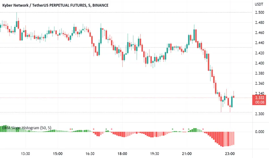
EMA Slope HistogramThe script shows change in a single EMA over a specified period as a histogram. The period of EMA as well as Change period can be specified. Moreover, it also shows change in direction of EMA. The change can be negative for a downward trend and positive for an upward trend.
KINSKI USDT Market Cap DominanceUSDT dominance charts are rare to find as almost everyone is fixated on BTC dominance. Bitcoin dominance gives us insight into investors' preferences when they have a choice between BTC and thousands of altcoins.
This oscillator gives insight into the state of the coin market. When people exchange their digital currencies like BTC and Altcoins for USDT, there is low confidence in the market. The opposite is true when BTC and Altcoins are bought because market sentiment is high.
So when USDT dominance rises, cryptocurrency prices fall, but when their dominance falls, cryptocurrency prices rise.
Features
Can be displayed as a moving average (default) or histogram.
Choice between 'CRYPTOCAP:USDT', 'CRYPTOCAP:USDT.D', 'CRYPTOCAP:OTHERS.D' => CRYPTOCAP:USDT.D is default.
Smoothing types Selectable
Upward and downward trend of MA line can be activated
Extensive style settings

DMA Histogram (20/50)This script plots the distance between two moving averages in the form of histogram. In this case, I am using 20 day moving average and 50 day moving average.
Volatility Quality Histogram (NicoadW)This indicator is based on the Volatility Quality Index ( VQI ) by Thomas Stridsman.
It shows the slope of the VQI in form of a histogram.
The VQI is calculated in the following Steps:
1. Applying a WeightedMovingAverage with the onto the low, open, high, close and prior close
2. Calculating the true range and the range from the results of step 1 and setting them into relation
3. Calculating a weighted lumpsum of the results from step 2 (This is the value of the widely known VQI )
4. The change from the current value of step 3 compared to the last value is the VQI-Slope
5. The VQI-Slope is filtered by only recogning changes greater as the User-Input
6. If the Slope is rising, its considered a long trend and if its falling its considered a short trend
User Inputs
Valuation Period: Length of the WMAs
Filter in Pips: minimum change of the VQI-Slope to result in a Trend-Change
Visuals
Inrease the size of the Signal: Highligts the Trend-Changes
Color Chart Bars: Colors the bars of the main chart depending on the trend given by the VQI

Price/Volume Trend MeterAnother simple indicator from the sweet indicator series, This is a combination of the Volume and Price Trend Meter indicators combined (Links below) into one indicator called PVTM (Price Volume Trend Meter).
PVTM measures the strength of price and volume pressure on a histogram.
The indicator sums up all green candles price and volume and red candles price and volume over a specific period of bars and plots based on Price summed value. The result will look similar to Price Trend Meter with the benefit of trying to filter out more noise.
Use this indicator to identify the increasing asset of price and volume with the green candles (Close is higher than open) and decreasing of price and volume with the red candles (Close is lower than open).
======= Calculation ==========
Bright Green Color Column: Total summed up Price and Volume are higher than 0.
Bright Red Color Column: Total summed up Price and Volume are Lower than 0.
Weak Green Color Column: Conflict between Price and Volume (One positive and one negative) so we continue based on previous color .
Weak Red Color Column: Conflict between Price and Volume (One positive and one negative) so we continue based on previous color.
======= Price/Volume Trend Meter Colors =======
Green: Increasing buying pressure.
Weaker Green: Declining Buying pressure (Possible Sell Reversal).
Red: Increasing selling pressure.
Weaker Red: Declining Selling pressure (Possible Buy Reversal).
Other sweet indicators that this indicator is based on:
Volume Trend Meter:
Price Trend Meter:
Like if you Like and Follow me for upcoming indicators/strategies: www.tradingview.com

ADX with Color like MACD HistogramThis is a usual ADX Indicator but the colors change when the next bar falls or grows from the previous bar.
I think that the use of ADX can be maximized by seeing whether the movement is lower or higher than the previous like MACD Histogram.
The ADX indicator is very powerful for driving long-term trends and is effectively used for 4-hour or 1-hour Time Frames.
When ADX is above level 20, the color of the Bar will be blue or light blue. The blue bar means that the bar is higher than the previous bar. The light blue bar means the bar is lower than the previous one.
When ADX is below level 20, the color of the bar will be dark gray or light gray. The dark gray bar means that the bar is lower than the previous bar. The light gray bar means the bar is higher than the previous bar.
When the bar turns blue that's when we can add shares to our winning position.
When the price is above level 40, the background of the bars will be red, indicating that the price is in a very strong trend and will run out of its thrust soon. That's when we get ready to take profit, which is when the ADX Bar which is blue turns light blue.
-
FYI, I use ADX just for adding the shares to my winning position and exiting the market. I don't wait for ADX turns blue to enter the market.

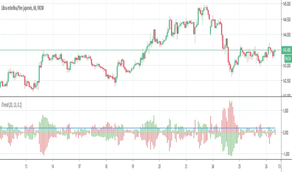
iTrendPorted version of the original iTrend.mq4, use it as a trend detector, just check the color of the upper bars in the histogram.

Scott’s volatility histogramATR shows volatility. SMA of ATR measures the average volatility over a chosen look-back period (default 200).
Divergence of ATR and sma is represented as a histogram.
Low periods of volatility are below the zero line. High periods of volatility are above the zero line.
Average volatility over a 200 period look-back is the zero value.

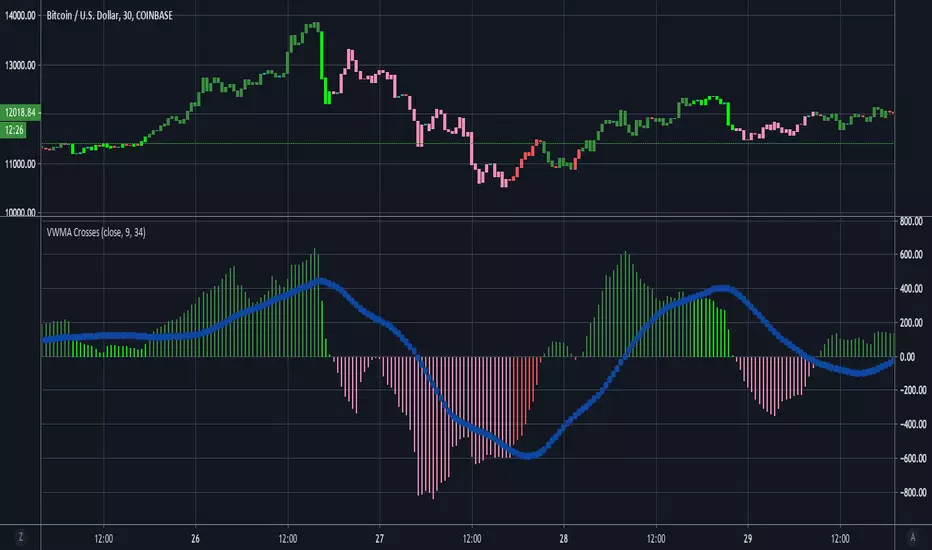
VWMA CrossesThis is a simple tool that gives traders a simple visual representation of Volume-Weighted Moving Average ( VWMA ) crossovers that is pretty similar to the MACD . We don't typically trade solely based on the VWMA , but it is definitely one of our go-to tools when combining multiple indicators.
When trading with VWMA's, it is common to enter a position when the fast VWMA crosses over the slow VWMA . In other words, the fast VWMA was previously less than the slow VWMA and is now greater in value than the slow VWMA . Conversely, traders often exit their positions when the fast VWMA crosses under the slow VWMA .
This tool plots the absolute value of the difference between the fast and slow VWMA's as a histogram. When the difference between the fast and slow VWMA's is greater than zero (meaning fast > slow), then the bars are green. The bars then turn red when the fast VWMA is less than the slow VWMA . The blue circle-line is a Simple Moving Average of the difference between the two lines.
Here's a quick guide to interpreting the chart:
if (fast VWMA > slow VWMA ) and (difference < sma of differences)
then color = lime green
if (fast VWMA > slow VWMA ) and (difference > sma of differences)
then color = dark green
if (fast VWMA < slow VWMA ) and (difference < sma of differences)
then color = light red
if (fast VWMA < slow VWMA ) and (difference > sma of differences)
then color = dark red
~Happy Trading~
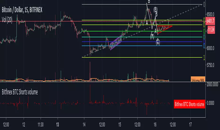
Bitfinex BTC Shorts histogramDifference between the BTC amount of short positions at every candle, respect to the previous one, plotted as an histogram.
Price and EMA Difference Customizable [Requested script]
Easy options, you can toggle the lines and other things. Even turn of the histogram.

Cumulative Delta Difference HistogramINTRODUCTION:
This "Cumulative Delta Difference Histogram" is a volume-based indicator that calculates the difference (delta) between aggressive buying volume and selling volume for each candle and then builds a cumulative momentum histogram with the following behavior:
Momentum Tracking: The indicator accumulates the delta values when the delta is positive and increasing, producing green bars whose height visually represents growing buying pressure momentum.
Negative Momentum Detection: When the delta becomes negative or starts to decline, the histogram bars turn red and the accumulation decreases, effectively showing increasing selling pressure momentum.
Directional Reset: On each change from positive to negative delta momentum or vice versa, the accumulator resets to zero, providing a clear and sharp visualization of shifts without persistence from previous trends.
Zero Reference Line: A horizontal zero line serves as a visual baseline to distinguish positive from negative momentum easily.
HOW TO USE:
To trade effectively using the "Cumulative Delta Difference Histogram," you compare the price action chart with the indicator to confirm momentum and detect potential reversals or continuations. Here's how to do it in practice:
Confirming Trends:
When the price is rising, look for the histogram bars to be green and increasing, indicating strong and growing buying pressure supporting the uptrend. If price rises but the histogram shows diminishing green bars or shifts to red, it could signal weakening momentum and a potential reversal.
Identifying Divergences:
Compare price highs/lows with histogram peaks. If price makes a new high but the histogram fails to make a corresponding new high (bearish divergence), it warns of a possible trend reversal. Conversely, if price makes a new low but histogram shows higher lows (bullish divergence), it signals potential bullish reversal.
Volume Confirmation:
The histogram reflects real-time volume aggression behind price moves. Confirmation of price breakouts or breakdowns by corresponding strong histogram colors and bar height increases adds reliability to signals.
By aligning price patterns and levels with the cumulative delta histogram's signals, traders gain a deeper understanding of market strength and better timing for trades.
This combined approach improves the accuracy of entries and exits beyond relying on price alone, especially in markets sensitive to order flow and volume dynamics.
Use this indicator with a default volume or with my other indicator "Agression Histogram" for a better reading.

Gabriel's Relative Unrealized Profit with Dynamic MVRV Histogram
Certainly! Here’s an enhanced description of the Gabriel's Relative Unrealized Profit with Dynamic MVRV Histogram indicator with detailed usage instructions and explanations of why it's effective:
Gabriel's Relative Unrealized Profit with Dynamic MVRV Histogram
Description:
The Gabriel's Relative Unrealized Profit with Dynamic MVRV Histogram is an advanced trading indicator designed to offer in-depth insights into asset profitability and market valuation. By integrating Relative Unrealized Profit (RUP) and the Market Value to Realized Value (MVRV) Ratio, this indicator provides a nuanced view of an asset's performance and potential trading signals.
Key Components:
SMA Length and Volume Indicator:
SMA Length: Defines the period for the Simple Moving Average (SMA) used to calculate the entry price, defaulted to 14 periods. This smoothing technique helps estimate the average historical price at which the asset was acquired.
Volume Indicator: Allows selection between "volume" and "vwap" (Volume-Weighted Average Price) for calculating entry volume. The choice impacts the calculation of entry volume, either based on standard trading volume or a weighted average price.
Realized Price Calculation:
Computes the average price over a specified period (default of 30 periods) to establish the realized price. This serves as a benchmark for evaluating the cost basis of the asset.
MVRV Calculation:
Current Price: The most recent closing price of the asset, representing its market value.
Total Cost: Calculated as the product of the entry price and entry volume, reflecting the total investment made.
Unrealized Profit: The difference between the current price and the entry price, multiplied by entry volume, indicating profit or loss that has yet to be realized.
Relative Unrealized Profit: Expressed as a percentage of the total cost, showing how much profit or loss exists relative to the initial investment.
Market Value and Realized Value: Market Value is the current price multiplied by entry volume, while Realized Value is the realized price multiplied by entry volume. The MVRV Ratio is obtained by dividing Market Value by Realized Value.
Normalization:
Normalizes both Relative Unrealized Profit and MVRV Ratio to a standardized range of -100 to 100. This involves calculating the minimum and maximum values over a 100-period window to ensure comparability and relevance.
Histogram Calculation:
The histogram is derived from the difference between the normalized Relative Unrealized Profit and the normalized MVRV Ratio. It visually represents the disparity between the two metrics, highlighting potential trading signals.
Plotting and Alerts:
Plots:
Normalized Relative Unrealized Profit (Blue Line): Plotted in blue, this line shows the scaled measure of unrealized profit. Positive values indicate potential gains, while negative values suggest potential losses.
Normalized MVRV Ratio (Red Line): Plotted in red, this line represents the scaled MVRV Ratio. Higher values suggest that the asset’s market value significantly exceeds its realized value, indicating potential overvaluation, while lower values suggest potential undervaluation.
Histogram (Green Bars): Plotted in green, this histogram displays the difference between the normalized Relative Unrealized Profit and the normalized MVRV Ratio. Positive bars indicate that the asset’s profitability is exceeding its market valuation, while negative bars suggest the opposite.
Alerts:
High Histogram Alert: Activated when the histogram value exceeds 50. This condition signals a strong positive divergence, indicating that the asset's profitability is outperforming its market valuation. It may suggest a buying opportunity or indicate that the asset is undervalued relative to its potential profitability.
Low Histogram Alert: Triggered when the histogram value falls below -50. This condition signals a strong negative divergence, indicating that the asset's profitability is lagging behind its market valuation. It may suggest a selling opportunity or indicate that the asset is overvalued relative to its profitability.
How to Use the Indicator:
Setup: Customize the SMA Length, Volume Indicator, and Realized Price Length based on your trading strategy and asset volatility. These parameters allow you to tailor the indicator to different market conditions and asset types.
Interpretation:
Blue Line (Normalized Relative Unrealized Profit): Monitor this line to gauge the profitability of holding the asset. Significant positive values suggest that the asset is currently in a profitable position relative to its purchase price.
Red Line (Normalized MVRV Ratio): Use this line to assess whether the asset is trading at a premium or discount relative to its cost basis. Higher values may indicate overvaluation, while lower values suggest undervaluation.
Green Bars (Histogram): Observe the histogram for deviations between RUP and MVRV Ratio. Large positive bars indicate that the asset's profitability is strong relative to its valuation, signaling potential buying opportunities. Large negative bars suggest that the asset's profitability is weak relative to its valuation, signaling potential selling opportunities.
Trading Strategy:
Bullish Conditions: When the histogram shows large positive values, it suggests that the asset’s profitability is strong compared to its valuation. Consider this as a potential buying signal, especially if the histogram remains consistently positive.
Bearish Conditions: When the histogram displays large negative values, it indicates that the asset’s profitability is weak compared to its valuation. This may signal a potential selling opportunity or caution, particularly if the histogram remains consistently negative.
Why This Indicator is Effective:
Integrated Metrics: Combining Relative Unrealized Profit and MVRV Ratio provides a comprehensive view of asset performance. This integration allows traders to evaluate both profitability and market valuation in one cohesive tool.

MACD-X, More Than MACD by DGTMoving Average Convergence Divergence – MACD
The most popular indicator used in technical analysis, the moving average convergence divergence (MACD), created by Gerald Appel. MACD is a trend-following momentum indicator, designed to reveal changes in the strength, direction, momentum, and duration of a trend in a financial instrument’s price
Historical evolution of MACD,
- Gerald Appel created the MACD line,
- Thomas Aspray added the histogram feature to MACD
- Giorgos E. Siligardos created a leader of MACD
MACD employs two Moving Averages of varying lengths (which are lagging indicators) to identify trend direction and duration. Then, MACD takes the difference in values between those two Moving Averages (MACD Line) and an EMA of those Moving Averages (Signal Line) and plots that difference between the two lines as a histogram which oscillates above and below a center Zero Line. The histogram is used as a good indication of a security's momentum.
Mathematically expressed as;
macd = ma(source, fast_length) – ma(source, slow_length)
signal = ma(macd, signal_length)
histogram = macd – signal
where exponential moving average (ema) is in common use as a moving average (ma)
fast_length = 12
slow_length = 26
signal_length = 9
The MACD indicator is typically good for identifying three types of basic signals ;
Signal Line Crossovers
A Signal Line Crossover is the most common signal produced by the MACD. On the occasions where the MACD Line crosses above or below the Signal Line, that can signify a potentially strong move. The standard interpretation of such an event is a recommendation to buy if the MACD line crosses up through the Signal Line (a "bullish" crossover), or to sell if it crosses down through the Signal Line (a "bearish" crossover). These events are taken as indications that the trend in the financial instrument is about to accelerate in the direction of the crossover.
Zero Line Crossovers
Zero Line Crossovers occur when the MACD Line crossed the Zero Line and either becomes positive (above 0) or negative (below 0). A change from positive to negative MACD is interpreted as "bearish", and from negative to positive as "bullish". Zero crossovers provide evidence of a change in the direction of a trend but less confirmation of its momentum than a signal line crossover
Divergence
Divergence is another signal created by the MACD. Simply, divergence occurs when the MACD and actual price are not in agreement. A "positive divergence" or "bullish divergence" occurs when the price makes a new low but the MACD does not confirm with a new low of its own. A "negative divergence" or "bearish divergence" occurs when the price makes a new high but the MACD does not confirm with a new high of its own. A divergence with respect to price may occur on the MACD line and/or the MACD Histogram
Moving Average Crossovers , another hidden signal that MACD Indicator identifies
Many traders will watch for a short-term moving average to cross above a longer-term moving average and use this to signal increasing upward momentum. This bullish crossover suggests that the price has recently been rising at a faster rate than it has in the past, so it is a common technical buy sign. Conversely, a short-term moving average crossing below a longer-term average is used to illustrate that the asset's price has been moving downward at a faster rate and that it may be a good time to sell.
Moving Average Crossovers in reality is Zero Line Crossovers, the value of the MACD indicator is equal to zero each time the two moving averages cross over each other. For easy interpretation by trades, Zero Line Crossovers are simply described as positive or negative MACD
False signals
Like any forecasting algorithm, the MACD can generate false signals. A false positive, for example, would be a bullish crossover followed by a sudden decline in a financial instrument. A false negative would be a situation where there is bearish crossover, yet the financial instrument accelerated suddenly upwards
What is “MACD-X” and Why it is “More Than MACD”
In its simples form, MACD-X implements variety of different calculation techniques applied to obtain MACD Line, ability to use of variety of different sources , including Volume related sources, and can be plotted along with MACD in the same window and all those features are available and presented within a single indicator, MACD-X
Different calculation techniques lead to different values for MACD Line, as will further discuss below, and as a consequence the signal line and the histogram values will differentiate accordingly. Mathematical calculation of both signal line and the histogram remain the same.
Main features of MACD-X ;
1- Introduces different proven techniques applied on MACD calculation , such as MACD-Histogram, MACD-Leader and MACD-Source, besides the traditional MACD (MACD-TRADITIONAL)
• MACD-Traditional , by Gerald Appel
It is the MACD that we know, stated as traditional just to avoid confusion with other techniques used with this study
• MACD-Histogram , by Thomas Aspray
The MACD-Histogram measures the distance between MACD and its signal line (the 9-day EMA of MACD). Aspray developed the MACD-Histogram to anticipate signal line crossovers in MACD. Because MACD uses moving averages and moving averages lag price, signal line crossovers can come late and affect the reward-to-risk ratio of a trade. Bullish or bearish divergences in the MACD-Histogram can alert chartists to an imminent signal line crossover in MACD
The MACD-Histogram represents the difference between MACD and its 9-day EMA, the signal line. Mathematically,
macdx = macd - ma(macd, signal_length)
Aspray's contribution served as a way to anticipate (and therefore cut down on lag) possible MACD crossovers which are a fundamental part of the indicator.
Here come a question, what if repeat the same calculations once more (macdh2 = macdh - ma(macdh, signal_length), will it be even better, this question will remain to be tested
• MACD-Leader , by Giorgos E. Siligardos, PhD
MACD Leader has the ability to lead MACD at critical situations. Almost all smoothing methods encounter in technical analysis are based on a relative-weighted sum of past prices, and the Leader is no exception. The concealed weights of MACD Leader are such that more relative weight is used in the more recent prices than the respective weights used by the components of MACD. In effect, the Leader expresses more changes in average price dynamics for the recent price movement than MACD, thus eventually leading MACD, especially when significant trend changes are about to take place.
Siligardos creates two less-laggard moving averages indicators in its formula using the same periods as follows
Indicator1 = ma(source, fast_length) + ma(source - ma(source, fast_length), fast_length)
Indicator2 = ma(source, slow_length) + ma(source - ma(source, slow_length), slow_length)
and then take the difference:
Indicator1 - Indicator2
The result is a new MACD Leader indicator
macdx = macd + ma(source - fast_ma, fast_length) - ma(source - slow_ma, slow_length)
• MACD-Source , a custom experimental interpretation of mine ,
MACD Source, presents an application of MACD that evaluates Source/MA Ratio, relatively with less lag, as a basis for MACD Line, also can be expressed as source convergence/divergence to its moving average. Among the various techniques for removing the lag between price and moving average (MA) of the price, one in particular stands out: the addition to the moving average of a portion of the difference between the price and MA. MACD Source, is based on signal length mean of the difference between Source and average value of shot length and long length moving average of the source (Source/MA Ratio), where the source is actual value and hence no lag and relatively less lag with the average value of moving average of the source . Mathematically expressed as,
macdx = ma(source - avg( ma(source, fast_length), ma(source, slow_length) ), signal_length)
MACD Source provides relatively early crossovers comparing to MACD and better momentum direction indications, assuming the lengths are set to same values
For further details, you are invited to check the following two studies, where the first seeds were sown of the MACD-Source idea
Price Distance to its Moving Averages study, adapts the idea of “Prices high above the moving average (MA) or low below it are likely to be remedied in the future by a reverse price movement", presented in an article by Denis Alajbeg, Zoran Bubas and Dina Vasic published in International Journal of Economics, Commerce and Management
First MACD like interpretation comes with the second study named as “ P-MACD ”, where P stands for price, P-MACD study attempts to display relationship between Price and its 20 and 200-period moving average. Calculations with P-MACD were based on price distance (convergence/divergence) to its 200-period moving average, and moving average convergence/divergence of 20-period moving average to 200-period moving average of price.
Now as explained above, MACD Source is a one adapted with traditional MACD, where Source stands for Price, Volume Indicator etc, any source applicable with MACD concept
2- Allows usage of variety of different sources, including Volume related indicators
The most common usage of Source for MACD calculation is close value of the financial instruments price. As an experimental approach, this study will allow source to be selected as one of the following series;
• Current Close Price (close)
• Average of High, Low, and Close Price (hlc3)
• On Balance Volume (obv)
• Accumulation Distribution (accdist)
• Price Volume Trend (pvt)
Where,
-Current Close Price and Average of High, Low, and Close Price are price actions of the financial instrument
- Accumulation Distribution is a volume based indicator designed to measure underlying supply and demand
- On Balance Volume (OBV) , is a momentum indicator that measures positive and negative volume flow
- Price Volume Trend (PVT) is a momentum based indicator used to measure money flow
3- Can be plotted along with MACD in the same window using the same scaling
Default setting of MACD-X will display MACD-Source with Current Close Price as a source and traditional MACD can be plotted eighter as a companion of MACD-X or can be selected to be plotted alone.
Applying both will add ability to compare, or use as a confirmation of one other
In case, traditional MACD Is plotted along with MACD-X to avoid misinterpreting, the lines plotted, the area between MACD-X Line and Signal-X Line is highlighted automatically, even if the highlight option not selected. Otherwise highlight will be applied only if that option selected
4- 4C Histogram
Histogram is plotted with four colors to emphasize the momentum and direction
5- Customizable
Additional to ability of selecting Calculation Method, Source, plotting along with MACD, there are few other option that allows users to customize the MACD-X indicator
Lengths are configurable, default values are set as 12, 26, 9 respectively for fast, slow and smoothing length. Setting lengths to 8,21,5 respectively Is worth checking, slower length moving averages will lead to less lag and earlier reaction to price actions but yet requires a caution and back testing before applying
Highlight the area between MACD-X Line and Signal-X Line, with colors emphasising the direction
Label can be added to display Calculation Method, Source and Length settings, the aim of this label is to server only as a reminder to trades to be aware of settings while they are occupied with charts, analysis etc.
Here comes another question, which is of more importance having the reminder or having the indicators with multi timeframe feature? Build-in Multi Time Frame features of Pine is not supported when labels and lines introduced in the script, there are other methods but brings complexity. To be studied further, this version will be with labels for time being.
Epilogue
MACD-X is an alternative variant of MACD, the insight/signals provided by MACD are also applicable to MACD-X with early and clear warnings for the changes in the trend.
If MACD is essential to your analysis, then it is my guess that after using the MACD-X for a while and familiarizing yourself with its unique character and personality, you will make it an inseparable companion to other indicators in your charts.
The various signals generated by MACD/MACD-X are easily interpreted and very few indicators in technical analysis have proved to be more reliable than the MACD, and this relatively simple indicator can quickly be incorporated into any short-term trading strategy
Disclaimer : Trading success is all about following your trading strategy and the indicators should fit within your trading strategy, and not to be traded upon solely
The script is for informational and educational purposes only. Use of the script does not constitutes professional and/or financial advice. You alone the sole responsibility of evaluating the script output and risks associated with the use of the script. In exchange for using the script, you agree not to hold dgtrd TradingView user liable for any possible claim for damages arising from any decision you make based on use of the script

MACD Histogram Expansion Alerts (Scalp)Purpose: Alerts when MACD histogram is expanding (momentum increasing) rather than simply crossing. Designed for 1-minute scalping and intraday momentum confirmation.
This script is for traders who are tired of late MACD cross alerts.
Instead of firing when MACD lines cross (which often happens after the move), this indicator alerts when the MACD histogram is expanding — meaning momentum is actually increasing right now, not rolling over.
I use it as a “heads up” alert, not a buy/sell signal. When it fires, I check price action, volume, VWAP, support/resistance, etc., to see if the move is worth trading.
Best suited for 1-minute charts, scalping, and fast intraday momentum.
MACD Histogram Expansion Alerts (Scalp) is a lightweight alert-focused indicator designed for intraday traders and scalpers, particularly on lower timeframes such as the 1-minute chart.
Rather than triggering alerts on standard MACD line crossovers (which tend to lag in fast or volatile markets), this script detects MACD histogram expansion — a condition that indicates momentum acceleration, not just direction.
🔍 What this script does
Uses a fast MACD configuration suitable for lower timeframes
Monitors the MACD histogram slope and magnitude
Triggers alerts only when the histogram expands for multiple consecutive bars
Alerts are fired on bar close only, reducing noise and false intrabar signals
🚀 Why focus on histogram expansion?
Histogram expansion highlights when momentum is building, which can be useful for:
Continuation setups
Early momentum confirmation
Avoiding entries when momentum is already fading
This approach is especially helpful in small caps, news-driven stocks, and volatile intraday instruments, where traditional MACD cross alerts can arrive too late.
🔔 Alert Types
Bullish MACD Histogram Expansion
Bearish MACD Histogram Expansion
Each alert can be enabled independently and is intended as an attention signal, not a standalone trading system.
⚙️ Customizable Inputs
MACD Fast / Slow / Signal lengths
Number of consecutive expanding histogram bars required
Optional minimum histogram magnitude filter
Optional directional filter (above/below zero line)
⚠️ Important Notes!!!!
This script does not place trades
Alerts should be used with additional context, such as price action, volume, VWAP, or support/resistance
Not designed for higher-timeframe or swing trading use .
If you find this helpful, feel free to adapt it to your own trading style or timeframe. This script is meant to be simple, flexible, and non-opinionated.

VOLD Ratio Histogram [Th16rry]How to Use the VOLD Ratio Histogram Indicator
The VOLD Ratio Histogram Indicator is a powerful tool for identifying buying and selling volume dominance over a selected period. It provides traders with visual cues about volume pressure in the market, helping them make more informed trading decisions.
How to Read the Indicator:
1. Green Bars (Positive Histogram):
- Indicates that buying volume is stronger than selling volume.
- Higher green bars suggest increasing bullish pressure.
- Useful for confirming uptrends or identifying potential accumulation phases.
2. Red Bars (Negative Histogram):
- Indicates that selling volume is stronger than buying volume.
- Lower red bars suggest increasing bearish pressure.
- Useful for confirming downtrends or identifying potential distribution phases.
3. Zero Line (Gray Line):
- Acts as a neutral reference point where buying and selling volumes are balanced.
- Crossing above zero suggests buying dominance; crossing below zero suggests selling dominance.
How to Use It:
1. Confirming Trends:
- A strong positive histogram during an uptrend supports bullish momentum.
- A strong negative histogram during a downtrend supports bearish momentum.
2. Detecting Reversals:
- Monitor for changes from positive (green) to negative (red) or vice versa as potential reversal signals.
- Divergences between price action and histogram direction can indicate weakening trends.
3. Identifying Volume Surges:
- Sharp spikes in the histogram may indicate strong buying or selling interest.
- Use these spikes to investigate potential breakout or breakdown scenarios.
4. Filtering Noise:
- Adjust the period length to control sensitivity:
- Shorter periods (e.g., 10) are more responsive but may produce more noise.
- Longer periods (e.g., 50) provide smoother signals, better for identifying broader trends.
Recommended Markets:
- Cryptocurrencies: Works effectively with real volume data from exchanges.
- Forex: Useful with tick volume, though interpretation may vary.
- Stocks & Commodities: Particularly effective for analyzing high-volume assets.
Best Practices:
- Combine the VOLD Ratio Histogram with other indicators like moving averages or RSI for confirmation.
- Use different period lengths depending on your trading style (scalping, swing trading, long-term investing).
- Observe volume spikes and divergences to anticipate potential market moves.
The VOLD Ratio Histogram Indicator is ideal for traders looking to enhance their volume analysis and gain a deeper understanding of market dynamics.

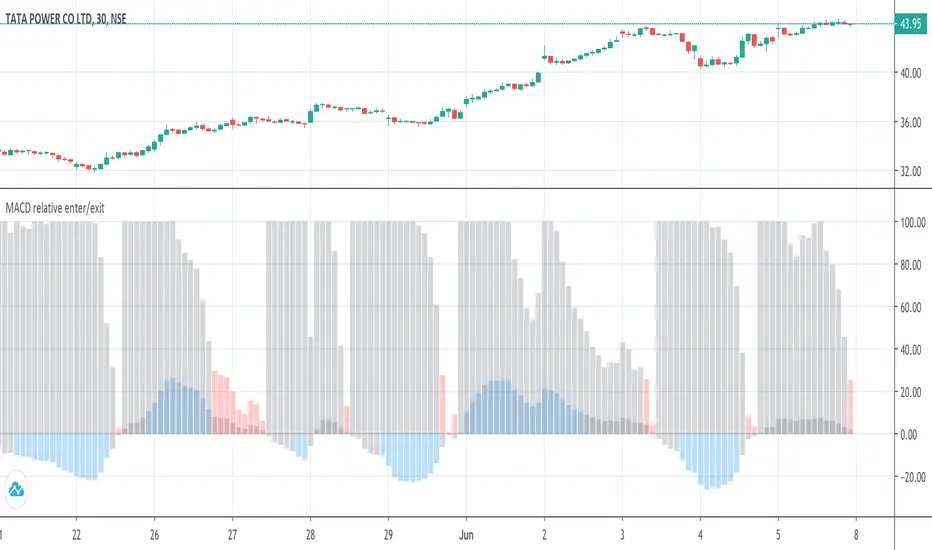
MACD Histogram Fibonacci Retracement LevelsMACD Histogram Fibonacci Retracement Level s.
MACD Histogram Fibonacci Retracement Levels indicator considers the highest and lowest histogram bar levels from Intraday Day Open.
Fibonacci retracement levels 23.6%, 38.2%, 50%, 61.8%, and 78.6% are displayed for the Highest and Lowest histogram bar .As the day progress revised Fibonacci Retracement Levels are set in based on change in Highest and Lowest histogram bar levels.
Histogram bars positions are monitored vis a vis the Fibonacci Retracement Levels to plan the trade entry or exit as per MACD indicator.
MACD and Signal levels are opted out to get clear histogram bar image on chart. Input check in box is available to display MACD and signal lines at Users option.
A Histogram intraday average line (Histo Intra Avg) indicate the intraday average movement of histogram bars.
MACD Histogram Fibonacci Retracement Levels is very useful to know the level of upward and downward Histogram bar movements vis a vis Fibonacci Retracement Levels compared to general MACD Indicator Histogram levels.
DISCLAIMER: For educational and entertainment purpose only .Nothing in this content should be interpreted as financial advice or a recommendation to buy or sell any sort of security/ies or investment/s.

Uptrick: EMA SMA Support Resistance HistogramPurpose:
The "Uptrick: EMA SMA Support Resistance Histogram" indicator, known by its short title 'UESH,' is meticulously crafted to offer traders a comprehensive view of potential support and resistance levels, leveraging the crossovers between the Exponential Moving Average (EMA) and Simple Moving Average (SMA). Its distinctive feature lies in the visualization of these crossovers through histogram bars, providing traders with an intuitive representation of market momentum and possible reversal points.
Explanation:
Input Parameters:
Traders benefit from the flexibility to tailor the length of both the SMA and EMA according to their trading strategies and market preferences.
The 'Source' parameter allows users to select the data series upon which the calculations are based, typically the closing price.
Additionally, the option to toggle the visibility of the histogram enhances the indicator's adaptability to different analytical approaches.
Moving Averages:
The script diligently computes both the SMA and EMA based on the specified lengths and the chosen data source.
The SMA (Simple Moving Average) acts as a smoothing mechanism, averaging price data over a defined period to discern underlying trends.
On the other hand, the EMA (Exponential Moving Average) places greater weight on recent price data, making it more responsive to short-term price fluctuations.
Cross Detection:
A hallmark of this indicator is its adeptness in identifying crossover and crossunder events between the EMA and SMA, signaling potential shifts in market sentiment.
A green color is assigned to the EMA when it crosses above the SMA (crossover), indicating bullish momentum.
Conversely, a red color is applied when the EMA crosses below the SMA (crossunder), signaling bearish momentum.
In the absence of a crossover, both lines are colored blue, denoting a neutral state.
Support and Resistance Visualization through Histogram Bars:
A notable feature of this indicator is its ability to delineate potential support and resistance levels through histogram bars.
The script calculates the disparity between the source data and the SMA, effectively capturing deviations from the prevailing trend.
Positive deviations (source above SMA) are represented by green histogram bars, highlighting potential support zones.
Conversely, negative deviations (source below SMA) manifest as red histogram bars, indicating potential resistance areas.
The length of the histogram bars is customizable, allowing traders to fine-tune the sensitivity to price movements based on their preferences and trading strategies.
In summary through it's dynamic features and meticulous design, this indicator empowers traders with actionable insights into market dynamics, facilitating informed trading decisions with regards to potential support and resistance levels. The inclusion of histogram bars enhances its analytical prowess, providing a visual representation of price deviations and reinforcing traders' ability to interpret market sentiment effectively.

MACD histogram relative open/closePrelude
This script makes it easy to capture MACD Histogram open/close for automated trading.
There seems to be no "magic" value for MACD Histogram that always works as a cut-off for trade entry/exit, because of the variation in market price over time.
The idea behind this script is to replicate the view of the MACD graph we (humans) see on the screen, in mathematics, so the computer can approximately detect when the curve is opening/closing.
Math
The maths for this is composed of 2 sections -
1. Entry -
i. To trigger entry, we normalize the Histogram value by first determining the lowest and highest values on the MACD curves (MACD, Signal & Hist).
ii. The lowest and highest values are taken over the "Frame of reference" which is a hyperparameter.
iii. Once the frame of reference is determined, the entry cutoff param can be defined with respect to the values from (i) (10% by default)
2. Exit
To trigger an exit, a trader searches for the point where the Histogram starts to drop "steeply".
To convert the notion of "steep" into mathematics -
i. Take the max histogram value reached since last MACD curve flip
ii. Define the cutoff with reference to the value from (i) (30% by default)
Plots
Gray - Dead region
Blue - Histogram opening
Red - Histogram is closing
Notes
A good value for the frame of reference can be estimated by looking at the timescale of the graph you generally work with during manual trading.
For me, that turned out to be ~2.5 hours. (as shown in the above graph)
For a 3-minute ticker, frame of reference = 2.5 * 60 / 3 = 50
Which is the default given in this script.
Ultimately, it is up to you to do grid search and find these hyperparams for the stock and ticker size you're working with.
Also, this script only serves the purpose of detecting the Histogram curve opening/closing.
You may want to add further checks to perform proper trading using MACD.
Bassi MACD Pro + ADX Filter + Smart Histogram TP + RSIA professional-grade MACD indicator that dramatically reduces false signals by combining four powerful filters:
Key Features
Classic MACD (12,26,9) with clean, high-visibility histogram coloring
ADX + DI filter – only takes trades when ADX > user-defined threshold (default 25) ensuring you trade only in strong trending markets
Smart Histogram Take-Profit logic – automatically detects the exact moment bullish/bearish momentum starts to weaken after a strong move and marks a precise TP level (one TP per trade – no repainting, no multiple signals)
Zero-line crossover confirmation + histogram direction filter – eliminates many whipsaw signals common in regular MACD
Separate RSI pane with overbought/oversold levels and visual markers (for additional confluence – does not interfere with main logic)
Visual Signals
Green “MACD BUY” label + lime triangle = confirmed long entry in strong trend
Red “MACD SELL” label + red triangle = confirmed short entry in strong trend
Small lime/red “TP” triangles = Smart Histogram Take-Profit triggered (perfect exit timing based on momentum fade)
Alert Conditions Included
MACD BUY
MACD SELL
TP Long Hit
TP Short Hit
Combined “Any Signal” alert
Why this version outperforms standard MACD
Most MACD crossovers fail in ranging markets. This script solves that by:
Requiring strong trend (ADX filter)
Confirming histogram is actually growing in the new direction
Waiting for the true zero-line cross with momentum
Giving you an intelligent, non-fixed % take-profit based on real histogram exhaustion
Excellent for swing trading, day trading, crypto, forex, and stocks on any timeframe (works especially well on 1H–4H–Daily).
Clean, fast, no repainting, fully alert-ready.
Add to chart → set your alerts → trade only the highest-probability MACD signals.
