Footprint liteFootprint Lite enables you to monitor volume distribution for the current ticker, offering resolutions as 1 second, segmented by specified price levels with visual representations. Additionally, you have the flexibility to customize the displayed Imbalance price level and the number of consecutive Imbalance level lines.
Here are the input options:
Group Display:
This section allows you to adjust how Footprints are displayed.
"Count show bars": Directly adjusts the display to show the last 'n' bars.
"Display all available bars": Shows all available bars.
Group Row size:
Adjusts the parameters for generating Footprints based on price step size.
"Ticks Per Row": Directly sets the price step, calculated by multiplying the entered value by syminfo.mintick.
"Auto": Enables automatic mode for selecting the "Ticks Per Row" value.
"Max row": Relevant for auto mode, it sets the acceptable number of rows within a bar. The automatic "Ticks Per Row" calculation is based on the first available bar and applied to subsequent bars.
Group Imbalance:
Customizes the display of price levels represented by Imbalance and emphasizes consecutive lines.
"Imbalance Percent": A coefficient expressed as a percentage to determine the Imbalance of price levels, comparing the buy price diagonally to the previous sell price.
"Stacked levels": Sets the minimum number of consecutive Imbalance levels required to draw extended lines.
Alerts:
You can set alerts for various events:
"New imbalance line sell": Alerts on the appearance of a new imbalance line for selling.
"New imbalance line buy": Alerts on the appearance of a new imbalance line for buying.
"Stop past imbalance line sell": Alerts when the previous imbalance line for selling stops, indicating it has reached the range from low to high of the current bar.
"Stop past imbalance line buy": Alerts when the previous imbalance line for buying stops, indicating it is within the range from low to high of the current bar.
"New imbalance buy": Alerts on the appearance of a new or change in the current imbalance level for buying.
"New imbalance sell": Alerts on the appearance of a new or change in the current imbalance level for selling.
Cerca negli script per "imbalance"

Nexural OrderFlow MatrixNexural OrderFlow Matrix
### Professional Order Flow Analysis for Index Futures on TradingView
**Specifically Engineered for:** ES, NQ, YM, RTY, and other high-liquidity index futures
---
## Before You Read Any Further
I need to be upfront with you about something important.
**True order flow analysis—the kind used by institutional traders and prop firms—is not possible on TradingView.**
When professionals talk about order flow, they're referring to the raw tape: every single trade, the exact price, the exact size, and whether it was a buyer lifting the offer or a seller hitting the bid. That level of data simply doesn't exist in TradingView's infrastructure.
So why did I build this indicator? Because TradingView *does* provide meaningful volume delta data through their official functions, and when presented correctly, it can still give you a genuine edge in understanding buying and selling pressure—especially on **index futures** where liquidity is deep and the uptick/downtick methodology works best.
This indicator was specifically engineered with index futures traders in mind. The data sources, the color thresholds, the activity calculations—all of it is optimized for the characteristics of ES, NQ, YM, and RTY. It can work on other instruments, but index futures are where it shines.
I'm not here to oversell you. I'm here to give you the best tool possible within the platform's limitations—and to be completely transparent about what those limitations are.
---
## What This Indicator Actually Does
Nexural OrderFlow Matrix uses TradingView's most advanced volume analysis functions under the hood:
- `ta.requestUpAndDownVolume()` — Samples lower timeframe data to estimate volume on upticks vs downticks
- `ta.requestVolumeDelta()` — TradingView's official cumulative volume delta calculation
The indicator presents this data in two ways:
**1. The Matrix Table**
A heatmap grid aligned beneath each candle showing:
- **Volume** — Total bar volume with yellow/gold intensity gradient
- **Bar VWAP** — Volume-weighted average price within the bar
- **Delta** — Net difference between buying and selling volume
- **Delta %** — Delta as a percentage of total volume (the most important metric)
- **Bar Δ CVD** — How much cumulative volume delta changed this bar
- **Buy Volume** — Estimated volume on upticks
- **Sell Volume** — Estimated volume on downticks
**2. The Imbalance Bars**
A visual stacked bar chart showing the proportional split between buyers and sellers. Green on top represents buying volume, red on bottom represents selling volume. The split is proportional—so a 70/30 bar instantly shows you the imbalance without reading numbers.
**3. The Nexural Flow Meter**
A real-time panel showing:
- Current bias (BUYERS/SELLERS/NEUTRAL)
- Intensity classification (EXTREME/STRONG/MODERATE/WEAK)
- Imbalance ratio (e.g., "BUY 2.3:1")
- Live delta, volume, and VWAP readings
---
## The Color System
I spent considerable time on this because it matters.
Most indicators treat all bars equally. That's noise. In reality, a bar with 8% delta imbalance tells you almost nothing, while a bar with 65% imbalance is screaming information at you.
**The Activity Threshold System:**
- Bars below your threshold (default 25% delta) fade to muted gray tones
- As imbalance increases, colors transition from gray → muted color → vibrant color
- High-activity bars pop with bright greens and reds
- Low-activity bars fade into the background where they belong
**Volume uses a separate yellow/gold gradient:**
- Low volume: Faint, dark yellow-brown
- High volume: Rich, vibrant amber/gold
- This lets you instantly spot volume spikes without reading numbers
The result: your eye is naturally drawn to the bars that matter.
---
## Honest Accuracy Assessment
Based on extensive comparison testing against TradingView's own Volume Footprint and CVD indicators, this indicator achieves approximately **85-90% correlation** with official TradingView tools.
Let me put that in perspective:
| Platform | Data Source | Typical Accuracy |
|----------|-------------|------------------|
| Sierra Chart (Denali feed) | Actual bid/ask tape | 99%+ |
| Bookmap | Actual bid/ask tape | 99%+ |
| NinjaTrader + Kinetick | Tick-level data | 95-99% |
| Jigsaw Daytradr | Reconstructed tape | 95-99% |
| **TradingView (this indicator)** | **Aggregated LTF sampling** | **85-90%** |
| Generic volume indicators | Basic volume only | 50-60% |
We're at the ceiling of what TradingView can provide. The dual data source approach, official library functions, and lower timeframe sampling squeeze out every drop of accuracy the platform allows.
But if you're a dedicated tape reader who needs to see every lot hitting the book, this isn't the tool for that. No TradingView indicator is. That's not a criticism—it's just the reality of the platform's architecture.
---
## Where This Indicator Works Best
### Primary Use Case: Index Futures
This indicator was built specifically for index futures traders. These instruments have the characteristics that make order flow analysis most reliable:
**The Big Four:**
| Symbol | Name | Why It Works |
|--------|------|--------------|
| **ES** | E-mini S&P 500 | Deepest liquidity in the world, tight spreads, clean delta readings |
| **NQ** | E-mini NASDAQ-100 | Massive volume, excellent uptick/downtick correlation |
| **YM** | E-mini Dow | Strong institutional participation, reliable volume data |
| **RTY** | E-mini Russell 2000 | Good liquidity, solid delta accuracy |
Index futures are ideal because:
- **Deep liquidity** — Thousands of contracts per minute means meaningful sample sizes
- **Tight spreads** — Usually 1 tick, so bid/ask attribution is more accurate
- **Continuous trading** — No gaps during RTH, consistent data flow
- **Institutional participation** — Real order flow, not retail noise
- **Official CME volume** — Accurate, exchange-reported data
If you're trading ES, NQ, YM, or RTY on TradingView, this indicator will give you the most accurate order flow approximation the platform can provide.
---
### Secondary Use Cases
**Other Liquid Futures:**
- CL, GC, SI (commodities) — Work well but slightly less optimized
- 6E, 6B, 6J (currency futures) — Decent accuracy with good liquidity
**Large-Cap Stocks & ETFs:**
- SPY, QQQ, IWM
- AAPL, MSFT, NVDA, TSLA, AMD
- Any stock trading millions of shares daily
**Crypto (with caveats):**
- BTC, ETH on major exchanges
- Works best during active hours
- Quality varies by exchange data feed
**Best Timeframes:**
- 1-minute to 15-minute for active intraday trading
- The indicator automatically selects appropriate lower timeframe sampling
- Can work on higher timeframes but edge diminishes
---
## Where This Indicator Struggles
I could hide this section and let you figure it out the hard way. I'd rather just tell you.
**Low-Volume Stocks:**
If a stock trades 50,000 shares a day, the delta readings will be noisy and inconsistent. The uptick/downtick estimation needs sufficient trade activity to be meaningful.
**Wide-Spread Instruments:**
When spreads are 10+ cents wide, a trade at the ask doesn't necessarily indicate aggressive buying. The bid/ask classification becomes less reliable.
**Forex:**
TradingView shows broker-specific volume for forex, not actual market volume. Readings will vary wildly depending on your data provider. Use with extreme caution, or not at all.
**Pre-Market & After-Hours:**
Liquidity thins dramatically. Estimations become less reliable. I'd trust regular session data far more.
**Daily/Weekly/Monthly Charts:**
The aggregation becomes so smoothed that the edge largely disappears. This is designed for intraday analysis.
---
## How to Actually Use This
### Focus on Delta %, Not Raw Delta
Raw delta is influenced by overall volume. A 500-lot delta sounds significant until you realize the bar traded 50,000 lots—that's just 1% imbalance, which is noise.
Delta % normalizes this. Look for readings above ±30% to identify meaningful pressure. Above ±50% is strong. Above ±70% is extreme.
### Let the Colors Guide You
If a bar is gray, the market isn't showing its hand. Don't overanalyze it. When you see bright green or red cells, that's when something is happening.
### Confirm With Price Action
Order flow data is context, not a signal generator. A strong bullish delta at a key support level means something different than the same reading in the middle of nowhere.
Use this alongside your existing analysis—levels, structure, momentum—not as a replacement.
### Watch for Divergences
Price making new highs while delta turns negative? That's absorption—sellers stepping in but price hasn't reacted yet.
Price dropping but delta stays positive? Buyers are defending.
These divergences often precede reversals. They're where order flow analysis provides genuine edge.
### Adjust the Activity Threshold
The default is 25%. For volatile instruments like NQ futures, you might lower it to 20%. For calmer instruments, raise it to 30-35%. The goal is filtering noise while keeping meaningful signals visible.
---
## Understanding the Metrics
| Metric | What It Tells You |
|--------|-------------------|
| **Volume** | Total contracts/shares traded |
| **Delta** | Net buying minus selling volume |
| **Delta %** | How imbalanced the bar is (key metric) |
| **Bar Δ CVD** | Cumulative delta change for this bar |
| **Imbalance Ratio** | Buy:Sell ratio (e.g., 2.1:1 or 1:1.8) |
| **Bar VWAP** | Where most volume transacted within the bar |
| Delta % Range | Interpretation |
|---------------|----------------|
| 0-15% | Neutral, no clear pressure |
| 15-30% | Weak directional bias |
| 30-50% | Moderate pressure |
| 50-70% | Strong imbalance |
| 70%+ | Extreme one-sided flow |
| Color | Meaning |
|-------|---------|
| Gray | Low activity, likely noise |
| Muted Green | Mild buying pressure |
| Bright Green | Strong buying pressure |
| Muted Red | Mild selling pressure |
| Bright Red | Strong selling pressure |
| Yellow/Gold | Volume intensity (separate scale) |
---
## Settings Breakdown
**Display Settings:**
- *Show Matrix Table* — Toggle the data heatmap on/off
- *Show Imbalance Bars* — Toggle the stacked visual bars on/off
- *Row Height* — Adjust the matrix row sizing
- *Activity Threshold* — Delta % below which bars fade to gray
**Imbalance Bars:**
- *Bar Height* — Vertical size of the stacked bars
- *Show Volume Labels* — Display buy/sell volume numbers
- *Show Percentage* — Display buy/sell percentages
**Timeframe Mode:**
- *Auto* — Sensible defaults based on your chart timeframe
- *Aggressive* — Samples from lowest possible timeframe (more granular)
- *Conservative* — Samples from slightly higher timeframe (smoother)
- *Custom* — You choose the exact lower timeframe
**CVD Reset:**
- *Daily* — Standard for intraday trading
- *Weekly/Monthly* — Useful for swing analysis
- *None* — Running cumulative total
---
## A Note on Expectations
I built this to be the best possible order flow tool within TradingView's constraints. It uses every optimization available, presents data in a clean and functional way, and doesn't pretend to be something it's not.
But I want to be clear: if order flow is central to your strategy and you're making decisions based on tape reading, you should seriously consider platforms designed for that purpose. Sierra Chart, Bookmap, Jigsaw—these tools show you the actual order book and time & sales. The difference is substantial.
Think of Nexural OrderFlow Matrix as a bridge. It gives TradingView users access to order flow concepts with reasonable accuracy. For many traders, especially those combining multiple analysis methods, that's enough. For dedicated tape readers, it's a starting point that might inspire you to explore deeper tools.
---
## What You're Getting
- **Dual visualization modes** — Matrix table and/or Imbalance bars
- **Activity-based color system** — Noise fades, signals pop
- **Real-time Nexural Flow Meter** — Live imbalance readings
- **Flexible configuration** — Show what you need, hide what you don't
- **Honest accuracy** — 85-90% correlation with official TradingView data
- **Clean, professional presentation** — Designed for actual trading, not screenshots
---
## What You're Not Getting
- Raw tick data (TradingView limitation)
- Bid/ask tape attribution (TradingView limitation)
- Order book depth (TradingView limitation)
- 99% accuracy (impossible on this platform)
- Magic signals (this is a tool, not a strategy)
---
## Final Thoughts
Trading is hard enough without tools that overpromise and underdeliver. I'd rather give you something that works within its limitations and be honest about those limitations than sell you a fantasy.
Nexural OrderFlow Matrix does what it says. It presents TradingView's best volume delta data in a clear, heatmap format with intelligent color coding. It's accurate within the platform's constraints. It's clean, it's fast, and it doesn't clutter your chart with noise.
Use it wisely. Combine it with price action, levels, and your own market understanding. And if you ever feel limited by what TradingView offers, know that there are deeper tools waiting for you when you're ready.
Trade well.
*— Nexural Trading*
---
## Quick Reference Card
**Built For:** Index Futures (ES, NQ, YM, RTY)
**Also Works On:** CL, GC, SPY, QQQ, large-cap stocks
**Avoid On:** Low-volume stocks, forex, illiquid instruments
**Best Timeframes:** 1-min to 15-min intraday
**Key Metric:** Delta % (not raw delta)
**Accuracy:** ~85-90% vs TradingView official tools
**Edge:** Divergences between price and delta
---
*Nexural OrderFlow Matrix — Engineered for index futures. Maximum accuracy within TradingView's limits.*

Gold 1&5 Min Trading Strategy [TradingFinder] XAU Scalper Signal🔵 Introduction
Scalping in financial markets is based on immediate price reactions and precise analysis of price action behavior. In this trading approach, the trader must identify signals that originate directly from market structure, momentum shifts, candlestick formations, and the position of price relative to key zones.
Supply and demand areas serve as the primary regions of order concentration and form the foundation of scalping analysis, since they provide the most accurate representation of balance or imbalance between buyers and sellers as well as the active flow of liquidity in the market.
In demand zones, price reactions usually begin with the formation of reversal or continuation candlestick patterns. These patterns include structures such as Pin Bar, Engulfing, Doji, Failure, Rejection, and other forms of false breakout behavior, each of which can indicate a potential short term change in direction.
Liquidity plays a central role in these reactions, because price entering a demand zone typically coincides with the absorption of sell side liquidity and the restoration of order flow. This process often leads to rapid movements that are suitable for scalping. Therefore, combining candlestick confirmation with the location of price inside a supply or demand zone is one of the most reliable methods of identifying low risk scalping signals.
Demand zones include several structural variations, each representing a different form of liquidity behavior. One of the most well known examples is the order block, which is the final bearish candle before a strong bullish movement and indicates the presence of unfilled buy side interest.
Another important structure is the Fair Value Gap, which appears when a price void forms across three consecutive candles due to a lack of liquidity during the moment of displacement. The market often returns to this area to restore balance. Imbalance structures also represent one sided pressure in order flow where the market reacts later to correct these inefficiencies.
Breaker structure is another key element in demand analysis. A breaker is formed when an order block is violated and price returns to the same level after collecting liquidity, then continues in the opposite direction. This pattern often appears near liquidity based highs or lows and reflects a shift in the strength of market participants.
Together, order blocks, Fair Value Gaps, imbalances, and breakers form the core of demand analysis in price action and are widely used in precise scalping strategies due to their strong connection with liquidity and the high predictability of price reactions within them.
Bullish Setup :
Bearish Setup :
🔵 How to Use
This strategy is built on price action analysis, market reactions inside supply and demand zones, and confirmation through candlestick patterns. The first step is to identify key areas such as order blocks, Fair Value Gaps, imbalances, or breakers.
After these zones are located, price behavior within them is examined using candlestick structure and momentum direction. Entries are taken only when price reaches a validated zone, a clear sign of liquidity absorption or injection appears, and a confirming candlestick forms inside the zone.
This approach allows the trader to capture fast and precise entries during moments when the market is actively reacting to decision points.
🟣 Long Setup
In the buy setup, a valid demand zone must first be identified. This can be a bullish order block, an unfilled bullish Fair Value Gap, an imbalance at the lower part of structure, or a bullish breaker. When price enters this zone and shows signs of absorbing sell side liquidity, candlestick behavior must be examined.
Formation of reversal signals such as a Pin Bar with a long lower wick, bullish Engulfing, Rejection Candle, or a false breakout of the low, indicates a favorable shift in order flow. After receiving candlestick confirmation, a buy entry is taken within the same zone and the stop level is placed below the liquidity boundary. Targets are typically based on filling gaps, reaching supply zones, or returning to structural means.
🟣 Short Setup
In the sell setup, a valid supply zone must be recognized. This may include a bearish order block, a bearish Fair Value Gap, an imbalance at the upper part of structure, or a bearish breaker. When price enters this zone and liquidity accumulates above nearby highs, the probability of a fast momentum shift increases.
Confirmation occurs when a bearish reversal pattern forms such as Engulfing, Pin Bar with a long upper wick, indecisive Doji followed by rejection, or a false breakout of the high. After confirmation, the sell entry is placed and the stop level is set above the liquidity zone. Targets are selected based on filling lower Fair Value Gaps, reaching demand zones, or returning to structural midpoints.
🔵 Settings
Last Candle in Signal Direction : When On, a signal is issued only if the last candle moves in the direction required by the signal.
Signal in Nearly Zone : When enabled, the signal becomes valid even if the candle is near the zone rather than strictly inside it. When disabled, only signals formed inside the zone are allowed.
Allow Both Side Signals : When On, signals from both sides of the structure can be issued even if a limiting level exists. When disabled, only signals that do not violate the limiting level are allowed.
🔵 Conclusion
Using price action, supply and demand zones, and candlestick confirmation alongside liquidity analysis creates an effective framework for identifying fast market reactions in scalping conditions. Focusing on structures such as order blocks, Fair Value Gaps, imbalances, and breakers allows the trader to recognize shifts in momentum and changes in order flow with greater precision.
In this approach, entries are taken only when price reaches a validated zone, liquidity behavior is observable, and the confirming candle forms at the correct location. This leads to organized, low risk scalping signals that are aligned with the real time behavior of the market.

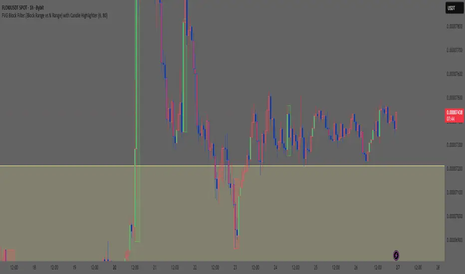
Smart Money Concept: FVG Block Filter Smart Money Concept: FVG Block Filter (FVG Block Range vs N Range) with Candle Highlighter
Summary:
Smart Money Concept (SMC): An advanced indicator designed to visualize and filter Fair Value Gaps (FVG) blocks based on their size (Range) compared to the preceding N Range candle movement. It also includes a customizable Candle Highlighter function that marks the specific candle responsible for creating the FVG. The indicator allows full color customization for both blocks and the highlighter, and features clean, label-free charts by default.
Key Features:
FVG Block Detection: Automatically identifies and groups sequential FVG imbalances to form consolidated FVG blocks.
FVG Block Filtering (N Range): Filters blocks based on a user-defined rule, comparing the block's size (Range) to the range of the preceding N candles (e.g., requiring the FVG block to be larger than the range of the previous 6 candles).
Customizable Candle Highlighter: Marks the central candle (B) within the FVG structure (A-B-C) to highlight the source of the price imbalance. Highlighter colors are fully adjustable via inputs.
Visualization Control: Labels are turned OFF by default to keep the chart clean but can be easily enabled via the indicator settings.
Full Color Customization: Allows independent customization of Bullish and Bearish FVG Block colors, Block Transparency, and Bullish/Bearish Highlighter colors.
Keywords:
Smart Money Concept, SMC, Fair Value Gap, FVG, Imbalance, Block Filter, Candle Highlighter, Range.
CandelaCharts - X Model📝 Overview
The X Model Indicator is a sophisticated trading strategy designed to identify high-probability entry points for both long and short positions. It utilizes a combination of key market levels, price action patterns, and multi-timeframe analysis to generate precise signals.
The model offers tailored entry conditions for both long and short trades, ensuring optimized risk-reward setups.
📦 Features
Previous Day High/Low (ERL): Resistance level from the previous day’s high/low.
H1 Bullish/Bearish FVG (IRL): A Bullish Fair Value Gap (FVG) on the 1-hour chart indicating price target potential.
m15 MSS / SMT: Market Structure Shift and Smart Money Technique on the 15-minute chart confirming the market's direction.
Only Short/Long Above/Below 00:00: Triggers short positions only after midnight to avoid potential market noise from earlier sessions.
⚙️ Settings
Core
Status: Filter models based on status
Bias: Controls what model type will be displayed, bullish or bearish
Fractal: Controls the timeframe pairing will be used
Sweep: Shows the sweep that forms a model
I-sweep: Controls the visibility of invalidated sweeps
D-purge: Plots the double purge sweeps
CISD: Displays the Change In State of Delivery for a model
Labels: Adjust the HTF candle label size
History
History: Controls the amount of past models displayed on the chart
HTF
Candles: Controls the number of HTF candles that will be visible on the chart
Open: Highlights with a line the open price of the current HTF candle
Show True Day Open: Display True Day Open line
Offset: Controls the distance of HTF from the current chart
Space: Controls the space between HTF candles
Size: Controls the size of HTF candles
LTF
H/L Line: Displays on the LTF chart High and Low of each HTF candle
O/C Line: Displays on the LTF chart Open and Close of each HTF candle
PD Arrays
PD Array: Displays ICT PD Arrays
CE Line: Style the equilibrium line of the PD Array
Border: Style the border of the PD Array
Projections
StDev: Controls standard deviation available levels
Labels: Controls the size of standard deviation levels
Anchor: Controls the anchor point of standard deviation levels (wick, body)
Lines: Controls the line widths and color of standard deviation levels
Dashboard
Panel: Display information about the current model
💡 Framework
The model incorporates multiple timeframe alignments for increased precision and reliability. The following timeframes are utilized for a comprehensive view of the market:
1m - 5m - 1H
2m - 15m - 4H
3m - 20m - 8H
5m - 30m - 12H
15m - 1H - 1D
1H - 4H - 1W
4H - 1D - 1M
1D - 1W - 3M
1W - 1M - 12M
These alignments ensure that the model captures both short-term price movements and longer-term trends, allowing for well-informed decision-making across various market conditions.
The X Model Indicator employs a precise set of conditions for both short and long entries, designed to capture optimal market opportunities based on key price levels, market imbalances, and institutional activity. These conditions combine multiple timeframes, price action patterns, and market sentiment to enhance the accuracy of entry signals.
Here's how each condition works:
Short Entry Conditions:
Previous Day High (ERL): The previous day’s high acts as a significant resistance level for the market. A price rejection or failure to break above this level indicates a potential short opportunity, as the market may reverse or consolidate.
H1 Bullish FVG (IRL): A Bullish Fair Value Gap (FVG) on the 1-hour chart highlights an area of price imbalance. This signals that the price may attempt to move back into this gap, providing a high-probability short entry if combined with other bearish signals.
m15 MSS / SMT: On the 15-minute chart, the Momentum Shift (MSS) and Smart Money Tool (SMT) indicators are used to confirm market manipulation or shift in momentum. If these indicators show bearish market activity, they strengthen the case for a short position.
Only Short Above 00:00: To avoid noise from earlier market sessions, the model only triggers short entries after midnight (00:00), ensuring that the trade occurs during a more stable, predictable phase of the trading day.
Long Entry Conditions:
Previous Day Low (ERL): The previous day’s low serves as a support level, marking an area where the price is likely to bounce. If the price pulls back and tests this level, it suggests a high-probability long entry, especially when other indicators align.
H1 Bearish FVG (IRL): A Bearish Fair Value Gap (FVG) on the 1-hour chart shows an imbalance to the downside, where the price may reverse and move upwards. This gap is often seen as an opportunity for the price to return to equilibrium, presenting a favorable long entry.
m15 MSS / SMT: The Momentum Shift (MSS) and Smart Money Tool (SMT) on the 15-minute chart help identify the market’s true intentions. A shift towards bullish momentum or signs of smart money accumulation increases the likelihood of a successful long entry.
Only Long Below 00:00: To focus on the market’s early session dynamics, the model only triggers long entries before midnight (00:00), capturing potential moves during quieter periods when the price can show clearer directional trends.
⚡️ Showcase
Introducing X Model is a powerful trading tool designed to elevate your market analysis and boost your trading success.
Bearish Model
Bullish Model
Unlock your full trading potential and experience the difference with X Model — your ultimate tool for smarter, more informed trading decisions.
🚨 Alerts
This script offers alert options for all model types. The alerts need to be setup manually from Tradingview.
Bearish Model
A bearish model alert is triggered when a model forms, signaling a high sweep on HTF and CISD on LTF.
Bullish Model
A bullish model alert is triggered when a model forms, signaling a low sweep on HTF and CISD on LTF.
⚠️ Disclaimer
These tools are exclusively available on the TradingView platform.
Our charting tools are intended solely for informational and educational purposes and should not be regarded as financial, investment, or trading advice. They are not designed to predict market movements or offer specific recommendations. Users should be aware that past performance is not indicative of future results and should not rely on these tools for financial decisions. By using these charting tools, the purchaser agrees that the seller and creator hold no responsibility for any decisions made based on information provided by the tools. The purchaser assumes full responsibility and liability for any actions taken and their consequences, including potential financial losses or investment outcomes that may result from the use of these products.
By purchasing, the customer acknowledges and accepts that neither the seller nor the creator is liable for any undesired outcomes stemming from the development, sale, or use of these products. Additionally, the purchaser agrees to indemnify the seller from any liability. If invited through the Friends and Family Program, the purchaser understands that any provided discount code applies only to the initial purchase of Candela's subscription. The purchaser is responsible for canceling or requesting cancellation of their subscription if they choose not to continue at the full retail price. In the event the purchaser no longer wishes to use the products, they must unsubscribe from the membership service, if applicable.
We do not offer reimbursements, refunds, or chargebacks. Once these Terms are accepted at the time of purchase, no reimbursements, refunds, or chargebacks will be issued under any circumstances.
By continuing to use these charting tools, the user confirms their understanding and acceptance of these Terms as outlined in this disclaimer.

Adaptive Squeeze Momentum (Zeiierman)█ Overview
Adaptive Squeeze Momentum (Zeiierman) is a hybrid oscillator that models the market’s transition between trend-efficient and inefficient (choppy or reversal-prone) regimes. It fuses a price efficiency framework, volatility-adaptive responsiveness, and a bounded directional trend score, then intelligently blends them through a dynamic transition band to emphasize either smooth, directional structure or spiky inefficiency.
Unlike traditional momentum tools, it does not simply measure speed or volatility. It measures how efficiently the price is moving. This multidimensional approach allows it to identify when markets are compressed and ready to expand, or stretched and ready to revert.
In essence, Adaptive Squeeze Momentum (Zeiierman) gives traders a deep structural perspective of efficiency, momentum, and compression energy, helping to expose hidden squeezes, early reversals, and trend continuations with remarkable accuracy.
⚪ Why This One Is Unique
Adaptive Squeeze Momentum (Zeiierman) stands out because it doesn’t rely on static momentum or volatility measures alone. It merges price efficiency, volatility adaptivity, and trend structure into one cohesive system capable of detecting:
Early squeeze build-ups and directional releases
Reversals emerging from inefficiency spikes
Shifts between clean trends and noisy, unstable ranges
Adaptive behavior across changing volatility conditions
In essence, it acts as a self-adjusting market intelligence tool, revealing when the price is efficient, exhausted, or preparing for significant expansion.
█ Main Features
⚪ Adaptive Squeeze Momentum Oscillator
The Adaptive Squeeze Momentum (Zeiierman) captures how price structure transitions between compression, expansion, and inefficiency. It merges a volatility-adaptive momentum engine with an efficiency-aware structure filter, creating a responsive oscillator that reflects not just how fast the market moves, but how efficiently it moves.
Adaptive Momentum: Reacts dynamically to changing volatility regimes
Efficiency Awareness: Distinguishes stable, directional flow from unstable or noisy price action
Volatility Squeeze Detection: Identifies buildup (compression) and breakout (release) conditions
Directional Context: Shows momentum alignment, exhaustion, or imbalance through color-coded histograms
This hybrid model provides a multidimensional view of trend quality, squeeze pressure, and inefficiency, ideal for precision-based trend following and structural reversal recognition.
⚪ Understanding the Squeeze
A squeeze occurs when volatility contracts, prices compress, and market energy builds, much like a coiled spring preparing to release. Once volatility expands, that stored energy transforms into directional movement, often marking the beginning of a significant breakout or new trend phase.
Traditional squeeze indicators focus only on volatility contraction. Adaptive Squeeze Momentum (Zeiierman) goes further by incorporating efficiency analysis to evaluate how organized or chaotic the buildup is. This reveals not only when a squeeze may fire but also whether the ensuing release is likely to be sustainable or structurally weak.
Visual Interpretation:
Lighter Dots: Represent low-volatility compression, energy building within an efficient or balanced structure.
Yellow Dots: Mark volatility release, the expansion phase where momentum accelerates.
⚪ Inefficiency Columns
Efficient Price Action
Efficient moves are clean, directional, and purposeful. Price advances with minimal back-and-forth noise, revealing strong conviction and structural alignment. In the indicator, these appear as smooth, non-blue histogram columns. Such periods indicate organized, high-probability momentum where breakouts, trends, and continuations are supported by efficient order flow.
Inefficient Price Action
Inefficient moves are noisy, erratic, and spiky, showing that price is fighting its own structure. Liquidity is thin, reactions are emotional, and momentum lacks balance. In the oscillator, inefficiency is displayed through blue columns, path-break spikes, or OB/OS inefficiency crosses (green/red). These elements act as early warnings of structural instability, suggesting the market may be overextended, losing organization, or entering a mean-reversion or reversal phase.
█ How to Use
⚪ Trend Following
When oscillator bars are above or below zero and growing in color intensity, momentum is expanding, confirming active, efficient trends. When colors fade, momentum is decelerating, signaling potential exhaustion or consolidation.
Interpretation:
Sustained smooth growth above zero indicates strong, efficient bullish momentum.
Sustained smooth growth below zero indicates efficient bearish continuation.
Color fading or a zero-line cross suggests trend fatigue or rotation.
Tip: Confirm trend continuation when yellow squeeze-release dots appear in the same direction. They often precede sustained breakouts following compression.
⚪ Inefficiency Reversals or Breakouts
Adaptive Squeeze Momentum (Zeiierman) excels at detecting instability within active trends, highlighting when moves lose internal efficiency and become unsustainable. When bars change color, outbreak columns appear, or Overbought/Oversold Inefficiency Crosses (green/red) appear, the structure is shifting toward potential reversal or exhaustion.
Blue Inefficiency Columns:
Above Zero: Indicates inefficient buying pressure where markets push higher impulsively or emotionally. Often signals an overstretched or unstable rally prone to short-term corrections or FOMO-driven peaks.
Below Zero: Reflects inefficient selling pressure where panic-driven or disorderly sell-offs often precede exhaustion and recovery phases.
Main Oscillator Inefficiency:
Spiky Column Above Zero
When the main oscillator suddenly surges upward and prints a tall, spiky column above the zero line without turning blue, it signals an inefficient and overextended push to the upside. This type of move breaks the oscillator’s usual smooth rhythm, showing that buyers are becoming overaggressive or emotional, often driven by FOMO or reactive momentum chasing.
Even though the column remains green, the abrupt path break reveals that the move is losing internal structure and may be unsustainable. Such inefficient upward bursts often indicate upside exhaustion or an overshoot, where the market temporarily loses control.
From here, two scenarios can unfold:
A sustained breakout if structure confirms (for example, a valid squeeze release or strong volume support).
A snapback or reversal if follow-through fails on the next bars and the oscillator begins to fade (growth → fall).
Spiky Column Below Zero
When the oscillator sharply dives and prints a tall, spiky column below the zero line without turning blue, it reflects an inefficient and emotional push to the downside. This behavior typically emerges during panic-driven selling, where traders aggressively dump positions, breaking the oscillator’s normal rhythm.
Even though the color remains red, this kind of path-break spike shows that the market has become disordered or overstretched. These inefficient downward thrusts often suggest bear exhaustion, capitulation, or a temporary overshoot below fair structure.
From this point, two potential outcomes can occur:
A sustained breakdown if the move is supported by strong volume or new structural lows.
A rebound or mean reversion occurs when momentum fails to extend, indicating that selling pressure has burned out.
Setting Tip: To focus purely on the oscillator’s structural peaks, set Inefficiency Detection and Inefficiency Duration to identical values, then adjust Inefficiency Price Peaks to control sensitivity. Use lower values for crisp detection and higher values for smoother blending.
Overbought and Oversold Inefficiency Signals
Green Overbought Cross: Signals that buyers are driving the market too aggressively, often from emotional extension or FOMO. This imbalance typically leads to short-term pauses, pullbacks, or corrections.
Red Oversold Cross: Signals panic-driven or emotionally imbalanced selling, marking structural exhaustion. Often precedes rebounds or base formations as volatility normalizes.
Interpretation: Both crosses identify where momentum is inefficient rather than simply overbought or oversold, helping detect exhaustion before conventional oscillators do.
⚪ Squeeze Builds and Releases (Volatility Expansion)
The squeeze system highlights volatility cycles when the market compresses, builds energy, and releases it through expansion.
Lighter Dots: Compression, where volatility contracts, structure tightens, and energy builds.
Yellow Dots: Release, where volatility expands, triggering directional movement.
Interpretation: Light dots signal potential breakout setups. When followed by a yellow dot and an aligned oscillator direction, they confirm momentum ignition —the moment the market transitions from equilibrium to expansion.
█ How It Works
⚪ Inefficiency Logic
The indicator evaluates how efficiently the price progresses relative to internal volatility. When market flow loses directional clarity, it transitions into an inefficiency state, represented by blue columns or sudden outbreaks within the oscillator. These moments reveal when the underlying structure becomes unstable or overly reactive, often preceding reversals or false momentum bursts.
Calculation: Applies an adaptive efficiency model that compares directional movement to internal dispersion and classifies it within a controlled stability band. A dual-threshold hysteresis with smooth interpolation ensures stable transitions between efficient (trend) and inefficient (spike) phases.
⚪ Directional Tendency Core
The directional tendency component models the underlying slope of market intent, expressing the balance between structured progression and reactive drift. It transforms directional bias into a bounded, volatility-normalized range that remains consistent across instruments and timeframes.
Calculation: Constructs a normalized directional field derived from trend displacement over an adaptive window, filtered through a nonlinear bounding transform and dynamic smoothing to control lag and oscillation.
⚪ Squeeze Engine
The squeeze system isolates compression and release cycles, the rhythmic build-up and discharge of volatility. Compression phases represent equilibrium and contraction, while release phases signify volatility expansion and directional acceleration.
Calculation: Integrates a volatility-adjusted energy model with directional gating. Compression forms during sustained contraction, while release occurs as volatility and momentum expand.
⚪ OB/OS Inefficiency Extremes
The OB/OS inefficiency system detects imbalanced extremes in order flow, when price pushes too far in one direction without structural support. These regions often precede exhaustion or rapid mean reversion.
Calculation: Generates an efficiency-weighted propagation field that identifies directional overextension. Threshold analysis and adaptive state classification determine overbought (green) and oversold (red) inefficiency zones.
⚪ Final Oscillator Composition
The final oscillator is an adaptive blend of inefficiency, directional tendency, and volatility state. It continuously morphs between spike-dominant and trend-dominant behavior based on the evolving efficiency environment. This produces a responsive structural map that visualizes the interplay between market stability, momentum, and compression energy.
Calculation: Combines the signed inefficiency signal and the bounded trend vector through a soft-weighted blending function governed by the efficiency band.
-----------------
Disclaimer
The content provided in my scripts, indicators, ideas, algorithms, and systems is for educational and informational purposes only. It does not constitute financial advice, investment recommendations, or a solicitation to buy or sell any financial instruments. I will not accept liability for any loss or damage, including without limitation any loss of profit, which may arise directly or indirectly from the use of or reliance on such information.
All investments involve risk, and the past performance of a security, industry, sector, market, financial product, trading strategy, backtest, or individual's trading does not guarantee future results or returns. Investors are fully responsible for any investment decisions they make. Such decisions should be based solely on an evaluation of their financial circumstances, investment objectives, risk tolerance, and liquidity needs.
Script a pagamento

RSI Pro Suite (Zeiierman)█ Overview
RSI Pro Suite (Zeiierman) is a complete RSI ecosystem built on an Efficient Price foundation. Instead of feeding RSI with the standard close, the script first converts price into an adaptive, efficiency-weighted trajectory known as Efficient Price. All major components of the tool, including the Efficient Price RSI, Significant RSI Moves, the divergence engine, the inefficiency layer, the momentum impulse system, and the multi-timeframe dashboard, are built on top of this refined data stream.
The result is an RSI that looks and behaves like a familiar oscillator while reflecting deeper qualities of the market, such as regime stability, volatility behavior, and directional consistency. It supports both discretionary and systematic workflows, whether you rely on classic overbought and oversold readings or more advanced interpretations such as significant internal RSI pressure, inefficiency clusters, divergence structures, and momentum bursts.
⚪ Why This One Is Unique
RSI Pro Suite does not treat RSI as a simple calculation on price. It embeds RSI inside a two-stage Efficient Price framework that reshapes how trend, rotation, and reversal pressure are interpreted. The chosen EP source (Close, Mean-reversion, or Trend) is first processed through an adaptive efficiency model that filters noise and enhances structural meaning. A second refinement pass produces the foundation for the EP-RSI, giving it a cleaner and more context-aware behavior than standard RSI.
Around this core, the script layers several specialized systems. Significant RSI Moves identify internal pressure zones where momentum stretches, revealing shifts that often occur before they appear on price.
█ Main Features
⚪ EP- Based RSI
The core of RSI Pro Suite is an RSI built on a refined Efficient Price rather than raw price, providing a cleaner and more structurally meaningful oscillator. It maintains the classic RSI visual style with 70/30 bands, a 50 midline, and soft gradient fills that express overbought and oversold tension. A smoothing layer allows several moving-average options for the RSI. This creates an intuitive environment for reading trend strength, exhaustion, and mean-reversion with far greater clarity than a standard RSI.
The Efficient Price engine can be driven by three behavioral modes that reshape the character of the RSI, allowing the indicator to adapt to different market conditions and trading styles.
Close
This mode follows price action directly, mirroring the natural rhythm of the market. It is the most general-purpose option and provides a balanced read of both trend and rotation, making it suitable for the majority of market environments.
Mean-reversion
Mean-reversion mode focuses on swing turns and snap-back behavior, emphasizing RSI-based cyclical reversals. It highlights oscillatory structures, swing reactions, and fading opportunities, making it highly effective for traders who target reversal setups or rotational markets.
Trend
The Trend mode uses a trend-smoothed input that emphasizes directional drift and sustained momentum. It provides clearer insight into trend continuation, trend maturity, and structural strength, helping traders stay aligned with broader directional moves.
⚪ Significant RSI Moves
RSI Pro Suite detects when RSI trades within its most important internal zones—areas where price has historically shown elevated reaction potential. The system continuously evaluates the structure of the RSI range and identifies moments when internal pressure becomes meaningful. When these conditions align, the indicator highlights Significant RSI Movements, revealing subtle but powerful structural shifts before they appear on price itself.
⚪ Divergence Detection
The suite includes regular bullish and bearish divergence detection between EP-RSI and price. It identifies clear pivot structures, marks them directly on the RSI pane, and labels each as Bull or Bear. Because divergences are evaluated using the Efficient Price RSI, the signals appear cleaner and less noisy, making them more reliable during both trend reversals and continuation setups.
⚪ Impulse
Momentum impulses appear when the RSI and Price exhibits unusually strong acceleration. Green circles near the upper region indicate sharp upside bursts, while red circles near the lower region reveal powerful downside surges. These impulses highlight moments of expansion, exhaustion, or sudden strength that stand out from typical RSI behavior.
⚪ Inefficiency Diamonds
Whenever the internal logic detects an inefficiency regime, the indicator plots blue diamonds on the mid-level. These diamonds mark structurally imbalanced or spiky conditions that often precede reaction swings, failed pushes, or key turning points in momentum.
⚪ Visual Multi-Timeframe Dashboard
A right-side dashboard provides a compact real-time overview of multiple structural signals across 5M, 15M, 1H, 2H, 4H, and 1D timeframes:
Directional Signals (up or down arrow)
OB/OS flags
Divergence state
Impulse activity
Inefficiency state
Explosive conditions
█ How to Use
⚪ Classic RSI Trading
Interpreting it is similar to a classic RSI but with structurally cleaner input. Sustained movement above the 50 midline reflects a bullish regime in the Efficient Price environment; persistent movement below 50 reflects a bearish regime. When EP-RSI repeatedly leans against the upper band near 70 while its smoothing line rises, it indicates strong upside control; repeated engagement with the lower band near 30 with a falling smoother indicates strong downside control.
⚪ Trend Trading
Use the Trend EP mode to smooth the RSI and track directional movement more clearly. When the RSI holds above the midline during an uptrend or below it during a downtrend, stay aligned with the direction. The multi-timeframe dashboard helps confirm trend strength by showing whether higher-timeframe signals agree with your chart.
Look for impulse markers and clean directional signals as continuation cues, and use inefficiency or weakening impulses as early signs to scale out or tighten stops.
⚪ Pullback Trading
Enable Trend mode and increase the length to 20 or higher. Then enable the Standard RSI and set it to 7. This configuration helps you track broader trends with the EP-RSI while using the shorter-period standard RSI to identify pullback opportunities within that trend.
When the EP-RSI is clearly green or red, indicating an established trend, begin watching the standard RSI for oversold or overbought conditions. These signals often mark clean pullbacks within the larger move. Entering during these moments allows you to participate in the continuation of the trend with improved timing and reduced risk.
⚪ Overbought/Oversold Trading
Treat the 70/30 regions as pressure zones, not automatic reversal signals. Use OB/OS flags on the dashboard to check whether multiple timeframes are stretched in the same direction. When price enters an overextended area, watch for Significant RSI Moves or impulse exhaustion markers to time entries or exits more precisely. This approach helps you avoid fading strong trends and instead focus on moments where reactions or pauses are more likely.
⚪ Mean-reversion Trading
Switch to Mean-reversion mode when focusing on turning points. This mode emphasizes snap-back behavior and makes reversal zones clearer. Combine reversal attempts with divergence signals, Significant RSI Moves, and impulse exhaustion markers. When several of these appear at once, especially across multiple timeframes on the dashboard, you have a stronger reversal setup.
⚪ Divergence Trading
Enable divergence detection when you want to focus on turning points rather than trend following. Bullish divergence occurs when price prints a lower low but the EP-RSI prints a higher low at a labeled pivot; bearish divergence occurs when price prints a higher high but the EP-RSI prints a lower high.
These divergences are most effective when they form near the 30 and 70 regions or after extended runs. A bullish divergence emerging from an oversold region can be used as confirmation to scale into long ideas; a bearish divergence near overbought regions can support profit-taking or contrarian short setups.
⚪ Breakout Trading
In breakout conditions, Significant RSI Moves and impulse markers work together as confirmation tools. When price pushes through a resistance level and the RSI prints a Significant RSI Move at the same time, it shows that internal momentum has shifted decisively in favor of the breakout. If this move is supported by green upper impulse markers, it strengthens the case that buyers are driving the move with conviction rather than the breakout occurring on weak momentum.
During a retest of the breakout zone, these signals become even more valuable. A Significant RSI Move forming at the retest, especially when paired with a fresh impulse burst, often marks strong rejection from the level and signals that the breakout structure is holding. This combination highlights areas where buyers are stepping in aggressively to defend the level.
The same concepts apply in reverse during breakdowns. A Significant RSI Move occurring at support alongside red downside impulses confirms heavy selling pressure and adds confidence to continuation entries. If such signals appear after an extended move, they can also highlight capitulation points that precede sharp reversals.
This makes Significant RSI Moves and impulse markers highly effective for validating breakouts, evaluating retests, and timing continuation or rejection trades with much greater precision.
⚪ Reversal Trading
Use contrarian signals to identify areas that may offer attractive reversal opportunities. These signals highlight moments when the market is stretched and showing signs of exhaustion, which can develop into a broader shift in direction. Combine them with Significant RSI Moves and impulse markers to gauge the strength and credibility of the potential reversal, especially around key levels or after extended trends.
⚪ Interpreting Inefficiency Regime
Watch the diamonds associated with the inefficiency regime as contextual signals. When they cluster following a smooth, steady trend, they often mark zones where the process shifts from “clean trend” to “noisy” or “imbalanced” behavior. Combined with EP-RSI rolling over from an extreme or divergence labels appearing nearby, such clusters can highlight high-value inflection areas.
⚪ Overview Panel
Use the right-hand dashboard as a quick alignment guide rather than a direct signal generator. Each row represents a different structural component of the market, and each column represents a timeframe from 5M to 1D. The Signals row shows immediate directional bias, OB/OS highlights stretched conditions, Divergence marks structural disagreement, Impulse reveals bursts of momentum, Inefficiency identifies unstable movement and Explosive highlights higher-timeframe volatility conditions.
The panel is most useful as a mental checklist. When several timeframes show similar characteristics, such as multiple signals pointing in the same direction or impulses aligning across the lower timeframes, the context for the trade becomes stronger. Mixed readings indicate hesitation or imbalance in the market, helping you avoid forcing trades during unclear conditions.
With coverage across 5M, 15M, 1H, 2H, 4H and 1D, the dashboard gives you an instant sense of whether momentum, pressure and structure are working together or pushing against each other, allowing you to judge at a glance whether the environment favors continuation, rotation or caution.
█ How It Works
⚪ EP Source and Pre-EP Layer
The system begins by selecting a core behavioral driver such as Close, Mean-Reversion, or Trend. This source is transformed into a stability-aware stream that evaluates how consistently the price is moving relative to its own volatility environment. Each movement is weighted by its structural quality rather than raw magnitude, producing a preliminary Efficient Price that reflects directional reliability instead of noise.
Calculation: Applies efficiency-based weighting and volatility normalization to the raw source, accumulating the results into a first-stage Efficient Price that represents structural strength and directional quality.
⚪ Main EP Engine and Adaptive Refinement
This first-stage Efficient Price is processed again through a second refinement pass, smoothing irregularities and further aligning the trajectory with coherent directional flow. The result is a fully refined Efficient Price that responds to meaningful structural shifts while avoiding the instability of raw price oscillation.
Calculation: Uses a second adaptive efficiency pass with volatility moderation, cumulative weighting, and slope extraction. This acts as a two-layer filter, favoring persistent movement while remaining sensitive to regime changes.
⚪ Inefficiency–Trend Blending
This component evaluates the EP-RSI through two behavioral lenses: inefficiency and trend. Inefficiency highlights spike-driven, imbalanced movement, while the trend component captures underlying directional slope and stability. A smooth blending mechanism transitions between these modes depending on where the system sits within efficiency space.
Calculation: Computes an inefficiency score from ER deviation and a trend score from normalized regression slope. A smoothstep transition blends them, and diamond markers appear when the oscillator confirms it is inside an inefficiency regime.
⚪ Momentum Impulse Modeling
Momentum impulses isolate moments when acceleration becomes unusually strong. The system exaggerates extreme RSI deviations while muting ordinary fluctuations, allowing only the sharpest bursts to stand out. A small clustering check eliminates transient noise, marking impulses only when structurally meaningful.
Calculation: Runs RSI through chained non-linear transforms, compares outputs against their own historical envelopes, evaluates local dominance, and emits impulse markers when deviations exceed cluster thresholds.
-----------------
Disclaimer
The content provided in my scripts, indicators, ideas, algorithms, and systems is for educational and informational purposes only. It does not constitute financial advice, investment recommendations, or a solicitation to buy or sell any financial instruments. I will not accept liability for any loss or damage, including without limitation any loss of profit, which may arise directly or indirectly from the use of or reliance on such information.
All investments involve risk, and the past performance of a security, industry, sector, market, financial product, trading strategy, backtest, or individual's trading does not guarantee future results or returns. Investors are fully responsible for any investment decisions they make. Such decisions should be based solely on an evaluation of their financial circumstances, investment objectives, risk tolerance, and liquidity needs.

FVG IFVG DetectorThe FVG IFVG Detector is a market–structure-based indicator designed to automatically detect Fair Value Gaps (FVGs) and Inversion Fair Value Gaps (IFVGs) on any timeframe. It highlights these imbalances as extended zones on the chart, helping traders identify areas where price has moved inefficiently and is likely to revisit.
Below is the detailed breakdown of what the indicator does:
1. Detects Bullish and Bearish Fair Value Gaps (FVGs)
The indicator checks for the standard 3-candle FVG structure:
Bullish FVG
Formed when high of candle (n-2) is below low of candle (n)
Indicates price moved upward too fast, leaving an imbalance below.
Bearish FVG
Formed when low of candle (n-2) is above high of candle (n)
Indicates price moved downward too fast, leaving an imbalance above.
2. Detects IFVG (Inversion Fair Value Gaps)
IFVG forms when an FVG is later retested and price reacts opposite its origin.
Bullish IFVG
A bullish FVG is created
Price returns and taps the upper boundary
The candle closes bullish (close > open)
The zone becomes a support-like inversion area
Bearish IFVG
A bearish FVG is created
Price returns and taps the lower boundary
The candle closes bearish (close < open)
The zone becomes a resistance-like inversion area
3. Draws IFVG Zones Extended to the Right
The indicator plots:
A top line
A bottom line
A filled area between the two lines
The zone extends indefinitely to the right, acting like supply/demand imbalance levels.
This makes it visually clear where price may react again in the future.
4. Separate Maximum Counts for Bullish & Bearish IFVGs
User can define:
How many bullish IFVG zones should be displayed
How many bearish IFVG zones should be displayed
Older zones are automatically removed to keep the chart clean.
5. Clean Visuals — No Labels, No Clutter
The indicator intentionally avoids:
Labels
Markers
Text overlays
Only clean, extended imbalance zones are shown for a professional SMC-style chart.
6. Fully Compatible with Any Timeframe
Works on:
Scalping (M1–M15)
Intraday (M30–H1)
Swing (H4–Daily)
The logic stays the same across all chart speeds.
7. Practical Use Cases for Traders
The indicator helps identify:
Areas where price is likely to return, react, or mitigate
Entries based on retest of imbalance
Potential zones for reversal, continuation, or trend confirmation
8. Advantages for SMC Traders
Automatically highlights hidden inefficiencies
Helps anticipate reversal zones
Filters low-quality imbalances
Provides structure-aligned entries
Reduces chart noise
Improves consistency in finding Smart Money levels

Scalping Dashboard - Volume Candles + Liquidity ZonesScalping Dashboard - Volume Candles + Liquidity Zones
📊 Overview
A comprehensive scalping indicator designed for high-frequency traders on 1-5 minute timeframes. This all-in-one dashboard combines volume analysis, order flow metrics, technical indicators, and institutional liquidity zones to identify high-probability scalping opportunities.
🎯 Key Features
✅ Multi-Timeframe Analysis
Fast MACD (5/13/5) for momentum
Quick EMAs (9/20/50) for trend direction
Rapid Stochastic (5/3/3) for oversold/overbought conditions
Fast RSI (7) for extreme readings
✅ Advanced Order Flow Metrics
CVD (Cumulative Volume Delta): Tracks buy vs sell pressure over time
Delta Momentum: Measures acceleration in buying/selling
Buy/Sell Pressure Ratio: Real-time balance of market forces
Order Flow Imbalance: Detects aggressive buying or selling
Tape Speed: Measures how fast volume is hitting the market
✅ Institutional Liquidity Zones
Buy-Side Liquidity: Areas above price where short stop losses cluster
Sell-Side Liquidity: Areas below price where long stop losses cluster
Liquidity Sweeps: Detects "stop hunts" by institutions before reversals
✅ Volume-Based Candle Coloring
Visual representation of volume intensity
Extreme, High, Normal, and Low volume categories
Fully customizable color schemes
✅ Dynamic Support/Resistance
Volume-weighted price levels
Automatically updates every 3 bars
Shows distance to key levels
📈 Dashboard Indicators Explained
The bottom-left dashboard displays 14 real-time metrics:
▸ MACD (●)
Green = Bullish momentum
Red = Bearish momentum
Gray = Neutral
▸ Supp (Price)
Support level
Green highlight = at support (good for long entry)
▸ Res (Price)
Resistance level
Orange highlight = at resistance (good for short entry)
▸ EMA (●)
Green = Price above EMAs (bullish)
Red = Price below EMAs (bearish)
▸ Stoch (●)
Green = Oversold (<20)
Red = Overbought (>80)
Gray = Neutral
▸ RSI (●)
Green = Oversold (<30)
Red = Overbought (>70)
Gray = Neutral
▸ CVD (●)
Green = Cumulative buying pressure
Red = Cumulative selling pressure
▸ ΔCVD (●)
Green = Increasing buy pressure
Red = Increasing sell pressure
▸ Imbal (●)
Green = Buy imbalance (>2:1 ratio)
Red = Sell imbalance
▸ Vol (●)
Green/Yellow background = Volume surge (>2x average)
▸ Tape (●)
Green/Yellow background = Fast tape (>1.5x speed)
▸ Liq (↑↓●)
↑ = Bullish sweep or near sell-side liquidity
↓ = Bearish sweep or near buy-side liquidity
● = Neutral
▸ Score (#L or #S)
Quality score (0-8) for Long or Short setups
Higher numbers = Better quality trade
▸ SCALP (LONG/SHORT/WAIT)
Primary signal
Bright color = High quality (score ≥5)
Dim color = Decent quality (score =4)
Gray = Wait for better setup
🎨 Candle Color System
Volume-Based Colors
Bright Green/Red: Extreme volume (>2.5x average) - Major moves
Medium Green/Red: High volume (>1.5x average) - Strong activity
Dull Green/Red: Normal volume - Standard market activity
Gray: Low volume (<0.5x average) - Avoid trading
Signal-Based Colors
Lime: Strong Long signal (score ≥5)
Green: Decent Long signal (score =4)
Orange: Strong Short signal (score ≥5)
Red: Decent Short signal (score =4)
Candle Color Modes (adjustable in settings):
Volume Only: Pure volume intensity
Volume + Signals: Signals override volume when present (default)
Signals Only: Only shows entry signals
🔵 Chart Indicators
Support & Resistance Lines
Green Line: Volume-weighted support level
Red Line: Volume-weighted resistance level
Lines update dynamically based on 100-bar volume profile
Liquidity Zones
Cyan Circles/Dashed Lines: Buy-side liquidity (above price)
Where short stop losses cluster
Potential targets for bullish moves
Institutions may push price here before reversing down
Magenta Circles/Dashed Lines: Sell-side liquidity (below price)
Where long stop losses cluster
Potential targets for bearish moves
Institutions may push price here before reversing up
Entry Markers
Large Green Triangle (▲): High quality long entry (score ≥5)
Small Green Triangle (▲): Decent long entry (score =4)
Large Orange Triangle (▼): High quality short entry (score ≥5)
Small Red Triangle (▼): Decent short entry (score =4)
Liquidity Sweep Markers
Cyan X-Cross (below bar): Bullish liquidity sweep - "LIQ↑"
Price swept sell-side liquidity and reversed up
Strong buy signal
Magenta X-Cross (above bar): Bearish liquidity sweep - "LIQ↓"
Price swept buy-side liquidity and reversed down
Strong sell signal
🎯 How to Use This Indicator
For Long Scalps (Buy):
Wait for Dashboard Signal: SCALP = "LONG" with score ≥5
Confirm Multiple Green Dots: Look for EMA, CVD, ΔCVD, Imbal all green
Check Volume: Vol or Tape should show yellow background (surge)
Look for Confluence:
Price at or near Support level (green highlight)
Price near Sell-Side Liquidity (magenta line below)
RSI oversold (green dot)
Large green triangle appears on chart
Best Entry: On a bullish liquidity sweep (cyan X-cross)
For Short Scalps (Sell):
Wait for Dashboard Signal: SCALP = "SHORT" with score ≥5
Confirm Multiple Red Dots: Look for EMA, CVD, ΔCVD, Imbal all red
Check Volume: Vol or Tape should show yellow background (surge)
Look for Confluence:
Price at or near Resistance level (orange highlight)
Price near Buy-Side Liquidity (cyan line above)
RSI overbought (red dot)
Large orange triangle appears on chart
Best Entry: On a bearish liquidity sweep (magenta X-cross)
Three Types of Scalping Setups:
1. Quick Scalp (Fastest - 1-5 minute holds)
MACD or Stochastic crossover + Volume surge
At Support/Resistance level
Score ≥4
2. Momentum Scalp (Ride the wave - 5-15 minute holds)
Strong EMA alignment + CVD slope positive
Order flow imbalance + Fast tape
Volume surge with price structure
Score ≥5
3. Reversal Scalp (Fade extremes - 3-10 minute holds)
Stochastic + RSI extreme readings
At Support/Resistance OR liquidity sweep
CVD momentum reversal
Score ≥6
⚙️ Recommended Settings
Timeframes
Primary: 1-minute, 2-minute, 5-minute
Confirmation: Use 15-minute chart for overall trend direction
Asset Types
Forex pairs (high liquidity)
Crypto (BTC, ETH with high volume)
Futures (ES, NQ)
Major stocks during market hours
Risk Management
Target: 1-3 times your stop loss
Stop Loss: Below nearest liquidity zone for longs, above for shorts
Position Size: Never risk more than 1% per trade
Score ≥5: Take full position size
Score =4: Take half position size or skip
🔧 Customization Options
Input Groups
MACD Settings
Fast Length: 5 (scalping optimized)
Slow Length: 13
Signal Length: 5
EMA Settings
EMA 9, 20, 50 (fast scalping EMAs)
Stochastic Settings
%K Length: 5
%D Smoothing: 3
Smooth: 3
CVD Settings
MA Length: 10 (for CVD smoothing)
RSI Settings
Length: 7 (fast RSI)
Overbought: 70
Oversold: 30
Volume Settings
MA Length: 10
Extreme Multiplier: 2.5x
High Multiplier: 1.5x
Low Multiplier: 0.5x
Liquidity Zone Settings
Lookback Periods: 20
Swing Strength: 3
Show Liquidity Zones: On/Off
Show Liquidity Sweeps: On/Off
Support/Resistance Settings
Volume Lookback: 100 bars (~2 hours on 1-min chart)
Order Flow Settings
Imbalance Threshold: 2.0 (2:1 ratio)
Color Customization
All volume colors customizable
All signal colors customizable
All liquidity colors customizable
📊 Volume Legend (Top Right)
The small table in the top-right corner shows the volume intensity key:
Extreme: >2.5x average volume
High: >1.5x average volume
Normal: 0.5x to 1.5x average volume
Low: <0.5x average volume
🔔 Built-in Alerts
Set up these alerts to never miss a trade:
High Quality Long Scalp: Triggers when entry_long and score ≥5
High Quality Short Scalp: Triggers when entry_short and score ≥5
Bullish Liquidity Sweep: Triggers when sell-side liquidity is swept
Bearish Liquidity Sweep: Triggers when buy-side liquidity is swept
To set up: Right-click chart → Add Alert → Select condition → Create
💡 Pro Tips
Understanding Liquidity Zones
Buy-Side Liquidity = Where shorts have their stops = Price tends to wick up here
Sell-Side Liquidity = Where longs have their stops = Price tends to wick down here
Liquidity Sweep = Institution triggers stops, absorbs liquidity, then reverses
Best trades = Enter AFTER the sweep when price reverses back
Reading the Dashboard
All Green Dots + Yellow Volume = Strong Long Setup
All Red Dots + Yellow Volume = Strong Short Setup
Mixed Colors = Choppy/Neutral = Wait
Score 6+ = Highest probability trades
Score 3 or less = Avoid
Confluence is Key
Never trade on a single indicator. Wait for:
Dashboard score ≥5
Volume surge (yellow background)
At support/resistance OR liquidity zone
CVD and momentum aligned
Price structure confirmation (triangle marker)
Avoid These Situations
❌ Low volume periods (gray candles)
❌ Dashboard shows "WAIT"
❌ Score below 4
❌ No volume surge during entry
❌ Trading against higher timeframe trend
Best Trading Sessions
Forex: London open (3-5 AM EST), NY open (8-10 AM EST)
Crypto: Works 24/7, best during high volume periods
Stocks: First hour (9:30-10:30 AM EST), last hour (3-4 PM EST)
Futures: US session open (9:30 AM EST)
🎓 Understanding the Scoring System
The indicator calculates a quality score (0-8) for both long and short setups:
+1 point for each:
EMA bias aligned (price above/below EMA structure)
CVD momentum bias aligned (buying/selling pressure)
Buy/Sell pressure ratio aligned (>1.5x or <0.67x)
Volume strength (surge detected)
Order flow imbalance (>2:1 ratio)
Tape speed (>1.3x average)
Price structure (higher highs or lower lows)
Liquidity bias (sweep detected)
Score Interpretation:
7-8: Extremely high probability (rare, take immediately)
6: Very high probability (excellent trade)
5: High probability (good trade)
4: Decent probability (acceptable with tight stop)
3 or less: Low probability (wait for better setup)
📋 Quick Reference Card
Entry Checklist
Dashboard shows LONG or SHORT
Score is ≥5
Multiple indicators aligned (green or red dots)
Volume surge present (yellow background)
At support/resistance or liquidity zone
Triangle marker appeared on chart
Risk:Reward ratio is at least 1:2
Exit Strategy
Take Profit: At opposite liquidity zone or resistance/support
Stop Loss: Below sell-side liquidity (longs) or above buy-side liquidity (shorts)
Trail Stop: Move to breakeven after 1:1 risk:reward achieved
⚠️ Important Notes
This is NOT a holy grail: No indicator is 100% accurate. Always use proper risk management.
Backtest first: Paper trade or backtest on your specific instrument before using real money.
Market conditions matter: This indicator works best in trending or volatile markets, not in tight consolidation.
Combine with price action: Use the indicator as confluence with your own price action reading.
Adjust for your instrument: Different assets may require tweaking the sensitivity settings.
Lower timeframes = More noise: 1-minute charts have more false signals than 5-minute charts.
🔄 Version History
v1.0 - Initial release
Multi-indicator dashboard
Volume-based candle coloring
Support/Resistance detection
Entry signal generation
v2.0 - Current version
Added liquidity zone detection
Added liquidity sweep identification
Enhanced scoring system (now 0-8)
Added liquidity bias to entries
New alerts for liquidity sweeps
Improved dashboard with Liq indicator
📞 Support & Feedback
If you find this indicator helpful, please:
⭐ Give it a boost
💬 Share your results in the comments
🐛 Report any bugs or issues
💡 Suggest improvements
Disclaimer: This indicator is for educational purposes only. Trading involves significant risk. Past performance does not guarantee future results. Always trade responsibly and never risk more than you can afford to lose.
🏆 Credits
Created for serious scalpers who want institutional-level insights on retail charts. Combines order flow analysis, volume profiling, and liquidity mapping into one comprehensive tool.
Happy Scalping! 🚀📈
Advanced Smart Trading Suite with OTE═══════════════════════════════════════
ADVANCED SMART TRADING SUITE WITH OPTIMAL TRADE ENTRY
═══════════════════════════════════════
A comprehensive institutional trading system combining multiple advanced concepts including multi-timeframe liquidity analysis, order blocks, fair value gaps, and optimal trade entry zones. Features optional anti-repainting controls for confirmed signal generation.
───────────────────────────────────────
WHAT THIS INDICATOR DOES
───────────────────────────────────────
This all-in-one trading suite provides:
- Multi-Timeframe Liquidity Detection - HTF (Higher Timeframe), LTF (Lower Timeframe), and current timeframe liquidity sweep identification
- Order Blocks - Institutional accumulation/distribution zones with enhanced detection
- Fair Value Gaps (FVG) - Price imbalance detection
- Inverse Fair Value Gaps (iFVG) - Counter-trend imbalance zones
- Optimal Trade Entry (OTE) Zones - Fibonacci retracement-based entry zones (0.618-0.786)
- Trading Sessions - Asian, London, and New York session visualization
- Anti-Repainting Controls - Optional confirmed signals with adjustable confirmation bars
- Comprehensive Alert System - Notifications for all major events
───────────────────────────────────────
HOW IT WORKS
───────────────────────────────────────
ANTI-REPAINTING SYSTEM:
This indicator includes optional anti-repainting controls that fundamentally change how signals are generated:
Confirmed Mode (Recommended):
- Signals wait for confirmation bars before appearing
- No repainting - what you see is final
- Adjustable confirmation period (1-5 bars)
- Slight lag in signal generation
- Better for backtesting and systematic trading
Live Mode:
- Signals appear immediately as patterns develop
- May repaint as new bars form
- Faster signal generation
- Better for discretionary real-time trading
The confirmation system affects all features: liquidity sweeps, order blocks, FVGs, and OTE zones.
LIQUIDITY SWEEP DETECTION:
Three-Tier System:
1. Current Timeframe Liquidity:
- Detects swing highs/lows on chart timeframe
- Configurable lookback and confirmation periods
- Session-tagged for context (Asian/London/NY)
2. HTF (Higher Timeframe) Key Liquidity:
- Default: 4H timeframe (configurable to Daily/Weekly)
- Strength-based filtering using ATR multipliers
- Distance-based clustering prevention
- Only strongest levels displayed (top 1-10)
- Labels show timeframe and strength rating
3. LTF (Lower Timeframe) Key Liquidity:
- Default: 1H timeframe (configurable)
- Precision entry/exit levels
- Strength-based ranking
- Distance filtering to avoid clutter
Sweep Detection Methods:
- Wick Break: Any wick beyond the level
- Close Break: Close price beyond the level
- Full Retrace: Break and close back inside (stop hunt detection)
Buffer System:
- Configurable ATR-based buffer for sweep confirmation
- Prevents false positives from minor price fluctuations
ORDER BLOCKS (Enhanced):
Detection Methodology:
- Identifies the last opposing candle before significant structure break
- Bullish OB: Last red candle before bullish break
- Bearish OB: Last green candle before bearish break
Enhanced Filters:
1. Size Filter:
- Minimum order block size (ATR-based)
- Ensures significant zones only
2. Volume Filter:
- Requires above-average volume (configurable multiplier)
- Confirms institutional participation
3. Imbalance Filter:
- Requires strong directional move after OB formation
- Validates true institutional activity
Violation Detection:
- Wick-based: Any wick through the zone
- Close-based: Close price through the zone
- Automatic removal of broken order blocks
FAIR VALUE GAPS (FVG):
Bullish FVG: Gap between candle 3 low and candle 1 high (three-bar pattern)
Bearish FVG: Gap between candle 3 high and candle 1 low
Requirements:
- Minimum gap size (ATR-based)
- Clear price imbalance
- No overlap between the three candles
Fill Detection:
- Configurable fill threshold (default 50%)
- Tracks partial and complete fills
- Removes filled gaps to keep chart clean
INVERSE FAIR VALUE GAPS (iFVG):
What are iFVGs:
- Counter-trend FVGs that form after original FVG is filled
- Indicate potential reversal or continuation failure
- Form within specific timeframe after original FVG
Detection Rules:
- Must occur after a FVG is filled
- Must form within 20 bars of original FVG
- Minimum size requirement (ATR-based)
- Opposite direction to original FVG
Visual Distinction:
- Dashed border boxes
- Different color scheme from regular FVGs
- Combined labels when FVG and iFVG overlap
OPTIMAL TRADE ENTRY (OTE) ZONES:
Based on Fibonacci retracement principles used by institutional traders:
Concept:
After a structure break (swing high/low violation), price often retraces to specific Fibonacci levels before continuing. The OTE zone (0.618 to 0.786) represents the optimal entry area.
Bullish OTE Formation:
1. Swing low is formed
2. Structure breaks above previous swing high (bullish structure break)
3. Price retraces into 0.618-0.786 Fibonacci zone
4. Entry signal when price enters and holds in OTE zone
Bearish OTE Formation:
1. Swing high is formed
2. Structure breaks below previous swing low (bearish structure break)
3. Price retraces into 0.618-0.786 Fibonacci zone
4. Entry signal when price enters and holds in OTE zone
Key Fibonacci Levels:
- 0.618 (Golden ratio - primary target)
- 0.705 (Square root of 0.5 - institutional level)
- 0.786 (Square root of 0.618 - deep retracement)
Structure Break Requirement:
- Optional setting to require confirmed structure break
- Prevents premature OTE zone identification
- Ensures proper swing structure is established
Entry/Exit Tracking:
- Green checkmark: Price entered OTE zone validly
- Red X: Price exited OTE zone (stop or target)
- Real-time status monitoring
TRADING SESSIONS:
Displays three major trading sessions with full customization:
Asian Session (Tokyo + Sydney):
- Default: 01:00-13:00 UTC+4
- Typically lower volatility
- Sets up key levels for London open
London Session:
- Default: 11:00-20:00 UTC+4
- Highest liquidity period
- Major institutional moves
New York Session:
- Default: 16:00-01:00 UTC+4
- US market hours
- High impact news events
Features:
- Real-time status indicators (🟢 Open / 🔴 Closed)
- Session high/low tracking
- Overlap detection and highlighting
- Historical session display (0-30 days)
- Customizable colors and borders
───────────────────────────────────────
HOW TO USE
───────────────────────────────────────
MASTER CONTROLS:
Enable/disable major features independently:
- Trading Sessions
- Liquidity Sweeps (Current TF)
- HTF Liquidity Sweeps
- LTF Liquidity Sweeps
- Order Blocks
- Fair Value Gaps
- Inverse Fair Value Gaps
- Optimal Trade Entry Zones
ANTI-REPAINTING SETUP:
For Backtesting/Systematic Trading:
1. Enable "Use Confirmed Signals"
2. Set Confirmation Bars to 2-3
3. All signals will wait for confirmation
4. No repainting will occur
For Real-Time Discretionary Trading:
1. Disable "Use Confirmed Signals"
2. Signals appear immediately
3. Be aware signals may adjust with new bars
MULTI-TIMEFRAME LIQUIDITY STRATEGY:
Top-Down Analysis:
1. Identify HTF liquidity levels (4H/Daily) for major targets
2. Find LTF liquidity levels (1H) for entry refinement
3. Wait for HTF liquidity sweep (liquidity grab)
4. Enter on LTF order block in direction of HTF sweep
5. Target next HTF or LTF liquidity level
Liquidity Sweep Trading:
1. HTF liquidity sweep = major institutional move
2. Look for immediate reversal or continuation
3. Use order blocks for entry timing
4. Place stops beyond the swept liquidity
SESSION-BASED TRADING:
Asian Session Strategy:
1. Identify Asian session high/low
2. Wait for London or NY session to open
3. Trade breakouts of Asian range
4. Target previous day's highs/lows
London/NY Session Strategy:
1. Watch for liquidity sweeps at session open
2. Enter on order block confirmation
3. Use OTE zones for retracement entries
4. Target session high/low or HTF liquidity
OTE ZONE TRADING:
Setup Identification:
1. Wait for clear swing high/low formation
2. Confirm structure break in intended direction
3. Monitor for price retracement to 0.618-0.786 zone
4. Enter when price enters OTE zone with confirmation
Entry Rules:
- Bullish: Long when price enters OTE zone from above
- Bearish: Short when price enters OTE zone from below
- Stop loss: Beyond 0.786 level or swing extreme
- Target: Previous swing high/low or HTF liquidity
Exit Management:
- Indicator tracks when price exits OTE zone
- Red X indicates position should be managed/closed
- Use order blocks or FVGs for partial profit targets
FAIR VALUE GAP STRATEGY:
FVG Entry Method:
1. Wait for FVG formation
2. Monitor for price return to FVG
3. Enter on first touch of FVG zone
4. Stop beyond FVG boundary
5. Target: Fill of FVG or next liquidity level
iFVG Reversal Strategy:
1. Original FVG is filled
2. iFVG forms in opposite direction
3. Indicates failed move or reversal
4. Enter on iFVG confirmation
5. Target: Opposite end of range or next structure
Combined FVG + iFVG:
- When both overlap, indicator combines labels
- Represents high-probability reversal zone
- Use with order blocks for confirmation
ORDER BLOCK STRATEGY:
Entry Approach:
1. Wait for order block formation after structure break
2. Enter on first return to order block
3. Place stop beyond order block boundary
4. Target: Next order block or liquidity level
Confirmation Layers:
- Order block + FVG = strong confluence
- Order block + Liquidity sweep = institutional setup
- Order block + OTE zone = optimal entry
- Order block + Session open = high probability
Volume Analysis:
- Wider colored section = stronger institutional interest
- Use volume bars to confirm order block strength
- Higher volume order blocks = more reliable
───────────────────────────────────────
CONFIGURATION GUIDE
───────────────────────────────────────
LIQUIDITY SETTINGS:
Lookback: 5-30 bars
- Lower = more frequent, sensitive levels
- Higher = fewer, more significant levels
- Recommended: 15 for intraday, 20-25 for swing
Sweep Detection Type:
- Wick Break: Most sensitive
- Close Break: More conservative
- Full Retrace: Stop hunt detection
Sweep Buffer: 0-1.0 ATR
- Adds distance requirement for sweep confirmation
- Prevents false positives
- Recommended: 0.1 for most markets
HTF/LTF LIQUIDITY:
HTF Timeframe Selection:
- Swing trading: 1D or 1W
- Day trading: 4H or 1D
- Scalping: 1H or 4H
LTF Timeframe Selection:
- Swing trading: 4H or 1D
- Day trading: 1H or 4H
- Scalping: 15m or 1H
Strength Filters:
- Min Pivot Strength: Higher = fewer, stronger levels
- Min Distance: Higher = less clustering
- Recommended: 2.0 ATR for HTF, 1.5 ATR for LTF
ORDER BLOCK SETTINGS:
Swing Length: 5-20
- Controls sensitivity of structure break detection
- Lower = more order blocks, faster signals
- Higher = fewer order blocks, stronger signals
- Recommended: 8-10 for most timeframes
Enhancement Filters:
- Min Size: 0.5-1.5 ATR typical
- Volume Multiplier: 1.2-2.0 typical
- Imbalance: Enable for strongest signals only
OTE SETTINGS:
Swing Length: 5-50
- Controls OTE zone formation sensitivity
- Lower = more frequent, smaller moves
- Higher = fewer, larger trend moves
- Recommended: 10-15 for intraday
Require Structure Break:
- Enabled: Only shows OTE after confirmed break
- Disabled: Shows potential OTE zones earlier
- Recommended: Enable for higher probability setups
FVG SETTINGS:
Min FVG Size: 0.1-2.0 ATR
- Lower = more gaps detected
- Higher = only significant gaps
- Recommended: 0.5 ATR for most markets
Fill Threshold: 0.1-1.0
- Determines when gap is considered "filled"
- 0.5 = 50% fill required
- Higher = more conservative
iFVG Min Size: 0.1-2.0 ATR
- Typically smaller than regular FVG
- Recommended: 0.3 ATR
ALERT SYSTEM:
Available Alerts:
- Liquidity Sweeps (Current TF)
- HTF Liquidity Sweeps
- LTF Liquidity Sweeps
- Session Changes (Open/Close)
- OTE Entry Signals
Alert Setup:
1. Enable alerts in settings
2. Select specific alert types
3. Create TradingView alert using "Any alert() function call"
4. Configure delivery method (mobile, email, webhook)
Alert Messages Include:
- Event type and direction
- Confirmation status (if using confirmed mode)
- Price level
- Timeframe (for liquidity sweeps)
───────────────────────────────────────
RECOMMENDED CONFIGURATIONS
───────────────────────────────────────
For Day Trading (15m-1H charts):
- HTF Liquidity: 4H
- LTF Liquidity: 1H
- Liquidity Lookback: 15
- Order Block Swing Length: 8
- OTE Swing Length: 10
- Confirmed Signals: Enabled, 2 bars
For Swing Trading (4H-1D charts):
- HTF Liquidity: 1D or 1W
- LTF Liquidity: 4H
- Liquidity Lookback: 20
- Order Block Swing Length: 10
- OTE Swing Length: 15
- Confirmed Signals: Enabled, 2-3 bars
For Scalping (5m-15m charts):
- HTF Liquidity: 1H or 4H
- LTF Liquidity: 15m or 1H
- Liquidity Lookback: 10-12
- Order Block Swing Length: 6-8
- OTE Swing Length: 8
- Confirmed Signals: Optional
───────────────────────────────────────
PERFORMANCE OPTIMIZATION
───────────────────────────────────────
This indicator is optimized with:
- max_bars_back declarations for efficient lookback
- Automatic memory cleanup every 10 bars
- Conditional execution based on enabled features
- Drawing object limits to prevent performance degradation
Memory Management:
- Old liquidity zones automatically removed
- Filled FVGs/iFVGs cleaned up
- Exited OTE zones removed
- Mitigated order blocks deleted
Best Practices:
- Enable only needed features
- Use appropriate timeframe combinations
- Don't display excessive historical sessions
- Monitor drawing object counts on lower timeframes
───────────────────────────────────────
EDUCATIONAL DISCLAIMER
───────────────────────────────────────
This indicator combines multiple institutional trading concepts:
- Liquidity theory (where orders accumulate)
- Order flow analysis (institutional footprints)
- Price imbalance detection (FVGs)
- Fibonacci retracement theory (OTE zones)
- Session-based trading (time-of-day patterns)
All calculations use standard technical analysis methods:
- Pivot high/low detection
- ATR-based normalization
- Volume analysis
- Fibonacci ratios
- Time-based filtering
The indicator identifies potential setups but does not predict future price movements. Success depends on proper application within a complete trading plan including risk management, position sizing, and market context analysis.
───────────────────────────────────────
USAGE DISCLAIMER
───────────────────────────────────────
This tool is for educational and analytical purposes. Trading involves substantial risk of loss. The anti-repainting features provide confirmed signals but do not guarantee profitability. Always conduct independent analysis, use proper risk management, and never risk capital you cannot afford to lose. Past performance does not indicate future results.

FVG & IFVG Box Detector
The "FVG & IFVG Box Detector" is a custom Pine Script v6 indicator for TradingView that identifies and highlights Fair Value Gaps (FVGs) and their subsequent mitigation as Imbalance Fair Value Gaps (IFVGs) on a price chart. Tailored for use on a 5-minute timeframe (though it must be manually set by the user due to script limitations), this indicator provides a visual representation of market imbalances using colored boxes, which automatically disappear when the gaps are filled by price action. The script is designed to be clean and minimalistic, omitting text labels or annotations as per your preference.Key FeaturesFVG Detection:A Bullish FVG is detected when the low of the current candle is higher than the high of the candle two bars ago, indicating a potential upward imbalance, visualized with a green-bordered box filled with a semi-transparent green background.
A Bearish FVG is detected when the high of the current candle is lower than the low of the candle two bars ago, indicating a potential downward imbalance, visualized with a red-bordered box filled with a semi-transparent red background.
A minimum gap size filter (default 0%) can be adjusted to exclude small gaps, ensuring only significant imbalances are highlighted.
IFVG Transition:When a Bearish FVG is filled (price closes below its lower boundary), the red box disappears, and a blue-bordered box with a semi-transparent blue background briefly appears to mark the Bullish IFVG, indicating the zone may now act as support. This box then vanishes.
When a Bullish FVG is filled (price closes above its upper boundary), the green box disappears, and an orange-bordered box with a semi-transparent orange background briefly appears to mark the Bearish IFVG, indicating the zone may now act as resistance. This box then vanishes.
The disappearance of boxes reflects the resolution of the imbalance, keeping the chart uncluttered.
Customization:Users can toggle the display of Bullish FVGs, Bearish FVGs, Bullish IFVGs, and Bearish IFVGs via input settings.
The extendBars parameter (default 50) controls how far to the right the boxes extend, allowing adjustment of their visibility duration.
Colors for Bullish FVG, Bearish FVG, Bullish IFVG, and Bearish IFVG can be customized using TradingView’s color picker, with defaults set to semi-transparent green, red, blue, and orange, respectively.
Performance:The script includes a cleanup mechanism to limit the number of active boxes to 50 per type, preventing performance issues by deleting the oldest boxes when the limit is exceeded.
It uses static variable assignments to ensure compatibility with Pine Script v6’s strict type requirements for drawing functions.
FunctionalityThe indicator scans each bar on the 5-minute chart to detect FVGs based on the defined conditions.
Upon detection, it creates a box extending from the starting bar (two bars ago) to the current bar plus the extendBars value, using the high and low prices to define the box’s vertical range.
When price action fills an FVG, the original box is deleted, and a brief IFVG box is created at the same price levels, which also disappears, signaling the imbalance has been neutralized.
No text or labels are displayed, ensuring a clean visual experience focused solely on the boxes.
Intended UseTraders: This tool is ideal for traders using FVG and IFVG concepts (common in Smart Money or ICT trading strategies) to identify potential support and resistance zones. The blue boxes (Bullish IFVGs) may indicate areas to buy or expect a bounce, while orange boxes (Bearish IFVGs) may indicate areas to sell or expect a pullback.
Chart Analysis: By observing when and where boxes appear and disappear, traders can track market structure shifts without cluttering the chart with annotations.
LimitationsThe script must be applied to a 5-minute chart manually, as the timeframe argument is not supported due to the use of drawing functions.
The brief appearance of IFVG boxes means historical levels must be tracked manually (e.g., via screenshots) or by adjusting the script to retain them if desired.
The minimum gap size filter might need tuning depending on the instrument (e.g., Gold) to capture relevant gaps.
Current Status (as of 08:53 AM EDT, October 23, 2025)The script is fully functional on your 5-minute chart, with the latest version (v5) resolving the timeframe error by removing the invalid argument. Boxes should now appear and disappear as intended, with green for Bullish FVGs, red for Bearish FVGs, blue for Bullish IFVGs, and orange for Bearish IFVGs.

Herd Flow Oscillator — Volume Distribution Herd Flow Oscillator — Scientific Volume Distribution (herd-accurate rev)
A composite order-flow oscillator designed to surface true herding behavior — not just random bursts of buying or selling.
It’s built to detect when market participants start acting together, showing persistent, one-sided activity that statistically breaks away from normal market randomness.
Unlike traditional volume or momentum indicators, this tool doesn’t just look for “who’s buying” or “who’s selling.”
It tries to quantify crowd behavior by blending multiple statistical tests that describe how collective sentiment and coordination unfold in price and volume dynamics.
What it shows
The Herd Flow Oscillator works as a multi-layer detector of crowd-driven flow in the market. It examines how signed volume (buy vs. sell pressure) evolves, how persistent it is, and whether those actions are unusually coordinated compared to random expectations.
HerdFlow Composite (z) — the main signal line, showing how statistically extreme the current herding pressure is.
When this crosses above or below your set thresholds, it suggests a high probability of collective buying or selling.
You can optionally reveal component panels for deeper insight into why herding is detected:
DVI (Directional Volume Imbalance): Measures the ratio of bullish vs. bearish volume.
If it’s strongly positive, more volume is hitting the ask (buying); if negative, more is hitting the bid (selling).
LSV-style Herd Index : Inspired by academic finance measures of “herding.”
It compares how often volume is buying vs. selling versus what would happen by random chance.
If the result is significantly above chance, it means traders are collectively biased in one direction.
O rder-Flow Persistence (ρ 1..K): Averages autocorrelation of signed volume over several lags.
In simpler terms: checks if buying/selling pressure tends to continue in the same direction across bars.
Positive persistence = ongoing coordination, not just isolated trades.
Runs-Test Herding (−Z) : Statistical test that checks how often trade direction flips.
When there are fewer direction changes than expected, it means trades are clustering — a hallmark of herd behavior.
Skew (signed volume): Measures whether signed volume is heavily tilted to one side.
A positive skew means more aggressive buying bursts; a negative skew means more intense selling bursts.
CVD Slope (z): Looks at the slope of the Cumulative Volume Delta — essentially how quickly buy/sell pressure is accelerating.
It’s a short-term flow acceleration measure.
Shapes & background
▲ “BH” at the bottom = Bull Herding; ▼ “BH-” at the top = Bear Herding.
These markers appear when all conditions align to confirm a herding regime.
Persistence and clustering both confirm coordinated downside flow.
Core Windows
Primary Window (N) — the main sample length for herding calculations.
It’s like the "memory span" for detecting coordinated behavior. A longer N means smoother, more reliable signals.
Short Window (Nshort) — used for short-term measurements like imbalance and slope.
Smaller values react faster but can be noisy; larger values are steadier but slower.
Long Window (Nlong) — used for z-score normalization (statistical scaling).
This helps the indicator understand what’s “normal” behavior over a longer horizon, so it can spot when things deviate too far.
Autocorr lags (acLags) — how many steps to check when measuring persistence.
Higher values (e.g., 3–5) look further back to see if trends are truly continuing.
Calculation Options
Price Proxy for Tick Rule — defines how to decide if a trade is “buy” or “sell.”
hlc3 (average of high, low, and close) works as a neutral, smooth price proxy.
Use ATR for scaling — keeps signals comparable across assets and timeframes by dividing by volatility (ATR).
Prevents high-volatility periods from dominating the signal.
Median Filter (bars) — smooths out erratic data spikes without heavily lagging the response.
Odd values like 3 or 5 work best.
Signal Thresholds
Composite z-threshold — determines how extreme behavior must be before it counts as “herding.”
Higher values = fewer, more confident signals.
Imbalance threshold — the minimum directional volume imbalance to trigger interest.
Plotting
Show component panels — useful for analysts and developers who want to inspect the math behind signals.
Fill strong herding zones — purely visual aid to highlight key periods of coordinated trading.
How to use it (practical tips)
Understand the purpose: This is not just a “buy/sell” tool.
It’s a behavioral detector that identifies when traders or algorithms start acting in the same direction.
Timeframe flexibility:
15m–1h: reveals short-term crowd shifts.
4h–1D: better for swing-trade context and institutional positioning.
Combine with structure or trend:
When HerdFlow confirms a bullish regime during a breakout or retest, it adds confidence.
Conversely, a bearish cluster at resistance may hint at a crowd-driven rejection.
Threshold tuning:
To make it more selective, increase zThr and imbThr.
To make it more sensitive, lower those thresholds but expand your primary window N for smoother results.
Cross-market consistency:
Keep “Use ATR for scaling” enabled to maintain consistency across different instruments or timeframes.
Denoising:
A small median filter (3–5 bars) removes flicker from volume spikes but still preserves the essential crowd patterns.
Reading the components (why signals fire)
Each sub-metric describes a unique “dimension” of crowd behavior:
DVI: how imbalanced buying vs selling is.
Herd Index: how biased that imbalance is compared to random expectation.
Persistence (ρ): how continuous those flows are.
Runs-Test: how clumped together trades are — clustering means the crowd’s acting in sync.
Skew: how lopsided the volume distribution is — sudden surges of one-sided aggression.
CVD Slope: how strongly accelerating the current directional flow is.
When all of these line up, you’re seeing evidence that market participants are collectively moving in the same direction — i.e., true herding.
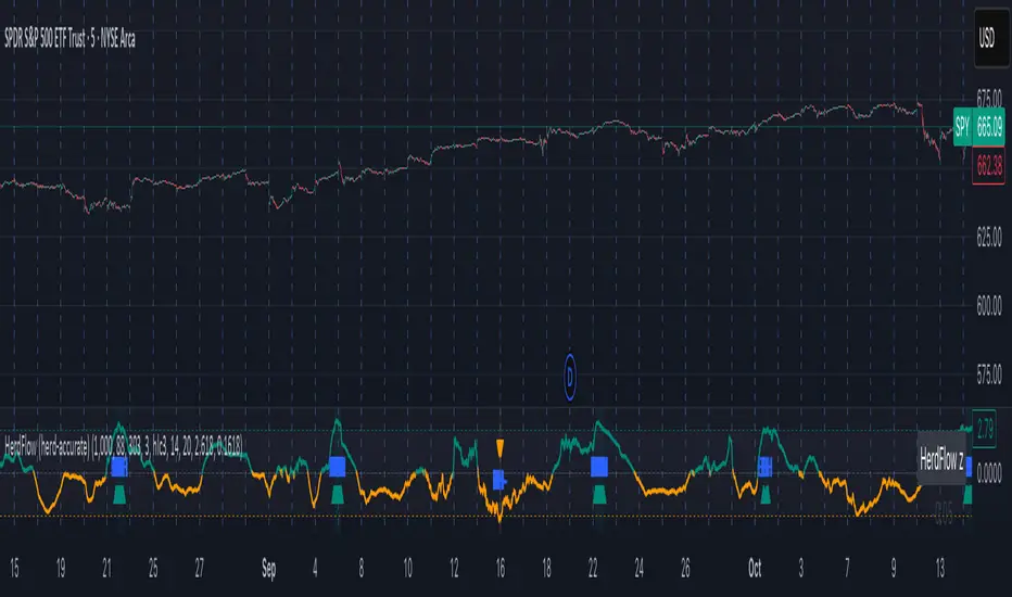
FVG - Fair Value Gap Detector with Large Movement FilterScript Description: Fair Value Gap (FVG) Detector with Large Movement Filter
This indicator is designed to identify Fair Value Gaps (FVG), which are price imbalances observed between three consecutive candles. Fair Value Gap detection is commonly used by traders to locate areas of imbalance where demand and supply temporarily lose equilibrium. This imbalance often draws price back to these zones, making them potential points of interest for buy or sell opportunities.
Key Features of the Indicator
FVG Detection Based on Three Consecutive Candles:
The script identifies a Fair Value Gap between three consecutive candles. This gap appears when the high of the first candle is below the low of the third candle (or vice versa). These gap zones are significant as they indicate an imbalance in price between buyers and sellers, with the expectation that price may revisit these areas in the future.
Large Movement Filter Using ATR:
To improve accuracy and avoid false signals in minor price fluctuations, this indicator includes a large movement filter based on the Average True Range (ATR). The ATR is calculated over a configurable period, and a multiplier is applied to set the minimum required range for a large movement. This helps ensure that only gaps in areas with significant price movement are identified.
Visual Differentiation with Customizable Colors:
The script allows users to configure FVG box colors for easy gap visualization. Identified zones on the chart are highlighted with a colored box, making it easy for the trader to identify imbalance points and observe potential mitigation.
FVG Mitigation and Capture:
The indicator continuously checks if the price is within the FVG zone, indicating that the gap has been mitigated or “captured” by the price. The mitigation or capture status is displayed visually on the chart, using a color scheme to indicate whether the gap has been retested by price after its creation.
How to Use the Indicator
Configuring Parameters:
ATR Multiplier: Defines how large a movement relative to ATR is required for the gap to be considered significant. Higher values require larger movements.
ATR Period: Sets the number of candles used in the ATR calculation, affecting the sensitivity to large movements.
Customizable Colors: Traders can adjust the FVG box colors and labels indicating mitigation and capture of the imbalance zones.
Visual Interpretation:
FVG Boxes: Colored boxes will appear on the chart to highlight gap zones. These boxes only display following the detection of a large movement, as defined by ATR.
Mitigation and Capture Labels: The indicator places a label below the bar when a gap is identified, highlighting zones where gaps may be mitigated or captured. The color scheme helps traders quickly interpret the status of a gap.
Underlying Concepts and Practical Application
The Fair Value Gap is widely used in liquidity analysis and price reversal zones. By identifying FVG zones based on large price movements, this script enables traders to monitor potential gap-fill areas. With the large movement filter, the indicator is ideal for strategies that prioritize liquidity and price zone mitigation, making it useful for both short-term (scalping) and long-term strategies.
This indicator provides a solid foundation for traders interested in observing price imbalances and future mitigations.

Flow of Trade [Orderflowing]Flow of Trade | Supply & Demand Zones | Turtle Soup Reversal Pattern Detection (+)
Built using Pine Script V5.
Introduction
The Flow of Trade indicator is a trading tool designed to leverage the principles of Supply and Demand, along with automatic “Turtle Soup” reversal pattern detection.
This indicator is made for traders who aim to identify potential market reversal points, supported by multi-timeframe analysis for a more complete market overview.
Core Concepts and Innovation
Supply and Demand (S&D) Zones
At the heart of the Flow of Trade indicator is the concept of Supply & Demand, along with Market Imbalance, which is sound for identifying the Supply and Demand zones.
The Turtle Soup Reversal Pattern Detection
Named after the ICT-derived trading pattern, the Flow of Trade script tries to find and plot these "failed breakout" reversals based on the user input configuration.
Inputs
The Flow of Trade indicator offers customization, allowing traders to fit the tool to their specific analysis needs and trading style.
Zone Ratio: Determines the scale of imbalance required for a candle to be considered for a zone. A higher value indicates a need for a more significant imbalance, making zones less frequent but potentially more reliable.
Zone Extension: Specifies how far to the right of the latest bar the zones should extend, providing a visual projection of potential future support and resistance areas.
Display LTF Zones: Enables the visualization of zones from lower timeframes on the current chart, offering a multi-timeframe perspective on supply and demand areas.
Supply and Demand Zone Colors: Customize the colors for supply (red) and demand (blue) zones, including opacity for chart visibility.
Border Color: Adjust the border color to find a suitable view of the zones. Optionally disable the S&D colors with 0% opacity and only keep border colors for a border-only view.
Text Display Settings: Options to display high/low quotes information within zones.
Timeframe Options: Select which timeframes to include in the analysis, from shorter periods like 30M to longer ones like Daily (D) or Weekly (W), allowing for a complete view across different timeframes.
How It Works
Imbalance Calculation.
The indicator looks at consecutive candles to measure the magnitude of price movement and volume imbalances.
A significant imbalance between buying and selling pressure is what defines a potential supply or demand zone.
Supply Zones Identification.
A supply zone is flagged when there's imbalance favoring sellers, typically after a notable price drop. It looks for a consolidation phase where the price fails to achieve a higher high, suggesting an area where sellers might regain control.
Demand Zones Identification.
A demand zone is marked in the presence of a buyer-dominated imbalance, especially after a significant price rally.
The indicator seeks periods of consolidation where the price doesn't make a lower low, indicating potential buyer accumulation.
Multi-Timeframe Imbalance Analysis.
The indicator extends its imbalance analysis across multiple timeframes of identified zones.
This multi-layered approach allows traders to discern the strength and relevance of supply and demand zones within a broader multi-timeframe market context.
Turtle Soup Reversal Pattern Detection.
The Turtle Soup pattern detection is fitted into the imbalance analysis.
The indicator scans for setups within or near the identified supply and demand zones, providing an additional layer of confirmation for potential reversals.
The Turtle Soup Pattern Logic
Attempts at detecting false breakouts within the zones. For example, a bearish Turtle Soup pattern emerges when the price dips below a demand zone but quickly reverses, indicating a failed breakout and potential upward momentum.
Integration and Practical Application
The Flow of Trade indicator integrates these elements, marking out S&D zones while also scanning for reversal patterns within or adjacent to these zones.
The added multi-timeframe analysis can help the traders understanding of broader market context, enabling you to find the relative strength of MTF zones and see how reversal setups perform in the specific asset.
Strategic Entry and Exit Points: Use the confluence of S&D zones and Turtle Soup patterns to find possible entry and exit points.
Risk Management: Potentially leverage the defined zones for setting stop-loss levels and managing trade risk based on supply and demand concepts.
Confirmation and Confluence: Apply multi-timeframe analysis to validate S&D zones and Turtle Soup patterns.
Example of High/Low (H/L) Quotes from Zones:
Example of MTF S&D Zones (4H/D/W):
Conclusion
The Flow of Trade indicator is of time-tested market principles and along with innovative pattern recognition, designed to offer traders a customizable method for more systematized view of supply and demand, along with reversal signals.
Its multi-timeframe analysis can be useful for decision-making and systemizing your trading layout.
Disclaimer
While the Flow of Trade Indicator is a useful tool for analysis, it is important for traders to remember that no single tool can guarantee success.
Past performance is not indicative of future results.
Do not solely rely on the signals from the Flow of Trade indicator.
The indicator is meant to be used as confluence to an existing strategy.

VIB / GIB v1.0The VIB / GIB indicator
V1 ----- 13 Feb 2023 ------------ Inital release.
This gives the user the ability to easily display VIB(Volume ImBalances) and GIB(Gap ImBalances) on their chart.
Volume imbalances (VIB) are created when there is a price difference between the close of a candle and the opening of the next candle. This price difference can be used as a level of support or resistance in future trading.
A Gap imbalance (GIB) has the same principles as a VIB, but also has the feature that no wick closes through the gap, showing an even more powerful imbalance in the market at that point.
GIBs and VIBs can be individually switched on or off via the settings, and optional icons can also be activated or not to show where the imbalance took place.
Please note that this is purely an indicator that should be used with other confluence before making trading decisions.
LANZ Origins🔷 LANZ Origins – Multi-Framework Liquidity, Structure & Risk Management Overlay
LANZ Origins is an advanced multi-framework visualization toolkit that unifies key institutional concepts into one efficient interface. Designed for professional traders, it merges session mapping, liquidity analysis, imbalance detection, multi-account risk control, and higher-timeframe candle tracing — all in a single overlay.
🧩 Core Components
🈵 Asian Range Liquidity
Automatically detects and projects the Asian session range (19:00–02:00 NY) with an optional mid-price line (50 %). This provides visual context for intraday liquidity and manipulation zones commonly referenced in ICT-style analysis.
📊 Imbalance Detector
Highlights Fair Value Gaps (FVG), Opening Gaps (OG), and Volume Imbalances (VI) directly on-chart, using separate color schemes for bullish and bearish inefficiencies. Each element can be customized by width, ATR filter, and extension length.
🕯️ Higher-Timeframe Candles (ICT Style)
Displays multi-timeframe candles (HTF1–HTF6) simultaneously — e.g., 5 m, 30 m, 1 h, 4 h, 1 D, 1 W — each rendered with independent wick, border, and fill settings. Includes remaining-time counters, timeframe labels, and optional imbalance shading between bodies.
📈 Market Structure (ZigZag 30 m)
Replicates 30-minute swing structure to all active timeframes, producing dynamic pivots with live extension. Ideal for contextualizing BOS/CHoCH events across multiple scales.
💸 Multi-Account Lot Size Panel
Calculates position size for up to five accounts simultaneously, using your defined capital, risk %, and fixed SL distance (in pips). Results appear in a clean table at the bottom-right corner of the chart.
🎨 Session Visualization
Colored backgrounds mark key trading phases:
🟢 Day division
🔴 No-action zone
🔵 Kill-zone
🟡 Hold session
⚙️ Customization & Performance
Every module can be toggled individually, with full color, opacity, and style control. The script is optimized for overlay use and supports up to 500 boxes, lines, and labels with efficient resource handling.
🧠 Best Use Case
LANZ Origins is ideal for traders who follow:
Smart Money Concepts / ICT methodology
Liquidity & Imbalance-based trading
Multi-timeframe confluence setups
Risk-based position sizing workflows
Use it to observe how price interacts with liquidity pools, higher-timeframe candles, and imbalances within key sessions — while monitoring lot size risk in real time.
📌 Recommended Setup
Timeframes: 30m - 5m – 3m
Pairs: FX
Session Timezone: New York (EST/EDT)
Combine with: LANZ Strategy series for execution and journaling
💬 Note
This indicator does not generate buy/sell signals. It’s a visual and analytical tool built to support your own decision-making process.

Momentum-Based Fair Value Gaps [BackQuant]Momentum-Based Fair Value Gaps
A precision tool that detects Fair Value Gaps and color-codes each zone by momentum, so you can quickly tell which imbalances matter, which are likely to fill, and which may power continuation.
What is a Fair Value Gap
A Fair Value Gap is a 3-candle price imbalance that forms when the middle candle expands fast enough that it leaves a void between candle 1 and candle 3.
Bullish FVG : low > high . This marks a bullish imbalance left beneath price.
Bearish FVG : high < low . This marks a bearish imbalance left above price.
These zones often act as magnets for mean reversion or as fuel for trend continuation when price respects the gap boundary and runs.
Why add momentum
Not all gaps are equal. This script measures momentum with RSI on your chosen source and paints each FVG with a momentum heatmap. Strong-momentum gaps are more likely to hold or propel continuation. Weak-momentum gaps are more likely to fill.
Core Features
Auto FVG Detection with size filters in percent of price.
Momentum Heatmap per gap using RSI with smoothing. Multiple palettes: Gradient, Discrete, Simple, and scientific schemes like Viridis, Plasma, Inferno, Magma, Cividis, Turbo, Jet, plus Red-Green and Blue-White-Red.
Bull and Bear Modes with independent toggles.
Extend Until Filled : keep drawing live to the right until price fully fills the gap.
Auto Remove Filled for a clean chart.
Optional Labels showing the smoothed RSI value stored at the gap’s birth.
RSI-based Filters : only accept bullish gaps when RSI is oversold and bearish gaps when RSI is overbought.
Performance Controls : cap how many FVGs to keep on chart.
Alerts : new bullish or bearish FVG, filled FVG, and extreme RSI FVGs.
How it works
Source for Momentum : choose Returns, Close, or Volume.
Returns computes percent change over a short lookback to focus on impulse quality.
RSI and Smoothing : RSI length and a small SMA smooth the signal to stabilize the color coding.
Gap Scan : each bar checks for a 3-candle bullish or bearish imbalance that also clears your minimum size filter in percent of price.
Heatmap Color : the gap is painted at creation with a color from your palette based on the smoothed RSI value, preserving the momentum signature that formed it.
Lifecycle : if Extend Unfilled is on, the zone projects forward until price fully trades through the far edge. If Auto Remove is on, a filled gap is deleted immediately.
How to use it
Scan for structure : turn on both bullish and bearish FVGs. Start with a moderate Min FVG Size percent to reduce noise. You will see stacked clusters in trends and scattered singletons in chop.
Read the colors : brighter or stronger palette values imply stronger momentum at gap formation. Weakly colored gaps are lower conviction.
Decide bias : bullish FVGs below price suggest demand footprints. Bearish FVGs above price suggest supply footprints. Use the heatmap and RSI value to rank importance.
Choose your playbook :
Mean reversion : target partial or full fills of opposing FVGs that were created on weak momentum or that sit against higher timeframe context.
Trend continuation : look for price to respect the near edge of a strong-momentum FVG, then break away in the direction of the original impulse.
Manage risk : in continuation ideas, invalidation often sits beyond the opposite edge of the active FVG. In reversion ideas, invalidation sits beyond the gap that should attract price.
Two trade playbooks
Continuation - Buy the hold of a bullish FVG
Context uptrend.
A bullish FVG prints with strong RSI color.
Price revisits the top of the gap, holds, and rotates up. Enter on hold or first higher low inside or just above the gap.
Invalidation: below the gap bottom. Targets: prior swing, measured move, or next LV area.
Reversion - Fade a weak bearish FVG toward fill
Context range or fading trend.
A bearish FVG prints with weak RSI color near a completed move.
Price fails to accelerate lower and rotates back into the gap.
Enter toward mid-gap with confirmation.
Invalidation: above gap top. Target: opposite edge for a full fill, or the gap midline for partials.
Key settings
Max FVG Display : memory cap to keep charts fast. Try 30 to 60 on intraday.
Min FVG Size % : sets a quality floor. Start near 0.20 to 0.50 on liquid markets.
RSI Length and Smooth : 14 and 3 are balanced. Increase length for higher timeframe stability.
RSI Source :
Returns : most sensitive to true momentum bursts
Close : traditional.
Volume : uses raw volume impulses to judge footprint strength.
Filter by RSI Extremes : tighten rules so only the most stretched gaps print as signals.
Heatmap Style and Palette : pick a palette with good contrast for your background. Gradient for continuous feel, Discrete for quick zoning, Simple for binary, Palette for scientific schemes.
Extend Unfilled - Auto Remove : choose live projection and cleanup behavior to match your workflow.
Reading the chart
Bullish zones sit beneath price. Respect and hold of the upper boundary suggests demand. Strong green or warm palette tones indicate impulse quality.
Bearish zones sit above price. Respect and hold of the lower boundary suggests supply. Strong red or cool palette tones indicate impulse quality.
Stacking : multiple same-direction gaps stacked in a trend create ladders. Ladders often act as stepping stones for continuation.
Overlapping : opposing gaps overlapping in a small region usually mark a battle zone. Expect chop until one side is absorbed.
Workflow tips
Map higher timeframe trend first. Use lower timeframe FVGs for entries aligned with the higher timeframe bias.
Increase Min FVG Size percent and RSI length for noisy symbols.
Use labels when learning to correlate the RSI numbers with your palette colors.
Combine with VWAP or moving averages for confluence at FVG edges.
If you see repeated fills and refills of the same zone, treat that area as fair value and avoid chasing.
Alerts included
New Bullish FVG
New Bearish FVG
Bullish FVG Filled
Bearish FVG Filled
Extreme Oversold FVG - bullish
Extreme Overbought FVG - bearish
Practical defaults
RSI Length 14, Smooth 3, Source Returns.
Min FVG Size 0.25 percent on liquid majors.
Heatmap Style Gradient, Palette Viridis or Turbo for contrast.
Extend Unfilled on, Auto Remove on for a clean live map.
Notes
This tool does not predict the future. It maps imbalances and momentum so you can frame trades with clearer context, cleaner invalidation, and better ranking of which gaps matter. Use it with risk control and in combination with your broader process.
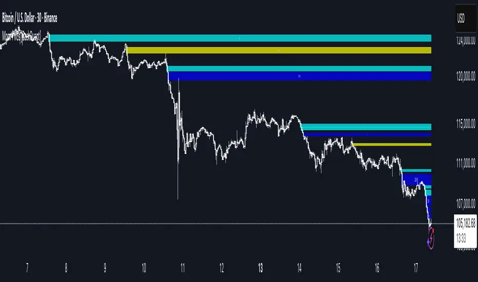
Footprint RealtimeFootprint Complete
A professional footprint-style order flow tool designed for serious traders who want deep insight into bid/ask dynamics, delta distribution, and imbalance detection directly on their TradingView charts.
🔑 Key Features
Footprint Wick Histogram
Visualize volume per tick with customizable block characters, scaled automatically (or via custom Vmax) for precision clarity.
Bid vs Ask Numbers (BvA)
Overlay raw bid/ask volume directly on each level of the candle wick for a true order-flow perspective.
Delta-Based Color Gradient
Adaptive coloring highlights strong buying/selling pressure. Includes neutral band and gamma curve control for fine-tuned intensity.
Diagonal Imbalance Detection
Spot aggressive buyers/sellers instantly. Highlights appear as transparent color fills, tiny horizontal markers, or both. Adjustable ratio thresholds, brightness, and transparency.
Imbalance Triangles
3-in-a-row IB triangles (▲/▼) signal stacked imbalance zones.
Edge Triangles mark traps at bar extremes (top/bottom).
Contrarian Delta Triangles detect divergences (e.g., red candle with positive delta).
Transparent IB Zones
Extend imbalance zones dynamically to the right until price retests their edge. Adjustable opacity, extension length, and minimum hold time.
Total Delta Label
Shows cumulative delta above each bar’s wick, with automatic color coding.
Customizable Everything
Colors, intensity curves, line characters, offsets, label transparency, and more — tailor the script to your personal trading style.
🎯 Benefits
Identify hidden absorption and aggressive imbalances.
Anticipate breakout traps and exhaustion zones.
Confirm order-flow bias with delta overlays.
Gain institutional-level insights without leaving TradingView.
This script combines multiple order flow concepts into one highly optimized package — giving you the footprint, imbalance, and delta context you need for sharper trading decisions.
Ultimate Market Structure [Alpha Extract]Ultimate Market Structure
A comprehensive market structure analysis tool that combines advanced swing point detection, imbalance zone identification, and intelligent break analysis to identify high-probability trading opportunities.Utilizing a sophisticated trend scoring system, this indicator classifies market conditions and provides clear signals for structure breaks, directional changes, and fair value gap detection with institutional-grade precision.
🔶 Advanced Swing Point Detection
Identifies pivot highs and lows using configurable lookback periods with optional close-based analysis for cleaner signals. The system automatically labels swing points as Higher Highs (HH), Lower Highs (LH), Higher Lows (HL), and Lower Lows (LL) while providing advanced classifications including "rising_high", "falling_high", "rising_low", "falling_low", "peak_high", and "valley_low" for nuanced market analysis.
swingHighPrice = useClosesForStructure ? ta.pivothigh(close, swingLength, swingLength) : ta.pivothigh(high, swingLength, swingLength)
swingLowPrice = useClosesForStructure ? ta.pivotlow(close, swingLength, swingLength) : ta.pivotlow(low, swingLength, swingLength)
classification = classifyStructurePoint(structureHighPrice, upperStructure, true)
significance = calculateSignificance(structureHighPrice, upperStructure, true)
🔶 Significance Scoring System
Each structure point receives a significance level on a 1-5 scale based on its distance from previous points, helping prioritize the most important levels. This intelligent scoring system ensures traders focus on the most meaningful structure breaks while filtering out minor noise.
🔶 Comprehensive Trend Analysis
Calculates momentum, strength, direction, and confidence levels using volatility-normalized price changes and multi-timeframe correlation. The system provides real-time trend state tracking with bullish (+1), bearish (-1), or neutral (0) direction assessment and 0-100 confidence scoring.
// Calculate trend momentum using rate of change and volatility
calculateTrendMomentum(lookback) =>
priceChange = (close - close ) / close * 100
avgVolatility = ta.atr(lookback) / close * 100
momentum = priceChange / (avgVolatility + 0.0001)
momentum
// Calculate trend strength using multiple timeframe correlation
calculateTrendStrength(shortPeriod, longPeriod) =>
shortMA = ta.sma(close, shortPeriod)
longMA = ta.sma(close, longPeriod)
separation = math.abs(shortMA - longMA) / longMA * 100
strength = separation * slopeAlignment
❓How It Works
🔶 Imbalance Zone Detection
Identifies Fair Value Gaps (FVGs) between consecutive candles where price gaps create unfilled areas. These zones are displayed as semi-transparent boxes with optional center line mitigation tracking, highlighting potential support and resistance levels where institutional players often react.
// Detect Fair Value Gaps
detectPriceImbalance() =>
currentHigh = high
currentLow = low
refHigh = high
refLow = low
if currentOpen > currentClose
if currentHigh - refLow < 0
upperBound = currentClose - (currentClose - refLow)
lowerBound = currentClose - (currentClose - currentHigh)
centerPoint = (upperBound + lowerBound) / 2
newZone = ImbalanceZone.new(
zoneBox = box.new(bar_index, upperBound, rightEdge, lowerBound,
bgcolor=bullishImbalanceColor, border_color=hiddenColor)
)
🔶 Structure Break Analysis
Determines Break of Structure (BOS) for trend continuation and Directional Change (DC) for trend reversals with advanced classification as "continuation", "reversal", or "neutral". The system compares pre-trend and post-trend states for each break, providing comprehensive trend change momentum analysis.
🔶 Intelligent Zone Management
Features partial mitigation tracking when price enters but doesn't fully fill zones, with automatic zone boundary adjustment during partial fills. Smart array management keeps only recent structure points for optimal performance while preventing duplicate signals from the same level.
🔶 Liquidity Zone Detection
Automatically identifies potential liquidity zones at key structure points for institutional trading analysis. The system tracks broken structure points and provides adaptive zone extension with configurable time-based limits for imbalance areas.
🔶 Visual Structure Mapping
Provides clear visual indicators including swing labels with color-coded significance levels, dashed lines connecting break points with BOS/DC labels, and break signals for continuation and reversal patterns. The adaptive zones feature smart management with automatic mitigation tracking.
🔶 Market Structure Interpretation
HH/HL patterns indicate bullish market structure with trend continuation likelihood, while LH/LL patterns signal bearish structure with downtrend continuation expected. BOS signals represent structure breaks in trend direction for continuation opportunities, while DC signals warn of potential reversals.
🔶 Performance Optimization
Automatic cleanup of old structure points (keeps last 8 points), recent break tracking (keeps last 5 break events), and efficient array management ensure smooth performance across all timeframes and market conditions.
Why Choose Ultimate Market Structure ?
This indicator provides traders with institutional-grade market structure analysis, combining multiple analytical approaches into one comprehensive tool. By identifying key structure levels, imbalance zones, and break patterns with advanced significance scoring, it helps traders understand market dynamics and position themselves for high-probability trade setups in alignment with smart money concepts. The sophisticated trend scoring system and intelligent zone management make it an essential tool for any serious trader looking to decode market structure with precision and confidence.

Dix$on's Weighted Volume FlowDixson's Weighted Volume Flow
Dixson's Weighted Volume Flow is a technical indicator designed to analyze and visualize the distribution of buy and sell volume within a given timeframe. It dynamically calculates the proportional allocation of volume based on price action within each bar, providing insights into market sentiment and activity. This indicator displays horizontal volume bars in a separate pane and annotates them with precise volume values.
How It Works
1. Volume Allocation:
- The indicator calculates buy and sell volume using the following formulas:
- Buy Volume = (Close - Low) / (High - Low) Total Volume
- Sell Volume = (High - Close) / (High - Low) Total Volume
- These formulas allocate volume proportionally based on the bar's price range, attributing more volume to buying or selling depending on the relationship between the close, high, and low prices.
2. Dynamic Scaling:
- The buy and sell volumes are scaled relative to their combined total for the period.
- The resulting values determine the length of the horizontal bars, providing a comparative view of buy and sell activity.
3. Bar Visualization:
- Buy Volume Bars: Displayed as green horizontal bars.
- Sell Volume Bars: Displayed as red horizontal bars.
- The lengths of the bars represent the dominance of buy or sell volume, scaled dynamically within the pane.
4. Labels:
- Each bar is annotated with a label showing its calculated buy or sell volume value.
5. Timeframe Adjustment:
- The indicator uses the request.security() function to fetch data from the selected timeframe, allowing users to customize their analysis for intraday, daily, or longer-term trends.
6. Customization Options:
- Enable or disable the indicator using a toggle.
- Adjust colors for the buy/sell bars and text labels to suit your chart theme.
How to Use It
1. Enable the Indicator:
- Activate the indicator using the "Enable/Disable" toggle in the settings.
2. Select a Timeframe:
- Choose the timeframe for analysis (e.g., 1-minute, 1-hour, daily). The indicator fetches volume data specific to the selected timeframe.
3. Interpret the Visualization:
- Compare Bar Lengths:
- Longer buy volume bars (green) indicate stronger buying activity.
- Longer sell volume bars (red) suggest dominant selling pressure.
- Labels:
- Use the labels to view the exact buy and sell volume values for precise analysis.
4. Combine with Other Tools:
- Use the indicator alongside price action analysis, support/resistance levels, or trend indicators to confirm market sentiment and detect potential reversals.
5. Monitor Imbalances:
- Significant disparities between buy and sell volume can signal shifts in market sentiment, such as the end of a trend or the start of a breakout.
Practical Applications
- Trend Confirmation:
- Align the dominance of buy or sell volume with price trends to confirm market direction.
- Reversal Signals:
- Watch for volume imbalances or a sudden shift in the dominance of buy or sell volume to identify potential reversals.
- High-Activity Zones:
- Identify areas with increased volume to anticipate significant price movements or key support/resistance interactions.
Dixson's Weighted Volume Flow provides a clear and systematic way to analyze market activity by visualizing the dynamics of buy and sell volume. It is particularly useful for traders looking to enhance their understanding of volume-based sentiment and its impact on price movements.

FxCanli CostaFxCanli Costa indicator draws all of the following with FxCanli Costa strategy
▪️ Market Structure
▪️ Up Trend with Green Lines
▪️ Down Trend with Red Lines
▪️ Imbalance(FVG)
▪️ Limit order Level
▪️ Entry Level
▪️ Stop Loss Level
▪️ Take Profit Level
******* Lets first understand about the FxCanli COSTA Strategy *******
Think that, we wait price to reverse from any level -
I call it PRZ (Potential Reversal Zone)
it can reverse in 2 type
Type 1 - it will reverse with 2 wave
Type 2 - it will reverse with 1 wave
⚫ What is PRZ (Potential Reversal Zone)?
Depends on your technical analysis, it can be any Harmonic Pattern level
or it can be Order block at Price action concept.
⚫ What is Imbalance (FVG)?
Fair Value Gaps are price jumps caused by imbalanced buying and selling pressures.
A bullish Fair Value Gap is created when there is a gap between the high of the first candle and the low of the third candle.
A bearish Fair Value Gap is created when there is a gap between the low of the first candle and the high of the third candle.
⚫ FxCanli Costa Strategy is starting now
At my trades, I always wait trend reversal ( Type1 or Type 2 , That I mention above)
for buy trades, I enter the trade below the break out candles
for sell trades, I enter the trade above the break out candles
⚫ Where to put stop loss and take profit?
Stop loss is always above/below swing High/Low
and take profit has to be at least 1/1 Risk/Reward ratio
******* What is FxCanli COSTA Indicator? *******
FxCanli Costa draws all these, depends on FxCanli Costa Strategy
🔴 Market Structure
▪️ Up Trend with Green Lines
▪️ Down Trend with Red Lines
🔴 Trade Levels
FxCanli Costa Indicator first draws Buy Limit level or Sell limit level on the chart
and when Price Reaced to that level it will show Entry / Stop Loss / Take Profit levels
it puts stop loss above/below swing High/Low
and it put Take profit depends on Risk/Reward ratio from inputs.
🔴 FILTERING
FxCanli Costa Indicator's input has got some filtering parts
With these filtering you will not enter all trades
For Example Fibonacci Filtering
it will only give entry signal of impulse's 0.618 and more fibonacci level
🔵 Others Filter are;
RSI Filtering - It will give entry signal, if only RSI is at Overbought or Oversold
EMA Filtering - It will give entry signal with the same direction of Exponential Moving Average
Imbalance Filtering - It will give entry signal, if there is FVG - Imbalance at the entry level
Thanks alot, wish you great trades
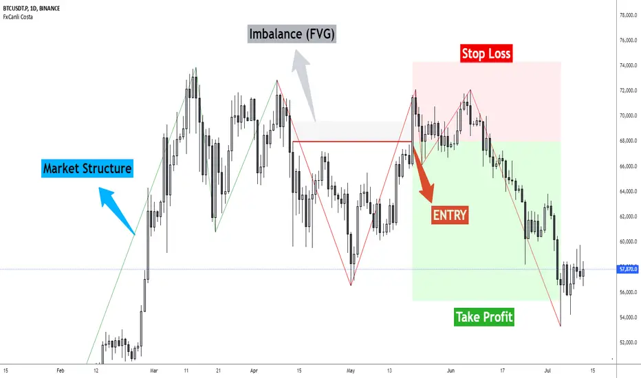
PVSRA Candles Auto OverrideWhat does this “PVSRA Candles Auto Override” Indicator
do?
This indicator automates PVSRA analysis for crypto traders. It finds the corresponding Binance Perpetual Futures chart for the current instrument, then replaces the current chart's volume profile with the perpetual futures data (if available) to ensure the PVSRA calculation uses the most relevant volume. This not only reduces human error during market scans but also automatically selects the appropriate Binance Perpetual Futures contract, saving time and improving the accuracy of PVSRA calculations.
How can a trader use this indicator?
This helps the trader to identify if there is volume data available in an equivalent Binance Perpetual Futures chart and automatically displays it, making it easier to switch coins whilst viewing the market. Why do we want to use Binance Perpetual Futures Volume? In most markets Binance volume surpasses those of other crypto exchanges so this will give us a better view on the volume spikes in the market.
What is PVSRA and how can I trade using this indicator?
PVSRA candles are a type of candlestick chart formatting. PVSRA stands for Price, Volume, Support and Resistance Analysis.
Here's a breakdown of what PVSRA candles aim to achieve:
Combine multiple factors: They take into account price movement, trading volume, and support and resistance levels to identify potential trading opportunities.
Highlight potential imbalances: By color-coding candles based on PVSRA analysis, they aim to show areas of high volume activity, potentially representing imbalances created by market makers (large institutions that influence price).
Identify areas of revisit: The theory is that these high-volume zones may be revisited by the market in the future, as there's "unrecovered liquidity" in those areas.
Usage of the Indicator:
By default the indicator will automatically use the Equivalent Binance Perpetual Chart for the Data
You can override the symbol manually if you what to view another instrument’s data.
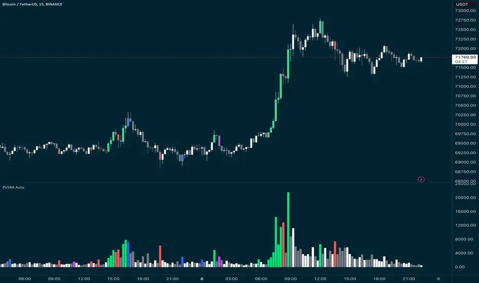
BK AK-FVG/SR Institutional⚔️ BK AK-FVG/SR Institutional — Smart Money Gaps. True Support/Resistance. ⚔️
There are already some excellent FVG tools out there—built by traders who’ve put in real work studying imbalance, liquidity, and smart money behavior.
BK AK-FVG/SR Institutional is simply my version of that idea: my attempt to take what I learned from those great frameworks and push it further into volume, structure, lifecycle, and accountability—so every zone is treated as a living, graded object, not just a static box on a chart.
This is my 12th script release—and that number matters to me. Twelve is structure: twelve tribes, twelve months, twelve divisions of ordered space. It’s the number of complete arrangement. So for script twelve, I’m releasing what I consider my institutional map—a tool built specifically around boundaries, alignment, and where real money chooses to defend and attack.
This script is invite-only. Access is controlled. It’s built for traders who actually respect structure, not tourists looking for colors on a chart.
“AK” in the name is not branding—it’s honor. It belongs to my mentor A.K., whose standard of discipline and clarity sits behind every decision in this tool. Above that, all glory and gratitude to Gd—the real source of any wisdom, edge, or endurance we have in this game.
🧠 What BK AK-FVG/SR Institutional Actually Does
This is a full institutional FVG/SR system, not a paintbrush. It:
Detects and manages bullish & bearish FVG zones using ATR/percent filters and aging logic
Assigns a 0–100 institutional strength score and 1–5★ rating to every zone
Builds a per-zone lower-timeframe volume profile with POC, volume delta, and optional volume text
Tracks historical touches, breaks, role reversals, merging, clustering, and divergence at the zone
Runs per-zone backtest stats and feeds that into an adaptive/ML-style confidence weight
Compresses the whole environment into a real-time Info Table: bias, market position, nearest S/R, risk, session
Fires alerts only when something actually matters: strong FVGs, magnetic pull, divergence at a level
If price is the map, this is the layer that tells you which levels are real and which are noise.
🧱 Core Engine — Institutional Zone Logic
Smart FVG Detection
Clean 3-bar gap logic for bullish & bearish FVGs
ATR or % based minimum gap size + optional distance filter from price
Zone aging with max life in bars and optional “reset on touch”
Overlap & proximity control:
Prevent overlapping zones
Enforce minimum bar spacing
Or keep only the strongest zone in a cluster
Institutional Strength & Rating
Each zone gets a score (0–100) + star rating (1–5★) based on:
Volume vs average (with optional lower timeframe split)
Gap size vs ATR
Pivot confluence
Historical meaningful touches
Role reversal (support ↔ resistance)
MTF FVG alignment
Session weighting (Asian / London / NY / overlaps)
Order block overlap & imbalance behavior
VWAP proximity/extremes
Fib level alignment
Delta divergence
Zone clustering & consolidation
Adaptive “performance weight” from historical reactions
Bad zones don’t just look weaker—they literally get filtered out when you enable minimum star / institutional filters.
📊 In-Zone Volume & Profile Intelligence
Each zone can be backed by lower-timeframe volume:
Per-zone volume histogram inside the gap
POC line at the most traded price in that zone
Optional total volume label
POC line color shifts with volume delta (buy vs sell pressure)
Additional bull/bear volume bars alongside the zone and/or numeric volume text inside the box
You’re not just staring at a gap—you’re seeing the liquidity pocket inside the gap.
🎯 Structure, Confluence & Role Reversal
The engine includes deep structural context:
Pivots: stored swing highs/lows for S/R confluence
MTF FVG Confluence: two extra timeframes for higher-timeframe alignment
Fibonacci Levels: auto-mapped 0.236 / 0.382 / 0.5 / 0.618 / 0.786 with optional lines & labels
Order Blocks & Imbalance: engulfing OB detection + volume/imbalance filters
VWAP Intelligence: VWAP proximity/extreme bonuses, optional short-form plotting
Delta Divergence: volume-based confirmation flags for zones under real internal pressure
Smart S/R Positioning & Role Flip
Hide “wrong side” zones or auto-flip roles when broken & retested
Track broken zones for N bars, then retire them
Mark role reversals with badges and strength bonuses
Support/resistance is treated like behavior, not just lines.
🤖 Adaptive Learning & Backtesting
Each zone is monitored when price touches it:
Checks if price respects the zone and moves X points away (success)
Or violates beyond failure threshold (failure)
Tracks successes, failures, and win rate per zone
Feeds a confidence score into an adaptive weight so consistently performing zones matter more
Zones that meet the bar get ML/🤖 marking when enabled
The script doesn’t just say “this looks strong”—it tracks how it actually behaved.
📋 Info Table & Sessions — On-Chart War Room
On the latest bar, an Info Table summarizes:
Zone count (bull vs bear)
Market position (NEAR SUPPORT / NEAR RESISTANCE / ABOVE RESISTANCE / BELOW SUPPORT / NEUTRAL)
Nearest S/R levels
Trade bias (BULLISH / BEARISH / NEUTRAL)
Active session (ASIAN / LONDON / NY / OVERLAP / OFF)
Risk level (LOW / MED / HIGH)
Sessions are coded in EST with multipliers so you can weight London/NY more heavily than Asia if that matches your playbook.
Hover the table for a strategy tooltip: live market posture, suggested behavior near the zones, and context around the current environment.
⚠ Divergence & Alerts
Real-time RSI/OBV/ADX divergence detection at the zone
Flexible visual modes: border, icon, color change, or combinations
Alerts included:
Magnetic Zone Pull (price entering ATR-based “field” of a strong zone)
Strong Bullish FVG
Strong Bearish FVG
Divergence at Zone
Let the chart call you when a real decision point appears, instead of forcing you to stare all day.
🕹 How to Use BK AK-FVG/SR Institutional
1️⃣ Build Bias With Structure
Use the Info Table, star ratings, and where the 4–5★ zones cluster relative to price to decide which side of the tape you’re allowed to trade on.
2️⃣ Only Trade From Strong, Aligned Zones
Focus on 4–5★ zones with confluence (pivots, Fib, OB, VWAP, clustering).
Use the zone body/wick region as your execution area, not some random mid-air candle.
3️⃣ Treat Role Reversal & Clusters as Campaign Nodes
When a strong zone breaks, flips role, and collects touches, that’s campaign territory—not scalp noise.
4️⃣ Use Divergence/Delta as a Brake, Not a Toy
If divergence lights up at your level, respect it: size down, wait for confirmation, or stand down.
5️⃣ Let the Engine Filter Junk For You
Tune volMultiplier, star thresholds, session multipliers, distance filters, and min star rating to match your timeframe and instrument.
This script’s job is to remove your excuse for taking low-quality trades.
📜 Boundaries & Wisdom
King Solomon wrote:
“Do not remove the ancient boundary stone that your fathers have set.”
This tool is built around that idea. It maps where the real boundaries live—where smart money defends, attacks, traps, and reverses.
It will not give you discipline. It will simply remove the illusion that “you didn’t know the level was there.”
🔒 Access & Usage
This is an invite-only TradingView script.
Access is granted at my discretion to traders who take structure, risk, and discipline seriously.
⚔️ BK AK-FVG/SR Institutional — Map the Smart Money Gaps. Trade Only the Real Levels.
May Gd bless your vision, your patience, and every decision you make at the edge. 🙏
