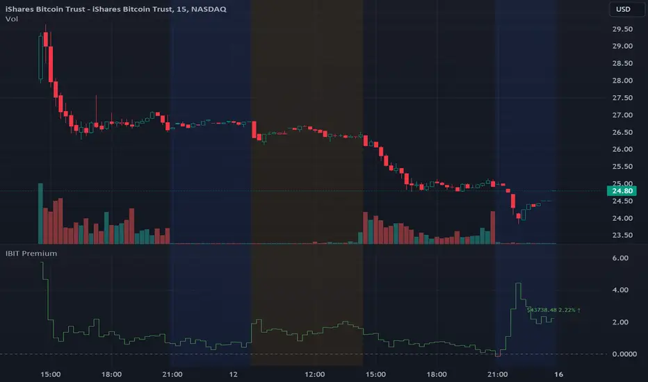
IBIT Premium to CoinbaseThe BTC ETF premium indicator for TradingView is a specialized tool designed to measure and visualize the premium or discount of the iShares Bitcoin Trust (IBIT), an investment vehicle that holds Bitcoin, relative to the actual price of Bitcoin on the Coinbase exchange. This indicator can be particularly insightful for traders interested in the BTC securities market and those analyzing the demand for Bitcoin as reflected by institutional investment products.
#### Description:
The BTC ETF premium indicator in TradingView leverages an advanced Pine Script algorithm to calculate the premium (or discount) percentage of IBIT compared to the spot price of Bitcoin (BTC/USD) on Coinbase. The premium is a critical insight that reflects market sentiment and potentially arbitrage opportunities between the trust's share price and the underlying cryptocurrency asset.
Here's how the indicator works:
1. **Calculation Methodology:**
- **Implied Bitcoin Price of IBIT:** We determine the implied price of Bitcoin within IBIT by dividing the IBIT closing price by the known ratio of Bitcoin per share.
- **IBIT Premium to Coinbase:** The percentage premium is then calculated as:
$$\text{IBIT Premium} = \frac{(\text{Implied Bitcoin Price of IBIT } - \text{Actual Bitcoin Price on Coinbase})}{\text{Actual Bitcoin Price on Coinbase}} \times 100$$
- This calculation is performed using the closing prices on a per-minute basis to ensure timely and accurate analysis.
2. **Visualization:** The indicator plots the premium as a step line chart, making it easy to visualize changes over time. A dynamic label accompanies the plot, displaying the implied Bitcoin price, the actual percentage premium or discount, and whether the premium is trending up or down compared to the previous day's value.
3. **Usage Scenario:** Traders can use this indicator to monitor the live premium 24/7 and analyze how it behaves during different market conditions, including when the equity market, where IBIT is traded, is closed.
#### Additional Features:
- **Color-Coding:** The premium is color-coded in green when positive (premium) and in red when negative (discount), aiding quick visual assessment.
- **Zero-Line Reference:** A horizontal line is drawn at zero to easily identify when IBIT is trading at par with the spot price of Bitcoin.
- **Real-Time Label Updates:** The label updates in real time with the latest premium/discount information and includes an arrow to signify the trend direction.
#### Access and Usage:
The indicator can be favorited or added to your TradingView charts. You are also welcome to use the source code as a foundation for further customization to suit your trading strategies.
#### Notes:
Please consider that the IBIT has specific trading hours, and the indicator can show live changes even when its market is closed, which might lead to discrepancies from official static data. For best performance, use this indicator alongside the IBIT candlestick chart on TradingView.
Cerca negli script per "implied"
GBTC Premium to CoinbaseThe BTC ETF premium indicator for TradingView is a specialized tool designed to measure and visualize the premium or discount of the Grayscale Bitcoin Trust (GBTC), an investment vehicle that holds Bitcoin, relative to the actual price of Bitcoin on the Coinbase exchange. This indicator can be particularly insightful for traders interested in the BTC securities market and those analyzing the demand for Bitcoin as reflected by institutional investment products.
#### Description:
The BTC ETF premium indicator in TradingView leverages an advanced Pine Script algorithm to calculate the premium (or discount) percentage of GBTC compared to the spot price of Bitcoin (BTC/USD) on Coinbase. The premium is a critical insight that reflects market sentiment and potentially arbitrage opportunities between the trust's share price and the underlying cryptocurrency asset.
Here's how the indicator works:
1. **Calculation Methodology:**
- **Implied Bitcoin Price of GBTC:** We determine the implied price of Bitcoin within GBTC by dividing the GBTC closing price by the known ratio of Bitcoin per share.
- **GBTC Premium to Coinbase:** The percentage premium is then calculated as:
$$\text{GBTC Premium} = \frac{(\text{Implied Bitcoin Price of GBTC} - \text{Actual Bitcoin Price on Coinbase})}{\text{Actual Bitcoin Price on Coinbase}} \times 100$$
- This calculation is performed using the closing prices on a per-minute basis to ensure timely and accurate analysis.
2. **Visualization:** The indicator plots the premium as a step line chart, making it easy to visualize changes over time. A dynamic label accompanies the plot, displaying the implied Bitcoin price, the actual percentage premium or discount, and whether the premium is trending up or down compared to the previous day's value.
3. **Usage Scenario:** Traders can use this indicator to monitor the live premium 24/7 and analyze how it behaves during different market conditions, including when the equity market, where GBTC is traded, is closed.
#### Additional Features:
- **Color-Coding:** The premium is color-coded in green when positive (premium) and in red when negative (discount), aiding quick visual assessment.
- **Zero-Line Reference:** A horizontal line is drawn at zero to easily identify when GBTC is trading at par with the spot price of Bitcoin.
- **Real-Time Label Updates:** The label updates in real time with the latest premium/discount information and includes an arrow to signify the trend direction.
#### Access and Usage:
The indicator can be favorited or added to your TradingView charts. You are also welcome to use the source code as a foundation for further customization to suit your trading strategies.
#### Notes:
Please consider that the GBTC has specific trading hours, and the indicator can show live changes even when its market is closed, which might lead to discrepancies from official static data. For best performance, use this indicator alongside the GBTC candlestick chart on TradingView.

VOLQ Sigma TableThis indicator replaces the implied volatility of VOLQ with the daily volatility and reflects that value into the price on the NDX chart to create the VOLQ standard deviation table.
It will only be useful for stocks related to the Nasdaq Index.
For example, NDX, QQQ or so.
And we want to predict the range of weekly fluctuations by plotting those values as a line in the future.
It is expressed as High 2σ by adding the standard deviation 2 sigma value of the VOLQ value from last week's closing price.
It is expressed as High 1σ by adding the standard deviation 1 sigma value of the VOLQ value from last week's closing price.
It is expressed as Low 1σ by subtracting the standard deviation 1 sigma value of the VOLQ value from the closing price of the previous week.
It is expressed as Low 2σ by subtracting the standard deviation 2 sigma value of the VOLQ value from last week's closing price.
1day predicts daily fluctuations.
2day predicts 2-day fluctuations.
3day predicts 3-day fluctuations.
4day predicts 4-day fluctuations.
5day predicts 5-day fluctuations.
In the settings you can select the start date to display the VOLQ line via input.
-----------------------------
What motivated me to create this indicator?
From my point of view, the reason for classifying vix volq historical volatility (realized volatility) is that the most important point is that VIXX and VolQ are calculated from implied volatility. It can be standardized as one-month volatility. There are many strike prices, but exchanges use the implied volatility of options traded on their own exchanges.
Because historical volatility depends on how the period is set, to compare with VIXX, we compare it with a month, that is, 20 business days. One-month implied volatility means (actually different depending on the strike price), because option traders expect that the one-month volatility will be this much, and it is the volatility created by volatility trading.
So we see it as the volatility expected by derivatives traders, especially volatility traders.
I'm trying to infer what the market thinks will fluctuate this much from the numbers generated there.

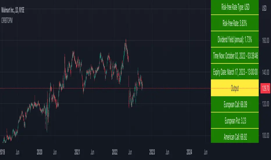
Cox-Ross-Rubinstein Binomial Tree Options Pricing Model [Loxx]Cox-Ross-Rubinstein Binomial Tree Options Pricing Model is an options pricing panel calculated using an N-iteration (limited to 300 in Pine Script due to matrices size limits) "discrete-time" (lattice based) method to approximate the closed-form Black–Scholes formula. Joshi (2008) outlined varying binomial options pricing model furnishes a numerical approach for the valuation of options. Significantly, the American analogue can be estimated using the binomial tree. This indicator is the complex calculation for Binomial option pricing. Most folks take a shortcut and only calculate 2 iterations. I've coded this to allow for up to 300 iterations. This can be used to price American Puts/Calls and European Puts/Calls. I'll be updating this indicator will be updated with additional features over time. If you would like to learn more about options, I suggest you check out the book textbook Options, Futures and other Derivative by John C Hull.
***This indicator only works on the daily timeframe!***
A quick graphic of what this all means:
In the graphic, "n" are the steps, in this case we can do up to 300, in production we'd need to do 5-15K. That's a lot of steps! You can see here how the binomial tree fans out. As I said previously, most folks only calculate 2 steps, here we are calculating up to 300.
Want to learn more about Simple Introduction to Cox, Ross Rubinstein (1979) ?
Watch this short series "Introduction to Basic Cox, Ross and Rubinstein (1979) model."
Limitations of Black Scholes options pricing model
This is a widely used and well-known options pricing model, factors in current stock price, options strike price, time until expiration (denoted as a percent of a year), and risk-free interest rates. The Black-Scholes Model is quick in calculating any number of option prices. But the model cannot accurately calculate American options, since it only considers the price at an option's expiration date. American options are those that the owner may exercise at any time up to and including the expiration day.
What are Binomial Trees in options pricing?
A useful and very popular technique for pricing an option involves constructing a binomial tree. This is a diagram representing different possible paths that might be followed by the stock price over the life of an option. The underlying assumption is that the stock price follows a random walk. In each time step, it has a certain probability of moving up by a certain percentage amount and a certain probability of moving down by a certain percentage amount. In the limit, as the time step becomes smaller, this model is the same as the Black–Scholes–Merton model.
What is the Binomial options pricing model ?
This model uses a tree diagram with volatility factored in at each level to show all possible paths an option's price can take, then works backward to determine one price. The benefit of the Binomial Model is that you can revisit it at any point for the possibility of early exercise. Early exercise is executing the contract's actions at its strike price before the contract's expiration. Early exercise only happens in American-style options. However, the calculations involved in this model take a long time to determine, so this model isn't the best in rushed situations.
What is the Cox-Ross-Rubinstein Model?
The Cox-Ross-Rubinstein binomial model can be used to price European and American options on stocks without dividends, stocks and stock indexes paying a continuous dividend yield, futures, and currency options. Option pricing is done by working backwards, starting at the terminal date. Here we know all the possible values of the underlying price. For each of these, we calculate the payoffs from the derivative, and find what the set of possible derivative prices is one period before. Given these, we can find the option one period before this again, and so on. Working ones way down to the root of the tree, the option price is found as the derivative price in the first node.
Inputs
Spot price: select from 33 different types of price inputs
Calculation Steps: how many iterations to be used in the Binomial model. In practice, this number would be anywhere from 5000 to 15000, for our purposes here, this is limited to 300
Strike Price: the strike price of the option you're wishing to model
% Implied Volatility: here you can manually enter implied volatility
Historical Volatility Period: the input period for historical volatility; historical volatility isn't used in the CRRBT process, this is to serve as a sort of benchmark for the implied volatility,
Historical Volatility Type: choose from various types of implied volatility, search my indicators for details on each of these
Option Base Currency: this is to calculate the risk-free rate, this is used if you wish to automatically calculate the risk-free rate instead of using the manual input. this uses the 10 year bold yield of the corresponding country
% Manual Risk-free Rate: here you can manually enter the risk-free rate
Use manual input for Risk-free Rate? : choose manual or automatic for risk-free rate
% Manual Yearly Dividend Yield: here you can manually enter the yearly dividend yield
Adjust for Dividends?: choose if you even want to use use dividends
Automatically Calculate Yearly Dividend Yield? choose if you want to use automatic vs manual dividend yield calculation
Time Now Type: choose how you want to calculate time right now, see the tool tip
Days in Year: choose how many days in the year, 365 for all days, 252 for trading days, etc
Hours Per Day: how many hours per day? 24, 8 working hours, or 6.5 trading hours
Expiry date settings: here you can specify the exact time the option expires
Take notes:
Futures don't risk free yields. If you are pricing options of futures, then the risk-free rate is zero.
Dividend yields are calculated using TradingView's internal dividend values
This indicator only works on the daily timeframe
Included
Option pricing panel
Loxx's Expanded Source Types
SPX Iron Fly Session TrackerOverview
This indicator provides visual tracking for iron fly option structures designed for SPX 0-day-to-expiration (0DTE) intraday trading. It implements a two-phase position management system that adapts to different market conditions throughout the trading day.
This is a visualization and tracking tool only. It does not execute trades, access real options data, or calculate actual profit and loss. All displayed positions are theoretical representations based on underlying price movement.
Strategy Goal and Context
The Core Objective:
The strategy aims to have SPX price expire within your iron fly positions at end of day. When price expires inside a fly's profit zone (between the wings), that position captures maximum premium. The challenge is that price moves throughout the day, so static positioning rarely succeeds.
The Solution: Active Management
Rather than setting positions and hoping price cooperates, this approach continuously manages and repositions flies to keep price centered within your profit zones. As SPX drifts during the trading session, you add new flies at current price levels and close flies that price has moved away from.
The Goal: Multiple Profitable Expirations
By session end, you want as many flies as possible to have price expire within their center zones. This requires:
Adding new flies as price moves away from existing positions
Closing flies when price crosses beyond their optimal range
Building layered coverage in the afternoon to increase probability of capture
Adapting wing widths to time of day and volatility
The Reality: Capital and Time Intensive
This is not a passive strategy. Successful implementation requires:
Substantial capital (each fly requires margin, multiple flies compound this)
Active monitoring throughout trading sessions
Quick decision-making as positions trigger
Multiple position adjustments per session
Disciplined adherence to management rules
How This Indicator Helps:
For backtesting:
Use replay mode to study how positions would have managed on historical sessions
Test different parameter combinations to find optimal settings
Observe position behavior during various market conditions
Understand timing and frequency of position adds and closes
Validate whether your capital can support the required position count
For live session support:
Real-time visual tracking shows current position coverage
Alerts notify you immediately when new positions should be added
Position closure alerts help you manage exits promptly
Reference strike tracking shows where you're measuring movement from
History table provides audit trail of all position activity
The indicator handles the complex tracking and rule application, allowing you to focus on execution and risk management.
Key Use Cases
1. Replay Mode - Backtest and Study
Use TradingView's replay feature to validate the strategy on historical sessions:
Step through past SPX sessions bar-by-bar
See exactly when positions would have opened and closed
Count how many flies would have expired profitably
Analyze different parameter settings on the same historical data
Study position behavior during trending vs ranging conditions
Calculate approximate capital requirements for your setup
Refine your parameters before risking real capital
2. Live Session Alerts
Set up real-time notifications for active trading sessions:
Get alerted immediately when new positions trigger
Receive notifications when positions close
Alerts include strike level, wing width, and closure reason
Works on mobile, desktop, email, or webhook
Never miss a position signal during active trading
Maintain awareness even when away from screens briefly
3. Fully Customizable Parameters
Adapt every aspect to your risk tolerance and capital:
Adjust trigger distances for more or fewer position adds
Modify wing widths for different volatility environments
Change session timing to match your trading schedule
Set maximum concurrent positions to your capital limits
Fine-tune spacing to match available strike increments
Iron Fly Structure
An iron fly is a neutral options strategy with four legs:
- Short 1 ATM Call
- Short 1 ATM Put
- Long 1 OTM Call (upper wing protection)
- Long 1 OTM Put (lower wing protection)
The structure creates a defined risk zone. Maximum profit occurs when price expires at the center strike. Loss increases as price moves toward the wings (breakeven points). Maximum loss is defined and occurs beyond the wings.
Expiration Goal:
You want SPX to close inside the fly's wings. If SPX expires at the strike, you capture maximum premium. If SPX expires between the strike and either wing, you still profit (reduced). If SPX expires beyond the wings, you realize a loss (but it's defined and limited by the wings).
Two-Phase Management System
The indicator tracks positions across two distinct trading phases with different management rules:
Phase 1: TWO_GLASS - Morning Session (Default 10am-1pm ET)
Conservative positioning with active repositioning:
- Trigger new positions when price moves 7.5 points from reference strike (configurable)
- Maintain maximum 2 concurrent positions (configurable)
- 10-point spacing between position strikes (configurable)
- 40-point wing width (configurable)
- Exit rule: When two positions are active and price crosses to one strike level, close the OTHER position
This phase uses a "follow the price" approach. You're not trying to stack multiple positions yet - you're maintaining one or two flies centered on wherever price currently is. As price drifts, you add a new fly at the current level and close the old one when price moves too far away.
Phase 2: THREE_GLASS - Afternoon Session (Default 1pm-4pm ET)
Accumulation mode with layered coverage:
- Trigger new positions every 2.5 points of price movement (configurable)
- Maintain maximum 6 concurrent positions (configurable)
- 5-point spacing between strikes (configurable)
- 20-point wings early, reducing to 10 points after 3pm (configurable)
- Exit rule: Positions only close when price reaches wing extremes
This phase builds a stacked profit zone. Instead of swapping positions, you accumulate multiple flies as price moves. The goal is to have several flies active at expiration, creating a wider net to capture price. Tighter spacing and more frequent triggers create this layered coverage.
Why Two Different Phases?
Morning (Phase 1):
Earlier in the day, price has more time to move substantially. Maintaining many concurrent positions is riskier because price could trend and hit multiple wings. The strategy uses selective positioning with wider wings and active replacement.
Afternoon (Phase 2):
Closer to expiration, price movements typically compress. Time for large moves decreases. The strategy shifts to accumulation, building a net of positions to increase probability that final expiration price falls within at least one (ideally several) of your flies. Tighter wings and more positions become appropriate.
Exit Mechanisms
Strike Cross Exit (Phase 1 Only)
When two positions are active, if price moves to or beyond one position's strike level, the OTHER position closes. This keeps your coverage centered on current price action rather than maintaining positions price has moved away from.
Example: Flies at 5900 and 5910 are open. Price moves to 5910. The fly at 5900 closes because price has moved to the 5910 level. You're now positioned at current price (5910) rather than maintaining coverage at old price (5900).
Wing Extreme Exit (Both Phases)
Any position closes immediately when price touches its upper or lower wing boundary. This represents the breakeven/maximum loss point, so the position is closed to prevent further deterioration.
Dynamic Wing Adjustment
Wing widths automatically adjust based on time of day:
- Phase 1 (Morning): 40 points (customizable)
- Phase 2 Early (1pm-3pm): 20 points (customizable)
- Phase 2 Late (3pm-4pm): 10 points (customizable)
This progressive tightening reflects decreasing price movement potential as expiration approaches. Wider wings earlier provide more protection when price could move substantially. Tighter wings later allow more precise positioning when price movements typically compress.
All values are fully adjustable to match your risk parameters and observed market volatility.
Customization Guide
Every parameter can be modified to suit your trading style, risk tolerance, and capital:
Session Timing
- TWO_GLASS Start Hour: When Phase 1 begins (default: 10am ET)
- THREE_GLASS Start Hour: When Phase 2 begins (default: 1pm ET)
- Wing Width Change Hour: When wings tighten (default: 3pm ET)
- Session End Hour: When tracking stops (default: 4pm ET)
Phase 1 Parameters (Fully Adjustable)
- Trigger Distance: How far price must move from reference strike to add new position (default: 7.5, range: 0.1+)
- Fly Spacing: Distance between position strikes (default: 10, range: 1.0+)
- Wing Width: Distance from strike to wings (default: 40, range: 5.0+)
- Max Flies: Maximum concurrent positions (default: 2, range: 1-10)
Phase 2 Early Parameters (Fully Adjustable)
- Trigger Distance: Movement needed to add new position (default: 2.5, range: 0.1+)
- Fly Spacing: Distance between strikes (default: 5, range: 1.0+)
- Wing Width: Strike to wing distance (default: 20, range: 5.0+)
- Max Flies: Maximum concurrent positions (default: 6, range: 1-20)
Phase 2 Late Parameters
- Wing Width: Reduced width after 3pm (default: 10, range: 5.0+)
General Settings
- Strike Rounding: Round strikes to nearest multiple (default: 5.0, range: 1.0+)
- Bars Before Check: Bars to wait before allowing closure (default: 2, prevents premature exits)
Display Options
- Show History Table: Toggle detailed position log (default: on)
- History Table Rows: Number of positions displayed (default: 15, range: 5-30)
Alert Settings
- Enable Alerts: Toggle notifications for opens/closes (default: on)
How to Use
For Backtesting in Replay Mode:
Select a historical SPX trading session
Apply indicator to 1-5 minute timeframe
Configure your preferred parameters
Activate TradingView's replay feature
Play through the session (step-by-step or continuous)
Observe when positions open (green boxes appear)
Watch position closures (boxes turn gray)
Count how many flies would have expired with price inside (green at session end)
Note total number of position adds throughout session
Calculate approximate capital needed (positions × margin per fly)
Test different parameter combinations on same historical data
Study position behavior during trending vs ranging sessions
For Live Trading Sessions:
Apply indicator to SPX on 1-5 minute timeframe
Configure parameters based on your backtest results
Create alerts for "Iron Fly Opened" and "Iron Fly Closed"
Set alert frequency to "Once Per Bar Close"
Choose notification method (popup, mobile app, email, webhook)
Monitor the status table (top-right) for current session and reference strike
Review history table (bottom-right) for position log with timestamps
When alert triggers, use visual cues to manually place actual option orders
Execute position adds and closes as indicated by the tracker
Visual Interpretation:
Green boxes = Active positions (theoretical profit zones)
White lines (Phase 1) / Aqua lines (Phase 2) = Strike levels
Red/Blue dotted lines = Wing boundaries (breakeven/risk limits)
Gray boxes = Closed positions (historical reference)
Current SPX price line = Shows where price is relative to positions
Top-right table = Current session status, reference strike, open/closed counts
Bottom-right table = Complete position history with open/close timestamps
Alert System Details
The indicator generates detailed alert messages for position management:
Position Opened:
- Strike level where fly should be placed
- Wing width (±points from strike)
- Session phase (Phase 1 or Phase 2)
- Alert format example: "Iron Fly OPENED | Strike: 5900 | Wings: ±40 | Session: TWO_GLASS"
Position Closed:
- Strike level of fly being closed
- Closure reason (strike cross, wing extreme, etc.)
- Session phase
- Alert format example: "Iron Fly CLOSED | Strike: 5900 | Reason: Price crossed to lower fly | Session: TWO_GLASS"
Configure alerts once before market open, then receive automatic notifications as positions trigger throughout the trading session.
Parameter Optimization Suggestions
For Higher Volatility Environments:
- Increase trigger distances (e.g., Phase 1: 10-15 points, Phase 2: 3-5 points)
- Widen wing widths (e.g., Phase 1: 50-60 points, Phase 2: 25-30 points early, 15-20 late)
- Increase strike spacing to reduce position frequency
For Lower Volatility Environments:
- Decrease trigger distances (e.g., Phase 1: 5-7 points, Phase 2: 1.5-2 points)
- Tighten wing widths (e.g., Phase 1: 30-35 points, Phase 2: 15-18 points early, 8-10 late)
- Reduce strike spacing for more granular coverage
For Conservative Risk Management:
- Reduce maximum concurrent positions (Phase 1: 1, Phase 2: 3-4)
- Widen wing widths for more breathing room
- Increase bars before check to avoid whipsaws
- Use wider trigger distances to reduce position frequency
For Aggressive Positioning:
- Increase maximum concurrent positions (Phase 2: 8-10)
- Tighten trigger distances for more frequent adds
- Reduce bars before check for faster responses
- Use tighter spacing to create denser coverage
Capital Considerations:
Remember that each fly requires margin. If Phase 2 allows 6 concurrent flies and each requires $10,000 margin, you need $60,000 in available capital just for position requirements, plus additional cushion for adverse movement.
Use replay mode to count maximum concurrent positions that would have occurred on historical sessions with your parameters, then calculate total capital needed.
Practical Application
This tool provides visual guidance and management support. To implement the strategy:
Backtest thoroughly in replay mode first
Validate capital requirements for your parameter settings
Confirm you can actively monitor positions during trading hours
Use displayed positions as reference for manual order placement
Match indicator parameters to your actual option contracts
Account for real-world factors: commissions, slippage, bid-ask spreads, option availability
Implement proper position sizing based on available capital
Set up alerts before market open to catch all signals
Execute actual trades manually in your brokerage platform
Track actual results versus indicator expectations
Important Limitations
Theoretical tracking only - not an automated trading system
No access to real option prices, Greeks, or implied volatility
No profit/loss calculations or risk metrics
Does not account for time decay (theta), delta, gamma, vega changes
Assumes continuous price action - gaps or halts not handled
Designed for 0DTE SPX options - not suitable for other timeframes or instruments
Assumes option availability at all strike levels - may not reflect reality
Does not model actual option bid/ask spreads or liquidity
Assumes instant execution at desired strikes - slippage not considered
Historical replay shows theoretical behavior only - actual market conditions may differ
Does not adjust for changing implied volatility throughout session
Position count and timing may not match what's executable in real markets
Capital and Time Requirements
This strategy is resource-intensive:
Capital Requirements:
Each iron fly requires margin (varies by broker and strike width)
Multiple concurrent positions multiply capital needs
Example: 6 flies at $10,000 each = $60,000 minimum
Additional cushion needed for adverse movement
Pattern Day Trader rules may apply (requires $25,000 minimum)
Time Requirements:
Active monitoring during trading hours (typically 10am-4pm ET)
Quick response to position add/close signals
Multiple position adjustments per session possible
Cannot be passive or set-and-forget
Requires ability to place orders promptly when alerted
Use replay mode to understand the commitment level before attempting live implementation.
Risk Considerations
Iron fly trading involves substantial risk. This indicator provides visualization and management support only - it does not constitute financial advice or trading recommendations.
Options trading can result in total loss of capital. The indicator's theoretical positions do not reflect actual trading results. Backtest analysis and historical visualization do not guarantee similar future outcomes. Multiple concurrent positions multiply both profit potential and loss risk.
Always conduct independent research, understand all risks, validate capital requirements, and never trade with funds you cannot afford to lose. Consider starting with paper trading to validate execution capability before risking real capital.
Technical Notes
The indicator uses price-based triggers only. It does not:
Connect to options data feeds
Calculate theoretical option values or Greeks
Execute trades automatically
Provide specific trading signals or recommendations
Account for option-specific factors (implied volatility, time decay, bid/ask spreads)
All displayed information represents theoretical position placement based solely on underlying SPX price movement and user-configured parameters. The tool helps visualize the management framework but requires the trader to handle all actual execution and risk management decisions.
This is an educational and analytical tool for understanding iron fly position management concepts. It requires active interpretation, backtesting validation, and manual implementation by the user.

IV Rank as a Label (Top Right)IV Rank (HV Proxy) – Label
Displays an IV Rank–style metric using Historical Volatility (HV) as a proxy, since TradingView Pine Script does not provide access to true per-strike implied volatility or IV Rank.
The script:
Calculates annualized Historical Volatility (HV) from price returns
Ranks current HV relative to its lookback range (default 252 bars)
Displays the result as a clean, color-coded label in the top-right corner
Color logic:
🟢 Green: Low volatility regime (IV Rank < 20)
🟡 Yellow: Neutral volatility regime (20–50)
🔴 Red: High volatility regime (> 50)
This tool is intended for options context awareness, risk framing, and volatility regime identification, not as a substitute for broker-provided IV Rank.
Best used alongside:
Options chain implied volatility
Delta / extrinsic value
Time-to-expiration analysis
Note: This indicator does not use true implied volatility data.

[KF] Multi-Duration Rate Expectations IndicatorAfter last fed cut in Oct then following jump in rates, I was frustrated at not having access to good rate expectations vs actual because the market usually prices in prior to fed action. This indicator was developed to make futures market rate expectations accessible and interpretable without requiring professional bond analytics systems.
Summary
This Pine Script indicator reveals what the futures market expects for interest rates across three key durations: Fed Funds (overnight), 2-Year, and 10-Year Treasury yields. By comparing futures-implied rates against current spot yields, it provides a clear visual signal of whether the market expects rates to rise, fall, or remain steady.
Understanding Rate Futures
Fed Funds futures (ZQ1!) use a simple design where the expected rate equals 100 minus the futures price. If ZQ1! trades at 96.12, the market expects a 3.88% Fed Funds rate. Treasury futures work differently - they trade as bond prices (typically 102-115) that move inversely to yields. Converting Treasury futures to implied yields requires complex bond mathematics involving duration and conversion factors.
This indicator solves the Treasury futures complexity by implementing a self-calibrating sensitivity model. It observes the historical relationship between futures prices and yields, then uses this to project rate expectations. The model also compares front-month to next-month contracts to detect expected rate direction, automatically adapting as market conditions change.
How to Use
Add the indicator to any chart and select your desired duration in the settings. The display shows the futures-implied rate, current yield, and the difference between them. Green indicates the market expects higher rates, red means lower expectations, and gray shows expectations in line with current rates.
The indicator excels at identifying divergences between market expectations and current rates, which often precede rate movements or futures repricing. Comparing expectations across different durations reveals insights about yield curve positioning and Fed policy anticipation.
Technical Note
While Fed Funds futures provide exact rate expectations, Treasury futures conversions are sophisticated approximations that provide reliable directional signals and reasonable magnitude estimates sufficient for most trading applications.

IV Rank (tasty-style) — VIXFix / HV ProxyIV Rank (tasty-style) — VIXFix / HV Proxy
Overview
This indicator replicates tastytrade’s IV Rank calculation—but built entirely inside TradingView.
Because TradingView does not expose live option-chain implied volatility, the script lets you choose between two widely used price-based IV proxies:
VIXFix (Williams VIX Fix): a fast-reacting volatility estimate derived from price extremes.
HV(30): 30-day annualized historical volatility of daily log returns.
The goal is to approximate the “rich vs. cheap” option volatility environment that traders use to decide whether to sell or buy premium.
Formula
IV Rank answers the question: Where is current implied volatility relative to its own 1-year range?
𝐼
𝑉
𝑅
=
𝐼
𝑉
𝑐
𝑢
𝑟
𝑟
𝑒
𝑛
𝑡
−
𝐼
𝑉
1
𝑦
𝐿
𝑜
𝑤
𝐼
𝑉
1
𝑦
𝐻
𝑖
𝑔
ℎ
−
𝐼
𝑉
1
𝑦
𝐿
𝑜
𝑤
×
100
IVR=
IV
1yHigh
−IV
1yLow
IV
current
−IV
1yLow
×100
IVcurrent: Current value of the chosen IV proxy.
IV1yHigh/Low: Highest and lowest proxy values over the user-defined lookback (default 252 trading days ≈ 1 year).
IVR = 0 → Current IV equals its 1-year low
IVR = 100 → Current IV equals its 1-year high
IVR ≈ 50 → Current IV sits mid-range
How to Use
High IV Rank (≥50–60%)
Options are relatively expensive → short-premium strategies (credit spreads, iron condors, straddles) may be more attractive.
Low IV Rank (≤20%)
Options are relatively cheap → long-premium strategies (debit spreads, calendars, diagonals) may offer better risk/reward.
Combine with your own analysis, liquidity checks, and risk management.
Inputs & Customization
IV Source: Choose “VIXFix” or “HV(30)” as the volatility proxy.
IVR Lookback: Rolling window for 1-year high/low (default 252 trading days).
VIXFix Parameters: Length and stdev multiplier to fine-tune sensitivity.
Info Label: Optional on-chart label displays current IV proxy, 1-year high/low, and IV Rank.
Alerts: Optional alerts when IVR crosses 50, falls below 20, or rises above 80.
Notes & Limitations
This indicator does not pull real option-chain IV.
It provides a close structural analogue to tastytrade’s IV Rank using price-derived proxies for markets where options data is not directly available.
For live option IV, use broker platforms or third-party data feeds alongside this script.
Tags: IV Rank, Implied Volatility, Tastytrade, VIXFix, Historical Volatility, Options, Premium Selling, Debit Spreads, Market Volatility
ATR > VXN Alert (5m)ATR > VXN Volatility Divergence Indicator
This custom TradingView indicator monitors real-time volatility divergence between realized volatility (via Average True Range, ATR) and implied volatility (via the CBOE NASDAQ Volatility Index, VXN). It is inspired by the GJR-GARCH (Glosten-Jagannathan-Runkle Generalized Autoregressive Conditional Heteroskedasticity) model, which captures asymmetric volatility dynamics—particularly how markets respond more sharply to negative shocks than to positive ones.
Core Logic:
Chart on NQ (5 minute timeframe)
ATR (5-min) reflects realized intraday volatility of the Nasdaq 100 futures (NQ).
VXN (5-min, delayed) represents forward-looking implied volatility.
The indicator highlights regime shifts in volatility:
ATR < VXN: Volatility compression → potential energy building up (market coiling).
ATR > VXN: Volatility expansion → real movement exceeds expectations → potential breakout zone.
Visuals & Alerts:
Background turns green when ATR crosses above VXN, signaling a bullish expansion regime.
Background turns red when ATR drops below VXN, signaling compression or risk-off environment.
Custom alerts trigger on volatility regime shifts for breakout traders.
Application (Manual GJR-GARCH Strategy):
Similar to how the GJR-GARCH model captures volatility clustering and asymmetry, this indicator identifies when actual price volatility (ATR) begins to spike beyond implied forecasts (VXN), often after periods of contraction—mirroring a conditional variance shock in the GARCH framework.
Traders can align with directional bias using technical confluence (order flow, structure breaks, liquidity zones) once expansion is confirmed.

4 diffs (CB & IBIT Premium)📊 Script Name: 4 diffs (CB & IBIT Premium)
Version: Pine Script® v6
Overlay: Yes (table displayed on chart)
🧠 What it Does:
This script tracks four important Bitcoin price differentials to monitor spot/perpetual/futures price inefficiencies and ETF premium/discounts, and displays them in a live table on the chart. It helps traders identify arbitrage opportunities or institutional pricing signals.
📈 Displayed Metrics:
Coinbase Premium
→ Difference between Coinbase spot and Binance spot prices.
→ Use case: US vs. offshore spot market divergence.
Coinbase Spot vs Binance Perpetual
→ Difference between Coinbase spot and Binance perpetual price.
→ Use case: Spot-perp basis, often used for funding rate insights or market stress.
Bybit vs Binance Perpetual
→ Difference between Bybit perp and Binance perp price.
→ Use case: Compare derivative pricing across major offshore exchanges.
IBIT Premium (CME vs ETF-implied)
→ Compares CME futures price vs. IBIT’s implied spot BTC value
→ IBIT implied BTC = IBIT ETF price ÷ (BTC held / shares outstanding)
→ Use case: Gauge institutional premium/discount and ETF arbitrage clues.
🛠️ Customization:
Text color of the table is adjustable via the input setting.
📌 Visual Output:
A fixed 2×4 table appears in the top-right corner of the chart.
Each row shows a label and the live price difference in USD.

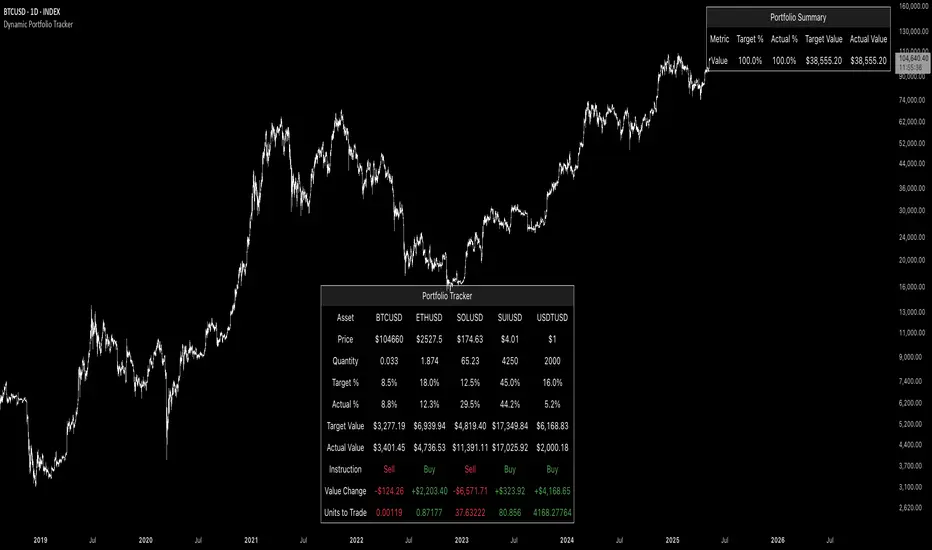
Dynamic Portfolio TrackerDynamic Portfolio Tracker
The Dynamic Portfolio Tracker is a visual tool for actively managing and monitoring a multi-asset portfolio directly on TradingView. It allows users to input up to 15 custom assets (with a default setup for 5), define how much of each asset they hold, and assign a target allocation percentage to each. The script then calculates live market prices, total portfolio value, current vs. target weightings, and provides clear, color-coded instructions on whether to buy, sell, or hold each asset. It displays all this data in an on-chart table, showing both the dollar amount and the quantity to adjust for each asset, helping users keep their portfolio aligned with their strategy in real time.
How to Use the Inputs (What Each Field Means)
1. Portfolio Assets (Tickers)
Fields: Asset 1 Ticker, Asset 2 Ticker, …, Asset 15 Ticker
What it does: Lets you select which assets (crypto, stocks, etc.) you want to track. These are live symbols pulled from TradingView.
2. Asset Quantities
Fields: Asset 1 Amount, Asset 2 Amount, …, Asset 15 Amount
What it means: How much of each asset you currently hold. For example:
• 0.03 BTC
• 2.1 ETH
Why it’s needed: The script multiplies this by the live price to calculate the current dollar value of each asset in your portfolio.
3. Target %
Fields: Asset 1 Implied %, Asset 2 Implied %, …, Asset 15 Implied %
What it means: Your desired allocation for each asset. For example:
• 40% BTC
• 20% ETH
• 10% SOL, etc.
Important: These must total 100% or less across all assets. The script checks this and shows an error if the total exceeds 100%.
The Dynamic Portfolio Tracker displays two powerful on-chart tables:
1. Main Table — Per Asset Breakdown
This table shows detailed, real-time information for each asset in your portfolio. Each row represents a different asset, and each column has a specific meaning:
Column What It Means
Asset = The symbol of the asset (e.g., BTCUSD, ETHUSD), auto-stripped from the exchange name.
Price = The current market price of the asset, pulled live from TradingView.
Quantity = How much of that asset you currently hold, entered manually in the inputs.
Target % = The percentage of your total portfolio you want this asset to represent.
Actual % = What percentage of your portfolio it currently makes up (based on price × quantity).
Target Value = How much (in $) this asset should be worth in your portfolio.
Actual Value = How much (in $) this asset is currently worth.
Instruction = Whether to Buy, Sell, or Hold to match your target allocation.
Value Change = The dollar amount you’d need to buy/sell to rebalance this asset.
Units to Trade = The number of asset units to buy/sell to reach the target value.
2. Portfolio Summary Table — Portfolio Totals
This smaller table appears in the top-right corner and summarizes your entire portfolio at a glance:
Target % = Total of all your assigned target allocations (should equal 100%).
Actual % = Actual portfolio composition (always 100% unless your capital is zero).
Target Value = Total value your portfolio should be based on your target percentages.
Actual Value = Current live total value of your portfolio.
If there’s a discrepancy between Target Value and Actual Value, the difference is shown in each row of the main table, so you can adjust individual assets accordingly.
Privacy First: Hide Sensitive Financial Data
A unique feature of this tool is the ability to hide sensitive financial data, such as:
• Target Value
• Actual Value
• Total Portfolio Value
You can turn these off using toggle settings, and they’ll be replaced with a crossed-out eye icon (👁️🗨️) — just like on modern crypto exchanges. This feature makes the script safe for streaming, screenshots, or sharing publicly while protecting your privacy.
But more importantly:
Feelings are the enemy of good investing.
Seeing the value of your portfolio fluctuate can trigger fear or greed. By hiding your dollar values, you’re not just securing your data — you’re reducing the temptation to react emotionally.
It’s just numbers. Systems over Feelings.
Table Automatically Adapts to Your Asset Count
The Dynamic Portfolio Tracker is designed to scale with your portfolio. Simply choose how many assets you want to track (up to 15), and the table will automatically resize to fit exactly that number — no wasted space or empty rows.
• Select 1 to 15 assets using the “Number of Assets” input
• The table expands or contracts dynamically to show only those rows
• All calculations, summaries, and layout elements adjust accordingly in real time
This keeps the interface clean, focused, and perfectly tailored to your setup — whether you’re tracking 3 coins or managing a full portfolio of 12+ tokens.
Customize Your Table to Match Your Style
The Dynamic Portfolio Tracker offers a full suite of visual customization options, allowing you to tailor the table to your charting style or stream layout. You can:
• Choose text colors for labels, values, and headers
• Set background colors for the full table and header row — or turn them off completely for a clean, transparent look
• Control border and frame settings, including color, thickness, or disabling them entirely
• Pick custom colors for Buy and Sell signals in the rebalance column
• Adjust table font size from tiny to large to match your resolution or preferences
Special Thanks
This tool wouldn’t exist without the knowledge and inspiration gained through The Real World. A sincere thank you to the Investing Master, the Guides, and Professor Adam — your frameworks and lessons brought clarity, discipline, and structure to this build.
And of course, glory to L4 — where real men are made.
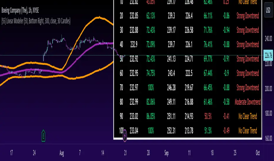
[SS] Linear ModelerHello everyone,
This is the linear modeler indicator.
It is a statistical based indicator that provides a likely price target and range based on a linear regression time series analysis.
To represent it visually, all the indicator does is it represents a linear regression channel and actually plots out the range at various points based on the current trend (see the chart below):
The indicator will perform the same assessment, but give you a working range and timeline for targets.
As well, the indicator will back-test the range and variables to see how it is performing and how reliable the results are likely to be.
General Functions:
In the chart above you can see all the various parameters and functions.
The indicator will display the most likely target (MLT) to be expected within the next pre-determined timeframe (by candles).
So for the first target, the indicator is saying within the next 10 candles, BA's MLT is 221.46 and based on BT results the reliability of this assessment is around 46%.
The indicator will also display the anticipated range at each designated timeframe.
In the chart above, we can see that at 20 candles, the likely range that BA should be trading in is 204 and 238 with a reliability of around 62% based on previous performance.
Plot Functions:
As this is performing a linear time series projection, you can have the indicator plot the projected ranges. Simply go to the settings menu and select the desired forecast length:
This will plot out the desired range and result over the specified time period. Here is an example of BA plotted over the next 50 candles on the hourly:
You can technically use this as an SMA/EMA type indicator, just keep in mind it may be a bit slower than a traditional EMA and SMA indicator, as it is processing a lot of data and plotting out forecasted data as opposed to an SMA or EMA.
If you wish to use it as an EMA or SMA, you can unselect the "Display Chart" Function to hide the table, and you can also select the "Plot Label" function. This will display the current projection analytics directly on your plotted line so you don't need to reference the table at all:
Tips on use:
I use this on the larger and smaller timeframes. On all timeframes, I will look to targets that display 90% to 100% in the BT results.
Bear in mind, this does not mean that we will 100% of the time hit this target, these targets can fail, it just means that there is a higher confidence of hitting this target than other, less reliable targets.
I will plot these targets out if they fall within the implied range of the timeframe I am looking at and will act on them according to the price action.
This is a great indicator to use in combination with other range based indicators. If you use the implied range from options to help guide your trading, you can see which targets are likely to be hit based on the current trend that fall within that implied range.
You can also assess the strength of the trends at various points in time and have an actionable range with a reliability reading at various points in time.
That is pretty much the bulk of the indicator.
Hopefully you find it helpful and useful.
As always, leave your questions and suggestions below.
Thanks for reading and checking it out!
Bull / Bear Market RegimeBull / Bear Market Regime
Instructions:
- A simple risk on or risk off indicator based on CBOE's Implied Correlation and VIX to highlight and indicate Bull / Bear Markets. To be used with the S&P500 index as that's the source from where the CBOE calculates and measures implied volatility & implied correlation. Can also be used with the other indices such as: Dow Jones, S&P 500, Nasdaq, & Nasdaq100, & Index ETF's such as DIA, SPY, QQQ, etc.
- Know the active regime, see the larger picture using the Daily or Weekly view, and visualize the current "Risk On (Bull) or Risk Off (Bear)" environment.
Description:
- Risk On and Risk Off simplified & visualized. Know if we are in a RISK ON or RISK OFF environment (Bull or Bear Market). (Absolute bottoms and tops will occur BEFORE a Risk On (Bull Market) or Risk Off (Bear Market) environment is confirmed!) This indicator is not meant to bottom tick or uptick market price action, but to show the active regime.
- Green: Bull Market, Risk On, low volatility, and low risk.
- Red: Bear Market, Risk Off, high volatility, and higher risk.
Buy & Sell Indicators (DAILY time frame)
- Nothing is 100% guaranteed! Can be used for short to medium term trades at the users discretion in BEAR MARKETS!!
- These signals are meant to be used during a RISK OFF / BEAR MARKET environment that tends to be accompanied with high volatility. A Risk on / Bull Market environment tends to have low volatility and endless rallies, so the signals will differ and in most instances not apply for Bull market / Risk on regime.
- The SELL signal will more often than not signal that a pullback is near in a BULL market and that a BMR-Bear Market Rally is almost over in a BEAR market.
- The BUY signal will have far more accuracy in a BEAR market-high volatility environment and can Identify short-term and major bottoms.
Always use proper sizing and risk management!

ICT Concepts [LuxAlgo]The ICT Concepts indicator regroups core concepts highlighted by trader and educator "The Inner Circle Trader" (ICT) into an all-in-one toolkit. Features include Market Structure (MSS & BOS), Order Blocks, Imbalances, Buyside/Sellside Liquidity, Displacements, ICT Killzones, and New Week/Day Opening Gaps.
🔶 SETTINGS
🔹 Mode
When Present is selected, only data of the latest 500 bars are used/visualized, except for NWOG/NDOG
🔹 Market Structure
Enable/disable Market Structure.
Length: will set the lookback period/sensitivity.
In Present Mode only the latest Market Structure trend will be shown, while in Historical Mode, previous trends will be shown as well:
You can toggle MSS/BOS separately and change the colors:
🔹 Displacement
Enable/disable Displacement.
🔹 Volume Imbalance
Enable/disable Volume Imbalance.
# Visible VI's: sets the amount of visible Volume Imbalances (max 100), color setting is placed at the side.
🔹 Order Blocks
Enable/disable Order Blocks.
Swing Lookback: Lookback period used for the detection of the swing points used to create order blocks.
Show Last Bullish OB: Number of the most recent bullish order/breaker blocks to display on the chart.
Show Last Bearish OB: Number of the most recent bearish order/breaker blocks to display on the chart.
Color settings.
Show Historical Polarity Changes: Allows users to see labels indicating where a swing high/low previously occurred within a breaker block.
Use Candle Body: Allows users to use candle bodies as order block areas instead of the full candle range.
Change in Order Blocks style:
🔹 Liquidity
Enable/disable Liquidity.
Margin: sets the sensitivity, 2 points are fairly equal when:
'point 1' < 'point 2' + (10 bar Average True Range / (10 / margin)) and
'point 1' > 'point 2' - (10 bar Average True Range / (10 / margin))
# Visible Liq. boxes: sets the amount of visible Liquidity boxes (max 50), this amount is for Sellside and Buyside boxes separately.
Colour settings.
Change in Liquidity style:
🔹 Fair Value Gaps
Enable/disable FVG's.
Balance Price Range: this is the overlap of latest bullish and bearish Fair Value Gaps.
By disabling Balance Price Range only FVGs will be shown.
Options: Choose whether you wish to see FVG or Implied Fair Value Gaps (this will impact Balance Price Range as well)
# Visible FVG's: sets the amount of visible FVG's (max 20, in the same direction).
Color settings.
Change in FVG style:
🔹 NWOG/NDOG
Enable/disable NWOG; color settings; amount of NWOG shown (max 50).
Enable/disable NDOG ; color settings; amount of NDOG shown (max 50).
🔹 Fibonacci
This tool connects the 2 most recent bullish/bearish (if applicable) features of your choice, provided they are enabled.
3 examples (FVG, BPR, OB):
Extend lines -> Enabled (example OB):
🔹 Killzones
Enable/disable all or the ones you need.
Time settings are coded in the corresponding time zones.
🔶 USAGE
By default, the indicator displays each feature relevant to the most recent price variations in order to avoid clutter on the chart & to provide a very similar experience to how a user would contruct ICT Concepts by hand.
Users can use the historical mode in the settings to see historical market structure/imbalances. The ICT Concepts indicator has various use cases, below we outline many examples of how a trader could find usage of the features together.
In the above image we can see price took out Sellside liquidity, filled two bearish FVGs, a market structure shift, which then led to a clean retest of a bullish FVG as a clean setup to target the order block above.
Price then fills the OB which creates a breaker level as seen in yellow.
Broken OBs can be useful for a trader using the ICT Concepts indicator as it marks a level where orders have now been filled, indicating a solidified level that has proved itself as an area of liquidity. In the image above we can see a trade setup using a broken bearish OB as a potential entry level.
We can see the New Week Opening Gap (NWOG) above was an optimal level to target considering price may tend to fill / react off of these levels according to ICT.
In the next image above, we have another example of various use cases where the ICT Concepts indicator hypothetically allow traders to find key levels & find optimal entry points using market structure.
In the image above we can see a bearish Market Structure Shift (MSS) is confirmed, indicating a potential trade setup for targeting the Balanced Price Range imbalance (BPR) below with a stop loss above the buyside liquidity.
Although what we are demonstrating here is a hindsight example, it shows the potential usage this toolkit gives you for creating trading plans based on ICT Concepts.
Same chart but playing out the history further we can see directly after price came down to the Sellside liquidity & swept below it...
Then by enabling IFVGs in the settings, we can see the IFVG retests alongside the Sellside & Buyside liquidity acting in confluence.
Which allows us to see a great bullish structure in the market with various key levels for potential entries.
Here we can see a potential bullish setup as price has taken out a previous Sellside liquidity zone and is now retesting a NWOG + Volume Imbalance.
Users also have the option to display Fibonacci retracements based on market structure, order blocks, and imbalance areas, which can help place limit/stop orders more effectively as well as finding optimal points of interest beyond what the primary ICT Concepts features can generate for a trader.
In the above image we can see the Fibonacci extension was selected to be based on the NWOG giving us some upside levels above the buyside liquidity.
🔶 DETAILS
Each feature within the ICT Concepts indicator is described in the sub sections below.
🔹 Market Structure
Market structure labels are constructed from price breaking a prior swing point. This allows a user to determine the current market trend based on the price action.
There are two types of Market Structure labels included:
Market Structure Shift (MSS)
Break Of Structure (BOS)
A MSS occurs when price breaks a swing low in an uptrend or a swing high in a downtrend, highlighting a potential reversal. This is often labeled as "CHoCH", but ICT specifies it as MSS.
On the other hand, BOS labels occur when price breaks a swing high in an uptrend or a swing low in a downtrend. The occurrence of these particular swing points is caused by retracements (inducements) that highlights liquidity hunting in lower timeframes.
🔹 Order Blocks
More significant market participants (institutions) with the ability of placing large orders in the market will generally place a sequence of individual trades spread out in time. This is referred as executing what is called a "meta-order".
Order blocks highlight the area where potential meta-orders are executed. Bullish order blocks are located near local bottoms in an uptrend while bearish order blocks are located near local tops in a downtrend.
When price mitigates (breaks out) an order block, a breaker block is confirmed. We can eventually expect price to trade back to this breaker block offering a new trade opportunity.
🔹 Buyside & Sellside Liquidity
Buyside / Sellside liquidity levels highlight price levels where market participants might place limit/stop orders.
Buyside liquidity levels will regroup the stoploss orders of short traders as well as limit orders of long traders, while Sellside liquidity levels will regroup the stoploss orders of long traders as well as limit orders of short traders.
These levels can play different roles. More informed market participants might view these levels as source of liquidity, and once liquidity over a specific level is reduced it will be found in another area.
🔹 Imbalances
Imbalances highlight disparities between the bid/ask, these can also be defined as inefficiencies, which would suggest that not all available information is reflected by the price and would as such provide potential trading opportunities.
It is common for price to "rebalance" and seek to come back to a previous imbalance area.
ICT highlights multiple imbalance formations:
Fair Value Gaps: A three candle formation where the candle shadows adjacent to the central candle do not overlap, this highlights a gap area.
Implied Fair Value Gaps: Unlike the fair value gap the implied fair value gap has candle shadows adjacent to the central candle overlapping. The gap area is constructed from the average between the respective shadow and the nearest extremity of their candle body.
Balanced Price Range: Balanced price ranges occur when a fair value gap overlaps a previous fair value gap, with the overlapping area resulting in the imbalance area.
Volume Imbalance: Volume imbalances highlight gaps between the opening price and closing price with existing trading activity (the low/high overlap the previous high/low).
Opening Gap: Unlike volume imbalances opening gaps highlight areas with no trading activity. The low/high does not reach previous high/low, highlighting a "void" area.
🔹 Displacement
Displacements are scenarios where price forms successive candles of the same sentiment (bullish/bearish) with large bodies and short shadows.
These can more technically be identified by positive auto correlation (a close to open change is more likely to be followed by a change of the same sign) as well as volatility clustering (large changes are followed by large changes).
Displacements can be the cause for the formation of imbalances as well as market structure, these can be caused by the full execution of a meta order.
🔹 Kill Zones
Killzones represent different time intervals that aims at offering optimal trade entries. Killzones include:
- New York Killzone (7:9 ET)
- London Open Killzone (2:5 ET)
- London Close Killzone (10:12 ET)
- Asian Killzone (20:00 ET)
🔶 Conclusion & Supplementary Material
This script aims to emulate how a trader would draw each of the covered features on their chart in the most precise representation to how it's actually taught by ICT directly.
There are many parallels between ICT Concepts and Smart Money Concepts that we released in 2022 which has a more general & simpler usage:
ICT Concepts, however, is more specifically aligned toward the community's interpretation of how to analyze price 'based on ICT', rather than displaying features to have a more classic interpretation for a technical analyst.

4C Options Expected Move (Weekly + 0DTE)This indicator plots the calculated Expected Move for BOTH Weekly and Zero Dated Expiration (0DTE) Daily options, for a quick visual reference.
Please Note: This indicator is different from our original "4C Expected Move (Weekly Options)" indicator, as it now packages the ability to ALSO plot 0DTE options expected moves along with Weekly expected moves. Many other newer features have also been implemented.
Background Information
The Expected Move (EM) is the amount that a stock is predicted to increase or decrease from its current price, based on the current level of options pricing and implied volatility.
This range can be viewed as possible support and resistance, or, once price gets outside of the range, institutional hedging actions can accelerate the move in that direction.
It can be useful to know what the weekly EM range is for a stock to understand the probabilities of the overall distance, direction and volatility for the week.
About the Indicator
This indicator plots the calculated Expected Move for BOTH Weekly and Zero Dated Expiration (0DTE) options, for a quick visual reference.
For the weekly EM, the range is based on the Weekly close of the prior week.
For the Daily EM based on 0DTE options, the range is based on the Daily close of the prior day.
The indicator will automatically start a new weekly EM plot at the beginning of the week, and a new daily EM at the beginning of each day.
The EM values must be updated weekly and/or daily.
Features
Plots the EM for the week
Plots the EM for the day, for symbols that offer daily expiration options
Plots the 2 Standard Deviation EM for both the weekly and daily EM
Labels with calculated values are plotted near the levels for quick visual aid
Settings
Can toggle weekly EM on/off
Can toggle Daily EM on/off
Can toggle 2 Standard Deviation lines on/off
Can toggle labels for all EM on/off
Robust line settings
Can adjust label location left/right based on personal preference
Can enter symbol into settings as a reference
Handy instructions in the settings
How To Set Up The Indicator
To use this indicator you must have access to a broker with options data (not available on Tradingview).
Usually, you can look at the stock's option chain to find the weekly expected move.
You will have to do your own research to find where this information is displayed depending on your broker. You may also need to find the information elsewhere if your broker does not have this information.
You can also do your calculation of the EM using the following formula (please do your own research):
Expected Move = Option Price x Implied Volatility x Square Root of Time
See screenshot example below
This is the Thinkorswim platform's option chain, and the Implied Volatility % and the calculated EM are on the right side of the option chain.
The Expected Move is circled in blue. Use the +- number in parentheses, NOT the % value.
For the weekly EM, input the number that corresponds to the weekly option into the indicator. This must be done on a weekly basis, and It is typically best to use the EM for the next week expiration that is generated AFTER the Friday close and/or before the Monday open of the upcoming week.
For the daily EM, input the number that corresponds to the daily 0DTE option into the indicator. This must be done on a daily basis, and it is typically best to use the EM value for the 0DTE option that is generated the night before (after market close), or before the market opens for that 0DTE. .
Synthetic VX3! & VX4! continuous /VX futuresTradingView is missing continuous 3rd and 4th month VIX (/VX) futures, so I decided to try to make a synthetic one that emulates what continuous maturity futures would look like. This is useful for backtesting/historical purposes as it enables traders to see how their further out VX contracts would've performed vs the front month contract.
The indicator pulls actual realtime data (if you subscribe to the CBOE data package) or 15 minute delayed data for the VIX spot (the actual non-tradeable VIX index), the continuous front month (VX1!), and the continuous second month (VX2!) continually rolled contracts. Then the indicator's script applies a formula to fairly closely estimate how 3rd and 4th month continuous contracts would've moved.
It uses an exponential mean‑reversion to a long‑run level formula using:
σ(T) = θ+(σ0−θ)e−kT
You can expect it to be off by ~5% or so (in times of backwardation it might be less accurate).

Rectified BB% for option tradingThis indicator shows the bollinger bands against the price all expressed in percentage of the mean BB value. With one sight you can see the amplitude of BB and the variation of the price, evaluate a reenter of the price in the BB.
The relative price is visualized as a candle with open/high/low/close value exspressed as percentage deviation from the BB mean
The indicator include a modified RSI, remapped from 0/100 to -100/100.
You can choose the BB parameters (length, standard deviation multiplier) and the RSI parameter (length, overbougth threshold, ovrsold threshold)
You can exclude/include the candles and the RSI line.
The indicator can be used to sell options when the volatility is high (the bollinger band is wide) and the price is reentering inside the bands.
If the price is forming a supply or demand area it can be a good opportunity to sell a bull put or a bear call
The RSI can be used as confirm of the supply/demand formation
If the bollinger band is narrow and the RSI is overbought/oversold it indicate a better opportunity to buy options
the indicator is designed to work with daily timeframe and default parameters.

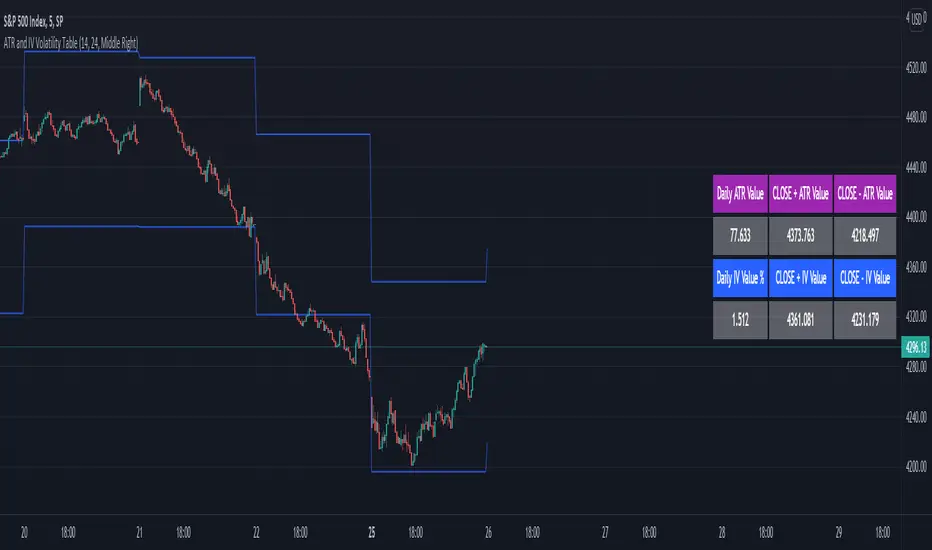
ATR and IV Volatility TableThis is a volatility tool designed to get the daily bottom and top values calculated using a daily ATR and IV values.
ATR values can be calculated directly, however for IV I recommend to take the values from external sources for the asset that you want to trade.
Regarding of the usage, I always recommend to go at the end of the previous close day of the candle(with replay function) or beginning of the daily open candle and get the expected values for movements.
For example for 26April for SPX, we have an ATR of 77 points and the close of the candle was 4296.
So based on ATR for 27 April our TOP is going to be 4296 + 77 , while our BOT is going to be 4296-77
At the same time lets assume the IV for today is going to be around 25% -> this is translated to 25 / (sqrt (252)) = 1.57 aprox
So based on IV our TOP is going to be 4296 + 4296 * 0.0157 , while our BOT is going to be 4296 - 4296 * 0.0157
I found out from my calculations that 80-85% of the times these bot and top points act as an amazing support and resistence points for day trading, so I fully recommend you to start including them into your analysis.
If you have any questions let me know !
vx_termsUSAGE
--------
This script helps train your intuition for changes in the VX term structure. I recommend using it on the VIX chart, so you can compare changes in the terms to changes in VIX. It's also nice for calendar spread traders who want to get a feel for the same changes.
1. Select a day, month, and year using the inputs
2. Observe the data table.
3. Open the input again and increment or decrement the day (and month, year as necessary).
4. Click "Ok".
5. Click to deselect the indicator, which allows the chart to load new data.
6. The data table will be reloaded with the next/previous day's data.
The data table has the following columns:
- contract: the VX contracts, in sequence. refer to the CBOE for month codes (F for January, etc.)
- close: the closing price of the contract.
- ma:mb: the spread (difference) between this row and the next row.
- ma:mb chg: the spread's change from prior close.
For example, given the following values for the first two columns:
VXQ2021, 16.5, -3.1, -0.2
VXU2021, 19.6, ..., ...
The front month (Q = august) closed at 16.5, $3.1 below the s\September contract. The negative spread enlarged by $0.20 from $2.90 on the previous trading day.
BUGS, ODDITIES, AND LIMITATIONS:
-------------------------------------------
- The first column will be greyed out after expiration day, which is the 3rd Tuesday of that month. Unfortunately, I can't load the next month's contract due to some limitations with TV.
- The active date is highlighted with a yellow background. When a non-trading date is selected, the highlight will disappear. However, the data table will sometimes fill with the nearest trading date, prematurely. No worries, just know that the data is probably for the previous Friday.
- The script is clunky and slow, but this is the best I can do with TV. Hopefully they add more continuous contracts or allow true dynamic symbol loading.
SPECIAL THANKS:
---------------------
Thanks to HeWhoMustNotBeNamed for helping me get through some messiness. Very helpful guy.
www.tradingview.com

vol_bracketThis simple script shows an "N" standard deviation volatility bracket, anchored at the opening price of the current month, week, or quarter. This anchor is meant to coincide roughly with the expiration of options issued at the same interval. You can choose between a manually-entered IV or the hv30 volatility model.
Unlike my previous scripts, which all show the volatility bracket as a rolling figure, the anchor helps to visualize the volatility estimate in relation to price as it ranges over the (approximate) lifetime of a single, real contract.
VIX Term StructureThis script allows users to visualize the state of the VIX Futures Term Structure. The user is able to select from five CBOE VIX Indices; VIX, VIX9D, VIX3M, VIX6M, and VIX1Y and the script will color the candles based on the price relationship between selected indices. Visit the CBOE website for more info on how the various VIX indices are calculated.

Vector Volume Delta Candles [Capitalize Labs]Vector Volume Delta Candles is a visual market analysis indicator designed to highlight relative volume activity directly on price candles. The indicator classifies candles based on volume intensity and price range expansion compared to recent historical data and applies color coding for visual context only.
This indicator functions strictly as a candle-coloring overlay. It does not generate trade signals, entries, exits, alerts, forecasts, or predictions. No automated trading decisions are made or implied.
How it works
Evaluates current candle volume relative to a moving average of recent volume
Optionally incorporates a volume × price range comparison to identify unusually active candles
Classifies candles as:
Climactic when volume activity is significantly above recent norms
Elevated when volume is above average but not climactic
Applies configurable colors to candles based on classification and candle direction
Includes optional color customization and the ability to revert candle coloring
Uses historical data only and does not repaint or reference future bars
Intended use
This indicator is intended for educational and analytical purposes only. It may be used as a visual reference alongside other tools or discretionary analysis methods. All interpretations are subjective and must be evaluated independently by the user.
No assumptions are made regarding market direction, probability, or outcome.
Disclaimer and Risk Notice
This indicator is provided strictly for educational and informational purposes. It is not intended to constitute financial advice, investment recommendations, or an offer or solicitation to buy or sell any financial instrument or security.
Financial markets involve substantial risk, and trading decisions can result in losses that exceed initial expectations. Market conditions can change rapidly due to volatility, liquidity constraints, economic events, or other external factors. No representation is made that the use of this indicator will result in profitable outcomes or that any interpretation of its output will be accurate or complete in all market conditions.
This indicator does not take into account individual financial circumstances, objectives, or risk tolerance. Users are solely responsible for evaluating the suitability of any analysis or methodology derived from this tool and for managing their own risk, position sizing, and execution decisions.
All calculations are based on historical price and volume data. Historical or simulated behavior should not be interpreted as a guarantee or prediction of future performance. The absence of repainting or lookahead logic does not imply predictive capability.
By using this indicator, the user acknowledges that all trading decisions are made at their own discretion and risk, and that the creator assumes no responsibility or liability for any losses, damages, or outcomes arising from its use.

MSSM - Multi-Session Structural Map (Precision Sweeps)MSSM – Multi-Session Structural Map (Precision Sweeps)
This indicator provides a structured view of the market based on four key components:
1). Previous session levels
2). Confirmed fractal swing points
3). Volume pocket highlights
4). Non-repainting precision liquidity sweep markers
It is designed to help analyze how price interacts with important reference areas and structural points. This tool does not generate signals or predictions. All information is visual and educational only.
HOW THE INDICATOR WORKS
PREVIOUS SESSION LEVELS
The script plots the previous session’s High, Low, and Mid. These levels help observe how the current session behaves around the prior day’s range. They act as reference areas only.
FRACTAL SWING MAP (NON-REPAINTING)
Confirmed fractals are used to mark historical swing highs and swing lows. Since fractals confirm after a certain number of bars, the swings do not repaint once formed. These swings provide a clearer view of market structure.
VOLUME POCKETS
The indicator highlights areas where volume expands relative to a rolling volume average. These regions show increased participation or activity. The highlights are informational and do not imply direction.
PRECISION LIQUIDITY SWEEPS (NON-REPAINTING)
A sweep is tagged only when:
• Price trades beyond a confirmed swing high or swing low
• Price closes back inside the previous swing level
• A wick rejection occurs
• Volume expands relative to a recent rolling average
These markers simply show where price interacted with liquidity around prior structural levels. They do not indicate a trading signal or bias.
HOW TO ADD THE INDICATOR
Open the Pine Editor in TradingView
Search the indicator name and add to favorites.
Click “Add to chart”
Adjust settings as needed (fractals, sweeps, volume pockets, or session levels)
HOW TO READ AND USE THE INDICATOR
SESSION LEVELS
Observe whether price respects, rejects, compresses around, or expands beyond the previous session high, low, or midpoint. These are observational reference levels only.
FRACTALS
Fractal highs and lows help visualize structural turning points. They provide a clearer picture of where liquidity may rest above or below past swing levels.
VOLUME POCKETS
When volume expands compared to the recent average, the candle is shaded. These areas may show increased participation, but no directional meaning is implied.
PRECISION SWEEPS
Sweeps highlight when price reaches beyond a prior confirmed swing level and then rejects that area with displacement. These markers identify interactions with liquidity, but they are not signals and do not forecast future outcomes.
CUSTOMIZATION OPTIONS
Users can adjust:
• Session level visibility
• Fractal sensitivity
• Volume pocket threshold
• Sweep sensitivity and visibility
• Transparency and styling
This makes the tool flexible across different symbols and timeframes.
IMPORTANT NOTES AND POLICY COMPLIANCE
• The indicator does not provide buy or sell signals
• The indicator does not predict price or direction
• All plotted elements are based on past price behavior
• All components are informational only
• Users should perform their own analysis and risk evaluation
• Past behavior does not guarantee future performance
SUMMARY
MSSM provides a structured view of price by combining previous session levels, confirmed swing structure, volume expansion zones, and non-repainting sweep identification. Its purpose is to assist traders in visually analyzing market structure while staying fully aligned with TradingView’s House Rules and content policies.
