Liquidity Channel with B/SIndicator - Liquidity Level
Which calculates the liquidity levels based on the highest high and lowest low of the specified period. It determines the middle line, upper line, and lower line of the liquidity channel. The liquidity level is the average of the upper and lower lines, and the liquidity level distance is half of the difference between the upper and lower lines.
Here, the code determines if the conditions for overbought and oversold signals are met. It compares the current closing price with the previous opening price to determine the color of the bar (red or green). If the conditions are met and the bar color matches the expected direction (red for overbought and green for oversold), the respective signals are triggered.
The code plots buy and sell signals on the chart using shape labels. It displays "Buy" labels below the bars for buy signals and "Sell" labels above the bars for sell signals. Additionally, it colors the bars in gray. The code also sets up alert conditions to send notifications when buy or sell signals occur.
*************** Please note that this is a high-level overview of the code's functionality. The specific details and calculations may vary based on the parameters and settings provided in the code.
*************** Remember, trading involves risks, and it's important to thoroughly test any strategy and consider risk management principles before using it in live trading. It's recommended to consult with a knowledgeable financial advisor or professional trader for guidance and assistance in developing and implementing trading strategies.
***************Happy trading..
I will try to share my most commonly used strategies with you as much as possible. For this, you can follow me as a source of motivation, and if you like the indicators, you can give me a rocket to make me happy, my friends! :))
Cerca negli script per "liquidity"

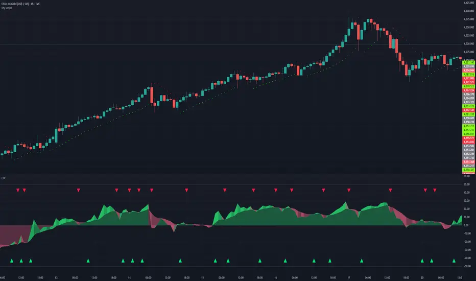
Liquidity Sentiment Profile | LUPENIndicator Guide: Liquidity Sentiment Profile (LSP).
What is the LSP?
The Liquidity Sentiment Profile (LSP) is a "Next-Generation" oscillator designed to look beyond simple price action. While standard indicators (like RSI or MACD) primarily focus on where a candle closes, the LSP analyzes the micro-structure of the entire candle—specifically the relationship between the candle's Body, its Wicks (Shadows), and the Volume.
The Core Philosophy:
Wicks tell the truth: A long lower wick indicates that sellers pushed the price down, but buyers aggressively absorbed that liquidity and pushed it back up.
That is hidden bullish strength.
Volume validates intent: A price move with low volume is noise. A price move (or wick rejection) with high volume is a commitment by institutional players.
The LSP calculates a "Sentiment Score" between -100 and +100 based on these factors.
How to Read the Visuals
The Colors (Intensity)
color: Light Green - Bullish Acceleration. Buyers are in control, and momentum is increasing. This is the ideal time to be in a Long trade.
color: Dark Green - Bullish Deceleration. Buyers are still in control (price is likely rising), but the momentum is fading. This is a warning sign to tighten stop-losses or take profits.
color: Light Red - Bearish Acceleration. Sellers are dominating, and panic is increasing. This is the ideal time to be Short.
color: Dark Red - Bearish Deceleration. Sellers are still in control, but the downward pressure is exhausted. Be careful with new short positions.
The Lines & Fills
The Main Line: The actual LSP sentiment value.
The Yellow Signal Line: A smoothed average of the sentiment.
The Core Fill: The colored area between the Main Line and the Signal Line. When this area "glows", the trend is strong. When it dims (Dark), the trend is weak. Bearish Deceleration. Sellers are still in control, but the downward pressure is exhausted. Be careful with new short positions.
The Lines & Fills
The Main Line: The actual LSP sentiment value.
The Yellow Signal Line: A smoothed average of the sentiment.
The Core Fill: The colored area between the Main Line and the Signal Line. When this area "glows" (Neon), the trend is strong. When it dims (Dark), the trend is weak.
How to Use It (Trading Strategies)
Strategy A: The "Power Cross" (Trend Entry)
Use this for entering trends when the market wakes up.
Long Entry: Wait for the LSP line to cross ABOVE the Yellow Signal Line.
Confirmation: The fill color must turn Neon Green.
Short Entry: Wait for the LSP line to cross BELOW the Yellow Signal Line.
Confirmation: The fill color must turn Neon Red.
Strategy B: The "Absorption" Play (Reversals)
This is where the LSP shines. It detects when liquidity is being absorbed before price turns.
Bullish Absorption: The Price makes a Lower Low, but the LSP makes a Higher Low. This happens because the LSP detects the Volume on the Lower Wicks (buyers absorbing selling pressure). This is a high-probability reversal signal.
Bearish Absorption: The Price makes a Higher High, but the LSP makes a Lower High. The volume on the Upper Wicks suggests sellers are absorbing the buy orders.
Strategy C: The "Dimming" Exit (Risk Management)
Don't wait for the price to crash to exit a trade.
If you are in a Long trade (Neon Green) and the color instantly shifts to Dark Green, it means the "fuel" is running out. Consider taking partial profits or moving your Stop Loss to break even.
Standard oscillators (like RSI) often give false signals during strong trends (showing "Overbought" while price keeps going up). The LSP avoids this because it weights Volume and Wicks. If price goes up and volume increases, the LSP stays Neon Green, telling you the move is genuine, not just overextended.
Liquidity Oscillator (Price Impact Proxy)Osc > +60: liquidity is high relative to recent history → slippage tends to be lower.
Osc < -60: liquidity is low → expect worse fills, bigger wicks, easier manipulation.
It’s most useful as a filter (e.g., “don’t enter when liquidity is low”).

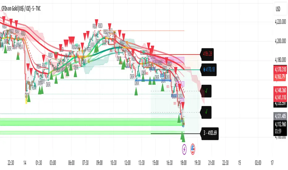
Liquidity Trend SystemThis script is a multi-strategy trading indicator. It combines several technical analysis tools into one overlay indicator to generate Buy and Sell signals. Here’s what it does:
✅ Main Purpose
It analyses price action and trends using multiple methods and plots signals, targets, and alerts on the chart. The goal is to identify high-probability trade setups.
🔍 Components & Their Roles
Target Trend
Detects trend direction using moving averages and ATR.
Draws stop-loss, entry, and three target levels on the chart.
Colours candles based on trend (bullish or bearish).
Plots visual signals (triangles) when trend changes.
Trend Filter
Applies a two-pole smoothing filter to price for trend detection.
Uses rising/falling conditions to confirm trend strength.
Plots a coloured line and optional signals when trend changes.
Liquidity Sweeps
Identifies liquidity grabs (price sweeping highs/lows).
Marks wicks, outbreaks, and retests visually.
Highlights zones where liquidity was taken.
Candle Range Trading
Detects two-candle reversal patterns:
Bullish CRT (second candle bullish after bearish first).
Bearish CRT (second candle bearish after bullish first).
Plots markers and optional high/low box for the pattern.
RBD/DBR Patterns
Detects supply/demand patterns:
Rally → Base → Drop (RBD)
Rally → Base → Rally (RBR)
Drop → Base → Drop (DBD)
Drop → Base → Rally (DBR)
Colours bars and plots labels for these patterns.
✅ Final Signal Logic
Combines all conditions from the above strategies AND higher timeframe confirmations (HTF)
Generates:
Buy signal when all bullish conditions align.
Sell signal when all bearish conditions align.
Plots Buy/Sell labels and triggers alerts.
⚠️ Key Notes
This is a confluence-based system: signals appear only when multiple strategies agree.
It uses multi-timeframe analysis, which can repaint if not handled carefully.
Heavy use of lines, labels, and arrays → may impact performance on lower-end devices.
Liquidity Void Detector + Pro SignalsWhat This Indicator Does
This indicator detects “liquidity voids”—large displacement candles with very high body-to-wick ratios and size significantly above recent ATR—where price moved rapidly and left untested areas.
It automatically draws shaded boxes for new, non-overlapping voids, shows a moveable dashboard (void fill probabilities), and provides one clean, actionable long/short signal per void when price action and momentum confirm.
How It Works
Void Detection: Candles with a body/wick ratio and size above user threshold trigger a potential liquidity void.
Box Drawing: Each new void is drawn as a shaded box (yellow/orange) that never overlaps other active voids.
Signal Confirmation: A “LONG” or “SHORT” label appears at the first bar within each valid void if momentum and candlestick structure align.
Dashboard: User-selectable dashboard shows up-to-date stats on remaining unfilled, partially filled, and fully filled voids.
Alerts: Built-in alerts fire when a new high-probability long/short signal is detected (user must add alerts manually).
Key Features
No overlap, no clutter: Only the latest set of boxes and a single signal per event are drawn. Oldest boxes are pruned automatically.
Momentum filter: Signals combine void and trend strength for higher conviction, filtering out weak/fake moves.
Non-repainting: Signals, boxes, and logic only use confirmed bar data—no repaint or future leaks.
Adjustable settings: Every threshold (body/wick ratio, ATR size, maximum boxes, dashboard location, signal label size) is user-configurable.
Efficient for all timeframes and asset classes.
How to Use
Add to your chart:
Click "Add to Chart" or search “Liquidity Void Detector” in the indicator search panel.
Tune your inputs:
Adjust the Body/Wick Ratio and Min Size vs ATR for your market or timeframe.
Set the Void Box Length (how many bars the box displays), signal sensitivity, and maximum concurrent voids.
Move the dashboard as needed for your chart layout.
What to look for:
Yellow/orange boxes highlight recent liquidity voids—untested price gaps where future reactions may occur.
LONG/SHORT signals appear only where a fresh void coincides with confirmed momentum in that direction.
Dashboard tracks probability of voids remaining unfilled, being partially filled, or fully refilled by price.
Trading logic and best use:
Traders may use void boxes to anticipate where price might react, reverse, or trend continuation can resume.
Combine signals with additional price action confirmation such as S/R levels, order blocks, wick rejections, volume spikes, or patterns (e.g., pin bars, engulfing).
Use signal alerts in conjunction with order flow, session profile, or support/resistance tools for increased confluence.
Always backtest and demo trade before live use.
Important Compliance & Disclaimer
No advice: This tool provides visual context only. All trading and risk decisions are the user’s responsibility.
No repainting, original source: The code is fully open-source, uses only native Pine Script, and never repaints.
No spam, no links, no 3rd-party promotion: 100% TradingView House Rules compliant.
If you find this useful, please consider leaving a positive review, and remember to always confirm with your own analysis.

Liquidity & Momentum Master (LMM)💎 Liquidity & Momentum Master (LMM)
A professional dual-system indicator that combines:
📦 High-Volume Support/Resistance Zones and
📊 RSI + Bollinger Band Combo Signals — to visualize both smart money footprints and momentum reversals in one clean tool.
🧱 1. High-Volume Liquidity Zones (Support/Resistance Boxes)
Conditions
Visible only on 1H and higher timeframes (1H, 4H, 1D, etc.)
Detects candles with abnormally high volume and strong ATR-based range
Separates bullish (support) and bearish (resistance) zones
Visualization
All boxes are white, with adjustable transparency (alphaW, alphaBorder)
Each box extends to the right automatically
Only the most important (Top-N) zones are kept — weaker ones are removed automatically
Interpretation
White boxes = price areas with heavy liquidity and volume concentration
Price approaching these zones often leads to bounces or rejections
Narrow spacing = consolidation, wide spacing = potential large move
💎 2. RSI Exit + BB-RSI Combo Signals
RSI Exit (Overbought/Oversold Recovery)
RSI drops from overbought (>70) → plots red “RSI” above the candle
RSI rises from oversold (<30) → plots green “RSI” below the candle
Works on 15m, 30m, 1H, 4H, 1D
→ Indicates short-term exhaustion recovery
BB-RSI Combo (Momentum Reversal Confirmation)
Active on 1H and higher only
Requires both:
✅ RSI divergence (bullish or bearish)
✅ Bollinger Band re-entry (after temporary breakout)
Combo Buy (Green Diamond)
Bullish RSI divergence
Candle closes back above lower Bollinger Band
Combo Sell (Red Diamond)
Bearish RSI divergence
Candle closes back below upper Bollinger Band
→ Confirms stronger reversal momentum compared to standard RSI signals

Liquidity Swap Detector Ultimate - Cedric JeanjeanAdvanced Smart Money Concepts indicator designed to detect high-probability liquidity sweeps and institutional order flow reversals. This professional-grade tool combines multiple ICT (Inner Circle Trader) strategies to identify optimal entry points.
═══════════════════════════════════════════════════════
📊 KEY FEATURES:
✅ Smart Swing Detection
- Identifies confirmed swing highs and lows using adaptive lookback periods
- Eliminates false signals through double-confirmation logic
- Detects liquidity grabs at key market structure points
✅ Fair Value Gap (FVG) Analysis
- Multi-timeframe FVG detection for enhanced accuracy
- Filters imbalances by minimum size threshold
- Combines current timeframe and higher timeframe FVGs
✅ Advanced Volatility Filter
- ATR-based volatility analysis to avoid low-quality setups
- Adjustable volatility threshold (default 0.35%)
- Ensures entries during optimal market conditions
✅ Precision Signal Generation
- LONG signals: Confirmed swing lows + FVG + volatility confirmation
- SHORT signals: Confirmed swing highs + FVG + volatility confirmation
- Clear visual markers with price labels
✅ Comprehensive Alert System
- Three alert types: Simple, Detailed, JSON (for webhooks)
- Separate LONG/SHORT alert controls
- Compatible with MT5 integration via webhooks
- TradingView native alertcondition support
✅ Professional Dashboard
- Real-time ATR monitoring
- Volatility percentage display
- FVG status indicator
- Alert status tracker
═══════════════════════════════════════════════════════
⚙️ CUSTOMIZABLE PARAMETERS:
🔹 Lookback Swing (1-50): Defines swing detection sensitivity
🔹 ATR Multiplier: Controls wick filter strength
🔹 Volatility Filter: Minimum required market volatility (%)
🔹 FVG Filter: Minimum fair value gap size (%)
🔹 FVG Timeframe: Higher timeframe for multi-TF analysis
🔹 Visual Options: Toggle swing marks, FVG zones, labels
🔹 Alert Controls: Enable/disable LONG/SHORT notifications
═══════════════════════════════════════════════════════
📈 HOW IT WORKS:
1. The indicator scans for confirmed swing points using a robust double-confirmation algorithm
2. Simultaneously analyzes Fair Value Gaps on both current and higher timeframes
3. Validates market volatility to ensure sufficient price movement
4. Generates precise entry signals when all conditions align
5. Triggers customizable alerts for instant notification
═══════════════════════════════════════════════════════
🎯 BEST PRACTICES:
- Use on liquid markets (Forex majors, indices, crypto)
- Recommended timeframes: 15m, 1H, 4H
- Combine with support/resistance for confirmation
- Adjust lookback period based on market volatility
- Test alert settings before live trading
- Use JSON alerts for automated trading integration
═══════════════════════════════════════════════════════
⚡ ALERT CONFIGURATION:
1. Click the Alert icon (bell) in TradingView
2. Select "Liquidity Swap Detector Ultimate - TITAN v6"
3. Choose your preferred alert condition:
- LONG Signal: Only bullish setups
- SHORT Signal: Only bearish setups
- ANY Signal: All trading opportunities
4. Set expiration and notification preferences
5. For MT5 integration: Select "JSON" message type and configure webhook URL

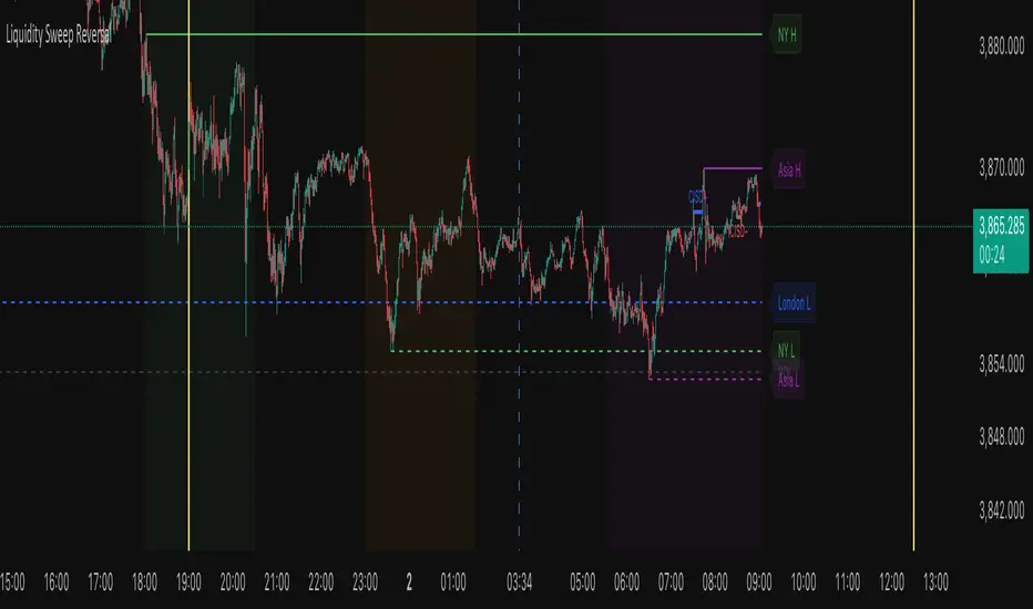
Liquidity Sweep ReversalThe Liquidity Sweep Reversal indicator is a sophisticated price-action-based tool designed for TradingView that identifies high-probability reversal setups by combining institutional liquidity concepts with session-based market structure. It detects potential reversals after price "sweeps" key support/resistance levels—such as prior day/week highs and lows or session extremes (Asian, London, New York)—followed by a rejection pattern.
The core logic revolves around two main signal types:
CISD (Close Inside, Sweep, Divergence) patterns that confirm liquidity grabs on higher timeframes.
Engulfing candlestick reversals occurring shortly after a touch of a key level within a defined lookback window.
To enhance relevance and reduce noise, the indicator optionally restricts signals to high-volatility “Killzone” sessions—including Asian, London, and New York AM/PM overlap periods—where institutional activity is typically concentrated.
Users can fully customize:
Timezone and higher timeframe (HTF) settings
Which key levels to monitor (PDH, PDL, PWH, PWL, session highs/lows)
Visual styling (line types, colors, labels)
Signal sensitivity (max bars after touch, signal size)
Display options (background highlights, level visibility, historical signal filtering)
Additionally, the script draws vertical lines for today’s and tomorrow’s London (08:00 CET) and New York (09:30 EST) market opens to provide contextual reference.
This tool is ideal for traders using auction market theory, order flow, or institutional footprint strategies who seek confluence between liquidity pools, session structure, and price rejection.
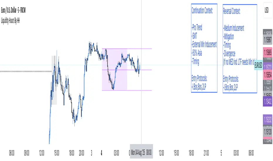
Liquidity Hours By HH
🚨 Sick of cluttered screens with 100 indicators? Yeah, me too! That’s why I built Liquidity Hours By HH — everything you NEED, packed into ONE clean, smart indicator.
💥 Custom Kill Team zones for London and New York sessions — pinpoint where the real action happens!
🎯 Asia session’s high, low, and midline? Those are GOLDEN liquidity zones, and we highlight exactly when they’re taken so you never miss a move. Stay sharp, stay informed, right on your chart!
Ready to simplify your trading and hunt liquidity like a pro? Check us out and level up your game! 🔥📈📉
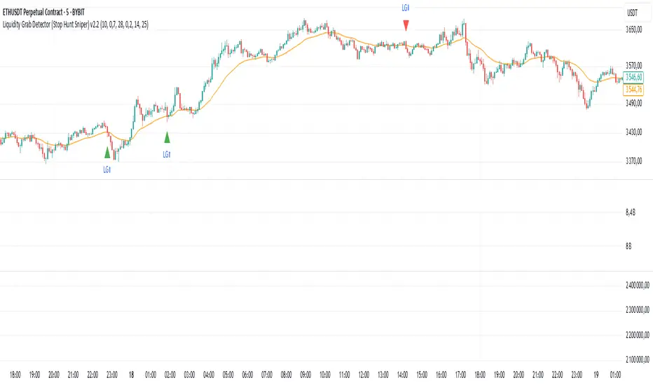
Liquidity Grab Detector (Stop Hunt Sniper) v2.2📌 Purpose
This indicator detects Stop Hunts (Liquidity Grabs) — false breakouts above/below recent highs or lows — filtered by trend direction, volatility, and volume conditions.
It is designed for scalpers and intraday traders who want to identify high-probability reversal zones.
🧠 How It Works
1. Key Logic
Detects previous swing high / swing low over the Lookback Bars.
Marks a false breakout when price moves beyond the level and closes back inside.
Requires a volume spike on the breakout to confirm liquidity sweep.
2. Trend Filter (EMA 50)
Bullish signals only if price is above EMA 50.
Bearish signals only if price is below EMA 50.
This removes most counter-trend stop hunts.
3. ADX Filter
Signals appear only when ADX < Max ADX (low-trend conditions).
This avoids false signals in strong trending markets.
📈 How to Use
Green Arrows: Bullish stop hunt (potential long entry).
Red Arrows: Bearish stop hunt (potential short entry).
Works best in range conditions, liquidity zones, or near session highs/lows.
Combine with order flow, volume profile, or price action for extra confirmation.
Recommended Timeframes: 1m–15m for scalping; 30m–1h for intraday.
Markets: Crypto, Forex, Indices.
⚙️ Inputs
Lookback Bars — swing detection
Volume Spike Multiplier
EMA Length (trend filter)
Min Retrace — how much price must return inside range
Max ADX — trend filter sensitivity
⚠️ Disclaimer
This script is for educational purposes only and does not constitute financial advice.
Always test thoroughly before live trading.
Liquidity Engulfing (Nephew_Sam_)🔥 Liquidity Engulfing Multi-Timeframe Detector
This indicator finds engulfing bars which have swept liquidity from its previous candle. You can use it across 6 timeframes with fibonacci entries.
⚡ Key Features
6 Customizable Timeframes - Complete market structure analysis
Smart Liquidity Detection - Finds patterns that sweep liquidity then reverse
Real-Time Status Table - Confirmed vs unconfirmed patterns with color coding
Fibonacci Integration - 5 customizable fib levels for precise entries
HTF → LTF Strategy - Spot reversals on higher timeframes, enter on lower timeframe fibs
📈 Engulfing Rules
Bullish: Current candle bullish + previous bearish + current low < previous low + current close > previous open
Bearish: Current candle bearish + previous bullish + current high > previous high + current close < previous open
Liquidity Sweep Reversal [Grimoire]The Liquidity Sweep Reversal indicator is designed to spot potential turning points by watching for “liquidity sweeps” above key prior highs. Specifically, it marks when price briefly pushes above levels such as:
The high of the previous candle
The high of the prior trading day
The high of the previous week
These sweeps often trigger stop-hunts or liquidity hunts, after which price frequently reverses. By highlighting those moments, the indicator helps you anticipate and trade these reversal moves more easily.

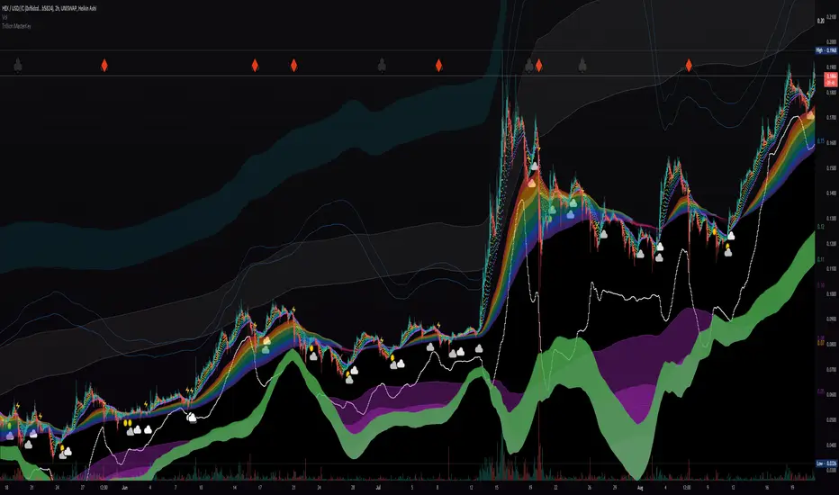
Liquidity Rainbow - Trillion ResearchThis indicator uses regression along with RSI and moving averages from multiple time frames to help you visualize the market in a single view. After learning the notations, you will be able to identify pockets of liquidity and determine high/low probability price zones without drawing a single line.
Booster symbols help confirm short term trends and breakouts based off of two waveform functions, one long period, the other with a much shorter period. You get the buy signal that everyone else sees plus the confirmation!
This is a system that is not fully developed, PNL is not available yet. Strategy version is coming soon, still back testing.
I am tuning this model for crypto specifically, although it works for anything with a price chart.
2 EMAs (configurable to MA)
Dragonskin - RGB circle plots eMA
Rainbow - RGB area plots eMA
+When you see the rainbow appear it means that the price is above the slowest ema baseline. Generally bullish as price tends to ride the rainbow. Ideally, you will see a white cloud at the origin.
-When you see white step line cutting into the upper colors of the rainbow.
Once the price has traded below the rainbow for the FIRST time, not just wicked. You can set a target that's just above the previous high bodys above the rainbow. Do not sell the dip, let the floppers flop.
The second time price cuts down through a thick rainbow is usually bearish .
What makes me so sure? Liquidity
In order to be successful, we need to understand liquidity, the juiciest pockets of profit.
I will reveal more of the strategy in the second script.
For now, use:
SUN symbol - Notice how the price always seems to come back and sweep up any SUNs that get left behind (up and down) this is a liquidity nugget
CLOUD(s) indicators of support. Meaning that on ema trend we expect a lower price but each time that happens, it gets bought up above baseline. weak->strong (little gray - light blue - white)
LIGHTNING indicator of resistance. Meaning the price is not being allowed to recover, each time it rises above baseline, it is sold down again.
YELLOW CROSS - Classically known as a whale manipulation indicator. It tends to indicate a strong bearish move incoming or the reversal of an ongoing bearish move. There's dumping. "Get ready something is happening" indicator.
HEARTS = BUY
SPADES = Buy
CLUBS = Sell
DIAMONDS = SELL
*do not use these during periods of consolidation. consolidation is a period when the price swings in both directions but not too much. In a narrow range the indicators can pop up.
Why does this happen?
Short periods, during which exchanges stabilize the prices, are necessary for the redistribution of assets over the course of trading. Sometimes they happen multiple times a week and can last 24 or 48hours. Also it is a great time to eat up algo traders and that's why you'll see noise.
You want to focus on the period immediately following a consolidations. Don't rush it, they really do take 20 hours+
If you realize that you are in one of these consolidation ranges, limit order the tips of the wicks, nothing in the middle. There is not much profit here but also there is minimal risk.
If you're confirmed in a consolidation, exchanges will work to buoy the price to the appropriate mark price even if there is a big buy/sell order. A lot of time price will go up the congruent amount afterwards to compensate the toxic vwap .
I hope this helps people see the bigger picture and become even more successful with bigger gains.
I've tested this on all the major cryptos. Bitcoin BTC Ethereum ETH HEX
Honestly, I have tested very few stonks with this, later.
-Market Enemy
Liquidity-Aware Daily Box (Stable v4)Highlights previous day liquidity range and estimates potential liquidation zones using volume and volatility stress. Overlapping lines indicate stronger liquidity confluence areas. Designed as a context tool, not a standalone signal.

Liquidity Absorption OscillatorDescription:
The Liquidity Absorption Oscillator (LAO) is a sophisticated momentum indicator that measures how efficiently price moves relative to trading range while confirming momentum with volume-based liquidity flows. By combining price efficiency analysis with volume velocity, the LAO provides earlier and more reliable signals than traditional price-only oscillators, helping traders identify high-probability trend initiations and reversals.
🔍 Core Technology & Innovation:
Tri-Component Signal Processing:
Price Efficiency Ratio (PER): Measures how "cleanly" price moves by comparing net displacement to total trading range over the lookback period. High PER indicates trending markets with directional conviction.
Volume Velocity Ratio (VVR): Combines price momentum with volume confirmation, normalized by ATR to ensure consistent behavior across different instruments and volatility regimes.
Adaptive Smoothing: Dynamically adjusts responsiveness based on market conditions - becoming more stable during noisy periods and more responsive in clean trends.
Multi-Layer Signal Detection:
Confirmed Crossovers: Traditional zero-line crosses filtered by efficiency thresholds
Early Momentum Signals: Detects momentum shifts BEFORE zero-line crosses for optimal entry timing
Smart Divergence Detection: Identifies hidden bullish/bearish divergences with built-in quality filters
🎯 Trading Signals & Interpretation:
🟢 BULLISH SIGNALS:
Strong Buy: LAO crosses above zero line with medium/high efficiency (PER)
Early Buy: Momentum accelerates while LAO is still negative (anticipates reversal)
Divergence Buy: Price makes lower low while LAO forms higher low
🔴 BEARISH SIGNALS:
Strong Sell: LAO crosses below zero line with medium/high efficiency
Early Sell: Momentum decelerates while LAO is still positive (anticipates top)
Divergence Sell: Price makes higher high while LAO forms lower high
⚪ SIGNAL QUALITY FILTERING:
Automatic signal suppression during low-efficiency (choppy) market conditions
Configurable PER threshold ensures only high-quality signals are considered
📊 Visual Features:
Clean Oscillator Display: Smooth line plot with gradient fills above/below zero line
Multiple Coloring Options: Choose between no coloring, trend-based, or slope-based bar coloring
Professional Styling: Inspired by institutional-grade indicator design with subtle visual cues
Non-Repainting Logic: All signals confirmed on bar close for reliable backtesting
⚙️ Input Parameters:
Core Settings:
Lookback Period: Base period for efficiency and velocity calculations (default: 24)
Base Smooth Period: Starting point for adaptive smoothing (default: 8)
Min Efficiency for Signals: PER threshold for signal validation (default: 35)
Divergence Lookback: Bars to search for divergence patterns (default: 5)
UI Options:
Bar Coloring: Choose visual style (None, Trend, Slope)
🔔 Alert Conditions:
Buy/Sell Signal: Traditional zero-line crosses with quality filtering
Early Buy/Early Sell: Momentum-based signals before traditional crosses
All alerts use confirmed, non-repainting logic

Liquidity Levels - PMH/PWH/PDH/HODWhat is it?
An indicator that tracks the main liquidity levels on TradingView, displaying the highs and lows of reference for month, week, previous day and current day.
What's it for?
It identifies price zones where there are many pending orders (liquidity). Traders use it to:
Find support and resistance points
Identify areas where price could bounce or break through
Receive alerts when price touches or breaks these levels
Which levels does it show?
LevelDescriptionColorLinePMH/PMLPrevious month's high and lowPurpleSolidPWH/PWLPrevious week's high and lowBlueSolidPDH/PDLPrevious day's high and lowOrangeSolidHOD/LODCurrent day's high and lowGrayDotted
How to use it?
Apply the indicator to your chart
Customize colors and enable/disable the levels you prefer
Set alerts to receive notifications when price touches or breaks levels
Use the levels to make trading decisions (entry, exit, stop loss)
Perfect for: Scalping, Day Trading, Swing Trading on any asset (forex, crypto, stocks)

Liquidity Sweep Pro (HTF + Confirmation) — patchedHow it works (in brief)
Bearish Sweep: High > (PDH/PWH + tolerance) and close < level, plus the selected confirmation.
Bullish Sweep: Low < (PDL/PWL − tolerance) and close > level, plus the selected confirmation.
Confirmation:
ATR: Candlestick range ≥ atrMult × ATR and candlestick direction matching.
MSS: Micro-structure shift: Bear → close below the most recent mini-low, Bull → close above the most recent mini-high.
ATR+MSS (default): both conditions must be met.
Optional session filter: Signals are only generated within the selected time period (exchange time period).
No repainting - no Lookahead: request.security(..., lookahead=barmerge.lookahead_off)
No repainting - no intrabar flutter: Signals only at candle close via barstate.isconfirmed (own _close signals for plot & alerts)
Use Previous Day High/Low
Activates PDH/PDL (previous day's high/low) as external liquidity levels.
These values come from the previous day's completed candlestick (no lookahead).
Use Previous Week High/Low
Activates PWH/PWL (previous week's high/low) as additional, "heavier" liquidity levels.
Also from the previous week's completed candlestick (no lookahead).
Sweep Tolerance (Ticks)
"Safety margin" in ticks around one level to filter out micro-wicks/spread noise.
Internal: tickSize = syminfo.mintick * tickTol.
Guidelines:
FX (majors, H1–H4): 1–5 ticks
Indices (M5–H1): 1–3 ticks
CFDs/volatile/smaller TFs: 5–10 ticks
Crypto: 5–50 ticks depending on the symbol
Larger = stricter (fewer, cleaner sweeps).
ATR Length
Period for ATR (volatility measure). The standard 14 is acceptable; 10–20 depends on the instrument.
Displacement Factor
Minimum "power" of the sweep candle relative to the current ATR.
Internal: rangeRatio = (High–Low)/ATR and we check rangeRatio > atrMult.
Guidelines:
0.6–0.8 → sensitive (more signals)
0.9–1.2 → stricter (only strong candles)
Micro-Structure Shift Lookback
Depth for the MSS check (structural break in the sweep direction):
Bear sweep: close < lowest(low, mssLen)
Bull sweep: close > highest(high, mssLen)
This ensures that we use the completed micro-structure as a reference (stable).
Guidelines: 3–8 (shorter = more, longer = stricter).
Confirmation Mode
None – only sweep at the level (wick back through the level + close).
ATR – sweep + candle must be "large enough" (rangeRatio > atrMult) and close appropriately (bearish/bullish).
MSS – Sweep + small structural break (MSS) in sweep direction.
ATR+MSS (recommended) – both conditions; very clean, but fewer signals.
Only trigger in session
Signals only within the specified session window.
Session Time (Exchange TZ)
Time window in the symbol's exchange time zone, not your local time.
FX/Indices: e.g., 8:00–17:00 (London/NY core time).
Crypto: often deactivated, as it operates 24/7.
Plot HTF Levels
Displays PDH/PDL/PWH/PWL as lines (for visual orientation).
Color Settings
PDH/PDL Color – Color of the daily levels.
PWH/PWL Color – Color of the weekly levels.
Bull/Bear Sweep Marker – Color of the sweep markers (shapes).
Best Practice Recommendations
Backtest setting: Alerts set to "Once per bar close" – your script will ultimately only generate bar close signals → 1:1 consistency.
Filter more strictly: Increase atrMult (e.g., 1.0–1.2) and mssLen 6–8.
More signals: atrMult 0.6–0.7, mssLen 3–4, but don't leave the tick tolerance too small (false sweeps!).
Instrument-specific:
FX H4/Session trading: Session on, tickTol 1–5, atrMult 0.8–1.0, mssLen 5–6.
Crypto: Session off, atrMult slightly higher (0.9–1.1), tickTol higher depending on the symbol.
Indices: Session on, tickTol 1–3, atrMult 0.8–1.0.
The additional filters
Min Body % / Max Wick %
filter out "pin candles" with a mini body and a large wick. These sweeps are often noise-oriented (stop clears without a real shift) → fewer false positives.
Min Close Distance from Level
requires that the closing price noticeably returns to the range. A close "close" to the level is often indecisive → even fewer false signals.

Liquidity Hours By HH🚦 Liquidity Hours By HH 🚦
This script highlights the major trading sessions on your chart — Asia, London KTW, and New York KTW — so you always know when the markets are buzzing! 🌏🕒
✨ Asia Session
Shows a colored box marking the entire session 🟣
Tracks the high and low with clear lines 📈📉
Optional midline that you can toggle ON/OFF 🔀 — perfect for spotting the session’s midpoint without cluttering your chart!
✨ London KTW & New York KTW Sessions
Displays clean boxes marking session duration 🟦🟩
No distracting high/low lines — just simple, neat session highlights
⏰ London session starts 1 hour earlier ⏰ — so you get an advanced heads-up for European market action! 🇬🇧
⏳ Boxes automatically hide on higher timeframes for a cleaner look 👀
Customize colors, durations, and toggle what you want to see — your chart, your rules! 🎨⚙️
Stay sharp and trade smarter with clear liquidity session zones! 💹🔥

Liquidity Sweep Trap Alert (Improved)Detects high-conviction “liquidity sweep” traps (false breakouts) by comparing price against recent swing highs/lows, applying a wick-size filter and a cooldown period so that only meaningful reversal wicks trigger signals.
Shows labels on the chart and provides alert conditions when a trap occurs.
How It Works (Core Concept)
Swing High / Low Sweep
The script looks back a user-defined number of bars (Lookback Period) to identify the most recent swing high and swing low (excluding the current forming bar).
A Bull Trap is identified when price’s high exceeds that swing high intrabar but the candle closes back below it.
A Bear Trap is identified when price’s low dips below that swing low intrabar but the candle closes back above it.
Wick-Size Filter
To avoid tiny “micro-sweeps,” the script measures the length of the reversal wick (the distance beyond the swing high or below the swing low) as a percentage of the bar’s total range.
Only if this wick percentage ≥ Min Wick/Range % does the raw trap condition qualify for further consideration.
Cooldown Mechanism
After a trap fires, the same type of trap (bull or bear) is suppressed for a specified number of bars (Cooldown Bars).
This prevents back-to-back signals in choppy conditions and ensures each trap has breathing room before the next.
Confirmed on Close
Signals only trigger once the bar has closed (barstate.isconfirmed), eliminating “ghost” signals that flash intrabar and then vanish.
Chart Labels & Alerts
When a trap is confirmed, a label (“Trap ↑” for bull, “Trap ↓” for bear) is plotted above/below the bar (toggleable via Show Trap Labels).
Built-in alertcondition calls allow users to create native TradingView alerts tied to these confirmed traps.
Inputs & Usage
Lookback Period (bars)
Defines how many bars back to compute the recent swing high/low.
Shorter values catch more frequent, smaller swings; longer values focus on larger pivots.
Show Trap Labels
Toggle on/off the on-chart label markers.
Cooldown Bars
Number of bars to wait after a trap fires before allowing the same trap type again.
Higher values reduce signal frequency; set lower if you want more frequent triggers.
Min Wick/Range %
Minimum required wick length (beyond the swing level) as a percentage of that bar’s high–low range.
Increase to filter out weak or noise-driven sweeps; decrease if you want to capture smaller reversals.
Recommended Settings & Markets
Timeframes: Works on any timeframe (e.g., 5m, 15m, 1h, daily). Adjust inputs per instrument volatility.
Crypto (e.g., BTC): Typical starting values might be Lookback = 10, Min Wick % = 0.10–0.20, Cooldown = 3–5 bars.
Equities / Indices (e.g., Nifty, Bank Nifty): Use higher Min Wick % (e.g., 0.30–0.50) and adjust volume-based filters externally. Cooldown may be 3–5 bars on daily charts.
Testing: Always backtest or visually review sample signals before live trading. Tune Lookback and Min Wick % to balance hit-rate vs. false positives.
Originality & What Makes It Different
Beyond Simple Breakout Alerts: Instead of alerting on any breakout, this indicator specifically looks for false breakouts (liquidity sweeps) where smart money may trap retail stops.
Wick-Size Threshold: Many scripts flag any high above a swing high; here, the reversal wick must be a configurable percentage of the bar’s range, filtering out minor spikes.
Cooldown Logic: Prevents repeated signals in tight ranges, unlike basic breakout or pivot indicators that may fire repeatedly.
Confirmed on Close: Eliminates intrabar flicker signals, ensuring each alert is based on a completed bar.
Lightweight & Self-Contained: No external dependencies; works standalone on the chart. Users can hook native TradingView alerts to these conditions.
How to Use
Add to Chart: Apply the published script; no need for additional overlays.
Configure Inputs: Open settings and set:
Lookback Period to match swing size you target.
Min Wick/Range % to filter out small reversals.
Cooldown Bars so signals aren’t clustered.
Toggle Show Trap Labels on/off.
Set Alerts: In TradingView Alerts, choose “Bull Trap Detected” or “Bear Trap Detected” as the condition.
Interpret Signals:
Bull Trap: Price tried to break above a recent high but failed—potential short opportunity or exit long.
Bear Trap: Price tried to break below a recent low but failed—potential long opportunity or exit short.
Combine with Risk Management: Always apply your own stop-loss and take-profit rules; use the trap signal as one element of your trade decision.
Chart Examples & Annotations
Clean Example Chart: Display only this indicator on the chart using default inputs or example settings.
Annotation Guidance: If you include manual drawings in screenshots, clearly explain:
“Red label marks the bar where price spiked above the 10-bar swing high, closed below it with wick ≥ 10% of range, and no prior bull trap in last 5 bars → Bull Trap.”
Avoid unrelated scripts or decorative drawings that aren’t described.
Disclaimer
Not Financial Advice: Signals indicate potential reversal setups but do not guarantee outcomes. Trade at your own risk.
Use Proper Risk Management: Always define stop-loss, position size, and consider market context.
Test Before Live: Review historical signals and backtest manually or via strategy tester if possible.

RSI + MACD + Liquidity FinderLiquidity Finder: The liquidity zones are heuristic and based on volume and swing points. You may need to tweak the volumeThreshold and lookback to match the asset's volatility and timeframe.
Timeframe: This script works on any timeframe, but signals may vary in reliability (e.g., higher timeframes like 4H or 1D may reduce noise).
Customization: You can modify signal conditions (e.g., require only RSI or MACD) or add filters like trend direction using moving averages.
Backtesting: Use TradingView's strategy tester to evaluate performance by converting the indicator to a strategy (replace plotshape with strategy.entry/strategy.close).

Liquidity Squeeze Indicator 1The provided Pine Script code implements a "Liquidity Squeeze Indicator" in TradingView, designed to detect potential bullish or bearish market squeezes based on EMA slopes, candle wicks, and body sizes.
Code Breakdown
EMAs Calculation: Calculates the 21-period (ema_21) and 50-period (ema_50) exponential moving averages (EMAs) on closing prices.
EMA Slope Calculation: Computes the slope of the 21-period EMA over a 21-period lookback to estimate trend direction, with a threshold of 0.45 to approximate a 45-degree angle.
Candle Properties: Measures the size of the candle's body and its upper and lower wicks for comparison to detect wick-to-body ratios.
Trend Identification: Defines a bullish trend when ema_21 is above ema_50 and a bearish trend when ema_21 is below ema_50.
Wick Conditions
Bullish Condition : In a bullish trend with the EMA slope up, checks if the upper wick is at least 3x the body size and the closing price is above the 21 EMA.
Bearish Condition: In a bearish trend with the EMA slope down, checks if the lower wick is at least 3x the body size and the closing price is below the 21 EMA.
Signal Plotting: Plots a green dot above the bar for bullish signals and a red dot below the bar for bearish signals.
Alerts: Defines alert conditions for both bullish and bearish signals, providing specific alert messages when conditions are met.
Summary
This indicator helps identify potential bullish or bearish liquidity squeezes by looking at trends, EMA slopes, and wick-to-body ratios in candlesticks. The primary signals are visualized through dots on the chart and can trigger alerts for notable market conditions.

Liquidity Sweep Indicator (Signal-based SL + BE/TP)I created a more advanced version of my Liquidity Sweep Indicator. Open source, but I dont recommend to create a TV-strategy from the code because you should combine it with price action an chart analysis! Have fun :)

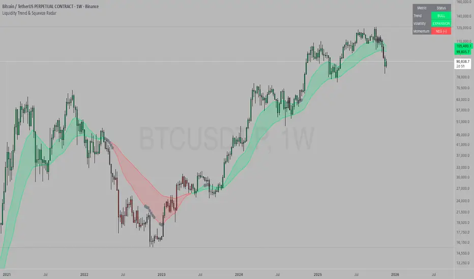
Liquidity Trend & Squeeze RadarThe Liquidity Trend & Squeeze Radar is a comprehensive trading system designed to visualize the three most critical components of price action: Trend, Volatility, and Momentum. The core philosophy of this tool is to identify periods of market "compression" (low volatility), where energy builds up, and then signal when that energy is released (expansion) for a potential breakout trade. It combines an EMA Cloud for trend direction with a TTM-style Squeeze indicator and a linear regression momentum filter.
Key Components
Trend Cloud (Structure) This component identifies the overall market bias. It uses a Fast EMA and a Slow EMA to create a shaded "Cloud."
Uptrend: The Fast EMA is above the Slow EMA. The Cloud is shaded green (default).
Downtrend: The Fast EMA is below the Slow EMA. The Cloud is shaded red (default).
Usage: Generally, traders should look to take Long signals only when the Trend Cloud is bullish and Short signals when the Trend Cloud is bearish.
Volatility Radar (The Squeeze) This logic detects when the market enters a period of low volatility. It calculates this by comparing Bollinger Bands (Expansion) against Keltner Channels (Average Range).
Squeeze Active: When the Bollinger Bands narrow and go inside the Keltner Channels, a "Squeeze" is active. This is represented by gray dots plotted along the Fast EMA and gray-colored price candles.
Usage: Do not trade during a Squeeze. This indicates indecision and chop. Treat this as a "Wait" signal while potential energy builds.
Momentum Filter (Hidden Logic) While the Squeeze is active, the script calculates the underlying momentum using Linear Regression. This predicts the likely direction of the breakout before it happens. This data is displayed in the Dashboard.
Breakout Signals (Fire) When the Squeeze condition ends (volatility expands), the script checks the Momentum filter.
Bullish Breakout: If the Squeeze ends and Momentum is positive, a triangle pointing up is plotted below the bar.
Bearish Breakout: If the Squeeze ends and Momentum is negative, a triangle pointing down is plotted above the bar.
Status Dashboard A table located in the top-right corner provides a real-time summary of the market state without needing to interpret the chart visuals manually. It lists the current Trend direction, Volatility state (Squeeze vs. Expansion), and Momentum value (Positive vs. Negative).
How to Trade This Indicator
Step 1: Identify the Trend Observe the background Cloud. Ensure you are trading in the direction of the dominant flow. If the Cloud is green, favor Longs. If red, favor Shorts.
Step 2: Wait for the Squeeze Look for the gray dots to appear on the moving average line and for the candles to turn gray. This indicates the market is resting and building energy. During this phase, you are stalking the trade. Avoid entering positions while the gray dots remain visible.
Step 3: The Breakout (The Trigger) Wait for the gray dots to disappear. This means the Squeeze has "Fired."
Long Entry: Look for a Triangle Up signal. Ideally, this should occur when the Trend Cloud is green.
Short Entry: Look for a Triangle Down signal. Ideally, this should occur when the Trend Cloud is red.
Step 4: Confirmation Check the Dashboard table. High-probability trades occur when all three metrics align (e.g., Trend is BULL, Volatility is EXPANSION, and Momentum is POSITIVE).
Settings Guide
Trend Structure:
Fast/Slow EMA Length: Adjusts the sensitivity of the Trend Cloud. Higher numbers effectively smooth out noise but react slower to trend changes.
Show Trend Cloud: Toggles the shaded area between EMAs on or off.
Volatility Radar:
Bollinger/Keltner Settings: These define the Squeeze sensitivity.
Keltner Mult: The most important setting. The default is 1.5. Lowering this to 1.0 will make the Squeeze harder to trigger (requiring extreme compression), leading to fewer but potentially more explosive signals.
Momentum:
Momentum Length: The lookback period for the linear regression calculation used to determine breakout direction.
Visuals:
Colorize Candles: Paints the price bars based on the current state (Gray for Squeeze, Green/Red for Trend).
Show Dashboard: Toggles the visibility of the data table.
Disclaimer This indicator and guide are for educational and informational purposes only. They do not constitute financial, investment, or trading advice. Trading in financial markets involves a significant risk of loss and is not suitable for every investor. Past performance of any trading system or methodology is not necessarily indicative of future results. The user assumes all responsibility for any trades made using this tool. Always use proper risk management.