SulLaLuna — HTF M2 x Ultimate BB (Fusion) 🌕 **SulLaLuna — HTF M2 x Ultimate BB (Fusion)** 🚀💵
**By SulLaLuna Trading**
(Portions of the Bollinger Band logic adapted with permission/credit from the *Ultimate Buy & Sell Indicator* by its original author — thank you for the brilliance!)
---
🧭 **What This Is**
This is not just another price-following tool.
This is **a macro liquidity detector** — a **Daily Higher Timeframe Hull Moving Average of the Global M2 Money Supply**, smoothed via lower timeframe candles (default 5m, 48 Hull length), overlaid with **Ultimate-style double Bollinger Bands** to reveal *over-extension & mean reversion zones*.
It doesn’t chase candles.
It watches the tides beneath the market — the **money supply currents** that have a **direct correlation** to asset price behavior.
When liquidity expands → risk-on assets tend to rise.
When liquidity contracts → risk-off waves hit.
We ride those waves.
---
🔍 **What It Does**
* **Tracks Global M2** across major economies, FX-adjusted, and scales it to your chart’s price.
* **HTF Hull MA** (Daily, smoothed via 5m base) → gives you the macro liquidity trend.
* **Ultimate BB logic** applied to the HTF M2 Hull → inner/outer bands for volatility envelopes.
* **Pivot Labels** → ideal entry/exit zones on macro turns.
* **Over-Extension Alerts** → when HTF M2 Hull pushes outside the outer bands.
* **Re-Entry Alerts** → mean reversion triggers when liquidity moves back inside the range.
* **Background Paint** from chart TF M2 slope → for confluence on your entry timeframe.
---
📜 **Suggested How-To**
1. **Choose your execution chart** — e.g., 1–15m for scalps, 1H–4H for swings.
2. **Use the background paint** as your *local tide check* (chart TF M2 slope).
3. **Trade in the direction of the HTF M2 Hull** — green line = liquidity rising, red line = liquidity falling.
4. **Watch pivot labels** — these are potential “macro inflection” points.
5. **Confluence stack** — pair with ZLSMA, WaveTrend divergences, VWAP volume, or your favorite price-action setups.
6. **Size down** when HTF M2 Hull is flat/gray (chop zone).
7. **Scale in/out** on over-extension + re-entry alerts for higher probability swings.
---
⚠️ **Important Note**
This indicator **does not predict price** — it tracks macro liquidity flows that *influence* price.
Think of it as your market’s **tide chart**: when the water’s coming in, you can swim out; when it’s going out, you’d better be ready for the undertow.
---
📢 **Alerts Available**
* HTF Pivot HIGH / LOW
* Over-Extension (HTF Hull outside outer BB)
* Re-Entry (return from overbought/oversold)
---
🤝 **Join the SulLaLuna Tribe**
If this indicator helps you capture better entries, follow & share so more traders can learn to trade *math, not emotion*.
We rise together — **and we’ll meet you on the Moon** 🌕🚀💵.
Cerca negli script per "liquidity"

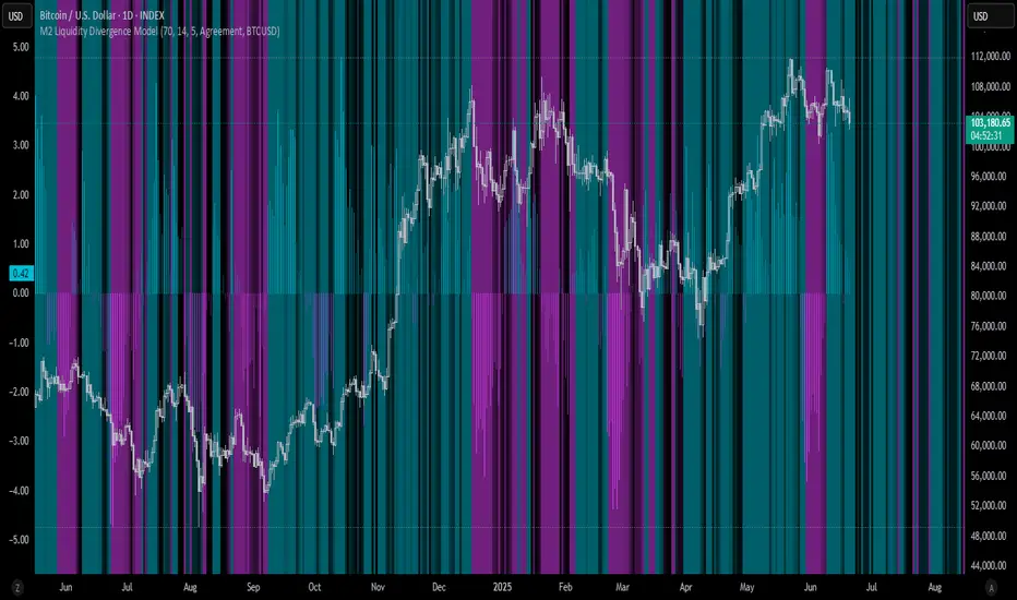
M2 Liquidity Divergence ModelM2 Liquidity Divergence Model
The M2 Liquidity Divergence Model is a macro-aware visualization tool designed to compare shifts in global liquidity (M2) against the performance of a benchmark asset (default: Bitcoin). This script captures liquidity flows across major global economies and highlights whether price action is aligned ("Agreement") or diverging ("Divergence") from macro trends.
🔍 Core Features
M2 Global Liquidity Index (GLI):
Aggregates M2 money supply from major global economies, FX-adjusted, including extended contributors like India, Brazil, and South Africa. The slope of this composite is used to infer macro liquidity trends.
Lag Offset Control:
Allows the M2 signal to lead benchmark asset price by a configurable number of days (Lag Offset), useful for modeling the forward-looking nature of macro flows.
Gradient Macro Context (Background):
Displays a color-gradient background—aqua for expansionary liquidity, fuchsia for contraction—based on the slope and volatility of M2. This contextual backdrop helps users visually anchor price action within macro shifts.
Divergence Histogram (Optional):
Plots a histogram showing dynamic correlation or divergence between the liquidity index and the selected benchmark.
Agreement Mode: M2 and asset are moving together.
Divergence Mode: Highlights break in expected macro-asset alignment.
Adaptive Transparency Scaling:
Histogram and background gradients scale their visual intensity based on statistical deviation to emphasize stronger signals.
Toggle Options:
Show/hide the M2 Liquidity Index line.
Show/hide divergence histogram.
Enable/disable visual offset of M2 to benchmark.
🧠 Suggested Usage
Macro Positioning: Use the background context to align directional trades with macro liquidity flows.
Disagreement as Signal: Use divergence plots to identify when price moves against macro expectations—potential reversal or exhaustion zones.
Time-Based Alignment: Adjust Lag Offset to synchronize M2 signals with asset price behavior across different market conditions.
⚠️ Disclaimer
This indicator is designed for educational and analytical purposes only. It does not constitute financial advice or an investment recommendation. Always conduct your own research and consult a licensed financial advisor before making trading decisions.
BSL & SSL - Liquidity Zones
BSL & SSL - Liquidity Zones
Indicator Description (for TradingView)
Concept
The BSL & SSL - Liquidity Zones indicator is a simple yet powerful visual tool that helps traders identify key liquidity zones in the market by tracking prominent highs and lows on the chart.
It is based on the concept that the Highest High (Buy Side Liquidity - BSL) and Lowest Low (Sell Side Liquidity - SSL) represent zones where stop-loss orders and pending orders accumulate — often attracting future price movements.
Purpose
This indicator helps traders spot hidden liquidity levels which may act as targets or potential reversal points. It is especially useful for traders who apply Smart Money Concepts (SMC) or institutional trading models.
Great for detecting potential stop hunts and understanding market structure shifts.
How It Works
The indicator calculates the Highest High and Lowest Low over a user-defined period (default: 20 candles).
When a new Higher High forms, it marks a new BSL.
When a new Lower Low forms, it marks a new SSL.
These zones are likely to attract price in the future — either as targets or traps.
Visualization
The indicator draws static horizontal lines (Stepline style) at BSL and SSL levels.
These lines remain in place until broken or a new level is formed.
Visual Labels enhance clarity:
🟢 Green Label → BSL
🔴 Red Label → SSL
Trading Insights / Practical Use
When price approaches a BSL or SSL zone, ask yourself:
✅ Will price break the level to grab liquidity?
✅ Will there be a reversal after liquidity is taken?
The indicator does not provide signals by itself — it serves as a valuable confirmation tool when combined with:
Price Action
Support & Resistance
Momentum Indicators
SMC Tools
Key Benefits
✅ Easy to use
✅ Enhances liquidity analysis
✅ Highlights zones targeted by institutional players
✅ Simple calculation — no complex formulas
Limitations
🚫 Does NOT generate buy/sell signals
🚫 Should be used as part of a complete trading framework
Conclusion
BSL & SSL - Liquidity Zones is a versatile and intuitive tool for any trader looking to better understand where liquidity is positioned on the chart.
It works across all timeframes and complements any trading strategy, especially Smart Money-based approaches.

Candle Liquidity Algo [ValiantTrader]Explanation of the "Candle Liquidity Algo" Indicator
This indicator is designed to help traders identify potential trading opportunities by analyzing liquidity zones and divergences between price action and these zones on higher timeframes.
Key Components:
1. Timeframe Settings
The indicator allows you to select a custom timeframe (like 'D' for daily, '60' for 60 minutes, etc.)
It then displays the first candle of each new period on this higher timeframe directly on your chart
2. Liquidity Zones
Creates smoothed high and low levels (using a simple moving average) from the higher timeframe
These act as potential support/resistance zones where liquidity may be concentrated
3. Divergence Detection
Looks for divergences between price action and the liquidity zones:
Bullish Divergence: When price makes a lower low but the liquidity zone low is higher
Bearish Divergence: When price makes a higher high but the liquidity zone high is lower
4. Visual Elements
Plots the first candle of each new higher timeframe period on your chart (colored green for up, red for down)
Draws labels when divergences are detected (green "Bullish Div" below price for bullish divergences, red "Bearish Div" above for bearish)
Draws temporary lines marking the relevant price levels where divergences occur
5. Alerts
The indicator can trigger alerts when divergences are detected, which can be useful for traders who want notifications about potential trading setups
How to Use in Trading:
Identify the Higher Timeframe Structure: The indicator shows you how the higher timeframe is developing while you're looking at a lower timeframe chart.
Watch for Divergences: When you see:
Price making lower lows but liquidity zones making higher lows → potential bullish reversal
Price making higher highs but liquidity zones making lower highs → potential bearish reversal
Use Liquidity Zones as Targets/Stops: The smoothed high/low levels can act as potential take-profit areas or stop-loss levels.
Combine with Other Confirmation: Like any indicator, it's best used with other confirmation signals (price action patterns, volume analysis, etc.)
The indicator is particularly useful for traders looking to align their trades with higher timeframe structure while operating on lower timeframes for entry precision.

RunRox - Entry Model🎯 RunRox Entry Model is an all-in-one reversal-pattern indicator engineered to help traders accurately identify key price-reversal points on their charts. It will be part of our premium indicator package and improve the effectiveness of your trading strategies.
The primary concept of this indicator is liquidity analysis, making it ideal for Smart Money traders and for trading within market structure. At the same time, the indicator is universal and can be integrated into any strategy. Below, I will outline the full concept of the indicator and its settings so you can better understand how it works.
🧬 CONCEPT
In the screenshot below, I’ll schematically illustrate the core idea of this indicator. It’s one of the patterns that the indicator automatically detects on the chart using a two-timeframe approach. We use the higher timeframe to identify liquidity zones, and the lower timeframe to capture liquidity removal and structure breaks. The schematic is shown in the screenshot below.
Our indicator includes three entry models in total , and I will discuss its functionality and features in more detail later in this post.
💡 FEATURES
Three entry models
PO3 HTF Bar
Entry Area
Optimization for each Entry Area
Filters
HTF FVG
Alert customization
Next, we will examine each entry model in detail.
🟠 ENTRY MODEL 1
The first model is the core one we’ll work with; all other models rely on its structure and construction. In the screenshot below, I’ll schematically show the complete model.
As shown in the screenshot above, we display higher-timeframe candles on the current chart to better visualize the entry model and keep the trader informed of what’s happening on the larger timeframe. The screenshot also highlights both the Long and Short models, as well as the Entry Area, which I will explain in more detail below.
The schematic model on the lower timeframe is shown in the screenshot above. It illustrates that after the Entry Model forms, we draw the Entry Area on the next candle and wait for a price pullback into this zone for the optimal trade entry. Statistically, before moving higher, the price typically revisits the Entry Area, covering the imbalances created by MSS; thus, the Entry Area represents the ideal entry point.
🟩 Entry Area
Once the Entry Model has formed, we focus on identifying the optimal pullback zone for taking a position. To determine which retracement area performs best, we conducted extensive historical backtesting on potential zones and selected those that consistently delivered the strongest results. This process yields Entry Areas with the highest probability of a successful reversal.
On the screenshot above, you can see an example of the Entry Area and which zones carry a higher versus lower probability of reversal. Zones rendered with greater transparency have historically delivered weaker results than the more opaque zones. The deeper-colored areas represent the optimal entry zones and can improve your risk-reward ratio by allowing you to enter at more favorable prices.
It’s important to remember that the entire Entry Area functions as a potential zone for scaling into a position. However, if your risk-to-reward ratio isn’t favorable, you can wait for the price to retrace to lower levels within the Entry Area and enter with a more attractive risk-to-reward.
🟢 Pattern Rating
Each entry model receives a rating in the form of green circles next to its name 🟢. The rating ranges from one to four circles, based on the historical performance of similar patterns. To calculate this rating, we backtest past data by analyzing candle behavior during the model’s formation and assign circles according to how similar patterns performed historically.
Example Ratings:
🟢 – One circle
🟢🟢 – Two circles
🟢🟢🟢 – Three circles
🟢🟢🟢🟢 – Four circles
The more green circles a model has, the more reliable it is—but it’s crucial to rely on your own analysis when identifying strong reversal points on the chart. This rating reflects the model’s historical performance and does not guarantee future results, so keep that in mind!
Below is a screenshot showing four model variations with different ratings on the chart.
⚠️ Unconfirmed Pattern
Entry Model 1 is designed so that, until the higher-timeframe candle closes, the pattern remains unconfirmed and is hidden on the chart. For traders who prefer to see setups as they form, there’s a dedicated feature that displays the unconfirmed pattern at the moment of its appearance - triggered by the Market Structure Shift - before the HTF candle closes. The screenshot below shows what the pattern looks like prior to confirmation.
‼️IMPORTANT: Until the pattern is confirmed and the higher-timeframe candle has closed, the model may disappear from the chart if price reverses and the HTF candle closes below the previous bar. Therefore, this mode is suitable only for experienced traders who want to see market moves in advance. Remember that the pattern can be removed from the chart, so we recommend waiting for the HTF candle to close before deciding to enter a trade.‼️
✂️ Filters
For the primary model, there are four filters designed to enhance entry points or exclude less-confirmed patterns. The filters available in the indicator are:
Bounce Filter
Market Shift Mode
Same Wave Filter
Only with Divergence
I will explain how each of these filters works below.
- Bounce Filter
The Bounce Filter identifies significant deviations of price from its mean and only displays the Entry Model once the asset’s price moves beyond the average level. The screenshot below illustrates how this appears on the chart.
The actual average-price calculation is more sophisticated than what’s shown in the screenshot, that image is just an illustrative example. When the price deviates significantly from the N-bar average, we start looking for the Entry Model. This approach works particularly well in range-bound markets without a clear trend, as it lets you trade strong deviations from the mean.
- Market Shift Mode
This filter works by detecting the initial impulse that triggered the liquidity sweep on the previous higher-timeframe candle, and then holding the Market Structure Shift level at that point after the sweep. If the filter is turned off, price may move higher following the liquidity removal, creating a new MSS level and potentially producing a false structure shift and entry signal on the formed model.
This filter helps you more accurately identify genuine shifts - but keep in mind that the model can still perform well without it, so choose the setting that best suits your trading style.
- Same Wave Filter
The Same Wave Filter removes entry models that form without a clear lower-timeframe structure when liquidity is swept from the previous higher-timeframe candle. In other words, if the prior HTF candle and the current one belong to the same impulse wave - without any retracements on the LTF - the model is filtered out.
Keep in mind that this filter may also exclude patterns that could have produced positive results, so whether to enable it depends on your trading system.
- Only with Divergence
The Only with Divergence filter detects divergence between the lows of successive candles and indicators like RSI. When the low that swept liquidity diverges from the previous candle’s low, the indicator displays a “DIV” label. Although RSI is cited as an example, our divergence calculation is more advanced. This filter highlights patterns where low divergence signals genuine liquidity manipulation and a likely aggressive price reversal.
🌀 Model Settings
Trade Direction: Choose whether to display models for Long or Short trades.
Fractal: Select between automatic fractal detection—which adapts the lower-timeframe (LTF) and higher-timeframe (HTF) candles—or Custom.
Custom Fractal: When Custom is selected, manually specify the LTF and HTF timeframes used to detect the patterns.
History Pattern Limit: Set the maximum number of patterns to display on the chart to keep it clean and uncluttered.
🎨 Model Style
You can flexibly customize the model’s appearance by choosing your preferred line thickness, color, and the other settings we discussed above.
🔵 ENTRY MODEL 2
This model appears under specific conditions when Model 1 cannot form. It’s a price-reversal model constructed according to different rules than the first model. The screenshot below shows how it looks on the chart.
This model forms less frequently than Model 1 but delivers equally strong performance and is displayed as a position-entry zone.
Like the Entry Area in Entry Model 1, this zone is calculated automatically and highlights the best entry levels: areas that showed the strongest historical results are rendered in a brighter shade.
🎨 Model Style
You can flexibly customize the style of Entry Model 2 - its color, opacity, visibility, and the average price of the previous candle.
🟢 ENTRY MODEL 3
Entry Model 3 is a continuation pattern that only forms after Entry Model 1 has completed and delivered the necessary price move to trigger Model 3.
Below is a schematic illustration of how Model 3 is intended to work.
🎨 Model Style
As with the previous models, you can flexibly customize the style of this zone.
⬆️ HTF CANDLES
One of the standout features of this indicator is the ability to plot higher-timeframe (HTF) candles directly on your lower-timeframe (LTF) chart, giving you clear visualization of the entry models and insight into what’s unfolding on the larger timeframe.
You can fully customize the HTF candles - select their style, the number of bars displayed, and tweak various settings to match your personal trading style.
HTF FVG
Fair Value Gaps (FVGs) can also be drawn on the HTF candles themselves, enabling you to spot key liquidity or interest zones at a glance, without switching between timeframes.
Additionally, you can view all significant historical HTF highs and lows, with demarcation lines showing where each HTF candle begins and ends.
All these options let you tailor the HTF candle display on your chart and monitor multiple timeframes’ trends in a single view.
📶 INFO PANEL
Instrument: the market symbol on which the model is detected
Fractal Timeframes: the LTF and HTF fractal periods used to locate the pattern
HTF Candle Countdown: the time remaining until the higher-timeframe candle closes
Trade Direction: the direction (Long or Short) in which the model is searched for entry
🔔 ALERT CUSTOMIZATION
And, of course, you can configure any alerts you need. There are seven alert types available:
Confirmed Entry Model 1
Unconfirmed Entry Model 1
Confirmed Entry Model 2
Confirmed Entry Model 3
Entry Area 1 Trigger
Entry Area 2 Trigger
Entry Area 3 Trigger
You also get a custom macro field where you can enter any placeholders to fully personalize your alerts. Below are example macros you can use in that field.
{{event}} - Event name ('New M1')
{{direction}} - Trade direction ('Long', 'Short')
{{area_beg}} - Entry Area Price
{{area_end}} - Entry Area Price
{{exchange}} - Exchange ('Binance')
{{ticker}} - Ticker ('BTCUSD')
{{interval}} - Timeframe ('1s', '1', 'D')
{{htf}} - High timeframe ('15', '60', 'D')
{{open}}-{{close}}-{{high}}-{{low}} - Candle price values
{{htf_open}}-{{htf_close}}-{{htf_high}}-{{htf_low}} - Last confirmed HTF candle's price
{{volume}} - Candle volume
{{time}} - Candle open time in UTC timezone
{{timenow}} - Signal time in UTC timezone
{{syminfo.currency}} - 'USD' for BTCUSD pair
{{syminfo.basecurrency}} - 'BTC' for BTCUSD pair
✅ USAGE EXAMPLES
Now I’ll demonstrate several ways to apply this indicator across different trading strategies.
Primarily, it’s most effective within the Smart Money framework - where liquidity and manipulation are the core focus - so it integrates seamlessly into your SMC-based approach.
However, it can also be employed in other strategies, such as classic technical analysis or Elliott Wave, to capitalize on reversal points on the chart.
Example 1
The first example illustrates forming a downtrend using a Smart Money strategy. After the market structure shifts and the first BOS is broken, we begin looking for a short entry.
Once Entry Model 1 is established, a Fair Value Gap appears, which we use as our position-entry zone. The nearest target becomes the newly formed BOS level.
In this trade, it was crucial to wait for a strong downtrend to develop before hunting for entries. Therefore, we waited for the first BOS to break and entered the trade to ride the continuation of the downtrend down to the next BOS level.
Example 2
The next example illustrates a downtrend developing with a Fair Value Gap on the 1-hour timeframe. The FVG is also displayed directly on the HTF candles in the chart.
The pattern forms within the HTF Fair Value Gap, indicating that we can balance this inefficiency and ride the continuation of the downtrend.
The target can simply be a 1:2 or 1:3 risk–reward ratio, as in our case.
📌 CONCLUSION
These two examples illustrate how this indicator can be used to identify reversals or trend continuations. In truth, there are countless ways to incorporate this tool, and each trader can adapt the model to fit their own strategy.
Always remember to rely on your own analysis and only enter trades when you feel confident in them.

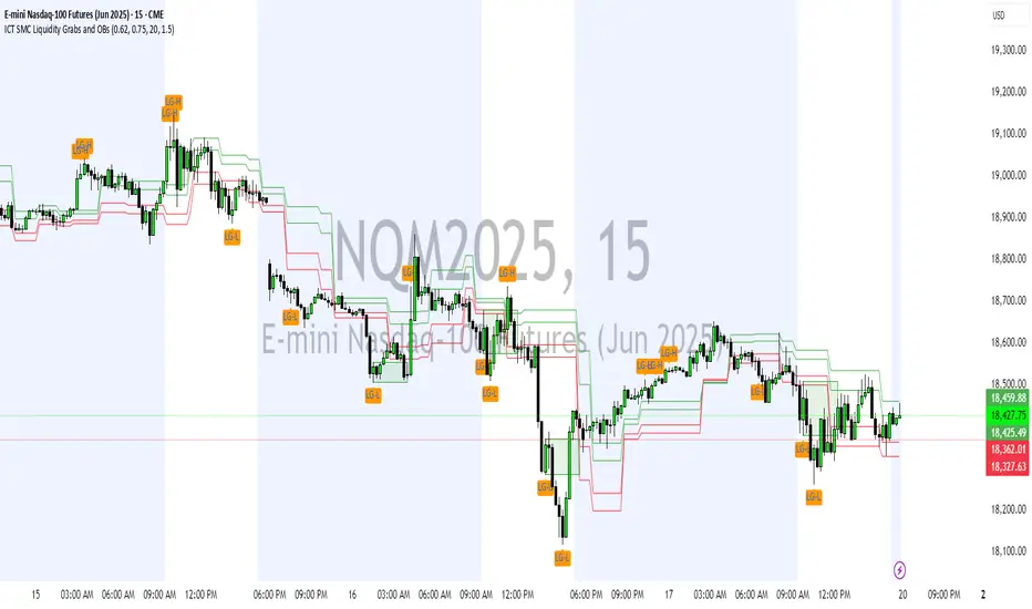
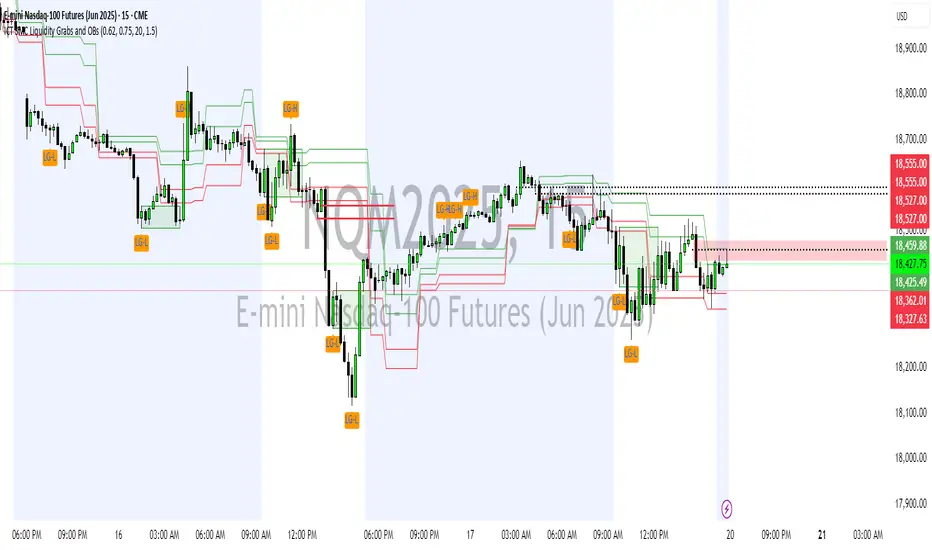
ICT SMC Liquidity Grabs and OBsICT SMC Liquidity Grabs + Order Blocks + Fibonacci OTE Levels
A High-Probability Entry Engine for Smart Money Concept Traders
This script combines three powerful Smart Money Concepts (SMC) into a single tool: Liquidity Grabs, Order Block Zones, and Fibonacci OTE Levels, allowing traders to identify institutional entry models with clean, rule-based visual signals.
It’s designed to simplify SMC trading by highlighting confluence zones where price is likely to reverse or continue — with clear visual zones, entry arrows, and take profit projections.
🔍 What This Script Does:
Detects Liquidity Grabs
Identifies when price sweeps above/below the highest high or lowest low within a user-defined lookback period and closes back inside.
Plots orange labels on the chart to signal potential liquidity events (LG-H / LG-L).
Plots Order Blocks After Liquidity Grabs
After a liquidity grab, the script looks for displacement candles (strong bullish or bearish moves) and draws highlighted OB zones extending several bars to the right.
These zones represent potential institutional footprints for price reversals.
Draws Fibonacci OTE Levels (Optimal Trade Entry)
Uses recent swing high and low pivots to automatically calculate OTE zones (default: 62% and 75% retracement levels).
Draws these retracement zones for both bullish and bearish setups.
Marks Valid OTE Entry Zones
Buy/Sell zones only trigger when:
A liquidity grab occurs,
Price enters the OTE zone,
And a strong confirming candle is present.
Plots green/red arrows for valid buy/sell OTE entries.
Auto-Draws Take Profit Zones
TP1 = Previous swing high/low
TP2 = Risk-based R-multiplied extension (e.g., 1.5R — customizable)
Alerts
Triggers alerts when valid buy or sell OTE setups are detected.
⚙️ Customization Features:
Toggle each feature: Liquidity Grabs, Order Blocks, Fibonacci OTE levels
Set Fibonacci retracement percentages (e.g., 0.62 / 0.75)
Adjust lookback window for liquidity detection
Customize the take-profit multiplier (R-based)
Full control over visuals: colors, labels, and lines
💡 How to Use:
Use this script to scan for high-confluence trade setups based on Smart Money principles.
Combine with session timing (e.g., New York open), major swing structure, or Kill Zone windows for maximum edge.
Look for arrows inside OB zones or OTE levels following liquidity sweeps for cleaner entries.
🔗 Works Best With:
✅ First FVG — Opening Range Fair Value Gap Detector: Identify early inefficiencies to set the narrative for the day.
✅ Liquidity Levels — Smart Swing Lows: Spot key structural lows that can fuel stop hunts and reversals.
✅ ICT Turtle Soup — Liquidity Reversal: Add a classic reversal pattern to your toolkit to catch fakeouts cleanly.
Together, these tools build a complete Smart Money ecosystem for entry precision, risk management, and price behavior forecasting.

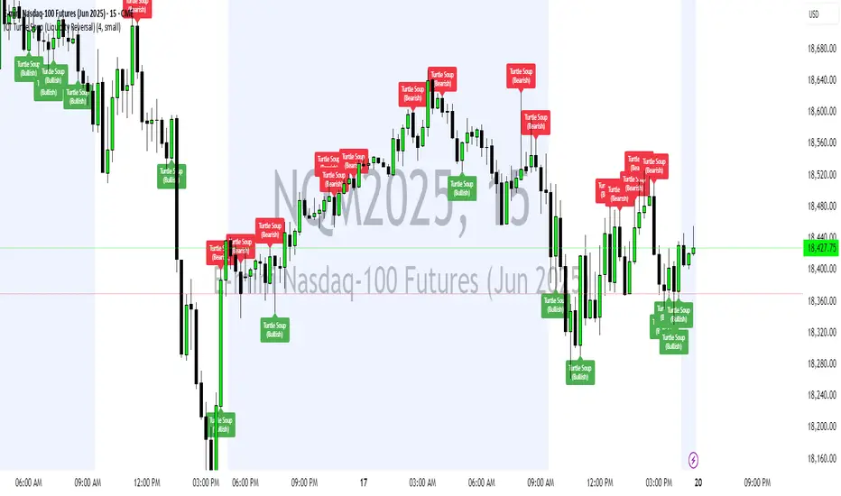
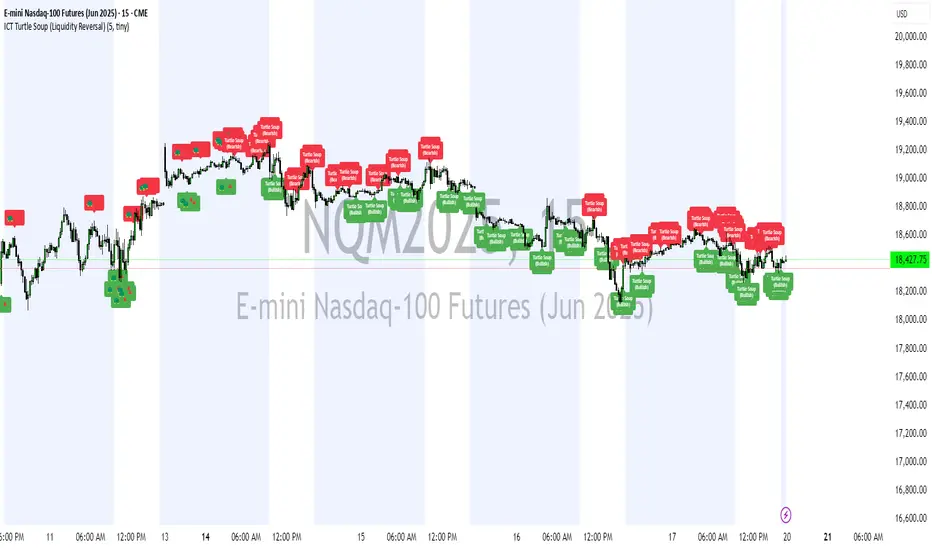
ICT Turtle Soup (Liquidity Reversal)ICT Turtle Soup — Liquidity Reversal Detection
Trap the Trap: A Precision Reversal Strategy from the Inner Circle Trader Playbook
This indicator implements the Turtle Soup liquidity reversal setup — a widely used ICT (Inner Circle Trader) concept that targets false breakouts beyond recent swing highs or lows. These patterns typically occur when price grabs liquidity above or below a known level, then snaps back, trapping retail traders and creating a high-probability reversal scenario.
🔍 What This Script Does:
Detects Liquidity Sweeps Above/Below Key Swing Levels
Uses a customizable swing lookback to identify recent swing highs and lows.
Triggers a Bearish Turtle Soup when price runs above a previous swing high and closes back below.
Triggers a Bullish Turtle Soup when price sweeps below a prior swing low and closes back above.
Plots Clear Visual Signals
Reversal signals appear as 🐢🔻 (Bearish) or 🐢🔺 (Bullish) markers directly on your chart.
Optional labels can be enabled for enhanced journaling and review.
Real-Time Alerts
Receive alert notifications when a Turtle Soup setup is detected — ideal for scalpers or intraday traders watching for reversals around liquidity pools.
⚙️ Customization Options:
Set the swing lookback sensitivity (default: 5)
Enable or disable labels
Choose label font size
Customize colors for bullish and bearish signals
💡 How to Use:
Deploy on intraday timeframes (e.g. 5m–15m) for high-resolution liquidity analysis.
Watch for signals at key highs/lows, session extremes, or zones where liquidity is likely resting.
Combine with tools like FVGs, Order Blocks, and OTE zones for layered confirmation.
🔗 Combine With These Tools for a Complete SMC Edge:
✅ First FVG — Opening Range Fair Value Gap Detector
✅ ICT SMC Liquidity Grabs + OB + Fibonacci OTE Levels
✅ Liquidity Levels — Smart Swing Lows
Together, these tools form a high-precision Smart Money toolkit — helping traders map, anticipate, and act on institutional-level liquidity events with clarity and confidence.
ICT Turtle Soup (Liquidity Reversal)ICT Turtle Soup — Liquidity Reversal Detection
Classic Liquidity Trap Reversal Strategy for Smart Money Traders
This indicator implements the ICT Turtle Soup concept — a classic liquidity-based reversal pattern — which occurs when price runs above or below a recent swing level to grab liquidity, then sharply reverses. This pattern is commonly used in Smart Money Concepts (SMC) and Inner Circle Trader (ICT) strategies to anticipate false breakouts and high-probability reversals.
🔍 What This Script Does:
Identifies Swing Highs & Lows
Detects recent swing highs and lows using a customizable lookback period.
Tracks Liquidity Grabs
A bearish Turtle Soup setup is triggered when price breaks above a recent swing high but closes back below it.
A bullish Turtle Soup setup is triggered when price breaks below a recent swing low but closes back above it.
These conditions often signal liquidity traps, where price sweeps resting orders before reversing.
Plots Signals Directly on the Chart
Turtle Soup setups are marked with 🐢🔻 (bearish) and 🐢🔺 (bullish) labels.
Optional full-text labels can also be displayed for clarity and journaling.
Includes Alert Conditions
Alerts can be enabled to notify you of bullish or bearish Turtle Soup reversals in real-time.
⚙️ Customization Features:
Adjustable swing lookback period
Enable/disable Turtle Soup labels
Set label font size
Choose your preferred bullish/bearish signal colors
💡 How to Use:
Add this script to your chart (ideally on intraday timeframes such as 5m–15m).
Wait for a Turtle Soup signal near a key swing high/low or liquidity zone.
Combine with other confirmation tools (e.g., FVGs, Order Blocks, OTE) for stronger setups.
Use alerts to stay ahead of fast-moving reversals.
🧠 Why It Works:
Turtle Soup setups are rooted in liquidity theory — they exploit the market’s tendency to sweep obvious swing levels before reversing. These moves often trap retail traders and mark the beginning of Smart Money entries.
🔗 Best Used With:
Maximize the edge by combining this with other SMC tools:
✅ First FVG — Opening Range Fair Value Gap Detector
✅ ICT SMC Liquidity Grabs + OB + Fibonacci OTE Levels
✅ Liquidity Levels — Smart Swing Lows
Together, they create a complete ecosystem for identifying, confirming, and executing liquidity-driven trade setups with precision.
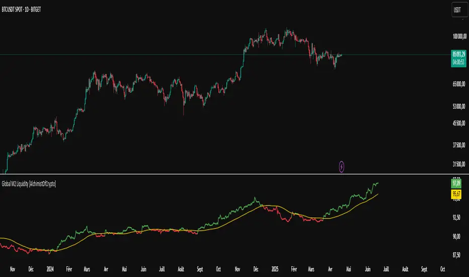
Global M2 Liquidity [TheAlchimist]🌍 Global M2 Liquidity – Navigating the Quantum Field of Markets 🌍
Category: Macroeconomic Indicators 📊
"In quantum physics, the observer effect states that the mere act of observation changes the system being observed. Similarly, in financial markets, global liquidity acts as a quantum field that permeates all market states simultaneously. Just as Heisenberg’s uncertainty principle suggests we cannot precisely measure both position and momentum, the M2 money supply’s influence on market dynamics creates a complex web of cause and effect across multiple timeframes."
📈 Overview
The Global M2 Liquidity indicator is a powerful tool that tracks the combined M2 money supply from five major economies (US, EU, China, Japan, UK), converted to USD 💵, offering a panoramic view of global liquidity conditions. With multi-timeframe analysis and a customizable forward-shift feature, it empowers traders to anticipate market movements driven by liquidity trends.
✨ Features
- Global Coverage 🌎: Monitors M2 money supply from 5 major economic regions (US, EU, China, Japan, UK).
- Real-Time Conversion 💱: Converts all data to USD for consistent analysis.
- Multi-Timeframe Analysis ⏰: Tracks liquidity from 15-minute to weekly charts.
- Forward-Shift Capability 🔮: Aligns M2 data with future price action for predictive insights.
- Color-Coded Trends 🎨: Visualizes liquidity trends (🟢 Expansion, 🔴 Contraction).
🚀 How to Use
1. Main Line 📉: Displays total global M2 liquidity in trillions of USD.
2. Golden Moving Average ⭐: Identifies the overall trend direction.
3. Trend Colors 🟢🔴:
- Green: Liquidity expanding above the moving average (bullish for risk assets).
- Red: Liquidity contracting below the moving average (bearish signal).
4. Forward Shift ⏩: Use the shift parameter to align M2 data with price action for predictive analysis.
5. Combine with Price Action 🔍: Correlate liquidity trends with assets like Bitcoin, stocks, or forex for strategic entries/exits.
⚙️ Settings
- MA Period 📏: Length of the moving average (default: 50).
- Shift ⏳: Number of days to shift data forward (default: 60).
🏷️ Tags
#Trading #Macroeconomic #M2Liquidity #GlobalLiquidity #MoneySupply #MultiTimeframe #TrendAnalysis #PredictiveAnalysis #Forex #Stocks #Crypto #Bitcoin #RiskAssets #CentralBanks #USD #TheAlchimist #QuantumTrading #AlgoTrading #DayTrading #SwingTrading
ICT SMC Liquidity Grabs and OBsICT SMC Liquidity Grabs + OB + Fibonacci OTE Levels
Smart Money Concepts Trading Assistant
This script is built for traders who follow ICT (Inner Circle Trader) and Smart Money Concepts. It intelligently combines three critical components of SMC trading: Liquidity Grabs, Order Blocks, and Fibonacci-based Optimal Trade Entry (OTE) zones — giving traders visual cues for potential high-probability reversals and entry points.
🔍 What This Script Does:
Detects Liquidity Grabs
Identifies swing highs/lows where price sweeps liquidity, then immediately reverses.
Labels them with orange markers when price takes out previous highs/lows but closes back inside.
Draws Order Blocks
After a liquidity grab, the script looks for strong bullish or bearish candles and automatically highlights the OB zone.
These OB zones are visualized with transparent colored boxes extending several bars forward.
Plots Fibonacci OTE Levels
Uses recent swing high/low pivots to dynamically draw customizable OTE retracement levels (e.g., 62% and 75%) for both long and short setups.
Highlights Optimal Entry Zones
Marks valid OTE-based buy/sell opportunities only when:
Liquidity has been taken,
Price enters the OTE zone,
And a strong confirming candle appears.
Adds visual zones, trade labels, and optional alerts for each qualified entry.
Includes Take Profit Targets
Automatically calculates take-profit levels based on previous structure and risk-reward ratios.
TP1 is the previous swing, and TP2 is an extended R-multiple (customizable by user).
⚙️ Customization Options:
Toggle each feature (Liquidity Grabs, OBs, Fibonacci Levels)
Adjust Fibonacci levels (default: 62% and 75%)
Set lookback period for liquidity checks
Customize the R-multiple for TP2 levels
💡 How to Use:
Enable desired features from the input panel.
Watch for Buy/Sell OTE zones highlighted in green/red.
Confirm with liquidity sweep and OB support for stronger signals.
Use the automatically generated TP levels to manage risk.
🚀 What Makes It Unique:
Unlike other open-source mashups, this script synchronizes multiple SMC concepts into a single tool that:
Waits for high-confidence conditions (not just blind fib or OB detection)
Validates entries using multiple confluences
Visually marks actionable setups
Automates trade management zones
Whether you're trend-trading, scalping, or swing trading ICT-style, this tool offers a streamlined, smart-money-aligned workflow directly on your chart.
M2 Global Liquidity Index - 10 Week Lead
M2 Global Liquidity Index - Forward Projection (10 Weeks)
This indicator provides a 10-week forward projection of the M2 Global Liquidity Index, offering traders insight into potential future market conditions based on global money supply trends.
What This Indicator Shows
The M2 Global Liquidity Index aggregates M2 money stock data from five major economies:
- China (CNY)
- United States (USD)
- European Union (EUR)
- Japan (JPY)
- Great Britain (GBP)
All values are converted to USD and presented as a unified global liquidity metric, providing a comprehensive view of worldwide monetary conditions.
Forward Projection Feature
This adaptation displays the indicator 10 weeks ahead of the current price, allowing you to visualize potential future liquidity conditions that might influence market behavior. The projection maintains data integrity while providing an advanced view of the liquidity landscape.
Trading Applications
- Anticipate potential market reactions to changing global liquidity conditions
- Identify divergences between projected liquidity and current price action
- Develop longer-term strategic positions based on forward liquidity projections
- Enhance your macro-economic analysis toolkit
Credit
This indicator is an adaptation of the original "M2 Global Liquidity Index" created by Mik3Christ3ns3n. Full credit for the original concept and implementation goes to the original author. This version simply adds a 10-week forward projection to the existing calculations.
Disclaimer
This indicator is for informational purposes only and should be used as one of many tools in your analysis. Past performance and projections are not guarantees of future results.

Quantum Liquidity Fractal Dynamics (QLFD) v2.1The Quantum Liquidity Fractal Dynamics (QLFD) v2.1 is an advanced multi-dimensional market analysis too l engineered for professional traders seeking to identify high-probability liquidity-driven reversals. Built upon a proprietary Fractal-Liquidity Convergence Model (FLCM), QLFD v2.1 leverages quantum-phase liquidity oscillations and institutional absorption mapping to dynamically assess order flow efficiency within multi-timeframe market structures.
Core Algorithmic Methodology
QLFD v2.1 integrates a Hybridized Recursive Liquidity Matrix (HRLM) with High-Frequency Adaptive EMA Displacement (HFAED) to model non-linear liquidity density clusters. This proprietary framework is further reinforced by a Multi-Layered RSI Vorticity Filter (MLRVF), enhancing the signal integrity by filtering out stochastic noise anomalies.
The EMA-200 Rejection Dynamics, combined with the Vortex RSI Momentum Refraction Index (VRMRI), allow the system to isolate institutional footprint imbalances. By capturing transient liquidity voids and microstructure inefficiencies, QLFD v2.1 enables traders to position themselves ahead of high-probability liquidity sweeps.
Signal Efficiency & Institutional Calibration
While QLFD v2.1 exhibits an exceptionally high accuracy rate in identifying potential reversal vectors, it is imperative for traders to exercise institutional-grade signal filtration. The indicator autonomously detects Phase-Induced False Signal Clusters (PIFSCs), yet discretion remains paramount in avoiding transient liquidity mirages—a common occurrence in markets exhibiting hyper-fractalized liquidity dislocations.
For optimal performance, professional traders must apply a Multi-Stage Confirmation Protocol (MSCP), leveraging additional confluence layers such as:
Order Flow Delta Cohesion (OFDC)
Gamma-Weighted Imbalance Deviation (GWID)
Synthetic Volume Shockwave Ratio (SVSR)
These advanced methodologies ensure that traders engage only with high-probability fractal reversals, filtering out structurally unreliable signals induced by inter-market arbitrage distortions.
Final Thoughts
QLFD v2.1 is not designed for retail-grade signal chasing. It is an institutional-grade analytical framework tailored for professionals who understand the fractal complexity of modern liquidity landscapes. Mastering the art of discretionary filtration—by distinguishing true liquidity-driven reversals from algorithmically-induced decoy impulses—is the key to leveraging this system’s full potential.

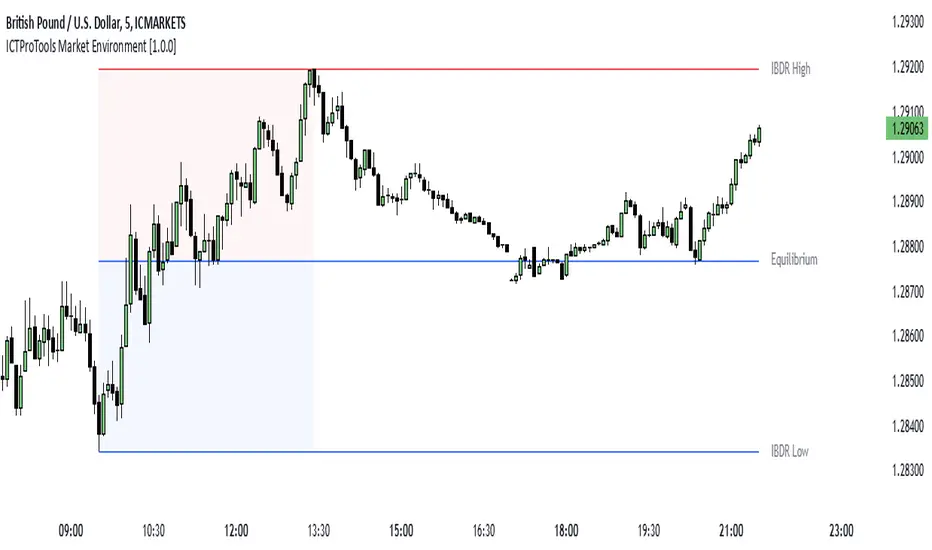
ICTProTools | ICT Insight - Market Environment🚀 INTRODUCTION
The Market Environment Indicator provides traders with an essential contextual framework for analyzing price movements. Built on the principles of ICT (Inner Circle Trader) and Smart Money Concepts (SMC), this tool offers a structured view of how institutional players drive markets through liquidity manipulation and price level interactions. By defining the market environment, the indicator helps traders focus on the most relevant price zones, reducing distractions and enhancing decision-making.
At its core, the Interbank Dealing Range (IBDR) creates a clear structure of protected highs/lows and Premium/Discount zones , highlighting key areas for potential price reactions. This framework gives traders a lens to interpret market behavior and concentrate on meaningful liquidity zones and price action. The indicator helps traders navigate the market with precision, spotting significant opportunities while filtering out market noise. Indeed, the IBDR isn't always easily identifiable, and not every move will form a distinct dealing range.
This indicator goes beyond mere price levels… It reveals the larger market context in which prices evolve. By mastering this environment, traders can align their strategies with institutional logic and make well-informed decisions.
💎 FEATURES
The Interbank Dealing Range (IBDR) is a crucial concept within the ICT methodology that helps traders identify the market environment across multiple timeframes, specifically the premium and discount zones. The IBDR delineates areas where traders have the potential to buy low and sell high.
Its extremes are defined by the sweep of both buy-side and sell-side liquidity . These levels indicate the boundaries within which price is expected to evolve . Understanding these boundaries allows traders to determine where it is appropriate to enter or exit trades.
The primary goal of utilizing the IBDR is to capitalize on price movements by buying at discounted levels and selling at premium levels. This strategy aligns with the fundamental principle of trading: to buy at lower prices and sell at higher prices, maximizing profit potential.
By visualizing the IBDR on your charts, you can gain valuable insights into the prevailing market conditions and make informed trading decisions that align with the institutional approach to buying and selling.
This chart illustrates the Interbank Dealing Range (IBDR) applied to the US100 index, displaying two from different timeframes: a 1-hour (1h) IBDR on the left and a 30-minute (30m) IBDR on the right. This multi-timeframe view provides essential context for price action analysis.
The 1h IBDR could here function as the primary reference range, establishing key boundaries (High and Low) for price movement. Within this range, the Equilibrium (midpoint) separates the Premium zone (above) from the Discount zone (below). The 0.25 and 0.75 levels add further precision by subdividing these zones.
Price action then flows between these zones, creating and targeting liquidity at higher and lower levels through Relative Equal Highs and Lows. A strong upward movement into the deeper level of the Premium Zone captures high-side liquidity (with a notable reaction at the FVG on the left), forming a secondary 30m IBDR. After this liquidity sweep, the remaining liquidity is on the low side. Price then reverses downward toward it. Here, the 30m IBDR would suggest a confirmation for a potential sell entry by targeting the IBDR lows.
The relationship between the broader 1h IBDR, the more detailed 30m IBDR, and all related levels creates a powerful analytical framework. The larger timeframe provides context, while the smaller one reveals specific trading opportunities by providing entry confirmations.
✨ SETTINGS
IBDR Metrics: Adjust the timeframe and sensitivity for calculating the IBDR so traders can adapt the indicator to both short-term intraday movements and longer-term trends.
Premium/Discount Zones: Customize the levels such as 0, 0.5, 1, and other levels like 0.25 and 0.75 by default and their displayed colors and associated labels.
Alerts: Configure the alerts for Premium/Discount zones, High/Low breaks, and new IBDR, ensuring traders are kept up to date on key market events.
🎯 CONCLUSION
The Market Environment indicator serves as a powerful tool for analyzing and navigating market structure through liquidity zones. It helps identify optimal buy and sell areas while aligning with the institutional logic of major market players. While its features provide a valuable edge, it’s essential to remember that none should be used on its own, and many more factors go into being a profitable trader.
SMC Order Block & Liquidity EntryThe SMC Order Block and Liquidity Trap Entry Strategy script uses Smart Money Concepts (SMC), which analyze institutional actions in the market, to assist traders in identifying high-probability trades. In order to help traders match their entry with institutional activity, this script highlights important regions of interest, including order blocks, liquidity zones, and indications for Break of Structure (BOS) or Change of Character (CHoCH).
The fundamental ideas of this approach, which focuses on regions where institutions frequently make sizable orders or sweep liquidity, are based on SMC principles. Order blocks, which are frequently important support or resistance zones when institutions are involved, are the final bullish or bearish candle before a significant price move in the other direction. There are liquidity zones that show where retail stop-loss orders build up (above recent highs or below recent lows), such as Buy-Side Liquidity (BSL) and Sell-Side Liquidity (SSL). Before changing the direction of the price, institutions could target these zones, giving traders possible chances.
The script depicts liquidity levels above or below recent highs and lows, automatically finds order blocks within a specified lookback time, and looks for BOS (a continuation signal) or CHoCH (a reversal signal). When liquidity retests inside an order block coincide with BOS or CHoCH circumstances, entry signals are produced. While short entries are triggered when the price breaks below the order block and SSL, long entry alerts are triggered when the price breaks above the order block and BSL.
Risk Matrix [QuantraSystems]Risk Matrix
The Risk Matrix is a sophisticated tool that aggregates a variety of fundamental inputs, primarily external (non-crypto) market data is used to assess investor risk appetite. By combining external macroeconomic factors and proxies for liquidity data with specific signals from the cryptomarket - the Risk Matrix provides a holistic view of market risk conditions. These insights are designed to help traders and investors make informed decisions on when to adopt a risk-on or risk-off approach.
Core Concept
The Risk Matrix functions as a dynamic risk assessment tool that integrates both fundamental and technical market indicators to generate an aggregated Z-score. This score helps traders to identify where the market is in a risk-off or risk-on state, The system provides both binary risk signals and a more nuanced “risk seasonality” mode for deeper analysis.
Key Features
Global Liquidity Aggregate - The Liquidity score is a custom measure of global liquidity, built by combining a variety of traditional financial metrics. These include data from central bank balance sheets, reverse repo operations and credit availability. This data is sourced from organizations such as the U.S. Federal Reserve, the European Central Bank, and the People’s Bank of China. The purpose of this aggregate is to gauge how much liquidity is available in the global financial system - which often correlates with risk sentiment. Rising liquidity tends to boost risk-on appetite, while liquidity contractions signal increased caution (risk-off) in the markets. The data sources used in this global liquidity aggregate include:
- U.S. Commercial Bank Credit data
- Federal Reserve balance sheet and reverse repo operations
- Liquidity from major central banks including the Fed, Bank of Japan, ECB, and PBoC
- Asset performance from major global financial indices such as the S&P 500, TLT, DXY (U.S. Dollar Index), MOVE (bond market volatility), and commodities like gold and oil.
Other key Z-scores (measured individually) - The Risk Matrix also incorporates other major Z-scores that represent different facets of the financial markets:
- Collateral Risk - A measure of US bond volatility, where higher values indicate higher interest rate risk - leading to potential market instability and cautious market behaviors.
- Stablecoin Dominance - The dominance of stablecoins in the crypto markets - which can signal risk aversion the total capital allocated to stables increases relative to other cryptocurrencies.
- US Currency Strength - The U.S. Dollar Index Z-score reflects currency market strength, with higher values typically indicating risk aversion as investors sell more volatile assets and flock to the dollar.
- Trans-pacific Monetary Bias - Signals capital flow and monetary trends that link between the East and West, heavily influencing global risk sentiment.
- Total - A measure of the total cryptocurrency market cap, signaling broader risk sentiment with the crypto market.
Neural Network Synthesis - The NNSYNTH component adds a machine learning inspired layer to the Risk Matrix. This custom indicator synthesizes inputs from various technical indicators (such as RSI, MACD, Bollinger Bands, and others) to generate a composite signal that reflects the health of the cryptomarket. While highly complex in its design, the NNSYNTH ultimately helps detect market shifts early by synthesizing multiple signals into one cohesive output. This score is particularly useful for gauging momentum and identifying potential turning points in market trends. Because the NNSYNTH is a closed source indicator, and it is included here, the Risk Matrix by extension is a closed source indicator.
How it Works
Z-score Aggregation - The Risk Matrix computes a final risk score by aggregating several Z-scores from different asset classes and data sources, all of which contribute proportionally to the overall market risk assessment. Each input is equally weighted - normalization allows for direct comparisons across global liquidity trends, currency fluctuations, bond market volatility and crypto market conditions. Furthermore, this system employs multi-calibration aggregation - where each individual matrix is itself an aggregate of multiple Z-scores derived from various timeframes. This ensures that each matrix captures a distinct average across different time horizons before being combined into the overall Risk Matrix. This layered, multi timeframe approach enhances the precision and robustness of the final Z-score.
Risk-On / Risk-Off Mode - The system’s binary mode provides a clear Risk On and Off signal. This nature of this signal is determined by the behavior of the Z-score relative to the midline, or Standard Deviation Bands, depending on specific conditions:
Risk-On is signaled when the aggregated final Z-score crosses above 0. However, in extreme oversold conditions, Risk-On can trigger early if the upper standard deviation band falls below the zero line. In such cases, the Risk-On signal is triggered when the z-score crosses the upper standard deviation band - without waiting to cross the midline.
Risk-Off is signaled when the final Z-score moves below 0. Similarly, Risk-Off can also be triggered early if the lower standard deviation band rises above the midline. In this instance, Risk-Off is triggered when the Z-score crosses below the lower band.
Risk Seasonality Mode - This mode offers a more gradual transition between risk states, measuring the change in the Z-score to visualize the shifts in risk appetite over time. It's useful for traders seeking to understand broader market cycles and risk phases. The seasonality view breaks down the market into the following phases:
Risk-On - High risk appetite where risk/cyclical markets are generally bullish.
Weakening - Markets showing signs of cooling off, here the higher beta assets tend to sell off first.
Risk-Off - Investors pull back, and bearish sentiment prevails.
Recovery - Signs of bottoming out, potential for market re-entry.
Component Matrices - Each individual Z-score is visualized as part of the component matrices - scaled to a 3 Sigma range. These component matrices allow traders to view how each data source is contributing to the overall risk assessment in real time - offering transparency and granularity.
Visuals and UI
Main Risk Matrix - The aggregated Z-Score is displayed saliently in the main risk matrix. Traders and investors can quickly see what season the Risk Matrix is signaling and adjust their strategies accordingly.
Overview Table - A detailed overview table shows the current confirmed Z-scores for each component, along with values from 2, and 3 bars back. This helps traders spot trends and the rate of change (RoC) between signals, offering additional insights for shorter-term risk management.
Customizability - Users can customize the visual elements of the matrix, including color palettes, table sizes, and positions. This allows for optimal integration into any trader’s existing workspace.
Usage Summary
The Risk Matrix is an incredibly versatile tool. It is especially valuable as a means of achieving a cross-market view of risk, incorporating both crypto-specific and macroeconomic factors. Some key use cases include:
Adjusting Capital Allocation Based on Risk Seasons - Traders can use the Risk Matrix to adjust their capital allocation dynamically. During Risk-On periods, they might increase exposure to long positions, capitalizing on stronger market conditions. Conversely, during Risk-Off periods, traders could reduce or hedge long positions and potentially scale up short positions or move into safer assets.
Complementing Other Trading Systems - The Risk Matrix can work alongside other technical systems to provide context to market moves. For instance, a trend-following strategy might suggest an entry, but the Risk Matrix could be used to verify whether the broader market conditions support this trade. If the Matrix is in a Risk-Off period, a trader might opt for more conservative trade sizes or avoid the trade entirely.
This flexibility allows traders to adjust their strategies and portfolio risk dynamically, enhancing decision making based on broader market conditions - as indicated by external macroeconomic factors, liquidity, and risk sentiment.
Important Note
The Risk Matrix always uses the most up-to-date data available, ensuring analysis reflects the latest market conditions and macroeconomic inputs. In rare cases, governments or financial institutions revise past data - and the Risk Matrix will adjust accordingly. This behavior can only be seen in the Liquidity Matrix. and can affect the final score. While this is uncommon, it highlights the benefit of using a system that adapts in real-time, incorporating the most accurate and current information to enhance decision making processes.

[DarkTrader] Swing OrderflowSwing Orderflow is a indicator that helps traders detect key swing highs and lows in price action. It is designed to enhance your charting experience by highlighting important support and resistance levels while providing clear visual cues on market structure changes. By tracking swing pivots and price trends, this indicator enables traders to make more informed decisions regarding potential entry and exit points in the market.
This indicator is inspired by @Fractalyst Indicator :
The core functionality of the script revolves around detecting swing highs and lows based on a customizable swing period. It identifies these pivots by comparing price movements over a specific time window, marking the points where price either peaks or bottoms out. Swing highs are plotted as resistance levels when the price breaks above a certain threshold, while swing lows are plotted as support levels when price breaks below it. These key points are represented with dotted lines and labels on the chart for easy reference.
Indicator In Use :
Swing High Calculation
A swing high occurs when the high of a specific bar (or candle) is greater than the highs of the surrounding bars within a defined range (called the swing period).
Function used to find the highest price within a specified range : ta.highest(period)
If the current price is greater than the highest price of this period, it's marked as a potential swing high.
A swing high generally represents a resistance level, where the price has reached a peak before declining.
Swing Low Calculation
A swing low occurs when the low of a specific bar is lower than the lows of the surrounding bars within the swing period.
Function used to find the lowest price within a specified range : ta.lowest(period)
If the current price is lower than this lowest price, it's identified as a swing low.
Swing lows represent support levels, where the price reaches a bottom before bouncing back.
These points are plotted on the chart, and the script also tracks whether price breaks above the swing high or below the swing low to determine trends or possible reversals.
BSL (Buy Side Liquidity)
BSL represents the Buy Side Liquidity, where traders are expected to have their buy orders (usually stop-loss orders for short positions).
When the price reaches a swing high, traders who are short may have stop orders placed above this level. Once these levels are breached, the script identifies this as a liquidity area where stop orders get triggered, causing potential upward price movement.
The script marks the swing high with a "BSL" label and line to indicate this key resistance and liquidity zone.
SSL (Sell Side Liquidity)
SSL refers to the Sell Side Liquidity, where traders place sell orders (usually stop-loss orders for long positions).
Swing lows are important levels where traders holding long positions place their stop orders. When the price drops below a swing low, it triggers these sell orders, causing potential downward price movement.
The script marks the swing low with an "SSL" label and line, signaling this key support and liquidity zone.
In essence, BSL and SSL represent areas where liquidity is pooled, making them critical points in price action. These liquidity areas, when breached, often lead to aggressive price moves, allowing traders to anticipate trends.

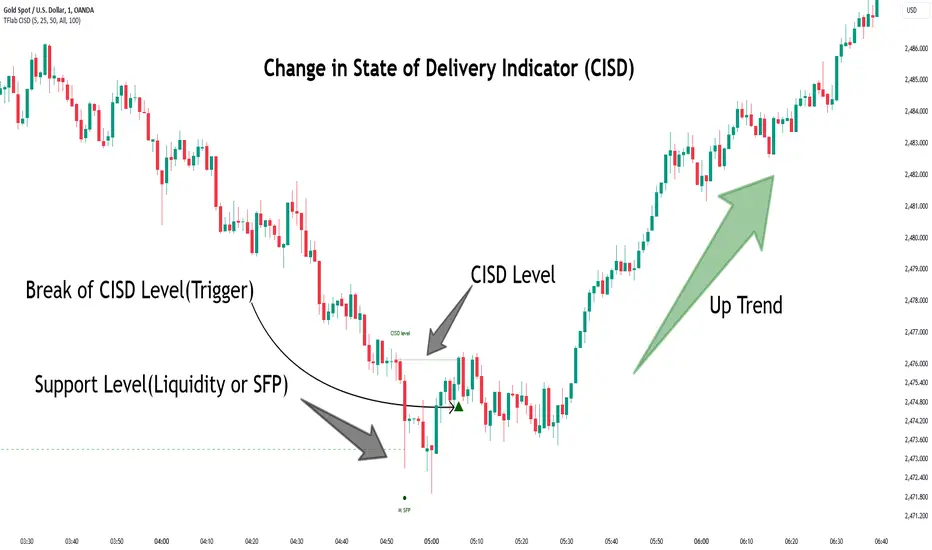
Change in State of Delivery CISD ICT [TradingFinder] Liquidity 1🔵 Introduction
🟣 What is CISD ?
Change in State of Delivery (CISD) is a key concept in technical analysis, similar to Change of Character (ChoCh) and Market Structure Shift (MSS) in the ICT (Inner Circle Trader) and Smart Money trading styles. Like ChoCh and MSS, CISD helps traders identify critical changes in market structure and make timely entries into trades.
To determine the CISD Level, traders typically review the last 1 to 4 candles to identify the first positive or negative candle. The CISD Level is then set using the opening price of the next candle.
In this version of the indicator, support and resistance levels are defined based on liquidity, which includes patterns such as SFP (Swing Failure Pattern), fake breakout, and false breakout.
Bullish CISD :
Bearish CISD :
🔵 How to Use
🟣 Bullish CISD (Change in State of Delivery Upward)
In Bullish CISD, the trend shifts from bearish to bullish after the price hits a liquidity zone, typically indicated by patterns such as SFP, fake breakout, or false breakout.
The steps to identify Bullish CISD are as follow s:
Identify the liquidity zone (SFP, fake breakout).
Review the candles and find the first positive candle.
Set the CISD Level using the opening price of the next candle after the positive candle.
Confirm the change in state of delivery when the price closes above the CISD Level.
Enter the trade after CISD confirmation.
🟣 Bearish CISD (Change in State of Delivery Downward)
In Bearish CISD, the trader looks for a shift from a bullish to a bearish trend. This change typically occurs when the price hits a liquidity level, indicated by patterns such as SFP or false breakout.
The steps to identify Bearish CISD are :
Identify the liquidity zone.
Review the candles and find the first negative candle.
Set the CISD Level using the opening price of the next candle after the negative candle.
Confirm the change in state of delivery when the price closes below the CISD Level.
Enter a short trade after CISD confirmation.
🟣 CISD Compared to ChoCh and MSS (CISD Vs ChoCh/ MSS)
CISD, ChoCh, and MSS are all tools for identifying trend changes in the market, but they have some differences :
CISD: Focuses on a change in the state of delivery and uses liquidity patterns (SFP, fake breakout) and key candles to confirm trend reversals.
ChoCh: Identifies a change in the market’s character, often signaling rapid shifts in trend direction.
MSS: Focuses on changes in market structure and identifies the breaking of key levels as a signal of trend shifts.
🔵 Settings
🟣 CISD Logical settings
Bar Back Check : Determining the return of candles to identify the CISD level.
CISD Level Validity : CISD level validity period based on the number of candles.
🟣 SFP Logical settings
Swing period : You can set the swing detection period.
Max Swing Back Method : It is in two modes "All" and "Custom". If it is in "All" mode, it will check all swings, and if it is in "Custom" mode, it will check the swings to the extent you determine.
Max Swing Back : You can set the number of swings that will go back for checking.
🟣 CISD Display settings
Displaying or not displaying swings and setting the color of labels and lines.
🟣 SFP Display settings
Displaying or not displaying swings and setting the color of labels and lines.
🔵 Conclusion
CISD is a powerful tool for identifying trend reversals using liquidity patterns and key candle analysis. Traders can use the CISD Level to detect trend changes and find optimal entry and exit points.
This concept is similar to ChoCh and MSS but stands out with its focus on confirming trend changes through liquidity and specific patterns. With the right approach, CISD helps traders capitalize on market movements more effectively.
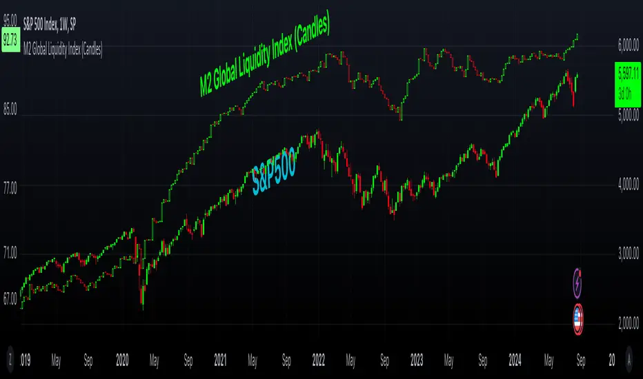
M2 Global Liquidity Index (Candles)M2 Global Liquidity Index (Candles)
In this enhanced version of the original M2 Global Liquidity Index script by Mik3Christ3ns3n , I've taken the foundational concept and expanded its capabilities for more in-depth analysis and user flexibility. This updated script aggregates M2 money supply data from major global economies—China, the U.S., the Eurozone, Japan, and the U.K.—adjusted by their respective exchange rates, into a customizable global liquidity index.
Key Enhancements:
Candlestick Visualization:
• Instead of a simple line chart, I've implemented a candlestick chart, providing a more detailed representation of liquidity trends with open, high, low, and close values for each period. This allows traders to analyze the index with the same technical tools used for price charts.
Customizable Components:
• Users can now select which components (M2 data and exchange rates) to include in the index calculation, giving you the flexibility to tailor the index to specific economic factors or regions of interest.
Dynamic Color Coding:
• Candles are color-coded based on their performance (bullish or bearish), with customized wick and border colors to enhance visual clarity, making it easier to spot liquidity trends at a glance.
Overlay Option:
• This script is designed to be an overlay, allowing you to plot the Global Liquidity Index directly on your price charts, facilitating comparison between liquidity trends and asset prices.
This enhanced script is ideal for traders and analysts who want a deeper understanding of global liquidity trends and their impact on financial markets.
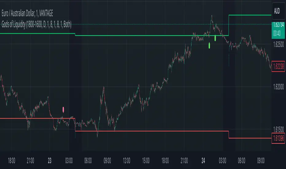
God's of LiquidityHere’s a detailed description for your script, following the guidelines for clarity and originality:
---
**Title:** God's of Liquidity
**Description:**
The "Gods of Liquidity" script is a comprehensive trading tool designed to help traders identify high-probability buy and sell opportunities based on a combination of liquidity levels, RSI-based sentiment analysis, and session-specific filters.
**Key Features:**
1. **Liquidity Zones Identification:**
- The script dynamically calculates the previous day's high and low levels, which serve as critical liquidity zones. Traders can use these levels to spot potential breakout points and reversals.
2. **RSI-Based Sentiment Analysis:**
- The script incorporates a sophisticated RSI-based sentiment model that differentiates between institutional (Banker) and retail (Hot Money) activity. This dual RSI approach allows traders to gauge market sentiment and anticipate shifts in momentum.
- **Banker RSI:** Measures the sentiment of institutional traders, with customizable sensitivity and period parameters.
- **Hot Money RSI:** Measures retail trader sentiment, with its own adjustable settings to tailor the script to various market conditions.
3. **Session and Day Filters:**
- Traders can restrict signals to specific trading sessions and days of the week, providing greater control and precision in executing trades. This feature is particularly useful for aligning trading activity with market conditions that best suit the strategy.
4. **Breakout and Reversal Signals:**
- The script generates buy signals when the price breaks above the previous day's high, accompanied by bullish RSI sentiment from institutional traders. Conversely, sell signals are generated when the price breaks below the previous day's low, with bearish institutional sentiment.
- These signals are visually marked on the chart, making it easier for traders to identify potential trading opportunities.
5. **Customizable Moving Averages:**
- The script allows users to customize the moving averages used in the RSI calculations, giving traders the flexibility to adapt the tool to their specific trading style and market conditions.
6. **Alert System:**
- Alerts are integrated to notify traders when buy or sell conditions are met, ensuring that traders can react promptly to potential trading opportunities without constantly monitoring the charts.
**How It Works:**
- The script uses the previous day's high and low as key liquidity levels. The price crossing these levels, combined with RSI-based signals, indicates potential buy or sell opportunities.
- The sentiment analysis is derived from the RSI values, with separate calculations for institutional and retail activities. The crossover points of these RSI values against their respective moving averages trigger buy or sell signals.
- The session and day filters allow traders to focus on the most relevant times for trading, enhancing the effectiveness of the strategy.
**Usage:**
- This indicator is designed for Forex traders who want to integrate liquidity zones and sentiment analysis into their trading strategy. It is particularly effective on daily or higher timeframes where liquidity levels and RSI-based sentiment analysis can provide strong indications of market direction.
- The script's flexibility in adjusting session times, days, and RSI parameters makes it suitable for a wide range of trading styles, from day trading to swing trading.
---
**License:**
This source code is subject to the terms of the Mozilla Public License 2.0 at (mozilla.org).
© bankbaguitarcrazy
---
This description should provide sufficient detail to comply with the publication guidelines, offering clear insight into how the script works and its unique features.
Daily Liquidity Peaks and Troughs [ST]Daily Liquidity Peaks and Troughs
Description in English:
This indicator identifies peaks and troughs of highest liquidity on a daily timeframe by analyzing volume data. It helps traders visualize key points of high buying or selling pressure, which could indicate potential reversal or continuation areas.
Detailed Explanation:
Configuration:
Lookback Length: This input defines the period over which the highest high and lowest low are calculated. The default value is 14. This means the script will look at the past 14 bars to determine if the current high or low is a pivot point.
Volume Threshold Multiplier: This input defines the multiplier for the average volume. For example, a multiplier of 1.5 means the volume needs to be 1.5 times the average volume to be considered a significant peak or trough.
Peak Color: This input sets the color for liquidity peaks. The default color is red.
Trough Color: This input sets the color for liquidity troughs. The default color is green.
Volume Calculation:
Average Volume: The script calculates the simple moving average (SMA) of the volume over the lookback period. This helps to identify periods of significantly higher volume.
Volume Threshold: The threshold is determined by multiplying the average volume by the volume threshold multiplier. Only volumes exceeding this threshold are considered significant.
Identifying Peaks and Troughs:
Liquidity Peak: A peak is identified when the current high is the highest high over the lookback period and the current volume exceeds the volume threshold. This indicates a potential area of strong selling pressure.
Liquidity Trough: A trough is identified when the current low is the lowest low over the lookback period and the current volume exceeds the volume threshold. This indicates a potential area of strong buying pressure.
These peaks and troughs are marked on the chart with labels and shapes for easy visualization.
Plotting Peaks and Troughs:
Labels: The script uses labels to mark peaks and troughs on the chart. Peaks are marked with a red label and troughs with a green label.
Shapes: The script plots triangles above peaks and below troughs to highlight these areas visually.
Indicator Benefits:
Liquidity Identification: Helps traders identify key areas of high liquidity, indicating strong buying or selling pressure.
Visual Cues: Provides clear visual signals for potential reversal or continuation points, aiding in making informed trading decisions.
Customizable Parameters: Allows traders to adjust the lookback length and volume threshold to suit different trading strategies and market conditions.
Justification of Component Combination:
Peaks and Troughs Identification: Combining pivot points with volume analysis provides a robust method to identify significant liquidity areas. This helps in detecting potential market reversals or continuations.
Volume Analysis: Utilizing average volume and volume threshold ensures that only significant volume spikes are considered, enhancing the accuracy of identified peaks and troughs.
How Components Work Together:
The script first calculates the average volume over the specified lookback period.
It then checks each bar to see if it qualifies as a liquidity peak or trough based on the highest high, lowest low, and volume threshold.
When a peak or trough is identified, it is marked on the chart with a label and a shape, providing clear visual cues for traders.
Título: Picos e Fundos de Liquidez Diários
Descrição em Português:
Este indicador identifica picos e fundos de maior liquidez no gráfico diário, analisando os dados de volume. Ele ajuda os traders a visualizar pontos-chave de alta pressão de compra ou venda, o que pode indicar áreas potenciais de reversão ou continuação.
Explicação Detalhada:
Configuração:
Comprimento de Retrocesso: Este input define o período sobre o qual a máxima e mínima são calculadas. O valor padrão é 14. Isso significa que o script analisará os últimos 14 candles para determinar se a máxima ou mínima atual é um ponto de pivô.
Multiplicador de Limite de Volume: Este input define o multiplicador para o volume médio. Por exemplo, um multiplicador de 1.5 significa que o volume precisa ser 1.5 vezes o volume médio para ser considerado um pico ou fundo significativo.
Cor do Pico: Este input define a cor para os picos de liquidez. A cor padrão é vermelha.
Cor do Fundo: Este input define a cor para os fundos de liquidez. A cor padrão é verde.
Cálculo do Volume:
Volume Médio: O script calcula a média móvel simples (SMA) do volume ao longo do período de retrocesso. Isso ajuda a identificar períodos de volume significativamente mais alto.
Limite de Volume: O limite é determinado multiplicando o volume médio pelo multiplicador de limite de volume. Apenas volumes que excedem esse limite são considerados significativos.
Identificação de Picos e Fundos:
Pico de Liquidez: Um pico é identificado quando a máxima atual é a máxima mais alta no período de retrocesso e o volume atual excede o limite de volume. Isso indica uma potencial área de forte pressão de venda.
Fundo de Liquidez: Um fundo é identificado quando a mínima atual é a mínima mais baixa no período de retrocesso e o volume atual excede o limite de volume. Isso indica uma potencial área de forte pressão de compra.
Esses picos e fundos são marcados no gráfico com etiquetas e formas para fácil visualização.
Plotagem de Picos e Fundos:
Etiquetas: O script usa etiquetas para marcar picos e fundos no gráfico. Os picos são marcados com uma etiqueta vermelha e os fundos com uma etiqueta verde.
Formas: O script plota triângulos acima dos picos e abaixo dos fundos para destacar essas áreas visualmente.
Benefícios do Indicador:
Identificação de Liquidez: Ajuda os traders a identificar áreas-chave de alta liquidez, indicando forte pressão de compra ou venda.
Cues Visuais: Fornece sinais visuais claros para pontos potenciais de reversão ou continuação, auxiliando na tomada de decisões informadas.
Parâmetros Personalizáveis: Permite que os traders ajustem o comprimento de retrocesso e o limite de volume para se adequar a diferentes estratégias de negociação e condições de mercado.
Justificação da Combinação de Componentes:
Identificação de Picos e Fundos: A combinação de pontos de pivô com análise de volume fornece um método robusto para identificar áreas significativas de liquidez. Isso ajuda na detecção de potenciais reversões ou continuações de mercado.
Análise de Volume: Utilizar o volume médio e o limite de volume garante que apenas picos de volume significativos sejam considerados, aumentando a precisão dos picos e fundos identificados.
Como os Componentes Funcionam Juntos:
O script primeiro calcula o volume médio ao longo do período especificado de retrocesso.
Em seguida, verifica cada barra para ver se ela se qualifica como um pico ou fundo de liquidez com base

Smart Money Liquidity Heatmap [AlgoAlpha]🌟📈 Introducing the Smart Money Liquidity Heatmap by AlgoAlpha! 🗺️🚀
Dive into the depths of market liquidity with our innovative Pine Script™ indicator designed to illuminate the trading actions of smart money! This meticulously crafted tool provides an enhanced visualization of liquidity flow, highlighting the dynamics between smart and retail investors directly on your chart! 🌐🔍
🙌 Key Features of the Smart Money Liquidity Heatmap:
🖼️ Visual Clarity: Uses vibrant heatmap colors to represent liquidity concentrations, making it easier to spot significant trading zones.
🔧 Customizable Settings: Adjust index periods, volume flow periods, and more to tailor the heatmap to your trading strategy.
📊 Dynamic Ratios: Computes the ratio of smart money to retail trading activity, providing insights into who is driving market movements.
👓 Transparency Options: Modify color intensity for better visibility against various chart backgrounds.
🛠 How to Use the Smart Money Liquidity Heatmap:
1️⃣ Add the Indicator:
Add the indicator to favourites. Customize settings to align with your trading preferences, including periods for index calculation and volume flow.
2️⃣ Market Analysis:
Monitor the heatmap for high liquidity zones signalled by the heatmap. These are potential areas where smart money is actively engaging, providing crucial insights into market dynamics.
Basic Logic Behind the Indicator:
The Smart Money Liquidity Heatmap utilizes the Smart Money Interest Index Indicator and operates by differentiating between the trading behaviors of informed (smart money) and less-informed (retail) traders. It calculates the differences between specific volume indices—Positive Volume Index (PVI) for retail investors and Negative Volume Index (NVI) for institutional players—and their respective moving averages, highlighting these differences using the Relative Strength Index (RSI) over user-specified periods. This calculation generates a ratio that is then normalized and compared against a threshold to identify areas of high institutional trading interest, visually representing these zones on your chart as vibrant heatmaps. This enables traders to visually identify where significant trading activities among smart money are occurring, potentially signalling important buying or selling opportunities.
🎉 Elevate your trading experience with precision, insight, and clarity by integrating the Smart Money Liquidity Heatmap into your toolkit today!

NZTVolumeDESCRIPTION IN ENGLISH
🔶 INTRODUCTION
NZTVolume is an advanced indicator for TradingView , inspired by the mentor Almaz . It is intended to facilitate the analytical work of traders who actively use data on real trading volumes in their analysis. The indicator also has many features that simplify operation and provide great opportunities for analysis , including the key function - identification of effective and ineffective movements, which are described below.
🔶 CONTENT
This tool provides detailed visualization of real volume . Other features such as candlestick color change depending on volume, histogram display percentage change in volume , and display candles that have gained liquidity, but the most unique function is the determination of effective and ineffective movements, alerts for them are built into the indicator, and traders will have a unique opportunity by setting alerts to wait for the first effective movement (its meaning and description below) , all this is implemented through advanced computational algorithms applied in the code.
Key features include Real Volume Histogram, Dynamic Candle Color Change, Average Volume Table, Volume Percent Change, Liquidity taken Candle, Volume Moving Averages, Effective and ineffective movements with their lines, 3 types of customizable Volume Alerts.
🔶 LOGIC
🔹 Dynamic Candle Color Change (Изменять цвет свечей)
Candles change to a contrasting color if their volume exceeds that of the previous candle , differentiated into bullish and bearish , including settings for transparency and colors . Can be configured, enabled of or disabled.
🔹 Real Volume Histogram (Показывать гистограмму объемов)
Automatically retrieves data on volumes and shows it on a chart. Can be configured, enabled of or disabled.
🔹 Liquidity Taken Candle (Показывать свечу собравшую ликвидность)
A candle that has taken/captured liquidity , which is determined in the code by the high and low prices of the candle and the volume it has , is displayed on the histogram . Can be configured, enabled or disabled.
🔹 Percent Change Volume (Показывать гистограмму процентного изменения объема)
Calculates and displays volume percent changes on a histogram. Can be configured, enabled or disabled.
🔹 Effective and Ineffective movement/column (Показывать эффективные и неэффективные движения)
By calculating the average volatility of the last bars, as well as calculating the average volume of the last bars, comparing and contrasting them, we obtain the principle of effective and ineffective movement/column. The code includes alerts that allow you to notify the user when the first effective movement/candle appears, which can significantly improve trading and maintain concentration. Basically it's a specific column on histogram, but is called movement so that's it's easier to understand its logic.
🔹 Line of efficiency and inefficiency (Показывать линии эффективности и неэффективности)
These lines connect all effective and ineffective movements' highs on the histogram, allowing traders to practice, as well as build their trading strategy for the trading day.
🔹 Average Volume Table (Показывать таблицу со средним объемом)
Displays the average volume per bar for selected time intervals with the ability to customize the period . Can be configured, enabled or disabled.
🔹 Volume Moving Averages (Показывать среднюю скользящую объема)
Three lines corresponding to users' set time intervals show the change in volume with color and thickness settings. Can be configured, enabled or disabled.
🔹 Alerts (Во сколько раз объем свечи должен превышать предыдущую для алерта)
Alerts can be triggered by 3 conditions
1. if on the selected timeframe the volume of the current candle exceeds the volume of the previous candle by a user-specified number of times , an alert will be triggered.
2. if a liquidity candle appears on the selected timeframe , an alert is triggered.
3. if an effective column/movement appears on the selected timeframe, an alert is triggered.
It can be configured, enabled or disabled.
🔶 TECHNICAL SPECIFICATION AND UNIQUENESS
At the core of NZTVolume is a series of advanced algorithms that analyze volume data in real-time.
Some of them are:
Calculate average volumes by given time period (in hours).
Candles, that took liquidity - considers high volume and wicks' size.
Percent volume change histogram - calculate percent change of volume for every bar and shows it on graph.
Effective and ineffective movement - calculates by algorithm that considers average volume and average volatility, assuming that big market players will contribute the volume.
🔶 DEMONSTRATION OF HOW THE INDICATOR WORKS ON DIFFERENT ASSETS
NZTLevel + NZTVolume Together
🔶 SETTINGS
🔹 Candles (Свечи)
Enable/disable color changes of candles based on volume . Customize colors of contrasting and standard candles, adjust transparency.
🔹 Histogram Settings (Настройки Гистограммы)
Show volume histogram , show liquidity taken candle, show volume percent change histogram, show effective, ineffective movements, show efficiency/inefficiency line.
🔹 Display settings on the Histogram (Настройки отображения на Гистограмме)
Customizable colors for bullish, bearish, liquidity taken columns as well as for effective and ineffective movement/columns and for lines that connect them.
🔹 Table (Таблица)
Toggle the display of the average volume table, customize the background, and set time ranges (3 parameters, multi-timeframe support). Tables shows "average volume over 24/48/72 hours" in translation
🔹 Lines (Линии)
Option to display/hide average volume lines , select colors and thickness for each of the three lines.
🔹 Alerts (Алерты)
As was said before, there are 3 types of alerts , that can be turned off , there is a parameter can be chosen - How many times volume of the current candle should exceeds the volume of the previous candle to trigger alert
🔶 RECOMMENDATIONS FOR USE
It is recommended to set and save the indicator settings that best match your trading preferences to ensure efficiency and ease of use.
NZTVolume stands out among other indicators for its universal functions, versatility, simplicity of installation and setup, high performance, and extensive customization capabilities, making it an indispensable tool for traders of all levels.
The indicator was developed by Temirlan Tolegenov for NZT Trader Community, April 2024, Prague, Czech Republic
ОПИСАНИЕ НА РУССКОМ ЯЗЫКЕ
🔶 ВСТУПЛЕНИЕ
NZTVolume — это продвинутый индикатор для TradingView , вдохновленный ментором Алмазом . Он предназначен для облегчения аналитической работы трейдеров, которые активно используют данные о реальных объёмах торгов в своем анализе. Индикатор также имеет множество функций, которые упрощают работу и предоставляют большие возможности для анализа , включая ключевую функцию - выявление эффективных и неэффективных движений, которые описаны ниже.
🔶 СОДЕРЖАНИЕ
Индикатор обеспечивает детальную визуализацию реального объема . Другие функции, такие как изменение цвета свечей в зависимости от объема, отображение гистограммы процентное изменение объема и отображение свечи, собравшей ликвидность, но самой уникальной функцией является определение эффективных и неэффективных движений, оповещения по ним встроены в индикатор, и у трейдеров появится уникальная возможность установить оповещения на ожидание первого эффективного движения (его смысл и описание ниже). ) , всё это реализовано посредством продвинутых вычислительных алгоритмов, примененных в коде.
Ключевые функции включают в себя гистограмму реального объема, динамическое изменение цвета свечи, таблицу среднего объема, процентное изменение объема, свечу, взявшую ликвидности, скользящие средние объема, эффективные и неэффективные движения с их линиями, 3 типа настраиваемых параметров. Оповещения об объеме.
🔶 ЛОГИКА
🔹 Динамическое изменение цвета свечей (Изменить цвет свечей)
Свечи меняют цвет на контрастный , если их объем превышает объем предыдущей свечи , дифференцируются на бычьи и медвежьи , включая настройки прозрачности и цвета . Можно настроить, включить или отключить.
🔹 Гистограмма реального объёма (Показывать гистограмму объёмов)
Автоматически извлекает данные по объемам и отображает их на графике. Можно настроить, включить или отключить.
🔹 Свеча, собравшая ликвидность (Показывать свечу собравшую ликвидность)
Свеча, собравшая ликвидность , которая определена в коде максимальной и минимальной ценой свечи и объемом, который она имеет , отображается на гистограмма . Можно настроить, включить или отключить.
🔹 Процентное изменение объема (Показывать гистограмму процентного изменения объема)
Вычисляет и отображает процентные изменения объема на гистограмме. Можно настроить, включить или отключить.
🔹 Эффективные и неэффективные движения(Показать Эффективныеи неэффективные движения)
Рассчитав среднюю волатильность последних баров, а также вычислив средний объем последних баров, сравнивая и противопоставляя их, мы получаем принцип эффективного и неэффективного движения/столбца. В код включены оповещения, которые позволяют оповещать пользователя при появлении первого эффективного движения/свечи, что позволяет существенно улучшить торговлю и сохранить концентрацию. По сути, это отдельный столбец на гистограмме, но он называется движением, потому что так, его логику будет легче понять.
🔹 Линия эффективности и неэффективности (Показывать линии эффективности и неэффективности)
Эти линии соединяют хаи всех эффективных и неэффективных движений на гистограмме, позволяя трейдерам практиковаться, а также строить свою торговую стратегию на торговый день.
🔹 Таблица среднего объема (Показать таблицу со значением определения)
Отображает средний объем на бар для выбранных временных интервалов с возможностью настройки периода . Можно настроить, включить или отключить.
🔹 Скользящие средние объёма (Показать среднюю скользящую объём)
Три линии, соответствующие установленным пользователем временным интервалам , показывают изменение объема с настройками цвета и толщины. Можно настроить, включить или отключить.
🔹 Оповещения (Во сколько раз объем свечи должен превышать предыдущую для оповещения)
Оповещения могут быть вызваны тремя условиями
1. Если на выбранном таймфрейме объем текущей свечи превысит объем предыдущей свечи в заданное пользователем количество раз , сработает оповещение
2. Если на выбранном таймфрейме появляется свеча ликвидности , срабатывает оповещение
3. Если на выбранном таймфрейме появляется эффективный столбец/движение , срабатывает оповещение.
Это можно настроить, включить или отключить.
🔶 ТЕХНИЧЕСКИЕ ХАРАКТЕРИСТИКИ И УНИКАЛЬНОСТЬ
В основе NZTVolume лежит серия продвинутых алгоритмов, которые анализируют данные об объемах в режиме реального времени.
Некоторые из них:
Рассчёт средние объёмы за заданный период времени (в часах).
Свечи, снявшие ликвидность - учитывает большой объем и размер шпилей.
Процентное изменение объема на гистограмме — рассчитывает процентное изменение объема для каждого бара и отображает его на графике.
Эффективное и неэффективное движение - рассчитывается по алгоритму, учитывающему средний объем и среднюю волатильность, предполагая, что объем крупных игроков будет сигнализировать о намерении рынка и силе движения.
🔶 НАСТРОЙКИ
🔹 Свечи
Включить/отключить изменение цвета свечей в зависимости от объема . Настройте цвета контрастных и стандартных свечей, настройте прозрачность.
🔹 Настройки гистограммы
Показать гистограмму объема , показать свечу взятой ликвидности, показать гистограмму процентного изменения объема, показать эффективные и неэффективные движения, показать линию эффективности/неэффективности.
🔹 Настройки отображения на гистограмме
Настраиваемые цвета для бычьих, медвежьих, свечей, собравших ликвидность столбцов, а также для эффективных и неэффективных движений/столбцов и линий, которые их соединяют.
🔹 Таблица
Переключайте отображение таблицы среднего объема, настраивайте фон и устанавливайте временные диапазоны (3 параметра, мультитаймфрейм).
🔹 Линии
Возможность отобразить/скрыть линии среднего объема , выбрать цвет и толщину для каждой из трех линий.
🔹 Алерты
Как было сказано ранее, есть 3 типа оповещений , которые можно отключить , можно выбрать параметр — во сколько раз объем текущей свечи должен превышать объем предыдущей свечи, чтобы сработало оповещение.
🔶 РЕКОМЕНДАЦИИ К ИСПОЛЬЗОВАНИЮ
Рекомендуется установить и сохранить настройки индикатора, которые лучше всего соответствуют вашим торговым предпочтениям, чтобы обеспечить эффективность и простоту использования.
NZTVolume выделяется среди других индикаторов своими универсальными функциями, универсальностью, простотой установки и настройки, высокой производительностью и широкими возможностями настройки, что делает его незаменимым инструментом для трейдеров всех уровней.
Индикатор разработан Темирланом Толегеновым для международного сообщества NZT Trader , Апрель 2024, Прага, Чешская Республика.
The indicator is published in accordance and respect to all House Rules of the TradingView platform.
Индикатор опубликован в соответствии и уважением ко всем внутренним правилами платформы TradingView.
