Nexus Blast Trading Strategy [Kaspricci]Nexus Blast Trading Strategy - Kaspricci
This indicator shows the different sessions during the day (London session, New York AM session, New York PM session and Asian session) by adding vertical lines and draws horizontal lines for the high and low during each session. Furthermore those lines turn red once the price has taken this high or low. Blue lines indicate liquidity not yet taken.
On top the indicator draws boxes of different color to indicate bullish and bearish Fair Value Gaps (FVG).
Happy to receive your feedback. Please leave a comment for bugs as well as ideas for improvement.
General Settings
Time Zone - used for marking sessions and end of day.
Sessions
Sessions - start and end time for each session based on set time zone
Number of Days back - for how many days in the past the startegy will draw strategy highs and lows. Theres is a maximum of 50 days defined.
FVG Settings
Threshold in Ticks - you can hide very small FVGs by increasing this threshold
FVG Colors - colors used for the bearish and bullish FVG box
This script is for educational purposes only! It is not meant to be a financial advice.
PS: The former strategy script was removed by TV, as it would violate several rules according to them.
Cerca negli script per "liquidity"
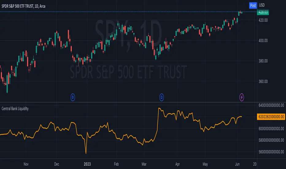
Central Bank LiquidityCentral Bank Liquidity = Total value of the assets of all Federal Reserve Banks - Overnight Reverse Repurchase Agreements (RRP) - The Treasury General Account (TGA)
TradingView ticker arithmetic: FRED:WALCL-FRED:WTREGEN-FRED:RRPONTSYD
Market Structure and Liquidity IndicatorThis indicator tracks the market structure by identifying the highest high and lowest low. It then calculates the area of interest by taking the average of these levels. Additionally, it calculates liquidity by dividing the volume by the range between the highest high and lowest low.
Please note that this is a basic example, and you can modify and enhance it according to your specific requirements and trading strategy. Remember to thoroughly backtest and validate any trading strategy or indicator before using it in live trading.

Global LiquidityPlots the sum of the balance sheets of the world's major central banks - FED, ECB, BoE, PBoC, BOJ, India and Switzerland - in a currency of your choice. Defaults to USD.
Also shows FED net liquidity (balance sheet - tga - rrp) for comparison. Uses a configurable multiplier to make the two lines viewable on the same price scale.

Traders Reality Vector Candle ZonesVector Candle Zone indicator displays areas of unrecovered liquidity based on PVSRA with override option for the chart symbol.
Developed for TradersReality by infernixx with library conversion by peshocore

SPX and Federal Net Liquidity differenceScript for applying Federal Net Liquidity to the SPX post-2020 monetary policy. Original indicator from jlb05013 with adjustments to make it more readable and usable. When the indicator is above 250 the SPX is overbought and when it's below -250 the SPX is oversold.
It's not perfect, I'm just publishing because I didn't see it already out there.

Price Action All In One IndicatorIf you are the one who is "Price Action" style & does not want to use many indicators or complex indicators or you are an ICT (The Inner Circle Trader)
student or ICT charter, this simple beautiful All In One Indicator is right for you.
The indicator has the following functions.
TIME ZONE SETTING
The default timezone is New York Time GMT-4, if you leave the time zone setting blank, it will use the symbol timezone. Note that the trading time changes with one hour delay in winter. so if you just trade forex, and leave the time zone setting blank, TradingView will adjust the symbol timezone automatically for you or don't forget to change the timezone setting GMT-4 or GMT-5 depending on daylight saving time.
STATISTIC PANEL
You can choose which panel to show through settings.
Session Info Panel : pips info of ADR, Asian, London, and New York sessions.
Trend Panel : showing trend (up/down) of
5m/15m/1h/4h/D/W time frames (TF)
4MA (default values: SMA with lengths: 20–50–100–200)
Money Management Panel : in trading, money management is very important. Just put the % risk, & stop loss value below, the indicator will calculate a suitable size/amount for each trade.
Size by Lots: input stop loss in pips
Size by Units: input stop loss in % (of price)
(*)Units size is calculated by % stop loss & current bar close price. You have to determine a stop-loss price to convert to % stop loss by yourself.
TIME SEPARATORS
We can choose which time separators we want to display. The indicator has 5 options: Anchor Time/Day/Week/Month/Quarter. Of course, we can choose to show just one or all 5 of them.
With Anchor Time you can choose which time you want to draw a vertical line for better timing analysis. This can show up to 2 Anchor Time lines. The default values are 00:00 (New York Midnight Opening) and 08:30 (New York Session Opening). You also have an option to show the past lines or not.
About Day Separator, cause TradingView has supported Session Breaks in Setting but if you don't like to use it or when enabling, it distracts you, you can use mine. My favorite trading dates are Tuesday & Wednesday.
PRICE LEVELS
For intraday trading, the high/low/close of the previous day, the previous week, ADR (default period is 5) are very important key levels. You can choose which one you like to show for better analysis. Of course, you can change the color & style of the lines. This is also my favorite indicator.
This indicator also has an option to show up to 2 price lines at a specific time, you can choose the price type (high/low/close/open) that you want to display. The default time values are:
Specific Time 1: 0:00. (New York Midnight Opening Price)
Specific Time 2: 8:30 am. (New York Session Opening Price)
ACCUMULATION ZONE
The market tends to reprice the higher/lower to the old high/low or imbalance/fair value price to promote buy/sell stops or to provide smart money pricing for long/short entries. Typically, it redistributes quickly and you must learn to anticipate them at key levels intraday. Weak short/long holders will be squeezed in the retracement.
Except for the open price, the price changes continuously until the closing time, so the accumulation area can also be changed in real-time, but if you combine it with other information when analyzing, you can predict/determine whether the zone has been established or not with high probability. In short, price needs time to be accumulated, I usually don't pay attention to this daily zone till London open/close or New York sessions
Not only daily zone, but the indicator also supports higher timeframes accumulation zone from
SESSION & STD
There are 3 sessions: Asian, London, New York. The default values are below (New York Time).
Asian: 19:00 ~ 00:00
London Open (London KillZone): 01:00 ~ 05:00
New York Open (New York KillZone): 07:00 ~ 10:00
If you do not want to show the label, just leave the label values blank or change them to whatever you want.
This is one of my favorite functions. I use it on 15m, 30m, 1h TF for Forex intraday trading. My favorite trading sessions are London Open & New York Open.
You also can choose to show or not Standard Deviations (STD). The default values are set for Asian Range STD and max STD levels can be shown are 5. I use the following 3 types of STD (New York Time):
CBDR (Central Bank Deviations) STD: 14:00 ~ 20:00
Flout STD: 15:00 ~00:00
Asian Range STD: 19:00 ~ 00:00
LOOKBACK HIGH/LOW/MID
Can show high/low/mid of the data ranges on the daily/4h chart. The default values are:
- 20–40–60 days back from today for daily TF.
- 30–60–90 bars back from the latest bar for 4h TF.
The default anchor bar for calculating the lookback is the latest one but with:
- 4h TF: we can change the lookback from the 1st day of the week.
- Daily TF: we can change the lookback from the 1st day of the month.
The indicator also has options showing the high/low/mid (equilibrium level) lines for better analysis. Especially, on daily TF, we have the option that can show up to 4 lines (25% for each one) of the data range.
Of course, you can change the colors or the style of the high/low/mid lines.
The lookback can be shown on the lower TFs for better detection when the market structure is shifted.
MAGIC BARS
Fractal bar : The bar's color is changed when the divergence occurs between the price & RSI. You can change the RSI period (default value is 14) & RSI source. (open/high/low/close,…)
Imbalance bar or liquidity void or fair value gap - whatever you call it. This is my favorite indicator when trading on all TFs.You can choose to extend the last n imbalance bars if you like in the settings. I make sure I covered all cases of imbalance/fair value gap.
OLD HIGH/LOW
First, this function is not used as the common Support & Resistance that retail traders usually use, so I call it Old High/Low. I usually use it in 2 ways:
Detect the next buy/sell stops that Market Makers aim to manipulate.
Detect whether market structure shifted or not (Break of structure)
In settings you can:
Set the period to detect high/low levels, the default value is 10. My other favorite values are 6 & 2.
On a lower time frame, you might want to set it to a large number to remove noise.
On a higher time frame, a small number is enough, I think.
Choose the numbers of the last lines you want to show on your chart.
Of course, the style of lines can be changed easily.
TRENDLINES
A very simple trendline with default pivot left strength is 10.
By default, trendline uses high/low price but you have the "Using close price" option.
LINEAR REGRESSION CHANNEL
The Linear Regression Channel is a three-line technical indicator used to analyze the upper and lower limits of an existing trend. It is a statistical tool used to predict the future from past data and is used to determine trend direction or when prices may be overextended.
You can choose
To fill the background or not
To show inner/outer lines or not
To change the colors/line styles of upper zone, lower zone, upper lines, lower lines, midline
DIRECTION BOX
Working on all TFs, this looks like the same with lookback function but if you would like to display them in a box for easily focusing/comparing with other symbols or for detecting divergence in a specific period. The indicator also has a setting to show or hide lines connecting between lows or highs.
Another example of how I use High/Low connecting lines to detect divergence between S&P 500 and NASDAQ 100.
ZIG ZAG
Can show up to 2 ZigZag lines.
This is suitable for traders who have difficulty in detecting key levels (recent high/low) of the prices to confirm market structure or just for drawing Fibonacci easily at those levels.
MA (Moving Average)
I believe that this is one of the most used indicators for every trader. There are 5 types of MA to choose from: EMA, SMA, WMA, VWMA, SMMA(RMA).
This can show up to 4 MAs. You can choose the source (close/high/low,…) for each one. My favorite values are 34 & 89 EMA.
This indicator also supports MA Bands. You can select which MA you want to display the bands, and the "width" of the bands can be changed via the settings.
WATERMARK
It's just a simple function but I think it's very useful for those who want to add Copyright info to the chart, to prevent others from copying it.
Others/known issues/limitations
In forex or stock (things that are traded only on weekdays), TradingView's does not include the latest bars till Monday so the Day Separator cannot fill that space. Because TradingView deals with those bars as Sunday's ones so I set the color of Sunday the same as Friday for good UI/UX. On Crypto charts, the indicator shows without problems.
If you see "Internal server study error", please try closing the current TradingView tab in your browser and reopening it in a new tab. The error will disappear.
Because TradingView does not provide any detailed error information when such "general error" occurs. It's very difficult to detect which function is causing this error or is there something that caused TradingView "overloaded" through a long time running/loading on that tab? Honestly, I don't know exactly the cause, but in my experience, this error often occurs in the following cases:
When you have the TradingView Tab open for hours. In my case, I usually leave TradingView tab open overnight & when I come back the next day, this error might appear. (I'm a Mac user & I almost never shut down my Mac)
When you change settings too many times, especially settings of drawing objects like line width in a using session, it might cause this error.
So, after changing the setting or when you come back for the next trade, please save & close that TradingView tab, and then open a new one, everything will work fine.
You can see the images below that show I have tested my indicator from 1-minute time frame, enabled all functions, change every setting to max values & everything still works fine.

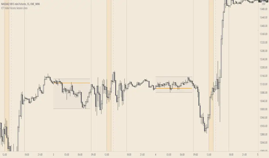
ICT Index Futures Session LinesICT Index Futures Session Lines
Description:
The script is based on one of ICT's concepts on trading Index Futures. The script lays out the daily range from an intraday basis.
Range:
00:00 - New York Midnight
08:30 – New York Open (News events come out)
12:00/13:00 - New York Lunch (No trade time period)
13:30 - (Algorithm)
16:30 - Close
* The open, high and low lines are plotted from 00:00 to 08:30
How To Use:
You will need to check the daily bias. Prior to 8:30 you are to look for previous swing points where liquidity may exist. During the open you want to see if a high or low is taken out, and then wait for an energetic break/displacement for a potential FVG/imbalance retracement entry.
Strategy is for LTF (1 to 15m)
Default time zone is set to America/New_York (UTC New York), so lines will be plotted correctly regardless of user’s local UTC chart setting.
Ticker SummaryTicker Summary provides at-a-glance summary information about a ticker near the current bar on the chart:
P/E ratio
Fwd P/E ratio
PEG ratio
Floating shares vs. total shares outstanding
% of trading volume that was short over the last 3 days
Average True Range (ATR) over last 14 days
There are a few less common items of information:
How many ATR multiples the ATR is extended over the last 10 bars. This gives an idea of how far the stock is currently extended.
"R-frequency", explained below.
An optional "ATR Reticule" is shown near the price. This is useful for traders that use ATR as a guideline for price targets and stop losses. On the left is the # of ATRs the stock is currently above the session open. On the right is the # of ATRs the stock is extended above the 10-bar moving average.
R-frequency: a measure of liquidity relevant to your own trading size. It is the frequency at which 1-R of your trading account is traded for a stock. Formula:
(1-R worth of shares) / (average dollar value traded per second), where:
"1-R worth of shares" is how many shares you would buy for a stop loss of -1 ATR, with max risk dollar value based on the Balance and Max Risk % indicator options.
"Average dollar value traded per second" is the 14-day average of (avg(high, low and close) * daily volume)
R-frequency of a second or less is very liquid. If the value is higher (for example, over 60 seconds) the stock is less liquid and you may have some trouble filling limit orders quickly.

Volumetric colored candles with matching pivot point linesCandles are split into 10 categories based on their volume, and can be changed in the options. By default and in the images, white is very high volume, reds are high volume, yellows are medium volume, greens are low and dark-grey is very low.
Adjustments for scale are included in the options. The Magnitude option is a 10x multiplier, so 1=10, 2=100, 3=1000, etc., up to 9. There is also a Multiplier selection option where 1=1, 2=2, 3=3, 4=4, etc.
To attenuate for a given chart, these multipliers will need to be changed. In general, all white means you need to increase the Magnitude and all dark-grey means you need to decrease the magnitude. Somewhere between those two, the Multiplier can be used for further calibration. All this color coating is relational, like a spectrum. As you adjust you will see them maintaining their proportions as the candles switch color (ex. green become yellow while yellow becomes red).
I have also included pivot lines that follow the same logic for color coding. Two options exist for adjusting the pivot high and pivot low points respectively. They do not always correspond to the exact color of the candle producing them, but they should be a rough average (ie. red and green bars making yellow lines). They make for good indicators of how much liquidity may be at a certain support/resistance level. The lines can also be turned off altogether.
If your candles aren't looking right, go to settings of both regular candles and heikin-ashi, and uncheck both border and wick.
I still have some code to clean up and I plan on expanding upon this study. If you like my work consider tipping!

Ravih Pro Momentum BreakoutThis is a Momentum Breakout Strategy on “DAILY Timeframe”
This Breakout Strategy is specially created for Momentum Traders and for Bursa Market. The learning applied here are derived from past market behavioural approach. It takes into account of recent strength of price action and volume.
However, it can be applied for other Exchanges as well; as long as the stock is active with unusual volume.
The Momentum Set-Ups Script is designed for Short Term traders as in 3 to 60 Trading Days holding period or unless and until Exit Signal appears. Sometimes it could extend longer depending on the pace of the Momentum.
It also caters the aggressive traders as in Buy Today Sell Tomorrow/Today (BTST) and Fast in Fast Out (FIFO). These are traders...usually looking for 5% to 7% or 12% gain in a short span of time. However, do take note; momentum stocks are explosive in their moves. Therefore one could maximise the Gain Ride until Exit/Sell Signal appears.
The Script provides you the best High-Probability Profitable Set-Up Entry. The system identifies the stock/s in action Right Now. It is a powerful strategy for trading both Fast and Slow Momentum Stocks.
The Momentum Script is built around 3 Primary Factors namely…
1. Volume
2. Price Action
3. Time
And 2 Secondary Factors namely…
1. Volatility
2. Liquidity
Buy Exit/Sell Arrows are triggered based on last candle bar closed. It plots automatically.
For Long
Light Blue Up Triangle denotes Buy at the Closing Price. Entry Price is Closing Price or with + or – 2% tolerance for the following market day.
For Exit/Sell
Orange Down Triangle denotes Exit to close any remaining position to free up capital. Or...
Red Down Triangle denotes Exit to close any remaining position to free up capital.
Either one of the arrow is Final.
For Setting Up Alerts
The user has the option to Setup Alerts for chart signals that is…for Long and for Exit/Sell.
For Demonstrative purpose...
I have on purpose chosen an O&G counter from a Cold Sector from MYX. This is a time of Pandemic. Therefore, choosing Technology or Glove and Healthcare Sectors would definitely reflect good performance. The idea here is to demonstrate that the Momentum Strategy application works on all market conditions anytime of the year.
Remember...
This strategy is only built for stocks. It is Not for Indices neither for any other financial instruments.
No SHORT signals in this strategy.

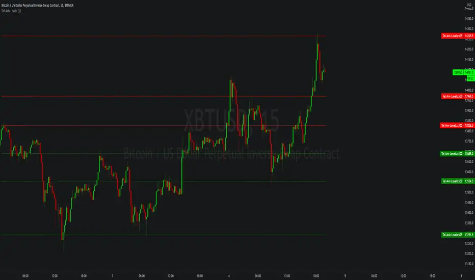
Tel Aviv LevelsSimple script that calculates static support/resistance levels for potential price reversals using a calculation for predicting liquidity from a base price, use in confluence with other technical analysis tools.
DM me on tradingview for access.
BTC/Fiat Volume Info for Altcoins: Quickly gauge liquidityBTC/Fiat Volume Info for Altcoins - Quickly gauge liquidity
On chart info that:
displays the daily Alt Coin volume in BTC if it is a BTC pair (or whatever the quote currency is)
displays the daily Alt Coin volume in USDT if it is a USDT pair (or whatever the quote currency)
displays the current timeframes volume for the above also.
each option can be configured on/off
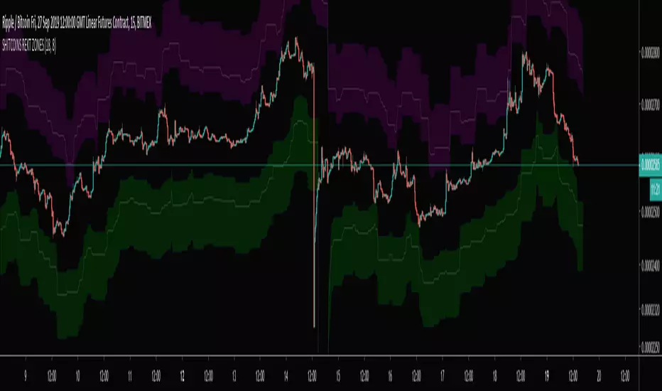
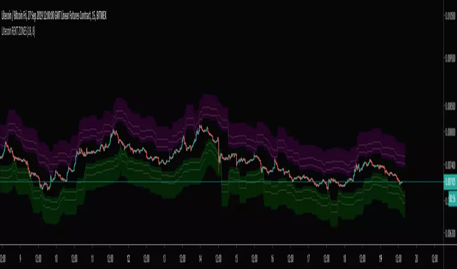
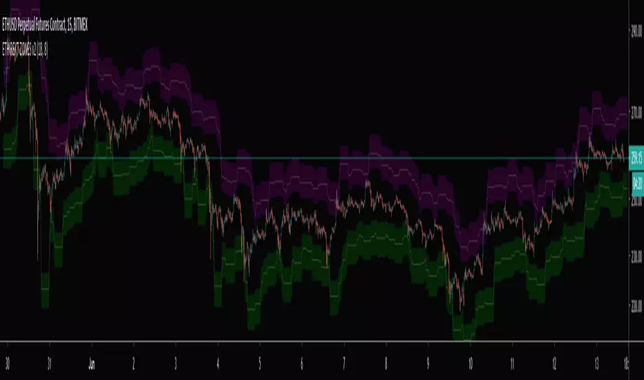
SHITCOINS REKT ZONESShitcoins(XRP, ADA, TRX, EOS, BCH) Bitmex Liquidity Zones. Best used on a 15 min chart.
Don't get REKT! Especially, on Shitcoins :)
TB!Guppy,Fib GMMA, VWap Resistance, Liquidity PoolThis is an assistive chart for the TB! Fibonacci Elliot Wave Oscillator indicator
It incorporates Fib Based fractalized GMMA , Liquidity Pool Theory and VWap based resistance zones.

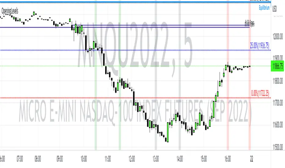
Opening Levels and ZonesThis indicator will show key weekly and daily opening levels including first and last hour trading zones. These will show NY Eastern Time zones only.
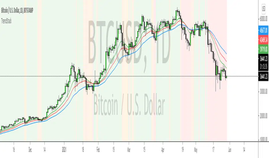
TrendStackTrendStack identifies Bullish, Bearish and Consolidation zones.
The indicator is based on 3 stacked moving averages.
The moving average periods can be changed accordingly under the user settings.
Currently all 3 periods are based on Fibonacci sequence and define short, intermediate and long term trends.
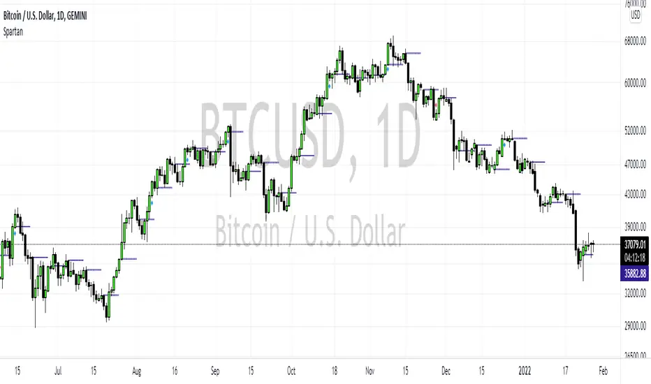
SpartanThe Spartan Strategy.
This is a momentum strategy which attempts to identify when buying pressure or selling pressure is present in the markets.
How to trade the long side:
Once a blue candle appears, enter Long on pullbacks into a blue candle for longs
Place your stop loss on the opposite side of the blue candle.
Target a previous high for longs
How to trade the short side:
Once a red candle appears, enter Short on pullbacks into a red candle for shorts
Place your stop on the opposite side of the red candle.
Target a previous low for shorts
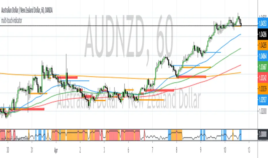
The Multi Touch Confluence Indicator SubplotThe Multi Touch EMA Confluence Indicator Subplot identifies zones where EMAs across 6 different time frames are within a specified range in proximity of the close value. These zones indicate confluence of EMAs.
The confluence zone is specified as a point difference.
When confluence is found, the indicator will paint vertical lines of different color and width.
Blue Zones indicate a confluence of 3 EMAs across all time frames
Orange Zones indicate a confluence of 4 EMAs across all time frames
Red Zones indicate a confluence of 5 or more EMAs across all time frames.
The maximum number of time frames being used is 6.
The maximum number of EMAs per time frame is 4.
When confluence occurs it usually indicates a precursor of price expansion. This indicator can be used to determine when momentum is about to come back into the market.

The Multi Touch EMA Confluence IndicatorThe Multi Touch EMA Confluence Indicator identifies zones where EMAs across 6 different time frames are within a specified range in proximity of the close value. These zones indicate confluence of EMAs.
The confluence zone is specified as a point difference.
When confluence is found, the indicator will paint horizontal lines of different color and width.
Blue Zones indicate a confluence of 3 EMAs across all time frames
Orange Zones indicate a confluence of 4 EMAs across all time frames
Red Zones indicato a confluence of 5 or more EMAs across all time frames.
The maximum number of time frames being used is 6.
The maximum number of EMAs per time frame is 4.
When confluence occurs it usually indicates a precursor of price expansion. This indicator can be used to determine when momentum is about to come back into the market.
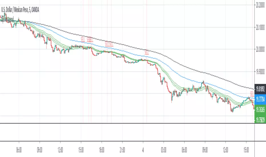
ap-fxit-trend-sysAP-FXIT-Trend Indicator
9/19/2019
The following system is designed to capture trend following moves in any market condition.
The system uses two stacked moving averages to filter long and short conditions.
The system uses an oscillator to time when to start looking for entries.
Buy and Sell signals are displayed on chart.
Alerts for BUY ONLY, SELL ONLY or BUY/SELL signals are available.
This system does not provide an alert on when to close positions.