Auto Fibonacci Retracement Levels MTFMulti Time Frame version of Auto Fibonacci Retracement Levels Indicator
Now you can see daily Fibo Retracement levels on any time frame
This indicator/tool (Auto Fibo) draws Fibonacci Retracement Levels automatically on any chart.
The algorithm of the Indicator Plots the extreme points and puts the retracement levels in order by itself with 100% sensitivity.
The key point is that to arrange the length of the "lookback bars" to arrange the correct extreme points.
Like the other auto plotting tools, the levels can change when the time frame of the chart changes, in contrast with manually drawn Fibo levels.
In technical analysis , a Fibonacci retracement is created by taking two extreme points (usually a major peak and trough) on a stock chart and dividing the vertical distance by the key Fibonacci ratios of 23.6%, 38.2%, 50%, 61.8% and 100%.
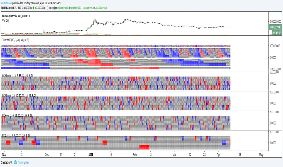
Cerca negli script per "mtf"

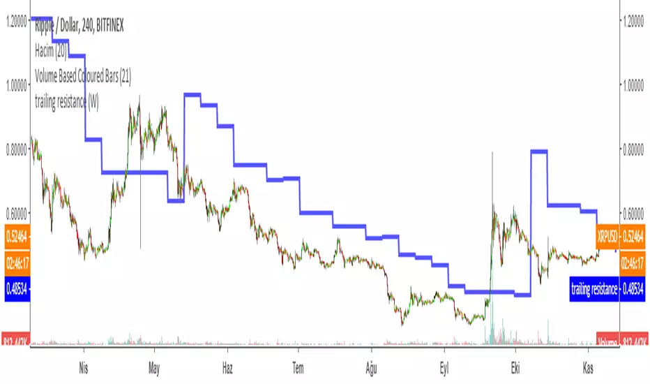
Trailing Resistance MTFTRAILING RESISTANCE INDICATOR is a helpful tool for traders to help one of the common problems that they face: where to buy/sell?
by using trailing resistance you can easily decide and see possible upward movements and understand if you are in a safe zone.
Using Trailing Resistance is just simple:
Go long/ Buy when price crosses above the indicator,
Stay on short position if prices are below the indicator.
The indicator is calculated from previous Lows and doesn't the value won't change until prices makes higher lows.
Multiple Time Frame Version of Trailing Stop Loss Indicator
Trailing Stop Loss Indicator by KıvanÇ fr3762
TRAILING STOP LOSS INDICATOR is a helpful tool for traders to help one of the greatest problems that they face: where to sell?
by using trailing stop loss you can easily decide and see possible downward movements and understand if you are in a safe zone.
Using Trailing Stop Loss is just simple:
Go short/ Sell when price crosses down the indicator,
Stay on long position if prices are above the indicator.
The indicator is calculated from previous Lows and doesn't the value won't change until prices makes higher lows.
Trailing Stop Loss MTFMultiple Time Frame Version of Trailing Stop Loss Indicator
TRAILING STOP LOSS INDICATOR is a helpful tool for traders to help one of the greatest problems that they face: where to sell?
by using trailing stop loss you can easily decide and see possible downward movements and understand if you are in a safe zone.
Using Trailing Stop Loss is just simple:
Go short/ Sell when price crosses down the indicator,
Stay on long position if prices are above the indicator.
The indicator is calculated from previous Lows and doesn't the value won't change until prices makes higher lows.
TURKISH EXPLANATION:
İz Süren Stop Loss İndikatörü
Adım 1- bu günün düşük fiyatından geriye doğru, daha düşük fiyatlı bir günle karşılaşıncaya kadar yatay bir çizgi çizin
bu sizin birinci countback’ iniz olacak.
Adım 2- bu yeni düşük günün düşük fiyatından geriye doğru tekrar bir başka düşük güne gelene kadar yatay bir çizgi
çekin. Bu sizin ikinci countback’ iniz olacak.
Adım 3- bu ikinci düşük günün düşüğünden ileri bu günkü tarihe kadar yatay bir çizgi çekin bu sizin talimat
verdiğinizde stop-loss noktanız oluyor.
Kural 1- asla aşağıya doğru stop koymayın. Eğer yeni stop-loss noktanız öncekinden daha düşükse onu atıyorsunuz.
Bu kural asla bozulmamalı.
Kural 2- countback çizginiz üzerindeki aynı düşük fiyata denk gelen günleri yok sayın. İkinci contback çizginizi çekmek
için ilkinden daha düşük bir nokta bulmalısınız. Eğer aynı düşük fiyata sahip bir çubuğa denk gelirseniz daha düşüğünü
buluncaya kadar devam edin. Gerçekten hepsi bu kadar. Bu kuralları uygulayarak stop-loss noktamızı her yeni günün
datası eklendikçe uzatabiliriz.
drive.google.com

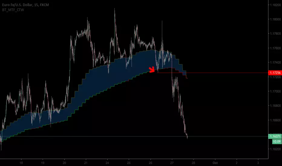
Tillson T3 Moving Average MTFMULTIPLE TIME FRAME version of Tillson T3 Moving Average Indicator
Developed by Tim Tillson, the T3 Moving Average is considered superior -1.60% to traditional moving averages as it is smoother, more responsive and thus performs better in ranging market conditions as well. However, it bears the disadvantage of overshooting the price as it attempts to realign itself to current market conditions.
It incorporates a smoothing technique which allows it to plot curves more gradual than ordinary moving averages and with a smaller lag. Its smoothness is derived from the fact that it is a weighted sum of a single EMA , double EMA , triple EMA and so on. When a trend is formed, the price action will stay above or below the trend during most of its progression and will hardly be touched by any swings. Thus, a confirmed penetration of the T3 MA and the lack of a following reversal often indicates the end of a trend.
The T3 Moving Average generally produces entry signals similar to other moving averages and thus is traded largely in the same manner. Here are several assumptions:
If the price action is above the T3 Moving Average and the indicator is headed upward, then we have a bullish trend and should only enter long trades (advisable for novice/intermediate traders). If the price is below the T3 Moving Average and it is edging lower, then we have a bearish trend and should limit entries to short. Below you can see it visualized in a trading platform.
Although the T3 MA is considered as one of the best swing following indicators that can be used on all time frames and in any market, it is still not advisable for novice/intermediate traders to increase their risk level and enter the market during trading ranges (especially tight ones). Thus, for the purposes of this article we will limit our entry signals only to such in trending conditions.
Once the market is displaying trending behavior, we can place with-trend entry orders as soon as the price pulls back to the moving average (undershooting or overshooting it will also work). As we know, moving averages are strong resistance/support levels, thus the price is more likely to rebound from them and resume its with-trend direction instead of penetrating it and reversing the trend.
And so, in a bull trend, if the market pulls back to the moving average, we can fairly safely assume that it will bounce off the T3 MA and resume upward momentum, thus we can go long. The same logic is in force during a bearish trend .
And last but not least, the T3 Moving Average can be used to generate entry signals upon crossing with another T3 MA with a longer trackback period (just like any other moving average crossover). When the fast T3 crosses the slower one from below and edges higher, this is called a Golden Cross and produces a bullish entry signal. When the faster T3 crosses the slower one from above and declines further, the scenario is called a Death Cross and signifies bearish conditions.
I Personally added a second T3 line with a volume factor of 0.618 (Fibonacci Ratio) and length of 3 (fibonacci number) which can be added by selecting the box in the input section. traders can combine the two lines to have Buy/Sell signals from the crosses.
Developed by Tim Tillson

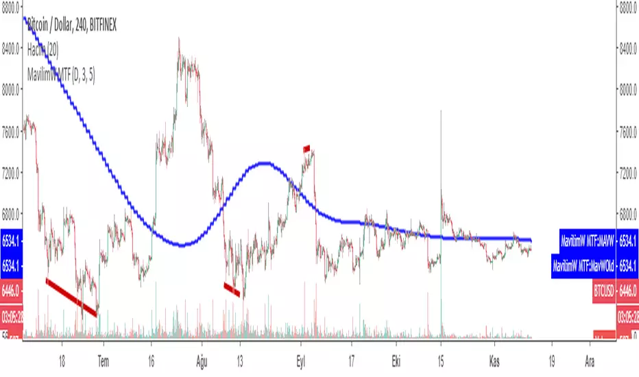
MavilimW MTFMultiple Time Frame version of MavilimW
This Indicator plots smoothed weighted moving average combinations of various Fibonacci numbers
a great support and resistance for long term trading and confirmation
1- You can change the sensitivity of the indicator by changing the first two parameters
2- In the settings you can also add the original version by checking the "Show previous version" button
3- The indicator calculates Fibonacci series automatically when you change the two parameters
HINT: first parameter must be equal or less then second
some examples: 1,1 or 1,2 or 2,3 or even 5,5 and so on...
by increasing the parameters the indicator becomes less sensitive for buy and sell signals but will have high potential of becoming support or resistance line
by decreasing the parameters you can have more sensitive buy an sell signals which changes the color of the indicator.
MAVİLİMW İNDİKATÖRÜ TÜRKÇE ANLATIM VİDEO LİNK:
MavilimW indikatörün MTF (çoklu Zaman Aralıklı) versiyonu
YENİLİKLER:
1-HASSASİYETİ ARTIRILIP AZALTILABİLİR
2-TRADİNGVİEWDA ESKİ VERSİYON DA EKLENEBİLİR KUTUCUK İŞARETLENEREK
3-BELİRLEYECEĞİNİZ 2 PARAMETREYE GÖRE DEVAM EDEN FIBONACCI SERİSİNİ KENDİSİ OTOMATİK OLUŞTURUR.
Alternate Time Frame(multiple time frame, MTF) Moving Average(J)This indicator is intended to highlight moving average (MA) for multiple timeframe(MTF).
Feel free to change them as you normally do on moving average index.
Please note that you can select up to 4 higher time frame,
just make sure that your current timeframe is the smallest one.

CCI MTF: Multi-timeframe CCIThis script can be quite useful to get a quick glance at momentum readings in the 3 main timeframes I use: Daily, Weekly and Monthly.
It helps, together with RgMov and the MTPC tool, to know how a market is moving and what to expect, without having to cycle through two or three timeframes constantly.
Cheers,
Ivan Labrie.


Ultimate Money Flow (UMF), Stoch, Multi Time Frame (MTF) [cI8DH]This indicator adds stochastic, multi time frame, signal line, histogram, and bar coloring options to my previous indicators. It can also replicate standard Money Flow Index ( MFI ), Chaikin's Accumulation/Distribution Line ( ADL ), On Balance Volume ( OBV ) and Price-Volume Trend ( PVT ). This indicator can be used for analyzing momentum, buy/sell pressure, overbought/oversold conditions, and trendiness/choppiness, as well as identifying swings (stoch). Chart below shows example multi-TF setup with bar coloring.
For analyzing price, I made a similar indicator based on Absolute and Relative Strength Indices, which you can find in the link below.
Equation
Here is part of the code used in the script: pastebin.com
Standard MFI, OBV, ADL and PVT
To validate the calculations, I stacked UMF on MFI, OBV, ADL, and PVT in the chart below (100% overlaps validate the calculations). It also shows how you can replicate these indicator if you'd like to use them, or if you want to make your own custom indicator by combining features from different indicators. I do not recommend MFI, ADL or OBV; read "why invent a new indicator" section below. (bear in mind that MFI scale is 0-100, while UMF scales is -100 to 100)
Money Flow based on "Balance of Power" (this is the default mode)
Balance of Power (BoP) equation is: (close - open) / (high - low)
In my opinion, BoP is the most accurate equation to measure the amount of volume accumulated or distributed. I used BoP in my previous open source indicators ADV , ADL , ADP and ADMF . I applied the "True Range" fix to BoP equation similar to what Twiggs did on CMF .
Aggregation Method
By changing aggregation methods, you can replicate my previous indicators which are also linked at the bottom of this page. Please read more about their applications in their respective pages.
aggregation method = Cumulative => ADL indicator: accumulation/distribution (price factoring should be turned off)
aggregation method = MA => ADMF indicator: accurate buy/sell pressure, momentum and divergence
aggregation method = MA Percent => ADP indicator: overbought/oversold conditions, buy/sell pressure, momentum and divergence, failure swings
Smoothing, signal line and histogram to detect trend and choppiness
You can apply additional smoothing to UMF. Also, you can add a signal line and histogram (histogram is the difference between main line and signal line). To do so, set the signal length to a number greater than one. Signal line can help you detect changes in trend similar to the signal line on MACD. If signal line criss-crosses UMF, it shows market is choppy. The worst case is when this criss-crossing coincides with UMF flattening near neutral line and histogram height is short; that means market is ded (until it is not; expansion following a contraction period is a common phenomena)! (Bear in mind that histogram will not show in stoch mode.)
Stochastic
To enable stoch, change the stoch length to a number greater than 1 (default stoch length for the built-in stoch RSI is 14). This length should be calibrated depending on TF and asset. If done correctly, it can be a powerful tool for identifying swings. Stoch can be combined with any aggregation method. I recommend using stoch with MA or cumulative aggregation methods. For conventional uses of stochastic, please read www.tradingview.com(STOCH) and www.tradingview.com(STOCH_RSI).
Experimental Bar coloring Feature
There is an option to color bars depending on UMF's position relative to the signal line. If both TFs are used in coloring and they are in disagreement, the TF with greater histogram height wins. There are two shades of green and red. The darker shade means both TFs agree. If you use the signal line, bar coloring can help with calibrating the indicator (play with parameters until you see a good looking chart i.e. a lot of green candles followed by a lot of red candles in a row). Please note that bar colors might change until candle(s) close(s). The bar coloring rules will most likely change in the future.
Notes
- Uncheck "Factor Price" for Bitmex or any other exchange that shows volume in terms of money.
- UMF is a replacement to ADP , ADMF and ADL , so no more updates for the old indicators!
- Smooth MA length N = EMA length 2*N-1
- Combined tickers, e.g. (COINBASE:BTCUSD+BITSTAMP:BTCUSD+KRAKEN:XBTUSD)/3, can mitigate inconsistency issues between different exchanges (I recommend not mixing USD and USDT pairs together)
Why invent a new indicator
I have spent a great deal of time to find the best equation that represents accumulation/distribution. Each of the well-known methods have a major flaw.
- Winner-take-all problem
MFI, OBV and to some extent Williams AD assign accumulation or distribution based on the direction of change in price. They don't account for the amount of change. That means the indicator does not differentiate between a full candle and a doji candle.
- Extreme divergence problem
Chaikin tried to avoid winner-take-all problem. However, he ended up with a solution that, in my opinion, is even worse. A big flaw of Chaikin's indicators is that they can diverge too much from price. Most responsive indicators in this class, require at least two candles to diverge from price, but CMF/ADL can diverge in a single candle. Chaikin used the same component ( aka Chaikin's money flow multiplier) in both CMF and ADL. CMF 's flaws may not be as visible because it is a normalized oscillator. However, this common flaw is more evident in accum/dist indicator which keeps all past information in its memory. As you can see in the chart below, accum/dist is constantly rising during an obviously distribution period.
ADV (Volume)
ADP
ADMF
ADL
Please give a like, and share the interesting configurations you find in the comments.

Ultimate Strength Index (USI),Stoch Multi Time Frame(MTF)[cI8DH]Ultimate Strength Index ( USI ) adds stochastic, multi time frame, signal line, histogram, and bar coloring options to RSI and Absolute Strength Index ( ASI ) . It can also turn into an indicator similar to Awesome Oscillator/MACD line. This indicator can be used for analyzing momentum and trendiness/choppiness, as well as identifying swings (stoch). The fix applied in True RSI is also applied here. Chart below shows example multi-TF setup with bar coloring.
For analyzing volume, I made a similar indicator based on money flow and accumulation/distribution, which you can find in the link below.
Aggregation Method
aggregation method = MA Percent => True RSI: momentum and divergence, failure swings
aggregation method = MA => Absolute Strength Index: accurate momentum and divergence
aggregation method = Cumulative => Awesome Oscillator alternative : momentum and divergence, twin peaks, ... (set the smoothing to 5 and signal length to 29ish)
Smoothing, signal line and histogram to detect trend and choppiness
You can apply additional smoothing to USI . Also, you can add a signal line and histogram (histogram is the difference between main line and signal line). To do so, set the signal length to a number greater than one. Signal line can help you detect changes in trend similar to the signal line on MACD. If signal line criss-crosses USI , it shows market is choppy. The worst case is when this criss-crossing coincides with USI flattening near neutral line and histogram height is relatively short; that means market is ded (until it is not; expansion following a contraction period is a common phenomena)! (Bear in mind that histogram will be hidden in stoch mode, and main and signal lines will be hidden in cumulative mode)
Stochastic
To enable stoch, change the stoch length to a number greater than 1 (default stoch length for the built-in RSI stoch is 14). This length should be calibrated depending on TF and asset. If done correctly, it can be a powerful tool for identifying swings. Stoch can be combined with any aggregation method. I recommend using stoch with MA aggregation (i.e. ASI ). For conventional uses of stochastic, please read www.tradingview.com(STOCH) and www.tradingview.com(STOCH_RSI).
Experimental Bar coloring Feature
There is an option to color bars depending on USI's position relative to the signal line. If both TFs are used in coloring and they are in disagreement, the TF with greater histogram height wins. There are two shades of green and red. The darker shade means both TFs agree. If you use the signal line, bar coloring can help with calibrating the indicator (play with parameters until you see a good looking chart i.e. a lot of green candles followed by a lot of red candles in a row). Please note that bar colors might change until candle(s) close(s). The bar coloring rules will most likely change in the future.
Notes
- Smooth MA length N = EMA length 2*N-1
- With correct settings, you can also create an alternative to normalized MACD line in the cumulative mode.
True RSI
Absolute Strength Index
Please give a like, and share the interesting configurations you find in the comments.

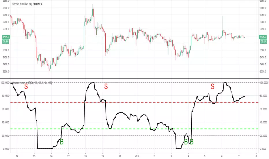
Volumezones-mtfso adding MTF function to the volumezone indicator make it nicer
i suggest that you play with setting untul you find best optimazation (here it set to one hour graph with 120 min time frame)
you can put the exit on 90 instead of 70 for better result
so have fun
BullTrading MTF Chaos Trend WaveRecently I have received very positive private messages about the "BullTrading MTF Chaos Trend Wave"
So I decided to add Multi Time Frame capabilities. For example, for intraday trading (15') you can use the 240´timeframe as a reference for choosing your technical bias.
If you are not familiar with the previous version BullTrading Chaos Trend Wave is used to trade fractal breakouts like the "Alligator"
The difference is that it combines smoothed and reactive algorithms to plot nice moving averages for trend recognition but at the same time filtering the most significant fractals for reversal levels.
Note: Modifying the standard settings except for the timeframe resolution is not recommended

{CDT} v1.0 - MTF Fibonacci RSIMulti Timeframe Fibonacci RSI.... **HIGHLY EXPERIMENTAL**
To show retracement potential, squeeze's, support and resistance, overbought and oversold levels... super filtered too... a new RSI! Regular RSI shown on the chart for comparison.
* This is a crazy indicator that is still under development so use at your own risk, i'm putting this out here because i'd like feedback and its been a good leading indicator so far.

RSI/Stoch/SRSI MTF COMBOThis combo-indicator is based on @ChrisMoody 's RSI and Stoch MTF original scripts.
It gives traders the possibility to overlay RSI, Stochastic and SRSI as well as to see how each element is behaving on a higher/lower TF.
RSI, Stoch and SRSI can be individually configured as well as turned on/off by the user.
Overbought/Oversold and Middle lines are available but only the formers can be configured by the user - Middle Line is fixed at 50.
This indicator is open source and free to use. Feel free to change it around to suit your needs.
***If you copy & paste the script, please remember to credit Chris Moody for his amazing work.***
Happy trading!

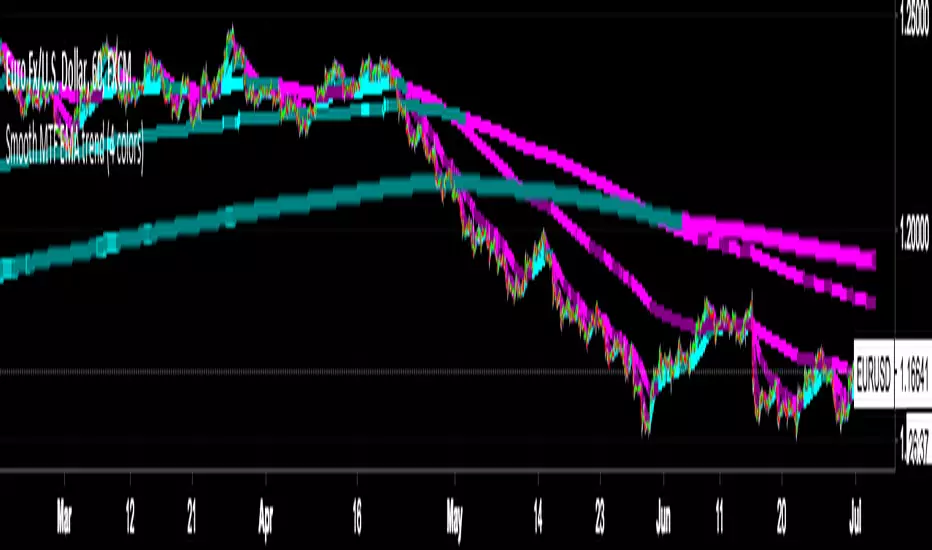
Smooth MTF EMA trend (4 colors)It's EMA20 on multi-timeframe but the line is smoother than original MTF line.
Support timeframe is: 1m 5m 15m 30m 1h 4h 1d 3d 1w.
Trend color:
strong up > aqua
weak up > teal
strong down > fuchsia
weak down > purple

STOCH MTF with Moving AverageBasic STOCH indicator with MTF support with moving average
USE EMA Cross with Stoch for buy / sell signal

RSI MTF with Moving AverageClassic RSI with MTF combined with its moving average (i reused a function to allow you to select any of them you want) for additional signals.
Indicator is based on this source: medium.com

2xRSI 2xEMA MTFThis is an MTF indicator with:
2 custom RSI's
2 custom EMA's
All can be toggled on and off
2nd RSI can be set to a different Timeframe than used on the chart
2nd EMA, dito.