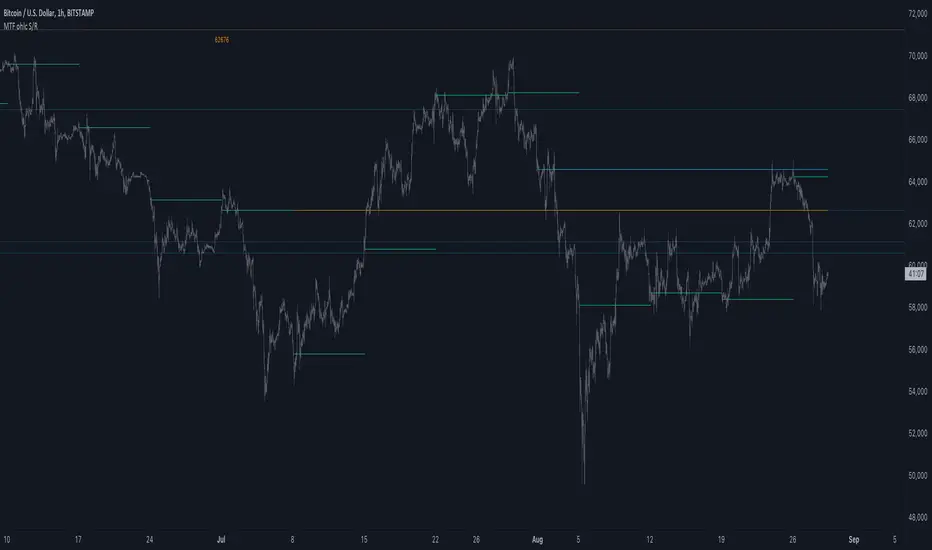
MTF ohlc S/RA very simple idea, a close (or high, low, ohlc4 or open) from a higher Time Frame
will give future Support/Resistance area's
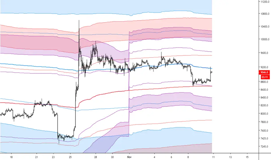
In this example of BTC/USD we see:
- Yearly close 2017 gave Resistance in June 2019
- Yearly close 2018 gave Support in March 2020
We are now pushing to the Resistance of Yearly close 2019...
Since there is a limit for the amount of lines (since it is just too much if everything is plotted)
there are different options:
- 4 different Time Frames, each can be enabled/disabled,
- TF can be chosen,
- source can be changed (close, open, high, low, ohlc4)
- Period can be changed, for example TF Month:
You can choose just to show a particular year, Month,...
You also can choose between which prices you want to see lines,
for example Monthly close, since the beginning till now, but only between $6000 - $8000:
This helps to know the closest S/R around the present price
Other example:
- Lines can be extended to the right, or not
- Labels can be enabled/disabled:
- Linewidth and brightness of the line can be changed, also the style (solid, dashed or dotted line)
Default only 2 very high TF's are enabled (3 Month = one quarter, and 1 Year)
The 3 Month has a dotted line, which helps distinguish the line against the yearly line
- Prices above 1000 are rounded since it seems distracting to see for example 6478,878654,
seems better just to see 6479, prices below 1000 are just seen as intended
Have fun!
Cerca negli script per "mtf"
MTF Rainbow RSIRSI with cloud trend EMA ..
RSI changes colors based on value ..
20 and under = red
21 to 30 = orange
31 to 39 = yellow
40 to 59 = green
60 to 69 = lime
70 to 79 = yellow
80 and over = red

mtf b zonesThese zones helps to do intraday, short term & long term. The blue lines are for intraday. The small green and red dotted lines are for weekly. The large green and red dotted lines are for monthly. use this along with price action trading. Best wishes. Thank you....
MTF Nested BB w/ Reversal SignalsNested BB with 1 Dev line and 2/3 Dev Cloud
Threshold signal indicating strong / extended move in direction ..
Reversal signal indicating potential reversal ..
Color / direction coated based on band that is extended .. band that price is reversing towards ..


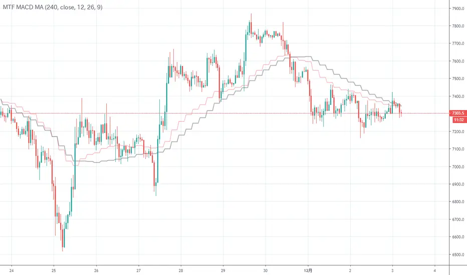
MTF MACD MAI calculated MACD backward and wrote it on the main chart.
The signal line on the upper leg looks good
MACDを逆算してメインチャートに書いてみました。
上位足のシグナルラインが良い感じですね
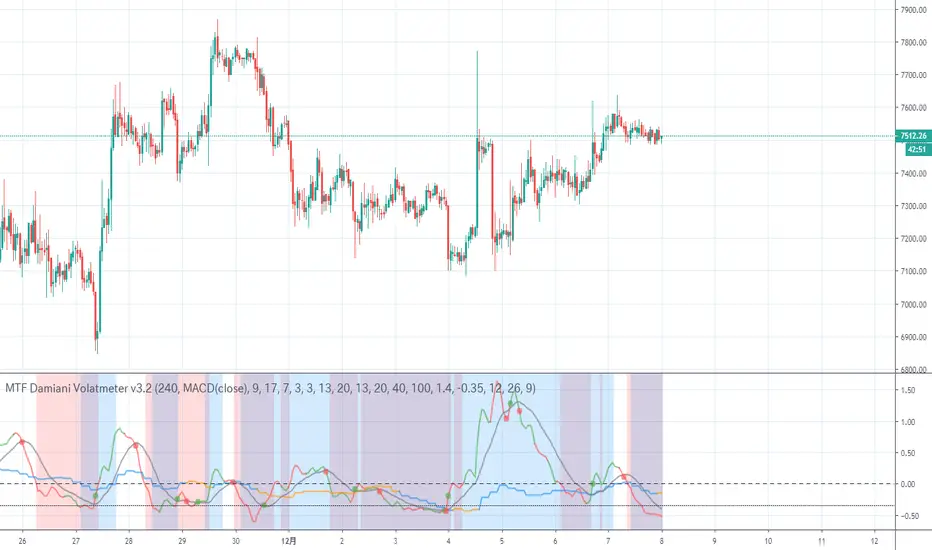
MTF Damiani Volatmeter v3.2Damiani_volatmeter.mq4 v3.2 |
Copyright © 2006,2007 Luis Guilherme Damiani |
It is a transplant of an indicator to judge the range market price.
The original is judged by the two curves, but this indicator shows the difference between the two curves.
If it is 0 or less, it can be judged as a range.
The red and green lines show the strength of this hourly trend, and if the range is below zero, the background is painted red.
The blue and orange lines indicate the strength of the trend of the upper leg, and if the market price is below zero, the background is painted blue.
I think that the background color will be purple if the market price is both strong and below zero.
レンジ相場を判定するインジケーターを移植したものです。
本来のものは2本の曲線で判断するのですが、このインジケーターでは2本の曲線の差を表示しています。
0以下ならレンジと判定できます。
赤と緑の線はこの時間足のトレンドの強さを示し、ゼロ以下のレンジ相場なら、背景を赤く塗っています。
青とオレンジ色の線は上位足のトレンドの強さを示し、ゼロ以下のレンジ相場なら、背景を青く塗っています。
両方ゼロ以下の強いレンジ相場なら背景色が紫色のなると思います。
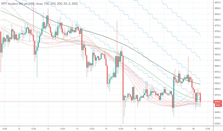
MTF modern MA set
HMA has a unique movement.
I created it because I feel something competent when I try to roll.
Since the price of the purple circle has exceeded the red bundle of HMA, the six red bundles of HMA are twisted in the blue square.
The purpose here is to reverse the tension at the heart.
It is a loss cut because it seems that the trend will continue when it falls below the red bundle completely.
Judging by HMA alone, we may meet a fool, so the JMA on the green line and the SSMA on the black line are further displayed.
We believe that it can be used for short-term downtrends as the green line breaks through JMA.
Furthermore, it is possible to improve the prediction accuracy considering the set of upper legs.
HMAは独特な動きをします。
トレ転するとき、なんか有能な気がしましますので作成しました。
紫丸の部分で価格がHMAの赤束を上抜けてから、青の四角の部分でHMA6本の赤い束が捻じれています。
ここで、ハートの場所で逆張りするのが目的です。
赤束を完全に下抜けた時はトレンド継続と思われますので損切りです。
HMAだけで判断すると騙しに会う場合がありますので、緑線のJMAと黒線のSSMAをさらに表示しています。
緑線のJMA突破で下落トレンドのショートの利確に使えると考えています。
さらに上位足のセットを考慮して予想精度上げることが可能です。
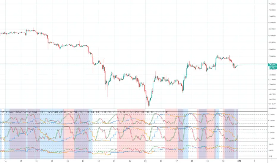
MTF multi Stochastic and RSI + DVIt is an indicator that it is going to see stochastic, stochast RSI, RSI, and Damiani Volatmeter v3.2 at a stretch.
In order from the top, stochastic, stochastic RSI, and RSI.
Due to the specifications of pine, the overall numerical value is +200 for stochastic and +100 for stochastic RSI.
The line that the current foot displays in two colors, green and red, and the signal gray line. This is a line with the upper legs displayed in blue and orange.
Damiani Volatmeter v3.2 is displayed in the background color.
Red is when the current foot is in the range market, blue is when the upper foot is in the range market. In the case of both ranges, the colors will overlap and become purple.
It was created with the idea that it might be relatively safe if you reverse the tension when the color of the stochastic changes in the purple area.
ストキャスティック、ストキャスRSI、RSI、Damiani Volatmeter v3.2を一気に見ようというというインジケーターです。
上から順番にストキャスティック、ストキャスRSI、RSIとなっています。
pineの仕様上、全体の数値が、ストキャスティックが+200、ストキャスRSIが+100となっています。
現在の足が緑と赤の2色で表示している線とシグナルの灰色の線。上位足が青とオレンジ色で表示している線です。
Damiani Volatmeter v3.2はバックグランドの色で表示しています。
赤色が現在の足がレンジ相場の場合、青色が上位足がレンジ相場の場合です。両方レンジ相場の場合は色が重なって紫色になると思われます。
紫色の所でストキャスティックなどの色が変わった時に逆張りをすれば比較的安全かもしれないという考えで作成しました。
MTF VWAP WITH STDEVSThis script displays multiple standard deviations for multiple vwaps. It also has options to use custom methods of calculating standard deviations.

MTF CMO (Chande Momentum Oscillator)Simple Multi-Timeframe version of the Chande Momentum Oscillator . Many thanks to HPotter whos script I used as a starting point. This displays 1, 2, 3, 4, and 24 period CMOs on the graph. 1, 2, 3, and 4 periods are smoothed by using their simple moving averages. 24 period is unsmoothed. I prefer to set my chart to a 1 hour timeframe and look for bottoming or topping patterns in the momentum. Strongest topping or bottoming patterns are when all timeframes roll over including the 24 period.

MTF-TTP-SThis indicator makes it easy to identify the trend transition and OHLC-ZONE. Use it as a hint to validate the Dow theory.


MTF Ichimoku Cloud(tandoori_chicken)通常の一目均衡表に加え、1つ上の主要時間足の一目均衡表をプロットします。
これにより、上位時間足を常に意識した立ち回りとなります。

MTF-COLORFUL_PivotsIt's a pivot indicator that can analyze multiple time frames at once. Use it as a hint to validate SR-ZONE.


MTF H/L RangeThis indicator will let you have multiple timeframe support and resistance levels on any timeframe!

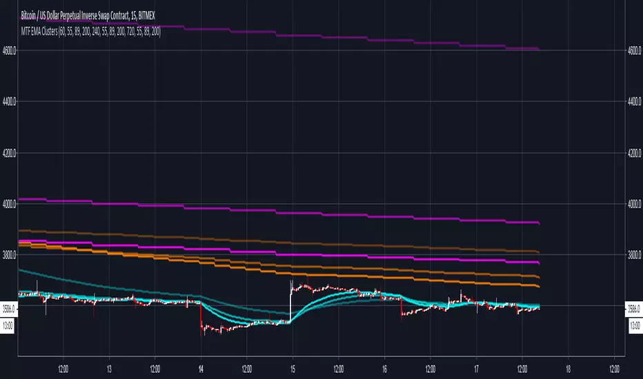
MTF EMA ClustersThis indicator can display three different timeframe EMA clusters simultaneously.
The default timeframe of three EMA clusters is 1 hour, 4 hours, 12 hours, and each EMA cluster contains three lines: ema55, ema89 and ema200, respectively.
In addition, this script supplys user to customize EMA cluster 1 whether to use the current timeframe and whether to display EMA cluster 2 and EMA cluster 3.