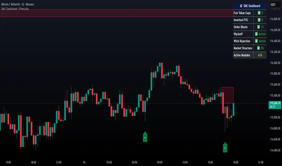
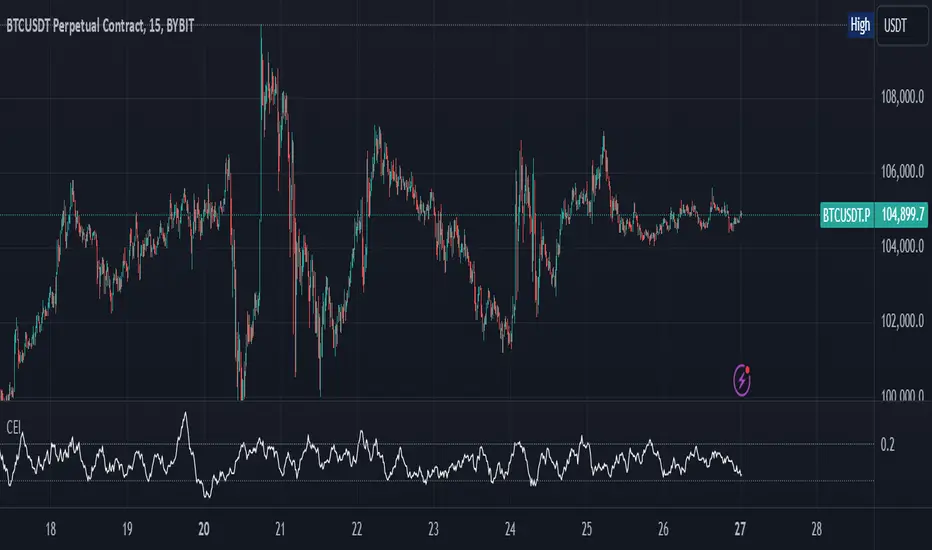
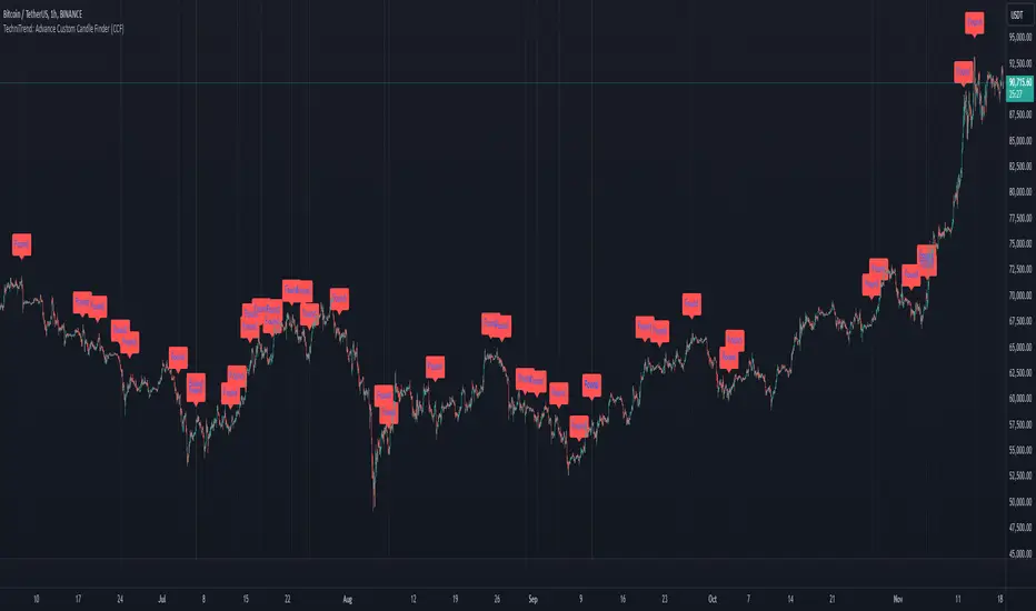
Crypto Mean Reversion System (Pullback & Bounce)Mean Reversion Theory
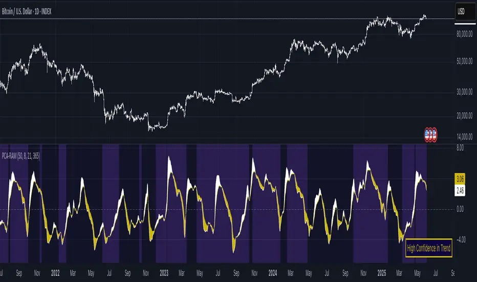
The indicator operates on the principle that extreme price movements in crypto markets tend to revert toward their mean over time.
Consider this a valuable aid for your dollar-cost averaging strategy, effectively identifying periods ripe for accumulating or divesting from the market.
Research shows that:
Short-term momentum often persists briefly after surges, but extreme moves trigger mean reversion
Sharp drops exhibit strong bounce patterns, especially after capitulation events
Longer timeframes (7-day) show stronger mean reversion tendencies than shorter ones (1-day)
Timeframe Analysis
1-Day Timeframe
Pullback probabilities: 45-85% depending on surge magnitude
Bounce probabilities: 55-95% depending on drop severity
Captures immediate overextension and panic selling
More volatile but faster signal generation
7-Day Timeframe
Pullback probabilities: 50-90% (higher confidence)
Bounce probabilities: 50-90% (slightly moderated)
Filters out noise and identifies sustained trends
Stronger mean reversion signals due to extended moves
Probability Tiers
Pullback Risk (After Surges)
Moderate (45-60%): 5-10% surge → Expected -3% to -12% pullback
High (55-70%): 10-15% surge → Expected -5% to -18% pullback
Very High (65-80%): 15-25% surge → Expected -10% to -25% pullback
Extreme (75-90%): 25%+ surge → Expected -15% to -40% pullback
Bounce Probability (After Drops)
Moderate (55-65%): -5% to -10% drop → Expected +3% to +10% bounce
High (65-75%): -10% to -15% drop → Expected +6% to +18% bounce
Very High (75-85%): -15% to -25% drop → Expected +10% to +30% bounce
Extreme (85-95%): -25%+ drop → Expected +18% to +45% bounce
The probability ranges are derived from:
Crypto volatility patterns: Higher volatility than traditional assets creates stronger mean reversion
Behavioral finance: Extreme moves trigger emotional trading (FOMO/panic) that reverses
Historical backtesting: Probability estimates based on typical reversion patterns in crypto markets
Timeframe correlation: Longer timeframes show increased reversion probability due to reduced noise
Key Features
Dual-direction signals: Identifies both overbought (pullback) and oversold (bounce) conditions
Multi-timeframe confirmation: 1D and 7D analysis for different trading styles
Customizable thresholds: Adjust sensitivity based on asset volatility
Visual alerts: Color-coded labels and table for quick assessment
Risk categorization: Clear severity levels for position sizing
Indicatore Pine Script®