Range Trends Enhanced (eleven11)This indicator automatically draws your Range Trend lines based upon your timeframe. When you select a timeframe, in the options, those lines will be locked in, whenever you switch timeframes on the chart. This allows you to "lock in" a timeframe's trendlines and then view it on different timeframes. But if you want to view the current trendlines for a timeframe then you need to select that "lockdown" timeframe in the settings. The original code was created by eleven11
Cerca negli script per "range"

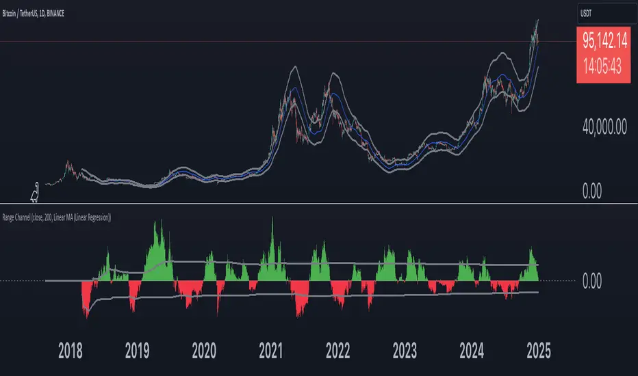
Range Channel by Atilla YurtsevenThis script creates a dynamic channel around a user-selected moving average (MA). It calculates the relative difference between price and the MA, then finds the average of the positive differences and the negative differences separately. Using these averages, it plots upper and lower bands around the MA as well as a histogram-like oscillator to show when price moves above or below the average thresholds.
How It Works
Moving Average Selection
The indicator allows you to choose among multiple MA types (SMA, EMA, WMA, Linear Regression, etc.). Depending on your preference, it calculates the chosen MA for the selected lookback period.
Relative Difference Calculation
It then computes the percentage difference between the source (typically the closing price) and the MA. (diff = (src / ma - 1) * 100)
Positive & Negative Averages
- Positive differences are averaged and represent how far the price typically moves above the MA.
- Negative differences are similarly averaged for when price moves below the MA.
Range Channel & Oscillator
- The channel is plotted around the MA using the average positive and negative differences (Upper Edge and Lower Edge).
- The “Untrended” histogram plots the difference (diff). Green bars occur when price is above the MA on average, and red bars when below. Two additional lines mark the upper and lower average thresholds on this histogram.
How to Use
Identify Overbought/Oversold Zones: The upper edge can serve as a dynamic overbought level, while the lower edge can suggest potential oversold conditions. When the histogram approaches or crosses these levels, it may signal price extremes relative to its average movement.
Trend Confirmation: Compare price action relative to the channel. If price and the histogram consistently remain above the MA and upper threshold, it could indicate a stronger bullish trend. If they remain below, it might signal a prolonged bearish trend.
Entry/Exit Timings:
- Entry: Traders can look for moments when price breaks back inside the channel from an extreme, anticipating a mean reversion.
- Exit: Watching how price interacts with these dynamic edges can help define stop-loss or take-profit points.
Because these thresholds adapt over time based on actual price behavior, they can be more responsive than fixed-percentage bands. However, like all indicators, it’s most effective when used in conjunction with other technical and fundamental tools.
Disclaimer
This script is provided for educational and informational purposes only. It does not guarantee any specific outcome or profit. Use it at your own discretion and risk.
Trade smart, stay safe.
Atilla Yurtseven
Range of body 30min avggives the average range of the past 30bars and indicates when a candle's body is greater than 150% the average.

Range of a source displayed in thirdsThis indicator will take the value of any external source input and display how it has changed over time (the lookback period in settings). For the purposes of display here I'm using the WT1 line from Wavetrend with Crosses by LazyBear to provide a source input.
The highest and lowest value of the source over the lookback period are used to determine the highest and lowest point - the green and red lines at the top and bottom of the bands. This region is then mathematically split into three, such that the source (and its optional moving average line) can be defined as being in the top third, the middle or the bottom third.
Applications for this could be in risk management where you may wish to take on a larger position size when a certain indicator is in the top third, or decide that you want to enter / leave positions when the source crosses in / out of the extreme points.

Range Identifier*Re-upload as previous attempt was removed.
An attempt to create a half decent identifier of when the markets are ranging and in a state of choppiness and mean reversion - as opposed to in trending trade conditions.
It's super simple logic just working on some basic price action and market structure operating on higher time frames.
It uses the Donchian Channels but with hlc3 data as opposed to high/lows - and identifies periods in which the baseline is static, or when the channel upper & lower are contracting.
This combination identifies non trending price action with decreasing volatility, which tends to indicate a lot of upcoming chop and ranging/sideways action; especially when intraday trading and applied on the daily timeframe.
The filter increasing results in a decrease of areas identified as choppy by extending the required period of a sideways static basis, I've found values of 2 or 3 to be a nice sweetspot!
Overall should be pretty intuitive to use, when the background changes just consider altering your trading and investing approach. This was created as I've not really seen anything on here that functions quite the same.
I decided to not include the Donchian upper/lower/basis as I found that can often lead to decision bias and being influenced by where these lines are situated causing you to guess on future direction.
It's obviously never going to be perfect, but a nice and unbiased way to quickly check where we may be in a cycle; let me know if there are any issues/questions and please enjoy!

Range SlicerThis is a tool I quickly put together to work along side of my round number and Quarter Theory Scripts. This script allows you to set a price range between to values and slice them up into equal price zones. Happy Trading!
Range MarkerThis indicator is built for chart traders.
When using price and action to trade, you need to keep the chart scale the same.
So this indicator will help you to mark the range you choose.
Let you keep precise when reading the chart.
Enjoy it!
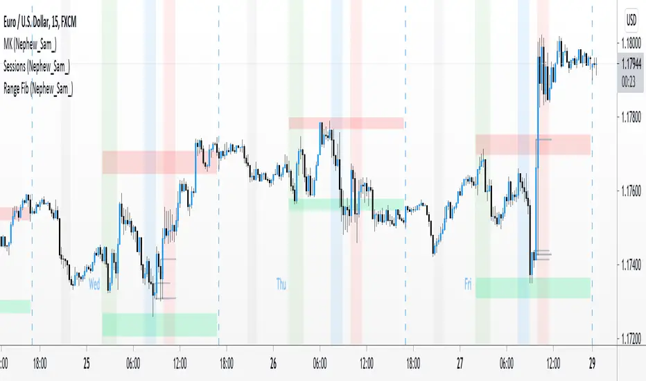
Range Fib (Nephew_Sam_)This indicator plots Fibonacci values based on a time range
Example: Asian session
If session time is 1700 - 0200, the indicator will find the high and low of that session then plot its fib extension lines and background outside of hours provided.
Currently supports 4 keys levels that can be changed under settings.
If you don't want the lines to display and only the background colors, you can uncheck the lines under the indicator settings -> styles.
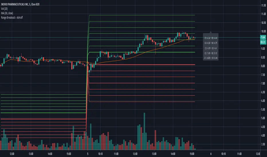
Range Breakouts - AshraffThis computes the Range Breakout strategy based on the last five days of stock data.
Range Action Verification IndexThe Range Action Verification Index or RAVI as it is commonly known is a trend detection indicator.
When RAVI is greater than 1% for longs and -1% for shorts (FX setting), the currency is in a trend.
The standard MA settings are 7 and 65 days for use on the daily chart, which are the cycles of 7 days and 3 months.
For trading the hourly charts the moving averages should be set to 24 and 120 with a threshold of 3%.
RAVI also keeps you out of a trend less market, so if the RAVI does not break above or below the set threshold,
the market is trend less.
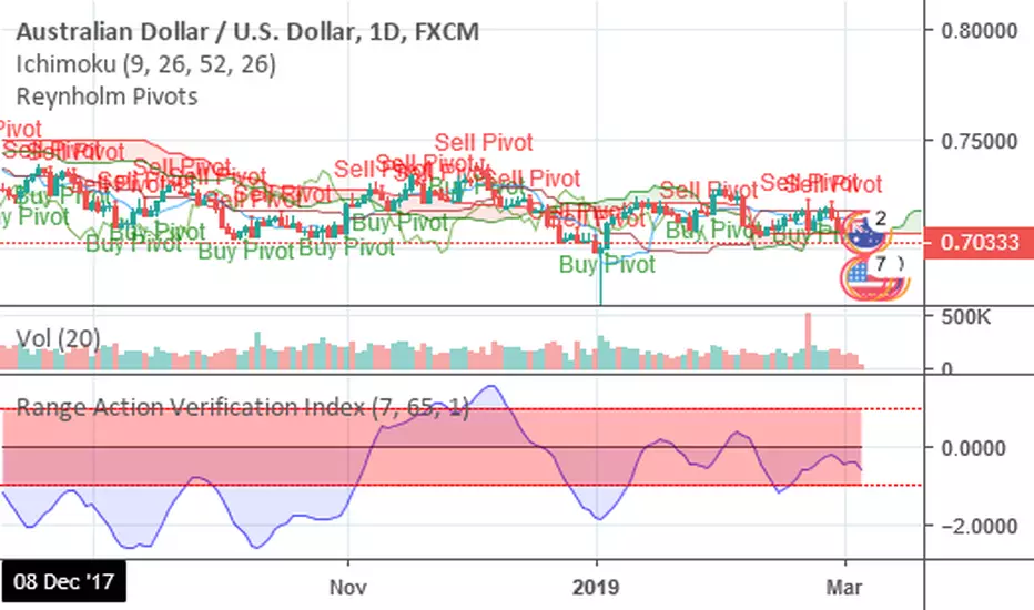

Range Action Verification IndexChoose the levels for bullish and bearish trends. Options range from .1% to .3%/-.1% to -.3%, depending on the market. The color of the histogram will help to quickly identify the RAVI trend direction.
Green = Trend is bullish
Red = Trend is bearish
Gray = Trend is ranging
If histogram changes from to gray, the most recent trend has ended. If histogram changes back to the previous color, trend is considered to have resumed. If histogram changes from gray to color that is opposite of previous color, trend is considered to have revered.

Range Spikes No NoiseSimilar to Sigma Spikes No Noise, but using range moves vs ATR20, either prior close to high or low and close to high or low.
Filtering out for noise by the treshold value

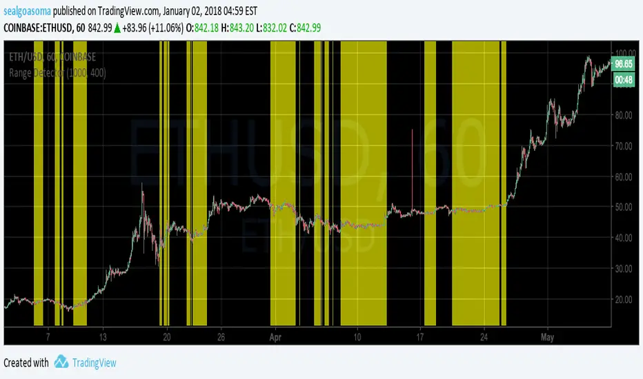
Range DetectorThis script highlights range-bound price movement. You'll need to tune the length and sensitivity depending on the time scale, and perhaps the market. Default settings work fairly well for ETH and BTC on the 1hr scale.
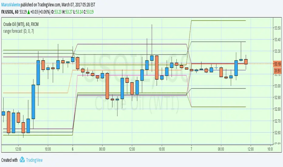
range forecast Calculate the price range , support and resistence for the current day. At the market open this algo will calculate the next price level with no repaint.
Stocks: QQQ Daily ATR% + Premarket Range (% of ATR)## Stocks/ETFs: QQQ Premarket Range (% of Daily ATR) — ORB Trading Guide
### What this indicator does
This indicator is built for **stocks and ETFs** like **QQQ** and is meant to support **Opening Range Breakout (ORB)** trading.
It measures the **Premarket Range** from **04:00 to 09:30** (exchange time), then compares that move to QQQ’s **typical full-day movement** using **Daily ATR(14)**.
The goal is simple:
> **Before the open, decide whether the day is more likely to behave like a “chop day” or an “expansion day,” and then choose the ORB style that matches.**
---
## Key terms (plain English)
### Daily ATR(14)
ATR stands for **Average True Range**.
On the **daily** timeframe, ATR(14) estimates QQQ’s **typical daily movement** over the last 14 trading days.
Think of it as:
> “On a normal day, QQQ tends to move about *X* dollars.”
---
### ATR% (vs Daily Close)
This converts ATR into a percent of price so you can compare volatility over time:
Think of it as:
> “QQQ’s typical daily move is about *X%* of its price.”
---
### Premarket Range (04:00–09:30)
This is the distance between the **premarket high** and **premarket low** during the session window:
**04:00 → 09:30**
Think of it as:
> “How much QQQ already moved before the bell.”
---
### Premarket Range % of ATR
This is the core measurement:
It answers:
> “How much of a normal day’s movement already happened before the open?”
Examples:
* **20%** = quiet premarket (small move)
* **60%** = active premarket (big move already happened)
---
## How to interpret the Regime label
This script classifies the day into one of three “regimes”:
### **CHOP-LEANING** (Premarket Range < 25% of Daily ATR)
Premarket was quiet. The open is more likely to be:
* range-bound
* full of fakeouts
* slower follow-through
### **NEUTRAL** (25%–50%)
Normal premarket activity. Either outcome is possible:
* trend or chop
* you must let the open confirm it
### **EXPANSION-LEANING** (Premarket Range > 50%)
Premarket was very active. The open is more likely to:
* move faster
* expand range quickly
* have stronger directional pushes (or sharp swings)
**Important:** Expansion does not guarantee a clean trend. It means **movement is more likely**.
---
# How I use this indicator with ORB (my rules)
This indicator is not a buy/sell signal by itself.
I use it to decide **which ORB style to trade**.
## Step 1 — Check the “Regime” before the open
* If the indicator reads **EXPANSION-LEANING**, I treat it like a momentum environment.
* If the indicator reads **CHOP-LEANING**, I treat it like a confirmation environment.
* If it reads **NEUTRAL**, I stay selective and let price action confirm.
---
## Step 2 — ORB Execution Rules
### ✅ If **EXPANSION-LEANING** (momentum day)
**Goal:** Catch the move early and avoid missing the breakout.
**My ORB plan:**
* Build my opening range using the **5-minute ORB**
* Enter on a **break of the ORB level**
* Use the **1-minute timeframe** for the actual entry trigger
**How I confirm the break:**
* I want a clean break through the ORB level (not just a wick touch)
* If price snaps immediately back inside the ORB, I avoid chasing
This approach fits expansion days because QQQ can move fast after the open and waiting for perfect retests can cause you to miss the push.
---
### ✅ If **CHOP-LEANING** (confirmation day)
**Goal:** Avoid fakeouts and only enter when the break proves itself.
**My ORB plan:**
* Build my opening range using a **15-minute ORB**
* I do **not** enter on the first break
* I wait for a **break and retest**
* Then I use the **5-minute timeframe** to confirm the retest holds before entry
This fits chop days because breaks fail more often, so I require confirmation before committing.
---
### ✅ If **NEUTRAL**
**Goal:** Reduce low-quality trades.
**My ORB plan:**
* Treat it as “wait and see”
* Only take the break if price shows strong conviction (hold outside ORB)
* If price is whipping in and out of the range, I skip the trade
---
## Best practices
* Works best on **1m / 5m / 15m charts** so the premarket high/low is captured accurately.
* Premarket session time uses the symbol’s **exchange time**.
* Use proper risk management—QQQ can move fast, especially on expansion days.
---
## Disclaimer
This script is for educational purposes only and is not financial advice. Trading involves risk. Always use risk management and test any approach before trading live.

Futures: NQ Overnight Range (% of Daily ATR)## Futures: NQ Overnight Range (% of Daily ATR) — ORB Trading Guide
### What this indicator does
This indicator is built for **NQ / MNQ futures** and is meant to support **Opening Range Breakout (ORB)** trading.
Because futures trade nearly 24 hours, a lot of important movement happens during **Asia + London**. This script measures the **Overnight Range** from **18:00 to 09:30** (exchange time), then compares it to the market’s **typical full-day movement** using **Daily ATR(14)**.
The goal is simple:
> **Before the open, decide whether the day is more likely to behave like a “chop day” or an “expansion day,” and then choose the ORB style that matches.**
---
## Key terms (plain English)
### Daily ATR(14)
ATR is the average daily movement over the last 14 days.
Think of it as:
> “On a normal day, NQ tends to move about *X* points.”
---
### Overnight Range (18:00–09:30)
This is the distance between the **overnight high** and **overnight low** from 18:00 to 09:30.
Think of it as:
> “How much NQ already moved before the cash open.”
---
### Overnight Range % of ATR
This is the “volatility meter” for the day:
It answers:
> “How much of a normal day’s movement already happened overnight?”
---
## How to interpret the Regime label
This script classifies the day into one of three “regimes”:
### **CHOP-LEANING** (Overnight Range < 25% of Daily ATR)
Overnight was quiet. The open is more likely to be:
* range-bound
* full of fakeouts
* slower follow-through
### **NEUTRAL** (25%–50%)
Normal overnight activity. Either outcome is possible:
* trend or chop
* you must let the open confirm it
### **EXPANSION-LEANING** (Overnight Range > 50%)
Overnight was very active. The open is more likely to:
* move faster
* expand range quickly
* have stronger directional pushes (or sharp swings)
**Important:** Expansion does not guarantee a clean trend. It means **movement is more likely**.
---
# How I use this indicator with ORB (my rules)
This indicator is not a buy/sell signal by itself.
I use it to decide **which ORB style to trade**.
## Step 1 — Check the “Regime” before the open
* If the indicator reads **EXPANSION-LEANING**, I treat it like a momentum environment.
* If the indicator reads **CHOP-LEANING**, I treat it like a confirmation environment.
* If it reads **NEUTRAL**, I stay selective and let price action confirm.
---
## Step 2 — ORB Execution Rules
### ✅ If **EXPANSION-LEANING** (momentum day)
**Goal:** Catch the move early and avoid missing the breakout.
**My ORB plan:**
* Build my opening range using the **5-minute ORB**
* Enter on a **break of the ORB level**
* Use the **1-minute timeframe** for the actual entry trigger
**How I confirm the break:**
* I want a clean break through the ORB level (not just a wick touch)
* If price snaps immediately back inside the ORB, I avoid chasing
This approach fits expansion days because the market can move quickly and waiting for perfect retests can cause you to miss the push.
---
### ✅ If **CHOP-LEANING** (confirmation day)
**Goal:** Avoid fakeouts and only enter when the break proves itself.
**My ORB plan:**
* Build my opening range using a **15-minute ORB**
* I do **not** enter on the first break
* I wait for a **break and retest**
* Then I use the **5-minute timeframe** to confirm the retest holds before entry
This fits chop days because breaks fail more often, so I require confirmation before committing.
---
### ✅ If **NEUTRAL**
**Goal:** Reduce low-quality trades.
**My ORB plan:**
* Treat it as “wait and see”
* Only take the break if price shows strong conviction (hold outside ORB)
* If price is whipping in and out of the range, I skip the trade
---
## Best practices
* This indicator works best on **1m / 5m / 15m charts** so the overnight high/low is captured accurately.
* Times are based on the symbol’s **exchange time**.
* Use proper risk management—futures can move fast, especially on expansion days.
---
## Disclaimer
This script is for educational purposes only and is not financial advice. Futures trading carries significant risk. Always use risk management and test any approach before trading live.
---

[SpaghettiForex] RO - Regime Oscillator RO — Regime Oscillator is a market-state tool that classifies price action into three regimes: TREND, RANGE, or CHOP.
It outputs a Regime Index (0–100) designed to measure how “directional and structured” the current environment is. RO is not an overbought/oversold oscillator and it does not generate trade entries. Its purpose is to provide context and help you decide how selective you should be with your execution rules.
What it shows:
- Regime Index (0–100): a smoothed score representing the current market state.
- Regime label: TREND / RANGE / CHOP (with optional background shading).
- Bias label: UP / DOWN / FLAT, derived from moving-average slope.
- Optional component breakdown in the table (ADX, BB width, ATR relative, slope).
________________________________________
Screenshots (examples):
Screenshot 1 — TREND regime (directional phase)
Example where RO stays in TREND during a sustained directional move.
The Regime Index remains high and the table shows a clear bias (UP or DOWN).
RO identifies a sustained directional phase as TREND (high index + clear bias).
Screenshot 2 — RANGE regime (mean-reverting phase)
Example where RO identifies a RANGE environment (lower index + low trend strength).
Useful to visualise when price is mostly oscillating rather than expanding directionally.
RO identifies a range environment with a low index and a flat bias.
Screenshot 3 — CHOP regime (mixed / noisy conditions)
Example where RO stays in CHOP when the market lacks clean structure.
This helps avoid forcing “trend logic” into random or unstable price action.
RO stays in CHOP when price action lacks clean structure and transitions are frequent.
________________________________________
How it works (high level):
RO combines four normalised components (0–1) into a weighted score, then smooths it:
1. ADX (trend strength)
2. Bollinger Band Width (compression/expansion)
3. Relative ATR (current volatility vs baseline)
4. MA Slope (magnitude) (directionality)
The resulting Regime Index is mapped into regimes using thresholds. An optional Early Trend mode reduces lag by allowing TREND to trigger earlier when ADX is rising and directional bias is present.
How to use it (context, not signals):
- Use RO to filter conditions: apply different rules in TREND vs RANGE vs CHOP.
- Combine RO with your own structure/levels and risk management.
- If you want a faster response, use Early Trend (enabled by default). If you prefer fewer regime flips, increase smoothing or raise thresholds.
Alerts:
RO includes alerts (bar-close confirmed) for:
- Regime changed
- Trend regime start
- Range regime start
- Chop regime start
Important note:
RO is a context tool. It does not provide financial advice or performance guarantees. Market regimes can change quickly and false transitions are possible—always use proper risk management.

Opening Ranges
Daily / Weekly / Monthly Highs & Lows + Opening Ranges
This indicator plots key **previous period highs and lows** (Daily, Weekly, Monthly)
and visualizes important **opening range** levels:
• Previous Daily, Weekly and Monthly highs/lows (with configurable lookback)
• Monday opening range (high/low + optional background fill)
• First trading day of the month (high/low + optional fill)
• First hour of the day (high/low + optional fill)
Perfect for traders who use:
• Previous day/week/month structure & key levels
• Monday / monthly open ranges
• Intraday breakout strategies (first hour / first day)
• Liquidity & range expansion setups
Features:
──────────────────────────────
• Customisable colors, line styles & widths
• Lookback period control for each timeframe
• Optional projection lines into the future
• Beautiful gradient effect showing recency (newest = strongest color)
• Extend Monday / First Day / First Hour fills & lines until end of period
• Smart label merging (MON/FDM when levels coincide)
• Clean status line integration (DH, DL, WH, WL, MH, ML)
Best used on intraday timeframes (1m–1h)
Most powerful on indices, forex, futures & large-cap stocks.
Enjoy your trading!
Feel free to leave feedback or suggestions.
Happy charting! 📈

Intraday Quarterly Session ranges (90m & 22.5m)This script plots intraday quarterly session ranges for London (00:00–06:00 EST) and New York PM (12:00–18:00 EST). Each session is divided into 90‑minute quarters and further into 22.5‑minute micro‑quarters, providing traders with a clear, time‑based framework to track liquidity sweeps, breaker retests, and expansions. It’s designed to help intraday traders visualize market rhythm and maintain disciplined cycle‑based trading.

Active Ranges Detector
1. Purpose
The script identifies and manages bar ranges, which are defined as bars where the high and low prices are fully contained within the high and low of the previous bar. These ranges are used by traders to identify potential breakouts and price consolidations.
2. Key Features
Active Range Validation
A potential range becomes an active range when the price breaks out of the bar’s high or low. The breakout direction is tracked:
• Upward breakout: When the price closes above the high of the range.
• Downward breakout: When the price closes below the low of the range.
The script creates:
• Lines to represent the high and low of the range.
• A colored background box to indicate the range, with color coded for breakout direction:
• Green: Upward breakout.
• Orange: Downward breakout.
Range Updates
• Exit Detection: The script detects if the price exits the range (moves outside the high or low levels).
• Reintegration and Mitigation:
• If the price re-enters an exited range, it marks the range as “mitigated.”
• The lines for mitigated ranges are updated (color and width are changed).
• The background box is removed for mitigated ranges.
3. User Inputs
The script provides customization options:
• Breakout Colors:
• upBreakoutColor: Background color for upward breakout ranges (default: semi-transparent green).
• downBreakoutColor: Background color for downward breakout ranges (default: semi-transparent orange).
• Mitigated Range Styling:
• mitigatedLineColor: Line color for mitigated ranges (default: red).
• mitigatedLineWidth: Width of the line for mitigated ranges.
• Line and Background Settings:
• activeLineWidth: Width of lines for active ranges.
• lineExtension: Length of line extensions beyond the range’s initial boundaries.
• Range Display Limits:
• maxActiveRanges: Maximum number of active ranges to display on the chart (default: up to 200).
4. Visualization
The script provides clear visual feedback for identified ranges:
• Lines: High and low levels of the range are drawn as lines on the chart.
• Background Boxes: Colored boxes are drawn to represent active ranges, with breakout direction indicated by the box’s color.
• Mitigation Styling: Mitigated ranges have updated line styles and no background.
5. Range Management
The script actively manages ranges:
• Tracks the status of each range (active, exited, reintegrated, mitigated).
• Limits the number of displayed ranges to improve chart readability and comply with TradingView’s object limits.
6. Use Case
This script is ideal for traders who:
• Use inside bars to identify areas of consolidation and breakout opportunities.
• Want to track active and mitigated ranges automatically.
• Need a clear, visual representation of ranges and breakout directions.
7. Limitations
• Inside bars are identified based only on the current and previous bar, so the script might not detect more complex consolidation patterns.
• The maximum number of ranges displayed is limited to the user-defined value (maxActiveRanges), with a hard limit of 200 due to TradingView’s object restrictions.

Session Opening Bar RangeSession Opening Bar Range (OBR) - Advanced Opening Range Indicator with Statistical Analysis
Overview
The Session First Bar Range (FBR) indicator is a comprehensive tool that captures and projects key levels based on the first bar of a user-defined trading session. Unlike traditional daily opening range indicators, this script allows traders to focus on specific session windows (New York RTH, London, Asia, etc.) and analyze price behavior relative to the initial momentum established in that session's opening bar.
What makes this indicator unique is its combination of three distinct projection methodologies: statistical analysis based on historical range data, Fibonacci extensions, and fixed-point rotation levels commonly used by institutional traders. To our knowledge, this is the only opening range indicator that incorporates statistical standard deviation levels calculated from historical first bar ranges, making it both a technical and probabilistic tool.
Core Concept
The opening range concept is based on the principle that the initial price action of a trading session often sets the tone for the remainder of that session.
Professional traders have long observed that:
The first bar's high and low act as key reference points
Price often respects or breaks these levels with significance
Expansion beyond the opening range tends to occur in measurable increments
This indicator takes these observations and enhances them with:
Historical probability analysis - "Based on the last 60 sessions, price typically extends X standard deviations beyond the opening range"
Proportional projections - Fibonacci-based extensions showing where measured moves typically target
Fixed-point rotations - Institutional rotation levels (e.g., 65 points for NQ, 15 points for ES)
How It Works
Session Detection & First Bar Capture
The indicator uses Pine Script's time() function with timezone support to precisely detect when a trading session begins. When the first bar of the selected timeframe occurs within the session window, the script captures:
High (H): The high of the first bar
Low (L): The low of the first bar
Mid (M): The midpoint (hl2) of the first bar
Critical Detail: These levels are fixed from the first bar only - they do not update as the session progresses. This differs from many "opening range" indicators that use a time period (e.g., first 30 minutes). Here, you select the bar timeframe (default 5-minute), and only that single first bar's range is captured.
Statistical Level Calculation
The indicator maintains a rolling array of the last N session's first bar ranges (default: 60 sessions). For each new session, it calculates:
Average Range: Mean of historical first bar ranges
Standard Deviation: Volatility of those ranges
Projection Levels: High/Low ± (Average Range + Std Dev × Multiplier)
This provides probability-based levels. For example, a +2σ level suggests: "Historically, price extending this far beyond the opening range is a 2-standard-deviation event (approximately 95th percentile)."
Fibonacci Extensions
Using the first bar range as the base unit (100%), the indicator projects Fibonacci levels:
100% extension: One full range above the high / below the low
1.618x extension: (Default) Golden ratio projection
2.618x, 3.618x extensions: Additional Fibonacci levels
Calculation: Range = H - L, then Target = H + (Range × Multiplier) for upside projections.
OR Rotation Levels
These are fixed-point increments from the first bar's high and low. Unlike percentage-based methods, rotations use absolute point values:
NQ traders often use 65-point increments
ES traders often use 15-point increments
Gold/bonds use different values
The indicator draws 5 levels above the high (R+1 through R+5) and 5 below the low (R-1 through R-5), each separated by your specified point increment.
Features:
Session Options
Pre-configured Sessions:
New York RTH (9:30am - 4:00pm)
New York Futures (8:00am - 5:00pm)
London (2:00am - 8:00am)
Asia (7:00pm - 2:00am)
Midnight to 5pm
ZB/Gold/Silver OR (8:20am - 4:00pm)
CL OR (9:00am - 4:00pm)
Custom Session: Define your own start/end times in HHMM format
Timezone Support: All sessions respect the selected timezone (default: America/New_York)
Customizable Timeframe
Select any timeframe for the first bar (1min, 5min, 15min, etc.)
Default: 5-minute bars
Important: This is the timeframe for the first bar capture, independent of your chart's timeframe
Display Options
Historical Ranges: Show/hide past session ranges (with configurable limit to manage performance)
Line Styles: Choose between Solid, Dashed, or Dotted for range lines and midline
Label Position: Left or Right side of range
Show Prices: Optionally display actual price values on labels
Custom Colors: Fully customizable colors for all components
Statistical Levels
Lookback Period: Number of historical sessions to analyze (default: 60)
Two Multiplier Levels: Default 1σ and 2σ, fully adjustable
Separate styling: Different line styles (dashed vs dotted) for each sigma level
Optional Labels: Show/hide sigma notation labels
Fibonacci Extensions
Four Extension Levels: 100%, 1.618x, 2.618x, 3.618x (all customizable)
Bidirectional: Projections both above and below the opening range
Optional Labels: Toggle percentage/multiplier labels
OR Rotation Levels
Configurable Increment: Set the point value for your instrument
Five Levels Each Direction: R±1 through R±5
Dynamic Labels: Show both rotation number and point value (e.g., "R+1 (65)")
Three Line Styles: Solid, Dashed, or Dotted
How to Use
Setup
Add the indicator to your chart
Select your trading session from the dropdown
Set the timeframe for first bar capture (typically 5-15 minutes)
Configure which projection methods you want to see (Statistical, Fibonacci, and/or Rotations)
For Day Traders
Scenario: Trading NQ during New York RTH
Session: Select "New York RTH (9:30am - 4:00pm)"
Timeframe: 5-minute (captures 9:30-9:35 bar)
Enable: OR Rotations with 65-point increments
Strategy:
Watch for acceptance/rejection at rotation levels
Use R+1/R-1 as initial profit targets
R+2/R-2 as extended targets
Statistical levels show when price is in "outlier" territory
and rotation levels
Performance Notes
The indicator limits objects to stay within TradingView's constraints (500 max)
If you enable all features, reduce "Maximum Historical Ranges" to prevent slowdown
Typical configuration: 10-20 historical ranges with all features enabled works well
Settings Guide
Session Settings
Session: Choose from pre-configured sessions or "Custom"
Custom Session Start/End: HHMM format (e.g., "0930" for 9:30am)
Timezone: Critical for accurate session detection
Opening Bar Format
Timeframe: The bar size for capturing the first bar's range
Show Midline: Toggle the mid-point line
Show Historical Ranges: Display previous sessions (recommended: leave ON)
Maximum Historical Ranges: Limit history to manage performance (1-500)
Range Style / MidLine Style: Solid, Dashed, or Dotted
Position: Label placement (Left or Right)
Show Prices: Include actual price values on labels
Statistical Levels
Lookback Periods: How many historical first bar ranges to analyze (default: 60)
Std Dev Multiplier 1/2: The sigma levels to project (default: 1.0 and 2.0)
All visual settings (colors, line width, label size)
Fibonacci Extensions
Show Fib Extensions: Enable/disable Fibonacci projections
Measured Move Extensions 1-4: The multipliers (default: 1.618, 2.618, 3.618, 4.618)
Visual customization options
OR Rotations
Rotation Increment: The point value for your instrument
NQ: 65 points
ES: 15 points
Adjust for other instruments based on their typical rotation behavior
Show Rotation Labels: Display level numbers and point values
Visual customization options
Use Cases
Gap Trading: When price gaps away from previous day's close, the first bar range shows the initial gap acceptance/rejection zone
Breakout Confirmation: Price breaking and holding above the first bar high with volume suggests trend day potential. Rotation levels provide measured targets.
Reversal Identification: Price reaching +2σ statistical level = rare event, potential exhaustion
Range Bound Days: Price oscillating between first bar high/low suggests range-bound session; trade reversals at extremes
Institutional Level Awareness: OR Rotations at 65 points (NQ) align with levels professional traders watch
Technical Notes
The indicator uses request.security() with lookahead=barmerge.lookahead_on to ensure the first bar levels are captured correctly
All drawing objects (lines, labels, fills) are managed in arrays with automatic cleanup to prevent memory issues
The statistical calculations use array.avg() and array.stdev() for accurate probability estimates
Rotation levels use individual line variables (like Fibonacci) rather than loops for reliability
Summary
This indicator is original in its combination of three distinct methodologies for projecting levels from a session's opening range:
Statistical Analysis - No other opening range indicator (to our knowledge) calculates standard deviation projections from historical first bar ranges
Time-Based Session Flexibility - Most OR indicators use only daily or fixed time periods; this allows any custom session window
Multiple Projection Methods - Traders can use statistical, Fibonacci, AND rotation levels together or separately

Custom Time Range HighlightThis indicator highlights specific time ranges on your TradingView chart with customizable background colors and labels, making it easier to identify key trading sessions and ICT (Inner Circle Trader) Killzones. It is designed for traders who want to mark important market hours, such as major sessions (Asia, New York, London) or high-volatility Killzones, with full control over activation, timing, colors, and transparency.
Features
Customizable Time Ranges: Define up to 9 different time ranges, including one custom range, three major market sessions (Asia, New York, London), and five ICT Killzones (Asia, NY Open, NY Close, London Open, London Close).
Individual Activation: Enable or disable each time range independently via checkboxes in the settings. By default, only the ICT Killzones are active.
Custom Colors and Transparency: Set unique background and label colors for each range, with adjustable transparency for both.
Labeled Time Ranges: Each active range is marked with a customizable label at the start of the period, displayed above the chart for easy identification.
Priority Handling: If multiple ranges overlap, the range with the higher number (e.g., Asia Killzone over Custom Range) determines the background color.
CET Time Zone: Time ranges are based on Central European Time (CET, Europe/Vienna). Adjust the hours and minutes to match your trading needs.
Settings
The indicator settings are organized into three groups for clarity:
Custom Range: A flexible range (default: 15:30–18:00 CET) for user-defined periods.
Session - Asia, NY, London: Major market sessions (Asia: 01:00–10:00, New York: 14:00–23:00, London: 09:00–18:00 CET).
ICT Killzones - Asia, NY, London: High-volatility periods (NY Open: 13:00–16:00, NY Close: 20:00–23:00, London Open: 08:00–11:00, London Close: 16:00–18:00, Asia: 02:00–05:00 CET).
For each range, you can:
Toggle activation (default: only ICT Killzones enabled).
Adjust start and end times (hours and minutes).
Customize the label text.
Choose background and label colors with transparency levels (0–100).
How to Use
Add the indicator to your chart.
Open the settings to enable/disable specific ranges, adjust their times, or customize colors and labels.
The chart will highlight active time ranges with the selected background colors and display labels at the start of each range.
Use it to focus on key trading periods, such as ICT Killzones for high-probability setups or major sessions for market analysis.
Notes
Ensure your time ranges align with your trading instrument’s session times.
Overlapping ranges prioritize higher-numbered ranges (e.g., Asia Killzone overrides London Session).
Ideal for day traders, scalpers, or ICT strategy followers who need clear visual cues for specific market hours.
Feedback
If you have suggestions for improvements or need help with customization, feel free to leave a comment or contact the author!
