NoProcess - PAX Opening RangeAll credit & honor goes to Matt Kenah (Pax)
PAX-OR is a high-precision, automated Opening Range indicator designed specifically for Futures Traders. Unlike standard OR indicators that require manual time inputs, PAX-OR automatically detects the asset class (Indices, Metals, Energies) and configures the correct Opening Time, Point Value, and Volatility "Rungs" without manual intervention.
It utilizes 30-second granularity to capture the exact opening wick/body mechanics, providing a distinct advantage over standard 1-minute or 5-minute calculations.
🎯 Key Features
1. Intelligent Asset Detection The indicator automatically recognizes the ticker symbol and adjusts its logic for:
Indices: ES, MES, NQ, MNQ, YM, RTY (Opens @ 9:30 AM ET)
Energies: CL, MCL, NG, QG (Opens @ 9:00 AM ET)
Metals: GC, MGC, SI, HG (Opens @ 8:20 AM ET)
2. Dynamic "Paylines" (Dollar-Based Targets) A unique feature of PAX-OR is the Payline. Instead of arbitrary ticks, you define a dollar amount (default: $200). The indicator calculates exactly how many points the market must move from the Opening Range High/Low to achieve that profit, based on the contract's point value (e.g., $50 for ES, $20 for NQ).
Use Case: Great for setting automated "Break Even" or "First Take Profit" levels.
3. Volatility "Rungs" The indicator projects fixed-interval targets (Rungs) above and below the range. These rung sizes are hardcoded to optimized values for each specific asset (e.g., 15 points for ES, 65 points for NQ) but can be overridden in the settings.
4. Overnight Context Automatically plots the Overnight High (ONH) and Overnight Low (ONL) relative to the current session, providing immediate context on whether the market is opening within or outside of the prior global session range.
5. Live Info Dashboard A clean data table in the top-right corner displays:
Current Symbol & Root
Rung Size (in points)
Payline Offset (in points)
Current Opening Range size
Dollar Value per Point
Minimum Tick Size
⚙️ How It Works
The Open: When the session begins (based on the asset class specific time), the indicator scans the first 30 seconds of data to establish the High, Low, and Open (Pit Open).
The Range: It draws the High and Low of that opening period, along with the Equilibrium (EQ/Midpoint).
The Extension:
Paylines: Dashed lines appear at the calculated dollar-target distance.
Rungs: Solid lines appear at fixed intervals to act as trend targets.
History: You can configure the indicator to show the OR levels for the current day only, or extend them for 2-3 days to see how price reacts to previous session levels.
🛠 Settings Overview
Opening Range: Toggle the visibility of the range, background shading, and the specific Pit Open price line.
Paylines & Rungs: Toggle specific lines (Short/Long) and customize colors/styles.
Config:
Payline $ Value: Set your target dollar amount (default $200).
Rung Override: Enter a custom point value if you disagree with the auto-detected volatility size.
Number of Rungs: How many levels to draw (default 15).
Extend Lines: Choose between "Current OR Only", "2 Day", "3 Day", or "All".
Note: This indicator is optimized for the assets listed above. If used on an unsupported ticker, it defaults to standard settings (9:30 Open, $50/point).
Disclaimer: Trading futures involves significant risk. This tool is for educational and technical analysis purposes only.
Cerca negli script per "range"

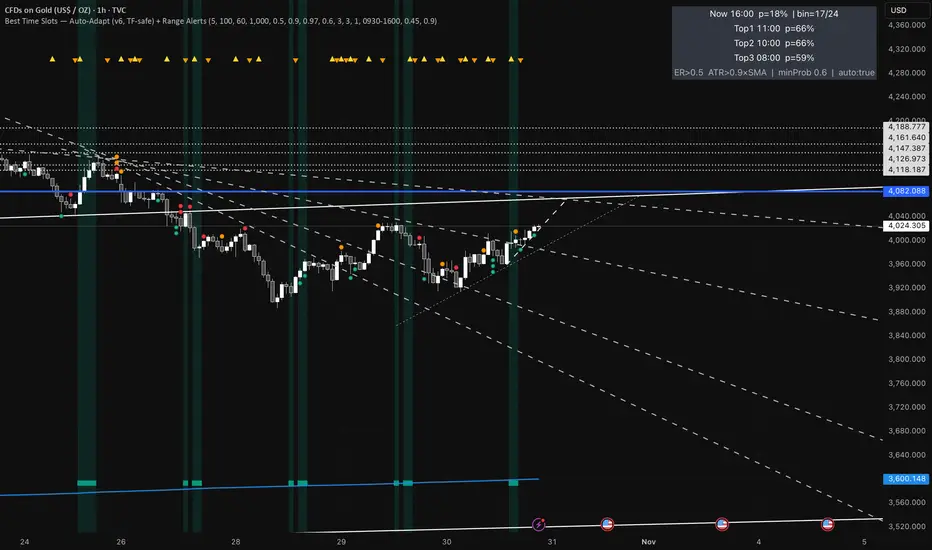
Best Time Slots — Auto-Adapt (v6, TF-safe) + Range AlertsTime & binning
Auto-adapt to timeframe
Makes all time windows scale to your chart’s bar size (so it “just works” on 1m, 15m, 4H, Daily).
• On = recommended. • Off = fixed default lengths.
Minimum Bin (minutes)
The size of each daily time slot we track (e.g., 5-min bins). The script uses the larger of this and your bar size.
• Higher = fewer, broader slots; smoother stats. • Lower = more, narrower slots; needs more history.
• Try: 5–15 on intraday, 60–240 on higher TFs.
Lookback windows (used when Auto-adapt = ON)
Target ER Window (minutes)
How far back we look to judge Efficiency Ratio (how “straight” the move was).
• Higher = stricter/smoother; fewer bars qualify as “movement”. • Lower = more sensitive.
• Try: 60–120 min intraday; 240–600 min for higher TFs.
Target ATR Window (minutes)
How far back we compute ATR (typical range).
• Higher = steadier ATR baseline. • Lower = reacts faster.
• Try: 30–120 min intraday; 240–600 min higher TFs.
Target Normalization Window (minutes)
How far back for the average ATR (the baseline we compare to).
• Higher = stricter “above average range” check. • Lower = easier to pass.
• Try: ~500–1500 min.
What counts as “movement”
ER Threshold (0–1)
Minimum efficiency a bar must have to count as movement.
• Higher = only very “clean, one-direction” bars count. • Lower = more bars count.
• Try: 0.55–0.65. (0.60 = balanced.)
ATR Floor vs SMA(ATR)
Requires range to be at least this many × average ATR.
• Higher (e.g., 1.2) = demand bigger-than-usual ranges. • Lower (e.g., 0.9) = allow smaller ranges.
• Try: 1.0 (above average).
How history is averaged
Recent Days Weight (per-day decay)
Gives more weight to recent days. Example: 0.97 ≈ each day old counts ~3% less.
• Higher (0.99) = slower fade (older days matter more). • Lower (0.95) = faster fade.
• Try: 0.97–0.99.
Laplace Prior Seen / Laplace Prior Hit
“Starter counts” so early stats aren’t crazy when you have little data.
• Higher priors = probabilities start closer to average; need more real data to move.
• Try: Seen=3, Hit=1 (defaults).
Min Samples (effective)
Don’t highlight a slot unless it has at least this many effective samples (after decay + priors).
• Higher = safer, but fewer highlights early.
• Try: 3–10.
When to highlight on the chart
Min Probability to Highlight
We shade/mark bars only if their slot’s historical movement probability is ≥ this.
• Higher = pickier, fewer highlights. • Lower = more highlights.
• Try: 0.45–0.60.
Show Markers on Good Bins
Draws a small square on bars that fall in a “good” slot (in addition to the soft background).
Limit to market hours (optional)
Restrict to Session + Session
Only learn/score inside this time window (e.g., “0930-1600”). Uses the chart/exchange timezone.
• Turn on if you only care about RTH.
Range (chop) alerts
Range START if ER ≤
Triggers range when efficiency drops below this level (price starts zig-zagging).
• Higher = easier to call “range”. • Lower = stricter.
Range START if ATR ≤ this × SMA(ATR)
Also triggers range when ATR shrinks below this fraction of its average (volatility contraction).
• Higher (e.g., 1.0) = stricter (must be at/under average). • Lower (e.g., 0.9) = easier to call range.
Alerts on bar close
If ON, alerts fire once per bar close (cleaner). If OFF, they can trigger intrabar (faster, noisier).
Quick “what happens if I change X?”
Want more highlighted times? ↓ Min Probability, ↓ ER Threshold, or ↓ ATR Floor (e.g., 0.9).
Want stricter highlights? ↑ Min Probability, ↑ ER Threshold, or ↑ ATR Floor (e.g., 1.2).
Want recent days to matter more? ↑ Recent Days Weight toward 0.99.
On 4H/Daily, widen Minimum Bin (e.g., 60–240) and maybe lower Min Probability a bit.
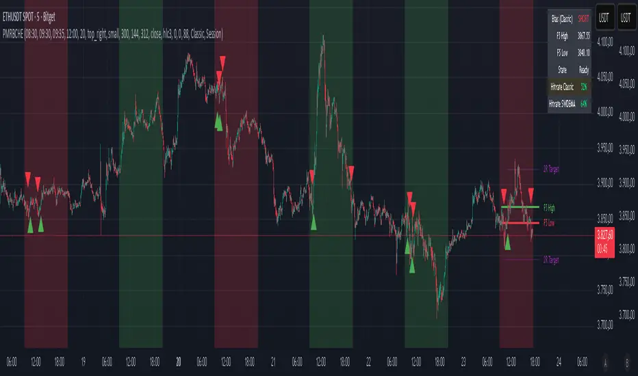
PM Range Breaker [CHE] PM Range Breaker — Premarket bias with first-five range breaks, optional SWDEMA regime latch, and simple two-times-range targets
Summary
This indicator sets a once-per-day directional bias during New York premarket and then tracks a strict first-five-minutes range from the session open. After the first five complete, it marks clean breakouts and can project targets at two times the measured range. A second mode latches an EMA-based regime to inform the bias and optional background tinting. A compact panel reports live state, first-five levels, and rolling hit rates of both bias modes using a user-defined midday close for statistics.
Motivation: Why this design?
Intraday traders often get whipsawed by early noise or by fast flips in trend filters. This script commits to a bias at a single premarket minute and then waits for the market to present an objective structure: the first-five range. Breaks after that window are clearer and easier to manage. The alternative SWDEMA regime gives a slower, latched context for users who prefer a trend scaffold rather than a midpoint reference.
What’s different vs. standard approaches?
Baseline: Typical open-range-breakout lines or a single moving-average filter without daily commitment.
Architecture differences:
Bias decision at a fixed New York time using either a midpoint lookback (“Classic”) or a two-EMA regime latch (“SWDEMA”).
Strict five-minute window from session open; breakout shapes print only after that window.
Single-shot breakout direction per session (debounce) and optional two-times-range targets.
On-chart panel with hit rates using a configurable midday close for statistics.
Practical effect: Cleaner visuals, fewer repeated signals, and a traceable daily decision that can be evaluated over time.
How it works (technical)
Time handling uses New York session times for premarket decision, open, first-five end, and a midday statistics checkpoint.
Classic bias: A midpoint is computed from the highest and lowest over a user period; at the premarket minute, the bias is set long when the close is above the midpoint, short otherwise.
SWDEMA bias: Two EMAs define a regime score that requires price and trend agreement; when both agree on a confirmed bar, the regime latches. At the premarket minute, the daily bias is set from the current regime.
The first-five range captures high and low from open until the end minute, then freezes. Breakouts are detected after that window using close-based cross logic.
The script draws range lines and optional targets at two times the frozen range. A session break direction latch prevents duplicate break markers.
Statistics compare daily open and a configurable midday close to record if the chosen bias aligned with the move.
Optional elements include EMA lines, midpoint line, latched-regime background, and regime switch markers.
Data aggregation for day logic and the first-five window is sampled on one-minute data with explicit lookahead off. On charts above one minute, values update intra-bar until the underlying minute closes.
Parameter Guide
Premarket Start (NY) — Minute when the bias is decided — Default: 08:30 — Move earlier for more stability; later for recency.
Market Open (NY) — Session start used for the first-five window — Default: 09:30 — Align to instrument’s RTH if different.
First-5 End (NY) — End of the first-five window — Default: 09:35 — Extend slightly to capture wider opening ranges.
Day End (NY) for Stats — Midday checkpoint for hit rate — Default: 12:00 — Use a later time for a longer evaluation window.
Show First-5 Lines — Draw the frozen range lines — Default: On — Turn off if your chart is crowded.
Show Bias Background (Session) — Tint by daily bias during session — Default: On — Useful for directional context.
Show Break Shapes — Print breakout triangles — Default: On — Disable if you only want lines and alerts.
Show 2R Targets (Optional) — Plot targets at two times the range — Default: On — Switch off if you manage exits differently.
Line Length Right — Extension length of drawn lines — Default: 20 (bars) — Increase for slower timeframes.
High/Low Line Colors — Visual colors for range levels — Defaults: Green/Red — Adjust to your theme.
Long/Short Bias Colors — Background tints — Defaults: Green/Red with high transparency — Lower transparency for stronger emphasis.
Show Corner Panel — Enable the info panel — Default: On — Centralizes status and numbers.
Show Hit Rates in Panel — Include success rates — Default: On — Turn off to reduce panel rows.
Panel Position — Anchor on chart — Default: Top right — Move to avoid overlap.
Panel Size — Text size in panel — Default: Small — Increase on high-resolution displays.
Dark Panel — Dark theme for the panel — Default: On — Match your chart background.
Show EMA Lines — Plot blue and red EMAs — Default: Off — Enable for SWDEMA context.
Show Midpoint Line — Plot the midpoint — Default: Off — Useful for Classic mode visualization.
Midpoint Lookback Period — Bars for high-low midpoint — Default: 300 — Larger values stabilize; smaller values respond faster.
Midpoint Line Color — Color for midpoint — Default: Gray — A neutral line works best.
SWDEMA Lengths (Blue/Red) — Periods for the two EMAs — Defaults: 144 and 312 — Longer values reduce flips.
Sources (Blue/Red) — Price sources — Defaults: Close and HLC3 — Adjust if you prefer consistency.
Offsets (Blue/Red) — Pixel offsets for EMA plots — Defaults: zero — Use only for visual shift.
Show Latched Regime Background — Background by SWDEMA regime — Default: Off — Separate from session bias.
Latched Background Transparency — Opacity of regime background — Default: eighty-eight — Lower value for stronger tint.
Show Latch Switch Markers — Plot regime change markers — Default: Off — For auditing regime changes.
Bias Mode — Classic midpoint or SWDEMA latch — Default: Classic — Choose per your style.
Background Mode — Session bias or SWDEMA regime — Default: Session — Decide which background narrative you want.
Reading & Interpretation
Panel: Shows the active bias, first-five high and low, and a state that reads Building during the window, Ready once frozen, and Break arrows when a breakout occurs. Hit rates show the percentage of days where each bias mode aligned with the midday move.
Colors and shapes: Green background implies long bias; red implies short bias. Triangle markers denote the first valid breakout after the first-five window. Optional regime markers flag regime changes.
Lines: First-five high and low form the core structure. Optional targets mark a level at two times the frozen range from the breakout side.
Practical Workflows & Combinations
Trend following: Choose a bias mode. Wait for the first clean breakout after the first-five window in the direction of the bias. Confirm with structure such as higher highs and higher lows or lower highs and lower lows.
Exits and risk: Conservative users can trail behind the opposite side of the first-five range. Aggressive users can scale near the two-times-range target.
Multi-asset and multi-TF: Works well on intraday timeframes from one minute upward. For non-US sessions, adjust the time inputs to the instrument’s regular trading hours.
Behavior, Constraints & Performance
Repaint and confirmation: Bias and regime decisions use confirmed bars. Breakout signals evaluate on bar close at the chart timeframe. On higher timeframes, minute-based sources update within the live bar until the minute closes.
security and HTF: The script samples one-minute data. Lookahead is off. Values stabilize once the source minute closes.
Resources: `max_bars_back` is five thousand. Drawing objects and the panel update efficiently, with position extensions handled on the last bar.
Known limits: Midday statistics use the configured time, not the official daily close. Session logic assumes New York session timing. Targets are simple multiples of the first-five range and do not adapt to volatility beyond that structure.
Sensible Defaults & Quick Tuning
Start with Classic bias, midpoint lookback at three hundred, and all visuals on.
Too many flips in context → switch to SWDEMA mode or increase EMA lengths.
Breakouts feel noisy → extend the first-five end by a minute or two, or wait for a retest by your own rules.
Too sluggish → reduce midpoint lookback or shorten EMA lengths.
Chart cluttered → hide EMA or midpoint lines and keep only range levels and breakout shapes.
What this indicator is—and isn’t
This is a visualization and signal layer for session bias and first-five structure. It does not manage orders, position sizing, or risk. It is not predictive. Use it alongside market structure, execution rules, and independent risk controls.
Disclaimer
The content provided, including all code and materials, is strictly for educational and informational purposes only. It is not intended as, and should not be interpreted as, financial advice, a recommendation to buy or sell any financial instrument, or an offer of any financial product or service. All strategies, tools, and examples discussed are provided for illustrative purposes to demonstrate coding techniques and the functionality of Pine Script within a trading context.
Any results from strategies or tools provided are hypothetical, and past performance is not indicative of future results. Trading and investing involve high risk, including the potential loss of principal, and may not be suitable for all individuals. Before making any trading decisions, please consult with a qualified financial professional to understand the risks involved.
By using this script, you acknowledge and agree that any trading decisions are made solely at your discretion and risk.
Do not use this indicator on Heikin-Ashi, Renko, Kagi, Point-and-Figure, or Range charts, as these chart types can produce unrealistic results for signal markers and alerts.
Best regards and happy trading
Chervolino
Many thanks to LonesomeTheBlue
for the original work. I adapted the midpoint calculation for this script. www.tradingview.com
India VIX Based Nifty/BankNifty Range Calculator (Auto Fetch)VIX-Based Expected Daily Range (Auto Volatility Forecast)
Created by: Harshiv Symposium
📖 Purpose
This indicator automatically fetches the India VIX value and calculates the expected daily price range for major Indian indices such as Nifty and BankNifty.
It helps traders understand how much the market is likely to move today based on current volatility conditions.
Designed for educational and analytical awareness, not for signals or profit-making systems.
⚙️ Core Logic
Expected Daily Move (Range) = (India VIX × Current Index Price) ÷ Multiplier
- Multiplier for Nifty: 1000
- Multiplier for BankNifty: 700
This calculation projects the 1-standard-deviation (≈ 68% probability) and 2-standard-deviation (≈ 95% probability) movement zones for the day.
📊 Example
If India VIX = 15 and Nifty = 25,000:
Expected Move ≈ (15 × 25,000) ÷ 1000 = 375 points
Hence,
- 68% Range: 24,625 – 25,375
- 95% Range: 24,250 – 25,750
This gives traders a realistic idea of daily volatility boundaries.
🧭 Key Features
✅ Auto-Fetch India VIX
No need for manual input — automatically pulls live data from NSE:INDIAVIX.
✅ Dynamic Range Visualization
Plots upper/lower boundaries for 1σ and 2σ probability zones with shaded expected-move area.
✅ Dashboard Panel
Displays:
- Current VIX
- Expected Move (in points and %)
- Upper and Lower Ranges
✅ Smart Alerts
Alerts when price crosses upper or lower volatility range — potential breakout signal.
🎯 How It Helps
Intraday Traders:
Know the likely daily movement (e.g., ±220 pts on Nifty) and plan realistic targets or stops.
Options Traders:
Quickly assess whether it’s a seller-friendly (low VIX, small range) or buyer-friendly (high VIX, large range) session.
Risk Managers:
Use volatility context for stop-loss width and position sizing.
Breakout Traders:
If price breaks beyond the 2σ range → indicates potential volatility expansion.
💡 Interpretation Guide
Condition Market Behavior Strategy Insight
VIX ↓ ( < 14 ) Calm / Range-bound Option Selling Edge
VIX ↑ ( > 20 ) Volatile Sessions Option Buying Edge
Price within Range Stable Market Mean Reversion Setups
Price breaks Range Volatility Expansion Breakout Trades
⚠️ Disclaimer
This indicator is for educational and awareness purposes only.
It does not generate buy/sell signals or guarantee returns.
Always apply your own analysis and risk management.

LA - Opening Price based Previous day Range PivotThis "LA - Opening Price based Previous day Range Pivot" indicator is a custom technical analysis tool designed for Trading View charts. It plots support and resistance levels (often referred to as pivots or ranges) based on the current opening price combined with the previous period's trading range. The "previous period" can be daily, weekly, or monthly, making it a multi-timeframe tool. These levels are projected using Fibonacci-inspired multipliers to create potential breakout or reversal zones.
The core idea is inspired by concepts like the Opening Range Breakout (ORB) strategy or Fibonacci pivots, but it's customized here to use a dynamic range calculation (the maximum of several absolute price differences) rather than a simple high-low range. This makes it more robust for volatile markets. Levels are symmetric above (resistance) and below (support) the opening price, helping traders identify potential entry/exit points, stop-losses, or targets. This will be useful when there is a gap-up/down as in Nifty/Sensex .
Purpose of the Indicator:
To visualize potential support/resistance zones for the current trading session based on the opening price and historical range data. This helps traders anticipate price movements, such as breakouts above resistance or bounces off support
Use Cases:
Intraday Trading: On lower timeframes (e.g., 5-min or 15-min charts), it shows daily levels for short-term trades.
Swing Trading: On higher timeframes (e.g., hourly or daily), it displays weekly/monthly levels for longer holds.
Range Identification: The filled bands highlight "zones" where price might consolidate or reverse.
Conditional Display: Levels only appear on appropriate timeframes (e.g., daily levels on intraday charts <60min), preventing clutter.
Theoretical Basis: It builds on pivot point theory, where the opening price acts as a central pivot. Multipliers (e.g., 0.618 for Fibonacci golden ratio) project levels, assuming price often respects these ratios due to market psychology.
How Calculations Work
Let's dive into the math with examples. Assume a stock with:
Current daily open (cdo) = $100
Previous daily high (pdh) = $105, low (pdl) = $95, close (pdc) = $102, close 2 days ago (pdc2) = $98
Step 1: Dynamic Range Calculation (var_d2):
This is the max of:
|pdh - pdc2| = |105 - 98| = 7
|pdl - pdc2| = |95 - 98| = 3
|pdh - pdl| = |105 - 95| = 10 (previous day range)
|pdh - cdo| = |105 - 100| = 5
|pdl - cdo| = |95 - 100| = 5
|pdc - cdo| = |102 - 100| = 2
|pdc2 - cdo| = |98 - 100| = 2
Max = 10 (so range = 10). This ensures the range accounts for gaps and extended moves, not just high-low.
Step 2: Level Projections:
Resistance (above open): Open + (Range * Multiplier)
dre6 = 100 + (10 * 1.5) = 115
dre5 = 100 + (10 * 1.27) ≈ 112.7
... down to dre0 = 100 + (10 * 0.1) = 101
dre50 = 100 + (10 * 0.5) = 105 (midpoint)
Support (below open): Open - (Range * Multiplier)
dsu0 = 100 - (10 * 0.1) = 99
... up to dsu6 = 100 - (10 * 1.5) = 85
Without Indicator
With Indicator
Pros and Cons
Pros:
Multi-Timeframe Flexibility: Seamlessly integrates daily, weekly, and monthly levels, useful for aligning short-term trades with longer trends (e.g., intraday breakout confirmed by weekly support).
Dynamic Range Calculation: Unlike standard pivots (just (H+L+C)/3), it uses max of multiple diffs, capturing gaps/volatility better—great for stocks with overnight moves.
Customizable via Inputs: Users can toggle levels, adjust multipliers, or change timeframes without editing code. Inline inputs keep the UI clean.
Visual Aids: Filled bands make zones obvious; conditional colors highlight "tight" vs. "wide" ranges (e.g., for volatility assessment).
Fibonacci Integration: Levels based on proven ratios, appealing to technical traders. Symmetric supports/resistances simplify strategy building (e.g., buy at support, sell at resistance).
No Repainting: Uses historical data with lookahead, so levels are fixed once calculated—reliable for back-testing.
Cons:
Chart Clutter: With all toggles on, 50+ plots/fills can overwhelm the chart, especially on mobile or small screens. Requires manual disabling.
Complexity for Beginners: Many inputs and calculations; without understanding fib ratios or range logic, it might confuse new users.
Performance Overhead: On low timeframes (e.g., 1-min), fetching higher TF data multiple times could lag, especially with many symbols or back-tests.
Assumes Volatility Persistence: Relies on previous range projecting future moves; in low-vol markets (e.g., sideways trends), levels may be irrelevant or too wide/narrow.
No Alerts or Signals: Purely visual; no built-in buy/sell alerts or crossover conditions—users must add separately.
Hardcoded Styles/Colors: Limited customization without code edits (e.g., can't change line styles via inputs).
Also, not optimized for non-stock assets (e.g., forex with 24/7 trading).
In summary, this is a versatile pivot tool for range-based trading based on Opening price, excelling in volatile markets but requiring some setup. If you're using it, start with defaults on a daily chart and toggle off unnecessary levels.

Opening Range TraderThis indicator, "Opening Range Trader," provides visual tools for defining and tracking two customizable intraday ranges plus today’s open, high, and low. It is designed for day traders to identify support, resistance, and breakout opportunities by automatically marking key price levels that often shape the day's momentum.
It offers:
Customizable start and end times for two independent time ranges.
Toggle options to display lines for the selected ranges and for today’s open, high, and low.
Automatic adaptation for New York market hours.
Real-time updates for session highs/lows and today’s evolving levels.
Traders use this to watch for breakouts above or below the opening range (ORB strategy), to fade false moves when price returns inside the range, or to participate in trending moves after volatility begins. A common setup is entering long on closes above the range high, or short on closes below the range low, with stops and targets based on the range’s width or the opposite boundary.
Risk management approaches include placing stop losses at the midpoint or at the opposite end of the range, and adjusting targets for measured moves. Volume confirmation can help filter valid breakouts, while adapting times for specific assets and trading styles maximizes flexibility.
The second range allows traders to repeat similar strategies later in the session for evolving momentum windows, making this indicator useful for multiple intraday setups.

Multi-Symbol Volatility Tracker with Range DetectionMulti-Symbol Volatility Tracker with Range Detection
🎯 Main Purpose:
This indicator is specifically designed for scalpers to quickly identify symbols with high volatility that are currently in ranging conditions . It helps you spot the perfect opportunities for buying at lows and selling at highs repeatedly within the same trading session.
📊 Table Data Explanation:
The indicator displays a comprehensive table with 5 columns for 4 major symbols (GOLD, SILVER, NASDAQ, SP500):
SYMBOL: The trading instrument being analyzed
VOLATILITY: Color-coded volatility levels (NORMAL/HIGH/EXTREME) based on ATR values
Last Candle %: The percentage range of the most recent 5-minute candle
Last 5 Candle Avg %: Average percentage range over the last 5 candles
RANGE: Shows "YES" (blue) or "NO" (gray) indicating if the symbol is currently ranging
🔍 How to Identify Trading Opportunities:
Look for symbols that combine these characteristics:
RANGE column shows "YES" (highlighted in blue) - This means the symbol is moving sideways, perfect for range trading
VOLATILITY shows "HIGH" or "EXTREME" - Ensures there's enough movement for profitable scalping
Higher candlestick percentages - Indicates larger candle ranges, meaning more profit potential per trade
⚡ Optimal Usage:
Best Timeframe: Works optimally on 5-minute charts where the ranging patterns are most reliable for scalping
Trading Strategy: When you find a symbol with "YES" in the RANGE column, switch to that symbol and look for opportunities to buy near the lows and sell near the highs of the ranging pattern
Risk Management: Higher volatility symbols offer more profit potential but require tighter risk management
⚙️ Settings:
ATR Length: Adjusts the Average True Range calculation period (default: 14)
Range Sensitivity: Fine-tune range detection sensitivity (0.1-2.0, lower = more sensitive)
💡 Pro Tips:
The indicator updates in real-time, so monitor for symbols switching from "NO" to "YES" in the RANGE column
Combine HIGH/EXTREME volatility with RANGE: YES for the most profitable scalping setups
Use the candlestick percentages to gauge potential profit per trade - higher percentages mean more movement
The algorithm uses advanced statistical analysis including standard deviation, linear regression slopes, and range efficiency to accurately detect ranging conditions
Perfect for day traders and scalpers who want to quickly identify which symbols offer the best ranging opportunities for consistent buy-low, sell-high strategies.

Ighodalo Gold - CRT (Candles are ranges theory)This indicator is designed to automatically identify and display CRT (Candles are Ranges Theory) Candles on your chart. It draws the high and low of the identified range and extends them until price breaks out, providing clear levels of support and resistance.
The Candles are Ranges Theory (CRT) concept was originally developed and shared by a trader named Romeotpt (Raid). All credit for the trading methodology goes to him. This indicator simply makes spotting these specific candles easier.
What is a CRT Candle & How Is It Used?
A CRT candle is a single candle that has both the highest high AND the lowest low over a user-defined period. It is identified by analysing a block of recent candles and finding the one candle that contains the entire price range of that block.
Once a CRT candle is formed, its high and low act as an accumulation range.
A break above or below this range is the manipulation phase.
A reclaim of the range (price closing back inside) signifies a potential distribution phase.
On higher timeframes, this sequence can be interpreted as:
Candle 1: Accumulation
Candle 2: Manipulation
Candle 3: Distribution
Reversal (Turtle Soup):
A sweep of the high or low, followed by a quick reclaim (price closing back inside the range), can signify a reversal. According to the theory’s originator, Romeo, this reversal pattern is called “turtle soup.”
After a bearish reversal at the high, the target becomes the CRT low.
After a bullish reversal at the low, the target becomes the CRT high.
How to Use This Indicator
The indicator is flexible and can be adapted to your trading style. The most important settings are:
Max Lookback Period: Number of past candles ("n") the indicator checks within to find a CRT.
CRT Timeframe:
Select a timeframe (e.g., 1H): The indicator will look at the higher timeframe you selected and plot the most recent CRT range from that timeframe onto your current chart. This is useful for multi-timeframe analysis.
Enable Overlapping CRTs:
False (unchecked): Shows only one active CRT range at a time. The indicator won’t look for a new one until the current range is broken.
True (checked): Constantly searches for and displays all CRT ranges it finds, allowing multiple ranges to appear on the chart simultaneously.
Disclaimer & Notes
-This is a visualisation tool and not a standalone trading signal. Always use it alongside your own analysis and risk management strategy.
-All credit for the "Candles are Ranges Theory" (CRT) concept goes to its creator, Romeotpt (Raid).
"On the journey to the opposite side of the range, price often provides multiple turtle soup entry opportunities. Follow their footprints." — Raid, 2025

Opening Range Suite by SBSniperOpening Range Suite
An all-in-one opening-range tool suite. It draws the 30-second, 5-minute, and 30-minute opening ranges for the AM session (09:30 NY). Each range is highlighted with a rectangle (high/low with midpoint) and can display a full pack of projection levels.
⸻
What it draws
• AM 09:30 ORs: 30s, 5m, 30m ranges.
• Midpoint line inside each box.
• Projections from the opening range (measured both High→Low and Low→High) at:
−0.5, −1, −1.5, −2, −2.5, −3, −3.5, −4.
• Text labels inside rectangles (fixed text):
AM — “OR 30sec / OR 5min / OR 30min”; PM — “PM 30sec / PM 5min / PM 30min”.
⸻
Smart behavior
• Today always extends to the current bar (so the current session’s box grows with price/time).
• Previous 5 days of each selected range are shown and, by default, extend to 12:00 NY for AM and 16:00 NY for PM (2.5h span).
Toggle available to extend previous 5 out to the current bar instead.
• Projection day cap: You choose how many recent days (including today) draw projection lines. This prevents chart clutter and avoids TradingView object limits.
• Weekend skip: Automatically ignores Saturdays and Sundays based on New York time.
• Single label toggle: Turn all labels on/off; styling and text are fixed for clarity and consistency.
⸻
How ranges are calculated
• The script anchors to New York local time and detects:
• AM session: 09:30 → grabs the 30s/5m/30m bar(s) that open at 09:30:00 NY.
• Each range uses the bar’s high/low, draws a rectangle spanning the selected time window, and plots the midpoint.
⸻
Notes & best practices
• The 30-second OR requires a symbol/data plan that provides 30-second bars. If your feed doesn’t have 30s, keep the 30s toggles off and use 5m/30m.
• Use on intraday charts. The tool relies on bar times to align with NY session opens.
• For non-US symbols or 24/7 markets, NY anchoring still works; just be aware that “open” is tied to 09:30 New York time.

12H Range (Body + Wicks)12H Range (Body + Wicks)
This indicator highlights the 12-hour candle ranges across any chart timeframe. Each 12H candle is split into its body and wicks, with customizable fill and border colors.
Features:
Draws the full 12H range (Open → Close for the body, High/Low for wicks).
Live updates as the current 12H candle forms.
Works on all chart timeframes.
Custom colors for bullish/bearish bodies and wicks.
Option to show only the current 12H block or keep a history of past ranges.
Lightweight performance with adjustable max bars to keep on chart.
Optional high/low guide lines for quick reference.
Use Cases:
Identify where price is trading relative to the current or past 12H session ranges.
Visualize intraday bias with clear body/wick separation.
Combine with your strategy to trade range reclaims, breaks, or reversals.
Tip: Change the reference timeframe input (default = 12H/720min) to quickly adapt for 4H, 6H, daily, etc.

Weekly Range ProjectionsWeekly Range Projections
Inspired by toodegrees' excellent "ICT Friday's Asian Range" indicator
This indicator is a modified and enhanced version of the original Friday's Asian Range indicator created by toodegrees. While studying their brilliant work, I realized the concept could be expanded beyond just Friday's Asian session to create a more versatile tool for weekly price projections.
What's New?
I've transformed the original concept into a fully customizable range projection tool that allows traders to:
Select Any Day of the Week - Not limited to just Fridays anymore
Define Custom Time Ranges - Set your own start and end times to capture any session (Asian, London, New York, or custom ranges)
Flexible Deviation Levels - Choose between 1-9 standard deviations instead of the fixed 5
Toggle Body/Wick Ranges - Show or hide body and wick projections independently
Updated to Pine Script v6 - Taking advantage of the latest Pine Script features
How It Works
The indicator captures the price range (body and/or wick) during your specified time window on your chosen day, then projects standard deviation levels from that range. These levels often act as significant support/resistance throughout the week.
Use Cases
Weekly Opening Range - Capture Monday's opening range for week-long projections
Session-Based Analysis - Define any session on any day for targeted analysis
Multi-Timeframe Projections - Create different instances for various time ranges
ICT Concepts - Perfect for traders following ICT methodologies with customizable ranges
Credits
Huge thanks to toodegrees for creating the original Friday's Asian Range indicator and sharing it with the community. Their clean code structure and innovative approach to range projections inspired this modification. The core logic and visual presentation style remain true to their original vision, with added flexibility for broader applications.
If you find this useful, please also check out toodegrees' original indicators - they create fantastic tools for the TradingView community!
Settings Guide
Range Settings - Choose your day and define start/end times
Range Type - Toggle body and/or wick ranges
Deviations - Select how many standard deviation levels to display
Styling - Customize colors and line styles for both range types
Alerts - Set up alerts for price crossing specific deviation levels
Remember to use this on 5-minute or 15-minute charts as intended by the original design.
Note: This indicator follows the Mozilla Public License 2.0

Open Range Breakout (ORB) with Alerts
🚀 ChartsAlgo – Open Range Breakout (ORB) with Alerts
The Open Range Breakout (ORB) Indicator by ChartsAlg is designed for intraday traders looking to capitalize on price movements after the market’s opening range. This tool is especially effective for futures (MNQ, MES) and high-volatility stocks or crypto where initial volatility sets the tone for the session.
This indicator identifies a user-defined opening range window, plots the high/low lines of that range, and visually alerts users when price breaks out above or below the range — with options to customize breakout repetitions, background fill, and alerts.
💡 What is an Open Range Breakout (ORB)?
The opening range represents the high and low established during the first few minutes of the trading session — usually 15 or 30 minutes. Many intraday strategies are based on the idea that breaking out of this initial range often signals strong momentum and trend continuation.
Traders often enter:
Long when price breaks above the range high.
Short when price breaks below the range low.
⚙️ How It Works
You define a session window (e.g., 09:30–09:45 EST).
The indicator tracks the high and low during this time.
Once the session ends, the high and low become your range breakout levels.
The indicator then:
Plots lines for visual clarity
Optionally fills background between the range
Triggers breakout signals if price crosses the levels
Provides alerts when breakouts occur
🛠️ Settings Breakdown
🔹 Session Settings
Range Session: Set your preferred window (e.g., 0930–0945). Can be premarket, first 30 mins, or any custom time.
Time zone: Use "America/New York" for EST (default) or change to "GMT+0" for international traders.
🔹 Breakout Settings
Bullish Breakout Signals: Number of allowed breakout alerts above the range.
Bearish Breakout Signals: Number of allowed breakout alerts below the range.
This prevents repeated alerts once breakout has been confirmed.
🔹 Display Settings
Show Background Fill: Fills area between high/low of the range for easier visual analysis.
Show Breakout Signals: Triangle markers plotted on the chart when breakouts happen.
Only Show Today’s Range: Keeps the chart clean by showing only the most current day’s range.
🔹 Color Settings
Range High/Low Line Colors: Choose any color for clarity.
Range Fill Color: Customize the highlight area for your chart style.
📊 Chart Features
Range High/Low Lines: Automatically plotted after range session ends.
Visual Fill Box: Optional background shading between the opening range.
Triangle Breakout Markers: Appear at the breakout candle.
Alerts: Can be used with TradingView’s alert system to notify you of breakouts in real-time.
🔔 Alerts
Two alert conditions are built in:
Bullish Breakout: Triggers when price breaks above the high of the range.
Bearish Breakout: Triggers when price breaks below the low of the range.
Example Alert Message:
📈 “Bullish Breakout above Open Range on AAPL!”
To activate:
Click “🔔 Alerts” on TradingView.
Set condition to this script.
Choose “ORB Breakout Up” or “ORB Breakout Down”.
Choose alert frequency and notification method.
⚠️ DISCLAIMER
ChartsAlgo tools are for informational and educational purposes only.
They are not financial advice or signals. Past performance does not guarantee future results. Use at your own risk and always implement solid risk management.
By using this indicator, you agree that you are solely responsible for any trades or decisions made based on the information provided.
Option Range Projector PRO (with Alerts)Indicator Name: Option Range Projector PRO (with Alerts)
Short Description
This is a powerful and flexible tool for traders that visualizes expected price movement ranges based on option pricing principles and statistical deviations. The indicator plots standard deviation levels (Sigmas) and boundaries calculated from the price of an options Straddle, providing a unique insight into market volatility expectations.
It is ideal for options traders, as well as those who trade futures or spot assets and want to gain an edge by understanding where the market anticipates price boundaries on a specific date.
Core Concepts
The indicator is based on three key ideas:
Standard Deviation (Sigma, σ): In statistics, this is a measure of value dispersion. In trading, when applied to prices, standard deviation levels show the probable range within which the price is expected to remain until a specific date (expiration).
±1σ (1 Sigma): Approximately 68.2% probability that the price will stay within this range.
±2σ (2 Sigmas): Approximately 95.4% probability. These levels often act as strong support/resistance.
±3σ (3 Sigmas): Approximately 99.7% probability. Reaching these levels is a statistically rare event.
Implied Volatility (IV): This is a key component. IV is the market's forecast of the asset's future volatility. It is derived from current option prices and reflects how significant the price movements are expected to be by traders. The higher the IV, the wider the calculated ranges will be.
Straddle-Based Levels: A straddle is an options strategy involving the simultaneous purchase of a Call and a Put option with the same strike price and expiration date. The cost of this combination (Call + Put) directly reflects the market's expected price movement in points. Our indicator uses this value to construct alternative, highly accurate boundaries of the expected range.
Key Features
Flexible Expiration Choice: Easily switch between standard contracts (Weekly, Monthly, Quarterly) or set any custom number of days to expiration (DTE).
Dual Volatility Calculation Mode: Use automatic calculation based on historical data or enter a precise IV value manually (e.g., from your broker's terminal) for maximum accuracy.
Two Types of Predictive Levels: Visualize classic standard deviations (Sigmas) and/or levels calculated from the Straddle price for a comprehensive analysis.
Expiration Comparison: Enable the display of additional levels for a different expiration date to visually compare short-term and long-term market expectations.
"Greeks" Calculation: The indicator calculates and displays key option Greeks (Delta, Gamma, Theta, Vega), helping to deepen the understanding of an option position's characteristics.
Informative Table: All key data—ATM price, IV, DTE, level prices, Greeks, and option prices—are consolidated into one clear table for quick analysis.
Customizable Alerts: Get instant notifications directly in TradingView when the price crosses any of the important levels (±1σ, ±2σ, ±3σ).
Full Visual Customization: Control colors, line thickness, labels, and zone fills to adapt the indicator to your trading style.
How to Use (Settings)
Price Settings:
Auto-detect ATM Price: When enabled, the indicator will use the current closing price as the At-The-Money (ATM) price.
Manual ATM Price: If auto mode is disabled, you can set a precise ATM price manually.
Volatility Settings:
Auto-calculate IV: Calculates historical volatility over a specified period. Useful if you don't have access to real-time IV.
Manual IV Value: (Recommended for accuracy). Enter the Implied Volatility (IV) value for the desired strike from your brokerage terminal or analytical services here.
Expiration:
Contract Type: Choose one of the standard terms (Weekly, Monthly, Quarterly) or "Custom" to use a manual day input.
Days to Expiration: Active only for the "Custom" type.
Show Multiple Expirations: Enables a second set of levels with a different term for comparison.
Straddle Boundaries:
Use Manual Input: Allows you to enter the precise Call and Put Settle prices from the official exchange summary (e.g., from the CME website). This provides the most accurate boundaries based on real market prices.
Trading Ideas and Application
Mean Reversion Trading: The ±2σ and ±3σ levels often act as strong overbought/oversold zones. A price reaching these extreme values has a high statistical probability of reversing or correcting back towards the central ATM price.
Trend Confirmation and Breakouts: A confident close outside the ±1σ range can indicate the beginning of a strong directional move.
Risk Management: Use the levels to set stop-losses or determine profit targets. For example, when opening a trade near the +1σ level, you might consider a target at +2σ and place a stop-loss behind the ATM level.
Volatility Analysis: By comparing the width of the ranges for different expirations, you can assess how the market is pricing short-term versus long-term risks. A narrow range suggests low expectations, while a wide range indicates high ones.
Disclaimer: This indicator is an analysis tool and does not provide direct financial advice or trading signals. All trading decisions are your own. Use this indicator in conjunction with other analysis methods.
ATR RopeATR Rope is inspired by DonovanWall's "Range Filter". It implements a similar concept of filtering out smaller market movements and adjusting only for larger moves. In addition, this indicator goes one step deeper by producing actionable zones to determine market state. (Trend vs. Consolidation)
> Background
When reading up on the Range Filter indicator, it reminded me exactly of a Rope stabilization drawing tool in a program I use frequently. Rope stabilization essentially attaches a fixed length "rope" to your cursor and an anchor point (Brush). As you move your cursor, you are pulling the brush behind it. The cursor (of course) will not pull the brush until the rope is fully extended, this behavior filters out jittery movements and is used to produce smoother drawing curves.
If compared visually side-by-side, you will notice that this indicator bears striking resemblance to its inspiration.
> Goal
Other than simply distinguishing price movements between meaningful and noise, this indicator strives to create a rigid structure to frame market movements and lack-there-of, such as when to anticipate trend, and when to suspect consolidation.
Since the indicator works based on an ATR range, the resulting ATR Channel does well to get reactions from price at its extremes. Naturally, when consolidating, price will remain within the channel, neither pushing the channel significantly up or down. Likewise, when trending, price will continue to push the channel in a single direction.
With the goal of keeping it quick and simple, this indicator does not do any smoothing of data feeds, and is simply based on the deviation of price from the central rope. Adjusting the rope when price extends past the threshold created by +/- ATR from the rope.
> Features & Behaviors
- ATR Rope
ATR Rope is displayed as a 3 color single line.
This can be considered the center line, or the directional line, whichever you'd prefer.
The main point of the Rope display is to indicate direction, however it also is factually the center of the current working range.
- ATR Rope Color
When the rope's value moves up, it changes to green (uptrend), when down, red (downtrend).
When the source crosses the rope, it turns blue (flat).
With these simple rules, we've formed a structure to view market movements.
- Consolidation Zones
Consolidation Zones generate from "Flat" areas, and extend into subsequent trend areas. Consolidation is simply areas where price has crossed the Rope and remains inside the range. Over these periods, the upper and lower values are accumulated and averaged together to form the "Consolidation Zone" values. These zones are draw live, so values are averaged as the flat areas progress and don't repaint, so all values seen historically are as they would appear live.
- ATR Channel
ATR Channel displays the upper and lower bounds of the working range.
When the source moves beyond this range, the rope is adjusted based on the distance from the source to the channel. This range can be extremely useful to view, but by default it is hidden.
> Application
This indicator is not created to provide signals, or serve as a "complete" system.
(People who didn't read this far will still comment for signals. :) )
This is created to be used alongside manual interpretation and intuition. This indicator is not meant to constrain any users into a box, and I would actually encourage an open mind and idea generation, as the application of this indicator can take various forms.
> Examples
As you would probably already know, price movement can be fast impulses, and movement can be slow bleeds. In the screenshot below, we are using movements from and to consolidation zones to classify weak trend and strong trend. As you can see, there are also areas of consolidation which get broken out of and confirmed for the larger moves.
Author's Note: In each of these examples, I have outlined the start and end of each session. These examples come from 1 Min Future charts, and have specifically been framed with day trading in mind.
"Breakout Retest" or "Support/Resistance Flips" or "Structure Retests" are all generally the same thing, with different traders referring to them by different names, all of which can be seen throughout these examples.
In the next example, we have a day which started with an early reversal leading into long, slow, trend. Notice how each area throughout the trend essentially moves slightly higher, then consolidates while holding support of the previous zone. This day had a few sharp movements, however there was a large amount of neutrality throughout this day with continuous higher lows.
In contrast to the previous example, next up, we have a very choppy day. Throughout which we see a significant amount of retests before fast directional movements. We also see a few examples of places where previous zones remained relevant into the future. While the zones only display into the resulting trend area, they do not become immediately meaningless once they stop drawing.
> Abstract
In the screenshot below, I have stacked 2 of these indicators, using the high as the source for one and the low as the source for the other. I've hidden lines of the high and low channels to create a 4 lined channel based on the wicks of price.
This is not necessary to use the indicator, but should help provide an idea of creative ways the simple indicator could be used to produce more complicated analysis.
If you've made it this far, I would hope it's clear to you how this indicator could provide value to your trading.
Thank you to DonovonWall for the inspiration.
Enjoy!

Tight Range Display with Background🌟 Tight Range Transparency Display with Background
What Is This Indicator?
Hey traders! Ever wanted a simple way to spot those quiet, low-volatility moments in the market that often signal a big move is coming? The Tight Range Transparency Display with Background does exactly that! This indicator highlights periods where the price is moving in a tight range—think of it as the calm before the storm. It paints the chart background blue to show these zones, with the shade getting darker the tighter the range becomes. It’s like having a visual cue to say, “Hey, something might be brewing here!”
Why You’ll Love It
Spot Key Moments Easily: The blue background makes it super easy to see when the market is in a tight range, which often happens before breakouts or big trends.
Customizable Settings: You can tweak the range thresholds to match your trading style—whether you’re looking for super tight zones or slightly broader ones.
Visual Clarity: The background gets darker when the range is tighter, giving you a quick sense of how compressed the price action is.
Perfect for Any Market: Works on stocks, forex, crypto, or any chart you trade, across any timeframe.
How to Use It
Add It to Your Chart:
Just copy this script into TradingView’s Pine Editor and hit "Add to Chart." It’ll overlay right on your price chart.
Tweak the Settings:
Open the indicator settings and use the dropdown menus to pick your preferred "Tight Range %" and "Wide Range %." For example, set a Tight Range % of 2.0% to catch smaller ranges, or go higher like 10.0% for broader ones.
You can also adjust the ATR Period (default is 5) to make the indicator more or less sensitive to recent price swings.
Watch for the Blue Background:
When the price enters a tight range, the chart background turns blue. The darker the blue, the tighter the range—meaning a potential breakout could be closer!
Trade Smarter:
Use these tight range zones to prepare for potential breakouts. For example, if you see a dark blue background, it might be a good time to watch for a big price move.
Pair this with other tools like support/resistance levels or volume spikes to confirm your trades.
Who Is This For?
Swing Traders: Perfect for spotting consolidation zones before a big swing.
Breakout Traders: Tight ranges often lead to breakouts—use this to time your entries.
Smart Money Followers: If you’re into smart money concepts, tight ranges can signal accumulation or distribution phases.
Beginners & Pros Alike: It’s easy to use for new traders but powerful enough for seasoned pros.
Real-World Example
Imagine you’re trading a stock on a 1-hour chart. You notice the background turns blue, and it’s getting darker over a few bars. This tells you the price range is tightening—maybe the stock is consolidating after a big move. You check your other indicators, see a volume spike, and spot a breakout above resistance. Boom! You catch the next big trend, all because this indicator helped you focus on the right moment.
Tips for Best Results
Try Different Timeframes: Tight ranges on a 15-minute chart might signal short-term moves, while a daily chart could highlight bigger trends.
Adjust for Your Market: For volatile markets like crypto, you might want a higher Tight Range % (e.g., 10.0%). For calmer markets like forex, try a lower setting (e.g., 2.0%).
Combine with Other Tools: Use this alongside trendlines, moving averages, or volume indicators to confirm your setups.
Why I Made This
I created this indicator because I wanted a simple, visual way to spot those critical low-volatility zones without cluttering my chart. The dynamic background color makes it intuitive to see when the market is “coiling up” for a potential move. I hope it helps you find better trading opportunities just like it does for me!
Let’s Connect
If you find this indicator helpful, I’d love to hear about it! Drop a comment or a rating to let me know how it’s working for you. Got ideas to make it even better? Feel free to message me on TradingView—I’m always open to suggestions.
Published On
Date: May 22, 2025
Happy trading, and may your charts always be in your favor! 🚀
How to Publish on TradingView
Open Pine Editor:
On TradingView, open a chart and go to the Pine Editor tab at the bottom.
Paste the Code:
Copy the script you provided and paste it into the Pine Editor.
Compile:
Click "Add to Chart" to ensure it compiles without errors.
Publish:
Click the "Publish Script" button (paper plane icon) in the Pine Editor.
Select "Publish New Script."
Add the Description:
Title: "Tight Range Transparency Display with Background"
Description: Copy the content above into the description field.
Visibility: Choose "Public" to share with everyone (or "Invite-Only" for restricted access).
Tags: Add tags like "tight range", "breakout", "smart money", "volatility", "swing trading".
Screenshot: Add a screenshot of the indicator on a chart, showing the blue background during a tight range.
Submit:
Click "Publish" to submit. TradingView will review it and make it live if it meets their guidelines.
Additional Notes
Screenshot Tip: Use a chart where the blue background is clearly visible (e.g., during a consolidation period) to make the indicator’s effect stand out.
Engage with Users: After publishing, respond to comments and feedback to build a positive reputation on TradingView.
This content is designed to be approachable and engaging, helping traders understand the value of your indicator and encouraging them to try it out.

Judas Swing ICT 01 [TradingFinder] New York Midnight Opening M15🔵 Introduction
The Judas Swing (ICT Judas Swing) is a trading strategy developed by Michael Huddleston, also known as Inner Circle Trader (ICT). This strategy allows traders to identify fake market moves designed by smart money to deceive retail traders.
By concentrating on market structure, price action patterns, and liquidity flows, traders can align their trades with institutional movements and avoid common pitfalls. It is particularly useful in FOREX and stock markets, helping traders identify optimal entry and exit points while minimizing risks from false breakouts.
In today's volatile markets, understanding how smart money manipulates price action across sessions such as Asia, London, and New York is essential for success. The ICT Judas Swing strategy helps traders avoid common pitfalls by focusing on key movements during the opening time and range of each session, identifying breakouts and false breakouts.
By utilizing various time frames and improving risk management, this strategy enables traders to make more informed decisions and take advantage of significant market movements.
In the Judas Swing strategy, for a bullish setup, the price first touches the high of the 15-minute range of New York midnight and then the low. After that, the price returns upward, breaks the high, and if there’s a candlestick confirmation during the pullback, a buy signal is generated.
bearish setup, the price first touches the low of the range, then the high. With the price returning downward and breaking the low, if there’s a candlestick confirmation during the pullback to the low, a sell signal is generated.
🔵 How to Use
To effectively implement the Judas Swing strategy (ICT Judas Swing) in trading, traders must first identify the price range of the 15-minute window following New York midnight. This range, consisting of highs and lows, sets the stage for the upcoming movements in the London and New York sessions.
🟣 Bullish Setup
For a bullish setup, the price first moves to touch the high of the range, then the low, before returning upward to break the high. Following this, a pullback occurs, and if a valid candlestick confirmation (such as a reversal pattern) is observed, a buy signal is generated. This confirmation could indicate the presence of smart money supporting the bullish movement.
🟣 Bearish Setup
For a bearish setup, the process is the reverse. The price first touches the low of the range, then the high. Afterward, the price moves downward again and breaks the low. A pullback follows to the broken low, and if a bearish candlestick confirmation is seen, a sell signal is generated. This confirmation signals the continuation of the downward price movement.
Using the Judas Swing strategy enables traders to avoid fake breakouts and focus on strong market confirmations. The strategy is versatile, applying to FOREX, stocks, and other financial instruments, offering optimal trading opportunities through market structure analysis and time frame synchronization.
To execute this strategy successfully, traders must combine it with effective risk management techniques such as setting appropriate stop losses and employing optimal risk-to-reward ratios. While the Judas Swing is a powerful tool for predicting price movements, traders should remember that no strategy is entirely risk-free. Proper capital management remains a critical element of long-term success.
By mastering the ICT Judas Swing strategy, traders can better identify entry and exit points and avoid common traps from fake market movements, ultimately improving their trading performance.
🔵 Setting
Opening Range : High and Low identification time range.
Extend : The time span of the dashed line.
Permit : Signal emission time range.
🔵 Conclusion
The Judas Swing strategy (ICT Judas Swing) is a powerful tool in technical analysis that helps traders identify fake moves and align their trades with institutional actions, reducing risk and enhancing their ability to capitalize on market opportunities.
By leveraging key levels such as range highs and lows, fake breakouts, and candlestick confirmations, traders can enter trades with more precision. This strategy is applicable in forex, stocks, and other financial markets and, with proper risk management, can lead to consistent trading success.

Volumetric Toolkit [LuxAlgo]The Volumetric Toolkit is a complete and comprehensive set of tools that display price action-related analysis methods from volume data.
A total of 4 features are included within the toolkit. Symbols that do not include volume data will not be supported by the script.
🔶 USAGE
The volumetric toolkit puts a heavy focus on price action, returning support/resistance levels, ranges, volume divergences...etc.
The main premise between each feature is that volume has a direct relationship with market participants level of interest over a specific symbol, and that this interest is not constant over time.
Each individual feature is detailed below.
🔹 Ranges Of Interest
The Ranges Of Interest construct a range from a surge of high liquidity in the market. This range is constructed from the price high and price low of the candle with the associated significant liquidity.
The returned extremities can be used as support and resistance, with breakouts often being accompanied by significant liquidity as well, suggesting potential trend continuations.
The length setting associated with this feature determines how sensitive the range detection algorithm is to volume, with higher values requiring more significant volume in order to display a new range.
🔹 Impulses
Impulses highlight times when volume makes a new higher high while the price makes a new higher high or lower low, suggesting increased market participation.
When this occurs when the price makes a new higher high the impulse is considered bullish (green), if the price makes a new lower low the impulse is bearish (red).
Impulses occurring within an established trend opposite to it (e.g a bearish impulse on an uptrend) might be indicative of reversals.
The length setting works similarly to the previously described ranges of interest, with higher values requiring longer-term volume higher high and price higher high/lower low, highlighting more significant impulse and potentially longer-term reversals.
🔹 Levels Of Interest
Levels of interest display price levels of significant trading activity, contrary to the range of interest only the closing price is taken into account, also volume peaks are used to detect significant trading activity.
Note that this feature is subject to backpainting, that is lines are set retrospectively.
Users can determine the amount of most recent levels to display on the chart. These can be used as classical support/resistances.
🔹 Volume Divergence
We define volume divergence as a decreased market participation while a trend is still developing.
More precisely volume divergences are highlighted if volume makes a lower high while price is making a new higher high/lower low.
This can be indicative of a lack of further participation in the current trend, indicating a potential reversal.
Using higher length values will return longer-term divergences.
Note that this feature is subject to backpainting, that is lines are set retrospectively.
🔶 SETTINGS
🔹 Ranges Of Interest
Show Ranges Of Interest: Display Ranges Of Interest.
Length: Ranges Of Interest sensitivity to volume.
🔹 Impulses
Show Impulses: Display Ranges Of Interest.
Length: Impulses sensitivity to volume.
🔹 Levels Of Interest
Show: Determine if Levels Of Interest are displayed, and how many from the most recent.
Length: Level detection sensitivity to volume.
🔹 Volume Divergences
Show Divergences: Determine if Volume Divergences are displayed.
Length: Period for the detection of price tops/bottoms and volume peaks.

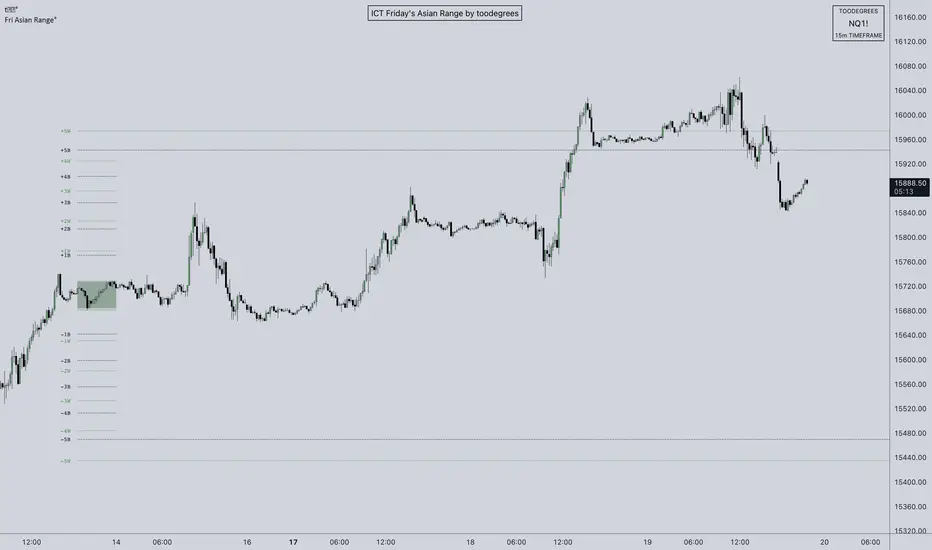
ICT Friday's Asian Range°This concept was engineered and taught by the Inner Circle Trader .
The goal of this script is to outline a potential draw on liquidity for the next trading week. It gives a parameter for ICT PD Arrays to be located above and below the marketplace and should be used in conjunction with the higher Timeframe Arrays as defined by ICT.
If there is a higher Timeframe array with a standard deviation confluence of the Friday Asian Range it is considered high probability for price to reach up/down to that level, and present a potential retracement or reversal.
The Asian Range is defined as the window of Time between 7PM to Midnight New York Time. In this case we will be only using the Friday's Asian Range which will take place on Thursday between these Times.
We have two ranges: a Body range made of the highest and lowest candle bodies, and a Wick range made by the highest and lowest candle wicks.
ICT teaches that we only want to apply this concept to the 5minute and 15minute chart.
THIS SCRIPT WILL NOT WORK ON ANY OTHER TIMEFRAME OUT OF THE BOX
Framework:
Visualization:
Example:
Trend Pro by ysfgnrADVANCED MARKET STRUCTURE & TECHNICAL ANALYSIS TOOL
This indicator is a comprehensive technical analysis tool designed to combine market structure behavior, trend dynamics, liquidity-aware price action, momentum analysis, and risk management into a single, highly configurable system.
Its modular design allows traders to enable only the components they need, keeping the chart clean and focused.
🔹 STYLE
MA → MA (Smoothing)
Applies a secondary smoothing moving average over the main moving average to reduce noise and provide a clearer visualization of trend direction and strength.
🔹 MONEY STRUCTURE ANALYSIS
BOS (Break of Structure)
Automatically detects structural breaks in price action, highlighting continuation or strengthening of the current trend.
CHoCH (Change of Character)
Identifies key moments where the behavior of price changes, often signaling potential trend reversals or transitions.
Order Blocks
Automatically marks significant supply and demand zones formed after structural breaks. These areas can act as potential reaction or continuation zones.
Equal High / Equal Low (EQH / EQL)
Detects equal highs and equal lows, highlighting liquidity concentration areas often associated with stop runs and breakout scenarios.
Fair Value Gap (FVG)
Identifies price imbalance zones created by strong impulsive moves. Mitigated gaps are automatically removed to keep the chart clean.
🔹 MOVING AVERAGES
Moving Average One
Moving Average Two
Moving Average Three
Up to three fully customizable moving averages with selectable source, type, length, and color. Suitable for short-, mid-, and long-term trend analysis.
🔹 PIVOT HIGH / LOW ANALYSIS
Pivot High / Low Points
Displays swing high and swing low points directly on the chart for clear structural reference.
Pivot High / Low Support & Resistance
Generates dynamic support and resistance zones based on pivot points and tracks price interaction with these zones.
Pivot High / Low Trendlines
Automatically draws High→High and Low→Low trendlines. Breakouts can be confirmed by candle close and used for alerts.
🔹 PIVOT POINTS STANDARD | TYPE: FIBONACCI
Plots Fibonacci-based standard pivot levels using a selectable timeframe, providing key reference levels for intraday and higher-timeframe trading.
🔹 RANGE DETECTOR
Identifies consolidation ranges based on price and volatility. Clearly distinguishes between unbroken ranges and upward/downward breakouts using color coding.
🔹 RSI-BASED CANDLE COLORING
Colors candles based on RSI values to visually represent momentum, overbought, oversold, and neutral conditions directly on price.
🔹 BREAKOUT CONFIRMATION & ALERT LOGIC
Allows confirmation of breakouts based on candle close. Includes alert conditions for:
Trendline breakouts
Support and resistance zone entries
🔹 RISK MANAGEMENT → ATR
Displays ATR-based volatility information in both price and percentage terms to assist with position sizing and risk awareness.
🔹 TREND CONFIRMATION
MA → MA (Smoothing)
Multi-timeframe trend confirmation using moving average alignment, summarized in a compact table.
RSI
Multi-timeframe RSI values with bullish and bearish thresholds to assess trend strength and momentum alignment.
🔹 TABLE
Summarizes trend, momentum, and risk data in a single table with adjustable position and size for optimal chart placement.
⚠️ Disclaimer
This indicator is not a trading strategy. It is intended for analysis and decision support only and does not constitute financial advice.

Auto-Zones (Fixed / Anchored Range)Title:
Auto-Zones (Fixed / Anchored Range) – Customizable Price Level Visualization
Description:
The Auto-Zones (Fixed / Anchored Range) indicator automatically plots key price levels based on a user-defined time range. It provides traders with a clear visual representation of average prices or fractions within a fixed or anchored range, helping to identify support, resistance, and potential breakout areas.
Key Features:
• Flexible Range Modes:
‣ Fixed Range – Plot averages only between a specific start and end date/time.
‣ Anchored – Plot averages from a start date/time extending indefinitely.
• Multiple Measurement Options:
‣ Loopback – Calculates averages over a set number of bars.
‣ Fraction – Divides the range into equal fractions for detailed zone mapping.
• Price Source Selection:
‣ Choose from Open, Close, High, Low, Midpoint, or High & Low for customized analysis.
• Automatic Zone Plotting:
‣ Lines are plotted at calculated averages or fractional levels, extended to the right for continuous reference.
• Fully Customizable Style:
‣ Line color and width are adjustable to suit chart preferences.
Inputs & Settings:
• Start/End Date & Time – Define the range for averaging or anchoring.
• Range Mode – Fixed or Anchored.
• Measurement Mode – Loopback bars or fractional divisions.
• Loopback Length – Number of bars for Loopback mode.
• Fractions – Number of levels for Fraction mode.
• Price Source – Determines which price data to use.
• Line Color & Width – Visual customization options.
Usage:
This indicator helps traders:
• Visualize key price levels for support/resistance analysis.
• Identify average price areas within a custom time range.
• Use fixed or anchored ranges for intraday, swing, or long-term analysis.
• Quickly see fractional zones for precise entry or exit planning.
Technical Notes:
• Anchored ranges extend indefinitely from the start date; adjust the start date to reset levels.
• Loopback mode averages only complete bar sets; fractional mode divides the total range into equal parts.
• Works best on standard OHLC charts; ensure proper date/time inputs for accurate plotting.

Trading Range Detector - [GonzaCam]Strict Market Structure
This indicator provides a highly disciplined approach to identifying Market Structure, Swing Points, and Trading Ranges. Unlike standard fractal indicators that simply look for high/low wicks, this script enforces a "Strict" set of rules combining Fractal Geometry, Candle Color, and Close Prices to filter out noise and identify high-probability structure levels.
It is designed for traders who need precise structural mapping (BOS) and want to avoid the "fake-outs" common with standard swing indicators.
Key Features
Strict Swing Detection : A 3-candle pattern is only valid if it meets three specific criteria:
Wick Fractal: The middle candle has the highest high (for Swing Highs) or lowest low (for Swing Lows).
Close Price Fractal: The Body (Close) of the middle candle must also be the highest/lowest of the pattern, preventing weak "wick-only" pivots.
Color Logic: Enforces specific color flows (e.g., Green → Red for tops) to ensure momentum has actually shifted.
Smart Range Tracking:
Active Range: Shows the current trading range (Top and Bottom) with thick, solid lines.
Historical Structure: Automatically archives broken levels as thin, dashed lines, creating a clean history of market structure.
"True Peak" Logic: When a Break of Structure (BOS) occurs, the script enters a "Seeking" phase. It intelligently tracks the Highest High (in a bearish break) or Lowest Low (in a bullish break) to ensure the new range is drawn from the true pivot, not just the first confirmed swing.
How It Works
1. Swing High Definition
A valid Swing High is confirmed when a 3-candle cluster appears with:
Middle Candle: Green Body.
Right Candle: Red Body.
Geometry: Middle Wick High > Left & Right Wicks AND Middle Close > Left & Right Closes.
Confirmation: Price must subsequently close below the low of the middle candle.
2. Swing Low Definition
A valid Swing Low is confirmed when a 3-candle cluster appears with:
Middle Candle: Red Body.
Right Candle: Green Body.
Geometry: Middle Wick Low < Left & Right Wicks AND Middle Close < Left & Right Closes.
Confirmation: Price must subsequently close above the high of the middle candle.
3. Range & BOS Logic
Break of Structure (BOS): Triggered when a candle closes outside the current Range Top or Bottom.
Seeking Phase: After a BOS, the script waits for a new opposing swing to form.
Example: If the market breaks UP (Bullish BOS), the script searches for the next confirmed Swing High.
Optimization: While seeking, it continuously updates to the Highest High reached, ensuring the Range Top is set at the absolute peak of the move.
Settings & Customization
Current Range Style: Customize the Color, Width, and Style (Solid/Dotted) of the active range lines.
Historical Swings Style: Customize the appearance of past structure levels to distinguish them from active price action.
Disclaimer.
This tool is for informational purposes only and does not constitute financial advice. Trading involves risk. Always use proper risk management

Scalping 4H Range + 50% This strategy is designed to capture high-probability reversals by exploiting "fakeouts" and liquidity sweeps that occur after the market's initial opening range.
How it Works:
The Range: The indicator automatically defines the High and Low of the first 4 hours of the trading session (typically the Asian/London overlap or New York Open).
The Setup: Instead of chasing breakouts, this strategy waits for a Failure to Break. It monitors for price to break out of the 4-hour range and then immediately close back inside.
The Signal:
BUY Signal: Price breaks below the Range Low (sweeping liquidity) but closes back inside the range.
SELL Signal: Price breaks above the Range High (sweeping liquidity) but closes back inside the range.
Trade Management:
Target: Trades target the opposing side of the range (e.g., a Buy at the Low targets the Range High).
Stop Loss: Placed at the extreme wick of the fakeout move to ensure a tight risk profile.
Equilibrium: A 50% Mid-Range line is provided to help secure partial profits or adjust stops to Breakeven.
How to Use This Indicator
1. Chart Setup
Timeframe: This strategy is optimized for the 5-Minute (M5) timeframe.
Asset Class: Works best on volatile pairs (Indices like US30/NAS100, or major Forex pairs like EURUSD/GBPUSD) where liquidity sweeps are common.
2. Session Configuration
Go to the indicator settings.
Session Input: Define the first 4 hours of your trading day (e.g., 0000-0400 for the New York midnight open or 0800-1200 for the London Open).
Note: The indicator automatically highlights this background in blue. No trades are taken during this formation phase.
3. Understanding the Visuals
Red Line: Range High (Resistance).
Green Line: Range Low (Support).
Grey Dotted Line: Mid-Range (50% Equilibrium).
4. Trading Rules The strategy does not trade breakouts; it trades false breakouts (fakeouts).
BUY Signal:
Price breaks below the Green Line.
Candle closes back above the Green Line.
Entry: On the close of the signal candle.
Stop Loss: Below the lowest wick of the breakout move.
Take Profit: Target the Red Line (Range High).
SELL Signal:
Price breaks above the Red Line.
Candle closes back below the Red Line.
Entry: On the close of the signal candle.
Stop Loss: Above the highest wick of the breakout move.
Take Profit: Target the Green Line (Range Low).
5. Management (Mid-Range)
When price hits the Grey Dotted Line (50%), it is recommended to move your Stop Loss to Breakeven or take partial profits.
Disclaimer: Trading involves a high risk of financial loss. This tool is provided for educational purposes only and does not constitute investment advice. Use of this tool is at your own risk. Pirate Pips ™ is not responsible for any losses incurred.

SMC Liquidity & Dealing Range [Blk0ut]SMC Liquidity & Dealing Range
- Concept -
This is a professional-grade Smart Money Concepts (SMC) toolkit designed for precision intraday trading. Unlike standard indicators that rely on static "Previous Day" ranges or lagging pivot points, this script features a Dynamic Dealing Range that adapts in real-time to market structure.
It identifies the valid structural range (Premium vs. Discount), automatically expands that range if price breaks out in real-time, and overlays significant liquidity pools (Internal/External) to help you frame high-probability setups.
- Key Features -
1. Dynamic Dealing Range (Real-Time Expansion)
Most structure indicators lag—they wait for a pivot to "confirm" (which takes bars) before moving the range.
This script is distinct: It anchors the Dealing Range to the last confirmed structure, BUT it actively monitors live price action.
Smart Expansion : If price makes a new High or Low after the confirmed pivot, the Dealing Range (and the Premium/Discount zones) automatically expands in real-time. You never have to wait for a candle close to see the true range.
2. Directional OTE (Golden Zone)
The script detects the current structural bias based on the sequence of pivots.
Bullish Structure: If the range is anchored by a Low, the script projects the Long OTE (61.8% - 78.6% Discount).
Bearish Structure: If the range is anchored by a High, the script projects the Short OTE (61.8% - 78.6% Premium).
3. Automated Liquidity Classification
The script plots key historical levels and classifies them dynamically:
Internal Liquidity: Levels trapped inside the current Dealing Range. (Targets for "fuel").
External Liquidity: Levels outside the Dealing Range. (Targets for stop runs).
Monitored Levels: PDH/PDL (Daily), PWH/PWL (Weekly), PMH/PML (Monthly), and Session Highs/Lows.
4. Smart Line Merging (Clustering)
To prevent chart clutter, the script uses a clustering algorithm. If multiple liquidity levels (e.g., Swing High + Previous Day High) exist within a tight price zone (default 1.5% of range), the script merges them into a single line with a combined label (e.g. PDH + Swing High).
Configuration Guide
Dealing Range (Structure)
Structure Type:
External (Swing): Uses larger lookback periods (Default: 50). Best for finding the overall "playing field" on 15m/1H charts.
Internal (Structure): Uses shorter lookback periods (Default: 20). Best for scalping sub-structure on 1m/5m charts.
Lookback Lengths: Fully customizable to match your trading style.
Note: Depending on the timeframes you use and your trading style you WILL have to play with the Lookback Lengths, and the selection of Internal vs. External structures!
General Settings
Forward / Backward Extension: Controls how far lines stretch across the screen.
Merge Threshold: Controls how aggressively the script combines overlapping lines.
Session Times
Pre-Market / After-Hours: Essential for futures/stock traders. Ensure these match your exchange times (e.g., 0400-0930 for NY Pre-Market).
How to Use
Check the Phase: Are we in Premium (Red) or Discount (Green)?
Identify Targets: Look for Internal Liquidity near the Equilibrium or OTE zones.
The Setup: A common SMC play is to wait for price to sweep Internal Liquidity, tap into the OTE zone, and then target the opposing External Liquidity.
Happy Trading! Don't be exit liquidity
