DTG Open Range Breakout
Description:
Overview The Open Range Breakout (ORB) is one of the most statistically significant strategies for day traders, particularly in Futures (ES/NQ) and Forex markets. This indicator automates the process of identifying the "Opening Range" (e.g., the first 30 minutes of the New York session) and visualizing the key High/Low levels that define the day's bias.
Unlike standard indicators that clutter the chart, this tool focuses on Price Action context. It highlights the critical volatility window and alerts you only when price makes a definitive move outside of this established range.
Key Features
Fully Customizable Session: Defaults to 09:30–10:00 (ET), but can be adjusted for any market (London Open, Tokyo Open, etc.).
Visual "No-Trade" Zone: Draws a shaded box representing the range formation period. This helps traders avoid "choppy" price action during the initial volatility.
Auto-Reset: The script automatically detects a new trading day and resets the range, keeping your chart clean without manual intervention.
Dynamic Support/Resistance: Once the range is closed, the High and Low lines extend forward, acting as key support or resistance levels for the rest of the session.
Smart Alerts: Alerts are programmed to trigger only after the range has fully formed, preventing false signals during the volatility establishment phase.
Reversals: If price breaks out but immediately fails and re-enters the box, consider this a "Fakeout" and look for a move to the opposite side.
Settings
Open Range Session: The specific time window to measure (Format: HHMM-HHMM).
Range Box Color: Visual preference for the shaded area.
Extend High/Low Lines: Toggle the dashed projection lines on/off.
DON.TRADES.GOLD@GMAIL.COM
Disclaimer This script is for educational and analytical purposes only. Past performance of a breakout strategy does not guarantee future results. Always manage risk.
Cerca negli script per "range"

CVD Flow Labels for Sessions Ranges [AMT Edition]CVD Flow Labels for Session Ranges
Description:
This script provides a session-aware Cumulative Volume Delta (CVD) analysis designed to enhance the “Session Ranges ” framework by combining price extremes with detailed volume flow dynamics. Unlike generic trend or scalping indicators, this tool focuses on identifying aggressive buying and selling pressure, distinguishing between absorption (failed auctions where aggressive flows are rejected) and acceptance (confirmed continuation of flows).
How it works:
CVD Calculation: The script calculates delta for each bar using a choice of Total, Periodic, or EMA-based cumulative methods. Delta represents the net difference between estimated buying and selling volume per bar.
Normalization: By normalizing delta relative to recent volatility, it highlights extreme flows that are statistically significant, making large shifts in market sentiment easier to spot.
Session-Specific Analysis: The indicator separates Asia, London, and New York sessions to allow context-sensitive interpretation of price and volume interactions. Each session’s extremes are monitored, and flow labels are plotted relative to these extremes.
Flow Labels: Bullish and bearish absorption (“ABS”) and acceptance (“ACC WEAK/STRONG”) labels provide immediate visual cues about whether aggressive flows are being absorbed or accepted at key price levels.
Alerts: Configurable alerts trigger when absorption or acceptance occurs, supporting active trading or strategy automation.
Originality & Usefulness:
This script is original because it integrates volume-based auction theory with session-specific market structure, rather than simply showing trend or scalping signals. By combining CVD dynamics with session extreme levels from the “Session Ranges ” script, traders can:
Identify where price is likely to be accepted or rejected.
Confirm aggressive buying or selling flows before entering trades.
Time entries near session extremes with higher probability setups.
How to use:
Apply the “Session Ranges ” to see session highs, lows, and interaction lines.
Use this CVD Flow Labels script to visualize absorption and acceptance at these session levels.
Enter trades based on alignment of session extremes and flow signals:
Absorption at a session extreme may indicate a potential reversal.
Acceptance suggests continuation in the direction of the flow.
Alerts can help manage trades without constant screen monitoring.
This tool is designed to give traders a structured, session-based view of market auctions, providing actionable insights that go beyond typical trend-following or scalping methods. It emphasizes flow analysis and statistical extremes, enabling traders to make more informed decisions grounded in market microstructure.

Volume vs Range Imbalance DetectorDescription :-
Concept :-
This indicator is designed to identify "Effort vs. Result" anomalies in the market using Volume Spread Analysis (VSA) concepts. It highlights specific candles where high trading activity (Volume) is occurring, but the price movement (Range) is restricted. This behavior often signals the presence of heavy absorption by buyers or sellers ("Smart Money" activity) before a potential reversal or continuation.
How It Works :-
The script combines two distinct methods of volume analysis into a single view
1. Structural Imbalance (Lime & Red Signals)
This logic detects major market anomalies by comparing the current candle against a 50-period average context.
The Logic: A signal is generated if the Volume is significantly higher than the average (default 1.618x the 50 SMA) AND the Price Range is significantly smaller than the average (default 1.272x the 50 ATR).
Lime Candle/Dot (Bullish Absorption): Massive volume with small range, closing in the upper 50% of the bar. This suggests sellers are dumping, but buyers are absorbing all orders, preventing the price from dropping.
Red Candle/Dot (Bearish Blockade): Massive volume with small range, closing in the lower 50% of the bar. This suggests buyers are pushing, but sellers are absorbing the demand, preventing the price from rising.
2. Hidden Activity (Orange Signals)
This logic is more sensitive and compares the current candle only to the previous candle.
The Logic: A signal is generated if the current Volume is higher than the previous bar's volume, but the current Range is smaller than the previous bar's range.
Orange Candle/Dot: This indicates "Churn." Effort is increasing, but the result (movement) is decreasing. It is often an early warning sign of congestion or a pending breakout.
Visual Guide
Lime Dot (Below Bar): Strong Buying Pressure (Bullish Imbalance).
Red Dot (Above Bar): Strong Selling Pressure (Bearish Imbalance).
Orange Dot (Above Bar): Hidden Activity / Churn (Warning).
Settings
Context Length: The lookback period for the moving averages (Default: 50).
Volume/Range Multipliers: Determine how strict the "Imbalance" signals are. Higher numbers result in fewer, more significant signals.
Show Hidden Activity: Toggle the orange signals on or off.
Disclaimer
This tool is for educational purposes only. Volume analysis is subjective and should be used in conjunction with other form

Intraday Sessions Ranges with Time SegmentationSession Ranges indicator overlays customizable range boxes on major trading sessions (e.g. London, Premarket, NY AM and NY PM) using New York time.
Toggle visibility, add evenly spaced vertical segment lines, and highlight key time zones. Perfect for traders marking price action and levels across multiple historical days.

QuantCrawler 5m ORB Pro - Opening Range with Confluence FiltersThis indicator captures the 5-minute Opening Range and generates entry signals using a breakout-then-retest methodology. It includes optional confluence filters to refine entries and reduce false signals.
HOW IT WORKS
1. Captures the 5-minute Opening Range (high, low, midpoint) at your selected session open
2. Waits for price to break beyond OR high or low by your defined distance
3. After breakout, monitors for price to retest the OR midpoint
4. Signals LONG after bullish breakout + midpoint retest
5. Signals SHORT after bearish breakout + midpoint retest
6. Marks invalidated signals with (X) if price breaks through the opposite side
PRE-CONFIGURED SESSIONS
- NYSE - 9:30-9:35 ET
- CME - 8:30-8:35 CT
- London - 3:00-3:05 ET
- Asia - 7:00-7:05 PM ET
- Custom - Define your own session times and timezone
BREAKOUT DISTANCE OPTIONS
Choose between fixed points or percentage-based breakout threshold. Percentage mode automatically scales to the instrument price.
CONFLUENCE FILTERS
Optional filters to add confirmation before signals fire:
- VWAP - Long requires price above VWAP, short requires below
- EMA Slope - Confirms trend direction using 20-period EMA
- Volume - Requires relative volume above 1.5x average
- FVG - Requires a Fair Value Gap supporting trade direction
- ATR - Filters Opening Ranges that are abnormally small or large relative to ATR
When filters block a valid setup, the indicator displays a BLOCKED label so you can see what you missed and why.
STATUS BOX
Real-time display showing:
- Current trade state (Building OR, Watching, Awaiting Retest, Long/Short Active)
- OR High, Low, and Midpoint levels
- Active filters and block reasons
ALERTS
Built-in alerts for Long Entry, Short Entry, or Any Entry.

First Candle Range (FCR) Gold Strategy - EtubersThe 18:00 (6:00 PM) candle is widely used by traders in the Forex and Futures markets because it marks the New York market rollover and the start of the Asian session.
How the Strategy Works:
- The Range: The High and Low prices of the 1-hour candle (18:00–19:00) create a "Supply and Demand" zone.
- The Breakout: A candle closing above the high signals a bullish breakout; a candle closing below the low signals a bearish breakout.
- Institutional Memory: By extending this zone forward for 4 days, traders can identify where "old" 18:00 levels act as support or resistance in the future.
- Execution: Traders often wait for a breakout followed by a "retest" of the box boundary to enter a high-probability trade.

CRT - Candle Range TheoryCRT - Candle Range Theory is an indicator that identifies CRT patterns based on the concept of liquidity sweeps and price rejection.
WHAT IS CRT?
A CRT (Candle Range Theory) pattern occurs when:
- A "Parent" candle establishes a range (High/Low)
- The next candle sweeps beyond one side of that range (liquidity grab)
- But closes back INSIDE the parent range (rejection)
This creates a potential reversal signal as liquidity has been taken and price rejected continuation.
PATTERN TYPES
BEARISH CRT
- CRT candle sweeps above Parent High
- Does NOT sweep below Parent Low
- Closes inside Parent range
BULLISH CRT
- CRT candle sweeps below Parent Low
- Does NOT sweep above Parent High
- Closes inside Parent range
ALERT TYPES
The indicator offers three alert filters based on the strength of rejection:
1. Close NOT Reach 50%
Strongest rejection - Close doesn't even retrace to the 50% level of the parent range.
Bearish: Close > 50% | Bullish: Close < 50%
2. Price NOT Reach 50%
Price (wick) doesn't reach the 50% level at all.
Bearish: Low > 50% | Bullish: High < 50%
3. Basic CRT
Any valid CRT pattern without the 50% filter.
VISUAL ELEMENTS
- PH / PL lines: Parent candle High and Low
- 50% line: Middle of the parent range
- 25% / 75% lines: Quarter levels of the parent range
- Labels: Appear on CRT candle showing pattern type and conditions met
HOW TO USE
1. Set your preferred chart timeframe
2. Enable the alert types you want to monitor
3. Create alerts via the TradingView alert menu
4. Labels will automatically appear when conditions are met
SETTINGS
Visual Settings
- Colors for PH/PL, 50%, and 25%/75% lines
- Line widths for each level type
- Toggle visibility for 50% and quarter lines
CRT Alerts
- Show/hide labels on chart
- Customize bearish/bullish label colors
- Enable/disable each alert type independently
NOTES
- This indicator works on any timeframe
- Multiple conditions can be displayed in one label if enabled
- Outside bars (sweep both sides) are excluded from CRT detection
- Close must be inside parent range for valid pattern

Visible Range / POC / Volume / SNR Detector PROVisible Range POC & Volume SNR Detector PRO
Visible Range POC & Volume SNR Detector PRO is a professional-grade volume-based market structure tool designed to identify institutional Support & Resistance zones, Point of Control (POC), and Value Areas directly from the visible chart range.
This indicator goes beyond traditional swing highs and lows by analyzing real traded volume, revealing where large players are active, where price finds fair value, and where high-probability reactions are most likely to occur.
🔍 Core Features
📊 Visible Range Volume Profile
🔹Builds a full Volume Profile using only the visible chart range
🔹Splits price into configurable precision bins for maximum accuracy
🔹Detects true volume clusters instead of subjective price levels
🎯 Point of Control (POC)
🔹 Automatically identifies the highest-volume price level
🔹Acts as a magnet price where market participants agree on value
🔹Fully customizable line style, width, and color
🔹 Optional label with timeframe + price + volume (K / M / B)
📦 Value Area (VAH / VAL)
* Calculates Value Area High & Low around the POC
* Default **70% volume range** (institutional standard)
* Optional Value Area fill for clear fair-value visualization
* Helps distinguish **range conditions vs trending moves**
🧱 Volume-Based Support & Resistance Zones
🔹Automatically detects high-impact S&R zones from volume behavior
🔹Zones are visually classified by strength:
🔹 🟢 Strong
🔹 🟡 Medium
🔹 🔴 Weak
🔹Clean box rendering with customizable borders:
🔹 Solid / Dashed / Dotted
🔹 Zones extend dynamically into the future for planning trades
🔄 Dynamic Flip Logic (PRO Standard)
🔹 Advanced Dynamic Flip system:
🔹 Support ➜ Resistance after a breakdown
🔹Resistance ➜ Support after a breakout
🔹 Reflects real market structure shifts
🔹Eliminates outdated static levels
🔁 True Retest & Zone Intelligence
🔹Each zone includes detailed contextual data:
🔹🔄 True Retest Count (price leaves zone and comes back)
🔹⏳ Zone Age (minutes / hours / days)
🔹💪 Strength Classification
🔹🔁 Flip Status
🔹⏱️ Timeframe
🔹💲 Exact price level
🔹All information is displayed in a single clean label.
🔔 Smart Alerts System
🔹Never miss key interactions:
🔹🟢 Touch Alert — price enters a zone
🔹⬇️⬆️ Break Alert — zone failure or breakout
🔹🔄 Retest Alert — classic break & retest setup
Alerts trigger on confirmed bars to reduce noise and false signals.
📋 Professional Dashboard
🔹At-a-glance market overview:
🔹Total Support & Resistance zones
🔹🎯 POC level
🔹📦 VA High / VA Low
🔹💪 Strong / Medium / Weak zone distribution
🔹📍 Nearest Support & Resistance
🔹📏 Distance to key levels
🔹 🎨 Auto / Dark / Light theme support
🔹 📐 Adjustable size & position

QFT MTF Range DetectorQFT MTF Range Detector — QuantumFlowTrader
Description:
The QFT MTF Range Detector is a multi-timeframe (MTF) tool designed to identify consolidation zones or ranging conditions across multiple intraday timeframes — from 1 minute up to 4 hours. This indicator is optimized for high-frequency trading environments such as scalping and day trading.
How it works:
For each selected timeframe, the indicator evaluates five key technical conditions:
- Low ADX (less than 17) – suggesting weak trend strength.
- Range width within a specific normalized threshold.
- Normalized ATR (volatility filter) in a defined range.
- RSI near the neutral zone (40–60) with low volatility.
- Price proximity to the mid-range (consolidation center).
Each condition contributes a score. If at least 3 out of 5 conditions are met, that timeframe is considered to be in a range (consolidation).
Visual output:
A compact table is displayed on the chart showing all selected timeframes:
Black box = Timeframe is in a range (consolidation).
Purple box = Not in a range (likely trending or volatile).
Timeframes are labeled (e.g., "4H", "15M") for clarity.
Customization:
Choose display corner (top/bottom, left/right).
Enable or disable table borders.
Set custom colors for range and non-range signals.
Use case:
Traders can quickly assess which timeframes are in a range, helping them:
Avoid choppy markets,
Time entries and exits better,
Confirm multi-timeframe alignment.
Note: This is not a buy/sell signal indicator. It is a market condition filter to enhance decision-making.

Visible RangeOverview This is a precision tool designed for quantitative traders and engineers who need exact control over their chart's visual scope. Unlike standard time calculations that fail in markets with trading breaks (like A-Shares, Futures, or Stocks), this indicator uses a loop-back mechanism to count the actual number of visible bars, ensuring your indicators (e.g., MA60, MA200) have sufficient sample data.
Why use this? If you use multi-timeframe layouts (e.g., Daily/Hourly/15s), it is critical to know exactly how much data is visible.
The Problem: In markets like the Chinese A-Share market (T+1, 4-hour trading day), calculating Time Range / Timeframe results in massive errors because it includes closed market hours (lunch breaks, nights, weekends).
The Solution: This script iterates through the visible range to count the true bar_index, providing 100% accurate data density metrics.
Key Features
True Bar Counting: Uses a for loop to count actual candles, ignoring market breaks. perfect for non-24/7 markets.
Integer Precision: Displays time ranges (Days, Hours, Mins, Secs) in clean integers. No messy decimals.
Compact UI: Displays information in a single line (e.g., View: 30 Days (120 Bars)), default to the Top Right corner to save screen space.
Fully Customizable: Adjustable position, text size, and colors to fit any dark/light theme.
Performance Optimized: Includes max_bars_back limits to prevent browser lag on deep history lookups.
Settings
Position: Default Top Right (can be moved to any corner).
Max Bar Count: Default 5000 (Safety limit for loop calculation).

BPR (Ballanced price range) DetectorHow This BPR Detector Works
This indicator is designed to detect and visualize balanced price ranges (BPRs) on price charts. The indicator has two main components:
Regular FVG Detection - The indicator first detects regular Fair Value Gaps in price action, which are spaces where price has moved quickly leaving a gap. This is necessary because BPRs are derived from regular FVGs.
BPR Detection - When the price action inverts and moves through a regular FVG in the opposite direction, the indicator identifies this as a BPR. This concept is important in Inner Circle Trader (ICT) methodology as it can signal potential changes in trend direction. Additionally the detection logic is refined by incorporating displacement.
The main functionality preserved includes:
Detection of regular FVGs (required to find BPRs)
Conversion of regular FVGs to BPRs when price moves through them creating a FVG in the opposite direction
Visual display of both FVG and BPR zones
Mitigation tracking for both types of imbalances
Displacement visualization that helps identify energetic price moves
Key Settings
FVG Settings - Control the appearance and behaviour of regular Fair Value Gaps
BPR Settings - Control the appearance of Breaker Price Ranges (which have different colours by default)
Mitigation Settings - Define how the indicator determines when an imbalance has been filled
Displacement Settings - Optional highlighting of energetic price moves that may lead to imbalances

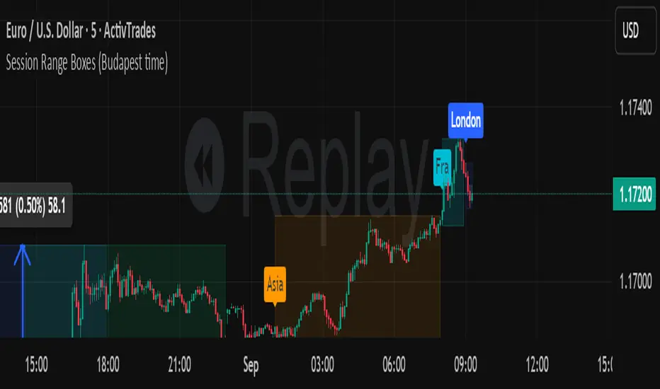
Session Range Boxes GR v2.1This indicator draws intraday range boxes for the main Forex sessions based on Europe/Budapest time (CET/CEST).
Tracked sessions (Budapest time):
Asia: 01:00 – 08:00
Frankfurt (pre-London): 08:00 – 09:00
London: 09:00 – 18:00
New York: 14:30 – 23:00
For each session, the script:
Detects the session start and session end using the current chart timeframe and the Europe/Budapest time zone.
Tracks the high and low of price during the session.
Draws a colored box from session open to session close, covering the full price range between the session high and low.
Draws a white midline inside every box at the midpoint between the session high and low (and keeps it visible for all past sessions).
Optionally plots a small label (“Asia”, “Fra”, “London”, “NY”) above the first bar of each session.
Color scheme:
Asia: soft orange box
Frankfurt: light aqua box
London: darker blue box
New York: light lime box
Use this tool to:
Quickly see which session created the high or low of the day,
Highlight important liquidity zones and prior session ranges that price may revisit,
Visually separate Asia, Frankfurt, London and New York volatility profiles on intraday charts.
Optimized for intraday trading (Forex / indices), but it works on any symbol where session behavior and time-of-day structure matter.

Session Range Boxes (Budapest time) GR V2.0Session Range Boxes (Budapest time)
This indicator draws intraday range boxes for the main Forex sessions based on Europe/Budapest time (CET/CEST).
Tracked sessions (Budapest time):
Asia: 01:00 – 08:00
Frankfurt (pre-London): 08:00 – 09:00
London: 09:00 – 18:00
New York: 14:30 – 23:00
For each session, the script:
Detects the session start and session end using the current chart timeframe and the Europe/Budapest time zone.
Tracks the high and low of price during the entire session.
Draws a box (rectangle) from session open to session close, covering the full price range between session high and low.
Optionally prints a small label above the first bar of each session (Asia, Fra, London, NY).
Color scheme:
Asia: soft orange box
Frankfurt: light aqua box
London: darker blue box
New York: light lime box
Use this tool to:
Quickly see which session created the high/low of the day,
Identify liquidity zones and session ranges that price may revisit,
Visually separate Asia, Frankfurt, London and New York volatility on intraday charts.
Optimized for intraday trading (Forex / indices), but it works on any symbol where session behavior matters.
Volume Based Ranges (VBR) [SS]Here is the Volume Based Ranges or VBR indicator.
How it works
The indicator works by:
Sorting volume into buying and selling volume, then
Calculating 2 independent Z-Scores for buying and selling data, then
Identifying the high buying and selling nodes through the use of the Z-score threshold.
Tracks the average target/move based on buying and selling nodes over a designated lookforward horizon (i.e. if you want to see the average move a high selling node happens over 20 candles, you can modify the lookforward horizon to 20).
Calculates the composition from each volume node, displaying the composition information on each line (the % of buying and selling each node contains).
How to Use it
To use this indicator:
Select the Z-Score length of assessment: By default, z-score is 75 and this is usually fine to leave.
Identify the threshold trigger: This will need to be adjusted based on your timeframe. If you are using 1 minute, the data is noiser and you want more profound signals. Thresholds generally in this range should be between 5 - 7. For larger timeframes, you want to relax this threshold, to about 2 to 3. You can toggle in increments of 0.5 to find what works the best. Generally you want to see very rigorous volume node signals instead of tons of them.
Determine what you want to see: You can turn of the support and resistance lines and just have the node identification signals and the return boxes. Or, you can just have the support and resistance lines and turn off the return boxes. You can customize the information the indicator displays in the settings menu to suit what you are most interested in.
Let's look at some examples '
DIS on the hourly. We can see that the average up move from the high buying nodes has a target of 115.42, and in between there we can see the high selling and buying nodes and their compositions.
High buying (100% of the high buying volume) is around the 112.61. This means, you would expect this to be an area of retracement.
We can also see that high selling is just below that at 111.66, which can be a resistance area.
Here is a closer look at the levels specifically:
EPAM on the daily:
You can see a successful retrace back to a high volume node.
Concluding remarks
That's the indicator!
Its one that is best to get a feel for, play around and decide on the settings you like for your individual ticker.
I have included tooltip descriptions for the settings within the indicator as well.
I hope you enjoy it and find it helpful!
Thanks for reading/checking it out and as always, safe trades!

15-Min Opening Range Indicator & Breakout Targets (ORB)- Willy
🔍 Overview
The **15-Min ORB (Opening Range Breakout)** indicator automatically identifies the **first 15-minute high and low range** after a market opens — and plots breakout targets based on user-defined expansion multiples.
It’s designed for traders who use **Opening Range Breakout (ORB)** strategies across multiple markets or sessions — and want **precise timing adjusted to their own timezone**.
---
⚙️ Features
🕐 **Time-Zone Offset (Local Adjustment)**
* Automatically shift your ORB window to match your **local timezone**.
* No more guessing when “09:30” happens in your region.
* Simply set the **offset (hours ahead or behind chart time)** and the indicator adjusts everything automatically.
⏱ **15-Minute Opening Range**
* Plots the high and low of your chosen 15-minute window.
* Works with any market or trading session (NYSE, London, Tokyo, Crypto, etc.).
* User can define **custom start hour and minute**.
🎯 **Breakout Targets (TP1, TP2)**
* Automatically calculates and draws **Take Profit levels** using customizable expansion multiples.
* Configurable TP1 / TP2 lines and labels with selectable styles (solid, dashed, dotted).
💬 **Visual Labels**
* Clear text labels showing:
* 15m High and Low levels.
* TP1 and TP2 targets.
* Label placement (left or right) adjustable for chart preference.
🧹 **Automatic Daily Reset**
* Resets all levels and targets at your midnight (or market day boundary).
* Ensures clean new ORB levels every day.
🔔 **Breakout Alerts**
* Built-in TradingView alerts for:
* **Closed Above 15m High**
* **Closed Below 15m Low**
---
🧭 How to Use
1. **Add to Chart**
* Click “Add to Favorite Scripts” and apply to your desired symbol.
* Works best on intraday timeframes (1m–15m).
2. **Set Your Market Session**
* Choose your **Range Start Hour and Minute** (e.g., 9:30 for NYSE).
* Set **My Time Offset from Chart (hours)** — for example:
* NYSE 9:30 New York → Bangkok (+12 hours)
* London 8:00 → Bangkok (+7 hours)
* The indicator adjusts automatically.
3. **Monitor the Range**
* The first 15-minute high and low are drawn as purple lines.
* When price breaks above or below, TP levels appear.
4. **Trade Your Plan**
* Alerts trigger when candles close outside the range.
* Manage targets using the expansion multipliers.
---
🧮 Example Settings
| Market | Local Open (Your Time) | Range Start (chart time) | Offset | Notes |
| :----------- | :--------------------------------- | :----------------------- | :----- | :----------------------- |
| NYSE (US) | 9:30 AM New York → 9:30 PM Bangkok | 9 | +12 | Typical for Thai traders |
| LSE (UK) | 8:00 AM London → 3:00 PM Bangkok | 8 | +7 | EU market overlap |
| Tokyo | 9:00 AM Tokyo → 7:00 AM Bangkok | 9 | +2 | Asian session |
| Crypto (UTC) | 0:00 UTC → 7:00 AM Bangkok | 0 | +7 | 24/7 markets |
---
📐 Parameters
### 15-Minute Range
* **Display 15-Minute Range** — toggles the range lines.
* **Show 15-Minute Labels** — toggles the range high/low labels.
* **Range Start Hour / Minute** — defines the start of your 15m window.
* **My Time Offset from Chart (hours)** — shifts the calculation to your local time.
* **Range Color / Style** — customize the look of your range lines.
### Targets
* **TP1 Expansion Multiple** — default `1.0` (equal to full range).
* **TP2 Expansion Multiple** — default `2.0`.
* **Show TP1 / TP2 Levels & Labels** — toggle individually.
* **TP Label Color** — customize breakout target visuals.
### Labels
* **Label Position (Left/Right)** — choose where labels appear on chart.
---
## 💡 Strategy Ideas
* Combine with volume or volatility filters for better confirmation.
* Use alongside VWAP, EMA, or session profiles for confluence.
* Apply on different markets:
* **Stocks (NYSE, NASDAQ)** — morning ORB strategy.
* **FX (London Open)** — volatility breakout.
* **Crypto (UTC 00:00)** — daily range breakout.
---
🧩 Technical Notes
* Built in **Pine Script v6**.
* Works on all intraday timeframes.
* Time calculations are local-adjusted using integer offset logic (avoids DST issues).
* No repainting — range values lock once 15m window completes.
---
🚀 Author Notes
Created for traders who want **simple, reliable ORB logic that respects your timezone**.
No unnecessary complexity — everything resets cleanly each day.
Tested and verified on:
* BTCUSD (Binance)
* ES1! (CME Futures)
* NAS100 / SPX500
* EURUSD / GBPJPY
* Thai SET50 index
---
🔔 Alerts
* “Closed Above 15m High”
* “Closed Below 15m Low”
You can configure custom alerts with your own messages.
---
## ⚠️ Disclaimer
This script is **for educational purposes only**.
It does not constitute financial advice or guarantee results.
Always backtest and trade responsibly.

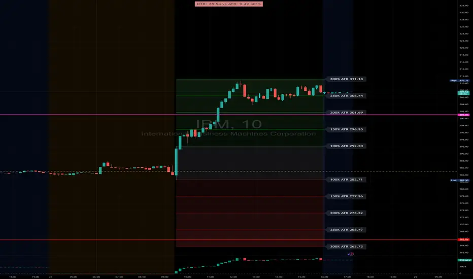
DTR & ATR with live zonesThis indicator is designed to help traders gauge the day's volatility in real-time. It compares the current Daily True Range (DTR)—the distance between the session's high and low—to the historical Average True Range (ATR).
The main purpose is to project potential price levels where the market might reach based on its average volatility. These levels (100% ATR, 150%, 200%, etc.) can be used as price targets. For instance, if you're in a long trade, you might consider taking partial or full profits as the price approaches these upper ATR extension levels. The indicator is highly customisable, allowing you to control the appearance of the ATR lines, zones, and labels to fit your charting preferences.
Core Concepts: ATR and DTR
To use this indicator effectively, it's important to understand its two main components:
Average True Range (ATR): This is a classic technical analysis indicator that measures market volatility. It calculates the average range of price movement over a specific period (e.g., 14 days). A higher ATR means the price is, on average, moving more, while a low ATR indicates less volatility. This script uses a higher timeframe ATR (e.g., Daily) to establish a stable volatility baseline for the current trading day.
Daily True Range (DTR): This is simply the difference between the current trading session's highest high and lowest low (session high - session low). It tells you how much the price has actually moved so far today.
The indicator's logic revolves around comparing the live, unfolding DTR to the historical, baseline ATR. An on-screen table conveniently shows this comparison as a percentage, to show how volatile the day has been.
How It Works: The Dynamic & Locked Mechanism
The most clever part of this indicator is how it draws the ATR levels. It operates in two distinct phases during the trading session:
Phase 1: Dynamic Expansion (Before DTR meets ATR)
At the start of the session, the DTR is small. The indicator calculates the remaining range needed to "complete" the 100% ATR level (difference = avg_atr - dtr). It then adds this remaining amount to the session high and subtracts it from the session low. This creates a "floating" 100% ATR range that expands dynamically as the session high or low is extended.
Phase 2: The Lock-in (After DTR meets or exceeds ATR)
Once the day's range (DTR) becomes equal to or greater than the avg_atr, the day has met its "expected" volatility. At this point, the levels lock in place. The indicator intelligently determines the anchor point for the locked range.
Once this primary 100% ATR range is established (either dynamically or locked), the script projects the other levels (150%, 200%, 250%, and 300%) by adding or subtracting multiples of the avg_atr from this base.
How to Use It for Trading
The primary use of this indicator is to set logical, volatility-based price targets.
Setting Profit Targets: If you enter a long position, the upper ATR levels (100%, 150%, 200%) serve as excellent areas to consider taking profits. A move to the 200% or 250% level often signifies an overextended or "exhaustion" move, making it a high-probability exit zone. For short positions, the lower ATR levels serve the same purpose.
Assessing Intraday Momentum: The on-screen table tells you how much of the expected daily range has been used. If it's early in the session and the DTR is only at 30% of the ATR, you can anticipate more significant price movement is likely to come. Conversely, if the DTR is already at 150% of ATR, the bulk of the day's move may already be complete.
Mean Reversion Signals: If the price pushes to an extreme level (e.g., 250% ATR) and shows signs of stalling (e.g., bearish divergence on an oscillator), it could signal a potential reversal or pullback, offering an opportunity for a counter-trend trade.
Key Settings
ATR Length & Smoothing Type: These settings control how the baseline ATR is calculated. The default 14 period and RMA smoothing are standard, but you can adjust them to your preference.
Session Settings: This is crucial. You must set the Market Session and Time Zone to match the primary trading hours of the asset you are analysing (e.g., "0930-1600" for the NYSE session).
Show Lines / Show Labels / Show Zones: The script gives you full control over the visual display. You can toggle each ATR level's lines, labels, and background zones individually to avoid a cluttered chart and focus only on the levels that matter to your strategy.
Asia/London 1-Minute Range — Smart Extend & PD LabelsAutomatically draws Asia and London ranges from the 1-minute anchor candle (wick high/low) at configurable times. Boxes extend to the right and only cap when a new range overlaps vertically; otherwise they run to X bars past price. Keeps 2 per session (today + PD) with PD.Asian range / PD.London range labels. Custom 50% midline (on/off, style, width, color). Fully customizable labels (text, color, size, position) with uniform offset (% / ticks / price). Works on any timeframe (HL fetched from 1m). Time zone and times are fully configurable..
FlowThe indicator attempts to capture the volatility within a range and apply a set of Fibonacci calculations to display a range of bands of varying degrees which represents zones where exhaustion may occur on both sides.
So if price gets in to the yellow or pink zones then the script author is on high alert for a reversal. It must be noted that the user of the script should be fluent in Elliott Wave Analysis as the script was developed to help the author determine if a wave sequence may have ended.
When the indicator glides along one of the green, yellow or pink bands, then the instrument is likely in a 3rd wave, in Elliott wave speak, as such the user of the script would wait and not try to fade the move up or down as continuation is likely. Instead a move away from one of the bands should indicate another attempt at reaching the band after moving away. Thus, this move back in should be a 5th wave of some degree within the timeframe.
The indicator is not bound to any timeframe, as such it works on a 1 minute chart as it does on a weekly timeframe.
One of the observations the author makes is the use of the indicator within a sideways market. The indicator performs very well within these lower volatility environments by indicating exhaustion within these range bound markets.
So in essence, within the framework of Elliott wave analysis and respective time frames. Watch several higher and lower time frames.
1) Once wave 1 has completed
2) Look for a move down to the lower green / yellow zone to identify a wave 2 zone.
3) Once wave 3 starts, do not attempt to fade or short the first touch on the pink zone. Wait for price to move away and then come back in to the pink zone before considering a top and any attempts to fade.
4) Wave 4 should find support on the lower yellow or green band. Where it may be considered that price may change direction.
5) Depending on the time frame and any expected/unexpected extensions, Wave 5 may find resistance in to the pink zone.
A question that the author often asks is "where will wave 3 end?" - Will it end at the 1.618% extension of wave 1 & 2, the 176.4 or higher and perhaps lower. Using the pink zones the author has found it useful and quite accurate to make such a judgement based on the current position of the bands - Pink for exhaustion in an uptrend and green for exhaustion in a down trending market.
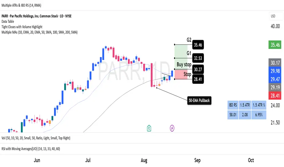
Average True Ranges with IBD RSAdvanced ATR Analysis with IBD Relative Strength
This comprehensive indicator combines Average True Range (ATR) analysis with IBD (Investor's Business Daily) Relative Strength calculation, providing both volatility measurement and momentum analysis in one powerful tool.
Key Features:
ATR Analysis:
Standard ATR: Customizable period (default 14) with multiple smoothing options
1.5x ATR: Extended range for wider stop-loss and target calculations
Smoothing Options: Choose between RMA, SMA, EMA, or WMA for ATR calculation
Customizable Colors: Distinct colors for easy visual identification
IBD Relative Strength:
Professional RS Formula: Uses the same calculation method as Investor's Business Daily
Multi-Timeframe Analysis: Compares current price to 3, 6, 9, and 12-month performance
Weighted Calculation: 40% weight on 3-month, 20% each on 6, 9, and 12-month performance
Zero-Based Scale: Values above 0 indicate outperformance, below 0 indicate underperformance
Trading Applications:
Volatility-Based Stops: Use ATR and 1.5x ATR for dynamic stop-loss placement
Position Sizing: ATR helps determine appropriate position size based on volatility
Relative Strength Analysis: IBD RS identifies stocks with superior momentum
Market Timing: High RS values often precede strong price moves
Risk Management: Combine volatility (ATR) with momentum (RS) for comprehensive analysis
Technical Details:
ATR Calculation: True Range smoothed over selected period with chosen method
IBD RS Formula: (40% × 3M) + (20% × 6M) + (20% × 9M) + (20% × 12M) - 100
Display: Separate pane indicator with customizable colors for each component
How to Interpret:
High ATR: Increased volatility, wider stops needed
Low ATR: Reduced volatility, tighter stops possible
Positive IBD RS: Stock outperforming market over measured periods
Negative IBD RS: Stock underperforming market over measured periods
Customizable Parameters:
ATR calculation length
Smoothing method for ATR
Individual colors for ATR, 1.5x ATR, and IBD RS lines
Perfect for swing traders and position traders who want to combine volatility analysis with relative strength momentum in their decision-making process. Particularly useful for stock selection and risk management.
Full Session ATR Range (Live) - with Position ToggleBelow is a publication-ready text for the "Full Session ATR Range (Live) - with Position Toggle" indicator, written in a professional yet accessible style suitable for a trading community (e.g., TradingView or a blog). The text highlights the indicator's features, usage, and benefits, while avoiding overly technical jargon for a broad audience.
---
### Introducing the Full Session ATR Range (Live) Indicator with Position Toggle
Enhance your trading strategy with the **Full Session ATR Range (Live) Indicator**, a powerful tool designed to provide real-time insights into market volatility and session dynamics. This customizable indicator, now available with a position toggle feature, compares the current session's range to a 10-day Average True Range (ATR), helping traders gauge market activity and anticipate potential movements.
#### Key Features
- **Live Range Tracking**: Displays the current session's range (high minus low) alongside a 10-day ATR, updated in real-time during market hours.
- **Session Mode Flexibility**: Includes an auto-toggle option to switch between Electronic Trading Hours (ETH) and Regular Trading Hours (RTH), adapting to your preferred trading session. Manually select ETH or RTH, or let the indicator auto-detect based on market hours.
- **Comprehensive Metrics**: Offers a detailed breakdown including:
- Range/Avg %: Percentage of the current range relative to the 10-day ATR.
- Points Left: Remaining points to reach the average range.
- 100% Range Up/Dn: Potential upper and lower targets based on the ATR difference.
- **Position Customization**: Adjust the table's location on your chart with options like top-left, top-right, middle-center, or bottom-right for optimal visibility.
- **Visual Appeal**: Features a customizable background and text color to match your chart theme.
#### How It Works
The indicator calculates the 10-day ATR using daily data and tracks the current session's range, resetting at the start of each day or session change. During market hours (e.g., 6 AM - 8 PM CDT, adjustable), it updates live, providing actionable insights. When the market is closed, it displays historical ATR while marking live metrics as "n/a" to avoid confusion. The ETH/RTH toggle ensures the range reflects either the full extended session or the core trading hours, tailored to your strategy.
#### Why Use It?
Whether you're a day trader monitoring intraday volatility or a swing trader assessing longer-term trends, this indicator helps you:
- Identify overextended or underactive sessions compared to historical norms.
- Plan entries and exits with targets based on the 100% Range Up/Dn levels.
- Stay informed with a clean, adjustable display that fits your workflow.
#### Installation & Customization
1. Add the indicator to your TradingView chart.
2. Adjust the ATR length (default: 10 days) and table position via the input settings.
3. Choose your session mode (Auto, ETH, or RTH) and customize colors to suit your style.
4. Test during market hours for live updates—note that static values may appear outside trading sessions.
#### Feedback & Support
This indicator is designed for flexibility and ease of use. Share your feedback or request enhancements by commenting below or contacting the developer. Happy trading!

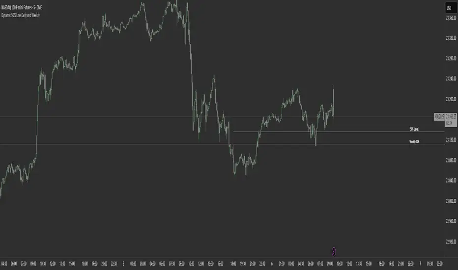
Dynamic 50% Line [Daily and Weekly Range]This indicator automatically plots the 50% retracement level (midpoint) of the daily and weekly trading ranges. It helps traders identify key support/resistance zones where price may react, offering insights into potential reversal or continuation areas.
Auction Market Theory & the 50% Level
At its core, this indicator is built on Auction Market Theory (AMT), which views price movement as an ongoing auction process where buyers and sellers compete to establish value. The 50% midpoint represents fair value—the equilibrium where price is most likely to balance before continuing its trend or reversing.
When price deviates too far from this level, it often returns to balance (mean reversion) or accepts new value (breakout). By tracking the daily and weekly 50% lines, traders can:
Identify high-probability reversal zones (where price may reject fair value).
Spot trend continuation areas (where price accepts higher/lower value).
Align with institutional order flow, as large players often use these levels for execution.
This makes the indicator particularly powerful for traders who follow volume profile, order flow, or ICT concepts, as it visually maps the market’s ongoing auction process.
Features:
✅ Automated Daily & Weekly Midpoints – Calculates the 50% level from the high/low of each session.
✅ Customizable Line Styles – Choose between solid, dotted, or dashed lines for better visibility.
✅ Clear Labeling – Optional text labels show "50% Level" or custom text at your preferred position (left, middle, or right).
✅ Flexible Styling – Adjust line colors, thickness, and text size to match your chart theme.
How It Works:
Daily 50% Line: Resets at 6 PM NY time (new trading day).
Weekly 50% Line: Resets on Sunday at 6 PM NY time (new trading week).
The midpoint is calculated as:
(High + Low) / 2
Lines extend 500 bars forward for easy visibility.
Why Use This Indicator?
Unlike static Fibonacci tools, this dynamic indicator auto-updates the 50% level as new highs/lows form, saving time and improving accuracy. Whether you trade forex, stocks, or crypto, these levels often act as strong magnets for price action.
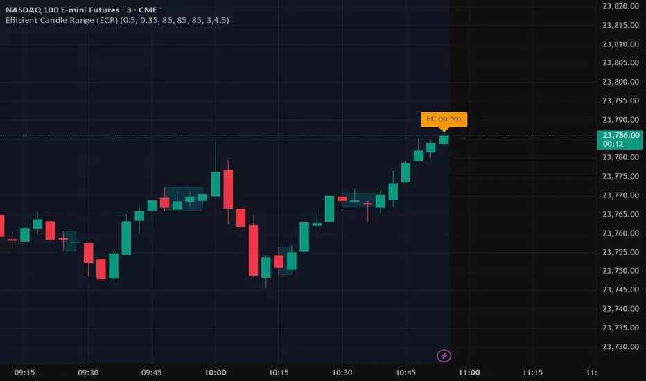
Efficient Candle Range (ECR)Efficient Candle Range (ECR)
A custom-built concept designed to detect zones of efficient price movement, often signaling the start, pause, or end of an implied move.
What is the Efficient Candle Range?
The Efficient Candle Range (ECR) is a unique tool that identifies price zones based on efficient candles—candles with relatively small bodies and balanced wicks. These candles reflect balanced or orderly price action, and when grouped into a range, they can reveal areas of temporary equilibrium in the market.
Rather than focusing on single candles, ECR builds a range that dynamically adjusts as new efficient candles form. This gives traders an objective way to track potential areas of absorption, distribution, or transition.
Why use ECR?
Efficient candles often occur:
At the beginning of a new move, after a liquidity sweep or shift in sentiment
At the end of a strong move, as momentum fades
Within consolidation zones, where price trades in a balanced, indecisive state
While ECRs can appear in any market condition, their interpretation depends on context:
In a range, an ECR might just reflect sideways balance.
But after a sweep or breakout, it could signal a potential shift in direction or continuation.
A close outside the ECR often marks the end of that balance and the start of a new impulse.
How it works
The script detects efficient candles based on body-to-range ratio and wick symmetry.
Consecutive ECs are grouped into a live ECR box.
The box dynamically extends as long as price stays inside the high-low range.
Once a candle closes outside, the ECR is considered invalid (fades visually, but remains visible for reference).
Each active range is labeled "ECR" within the box for easy tracking.
Customizable in settings
Max body percentage of range
Max wick imbalance
Box and label color/transparency
Suggested usage
Let the ECR define your observation zone.
Instead of reacting immediately to an efficient candle, wait for a confirmed breakout from the ECR to validate the next move.
Whether you trade breakouts, reversals, or continuation setups, ECR provides an objective way to visualize price balance and understand when the market is likely to expand.
Designed for individual traders looking to build structure around efficient price movement — no specific methodology required.
Candle Range Classifier Dots OnlyCandle Range Classifier (Dots Only)
This indicator analyzes the price range of each candle relative to its recent average range to classify market activity into three categories: wide range, narrow range, or normal range.
Wide Range Candles (red dots above bars) indicate significant price movement and strong market effort.
Narrow Range Candles (blue dots below bars) indicate low volatility and possible market absorption or consolidation.
Normal Range Candles are not marked, keeping the chart clean and focused on meaningful range extremes.
