RSI Trend Bias█ OVERVIEW
The RSI Trend Bias indicator is a custom technical analysis tool that utilizes the Relative Strength Index (RSI) to gauge market momentum and identify potential trend shifts. By monitoring RSI crossovers and crossunders relative to customizable threshold levels, the indicator provides clear visual cues that distinguish between bullish and bearish market conditions. This flexible approach makes it suitable for both short-term scalping and longer-term trend analysis.
█ KEY FEATURES
Dynamic RSI Trend Detection
The indicator dynamically determines market bias by monitoring the RSI for crossovers above the upper threshold and crossunders below the lower threshold. This method ensures that only significant momentum shifts trigger a change in trend, reducing false signals in volatile markets.
Adaptive Visualizations
The RSI Trend Bias indicator enhances clarity by plotting the RSI with colors that reflect current market conditions. Additionally, it offers an optional background color change to further emphasize bullish or bearish states, providing immediate visual feedback to traders.
Clear Threshold Indicators
Upper and lower threshold levels are plotted as constant reference lines, clearly delineating overbought and oversold regions. These markers help traders quickly assess market conditions at a glance.
Customizable Settings
Users have full control over key parameters including the RSI length, threshold levels, and visual settings. This customization allows the indicator to be tailored for different markets and trading styles, ensuring optimal performance across various timeframes.
█ UNDERLYING METHODOLOGY & CALCULATIONS
RSI Calculation
The indicator computes the Relative Strength Index over a user-defined period (default is 14), providing a measure of market momentum that reflects price changes over time.
Trend Determination Logic
By detecting when the RSI crosses above the upper threshold, the indicator signals a shift towards bullish momentum. Conversely, a crossunder below the lower threshold indicates bearish conditions. This straightforward binary approach filters out minor fluctuations, ensuring clarity in trend analysis.
Visual Signal Integration
Based on the detected trend, the RSI line is dynamically colored—green for bullish conditions and red for bearish conditions. An optional background color change further reinforces these signals, offering an immediate visual cue of prevailing market sentiment.
█ HOW TO USE THE INDICATOR
1 — Apply the Indicator
• Add the RSI Trend Bias indicator to a separate pane in your trading platform.
2 — Adjust Settings for Your Market
• RSI Length – Define the period for RSI calculation (default is 14).
• Threshold Levels – Set the upper (default 70) and lower (default 30) thresholds to identify overbought and oversold conditions.
• Visual Customization – Choose the bullish (green) and bearish (red) colors, and enable background color changes to enhance visual trend recognition.
3 — Interpret the Signals
• RSI Line – Observe the dynamically colored RSI line; a shift to green signals bullish momentum, while red indicates bearish conditions.
• Threshold Levels – Use the constant upper and lower lines as reference points for overbought and oversold states.
• Signal Timing – A crossover above the upper threshold or a crossunder below the lower threshold suggests potential entry or exit points.
4 — Integrate with Your Trading Strategy
• Combine RSI Trend Bias signals with other technical analysis tools to confirm market direction.
• Utilize the visual cues for fine-tuning your entry and exit decisions, ensuring robust risk management and optimized trade timing.
█ CONCLUSION
The RSI Trend Bias indicator offers a streamlined yet effective approach to monitoring market momentum. By leveraging the established principles of RSI analysis alongside dynamic visual cues, it enables traders to quickly identify bullish and bearish trends. Its customizable features and clear threshold indicators make it a valuable tool for enhancing technical analysis and making informed trading decisions.
Cerca negli script per "rsi"

RSI Crossover dipali parikhThis script generates buy and sell signals based on the crossover of the Relative Strength Index (RSI) and the RSI-based Exponential Moving Average (EMA). It also includes an additional condition for both buy and sell signals that the RSI-based EMA must be either above or below 50.
Key Features:
Buy Signal: Triggered when:
The RSI crosses above the RSI-based EMA.
The RSI-based EMA is above 50.
A green "BUY" label will appear below the bar when the buy condition is met.
Sell Signal: Triggered when:
The RSI crosses below the RSI-based EMA.
The RSI-based EMA is below 50.
A red "SELL" label will appear above the bar when the sell condition is met.
Customizable Inputs:
RSI Length: Adjust the period for calculating the RSI (default is 14).
RSI-based EMA Length: Adjust the period for calculating the RSI-based EMA (default is 9).
RSI Threshold: Adjust the threshold (default is 50) for when the RSI-based EMA must be above or below.
Visuals:
The RSI is plotted as a blue line.
The RSI-based EMA is plotted as an orange line.
Buy and sell signals are indicated by green "BUY" and red "SELL" labels.
Alerts:
Alerts can be set for both buy and sell conditions to notify you when either condition is met.
How to Use:
Use this script to identify potential buy and sell opportunities based on the behavior of the RSI relative to its EMA.
The buy condition indicates when the RSI is strengthening above its EMA, and the sell condition signals when the RSI is weakening below its EMA.
Strategy Use:
Ideal for traders looking to leverage RSI momentum for entering and exiting positions.
The RSI-based EMA filter helps smooth out price fluctuations, focusing on stronger signals.
This script is designed for both discretionary and algorithmic traders, offering a simple yet effective method for spotting trend reversals and continuation opportunities using RSI.

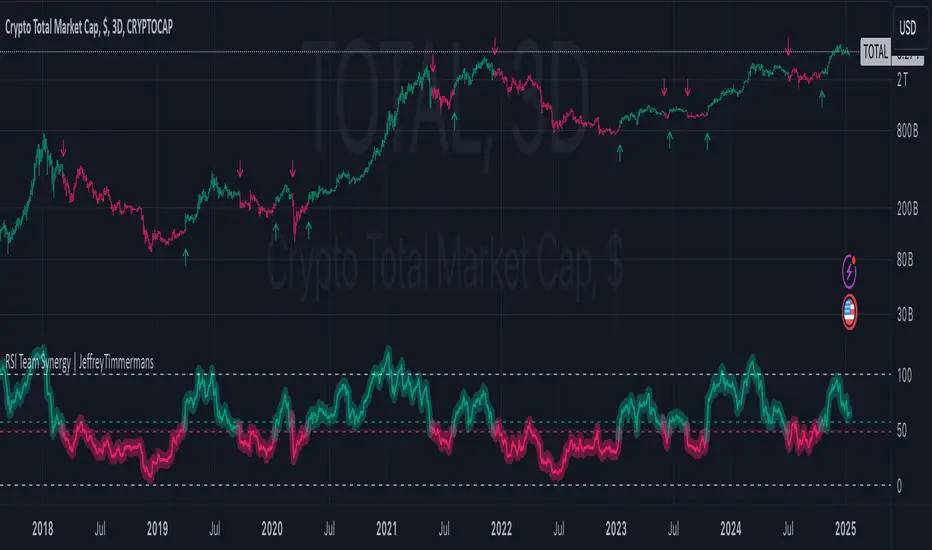
RSI Team Synergy | JeffreyTimmermansRSI Team Synergy
The "RSI Team Synergy" indicator is an advanced and highly customizable tool that integrates a Double RSI (DRSI) approach for comprehensive trend and momentum analysis. It utilizes two layers of RSI calculations, along with optional smoothing and various moving average types, to enhance signal accuracy. The dynamic visuals and alerts make this indicator a valuable resource for traders aiming to optimize their strategies.
Key Features
Double RSI (DRSI) Calculation
First RSI (Primary Layer): Captures the core price momentum using a configurable period.
Second RSI (DRSI Layer): Applies a second RSI calculation to the smoothed first RSI, refining signals and amplifying trend accuracy.
Double RSI Formula: Combines the smoothed RSI layers into a single robust indicator that adapts to market conditions.
Smoothing and Advanced Moving Averages
Optional Smoothing: Enables users to reduce noise by applying smoothing to both RSI layers.
Advanced MA Options: Supports multiple MA types, including SMA, EMA, WMA, RMA, DEMA, TEMA, VWMA, ZLEMA, and HMA. These can be applied to tailor the indicator to specific trading conditions.
Separate Configurations: Independent smoothing lengths and types for each RSI layer provide unparalleled customization.
Threshold and Signal System
Long Threshold: Highlights bullish conditions when the Double RSI exceeds the threshold.
Short Threshold: Signals bearish conditions when the Double RSI falls below the threshold.
Directional State: Tracks the overall direction using a state-based signal system (bullish, bearish, or neutral).
Dynamic Visualization
Oscillator Color Coding: Green shades for bullish momentum. Red shades for bearish momentum. Dynamic gradients for smoother transitions.
Glow Effect: Optional glowing lines enhance the visual clarity of the oscillator.
Threshold Lines: Configurable dashed horizontal lines to mark critical levels for easy reference.
Bar Color Integration
Bar Coloring: Matches bar colors to the oscillator's direction for cohesive visualization.
Advanced Control: Toggle bar coloring on/off without affecting other plots.
Alerts
Bullish Signal Alert: Triggers when the Double RSI crosses above the long threshold.
Bearish Signal Alert: Triggers when the Double RSI crosses below the short threshold.
Custom Messages: Alerts are equipped with descriptive messages for actionable insights.
Signal Arrows
Bullish Arrow (↑): Marks upward trends directly on the chart.
Bearish Arrow (↓): Highlights downward trends, ensuring traders never miss an opportunity.
Improvements
Customizable Thresholds: Adjustable long and short thresholds allow traders to fine-tune sensitivity.
Enhanced Smoothing Control: Separate smoothing options for each RSI layer provide flexibility in noise reduction.
Multiple MA Types: Extensive support for advanced moving averages to suit diverse trading preferences.
Color-Coded Oscillator: Improves trend visibility with gradient-based coloring and optional glow effects.
Signal Detection: Clear and intuitive arrows directly on the chart for quick signal interpretation.
Alerts and Notifications: Comprehensive alert conditions keep traders informed in real-time.
Use Cases
Momentum Analysis: Identify sustained bullish or bearish trends using the Double RSI calculation.
Noise Reduction: Utilize smoothing and advanced MA options to remove market noise.
Reversal Detection: Spot potential trend reversals with threshold-based signals.
Customizable Strategies: Tailor the indicator for scalping, swing trading, or long-term analysis.
The RSI Team Synergy indicator combines precision, flexibility, and intuitive design, making it an essential tool for traders at all levels. With its innovative Double RSI approach and advanced customization options, it provides actionable insights for mastering market trends.
This script is inspired by "Clokivez" . However, it is more advanced and includes additional features and options.
-Jeffrey
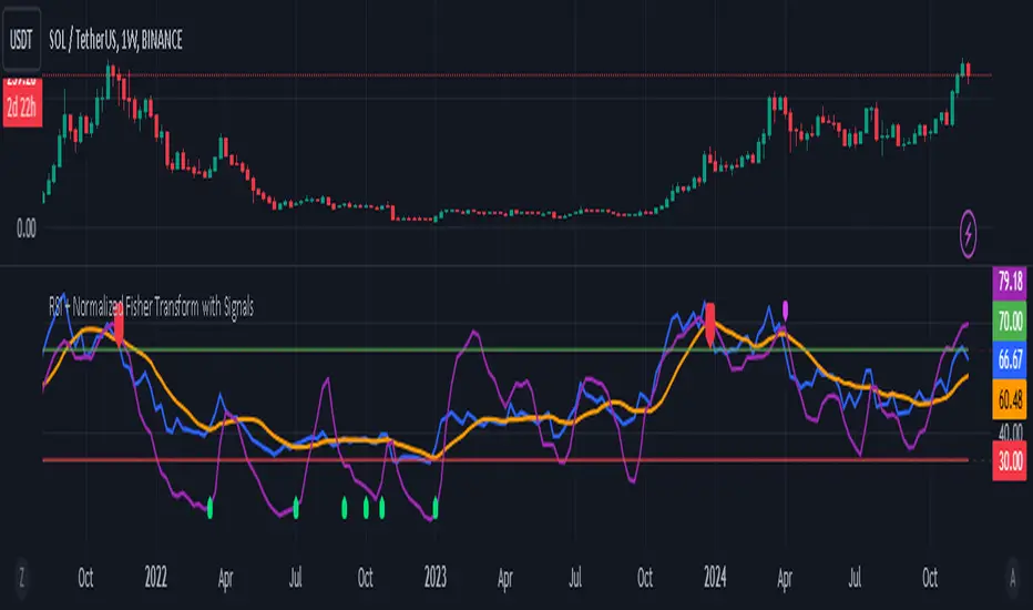
RSI + Normalized Fisher Transform with SignalsThis indicator combines three tools for market analysis: the Relative Strength Index (RSI), the RSI's moving average, and the Fisher Transform. RSI is a momentum oscillator that measures the speed and change of price movements, helping identify overbought and oversold conditions. The RSI moving average is a smoothed version of the RSI that filters noise and confirms trends. The Fisher Transform is a mathematical technique that transforms price data into a Gaussian normal distribution, making it easier to identify turning points. It has been normalized to the same scale as the RSI (0-100) for consistency.
Purpose
The goal of this indicator is to identify potential buy and sell opportunities with varying degrees of strength (strong and weak). By combining the RSI, its moving average, and the Fisher Transform, the indicator ensures signals are based on both momentum and reversals, making it highly versatile across different market conditions.
Key Features
This indicator provides strong and weak buy and sell signals. A strong buy occurs when the RSI crosses above its moving average while both the RSI and its moving average are oversold (below the default threshold of 30), and the Fisher Transform reverses direction within the same or prior bar while also being oversold. A weak buy occurs when the Fisher Transform is oversold, and the RSI crosses above its moving average while its value is between the default oversold threshold (30) and 50. A strong sell occurs when the RSI crosses below its moving average while both the RSI and its moving average are overbought (above the default threshold of 70), and the Fisher Transform reverses direction within the same or prior bar while also being overbought. A weak sell occurs when the Fisher Transform is overbought, and the RSI crosses below its moving average while its value is between 50 and the default overbought threshold (70).
The indicator includes customizable thresholds and lengths. Users can adjust the oversold and overbought thresholds to suit their trading style. The RSI length, moving average length, and Fisher Transform length are also customizable. The Fisher Transform is scaled to the RSI’s range of 0-100 to simplify analysis and signal interpretation.
How to Use the Indicator
On the chart, you will see the RSI line in blue, the RSI moving average in orange, and the Fisher Transform in purple. Horizontal lines at the default oversold (30) and overbought (70) levels mark critical zones for signals. Adjust these thresholds in the indicator settings as needed.
Strong buy signals are shown as larger, darker green arrows below the price. Weak buy signals are small lime arrows below the price. Strong sell signals are larger, darker red arrows above the price. Weak sell signals are small fuchsia arrows above the price.
Signal Interpretation
A strong buy indicates a highly favorable buying opportunity. This typically occurs when the asset is in a downtrend but shows signs of reversal, particularly in oversold zones. A weak buy suggests a potential buying opportunity but with less conviction, often when the market is neutral to slightly bearish but showing upward momentum. A strong sell indicates a highly favorable selling opportunity, usually occurring when the asset is in an uptrend but shows signs of reversal, particularly in overbought zones. A weak sell suggests a potential selling opportunity but with less conviction, often in neutral to slightly bullish markets showing downward momentum.
Practical Tips
Avoid using signals in isolation. Combine this indicator with other tools such as trendlines, moving averages, or support/resistance levels for greater accuracy. Adjust the parameters for different assets to match their volatility. For volatile assets, consider wider thresholds like 20/80 for oversold/overbought levels. For less volatile assets, tighter thresholds like 35/65 may be more appropriate. Use higher timeframes to confirm signals before trading on lower timeframes. Be cautious in sideways markets, as both RSI and the Fisher Transform perform better in trending conditions.
Instructions for Adjustments
To change the oversold or overbought levels, open the indicator settings by clicking the gear icon and modify the "Oversold Threshold" and "Overbought Threshold" values. To adjust lengths for RSI and Fisher Transform, update the "RSI Length," "RSI Moving Average Length," and "Fisher Transform Length" settings. If needed, toggle signal visibility by enabling or disabling specific arrows (Strong Buy, Weak Buy, Strong Sell, Weak Sell) in the "Style" tab.
Best Practices
Risk management is essential. Always set appropriate stop-loss levels and position sizes based on your risk tolerance. Backtest the indicator on historical data to understand its performance and behavior for your chosen asset and timeframe. Combining this indicator with volume or volatility analysis (Bollinger Band Width, for example) can help confirm signal validity.
This indicator simplifies decision-making by identifying high-probability trading opportunities using a combination of momentum, trend, and reversals. Follow these instructions to fully utilize its capabilities without needing to analyze the underlying code.
RSI with Dynamic ColorsThe "RSI with Dynamic Colors" is a custom indicator built on top of the traditional Relative Strength Index (RSI), which helps traders identify overbought or oversold market conditions. This enhanced version includes added functionality like dynamic colors, highlighting specific conditions, and more customization options. Here's a breakdown of how this indicator works:
Indicator Components:
Relative Strength Index (RSI) Calculation:
The RSI is a momentum oscillator that measures the speed and change of price movements. It oscillates between 0 and 100, helping traders determine if an asset is overbought or oversold.
In this version, the RSI is calculated with a configurable lookback period (default is 14) and applies smoothing to both upward and downward price changes using the Relative Moving Average (RMA).
Dynamic Coloring:
The indicator dynamically changes the color of the RSI line based on its value. Specific thresholds include:
Blue: When the RSI is at or above an extreme overbought level (≥ 85).
Red: When the RSI is in the overbought zone (≥ 70 but < 85).
Yellow: When the RSI is at or below the extreme oversold level (≤ 15).
Green: When the RSI is in the oversold zone (≤ 30 but > 15).
White: When the RSI is between the oversold and overbought zones.
Moving Average Options (MA):
The indicator allows the user to plot an optional moving average of the RSI for additional trend confirmation. Users can select from various types of moving averages, including Simple Moving Average (SMA), Exponential Moving Average (EMA), and others.
Bollinger Bands can be optionally applied around the RSI to visualize volatility.
Overbought and Oversold Highlights:
It provides visual highlights (green for overbought and red for oversold) in the background of the RSI plot, making it easier to identify potential reversal zones.
Divergence Detection (Optional):
The indicator can optionally display regular bullish or bearish divergence, which can signal potential trend reversals. Divergence occurs when price moves in the opposite direction of the RSI.
Bullish divergence is indicated when the price makes lower lows while the RSI makes higher lows.
Bearish divergence is shown when the price makes higher highs while the RSI makes lower highs.
Alerts:
Users can set up alerts for bullish or bearish divergence, making it easier to get notified when key conditions occur in the market.
Use Case:
This custom RSI indicator is designed for traders who want to combine the classic RSI functionality with enhanced visual aids, such as color coding for different RSI zones, customizable moving averages, and Bollinger Bands. It is particularly useful for identifying potential market tops and bottoms by highlighting overbought/oversold conditions and divergence signals.
In summary, this indicator not only retains the traditional RSI's power but also adds new layers of insight through color, moving averages, and divergence detection, helping traders make better-informed decisions.

RSI Multi-Timeframe PINESCRIPTLABS📈 Use the Relative Strength Index (RSI) calculated across multiple time frames to generate signals
🔹 Intraday: Displays a table with real-time RSI values for the time frames of 5 minutes, 15 minutes, 30 minutes, 1 hour, 4 hours, and 1 day.
🔹 Standard: Displays a table with real-time RSI values for the time frames of 30 minutes, 1 hour, 4 hours, 1 day, 1 week, and 1 month.
The indicator allows you to customize overbought and oversold thresholds, as well as choose between viewing RSI values for intraday or standard time frames, tailoring the analysis to your specific needs. 🔧📊
🔔 Signals are generated when in 4 of the 6 time frames we define below:
Overbought Signal (When RSI indicates overbought conditions):
• Intraday: Activated when the RSI in the time frames of 5 minutes, 15 minutes, 30 minutes, and 1 hour is above the 70 threshold. 📈
• Standard: Activated when the RSI in the time frames of 30 minutes, 1 hour, 4 hours, and 1 day is above the 70 threshold. 📈
Oversold Signal (When RSI indicates oversold conditions):
• Intraday: Activated when the RSI in the time frames of 5 minutes, 15 minutes, 30 minutes, and 1 hour is below the 30 threshold. 📉
• Standard: Activated when the RSI in the time frames of 30 minutes, 1 hour, 4 hours, and 1 day is below the 30 threshold. 📉
Español:
📈 Utiliza el Índice de Fuerza Relativa (RSI) calculado en varios marcos de tiempo para generar señales
🔹 Intraday: Muestra una tabla con los valores del RSI en tiempo real para los marcos de tiempo de 5 minutos, 15 minutos, 30 minutos, 1 hora, 4 horas y 1 día.
🔹 Standard: Muestra una tabla con los valores del RSI en tiempo real para los marcos de tiempo de 30 minutos, 1 hora, 4 horas, 1 día, 1 semana y 1 mes.
El indicador te permite personalizar los umbrales de sobrecompra y sobreventa, así como elegir entre ver los valores RSI para marcos de tiempo intradía o estándar, adaptando el análisis a tus necesidades específicas. 🔧📊
🔔 Las señales se generan cuando en 4 de los 6 marcos de tiempo que definimos a continuación:
Señal de Sobrecompra (Cuando el RSI indica sobrecompra):
• Intraday: Se activa cuando el RSI en los marcos de tiempo de 5 minutos, 15 minutos, 30 minutos y 1 hora está por encima del umbral de 70. 📈
• Standard: Se activa cuando el RSI en los marcos de tiempo de 30 minutos, 1 hora, 4 horas y 1 día están por encima del umbral de 70. 📈
Señal de Sobreventa (Cuando el RSI indica sobreventa):
• Intraday: Se activa cuando el RSI en los marcos de tiempo de 5 minutos, 15 minutos, 30 minutos y 1 hora está por debajo del umbral de 30. 📉
• Standard: Se activa cuando el RSI en los marcos de tiempo de 30 minutos, 1 hora, 4 horas y 1 día están por debajo del umbral de 30. 📉

RSI + Divergences + Alerts [MisterMoTA]The indicator RSI + Divergences + Alerts by MisterMoTA is an RSI indicator that fills the RSI and RSI moving average with 4 different colors (growing up, falling up, falling down and rising down colors), users can customize colors from dashboard , also can be disabled the fill if the user want a standard RSI.
The dafault value of RSI is 14 and value of the moving average is 50 ( a dynamic 50 rsi line is better for trend identification than a standard 50 line) and users can change the values from indicator settings.
For detecting the divergences displayed in the indicator, I integrated in our script the default Divergences indicator from Tradingview, users can display, hide and change colors for regular and hidden divergences.
RSI indicator display also trend conditions for RSI and RSI MA, the RSI MA angle is calculated using ATR value, the slope of the RSI Noving Average can help to identify trend conditions too.
The script comes with 12 different alerts, if need different alerts please let me know in the comments and will update the script with your request:
Alert for Regular Bullish Divergence
Alert for Regular Bearish Divergence
Alert for Hidden Bullish Divergence
Alert for Hidden Bearish Divergence
Alert for RSI Overbought
Alert for RSI Extreme Overbought
"Alert for RSI Oversold
Alert for RSI Extreme Oversold
Alert for RSI Crossing Above RSI MA
Alert for RSI Crossing Bellow RSI MA
Alert for RSI Crossing Above 50
Alert for RSI Crossing Bellow 50
Please follow me for other script like this one.
Kind regards,
MisterMoTA
RSI-Instant-TA 3.69 by SimpsTAHow can this indicator benefit you?
Are you familiar with the RSI (Relative Strength Index), which is a commonly used indicator? Let me explain how it works in simpler terms. When the RSI is below 30 (considered oversold), it may be a signal to buy, and when it's above 70 (considered overbought), it may be a signal to sell. To confirm these signals, you can look for the RSI line crossing a moving average line while forming a higher high or lower low. I usually use a 1-hour timeframe (TF) for analysis but also glance at lower timeframes for better market understanding.
This indicator combines different averages of the RSI line, including the most important one, which is the RSI line averaged from 7 different timeframes. This averaging helps you gain a clearer understanding of what's happening across those timeframes.
To ensure you don't miss important market moments, you can set up predefined alerts using this indicator. However, it's always important to visually verify these alerts before taking any action.
What is what?
What do the different parts of the indicator represent and where does the data for plotting the lines come from?
1) THICK RED/GREEN OSCILLATING RSI LINE:
This line is a visual representation of the RSI (Relative Strength Index) calculated by averaging the RSI values from 7 different timeframes. It moves between the oversold and overbought regions while intersecting other simplified averaged RSI lines. The data used for plotting these line is derived from the RSI values calculated based on price movements across different timeframes.
2) THICK WHITE RSI LINE:
The thick white line is a slightly smoothed average of the regular RSI line (thin white line). It helps reduce the noise and volatility of the RSI line, making it easier to interpret.
3) TWO OSCILLATING RED/GREEN LINES WITH RED/GREEN BACKGROUND FILL:
These lines are further averages of the normal RSI line, providing a smoother oscillating baseline. When the thick white line or thick red/green line crosses this baseline, it typically indicates a change in direction.
4) BIG TRIANGLE WITH RED/GREEN VERTICAL BG LINE:
This element is used to create an alert. It serves as a visual signal when the market is likely to change direction. Many users find this feature particularly useful. (I pretty much use just this one)
5) SMALL TRIANGLE AND SMALL CIRCLE WITH RED/GREEN VERTICAL BG LINE:
These elements, although visually distinct, serve a similar purpose. They are used when a good entry opportunity has been missed, but there is still a desire to enter the position. They can also be helpful for re-entries into a position.
6) YELLOW HORIZONTAL LINE:
The yellow horizontal line represents the middle RSI line with a value of 50. It acts as a reference point for determining whether the RSI is in the overbought or oversold region.
7) TWO WHITE HORIZONTAL LINES:
These white horizontal lines represent the top and bottom RSI lines with values of 30 and 70, respectively. They serve as thresholds for identifying oversold (below 30) and overbought (above 70) conditions.
How to use this indicator effectively:
SETTING ALARMS:
To begin, familiarize yourself with setting alerts in TradingView. Here's how I usually set mine:
a) Choose the indicator name from the dropdown menu.
b) Select either a BUY or SELL TRIANGLE as the alert marker.
c) Set a value greater than 0 (this is necessary for the alert to trigger).
d) Opt for the alert to occur once per bar.
e) Write a description that you will recognize.
f) Choose the type of notification you prefer.
g) You're all set!
HOW TO READ THE LINES:
a) The baseline consists of two oscillating red/green lines (3) with a background fill.
b) When the thick red/green line (1) or the thick white line (2) is above the baseline, it indicates a BUY signal. If they are below the baseline, it signifies a SELL signal.
c) Confirm the signal by observing whether the thick red/green line (1) or the thick white line (2) form a Lower High (LH) as a SELL signal or a Higher Low (HL) as a BUY signal. It can occur before crossing baseline (3), so consider having ALERTS that support this.
d) Additionally, consider the vertical background colors from alerts as supplementary confirmation.
e) When the lines appear messy and there is no clear indication due to excessive zig-zagging through the baseline, it typically suggests that the market will continue its previous movement without any significant changes.
MY PREFERRED WORKFRAME:
I recommend using a 5-frame window, which includes the following timeframes:
3-minute TF (fine tuned entry)
13-minute TF (to understand 3minTF better)
30-minute TF (to understand 1h TF better)
1-hour TF (the most important one - looking for HL/LH on (1) or (2) and/or their crossings the baseline (3))
1-day TF (for a broader perspective on the market - you certainly wont do LONGS if market broke certain support)
Buy/Sell examples
To provide you with a better understanding, let's consider some examples of BUY and SELL signals using this indicator.
1st TRADING EXAMPLE:
This example is for those who want to take advantage of every market turn to maximize their gains. Please remember to rest and sleep; this approach may not be suitable for everyone.
Initially, the data might seem overwhelming, but as you become familiar with the meaning behind specific situations, it becomes less daunting. Let me guide you through what you see in the picture:
The UPPER WINDOW shows a BTC chart with marked positions and the gains you would have achieved by following the indicator's signals.
The LOWER WINDOW displays this indicator with my comments, explaining what is happening in the marked areas (circles).
You can view the example here:
To implement this approach, you need to set alerts on the 1-hour timeframe (TF) using the following options: BUY/SELL TRIANGLE, BUY/SELL triangle, and BUY/SELL circle. These alerts will send you notifications every few hours. When you receive a notification, visually assess the situation (consider going long, short, or exiting) based on the detailed criteria explained earlier.
2nd TRADING EXAMPLE:
This example is for those who prefer to have more free time and only react when there is an obvious market change, with more than a day or two between actions (going long, short, or exiting).
Here's what you see in the picture:
The UPPER WINDOW displays a BTC chart with marked positions and the gains you would have achieved by following the indicator's signals. As you can see, these positions are open for several days leaving you lots of time to rest.
The LOWER WINDOW shows this indicator with circles, highlighting the situations that prompted the actions. By now, you should be familiar with the rules.
You can view the example here:
To implement this approach, set alerts on the 1-hour timeframe (TF) for when the RSI AVG crosses the Slowest Line (select it from the dropdown menu). When you receive a notification, don't take immediate action; instead, turn on another alert (BUY/SELL triangle ALERT). If the RSI AVG is below the Slowest Line, choose the SELL triangle; if it's above, select the BUY triangle. Wait for the RSI AVG to return close to the Slowest Line for confirmation.
This approach will result in two to three notifications per day, allowing you to relax in the meantime.
******
PRO TIP!
Try not to constantly stare at the charts and this indicator. Instead, look and react only when the alerts are triggered. Remember, the market won't change direction without triggering those alerts (provided they are set correctly). This will save you a significant amount of time and stress.

RSI-CCI Fusion + AlertsThe "RSI-CCI Fusion" indicator combines the Relative Strength Index (RSI) and Commodity Channel Index (CCI) from TradingView.
RSI-CCI Fusion: Unlocking Synergies in Technical Analysis
Technical analysis plays a crucial role in understanding market dynamics and making informed trading decisions. I often rely on a combination of indicators to gain insights into price movements and identify potential trade opportunities. In the lines below, I will explore the "RSI-CCI Fusion" indicator, a powerful tool that combines the strengths of the Relative Strength Index (RSI) and the Commodity Channel Index (CCI) to provide enhanced trading insights.
1. Understanding the RSI and CCI Indicators
Before delving into the fusion of these indicators, let's briefly review their individual characteristics. The RSI is a widely used momentum oscillator that measures the speed and change of price movements. It oscillates between 0 and 100, with readings above 70 indicating overbought conditions and readings below 30 indicating oversold conditions.
On the other hand, the CCI is a versatile indicator designed to identify cyclical trends in prices. It measures the distance between the price and its statistical average, thereby providing valuable insights into overbought and oversold levels.
2. The Concept of RSI-CCI Fusion
The RSI-CCI Fusion indicator is born out of my desire to harness the collective power of the RSI and CCI. By combining these indicators, I can benefit from a more comprehensive trading signal that captures both momentum and cyclical trend dynamics.
The fusion process involves assigning weights to the RSI and CCI, creating a blended indicator that reflects their relative importance. The weighted combination ensures that both indicators contribute meaningfully to the final result.
To maintain consistency, the RSI and CCI values are standardized using the z-score technique. This normalization process brings the values to a common scale, making them directly comparable. Rescaling is then applied to bring the combined indicator back to its original scale, facilitating intuitive interpretation.
3. Interpreting the RSI-CCI Fusion Indicator
When plotting the RSI-CCI Fusion indicator on a chart, I gain valuable insights into market dynamics and potential trading opportunities. The indicator's plot typically includes dynamic upper and lower bands, which are calculated based on the indicator's standard deviation. These bands provide boundaries for evaluating overbought and oversold conditions.
When the RSI-CCI Fusion indicator crosses above the lower band, it suggests oversold conditions and potential buying opportunities. Conversely, when the indicator crosses below the upper band, it indicates overbought conditions and potential selling opportunities. I also pay attention to the baseline, which represents the neutral level and may signal potential trend reversals.
4. Utilizing Alerts for Trading Decisions
The RSI-CCI Fusion indicator can be further enhanced by incorporating alerts. These alerts notify me when the indicator generates buy or sell signals, enabling me to take prompt action. I can customize the alerts based on my preferred thresholds and timeframes.
However, it is crucial to remember that the RSI-CCI Fusion indicator should not be relied upon in isolation. To increase the robustness of my trading decisions, it is recommended to combine the indicator with other analysis techniques such as trend lines, support and resistance levels, or additional indicators. This convergence of analysis methodologies enhances the overall accuracy of my trade signals.
Conclusion: The RSI-CCI Fusion indicator represents a compelling approach to technical analysis by synergizing the strengths of the RSI and CCI. By combining momentum and cyclical trend dynamics, I gain a more comprehensive view of market conditions. The fusion of these indicators, accompanied by timely alerts, equips me with valuable insights and facilitates well-informed trading decisions.
As with any technical analysis tool, it is essential for me to backtest the RSI-CCI Fusion indicator to evaluate its performance across different market conditions and timeframes. Additionally, applying proper risk management strategies is crucial to ensure consistent and disciplined trading practices.

RSI PRO+ [APIDEVS]TRADITIONAL RSI
The RSI (Relative Strength Index) is an oscillator-type indicator used by traders who perform technical analysis to estimate the status of overbought or oversold of an asset on the stock market.
This tool gives the trader the advantage of comparing supply and demand (buying and selling), therefore, we must take into account the following interpretation for its use.
If the buy and sell index are equal, the indicator takes a percentage value of 50, which indicates that the relative forces are in equity.
As its value is over 50%, it indicates that the buyer interest is higher than the seller.
When it is less than 50%, then we must know that the selling force is greater.
It also indicates that when the RSI is above 70 on the oscillator, the price is oversold, therefore, it should exit the market.
Similarly, when the RSI is below 30, the asset is oversold, so it is considered convenient to buy.
NEW RSI PRO +
The main improvement lies in the incorporation of a script that allows to visually observe the force of the movement and that this reinforces the perception of the RSI trajectory. It is for this reason that we incorporate the Average Directional Index (ADX) in this indicator so that through its logic it can provide other visual elements to help traders.
In this merger we try to maintain the original design of the RSI in order to make a clean integration that does not confuse traders with another indicator.
Improvements made:
• The coloration resulting from the crossing of the DI + and DI- of the ADX was incorporated into the line that marks point 50 of this indicator.
o When the Di + is above the DI- the trend is bullish therefore the middle line of the RSI will be painted green.
o When the Di- is above the DI + the trend is bearish therefore the middle line of the RSI will be painted green.
• Se incorporó un background de color verde para la tendencia alcista y rojo para la tendencia bajista, que se activa exclusivamente cuando el precio adquiere una fuerte tendencia. Esta característica altamente importante para la interpretación de esta nueva versión del indicador fue absorbida del ADX.
• Se añadió una función que permite evidenciar la debilidad del RSI cambiando su coloración de verde a rojo según sea el caso.
• Pensando en los usuarios más tradicionales, se incorporó una función que permite pintar el RSI de un solo color.
• Se incorporó un selector de colores que permite pintar las velas en función al ADX ó al RSI.
• Se añadió un panel lateral que indica el valor numérico que posee el ADX y el RSI.
• Como una mejora visual, se creó una banda superior e inferior que evidencian de forma mas clara el estado de sobre venta y sobre compra del oscilador.
---------------------------------- SPANISH -----------------------------------
Lógica basada en la versión original del indicador:
El RSI (Relative Strength Index), Es un indicador de tipo oscilador utilizado por los traders que realizan análisis técnicos, para estimar el estado de sobre compra o sobre venta de un activo del mercado bursátil.
Esta herramienta da al trader la ventaja de cotejar la oferta y demanda (compra y venta), por tanto, debemos tomar en cuenta la siguiente interpretación para su uso.
Si el índice de compra y venta son iguales, el indicador toma un valor porcentual de 50, lo que nos indica que las fuerzas relativas se encuentran en equidad.
Al estar su valor sobre 50%, señala que el interés comprador es mayor al vendedor.
Cuando es inferior a 50%, entonces debemos saber que la fuerza vendedora es mayor.
También indica que cuando el RSI está por encima de 70 en el oscilador, el precio esta en sobre venta, por lo tanto, se debería salir del mercado.
DE igual forma, cuando el RSI esta por debajo de 30 el activo esta sobre vendido, por lo que se estima conveniente comprar.
FOTO DEL NUEVO RSI PRO+
La mejora principal radica en la incorporación de un script que permita observar visualmente la fuerza del movimiento y que esta refuerce la percepción de la trayectoria del RSI. Es por esta razón por la que incorporamos en este indicador al Average Directional Index (ADX) para que a través de su lógica pueda proporcionar otros elementos visuales para ayudar a los traders.
En esta fusión procuramos mantener el diseño original del RSI a los fines de hacer una integración limpia que no confundiera a los traders con otro indicador.
Mejoras realizadas:
• Se incorporó en la línea que marca el punto 50 de este indicador la coloración resultante del cruce del DI+ y el DI- del ADX.
o Cuando el Di+ está por encima del DI- la tendencia es alcista por lo tanto la línea media del RSI se pintará de color verde.
o Cuando el Di- está por encima del DI+ la tendencia es bajista por lo tanto la línea media del RSI se pintará de color verde.
• Se incorporó un background de color verde para la tendencia alcista y rojo para la tendencia bajista, que se activa exclusivamente cuando el precio adquiere una fuerte tendencia. Esta característica altamente importante para la interpretación de esta nueva versión del indicador fue absorbida del ADX.
• Se añadió una función que permite evidenciar la debilidad del RSI cambiando su coloración de verde a rojo según sea el caso.
• Pensando en los usuarios más tradicionales, se incorporó una función que permite pintar el RSI de un solo color.
• Se incorporó un selector de colores que permite pintar las velas en función al ADX ó al RSI.
• Se añadió un panel lateral que indica el valor numérico que posee el ADX y el RSI.
• Como una mejora visual, se creó una banda superior e inferior que evidencian de forma mas clara el estado de sobre venta y sobre compra del oscilador.

RSI Swing Indicator (Win-Rate + Forecast Line + Range Row)What the script does:
It’s essentially an enhanced RSI tool that doesn’t just show the raw RSI line. Instead, it adds forecasting, trade statistics, and range detection so you can see how reliable RSI signals have been historically and what they might mean going forward.
The main components
RSI Calculation
- Uses your chosen source (close, hl2, etc.) and length (default 7).
- Plots the RSI line (orange).
Forecasting
- Projects RSI into the future using slope extrapolation.
- Plots a forecast line (blue) and shows whether RSI is likely to become overbought, oversold, or stay neutral.
Trade Statistics
- Tracks how many long and short trades would have been profitable based on RSI bias.
- Calculates Win‑Rate (percentage of profitable trades) and Average Return (average gain/loss per trade).
- This gives you a statistical edge: are longs or shorts historically working better?
Bias & Conflict Detection
- Defines current bias (Bullish, Bearish, Neutral).
- Flags Conflict when the forecast disagrees with the current bias (e.g., RSI bullish now but forecast bearish).
- Helps you avoid trading against weakening momentum.
Range Detection
- Checks if RSI slope is flat and values are between mid‑bounds (40–60).
- Calculates Range Probability (how often range conditions occur).
- Adds a Range row to the table so you know when the market is likely sideways instead of trending.
Table Display
- Summarizes everything in a neat table: Forecast, Win‑Rates, Avg Returns, Prob Bias, Conflict, Range Prob, and Range status.
- Color‑coded so you can instantly see what’s favorable (green), risky (red), or neutral (yellow/orange).
How to use it
- Trend trading: Look for Profitable Bias with forecast alignment.
- Range trading: When both win‑rates are weak and Range row says Range Likely, fade extremes (buy low RSI, sell high RSI).
- Risk management: Avoid trades when Conflict is flagged.
- Forecasting: Use the projected RSI to anticipate overbought/oversold zones before they happen.
In short:
The script is like a “smart RSI dashboard”. It takes the basic RSI, adds forecasting, tracks how well past trades worked, and tells you whether the market is trending or ranging. This way, you’re not just reacting to RSI — you’re trading with context, probabilities, and forward‑looking signals.

Bästa Bob Multi-RSI 😎👊✅ RSI 7 → Fast impulse indicator
• Shows micro-movements
• Reacts instantly to liquidity sweeps
• Perfect for entry timing
✅ RSI 14 → Macro momentum indicator
• Captures the real trend
• Filters out noise
• Confirms larger market movements
When both are in sync → you get true market direction plus perfect timing.
👉 How to Use RSI 7 + RSI 14
1️⃣ Entry Signals (the best method)
BUY when:
• RSI 7 turns up from oversold
• RSI 14 is also sloping upward or gets crossed by RSI 7 from below
→ Extremely accurate right after a liquidity sweep.
SELL when:
• RSI 7 turns down from overbought
• RSI 14 is sloping downward or gets crossed by RSI 7 from above
→ Works insanely well for fakeouts and FVG entries.
2️⃣ Trend Filter
• When RSI 14 stays above 50 → market is bullish
• When RSI 14 stays below 50 → bearish
RSI 7 is then used only for timing entries.
3️⃣ A++ Setups (your favorite ones 😉🔥)
The best signals appear when:
✔ RSI 7 crosses RSI 14 at the same time as:
• a liquidity sweep happens
• price taps into an FVG or Order Block
• volume reacts
• your trend filter (EMA, HTF) supports the move
This combo is criminally effective when scalping BTC, NAS100, and XAUUSD.
RSI & Bull Bear Power ProRSI & Bull Bear Power Pro
RSI & Bull Bear Power Pro is an advanced momentum confirmation indicator that combines RSI behavior with real Bull–Bear market pressure. It detects strong reversals, trend continuation setups, exhaustion zones, and divergence, helping you filter noise and avoid weak entry signals. Works on all markets and timeframes and includes strong buy/sell alerts with non-repainting logic.
FEATURE HIGHLIGHTS
• RSI + Bull/Bear pressure
• Strong Buy / Strong Sell alerts
• Divergence detection
• Trend confirmation
• Exhaustion zones
• No repaint
• Works on every market & timeframe
WHY USE IT
Traditional RSI often gives late or weak signals. By confirming momentum with directional power, this tool shows when buyers or sellers actually take control, improving entry timing and filtering false setups.
WHO IS IT FOR
Scalpers, day traders, swing traders, and anyone who needs high-probability reversal and momentum confirmation signals.
INDICATOR DEFINITIONS (Short Technical Notes)
RSI (Relative Strength Index)
Measures momentum by comparing recent gains and losses. It helps identify overbought/oversold conditions and momentum shifts.
Smoothed RSI
A moving average applied to RSI to reduce noise and provide a clearer momentum reading.
RSI Momentum
Shows whether momentum is increasing or decreasing by comparing current RSI to its previous value.
RSI Trend Condition
Defines trend direction by comparing RSI to its short moving average, helping identify bullish or bearish momentum phases.
Bull Power
Measures how far the high price is above the EMA. Indicates bullish pressure and buyer strength.
Bear Power
Measures how far the low price is below the EMA. Indicates bearish pressure and seller strength.
Bull/Bear Power (BBP Combined)
Combines bull and bear power into one value, showing the balance between buying and selling pressure.
BBP Increasing Trend
Checks if power is rising compared to the previous bar, confirming strength in the current direction.
BBP Positive/Negative Zone
Indicates if the market power is dominated by buyers (positive) or sellers (negative).
Strong Buy Signal
Triggered when RSI exits oversold AND Bull/Bear Power turns positive at the same time.
Strong Sell Signal
Triggered when RSI exits overbought AND Bull/Bear Power turns negative at the same time.
Normal Buy / Sell Signals
Conditional mid-level signals based on momentum changes without full confirmation.
Bullish Divergence
Price makes a lower low while RSI makes a higher low, indicating a potential bullish reversal.
Bearish Divergence
Price makes a higher high while RSI makes a lower high, indicating a potential bearish reversal.
Stop guessing momentum strength. Trade with real confirmation and see who truly controls the market.

RSI Rate of Change (ROC of RSI)The RSI Rate of Change (ROC of RSI) indicator measures the speed and momentum of changes in the RSI, helping traders identify early trend shifts, strength of price moves, and potential reversals before they appear on the standard RSI.
While RSI shows overbought and oversold conditions, the ROC of RSI reveals how fast RSI itself is rising or falling, offering a deeper view of market momentum.
How the Indicator Works
1. RSI Calculation
The indicator first calculates the classic Relative Strength Index (RSI) using the selected length (default 14). This measures the strength of recent price movements.
2. Rate of Change (ROC) of RSI
Next, it computes the Rate of Change (ROC) of the RSI over a user-defined period.
This shows:
Positive ROC → RSI increasing quickly → strong bullish momentum
Negative ROC → RSI decreasing quickly → strong bearish momentum
ROC crossing above/below 0 → potential early trend shift
What You See on the Chart
Blue Line: RSI
Red Line: ROC of RSI
Grey dotted Zero Line: Momentum reference
Why Traders Use It
The RSI ROC helps you:
Detect momentum reversals early
Spot bullish and bearish accelerations not visible on RSI alone
Identify exhaustion points before RSI reaches extremes
Improve entry/exit precision in trend and swing trading
Validate price breakouts or breakdowns with momentum confirmation
Best For
Swing traders
Momentum traders
Reversal traders
Trend-following systems needing early confirmation signals
RSI VWAP EMA ON CHART1. Understand the components
VWAP (Volume Weighted Average Price)
Green: price is above VWAP → bullish trend
Red: price is below VWAP → bearish trend
Blue: price exactly at VWAP → neutral
Acts as a dynamic trend line and support/resistance.
4 Moving Averages (MA1–MA4)
Customizable lengths and type (SMA or EMA).
Useful for trend confirmation and dynamic support/resistance.
Typically:
MA1 = fastest (short-term)
MA4 = slowest (long-term)
When price is above multiple MAs → strong bullish trend; below → bearish trend.
RSI Overlay with VWAP Alignment
RSI line normalized to price scale.
Background shading indicates momentum aligned with VWAP trend:
Green shading: RSI > 50 and price above VWAP → bullish momentum
Red shading: RSI < 50 and price below VWAP → bearish momentum
Gray areas: neutral or momentum does not align with VWAP.
2. Basic usage workflow
Trend Confirmation
Look at VWAP color: price above → bullish, below → bearish.
Check RSI + VWAP shading: green confirms bullish momentum, red confirms bearish momentum.
Check MA alignment: shorter MAs above longer MAs = stronger bullish trend; vice versa for bearish.
Entry Signals (Scalping)
Long (Buy) Setup
Price above VWAP (green)
RSI green shading (RSI > 50)
Shorter MAs above longer MAs (trend support)
Short (Sell) Setup
Price below VWAP (red)
RSI red shading (RSI < 50)
Shorter MAs below longer MAs
Exits / Stops
Exit if price closes against VWAP trend (e.g., price drops below VWAP during a bullish trade).
Use nearest MA support/resistance as stop-loss or take-profit zones.
3. Optional adjustments for scalping
RSI length / thresholds
Shorter RSI (7–10) → faster response for scalping.
Standard RSI (14) → smoother, fewer false signals.
MA lengths
Short-term: 20–50
Medium-term: 50–100
Long-term: 100–200
Can tweak for the timeframe you trade (1m, 5m, 15m).
Timeframe
VWAP works best on intraday charts (1m, 5m, 15m).
Use higher timeframe (e.g., 15m or 1h) for trend direction and lower timeframe (1m–5m) for entries.
4. Example Scalping Setup
Bullish setup (buy):
Price above VWAP → VWAP green
RSI > 50 and green shading
Shorter MAs above longer MAs
Enter on small pullback or breakout
Stop: below nearest MA or VWAP
Bearish setup (sell):
Price below VWAP → VWAP red
RSI < 50 and red shading
Shorter MAs below longer MAs
Enter on minor bounce or breakdown
Stop: above nearest MA or VWAP
5. Visual cues summary
Element Interpretation
VWAP Green Price above VWAP → bullish trend
VWAP Red Price below VWAP → bearish trend
RSI Green Shading Bullish momentum aligns with VWAP
RSI Red Shading Bearish momentum aligns with VWAP
MA Alignment Trend strength (short above long = bullish, short below long = bearish)

RSI Maniac
RSI Maniac
A powerful, fully-customizable RSI indicator designed for traders who want deeper insight into momentum across multiple timeframes. This indicator enhances the traditional RSI by adding multi-timeframe analysis, multi-timeframe moving averages, and optional Bollinger Bands applied directly on the RSI curve.
----- Key Features -----
1️⃣ Multi-Timeframe RSI (HTF RSI) : Analyse higher-timeframe momentum while staying on your current chart.
Enable/Disable HTF RSI
Select any timeframe (1m → 1M)
Dedicated RSI length & source for HTF
Great for spotting:
Trend confirmation or divergence between LTF & HTF momentum
2️⃣ Multi-Timeframe Moving Averages : A powerful addition for traders using higher timeframe confirmation.
Enable/Disable HTF MAs
Independent Fast & Slow MA settings
Separate HTF timeframe
Separate MA type for HTF (EMA or HMA)
Great for spotting:
HTF RSI trend direction
HTF momentum overlays on LTF RSI
Cross-timeframe momentum alignment
🎛️ Clean & Organized User Interface : The indicator organizes settings into intuitive groups.
Current Timeframe RSI
Current Timeframe MA
Higher Timeframe RSI
Higher Timeframe MA
Bollinger Bands Settings
Traders can toggle any component independently.
How to trade ?
Based on my approach, I don’t use RSI to catch reversals. Instead, I use it to trade continuations—when the lower timeframe (LTF) RSI aligns with the higher timeframe (HTF) trend. I simply wait for the LTF RSI to move in the same direction as the HTF RSI and then take the continuation trade. Please check the snapshots for a clearer understanding of how these trades work.
Trade less, trade better!

RSI MTF 15m + 1h (Oriol)//@version=5
indicator("RSI MTF 15m + 1h (Oriol)", overlay = false, timeframe = "", timeframe_gaps = true)
// ─── PARÀMETRES ─────────────────────────────────────────────
rsiLength = input.int(14, "Període RSI")
src = input.source(close, "Font de preu")
tfFast = input.timeframe("15", "Timeframe ràpid (RSI 15m)")
tfSlow = input.timeframe("60", "Timeframe lent (RSI 1h)")
showSignals = input.bool(true, "Mostrar senyals LONG/SHORT")
// ─── RSI MULTITIMEFRAME ────────────────────────────────────
// RSI del timeframe ràpid (per defecte 15m)
src_fast = request.security(syminfo.tickerid, tfFast, src)
rsi_fast = ta.rsi(src_fast, rsiLength)
// RSI del timeframe lent (per defecte 1h)
src_slow = request.security(syminfo.tickerid, tfSlow, src)
rsi_slow = ta.rsi(src_slow, rsiLength)
// ─── DIBUIX RSI ─────────────────────────────────────────────
plot(rsi_fast, title = "RSI ràpid (15m)", color = color.new(color.aqua, 0), linewidth = 2)
plot(rsi_slow, title = "RSI lent (1h)", color = color.new(color.orange, 0), linewidth = 2)
hline(70, "Sobrecomprat", color = color.new(color.red, 70), linestyle = hline.style_dashed)
hline(30, "Sobrevenut", color = color.new(color.lime, 70), linestyle = hline.style_dashed)
hline(50, "Mitja", color = color.new(color.gray, 80))
// ─── CONDICIONS D’EXEMPLE ───────────────────────────────────
// LONG: RSI 1h < 40 i RSI 15m creua cap amunt 30
// SHORT: RSI 1h > 60 i RSI 15m creua cap avall 70
longCond = (rsi_slow < 40) and ta.crossover(rsi_fast, 30)
shortCond = (rsi_slow > 60) and ta.crossunder(rsi_fast, 70)
// ─── SENYALS (SENSE SCOPE LOCAL) ────────────────────────────
plotshape(showSignals and longCond,
title = "Possible LONG",
style = shape.triangleup,
location = location.bottom,
color = color.new(color.lime, 0),
size = size.small,
text = "LONG")
plotshape(showSignals and shortCond,
title = "Possible SHORT",
style = shape.triangledown,
location = location.top,
color = color.new(color.red, 0),
size = size.small,
text = "SHORT")
// ─── ALERTES ────────────────────────────────────────────────
alertcondition(longCond, title = "Senyals LONG RSI 15m+1h",
message = "Condició LONG RSI 15m + 1h complerta")
alertcondition(shortCond, title = "Senyals SHORT RSI 15m+1h",
message = "Condició SHORT RSI 15m + 1h complerta")

RSI Regime: Continuation vs Reversal Indicator Description: RSI Regime (Continuation vs. Reversal)
This indicator uses the standard Relative Strength Index (RSI) to analyze market momentum and categorize it into three "regimes." Its primary goal is to help you determine if an overbought (OB) or oversold (OS) signal is likely to be a continuation of the current trend or a reversal point.
It also identifies "Fast Trend Starts," which are exceptionally fast and powerful moves from one extreme to the other.
Core Features & How to Read It
1. The Three RSI Regimes (Background Color) The script calculates a moving average (SMA) of the RSI to determine the dominant medium-term momentum. This is shown as the background color:
Bull Regime (Green Background): The RSI's average is high (e.g., above 55). The market is in a clear uptrend.
Bear Regime (Red Background): The RSI's average is low (e.g., below 45). The market is in a clear downtrend.
Range Regime (Orange Background): The RSI's average is in the middle. The market is consolidating or undecided.
2. Overbought (OB) & Oversold (OS) Signals
When the RSI line crosses into the overbought (e.g., >70) or oversold (e.g., <30) zones, the indicator generates one of two types of signals:
A) Continuation Signals (Small Triangles: ►)
These signals suggest an OB/OS reading is just a "pause" and the main trend will likely continue.
Orange ► (at the top): Appears when RSI becomes overbought while the market is already in a Bull Regime. This suggests the uptrend is strong, and this OB signal may not lead to a big drop.
Teal ► (at the bottom): Appears when RSI becomes oversold while the market is already in a Bear Regime. This suggests the downtrend is strong, and this OS signal may not lead to a big bounce.
(Note: An optional Price EMA filter can be enabled to make these signals more strict.)
B) Reversal Signals (Small Labels: "OS→>50" / "OB→<50")
These labels appear after an OB/OS signal to confirm that a reversal has actually occurred.
"OS→>50 Reversal" (Aqua Label): Appears if the RSI becomes oversold and then recovers back above the 50 midline within a set number of bars. This confirms the oversold dip was a reversal point.
"OB→<50 Reversal" (Orange Label): Appears if the RSI becomes overbought and then falls back below the 50 midline within a set number of bars. This confirms the overbought peak was a reversal point.
3. "Fast Trend Starts" (Large Labels)
This is a unique feature that identifies the fastest percentile of market moves. It measures how many bars it takes for the RSI to go from one extreme to the other and flags when a move is in the top 5% (default) of all historical moves.
"Long Pullbacks (Fast OS→BullRange)" (Large Green Label): This powerful signal appears when the RSI moves from oversold (<30) all the way up to the bull range (>60) exceptionally fast. It identifies a very strong, fast, and decisive bounce that could signal the start of a new uptrend.
"Short Pumps (Fast OB→BearRange)" (Large Red Label): This appears when the RSI moves from overbought (>70) all the way down to the bear range (<40) exceptionally fast. It identifies a very sharp, fast rejection or "pump-and-dump" that could signal the start of a new downtrend.
Key User Inputs
RSI Length (14): The lookback period for the main RSI calculation.
OB (70) / OS (30): The standard overbought and oversold levels.
Bull/Bear Range Threshold (60/40): These are the levels used to confirm the "Fast Trend Starts." They are separate from the OB/OS levels.
RSI Regime SMA Length (21): The lookback period for the moving average that determines the background regime.
Use Price EMA filter (true): If checked, the small "Continuation" triangles will only appear if the price is also above (for bulls) or below (for bears) its own 50-period EMA.
Fastest X% duration (5.0): This sets the percentile for the "Fast Trend Start" labels. 5.0 means it only flags moves that are in the fastest 5% of all recorded moves.

RSI Divergence DetectorOverview
The RSI Divergence Detector is a comprehensive technical analysis tool designed to identify both regular and hidden divergences between price action and the Relative Strength Index (RSI). This indicator helps traders spot potential trend reversals and continuations by automatically detecting when price movements diverge from RSI momentum.
What are Divergences?
Regular Divergences signal potential trend reversals:
Bullish Divergence: Price makes a lower low while RSI makes a higher low → Potential upward reversal
Bearish Divergence: Price makes a higher high while RSI makes a lower high → Potential downward reversal
Hidden Divergences signal trend continuation:
Hidden Bullish Divergence: Price makes a higher low while RSI makes a lower low → Uptrend continuation
Hidden Bearish Divergence: Price makes a lower high while RSI makes a higher high → Downtrend continuation
Automatic Divergence Detection
Detects all four types of divergences automatically
Draws connecting lines between divergence points on the RSI
Labels each divergence with clear text indicators ("Bull", "Bear", "HBull", "HBear")
Independent toggle switches for each divergence type
Dynamic RSI Display
RSI line changes color based on momentum:
Green when RSI is above 50 (bullish momentum)
Red when RSI is below 50 (bearish momentum)
Standard overbought (70) and oversold (30) levels marked
Shaded background zones for overbought/oversold areas
Pivot Detection System
Adjustable pivot lookback period (default: 4 bars)
Visual pivot markers at tops and bottoms of RSI
Configurable maximum divergence range (default: 60 bars)
Adjust the setting to you desired sensitivity on each timeframe.
Full Customization Suite
Label Customization:
Choose label size (Tiny, Small, Normal, Large, Huge)
Separate color selection for each divergence type
Adjustable transparency (0-100%)
Line Customization:
Independent color control for bullish and bearish lines
Line style options for each type (Solid, Dashed, Dotted)
Default: Regular divergences use dashed lines, hidden divergences use dotted lines
Visual Settings:
Customizable overbought/oversold zone colors and transparency
Gray horizontal reference lines (70, 50, 30)
Pivot markers with adjustable visibility
Default Settings
RSI Length: 14 periods
Pivot Lookback: 4 bars
Max Divergence Range: 60 bars
Label Size: Normal
Bullish Color: #4CAF50 (Material Green)
Bearish Color: #FF5252 (Material Red)
Regular Line Style: Dashed
Hidden Line Style: Dotted
How to Use
Customize Settings: Adjust colors, line styles, and detection parameters to your preference
Toggle Divergence Types: Enable/disable specific divergence types based on your trading strategy
Identify Signals: Look for labeled divergences with connecting lines on the RSI pane
Confirm with Price Action: Use divergences in conjunction with other technical analysis tools
Best Practices
Regular Divergences: Best used to spot potential reversals at market extremes
Hidden Divergences: Best used to identify pullback entry points in trending markets
Confirmation: Always wait for price confirmation before entering trades based on divergences
Multiple Timeframes: Check for divergences across multiple timeframes for stronger signals
Risk Management: Use proper stop-losses as not all divergences lead to reversals
Technical Specifications
PineScript Version: v6
Indicator Type: Oscillator (separate pane)
Maximum Lines: 500
Calculation Method: Pivot-based divergence detection using price and RSI comparisons

RSI with SMA + 70/60/50/40/30 LevelsIndicator Name:
RSI with SMA + 70/60/50/40/30 Levels
🧩 Concept Overview:
यह indicator दो popular tools को combine करता है:
RSI (Relative Strength Index) – momentum indicator जो market ke overbought aur oversold zones ko identify karta hai.
SMA (Simple Moving Average) – trend smoother jo RSI ke movement ko average karke lagging confirmation deta hai.
इन दोनों के साथ 70, 60, 50, 40, और 30 की multiple reference lines draw की जाती हैं, ताकि trader को RSI ke swings aur reversals easily samajh aaye.
⚙️ Indicator Components:
RSI Line:
Default Period: 14 (customize kar sakte ho).
Show karta hai price momentum – agar RSI 70 ke upar jaata hai to market overbought zone me hota hai; agar 30 ke niche jaata hai to oversold zone me.
SMA on RSI:
RSI ka smooth version (usually 9-period SMA).
Trend confirmation ke liye – jab RSI line SMA ke upar cross karti hai to bullish signal, aur neeche cross kare to bearish signal.
Horizontal Levels:
70: Overbought zone (potential sell area).
60: Strong bullish momentum line (trend confirmation).
50: Neutral / midline (trend direction flip area).
40: Weak bearish zone (trend losing strength).
30: Oversold zone (potential buy area).
💡 How to Use:
Trend Identification:
RSI > 60 aur SMA ke upar → Bullish trend.
RSI < 40 aur SMA ke neeche → Bearish trend.
Reversal Spotting:
RSI 70 ke upar jaake wapas niche aaye → Sell signal.
RSI 30 ke neeche jaake wapas upar aaye → Buy signal.
Confirmation Using SMA:
RSI cross SMA from below → Confirmed bullish reversal.
RSI cross SMA from above → Confirmed bearish reversal.

RSI Breakout Zones█ OVERVIEW
“RSI Breakout Zones” is a technical analysis tool that identifies significant zones on the chart based on the Relative Strength Index (RSI). The indicator maps overbought (OB) and oversold (OS) zones using boxes, then extends them until the next zone of the same type is detected, highlighting breakout points to aid in trade entry decisions. These zones often serve as areas of consolidation, support, or resistance.
█ CONCEPTS
The indicator identifies overbought (above 70) and oversold (below 30) zones, drawing boxes that extend until the next zone of the same type (OB for OB, OS for OS) is detected. Breakout signals are generated when the price crosses the zone boundaries, indicating potential shifts in market momentum.
Why are RSI zones important? These zones represent areas of extreme market sentiment, often leading to corrections or reversals. Overbought zones suggest potential selling pressure, while oversold zones indicate buying opportunities. After a breakout, a zone may switch roles, e.g., from support to resistance or vice versa, making it a key element in price action analysis. Larger zones, formed during high volatility, may attract price for retests due to stronger imbalances in buyer/seller dynamics. Consolidation often occurs within these zones as the market seeks equilibrium before further moves. However, in strong trends, zones may be decisively broken without immediate pullbacks, and their significance depends on their position relative to key support and resistance levels.
█ FEATURES
- RSI Zone Detection: Calculates RSI with a customizable length (default 14) and identifies overbought/oversold zones based on user-defined levels (default 70/30), drawing boxes that dynamically adjust to price action within the zone.
- Customizable Boxes: Zones extend until the next zone of the same type is detected. The indicator draws zones with adjustable colors for overbought (red) and oversold (green) areas, with options for box and zone transparency.
- Breakout Signals: Generates upward (green triangle) and downward (red triangle) breakout signals when the price crosses the top or bottom of a zone. Signals appear below or above the bar, indicating potential trade entry points.
- Midline: Automatically draws a dashed line at the midpoint of each zone, helping traders assess price behavior within the zone and potential halfway retests.
- Box Management: Option to remove outdated boxes.
- Alerts: Built-in support for alerts on breakout signals, enabling traders to receive notifications for key zone crossings.
█ HOW TO USE
Add to Chart: Apply the indicator to your TradingView chart via the Pine Editor or Indicators menu.
Configure Settings:
- RSI Settings: Adjust RSI Length (default 14), Overbought Level (default 70), and Oversold Level (default 30) to tailor zone detection sensitivity—higher lengths smooth signals for longer-term analysis.
- Box Settings: Configure colors and transparency for overbought (red) and oversold (green) zones, including box transparency (default 90) and zone transparency (default 90).
- Signal Settings: Customize breakout signal colors (green for upward, red for downward) and enable/disable keeping boxes after RSI normalization.
Interpreting Signals:
- Upward Breakout Signal: A green triangle below the bar indicates a breakout, suggesting potential bullish momentum and trend continuation or reversal.
- Downward Breakout Signal: A red triangle above the bar indicates a breakout, suggesting potential bearish momentum.
- RSI Zones: If the price re-enters a zone after a breakout, it may signal a false breakout or consolidation; persistent zones can act as future support/resistance levels. Consolidation often occurs within these zones as the market seeks equilibrium.
- Use signals alongside other technical analysis tools for confirmation, such as moving averages (to confirm trend direction), Fibonacci levels (to identify key price zones), or volume indicators (to validate breakout strength). Analyze RSI zones on higher timeframes for stronger signals due to broader market context.
█ APPLICATIONS
- Momentum Trading: Use RSI zones as overbought/oversold filters. In an uptrend, look for buying opportunities on upward breakouts, and in a downtrend, on downward breakouts. Combining with MACD crossovers, Fibonacci levels, or pivot points enhances zone significance.
- Inter-Zone Trading: Utilize breakouts from one RSI zone and hold the position until reaching the next zone, which may act as a target level or reversal point.
█ NOTES
- Test the indicator across different timeframes and markets (stocks, forex, crypto) to optimize RSI length and levels for your trading style.
- For best results, use in trending markets where RSI extremes are more predictive; in ranging markets, additional filters are recommended to reduce false signals.
- Always combine with risk management; RSI zones alone do not guarantee reversals, and false breakouts may occur in low-liquidity environments.

RSI: chart overlay
This indicator maps RSI thresholds directly onto price. Since the EMA of price aligns with RSI’s 50-line, it draws a volatility-based band around the EMA to reveal levels such as 70 and 30.
By converting RSI values into visible price bands, the overlay lets you see exactly where price would have to move to hit traditional RSI boundaries. These bands adapt in real time to both price movement and market volatility, keeping the classic RSI logic intact while presenting it in the context of price action. This approach helps traders interpret RSI signals without leaving the main chart window.
The calculation uses the same components as the RSI: alternative derivation script: Wilder’s EMA for smoothing, a volatility-based unit for scaling, and a normalization factor. The result is a dynamic band structure on the chart, representing RSI boundary levels in actual price terms.
Key components and calculation breakdown:
Wilder’s EMA
Used as the anchor point for measuring price position.
myEMA = ta.rma(close, Length)
Volatility Unit
Derived from the EMA of absolute close-to-close price changes.
CC_vol = ta.rma(math.abs(close - close ), Length)
Normalization Factor
Scales the volatility unit to align with the RSI formula’s structure.
normalization_factor = 1 / (Length - 1)
Upper and Lower Boundaries
Defines price bands corresponding to selected RSI threshold values.
up_b = myEMA + ((upper - 50) / 50) * (CC_vol / normalization_factor)
down_b = myEMA - ((50 - lower) / 50) * (CC_vol / normalization_factor)
Inputs
RSI length
Upper boundary – RSI level above 50
Lower boundary – RSI level below 50
ON/OFF toggle for 50-point line (EMA of close prices)
ON/OFF toggle for overbought/oversold coloring (use with line chart)
Interpretation:
Each band on the chart represents a chosen RSI level.
When price touches a band, RSI is at that threshold.
The distance between moving average and bands adjusts automatically with volatility and your selected RSI length.
All calculations remain fully consistent with standard RSI values.
Feedback and code suggestions are welcome, especially regarding implementation efficiency and customization.

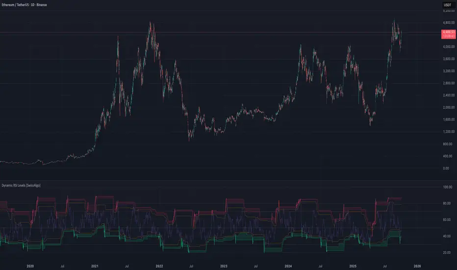
RSI with Dynamic Overbought/Oversold Levels [SwissAlgo]RSI with Dynamic Overbought/Oversold Levels
RSI indicator with adaptive overbought/oversold levels based on percentile analysis instead of fixed thresholds 30/70.
----------------------------------------------------------------
OVERVIEW
Traditional RSI uses static 30/70 levels that may fail to adapt to changing market conditions. This indicator calculates dynamic overbought/oversold zones based on recent price behavior, providing context-aware signals across dynamic volatility regimes.
----------------------------------------------------------------
KEY FEATURES
Dynamic percentile bands (98th, 95th, 90th, 10th, 5th, 2nd) that automatically adjust to current market volatility
Color-coded RSI line: red when above 98th percentile (extreme overbought), green when below 2nd percentile (extreme oversold), purple otherwise
Highlighted extreme zones with subtle background fills for easy visual identification
Adjustable responsiveness: Fast (50 bars), Medium (100 bars), or Slow (200 bars) for different trading styles and timeframes
Optional smoothing MA with multiple types: SMA, EMA, RMA, WMA, VWMA
Built-in alerts for extreme overbought/oversold conditions
----------------------------------------------------------------
HOW IT WORKS
The indicator tracks RSI values over a rolling window and calculates percentile ranks. When RSI reaches its 98th percentile, it means current momentum is stronger than 98% of recent readings — signaling a potentially extreme overbought condition relative to recent behavior, not just an arbitrary fixed level.
----------------------------------------------------------------
USAGE
Watch for RSI entering colored extreme zones (red/green fills) for potential exhaustion signals
Use the 90th/10th percentile bands as early warning levels
Combine with price action, support/resistance, or other indicators and your own analysis for confirmation
Adjust responsiveness based on your timeframe
----------------------------------------------------------------
SETTINGS
RSI Length: Standard 14-period default, adjustable
RSI Source: Close price default, customizable
Responsiveness: Choose how quickly percentile bands adapt to new data
Smoothing: Optional moving average overlay on RSI
Show Percentile Bands: Toggle visibility of dynamic levels
----------------------------------------------------------------
ALERTS
Two alert conditions are available:
RSI Extreme Overbought (crosses above 98th percentile)
RSI Extreme Oversold (crosses below 2nd percentile)
----------------------------------------------------------------
NOTES
Percentile levels recalculate as new data arrives, providing adaptive context rather than fixed historical values. This is intentional; the indicator shows where RSI stands relative to recent market behavior, not potentially outdated static thresholds.
----------------------------------------------------------------
LIMITATIONS & DISCLAIMER
PERCENTILE RECALCULATION
This indicator uses rolling percentile calculations that update as new price data arrives. Historical percentile levels may shift slightly as the lookback window moves forward . This is by design; the indicator provides context relative to recent market behavior, not static historical thresholds. Users should be aware that backtest results may differ slightly from real-time performance due to this adaptive nature.
NO PREDICTIVE CLAIMS
This indicator identifies when RSI reaches extreme levels relative to recent history. It does NOT predict future price movements, guarantee reversals, or provide trading signals. Extreme overbought/oversold conditions can persist during strong trends, price may continue moving in the same direction even after entering extreme zones.
ALERT TIMING
Alerts trigger when RSI crosses percentile thresholds on bar close. In fast-moving markets, significant price movement may occur between alert generation and user response. Always confirm conditions and DYOR before taking action.
NOT FINANCIAL ADVICE
This tool is for informational and educational purposes only. It does not constitute financial, investment, or trading advice. Past performance of any trading system or methodology is not indicative of future results. Trading involves substantial risk of loss and is not suitable for all investors.
USER RESPONSIBILITY
Users are solely responsible for their trading decisions. Always conduct your own analysis, implement proper risk management, and never risk more than you can afford to lose. Test thoroughly on paper/demo accounts before live trading.
NO WARRANTIES
This indicator is provided "as is" without warranties of any kind. The author assumes no responsibility for trading losses, technical errors, or any damages resulting from the use of this indicator.