RSI with J-Line ***For ease of use, I recommend changing the J Histogram to a line indicator, then it works like the KDJ Stochastic indicator. Full disclosure, I created this script with the help of GPT. This script was inspired by the KDJ Stochastic indicator by Dreadblitz***
The "RSI with J-Line" script is essentially a modified Relative Strength Index (RSI) indicator with an added histogram component. Here's how to use the different components of the script:
RSI Line (Blue): The RSI is a momentum oscillator that measures the speed and change of price movements. It oscillates between zero and 100, and is typically used to identify overbought and oversold conditions in a market. Traditionally, readings over 70 are considered overbought, and readings under 30 are considered oversold. However, these are not strict rules and can vary depending on the market and the overall trend.
RSI Smooth Line (Orange): This is the simple moving average of the RSI. It helps to smooth out the RSI and to identify the overall trend of the momentum. When the RSI line crosses above the RSI Smooth line, it might indicate that the momentum is moving upwards. When the RSI line crosses below the RSI Smooth line, it might indicate that the momentum is moving downwards.
RSI J-Line (Red Histogram): The J-Line is an additional line that's calculated as 3*rsiSmooth - 2*rsi. It's similar to the %J line in the Stochastic indicator and is designed to provide quicker signals than the RSI or RSI Smooth line. When the histogram is above the 0 line, it might indicate bullish momentum. When it's below the 0 line, it might indicate bearish momentum.
Please note that these interpretations are standard for these types of indicators, but actual market behavior can be complex and is influenced by many factors. Indicators should be used as part of a comprehensive trading strategy, not in isolation. Always take into account other market information and indicators before making trading decisions.
Cerca negli script per "rsi"
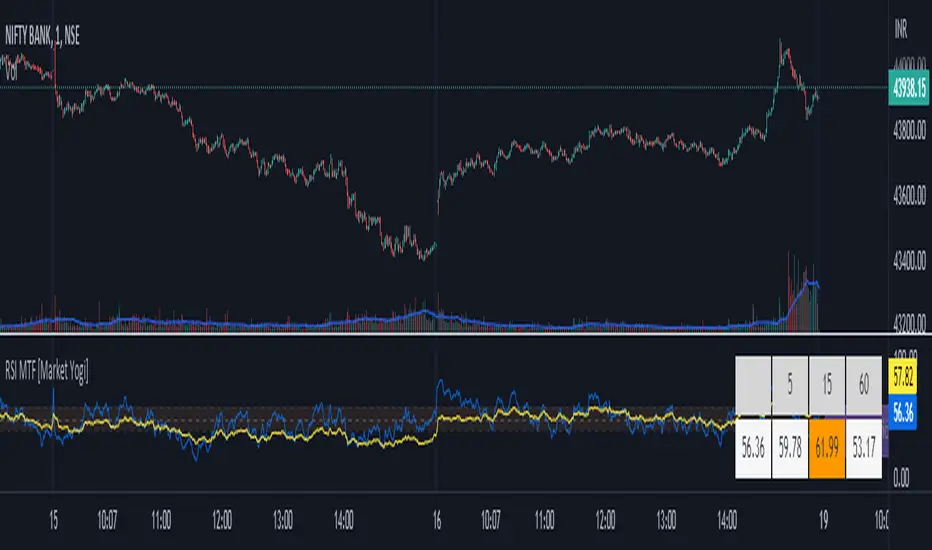
RSI MTF [Market Yogi]The Multi-Time Frame RSI with Money Flow Index and Average is a powerful trading indicator designed to help traders identify overbought and oversold conditions across multiple time frames. It combines the Relative Strength Index (RSI) with the Money Flow Index (MFI) and provides an average value for better accuracy.
The Relative Strength Index (RSI) is a popular momentum oscillator that measures the speed and change of price movements. It oscillates between 0 and 100 and is used to identify overbought and oversold conditions in an asset. By incorporating the RSI across multiple time frames, this indicator offers a broader perspective on market sentiment.
In addition to the RSI, this indicator also includes the Money Flow Index (MFI). The MFI is a volume-based oscillator that measures the inflow and outflow of money into an asset. It takes into account both price and volume, providing insights into the strength and direction of buying and selling pressure.
By combining the RSI and MFI across multiple time frames, traders gain a comprehensive understanding of market dynamics. The indicator allows for comparing the RSI and MFI values across different time frames, enabling traders to identify divergences and potential trend reversals.
Furthermore, this indicator provides an average value of the multi-time frame RSI, offering a consolidated signal that helps filter out noise and enhance the accuracy of trading decisions.
Key Features:
1. Multi-Time Frame RSI: Combines the RSI across different time frames to provide a comprehensive view of market sentiment.
2. Money Flow Index (MFI): Incorporates the MFI to gauge buying and selling pressure based on both price and volume.
3. Average Calculation: Computes the average value of the multi-time frame RSI to generate a consolidated trading signal.
4. Divergence Detection: Enables traders to spot divergences between the RSI and MFI values, indicating potential trend reversals.
5. Overbought and Oversold Levels: Highlights overbought and oversold levels on the RSI, aiding in timing entry and exit points.
The Multi-Time Frame RSI with Money Flow Index and Average is a versatile tool that can be applied to various trading strategies, including trend following, swing trading, and mean reversion. Traders can adjust the time frame settings to suit their preferences and trading style.
Note: It's important to use this indicator in conjunction with other technical analysis tools and indicators to validate signals and make informed trading decisions.
RSI-ROC Momentum AlertThis is the RSI-ROC Momentum Alert trading indicator, designed to help traders identify potential buy and sell signals based on the momentum of price movements.
The indicator is based on two technical indicators: the Rate of Change (ROC) and the Relative Strength Index (RSI). The ROC measures the speed of price changes over a given period, while the RSI measures the strength of price movements. By combining these two indicators, this trading indicator aims to provide a comprehensive view of the market momentum.
An RSI below its oversold level, which shows as a green background, in addition to a ROC crossing above its moving average (turns green) signals a buying opportunity.
An RSI above its overbought level, which shows as a red background, in addition to a ROC crossing below its moving average (turns red) signals a selling opportunity.
Traders can use this indicator to identify potential momentum shifts and adjust their trading strategies accordingly.
The ROC component of the indicator uses a user-defined length parameter to calculate the ROC and a simple moving average (SMA) of the ROC. The color of the ROC line changes to green when it is above the ROC SMA and to red when it is below the ROC SMA. The ROC SMA color changes whether it's above or below a value of 0.
The RSI component of the indicator uses a user-defined length parameter to calculate the RSI, and user-defined RSI Low and RSI High values to identify potential buy and sell signals. When the RSI falls below the RSI Low value, a green background color is applied to the chart to indicate a potential buy signal. Conversely, when the RSI rises above the RSI High value, a red background color is applied to the chart to indicate a potential sell signal.
This indicator is intended to be used on any time frame and any asset, and can be customized at will.
RSI Screener and Divergence [5ema]
Displayed on the RSI chart according to a custom timeframe.
Displays the RSI tracking table of various timeframes.
Identify normal divergence, hidden divergence on RSI chat.
Show buy and sell signals (strong, weak) on the board.
Send notifications when RSI has a buy or sell signal.
-----
I reused some functions, made by (i believe that):
©paaax : The table position function.
@everget : The RSI divergence function.
@QuantNomad : The function calculated value and array to show on table for input symbols.
I have commented in my code. Thanks so much!
-----
How it works:
1. Input :
input.int length of RSI => calculate RSI.
input.int upper/lower => checking RSI overbought/oversold.
input.int right bars / left bars => returns price of the pivot low & high point => checking divergence.
input.int range upper / lower bars => compare the low & high point => checking divergence.
input.timeframe => request.security another time frame.
input.string table position => display screener table.
2. Input bool:
plot RSI on chart.
Plot Regular Bullish divergence .
Regular Bearish divergence.
Hidden Bullish divergence .
Hidden Bearish divergence.
3. Basic calculated:
Make function for RSI , pivot low & high point of RSI and price.
Request.security that function for earch time frame.
Result RSI, Divergence.
4. Condition of signal:
Buy condition:
RSI oversold (1)
Bullish divergence (2).
=> Buy if (1) and (2), review buy (1) or (2).
Sell condition:
RSI overbought (3).
Bearish divergence (4).
=> Sell if (3) and (4), review sell (3) or (4).
5. Table screener:
Time frame.
RSI (green - oversold, red - overbought)
Divergence (⬈⬈ - regular bullish , ⬊⬊ regular bearish , ⬊ - hidden bullish , ⬈ - hidden bearish ).
Signal (🟢 - Buy, 🔴 - sell, green 〇 - review buy, red 〇 - review sell)
----
This indicator is for reference only, you need your own method and strategy.
If you have any questions, please let me know in the comments.

RSI Strategy - Backtest [AlgoRider]█ OVERVIEW
Hello dear Tradingviewers !
We share with you this new indicator which simulates a trading strategy based solely on the well-known technical indicator RSI . We designed it for the sole educational and analytical purposes of showing novice traders and new investors that basing a trading strategy only on one such technical indicator is not necessarily a good thing to do. We do not recommend to apply this strategy for real.
Thanks to this indicator redesigned in our own way by incorporating our simple and easy-to-use Backtest functionality, you will be able to see and report on the performance and results that such a strategy has produced in the past.
The configuration window has also been designed to be easily readable and simple to use. Our goal is to make parameter customization as easy as possible.
█ HOW THE STRATEGY WORKS
• The script will trigger Long entries when the price crosses upwards the Oversold zone (Default 38.2) and Short entries when the price crosses downward the Overbought zone (Default 61.8).
• A Short signal ends a Long trade, a Long signal ends a Short trade.
• The script also allows setting up custom TP and SL.
• Several options allow you to reverse entry and exit conditions of trades. You can choose to reverse entries or/and exits (Ex: when the script detects a Long Entry, it will actually trigger a Short trade).
• You can also change the entry conditions of the strategy. Instead of entering oversold/overbought zone conditions, it will trigger entries when the Rsi changes direction and reverses (Ex: when the rsi has been going down for 5 candles, and the rsi starts going up) , regardless of the area in which the RSI is located.
• There is no repaint, once an entry/exit symbol or drawing is displayed it doesn't change anymore. The Short and Long signals appear at the open of the candles, just after the signal was confirmed at the close of the previous candle. The custom TP and custom SL signals can appear when a candle is not yet finished, but once displayed they don't change.
█ HOW TO PROCEED
1 — Once the script is applied to your chart, it already works with its default settings. You can already see the performance of the strategy in the data table directly on the chart (in the top right corner by default).
2 — You can customize the strategy and influence the results/performance by modifying its parameters. 4 types of parameters are present and can be modified.
3 — You can use this indicator in all types of markets.
4 — You can apply the script in every timeframe.
█ PARAMETERS
• Settings For Backtesting
- Strategy : Choose from a drop-down list if the strategy should execute only Long trades or only Short trades or both. Default Both.
- Invest. : Choose the amount you want to invest in the simulation. Default 10000.
- Position : Choose the amount of the position (Size order) that will be used during the simulation. This will be the $ amount staked/involved for each trade entry.
Ex: If you put 20000 in position and 10000 in Invest. We consider that you use at least a leverage x2. Default 10000.
- Slipp. TP : Choose the amount in percentage of average slippage for Take Profits. This parameter makes it possible to predict a potential gap between the theoretical exit price for each TP (On the graph) and the real exit price on an exchange when implementing the strategy for real (slippage may be due to a time lag of a few seconds from execution time of the order on the exchange and/or due to the execution of a market order).
Ex: If a TP exit order of a Long trade, with entry $19000 (on BTCUSDT ), is carried out in theory on the chart at $20000, in practice on the exchange the script have indeed sent an exit order at 20000 , but if the true exit price is 20050, the TP slippage is then +0.25%. Default 0.
- Slipp. SL : Choose the amount in percentage of average slippage for Stop Losses. This parameter makes it possible to predict a potential gap between the theoretical exit price for each SL (On the graph) and the real exit price on an exchange when implementing the strategy for real.
Ex: If an SL exit order of a Long trade, entry $19000 (on BTCUSDT ), is carried out in theory on the chart at $18000, in practice on the exchange the script have indeed sent an exit order at 18000 $, but if the true exit price is 17950, the slippage SL is then +0.278%. Default 0.
- Fees % : Choose the percentage amount of fees applied to each trade to simulate the application of the strategy on the exchange of your choice. Applies to the entry and exit of each trade. Ex: For Binance Futures: 0.04; For Bybit futures: 0.06; For Ftx Futures: 0.075. Default 0.
- Cumulate Trades : If you check this, the Backtest will use 100% of the balance as Order Size (Position) for All or in the next X consecutive trades. Default not checked.
⚠️ Be Careful please, this option is available to show the full extent and possibilities of the algorithm when pushed to its limits thanks to the accumulation of profits (cumulative earnings ), but it is a strategy that involves great risk. If a bad trade suffers a -50% loss, 50% of the account balance is lost, if the position is liquidated, the entire account balance is lost.
- All : If you check this All trades will be accumulated. Default not checked.
- Consecutive Trades : Choose the number of trades to accumulate. After X consecutive trades, the algorithm reassigns the initial order size to the current one and starts again for X consecutive trades. Minimum Value 2, Default 2.
• Change Entry & Exit conditions
- Rsi Turns Up/Down : Enable this option to change conditions for trade entries. For Long entries : It will start a Long trade when RSI turns up and the RSI was falling on the last X bar(s). For Short entries : It will start a Short trade when RSI turns down and the RSI was rising on the last X bar(s). Default not checked.
- After Falling/Rising Bars(s) : Choose the number of bars/candles since which the price was falling/rising. Default 5.
- Reverse Entries : Enable this option to reverse conditions for trade entries. When a Short signal appears, it will actually start a Long trade. When a Long signal appears, it will actually start a Short trade. Default not checked.
- Reverse Exits : Enable this option to reverse conditions for trade exits. Default not checked.
- Safety Stop Loss : Enable this option to quickly cut the trade when the price turns quickly. For a Long trade : if the price returns to the oversold zone, it ends the trade. For a Short trade : if the price returns to the overbought zone, it ends the trade. Mainly useful for basic strategy (overbought/oversold conditions). Default not checked.
• Settings To Optimize Performances and Risk Management
- Len RSI : The length of RSI . Default 14.
- Overbuy : You can change the limit value of the overbought zone of the RSI . Default 61.8.
- Oversell : You can change the limit value of the oversell zone of the RSI . Default 38.2.
- Use TP / Use SL : If you check these, the algorithm will trigger personalized trade exit signals when the price evolution has reached the amounts indicated since the trade entry. Default not Checked.
- % TP - SL : Indicate here the personalized amount in percentage that you want for your Take Profit and Stop Loss of each trade. Default 15-5.
• Settings For Appearances
- Small-size Data Table : If you check this, the data table will become smaller to free up more space on the chart to make it visually more pleasing. Default not checked.
Hide Table /
- Hide Labels / : You can check these to get a cleaner chart and focus only on what interests you in the indicator. Default not checked.
Hide Risk-Reward Areas
█ LIMITATIONS
• ⚠️ We repeat it once again, this strategy is not intended to be reproduced in real conditions, we have designed it for educational and analytical purposes only.
• Even if you see good performances when you backtest the strategy, you must take into account that these results are performed in the past and that in no case does this guarantee that these same performances will be repeated again in the future.
• When you run for real a trading strategy you must be aware of the fact that you are solely responsible for the results that you will be able to obtain and you must be aware of the possibility at all times of partial or even total losses of your invested capital.
• Keep in mind that generating profits in trading is difficult. A strategy can perform very well at one time in the past during a period that is favorable to it, then from one day to the next it can give really bad results for several months or years.
• When backtesting a trading strategy, there are many factors to consider, not just trade entries to which you add a Take Profit and sometimes a Stop Loss. You must at least take into account the size of the position in relation to the capital you want to invest, the trading fees, the slippages (which can be really important depending on the exchange on which you are trading and depending on the asset you are trading), trading frequency, risk management, momentum, volumes and even more.
The information published here on TradingView is not prohibited, doesn't constitute investment advice, and isn't created solely for qualified investors.
═════════════════════════════════════════════════════════════════════════
Important to note : our indicators with the same backtesting system are published in separate publications, because putting them together in a single script would considerably slow down the execution of the script. In addition each indicator, even when it is based on a simple technical indicator, has several options, parameters and entry/exit conditions specific to the underlying technical indicator. Finally, we want to keep the simplicity of use, configuration and understanding of our indicator by not mixing strategies that have nothing to do with each other.

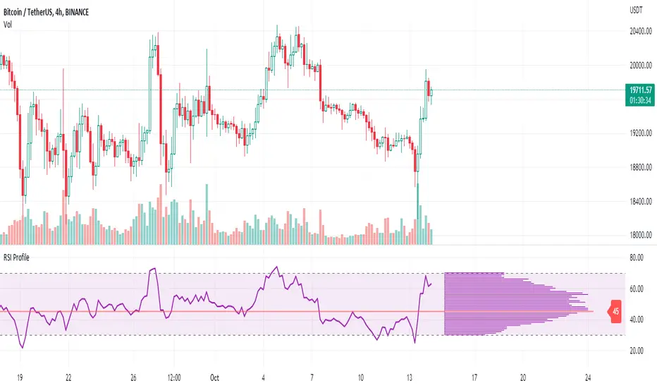
RSI ProfileThis indicator shows the RSI profile from historical RSI Value and High / Low RSI Pivots.
It is inspired by the Volume Profile which is a common charting study that indicates activity at specified levels. It plots a histogram on the chart meant to identify dominant/significant levels.
This script is profiling RSI levels into a histogram, which can identify the crucial RSI values in the chart. Along with the pivot options that can help identify the dominant pivot points where RSI values had been rebounding historically.
How to use:
There are three profile types available in the settings. When selecting RSI Values, the indicator will count RSI values from history, and plot the count in a histogram at the end of the chart. If you select RSI Pivots High or RSI Pivots Low, the indicator will count only the RSI Pivot Highs and Lows and plot the count in a histogram. Users can select the Pivot Left/Right length from the settings.
Users can extend the POC line to the left, to study how the values had been reacting to POC
Please note: Since the RSi values range from 0 to 100, the indicator is rounding off the values to absolute numbers. This can cause a situation where multiple POC are identified, to find the unique POC, you can increase the width of the histogram.
The Max/Min RSI settings are for visual purposes only, it can help users shrink down the histogram's top and bottom visibility
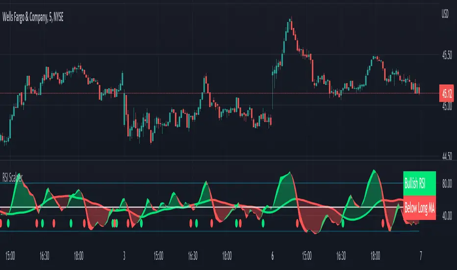
RSI Scalping & Swing Signals With AlertsThis RSI indicator shows a green or red ribbon when the smoothed RSI is bullish or bearish. It also includes a long moving average for overall trend confirmation. Wait until the ribbon holds above or below the long moving average and take positions in that direction.
To get an easier to read RSI indicator, I smoothed the RSI out and paired it next to a short term RMA. These two together form the ribbon that will show you early reversals and trend direction. The long moving average is used as an overall trend detector and confirmation for longer term trends.
***HOW TO USE***
Scalping: Enter longs when the ribbon turns green and enter shorts when the ribbon turns red. Exit positions when the ribbon turns the opposite color or crosses the long moving average.
Swing Trading: When the ribbon holds above the long moving average or breaks out and retests it, look for long positions and exit when the ribbon turns red or crosses the long moving average. When the ribbon holds below the long moving average or breaks down and retests it, look for short positions and exit when the ribbon turns green or crosses the long moving average.
***DETAILS***
This indicator gives early reversal signals very well and waiting for the RSI ribbon to cross the long moving average helps to get you into positions when the market is ready to really move while filtering out some of the noise.
The ribbon and background will change to green or red depending on whether it is currently bullish or bearish.
There is also a label that changes colors and tells you if RSI is bullish or bearish and also whether the RSI ribbon is above or below the long moving average.
Green or red circles will appear on the indicator when there is a bullish or bearish cross of the RSI ribbon and the long moving average.
It also has alerts that trigger when RSI is turning bullish/bearish or when the RSI ribbon is crossing the long moving average.
***CUSTOMIZATION***
Each piece of this indicator can be customized to suit your preferences including the RSI source, length, smoothing length, short moving average length and long moving average length. You can also turn off the labels, signals and long moving average. All of these settings can be managed within the indicator settings input tab.
***MARKETS***
This indicator can be used as a signal on all markets, including stocks, crypto, futures and forex.
***TIMEFRAMES***
This RSI Scalping & Swing Signals indicator can be used on all timeframes.
***TIPS***
Try using numerous indicators of ours on your chart so you can instantly see the bullish or bearish trend of multiple indicators in real time without having to analyze the data. Some of our favorites are Trend Friend Scalp & Swing Trade Signals, Volume Spike Scanner, Buy & Sell Pressure Volume Profile, and Momentum Scalper in combination with this RSI indicator. They all have real time Bullish and Bearish labels as well so you can immediately understand each indicator's trend.
RSI Failure Swings & AO DivergencesHello!
The script identifies RSI divergences, similar to other public scripts; however, RSI failure swings are also distinguished. When a failure swing is identified, the script calculates the highest RSI measurement (bottom failure swing) or the lowest RSI measurement (top failure swing) between the two RSI pivot points. A continually updating line is plotted at the "fail point" until it is penetrated for two sessions! In addition, the script displays the RSI fail point measurement. RSI bearish divergences are only distinguished when both RSI peaks form above 70. bullish divergences are only distinguished when both RSI troughs form below 30. Top failure swings require the initial RSI peak be above 70, the second RSI peak can form at any measurement. Bottom failure swings require the initial RSI trough be below 30, the second RSI trough can form at any measurement.
Included are Awesome Oscillator divergences. The indicator is a bit tricky; the oscillator does not incorporate an upper or lower extremity. Consequently, the script uses interpolated percentiles to characterize relatively high measurements and relatively low measurements. Bearish divergences that form within the 90th - 99th percentile are distinguished, and bullish divergences that form within the 1 - 10th percentile are distinguished. This can CERTAINLY be changed should you copy the source code and think of something better! For AO, white columns reflect a difference measurement >= 0; black bars reflect a difference measurement < 0

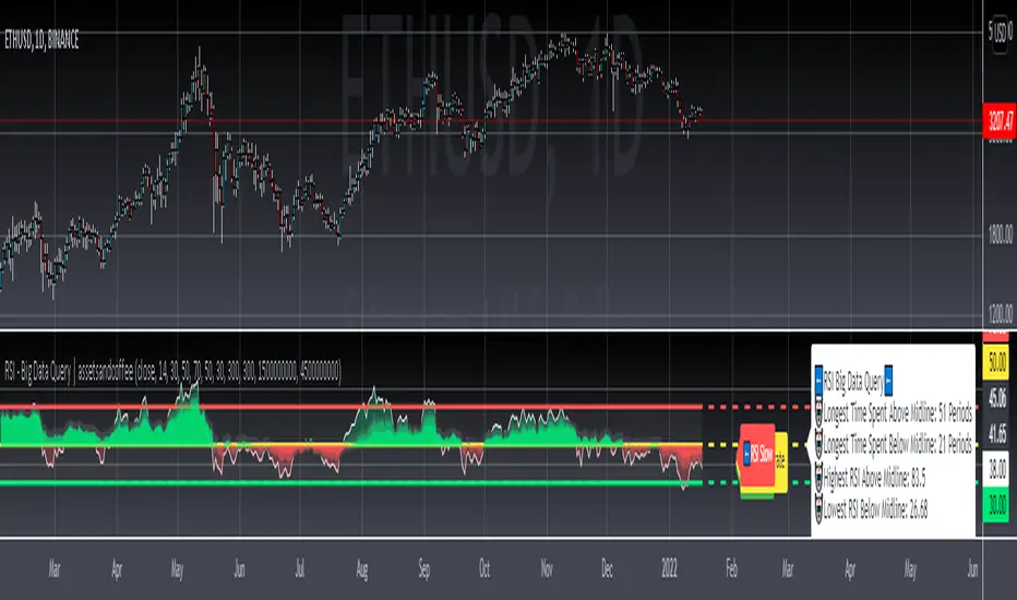
RSI Big Data Query | assetsandcoffee=============================================
…………………………..📖Description📚………………..……….
=============================================
The Relative Strength Index(RSI) is a powerful momentum indicator used to determine when price is overbought or oversold. Fairly straight forward indicator that several new and veteran traders implement into their trading strategies.
What my implementation of the RSI aims to answer is "how do we get the most out of it?". The data is there, a programming language is provided to you, might as well combine those two to query useful information.
Enjoy!
=============================================
………………………...⚙️RSI Settings⚙️………………...………
=============================================
➡️Group : RSI Restriction Settings
1.) Indicators work well for specific timeframes. That being said, you have the option to activate the restriction for the indicator to work only the daily or 4 day, or on all time frames.
➡️Group : RSI Regular Settings
1.) RSI fast, moderate and slow lengths allow you to see the strength of each RSI given a particular amount of data.
- The more data that is taken in, the slower a line will move up or down for the RSI. That is how those mountains, hills, icebergs, however way you want to see the RSI data, were visually made possible.
- The strength of this visual implementation is shown, when we visit a resistance or support line more than once.
2.) RSI upper, middle, and lower thresholds were selected based on traditional specifications.
3.) Adjust RSI Labels allows the movement of the RSI fast, moderate, and slow labels left or right based on user preference.
➡️Group : RSI Big Data Query Settings
1.) Lookback Period For Longest Time Spent Above & Below Midline?
- The higher the lookback period, the more accurate your entry and exits may be, when attempting to time when a ticker will cross above or below the midline.
- If "NaN" shows as a result, it means the lookback period is set too high. The ticker has not been around long enough on the requested timeframe to produce a result.
2.) Lookback Period For Highest & Lowest RSI; Above and Below Midline?
- Attempting to sell the top or buy the dip? Exiting and entering as close to the peaks and troughs is a good place to start.
3.) Adjust Big Data Query Label allows the movement of the RSI big data query label left or right based on user preference.
=================================
....🎉🎉🎉Before You Go🎉🎉🎉…..
=================================
Leave a like👍 and/or comment💬.
We appreciate and value everyone's feedback.
Fancy the content? Make sure to follow us🌟 so you don't miss out on our new releases🔥
"Keeping it short and sweet as always"
- assetsandcoffee📈☕
=================================
..📚Indicator Legacy/Definition(s)📖..
=================================
www.investopedia.com
RSI Divergence UltimateHere it is Everyone - What was once hidden is now revealed
This is the Ultimate RSI Divergence Indicator
Not only does it plot Regular and Hidden Divergence lines for an RSI smoothed by an EMA and for its Signal Line
The RSI can be set to change color with direction or can be set as single color with or with out OB / OS highlights
Color Changing RSI helps when trading Multiple Time Frames as you can look for confluence in the direction of RSI
Included options for the Signal Line include;
Various calculations EMA, SMA and Linear Regression which provides very accurate signal line crossover signals
Color Changing with direction
Second RSI with different Length
Multi Time Frame RSI
Bollinger Bands applied to the RSI
RSI Stochastic that has been compressed to fit into RSI OB / OS so that it doesnt compress the RSI when in these regions
There are also Background Highlights (thanks to Chris Moody) for when the RSI Stochastic moves into OB / OS and crosses its signal line
There are plenty of Alerts for signals with more complex alerts coming soon
I have also added Hima Reddy's Power Zones for support and resistance so now you can also
Take full advantage of trading; signal line crosses, 50 crosses and Power Zone RSI support and resistance and much more
The divergence script is thanks to @RicardoSantos, I've just adjusted it to suite my indicator
Remember that divergences work best when traded with the trend or very late in a trend when going against the trend

RSI Overbought, Oversold and over/under midlineMade that script where you get a very quick overview about the current RSI state. There are different colors and symbols available:
Circles = RSI 2 period is in overbought /-sold -> Weaker buy / sell signal
Cross = RSI 2 period is in overbought /-sold + price is above MA200 + below MA5 -> stronger buy / sell entry signal
brown / dark green background = RSI 14 over or under midline -> Indicates bullish / bearisch momentum
light red / green background = RSI 14 over 70 or under 30 -> Normal RSI overbought /-sold state
red / bright green background = RSI 14 over 80 or under 20 -> Stronger RSI overbought /-sold state
yellow background = RSI 14 over / under the 52 week high / low -> Very strong RSI overbought /-sold state
The indicator is designed to work on multiple chart layouts and smaller screens where you would not see the exact RSI states in the normal RSI indicator. You can also identify the RSI state very quick and it saves you space because you can identify the states even if the indicator window is very small.
Please give feedback in the comments what you think and what you would do better.
For access please leave a comment.
RSI HunterConcept and Methodology This indicator is an advanced technical tool that "reverse engineers" J. Welles Wilder’s standard Relative Strength Index (RSI).
While a standard RSI takes price data and outputs an oscillator value (0-100), this script performs the inverse operation. It calculates exactly what Price the current candle must reach to generate a specific RSI value (e.g., RSI 74 or RSI 26). By projecting these price levels onto the chart, traders can visualize Overbought and Oversold zones in real-time, turning the RSI from a lagging confirmation tool into a leading price-target system.
Key Features
1. Multi-Timeframe (MTF) Projection The indicator allows you to map RSI levels from a higher timeframe onto your current chart. For example, you can view the 3-Hour RSI "Overbought" price levels while trading on a 5-minute chart. This creates distinct "stepped" support and resistance lines that remain valid for the duration of the higher timeframe's candle.
2. Dual Zone Logic The script projects two distinct bands of resistance and support:
Inner Zone (Early Warning): Defaults to RSI 69 / 31. This represents the initial threshold of over-extension.
Outer Zone (Extreme): Defaults to RSI 74 / 26. This represents statistical extremes where mean reversion probabilities are higher.
Zone Shading: The area between the Inner and Outer lines is shaded (Red for Resistance, Green for Support) to visually identify the "Reversal Zone."
3. Smart Wick & Rejection Filter (New) This version introduces a robust filtration system designed to reduce false signals during strong trending moves (often referred to as "falling knives").
How it works: The signal logic is Intra-bar Aware. It continuously asks two questions:
Did the price touch the zone? (Did the High/Low breach the Inner line?)
Did the price reject? (Did the candle Close back inside the neutral channel?)
The Result: Signals are generated only when the price tests the level but closes safely back inside the range. This captures both long-tail wick rejections (single bar) and trend reversals, while suppressing signals when the candle closes deep inside the Overbought/Oversold zones.
How to Interpret
Stepped Lines: These are the dynamic resistance (Red) and support (Green) levels based on the selected Timeframe's RSI.
Large Arrows (Deep Red / Lime Green): Triggered when price touches the Outer (Extreme) band and rejects/closes back below the Inner band.
Small Arrows (Standard Red / Green): Triggered when price touches the Inner (Early) band and rejects/closes back, but did not reach the Outer extreme.
Settings & Defaults
RSI Length: 23
Timeframe: 3 Hours (180 minutes)
Targets: 74/26 (Outer) and 69/31 (Inner)
Filter: "Wait for Confirmed Exit" is ON by default.
Disclaimer This tool is for informational and educational purposes only. RSI projections are mathematical calculations based on historical price averages and do not guarantee future market movements. Always use proper risk management.

RSI Exit + BB-RSI Combo📊 RSI Exit + BB-RSI Combo Indicator
This indicator combines RSI overbought/oversold exit signals with Bollinger Band re-entry conditions to highlight potential reversal or retracement zones.
1️⃣ RSI Exit Signal
- When RSI drops below 70 after being overbought → 🔴 "RSI" label
- When RSI rises above 30 after being oversold → 🟢 "RSI" label
- Works on 15m / 30m / 1h / 4h / 1D timeframes
2️⃣ BB-RSI Combo Signal
- When an RSI divergence forms and
- The candle body re-enters the Bollinger Band on 1H+ timeframe
→ Combo signal (💎 diamond) is shown
💡 How to Use
- Use RSI exit signals to spot overextension corrections
- Use combo signals to identify high-probability reversal or rebound setups
- Suitable for both swing and short-term trading

RSI Trendline Pro - Multi Confirmation
Overview
RSI Trendline Pro is an advanced Pine Script indicator that automatically draws trendlines on the RSI (Relative Strength Index) to detect support and resistance breakouts. It generates high-quality trading signals through a multi-confirmation system.
Key Features
Auto Trendlines: Detects pivot points on RSI to create intelligent support and resistance lines
Multi-Confirmation System: Combines Volume, Stochastic RSI, ADX, and Divergence filters to reduce false signals
RSI Divergence Detection: Automatically identifies bullish/bearish divergences between price and RSI
Live Dashboard: Displays RSI value, active trendlines, ADX strength, and last signal info on a visual panel
Smart Breakout Detection: Identifies trendline breaks and generates LONG/SHORT signals
How to Use
Add to TradingView: Paste code into Pine Editor and add to chart
Configure Parameters:
RSI Length: RSI period (default: 14)
Pivot Strength: Trendline sensitivity (lower = more lines)
Filters: Enable/disable Volume, Divergence, Stoch RSI, and ADX confirmations
Follow Signals:
LONG (Green): When RSI breaks resistance upward
SHORT (Red): When RSI breaks support downward
Divergence: "D" markers indicate potential trend reversals
Alert Setup
Script offers 4 alert types:
LONG Breakout: Resistance break
SHORT Breakout: Support break
Bullish/Bearish Divergence: Divergence detection
Any Signal: Combined alert for all signals
Best Practices
Prioritize high-volume breakouts (Volume Filter enabled)
Trends are stronger when ADX > 25
Confirm divergence signals with price action
Trade when 2-3 confirmations align

RSI Colored by Relative StrengthThis indicator enhances the traditional RSI by combining it with Relative Strength (RS) — the ratio of an asset’s price to a chosen benchmark (e.g., SPY, QQQ, BTCUSD) — to create a more accurate, powerful, and dynamic momentum confirmation tool.
Instead of relying solely on RSI’s internal momentum, this version color-codes RSI values and backgrounds based on whether the asset is outperforming, underperforming, or neutral relative to the benchmark, not only identifying the RSI value, but color codes it in relation to the overall market to give more accurate confirmations.
• RS > 1 → The asset is outperforming the benchmark (relative strength).
• RS < 1 → The asset is underperforming.
• RS ≈ 1 → Neutral or moving in sync with the benchmark.
Gradient background zones:
• Green tones = outperformance (RS > 1).
• Red tones = underperformance (RS < 1).
• Gray neutral band = parity (RS ≈ 1).
Intensity adjusts dynamically based on how far RS deviates from 1, giving an at-a-glance view of market leadership strength.
• Color-coded RSI line: Green when RS > 1, red when RS < 1.
• Optional markers and labels show confirmed RS+RSI crossovers with smart spacing to prevent clutter.
• Alerts included for bullish and bearish RS+RSI alignment events.
How to Use
1. Add your preferred benchmark symbol (default: SPY).
2. Move this indicator into the same pane as your RSI (No need to overlay, does so automatically) and can also be used standalone.
3. Watch for:
• Green RSI & background: Significant momentum strength (asset trending upward and outpacing the market).
• Red RSI & background: False or insignificant momentum (asset lagging).
• Gray zone: neutral phase — consolidation or rotation period.
Use this as a trend-confirmation filter rather than a signal generator.
For example:
• Confirm and refine breakout entries when RS > 1 (RSI support = stronger conviction).
• Take profits when RSI weakens and RS slips below 1.
RSI deyvidholnik
📊 Overview
RSI deyvidholnik is an advanced technical indicator that combines the power of traditional RSI (Relative Strength Index) with automatic divergence detection to identify potential market reversal points. This indicator was developed by kingthies and offers clear visual analysis of overbought/oversold conditions along with highly precise divergence signals.
🔧 Key Features
Customizable RSI
Data Source: Configurable (default: close)
Period: Adjustable (default: 14)
Moving Average: Multiple types available (SMA, EMA, SMMA, WMA, VWMA, MMS)
MA Period: Configurable (default: 14)
Divergence Detection
The indicator identifies four types of divergences:
🟢 Bullish Divergence
Occurs when price makes lower lows, but RSI makes higher lows
Indicates possible trend reversal from bearish to bullish
Signaled with green dots on RSI
🔴 Bearish Divergence
Occurs when price makes higher highs, but RSI makes lower highs
Indicates possible trend reversal from bullish to bearish
Signaled with red dots on RSI
🟢 Hidden Bullish Divergence (Optional)
Price makes higher lows while RSI makes lower lows
Confirms continuation of bullish trend
Useful in trending markets
🔴 Hidden Bearish Divergence (Optional)
Price makes lower highs while RSI makes higher highs
Confirms continuation of bearish trend
Useful in trending markets
⚙️ Pivot Settings
Optimized Default Configuration
Right Bars: 1 (quick confirmation)
Left Bars: 5 (noise filtering)
Maximum Bars Between Pivots: 60
Minimum Bars Between Pivots: 3
These settings have been adjusted to provide:
✅ Faster and more responsive signals
✅ Reduction of false signals
✅ Better identification of significant pivots
🎨 Visual Interface
RSI Levels
Line 70: Overbought zone (red)
Line 50: Neutral centerline
Line 30: Oversold zone (green)
Gradient fill: Visually intensifies extreme zones
Graphical Elements
RSI: Main line in white
Moving Average: Smoothed yellow line
Divergence Points: Colored markers on pivots
Background: Subtle fill for better readability
📈 How to Use
For Reversal Trading
Enable only: Bullish and Bearish (default)
Look for: Divergences in overbought/oversold zones
Confirm with: Other indicators or price analysis
For Trend Trading
Enable: Hidden Bull and Hidden Bear
Use in: Markets with clear established trends
Combine with: Market structure analysis
Alert Configuration
The indicator includes automatic alerts for:
⚠️ Bullish Divergence
⚠️ Bearish Divergence
⚠️ Hidden Bullish Divergence
⚠️ Hidden Bearish Divergence
💡 Main Advantages
✅ Automatic Detection: Identifies divergences without manual interpretation
✅ Optimized Configuration: Default values tested for maximum efficiency
✅ Clean Interface: Clear and professional visual
✅ Integrated Alerts: Automatic signal notifications
✅ Flexibility: Multiple customization options
✅ Performance: Optimized code for efficient execution
🎯 Recommended Timeframes
Scalping: 1m, 5m (with more sensitive settings)
Intraday: 15m, 30m, 1h (default configuration)
Swing: 4h, 1D (for medium-term signals)
⚠️ Important Considerations
Not infallible: Always use in conjunction with other analysis methods
Sideways markets: More effective in markets with directional movement
Confirmation: Always wait for signal confirmation before trading
Risk management: Always implement adequate stop-loss and take-profit

RSI Momentum Divergence Zones [ChartPrime]⯁ OVERVIEW
RSI Momentum Divergence Zones is a hybrid oscillator and chart overlay tool that detects RSI-based momentum divergences and projects them as key zones on the chart. By combining RSI divergence logic with horizontal level plotting, this indicator reveals high-probability support and resistance areas where price has historically reacted to hidden or classic divergences.
⯁ KEY FEATURES
Momentum-Based RSI Source:
Instead of the classic RSI input, this tool uses the momentum of price as the RSI source:
rsiSrc = ta.mom(close, 10)
This emphasizes acceleration and deceleration of price moves, sharpening divergence signals and making them more responsive to early shifts in momentum.
Automatic Divergence Detection (Optional):
When enabled, the indicator continuously scans for:
— Bullish Divergence : Price makes a Lower Low while RSI forms a Higher Low
— Bearish Divergence : Price makes a Higher High while RSI forms a Lower High
It ensures divergence is valid by checking the spacing between pivots (min 5, max 50 bars).
Divergence Labels & Markers (RSI Pane + Chart):
When a valid divergence is detected:
— On RSI pane:
Labels appear at HL/LH points (“Bull” / “Bear”)
Colored lines show pivot structures
— On price chart:
Labels (“▲ Bull” / “Bear ▼”) mark price pivot that triggered the divergence
Lines highlight the exact price level at the divergence origin
Divergence Zones / Levels (Toggleable):
The indicator projects horizontal zones across the chart based on confirmed divergence points.
These levels dynamically extend as long as price respects them, and auto-expire once broken.
They act as S/R levels created by market imbalance caused by divergence reactions.
Dynamic Zone Extension Logic:
Once plotted, divergence levels will extend to the right:
— If price respects the level, the zone keeps growing
— If broken in the opposite direction, the level stops extending and turns dashed (visually showing break)
Zone Layering and Limit Control:
You can limit the number of simultaneous zones shown on the chart (e.g., 10 most recent).
Old zones automatically expire and are removed to keep the chart clean and focused.
Color Customization and Intensity:
Different colors for bullish and bearish zones let you easily distinguish trend direction.
Background fill, line width, and transparency are all adjustable.
Clean Zone Management with Arrays:
Behind the scenes, the script uses custom divLevel type arrays to manage plotted levels, ensuring they stay up-to-date, extend correctly, and delete once invalidated.
⯁ USAGE
Use bullish divergence zones as potential demand areas and bearish ones as supply zones.
Combine RSI pane labels with price-level zones to confirm strength of reversal.
Watch for price approaching a divergence level to anticipate reactions or breakouts.
Use divergence levels as trade triggers, stop-loss guides, or take-profit markers.
Limit signal count using the “Qty Divergence Zones” setting to reduce chart clutter.
Enable divergence detection only when you want to focus on key structural zones — ideal for swing or positional setups.
⯁ CONCLUSION
RSI Momentum Divergence Zones blends oscillator divergence logic with price action structure to uncover hidden strength or weakness in the market. With flexible zone plotting and clean visual signals, this tool empowers traders to identify where momentum turns into structure — turning hidden signals into tradable edges.

RSI Slope RibbonThe RSI Slope Ribbon is an advanced momentum indicator designed to visually highlight shifts in market momentum by comparing the slopes of two RSI calculations: a fast RSI and a slow RSI. Unlike standard RSI indicators that track price strength, this script focuses on the rate of change (slope) of these RSI values, offering a dynamic way to identify evolving market trends earlier.
Key Features:
Dual RSI Periods: Calculates both a short-term (fast) and a long-term (slow) RSI, allowing users to see momentum shifts across different timeframes.
Slope Calculation with SWMA Smoothing: Instead of raw RSI values, the indicator derives the slope of each RSI (current minus previous value) and smooths these slopes using a Symmetrically Weighted Moving Average to reduce noise and volatility spikes.
Oscillator Normalization: Slopes are normalized over a configurable lookback window, making comparisons intuitive and visually consistent regardless of market conditions.
Ribbon Visualization: A colored ribbon fills the area between the normalized fast and slow RSI slopes:
Green when short-term momentum exceeds long-term momentum (suggesting bullish conditions).
Red when short-term momentum lags behind long-term momentum (indicating bearish conditions).
Critical Levels: Horizontal lines marking overbought (80), oversold (20), and neutral (50) zones aid traders in judging the strength and extremes of momentum shifts.
Usage and Interpretation:
The crossover of the fast slope above the slow slope signals a potential bullish momentum shift.
Conversely, a fast slope crossing below the slow slope may indicate bearish momentum onset.
The normalized scale lets traders quickly assess whether momentum changes occur near critical overbought or oversold thresholds.
Adjustable input parameters (RSI lengths, smoothing period, normalization window, and price type) enable customization suited for various assets and trading styles.

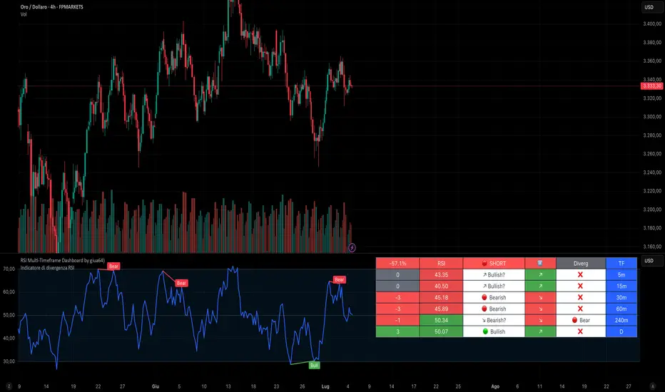
RSI Multi-Timeframe Dashboard by giua64)### Summary
This is an advanced dashboard that provides a comprehensive overview of market strength and momentum, based on the Relative Strength Index (RSI) analyzed across 6 different timeframes simultaneously (from 5 minutes to the daily chart).
The purpose of this script is to offer traders an immediate and easy-to-read summary of market conditions, helping to identify the prevailing trend direction, overbought/oversold levels, and potential reversals through divergence detection. All of this is available in a single panel, eliminating the need to switch timeframes on your main chart.
### Key Features
* **Multi-Timeframe Analysis:** Simultaneously monitors the 5m, 15m, 30m, 1H, 4H, and Daily timeframes.
* **Scoring System:** Each timeframe is assigned a score based on multiple RSI conditions (e.g., above/below 50, overbought/oversold status, direction) to quantify bullish or bearish strength.
* **Aggregated Signal:** The dashboard calculates a total percentage score and provides a clear summary signal: **LONG**, **SHORT**, or **WAIT**.
* **Divergence Detection:** Automatically identifies Bullish and Bearish divergences between price and RSI for each timeframe.
* **Non-Repainting Option:** In the settings, you can choose to base calculations on the close of the previous candle (`Use RSI on Closed Candle`). This ensures that past signals (like status and score) do not change, providing more reliable data for analysis.
* **Fully Customizable:** Users can modify the RSI period, overbought/oversold thresholds, divergence detection settings, and the appearance of the table.
### How to Read the Dashboard
The table consists of 6 columns, each providing specific information:
* **% (Total Score):**
* **Header:** Shows the overall strength as a percentage. A positive value indicates bullish momentum, while a negative value indicates bearish momentum. The background color changes based on intensity.
* **Rows:** Displays the numerical score for the individual timeframe.
* **RSI:**
* **Header:** The background color indicates the average of all RSI values. Green if the average is > 50, Red if < 50.
* **Rows:** Shows the real-time RSI value for that timeframe.
* **Signal (Status):**
* **Header:** This is the final operational signal. It turns **🟢 LONG** when bullish strength is high, **🔴 SHORT** when bearish strength is high, and **⚪ WAIT** in neutral conditions.
* **Rows:** Describes the RSI status for that timeframe (e.g., Bullish, Bearish, Overbought, Oversold).
* **Dir (Direction):**
* **Header:** Displays an arrow representing the majority direction across all timeframes.
* **Rows:** Shows the instantaneous direction of the RSI (↗️ for rising, ↘️ for falling).
* **Diverg (Divergence):**
* Indicates if a bullish (`🟢 Bull`) or bearish (`🔴 Bear`) divergence has been detected on that timeframe.
* **TF (Timeframe):**
* Indicates the reference timeframe for that row.
### Advantages and Practical Use
This tool was created to solve a common problem: the need to analyze multiple charts to understand the bigger picture. With this dashboard, you can:
1. **Confirm a Trend:** A predominance of green and a "LONG" signal provides strong confirmation of bullish sentiment.
2. **Identify Weakness:** Red signals on higher timeframes can warn of an impending loss of momentum.
3. **Spot Turning Points:** A divergence on a major timeframe can signal an excellent reversal opportunity.
### Originality and Acknowledgements
This script is an original work, written from scratch by giua64. The idea was to create a comprehensive and visually intuitive tool for RSI analysis.
Any feedback, comments, or suggestions to improve the script are welcome!
**Disclaimer:** This is a technical analysis tool and should not be considered financial advice. Always do your own research and backtest any tool before using it in a live trading environment.
Script open-source
In pieno spirito TradingView, il creatore di questo script lo ha reso open-source, in modo che i trader possano esaminarlo e verificarne la funzionalità. Complimenti all'autore! Sebbene sia possibile utilizzarlo gratuitamente, ricorda che la ripubblicazione del codice è soggetta al nostro Regolamento.
giua64
borsamercati.it – Educational tools by giua64
Anche su:
Declinazione di responsabilità
Le informazioni ed i contenuti pubblicati non costituiscono in alcun modo una sollecitazione ad investire o ad operare nei mercati finanziari. Non sono inoltre fornite o supportate da TradingView. Maggiori dettagli nelle Condizioni d'uso.
RSI-Adaptive T3 [ChartPrime]The RSI-Adaptive T3 is a precision trend-following tool built around the legendary T3 smoothing algorithm developed by Tim Tillson , designed to enhance responsiveness while reducing lag compared to traditional moving averages. Current implementation takes it a step further by dynamically adapting the smoothing length based on real-time RSI conditions — allowing the T3 to “breathe” with market volatility. This dynamic length makes the curve faster in trending moves and smoother during consolidations.
To help traders visualize volatility and directional momentum, adaptive volatility bands are plotted around the T3 line, with visual crossover markers and a dynamic info panel on the chart. It’s ideal for identifying trend shifts, spotting momentum surges, and adapting strategy execution to the pace of the market.
HOIW IT WORKS
At its core, this indicator fuses two ideas:
The T3 Moving Average — a 6-stage recursively smoothed exponential average created by Tim Tillson , designed to reduce lag without sacrificing smoothness. It uses a volume factor to control curvature.
A Dynamic Length Engine — powered by the RSI. When RSI is low (market oversold), the T3 becomes shorter and more reactive. When RSI is high (overbought), the T3 becomes longer and smoother. This creates a feedback loop between price momentum and trend sensitivity.
// Step 1: Adaptive length via RSI
rsi = ta.rsi(src, rsiLen)
rsi_scale = 1 - rsi / 100
len = math.round(minLen + (maxLen - minLen) * rsi_scale)
pine_ema(src, length) =>
alpha = 2 / (length + 1)
sum = 0.0
sum := na(sum ) ? src : alpha * src + (1 - alpha) * nz(sum )
sum
// Step 2: T3 with adaptive length
e1 = pine_ema(src, len)
e2 = pine_ema(e1, len)
e3 = pine_ema(e2, len)
e4 = pine_ema(e3, len)
e5 = pine_ema(e4, len)
e6 = pine_ema(e5, len)
c1 = -v * v * v
c2 = 3 * v * v + 3 * v * v * v
c3 = -6 * v * v - 3 * v - 3 * v * v * v
c4 = 1 + 3 * v + v * v * v + 3 * v * v
t3 = c1 * e6 + c2 * e5 + c3 * e4 + c4 * e3
The result: an evolving trend line that adapts to market tempo in real-time.
KEY FEATURES
⯁ RSI-Based Adaptive Smoothing
The length of the T3 calculation dynamically adjusts between a Min Length and Max Length , based on the current RSI.
When RSI is low → the T3 shortens, tracking reversals faster.
When RSI is high → the T3 stretches, filtering out noise during euphoria phases.
Displayed length is shown in a floating table, colored on a gradient between min/max values.
⯁ T3 Calculation (Tim Tillson Method)
The script uses a 6-stage EMA cascade with a customizable Volume Factor (v) , as designed by Tillson (1998) .
Formula:
T3 = c1 * e6 + c2 * e5 + c3 * e4 + c4 * e3
This technique gives smoother yet faster curves than EMAs or DEMA/Triple EMA.
⯁ Visual Trend Direction & Transitions
The T3 line changes color dynamically:
Color Up (default: blue) → bullish curvature
Color Down (default: orange) → bearish curvature
Plot fill between T3 and delayed T3 creates a gradient ribbon to show momentum expansion/contraction.
Directional shift markers (“🞛”) are plotted when T3 crosses its own delayed value — helping traders spot trend flips or pullback entries.
⯁ Adaptive Volatility Bands
Optional upper/lower bands are plotted around the T3 line using a user-defined volatility window (default: 100).
Bands widen when volatility rises, and contract during compression — similar to Bollinger logic but centered on the adaptive T3.
Shaded band zones help frame breakout setups or mean-reversion zones.
⯁ Dynamic Info Table
A live stats panel shows:
Current adaptive length
Maximum smoothing (▲ MaxLen)
Minimum smoothing (▼ MinLen)
All values update in real time and are color-coded to match trend direction.
HOW TO USE
Use T3 crossovers to detect trend transitions, especially during periods of volatility compression.
Watch for volatility contraction in the bands — breakouts from narrow band periods often precede trend bursts.
The adaptive smoothing length can also be used to assess current market tempo — tighter = faster; wider = slower.
CONCLUSION
RSI-Adaptive T3 modernizes one of the most elegant smoothing algorithms in technical analysis with intelligent RSI responsiveness and built-in volatility bands. It gives traders a cleaner read on trend health, directional shifts, and expansion dynamics — all in a visually efficient package. Perfect for scalpers, swing traders, and algorithmic modelers alike, it delivers advanced logic in a plug-and-play format.

RSI Hybrid ProfileThis is a Hybrid Script designed on the basis of a well know Indicator RSI - Relative strength Index, ATR, Standard Deviations and Medians. Effort is being made to present RSI in a Profile based concept to leverage and elevate trading signals and identify potential trade while effectively managing the RISK.
Trend Colour Coding :-
Green = Bullish
Red = Bearish
Gray = Mean Reversion/ Rangebound Markets
The script includes the following Elements
1) Candlestick chart of RSI of current time frame in lower pane :-
It helps to effectively compare the price action with that of RSI to clearly identify early breakouts or breakdowns in RSI as compared to price chart and identify early trade opportunities as well as Divergences
2) Higher Time Frame RSI :-
The orange line in the lower pane to help take analysis of Higher Timeframe, to evaluate and assess trend in more refined manner.
3) Point of Control Zone :-
The middle horizontal band with colour coding to highlight the Point of Control of the price action based on its relative strength.
4) Black Circles - POC Change Markers - RSI profile Value area Shifts :-
All the Black Circles plotted on chart are RSI Point of Controls, which signal upcoming Trend and should be closely watched as it can help identify wonderful Entry/Exit Opportunities.
5) Value Area :-
The horizontal lines above and below the POC Zones are the Value areas, they are extremely useful to identify the potential support/resistance zones during the trending markets and potential target zones during the mean reverting markets. The width also helps assess the underlying volatility and risk and can help in determining the position size based on it. The setting can be adjusted based on Value area Range Multiplier. 1 is the ideal setting as it represents 1 Standard Deviation of Data.
6) Trailing Stops :-
The Green Trailing line helps as trailing stoploss in buying positions and Red Trailing Line helps as trailing SL in Selling Positions. These are especially useful when price is far away from the value area zones or when volatility is very high. The setting can be adjusted based on trail multiplier in the settings.
Here are the few examples of how to use the script on different asset classes
1) Gold Futures - Exhibiting the use of trend and SL and how to change positions based on retracement and RSI Interpretation.
2)Nifty 50 - Exhibiting the importance of POC , RSI Divergence and Breakout and SL Trail and POC Change Markers
3) Bitcoin/US Dollar - Showing the use of Value areas as support zones and using RSI overbought and oversold regions to manage pullbacks and retracement confirmations.
4) JSW Energy Limited - Stock - Showing the combined use of the scripts elements in trading environment.
Feel Free to use it on Charts and leverage the power of this wonderful Indicator.

RSI + Composite RSI with Regular & Hidden Divergences📌 Description (for TradingView Public Publishing):
RSI Composite Pro is a reimagined version of the classic RSI indicator, enhanced with deeper insights. This tool displays both the standard RSI of the current asset and a normalized RSI derived from a reference index (e.g., XU100, NDX, SPX), all on the same panel.
By default, the composite RSI source is automatically selected based on the exchange you're viewing (e.g., BIST → XU100, NASDAQ → NDX, NYSE → SPX). However, users can also manually input any symbol through the settings panel.
Additionally, you can apply smoothing filters such as SMA, EMA, or Bollinger Bands to both RSI lines.
The script also detects regular and hidden divergences on RSI, helping to identify potential trend reversal points.
Key Features:
Dual RSI view: asset RSI vs. composite market RSI
Auto or manual selection of composite RSI source
Supports MA smoothing and Bollinger Band overlays
Automatic detection of regular & hidden divergences
Clean and customizable visualization on a single chart
This indicator is flexible and can be tailored to your trading style, suitable for both short-term trading and trend analysis.

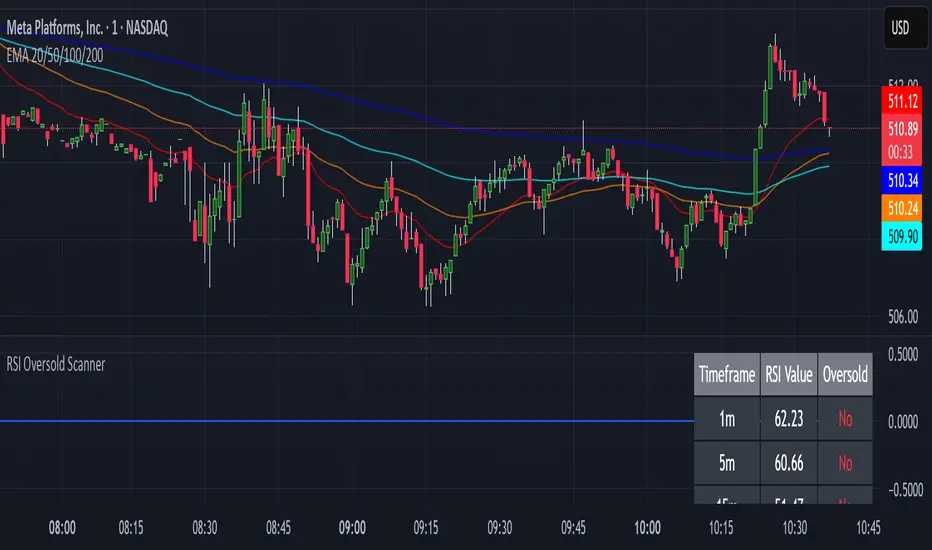
RSI Oversold ScannerPine Script Description for TradingView Publication
Title: RSI Oversold Scanner (1m, 5m, 15m)
Description:
The RSI Oversold Scanner is a powerful tool designed to identify stocks that are simultaneously oversold on the 1-minute, 5-minute, and 15-minute timeframes, based on the Relative Strength Index (RSI). This script is ideal for traders seeking short-term reversal or momentum opportunities across multiple intraday timeframes.
Key Features:
Multi-Timeframe RSI Analysis: Calculates RSI (default length: 14) on the 1m, 5m, and 15m timeframes and checks if all are below the oversold threshold (default: 30).
Visual Output: Displays a table in the top-right corner showing RSI values and oversold status ("Yes" or "No") for each timeframe, making it easy to verify conditions.
Scan Result: Plots a value of 1 when all three timeframes are oversold, or 0 otherwise, enabling quick identification of matching stocks.
Alert Support: Includes an alert condition that triggers when a stock is oversold on all timeframes, with a customizable message for real-time notifications.
User-Friendly: Built with Pine Script v6 for compatibility and reliability, with clear visual feedback for traders of all levels.
How It Works:
The script uses ta.rsi to compute RSI on the current chart’s timeframe (1m) and request.security to fetch RSI data for the 5m and 15m timeframes.
It checks if RSI is below the oversold level (default: 30) on all three timeframes.
A table displays the RSI values and oversold status for easy debugging.
The Scan Result plot (1 or 0) indicates whether the stock meets the oversold criteria, which can be used for manual scanning or alerts.
Usage Instructions:
Add the script to your chart via Pine Editor.
Use a watchlist to switch between stocks and check the table or Scan Result for oversold conditions.
Set alerts by selecting the script’s Scan Result condition (value = 1) to get notified when a stock is oversold on all timeframes.
Customize the RSI length or oversold level in the script’s code if needed (e.g., change rsiLength or oversoldLevel).
Notes:
Best used on intraday charts (e.g., 1m or higher) with a watchlist for manual scanning, as TradingView’s Stock Screener does not directly support custom Pine Scripts.
Real-time alerts and intraday data may require a TradingView paid plan.
The script uses only two request.security calls, staying well within Pine Script’s limits.
Ideal For:
Day traders and swing traders looking for oversold stocks across multiple intraday timeframes.
Users who want to combine technical analysis with visual and alert-based confirmation.