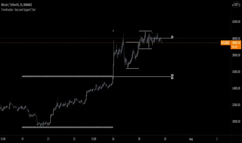
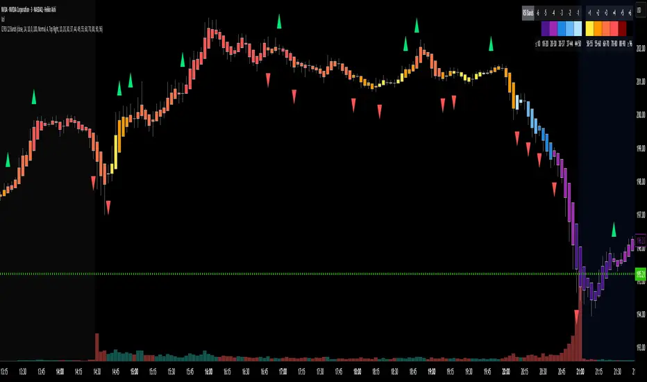
RSI, Range, and Key Level Support Tool v2.1This indicator is actually 3 different indicators combined to be able to watch key levels such as daily/weekly/monthly opens, previous days and week range highs and lows, as well as see Oversold and Overbought conditions relating to the Relative Strength Index (RSI).
- RSI DOTS SYSTEM
The first part is a custom Relative Strength Index indicator that shows RSI dots above in Red and Below in Green of the bars.
As the RSI Dots go from dark and barely visible to bright and Red For Oversold or Green for Overbought it gives a direct representation above the bar chart of Overbought or Oversold conditions. The brighter the color, the closer to 100 (Overbought and Red) or 0 (Oversold and Green) the current RSI is.
As the Overbought and Oversold conditions reverse this will show a bright Yellow Dot over the bar if it crosses a value from Overbought conditions to not Overbought conditions and the same if it crosses from Oversold conditions to not oversold conditions. To put it simply, it shows RSI reversal.
- KEY LEVELS OPENS - Daily, Weekly, Monthly Opens
This is a simple line indicator that shows 3 key levels: Daily Open, Weekly Open, and Monthly Open.
These higher time frame key levels show precisely at what price that time frame opened based on 0 UTC.
- PREVIOUS HIGHS/LOWS
This part of the indicator will show the previous day and even week highs and lows. This will help the user establish a functional range of the previous days and weeks.
The highs and lows for the daily are rows of circles above and below the high and low for that specific day and the previous weekly range are rows of crosses above and below the high and low for the past week.
How to Best use the indicator:
The RSI dots will help the user find the tops and bottoms where the Key Levels Opens and Previous Highs and Lows will help the user establish the range.
Knowing where the local top/bottom is in correlation to the potential range tops and bottoms allows the user to effectively time trend reversals and potential tops/bottoms.
Cerca negli script per "rsi"
RSI TunnelsAn experimental RSI Tunnels indicator that plots RSI inside RSI High/Low tunnels and shows the breakouts of the tunnel.
The tunnels are made by fetching the RSI previous highest high and previous lowest low.
==Explanation==
If current RSI CROSS OVER the higher band and above zero line, we have a bullish signal.
If current RSI CROSS UNDER the lower band and below zero line, we have a bearish signal.
==Colors==
The colors define the trend strength and define if current RSI is below zero line or above zero line.
GREEN: Strong up trend.
LIGHT GREEN: Weakening up trend. (Might indicate an up reversal)
RED: Strong down trend.
Light Red: Weakening down trend. (Might indicate a down reversal)
The Trick is that trend continues until the other way signal triggers, than we change color.
==Notes==
Bars are not colored by default.
From a few tests it seems to work better on higher time frames - 1 hour and above.
Each asset can have its own rhythm, adjust 'Tunnels look back' period in settings to meet the asset rhythm.
Quote which i like: “Minimizing downside risk while maximizing the upside is a powerful concept.” – Mohnish Pabrai
Enjoy and like if you like. :)
Follow for up coming indicators: www.tradingview.com

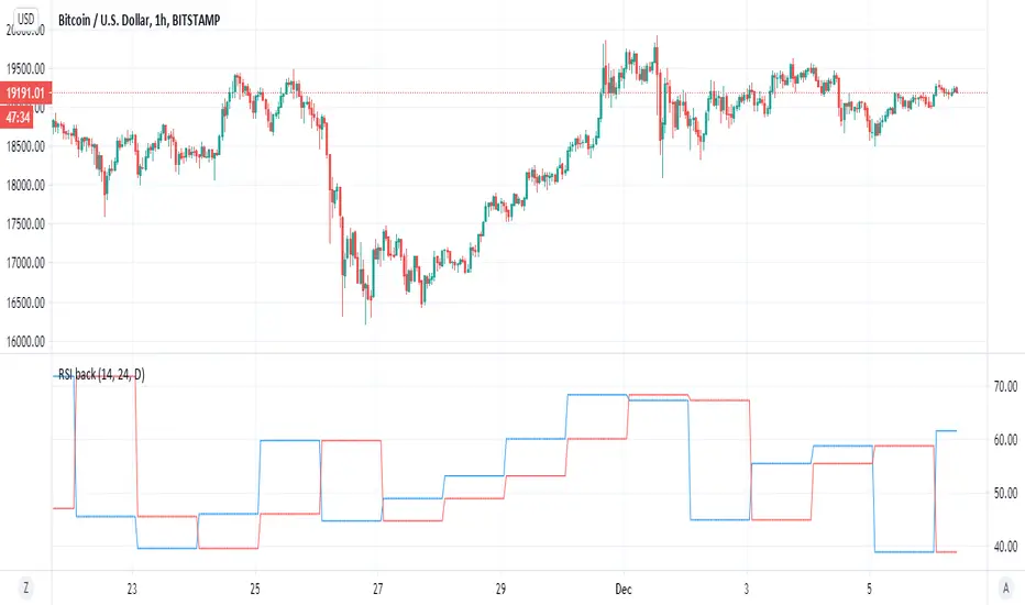
RSI backsimple indicator that based on difference between current RSI and past RSI (historic)
so lets say if take 1 hour chart then in a day there are 24 hour
so our RSI back if we put close will be the rsi of 24 hour before and this we compare it to the current rsi
if the current is above the past one then the signal is bullish , and vice versa. (similar logic to system of buy that based on close yesterday compare open of today)
so to this logic we can add no security MTF to make it nicer
blue line is current MTF RSI , red line is historic RSI based on the number of candles we choose
when blue over red is bullish ,red over blue is bearish
same on 4 hour mTF '1 hour chart and 24 candle back
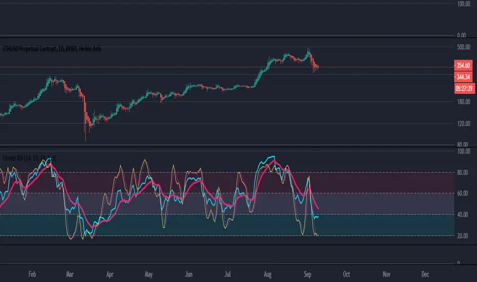
Finnie's RSI with EMA crossover + StochRSI seams to be one of the most used indicators by far, and that comes because of merit. With that in mind, the goal of this indicator is to expand upon the tradition RSI or Relative Strength Index we all know and love :) I started by adding an EMA crossover. Which gives you, the users, a general idea of when to buy and sell outside of just watching a line go down and up. To take thinks even further, I decided to add options for both Fast and Slow Stochastic oscillators. Adding STOCH brings in another variable when deciding on an entry, technically its a bit hard to explain but in practice it would go something like this: you notice RSI is down around the level 20 mark and RSI is crossing up above it's EMA, which is BULLISH signal, and you're thinking about going long. As a second confirmation you can look at the STOCH rsi, if it's also crossing above the previously spoken EMA that's another BULLISH signal. This process can be repeated once RSI has risen to find an exit.
EDIT: If you find the indicator is a bit too cluttered for you, feel free to disable the 'STOCH rsi' feature in settings :)
RSI DivergenceWhat is RSI Divergence?
It occurs when the price action and RSI are moving in opposite directions, suggesting an early sign of reversal.
When the price action is making lower lows while RSI is making higher lows, a regular bullish divergence forms.
This indicator detects four types of divergences:
Regular bear divergence marked in R tag above the RSI line, hidden bear divergence marked in a H tag above the RSI line, regular bull divergence marked in a R tag below the RSI line, and hidden bull divergence marked in a H tag below the RSI line.

RSI HeatmapHeatmap showing version measurement lengths of RSI (user selectable)
For each bar on the chart, the script calculates RSI at that point for multiple RSI lengths (e.g. 3, 7, 14, 16 etc) and displays them vertically top to bottom, fastest RSI to slowest RSI respectively. It indicates the actual RSI reading (0 to 100) by way of a colour (green for overbought, red for oversold).
So for example, if the indicator shows a cluster of reds, you know that price is oversold on several RSI lengths simultaneously.
Idea was taken from an article.

RSI MTF by PeterOThis is my take on reaching Higher TimeFrame charts, what is usually helpful when determining the trend. On the example of RSI.
So imagine you want to check RSI from higher timeframe. 15x higher for example. There are 3 ways to do it.
1. security(tickerid,"15",rsi(close,14))
DON'T!!! I strongly advise against this method. Security() function is buggy in PineScript, leads to so-called "repainting" issues. Repainting is caused by creating leak from future data and leads to abnormally fantastic strategy backtest results like the one in Open Close Cross Strategy. Theoretically speaking if security() used correctly - with Pine version3 and barmerge.lookahead_off - you should encounter no repainting, but I could swear I saw scripts repaint even with security() implemented properly.
Even assuming security() implemented correctly will not repaint - it will create delay in your script. I'm using "15" multiplier in my example, and this means, I have to wait for 15 candles to close to produce indicators value. If a strong move happens in the meantime, I'm blind, because I have to wait anyway.
So for your own security, stay away from security() at all times.
2. rsi(close,14*15)
This will produce RSI plot with no delay, but a very flattened one. RSI will move between 45 and 45, never even reaching 30 or 70 levels. So pretty useless.
3. Dig-in-the-formula way.
Doing a bit more math produces RSI line, which is not delayed, not repainting and moving in full 0-100 RSI range. Actually - looking almost identical to the one from the higher timeframe. Which was the goal of this script.

RSI-buy forceThis indicator give you the buy and sell force of RSI .
in blue is volume based RSI ( I like better as it more smooth then regular RSI
the columns in green is when RSI strength go up , columns in red when RSI power go down
this way you see better the sell and buy power based on the rsi
I used the model of modelius volume and hybrid it with this rsi . so results look interesting

RSI Divergence PRO - Baby WhaleThis RSI script will show you the following things:
When the RSI moves between the green lines (40 - 80++) we are in a Bull market.
If the RSI moves between the middle green and red line (40-60) we have some sideways action.
And yes, when the RSI is between the red lines (60 - 20--) we can say that we are in a Bear market.
The dashed lines in between are on every 10 points on the RSI .
All colors and lines are customisable.
The real MVP -1.38% of this scrip is the RSI Divergence spotter.
A little green or red triangle will show up on the chart when a RSI Divergence is formed.
The Divergence is only shown when it happens in overbought (70+) or oversold (30-) regions to avoid too many signals.
I highly recommend not to jump in on every signal you get, but also use multiple reasons, like Elliot Wave or fib levels, before entering a trade.
This Pro version is for paid subscribers of TradingView only.
It will give you the ability to create alert inside of TradingView.
If you want access, just send a message please.
Much love from Baby Whale!!
🙏❤️🐳

RSI + BB (EMA) + Dispersion (2.0)First version here
Initial data:
1) RSI
2) Bollinger Bands (Basis - EMA )
3) Dispersion (around basis)
Signal for purchase: RSI crosses the dispersion zone upwards
Signal for sale: RSI crosses the dispersion zone downwards
Buffer zone: white area, it is not recommended to make transactions.
--- Add ( 02.10.2018 )
1) RSI lines (overbought / oversold) = 70 / 30. Сan be changed in the settings.
2) Alerts:
• RSI line crossover Dispersion Zone (green)
• RSI line crossunder Dispersion Zone (red)

RSI Overbought/Oversold OverlayDo you love RSI Overbought/Oversold signals, but want more space on the screen for the actual price chart? "RSI Overbought/Oversold Overlay" to the rescue! This indicator highlights the chart's background color green when the RSI goes overbought and red when the RSI goes oversold. You can set the RSI length, overbought level, and oversold level in the format box.
Obviously, this is not the indicator to use if you're looking for things like RSI divergence, but if you're only interested in when RSI reaches the extremes of the range, this can save you some screen real estate.
RSI cyclic smoothed ProCyclic Smoothed Relative Strength Indicator - Pro Version
The cyclic smoothed RSI indicator is an enhancement of the classic RSI, adding
additional smoothing according to the market vibration,
adaptive upper and lower bands according to the cyclic memory and
using the current dominant cycle length as input for the indicator.
The cRSI is used like a standard indicator. The chart highlights trading signals where the signal line crosses above or below the adaptive lower/upper bands. It is much more responsive to market moves than the basic RSI.
The indicator uses the dominant cycle as input to optimize signal, smoothing and cyclic memory. To get more in-depth information on the cyclic-smoothed RSI indicator, please read Chapter 4 "Fine tuning technical indicators" of the book "Decoding the Hidden Market Rhythm, Part 1" available at your favorite book store.
Info: Pro Version
This is the actively maintained and continuously enhanced edition of my free, open-source indicator “RSI Cyclic Smoothed v2” which was recognized with a TradingView Editors’ Pick. The Pro Version will remain fully up to date with the latest Pine Script standards and will receive ongoing refinements and feature improvements, all while preserving the core logic and intent of the original tool. The legacy version will continue to be available for code review and educational purposes, but it will no longer receive updates. The legacy open-source version is here
Pro Features V1:
1) Leveraging multi-timeframe analysis
Indicator can be used on one chart by using different time frames at the same time. Read more on TradingView here .
2) Scoring feature added for scanning and filtering
This indicator now provides four distinct scoring states for both bullish and bearish conditions, making it fully compatible with the TradingView Screener .
Each score reflects a specific market phase based on RSI behavior, slope, and crossover signals.
Bullish States (Positive Scores)
+1 – Bull Exhaustion: Price is above the upper threshold and still rising (upsloping).
+2 – Bull Fatigue: Price is above the upper threshold but losing momentum (downsloping).
+3 – Bull Exit: A fresh downward crossover has occurred.
+4 – Recent Bull Exit: A downward crossover occurred within the recent lookback window.
Bearish States (Negative Scores)
–1 – Bear Exhaustion: Price is below the lower threshold and still declining (downsloping).
–2 – Bear Fatigue: Price is below the lower threshold but starting to turn upward (upsloping).
–3 – Bear Exit: A fresh upward crossover has occurred.
–4 – Recent Bear Exit: An upward crossover occurred within the recent lookback window.
The scoring states are shown in the indicator status panel when plotting the indicator on the chart. For a Screener run, use a generic cycle length setting.
How to determine the current active cycle length?
You can use the following additional tools to fine-tune the current dominant cycle length:
1. The advanced dyanmic Cycle Spectrum Scanner
2. The free Detremded Market Rhythm Oscillator

RSI Price Action Hunter [AlgoSystem]A combined indicator designed to identify precise trend reversal points. The algorithm filters RSI overbought and oversold signals by confirming them with powerful candlestick patterns (Bullish and Bearish Engulfing).
How it works: The indicator solves the main issue with RSI—false counter-trend signals. An entry signal is generated only when two conditions are met simultaneously:
RSI hits extreme zones: The price is in the overbought (default >70) or oversold (<30) zone.
Candlestick Confirmation: An "Engulfing" pattern forms, indicating a genuine shift in market sentiment.
Key Features:
Buy/Sell Signals: Clear labels on the chart when conditions align.
Zone Visualization: Background highlighting (Green/Red) at the moment of the signal for better visibility.
Flexible Settings: Adjustable RSI period, Overbought/Oversold levels, and pattern filters.
Alerts: Built-in alert system for App or Email notifications.
Settings:
RSI Length: RSI indicator period (default is 7 for faster reaction).
Overbought/Oversold: Boundary levels (70/30).
Patterns: Enable/Disable Engulfing filter.
Exit Zone: Visual hint for the estimated exit zone (in %).
Usage Strategy: Use this tool for Swing Trading reversals or to find pullbacks within a global trend. It works best on timeframes from 15m to 4h.

Combined: RSI Swing + Div + Sentiment + CCI — v6RSI Swing Structure (LL, LH, HH, HL)
✅ RSI Sentiment Direction (Up / Down)
✅ CCI Steroid Direction (Up / Down)
✅ Buy Signal when:
RSI Swing makes LL or HL, AND
RSI Sentiment trending UP, AND
CCI trending UP
✅ Sell Signal when:
RSI Swing makes HH or LH, AND
RSI Sentiment trending DOWN, AND
CCI trending DOWN

RSI Candle 12-Band SpectrumExperience RSI like never before. This multi-band visualizer transforms relative strength into a living color map — directly over price action — revealing momentum shifts long before traditional RSI signals.
🔹 12 Dynamic RSI Bands – A full emotional spectrum from oversold to overbought, colored from deep blue to burning red.
🔹 Adaptive Pulse System – Highlights every shift in RSI state with an intelligent fade-out pulse that measures the strength of each rotation.
🔹 Precision Legend Display – Clear RSI cutoff zones with user-defined thresholds and color ranges.
🔹 Multi-Timeframe Engine – Optionally view higher-timeframe RSI context while scalping lower frames.
🔹 Stealth Mode – Borders-only visualization for minimal chart impact on dark themes.
🔹 Complete Customization – Adjustable band levels, color palettes, and fade behavior.
🧠 Designed for professional traders who move with rhythm, not randomness.
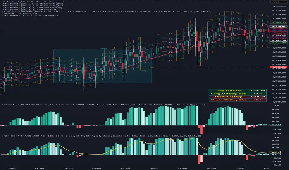
(RSI + CCI) × (MACD/ATR)^2⚙️ (RSI + CCI) × (MACD / ATR)² Composite — Normalized, Compressed, Dynamic Colors
This advanced composite oscillator merges three powerful momentum indicators — RSI, CCI, and MACD — into one normalized and volatility-adjusted signal that reacts smoothly across all markets.
By dividing MACD by ATR (Average True Range), the indicator self-scales for different symbols, and an optional tanh-like compression prevents extreme spikes while keeping the movement fluid and responsive.
🧩 Core Formula
(RSI + CCI) × (MACD / ATR)²
(optionally passed through a tanh compression for stability)
RSI and CCI are normalized (RSI ÷ 50, CCI ÷ 100) → roughly −2 to +2 range.
MACD is volatility-adjusted by ATR → scale-independent between assets.
The result is centered around 0 for clear bullish/bearish momentum comparison.
🎨 Visual Features
🟢🔴 Dynamic 4-Color Histogram
Positive + Rising = Strong Teal
Positive + Falling = Light Teal
Negative + Falling = Strong Red
Negative + Rising = Light Red
🟡⚫ 4-Color Smoothing Line
Positive & Rising = Bright Yellow
Positive & Falling = Soft Yellow
Negative & Rising = Grey
Negative & Falling = Dark Grey
Zero-centered layout for intuitive bullish/bearish visualization.
⚙️ Adjustable Parameters
Individual RSI, CCI, and MACD lengths and sources.
ATR length for volatility normalization.
Optional tanh-style compression with adjustable gain (to keep values in ±1 range).
Fully customizable colors and line widths for both bars and smoothing line.
🔔 Alerts
Triggered automatically when the composite crosses above or below zero, signaling potential trend reversals or momentum shifts.
💡 How to Use
Composite > 0 → Bullish momentum ↑
Composite < 0 → Bearish momentum ↓
A brightening line or bar = momentum accelerating.
A fading color = momentum weakening or reversal forming.
Combine with higher-timeframe trend filters (EMA, VWAP, Supertrend) for confirmation.
RSI HIGHs and LOWs MarkerThis indicator marks significant RSI (14) pivot points directly on the price chart.
Red markers above candles highlight confirmed RSI highs where the RSI value exceeded 75 (overbought zone).
Green markers below candles highlight confirmed RSI lows where the RSI value dropped below 25 (oversold zone).
These signals help traders quickly identify potential reversal zones and overextended market conditions without having to monitor the RSI window separately.

RSI + Sell/Buy RatesEnglish follow
Sell/Buy Rates = des barres vert/rouge qui mesurent la pression acheteurs vs vendeurs (calculé à partir des bougies et du volume), centrées sur 50. > 50 (vert) : acheteurs dominent. < 50 (rouge) : vendeurs dominent. Plus loin de 50 ⇒ plus fort. Avec le RSI : on ne fait que confirmer — RSI > 50 et barres > 50 → acheteurs ; RSI < 50 et barres < 50 → vendeurs ; sinon on s’abstient.
Sell/Buy Rates = green/red bars that measure buyer vs. seller pressure (calculated from candles and volume), centered at 50.
> 50 (green): buyers dominate. < 50 (red): sellers dominate.
Farther from 50 ⇒ stronger.
With RSI: it’s just a confirmation — RSI > 50 and bars > 50 → buyers; RSI < 50 and bars < 50 → sellers; otherwise, stand aside.

RSI Divergence Filtered by ZigZag RatiosRSI Divergence Filtered by ZigZag Ratios
This indicator is designed to help traders identify potential trend reversals by finding RSI divergence and then confirming it with a unique filter based on price movements. It draws two ZigZag lines on your chart to visually represent these patterns.
Core Functionality
The indicator works by doing three main things:
Price ZigZag (Blue Line): ZigZag line directly on the price chart. This line connects the significant high and low points of the price action, based on the ZigZag Deviation % you set. It's a way to simplify the trend and clearly see the "legs" or swings of the market.
RSI ZigZag (Orange Line): It also draws a separate ZigZag line, colored orange, that follows the movement of the RSI indicator. This helps you visually track the highs and lows of the RSI at the same time as the price.
Divergence Detection: The indicator continuously looks for divergence between the price ZigZag and the RSI.
The Key Filter: ZigZag Ratio
This is what makes the indicator unique. When a potential divergence is found, it doesn't just display a signal immediately. It performs an extra check:
It compares the size of the most recent price swing (the "last leg") to the size of the previous swing in the same direction. It then calculates a ratio. If the most recent swing is significantly smaller than the previous one, it confirms the signal and displays a label.
This filtering mechanism aims to weed out weak signals and highlight divergences that occur after a period of slowing momentum.
Bullish/Bearish Div Labels: When a valid, filtered divergence is found, the indicator will place a green Bullish Div label at the bottom of a low swing or a red Bearish Div label at the top of a high swing.
User Inputs
ZigZag Deviation %: This is the minimum percentage change required to form a new ZigZag pivot. The default value is set to 0.3618, which is a popular number in technical analysis. A lower value will capture more minor swings, while a higher value will focus only on larger, more significant ones.
RSI Length: The number of bars used to calculate the RSI. The default is 6, but you can adjust this to your preference.

RSI MTF HWThis Pine Script indicator is designed to provide a comprehensive view of market momentum by plotting the Relative Strength Index (RSI) from four different time frames simultaneously on a single chart. This allows traders to quickly identify alignment or divergence in momentum across various time horizons, which can be a powerful tool for confirming trade setups or spotting potential trend reversals.
Key Features:
Customizable Inputs: The indicator provides a flexible set of user inputs, including a dropdown menu to select the data source for the RSI calculation (e.g., close, open, high, low). You can also define four separate RSI lengths to analyze different periods.
Multi-Time Frame Analysis: A key feature is the ability to choose a time frame for each of the four RSI lines from a predefined list (Chart, 1 day, 1 week, 1 month). The script uses the request.security() function with lookahead enabled to ensure the most accurate, real-time data is used for each calculation, eliminating look-ahead bias and calculation errors.
Visual Levels: The indicator plots standard RSI levels at 30, 50, and 70, with a shaded background between the oversold (30) and overbought (70) zones to provide a clear visual reference.
Momentum Alignment Signals: The script includes an optional feature that highlights the chart's background with a red or green color when all four RSIs simultaneously enter an overbought or oversold state. This serves as an immediate visual alert for a strong, multi-time frame momentum condition.
This indicator is a robust tool for technical analysis, suitable for traders who use a top-down approach to their market analysis.
Bharat Jhunjhunwala - RSI Cross Trading SignalRSI Crossover Indicator
This custom indicator uses the Relative Strength Index (RSI) to generate precise buy and sell signals based on momentum shifts. The strategy works as follows:
Buy Signal: Triggered when:
The Daily RSI is above 50, indicating bullish market conditions.
The Hourly RSI crosses above 70, signaling a strong upward momentum.
Sell Signal: Triggered when:
The Daily RSI is below 50, indicating bearish market conditions.
The Hourly RSI crosses below 30, signaling potential downward momentum.
The indicator plots green up arrows for buy signals and red down arrows for sell signals, making it ideal for traders looking to trade momentum shifts with clarity.

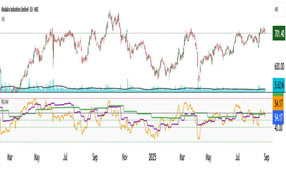
RSI de LoquyIndicator Description: RSI de Loquy
This custom indicator blends the power of the Relative Strength Index (RSI) with the Hull Moving Average (HMA), enhanced by a linear regression to reveal underlying momentum trends.
How It Works:
The RSI is calculated not on price directly, but on the HMA, offering a smoother and more responsive signal.
The RSI is remapped to a -100 to +100 scale for more intuitive reading:
+100 = extreme oversold
-100 = extreme overbought
A linear regression line is plotted over the rescaled RSI to highlight trend direction and strength.
Usage Tips:
Reversed overbought/oversold levels:
Above +70 = potential oversold condition
Below -70 = potential overbought condition
The white regression line helps confirm trend shifts or momentum continuation.
⚙️ Customizable Inputs:
HMA period
RSI length
Regression length
RSI With TSIThis indicator combines the power of the Relative Strength Index (RSI) and the True Strength Index (TSI) into a single tool, helping traders identify both short-term and long-term momentum shifts with improved clarity and precision.
Features:
Relative Strength Index (RSI):
Adjustable period and source for RSI calculation (default: 14, close).
RSI displayed with distinct color.
Includes upper (70) and mid (50) level lines with background fill for visual emphasis.
Background fill highlights the RSI range visually.
True Strength Index (TSI):
Customizable long, short, and signal lengths.
TSI and its signal line plotted for momentum analysis.
Zero line added to quickly identify bullish or bearish zone.
📊 Why Use This Indicator?
This dual-indicator setup is excellent for:
Momentum confirmation between RSI and TSI.
Identifying early entries and trend continuations.
Spotting divergences and momentum reversals.
