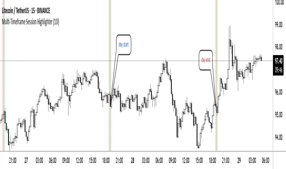
Multi-Timeframe Session HighlighterWhat is the Multi-Timeframe Session Highlighter?
It’s a simple Pine Script indicator that paints two special candles on your chart, no matter what timeframe you’re looking at. Think of it as a highlighter pen for session starts and ends—can be used for session-based strategies or just keeping an eye on key turning points.
How it works:
Green Bar (Session Open): Marks the exact bar when your chosen higher-timeframe session kicks off. If you select “4H,” on the indicator, you’ll see green on every 4-hour open, even if you’re staring at a 15-minute chart.
Red Bar (Session Close): Highlights the very last lower-timeframe candle immediately before that session wraps up. So on a 1H chart with “Daily” selected, you’ll get a red band on the 23:00 hour before the new daily bar at midnight.
Customizable: Pick your own colors and transparency level to match your chart theme.
Getting started:
Add the indicator to your chart.
In the inputs, select the session timeframe (for example, “240” for 4H or “D” for daily).
Choose your favorite green and red shades.
That’s it.
Cerca negli script per "session"
NY Trading Session TrackerNY Trading Session Tracker
This indicator highlights the New York trading session (14:30–21:00 UTC) directly on your chart. It visually identifies the session with a customizable background color and optional labels marking the session’s open and close. For added clarity, the labels can display the precise open and close prices, formatted with commas and up to 4 decimal places. Perfect for intraday traders looking to focus on one of the most active market periods.
Features:
• Highlight the NY session with a customizable background.
• Optional session open/close labels.
• Display open/close prices with professional formatting.
• Fully customizable settings for labels and colors.
Streamline your trading workflow and focus on what matters with the NY Trading Session Tracker!

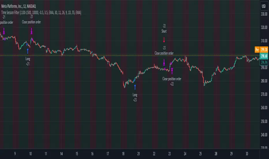
Time Session Filter - MACD exampleTime Session Filter in TradingView Strategy: A Comprehensive Guide
Welcome to this educational TradingView blog where we dive deep into the functionality and utility of the time session filter in trading strategies. It's interesting to note that the time session filter is a commonly overlooked feature in Pine Script, often not integrated into overall trading strategies. Yet, when used wisely, this tool can significantly enhance your trading approach. In essence, the session filter ensures that trades are only made within a specific, user-defined time frame. By incorporating this often-neglected building block, you can make your strategy more adaptable to various market conditions and trading preferences.
What is a Time Session Filter?
A time session filter is designed to:
Select Times of the Day to Trade: The filter allows you to choose specific hours during the day in which trades are allowed to be excecuted.
Toggle Days to Trade: You can decide which days of the week you want to trade, giving you the flexibility to avoid days that are historically not profitable for your strategy.
Close Trade When Session Ends: The filter can automatically close any open trade once the specified time session concludes, reducing the risk associated with holding positions outside your chosen time frame.
The user interface is streamlined, taking minimal space for the input sections, making it convenient to integrate with other indicators in your overall strategy script. In addition the script colors the background of the chart green when the timesession filter is on and makes the background red when the filter doesn't allow any trades. This helps you to visualise the selected timeframes in relation to chart patterns.
Best Practices for Time Selection
From my personal trading experience I share some input settings you can try to play around with:
Stocks: Trading stocks sometimes yield better results if you only trade in the mornings until lunchtime. This is the period when markets are generally more active, and traders are keenly participating.
Cryptocurrencies: For cryptocurrencies, it sometimes makes sense to avoid trading on Fridays, a day when futures contracts often expire. Various other market-moving events also typically occur on Fridays.
Random Selection: Interestingly, sometimes choosing a random selection of times and days can improve the script's performance, adding an element of unpredictability that might outperform more systematic approaches.
Strategy Overview
This strategy script incorporates various elements, including risk position size and MACD indicator, to provide a comprehensive trading strategy. For a detailed explanation of risk position sizing, please refer to this article:
For a complete understanding of the MACD indicator utilized, visit the following explanation:
Additionally, for high time frame trend filters, consult this resource for more info:
Educational Purposes and Risks
Please note that this script is for educational purposes and serves merely as an example of how to incorporate a time session filter into a trading strategy for pinescript. It is a simplified strategy without a fixed stop-loss, which can result in higher exposure to significant losses. The time session filter can be a powerful addition to your trading strategy, providing you with the tools to tailor your approach according to time-specific market conditions. By understanding its functionalities and best practices, you can make more informed trading decisions, but always remember that trading carries inherent risks.
Happy trading!
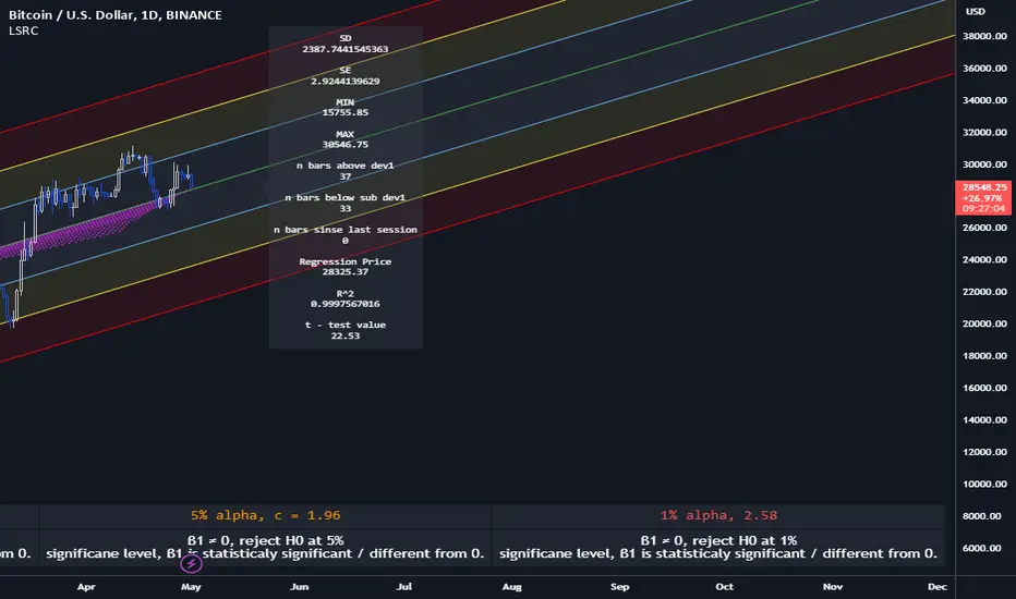
Lagging Session Regression ChannelHello Traders !
Note :
This is my very first published script on trading view & from brainstorming an idea to developing to the finched product it was imperative to me for the indiactor and every one of its features to be of some meaningfull use. If you like the idea of statsitics being able to predict future prices in the market then this indicator may be usefull in your trading arsenal.
Introduction :
Lagging Session Regression Channel (LSRC) is a statistical trend analysis indicator that "laggs" the market by the user defined session, by defualt a day, by doing so the indicator leverges the ability of simple linear regression to predict future asset price.(This can be used on any asset in any market in any time frame)
Options & inputs :
- Bar regression lookback :
The value of bars back from the lats session change, if the seesion time is equivelnt to the the chart timefrmae then the regression line will not lag price, i.e it will act as a stantdard lineer regression channel chnaging on evrey last confimred bar.
- Standard Deviation lookback :
The value of bars from the last session change to cacluate the unbiased standard deviation, The lookback can be set to > or < the regression lookback to cauture > or < less asset volatility. (note this is the same as the residual standard deviation)
- Predicted price at nth bar :
if you whant to know the predicted close price value at any given point in the regression and to the RHS of the regression.
- Regression Line colors group :
Changes the colors of each plotted line.
- OLS Line color : is only changeable when trend color is set to false / unticked.
- Visable deviations group :
Plots the lines that you want on chart, e.g if "Show DEV1" and "Sow DEV SUB1" are the only inputs ticked then they will be the only lines ploted along with the simple linear regression line.
- Regression Line Dynamics group :
All inputs in this group change the regressions calculations given the bar lookback is constant / the same.
- Trend color : if set too true, when the close of the proceding real time bar is greater than the simple linear regression line from the last confimred session the line will be colored green, if otherwise the close is below the simple linear regression line the line will be colored red.
- Extend regression line :
This is the same chart image as seen on the publication chart image but with Extend regression line set to true, this allows the trader to test the valdity of the regression and how well it predicts future price, as seen on the M15 chart of BTCUSD above the indicator was pritty good at doing this.
- Standard deviation channel source :
Source for standard deviation to be calculated on. note if this is set to a varible other than the close then this will no longer be the resdiaul standard deviation, as of now "LSRC 1.0" the regression uses only the close for y / predicted values.
- Time elasped unitl next regression calculation :
The session time until the next LSRC will be calculated and plotted
Label LSRC stats :
- STAN DEV : the standard deviation used to cacluateed the deviation channels
- MIN : The lowest price across the regression
- MAX : The highest price across the regression
- n bars above dev 1 : The number of bars that closed above the first standard deviation channel across the entire regression calculation
- n bars below sub dev1 : The number of bars that closed below the first standard deviation channel.
- Regression Price : The output of "Predicted price at nth bar" input.
Hope you find this usefull !
I will continue too try improve this script and update it accordingly.
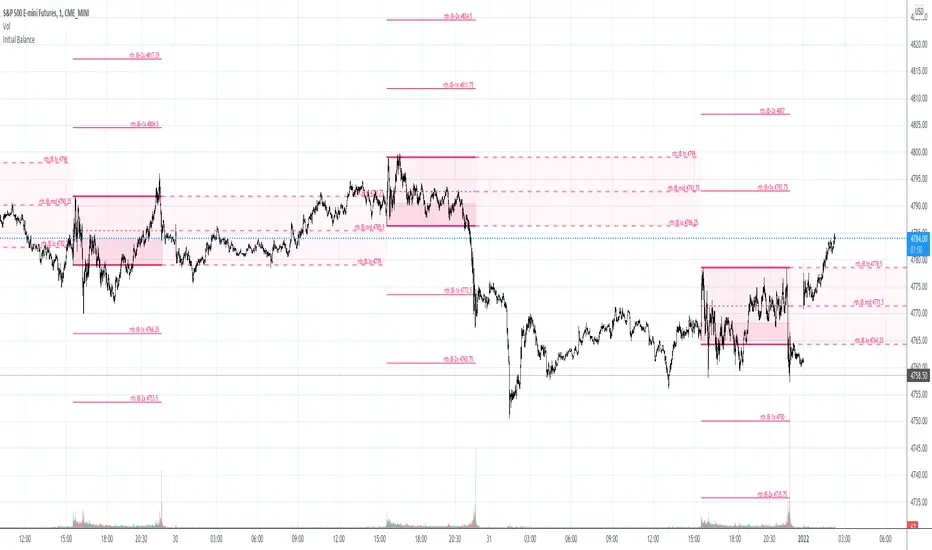
Initial Balance & extensions Custom session time and IB durationThe indicator will plot Initial Balance levels and extensions. The session start and end times are configurable depending on instrument, as well as the Initial Balance end time. The session times must be entered in the underlying instrument's timezone, for example:
ES-futures (Chicago Timezone)
Session Start: 0830
Initial Balance End: 0930
Session End: 1515
US-Stocks (New York Timezone)
Session Start: 0930
Initial Balance End: 1030
Session End: 1600
Europe Futures (Madrid Timezone)
Session Start: 0800
Initial balance End: 0900
Session End: 2200
Colors and linewidths are also customisable.
Trading Sessions Highs & LowsFull Azia , London and New York Sessions Highs & Lows are shown until triggered.

SPY Quant ML + Session Filter Strategy [CocoChoco]S&P 500 Quant: Machine Learning & Mean Reversion (Session-Filtered)
Overview
This is a professional-grade quantitative strategy designed specifically for the S&P 500. It combines classical statistical mean reversion (Z-Score) with a modern Machine Learning filter and rigorous institutional-grade risk management.
The strategy is optimized for traders who prioritize high win rates and capital preservation, specifically avoiding the "gap risk" associated with holding positions overnight.
Core Methodology
1. Statistical Entry (The Z-Score Engine)
The strategy identifies "oversold" conditions in a bullish context. It calculates the Z-Score of the price relative to its 20-period Mean (SMA). By default, it looks for a -1.2 Standard Deviation extension, signaling a high-probability "dip" ripe for a snap-back to the mean.
2. Trend & ML Filters
To avoid "catching a falling knife," the strategy uses two layers of confirmation:
Trend Filter: Only takes Long positions when the price is above the 200-period SMA, ensuring we only buy dips in a confirmed uptrend.
ML Correlation Filter: A Machine Learning-inspired module that analyzes the correlation between RSI and Volatility (ATR). It only permits entries when market internal dynamics suggest a reversal is technically "healthy."
3. Institutional Risk Management
This script is built for "safety-first" automation:
Hard Stop Loss: Fixed at 1.5% to protect against sudden market shocks.
Active Trailing: A dual-trigger trailing stop. It activates once the price touches the 20 SMA (The Mean) OR once a trade reaches a 0.50% profit threshold. This ensures near-winners are protected and large runners are captured.
Intraday Circuit Breaker: Includes a Max Daily Drawdown (2%) limit. If hit, the script automatically closes losing positions and halts trading for the day, while allowing winning positions to continue.
Key Features
Session-Specific: Tailored for the US Trading Session (UTC/NY times).
Zero Overnight Risk: Automatically flattens all positions before the market close (16:00 NY Time).
Holiday Intelligence: Hard-coded logic for US Market Holidays and Early Closes (2026–2028), ensuring the bot doesn't get stuck in illiquid holiday markets.
Hourly Entry Cap: Limits entries to one per hour to prevent over-concentration during a single price leg.
How to Use
Timeframe: I suggest you use it on the 5-minute or 1-hour timeframe for optimal results.
Instrument: Designed for the S&P 500, but highly effective on SPY, IVV, and ES (Futures).
Pyramiding: Designed to handle up to 3 concurrent positions, allowing the strategy to scale into a move as the Z-Score deepens.
Automation Ready
This script is fully compatible with webhook-based automation tools. All signals (Entry, SL, Trail, Market Close, and Daily Limit) are clearly labeled in the Alert comments for seamless execution. I haven't tasted it though. This is not financial advice. Please perform your own tests and manage your risk.
Disclaimer
Past performance does not guarantee future results. This script is a tool for quantitative analysis and should be used as part of a broader diversified trading plan.

Intraday Session BehaviorThis indicator was built to study how price behaves throughout the trading day, from pre-London session to the New York close.
The goal was simple: identify recurring intraday tendencies, reversals, and consolidation phases based on time, not indicators.
I created this script to visually segment key intraday windows and then ran 100 manual backtests to observe where price most frequently shifts direction or changes behavior.
Key observation:
Across multiple samples, 8:00 AM NY time showed the highest frequency of reversals, often aligning with positioning ahead of the New York open.
This tool is not a signal generator. It’s designed for context, study, and confluence — especially for traders focused on session-based trading, liquidity behavior, and intraday structure.
Use it as a framework to:
Study session transitions
Refine time-based playbooks
Combine with your own strategy, structure, and risk management
Built the old-school way: observe, test, repeat.


FDAX Session Levels (Daily open, 10:00, 14:00)Automated intraday levels for FDAX/DAX traders based on the Europe/Berlin timezone
Monitored Levels:
Daily Open (DO): Midnight open price (00:00 CET).
08:00 CET: Frankfurt session start.
10:00 CET: Morning trend establishment.
14:00 CET: Pre-US session liquidity shift.
Visibility: Clearly labeled levels with adjustable line thickness (Width 3).
Extend Logic: Toggle between infinite lines or session-only historical views.
Precision: Synced with Eurex trading hours.
Ideal for: Identifying intraday Support/Resistance and S/R flips on 1m to 15m timeframes.

KJ Sessions (Today Only): Asia/London/US + OverlapKJ Sessions : Asia/London/US + Overlap.
best for people to clearly mark Asia, UK and US opening and closing timing.

KJ Sessions : Asia/London/US + OverlapKJ Sessions : Asia/London/US + Overlap.
times are set as per dubai time.

HazMeed Session Highs/Lows)Marks out Asia Session Highs and Lows
Marks out London Session Highs and Lows
Marks out NYAM Session Highs and Lows

First FVG per Session - Big Boss Traders)First FVG per Session - Big Boss Traders)
All persistent variables (fvgTop, fvgBottom, boxes) declared with var at the top.
No assignment to na without var → compiles error-free.
FVG boxes and levels are dark orange.
First FVG per session is drawn and prolonged dynamically.
Background colors per session remain.

DAX 9-10 Breakout Strategy IndicatorOpening Hour Breakout (ORB) indicator for intraday trading.
WHAT IT DOES:
• Identifies the price range of a specific hour (default: 9:00-10:00)
• Detects breakout direction (Long/Short) when price breaks above HIGH or below LOW
• Automatically calculates Take Profit and Stop Loss zones based on range size
• Tracks trade outcome (Win/Lose) when TP or SL is hit
HOW TO USE:
1. Set the session hour according to your chart's timezone
2. Wait for the session range to form (yellow box)
3. Enter on breakout above HIGH (Long) or below LOW (Short)
4. TP and SL levels are automatically calculated
DEFAULT SETTINGS:
• TP Multiplier: 1.41x range (Risk:Reward ≈ 1:2.7)
• SL Multiplier: 0.52x range
FEATURES:
• Works on any timeframe (H1, M15, M30, etc.)
• Visual zones for session range, TP, and SL
• Price labels for all key levels
• Entry arrows and direction letters (L/S)
• Win/Lose markers (W/X) when trade closes
• Fully customizable - show/hide any element
• Info panel with live status and R:R ratio
• Alert conditions for Entry, TP hit, SL hit
BEST USED ON:
• DAX (Germany 40)
• Other indices: US30, US500, NAS100
• Forex majors during London/NY open
NOTE: This is an indicator for visual analysis. Use the Strategy version for backtesting.

ICT IRON-CLAD: Fixed Sessionsall sessions and killzones marked out with colours and lables as used by all traders


NY Session Bar Counter & Bar painterThe NY Session Bar Counter is a high-visibility technical utility that provides an automated, sequential count of every candle during the New York session (09:30 to 16:00 EST). Unlike standard session highlighters, this tool numbers each bar starting from the market open, allowing traders to identify specific "time-of-day" windows with surgical precision.
This script is specifically engineered for traders who follow setups based on specific bar numbers (e.g., the Bar 17 reversal, the Bar 36 lunch-power-hour, or the final EOD flush).
🚀 Key Features
Precision Timing: Automatically resets every day at 09:30 AM New York time, regardless of your local timezone settings.
Multi-Timeframe Logic: Optimized to work seamlessly on 1m, 5m, 15m, and 30m charts without breaking the daily count.
Historical & Replay Compatibility: Unlike many session tools, this script is fully compatible with Bar Replay and displays historical data across several days (up to 500 labels).
Special Bar Highlighting: Includes a "Paint Bar" feature that allows you to choose a specific bar number (e.g., Bar 17) and automatically color the candle body for instant visual recognition.
Customizable Display: Filter for Odd/Even numbers to reduce chart clutter and adjust font size, color, and position (Above/Below bar).
💡 Why It Is Useful
In the modern trading environment, the market moves in cycles of liquidity and volatility that are often tied to specific times. This script is useful because:
Standardization: It provides a common language for traders. Instead of saying "the 10:50 AM candle," traders can refer to "Bar 17" (on a 5m chart), which is faster and more consistent.
Backtesting Accuracy: When reviewing past days or using Bar Replay, you can easily identify if your strategy triggers at the same relative time every day.
Visual Discipline: By highlighting a "Target Bar," you can train your eyes to wait for specific time windows before looking for a setup, helping to prevent overtrading during low-probability hours.
Operational Efficiency: It removes the manual work of counting bars from the open, allowing you to focus entirely on price action and order flow.
How to Use
Install the script on any intraday timeframe (best on 5m or 15m).
Adjust Lookback: Use the settings to determine how many historical days you want to view.
Identify Patterns: Use the "Special Bar Highlight" to mark the bar where your strategy most frequently triggers.

SMC Post-Analysis Lab [PhenLabs]📊 SMC Post-Analysis Lab
Version: PineScript™ v6
📌 Description
The SMC Post-Analysis Lab is a dedicated hindsight analysis tool built for traders who want to understand what really happened during any historical trading period. Unlike forward-looking indicators, this tool lets you scroll back through time and instantly receive algorithmic classification of market states using Smart Money Concepts methodology.
Whether you’re reviewing a losing trade, studying a successful session, or building your pattern recognition skills, this indicator provides immediate context. The expansion-aware algorithm processes price action within your selected window and outputs clear, actionable classifications ranging from Parabolic Expansion to Consolidation Inducements.
Stop relying on subjective post-trade analysis. Let the algorithm objectively tell you whether institutional players were accumulating, distributing, or running inducements during your trades.
🚀 Points of Innovation
First indicator specifically designed for SMC-based post-trade review rather than live signal generation
Dual-mode analysis system allowing both dynamic scrollback and precise date selection
Expansion-aware classification algorithm that weighs range position against net displacement
Real-time efficiency metrics calculating directional quality of price movement
Integrated visual FVG detection within the analysis window only
Interactive table with clickable date range adjustment via chart interface
🔧 Core Components
Pivot Detection Engine: Uses configurable pivot length to identify significant swing highs and lows for structure break detection
Window Calculator: Determines active analysis zone based on either bar offset or timestamp boundaries
Data Aggregator: Tracks window open, high, low, close and counts bullish/bearish structure break events
State Classification Algorithm: Applies hierarchical logic to determine market state from six possible classifications
Visual Renderer: Draws structure breaks, FVG boxes, and window highlighting within the active zone
🔥 Key Features
Sliding Window Mode: Use the Scroll Back slider to dynamically move your analysis zone backwards through history bar-by-bar
Date Range Mode: Select specific start and end timestamps for precise session or trade review
Six Market State Classifications: Parabolic Expansion (Bull/Bear), Bullish/Bearish Order Flow, Accumulation/Distribution Reversal, and Consolidation/Inducement
Range Position Percentile: See exactly where price closed relative to the window’s high-low range as a percentage
Bull/Bear Event Counter: Quantified count of structure breaks in each direction during the analysis period
Efficiency Calculation: Net move divided by total range reveals trending quality versus chop
🎨 Visualization
Blue Window Highlight: Active analysis zone is clearly marked with blue background shading on the chart
Structure Break Lines: Dashed lines appear at each bullish or bearish structure break within the window
FVG Boxes: Fair Value Gaps automatically render as semi-transparent boxes in bullish or bearish colors
Dashboard Table: Top-right positioned table displays State, Analysis description, and Metrics in real-time
Color-Coded States: Each classification uses distinct coloring for immediate visual recognition
Interactive Tip Row: Optional help text guides users on clicking the table to adjust date range
📖 Usage Guidelines
General Configuration
Analysis Mode: Default is Sliding Window. Choose Date Range for specific timestamp analysis.
Sliding Window Settings
Scroll Back (Bars): Default 0. Increase to move window backwards into history.
Window Width (Bars): Default 100. Range 20-50 for scalping, 100+ for swing analysis.
Date Range Settings
Start Date: Select the beginning timestamp for your analysis period.
End Date: Select the ending timestamp for your analysis period.
Visual Settings
Show Help Tip: Default true. Toggle to hide instructional row in dashboard.
Bullish Color: Default teal. Customize for bullish elements.
Bearish Color: Default red. Customize for bearish elements.
SMC Parameters
Pivot Length: Default 5. Lower values (3-5) catch minor breaks. Higher values (10+) focus on major swings.
✅ Best Use Cases
Post-trade review to understand why entries succeeded or failed
Session analysis to identify institutional activity patterns
Trade journaling with objective algorithmic classifications
Pattern recognition training through historical scrollback
Identifying whether stop hunts were inducements or legitimate breaks
Comparing your real-time read versus what the algorithm detected
⚠️ Limitations
Designed for historical analysis only, not live trade signals
Classification accuracy depends on appropriate pivot length for the timeframe
FVG detection uses simple gap logic without mitigation tracking
State classification is based on window data only, not broader context
Requires manual scrolling or date input to review different periods
💡 What Makes This Unique
Purpose-Built for Review: Unlike most indicators focused on live signals, this is designed specifically for post-trade analysis
Expansion-Aware Logic: Algorithm weighs both position in range AND directional efficiency for accurate state detection
Interactive Date Control: Click the dashboard table to reveal draggable anchors for window adjustment directly on chart
🔬 How It Works
1. Window Definition:
User selects either Sliding Window or Date Range mode
System calculates which bars fall within the active analysis zone
Active zone receives blue background highlighting
2. Data Collection:
Algorithm captures window open, running high, running low, and current close
Structure breaks are detected when price crosses above last pivot high or below last pivot low
Bullish and bearish events are counted separately
3. State Classification:
Range Position calculates where close sits as percentage of high-low range
Efficiency calculates net move divided by total range
Hierarchical logic applies priority rules from Parabolic states down to Consolidation
4. Output Rendering:
Dashboard table updates with State title, Analysis description, and Metrics
Visual elements render within window only to keep chart clean
Colors reflect bullish, bearish, or neutral classification
💡 Note:
This indicator is intended for educational and review purposes. Use it to develop your understanding of Smart Money Concepts by analyzing what institutional order flow looked like during historical periods. Combine insights with your own analysis methodology for best results.

New York Sessions High/Low with Liquidity Purge CriteriaDisplays horizontal lines at the highest high and lowest low of the NY AM (09:30–12:00) and NY PM (13:30–16:00) sessions in New York time.
Lines extend forward until price strongly breaks them by a user-defined threshold (N points), at which point they cease extending - liquidity purged.
Option to show only active lines (unpurged liquidity) - toggle to hide old liquidity pools for a cleaner chart.
Customizable colors, line styles, width, lookback days and purge threshold.

Volatility High/Low Projection (PHOD / PLOD)AP Capital – Volatility + High/Low Projection
This indicator is designed to identify high-probability intraday turning points by combining daily range statistics, session behaviour, and volatility context into a single clean framework.
It is built for index, forex, and metals traders who want structure, not noise.
🔹 Core Features
1️⃣ Potential High of Day (PHOD) & Potential Low of Day (PLOD)
The indicator highlights likely intraday extremes based on:
Session timing (Asia, London, New York)
Current day volatility vs historical averages
Prior day expansion or compression behaviour
Each level is displayed with:
A clear label (PHOD / PLOD)
A forward-extending box acting as a live Point of Interest (POI)
Automatic invalidation when price breaks the zone
2️⃣ Volatility & Range Context (Info Panel)
A compact information panel in the top-right corner provides real-time context without cluttering the chart:
20-Day Average Range
% of the average range already used today
Range status (NORMAL / EXHAUSTED)
Average session ranges for:
Asia
London
New York
This allows traders to immediately assess whether price is:
Early in the day with room to trend
Statistically stretched and prone to reversal
Over-extended where breakout chasing is risky
3️⃣ Session-Aware Logic
The model respects how markets behave across the trading day:
Asia favours accumulation and potential lows
London provides expansion
New York often delivers distribution or exhaustion
This prevents random high/low marking and focuses only on structurally meaningful levels.
🧠 How to Use
Use PHOD / PLOD boxes as reaction zones, not blind entries
Combine with your own confirmation (structure break, momentum, volume, EMA reclaim, etc.)
Avoid chasing trades when the Range Status = EXHAUSTED
Particularly effective on 15m – 1h timeframes
⚠️ Important Notes
This indicator does not repaint
It is contextual, not a buy/sell signal generator
Best used as part of a complete trading plan
📈 Suitable Markets
XAUUSD (Gold)
Indices (NASDAQ, S&P 500, DAX)
Major FX pairs
📌 Disclaimer
This indicator is for educational and analytical purposes only.
It does not constitute financial advice. Trading involves risk.

Golden hour 1130 1230 Session LinesGolden Hour 11:30–12:30 Session Lines
Overview :
Calculate the session high and low between 11:30 AM and 12:30 PM and mark the lines.
Trading Rule
Once the price breaks either side (high or low), it will continue to move further in that direction.
Session Time : 11:30 AM – 12:30 PM
Key Levels : Session High & Session Low
Strategy : Breakout continuation in the direction of the break
