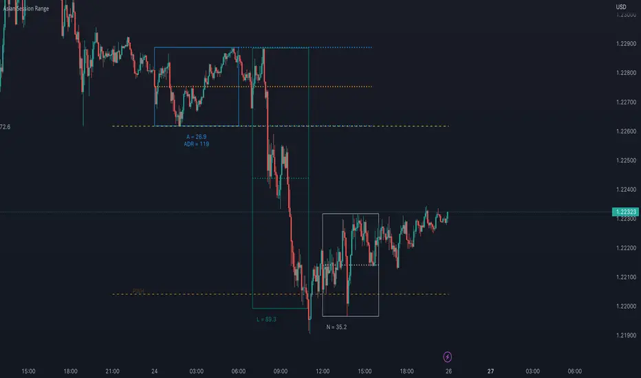
FXN - Asian Session RangeThe Asian Session Range is an indicator that draws a box around the Asian session range which runs from 20.00 pm to 02.00 am EST. It then provides lines that extend into the London and New York sessions that identify the high, low and mid-range of the Asian session.
The indicator is designed to be used on the 15 minute timeframe, although it does work on any timeframe up to a from 1 minute to a 4 hour chart, after which the indicator does not make any sense. All settings from session times, line width, style and colors can be changed through the settings, with the default configuration being for the Asian session and the light-themed user interface of TradingView.
Cerca negli script per "session"
VDUB BB %B REVERSAL_v4.2 revised by JustUncleLThis is an revised Open Public version of Vdub Bollinger Band %B reversal indicator. This version includes optional Divergence Finder with selectable channel width, optional Market Session time highlighting and optional Binary Option expiry markers.

Rapid ORB Pro - Breakout & Fakeout Detector (Multi Sessions)Rapid ORB Pro — Multi-Session Opening Range Framework
Overview
Rapid ORB Pro is a session-based Opening Range Breakout (ORB) framework designed for traders who want structured, rule-driven breakout analysis rather than isolated indicators.
It combines session range construction, breakout validation, trend alignment, and optional trade-planning tools into a single, coherent workflow.
This is not a collection of unrelated studies. Each component activates only when the prior conditions are met, forming a layered decision process from session open to trade management.
Core Design Philosophy
The script follows a strict execution flow:
Session → Range → Breakout → Validation → Trend Alignment → Context Tools → Trade Planning
Every module is optional, but all are designed to work together as one system.
1. Multi-Session Opening Range Engine
Rapid ORB Pro builds independent opening ranges for multiple global sessions (e.g. New York, London, Sydney).
Each session has its own:
• Timezone input (explicit, DST-safe)
• Range window
• Projection window
• Reset logic
This architecture avoids daylight-saving and broker-timezone errors that commonly affect time-based ORB scripts.
2. Breakout Detection & Validation
A breakout is detected only after the opening range is completed.
A signal is then validated using configurable confirmation rules, including:
• Momentum body validation (to avoid wick-only breaks)
• Structural continuation vs the prior candle
• Optional body-outside-range requirements
This helps filter weak or stop-hunt moves and focuses on genuine momentum expansion.
3. Fakeout (FO) Detection
Rapid ORB Pro includes a dedicated fakeout engine.
If price breaks the range but the very next candle closes back inside (or beyond the opposite side), a Fakeout (FO) marker is plotted.
This logic triggers only once per session and resets cleanly with each new range.
The FO marker helps traders identify liquidity traps and failed breakouts early.
4. Inside-Range Persistence (“7-Bar” Signal)
If price remains fully inside the opening range for seven consecutive candles without a valid breakout, the script can optionally mark this condition.
This highlights sessions where volatility is compressed and breakout probability is reduced — or where energy may be building for later expansion.
5. Volume Context Table
A compact table compares:
• Breakout candle volume
• Highest volume printed inside the opening range
This provides quick context on whether a breakout was supported by participation or occurred on weaker flow.
6. Advanced Trend Alignment System
Trend alignment is handled through a three-layer gate:
• Chart-timeframe trend filter
• Higher-Timeframe (HTF 1) filter
• Higher-Timeframe (HTF 2) filter
Each filter supports multiple modes:
Disabled, Long-Only, Short-Only, EMA Cross, or Price Position.
HTF EMA values are frozen until the higher-timeframe bar closes, preventing mid-bar flicker or repaint behavior.
HTF filters can be combined using either:
• “Either HTF OK” (OR logic), or
• “Both HTFs Must Agree” (AND logic)
This allows true multi-timeframe alignment when desired.
7. In-Range Fair Value Gap (FVG) Context
An optional Fair Value Gap detector identifies three-candle FVG structures that:
• Originate inside the opening range
• Complete outside the range
• Optionally require the third candle to close beyond the middle candle’s range
Detected FVGs are drawn forward to help monitor reaction areas after the breakout.
This module provides contextual insight, not standalone trade signals.
8. Trade Planning & Risk Visualization (Optional)
Rapid ORB Pro can draw a full, session-aware trade framework:
• Entry reference (configurable method)
• Stop-Loss (previous candle or previous swing, history-safe)
• Break-Even (1R) line
• Take-Profit (2R) line
All lines automatically expire after a user-defined number of bars to keep charts clean.
These are analytical guides only — not execution signals.
Reliability & Stability
Special care has been taken to ensure robustness across symbols and markets:
• Explicit timezone handling per session (DST-safe)
• History-safe swing detection (no buffer overflow errors)
• Clean resets at session boundaries
• No repainting from HTF data
The script is designed to run reliably on forex, indices, futures, crypto, and commodities.
How to Use
Typical usage:
• Chart timeframe: 1–15 minutes
• HTF references: 1H–4H
• Enable only the filters relevant to your strategy
• Use the framework for structured decision-making, not signal chasing
All inputs include tooltips explaining their behavior.
Originality Statement
Rapid ORB Pro uses a session-state engine with multi-bar memory, confirmed higher-timeframe freezing, and interdependent signal gates.
Its behavior cannot be replicated by simply combining standard ORB, EMA, or FVG indicators.
The closed-source format protects this integrated architecture while still providing full transparency into how signals are formed conceptually.
Disclaimer
This indicator is for educational and analytical purposes only.
It does not provide financial advice or guarantee performance.
Trading involves risk — always backtest and manage risk appropriately.

World sessionsThe indicator highlights trading sessions of major global exchanges (Tokyo, Hong Kong, Frankfurt, London, New York, Chicago).
It highlights them with horizontal dashed lines from the start to the end of each session. At the session start, it draws a label with the exchange name above the bar, with adjustable height based on ATR.
With gratitude to God the Father, the Lord Jesus Christ - the Son of God, and the Holy Spirit.
// © icman — ic380.com
// Open Source: исходный код открыт (MPL-2.0)

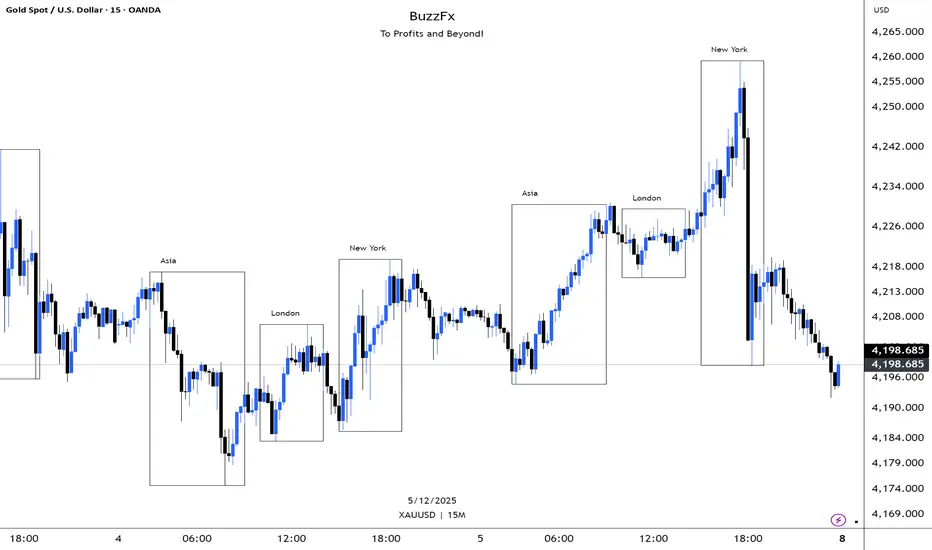
BuzzFx Market SessionsBuzzFx Market Sessions is a clean and powerful tool that highlights the most important trading sessions directly on your chart.
It automatically marks:
London Session
New York Session
Asian Session
Pre-New York
Session highs & lows (optional)
Session ranges & volatility zones
This indicator helps traders instantly understand:
When major liquidity enters the market
When volatility typically increases
How price reacts inside each session
Which session is driving the current trend
Designed for both beginners and advanced traders, BuzzFx Market Sessions gives you a clearer view of market structure and timing—so you can trade smarter, not harder.
Perfect for day traders, scalpers, and SMC traders who rely on timing, volatility, and session behavior.
All-in-One (PHT)All-in-One (PHT) — Modular Multi-Tool Market Analyzer (Pine Script v6)
All-in-One (PHT) is a complete, modular market-analysis toolkit designed for traders who want clean, reliable, and professional-grade charting - in a single indicator.
Built using Pine Script® v6 and structured with reusable PHT-Libraries (EMA Band, Bollinger Band, Fractal, Session), this indicator delivers clarity, precision, and consistent performance across all markets and timeframes.
Unlike traditional indicators that mix logic and visuals, AIO (PHT) uses a fully modular architecture. All calculations come from dedicated libraries, and this main script focuses purely on visual output and clean plotting.
This ensures:
Stable plot references
Zero repainting in all included modules
High performance even with complex overlays
Easy extensibility for future upgrades
🔥 Included Modules
1. EMA Band (PHT Library)
A triple-EMA band designed for trend clarity and structure.
Provides:
EMA of High
EMA of Close
EMA of Low
Band fill visualization
Ideal for identifying trend strength, momentum pockets, and mean-reversion zones.
2. Bollinger Band Suite
A complete Bollinger framework with:
SMA / EMA / WMA midline options
Dual standard-deviation envelopes
Multi-zone band fills (upper, middle, lower)
User-controlled visibility for each layer
Perfect for volatility detection, squeeze identification, and precision envelope trading.
3. Fractal Engine (High/Low Pivots)
Fast, reliable fractal detection using user-defined left/right periods.
Features:
Pivot Highs & Pivot Lows
Multiple marker sizes (Tiny → Large)
Zero-lag plotting with proper offset handling
Useful for swing structure, breakout confirmation, and automated level marking.
4. Market Session Tracker
A powerful session-mapping module that visually highlights market sessions with:
Dynamic session boxes
High & Low markers
Persistent historical sessions
Auto-managed labels, lines, and live updates
Timezone-aware session boundaries (supports IANA zones)
Designed for identifying daily ranges, session liquidity, volatility pockets, and market timing.
🧠 Why This Indicator Is Different
Most “all-in-one” tools mix plotting, logic, and calculations in a single heavy script, causing lag, reference instability, and repainting issues.
All-in-One (PHT) solves this by using a Pine v6 library architecture:
Each component is computed in its own library
The main script handles only visuals
No hidden code, no repainting tricks
Maximum clarity and maintainability
This design mirrors professional software architecture:
clear separation of logic, visuals, and user interface.
🎯 Ideal For
Trend traders
Scalpers & intraday traders
Swing and positional traders
Volatility analysts
Structure-based price action traders
Anyone who wants multiple high-quality tools in one clean indicator
Whether you analyze markets manually or build algorithmic systems, AIO (PHT) provides a solid foundation.
⚙️ Features at a Glance
Fully modular Pine v6 design
Complete EMA band engine
Advanced Bollinger band system (multi-deviation, multi-fill)
Configurable fractal high/low markers
Smart session boxing with history
Clean visuals and transparent settings
No repainting
Fully customizable colors & visibility
Optimized for performance
💡 How to Use
Choose the modules you want to display (EMA, BB, Fractals, Sessions).
Adjust lengths, deviations, or fractal periods as per your trading style.
Use session boxes to understand volatility timing.
Combine bands + fractals for advanced structure-based decisions.
The indicator is designed to overlay on price for maximum clarity.
🚀 Future Upgrades
The PHT framework supports smooth future expansion. Planned modules include:
ATR/volatility engines
Trend switches
Supertrend/Donchian plugins
Volume profile extensions
Updates will remain backward compatible across all modules.
⭐ Summary
All-in-One (PHT) is not just another overlay — it’s a complete multi-tool trading framework built using professional engineering practices in Pine Script v6.
If you want cleaner charts, smarter signals, and a high-performance modular system, this indicator gives you everything in one reliable package.

MaxToro 1H Pivots HL + Sessions + Wick Detector + EMAs [v2.4]MaxToro 1H Pivots + Sessions + Wick Detector + EMAs — Indicator Description
The MaxToro 1H Pivots + Sessions + Wick Detector + EMAs indicator is a multi-tool market-structure system designed to highlight liquidity, wick imbalances, intraday session behavior, and dynamic trend direction. It combines several professional-grade tools into a single clean overlay.
Core Features
1. Automatic Pivot High/Low Mapping (1H-Style Labels)
Plots swing highs and lows using customizable left/right lengths.
Labels each pivot with the exact price for easy reference.
Helps identify structural shifts, liquidity zones, and trending environments.
2. Session Visualization (Tokyo, London, New York)
Highlights the three major trading sessions directly on the chart.
Custom session times (America/Chicago timezone).
Each session has a separate color for fast volatility recognition.
Ideal for traders using:
Time-of-day models
ICT Killzones
Session-based liquidity shifts
3. Wick Rejection Detector
This system identifies candles with abnormally large wicks, helping you detect:
Liquidity sweeps
Rejection zones
Stop hunts
Market inefficiencies
Features include:
Upper wick detections
Lower wick detections
Bar highlighting
Optional wick-range lines
Alerts for both upper and lower wick events
Perfect for spotting algorithmic manipulation and reversal zones.
4. EMA Trend Filters (20 / 50 / 100 / 200)
This version includes a full moving average suite:
EMA 20 → short-term momentum
EMA 50 → mid-term trend
EMA 100 → structure bias
EMA 200 → higher-timeframe trend anchor
Features:
Toggle on/off
Adjustable opacity
Clean color-coded lines
Works as dynamic support/resistance
Confluence with pivots & wick sweeps
5. Information Table
A corner-based info box shows wick conditions in real time:
Wick multiplier
Upper wick signal (true/false)
Lower wick signal (true/false)
Helps traders interpret candle behavior without scanning every bar.
What This Indicator Helps You Do
✔ Identify liquidity sweeps
Wick detector + pivot labels show where algorithms take out highs/lows.
✔ Improve directional bias
EMA 100/200 and pivot structure help confirm trend direction.
✔ Read session-driven volatility
You instantly see when price is entering or exiting high-volume killzones.
✔ Catch reversals early
Wick rejections highlight exhaustion, displacement setups, and trap candles.
✔ Trade with confidence
You always know:
Where pivots are
What session you’re in
Where major EMAs sit
Whether candles show aggressive wick pressure
Ideal For
ICT/SMC traders
Liquidity & sweep-based strategies
Session-based traders
Trend-followers or scalpers
Anyone using 1H pivots for intraday directional bias
Summary
This all-in-one indicator blends institutional concepts—liquidity mapping, wick manipulation, time-of-day behavior, and trend structure—to give you a complete picture of the market in one clean visual tool.
Perfect for mechanical execution and top-down confluence.

ADR Daily Range + Volatility + KZs — SMC/ICT (@PueblaATH)ADR Daily Range + Volatility + KZs — SMC/ICT (@PueblaATH) is a complete intraday context and volatility HUD that plots market opens, killzones, previous period highs/lows, and a dynamic ADR/volatility dashboard. It is built to give SMC/ICT traders an at-a-glance view of when and where price is moving: sessions, overlaps, ranges, and distance to key levels, all on a single clean overlay.
What the Indicator Does
Market Opens (Tokyo, London, New York)
Professional-grade session open lines with:
Individually configurable open times per session and timezone.
Infinite vertical lines or height-limited extensions (custom tick offsets).
Fully styled labels: size, alignment, auto-background, manual background, and vertical offset.
Killzones & Session Overlaps
Precision-timed shaded boxes for:
Tokyo Killzone
London Killzone
New York Killzone
London–New York Overlap
Previous Period Levels (PDH/PWH/PMH & PDL/PWL/PML)
Robust daily/weekly/monthly high/low engine:
Accurate Previous Day / Week / Month Highs & Lows (Europe/Madrid reference).
Line length modes: infinite, N bars, or end-of-day projection.
Per-level colors + labeled markers placed to the right of price with custom horizontal/vertical spacing.
Timeframe & Weekend Filters
Keep charts clean by hiding components based on:
Custom timeframe ranges (hide opens or killzones on HTFs).
Weekend filters for opens, killzones, and ADR/table.
Optional override to display the HUD table across all timeframes.
Session Comparison Table (Top-Right HUD)
A compact, institutional-style session dashboard comparing:
Tokyo, London, New York — current open vs previous session and previous day.
Bullish/Bearish state with color-coded logic (+ optional ▲/▼ arrows).
Optional Δ% change column relative to previous day’s open.
ADR / Volatility Panel (24h Rolling Window)
A powerful real-time volatility module providing:
True 24-hour rolling high–low range.
SMA-based ADR calculation with automatic bar-count safety limits.
ADR% expansion metric with two thresholds + blinking color logic for volatility extremes.
Directional bias vs price 24 hours ago (Bullish/Bearish).
Optional metrics: distance to PDH/PDL (in price units) and absolute H–L / ADR values.
How to Use It
Set each session’s open time and killzone window according to your broker or desired timezone alignment.
Enable or disable session opens and killzones to frame the trading windows you prioritize (e.g., LDN Killzone or NY session expansion).
Activate key previous period levels (PDH/PDL, PWH/PWL, PMH/PML) and tune the line-length mode and label spacing to match your workflow.
Use timeframe & weekend filters to keep higher-timeframe charts clean while maintaining precise intraday visibility on lower timeframes.
Monitor the session comparison table to understand directional behavior relative to previous sessions and previous day opens.
Watch the ADR panel to classify the day as compressed, normal, or expanded—and anticipate potential reversion or continuation.
Originality & Credits Disclaimer
This indicator is an original work by @PueblaATH , created specifically for the tool ADR Daily Range + Volatility + KZs — SMC/ICT (@PueblaATH) and distributed under the MPL 2.0 license.
While the concepts implemented—session opens, killzones, ADR, and previous highs/lows—are public and widely known in the trading community, this script introduces a uniquely integrated framework that combines:
Multi-timezone session scheduling with dynamic TF/weekend filtering.
A modular PDH/PWH/PMH + PDL/PWL/PML engine with versatile projection and labeling controls.
A precise 24-hour volatility model tied to an ADR panel with extension thresholds, blinking alerts, and distance-to-PD metrics.
A multi-session comparative table that unifies Tokyo, London, and New York open data in real time.
This work does not reuse or repackage code from other authors. Any future adaptations from public sources will always include full, transparent credit and documentation.

MCM By Inner Racers# MCM By Inner Racers - Multi-Timeframe Key Levels & Session Indicator
## 📊 Overview
**MCM (Multi-Timeframe Chart Mapping)** is a comprehensive trading indicator designed for professional traders who need clear visual representation of critical price levels, session ranges, and time-based market structure. This all-in-one tool eliminates chart clutter while providing essential information for ICT, SMC, and institutional trading methodologies.
---
## ✨ Key Features
### 📅 **Previous Daily Levels**
- **Previous Day High (PDH)** - Acts as key resistance/liquidity zone
- **Previous Day Low (PDL)** - Acts as key support/liquidity zone
- **Previous Day Mid (PDM)** - 50% equilibrium level for mean reversion trades
- **Daily Separators** - Vertical lines marking new trading days
### 📆 **Previous Weekly Levels**
- **Previous Week High (PWH)** - Major weekly resistance for swing trading
- **Previous Week Low (PWL)** - Major weekly support for swing trading
- **Previous Week Mid (PWM)** - Weekly equilibrium for higher timeframe bias
- **Weekly Separators** - Vertical lines marking new trading weeks
### 🌅 **True Day Opens (TDO)**
- Displays opening prices at **midnight NY time** for the past 1-10 days
- Each level labeled as "TDO D-0", "TDO D-1", "TDO D-2", etc.
- Critical for tracking institutional reference points and gap trading
- Respects true midnight opens (not session opens)
### 📍 **Weekly Opens**
- **Monday 00:00 Open** - True weekly open at Monday midnight NY time
- **Sunday 17:00 Open** - Forex market open (Sunday 5 PM NY time)
- Essential for understanding weekly bias and manipulation zones
### 🌏 **Trading Session Ranges**
Dynamic session boxes that track real-time high/low ranges:
- **Asian Session** (Default: 20:00-00:00 NY) -
- **London Session** (Default: 02:00-05:00 NY) -
- **New York Session** (Default: 07:00-16:00 NY) -
All session times are **fully customizable** in 15-minute increments.
---
## 🎯 Who Is This For?
✅ **ICT/SMC Traders** - Key levels for market structure, liquidity, and order flow
✅ **Session Traders** - Identifying killzones and optimal entry zones
✅ **Swing Traders** - Previous day/week levels as support/resistance
✅ **Multi-Timeframe Analysts** - Understanding price relationships across timeframes
✅ **Forex & Indices Traders** - NY time-based analysis for institutional moves
---
## 🎨 Full Customization
Every element is fully customizable:
- ✏️ **Colors** - Match your chart theme perfectly
- 📏 **Line Widths** - 1-5 pixels for visibility
- 🎭 **Line Styles** - Solid, Dashed, or Dotted
- 🏷️ **Labels** - Custom text and 5 size options (Tiny to Huge)
- ⏱️ **Session Times** - Adjust to your timezone or broker
- 📐 **Line Extension** - 20-500 bars forward projection
- 👁️ **Toggle Visibility** - Show/hide any feature independently
---
## 🔧 Technical Highlights
- Uses **request.security()** for accurate higher timeframe data
- Implements **lookahead=barmerge.lookahead_on** for non-repainting levels
- All times calculated in **America/New_York timezone** for consistency
- Efficient line management with proper deletion/recreation
- Maximum 500 lines supported for clean chart performance
- Session detection respects broker time differences
---
## 📖 How To Use
### **For Day Traders:**
1. Enable Daily Levels + True Day Opens for intraday structure
2. Use Session Ranges to identify high-probability trading windows
3. Watch for price reactions at PDH/PDL and TDO levels
### **For Swing Traders:**
1. Enable Weekly Levels for higher timeframe bias
2. Use PWH/PWL as major support/resistance zones
3. Monitor Weekly Opens for institutional reference points
### **For Multi-Timeframe Analysis:**
1. Combine Daily + Weekly levels for confluence zones
2. Use Mid levels (50%) for mean reversion opportunities
3. Align session ranges with higher timeframe structure
---
## ⚙️ Setup Tips
- **Timeframe:** Works on all timeframes (recommended: 1m to 1H for intraday)
- **Chart Type:** Overlay indicator - displays directly on price chart
- **Clean Charts:** Toggle off features you don't need for specific strategies
- **Labels:** Turn off labels for cleaner charts, turn on for reference
- **Line Extension:** Adjust based on your screen size and bar count
---
## 🚀 What Makes This Different?
Unlike basic support/resistance indicators, MCM provides:
- ✅ **True NY midnight opens** (not session opens)
- ✅ **Multiple day opens** tracking (not just previous day)
- ✅ **Dynamic session ranges** (not static boxes)
- ✅ **Both true weekly opens** (Monday 00:00 AND Sunday 17:00)
- ✅ **Fully customizable everything** (colors, styles, labels, times)
- ✅ **Non-repainting levels** using proper lookahead settings
- ✅ **All-in-one solution** (no need for multiple indicators)
---
## 📝 Notes
- All times are in **America/New_York timezone** for consistency with institutional trading
- Previous levels update at the start of each new day/week
- Session ranges are calculated dynamically during active sessions
- Lines extend forward for clear visual reference
- Works with any symbol: Forex, Indices, Crypto, Stocks
---
## 🏷️ Tags
`Multi-Timeframe` `Key Levels` `ICT` `Smart Money Concepts` `Sessions` `Previous Day High/Low` `Previous Week High/Low` `Support Resistance` `Institutional Trading` `Order Flow` `Liquidity` `Market Structure`
---
© Inner_Racers
For questions, suggestions, or feedback, please leave a comment below!
**⭐ If you find this indicator helpful, please give it a boost and share with fellow traders!**

Traderei SessionsTraderei Sessions shows the previous daily H/L + previous weekly H + L, daily open from the current day, the H/L from Asia/London/NY Session, including the 50% Level for Premium or Discount Price.
VPOC for each Session. VPOC do not work on FX ! only Crypto + Gold !
2 EMAs and 1 SMA, + 1 additional EMA/SMA.
default settings for EMA 20/50, SMA 200
all lines, labels can be toggled
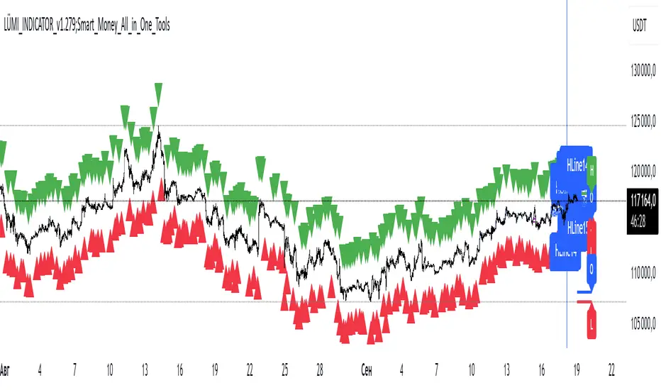
LÜMI_INDICATOR_v1.279_Smart_Money_All_in_One_Tools!!!Русский перевод внизу!!!!
Before using it, go to the settings and uncheck all the boxes!!!
And only then after that deal with this indicator, what you need from there, then add.
In the future, I will release a COMPLETE guide to this indicator with screenshots, so throw it to your favorites, don't waste it.
This version is still raw, but WORKING. There will be improvements in the structure of the indicator so that you can intuitively understand what each of the 100+(!) indicator settings is responsible for.
What's inside:
1. Session indicator. 15 Fully customizable time boxes, for any needs, and sessions. Enter your time zone, the time of your session, and that's it. There are also a couple of unexpected bonuses in this part of the indicator))
2. A set of horizontal lines of lines that come out at the right time for you. It is convenient to designate NYM, NYSE OPEN RANge, and other events on the chart that occur strictly on time. It can be widely used if you know what to look for.
3. Like the 2nd item, only vertical.
4. Fractal indicator.
5. OHL levels for
5.1. Current day
5.2. Current week
5.3. Current month.
6. Vertical chart dividers by opening levels
6.1 Days
6.2. Weeks
6.3. Months.
This feature is ideal for those who trade forex price delivery profiles or indices.
!!! Перед использованием зайдите в настройки и поснимайте все галочки!!!
И только потом после этого разбирайтесь с этим индюком, что вам оттуда нужно, то и добавляйте.
В дальнейшем выпущу ПОЛНЕЙШИЙ гайд на этот индюк со скриншотами, так что кидайте в избранное, не теряйте
Версия пока сырая, но РАБОЧАЯ. Будут доработки в структуре индикатора, чтобы можно было интуитивно понять, за что отвечает каждая из 100+(!) настроек индикатора
Что внутри:
1. Индикатор сессий. 15полностью настраиваемых боксов по времени, под любые нужды, и сессии. Вводите свой часовой пояс, время вашей сессии и всё. В этой части индикатора также есть пара неожиданных бонусов))
2. Набор горизонтальных линий линий, выходят в нужное для вас время. Удобно обозначать NYM, NYSE OPEN RANge, и другие события на графике, которые происходят строго по времени. Применение можно найти широкое, если знать, что искать
3. Как 2 пункт, только вертикальные.
4. Индикатор фракталов.
5. Уровни OHL для
5.1. Текущего дня
5.2. Текущей недели
5.3. Текущего месяца.
6. Вертикальные разделители графика по уровням открытия
6.1 Дня
6.2. Недели
6.3. Месяца.
Эта функция идеальна для тех, кто торгует профили доставки цены форекс или индексов.
Multi-Session Levels + EMA Crosses + TP Calculator (GBP/USD)# Multi-Session Levels + EMA Crosses + TP Calculator
## 📋 Description
**Advanced trading indicator combining multi-session analysis, EMA cross validation, and automated Take Profit calculations for Forex markets.**
This comprehensive tool integrates session-based level analysis with validated EMA crossovers and intelligent TP calculations, designed specifically for serious traders who need precise entry signals with calculated exit strategies.
## 🎯 Key Features
### 📊 **Multi-Session Analysis**
- **Asian Session (6PM-1AM Mexico)**: Generates key support/resistance levels
- **London Session (1AM-6AM Mexico)**: Analyzes manipulation patterns
- **New York Session (8AM-4PM Mexico)**: Dynamic levels with trend confirmation
- **AMD Setup Detection**: Combines all sessions for high-probability setups
### 📈 **Advanced EMA System**
- **4 EMAs**: 8, 13, 21, and 55 periods with visual display
- **Validated Crossovers**: EMA 8 vs EMA 13 with multiple confirmations
- **Smart Filtering**: Only shows signals during optimal trading hours (6AM-12PM Mexico)
### ✅ **Triple Validation System**
- **MACD Confirmation**: Histogram strength + signal line position + momentum direction
- **RSI Filter**: Overbought/oversold levels with moving average confirmation
- **Squeeze Momentum**: Bollinger Bands vs Keltner Channels compression detection
### 💰 **Intelligent TP Calculator**
- **ADR-Based Targets**: Uses Average Daily Range for realistic profit expectations
- **ATR Multipliers**: Conservative (1.5x), Aggressive (2.5x), Very Aggressive (3.5x)
- **Session-Aware**: Considers already-traveled distance in NY session
- **Real-Time Table**: Live pip calculations for all TP levels
- **Visual Levels**: Automatic TP lines drawn on chart with color coding
### 🚨 **Smart Alert System**
- **Validated Signals Only**: Alerts trigger only when ALL confirmations align
- **TP Integration**: Alerts include suggested take profit levels
- **Non-Validated Tracking**: Shows basic crosses that don't meet full criteria
## 📐 **Technical Calculations**
### **ADR (Average Daily Range)**
- 20-period average of daily high-low ranges
- Converted to pips for easy interpretation
- Used for percentage-based TP targets (50%, 75%, 100% of ADR)
### **ATR (Average True Range)**
- 14-period ATR from H1 timeframe (configurable)
- Accounts for gaps and volatility
- Base for multiplier-based TP levels
### **Session Tracking**
- Real-time monitoring of NY session range
- Calculates remaining potential movement
- Optimizes TP placement based on session progress
## 🎨 **Visual Elements**
### **Chart Levels**
- **Orange Lines**: Asian and London session levels
- **White/Green/Red Lines**: NY session levels (color changes with trend direction)
- **TP Lines**: Color-coded take profit levels with different styles
### **EMA Display**
- **Blue**: EMA 8 (fastest)
- **Green**: EMA 13 (signal line)
- **Yellow**: EMA 21 (trend filter)
- **Red**: EMA 55 (major trend)
### **Signal Shapes**
- **Bright Triangles**: Fully validated signals
- **Faded Triangles**: Non-validated basic crosses
- **Size Variation**: Signal strength indication
## 📊 **Information Table**
Real-time display showing:
- **TP Levels**: All calculated take profit targets in pips
- **Session Data**: NY range already traveled vs average
- **Volatility Metrics**: Current ATR and ADR values
- **Clean Design**: Easy-to-read format with color coding
## ⚙️ **Customization Options**
### **Session Times**
- Fully configurable session times
- Mexico City timezone support
- Enable/disable individual session analysis
### **Validation Controls**
- Toggle MACD, RSI, Squeeze validation independently
- Adjust RSI overbought/oversold levels
- Customize MACD and Squeeze parameters
### **Display Options**
- Show/hide EMAs, crosses, TP levels, table
- Customize TP calculation periods (ADR, ATR)
- Choose ATR timeframe for calculations
## 🎯 **Ideal For**
- **Forex Day Traders**: Especially USD pairs during NY session
- **Session-Based Strategies**: Traders who respect market sessions
- **Risk Management Focus**: Those who need calculated exit strategies
- **Multi-Timeframe Analysis**: Traders using H1-H4 charts
## 📈 **Best Practices**
1. **Use during high-volume sessions** (London-NY overlap)
2. **Wait for full validation** before entering trades
3. **Consider session context** when setting TPs
4. **Combine with proper risk management** (1-2% per trade)
5. **Backtest thoroughly** before live trading
## ⚠️ **Important Notes**
- **Signals work best** during trending market conditions
- **AMD setups** provide highest probability entries
- **TP levels are suggestions** - adjust based on market context
- **Always use stop losses** (not included in this indicator)
- **Designed for Forex markets** - may need adjustment for other instruments
---
*This indicator combines proven technical analysis concepts with modern session-based trading approaches, providing both entry timing and exit planning in one comprehensive tool.*
VWAP with Prev. Session BandsVWAP with Prev. Session Bands is an advanced indicator based on TradingView’s original VWAP. It adds configurable standard deviation or percentage-based bands, both for the current and previous session. You can anchor the VWAP to various timeframes or events (like Sessions, Weeks, Months, Earnings, etc.) and selectively show up to three bands.
The unique feature of this script is the ability to display the VWAP and bands from the previous session, helping traders visualize mean reversion levels or historical volatility ranges.
Built on top of the official TradingView VWAP implementation, this version provides enhanced flexibility and visual clarity for intraday and swing traders alike.

Market Sessions by BASSWELLThis TradingView indicator visually highlights major global trading sessions (Tokyo, London, New York) directly on intraday charts. It provides a clear, color-coded display of session activity and key statistics to help traders better understand session dynamics and overlaps.
✅ Key Features:
Visual Session Boxes: Draws background boxes for each session with configurable colors.
Session Names: Displays the name of each session as a label above the session box.
Open/Close Lines: Optionally shows dashed lines at session open and close prices.
Average Price Line: Plots the average session price as a dotted line.
Tick Range Display: Calculates and shows the high-low range in ticks.
Time Zone Support: Fully timezone-aware via IANA definitions (e.g. "Europe/London").
Overlap Handling: Automatically dims older sessions when a new one starts for visual clarity.
🔧 Configurable Parameters:
Show/hide each session individually.
Set session times and timezones.
Customize label visibility and box contents.
Adjust session colors with transparency.
Includes basic visual styling for better chart readability.
⚠️ Note: Works only on intraday timeframes. Daily/weekly/monthly charts are not supported.
Trading Sessions with TableTrading Sessions with Table is a dynamic TradingView indicator that displays the status of major global trading sessions directly on your chart. The script features a customizable table listing key sessions—Sydney, Tokyo, London, and New York—along with their open and close times and current status ("Open" or "Closed").
Key features include:
Custom Time Inputs: Easily set your session times by entering HH:MM formatted strings.
Dynamic Timestamps: The script calculates session timestamps for the current day and automatically adjusts for sessions that span midnight.
Visual Cues: Active sessions are highlighted with distinct background colors for quick reference.
Alert Conditions: Built-in alerts notify you when each session starts and ends, so you can stay informed of market shifts.
Ideal for traders managing multi-market strategies, this tool offers a clear, at-a-glance overview of session activity and helps streamline your trading decisions across different time zones.

Standard Deviation Range with Box (NY Session Timeframe)
---
Standard Deviation Range with Box (NY Session Timeframe)
This TradingView script is designed to help traders visualize a **price range** along with **standard deviations** during the **New York session (GMT-5)**. It provides key insights into market movements and standard deviation levels, all while offering graphical representations for easy analysis.
#### **Key Features**:
*⏰ Customizable Time Range**:
- Define a **start** and **end time** for the price range during the New York session (default: 09:40 to 09:50 GMT-5).
- The script automatically converts the specified time into New York timezone timestamps.
**📦 Price Range Box**:
- Draws a **dynamic box** to capture the **highest** and **lowest** prices during the defined timeframe.
- The box automatically updates as the highest and lowest prices change during the session.
**📏 Standard Deviations**:
- Calculates **standard deviation levels** (e.g., -1.5, 2, 2.5, -2, -1) based on the session's high-low range.
- Plots **horizontal lines** to represent these standard deviations, allowing for quick visual analysis of price volatility.
**🎨 Graphical Customization**:
- Customize the **box color**, **background color**, and **line styles** to match your chart’s aesthetics.
- The standard deviation lines are also customizable in terms of color and style for optimal visual clarity.
**💬 Watermark and Information Overlay**:
- Displays a **quote watermark** on the chart. The default quote is: "Patience is the price of the best opportunities."
- Provides real-time **symbol information** (ticker, timeframe, date) for context while analyzing the chart.
**🔄 Dynamic Updates**:
- Continuously updates the **highest** and **lowest** prices during the selected session.
- The box and deviation lines are automatically redrawn with each new bar during the session.
**Use Case**:
Ideal for traders who want to analyze **price movements** and **volatility** within a specific New York session window. It offers a clear view of the market’s historical range and current volatility, helping traders make data-driven decisions.
#### **How It Works**:
**Set the Time Range** ⏱️: Choose your start and end time for the New York session price range.
**Observe the Box** 📦: View the box showing the high/low price range for the session.
. **Check Standard Deviations** 📉: Monitor how the price relates to various standard deviation levels (plotted as horizontal lines).
**Watch Watermark & Info** 🧑💻: View your selected symbol’s **ticker**, **timeframe**, and **date** on the chart.

STRX - Macro TimesSTRX - Macro Times
The STRX - Macro Times is an advanced indicator designed to highlight key moments in financial markets based on specific macroeconomic time frames for Forex, Indices, and Gold. With this tool, you can optimize your trading decisions by monitoring periods of increased volatility and activity in the markets, leveraging the most strategic time windows to operate.
Key Features:
Highlighting Forex, Indices, and Gold Sessions:
The STRX - Macro Times automatically colors the candles on the chart during crucial time intervals for Forex, Indices, and Gold markets, helping you easily spot periods of heightened economic and financial activity. This allows you to focus on times when the market is most liquid and volatile, enhancing your trading performance.
Pre-set Macro Times:
The indicator is programmed to highlight three different key time windows for each market:
Forex: Major sessions from 8:30 to 10:00, 12:00 to 13:00, and 15:00 to 15:30.
Indices: Key times from 9:00 to 10:00, 15:45 to 16:15, and 19:00 to 20:00.
Gold: Strategic moments from 8:30 to 10:00, 14:30 to 16:00, and 20:00 to 21:30.
Total Customization:
You can enable or disable the coloring for different markets (Forex, Indices, Gold) based on your trading preferences. This allows you to focus only on the markets you follow, simplifying chart analysis and optimizing your response time to market changes.
Clear and Intuitive Visual Coloring:
The chart bars are colored in white, creating a clear visual distinction to recognize the most relevant time windows. This makes it easy to identify macroeconomic periods without wasting time manually calculating opportunity windows.
With STRX - Macro Times, you’ll have a strategic advantage in trading by focusing on periods of high volatility and improving the efficiency of your operations in the most active markets. This indicator is perfect for those looking to enhance their strategy and operate in sync with the key moments of the global market.

Equity Sessions [vnhilton]Note: Numbers in the chart above, particularly volume, are incorrect as I didn't have extra market data at the time of publication. Default settings are set for US markets.
(OVERVIEW)
This indicator was made specifically for equity markets which have pre-market and after-hours trading, though can be used for any other markets without these sessions, there are many other session indicators better suited for those markets. What makes this indicator different to the hundreds of session indicators out there will be highlighted in bold in the Features section below.
(FEATURES)
- After-Hours session can start earlier if the day ends short and starts after-hours trading earlier due to holidays for example
- Sessions constrained to regular trading hours can also adjust for short days as well
- Show volume for each session and also as a percentage/multiplier of day volume, average day volume with customisable period
- Show range for each session and also as a percentage/multiplier of the daily ATR with customisable period
- Lookback period for the boxes
- Customisable text size, placement, colour, name
- Customisable session lengths and constraints (regular trading hours or all including extending trading hours)
- Customisable border widths, styles and colours, and session background colour
- Toggles to show/hide sessions, volume, day volume, average day volume, session range and day ATR
NYSE extended session backgroundThis script adds background to the chart to highlight different time areas in any chart.
The time areas are in relation to the open/close time of NYSE , both regular and extended session.
The background colors are the following by default:
NO COLOR : NYSE is open
DARK BLUE : NYSE is closed
LIGHT BLUE : NYSE post market session
ORANGE : NYSE pre market session
In addition, previous day close price line is shown during extended and closed sessions (orange line).
This script is useful to visualize any chart in relation to the NYSE timetable.
London_NYThis is a session indicator that is one color from beginning of London Session to end of New York Session.

Code for All 4 Forex Sessions W/ Background Highlight!!!This is one indicator including the New York Session, Australia Session, Asian Session, Europe Session. IMPORTANT - This template is set up based on East Coast (NY Time). Currently you have to go in to code to change times. Link in 1st Post to VIDEO walking you through the steps. Specific details in 1st Post.

Example Indicator: 3 Sessions Indicator [Nexo Mechanics]This indicator is a demo script inspired by the Forex 3-Session System. It visualises three major market sessions (Tokyo, London, New York) on-chart and shows a simple world clock.
What it demonstrates
How to detect sessions in different time zones and draw session boxes that update with the session high/low.
Optional Tokyo split into AM and PM blocks.
A compact World Clock table (London, New York, Tokyo) with local time and OPEN/CLOSED status.
Basic session open alerts (London, New York, Tokyo, Tokyo PM).
Notes
Sessions are intentionally limited to up to 60m charts for clarity/performance.
Some timeframes can show slightly misaligned boundaries if they don’t divide evenly into an hour.
Published for demo purposes. Not a robust or tested trading system.
Not financial advice.

LH Alert Orb & SessionsLH Alert Orb & Session Levels
LH Alert ORB & Sessions is a multi-module intraday trading overlay that combines an Opening Range Breakout (ORB) framework, automated session reference levels, and a “Sniper” alert engine designed to highlight higher-quality momentum entries during a defined New York trading window. It is optimized for index futures—especially NQ/MNQ—and is best used on a 5-minute chart for the intended balance of signal quality and structure clarity.
The indicator plots EMA 10/20/200 and VWAP for trend/mean reference, then generates Sniper Long/Short alerts only when multiple conditions align: directional EMA trend (10 vs 20), reclaim confirmation relative to VWAP and EMA200 within a configurable lookback window, optional “recent cross” validation, and optional RSI and volume expansion filters. To reduce low-quality signals, the Sniper engine includes comprehensive candle-quality rules (minimum body % to avoid dojis, max wick-to-body ratios to avoid wicky indecision candles, hammer-like rejection filtering, and an optional “wick battle” filter that blocks candles where either wick represents an outsized share of the candle range). Alerts can also be gated by proximity to the current ORB and, optionally, require that both VWAP and EMA200 are contained within the opening range to enforce tighter structure-based entries.
The ORB module supports a configurable opening-range duration and an optional custom session (default 08:00–08:15 UTC-5), draws the opening range box, OR High/Low/Mid levels, and optionally displays breakout markers and bias-aware target logic (all breakout signals and targets are disabled by default for a clean chart). Historical ORB drawings can be preserved or hidden based on preference.
In addition, the Sessions module continuously tracks and draws key market structure levels for Asia, London, and PreMarket sessions (High/Low and an average line for each), along with prior trading day high/low using a futures-style trading day definition (rolling at 18:00 New York time). Each level is fully style-customizable (color, line style, width), providing a complete intraday roadmap of session extremes and mean levels alongside the Sniper/ORB framework.
This script is intended for intraday charts only (it enforces a timeframe below 1D) and is designed to be used as an alert-driven decision aid—prioritizing confluence, structure, and candle quality to reduce noise while keeping all major components configurable via grouped settings.
