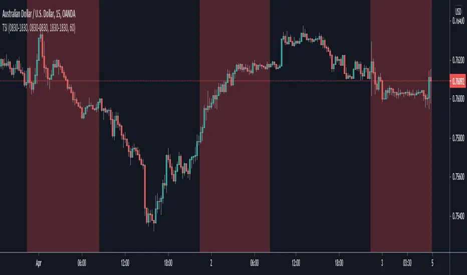
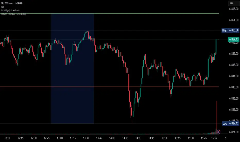
Trading Session IndicatorThis indicator is basically just a back-testing tool. All it does is highlight the background of your charts with the specified color within the specified timezone.
This is useful particularly for back-testing purposes, such as testing a day-trading strategy within a particular period of the day or ignoring signals that fall within the given timeframe (which is useful for ignoring setups during your testing that appear while you're asleep or at work etc.)
Take it easy :)
- Matt.
Cerca negli script per "session"

Уровни SL/TP и значение ATR первого часаSession Range SL/TP Levels with Advanced ATR
Overview
The Session Range SL/TP Levels indicator is a comprehensive tool designed for session-based trading strategies, particularly for breakouts. It identifies the high and low of a user-defined time range (e.g., the Asian session) and uses a sophisticated, customizable Average True Range (ATR) calculation to project key Stop Loss (SL) and Take Profit (TP) levels.
This indicator helps traders visualize potential entry and exit points based on the volatility of a specific trading session, with all crucial data presented in a clean on-screen table.
Key Features
Customizable Trading Session: Define any time range to establish your core trading zone. The indicator will automatically find the high and low of this period.
Advanced ATR Calculation: The indicator uses an ATR calculated on a 5-minute timeframe for higher precision. You can customize:
The ATR length and smoothing method (RMA, SMA, EMA, WMA).
A unique percentage reduction from the ATR to create a more conservative volatility buffer.
Volatility-Based SL/TP Levels: Automatically calculates and plots multiple SL and TP levels for both long and short scenarios based on user-defined multipliers of the modified ATR.
Comprehensive On-Screen Display: A detailed on-screen table provides all critical data at a glance, including:
The original 5-min ATR value.
The modified ATR after the percentage reduction.
Three custom ATR-multiple values for quick reference.
All calculated SL and TP price levels for both Long and Short setups.
Copy-Friendly Data Logging: With a single click in the settings, you can print all calculated values into the Pine Logs panel, allowing for easy copying and pasting into other applications or trading journals.
How to Use
Define Your Session: In the settings, enter the time for the trading session you want to analyze (e.g., "0200-0300" for a part of the Asian session).
Identify the Range: The indicator will draw the high and low of this session once the time period is complete.
Plan Your Trade: The calculated levels provide potential targets for breakout trades.
For a Long Trade: If the price breaks above the session high, the green Take Profit lines (TP1, TP2, TP3) serve as potential exit points, while the Stop Loss (Long) level serves as a volatility-based stop.
For a Short Trade: If the price breaks below the session low, the red Take Profit lines serve as potential targets, with the Stop Loss (Short) level as the corresponding stop.
Reference the Table: Use the on-screen table to see the exact price levels and ATR values without needing to hover over the lines.
TedAlpha – Structure / FVG / OB Sessions:
Only looks for trades when price is inside your defined London or NY time blocks.
CHOCH:
Uses pivots to track swing highs/lows, then flags a bullish CHOCH when structure flips from LL/LH to HH/HL, and vice versa for bearish.
FVG:
Detects 3-candle imbalance and keeps the zone “active” for fvgLookback bars, then checks if price trades back into it.
Order Blocks:
On a CHOCH, grabs the last opposite candle (bearish before bull CHOCH = bullish OB, bullish before bear CHOCH = bearish OB) and marks its body as the OB zone.
Signal:
A valid long = bull CHOCH + in session + (price inside bullish FVG and/or bullish OB, depending on toggles).
Short is the mirror image.
RR 1:3:
SL uses the last swing low (for longs) or last swing high (for shorts), TP is auto-set at 3× that distance and plotted as lines.

timer/tr/atr [keypoems]Session and Instant Volatility Ticker
What it actually does:
- Session ATR – Reports the historical (e.g. “0200-0600”) average true range of the past x sessions, reports the +1Stdev value.
- Real-time ATR feed – streams the current ATR value every tick.
- Ticker line – Sess. ATR +1Stdev | Current ATR | Previous TR | 🕒 Time-left-in-bar |
Think of it as a volatility check: a single glance tells you if the average candle size is compatible with your usual stop or not.
Open Source.

Volume Profile with HVN / LVN Detection (Low-TF Safe)Session-based volume profile with VPOC, HVN, and LVN detection, optimized for fast charts and runtime-safe lower-timeframe execution.
Volume Profile with HVN / LVN Detection (Low-TF Safe)
This indicator plots a session-based Volume Profile , highlights the Volume Point of Control (VPOC) , and automatically detects High Volume Nodes (HVNs) and Low Volume Nodes (LVNs) from the completed profile.
It is a performance-focused refactor of the original Volume Profile With HVN/LVN Detector , redesigned to work reliably on fast timeframes (including 5-second charts) without runtime errors.
Features
Session-based volume profile with adjustable row resolution
VPOC with optional extension and date labeling
Automatic HVN and LVN detection from the prior session
HVNs and LVNs displayed as levels or areas
Configurable strength, colors, and line/area styles
Runtime-safe lower-timeframe handling using request.security_lower_tf
Optimized to reduce execution overhead on high-frequency charts
Designed for traders who use volume structure to identify acceptance, rejection, and potential support/resistance zones across all chart timeframes.
---
What’s new in this version
Refactored lower-timeframe logic to prevent runtime errors on fast charts
Automatic, runtime-safe fallback when selected lower TF exceeds chart TF
Stable execution on very low timeframes (e.g. 5s, 10s)
Preserved original profile, VPOC, HVN, and LVN behavior
No repainting of completed session profiles
This update prioritizes stability, correctness, and cross-timeframe compatibility .
---
Credits & Attribution
This script is based on the original
“Volume Profile With HVN/LVN Detector”
by tradeforopp (revised by Madpuppy88 ).
The current version refactors the original implementation to improve:
Runtime safety on low timeframes
Performance on high-frequency charts
Robust multi-timeframe handling
Original concept and core logic credit remain with the original authors.
---
How to Use
VPOC highlights the price level of highest traded volume for the session and often acts as a magnet or balance point.
HVNs represent areas of acceptance where price previously traded heavily and may act as support/resistance or consolidation zones.
LVNs mark areas of rejection where price moved quickly and may act as inflection or breakout levels.
Use HVNs and LVNs from the prior session to frame intraday bias, targets, and risk zones.
On very fast charts, the script automatically falls back to chart-timeframe data to maintain stability.

ORB 15m + MAs (v4.1)Session ORB Live Pro — Pre-Market Boxes & MA Suite (v4.1)
What it is
A precision Opening Range Breakout (ORB) tool that anchors every session to one specific 15-minute candle—then projects that same high/low onto lower timeframes so your 1m/5m levels always match the source 15m bar. Perfect for scalpers who want session structure without drift.
What it draws
Asia, Pre-London, London, Pre-New York, New York session boxes.
On 15m: only the high/low of the first 15-minute bar of each window (optionally persists for extra bars).
On 5m: mirrors the same 15m range, visible up to 10 bars.
On 1m: mirrors the same 15m range, visible up to 15 bars.
Levels update live while the 15m candle is forming, then lock.
Fully editable windows (easy UX)
Change session times with TradingView’s native input.session fields using the familiar format HHMM-HHMM:1234567. You can tweak each window independently:
Asia
Pre-London
London
Pre-New York
New York
Multi-TF logic (no guesswork)
Designed to show only on 1m, 5m, 15m (by default).
15m = ground truth. Lower timeframes never “recalculate a different range”—they mirror the 15m bar for that session, exactly.
Alerts
Optional breakout alerts when price closes above/below the session range.
Clean visuals
Per-session color controls (box + lines). Boxes extend only for the configured number of bars per timeframe, keeping charts uncluttered.
Built-in MA suite
SMA 50 and RMA 200.
Three extra MAs (SMA/EMA/RMA/WMA/HMA) with selectable color, width, and style (line, stepline, circles).
Why traders like it
Consistency: Lower-TF ranges always match the 15m source bar.
Speed: You see structure immediately—no waiting for N bars.
Control: Edit session times directly; tune how long boxes stay on chart per TF.
Clarity: Minimal, purposeful plotting with alerts when it matters.
Quick start
Set your session times via the five input.session fields.
Choose how long boxes persist on 1m/5m/15m.
Enable alerts if you want instant breakout notifications.
(Optional) Configure the MA suite for trend/bias context.
Best for
Intraday traders and scalpers who rely on repeatable session behavior and demand exact cross-TF alignment of ORB levels.

Sessions + EMAS + Nube (Mini Table)This indicator is designed to help traders analyze market trends and identify potential trading opportunities.
It provides clear visual signals based on price behavior and technical calculations, allowing traders to better understand market structure, momentum, and direction.
The indicator can be used on any market and timeframe, making it suitable for both intraday and swing trading.
It is intended as a decision-support tool and should be used in combination with proper risk management and other forms of analysis.


Sessions High/LowIndicator lines to show the prior days NY high/low, overnight Asian high/low, and recent London high/low. Time frame variables are included as well as the option to change colors for both the high and low. Good luck.

Sessions Rainbow EST with overlapsThis script displays the trading zones with overlaps based on the color of the rainbow. It is used with a Point&Figure chart to show trends associated with trading periods and overlapping trading periods.
Sessions - London NY overlapOther scripts show London closing at 5pm GMT whereas i believe the forex market on London closes at 4pm GMT. So i have adjusted an already published script to reflect this

Session Open/Close Labels - SimpleSimple and Minimal Label that shows Tokyo and EU open and close times on the chart

Session Fibonacci 20 Levels FixedAsia range STDV to measure reversals Asia range STDV to measure reversals Asia range STDV to measure reversals

Session & ATR Trailing Stop mindedgean indicator that highlights the asian range where i look for the 15m fractal to be swept and then i trade in the opposite direction

Session SFPThis script is a powerful, multi-timeframe tool designed to identify high-probability Swing Failure Patterns (SFPs) at key historical levels.
Instead of looking for traditional "pivots" (like a 3-bar swing), this indicator finds the actual high and low of a previous higher-timeframe (HTF) bar (e.g., the previous weekly high/low) and waits for a lower-timeframe (LTF) candle to sweep that level and fail.
This allows you to spot liquidity sweeps and potential reversals at significant, structural price points.
How It Works
The indicator's logic is based on a simple, two-timeframe process:
Level Detection: First, it finds the high and low of the previous bar on your chosen "Level Timeframe" (e.g., W for Weekly, D for Daily). It plots these as small 'x' markers on your chart.
SFP Identification: Second, it watches price action on a lower "SFP Timeframe" (e.g., 240 for 4H). A potential SFP is identified when a candle's wick sweeps above a key high or below a key low.
Confirmation: The SFP is only confirmed after the SFP candle closes back below the high (for a bearish SFP) or above the low (for a bullish SFP). It then waits for a set number of "Confirmation Bars" to pass. If price does not close back over the level during this window, the signal is locked in, and a label is printed.
How to Use (Key Settings)
Level Timeframe (Most Important): This is the timeframe for the levels you want to trade. Set this to W to find SFPs of the previous weekly high/low. Set it to D to find SFPs of the previous daily high/low.
SFP Timeframe: This is the timeframe you want to use to find the SFP candle itself. This should be lower than your Level Timeframe (e.g., 240 or 60).
Level Lookback: This controls how many old levels the script will track. A value of 10 on a W Level Timeframe will track the highs and lows of the last 10 weeks.
Confirmation Bars: This is your "patience" filter. It's the number of SFP Timeframe bars that must close without reclaiming the level after the SFP. A value of 0 will confirm the SFP immediately on the candle's close.
Enable Wick % Filter: A quality filter. If checked, this ensures the SFP candle's rejection wick is a significant percentage of the candle's total range.
Chart Visuals
'x' Markers: These are the historical highs and lows from your "Level Timeframe". You can turn these on or off in the settings.
SFP Label: When an SFP is fully confirmed, a label (Bearish SFP or Bullish SFP) will appear, detailing the level that was swept and the timeframes used.
SFP Line: A solid horizontal line is drawn from the 'x' marker to the SFP candle to highlight the sweep.
Colored Boxes (Optional): If you are viewing a chart timeframe lower than your "SFP Timeframe", you can enable background boxes to highlight the exact SFP candle and its confirmation bars.


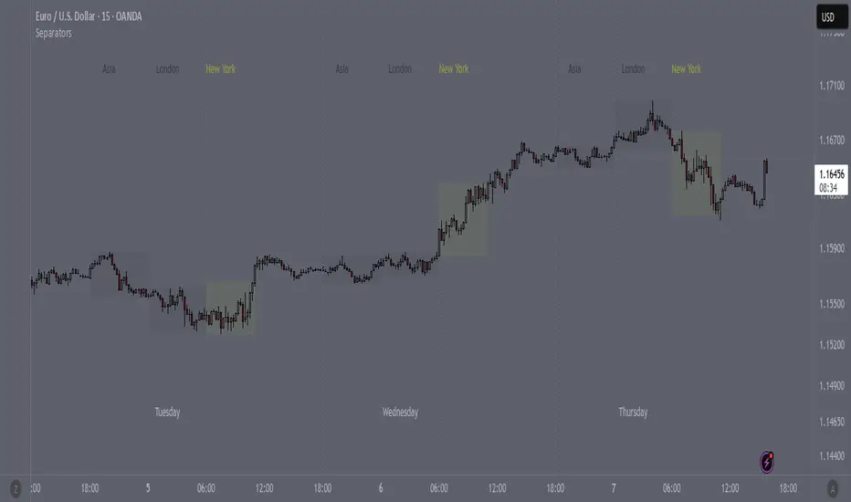
SeparatorsSession - H1 and below Time Frame
Day - H4 and below Time Frame
Month - D Time Frame
Quarter - W Time Frame
Session Key Levels Lines (with Labels)This is an extension of the previous indicator, it just plots all the information you need automatically for you so you dont have to lift a finger. hope it helps :)

Session Moving AveragesAdds EMAs and SMAs to chart using 8am-8pm EST values. Completely configurable in settings.
Some platforms allow users to configure what time frame they would like to view market data. One popular selection is 8am-8pm EST as 8am is when institutional orders go through. An argument can be made that price action before 8am EST is not valid yet moving averages will use that data.
This matters less for shorter moving averages such as a 9 or 20 ema, but it dramatically changes the 200 or the 50 sma for example.
This script allows you to ignore that pre-market data (or any data you choose to configure in the settings) and select up to 3 moving averages (either Exponential or Simple) for a set time.
By default the moving averages include the 9-ema (gray), 20-ema (green), and 200-sma (purple) and is set to 8am-8pm EST
This is configurable in the settings including the time frame you would like the moving averages to start using market data.
By default the script will use your charts timeframe. You are able to use multi-time frames with this script just scroll down to "timeframe", then click "chart" in settings... this will then allow you to select a timeframe.
A popular choice is 5-minute value of 8am-8pm EST moving averages. This means regardless of the time frame you are on (sub 1-minute, 1-minute, etc.) the script will display 5-minute data.
Final note: In settings you are able to turn on/off shapes (the gray lines at the bottom) which shows when the data is being used. This can be helpful on certain tickers that trade continuously such as /ES or /NQ.
