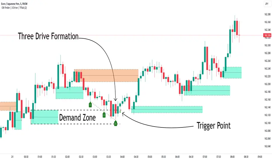
Smart Money Setup 04 [TradingFinder] Three Drive (Harmonic) + OB🔵 Introduction
The "Three Drive" pattern is a well-known formation in technical analysis, recognized for its ability to signal potential trend reversals in price action. Within the realm of trading, particularly in the context of "Reversal Patterns," the Three Drive pattern holds significance as a reliable indicator of shifts in market sentiment.
🟣 Bullish 3 Drive
This pattern typically manifests at a price bottom, where a sequence of lower lows suggests a prevailing negative trend. However, within the structure of the Three Drive pattern, a notable occurrence unfolds.
The second low breaches the range of the first low, followed by the third low surpassing the range of the second low. These penetrations signify a diminishing selling pressure and an emerging buying interest.
Traders often await the confirmation of the third low surpassing the second low as an entry point, with price targets set at the highs formed within the Three Drive pattern.
🟣 Bearish 3 Drive
Conversely, the Bearish Three Drive pattern emerges at a price top, characterized by a sequence of higher highs indicating an upward trend. Yet, amidst this apparent bullish momentum, a shift occurs.
The second high breaks beyond the range of the first high, succeeded by the third high exceeding the range of the second high. These breaches signify a waning buying strength and a resurgence in selling pressure.
Entry into a trade is often executed after the confirmation of the third high surpassing the second high, with targets set at the lows formed within the Three Drive pattern.
Importance :
Understanding the Three Drive pattern's significance extends beyond mere technical analysis. It bears resemblance to other established patterns, such as the Harmonic Pattern and Ending Diagonal within the Elliott Wave Theory.
Recognizing these parallels aids traders in comprehending broader market dynamics and potential price movements.
🔵 Formation of 3 Drive in Order Block Zone
The convergence of the Three Drive pattern with the concept of the Order Block Zone introduces a nuanced layer to traders' analytical approach.
In "Price Action" methodology, Order Blocks represent areas on the price chart where significant market players, such as institutional traders, have executed notable orders.
These zones often act as barriers, with price encountering resistance or support upon reaching them.
When the Three Drive pattern forms within an Order Block Zone, it signifies a confluence of market dynamics.
The completion of the pattern within this zone suggests a potential reversal in the prevailing trend, augmented by the presence of significant institutional orders.
Traders incorporate these Order Blocks into their analysis to identify probable levels where price may change direction, enhancing the reliability of their trading decisions.
🔵 How to Use :
To effectively utilize the Three Drive pattern within the Order Block Zone, traders seek alignment between the completion of the pattern and the presence of significant Order Blocks.
This convergence enhances the reliability of the pattern's signals, increasing the likelihood of successful trade outcomes.
Bullish Three Drive in Demand Zone :
Bearish Three Drive in Supply Zone :
Settings :
You can set your desired "Pivot Period" via settings for the indicator to identify setups based on it.
Cerca negli script per "smart"
SmartPhase Analyzer📝 SmartPhase Analyzer – Composite Market Regime Classifier
SmartPhase Analyzer is an adaptive regime classification tool that scores market conditions using a customizable set of statistical indicators. It blends multiple normalized metrics into a composite score, which is dynamically evaluated against rolling statistical thresholds to determine the current market regime.
✅ Features:
Composite score calculated from 13+ toggleable statistical indicators:
Sharpe, Sortino, Omega, Alpha, Beta, CV, R², Entropy, Drawdown, Z-Score, PLF, SRI, and Momentum Rank
Uses dynamic thresholds (mean ± std deviation) to classify regime states:
🟢 BULL – Strongly bullish
🟩 ACCUM – Mildly bullish
⚪ NEUTRAL – Sideways
🟧 DISTRIB – Mildly bearish
🔴 BEAR – Strongly bearish
Color-coded histogram for composite score clarity
Real-time regime label plotted on chart
Benchmark-aware metrics (Alpha, Beta, etc.)
Modular design using the StatMetrics library by RWCS_LTD
🧠 How to Use:
Enable/disable metrics in the settings panel to customize your composite model
Use the composite histogram and regime background for discretionary or systematic analysis
⚠️ Disclaimer:
This indicator is for educational and informational purposes only. It does not constitute financial advice or a trading recommendation. Always consult your financial advisor before making investment decisions.

Smart Money COTThis indicator implements the method of analysing COT data as defined by Michael Huddleston (I.E. The Inner Circle Trader). It removes all superfluous information contained in the standard COT reports and focusses only on Commercial speculators using the overall Long-Short positions.
Features
The unique feature of this indicator is its ability to look back over time and provide the following information:
Calculation of the range high and low of the specified lookback range.
Calculation of equilibrium of that range.
Automatic colour coding of net long and net short positions when the Long-Short COT calculation is above or below equilibrium of the lookback range.
Instructions
Use the Daily Timeframe only. You may get unexpected results on other timeframes.
Ensure the asset has COT data available. Script is mainly focused on commodity futures, such as ES, NQ, YM. It has not been tested against Forex.
You will need to define the "Lookback" setting in the script settings. Use the total number of trading days required for your analysis. E.g. if you want a 6 month COT analysis, use the measurement tool to count the quantity of daily candles between now and 6 months ago - use this as your Lookback setting. Adjust as needed for other lookback periods, e.g. 3 months, 12 months etc.
Other Info
The script provides the ability to customise colours in its settings.
Range High and Range Low plots can be disabled in settings.

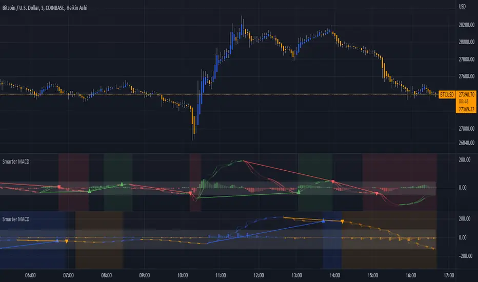
Smarter MACDA classic MACD with average peak and dip lines. The lighter green and red horizontal lines are the average peak and dip of the entire span, respectively. The second, bolder of the two lines are the averages of the peaks and dips above and below the overall peak and dip averages. The filled in color is to help visualize these averages and possible trade setups. Rework of the MACD + Averages script.
Smarter Pullback + Candlestick Pattern (Steven Hart)Built with love "Smarter Pullback + Candlestick Pattern"
This indiator will help you to find a Pullback + Candlestick Pattern, inspirated by Steven Hart
You can combine with your own strategy, or use this purely
DISCLAIMER :
Measure the risk first before use it in real market
Backtest The Strategy was very important, so you know the probability
Fundamentally Logical :
Pullback (Some Previous candle is Red for Bull Pullback vice versa)
the Entry candle must be a Candlestick Pattern
Features :
1. Engulfing
2. Hammer & Shooting Star
3. Doji
How to use it :
1. Adjust the Pullback Period
2. Check and Uncheck the Pattern you want to see
3. Adjust the style to your favourite
Regards,
Hanabil

Smarter SNR (Support and Ressistance, Trendline, MTF OSC)Built with love "Smarter SNR (Support and Ressistance, Trendline, MTF OSC) "
This indiator will show you Support & Ressistance, Good Trendline, and Multi-timeframe analyzing of Oscillator (Stochastic and RSI)
You can combine with your own strategy, or use this purely
DISCLAIMER :
Measure the risk first before use it in real market
Backtest The Strategy was very important, so you know the probability
Fundamentally Logical :
SNR -> Last 3 Zigzag Pivot
Trendline -> Using two last pivot for calculating the slope
Features :
1. SNR
2. Trendline
3. MTF Oscillator Analyzing
How to use it :
1. All Label, Table & Line can be turned on/off in settings
2. Pivot Period can be Adjusted in settings
3. All Label, Table & Line style can be adjusted in settings
Regards,
Hanabil

Smart Money ChecklistJust a basic info panel I made to remind me of my trading strategy.
I couldn't find a script close enough to what I wanted so I made this.
Be free to tweak it to your needs.

Smart Wedge Pattern [The_lurker]🔺 Smart Wedge Pattern نموذج الوتد الذكي
Advanced & Intelligent Wedge Detection Engine
This is not a traditional indicator that simply draws wedge lines — it is a comprehensive intelligent engine (system) for detecting and analyzing wedge patterns (Rising & Falling Wedge) based on price geometry, market context, and statistical quality of the pattern.
This indicator was designed to address the biggest problems in common wedge indicators:
❌ Too many false patterns
❌ Ignoring prior trend
❌ No real quality assessment for patterns
A comprehensive intelligent system that combines:
Adaptive algorithm that self-calibrates automatically according to market conditions
7 strict validation layers that filter out weak patterns and keep only the highest quality
Quality scoring system that evaluates each pattern from 0 to 100
3D visualization that makes patterns visually clear in an exceptional way
Smart targets based on Fibonacci ratios with real-time achievement tracking
The Result:
➡️ Fewer patterns
➡️ Cleaner, more accurate and reliable signals
➡️ Higher quality
➡️ Real practical use
═════════════════════════════════════════════════════════════
🎯 What Are Wedge Patterns?
1- Falling Wedge — Bullish Reversal Pattern
The falling wedge forms when price moves in a converging downward channel — meaning both the upper resistance line and the lower support line are declining, but the support line declines at a less steep angle, gradually narrowing the channel.
Why does the bullish breakout occur?
Declining highs show continuous selling pressure
But rising lows (P2 < P4) reveal that buyers are entering at higher levels
Convergence indicates decreasing bearish momentum
At a certain point, buying pressure overcomes and the breakout occurs
2- Rising Wedge — Bearish Reversal Pattern
The rising wedge is the exact opposite of the falling wedge — a converging upward channel where both lines rise, but the resistance line rises at a less steep angle.
Why does the bearish breakout occur?
Rising lows show continuous buying pressure
But declining highs (P2 > P4) reveal that sellers are entering at lower levels
Convergence indicates decreasing bullish momentum
At a certain point, selling pressure overcomes and the breakout occurs
═════════════════════════════════════════════════════════════
🧠 Adaptive Pivot System — The Heart of the Smart Indicator
The Problem with Traditional Indicators
Traditional indicators use a fixed value for pivot detection (like 5 bars left and 5 bars right). This means:
In quiet markets → Many delayed signals
In volatile markets → Few missed signals
No adaptation to the nature of each market or timeframe
The Solution: Smart Adaptation Algorithm
The indicator calculates optimal pivot sensitivity on each bar using 5 weighted factors:
Final Score = (Volatility_Score × 0.30) + (Trend_Score × 0.25) +
(Stability_Score × 0.20) + (Percentile_Context × 0.15) +
(Range_Score × 0.10)
Factor Weight How It's Calculated Why It's Important
Volatility Score 30% ATR(10) / ATR(50) Detects sudden changes in volatility
Trend Score 25% ADX(14) / 50 Trending markets need different sensitivity
Stability Score 20% StdDev(ATR) / Mean(ATR) Measures volatility consistency
Percentile Context 15% ATR / Percentile(ATR, 50) Places volatility in historical context
Range Score 10% Current_Range / Average_Range Detects unusual bars
The Result: The indicator uses low sensitivity (fewer, more important pivots) in quiet markets, and high sensitivity (more pivots, faster response) in volatile markets (more accurate pivots = correct geometric patterns).
═════════════════════════════════════════════════════════════
✅ Seven Validation Layers — Why This Indicator Is Different
Every detected pattern passes through 7 strict tests before being displayed:
1- Geometric Structure Validation
Validates:
P1 precedes P2 precedes P3 precedes P4 chronologically
Distance between each two points ≥ minimum threshold
Pattern width (P1→P4) within allowed range
Highs and lows order is correct for the wedge type
2- True Convergence Check
A true wedge must show convergence:
├── Gap at P4 < Gap at P1
├── Convergence ratio = End_Gap / Start_Gap
└── Ratio must be < defined convergence threshold (default 75%)
3- Slope Validation
For Falling Wedge:
├── Resistance line slope < 0 (declining)
├── Support line slope < 0 (declining)
└── Resistance slope < Support slope (convergence)
For Rising Wedge:
├── Resistance line slope > 0 (rising)
├── Support line slope > 0 (rising)
└── Support slope > Resistance slope (convergence)
4- Prior Trend Filter
Reversal patterns need a prior trend to reverse from:
├── Measures price movement during a defined period before P1
├── Normalizes movement using ATR for fair comparison
├── Falling wedge requires prior downtrend
└── Rising wedge requires prior uptrend
5- Channel Respect
Normal mode (close check):
└── Every close between P1 and P4 must be within wedge boundaries
Strict mode (high/low check):
├── Every high must be below resistance line (+ tolerance)
└── Every low must be above support line (- tolerance)
6- Post-P4 Validation
After the fourth point forms:
├── For falling wedge: Price doesn't break support or drop below P4
└── For rising wedge: Price doesn't break resistance or rise above P4
7- Quality Scoring System
Quality = (Convergence_Score × 0.30) + (Slope_Score × 0.25) +
(Width_Score × 0.20) + (Trend_Score × 0.15) +
(Height_Score × 0.10)
├── Convergence Score: More convergence = higher quality
├── Slope Score: Consistency of upper and lower line slopes
├── Width Score: Patterns with 40-100 bar width are ideal
├── Trend Score: Prior trend strength
└── Height Score: Pattern height relative to ATR
═════════════════════════════════════════════════════════════
✅ Pattern Lifecycle Management
The indicator doesn't just draw and disappear — it follows the complete pattern:
Pattern detection
Post-fourth point monitoring
Breakout confirmation
Target calculation
Target achievement tracking
Success or cancellation marking
❌ Pattern is automatically cancelled if:
Breakout fails
Channel is broken in reverse direction
Waiting period exceeded
═════════════════════════════════════════════════════════════
✅ Smart Targets + Success Level
After breakout:
Target is calculated based on pattern height
3 target modes:
Conservative (0.618)
Balanced (1.0)
Aggressive (1.618)
Independent Success level to measure move strength before target
═════════════════════════════════════════════════════════════
🎨 Advanced Visual Display (3D Visualization)
Three-dimensional pattern representation
Visual depth reflecting pattern size
3D target zone
Dynamic colors upon target achievement
🎨 The purpose of 3D is not decoration
But reading the pattern visually with speed and clarity
═════════════════════════════════════════════════════════════
⚙️ Key Features
✅ Automatic wedge detection
✅ Smart filtering reduces false signals
✅ Real quality assessment for each pattern
✅ Realistic and customizable targets
✅ Full support for Rising & Falling Wedge
✅ Works on all markets and timeframes
✅ Professional design and high performance
═════════════════════════════════════════════════════════════
📊 Usage Scenarios
🟢 Scalping
Timeframes: 1–15 minutes
Quality ≥ 60
Conservative targets
🔵 Day Trading
Timeframes: 15m–1h
Quality ≥ 50
Balanced targets
🟣 Swing Trading
Timeframes: 4h–Daily
Quality ≥ 40
Strict channel
Aggressive targets
🟠 Cryptocurrencies
Strict convergence
Strict channel
Quality ≥ 65
═════════════════════════════════════════════════════════════
🔔 Alerts
Falling wedge breakout ⇒ Buy
Rising wedge breakout ⇒ Sell
Any wedge breakout
═════════════════════════════════════════════════════════════
⚠️ Disclaimer
This indicator is for educational and analytical purposes only. It does not represent financial, investment, or trading advice. Use it in conjunction with your own strategy and risk management. Neither TradingView nor the developer is responsible for any financial decisions or losses.
═════════════════════════════════════════════════════════════
🔺 Smart Wedge Pattern نموذج الوتد الذكي
Advanced & Intelligent Wedge Detection Engine
ليس مؤشرًا تقليديًا يرسم خطوط وتد فقط ، بل هو محرك (نظام) ذكي متكامل لاكتشاف وتحليل نماذج الوتد (Rising & Falling Wedge) اعتمادًا على الهندسة السعرية ، السياق السوقي ، والجودة الإحصائية للنموذج.
تم تصميم هذا المؤشر لمعالجة أكبر مشكلة في مؤشرات الوتد الشائعة:
❌ كثرة النماذج الوهمية
❌ تجاهل الاتجاه السابق
❌ عدم وجود تقييم حقيقي لجودة النموذج
نظام ذكي متكامل يجمع بين:
خوارزمية تكيفية تُعاير نفسها تلقائياً حسب ظروف السوق
7 طبقات تحقق صارمة تُصفّي الأنماط الضعيفة وتُبقي فقط الأعلى جودة
نظام تسجيل جودة يُقيّم كل نموذج من 0 إلى 100
تصور ثلاثي الأبعاد يجعل الأنماط واضحة بصرياً بشكل استثنائي
أهداف ذكية مبنية على نسب فيبوناتشي مع تتبع التحقق الآني
النتيجة:
➡️ نماذج أقل
➡️ إشارات أنظف أكثر دقة وموثوقية
➡️ جودة أعلى
➡️ استخدام عملي حقيقي
═════════════════════════════════════════════════════════════
🎯 ما هي نماذج الأوتاد؟
1- الوتد الهابط (Falling Wedge) — نموذج انعكاسي صعودي
الوتد الهابط يتشكل عندما يتحرك السعر في قناة هابطة متقاربة — أي أن خط المقاومة العلوي وخط الدعم السفلي كلاهما يهبطان، لكن خط الدعم يهبط بزاوية أقل حدة، مما يُضيّق القناة تدريجياً.
لماذا يحدث الكسر الصعودي؟
القمم الهابطة تُظهر ضغطاً بيعياً مستمراً
لكن القيعان الصاعدة (P2 < P4) تكشف أن المشترين يدخلون عند مستويات أعلى
التقارب يُشير إلى تناقص الزخم الهبوطي
عند نقطة معينة، يتغلب ضغط الشراء ويحدث الكسر
2- الوتد الصاعد (Rising Wedge) — نموذج انعكاسي هبوطي
الوتد الصاعد هو عكس الهابط تماماً — قناة صاعدة متقاربة حيث يصعد كلا الخطين، لكن خط المقاومة يصعد بزاوية أقل حدة.
لماذا يحدث الكسر الهبوطي؟
القيعان الصاعدة تُظهر ضغطاً شرائياً مستمراً
لكن القمم الهابطة (P2 > P4) تكشف أن البائعين يدخلون عند مستويات أدنى
التقارب يُشير إلى تناقص الزخم الصعودي
عند نقطة معينة، يتغلب ضغط البيع ويحدث الكسر
═════════════════════════════════════════════════════════════
🧠 نظام المحاور التكيفي — قلب المؤشر الذكي
المشكلة مع المؤشرات التقليدية
المؤشرات التقليدية تستخدم قيمة ثابتة لاكتشاف المحاور (مثل 5 شموع يسار و5 شموع يمين). هذا يعني:
في الأسواق الهادئة → إشارات كثيرة ومتأخرة
في الأسواق المتقلبة → إشارات قليلة وضائعة
لا تكيف مع طبيعة كل سوق أو إطار زمني
الحل: خوارزمية التكيف الذكي
المؤشر يحسب حساسية المحور المثلى في كل شمعة باستخدام 5 عوامل مرجحة:
النتيجة النهائية = (درجة_التقلب × 0.30) + (درجة_الاتجاه × 0.25) +
(درجة_الاستقرار × 0.20) + (السياق_المئوي × 0.15) +
(درجة_النطاق × 0.10)
العامل الوزن كيف يُحسب لماذا مهم
درجة التقلب 30% ATR(10) / ATR(50) يكشف التغير المفاجئ في التقلب
درجة الاتجاه 25% ADX(14) / 50 الأسواق الاتجاهية تحتاج حساسية مختلفة
درجة الاستقرار 20% StdDev(ATR) / Mean(ATR) يقيس ثبات التقلب
السياق المئوي 15% ATR / Percentile(ATR, 50) يضع التقلب في سياقه التاريخي
درجة النطاق 10% النطاق_الحالي / متوسط_النطاق يكشف الشموع غير العادية
النتيجة: المؤشر يستخدم حساسية منخفضة (محاور أقل، أكثر أهمية) في الأسواق الهادئة، وحساسية عالية (محاور أكثر، استجابة أسرع) في الأسواق المتقلبة (محاور أدق = نماذج هندسية صحيحة).
═════════════════════════════════════════════════════════════
✅ طبقات التحقق السبع — لماذا هذا المؤشر مختلف
كل نموذج مُكتشف يمر عبر 7 اختبارات صارمة قبل عرضه:
1- التحقق من البنية الهندسية
يتحقق من:
P1 يسبق P2 يسبق P3 يسبق P4 زمنياً
المسافة بين كل نقطتين ≥ الحد الأدنى المحدد
عرض النموذج (P1→P4) ضمن النطاق المسموح
ترتيب القمم والقيعان صحيح حسب نوع الوتد
2- فحص التقارب الحقيقي
الوتد الحقيقي يجب أن يُظهر تقارباً:
├── الفجوة عند P4 < الفجوة عند P1
├── نسبة التقارب = الفجوة_النهائية / الفجوة_الابتدائية
└── النسبة يجب أن تكون < عتبة التقارب المحددة (افتراضي 75%)
3- التحقق من الميل
للوتد الهابط:
├── ميل خط المقاومة < 0 (هابط)
├── ميل خط الدعم < 0 (هابط)
└── ميل المقاومة < ميل الدعم (تقارب)
للوتد الصاعد:
├── ميل خط المقاومة > 0 (صاعد)
├── ميل خط الدعم > 0 (صاعد)
└── ميل الدعم > ميل المقاومة (تقارب)
4- فلتر الاتجاه السابق
النماذج الانعكاسية تحتاج اتجاهاً سابقاً لتنعكس منه:
├── يقيس حركة السعر خلال فترة محددة قبل P1
├── يُطبّع الحركة باستخدام ATR لمقارنة عادلة
├── الوتد الهابط يحتاج اتجاهاً هابطاً سابقاً
└── الوتد الصاعد يحتاج اتجاهاً صاعداً سابقاً
5- احترام القناة
وضع عادي (فحص الإغلاق):
└── كل إغلاق بين P1 و P4 يجب أن يكون داخل حدود الوتد
وضع صارم (فحص القمة/القاع):
├── كل قمة يجب أن تكون تحت خط المقاومة (+ نسبة تسامح)
└── كل قاع يجب أن يكون فوق خط الدعم (- نسبة تسامح)
6- التحقق بعد P4
بعد تشكل النقطة الرابعة:
├── للوتد الهابط: السعر لا يكسر خط الدعم أو ينزل تحت P4
└── للوتد الصاعد: السعر لا يكسر خط المقاومة أو يصعد فوق P4
7- نظام تسجيل الجودة
الجودة = (درجة_التقارب × 0.30) + (درجة_الميل × 0.25) +
(درجة_العرض × 0.20) + (درجة_الاتجاه × 0.15) +
(درجة_الارتفاع × 0.10)
├── درجة التقارب: كلما زاد التقارب، زادت الجودة
├── درجة الميل: تناسق ميل الخطين العلوي والسفلي
├── درجة العرض: الأنماط بعرض 40-100 شمعة مثالية
├── درجة الاتجاه: قوة الاتجاه السابق
└── درجة الارتفاع: ارتفاع النموذج نسبة لـ ATR
═════════════════════════════════════════════════════════════
✅ إدارة دورة حياة النموذج (Pattern Lifecycle)
المؤشر لا يرسم ثم يختفي، بل يتابع النموذج كاملًا:
اكتشاف النموذج
مراقبة ما بعد النقطة الرابعة
تأكيد الاختراق
حساب الهدف
تتبع الوصول للهدف
تمييز النجاح أو الإلغاء
❌ يتم إلغاء النموذج تلقائيًا إذا:
فشل في الاختراق
كُسرت القناة عكسيًا
تجاوز مدة الانتظار المحددة
═════════════════════════════════════════════════════════════
✅ أهداف ذكية + Success Level
بعد الاختراق:
يتم حساب الهدف بناءً على ارتفاع النموذج
3 أوضاع للأهداف:
Conservative (0.618)
Balanced (1.0)
Aggressive (1.618)
مستوى Success مستقل لقياس قوة الحركة قبل الهدف
═════════════════════════════════════════════════════════════
🎨 عرض بصري متقدم (3D Visualization)
تمثيل ثلاثي الأبعاد للنموذج
عمق بصري يعكس حجم النموذج
منطقة هدف ثلاثية الأبعاد
ألوان ديناميكية عند تحقق الهدف
🎨 الهدف من 3D ليس الزينة
بل قراءة النموذج بصريًا بسرعة ووضوح
═════════════════════════════════════════════════════════════
⚙️ أهم المميزات
✅ اكتشاف تلقائي للأوتاد
✅ فلترة ذكية تقلل الإشارات الوهمية
✅ تقييم جودة حقيقي لكل نموذج
✅ أهداف واقعية وقابلة للتخصيص
✅ دعم كامل لـ Rising & Falling Wedge
✅ يعمل على جميع الأسواق والفريمات
✅ تصميم احترافي وأداء عالي
═════════════════════════════════════════════════════════════
📊 سيناريوهات الاستخدام
🟢 المضاربة السريعة
أطر: 1–15 دقيقة
جودة ≥ 60
أهداف محافظة
🔵 التداول اليومي
أطر: 15د–1س
جودة ≥ 50
أهداف متوازنة
🟣 التداول المتأرجح
أطر: 4س–يومي
جودة ≥ 40
قناة صارمة
أهداف عدوانية
🟠 العملات الرقمية
تقارب صارم
قناة صارمة
جودة ≥ 65
═════════════════════════════════════════════════════════════
🔔 التنبيهات
كسر وتد هابط ⇒ شراء
كسر وتد صاعد ⇒ بيع
أي كسر وتد
═════════════════════════════════════════════════════════════
⚠️ إخلاء المسؤولية
هذا المؤشر لأغراض تعليمية وتحليلية فقط. لا يُمثل نصيحة مالية أو استثمارية أو تداولية. استخدمه بالتزامن مع استراتيجيتك الخاصة وإدارة المخاطر. لا يتحمل TradingView ولا المطور مسؤولية أي قرارات مالية أو خسائر.

Smart Fixed Volume Profile [MarkitTick]💡 This comprehensive analysis suite integrates Auction Market Theory, structural gap analysis, and statistical liquidity strain modeling into a single, cohesive toolkit. Designed for traders who require a granular view of institutional order flow, this indicator overlays a Fixed Range Volume Profile with intelligent price gap classification and a volatility-adjusted exhaustion detector. By combining these three distinct analytical dimensions, it allows users to identify value consensus, structural breakouts, and potential market turns driven by liquidity shortages.
✨ Originality and Utility
While standard Volume Profiles display where trading occurred, this script advances the concept by contextually analyzing *how* price arrived at those levels. It solves the problem of isolated analysis by fusing three disparate methodologies:
Contextual Integration: It does not merely show support and resistance; it qualifies moves using "Smart Gaps" (classifying gaps based on market structure) and "Liquidity Strain" (identifying unsustainable price velocity).
Institutional Footprint: The inclusion of an "Unusual Volume" highlighter within the profile bars helps traders spot hidden institutional accumulation or distribution blocks that standard profiles miss.
Hybrid Logic: By combining a fixed-time profile (anchored to specific dates) with dynamic, developing gap analysis, it provides both a static roadmap of the past and a dynamic interpretation of current price action.
🔬 Methodology and Concepts
• Fixed Volume Profile Engine
The core of the indicator constructs a volume distribution histogram over a user-defined time window. It utilizes a custom aggregation engine that:
Fetches higher-timeframe volume and price data to ensure accuracy.
Segments the price range into specific "bins" or rows.
Allocates volume to these bins based on price action within the bar, separating Buying Volume (Up bars) from Selling Volume (Down bars).
Calculates the Point of Control (POC) —the price level with the highest traded volume—and the Value Area , which contains 70% (customizable) of the total volume centered around the POC.
• Smart Gap Logic
The script systematically identifies price gaps and classifies them based on their location relative to market pivots (Highs/Lows):
Breakaway Gaps: Occur when price gaps beyond a significant structural pivot (Lookback High/Low), signaling a potential trend initiation.
Runaway Gaps: Occur within an existing trend without breaking structure, indicating trend continuation.
Exhaustion Gaps: Identified when a gap occurs late in a mature trend (measured by bar count since the last pivot) accompanied by a volume spike, suggesting the trend is overextended.
• Liquidity Strain Detector
This module utilizes a statistical approach to measure market stress. It calculates "Illiquidity" by analyzing the ratio of True Range to Volume (Price Impact).
It applies a Logarithmic transformation to normalize the data.
It calculates a Z-Score (Standard Deviation from the mean) of this impact.
If the Z-Score exceeds a threshold (e.g., 2.0 Sigma) while the trend opposes the price move, it triggers an exhaustion signal, indicating that price is moving too easily on too little volume (thin liquidity).
🎨 Visual Guide
• Volume Profile Elements
Histogram Bars: Horizontal bars representing volume at price. Cyan indicates bullish volume; Red indicates bearish volume.
Unusual Volume Highlight: Bars with volume exceeding the average by a set factor (default 2x) are highlighted with brighter, distinct overlays to denote institutional interest.
POC Line: A solid Yellow line marking the price level with the highest volume.
VAH / VAL Lines: Dashed Blue lines marking the Value Area High and Value Area Low.
Background Box: A grey shaded area encapsulating the entire time and price range of the profile.
• Smart Gap Boxes
Blue Box (Breakaway): Marks the start of a new structural move.
Orange Box (Runaway): Marks continuation gaps in the middle of a trend.
Red Box (Exhaustion): Marks potential trend termination points.
Dotted Lines: Extend from the center of gap boxes to serve as future support/resistance levels. These boxes are automatically deleted if price "fills" or violates the gap level.
Note: This tool incorporates core components from [ Smart Gap Concepts ], optimized for this specific strategy.
• Liquidity Signals
Green Label (SE): "Seller Exhaustion" – Appears below bars in a downtrend when selling pressure is statistically overextended.
Red Label (BE): "Buyer Exhaustion" – Appears above bars in an uptrend when buying pressure is statistically overextended.
Note: This tool incorporates core components from [ Liquidity Strain Detector ], optimized for this specific strategy.
📖 How to Use
• Interactive Range Selection: This indicator features a flexible, interactive input system. Upon adding the script to your chart, execution is paused until the analysis range is defined. You will be prompted to click on the chart twice: first to establish the Start Date and second to establish the End Date. Once these anchor points are confirmed, the indicator will automatically load the data and generate the profile for the selected specific period.
● Strategies for Optimal Anchoring
the optimal starting and ending points for high-probability setups:
Swing Highs and Lows (Trend Analysis):
Anchor the Start Date at a major structural swing high or low and the End Date at the current price using the Extend to Present feature. This identifies the "Fair Value" for the entire price move .
Consolidation/Range Anchoring:
Set the Start Date at the first bar of a sideways range and the End Date at the breakout candle. This reveals the high-node volume clusters that will act as future support or resistance.
Session-Based Anchoring (Intraday):
Align the Start Date with the session open (e.g., London or New York open) to track institutional flow for that specific day .
Event-Driven Anchoring:
Place the Start Date on a significant news event or a Breakaway Gap identified by the script's Gap Engine. This helps determine if the new volume supports the direction of the gap.
Correction Cycles:
During a pullback, anchor the Start Date at the start of the correction to find the Value Area Low (VAL), which often serves as a tactical entry point for a trend continuation.
• Identifying Value:
Use the Value Area to gauge market consensus. Acceptance of price within the VA indicates balance. A breakout above VAH or below VAL suggests the market is searching for new value. The POC often acts as a magnet for price correction.
• Trading Breakouts:
Watch for Breakaway Gaps (Blue) that align with a move out of the Volume Profile's Value Area. This confluence increases the probability of a sustained trend.
• Spotting Reversals:
Combine Exhaustion Gaps (Red) with Liquidity Strain Signals (SE/BE) . If price gaps up into a low-volume node on the profile and prints a "Buyer Exhaustion" signal, it suggests the move is unsupported by liquidity and liable to reverse.
• Support and Resistance:
The extended dotted lines from the Smart Gap boxes act as dynamic support/resistance. A retest of a "Runaway Gap" is often a viable entry point for trend continuation.
⚙️ Inputs and Settings
• Global Profile:
Start/End Date: Define the exact window for the volume profile calculation.
Extend to Present: If checked, the profile updates with live data beyond the end date.
• Profile Settings:
Number of Rows: Determines the vertical resolution (granularity) of the histogram.
Value Area %: Default is 70%, representing one standard deviation of volume distribution.
Placement: Position the profile on the Left or Right of the defined range.
• Liquidity & Gaps:
Unusual Threshold: Multiplier of average volume to highlight institutional bars (default 2.0x).
Structure Lookback: Adjusts the sensitivity of pivot detection for gap classification.
Stress Threshold (Sigma): The Z-Score limit for triggering Liquidity Strain signals (default 2.0).
🔍 Deconstruction of the Underlying Scientific and Academic Framework
• Auction Market Theory (AMT):
The script is grounded in AMT, which posits that the market's primary function is to facilitate trade. The Volume Profile visualizes this by displaying a bell curve of price distribution. The Value Area (typically 70%) corresponds to the First Standard Deviation in a normal Gaussian distribution, representing the area of "Fair Value" where buyers and sellers agree.
• Market Microstructure & Kyle’s Lambda:
The Liquidity Strain module draws conceptually from Kyle’s Lambda, a metric in market microstructure that measures market depth and price impact (Illiquidity). By calculating the ratio of price change (True Range) to Volume, the script approximates the "cost" of moving the market.
• Statistical Z-Score Normalization:
To make the liquidity data actionable, the script applies Z-Score normalization: Z = (X - μ) / σ . This converts raw illiquidity values into standard deviations from the mean. A Z-Score above +2.0 signifies a statistically significant anomaly—an outlier event where price moved excessively relative to the volume traded, often preceding a mean-reversion event.
⚠️ Disclaimer
All provided scripts and indicators are strictly for educational exploration and must not be interpreted as financial advice or a recommendation to execute trades. I expressly disclaim all liability for any financial losses or damages that may result, directly or indirectly, from the reliance on or application of these tools. Market participation carries inherent risk where past performance never guarantees future returns, leaving all investment decisions and due diligence solely at your own discretion.

Smart Divergence [Reason Edition]Stop trading divergences "in thin air". Start trading structural confluence.
Most divergence indicators fail for one reason: they signal reversals based solely on oscillator math (RSI vs. Price), ignoring the chart's structure. This leads to costly entries against strong trends.
Smart Divergence solves this by applying an Institutional Context Filter. It does not simply alert you of a divergence; it validates the signal against key market structures ("Walls") and—crucially—tells you exactly why the signal appeared directly on the label.
🚀 How It Works: The "Smart Filter" Logic
This script operates on a strict rule: "No Structure, No Signal."
For a Bullish or Bearish divergence to be valid, price must not only diverge from RSI but also physically touch or react to one of four key structural levels:
BB (Bollinger Bands): Rejection due to volatility extension (2.0 StdDev).
KC (Keltner Channels): Rejection due to average range deviation (1.5 ATR).
Pivots (S1/R1): Rejection at standard daily algorithmic levels.
VWAP: Rejection at the institutional average price (Volume Weighted Average Price).
🏷️ Dynamic "Reason" Labels
This is the core feature of this edition. The label on your chart adapts dynamically to show the specific confluence behind the trade.
Examples you will see:
SMART BULL (BB) → The divergence is valid because price hit the Bollinger Band.
SMART BULL (VWAP) → The divergence is valid because price bounced off the VWAP.
SMART BULL (BB VWAP) → High Probability: Price hit the Bollinger Band AND the VWAP simultaneously.
The Logic: The more "Reasons" (acronyms) appear inside the label, the stronger the structural wall, and the higher the probability of a reversal.
🛠️ Settings & Features
🛡️ Smart Filter (Toggle):
ON (Default): Only shows high-quality signals that occur at Support/Resistance zones.
OFF: Shows all raw technical divergences (standard mode).
Alerts Included: Setup custom alerts for "Smart Bull" (Buys) and "Smart Bear" (Sells).
Zero Repainting: Signals are confirmed upon candle close/pivot confirmation.
📋 How to Trade It
Wait for the Label: Do not guess. Wait for the SMART label to appear.
Check the Reason: Look at the text in parenthesis (...).
Single reason (e.g., KC) is a valid setup.
Cluster reasons (e.g., BB S1 VWAP) represent a "Concrete Wall" and are ideal for aggressive entries.
Context: Works best on Intraday timeframes (1m, 5m, 15m) for scalping, and Daily timeframe for Swing Trading bottoms/tops.
Disclaimer: This tool is for educational purposes and technical analysis assistance. Past performance does not guarantee future results. Manage your risk.

Smart RSI MTF [DotGain]Summary
Are you tired of constantly switching between timeframes to check the RSI, only to miss the bigger picture?
The Smart RSI MTF (Multi-Timeframe) is designed to solve this exact problem. It is a streamlined chart overlay that monitors RSI conditions across up to 10 different timeframes simultaneously —from the 1-minute chart all the way up to the Monthly view.
This indicator removes the need for multiple open tabs and declutters your analysis by plotting signals directly on your main chart using a smart "visual hierarchy" system based on transparency.
⚙️ Core Components and Logic
The Smart RSI MTF relies on a sophisticated 3-layer logic to deliver clear, actionable context:
Multi-Timeframe Engine: The script runs 10 independent RSI calculations in the background. It checks standard intervals (5m, 15m, 1h, 4h, Daily, Weekly, Monthly) to ensure you never miss a momentum extreme on any scale.
Classic RSI Thresholds:
Overbought (> 70): Indicates price may be extended to the upside.
Oversold (< 30): Indicates price may be extended to the downside.
Smart Visibility System (The "Secret Sauce"): Not all signals are equal. A 5-minute Overbought signal is "noise" compared to a Weekly Overbought signal. This indicator automatically applies Transparency to differentiate importance:
Minutes = High Transparency (Faint).
Hours = Medium Transparency.
Days/Weeks/Months = No Transparency (Solid/Bold).
🚦 How to Read the Indicator
The indicator plots shapes (Labels by default) directly above or below the candles. The appearance tells you the direction and the timeframe significance:
🟥 RED SIGNALS (Overbought Condition)
Trigger: RSI is above 70 on a specific timeframe.
Location: Placed above the candle bar.
Meaning: Potential bearish reversal or pullback.
🟩 GREEN SIGNALS (Oversold Condition)
Trigger: RSI is below 30 on a specific timeframe.
Location: Placed below the candle bar.
Meaning: Potential bullish reversal or bounce.
👻 TRANSPARENCY (Signal Strength)
Faint/Ghostly: The signal comes from a lower timeframe (e.g., 5m, 15m). Use for scalping or entry timing.
Solid/Bright: The signal comes from a major timeframe (e.g., Daily, Weekly). Use for swing trading and identifying major market turns.
Visual Elements
Symbol Shapes: Fully customizable (Label, Diamond, Circle, Triangle, etc.) via settings.
Stacking: If multiple timeframes trigger at once, symbols will overlay, creating a visually denser and darker color, indicating Confluence .
Key Benefit
The goal of the Smart RSI MTF is to help traders instantly spot Confluence . When you see a faint short-term signal align with a solid long-term signal, you have identified a high-probability reversal zone without leaving your chart.
Have fun :)
Disclaimer
This "Smart RSI MTF" indicator is provided for informational and educational purposes only. It does not, and should not be construed as, financial, investment, or trading advice.
The signals generated by this tool (both "Buy" and "Sell" indications) are the result of a specific set of algorithmic conditions. They are not a direct recommendation to buy or sell any asset. All trading and investing in financial markets involves substantial risk of loss. You can lose all of your invested capital.
Past performance is not indicative of future results. The signals generated may produce false or losing trades. The creator (© DotGain) assumes no liability for any financial losses or damages you may incur as a result of using this indicator.
You are solely responsible for your own trading and investment decisions. Always conduct your own research (DYOR) and consider your personal risk tolerance before making any trades.
Smart Money Volume Tools | Lyro RSSmart Money Volume Tools | Lyro RS
Overview
The Smart Money Volume Tools (SMVT) is a multi-dimensional volume-based analysis suite designed to visualize the interplay between price action, moving averages, and smart money behavior.
By integrating dynamic moving averages, volume normalization, and multi-timeframe intelligence, SMVT helps traders identify when institutional (smart money) or retail participants are influencing price movements — all in a single, adaptive display.
Unlike traditional oscillators or trend tools, SMVT dynamically adjusts its sensitivity and thresholds based on volume z-scores and normalized momentum, revealing true intent behind price shifts rather than reacting to them.
🔹 Key Features
4 Core Analytical Modes:
Trail Mode – Identifies directional bias using dynamic volume-weighted trails based on adaptive ATR multipliers.
Volume Mode – Displays normalized volume strength vs. price trend, highlighting volume-driven expansions.
Smart Money Volume Mode – Detects institutional buying/selling spikes from lower timeframes using volume z-score outliers.
Retail Money Volume Mode – Contrasts retail-driven impulses to visualize crowd behavior and exhaustion points.
Dynamic Volume Normalization: Converts volume impulses into a 0–100 range using a sigmoid function for smoother interpretation.
Multi-Timeframe Intelligence: Automatically reads lower timeframe volume data to distinguish smart vs. retail activity.
Adaptive Color Systems: Multiple palette modes ( Classic , Mystic , Accented , Royal ) or full custom color control.
Signal Table Overlay: Built-in real-time module summary showing status for Trail , Volume , Smart Money , and Retail Money — right on your chart.
🔹 How It Works
Volume Strength Calculation:
Calculates relative volume strength using a moving average baseline, then normalizes the result via a sigmoid function — mapping activity into a clean 0–100 range.
Smart Money Detection:
Scans lower timeframe data for extreme volume z-scores ( z > 2 ) to pinpoint institutional accumulation or distribution zones.
Trail Logic:
Uses adaptive upper and lower trails based on ATR and volume intensity to track volatility-adjusted trend direction.
Color Logic:
Trail, candle, and fill colors change dynamically according to the active signal type and selected palette — making directional bias instantly visible.
🔹 Practical Use
Swing Confirmation (Trail Mode): Confirms sustained bullish or bearish momentum supported by volume, ideal for trailing positions and managing exits.
Volume Expansion (Volume Mode): Highlights key moments when institutional liquidity pushes price before visible breakout confirmation.
Smart vs. Retail Divergence: Identify conflicts between retail activity and smart money to detect exhaustion or reversal points early.
Table Overlay Utility: Instantly see all active signals across modules in one compact, on-chart interface.
🔹 Customization
Custom color palettes or manual bullish/bearish color selection.
Adjustable EMA lengths and Volume SMA period .
Selectable lower timeframe source for Smart Money analysis.
Flexible table position & size controls — choose between Top, Middle, Bottom and Tiny to Huge.
Switch freely between Trail , Volume , Smart Money , and Retail Money modes.
Credits
Thank you to @AlgoAlpha for the smart money and retail activity source code.
⚠️Disclaimer
This indicator is a tool for technical analysis and does not provide guaranteed results. It should be used in conjunction with other analysis methods and proper risk management practices. The creators of this indicator are not responsible for any financial decisions made based on its signals.

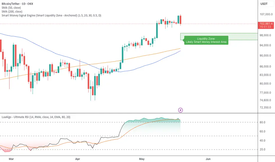
Smart Money Signal Engine (Smart Liquidity Zone - Anchored)🧭 Smart Liquidity Zone Indicator – Simple Guide
✅ What This Does
This tool helps you spot:
1. Smart Money Buy Zones (green box)
2. Fake Breakouts (trap alerts)
3. Real Breakouts (momentum alerts)
⸻
1. 🟩 Liquidity Zone (Green Box)
What it means:
Where big players (smart money) are likely interested in buying.
What you do:
• If price enters the box and holds → consider buying
• If price drops through fast → wait or look for short setups
⸻
2. 🔴 Trap Alert (Smart Money Trap)
What it means:
Price goes up fast with volume…
But no real buying power underneath = likely fakeout
On chart:
You’ll see a red label that says “Trap”
What you do:
• ❌ Don’t chase the pump
• ✅ Wait for reversal or short entry
⸻
3. 🟢 Breakout Alert
What it means:
Price breaks above a key level with strong volume
Smart money is likely behind the move
On chart:
You’ll see a green label that says “Breakout”
What you do:
• ✅ You can enter a momentum trade
• ✅ Place stop below previous structure
⸻
🔔 How to Turn on Alerts
Go to:
• TradingView > Alerts > Condition
• Choose:
• Smart Money Trap Alert
• Breakout Confirmed Alert
This way, TradingView notifies you instantly when:
• A fakeout is happening
• A real breakout begins
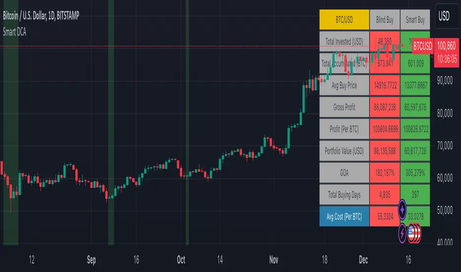
Smart DCA Strategy (Public)INSPIRATION
While Dollar Cost Averaging (DCA) is a popular and stress-free investment approach, I noticed an opportunity for enhancement. Standard DCA involves buying consistently, regardless of market conditions, which can sometimes mean missing out on optimal investment opportunities. This led me to develop the Smart DCA Strategy – a 'set and forget' method like traditional DCA, but with an intelligent twist to boost its effectiveness.
The goal was to build something more profitable than a standard DCA strategy so it was equally important that this indicator could backtest its own results in an A/B test manner against the regular DCA strategy.
WHY IS IT SMART?
The key to this strategy is its dynamic approach: buying aggressively when the market shows signs of being oversold, and sitting on the sidelines when it's not. This approach aims to optimize entry points, enhancing the potential for better returns while maintaining the simplicity and low stress of DCA.
WHAT THIS STRATEGY IS, AND IS NOT
This is an investment style strategy. It is designed to improve upon the common standard DCA investment strategy. It is therefore NOT a day trading strategy. Feel free to experiment with various timeframes, but it was designed to be used on a daily timeframe and that's how I recommend it to be used.
You may also go months without any buy signals during bull markets, but remember that is exactly the point of the strategy - to keep your buying power on the sidelines until the markets have significantly pulled back. You need to be patient and trust in the historical backtesting you have performed.
HOW IT WORKS
The Smart DCA Strategy leverages a creative approach to using Moving Averages to identify the most opportune moments to buy. A trigger occurs when a daily candle, in its entirety including the high wick, closes below the threshold line or box plotted on the chart. The indicator is designed to facilitate both backtesting and live trading.
HOW TO USE
Settings:
The input parameters for tuning have been intentionally simplified in an effort to prevent users falling into the overfitting trap.
The main control is the Buying strictness scale setting. Setting this to a lower value will provide more buying days (less strict) while higher values mean less buying days (more strict). In my testing I've found level 9 to provide good all round results.
Validation days is a setting to prevent triggering entries until the asset has spent a given number of days (candles) in the overbought state. Increasing this makes entries stricter. I've found 0 to give the best results across most assets.
In the backtest settings you can also configure how much to buy for each day an entry triggers. Blind buy size is the amount you would buy every day in a standard DCA strategy. Smart buy size is the amount you would buy each day a Smart DCA entry is triggered.
You can also experiment with backtesting your strategy over different historical datasets by using the Start date and End date settings. The results table will not calculate for any trades outside what you've set in the date range settings.
Backtesting:
When backtesting you should use the results table on the top right to tune and optimise the results of your strategy. As with all backtests, be careful to avoid overfitting the parameters. It's better to have a setup which works well across many currencies and historical periods than a setup which is excellent on one dataset but bad on most others. This gives a much higher probability that it will be effective when you move to live trading.
The results table provides a clear visual representation as to which strategy, standard or smart, is more profitable for the given dataset. You will notice the columns are dynamically coloured red and green. Their colour changes based on which strategy is more profitable in the A/B style backtest - green wins, red loses. The key metrics to focus on are GOA (Gain on Account) and Avg Cost.
Live Trading:
After you've finished backtesting you can proceed with configuring your alerts for live trading.
But first, you need to estimate the amount you should buy on each Smart DCA entry. We can use the Total invested row in the results table to calculate this. Assuming we're looking to trade on
BTCUSD
Decide how much USD you would spend each day to buy BTC if you were using a standard DCA strategy. Lets say that is $5 per day
Enter that USD amount in the Blind buy size settings box
Check the Blind Buy column in the results table. If we set the backtest date range to the last 10 years, we would expect the amount spent on blind buys over 10 years to be $18,250 given $5 each day
Next we need to tweak the value of the Smart buy size parameter in setting to get it as close as we can to the Total Invested amount for Blind Buy
By following this approach it means we will invest roughly the same amount into our Smart DCA strategy as we would have into a standard DCA strategy over any given time period.
After you have calculated the Smart buy size, you can go ahead and set up alerts on Smart DCA buy triggers.
BOT AUTOMATION
In an effort to maintain the 'set and forget' stress-free benefits of a standard DCA strategy, I have set my personal Smart DCA Strategy up to be automated. The bot runs on AWS and I have a fully functional project for the bot on my GitHub account. Just reach out if you would like me to point you towards it. You can also hook this into any other 3rd party trade automation system of your choice using the pre-configured alerts within the indicator.
PLANNED FUTURE DEVELOPMENTS
Currently this is purely an accumulation strategy. It does not have any sell signals right now but I have ideas on how I will build upon it to incorporate an algorithm for selling. The strategy should gradually offload profits in bull markets which generates more USD which gives more buying power to rinse and repeat the same process in the next cycle only with a bigger starting capital. Watch this space!
MARKETS
Crypto:
This strategy has been specifically built to work on the crypto markets. It has been developed, backtested and tuned against crypto markets and I personally only run it on crypto markets to accumulate more of the coins I believe in for the long term. In the section below I will provide some backtest results from some of the top crypto assets.
Stocks:
I've found it is generally more profitable than a standard DCA strategy on the majority of stocks, however the results proved to be a lot more impressive on crypto. This is mainly due to the volatility and cycles found in crypto markets. The strategy makes its profits from capitalising on pullbacks in price. Good stocks on the other hand tend to move up and to the right with less significant pullbacks, therefore giving this strategy less opportunity to flourish.
Forex:
As this is an accumulation style investment strategy, I do not recommend that you use it to trade Forex.
For more info about this strategy including backtest results, please see the full description on the invite only version of this strategy named "Smart DCA Strategy"
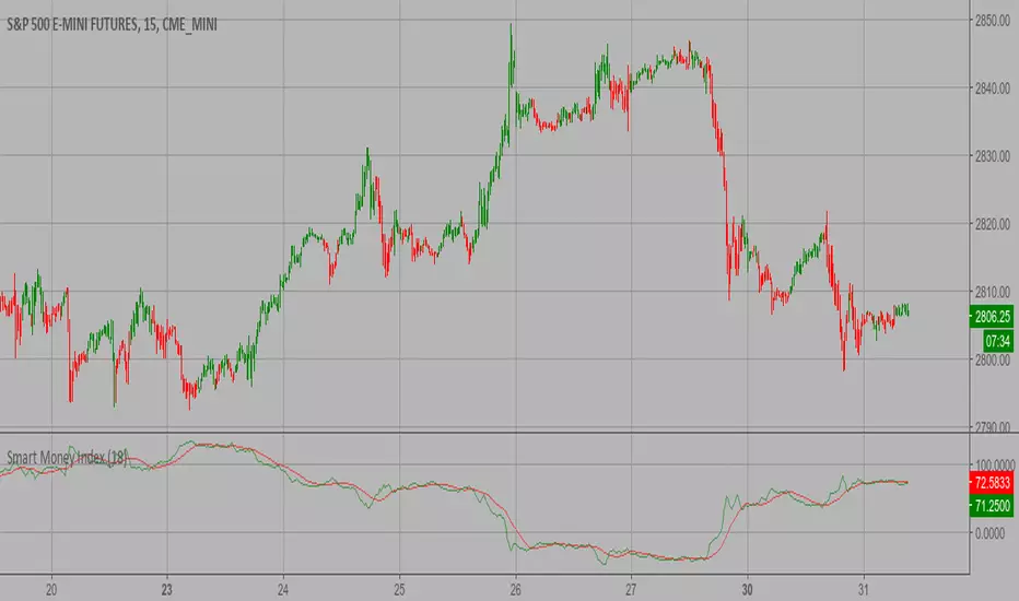
Smart Money Index (SMI) Strategy Attention:
If you would to use this indicator on the ES, you should have intraday data 60min in your account.
Smart money index (SMI) or smart money flow index is a technical analysis indicator demonstrating investors sentiment.
The index was invented and popularized by money manager Don Hays. The indicator is based on intra-day price patterns.
The main idea is that the majority of traders (emotional, news-driven) overreact at the beginning of the trading day
because of the overnight news and economic data. There is also a lot of buying on market orders and short covering at the opening.
Smart, experienced investors start trading closer to the end of the day having the opportunity to evaluate market performance.
Therefore, the basic strategy is to bet against the morning price trend and bet with the evening price trend. The SMI may be calculated
for many markets and market indices (S&P 500, DJIA, etc.)
The SMI sends no clear signal whether the market is bullish or bearish. There are also no fixed absolute or relative readings signaling
about the trend. Traders need to look at the SMI dynamics relative to that of the market. If, for example, SMI rises sharply when the
market falls, this fact would mean that smart money is buying, and the market is to revert to an uptrend soon. The opposite situation
is also true. A rapidly falling SMI during a bullish market means that smart money is selling and that market is to revert to a downtrend
soon. The SMI is, therefore, a trend-based indicator.
Some analysts use the smart money index to claim that precious metals such as gold will continually maintain value in the future.
WARNING:
- This script to change bars colors.
Smart Pivot Trend█ OVERVIEW
Smart Pivot Trend is a market structure–based trend indicator that combines swing pivots, volatility adaptation (ATR), and dynamic range levels to determine which side of the market is in control — buyers or sellers. Instead of moving averages, trend direction is defined through structural breaks inside pivot ranges.
The indicator visualizes the active trend, evolving market structure, and historical support/resistance levels created at moments of control shifts. It helps identify trend transitions, structure breaks, and areas where price has an increased probability of reaction.
█ CONCEPT
Built around adaptive swing structure. The core idea is that trend emerges from market structure, not from price relative to an average.
- Swing highs and swing lows form the current structural range.
- Two internal percentage-based levels inside this range act as decision zones.
- Break above the upper level → bullish control.
- Break below the lower level → bearish control.
To prevent structure from becoming outdated during strong moves, pivots are dynamically adjusted when price deviates beyond ATR × multiplier. This mechanism makes the structure volatility-aware rather than static.
As a result, the indicator combines:
- a dynamic, living market structure (active pivot trend)
- static “market memory” levels marking previous control shifts
█ FEATURES
Calculations
- Swing pivots as the foundation of market structure
- Internal range levels as structural decision zones
- ATR-based adaptive pivot correction (volatility-aware structure)
- Smooth Factor — controls the degree of structural correction relative to price; defines how fast pivots adapt during strong moves
- Trend change detection through structural range breaks
Visualization
- Active trend line based on current structure
- Historical support/resistance levels plotted at trend flips
- Triangles marking breaks of those levels
- Gradient fill between price and the active trend line
- Trend-based coloring (green = bullish, red = bearish)
- Optional candle coloring based on current structural trend (bullish / bearish control)
Signals
- BUY / SELL — on structural trend changes
- Bullish Break / Bearish Break — when historical levels are broken
- Impulse breaks (when candles break levels with strong momentum)
Alerts
- Trend change to bullish
- Trend change to bearish
- Resistance break
- Support break
█ HOW TO USE
Main settings:
- Swing Length — sensitivity of swing detection
- Lower / Upper Level — internal structural decision levels
- ATR Length / Multiplier — influence of volatility on pivot adaptation
- Smooth Factor — speed of structural adjustment to price
- Visual options — colors, hiding lines, deleting broken levels, color candles by trend
Trend logic:
- Price above active pivot low → bullish structure
- Price below active pivot high → bearish structure
█ APPLICATION
Trend-following
- The indicator can act as a directional filter for signals from other tools.
- Entries are taken only when signals from external indicators (e.g., RSI, MACD, momentum tools, price action setups, breakout systems) align with the current Smart Pivot Trend direction.
- Highest probability occurs when entries happen during pullbacks to the active trend line in the direction of the prevailing structure.
Market structure shifts
- A trend flip represents a transfer of control between buyers and sellers.
- These moments often precede larger moves because the swing structure changes.
Breakout trading
- Historical levels mark areas where control previously changed.
- Their break often leads to volatility expansion and impulsive movement.
Pullback trading
- The active trend line acts as dynamic support/resistance.
- Pullbacks to this line in strong trends often provide favorable risk-to-reward setups.
█ ADAPTATION TO TRADING STYLE
The Swing Length and Smooth Factor parameters allow the indicator to be tailored to different trading styles:
Shorter Swing Length + higher Smooth Factor
- structure reacts faster
- more frequent trend shifts
- suitable for scalping and intraday trading
Longer Swing Length + lower Smooth Factor
- slower structural changes
- filters minor fluctuations
- better suited for swing trading and longer-term positions
This allows the indicator to function both as a fast micro-structure engine and as a stable higher-level trend filter.
█ NOTES
- This is a structural analysis tool, not a standalone trading system
- Best results come when combined with key S/R levels, higher timeframe context, and price action
- In ranging markets, trend flips may occur more frequently — a natural behavior of structure-based systems

Smart Money Pressure DifferentialPurpose
The Smart Money Pressure Differential (SMPD) is built to reveal the underlying tug‑of‑war between informed volume flows represented by NVI and reactive volume flows represented by PVI, using a clean statistical framework. Instead of relying on raw NVI or PVI, which drift over time and are not directly comparable, the script isolates pressure deviations by measuring how far each index moves away from its own long‑term expectation. By standardizing these deviations, SMPD produces a stable, volatility‑normalized spread that highlights accumulation, distribution, and regime transitions with far greater clarity than traditional volume indicators.
How It Works
The script computes NVI and PVI, scales them, and subtracts their EMAs to extract deviation‑from‑trend pressure, with optional WMA smoothing to reduce micro‑noise. Each deviation series is then standardized independently using rolling mean and standard deviation, ensuring both NVI and PVI operate on equal statistical footing. Their difference becomes the SMPD spread, a normalized measure of which side is exerting more pressure. A second layer applies log‑ROC to capture acceleration rather than level, and these acceleration signals can be plotted as dotted lines. Standard deviation reference levels at 0, 1, 2, and 3 provide a consistent frame for interpreting extreme pressure events.
Rationale
This architecture solves structural weaknesses found in most volume‑based tools, particularly scale drift, volatility collapse, and the instability of cumulative indicators. Standardizing before differencing prevents one index from overpowering the other, ensuring the spread reflects true pressure imbalance rather than structural bias. The log‑ROC layer adds a stable acceleration measure that avoids the distortions of classic ROC when values approach zero. The result is a regime‑independent engine, producing signals that remain comparable across assets, timeframes, and market conditions. SMPD therefore becomes a robust diagnostic tool for identifying when smart‑money pressure is building, fading, or reversing, without relying on arbitrary thresholds or bounded oscillators that distort signal strength.

Smart Trader, Episode 04, by Ata Sabanci, Candles and Z ScoresSmart Trader, Episode 04
Candles and Z-Scores: A Statistical Approach to Market Analysis
━━━━━━━━━━━━━━━━━━━━━━━━━━━━━━━━━━━━━━━━━━━
OVERVIEW
This indicator applies Z-Score statistical analysis to measure how unusual current market conditions are compared to historical norms. It simultaneously analyzes five key metrics: Price, Total Volume, Buy Volume, Sell Volume, and Delta (Buy minus Sell) . The system detects 60 academically-researched market scenarios and provides visual feedback through Z-Lines (support/resistance levels), Event Markers, Trend Channels, and a comprehensive Dashboard.
━━━━━━━━━━━━━━━━━━━━━━━━━━━━━━━━━━━━━━━━━━━
CORE CONCEPT: WHY Z-SCORE?
A Z-Score measures how many standard deviations a value is from its mean. In financial markets, extreme Z-Scores indicate statistically rare events that often precede significant price movements.
Mathematical Formula:
Z = (Current Value - Mean) / Standard Deviation
Interpretation:
• Z ≥ +2.0: Extremely high (occurs approximately 2.5% of the time)
• Z ≥ +1.0: Above average
• Z ≈ 0: Normal (near the mean)
• Z ≤ -1.0: Below average
• Z ≤ -2.0: Extremely low (occurs approximately 2.5% of the time)
━━━━━━━━━━━━━━━━━━━━━━━━━━━━━━━━━━━━━━━━━━━
ACADEMIC FOUNDATION
This indicator is inspired by / grounded in market microstructure literature (abbreviated citations in-script) from market microstructure literature:
• Price-Volume Relationship - Karpoff (1987), Journal of Financial and Quantitative Analysis, Cambridge
Volume is positively correlated with price change magnitude
• Order Flow Imbalance - Cont, Kukanov, Stoikov (2014), Journal of Financial Econometrics
Order imbalance drives price more reliably than raw volume
• Informed Trading (PIN Model) - Easley, Kiefer, O'Hara, Paperman (1996), Journal of Finance
Buy/Sell imbalance reveals informed trader activity
• Mixture of Distributions - Tauchen & Pitts (1983), Clark (1973)
Volume clusters with volatility regimes
• Volume Predictability - Gervais, Kaniel, Mingelgrin (2001)
Volume shocks predict future returns
• Liquidity & Order Imbalance - Chordia, Roll, Subrahmanyam (2002)
Order imbalance affects short-term returns
• Volume-Return Dynamics - Llorente, Michaely, Saar, Wang (2002)
Speculation vs. risk-sharing patterns
• Reversal vs. Continuation - Campbell, Grossman, Wang (MIT)
High volume predicts lower autocorrelation
━━━━━━━━━━━━━━━━━━━━━━━━━━━━━━━━━━━━━━━━━━━
VOLUME ENGINE
The indicator offers two methods for decomposing total volume into Buy and Sell components:
Method 1: Geometry (Approximation)
Uses candle structure to estimate buying and selling pressure:
Buy Volume = Total Volume × (Close - Low) / (High - Low)
Sell Volume = Total Volume × (High - Close) / (High - Low)
• Works on all instruments without additional data requirements
• Fast calculation
• Less precise than intrabar method
Method 2: Intrabar (Precise)
Uses Lower Timeframe (LTF) tick/second data to aggregate actual up-ticks versus down-ticks:
• More accurate volume decomposition
• Requires LTF data availability
• Configurable LTF: 1T (tick), 1S, 15S, 1M
Delta Calculation:
Delta = Buy Volume - Sell Volume
━━━━━━━━━━━━━━━━━━━━━━━━━━━━━━━━━━━━━━━━━━━
Z-SCORE SYSTEM
The system calculates Z-Scores for five metrics simultaneously, using a configurable lookback period (default: 20 bars):
• Zp (Price Z-Score): Measures price deviation from its mean
• Zv (Volume Z-Score): Measures total volume deviation
• Zbuy (Buy Volume Z-Score): Measures buying pressure deviation
• Zsell (Sell Volume Z-Score): Measures selling pressure deviation
• ZΔ (Delta Z-Score): Measures order flow imbalance deviation
Threshold Constants:
• ZH (Z High) = 2.0: Extreme threshold
• ZM (Z Medium) = 1.0: Moderate threshold
• Z0 (Z Zero) = 0.5: Near-zero threshold
Group System:
The analysis window is divided into groups (default: 5 groups × 20 bars = 100 bar total window). Group numbers (1, 2, 3...) are displayed above candles when enabled, helping identify the relative age of detected levels.
━━━━━━━━━━━━━━━━━━━━━━━━━━━━━━━━━━━━━━━━━━━
Z-LINES (SUPPORT/RESISTANCE LEVELS)
When any metric reaches an extreme Z-Score, the system marks that price level as a significant support or resistance zone.
Detection Logic:
• Upper Z-Line: Drawn from the HIGH when Z ≥ upper threshold (default +2.0)
• Lower Z-Line: Drawn from the LOW when Z ≤ lower threshold (default -2.0)
Multi-Metric Detection:
Z-Lines can be triggered by any of the five metrics (Price, Volume, Buy, Sell, Delta). When multiple metrics trigger at similar price levels, they are clustered together into a single combined label showing all contributing metrics.
Persistence:
Z-Lines persist for the entire analysis window (Period × Groups bars) and are NOT removed when price touches them. This allows traders to see historical support/resistance levels that may still be relevant.
Anti-Overlap System:
Labels are automatically repositioned to prevent overlap. The "Label Min Gap (%)" setting controls minimum vertical separation between ALL labels (both upper and lower), ensuring readability even when multiple levels cluster together.
━━━━━━━━━━━━━━━━━━━━━━━━━━━━━━━━━━━━━━━━━━━
EVENT DETECTION ENGINE (60 SCENARIOS)
The system analyzes 60 distinct market scenarios based on Z-Score combinations. Each scenario is derived from academic research and assigned a confidence score based on signal strength and alignment.
Notation:
• Zp = Price Z-Score
• Zv = Total Volume Z-Score
• Zbuy = Buy Volume Z-Score
• Zsell = Sell Volume Z-Score
• ZΔ = Delta Z-Score
• dirP = Price direction (+1 if Zp > 0.5, -1 if Zp < -0.5, else 0)
• = Previous bar value
• ZH = 2.0 (High threshold)
• ZM = 1.0 (Medium threshold)
• Z0 = 0.5 (Zero threshold)
─────────────────────────────────────────────────────────────
CATEGORY A: PRICE-VOLUME (Events 1-10)
Based on: Karpoff (1987), Tauchen-Pitts (1983), Clark (1973)
─────────────────────────────────────────────────────────────
Event 1: Breakout Confirmed
|Zp| ≥ ZH AND Zv ≥ ZH AND sign(ZΔ) = dirP AND dirP ≠ 0
Direction: Bullish/Bearish (follows price direction)
Event 2: Trend Strength Confirmed
|Zp| ≥ ZH AND Zv ≥ ZH
Direction: Follows price direction
Event 3: Fragile Move
|Zp| ≥ ZH AND Zv ≤ -ZM
Direction: Warning (price move without volume support)
Event 4: Weak Rally
Zp ≥ ZH AND Zv ≤ -ZH
Direction: Warning (price up without volume)
Event 5: Weak Selloff
Zp ≤ -ZH AND Zv ≤ -ZH
Direction: Warning (price down without volume)
Event 6: Momentum Build
ZM ≤ |Zp| < ZH AND Zv ≥ ZH
Direction: Follows price direction
Event 7: Churn
|Zp| ≤ Z0 AND Zv ≥ ZH
Direction: Neutral (high volume, low price movement)
Event 8: Quiet Compression
|Zp| ≤ Z0 AND Zv ≤ -ZH
Direction: Neutral (low volume, low price movement)
Event 9: High Volume Regime
Zv ≥ ZH
Direction: Neutral
Event 10: Low Volume Regime
Zv ≤ -ZH
Direction: Neutral
─────────────────────────────────────────────────────────────
CATEGORY B: ORDER-FLOW / DELTA (Events 11-16)
Based on: Cont, Kukanov, Stoikov (2014), Easley, Kiefer, O'Hara, Paperman (1996)
─────────────────────────────────────────────────────────────
Event 11: Imbalance Drives Price
|ZΔ| ≥ ZH AND sign(ZΔ) = dirP AND dirP ≠ 0
Direction: Follows price direction (dirP), with delta alignment required
Event 12: Divergence Top
Zp ≥ ZH AND ZΔ ≤ -ZH
Direction: Warning (distribution at top)
Event 13: Divergence Bottom
Zp ≤ -ZH AND ZΔ ≥ ZH
Direction: Warning (accumulation at bottom)
Event 14: Absorption Positive
|Zp| ≤ Z0 AND Zv ≥ ZH AND ZΔ ≥ ZH
Direction: Bullish (buy absorption, support forming)
Event 15: Absorption Negative
|Zp| ≤ Z0 AND Zv ≥ ZH AND ZΔ ≤ -ZH
Direction: Bearish (sell absorption, resistance forming)
Event 16: Depth Wall
Zv ≥ ZH AND |ZΔ| ≥ ZH AND |Zp| ≤ Z0
Direction: Neutral (market depth absorbing)
─────────────────────────────────────────────────────────────
CATEGORY C: BUY VS SELL (Events 17-23)
Based on: Easley, Kiefer, O'Hara, Paperman (1996), Chordia, Roll, Subrahmanyam (2002)
─────────────────────────────────────────────────────────────
Event 17: Aggressive Buy Dominance
Zbuy ≥ ZH AND ZΔ ≥ ZH AND Zsell ≤ -ZM
Direction: Bullish
Event 18: Aggressive Sell Dominance
Zsell ≥ ZH AND ZΔ ≤ -ZH AND Zbuy ≤ -ZM
Direction: Bearish
Event 19: Two-Sided Battle
Zbuy ≥ ZH AND Zsell ≥ ZH AND |ZΔ| ≤ Z0
Direction: Neutral (buyers and sellers equally strong)
Event 20: Battle with Buy Edge
Zbuy ≥ ZH AND Zsell ≥ ZH AND ZM ≤ ZΔ < ZH
Direction: Bullish
Event 21: Battle with Sell Edge
Zbuy ≥ ZH AND Zsell ≥ ZH AND -ZH < ZΔ ≤ -ZM
Direction: Bearish
Event 22: Hidden Accumulation
Zbuy ≥ ZH AND |Zp| ≤ Z0 AND Zv ≥ ZH
Direction: Bullish (buy shock without price movement)
Event 23: Hidden Distribution
Zsell ≥ ZH AND |Zp| ≤ Z0 AND Zv ≥ ZH
Direction: Bearish (sell shock without price movement)
─────────────────────────────────────────────────────────────
CATEGORY D: PREDICTABILITY (Events 24-26)
Based on: Gervais, Kaniel, Mingelgrin (2001), Karpoff (1987)
─────────────────────────────────────────────────────────────
Event 24: Volume Shock Positive Drift
Zv ≥ ZH AND |Zp| ≤ ZM
Direction: Follows price direction
Event 25: Volume Shock Negative Drift
Zv ≤ -ZH AND |Zp| ≤ ZM
Direction: Opposite to price direction
Event 26: Abnormal Volume Info Arrival
Zv ≥ ZH
Direction: Neutral
─────────────────────────────────────────────────────────────
CATEGORY E: REVERSAL VS CONTINUATION (Events 27-30)
Based on: Campbell, Grossman, Wang (MIT), Llorente, Michaely, Saar, Wang (2002)
─────────────────────────────────────────────────────────────
Event 27: High Vol Reversal Risk
Zv ≥ ZH
Direction: Warning (high volume implies lower positive autocorrelation)
Event 28: Low Vol Continuation Risk
Zv ≤ -ZH
Direction: Follows price direction (trend likely continues)
Event 29: Speculation Continuation
Zv ≥ ZH AND |ZΔ| ≥ ZM AND sign(ZΔ) = dirP AND dirP ≠ 0
Direction: Follows price direction
Event 30: Risk Sharing Reversal
Zv ≥ ZH AND |ZΔ| ≤ Z0
Direction: Warning (potential reversal)
─────────────────────────────────────────────────────────────
CATEGORY F: IMBALANCE LAG (Events 31-33)
Based on: Chordia, Roll, Subrahmanyam (2002)
─────────────────────────────────────────────────────────────
Event 31: Persistent Imbalance Push
|ZΔ| ≥ ZM AND |ZΔ | ≥ ZM AND sign(ZΔ) = sign(ZΔ )
Direction: Follows delta direction (persistent pressure)
Event 32: Imbalance Pressure Decay
(ZΔ ≥ ZM AND ZΔ ≤ -ZM) OR (ZΔ ≤ -ZM AND ZΔ ≥ ZM)
Direction: Warning (imbalance sign flip)
Event 33: Intraday Imbalance Predicts
|ZΔ| ≥ ZM
Direction: Follows delta direction
─────────────────────────────────────────────────────────────
CATEGORY G: SUPPORT/RESISTANCE (Events 34-36)
Based on: Peskir (Manchester)
─────────────────────────────────────────────────────────────
Event 34: SR Barrier Event
|Zp| ≤ Z0 AND Zv ≥ ZH
Direction: Neutral (price stalls with high volume)
Event 35: Volume Backed SR Level
|Zp| ≤ Z0 AND Zv ≥ ZH AND |ZΔ| ≥ ZM
Direction: Follows delta direction
Event 36: Volume Poor SR Level
|Zp| ≤ Z0 AND Zv ≤ -ZM
Direction: Warning (weak S/R without volume)
─────────────────────────────────────────────────────────────
CATEGORY H: EXTENDED ANALYSIS (Events 37-50)
Based on: Extended market microstructure analysis
─────────────────────────────────────────────────────────────
Event 37: Climax Buy
Zbuy ≥ ZH AND Zp ≥ ZH AND Zv ≥ ZH
Direction: Warning (extreme buying exhaustion, potential top)
Event 38: Climax Sell
Zsell ≥ ZH AND Zp ≤ -ZH AND Zv ≥ ZH
Direction: Warning (extreme selling exhaustion, potential bottom)
Event 39: Stealth Accumulation
Zbuy ≥ ZM AND |Zp| ≤ Z0 AND Zv ≤ Z0
Direction: Bullish (quiet buying)
Event 40: Stealth Distribution
Zsell ≥ ZM AND |Zp| ≤ Z0 AND Zv ≤ Z0
Direction: Bearish (quiet selling)
Event 41: Volume Divergence Bull
Zp ≤ -ZM AND Zv ≤ -ZM
Direction: Bullish (price down but volume declining)
Event 42: Volume Divergence Bear
Zp ≥ ZM AND Zv ≤ -ZM
Direction: Bearish (price up but volume declining)
Event 43: Delta Price Alignment
|Zp| ≥ ZM AND |ZΔ| ≥ ZM AND sign(Zp) = sign(ZΔ)
Direction: Follows price direction (strong trend confirmation)
Event 44: Extreme Compression
|Zp| ≤ Z0 AND Zv ≤ -ZH
Direction: Neutral (very low volatility)
Event 45: Volatility Expansion
|Zp| ≥ ZH AND Zv ≥ ZH
Direction: Follows price direction (breakout from compression)
Event 46: Buy Exhaustion
Zbuy ≥ ZH AND Zp ≤ Z0
Direction: Warning (high buy but price fails)
Event 47: Sell Exhaustion
Zsell ≥ ZH AND Zp ≥ -Z0
Direction: Warning (high sell but price holds)
Event 48: Trend Acceleration
|Zp| ≥ ZM AND |Zp| > |Zp | AND Zv ≥ ZM
Direction: Follows price direction (increasing momentum)
Event 49: Trend Deceleration
|Zp| ≥ ZM AND |Zp| < |Zp | AND sign(Zp) = sign(Zp )
Direction: Warning (decreasing momentum)
Event 50: Multi Divergence
(Zp ≥ ZM AND ZΔ ≤ -ZM) OR (Zp ≤ -ZM AND ZΔ ≥ ZM) + |Zp| ≥ ZM AND Zv ≤ -ZM
Direction: Warning (multiple divergence signals)
─────────────────────────────────────────────────────────────
CATEGORY I: TREND-INTEGRATED (Events 51-60)
Based on: Combined price-volume-delta trend analysis
─────────────────────────────────────────────────────────────
Event 51: Trend Breakout Confirmed
|Zp| ≥ ZH AND Zv ≥ ZH AND |ZΔ| ≥ ZM AND sign(ZΔ) = dirP AND dirP ≠ 0
Direction: Follows price direction
Event 52: Trend Support Test
Zp ≥ ZM AND Z0 ≤ Zp < ZM AND ZΔ ≥ Z0
Direction: Bullish (pullback in uptrend)
Event 53: Trend Resistance Test
Zp ≤ -ZM AND -ZM < Zp ≤ -Z0 AND ZΔ ≤ -Z0
Direction: Bearish (rally in downtrend)
Event 54: Trend Reversal Signal
sign(Zp) ≠ sign(Zp ) AND |Zp| ≥ ZM AND |Zp | ≥ ZM
Direction: Follows new price direction (momentum flip)
Event 55: Channel Absorption
|Zp| ≤ Z0 AND Zv ≥ ZH
Direction: Neutral (range-bound with volume)
Event 56: Trend Continuation Volume
|Zp| ≥ ZM AND Zv ≥ ZM AND sign(ZΔ) = dirP AND dirP ≠ 0
Direction: Follows price direction (healthy trend with volume)
Event 57: Trend Exhaustion
|Zp| ≥ ZM AND Zv ≤ -ZM AND |Zp| < |Zp |
Direction: Warning (trend losing steam)
Event 58: Range Breakout Pending
|Zp| ≤ Z0 AND Zv ≤ -ZH AND |ZΔ| ≥ ZM
Direction: Follows delta direction (compression with imbalance)
Event 59: Trend Quality High
|Zp| ≥ ZM AND sign(ZΔ) = dirP AND Zv ≥ Z0 AND dirP ≠ 0
Direction: Follows price direction (strong aligned signals)
Event 60: Trend Quality Low
|Zp| ≥ ZM AND sign(ZΔ) ≠ dirP AND dirP ≠ 0
Direction: Warning (conflicting signals)
━━━━━━━━━━━━━━━━━━━━━━━━━━━━━━━━━━━━━━━━━━━
TREND CHANNEL SYSTEM
The trend channel system is adapted from Smart Trader Episode 03 to provide consistent visual context for price action analysis.
How It Works:
• Divides the chart into blocks based on Z-Score groups
• Calculates OHLC (Open, High, Low, Close) for each block
• Detects Higher Highs/Higher Lows (uptrend) or Lower Highs/Lower Lows (downtrend) patterns
• Draws channel lines connecting block extremes
• Classifies by angle: steep angles indicate trends, flat angles indicate ranges
Channel Classifications:
• UPTREND: Higher highs and higher lows detected
• DOWNTREND: Lower highs and lower lows detected
• RANGE: Channel angle below threshold (default 10 degrees)
Label Information:
• Trend direction (UPTREND/DOWNTREND/RANGE)
• Channel boundary prices
• Distance from current price (absolute and percentage)
• Channel angle in degrees
━━━━━━━━━━━━━━━━━━━━━━━━━━━━━━━━━━━━━━━━━━━
DASHBOARD
The dashboard provides a comprehensive real-time view of all Z-Score metrics and detected events.
Dashboard Sections:
1. Header Row
Displays indicator name and current calculation mode (CLOSED or LIVE).
2. Metric Rows (Price, Total Volume, Buy Volume, Sell Volume, Delta)
Each row displays:
• Value: Current metric value
• Z: Calculated Z-Score
• Visual: Graphical Z-bar showing position relative to mean
• Status: Interpretation (Extreme High, Above Avg, Normal, Below Avg, Extreme Low)
• Upper: Oldest active upper Z-Line in window (Label Mirror)
• Lower: Oldest active lower Z-Line in window (Label Mirror)
3. Event Detection Section
• Count of triggered events out of 60 total scenarios
• Market Bias: Bull/Bear/Neutral percentage with visual bar
• Strongest Event: Highest confidence event currently triggered
• #2 Event: Second highest confidence event
4. Footer
Shows engine type (Geometry/Intrabar), Z-Score period, calculation basis, and number of valid bars.
━━━━━━━━━━━━━━━━━━━━━━━━━━━━━━━━━━━━━━━━━━━
ALERT SYSTEM
The indicator uses native alertcondition() functions, keeping the settings menu clean while providing comprehensive alert options in TradingView's alert dialog.
Available Alert Categories:
• Master Alerts: Any event, Any bullish, Any bearish, Any warning
• Single Event Alerts: Individual alerts for key events (Breakout, Climax, Divergence, etc.)
• Category Alerts: Alerts by event category (Price-Volume, Order-Flow, etc.)
• Confluence Alerts: 2+, 3+, 4+, or 5+ aligned events
• Bias Shift Alerts: 10%, 20%, or 30% shifts in market bias
• High Confidence Alerts: Events with 60%+, 70%+, 80%+, or 90%+ confidence
• Divergence Alerts: Price vs Volume or Price vs Delta divergences
━━━━━━━━━━━━━━━━━━━━━━━━━━━━━━━━━━━━━━━━━━━
DATA ACCURACY AND LIMITATIONS
This indicator is 100% VOLUME-BASED and requires Lower Timeframe (LTF) intrabar data for accurate calculations when using the Intrabar method.
Data Accuracy Levels:
• 1T (Tick): Most accurate, real volume distribution per tick
• 1S (1 Second): Reasonably accurate approximation
• 15S (15 Seconds): Good approximation, longer historical data available
• 1M (1 Minute): Rough approximation, maximum historical data range
Backtest and Replay Limitations:
• Replay mode results may differ from live trading due to data availability
• For longer backtest periods, use higher LTF settings (15S or 1M)
• Not all symbols/exchanges support tick-level data
• Crypto and Forex typically have better LTF data availability than stocks
A Note on Data Access:
Higher TradingView plans provide access to more historical intrabar data, which directly impacts the accuracy of volume-based calculations. More precise volume data leads to more reliable calculations.
━━━━━━━━━━━━━━━━━━━━━━━━━━━━━━━━━━━━━━━━━━━
LANGUAGE SUPPORT (TRI-LINGUAL UI)
This indicator includes a built-in language switch with three interface languages :
• English (EN)
• Türkçe (TR)
• 한국어 (KO)
The selected language updates key interface text such as the Dashboard headers/rows , tooltips , and the Event Engine outputs (event names, category names, and direction labels). Turkish diacritics and Korean Hangul are supported for clean, native readability.
Why only three languages?
Each additional language requires duplicating strings throughout the code, which increases script size/memory usage and compilation time. To keep the indicator optimized and responsive, language options are intentionally limited to three.
━━━━━━━━━━━━━━━━━━━━━━━━━━━━━━━━━━━━━━━━━━━
⚠️ DISCLAIMER
FOR EDUCATIONAL AND RESEARCH PURPOSES ONLY
This indicator is designed as an educational and research tool based on academic market microstructure literature. It is NOT financial advice and should NOT be used as the sole basis for trading decisions.
Important Notices:
• Past performance does not guarantee future results
• All trading involves risk of substantial loss
• The indicator's signals are statistical probabilities, not certainties
• Always conduct your own research and consult qualified financial advisors
• The creator assumes no responsibility for trading losses
Research Sources:
This indicator is built upon peer-reviewed academic research from:
• Journal of Financial and Quantitative Analysis (Cambridge University Press)
• Journal of Finance
• Journal of Financial Econometrics
• MIT Working Papers
• arXiv Financial Mathematics

Smart Liquidity & Step-TrendSmart Liquidity & Step-Trend
Overview
The Smart Liquidity & Step-Trend is a technical analysis tool designed to identify market manipulation points, specifically Liquidity Sweeps, and filter them using a Dynamic Multi-Timeframe (MTF) Trend.
By combining Price Action concepts with institutional flow logic, this indicator helps traders spot high-probability reversal zones where "Smart Money" typically enters the market by capturing retail stop-losses.
The Core Concept: Where is the Liquidity?
Markets do not move randomly. Institutional players require significant liquidity to fill their large orders. This liquidity is often found where retail traders place their stop-loss orders: above obvious swing highs and below obvious swing lows.
A Liquidity Sweep occurs when the price briefly breaks through these key levels to trigger stops/orders and then immediately reverses back into the range. This indicator visualizes these events as potential turning points.
To increase the probability of success, the Step-Trend (EMA) provides a higher-timeframe context, ensuring you are aware of the dominant market direction.
Key Features
Advanced Sweep Detection: Automatically identifies false breakouts of key swing highs and lows.
Dynamic MTF Logic:
- Trend Filter: The EMA (Exponential Moving Average) is calculated on a timeframe of your choice (e.g., 4H) even while viewing a lower timeframe (e.g., 15m).
- MTF Swings: Support and Resistance zones are derived from MTF data for higher reliability.
Temporary vs. Historical Zones:
- Mitigation Logic (Default): Zones are automatically deleted once the price closes through them. This keeps your chart clean, showing only active and relevant levels that haven't been "tested" yet.
- History Mode: Toggle "Show Historical Zones" to keep all past levels on the chart for backtesting and analysis.
ATR Filter (Zone Importance): Adjustable sensitivity to filter out market noise and focus on significant liquidity grabs.
How to Trade with This Indicator
1. Trend Confluence (Recommended)
This is the highest probability setup.
- BUY Signal: Look for a "SUPPORT" zone (teal) forming below the price while the Step-Trend EMA indicates an uptrend. This suggests a "buy-the-dip" manipulation. Use the "Trend Confluence Buy Signal" alert.
- SELL Signal: Look for a "RESISTANCE" zone (orange) forming above the price while the Step-Trend EMA indicates a downtrend. Use the "Trend Confluence Sell Signal" alert.
2. Scalping & Reversals
- Users can utilize the "SUPPORT" and "RESISTANCE" zones as potential targets or quick scalp entry points even against the main trend. Use the "Any Trend" sweep alerts for this style of trading.
Settings Explained
- Liquidity & Trend Timeframe: The timeframe used for trend calculation and swing detection.
- Swing Sensitivity: How "obvious" a high or low must be to be considered a liquidity target.
- Zone Importance (ATR Filter): Defines how deep the sweep must be relative to current volatility.
- Show Historical Zones: Switch between a clean chart (temporary zones) and a backtesting view (historical zones).
Important Notice:
No indicator is 100% accurate. This tool is intended to confirm your own analysis and trading strategies. Always use proper Risk Management and do not trade based on just one indicator.
I hope this tool will help you improve your trading!

Smart Auto-Step Open (1H Base)The "Big Brother" to the 15m Open: While the 15m Open is perfect for scalping entries, this indicator is designed for Trend Direction & Bias. It automatically identifies the major Hourly and Daily opening levels, giving you the "Big Picture" context instantly.
🧠 Smart Auto-Step Logic: This script detects your timeframe and automatically upgrades the level to the next major resistance:
Intraday Mode (1s – 1H): Locks to the 1-Hour Open. This is your primary "Bull/Bear" line for the session.
Swing Mode (4H): Automatically switches to the 4-Hour Open.
Daily Mode (D): Automatically switches to the Daily Open.
Noise Filter: Hides automatically on intermediate frames (like 2H or 3H) to keep your chart clean.
✨ Luxury Visuals:
Floating Labels: No ugly boxes. Text floats cleanly in the right-side margin.
Custom Typography: Includes a "Luxury" setting that uses Bold Serif Unicode characters (e.g., 𝟏𝐇 𝐎𝐩𝐞𝐧) for a high-end, institutional look.
Dark Mode Optimized: Defaulted to Bright White for maximum contrast.
🚀 Key Features:
Zero-Lag Anchor: Uses time-based coordinates to ensure the line never repaints.
Smart Visibility: Works perfectly even if you are viewing the 1H chart itself (prevents the "disappearing line" bug).
Price Tags: Displays the exact price with a $ symbol.
PRO Strategy (The "Confluence" Setup): Load this indicator together with the "15m Open" version.
When Price is above the 15m Open AND the 1H Open → Strong Buy Signal.
When Price is below both → Strong Sell Signal.
Settings:
Font Style: Modern, Luxury, or Hacker.
Offset: Move the label right/left.
Color: Fully customizable.

Smart RSI Candles [DotGain]Smart RSI Candles – Description
Smart RSI Candles is a minimalist yet powerful overlay indicator that visualizes RSI conditions directly on price candles. Instead of plotting a separate RSI oscillator, this tool colors the chart bars based on customizable RSI threshold levels, allowing traders to instantly identify overbought and oversold regimes within the price action itself.
The indicator is built on the classic Wilder RSI and supports up to three upper (overbought) and three lower (oversold) levels. Each level can be individually enabled or disabled, making the indicator fully modular and adaptable to different trading styles and market conditions.
Key Features
RSI-based candle coloring (no separate panel required)
Up to 6 customizable RSI levels
Individual On/Off toggle for each level
Extreme conditions highlighted in blue
Works on any market and timeframe
Clean, non-intrusive visual design
Color Logic
Overbought (Upper Levels)
Level 1: Light green → mild overbought
Level 2: Dark green → strong overbought
Level 3: Blue → extreme overbought
Oversold (Lower Levels)
Level 1: Light red → mild oversold
Level 2: Dark red → strong oversold
Level 3: Blue → extreme oversold
Neutral RSI values keep the original candle color.
How to Use
Use upper levels to identify potential exhaustion in bullish moves.
Use lower levels to spot potential panic or capitulation zones.
Combine with trend analysis, support/resistance, or volume for confirmations.
Disable specific levels to create conservative or aggressive RSI regimes.
Use Cases
Mean reversion strategies
Momentum exhaustion detection
Visual risk regime mapping
Multi-timeframe RSI context
Smart RSI Candles is designed for traders who want RSI information integrated directly into price, without clutter — fast, intuitive, and highly customizable.
Have fun :)
Disclaimer
This Smart RSI Candles indicator is provided for informational and educational purposes only. It does not, and should not be construed as, financial, investment, or trading advice.
This indicator is an independent implementation of a Relative Strength Index (RSI) based visualization tool and is not affiliated with, or endorsed by, any third-party trading systems, strategies, or trademarked methodologies. The colored candles displayed by this indicator are generated by a predefined set of algorithmic conditions based on RSI threshold levels. They do not constitute a direct recommendation to buy or sell any financial instrument.
All trading and investing in financial markets involves a substantial risk of loss. You may lose part or all of your invested capital. Past performance does not guarantee future results. This indicator highlights potential overbought and oversold market conditions and may produce false, lagging, or misleading signals. Market conditions can change rapidly and remain irrational longer than expected.
The creator DotGain assumes no responsibility or liability for any financial losses, damages, or decisions made based on the use of this indicator or the information it provides.You are solely responsible for your own trading and investment decisions. Always conduct your own research (DYOR), use proper risk management, validate signals with additional tools or analysis, and consider your personal financial situation and risk tolerance before entering any trade.

Smart Fear & Greed Index [MarkitTick]💡 This comprehensive technical tool is designed to quantify market sentiment on an asset-specific basis, translating complex price action into a singular, normalized gauge of "Fear" and "Greed." While traditional Fear & Greed indices rely on macro-economic data (like put/call ratios or junk bond demand) generally applied to the broad S&P 500, this script calculates a localized index for the specific chart you are viewing. It synthesizes Momentum, Volatility, Volume, and Price Positioning into a bounded 0-100 oscillator, aiming to identify psychological extremes where market reversals are statistically more likely to occur.
✨ Originality and Utility
● Asset-Specific Sentiment Analysis
Most sentiment tools are external to the chart (e.g., news sentiment or broad market indices). The Smart Fear & Greed Index is unique because it internalizes this logic, creating a bespoke psychological profile for any ticker—whether it is Crypto, Forex, or Stocks. It allows traders to see if *this specific asset* is overheated (Greed) or oversold (Fear) relative to its own recent history.
● The "Buy the Fear, Sell the Greed" Logic
The script employs a contrarian color-coding philosophy aligned with the famous investment adage: "Be fearful when others are greedy, and greedy when others are fearful."
When the indicator shows Fear (Low values), it colors the zone Green, signaling a potential buying opportunity (discount).
When the indicator shows Greed (High values), it colors the zone Red, signaling potential downside risk (premium).
● Integrated Divergence Detection
Unlike standard oscillators that leave interpretation entirely to the user, this tool includes an automated divergence engine. It detects discrepancies between the sentiment index and price action, plotting lines and labels to highlight potential exhaustion points before they become obvious on the price chart.
🔬 Methodology and Concepts
The calculation is driven by a custom User-Defined Type (UDT) called QuantEngine , which aggregates four distinct technical "pillars" to form the final Composite Index.
• Pillar 1: Momentum (RSI)
The engine utilizes the Relative Strength Index to measure the velocity and magnitude of directional price movements. High momentum contributes to the "Greed" score, while collapsing momentum contributes to "Fear."
• Pillar 2: Volatility (Inverted Normalized ATR)
This component interprets volatility through a psychological lens.
Low Volatility is interpreted as complacency or "Greed" (steady uptrends often have low vol).
High Volatility is interpreted as "Fear" (panic selling and erratic ranges often spike volatility).
The script normalizes the Average True Range (ATR) and inverts it so that stability adds to the score, and instability subtracts from it.
• Pillar 3: Volume Strength
Volume is analyzed relative to its moving average. However, raw volume isn't enough; the engine applies directional logic.
High relative volume on an Up-Close adds to the Greed score.
High relative volume on a Down-Close subtracts, adding to the Fear score.
• Pillar 4: Price Position (Stochastic)
This calculates where the current close sits relative to the recent High-Low range. Closing near the highs indicates confidence (Greed), while closing near the lows indicates pessimism (Fear).
• The Composite & Smoothing
These four metrics are averaged to create a raw composite, which is then smoothed via an Exponential Moving Average (EMA) to filter out noise and produce the final, readable "Smart Fear & Greed" line.
🎨 Visual Guide
● The Oscillator Line
This is the primary fluctuating line that moves between 0 and 100.
Values > 50 suggest positive sentiment.
Values < 50 suggest negative sentiment.
● Color-Coded Zones
The plot changes color dynamically to reflect the psychological state:
Red (70-100): Extreme Greed. The market may be irrationally exuberant.
Orange (60-70): Greed. Strong bullish conviction.
Yellow (40-60): Neutral. Indecisive or transitionary market.
Light Green (30-40): Fear. Sentiment is turning bearish.
Bright Green (0-30): Extreme Fear. Panic selling, often a precursor to a value bounce.
● Background Highlights
A semi-transparent Red Background appears when the index breaches 75, warning of a potential "Top."
A semi-transparent Green Background appears when the index drops below 25, highlighting a potential "Bottom."
● Divergence Elements
Red Lines/Labels ("Bear"): Bearish Divergence. Price makes a Higher High, but the Index makes a Lower High. This suggests momentum is waning despite rising prices.
Green Lines/Labels ("Bull"): Bullish Divergence. Price makes a Lower Low, but the Index makes a Higher Low. This suggests selling pressure is drying up.
📖 How to Use
• Identifying Reversals
Wait for the oscillator to enter "Extreme" zones. Do not trade immediately upon entry; wait for the line to exit the extreme zone to confirm the reversal. For example, if the line hits 80 (Red) and then crosses back down below 70, it signals that Greed is fading.
• Trend Continuation
In a strong trend, the indicator may hover in the Greed (Orange) or Fear (Light Green) zones for extended periods. In these cases, use the Neutral (Yellow) zone crosses as re-entry signals in the direction of the trend.
• Divergence Confirmation
Use the automated divergence lines as high-conviction triggers. If the background turns Green (Extreme Fear) AND a Bullish Divergence label appears, it provides a stronger technical case for a long position than the zone alone.
⚙️ Inputs and Settings
● Calculation Settings
Global Lookback Period (Default: 21): The core lookback window for RSI, ATR, Volume, and Stochastic calculations. Increasing this makes the index slower and less reactive; decreasing it makes it faster.
Smoothing Length (Default: 5): Determines how smooth the final line is. Higher numbers reduce "whipsaws" but add lag.
Color Main Chart Candles : Colors the chart bars based on Fear/Greed sentiment.
● Divergence Settings
Divergence Lookback (Default: 5): Determines the pivot strength required to register a high or low for divergence checks.
Show Divergence Lines/Labels: Toggles to hide visual clutter if you only want to see the oscillator.
🔍 Deconstruction of the Underlying Scientific and Academic Framework
● Normalization Theory
The core scientific principle here is Min-Max Normalization. The script takes heterogeneous data types—Price (Dollars/Cents), Volume (Shares/Contracts), and Volatility (Points)—and standardizes them into a unit-less distribution between 0 and 100. This allows for the summation of disparate market forces into a single vector.
● Mean Reversion and Oscillator Bounds
The indicator relies on the statistical concept of Mean Reversion. Markets, like elastic bands, can only stretch so far from their average valuation (represented by the 50 line) before snapping back. The "Extreme" zones (Upper and Lower deciles) represent areas of statistical improbability where the likelihood of a continuation decreases and the likelihood of a reversion increases.
● Divergence and Momentum Theory
The divergence logic is grounded in the principle that momentum precedes price. Mathematically, price is the integral of velocity. When the derivative (momentum/sentiment) approaches zero or reverses while the function (price) continues, it signals a non-sustainable anomaly in the data series, often resolved by a price correction.
⚠️ Disclaimer
All provided scripts and indicators are strictly for educational exploration and must not be interpreted as financial advice or a recommendation to execute trades. I expressly disclaim all liability for any financial losses or damages that may result, directly or indirectly, from the reliance on or application of these tools. Market participation carries inherent risk where past performance never guarantees future returns, leaving all investment decisions and due diligence solely at your own discretion.

Smart Money Structure | GainzAlgo📊 OVERVIEW:
================
Smart Money Structure Analysis is a professional-grade market structure and order-flow system designed to identify institutional trading behavior through volatility-adaptive logic, multi-timeframe trend alignment, and volume-based confirmation.
This indicator implements original mathematical models to detect Change of Character (CHoCH), Break of Structure (BOS), cumulative volume dynamics, and trend convergence across seven timeframes — delivering high-probability trade signals with significantly reduced noise.
Unlike basic indicator combinations, this system functions as a unified trading framework, where volatility adaptation, structure analysis, and volume confirmation continuously reinforce each other to provide precise, context-aware signals.
⭐ WHY THIS SYSTEM IS UNIQUE AND WORTHY OF PUBLICATION:
=====================================================
This is not a collection of common indicators placed together.
Smart Money Structure Analysis represents a cohesive institutional methodology, engineered so that:
- Volatility adjusts signal sensitivity in real time
- Multi-timeframe trends define directional bias
- Market structure determines timing
- Volume confirms institutional participation
- Advanced filters eliminate low-quality setups
Each component is mathematically linked to the others, creating a workflow that cannot be replicated by stacking separate indicators.
🔗 SYNERGISTIC INTEGRATION – HOW THE SYSTEM WORKS TOGETHER:
==========================================================
🧠 1. CONTEXT-AWARE VOLATILITY ADAPTATION
ATR-based volatility logic dynamically adjusts all momentum thresholds:
- Higher volatility → stronger confirmation required
- Lower volatility → sensitivity increases to capture valid moves
This prevents over-signaling in choppy markets and under-signaling during expansion phases — a core flaw in static indicators.
📐 2. MULTI-TIMEFRAME TREND CONVERGENCE ENGINE
Seven timeframes are analyzed simultaneously:
1M • 5M • 15M • 30M • 1H • 4H • 1D
Each timeframe is scored using EMA + VWAP alignment, producing a composite Trend Strength Score from -100 to +100.
The stronger the alignment across timeframes, the higher the probability of continuation — instantly visible through the real-time dashboard.
🏗️ 3. INSTITUTIONAL MARKET STRUCTURE (CHoCH & BOS)
The system automatically identifies the two core smart money concepts:
- CHoCH (Change of Character):
Signals potential trend exhaustion or reversal zones
- BOS (Break of Structure):
Confirms trend continuation and institutional commitment
Structure zones are visualized with persistent, color-coded levels and clouds, providing precise contextual timing rather than lagging signals.
📊 4. CUMULATIVE VOLUME DELTA (CVD) CONFIRMATION
CVD tracks the cumulative difference between buying and selling pressure:
- Rising CVD → accumulation
- Falling CVD → distribution
- Divergence vs price → early reversal warning
Volume participation is categorized into Low / Medium / High, adding depth beyond simple volume bars.
🛡️ 5. SIX-LAYER PROFESSIONAL SIGNAL FILTERING
Every signal must pass through up to six independent confirmation layers:
1. Volatility-adjusted momentum
2. Higher timeframe trend alignment
3. Lower timeframe conflict prevention
4. Institutional volume confirmation
5. Structural breakout validation
6. Repeated-signal restriction
This dramatically reduces false positives while preserving only high-quality institutional setups.
🧮 DETAILED CORE SYSTEMS:
========================
📏 ADAPTIVE MOMENTUM FORMULA
- Momentum Threshold = Base × (1 + (ATR ÷ Price) × 2)
- Pre-Momentum Factor = Base × (1 − (ATR ÷ Price) × 0.5)
📊 TREND STRENGTH CALCULATION
- Trend Strength = (Sum of 7 timeframe scores ÷ 7) × 100
📦 CVD LOGIC
- Close > Previous Close → Buy volume added
- Close < Previous Close → Sell volume subtracted
- Cumulative sum reveals institutional intent
🧠 STRUCTURE DETECTION
- Pivot-based swing logic
- Candle confirmation
- Configurable lookback periods
- Non-repainting visualization
🧩 ADVANCED ANALYSIS TOOLS:
==========================
🧲 LIQUIDITY ZONE DETECTION
Identifies probable retail stop-loss clusters where institutions often initiate stop hunts before true directional moves.
📦 MARKET PROFILE & ORDER FLOW IMBALANCE
Detects buy/sell dominance using volume ratios, highlighting accumulation and distribution zones before large price moves.
🔄 RSI DIVERGENCE SCANNER
Identifies bullish and bearish divergences that frequently precede structure shifts and trend reversals.
🎨 VISUAL SYSTEM & DASHBOARD:
============================
📊 SMART MONEY MATRIX
- Composite trend strength
- System confidence %
- CVD value
- Directional grid for all timeframes
📈 TREND PREDICTION MATRIX (Optional)
Forecasts short-term directional bias using trend, momentum, and volatility data.
🏷️ SIGNAL LABELS
- BUY / SELL → Fully confirmed entries
- READY → Momentum building
- BOS / CHoCH → Structure events
- FLOW / LIQ / BULL / BEAR → Advanced confirmations
⚙️ CORE FEATURES:
================
1. Multi-Timeframe Trend Convergence
2. Smart Money Structure Detection (CHoCH & BOS)
3. Adaptive Volatility-Based Momentum
4. Cumulative Volume Delta (CVD)
5. Six-Layer Signal Filtering
6. Liquidity Zone Detection
7. Order Flow & Market Profile Analysis
8. Divergence Scanner
9. Dynamic Trendlines
10. Institutional-Grade Dashboard
📘 WHO THIS INDICATOR IS FOR:
============================
- Scalpers: Noise-filtered precision on lower timeframes
- Day Traders: High-probability continuation setups
- Swing Traders: Multi-timeframe alignment & structure zones
- Reversal Traders: Divergence + CHoCH confirmation
⚠️ IMPORTANT DISCLAIMER:
========================
This indicator is a technical analysis and educational tool only.
It does not provide financial advice or trade recommendations.
Trading involves substantial risk, and losses are a natural part of trading.
Past performance does not guarantee future results.
All trading decisions remain the sole responsibility of the user.
