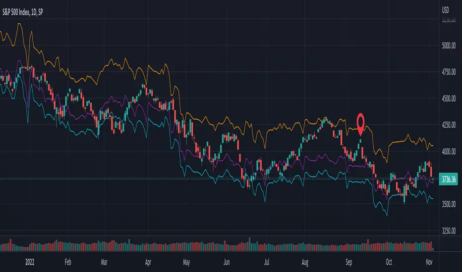
SPX / Silver (XAGUSD) RatioThis script visualizes the S&P 500 Index to Silver ratio (SPX/Silver) — a powerful tool for monitoring the relative strength of equities vs. precious metals over time.
📊 Use Case:
Helps traders assess macro sentiment shifts between risk-on (equities) and risk-off (commodities).
A rising ratio indicates equity outperformance vs Silver, often in growth-driven bull markets.
A falling ratio suggests Silver is outperforming — potentially due to inflation, geopolitical risk, or weakening equities.
⚙️ Data & Calculation:
SPX: SP:SPX (S&P 500 Index)
Silver: TVC:SILVER
Formula:
SPX / Silver
(Both are spot/index prices, updated on daily timeframe)
📈 Interpretation:
📈 Ratio Rising → SPX outperforming Silver → Risk-on sentiment
📉 Ratio Falling → Silver outperforming SPX → Possible flight to safety or inflation hedge
🧠 Ideal For:
Macro trend analysis
Intermarket strategy development
Asset rotation decision-making
Spotting Silver bottoms during SPX/Silver peak zones
Cerca negli script per "spx"

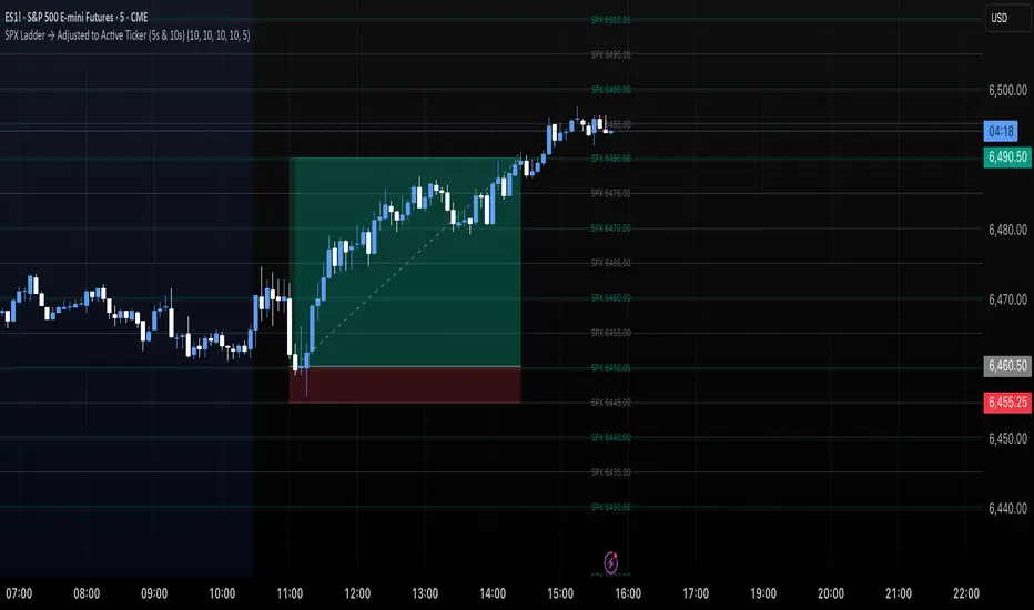
SPX Ladder → Adjusted to Active Ticker (5s & 10s)This indicator allows you to a grid of SPX levels directly on the ES1! (E-mini S&P 500 Futures) chart, automatically adjusting for the spread between SPX and ES1!. This is particularly useful for traders who perform technical analysis on SPX but execute trades on ES1!.
Features:
Renders every 5 and 10 points steps of the SPX in your current chart.
The script adjusts these levels in real-time based on the current spread between SPX and ES1!
Plots updated horizontal lines that move with the spread
Supports Multiple Tickers, ES1!, SPY and SPX500USD.
Ideal for futures traders who want SPX context while trading ES1!.
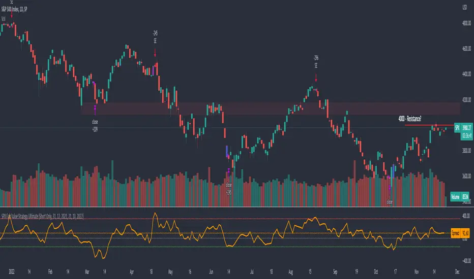
SPX Fair Value Strategy UltimateThis is a strategy using the SPX Fair Value derived from Net Liquidity.
Net Liquidity function is simply: Fed Balance Sheet - Treasury General Account - Reverse Repo Balance
Formula for calculating the fair value of SPX using Net Liquidity looks like this: net_liquidity/1000000000/1.1 -1625
The SPX Fair Value is then subtracted from the SPX value which creates an oscillating diff value.
When diff is greater than 350, SPX is considered overbought and we go short/sell.
When diff is less than -150, SPX is considered oversold and we cover/buy.
The net liquidity values I calculate outside of TradingView. If you'd like the strategy to work for future dates, you'll need to update them.
Paremeters:
Strategy: Short Only, Long Only, Long/Short
Inverse (bool): check if using an inverse ETF to go long instead of short.
Start After Date: When the strategy should start trading
Close Date: Day to close open trades. I just like it to get complete results rather than the strategy ending with open trades.
Enhanced SPX and BTC Overlay with EMASPX-BTC Momentum Gauge and EMA Cross Indicator
Thorough Analysis:
• Combined Overlay (Green/Red Line):
o Function: Plots a wide line over the price chart, representing a composite of SPX and BTC dynamics adjusted by volume data.
o Color Coding:
Green: Indicates bullish conditions when the combined value exceeds its 10-period SMA and Bitcoin volume increases.
Red: Signals bearish conditions when the combined value drops below its 10-period SMA and Bitcoin volume decreases.
o Line Characteristics:
Width: Set at 8 for high visibility.
Transparency: 86% for both colors to overlay without obscuring candlesticks.
Scaling: Uses a factor of 0.02446 to amplify movements, making trend changes more noticeable.
• Continuous Bright Red and Green Lines:
o 20-period EMA of Current Ticker (Red):
Purpose: Acts as a medium-term trend indicator, smoothing price data to reflect the asset's general direction over time.
Color: Bright red for easy identification.
Transparency: 60% to keep it visible but not overpowering.
o 5-period EMA of BTC (Green):
Purpose: Provides insights into short-term Bitcoin momentum, capturing rapid changes in market sentiment.
Color: Bright green to distinguish from the red EMA.
Transparency: 30% for high visibility against price movements.
Detailed Analysis of the EMA Cross:
• Crossing Points:
o Bullish Crossover:
Occurs when the 5-period BTC EMA (green) moves above the 20-period EMA of the current ticker (red).
Suggests that Bitcoin's short-term momentum is gaining strength relative to the asset's medium-term trend, potentially signaling an upcoming uptrend or strengthening of an existing one.
o Bearish Crossover:
When the green line falls below the red, it indicates that Bitcoin's immediate momentum is weakening compared to the asset's medium-term trend, which might precede a downtrend or confirm one.
• Early Trade Signals:
o Entry/Exit Points:
These crossovers can guide traders in making timely decisions to enter or exit trades, especially when corroborated by the combined overlay's color.
o Confirmation:
EMA crossovers can confirm trends indicated by the combined overlay. For example, a bullish crossover with a green combined line could validate a buying opportunity.
o Volatility Insights:
The rapid shifts in Bitcoin's 5-period EMA highlight potential volatility spikes, offering an additional layer of market analysis, particularly useful in volatile markets.
• Strategic Use:
o Multi-Market Insight: The script integrates data from both traditional (SPX) and crypto (BTC) markets, allowing for a more comprehensive analysis of market conditions.
o Decision-Making: Provides traders with visual cues for market sentiment, trend direction, and potential reversals, enhancing strategic trading decisions.
o Trend Confirmation: The combination of EMA crossovers and the overlay's color changes offers a multi-faceted approach to trend confirmation or divergence.
In Summary:
• This script merges elements of traditional stock market analysis with cryptocurrency dynamics, utilizing color changes, line thickness, and EMA crossovers to visually communicate market conditions, offering traders a robust tool for analyzing and acting on market movements.

SPX Open vs SMA AlertThis indicator is specifically designed to identify the first market-relevant candle of the S&P 500 (SPX) after the market opens. The opening price of the trading day is compared to a customizable simple moving average (SMA) period. A visual marker and an alert are triggered when the opening price is above the SMA. Perfect for traders seeking early market trends or integrating automated trading strategies.
Features:
Market Open: The indicator uses the New York market open time (09:30 ET), accounting for time zones and daylight saving time changes.
Flexible Time Offset: Users can set a time offset to trigger alerts after the market opens.
Customizable SMA: The SMA period is adjustable, with a default value of 10.
Visual Representation: A step-line SMA is plotted directly on the chart with subtle transparency and clean markers.
Alert Functionality: Alerts are triggered when conditions are met (opening price > SMA).
Usage:
This indicator is ideal for identifying relevant trading signals early in the session.
Alerts can also serve as triggers for automated trading, e.g., in conjunction with the Trading Automation Toolbox.
Supports both intraday and daily charts.
Alarm Settings:
Select the appropriate symbol (e.g., SPX) and the alert condition "SPX Open > SMA10".
Trigger Settings:
Choose "Once Per Bar Close" to ensure the condition is evaluated at the end of each candle.
If you prefer to evaluate the condition immediately when it becomes true, choose "Once Per Minute".
Duration:
Set the alarm to "Open-ended" if you want it to remain active indefinitely.
Alternatively, set a specific expiration date for the alarm.

SPX and Federal Net Liquidity differenceScript for applying Federal Net Liquidity to the SPX post-2020 monetary policy. Original indicator from jlb05013 with adjustments to make it more readable and usable. When the indicator is above 250 the SPX is overbought and when it's below -250 the SPX is oversold.
It's not perfect, I'm just publishing because I didn't see it already out there.

SPX Options Days Drop By DeltaSimple script that uses the percentage drop for a particular options delta and DTE to show how often you would be assigned on selling cash secured Puts (or naked Puts). Calculate the estimated percentage drop by finding your desired delta in the options chain and divide that price by the current price. For example a Delta of 10% could be $4055 with a current price of $4161 on a given day. The price differential is 2.5%. We test for how many times a 2.5% drop is encountered for our days to expiry (DTE) as this will be the number of times you would be assigned for that position. The lower the Delta the more the price has to drop ie a Delta of 7% would require a 4% drop etc. Objective is to NEVER be "assigned" and make "fee money" selling premium ie Puts.
SPX options expire 3 times a week as do SPY options
SPX options use the European model
SPX options settle in cash ie you are not assigned
NOTE: If you change your DTE you change your Delta and therefore your percentage differential.

SPX-to-ES Gamma Levels (20 GEX Levels)Draws GEX levels specified by user on ES futures chart.
User inputs SPX-to-ES offset, SPX price level, and length of box

SPX overnightThis script calculates SPX value during off trading hours, including overnight after the afterhours (before the pre hours of trading), based on value of ES1!
Script is intended to be used only with ES1! ticker, for now and timeframes up to 120 minutes.
It draws a line of ES1! price at NYSE previous day's closing time (4pm NY time) and displays change since that moment and caluclates spx value based on these data.
Also it can draw a previous week's closing line as well.
Whoever wants to improve this script is more than welcome to do it.
I just did it to be enough for what I needed it.

SPX Fair Value Bands V2An updated version of the SPX Fair Value Bands script from dharmatech and based on the net liquidity concept by MaxJAnderson .
Now with full customization of parameters through the settings (Dialog Box) and allowing the options to the use of
1) Standard Bands based on Offsets of the Fair Value
2) Bollinger Bands
3) Keltner Channels
to better capture buy/sell areas rather than relying on noisy unreliably (and unevenly) updated data from the Treasury/Fed.
==================================
Net Liquidity's importance in the new post-COVID QE to QT regime as described MaxJAnderson
----------------
" In past cycles, size of Fed's balance sheet changed a lot, while TGA and RRP changed relatively little. So size of balance sheet roughly equated Net Liquidity.
(The Treasury General Account) TGA and (Reverse Repo) RRP didn't matter. They were rounding errors by comparison.
But starting in 2020, relative changes in TGA and RRP have been THREE TIMES LARGER than the change in size of the Fed's balance sheet. As result, changes in TGA and RRP have taken over as the primary drivers Net Liquidity.
This is new, and changes the game significantly. Again - the size of the Fed's balance sheet doesn't matter.
What matters is the portion of it that's available to circulate in the economy (Net Liquidity).
And ever since 2020, the Treasury and Reverse Repo have become what controls that. Not the size of Fed's balance sheet.
----------------
The idea that follows is simple,short when $SPX reaches extreme levels of overvaluation, and close out when SPX returns to being undervalued. Here's the formulas I currently use to determine fair value:
Fair Value = (Fed Bal Sheet - TGA - RRP)/1.1 - 1625
And here's the trading rules I currently follow:
Short when diff of $SPX - Fair Value > 350
Close when diff of $SPX - Fair Value < 150
When one of these rules is triggered upon market close on a given day, trades are entered at open of the following day "

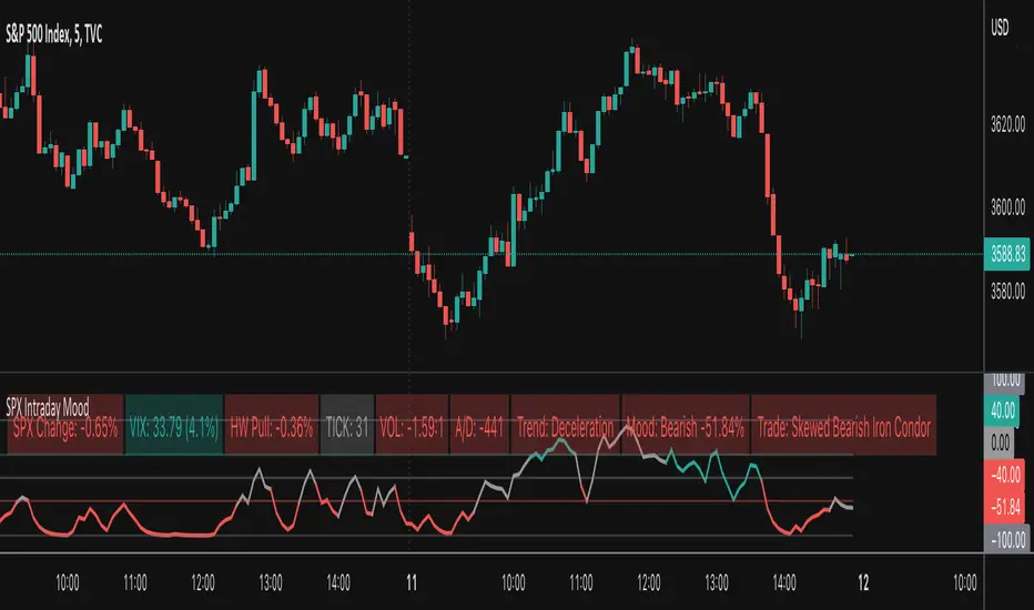
SPX Intraday Mood IndicatorThe SPX Intraday Mood Indicator tries to gauge the intraday market direction of the S&P 500 (SPX) by focusing on internal market data.
Based on the 0DTE Mood Indicator concept. Overall strength/weakness is converted into a directional Mood Percentage which can help with choosing a trade type.
Use at your own risk and discretion. Potential trade ideas offer no guarantees. Intraday Charts Only. Turn off extended hours data. Only works on SPX.
This first version is untested and I am only sharing it to gather feedback on its accuracy, use at your own risk.
SPX 0.5% Move + Volume Filter.5%+ move in SPX in 2 minute candle. Usage for creating an alert for web hook trigger or basic alert.

SPX Master Levels & Correlations [Gemini] (v4.2)This will draw on your chart levels of SPX from other time frames low , high and ES

SPX Year-End 2025 Targets by AnalystsJust year end analyst targets for SPX as of 02 October 2025, as answered by Grok

SPX EMA 9/21 + VWAP Strategy1. Temporality: 2 minutes.
2. EMA 9 and EMA 21:
• Purchase Call: when EMA 9 crosses up EMA 21 and the price is > VWAP.
• Put : when EMA 9 crosses down EMA 21 and the price is < VWAP.
3. Stop and Take Profit:
• Stop: candle closure on the other side of the VWAP.
• TP: configurable in points (e.g. +10 pts, +20 pts) or up to the opposite crossing of EMAs.
• Long enters when EMA 9 crosses up 21 and the price is above VWAP.
• Short enters when the EMA 9 crosses down the 21 and the price is below VWAP.
• TP and SL in SPX points (configurable in inputs).
• You can run in 2 minutes on SPX.

SPX Fair Value BandsThese are based on Darius Dale and Max Anderson's Net Liquidity model.
This is intended for use with the $SPX chart.
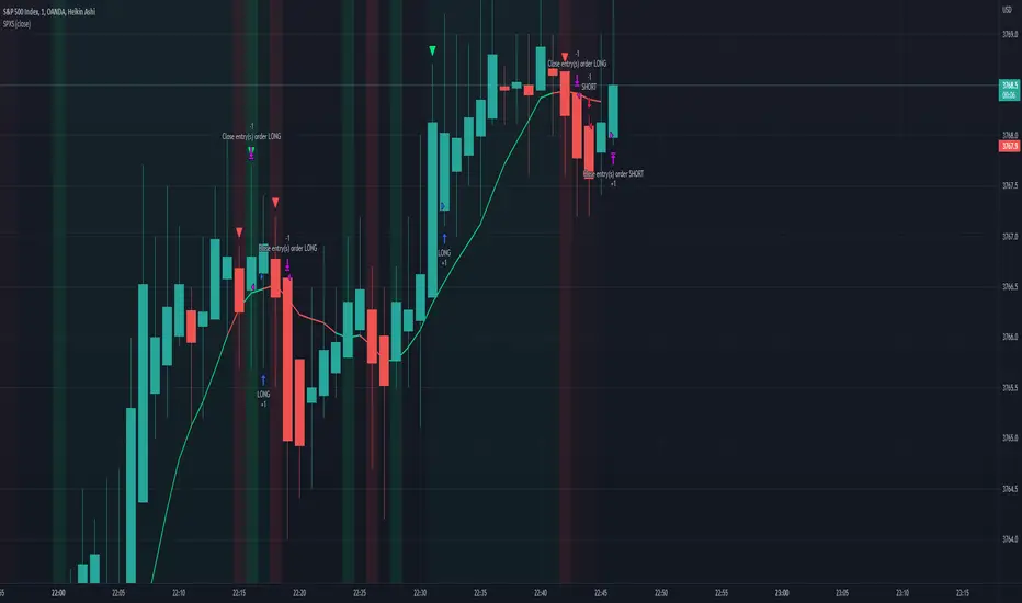
SPX Scalping StrategyThis strategy points out good entries and exits to go with the direction of SPY
Used with:
Ticker: SPX 500 USD
Heiken Ashi Candles
1, 3, 5 min timeframe
SPX DivergenceScript plots divergence of SPX sectors and world markets based on 3 months return of various ETF's.
Excessive divergence in returns typically preceeds strong market downturns 1-2 weeks ahead of time.

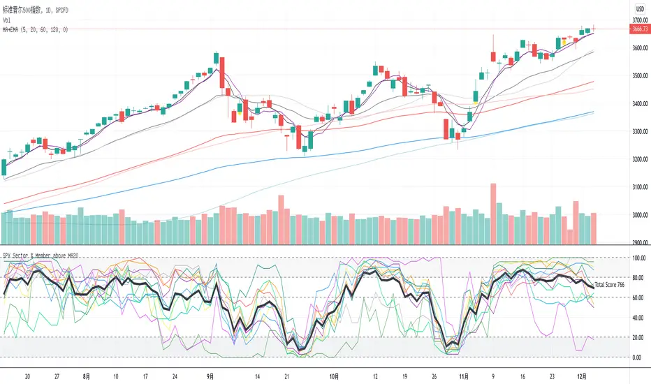
SPX Sector % Member above MA20This indicator shows the SPX sector members which are above ma20. And bold black line is the total, if it is above 1000 which means market so hot and you should sell, or if it is below 200 means you should buy.
SPX DIXThis is the SPX DIX from Squeezemetrics. The code was generated with Python-Pandas. I cannot get the full DIX because I hit the variable limit and have not found a workaround. Publishing this to see if others know of a workaround.

SPX ATR14 indicator This indicator works well on SPX 500
Needs to be inverted so Red is at the bottom
Levels of pullbacks are used to determine trend .
Pullback to the Green zone normal Bull Market
Pullback to the Brown Zone are warning of potential Bear Market , but if it holds , just a deeper correction within a Bull Market
Pullbacks into the Red , Bear Market .
In Bear , wait until indicator is forming a reversal trend up and price should make a divergence by either making a new low or retesting previous low.
The Blue MA is the 33 MA and can be used as a form of stop trend indicator on the cross below the MA
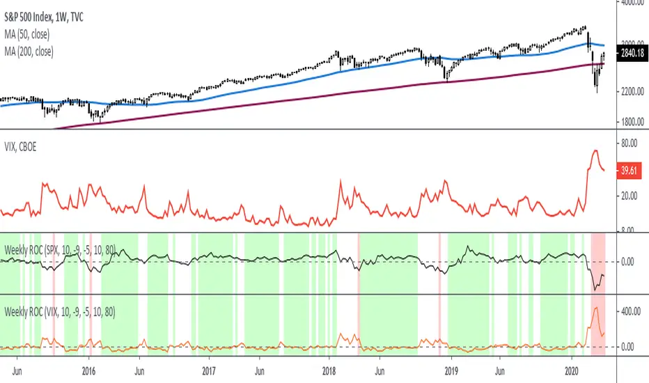
Rate Of Change - Weekly SignalsRate of Change - Weekly Signals
This indicator gives a potential "buy signal" using Rate of Change of SPX and VIX together,
using the following criteria:
SPX Weekly ROC(10) has been BELOW -9 and now rises ABOVE -5
*PLUS*
VIX Weekly ROC(10) has been ABOVE +80 and now falls BELOW +10
The background will turn RED when ROC(SPX) is below -9 and ROC(VIX) is above +80.
The background will turn GREEN when ROC(SPX) is above -5 and ROC(VIX) is below +10.
So the potential "buy signal" is when you start to get GREEN BARS AFTER RED - usually with
some white/empty bars in between...but wait for the green. This indicates that the volatility
has settled down, and the market is starting to turn up.
This indicator gives excellent entry points, but be careful of the occasional false signals.
See Nov. 2001 and Nov. 2008, in both cases the market dropped another 25-30% before the final
bottom was formed. Always have an exit strategy, especially when buying in after a downtrend.
How I use this indicator, pretty much as shown in the preview. Weekly SPX as the main chart with
some medium/long moving averages to identify the trend, VIX added as a "Compare Symbol" in red,
and then the Weekly ROC signals below.
For the ROC graphs, you can show SPX+VIX together, SPX alone, or VIX alone. I prefer to display
them separately because they don't scale well together (VIX crowds out the SPX when it spikes).
Background color is still based on both SPX/VIX together, regardless of which graph is shown.
Note that there is no VIX data available on Trading View prior to 1990, so for those dates the
formula is using only ROC(SPX) and the assigned thresholds (-9 and -5, or whatever you choose).
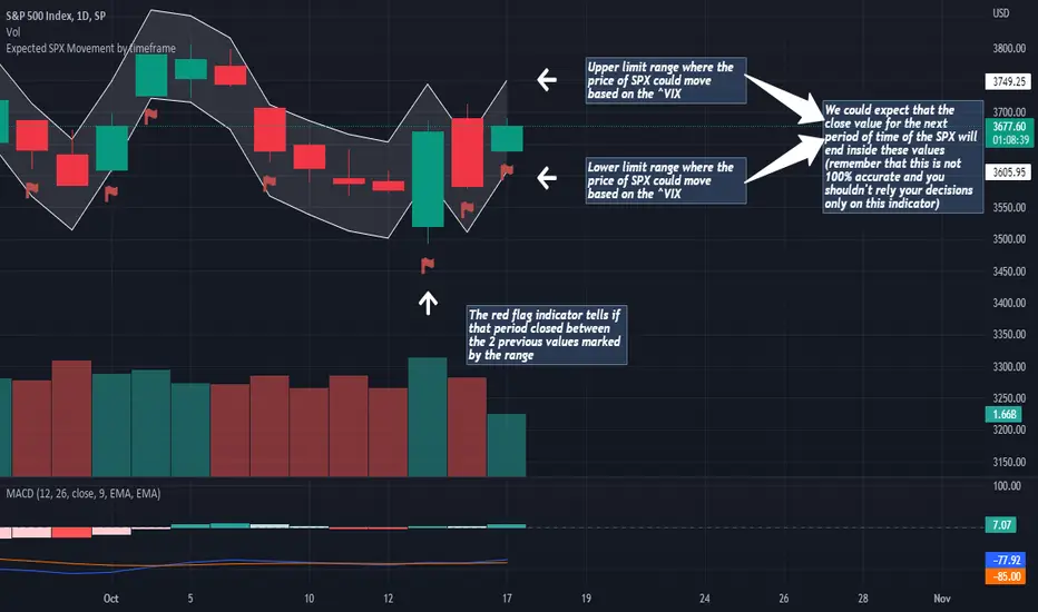
Expected SPX Movement by timeframeTHIS INDICATOR ONLY WORKS FOR SP:SPX CHART
This code will help you to measure the expected movement of SP:SPX in a previously selected timeframe based on the current value of VIX index
E.g. if the current value of VIX is 30 we calculate first the expected move of the next 12 months.
If you selected the Daily timeframe it will calculate the expected move of SPX in the next Day by dividing the current VIX Value by the squared root of 252
(The 252 value corresponds to the approximate amount of trading sessions of the year)
If you selected the Weekly timeframe it will calculate the expected move of SPX in the next Week by dividing the current VIX Value by the squared root of 52
(The 52 value corresponds to the amount of weeks of the year)
If you selected the Monthly timeframe it will calculate the expected move of SPX in the next Week by dividing the current VIX Value by the squared root of 12
(The 12 value corresponds to the amount of months of the year)
For lower timeframes you have to calculate the amount of ticks in each trading session of the year in order to get that specific range
Once you have that calculation it it'll provide the range expressed as percentage of the expected move for the following period.
This script will plot that information in a range of 2 lines which represents the expected move of the SPX for the next period
The red flag indicator tells if that period closed between the 2 previous values marked by the range