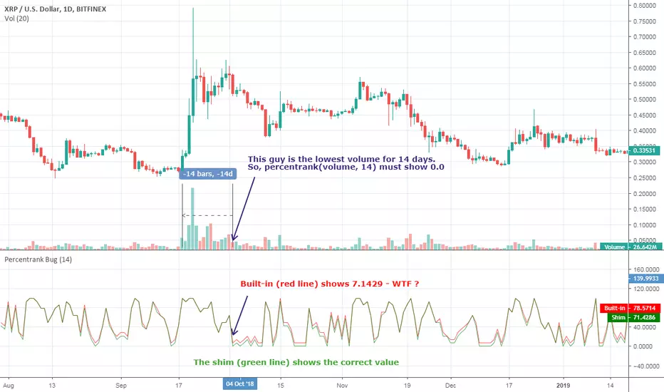
[RESEARCH] Percentrank BugI found a bug with built-in percentrank function. Sometimes it gives unexpected and incorrect results. You can see a one of them on the chart.
ALL scripts which use percentrank function are affected. No matter which version they use, no matter who is their author - ALL scripts which use this built-in function can work incorrectly.
If you want to avoid this bug use _percentrank function (the "shim" ) - you can find it in the script.
NOTE: Don't push on TradingView Support or Pine Core Team because they already know about this issue and work on the fix. I publish it to warn you.
Cerca negli script per "the script"
Relative Volume Change: BTC | Retail v. Non-Retail [Sim]This script was inspired by Cryptorae's BTC Volume Share, Retail script:
The script plots the relative monthly change of BTC volume, retail vs. non-retail. A move above 1 means the volume of retail or non-retail, respectively, is greater than last month's cumulative volume.

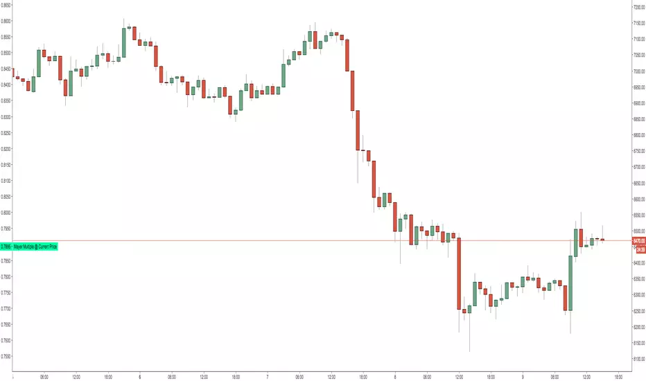
Mayer Multiple @ Current PriceThough this script is by me, the original idea comes from a podcast I heard where Trace Mayer talks about how he does crypto valuation. It is based on current price against the 200 day moving average. This indicator script will simply plot that value as a label overlayed on your trading view chart. Best long term results occur when acquiring BTC when the multiple is 2.4 or less. For more info, google "mayer multiple" This script/indicator is strictly for educational purposes. It is not exclusive to bitcoin.
To get the best look out of your charts I make the following changes.
1.Apply the indicator to your chart.
2. In the tools palette of trading view, when looking at a chart, click "Show Objects Tree" the icon displayed above the trash can.
In the objects tree panel, click the preferences icon for "Mayer Multiple @ Current Price"
Switch "scale" to "scale Left"
3. Then for your chart preferences (right click on chart background and select "Properties", and be sure the following are checked on the "Scales" tab
Left Axis
Right Axis
Indicator Last Value
Indicator Labels
Screenshots are not allowed in this view, so I can't post screenshots, but the view above is what it should look like when you are done.
For anyone who wants to see the code, here is the code of the script:
Use at will, and at your own risk.
//@version=3
// Created By Timothy Luce, inspired by Trace Mayer's 200 Day SMA cryptocurrency valuation method
study("Mayer Multiple @ Current Price", overlay=true)
currentPrice = close
currentDay = security(tickerid, "D", sma(close, 200))
mayerMultiple = currentPrice/currentDay
plot(mayerMultiple, color=#00ffaa, transp=100)
If you want to change the color, change this line: #00ffaa
Institutional Alpha Vector | D_QUANT Institutional Alpha Vector | D_QUANT
Overview
The Institutional Alpha Vector (IAV) is an original trend-following framework that replaces single-indicator bias with a Weighted Composite Score . Instead of relying on a simple moving average, this script aggregates four distinct quantitative dimensions—Price, Momentum, Volatility, and Volume—into a normalized value called the "Alpha Vector."
The goal of this tool is to identify "Institutional Consensus"—periods where multiple mathematical models align in the same direction, reducing the likelihood of false breakouts in choppy markets.
How It Works: The Quantitative Engines
The script calculates four independent signals. For each module, a state is stored (1 for Bullish, -1 for Bearish, 0 for Neutral).
1. Price Filter (Hull Moving Average):
The script uses an HMA (a weighted moving average that reduces lag by using the square root of the period). A signal is triggered when the price crosses over/under this "Spine."
2. Volatility Regime (RMA + ATR):
This module uses a Moving Average (RMA) combined with an Average True Range (ATR) offset. It acts as a volatility filter that price must move beyond 1 ATR from the mean to register a trend, ensuring the market isn't just "drifting."
3. Momentum Physics (ADX/DMI):
Based on J. Welles Wilder’s Directional Movement Index. It checks if the is above (or vice versa) but only if the ADX (Average Directional Index) is above a user-defined threshold (default: 10), confirming the presence of a strong trend.
4. Institutional Flow (Chaikin Money Flow):
This confirms price action with volume. It calculates the accumulation/distribution of money flow over a specific period. A signal is only valid if the CMF is positive (Bullish) or negative (Bearish).
The Alpha Vector Calculation
This is the core "originality" of the script. The indicator takes the active modules and calculates a Composite Score :
This results in a value between -1.0 and +1.0 .
* High Confidence Long: When the score exceeds +0.1 (adjustable).
* High Confidence Short: When the score drops below -0.1 (adjustable).
* Neutral Zone: When the score is near 0, the script colors the bars grey, signaling a lack of institutional consensus.
Visual Intelligence: The "Electric Conduit"
The script visualizes market energy through a custom rendering engine:
* The Spine: A central line representing the HMA trend.
* The Conduit (Fill): A dynamic gradient that expands or contracts based on the ATR (Average True Range) . This allows traders to see "volatility expansion" (wide ribbon) vs "compression" (tight ribbon) at a glance.
* Bar Coloring : Automatically aligns the chart candles with the Alpha Vector state to remove cognitive load.
How to Use
1. Define your Strategy: In the settings, you can toggle specific modules. If you are trading a low-volume asset, you might disable the **CMF** module.
2. Identify the Consensus: Look for the ribbon to change from Grey (Neutral) to Cyan/Gold.
3. Monitor the HUD: A small dashboard in the bottom right displays the live Alpha Vector score. A score of 1.0 means all four engines are in 100% bullish agreement.
Disclaimer: Trading involves significant risk. This tool is for educational and analytical purposes and does not constitute financial advice.

Anhnga4.0 - Filter ToggleINPUTS:
1.5 0.8 (OR 1.6 0.5/0.6)
BE=0.45
1
MAs: 35 135
7
This Pine Script code defines a trading strategy named **"Anhnga4.0 - Filter Toggle"**. It is a trend-following strategy that uses momentum oscillators and moving averages to identify entries, while featuring a specific "Overextension Filter" to avoid buying at the top or selling at the bottom.
Here is a breakdown of how the script works:
---
## 1. Core Trading Logic (The Entry)
The strategy looks for a "perfect storm" of three factors before entering a trade:
* **Momentum (WaveTrend):** It uses the WaveTrend oscillator (`wt1` and `wt2`).
* **Long:** A bullish crossover happens while the oscillator is below the zero line (oversold).
* **Short:** A bearish crossunder happens while the oscillator is above the zero line (overbought).
* **Trend Confirmation:** The price must be on the "correct" side of three different lines: the 20-period Moving Average (BB Basis), the 50-period SMA, and the 200-period SMA.
* **The Window:** You don't have to enter exactly on the cross. The `Signal Window` allows the trade to trigger up to 4 bars after the momentum cross, provided the trend filters align.
## 2. The "Overextension" Filter
This is a unique feature of this script. It calculates the distance between the current price and the **50-period Moving Average**.
* If the price is too far away from the MA (defined by the **ATR Limit**), the script assumes the move is "exhausted."
* If `Enable Overextension Filter?` is on, the strategy will skip these trades to avoid "chasing the pump."
* **Visual Cue:** The chart background turns **purple** when the price is considered overextended.
---
## 3. Risk Management & Exit Strategy
The script manages trades dynamically using Bollinger Bands and Risk:Reward ratios:
| Feature | Description |
| --- | --- |
| **Stop Loss (SL)** | Set at the **Lower Bollinger Band** for Longs and **Upper Band** for Shorts. |
| **Take Profit (TP)** | Calculated based on your **RR Ratio** (default is 2.0). If your risk is $10, it sets the target at $20 profit. |
| **Breakeven** | A "protection" feature. Once the price moves in your favor by a certain amount (the `Breakeven Trigger`), the script moves the Stop Loss to your entry price to ensure a "risk-free" trade. |
---
## 4. Visual Elements on the Chart
* **Green Lines:** Your target price (TP).
* **Red Lines:** Your initial Stop Loss.
* **Yellow Lines:** Indicates the Stop Loss has been moved to **Breakeven**.
* **Purple Background:** High alert—price is overextended; trades are likely being filtered out.
---
## Summary of Settings
* **BB Multiplier:** Controls how wide your initial stop loss is.
* **ATR Limit:** Controls how sensitive the "Overextension" filter is (higher = more trades allowed; lower = stricter filtering).
* **Breakeven Trigger:** Set to 1.0 by default, meaning once you are "1R" (profit equals initial risk) in profit, the stop moves to entry.

RSI Statistics [Honestcowboy]⯁ Overview
Research tool for analysing price behaviour based on RSI, find out how your favorite trading pair / timeframe combinations react to RSI. 5 Different projections based on 5 different value zones of RSI:
RSI between 100-80 (very overbought)
RSI between 80-60 (overbought)
RSI between 60-40 (normal)
RSI between 40-20 (oversold)
RSI between 20-00 (very oversold)
The script simply show price projections of different RSI environments so you can get an idea of what price could do when RSI reaches this RSI value zone. Ofcourse past price performance does not guarantee future returns and this is just projections based on the past.
The script also projects RSI just like it does with price so you can get an idea of how long RSI might stay in overbought or very overbought etc
Script is mainly a research tool to use to get ideas to explore further and build upon. Here are some examples:
⯁ Settings
RSI Lenght: this is just normal RSI settings you find in standard RSI (bars used to calculate RSI)
Projection Length: Amount of bars to save for projections. The projections will also project this many bars in futre. Higher values here increase loading time drastically.
Price Action Boundaries: turn the highs / lows of projection zone on or off. I usually turn this off to look more closely at the averages themselves.
Maximum Stats history: Not on by default, in case you only want to show the average projection of last X amount of occurences RSI was in a specific RSI value zone
Selection of the different zones: in case you want to look at a specific zone alone or turn of some zones. It will no longer project for that zone both in the price projection and RSI projections.
⯁ How are these calculated?
To calculate the average price reaction script uses a very simple approach. On each bar it will save price action array up to projection length back in time. It will then check what the RSI value was there and store the array inside the right matrix.
It will use this matrix to calculate the averages, highs and lows of all these arrays for that specific RSI zone. It uses a simple arithmatic averaging method to get average value.
The script uses a similar approach for projecting the RSI itself into the future.
I include a visual showing it a bit better. This is from a different indicator of me using same approach:
The script will force you into a specific background, bar color and color template. Script is not meant to be used with other scripts and should be used as a standalone tool.

Supply & Demand Sniper369Indicator Philosophy: The Convergence of Structure and Liquidity
The Supply & Demand Sniper369 is not just another signal generator; it is a professional-grade execution framework built on the principles of Institutional Order Flow and Liquidity Engineering. While standard indicators often lag or provide signals in "no-man's land," this script is designed to identify high-probability reversal points by combining macro-structural zones with micro-execution triggers.
What Makes This Script Original?
Most scripts treat Supply/Demand and Entry Triggers as separate entities. The originality of the Sniper369 lies in its Strict Hierarchical Logic. It employs a "Two-Factor Authentication" system for trades:
1. Structural Validation: Identifying where "Smart Money" has historically left unfilled orders.
2. Liquidity Sweep Confirmation: Using the Enigma 369 logic to detect a specific manipulation pattern (a stop-run or "sweep") that occurs exclusively within those structural zones.
By using Pine Script v6 Object-Oriented Programming, the script manages dynamic arrays of boxes and lines that auto-delete upon mitigation, ensuring your chart remains a clean, actionable workspace.
Underlying Concepts & Calculations
1. Macro: Structural Supply & Demand
The indicator calculates zones based on Pivot Strength and Volatility Scaling.
Calculations: It scans for major structural pivots ( and ). Once a pivot is confirmed, it doesn't just draw a line; it calculates a zone width based on the Average True Range (ATR).
Why it works: Institutions do not enter at a single price; they enter in "pockets" of liquidity. Using ATR-based zones ensures that on high-volatility pairs (like Gold or GBP/JPY), your zones are appropriately wide, while on lower-volatility pairs, they remain tight and precise.
2. Micro: The Enigma 369 Sniper Logic
Once price enters a zone, the "Sniper" logic activates. This is based on the Institutional Wick-Liquidity concept.
The Sweep: The script looks for a candle that breaks the high/low of the previous candle (trapping "breakout" traders) but fails to hold that level.
The Mean Threshold (50% Wick): A core calculation of the Enigma logic is the midpoint of the rejection wick.
Calculation: for Sells.
Logic: Institutions often re-test the 50% level of a long wick to fill the remaining orders before the real move starts.
How to Use the Indicator
Step 1: Wait for Structural Alignment
Observe the Teal (Demand) and Red (Supply) boxes. These are your "Points of Interest" (POI). Do not take any trades until the price is physically touching or inside these boxes.
Step 2: Monitor for the Sniper Trigger
When the price is inside a zone, look for the appearance of the Solid and Dotted lines.
The Solid Line: This is the extreme of the manipulation candle. It serves as your structural invalidation level (Stop Loss).
The Dotted Line: This is the 50% Wick level. It is your "Sniper Entry" target.
Step 3: Execution & Alerts
The script features a built-in alert system that notifies you the moment a Sniper activation occurs inside a zone.
Conservative Entry: Place a Limit Order at the Dotted Line.
Aggressive Entry: Market enter on the close of the Sniper candle if the price has already reacted strongly.
Exit: Target the opposing Supply or Demand zone for a high Risk-to-Reward ratio.
Technical Summary for Traders
Trend Detection: Uses an EMA-50 Filter to ensure Snipers only fire in the direction of the dominant trend (optional).
Scalping/Day Trading: Optimized for the 1m, 5m, and 15m timeframes, but functions perfectly on 4H/Daily for swing traders.
Dynamic Cleanup: The script automatically deletes lines if the price closes past them, signaling that the "Liquidity Grab" was actually a breakout, thus preventing you from entering a losing trade.

EMA 8 48 System v1Short Description:
A trend-following indicator using EMA crossovers, ATR-based volatility filter, and a cooldown period to reduce false signals. Designed for clear buy/sell signals in trending markets.
Full Description:
What is this indicator?
This script implements a dual EMA crossover system (8-period and 48-period EMAs) with a trend filter (EMA200), ATR-based volatility filter, and a cooldown period to avoid overtrading.
It visually plots EMAs, buy/sell signals, and ATR-based stop loss/target levels.
Why is it useful?
Helps traders identify high-probability trend entries and avoid choppy, low-volatility conditions.
Reduces false signals by requiring trend confirmation, sufficient volatility, and spacing out trades.
Suitable for intraday and swing trading on most liquid assets.
When to use:
Best used in markets showing clear trends (not sideways).
Works on most timeframes, but higher timeframes (15m, 1h, 4h, daily) tend to give more reliable signals.
How to spot buy and sell:
Buy: Green “BUY” label appears when EMA8 crosses above EMA48, price is above EMA200, and ATR is above the minimum threshold.
Sell: Red “SELL” label appears when EMA8 crosses below EMA48, price is below EMA200, and ATR is above the minimum threshold.
ATR-based stop loss and target levels are plotted for each signal.
Additional tips:
Adjust the minimum ATR and cooldown settings to match your asset’s volatility and your trading style.
Use in conjunction with price action or higher timeframe analysis for best results.
Avoid trading during low volatility or sideways markets, as signals may be less reliable.
Always backtest and forward-test before using live.
How to add signals and update settings:
Use the script’s input panel to adjust EMA lengths, ATR settings, minimum ATR, and cooldown period.
To add alerts, use TradingView’s “Add Alert” feature and select the buy or sell conditions from the script’s alert options.
For further customization, you can edit the script to add additional filters or notification logic.
This indicator is for educational purposes only. Always use proper risk management and do your own research before trading.
Disclaimer:
This script is for informational and educational purposes only and does not constitute financial advice or a recommendation to buy or sell any financial instrument.
Trading involves risk. Past performance is not indicative of future results. Always do your own research and use proper risk management.
The author is not responsible for any losses incurred from the use of this script. By using this script, you agree to take full responsibility for your trading decisions.

Support and Resistance Breakout Signals [MarkitTick]💡 This indicator provides a comprehensive, automated system for identifying, tracking, and trading Support and Resistance (S/R) breakouts. By synthesizing classic Swing High and Swing Low pivot analysis with Multi-Timeframe (HTF) capabilities and Volume confirmation, it transforms raw price action into actionable structural data. It is designed to declutter charts by automatically managing active levels and highlighting significant market structure shifts (Higher Highs, Lower Lows) alongside verified breakout signals.
✨ Originality and Utility
While many indicators draw static pivot points, this tool distinguishes itself through "State Management." It treats Support and Resistance not just as historical markers, but as active zones that evolve.
Dynamic Level Management: Instead of flooding the chart with infinite lines, the script uses arrays to store a specific number of recent levels. As price action progresses, invalid or broken levels are removed or updated, keeping the analysis focused on current relevance.
Multi-Timeframe Confluence: Uniquely, it allows you to overlay higher timeframe support and resistance levels (e.g., Daily levels on a 4-hours chart) without changing your chart view, enabling top-down analysis instantly.
Market Structure Labeling: It automatically tags pivot points with Dow Theory labels (HH, LH, LL, HL), aiding traders in instantly recognizing trend direction without manual charting.
🔬 Methodology and Concepts
The script operates on three core technical pillars:
● Swing Pivot Detection
The foundation is the detection of local extrema using a "Left/Right" bar lookback mechanism. A Swing High is identified when a high is greater than the L bars preceding it and the R bars following it. This confirms a fractal peak or valley.
Note on Confirmation: Because the script waits for R bars to close to confirm a pivot, the lines appear retroactively. However, the extension of these lines and subsequent breakout signals occur in real-time.
● Breakout Logic with Volume Integration
A breakout is triggered when the Close price crosses an active S/R line.
Resistance Break: Current Close > Resistance Level (and Previous Close ≤ Level).
Support Break: Current Close < Support Level (and Previous Close ≥ Level).
Volume Confirmation: An optional filter requires the breakout bar's volume to exceed a Moving Average of volume, ensuring momentum backs the move.
● Time Decay
To mimic the reduced relevance of stale levels, the script includes a "Time Decay" feature. If a level is not interacted with for a user-defined number of bars, it is automatically purged from the system, ensuring the chart reflects only fresh interest levels.
🎨 Visual Guide
The indicator uses a specific color-coding and labeling system to convey information quickly:
● Support & Resistance Lines
Red Lines (Thin): Represent active Resistance levels on the current timeframe.
Green Lines (Thin): Represent active Support levels on the current timeframe.
Fuchsia Lines (Thick): Represent Higher Timeframe (HTF) Resistance levels.
Aqua Lines (Thick): Represent Higher Timeframe (HTF) Support levels.
● Market Structure Labels
Located at the pivot points, these text labels define the trend structure:
HH / LH: Higher High / Lower High (Red Text).
LL / HL: Lower Low / Higher Low (Green/Aqua Text).
HTF-R / HTF-S: Indicates major structural pivots from the higher timeframe.
● Breakout Signals
When a valid break occurs, a label appears above or below the bar:
Blue Triangle Up (▲): Bullish breakout through resistance.
Blue Triangle Down (▼): Bearish breakout through support.
Number in Label: Indicates the cumulative count of breaks for that specific trend sequence (e.g., "1" is the first break, "2" is the second).
The breakout count represents the intensity of the move. A reading greater than 1 signals exceptional market strength, indicating the penetration of multiple Key Levels (Support or Resistance) within a single candle.
📖 How to Use
Trend Continuation: In an uptrend (sequence of HH/HL), wait for a Blue Triangle Up (▲) occurring at a Red Resistance line. This signals the continuation of the trend.
Trend Reversal: Watch for a "Structure Break." If price is making Higher Highs, but then breaks a Green Support line (generating a ▼ signal) and forms a Lower Low (LL), the trend may be reversing.
HTF "Bounce" Plays: Use the thick Fuchsia/Aqua lines as major zones. If price approaches a thick Aqua line (HTF Support) and fails to break it, look for LTF bullish structure (HH/HL) to form for an entry.
Volume Filtering: Enable the "Volume Confirmation" setting to filter out "fakeouts" (breaks on low volume).
⚙️ Inputs and Settings
● Swing Settings
Left/Right Bars: Determines the sensitivity of the pivot detection. Higher numbers = fewer, more significant pivots.
Max Stored Levels: How many S/R lines to keep in memory at once.
Max Break Labels: Limits visual clutter by capping the number of signal labels.
● Usability & HTF
Enable Time Decay: If true, deletes lines that are older than "Decay Period" bars.
Enable HTF Levels: Toggles the display of higher timeframe pivots.
HTF Timeframe: Select the specific timeframe for the macro view (e.g., "D" for Daily).
● Analysis
Volume Confirmation: Toggles the requirement for volume to be above its average for a signal to fire.
Show Market Structure: Toggles the HH/LL text labels.
🔍 Deconstruction of the Underlying Scientific and Academic Framework
The script's logic is rooted in Fractal Geometry and Auction Market Theory .
● Mandelbrot's Fractals: The use of `leftBars` and `rightBars` is a direct application of identifying market fractals. Markets are self-similar across timeframes; a pivot on a 5-minute chart is structurally identical to one on a Weekly chart. This script exploits this property by allowing nested timeframe analysis (LTF inside HTF).
● Memory of Price (Behavioral Finance): Support and resistance lines represent zones where market participants have previously established value (Price Memory). The "Breakout" signal is mathematically significant because it represents a shift in the supply/demand equilibrium. When price closes beyond a stored array value (the pivot price), it signifies that the aggressive limit orders that created the pivot have been exhausted or withdrawn, validating a new search for value.
⚠️ Disclaimer
All provided scripts and indicators are strictly for educational exploration and must not be interpreted as financial advice or a recommendation to execute trades. I expressly disclaim all liability for any financial losses or damages that may result, directly or indirectly, from the reliance on or application of these tools. Market participation carries inherent risk where past performance never guarantees future returns, leaving all investment decisions and due diligence solely at your own discretion.

Smart Money Flow Oscillator [MarkitTick]💡This script introduces a sophisticated method for analyzing market liquidity and institutional order flow. Unlike traditional volume indicators that treat all market activity equally, the Smart Money Flow Oscillator (SMFO) employs a Logic Flow Architecture (LFA) to filter out market noise and "churn," focusing exclusively on high-impact, high-efficiency price movements. By synthesizing price action, volume, and relative efficiency, this tool aims to visualize the accumulation and distribution activities that are often attributed to "smart money" participants.
✨ Originality and Utility
Standard indicators like On-Balance Volume (OBV) or Money Flow Index (MFI) often suffer from noise because they aggregate volume based simply on the close price relative to the previous close, regardless of the quality of the move. This script differentiates itself by introducing an "Efficiency Multiplier" and a "Momentum Threshold." It only registers volume flow when a price move is considered statistically significant and structurally efficient. This creates a cleaner signal that highlights genuine supply and demand imbalances while ignoring indecisive trading ranges. It combines the trend-following nature of cumulative delta with the mean-reverting insights of an In/Out ratio, offering a dual-mode perspective on market dynamics.
🔬 Methodology
The underlying calculation of the SMFO relies on several distinct quantitative layers:
• Efficiency Analysis
The script calculates a "Relative Efficiency" ratio for every candle. This compares the current price displacement (body size) per unit of volume against the historical average.
If price moves significantly with relatively low volume, or proportional volume, it is deemed "efficient."
If significant volume occurs with little price movement (churn/absorption), the efficiency score drops.
This score is clamped between a user-defined minimum and maximum (Efficiency Cap) to prevent outliers from distorting the data.
• Momentum Thresholding
Before adding any data to the flow, the script checks if the current price change exceeds a volatility threshold derived from the previous candle's open-close range. This acts as a gatekeeper, ensuring that only "strong" moves contribute to the oscillator.
• Variable Flow Calculation
If a move passes the threshold, the script calculates the flow value by multiplying the Typical Price and Volume (Money Flow) by the calculated Efficiency Multiplier.
Bullish Flow: Strong upward movement adds to the positive delta.
Bearish Flow: Strong downward movement adds to the negative delta.
Neutral: Bars that fail the momentum threshold contribute zero flow, effectively flattening the line during consolidation.
• Calculation Modes
Cumulative Delta Flow (CDF): Sums the flow values over a rolling period. This creates a trend-following oscillator similar to OBV but smoother and more responsive to real momentum.
In/Out Ratio: Calculates the percentage of bullish inflow relative to the total absolute flow over the period. This oscillates between 0 and 100, useful for identifying overextended conditions.
📖 How to Use
Traders can utilize this oscillator to identify trend strength and potential reversals through the following signals:
• Signal Line Crossovers
The indicator plots the main Flow line (colored gradient) and a Signal line (grey).
Bullish (Green Cloud): When the Flow line crosses above the Signal line, it suggests rising buying pressure and efficient upward movement.
Bearish (Red Cloud): When the Flow line crosses below the Signal line, it suggests dominating selling pressure.
• Divergences
The script automatically detects and plots divergences between price and the oscillator:
Regular Divergence (Solid Lines): Suggests a potential trend reversal (e.g., Price makes a Lower Low while Oscillator makes a Higher Low).
Hidden Divergence (Dashed Lines): Suggests a potential trend continuation (e.g., Price makes a Higher Low while Oscillator makes a Lower Low).
"R" labels denote Regular, and "H" labels denote Hidden divergences.
• Dashboard
A dashboard table is displayed on the chart, providing real-time metrics including the current Efficiency Multiplier, Net Flow value, and the active mode status.
• In/Out Ratio Levels
When using the Ratio mode:
Values above 50 indicate net buying pressure.
Values below 50 indicate net selling pressure.
Approaching 70 or 30 can indicate overbought or oversold conditions involving volume exhaustion.
⚙️ Inputs and Settings
Calculation Mode: Choose between "Cumulative Delta Flow" (Trend focus) or "In/Out Ratio" (Oscillator focus).
Auto-Adjust Period: If enabled, automatically sets the lookback period based on the chart timeframe (e.g., 21 for Daily, 52 for Weekly).
Manual Period: The rolling lookback length for calculations if Auto-Adjust is disabled.
Efficiency Length: The period used to calculate the average body and volume for the efficiency baseline.
Eff. Min/Max Cap: Limits the impact of the efficiency multiplier to prevent extreme skewing during anomaly candles.
Momentum Threshold: A factor determining how much price must move relative to the previous candle to be considered a "strong" move.
Show Dashboard/Divergences: Toggles for visual elements.
🔍 Deconstruction of the Underlying Scientific and Academic Framework
This indicator represents a hybrid synthesis of academic Market Microstructure theory and classical technical analysis. It utilizes an advanced algorithm to quantify "Price Impact," leveraging the following theoretical frameworks:
• 1. The Amihud Illiquidity Ratio (2002)
The core logic (calculating body / volume) functions as a dynamic implementation of Yakov Amihud’s Illiquidity Ratio. It measures price displacement per unit of volume. A high efficiency score indicates that "Smart Money" has moved the price significantly with minimal resistance, effectively highlighting liquidity gaps or institutional control.
• 2. Kyle’s Lambda (1985) & Market Depth
Drawing from Albert Kyle’s research on market microstructure, the indicator approximates Kyle's Lambda to measure the elasticity of price in response to order flow. By analyzing the "efficiency" of a move, it identifies asymmetries—specifically where price reacts disproportionately to low volume—signaling potential manipulation or specific Market Maker activity.
• 3. Wyckoff’s Law of Effort vs. Result
From a classical perspective, the algorithm codifies Richard Wyckoff’s "Effort vs. Result" logic. It acts as an oscillator that detects anomalies where "Effort" (Volume) diverges from the "Result" (Price Range), predicting potential reversals.
• 4. Quantitative Advantage: Efficiency-Weighted Volume
Unlike linear indicators such as OBV or Chaikin Money Flow—which treat all volume equally—this indicator (LFA) utilizes Efficiency-Weighted Volume. By applying the efficiency_mult factor, the algorithm filters out market noise and assigns higher weight to volume that drives structural price changes, adopting a modern quantitative approach to flow analysis.
● Disclaimer
All provided scripts and indicators are strictly for educational exploration and must not be interpreted as financial advice or a recommendation to execute trades. I expressly disclaim all liability for any financial losses or damages that may result, directly or indirectly, from the reliance on or application of these tools. Market participation carries inherent risk where past performance never guarantees future returns, leaving all investment decisions and due diligence solely at your own discretion.

Broadening Formation Structure Review ToolThis script provides an educational, checklist-based framework for studying Broadening Formations together with basic Strat-style reversal behavior and higher-timeframe direction. It is designed to show multiple structural conditions in one place so users can observe how they interact. It does not execute trades, generate signals, or provide financial advice.
What makes this script original is the integration of four components into a single logical framework:
• dynamic tracking of Broadening Formation high/low levels
• proximity evaluation relative to those levels
• classification of simple bar reversal behavior
• higher-timeframe open–close continuity checks
Instead of using these concepts as separate tools, the script combines them into a single checklist so users can see when multiple conditions occur at the same time.
Broadening Formation levels may be user-defined or automatically derived using:
• unlimited dynamic expansion
• range-limited dynamic expansion
• swing-pivot detection
• manual input mode
Users may also optionally lock levels once a structure is identified.
Proximity to BF levels can be measured in several ways, including percentage, ticks, points, dollars, ATR multiples, or expected-move multiples. The script can also detect when price takes out BF highs or lows.
The script classifies basic Strat-style price behavior, including:
• two-up / two-down moves
• outside bars
• failed 2U/2D reversals
• 2D→2U and 2U→2D reversals
A selectable higher timeframe (such as 60, 240, D, W, or M) is used to evaluate direction by comparing the higher-timeframe open and close.
The on-chart table summarizes:
• current BF High and BF Low levels
• proximity status relative to those levels
• whether BF highs or lows have been taken out
• reversal classification results
• higher-timeframe direction
• theoretical risk distance and 2R/3R projections
Optional alerts can notify when three-condition or four-condition checklist alignment occurs, based only on the logical rules visible in the script. Optional chart lines for BF levels may also be displayed.
Transparency and behavior notes
• swing pivots repaint until confirmed
• higher-timeframe direction is only final at bar close
• dynamically derived BF levels may update as price forms new extremes
This script is intended purely for market-structure study and education. It does not guarantee performance, predict outcomes, or recommend trades.

Smart Candlestick Pattern Filter [MarkitTick]💡 This Script is a sophisticated technical analysis tool designed to identify, grade, and display over 40 distinct candlestick formations based on a proprietary strength and context filtering system. Unlike standard pattern finders that often clutter charts with conflicting signals, this script utilizes a hierarchy logic to display only the most significant pattern detected on any given candle, ensuring chart clarity and actionable data.
● Originality and Utility
The primary utility of this script lies in its filtering engine. Standard indicators often flag every minor Doji or Spinning Top, creating noise. This indicator categorizes patterns into five distinct levels of strength, ranging from simple indecision to very strong reversal or continuation signals.
Furthermore, it incorporates a Trend Context filter, which checks the relationship between price and a Simple Moving Average (SMA). This ensures that reversal patterns (like Hammers) are prioritized during downtrends, while continuation patterns are highlighted during established moves, reducing false positives.
● Methodology
The indicator evaluates price action using specific ratios between the Open, High, Low, and Close, alongside the body size relative to the total range. It assigns a strength score to each detected pattern.
• Pattern Strength Grading
Strength 1 (Indecision): Includes patterns like Doji, Spinning Tops, Dragonfly, and Gravestone Dojis. These signal a pause in momentum.
Strength 2 (Weak): Includes patterns like Hanging Man, Inverted Hammer, Belt Holds, and In-Neck lines. These suggest potential movement but often require confirmation.
Strength 3 (Moderate): Includes classic reversals like Hammers, Shooting Stars, Haramis, Dark Cloud Cover, and Piercing Lines.
Strength 4 (Strong): Includes major signals like Engulfing patterns, Morning/Evening Stars, and Marubozu candles.
Strength 5 (Very Strong): Reserved for rare, high-probability multi-candle formations like Three White Soldiers, Three Black Crows, Rising/Falling Three Methods, and Breakaway gaps.
The script calculates all potential patterns for the current bar and then compares their strength scores. Only the pattern with the highest strength is displayed. If the Show Trend Context option is enabled, the script further validates the pattern against the current market direction (determined by the SMA and slope) before plotting.
● How to Use
Traders can use this tool to identify potential entry and exit points based on the strength of the signal.
• Visual Signals
Patterns are labeled directly on the chart:
Green Labels/Text: Indicate Bullish patterns.
Red Labels/Text: Indicate Bearish patterns.
Gray/White Labels: Indicate Indecision or Weak patterns.
Hovering over any label provides the full name of the pattern and its strength rating (e.g., "Bullish Engulfing - Strength: Strong").
• Trading Logic
High Strength Signals (Levels 4-5): These can be used as primary triggers for trend reversals or strong continuations.
Moderate Signals (Level 3): Useful for adding confluence to existing analysis or anticipating a setup.
Indecision (Level 1): Often useful for taking profits or tightening stop-losses, as they indicate the current trend may be stalling.
● Settings
Show Only Strong Patterns: When enabled, filters out Strength 1, 2, and 3, showing only the most significant signals (Strength >= 4).
Max Patterns to Display: Limits the number of historical labels to prevent chart clutter.
Max Candles to Check Engulfing: Adjusts how far back the script looks to validate the size of an engulfing candle.
Trend Detection Period: Sets the length of the SMA used to determine the background trend context.
Show Only Trend-Appropriate Patterns: If checked, bullish reversals are only shown in downtrends, and bearish reversals in uptrends.
● Disclaimer
All provided scripts and indicators are strictly for educational exploration and must not be interpreted as financial advice or a recommendation to execute trades. I expressly disclaim all liability for any financial losses or damages that may result, directly or indirectly, from the reliance on or application of these tools. Market participation carries inherent risk where past performance never guarantees future returns, leaving all investment decisions and due diligence solely at your own discretion.

BTC - DCA vs HODL Calculator MatrixBTC - DCA vs. HODL Calculator Matrix | RM
Overview
The BTC - DCA vs. HODL Calculator Matrix is a high-performance telemetry laboratory designed to settle the ultimate debate in Bitcoin accumulation: Is it more efficient to deploy all capital at once ( Lump Sum & HODL ) or utilize a recurring purchase strategy ( DCA )? More importantly, if DCA is the choice, which exact frequency and weekday provides the mathematical edge?
The Calculator Matrix was engineered to solve a critical limitation in the current script ecosystem (at least I couldnt find such an indicator): the inability to compare multiple DCA frequencies and specific calendar days simultaneously within a single dashboard. While developing this tool, I found that existing calculators typically only permit testing one strategy at a time (e.g., a generic "Weekly" buy). This script fills that gap by utilizing a high-performance array-based "Telemetry Engine" to rank dozens of variables—including every individual weekday and specific monthly dates—against a HODL benchmark in real-time. This unique simultaneous comparison allows investors to mathematically identify "Weekday Alpha" across any user-defined timeframe.
Core Philosophy
The script utilizes a Normalized Capital Model . To ensure a true "apples-to-apples" comparison, your total capital (e.g., $10,000) is distributed with mathematical precision across the exact number of entries for each specific strategy. This eliminates the ROI skewing commonly found in basic scripts, ensuring that every strategy is judged on the same total dollar expenditure over the same "Race Track."
Key Features & Analytics
• The Podium System: An automated ranking algorithm that awards 🥇 Gold, 🥈 Silver, and 🥉 Bronze medals to the top three performing strategies. Spoiler: Regular Winner: 1-time HODL (Lump Sum)
• Simultaneous Strategy Testing: Compare Daily, 7 different Weekly days (Mon-Sun), and Monthly dates (1st–28th) all at once.
• Risk Telemetry: Integrated Max Drawdown (MDD) sensors for every strategy, revealing the "Emotional Cost" of your accumulation path.
• Race Track Visuals: Blue dashed "Green Flag" and "Checkered Flag" lines visually define the boundaries of your backtest.
• Dashboard Customization: Use the "Odd/Even" filter to keep the matrix sleek and readable on (nearly) any screen resolution.
The Strategies Tested
• 1-TIME HODL: The benchmark (Lump sum entry on Day 1 - meaning all the capital is deployed at the start date).
• DAILY DCA: High-frequency, day-by-day accumulation (the capital is split amongst the different entries).
• WEEKLY (SUN-SAT): Evaluates which specific day of the week historically captures the best entries (e.g., "Weekend Dips").(The capital is split amongst the different entries).
• MONTHLY (1-28 + END): Tests monthly date performance to optimize for beginning-of-month or end-of-month cycles. (The capital is split amongst the different entries).
Monte Carlo Simulation & Python Research
While this tool allows you to manually check any specific timeframe, manual testing is limited by "Start Date Bias." To find the Universal Winner , I have conducted a Monte Carlo Simulation using 100 random entry dates over the last 5 years via Python/Colab. This research reveals the statistical probability of a day (like Saturday) winning the Gold medal across all market conditions.
Access the Python Heatmap Research in my substack article (link for substack in Bio).
How to Use
1. Set the Race Track: Input Start and End dates in the settings.
2. Fuel the Engine: Set your Total Capital ($).
3. Analyze the Matrix: Compare ROI vs. MAX DD. The goal is not just the highest return, but the best Risk-Adjusted return.
Technical Implementation
This script utilizes an array-based telemetry engine to handle the simultaneous calculation of 30+ independent investment strategies. To ensure computational efficiency and bypass the limitations of standard security-based backtesting, I implemented a custom-built accumulator logic using array.new_float() and array.set() . The core calculation loop ( if in_race and is_new_day ) processes capital deployment on a per-bar basis, utilizing ta.change(time("D")) to ensure entry synchronization with the Daily UTC close. By decoupling the unit accumulation ( u_weekly , u_monthly ) from the final valuation logic ( f_get_stats ), the script maintains a Normalized Capital Model. This ensures that even with complex comparative logic across varying frequencies, the script provides a mathematically rigorous, reproducible result that matches real-world execution at the Daily UTC Midnight close.
Note: All calculations are made on the "close" bar, which means UTC 00:00. By creating a strategy or using the research, make sure to be aware of your time zone
Disclaimer: Past performance is not indicative of future results. This tool is for educational and research purposes only. Rob Maths is not liable for any financial losses.
Tags:
robmaths, Rob Maths, DCA, HODL, Bitcoin, BTC, Backtest, RiskManagement, Investment, Strategy, Statistics

Smart Gap Concepts [MarkitTick]💡 This indicator automates the identification and classification of price gaps, commonly known as Fair Value Gaps (FVG) or Imbalances, by integrating market structure and volume analysis. Unlike standard gap detectors that simply highlight empty space on a chart, this script applies algorithmic filters to categorize gaps into three distinct phases of market movement: Breakaway, Runaway, and Exhaustion. This helps traders understand the potential context of a move rather than just seeing a support or resistance zone.
● Originality and Utility
The primary innovation of this tool is its dynamic classification system. It moves beyond visual detection by checking the "why" behind the gap. By referencing Swing Highs and Swing Lows (Market Structure) alongside Volume efficiency, it determines if a gap represents a breakout, a trend continuation, or a climatic end to a move. Additionally, the script features an automated mitigation tracking system that removes gaps from the chart once price has re-tested the midpoint, ensuring the visual workspace remains clean and relevant to current price action.
● Methodology
The script operates on a multi-stage logic engine:
• Gap Detection
It first identifies the core imbalance where the Low of the current bar does not overlap with the High of the bar two periods prior (for bullish gaps), ensuring the intervening candle represents a strong displacement.
• Structural Analysis (Breakaway Gaps)
The script monitors Pivot Highs and Lows. If a gap occurs simultaneously with a close beyond a key structural Pivot, it is classified as a "Breakaway Gap." This signals the potential start of a new trend.
• Volume and Time Analysis (Exhaustion Gaps)
To identify potential reversals, the script looks for "Trend Maturity." If a gap forms after a long duration since the last pivot and is accompanied by a volume spike (defined by the Volume Spike Multiplier), it is labeled as an "Exhaustion Gap."
• Continuation (Runaway Gaps)
If a gap is valid but meets neither the Breakaway nor Exhaustion criteria, it is considered a "Runaway Gap," typically found in the middle of an established trend.
• Dynamic Cleanup
The script tracks the midpoint of every active gap. If price creates a lower low (for bullish gaps) or higher high (for bearish gaps) beyond this midpoint, the gap is considered mitigated and is removed from the screen.
📖 How to Use
Traders can utilize the color-coded classifications to gauge market intent:
Breakaway (Default Blue): Watch these zones for potential trend initiations. These are often high-probability areas for a retest entry after a structure break.
Runaway (Default Orange): These indicate strong momentum. They can be used to trail stop-losses or add to winning positions, as price should ideally not close below these gaps in a healthy trend.
Exhaustion (Default Red): Be cautious when these appear. They suggest the current move is overextended and a reversal or complex pullback may be imminent.
• Exhaustion Gap : A Practical Case Study
• Breakaway Gap: A Practical Case Study
• Runaway Gap : A Practical Case Study
⚙️ Inputs and Settings
Min Gap Size (Points): Filters out insignificant gaps smaller than this threshold.
Structure Lookback: Defines the sensitivity of the Pivot detection (Swing High/Low).
Volume Avg Length & Multiplier: Determines what qualifies as a "Volume Spike" for exhaustion logic.
Trend Maturity: The minimum number of bars required to consider a trend "old" enough for an exhaustion signal.
Visual Settings: Custom colors for each gap type and box extension length.
● Disclaimer
All provided scripts and indicators are strictly for educational exploration and must not be interpreted as financial advice or a recommendation to execute trades. I expressly disclaim all liability for any financial losses or damages that may result, directly or indirectly, from the reliance on or application of these tools. Market participation carries inherent risk where past performance never guarantees future returns, leaving all investment decisions and due diligence solely at your own discretion.

MP SESSIONS, DST, OTTMP SESSIONS, DST, OTT – What this indicator does
This script is a multi-session market timing tool that:
Draws full trading sessions on the chart (Asia, Sydney, Tokyo, Shanghai, Europe, London, New York, NYSE)
Automatically adjusts for Daylight Saving Time (DST) for Sydney, London, and New York
Shows a live info table with session times, DST status, and whether each session is currently open or closed
Adds optional custom “OTT” vertical lines at user-defined intraday times (for your own models, killzones, or time blocks)
Main Features (high level)
1. Market mode & time zone handling
Market Mode:
Forex
Stock
User Custom (you type your own session ranges)
TFlab suggestion (predefined “optimized” session times)
Time Zone Mode:
UTC
Session Local Time (local exchange time: Sydney, Tokyo, London, New York etc.)
Your Time Zone (converts to the user-selected TZ, e.g. UTC-4:00)
Handles separate time zones for:
Asia, Sydney, Tokyo, Shanghai, Europe, London, New York, NYSE
Has logic to recalculate session start/end depending on DST and the chosen mode.
2. Daylight Saving Time (DST) engine
The function DST_Detector:
Calculates when DST starts and ends for:
Australia/Sydney
Europe/London
America/New_York
Detects the correct Sunday (2nd, 4th, etc.) for start/end using day-of-week and week counts.
Returns 'Active' or 'Inactive' for each region.
These values are then used to shift the sessions (e.g. New York 13:00–21:00 vs 12:00–20:00 in UTC).
The script can also draw vertical lines on the chart when DST starts/ends and label them:
“Sydney DST Started / Ended”
“London DST Started / Ended”
“New York DST Started / Ended”
3. Session timing & sessions on the chart
The function Market_TimeZone_Calculator:
Based on Market Mode + Time Zone Mode + DST state, it returns:
Time ranges for: Sydney, Tokyo, Shanghai, Asia (combined), Europe, London, New York, NYSE
These ranges are in "HHMM-HHMM" format.
Then the script:
Converts these to time() conditions using the proper time zone
Creates boolean series like On_sesAsia, On_sesEurope, On_sesNewYork, etc., which are 1 when the session is open and 0 when closed.
4. Session high/low boxes & labels
The function LowHighSessionDetector:
Tracks high and low of each session while it’s active.
When a new session starts:
Resets and starts recording the session high/low.
While session is active:
Updates High with the max of current bar high and previous session high.
Updates Low with the min of current bar low and previous session low.
When the session is "on":
Draws a box from session low to high (box.new) and extends it to the right as long as the session continues.
Places a label with session name (Asia, London, New York, etc.) near the high:
Style depends on the session (down/right/left).
You have visibility toggles per session:
Asia Session, Sydney Session, Tokyo Session, Shanghai Session, Europe Session, London Session, New York Session, NYSE (for TFlab mode).
So you visually see:
A shaded box for each session
The full H/L range for that session
A text label with the session name.
5. Info table
The indicator builds a table in a corner of the chart showing:
Header:
“FOREX Session”, “Stock Market Trading Hours”, “User Custom Session”, or “TFlab suggestion” depending on mode.
Columns:
Session name (Asia, Sydney, Tokyo, Shanghai, Europe, London, New York, NYSE)
DST status for that region (“Active 🌞 / Inactive 🍂 / Not Observed”)
Session start time
Session end time
Current status (“Open / Closed”, with green/red background)
The function SplitFunction:
Parses the "HHMM-HHMM" strings for each session.
Converts them into:
Either raw times (if viewing in UTC/session local)
Or converted times in Your Time Zone using timestamp and hour/ minute with YourTZ.
Returns formatted Start and End strings like 9:30, 13:00, etc.
So the table is effectively a live session schedule that:
Auto-adjusts to DST
Can show times in your own time zone
Shows which session is open right now.
6. OTT vertical lines (custom intraday markers)
At the bottom, there is an OTT section which lets you draw up to three sets of vertical lines at specific times:
Each OTT block has:
Enable toggle (Enable OTT 1/2/3)
Start hour & minute
End hour & minute
Color
Global OTT settings:
Line style: Solid / Dashed / Dotted
Line width
Toggle: “Show OTT Labels?”
Logic:
is_ott_time() checks if current bar’s hour and minute match the OTT input time.
draw_ott():
When the bar time matches, draws a vertical line through the candle from low to high (extend.both).
Optionally adds a label above the bar, like "OTT1 Start", "OTT1 End", etc.
Use cases:
Marking open/close of your trading session
Defining killzones, news times, or custom model windows
Visual anchors for your intraday routine (NY open, 10 AM candle, etc.)

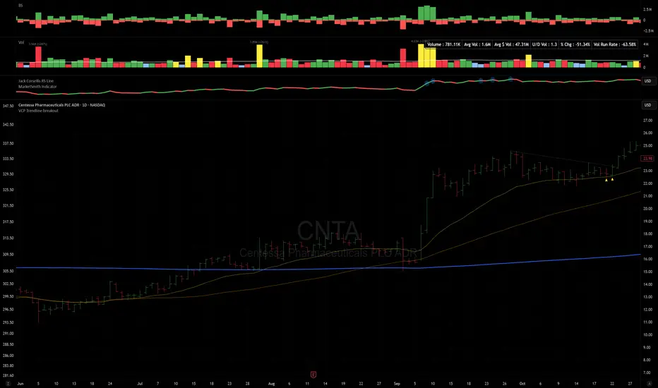
VCP Trendline breakoutThe Signal:
Green Triangles indicate the price is approaching the trendline (Watchlist candidate).
Yellow Triangles indicate the price is very tight against the line (Execution imminent).
The Trigger: When price closes above the Grey Dotted Line, the line stops extending. This is your breakout signal.
Indicator Overview
The The VCP Trendline breakout indicator is a sophisticated technical indicator designed for trend followers and breakout traders (O'Neil, Minervini, Wyckoff styles). This script employs a State Machine logic to identify structural Volatility Contraction Patterns (VCP) in real-time.
It automatically detects valid Bases, tracks the "Right Side" construction, identifies nested handles (contractions), and draws precise supply trendlines—while strictly enforcing structural integrity rules (Higher Lows).
Core Logic & Features
1. Smart Base Detection
Trend Filter: The pattern recognition engine only activates when the price is above the 200 SMA, ensuring you are trading with the primary trend.
Base Validation: It identifies a "Base High" (H1) based on a configurable lookback period. It tracks the depth of the base and automatically invalidates the pattern if the drawdown exceeds the user-defined threshold (default 30%).
2. Recursive Nested Trendlines (VCP)
The indicator is capable of drawing Nested Trendlines (recursive resistance). It doesn't just draw a line from the peak; it identifies internal contractions within the base.
H1 (Primary): The main supply line from the top of the base.
H2, H3 (Internal): Trendlines connecting subsequent lower highs (handles) as volatility contracts.
Smart Fan: Includes a "Clean Fan" mode to show only the most relevant, latest trendline per anchor point.
3. Structural Integrity Enforcement (The "Higher Low" Rule)
This is the standout feature of this script. It performs an Anchor Integrity Check on every bar.
In a valid VCP, every contraction must form a Higher Low.
If the price creates a new pivot (H3) but then crashes lower than the previous contraction's floor (H2), the script identifies this as a Structural Failure.
Auto-Deletion: It immediately retroactively deletes the invalid trendlines associated with that failed contraction, keeping your chart clean and free of "ghost" signals.
4. "Right-Side" Logic
Collision Detection: Trendlines are calculated using "Right-Side Clearance." A line is only drawn if the path from the anchor to the new pivot is unobstructed by price action.
Signal Protection: "Watch" and "Near" signals are suppressed during the decline phase (Left Side). They only appear once the "Bottom" (L1) has been confirmed and price is recovering on the Right Side.
5. Proximity Alerts & Breakouts
Watch Zone (Green Triangle): Appears when the Low of the bar is within 8% (configurable) of a valid trendline.
Near Zone (Yellow Triangle): Appears when the Low of the bar is within 4% (configurable) of a valid trendline.
Breakout Stop: Trendlines are dynamic. The moment a bar closes above a trendline, the line stops extending immediately, marking the exact breakout point.
How to Use This Indicator
The Setup: Look for a stock in an uptrend (Price > 200 SMA).
The Construction: Wait for the script to identify the Base High (H1). As the price corrects and begins to recover, you will see Grey Dotted Lines appear, connecting the highs.
The Contraction: Watch for Nested Trendlines. If you see a second or third line form from a lower high (H2, H3), it indicates a tightening of price action (VCP).
Settings Configuration
Moving Averages
21 EMA, 50 SMA, 200 SMA: Built-in reference averages.
Base Settings
H1 Lookback: How many bars back the script looks to find the "Start" of the base (Default: 21). Increase this for longer-term bases.
Sub-High Pivot Bars: Controls the sensitivity of identifying internal highs (handles).
Max Base Depth: If the base drops more than this % (Default: 30%), the structure is considered failed and lines are removed.
Enable Nested Trendlines: Toggle ON to see internal VCP lines (H2, H3). Toggle OFF to see only the main H1 trendline.
Show Only Latest Line: Keeps the chart clean by removing older lines from the same anchor point.
Visuals & Signals
Near/Watch Zone %: Adjust the sensitivity of the Green/Yellow triangles.
Signal Size: Change the size of the triangle markers.
DISCLAIMER
This is an indicator, not a trading system. Apply good risk management and do your own due diligence before putting your hard earned money into anything.
This script is for educational and analytical purposes only. It does not constitute financial advice. Automated pattern recognition has limitations and should always be verified visually.