EZ TrendThis is a simple and easy to use trend/momentum indicator that is a modification of a thinkorswim script from usethinkscript.com...which was adapted from a script found here on Tradingview.
I've added the option of changing the moving average periods. Play around with it as needed. I haven't used it on it's own for trading signals...but it has potential. It's great for trend confirmation in combination with other strategies.
Enjoy!
Cerca negli script per "trend"
WTT Volume Trend [Morty]WTT Volume Trend by Morty
Inspired by Natural Trading Theory
It is a colored volume indicator based on the strength of single candlestick pattern.
It also paints two weighted volume SMA, which shows the strength and trend of the market.
Version 1.0, Updated at 20210327
Features:
- Colored volume bars (Optional)
- Weighted Bullish volume SMA trend lines according to candlestick pattern
- Weighted Bearish volume SMA trend lines according to candlestick pattern
- Adjustable volume SMA length
- Adjustable weighting factors
- Filling the background between volume SMA trend lines
ALMA Cross & TrendArnaud Legoux Moving Average (ALMA) is one of the least lagging moving average by nature.
This script builds two ALMA line, Fast and Slow, and to check their crossing over to generate Buy / Sell Signals.
The drawback of Moving average crossing strategy is the too many crossing during a range trading, therefore, a third ALMA is used to show the trend of the ticker's price as a reference.
The default value for the Trend ALMA is 70 bars, it is due to the quick response of the Arnaud Legoux MA.
The Trend ALMA is plotted in dotted line for reference only, it does not affect the Buy/Sell signal generate from the crossing of the Fast and Slow ALMA lines.
IBB trendThe same as IBB, let's add another slow line. Physical sense, blue line analogue of acceleration, red line as like a speed. In theory, crossing the lines is a trend change. But if the blue crosses the red, and the red keeps the direction, then we have a movement in several waves in the direction of the red line. When red and blue lines go in the same direction - steady trend.
Indices trendsAccording to the Dow theory, indices must confirm each other. Based on this idea, I develop an indices trends indicator, including SPY, DIA, and QQQ. The indices trends were calculated based on the average of the short- (blue) and intermediate-term (orange) changes of indices moving average slopes. In addition, IWM trends are shown as a reference in gray color.
Use this indicator together with one of SPY, DIA, QQQ, or IWM to show the overall market conditions.

First Week Trend [MX]I created this indicator based on one of my ways of analyzing the BTC trend in particular, I noticed that the break of the first weekly candle usually indicates the trend for the rest of the month.
This indicator has a bug in which if you change the timeframe of the indicator it will show erroneous values
If you use the candlestick chart, you will need to pull the visual order of this indicator to the top to overlay the colors of the standard candles, or simply hide the standard candles
the trend colors are bugged in timeframes other than the weekly
special thanks to @xdecow who helped me with the code
////////////////////////////////////////////////////////////////////////
Eu criei esse indicador baseado em uma das minhas formas de analisar a tendência do BTC em específico, eu notei que o rompimento do primeiro candle do semanal costuma indicar a tendência para o resto do mês.
Esse script tem um bug em que se mudar o timeframe do indicador ele irá mostrar valores errados
Se você usa o gráfico de candlesticks, você precisará puxar para o topo a ordem visual desse indicador para sobrepor as cores do candles padrões, ou simplesmente ocultar os candles padrões
as cores da tendencia estão bugados em outros timeframes diferentes do semanal
agradecimentos especiais ao @xdecow que me ajudou no código

SNAKE TRENDThis is a script I made which uses 6 moving averages to decide how to color the trend. These SMA are configured to run on 4H, 6H, 8H, 12H, 18H and 1D timeframes. The script will check how many of them are bullish or bearish.
I made this script to reference the current market environment while working on the lower time frames. You are free to use it as a filter in any script as long as you mention me in the description of it.
.
.
.
.
.
.
.
.
GREEN:
If many SMAs are bullish, the snake will be completely green. If there is a green glow around it that means that all SMAs are bullish.
RED:
If many SMAs are bearish, the snake will be completely red. If there is a red glow around it that means that all SMAs are bullish.
PURPLE:
Purple will be used to indicate that some SMAs are not in the trend the snake was going.
MID:
The small blue line in the middle of the snake means that the 1day trend is bullish.
The small magenta line in the middle of the snakes means that the 1 days trend is bearish.

Fibonacci EMAs / Trend and Chopzone identifier Implementation from the highly recommended course "Pinescript Indicator Development" on Udemy
www.udemy.com
This indicator is mostly to show some techniques in Pinescript rather than be useful for trading, however it does nicely identify trend and chop zones (sideways) on the 1-hour or 4-hour chart.
What it does:
- Has three EMAs at varying length and plots these on the chart
- Computes when the EMAs are in bullish configuration (EMA short > Medium > long)
- Computes when EMAs are in bearish configuration (EMA short < Medium < long)
- When the EMAs are crossed there is a chop zone (sideways)
- Colours the background of the chart as Green (bullish), Red (bearish) or Orange (sideways chop zone)
- Also predicts the value of the three EMA's three points into the future using linear regression (showed as dots on the chart)

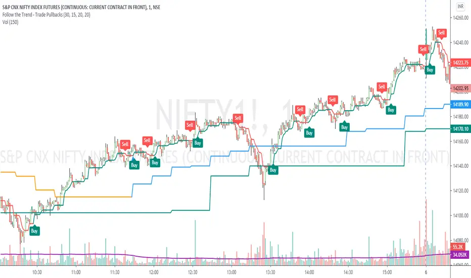
Follow the Trend - Trade PullbacksKindly follow the rules stated below for entry, exit and stop loss. Not every Buy / Sell signal will be profitable.
Timeframe of the chart acts as current timeframe. You need to choose 2 more as middle and higher timeframes.
This indicator is based on candlesticks, ATR and CCI indicators and the logic provides buy / sell signals at the pullbacks of the trend depicted by higher timeframe, that must be respected throughout.
Enter the long / short trade respectively when the indicator gives buy / sell signal after price has gone below the green / above the red line for higher timeframe.
Stop loss shall be low / high of recent swing. Exit when the price closes below / above the middle timeframe, to be used as trailing target.
Use it for any instrument for any timeframe of your choice.
For example, check the shared chart. It is a 1 min intraday, but the indicator can be used for short or long term positional trades as well.
Enter long at 14102, with stop loss 14077. Trailing target is achieved at 14156 giving a Risk:Reward ratio of 1:2.
Another Buy signal is observed around same level and uptrend continues till day end, again for a Risk:Reward ratio of approx. 1:2.
Rules to follow for Long trades -
Enter long position at Buy signal given after price has moved below green line of higher timeframe.
Exit the position when price closes below orange / blue line of middle timeframe.
Stop loss must be at low of recent swing, appearing just before the Buy signal.
Rules to follow for Short trades -
Enter short position at Sell signal given after price has moved above red line of higher timeframe.
Exit the position when price closes above orange / blue line of middle timeframe.
Stop loss must be at high of recent swing, appearing just before the Sell signal.
Optimized Trend Tracker STRATEGY & SCREENEROptimized Trend Tracker - OTT STRATEGY & SCREENER screens the BUY and SELL signals (trend reversals) for 20 user defined different tickers in Tradingview charts.
Simply input the name of the ticker in Tradingview that you want to screen.
Terminology explanation:
Confirmed Reversal: OTT reversal that happened in the last bar and cannot be repainted.
Potential Reversal: OTT reversal that might happen in the current bar but can also not happen depending upon the timeframe closing price.
Downtrend: Tickers that are currently in the sell zone
Uptrend: Tickers that are currently in the buy zone
Screener has also got a built in OTT indicator which users can confirm the reversals on graphs.
Screener explores the 20 tickers in current graph's time frame and also in desired parameters of the OTT indicator.
Also you can optimize the parameters manually with the built in STRATEGY version.
Optimized Trend Tracker indicator :
Built in Moving Average type defaultly set as VAR but users can choose from 8 different Moving Average types like:
SMA : Simple Moving Average
EMA : Exponential Movin Average
WMA : Weighted Moving Average
TMA : Triangular Moving Average
VAR : Variable Index Dynamic Moving Average aka VIDYA
WWMA : Welles Wilder's Moving Average
ZLEMA : Zero Lag Exponential Moving Average
TSF : True Strength Force
Tip: In sideways VAR would be a good choice
You can use OTT default alarms and Buy Sell signals like:
1-
BUY when Prices are above OTT
SELL when Prices are below OTT
2-
BUY when OTT support Line crosses over OTT line.
SELL when OTT support Line crosses under OTT line.
3-
BUY when OTT line is Green and makes higher highs.
SELL when OTT line is Red and makes lower lows.
IMPORTANT: SCREENER ONLY EXPLORES AND SCREENS FOR THE 2nd SIGNAL TYPE:
BUY when OTT support Line crosses over OTT line.
SELL when OTT support Line crosses under OTT line.

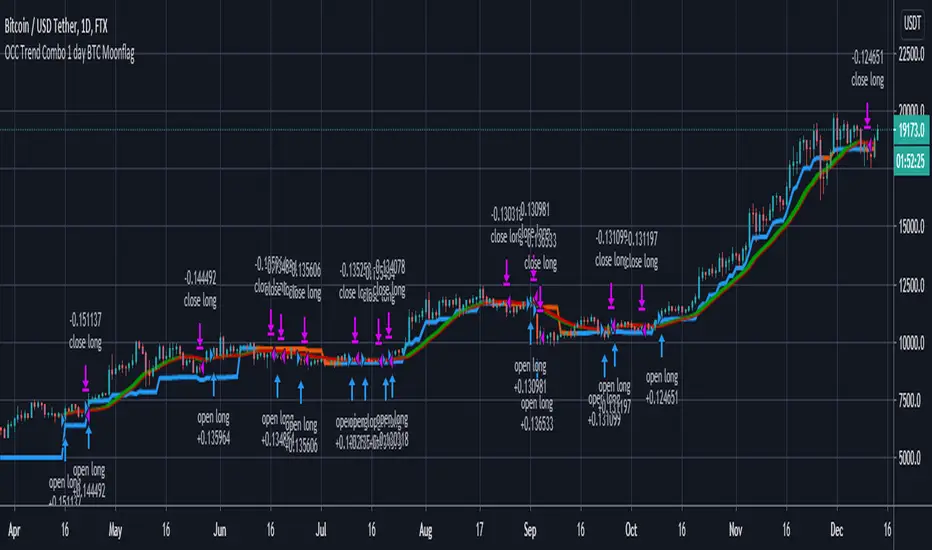
OCC Trend Combo 1 day BTC MoonflagRuns on BTC 1 DAY (NOTE USE THIS NOT THE PREVIOUS VERSION - DEFAULTS TUNED TO 1 day BTC HERE)
USE DEFAULT SETTINGS
The strategy is to maximise the profit for OCC longs (ALMA algo)
Longs start when the price action settles around the ALMA OCC, then typically breaks up
Then follow the trend indcator (blue/orange)
Shorts normally happen when the price action crosses below the ALMA OCC, although these initiate faster than the 1 day time setting - so watchout for shorts - are harder to predict than longs
So this catches most of the big move longs at their initiation
G TREND GUNBOTG TREND indicator follows trends based on higher open or close based on trend direction

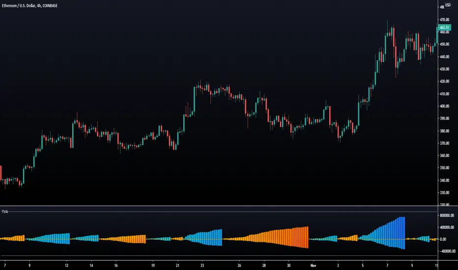
Trend Volume Accumulations [LuxAlgo]Deeply inspired by the Weiss wave indicator, the following indicator aims to return the accumulations of rising and declining volume of a specific trend. Positive waves are constructed using rising volume while negative waves are using declining volume.
The trend is determined by the sign of the rise of a rolling linear regression.
Settings
Length : Period of the indicator.
Src : Source of the indicator.
Linearity : Allows the output of the indicator to look more linear.
Mult : the multiplicative factor of both the upper and lower levels
Gradient : Use a gradient as color for the waves, true by default.
Usages
The trend volume accumulations (TVA) indicator allows determining the current price trend while taking into account volume, with blue colors representing an uptrend and red colors representing a downtrend.
The first motivation behind this indicator was to see if movements mostly made of declining volume were different from ones made of rising volume.
Waves of low amplitude represent movements with low trading activity.
Using higher values of Linearity allows giving less importance to individual volumes values, thus returning more linear waves as a result.
The indicator includes two levels, the upper one is derived from the cumulative mean of the waves based on rising volume, while the lower one is based on the cumulative mean of the waves based on declining volume, when a wave reaches a level we can expect the current trend to reverse. You can use different values of mult to control the distance from 0 of each level.
Trend Finder V2A variation of a previous indicator i made using two stochastics and a volume weighted moving average to look for trend, 10% equity used per trade at 0.1% commission
The close can be used more of a stop loss if volatility is used to take profit
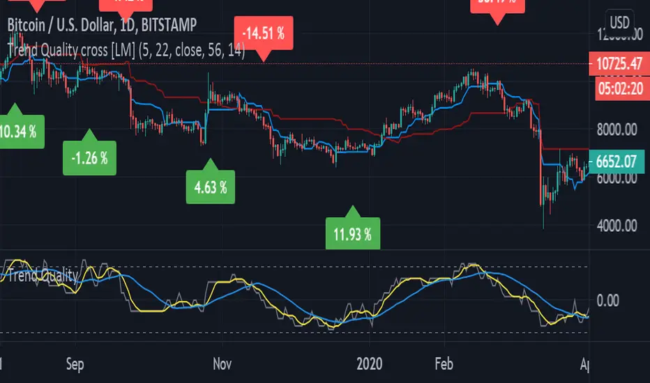
Trend Quality cross [LM]Hi Guys,
I would like to introduce you Trend quality cross indicator. The idea orginallybcomes from @kruskakli and his indicator "Trend Quality" so shout-out to him
I have modified the indicator to display just binary option buy/sell and display diff percentage from previous cross. Also there is a difference that I have double smoothed tq indicator results to give less false signals.
and also added for the same reason like in my other indicator vpci ma cross base line and conversion line from ichimoku.
Any suggestions are welcomed
Heikin Ashi Trend IndicatorMy own implantation of Heikin Ashi which i call HAT.
The Heikin Ashi Trend Indicator (HAT) used to determine the price direction of an asset, as well as draw attention to when the price direction is changing.
The HAT indicator translates the current close/open/high/low into Heikin Ashi and smooths them a bit using Tilson T3 formula.
Buy signal when Heikin Ashi Close is bigger than Heikin Ashi Open with Tilson T3 smoothing.
Sell signal when Heikin Ashi Open is bigger than Heikin Ashi Close with Tilson T3 smoothing.
Set the 'percentSqueeze' percentage to display possible reversal with light Red/Green crosses.
Green - Up Trend
Light Green - Possible reversal is near
Red - Down Trend
Light Red - Possible reversal is near
Follow for more indicators: www.tradingview.com

TMSignal Trend Channel V1.0TMSignal Trend Channel V1.0: Automatically calculates bullish , bearish or lateral channels. %Pearson's R is added for better trend analysis.
Deviations can be configured and adjusted for greater precision in the marked channels.
We hope you like it! Contact us any question or improvement suggestions.

Momentum Adjusted EMA TrendThe script draws a moving average which responds to trend changes extraordinary fast!
It's calculated using Momentum, Acceleration and Probability (Psychological Effect) by interfering the Golden Ratio!
I got the idea thanks to Tradingview user DGT (dgtrd) and his/her excellent descriptions.
The indicator is simplified for users and the default settings work great, so use it as you like specially as a trend indicator.

[ProfitTrailer:Feeder] Market Trends Top X / BTCThis script will help you determine your MarketConditions Grouping for PtFeeder. You're able to input the specific top 10/20/xx pairs you want to use to fine-tune your groupings as well as specific BasePairs, there values will be automatically printed on the chart!
When measuring top coins trend, this is how many top coins to check by volume from the exchanges that you have configured PT Feeder for. For, the top 50 coins will be checked and their price change over the MeasureTimes property and the average change calculated. This average is used for the MaxTopCoinAverageChange property
If you like this kind of content, please 'like' and 'follow' and I'll continue publishing these kind of scripts!
Enjoy!

Fibonacci and Pivot Point ,vwap and Average to Determine Trend Script has Current day Pivot Point with Central Pivot Range,vwap and Average to Determine Trend , and a day Back Projection of Fibonacci.
Its Very easy to see the Support and Resistance and even can set your Target based on that ..
i will clean it more after that and Update same ..
Thank You
If any one has any Modification to do its Code is open to Use.

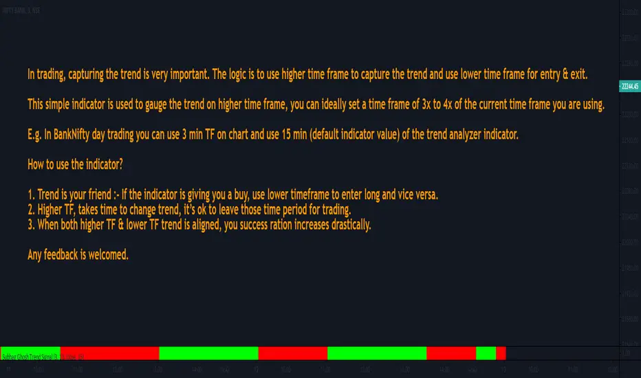
Subhag Ghosh Trend SignalIn trading, capturing the trend is very important. The logic is to use higher time frame to capture the trend and use lower time frame for entry & exit.
This simple indicator is used to gauge the trend on higher time frame, you can ideally set a time frame of 3x to 4x of the current time frame you are using.
E.g. In BankNifty day trading you can use 3 min TF on chart and use 15 min (default indicator value) of the trend analyzer indicator.
How to use the indicator?
1. Trend is your friend :- If the indicator is giving you a buy, use lower timeframe to enter long and vice versa.
2. Higher TF, takes time to change trend, it’s ok to leave those time period for trading.
3. When both higher TF & lower TF trend is aligned, you success ration increases drastically.
Any feedback is welcomed.
[A618] Trend Tracker using Chandelier StopTrend Tacker
Works on ATR concepts and uses "Chandelier Stop by pipCharlie" as its main engine
How it is calculated
> 2 ATR stop plots are plotted
> #one ATR stop is of current time frame
> other one is the 5 times multiple of the current timeframe
> Their crossovers are analysed with the close of Current Timeframe
> This sort of methodology can help one with generating consistent entry signals over a particular timeframe
> My timeframe of choice is : 5 mins
> I have used resolution of 25, for 5 mins (see 5*5 =25)
Credits:
Chandelier Stop by pipCharlie
Hope this helps!!!

Combo Backtest 123 Reversal & Extracting The Trend This is combo strategies for get a cumulative signal.
First strategy
This System was created from the Book "How I Tripled My Money In The
Futures Market" by Ulf Jensen, Page 183. This is reverse type of strategies.
The strategy buys at market, if close price is higher than the previous close
during 2 days and the meaning of 9-days Stochastic Slow Oscillator is lower than 50.
The strategy sells at market, if close price is lower than the previous close price
during 2 days and the meaning of 9-days Stochastic Fast Oscillator is higher than 50.
Second strategy
Extracting The Trend
The related article is copyrighted material from Stocks & Commodities Mar 2010
WARNING:
- For purpose educate only
- This script to change bars colors.
