Cumulative High Low IndexThis indicator tells how many days it is making new HighLowPeriod highs or lows in Lookback period.
If bar makes new HighLowPeriod high, HighLow index for that bar is +1
If bar makes new HighLowPeriod low, HighLow index for that bar is -1
Cumulative high low index is sum of HighLow index for Lookback periods.
Optional moving average can also be applied on this index
Cerca negli script per "trend"

Trendanalysis with Monthly/Weekly/Daily Opens and TrendindicatorThis script is based on price action Trendanalysis.
It has 7 indicators.
Also Monthly/Weekly/Daily Opens for better visuals.
Trend Bandsmovig averages of 4 bands to calculate roughly if if prices are moving up or down in a given time frame, though it is a lagging indicator
KJ MagicTrend Magic consists of two main calculation parts as momentum and volatility:
First part is ATR based (like ATR Trailing Stop) logic, second part is all about CCI which also determines the color of Trend Magic.
Blue: when CCI is positive
Red: when CCI is negative
Also added alert condition regarding price crosses :
when LOW CrossesAbove TM
and HIGH CrossesBelow TM
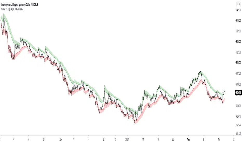
hlma_v2.0trend indicator, based on new high's and low's mixed with sma high's and low's.
green area is strong bullish trend, red area is strong bearish trend, middle area is range of uncertainty/accumulation/distribution.
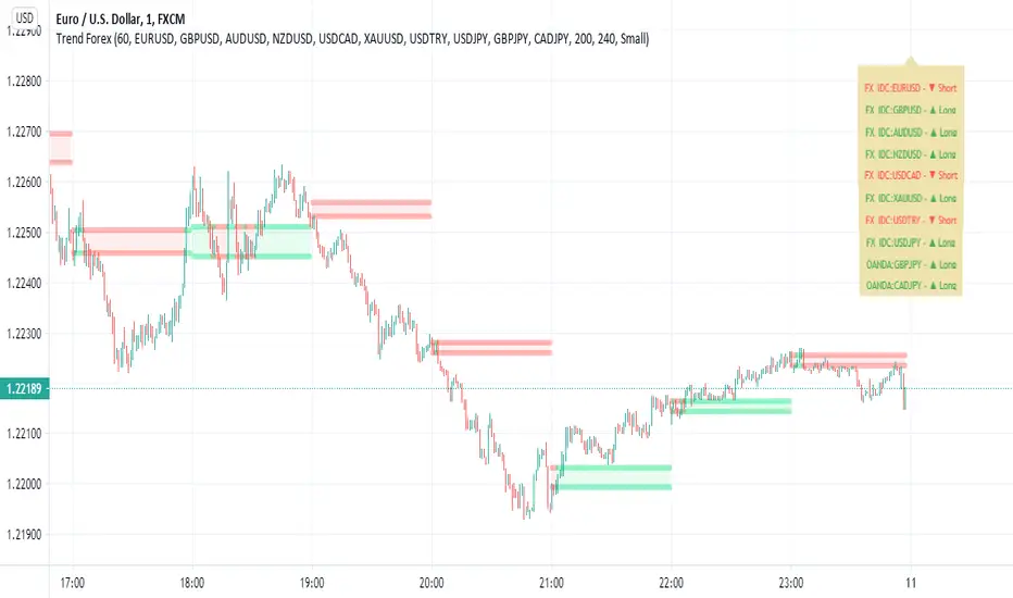
Trend Forexby request of a friend I just made this fast
using screen script taken from
this is a helper for those who play forex
it set on 1 hour non repainting candles MTF
we use it on 1-5 min chart.
you can play with the MTF to be 30 min or lower /higher etc
control of xcreen is by F for height (set to 240 min) you can change to other
its just for fast screening of things you like to see faster/ i suggest to attach to it other indicator if you plan to use it to make decision better
30 min mtf candles on 1 min chart

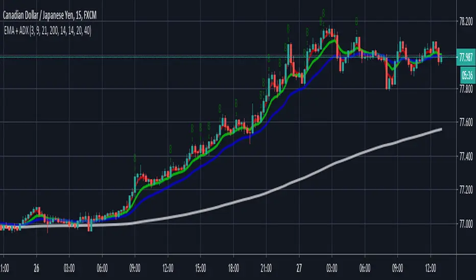
EMA + ADXTrend trading system that uses price and combined with EMA's + ADX above 20 to determine trend
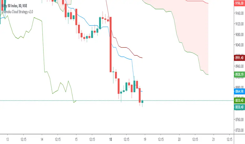
Ichimoku Cloud Strategy v2.0Trend following trading strategy “Ichimoku Crossover” is a popular Ichimoku trading strategy that uses the cloud and crossover of two base lines to define the market reverse point. Ichimoku crossover trading strategy has appeared to be a profitable trading strategy.
The indicator has 5 base lines and to read Ichimoku indicator it is required to understand the meaning of these lines first of all:
Tenkan-Sen line, also called the Conversion Line, represents the midpoint of the last 9 candlesticks . It is calculated with the following Ichimoku formula: .
Kijun-Sen line, also called the Base Line, represents the midpoint of the last 26 candlesticks . It is calculated with the following formula: .
Chiou Span, also called the Lagging Span, lags behind the price (as the name suggests). The Lagging Span is plotted 26 periods back.
Senkou Span A, also called the Leading Span A, represents one of the two Cloud boundaries and it’s the midpoint between the Conversion Line and the Base Line: . This value is plotted 26 periods into the future and it’s the faster Cloud boundary.
Senkou Span B, or the Leading Span B, represents the second Cloud boundaries and it’s the midpoint of the last 52 price bars: . This value is plotted 52 periods into the future and it is the slower Cloud boundary.
Trading with Ichimoku is very simple.
The Conversion Line needs to break above the Base Line. This will be a buy signal.
For a bearish (sell) signal a trader should wait for the Conversion line crosses the Base line downwards it is a sell signal.

Trend TrackerWorks best on the Daily Something Iv'e been playing around with for a while seems to work real well on High Beta Names


Trend MuhsinErtugrul@MuhsinErtugrul_ tarafından twitterda paylaşılan kodun tradingview versiyonudur.

Noro's ZigTrend Strategy v1.0Trend reverse trade strategy. The indicator a zigzag is used.
If the candle is closed above than the line of a zigzag - to open a long position.
If the candle is closed below than the line of a zigzag - to open a short position.
