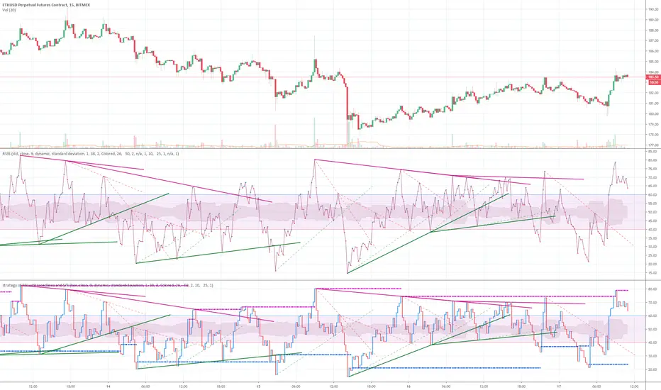
strategy of RSI with trendlines and S/RBefore I go through this chart I want to acknowledge the great programmers who spent much of their time and effort to assist many TV users and traders.
Thank you to LunaOwl for the RSI American lines her script made me realize the need to have trendlines, supports, and resistance on RSI charts.
Also, a copy of Lij_MC code from was taken which had been credited to Duyck. Thank you Duyck.
The BB was copied from morpheus747
As I researched different strategies one strategy seemed to assist the trader for entry and exits. It was the combination of Support and resistance on the RSI. In addition, diagonal lines (Recently introduced in pine script V4) assists in the direction and reversals that may occur. What is supplied is only a graphical representation and no trade entry or exit points are selected.
On the chart you can use;
• RSI line or bar;
• Bollinger High / Low support line;
• Diagonal trend lines. A primary and a secondary group of trendlines; and
• Trendline candle highlighter.
I am hoping people with great skills could assist to develop this to the next level.
I hope this graphical strategy may help until further development. Enjoy.
Cerca negli script per "trendline"
Mitsos4 RSI + BB + Dispersion + Trendlines + VIX Fix Mitsos4 RSI + BB + Dispersion + Trendlines + VIX Fix
This powerful custom indicator combines two analytical tools into one view:
RSI-based Bollinger Bands with Dispersion and the Vix Fix volatility spike detector.
It is designed for traders who want early volatility signals and precision RSI insights, all in a single pane.
🧩 What's Included:
✅ 1. RSI + BB (EMA) + Dispersion
RSI-Based Bollinger Bands: Tracks the RSI with Bollinger Bands using an EMA as the basis.
Dispersion Zone: A buffer zone around the moving average band for more sensitive overbought/oversold detection.
Dynamic RSI Coloring:
🟢 Green: RSI breaks above the dispersion zone.
🔴 Red: RSI breaks below the dispersion zone.
🟡 Yellow: RSI inside the zone (neutral).
Trendlines at RSI levels: 40 (green), 50 (yellow), 60 (red).
Alerts when RSI crosses dispersion zones.
✅ 2. CM_Williams_Vix_Fix
Designed to simulate VIX-like volatility spikes on non-VIX instruments.
Detects potential market bottoms by measuring price deviation from recent highs.
Includes:
Bollinger Band range on WVF.
Percentile high/low zones to detect significant volatility moves.
Histogram plot of WVF for quick visual alerts.
Color-coded spikes (green when above upper thresholds).
⚙️ User Controls:
Adjustable RSI, Bollinger Band, and dispersion settings.
Toggle options for:
Viewing high/low VIX percentiles.
Showing standard deviation bands for WVF.
Custom trendline display levels at RSI key areas.
📌 Best Use Cases:
Detect early market reversals and volatility spikes.
Combine RSI strength with volatility-based bottom signals.
Layer dispersion-based logic on top of classic RSI strategies.

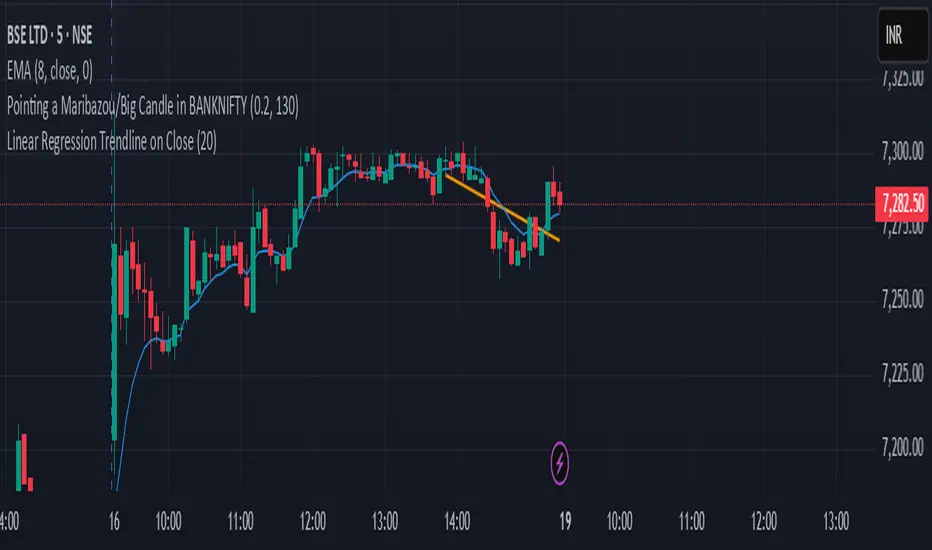
Linear Regression Trendline on Close
This indicator draws a linear regression trendline that connects the closing prices of the last N candles, where N is a user-defined input.
🔹 Key Features:
Uses least-squares linear regression to fit a straight line to recent closes
Automatically adapts to any timeframe (5min, 1h, daily, etc.)
Input lets you select how many recent candles to include
Helps identify short-term trend direction and momentum
🔸 How to Use:
Set the "Number of Candles" input to choose how far back the regression line should look
The line updates in real time as new candles form
Use it to gauge short-term bias, or combine with support/resistance/zones for confirmation
🧠 Tip: Increase the number of candles for smoother trends; decrease for more reactive trendlines.
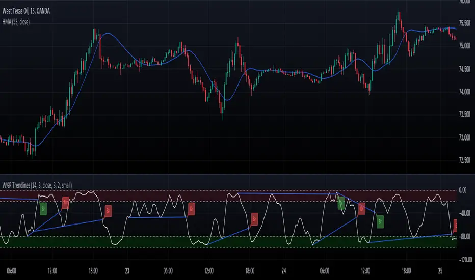
Williams Percent Range with Trendlines and BreakoutsHere is my "Williams Percent Range with Trendlines and Breakouts" indicator, a simple yet powerful tool for traders. This indicator combines the classic Williams %R oscillator, which helps identify overbought and oversold levels, with added trendlines for easier trend analysis at a glance.
It's designed to make spotting potential breakouts easier by drawing attention to significant price movements. With customizable settings for the Williams %R period and trendline sensitivity, it's a flexible tool for various symbols and trading styles.
Whether you're looking to refine your trading strategy or just need a clearer view of market trends, this indicator should offer a straight forward approach to hopefully enhance your trading decisions.
Disclaimer: This indicator is intended for educational and informational purposes only. Always conduct your own research and analysis before making trading decisions.
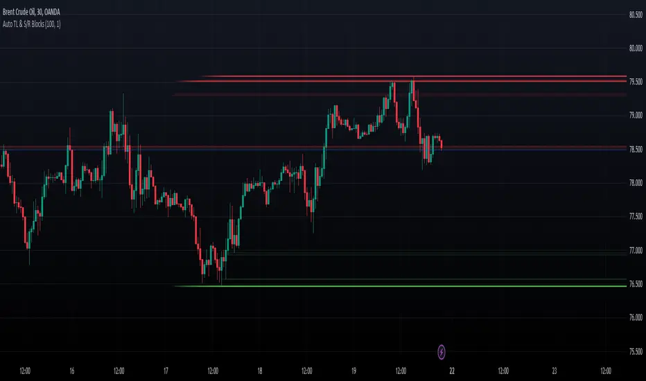
Dynamic Auto Trendline and S/R BlocksAuto TL & S/R Blocks by Nostalgic_92
This powerful TradingView indicator automatically identifies trendlines and support/resistance levels with dynamic transparency blocks, helping traders make informed decisions. Easily customizable, it offers adjustable parameters for lookback periods and transparency, allowing you to adapt it to your trading style.
Key Features:
Lookback Period for Extremes: The lookback period for identifying highs and lows is adjustable, allowing you to fine-tune the indicator to suit your trading strategy.
Maximum Transparency: Set the maximum transparency level to control the visibility of dynamic blocks, ensuring they adapt to market volatility.
Trend Block Color: Choose your preferred color for trendline blocks to visually highlight trend direction.
Support/Resistance Block Color: Customize the color for support and resistance blocks, making them easily distinguishable on your chart.
How it Works:
This indicator calculates the highest high and lowest low over the specified lookback period. It then draws dynamic blocks on your chart with changing transparency levels, depending on the proximity of the current price to these extremes. This visual representation helps you identify trend changes and key support/resistance levels at a glance.
Usage:
Use it in conjunction with your existing trading strategy to confirm trends and support/resistance levels.
Adjust the input parameters to match your preferred trading style and time frame.
Enhance your trading experience with the Auto Trendlines and Support/Resistance with Dynamic Blocks indicator. It's a valuable tool for traders seeking an edge in the market.
Disclaimer: This indicator is intended for educational and informational purposes only. Always conduct your own research and analysis before making trading decisions.
Linear Average PriceWhat is "Linear Average Price"?
"Linear Average Price" is both a trend and an overbought oversold indicator .
What it does?
it creates a trendline and trading zones.
How it does it?
To create the trend line, it averages the difference between each data and chooses it as the slope of the line it creates. then it positions this line so that it passes right through the middle of the data at hand. It uses standard deviation to create trading zones.
How to use it?
It can be used both to have an idea about the trend direction and to determine buy-sell zones. You can choose how many candles the indicator will calculate from the "lenght" section. The "range" part is the coefficient of the standard deviation and can be used to expand or collapse zones.

Fibonacci + Support/Resistant + Trendline (Price action)This is opening source code version: Fibonacci + Support/Resistant + Trendline (One of Advanced Price action Analysis).
How it works:
It find entry Long/Short by combining: Fibonacci + Support/Resistant + Trendline
1. Find Impulse wave:
To findind Impulse wave, It uses Pivot High/Low to find Impulse wave. In case find entry Long, If having Pivot High higher Pivot High before, it will draw an Impulse wave.
2. Find entry at Fibonacci levels:
Draw Fibonacci fibonacci retracement from Pivot Low to Pivot High. A Fibonacci retracement forecast is created by taking two extreme points on a chart and dividing the vertical distance by important Fibonacci ratios. 0% is considered to be the start of the retracement, while 100% is a complete reversal to the original price before the move. Horizontal lines are drawn in the chart for these price levels to provide support and resistance levels. Common levels are 23.6%, 38.2%, 50%, and 61.8%
3. Find entry at Support/Resistant Zone:
Support/Resistant Zone drawed from Pivot High before, which price just breaken and return to retest.
4. Find entry at Trendline:
Trendline drawed from Pivot High/Low before, which price just breaken and return to retest.
How do use it:
+ You can customize the thickness of the lines.
+ You can set up an alert when the price touchs important areas.

Pivot TrendLineThe simplest version of the indicator automatically draws trendLine on your charts, with build-in functions only.
You can change the looking back length settings to get more proper lines you want.
There is also a switch to turn off the historical trendlines.
You can use this to build more advanced indicators or strategies.
ATR Based Trendlines - JDThis script draws trendlines from the pivot points in the price chart.
The angle of the trendlines is determined by (a percentage of) the atr.
The angle follows the change in price, dictated by the atr at the moment where the pivot point is detected.
The atr percentage determines if the trendline follows the rate of change of the atr or a fraction ( value < 100) or a multiple ( value > 100) of that
JD.
#NotTradingAdvice #DYOR
Disclaimer.
I AM NOT A FINANCIAL ADVISOR.
THESE IDEAS ARE NOT ADVICE AND ARE FOR EDUCATION PURPOSES ONLY.
ALWAYS DO YOUR OWN RESEARCH!

SilverHawk Trendline BreakoutsSilverHawk Trendline Breakouts
This indicator automatically draws trendlines from recent pivot highs and lows, projecting them forward to identify potential breakouts.
Features:
• Dynamic trendline zones based on pivot points (wicks or body option)
• Breakout signals when price crosses the projected line
• Volatility-adjusted target (TP) lines
• Built-in alerts for bullish/bearish breakouts, TP hits, and SL hits
Settings:
• Period: lookback length for pivot detection (default 10)
• Type: Wicks or Body for pivot calculation
• Extend: projection length in bars (25, 50, or 75)
• Show Targets: toggle TP lines on/off
Best suited for H1 to H4 timeframes on Forex pairs or indices for trend continuation setups. Use with proper risk management and confirmation.
Educational tool only. Not financial advice. Trading involves risk.

20SMA Reversal - Peak/Trough TrendlinesTitle: 20SMA Reversal with Peak/Trough Trendlines
Description (English): This indicator detects pivot points where the 20-period SMA reverses direction (forming a V-shape or an Arch-shape). Upon detection, it automatically identifies the local peak/trough from a lookback period and connects them with an extended trendline if they show a "Lower High" or "Higher Low" pattern. Useful for identifying trend structural changes and potential breakout levels.
概要(日本語): このインジケーターは、20期間SMAが反転(V字回復や山なり反転)するポイントを検出します。反転確定時に、指定した遡り期間内の高値・安値を自動的に特定し、それらが「高値切り下がり」または「安値切り上がり」の条件を満たす場合に、右側に延長されたトレンドラインを描画します。トレンドの構造変化やブレイクアウトの目安として活用いただけます。

Trend lines & Pressure Zone Overview
This indicator intelligently identifies and plots dynamic support and resistance zones based on swing pivots and price action validation. It combines trend analysis with pressure zone detection to highlight key areas where price is likely to react.
Key Features
1.Smart Zone Detection
Automatically identifies the strongest resistance and support levels
Requires multiple price touches for validation (configurable)
Plots only the 2 most relevant trendlines to keep charts clean
Dynamic channel zones show the area of influence around each trendline
2.Dual Analysis Method
Uses swing pivot detection to find turning points
Validates zones through touch counting with price margin tolerance
Combines aspects of trendline analysis and pressure zone theory
Adapts to different timeframes and instruments
3.Contact Detection & Alerts
Visual circle markers when price contacts zones
Arrow indicators for zone interactions
Alert conditions for zone creation, breaks, and contacts
Customizable visual feedback
4.Flexible Configuration
Adjustable swing length for pivot detection
Configurable price margin tolerance
Minimum touch requirements prevent false signals
Optional line extension with custom length
Peak reset interval to refresh zones periodically
How It Works
Resistance Zones:
Identifies swing high pivots
Tracks the highest peak within the reset interval
When price drops below the peak, draws a downward trendline
Validates the zone by counting touches within the price margin
Only displays the zone after minimum touches are confirmed
Support Zones:
Identifies swing low pivots
Tracks the lowest trough within the reset interval
When price rises above the trough, draws an upward trendline
Validates the zone by counting touches within the price margin
Only displays the zone after minimum touches are confirmed
Zone Channels:
Each trendline includes a parallel channel showing the pressure zone width, making it easier to identify when price is interacting with the zone.
Pivot Detection:
Swing Length (default: 5) - Bars on each side to confirm pivot points
Peak Reset Interval (default: 100) - Bars before resetting tracked peak/trough
Zone Settings:
Price Margin % (default: 0.1%) - Tolerance for touch validation
Minimum Touches (default: 3) - Required touches before drawing zone
Channel Width % (default: 0.5%) - Visual width of pressure zone
Extension:
Extend Lines (default: off) - Project lines into the future
Extension Length (default: 50) - Bars to extend when enabled
Visual Styling:
Separate color/width controls for resistance and support
Customizable fill transparency for channels, Toggle contact arrows and circles
Trading Applications
Entry Signals:
Buy when price contacts support zone with confirmation
Sell when price contacts resistance zone with confirmation, Look for zone breaks as momentum signals
Stop Loss Placement:
Place stops beyond the opposite zone, Use channel width to gauge volatility
Target Setting:
Opposite zone acts as first profit target, Zone breaks signal potential trend continuation
Confluence:
Works well with volume analysis,Combine with RSI/MACD for confirmation,
Use multiple timeframes for stronger signals
Best Practices
✅ DO:
Adjust swing length based on timeframe (lower for intraday, higher for daily+)
Reduce minimum touches (2-3) for volatile markets
Increase price margin for choppy conditions
Wait for candle close confirmation on zone breaks
❌ DON'T:
Trade zones in isolation without other confirmation
Use overly tight parameters that generate false signals
Ignore the broader trend context
Chase price after zone breaks without pullback
Tips for Optimization
Scalping (1-5 min): Swing Length: 3-5, Min Touches: 2
Day Trading (15-60 min): Swing Length: 5-10, Min Touches: 3
Swing Trading (4H-Daily): Swing Length: 10-20, Min Touches: 3-4
Position Trading (Daily-Weekly): Swing Length: 15-25, Min Touches: 4-5
Alert Conditions
Zone Contact: Price touches resistance or support zone
Set up notifications for real-time trading opportunities
Disclaimer: This indicator is for educational and informational purposes only. It should not be considered financial advice. Always perform your own analysis and risk management before trading.

FluxVector Liquidity Universal Trendline FluxVector Liquidity Trendline FFTL
Summary in one paragraph
FFTL is a single adaptive trendline for stocks ETFs FX crypto and indices on one minute to daily. It fires only when price action pressure and volatility curvature align. It is original because it fuses a directional liquidity pulse from candle geometry and normalized volume with realized volatility curvature and an impact efficiency term to modulate a Kalman like state without ATR VWAP or moving averages. Add it to a clean chart and use the colored line plus alerts. Shapes can move while a bar is open and settle on close. For conservative alerts select on bar close.
Scope and intent
• Markets. Major FX pairs index futures large cap equities liquid crypto top ETFs
• Timeframes. One minute to daily
• Default demo used in the publication. SPY on 30min
• Purpose. Reduce false flips and chop by gating the line reaction to noise and by using a one bar projection
• Limits. This is a strategy. Orders are simulated on standard candles only
Originality and usefulness
• Unique fusion. Directional Liquidity Pulse plus Volatility Curvature plus Impact Efficiency drives an adaptive gain for a one dimensional state
• Failure mode addressed. One or two shock candles that break ordinary trendlines and saw chop in flat regimes
• Testability. All windows and gains are inputs
• Portable yardstick. Returns use natural log units and range is bar high minus low
• Protected scripts. Not used. Method disclosed plainly here
Method overview in plain language
Base measures
• Return basis. Natural log of close over prior close. Average absolute return over a window is a unit of motion
Components
• Directional Liquidity Pulse DLP. Measures signed participation from body and wick imbalance scaled by normalized volume and variance stabilized
• Volatility Curvature. Second difference of realized volatility from returns highlights expansion or compression
• Impact Efficiency. Price change per unit range and volume boosts gain during efficient moves
• Energy score. Z scores of the above form a single energy that controls the state gain
• One bar projection. Current slope extended by one bar for anticipatory checks
Fusion rule
Weighted sum inside the energy score then logistic mapping to a gain between k min and k max. The state updates toward price plus a small flow push.
Signal rule
• Long suggestion and order when close is below trend and the one bar projection is above the trend
• Short suggestion and flip when close is above trend and the one bar projection is below the trend
• WAIT is implicit when neither condition holds
• In position states end on the opposite condition
What you will see on the chart
• Colored trendline teal for rising red for falling gray for flat
• Optional projection line one bar ahead
• Optional background can be enabled in code
• Alerts on price cross and on slope flips
Inputs with guidance
Setup
• Price source. Close by default
Logic
• Flow window. Typical range 20 to 80. Higher smooths the pulse and reduces flips
• Vol window. Typical range 30 to 120. Higher calms curvature
• Energy window. Typical range 20 to 80. Higher slows regime changes
• Min gain and Max gain. Raise max to react faster. Raise min to keep momentum in chop
UI
• Show 1 bar projection. Colors for up down flat
Properties visible in this publication
• Initial capital 25000
• Base currency USD
• Commission percent 0.03
• Slippage 5
• Default order size method percent of equity value 3%
• Pyramiding 0
• Process orders on close off
• Calc on every tick off
• Recalculate after order is filled off
Realism and responsible publication
• No performance claims
• Intrabar reminder. Shapes can move while a bar forms and settle on close
• Strategy uses standard candles only
Honest limitations and failure modes
• Sudden gaps and thin liquidity can still produce fast flips
• Very quiet regimes reduce contrast. Use larger windows and lower max gain
• Session time uses the exchange time of the chart if you enable any windows later
• Past results never guarantee future outcomes
Open source reuse and credits
• None

Instantaneous Trendline with Cloud Instantaneous Trendline with Cloud
Introduction & History
The Instantaneous Trendline was introduced by John Ehlers, a well-known figure in the field of technical analysis, particularly for applying digital signal processing concepts to financial markets. Ehlers aimed to create an indicator that reacts to market price changes more quickly than traditional moving averages, yet remains smooth enough to avoid excessive noise. By incorporating concepts from digital filtering, he devised a formula that calculates a trendline with minimal lag—hence the term “instantaneous.”
Purpose
The primary purpose of the Instantaneous Trendline with Cloud is to provide traders and analysts with a responsive, smoothed line that closely follows market price movements. Additionally, this script enhances the visual cues by adding a cloud fill to highlight bullish and bearish zones:
Trend Identification
The ITL (Instantaneous Trendline) is plotted alongside the price. When price consistently stays above the ITL, it may signal an uptrend. Conversely, when price dips below the ITL, it can suggest a downtrend.
Signal Generation
Crossover points between the price and the ITL can serve as potential entry or exit signals. A bullish crossover (price moving above the ITL) often indicates the start of upward momentum, while a bearish crossover (price dropping below the ITL) may point to downward momentum.
Noise Reduction
By applying digital filtering concepts and smoothing through the alpha (smoothing coefficient), the ITL reduces noise while still responding relatively quickly to price changes. Traders can adjust alpha to make the trendline more reactive (higher alpha) or smoother (lower alpha).
Clarity via Cloud Fill
A color-coded cloud between the price and the ITL provides an at-a-glance view of market bias. The green cloud highlights potentially bullish phases, while the red cloud highlights potentially bearish phases.
Experiment with the alpha value (commonly between 0.2 and 0.3) to find a balance that suits your preference for responsiveness versus smoothness.
This indicator implements John Ehlers’ Instantaneous Trendline concept and plots a smoothed trendline (ITL) alongside the price. The trendline is controlled by a user-defined smoothing coefficient (alpha). A higher alpha makes the trendline respond more quickly to price changes, while a lower alpha produces a smoother line.
A color-filled cloud helps traders identify bullish and bearish conditions:
Green cloud if the price is above the ITL (bullish potential).
Red cloud if the price is below the ITL (bearish potential).
Key Benefits
Trend Visualization: Quickly see if the market is in an uptrend or downtrend based on the position of the price relative to the trendline.
Crossover Signals: Identify potential shifts in trend or momentum when the price crosses the ITL.
Customizable Sensitivity: Adjust the alpha parameter to make the ITL more or less reactive to price moves. Use this tool to better visualize short-term trend changes and potential entry/exit signals in conjunction with other technical analysis methods.

Time Anchored Intraday High/Low TrendlineOftentimes, intraday trendlines that are started at specific times, e.g. 8:00am or market open 9:30am, are well respected throughout the trading day.
This indicator draws up tp 3 intraday trendlines that are anchored at user defined times, respectively at the corresponding candle's high and low points.
From there, the line*s xy2 are connected in a way that all following candles are enclosed.
Cnagda Trading ToolCnagda Trading Tools - complete set of intraday trading
1. Trendline breakout based On ATR.
2. Live RSI, volume/candle average 20 Periods, trend direction last 34 periods, and some useful dashboard features.
3. Ma Scalp Line provide trend support and resistance + Where Line More Flat Previous Time You Also Use That Range As Support And Resistance
4. RSI based POC ( Point Of Control) indicate high Volume Area like fixed Range Volume profile
5. London session breakout with buy/sell Signal and NewYork session opening half hour range breakout with Buy/sell signal
Ma Scalp Buy And Sell Signal For Short term Scalping ( 5 Min Timeframe) Based on Ema And Wma Crossover
I hope these tools will improve your trading, but you should trade only after proper research, this indicator is not responsible for any loss.

Pivot TrendLine with typeIntro
The simplest version of the indicator automatically draws trendLine on your charts, with newest Type syntax.
Type is some thing like type or interface in typescript or Structure in Clang.
with type key word you can write more clear code in pinescript.
Usage
You can change the looking back length settings to get more proper lines you want.
There is also a switch to turn off the historical trendlines .
You can use this to build more advanced indicators or strategies.
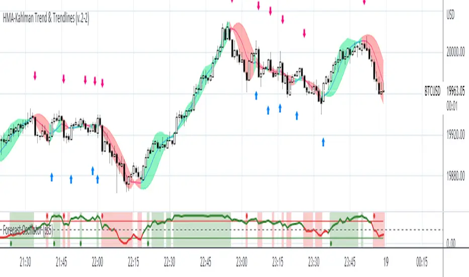
HMA-Kahlman Trend & Trendlines (v.2)This is an upgrade to the HMA-Kahlman Trend & Trendlines script ().
This version gives more flexibility because you can play around with 2 parameters to Kalman function (Sharpness and K (aka. step size)).
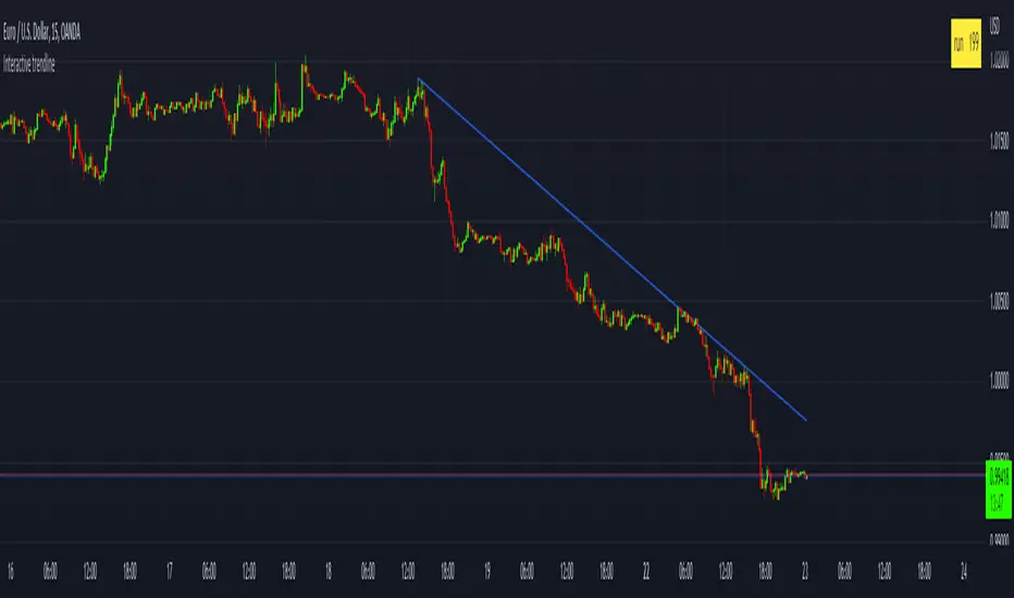
Interactive trendlineThis is a concept that I have been playing with
to make a manual trend line that has more then just two connecting dots
but that has sequential data connected on every bar between the
beginning an the end point that can then be used to determine a break of trend or
a bounce.
This is added in a few simple steps
1) add the indicator to your chart
2) set the x_1 time bar
3) set the y_1 price
4) set the x_2 time bar
5) set the y_2 price
6) check the table that calculated the run value and enter that value in the settings box in the "Run" input box
[_ParkF]Linreg & Trendlines* The script has been uploaded again.
Linear regression and trendline not only facilitate trend identification,
but also identify support and resistance within it,
and linear regression and trendline departure can detect trend changes, which are useful in trading.
Linear regression and trend lines are shown in the chart.
It offers a variety of options, length, color, thickness, on/off switch, etc.
I hope it will help you with your trading.
hope you become rich!
---------------------------------------------------------------------------------------------------------------------------
* 스크립트가 다시 업로드 되었습니다.
선형 회귀(채널) 및 추세선은 추세 식별을 용이하게 할 뿐만 아니라,
또한 그 안에서 지지와 저항을 식별하고,
선형 회귀(채널) 및 추세선 이탈은 거래에 유용한 추세 변화를 감지할 수 있습니다.
선형 회귀(채널) 및 추세선이 차트에 표시됩니다.
길이, 색상, 두께, 온/오프 스위치 등 다양한 옵션을 제공합니다.
거래에 도움이 되셨으면 합니다.
부자되세요!
---------------------------------------------------------------------------------------------------------------------------
* I would like to express my gratitude to zdmre for revealing the linear regression source.

ALMA TrendlineThis is a simple indicator to make ALMA Trendline to be used as STOP LOSS guidance in trending market. The trendline will change color from GREEN to RED and vice versa once price crossing down or crossing up the trendline.

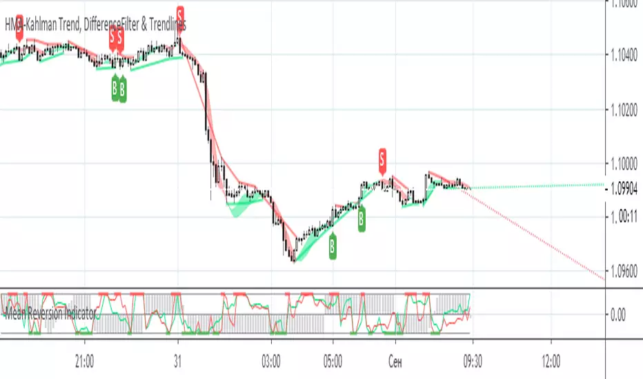
HMA-Kahlman Trend, DifferenceFilter & TrendlinesThis update to the previous HMA-Kahlman Trend, Clipping & Trendlines script features the same structure with the three modules:
- Trendlines module,
- NEW Winsorizing submodule using difference-based filtering.
- HMA-Kahlman Trend module.
The Winsorizing submodule filters signals by a volume level, eliminating the ones with the volume below a threshold. This module substitutes the previous 'low-level' filtering implementation. This time it filters out based on difference between scaled volume and its moving average.
Tested with BTCUSD.
HMA-Kahlman Trend, Clipping & TrendlinesThis script utilizes three modules:
- Trendlines module (by Joris Duyck),
- Winsorizing submodule and
- HMA-Kahlman Trend module.
The Trendlines module produces crossovers predictive of the next local trend. The Winsorizing (clipping) submodule filters signals by a volume level, eliminating the ones with the volume below a threshold. The last feature obviously does not work with the assets not supporing Volume, so set the Winsorizing submodule to false. The Winsorizing and Trendlines modules can be turned off.
