Better VolumePlots perceived buy volume,sell volume, an sma of volume over the last x amount of bars, and an arrow when volume is above average.
Cerca negli script per "volume"

Plot Other Symbol VolumeThis script plots the volume of another specified symbol.
The standard TradingView 'compare' functionality already covers plotting the various price types.

Delta Volume/Cumulative deltaThis is a slightly modified version of the Delta Volume v2.1 indicator from kernel_phi.
You can read the documentation here:

Currency Group Volume
This indicator shows the combined volume of an entire currency from the majors and crosses. So if you chose USD you get the combined volume of audusd, nzdusd, usdjpy, usdchf, eurusd, gbpusd, usdcad...
I made it to see if it would reveal where orders where flowing or perhaps where turning points were etc.
There's an example below of how I was trying to use it. I'm not sure it shows anything too far from obvious.
Its been in my archive for ages so I thought i might as well share it - if anyone sees something I've missed let me know.
(the currency that had the smallest volume spike (AUD) had the biggest push after the volume)
DAX VolumeDAX index (DEU30) hourly volume indicator, which is obtained by adding the sum of the underlying stocks volume.
The volume is displayed in millions of EUR.

Price Weighted VolumeReally simple: VWAP idea applied to volume, to see how much actual value is moving around. Great for assets pegged to fiat like USD, as it then shows how many dollars moved.
It's fun to pair with a long-term VWAP.

Time and sales volume final 1 hello, this is a volume script that depicts the basics of time and sales onto an accurate volume scale. what this can be used for is finding reversal to enter shorts, or puts and strong bullish movement to enter longs or calls. The green indicates buying and red indicates selling inside a candlestick. obviously when securities are exchanged there is an equal amount but this works off relative to the candle close and open to help determine a certain direction.

Altcoin Volume StatsShows how much BTC volume an alt has done in the past 24 hours as a label, with a comparison of that volume versus ETHBTC on Binance, as a percentage. Something I have been hoping the good people at Tradingview would add to the interface for years. It also shows some other stats in the data window on the right: i.imgur.com
Big thanks to the talented @Daveatt who helped unbake my noodle with some label code I couldn't figure out.
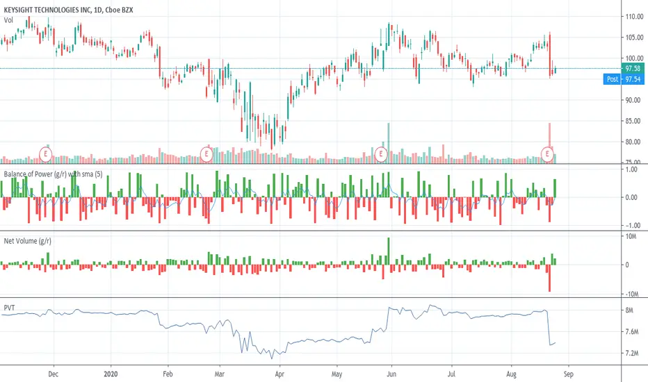
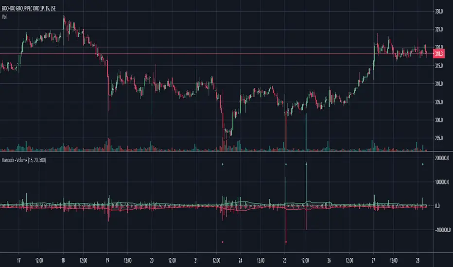
Hancock - VolumeEstimates the buy and sell volume of each candle by using a configurable lower time-frame and displays the volume in a colored histogram.
Happy trading
Hancock
Logarithmic VolumeIn volatile markets, normal indicator suffer from volume spikes that make the rest of plot seem non-existent.
Using logarithmic exponent, this indicator normalizes the volume, so this makes it easier to read.
The obvious drawback is that it does not display the actual volume amount, only a relative value.

Simple Volume VerificationEnglish
Using a simple moving average, this indicator uses a coloring rule to highlight when volume is above or below average. According to Dow's theory where volume can be used to confirm a price trend.
Português
Utilizando de uma média móvel simples, esse indicador utiliza de uma regra de coloração para destacar quando o volume está acima ou abaixo da média. Conforme teoria de Dow onde volume pode ser utilizado para confirmar uma tendencia de preço.
Espanhol
Utilizando uma média móvel simples, esse indicador utiliza uma regra de cor para destacar quando o volume está acima ou abaixo da média. Conforme teoria de Dow, onde o volume pode ser usado para confirmar uma tendência de preço.
[PX] Volume Peak LevelsThe indicator identifies peaks in volume and plots horizontal level accordingly.
If you are looking for someone to develop your own indicator or trading strategy, don't hesitate to get in touch with me here on TradingView or below.
Contact:
www.pascal-simon.de
info@pascal-simon.de

ETH World Volume (Multi-Exchange) [v2019-07-20]This is a fork of but applied to Ethereum instead of BTC

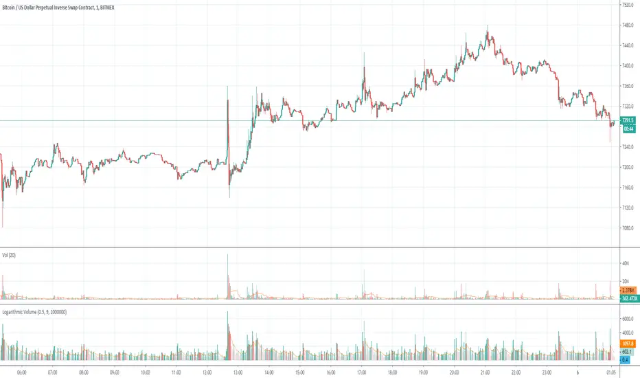
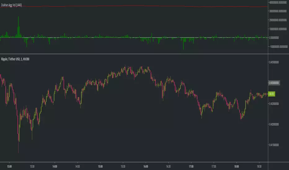
Dukhan 24 Hours rolling volume similar to exchanges Shows 24 hour rolling volume similar to the exchange - Done for BTC but works on anything
input is number of candle to calculate back
usage:
1m candle : 24h * 60 = 1440
5m candle: (24h * 60) / 5 = 288
etc
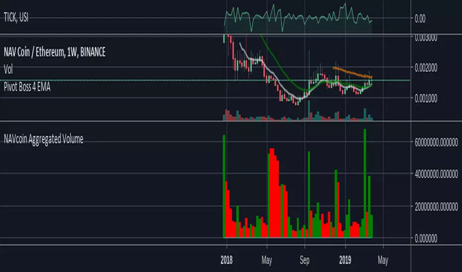
NAVcoin Aggregated Volume// Script is pretty self-explanatory. Take all volume in NAVcoin pairs across all exchanges that TradingView monitors.
// Combine them, show the result.
// Enjoy!
real (colored) volumeThis script plots the volume in terms of the underlying base (e.g. USD or btc) not number of coins traded. It plots volume*mid price.
In addition, the volume color density depends on the candle body divided to high-low. Very green for long up candle body, grey means short candle body compared to high-low, very red for long down candle body. It may provide some indications of the strength of bulls versus bears.
C Volume BarsOk do not take this one as serious as I made it as a joke .Its a volume bar that give you such great results and you can call it with fancy names and even hide the code . as there is no signals no one will pay attention that its repaint . And folks can even pay you money for it as its look so good. I even give you the script to show you how generous I am :)
its even better then the fancy name one as it actually give you time frames to choose from.
but on the other hand who said that repainting is bad?
mine look better:)))

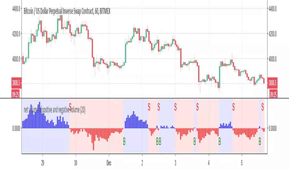
net volume of positive and negative volume buy and sell alertThis indicator try to give the mean number of bars in regarding to net volumes
This signal is produce by either cross up the 0 =buy or crossdown the 0 =sell
alerts inside
you can play with length to make optimization