Bat Harmonic Pattern [TradingFinder] Bat Chart Indicator🔵 Introduction
The Bat Harmonic Pattern, created by Scott Carney in the 1990s, is a sophisticated tool in technical analysis, used to identify potential reversal points in price movements by leveraging Fibonacci ratios.
This pattern is classified into two primary types: the Bullish Bat Pattern, which signals the end of a downtrend and the beginning of an uptrend, and the Bearish Bat Pattern, which indicates the conclusion of an uptrend and the onset of a downtrend.
🟣 Bullish Bat Pattern
The Bullish Bat Pattern is designed to identify when a downtrend is likely to end and a new uptrend is about to begin. The key feature of this pattern is Point D, which typically aligns near the 88.6% Fibonacci retracement of the XA leg.
This point is considered a strong buy zone. When the price reaches Point D after a significant downtrend, it often indicates a potential reversal, presenting a buying opportunity for traders anticipating the start of an upward movement.
🟣 Bearish Bat Pattern
In contrast, the Bearish Bat Pattern forms when an uptrend is nearing its conclusion. Point D, which also typically aligns near the 88.6% Fibonacci retracement of the XA leg, serves as a critical point for traders.
This point is regarded as a strong sell zone, signaling that the uptrend may be ending, and a downtrend could be imminent. Traders often open short positions when they identify this pattern, aiming to capitalize on the anticipated downward movement.
🔵 How to Use
The Bat Pattern consists of five key points: X, A, B, C, and D, and four waves: XA, AB, BC, and CD. Fibonacci ratios play a crucial role in this pattern, helping traders pinpoint precise entry and exit points. In both the Bullish and Bearish Bat Patterns, the 88.6% retracement of the XA leg is a critical level for identifying potential reversal points.
🟣 Bullish Bat Pattern
Traders typically enter buy positions after Point D forms, expecting the downtrend to end and a new uptrend to start. This point, located near the 88.6% retracement of the XA leg, serves as a reliable buy signal.
🟣 Bearish Bat Pattern
Traders usually open short positions after identifying Point D, expecting the uptrend to end and a downtrend to begin. This point, also near the 88.6% retracement of the XA leg, acts as a valid sell signal.
🟣 Trading Tips for the Bat Pattern
Accurate Fibonacci Point Identification : Accurately identify Points X, A, B, C, and D, and calculate the Fibonacci ratios between these points. Point D should ideally be near the 88.6% retracement of the XA leg.
Signal Confirmation with Other Tools : To enhance the pattern's accuracy, avoid trading solely based on the Bat Pattern.
Risk Management : Always use stop-loss orders. In a Bullish Bat Pattern, place the stop-loss below Point X, and in a Bearish Bat Pattern, above Point X. This helps limit potential losses if the pattern fails.
Wait for Price Movement Confirmation : After identifying Point D, wait for the price to move in the anticipated direction to confirm the pattern's validity before entering a trade.
Set Realistic Profit Targets : Use Fibonacci retracement levels to set realistic profit targets, such as 38.2%, 50%, and 61.8% retracement levels of the CD leg. This strategy helps maximize profits and prevents premature exits.
🔵 Setting
🟣 Logical Setting
ZigZag Pivot Period : You can adjust the period so that the harmonic patterns are adjusted according to the pivot period you want. This factor is the most important parameter in pattern recognition.
Show Valid Forma t: If this parameter is on "On" mode, only patterns will be displayed that they have exact format and no noise can be seen in them. If "Off" is, the patterns displayed that maybe are noisy and do not exactly correspond to the original pattern.
Show Formation Last Pivot Confirm : if Turned on, you can see this ability of patterns when their last pivot is formed. If this feature is off, it will see the patterns as soon as they are formed. The advantage of this option being clear is less formation of fielded patterns, and it is accompanied by the latest pattern seeing and a sharp reduction in reward to risk.
Period of Formation Last Pivot : Using this parameter you can determine that the last pivot is based on Pivot period.
🟣 Genaral Setting
Show : Enter "On" to display the template and "Off" to not display the template.
Color : Enter the desired color to draw the pattern in this parameter.
LineWidth : You can enter the number 1 or numbers higher than one to adjust the thickness of the drawing lines. This number must be an integer and increases with increasing thickness.
LabelSize : You can adjust the size of the labels by using the "size.auto", "size.tiny", "size.smal", "size.normal", "size.large" or "size.huge" entries.
🟣 Alert Setting
Alert : On / Off
Message Frequency : This string parameter defines the announcement frequency. Choices include: "All" (activates the alert every time the function is called), "Once Per Bar" (activates the alert only on the first call within the bar), and "Once Per Bar Close" (the alert is activated only by a call at the last script execution of the real-time bar upon closing). The default setting is "Once per Bar".
Show Alert Time by Time Zone : The date, hour, and minute you receive in alert messages can be based on any time zone you choose. For example, if you want New York time, you should enter "UTC-4". This input is set to the time zone "UTC" by default.
🔵 Conclusion
The Bat Harmonic Pattern is a powerful tool in technical analysis, offering traders the ability to identify critical reversal points using Fibonacci ratios. By recognizing the Bullish and Bearish Bat Patterns, traders can anticipate potential trend reversals and make informed trading decisions.
However, it is essential to combine the Bat Pattern with other technical analysis tools and confirm signals for better trading outcomes. With proper use, this pattern can help traders minimize risk and optimize their entry and exit points in the market.
Cerca negli script per "wave"

ZigzagLibrary "Zigzag"
Zigzag related user defined types. Depends on DrawingTypes library for basic types
method tostring(this, sortKeys, sortOrder, includeKeys)
Converts ZigzagTypes/Pivot object to string representation
Namespace types: Pivot
Parameters:
this (Pivot) : ZigzagTypes/Pivot
sortKeys (bool) : If set to true, string output is sorted by keys.
sortOrder (int) : Applicable only if sortKeys is set to true. Positive number will sort them in ascending order whreas negative numer will sort them in descending order. Passing 0 will not sort the keys
includeKeys (string ) : Array of string containing selective keys. Optional parmaeter. If not provided, all the keys are considered
Returns: string representation of ZigzagTypes/Pivot
method tostring(this, sortKeys, sortOrder, includeKeys)
Converts Array of Pivot objects to string representation
Namespace types: Pivot
Parameters:
this (Pivot ) : Pivot object array
sortKeys (bool) : If set to true, string output is sorted by keys.
sortOrder (int) : Applicable only if sortKeys is set to true. Positive number will sort them in ascending order whreas negative numer will sort them in descending order. Passing 0 will not sort the keys
includeKeys (string ) : Array of string containing selective keys. Optional parmaeter. If not provided, all the keys are considered
Returns: string representation of Pivot object array
method tostring(this)
Converts ZigzagFlags object to string representation
Namespace types: ZigzagFlags
Parameters:
this (ZigzagFlags) : ZigzagFlags object
Returns: string representation of ZigzagFlags
method tostring(this, sortKeys, sortOrder, includeKeys)
Converts ZigzagTypes/Zigzag object to string representation
Namespace types: Zigzag
Parameters:
this (Zigzag) : ZigzagTypes/Zigzagobject
sortKeys (bool) : If set to true, string output is sorted by keys.
sortOrder (int) : Applicable only if sortKeys is set to true. Positive number will sort them in ascending order whreas negative numer will sort them in descending order. Passing 0 will not sort the keys
includeKeys (string ) : Array of string containing selective keys. Optional parmaeter. If not provided, all the keys are considered
Returns: string representation of ZigzagTypes/Zigzag
method calculate(this, ohlc, indicators, indicatorNames)
Calculate zigzag based on input values and indicator values
Namespace types: Zigzag
Parameters:
this (Zigzag) : Zigzag object
ohlc (float ) : Array containing OHLC values. Can also have custom values for which zigzag to be calculated
indicators (matrix) : Array of indicator values
indicatorNames (string ) : Array of indicator names for which values are present. Size of indicators array should be equal to that of indicatorNames
Returns: current Zigzag object
method calculate(this)
Calculate zigzag based on properties embedded within Zigzag object
Namespace types: Zigzag
Parameters:
this (Zigzag) : Zigzag object
Returns: current Zigzag object
method nextlevel(this)
Calculate Next Level Zigzag based on the current calculated zigzag object
Namespace types: Zigzag
Parameters:
this (Zigzag) : Zigzag object
Returns: Next Level Zigzag object
method clear(this)
Clears zigzag drawings array
Namespace types: ZigzagDrawing
Parameters:
this (ZigzagDrawing ) : array
Returns: void
method drawplain(this)
draws fresh zigzag based on properties embedded in ZigzagDrawing object without trying to calculate
Namespace types: ZigzagDrawing
Parameters:
this (ZigzagDrawing) : ZigzagDrawing object
Returns: ZigzagDrawing object
method drawfresh(this, ohlc, indicators, indicatorNames)
draws fresh zigzag based on properties embedded in ZigzagDrawing object
Namespace types: ZigzagDrawing
Parameters:
this (ZigzagDrawing) : ZigzagDrawing object
ohlc (float ) : values on which the zigzag needs to be calculated and drawn. If not set will use regular OHLC
indicators (matrix) : Array of indicator values
indicatorNames (string ) : Array of indicator names for which values are present. Size of indicators array should be equal to that of indicatorNames
Returns: ZigzagDrawing object
method drawcontinuous(this, ohlc, indicators, indicatorNames)
draws zigzag based on the zigzagmatrix input
Namespace types: ZigzagDrawing
Parameters:
this (ZigzagDrawing) : ZigzagDrawing object
ohlc (float ) : values on which the zigzag needs to be calculated and drawn. If not set will use regular OHLC
indicators (matrix) : Array of indicator values
indicatorNames (string ) : Array of indicator names for which values are present. Size of indicators array should be equal to that of indicatorNames
Returns:
method getPrices(pivots)
Namespace types: Pivot
Parameters:
pivots (Pivot )
method getBars(pivots)
Namespace types: Pivot
Parameters:
pivots (Pivot )
Indicator
Indicator is collection of indicator values applied on high, low and close
Fields:
indicatorHigh (series float) : Indicator Value applied on High
indicatorLow (series float) : Indicator Value applied on Low
PivotCandle
PivotCandle represents data of the candle which forms either pivot High or pivot low or both
Fields:
_high (series float) : High price of candle forming the pivot
_low (series float) : Low price of candle forming the pivot
length (series int) : Pivot length
pHighBar (series int) : represents number of bar back the pivot High occurred.
pLowBar (series int) : represents number of bar back the pivot Low occurred.
pHigh (series float) : Pivot High Price
pLow (series float) : Pivot Low Price
indicators (Indicator ) : Array of Indicators - allows to add multiple
Pivot
Pivot refers to zigzag pivot. Each pivot can contain various data
Fields:
point (chart.point) : pivot point coordinates
dir (series int) : direction of the pivot. Valid values are 1, -1, 2, -2
level (series int) : is used for multi level zigzags. For single level, it will always be 0
componentIndex (series int) : is the lower level zigzag array index for given pivot. Used only in multi level Zigzag Pivots
subComponents (series int) : is the number of sub waves per each zigzag wave. Only applicable for multi level zigzags
microComponents (series int) : is the number of base zigzag components in a zigzag wave
ratio (series float) : Price Ratio based on previous two pivots
sizeRatio (series float)
subPivots (Pivot )
indicatorNames (string ) : Names of the indicators applied on zigzag
indicatorValues (float ) : Values of the indicators applied on zigzag
indicatorRatios (float ) : Ratios of the indicators applied on zigzag based on previous 2 pivots
ZigzagFlags
Flags required for drawing zigzag. Only used internally in zigzag calculation. Should not set the values explicitly
Fields:
newPivot (series bool) : true if the calculation resulted in new pivot
doublePivot (series bool) : true if the calculation resulted in two pivots on same bar
updateLastPivot (series bool) : true if new pivot calculated replaces the old one.
Zigzag
Zigzag object which contains whole zigzag calculation parameters and pivots
Fields:
length (series int) : Zigzag length. Default value is 5
numberOfPivots (series int) : max number of pivots to hold in the calculation. Default value is 20
offset (series int) : Bar offset to be considered for calculation of zigzag. Default is 0 - which means calculation is done based on the latest bar.
level (series int) : Zigzag calculation level - used in multi level recursive zigzags
zigzagPivots (Pivot ) : array which holds the last n pivots calculated.
flags (ZigzagFlags) : ZigzagFlags object which is required for continuous drawing of zigzag lines.
ZigzagObject
Zigzag Drawing Object
Fields:
zigzagLine (series line) : Line joining two pivots
zigzagLabel (series label) : Label which can be used for drawing the values, ratios, directions etc.
ZigzagProperties
Object which holds properties of zigzag drawing. To be used along with ZigzagDrawing
Fields:
lineColor (series color) : Zigzag line color. Default is color.blue
lineWidth (series int) : Zigzag line width. Default is 1
lineStyle (series string) : Zigzag line style. Default is line.style_solid.
showLabel (series bool) : If set, the drawing will show labels on each pivot. Default is false
textColor (series color) : Text color of the labels. Only applicable if showLabel is set to true.
maxObjects (series int) : Max number of zigzag lines to display. Default is 300
xloc (series string) : Time/Bar reference to be used for zigzag drawing. Default is Time - xloc.bar_time.
ZigzagDrawing
Object which holds complete zigzag drawing objects and properties.
Fields:
zigzag (Zigzag) : Zigzag object which holds the calculations.
properties (ZigzagProperties) : ZigzagProperties object which is used for setting the display styles of zigzag
drawings (ZigzagObject ) : array which contains lines and labels of zigzag drawing.

LibrarySupertrendLibrary "LibrarySupertrend"
selective_ma(condition, source, length)
Parameters:
condition (bool)
source (float)
length (int)
trendUp(source)
Parameters:
source (float)
smoothrng(source, sampling_period, range_mult)
Parameters:
source (float)
sampling_period (simple int)
range_mult (float)
rngfilt(source, smoothrng)
Parameters:
source (float)
smoothrng (float)
fusion(overallLength, rsiLength, mfiLength, macdLength, cciLength, tsiLength, rviLength, atrLength, adxLength)
Parameters:
overallLength (simple int)
rsiLength (simple int)
mfiLength (simple int)
macdLength (simple int)
cciLength (simple int)
tsiLength (simple int)
rviLength (simple int)
atrLength (simple int)
adxLength (simple int)
zonestrength(amplitude, wavelength)
Parameters:
amplitude (int)
wavelength (simple int)
atr_anysource(source, atr_length)
Parameters:
source (float)
atr_length (simple int)
supertrend_anysource(source, factor, atr_length)
Parameters:
source (float)
factor (float)
atr_length (simple int)
Best Support And Resistance Indicator V1 [ForexBee]This Indicator Identifies and draws the support and resistance Zones On the Chart
🔶Overview
The support and resistance indicator is a technical indicator that will plot the support zone and resistance zone on the candlestick chart. It determines the price touches to find the strong support resistance zones.
The support and resistance indicator is the most basic technical analysis in trading. Instead of drawing zones manually, this indicator can save you time by plotting zones automatically.
🔶Working
There are specific characteristics of a valid support and resistance zone. Price always bounces upward from the support zone while it bounces downward from the resistance zone. On the other hand, when a breakout of the support or resistance zone happens, the price trends toward the breakout.
🔶Valid support zone
When the price touches a zone two to three times and bounces in a bullish direction, it is a good support zone.
The main point is that you should always find the bounces in clear price swings. The touches or bounces of the price must not be in the form of a choppy market. Price always moves in the form of swings or waves.
🔶Valid resistance zone
When the price touches a zone two to three times with a bounce in a bearish direction, then a valid resistance zone forms.
Here the price bounces must be in the form of swings or waves. You must avoid a choppy market.
So the support and resistance zone indicator finds these parameters on the chart and draws only valid zones.
🔶Settings of indicator
There are two inputs available in the indicator.
Number of bars for swing
The number of bars for the swing bars represents the size of the swing for a valid support or resistance touch. This parameter helps to filter the ranging price. the default value is 10.
Number of Tests for valid support and resistance
In this indicator, the number of pivots represents the support or resistance touches. so if you select the number 3, the indicator will only draw a zone with three touches.
🔶Features
There are the following features that this indicator identifies automatically, so you don’t need to do manual work.
Identify the valid support and resistance zones
Add the confluence of swings or waves during zone identification
Choppy market filter
We are also adding the feature of a candlestick pattern at the zone, which will be added in the next update.
Mad_MATHLibrary "MAD_MATH"
This is a mathematical library where I store useful kernels, filters and selectors for the different types of computations.
This library also contains opensource code from other scripters.
Future extensions are very likely, there are some functions I would like to add, but I have to wait for approvals so i can include them.
Ehlers_EMA(_src, _length)
Calculates the Ehlers Exponential Moving Average (Ehlers_EMA)
Parameters:
_src (float) : The source series for calculation
_length (simple int) : The length for the Ehlers EMA
Returns: The Ehlers EMA value
Ehlers_Gaussian(_src, _length)
Calculates the Ehlers Gaussian Filter
Parameters:
_src (float) : The source series for calculation
_length (simple int) : The length for the Ehlers Gaussian Filter
Returns: The Ehlers Gaussian Filter value
Ehlers_supersmoother(_src, _length)
Calculates the Ehlers Supersmoother
Parameters:
_src (float) : The source series for calculation
_length (simple int) : The length for the Ehlers Supersmoother
Returns: The Ehlers Supersmoother value
Ehlers_SMA_fast(_src, _length)
Calculates the Ehlers Simple Moving Average (SMA) Fast
Parameters:
_src (float) : The source series for calculation
_length (simple int) : The length for the Ehlers SMA Fast
Returns: The Ehlers SMA Fast value
Ehlers_EMA_fast(_src, _length)
Calculates the Ehlers Exponential Moving Average (EMA) Fast
Parameters:
_src (float) : The source series for calculation
_length (simple int) : The length for the Ehlers EMA Fast
Returns: The Ehlers EMA Fast value
Ehlers_RSI_fast(_src, _length)
Calculates the Ehlers Relative Strength Index (RSI) Fast
Parameters:
_src (float) : The source series for calculation
_length (simple int) : The length for the Ehlers RSI Fast
Returns: The Ehlers RSI Fast value
Ehlers_Band_Pass_Filter(_src, _length)
Calculates the Ehlers BandPass Filter
Parameters:
_src (float) : The source series for calculation
_length (simple int) : The length for the Ehlers BandPass Filter
Returns: The Ehlers BandPass Filter value
Ehlers_Butterworth(_src, _length)
Calculates the Ehlers Butterworth Filter
Parameters:
_src (float) : The source series for calculation
_length (simple int) : The length for the Ehlers Butterworth Filter
Returns: The Ehlers Butterworth Filter value
Ehlers_Two_Pole_Gaussian_Filter(_src, _length)
Calculates the Ehlers Two-Pole Gaussian Filter
Parameters:
_src (float) : The source series for calculation
_length (simple int) : The length for the Ehlers Two-Pole Gaussian Filter
Returns: The Ehlers Two-Pole Gaussian Filter value
Ehlers_Two_Pole_Butterworth_Filter(_src, _length)
Calculates the Ehlers Two-Pole Butterworth Filter
Parameters:
_src (float) : The source series for calculation
_length (simple int) : The length for the Ehlers Two-Pole Butterworth Filter
Returns: The Ehlers Two-Pole Butterworth Filter value
Ehlers_Band_Stop_Filter(_src, _length)
Calculates the Ehlers Band Stop Filter
Parameters:
_src (float) : The source series for calculation
_length (simple int) : The length for the Ehlers Band Stop Filter
Returns: The Ehlers Band Stop Filter value
Ehlers_Smoother(_src)
Calculates the Ehlers Smoother
Parameters:
_src (float) : The source series for calculation
Returns: The Ehlers Smoother value
Ehlers_High_Pass_Filter(_src, _length)
Calculates the Ehlers High Pass Filter
Parameters:
_src (float) : The source series for calculation
_length (simple int) : The length for the Ehlers High Pass Filter
Returns: The Ehlers High Pass Filter value
Ehlers_2_Pole_High_Pass_Filter(_src, _length)
Calculates the Ehlers Two-Pole High Pass Filter
Parameters:
_src (float) : The source series for calculation
_length (simple int) : The length for the Ehlers Two-Pole High Pass Filter
Returns: The Ehlers Two-Pole High Pass Filter value
pr(_src, _length)
pr Calculates the percentage rank (PR) of a value within a range.
Parameters:
_src (float) : The source value for which the percentage rank is calculated. It represents the value to be ranked within the range.
_length (simple int) : The _length of the range over which the percentage rank is calculated. It determines the number of bars considered for the calculation.
Returns: The percentage rank (PR) of the source value within the range, adjusted by adding 50 to the result.
smma(_src, _length)
Calculates the SMMA (Smoothed Moving Average)
Parameters:
_src (float) : The source series for calculation
_length (simple int)
Returns: The SMMA value
hullma(_src, _length)
Calculates the Hull Moving Average (HullMA)
Parameters:
_src (float) : The source series for calculation
_length (simple int) : The _length of the HullMA
Returns: The HullMA value
tma(_src, _length)
Calculates the Triple Moving Average (TMA)
Parameters:
_src (float) : The source series for calculation
_length (simple int) : The _length of the TMA
Returns: The TMA value
dema(_src, _length)
Calculates the Double Exponential Moving Average (DEMA)
Parameters:
_src (float) : The source series for calculation
_length (simple int) : The _length of the DEMA
Returns: The DEMA value
tema(_src, _length)
Calculates the Triple Exponential Moving Average (TEMA)
Parameters:
_src (float) : The source series for calculation
_length (simple int) : The _length of the TEMA
Returns: The TEMA value
w2ma(_src, _length)
Calculates the Normalized Double Moving Average (N2MA)
Parameters:
_src (float) : The source series for calculation
_length (simple int) : The _length of the N2MA
Returns: The N2MA value
wma(_src, _length)
Calculates the Normalized Moving Average (NMA)
Parameters:
_src (float) : The source series for calculation
_length (simple int) : The _length of the NMA
Returns: The NMA value
nma(_open, _close, _length)
Calculates the Normalized Moving Average (NMA)
Parameters:
_open (float) : The open price series
_close (float) : The close price series
_length (simple int) : The _length for finding the highest and lowest values
Returns: The NMA value
lma(_src, _length)
Parameters:
_src (float)
_length (simple int)
zero_lag(_src, _length, gamma1, zl)
Calculates the Zero Lag Moving Average (ZeroLag)
Parameters:
_src (float) : The source series for calculation
_length (simple int) : The length for the moving average
gamma1 (simple int) : The coefficient for calculating 'd'
zl (simple bool) : Boolean flag for applying Zero Lag
Returns: An array containing the ZeroLag Moving Average and a boolean flag indicating if it's flat
copyright HPotter, thanks for that great function
chebyshevI(src, len, ripple)
Calculates the Chebyshev Type I Filter
Parameters:
src (float) : The source series for calculation
len (int) : The length of the filter
ripple (float) : The ripple factor for the filter
Returns: The output of the Chebyshev Type I Filter
math from Pafnuti Lwowitsch Tschebyschow (1821–1894)
Thanks peacefulLizard50262 for the find and translation
chebyshevII(src, len, ripple)
Calculates the Chebyshev Type II Filter
Parameters:
src (float) : The source series for calculation
len (int) : The length of the filter
ripple (float) : The ripple factor for the filter
Returns: The output of the Chebyshev Type II Filter
math from Pafnuti Lwowitsch Tschebyschow (1821–1894)
Thanks peacefulLizard50262 for the find
wavetrend(_src, _n1, _n2)
Calculates the WaveTrend indicator
Parameters:
_src (float) : The source series for calculation
_n1 (simple int) : The period for the first EMA calculation
_n2 (simple int) : The period for the second EMA calculation
Returns: The WaveTrend value
f_getma(_type, _src, _length, ripple)
Calculates various types of moving averages
Parameters:
_type (simple string) : The type of indicator to calculate
_src (float) : The source series for calculation
_length (simple int) : The length for the moving average or indicator
ripple (simple float)
Returns: The calculated moving average or indicator value
f_getfilter(_type, _src, _length)
Calculates various types of filters
Parameters:
_type (simple string) : The type of indicator to calculate
_src (float) : The source series for calculation
_length (simple int) : The length for the moving average or indicator
Returns: The filtered value
f_getoszillator(_type, _src, _length)
Calculates various types of Deviations and other indicators
Parameters:
_type (simple string) : The type of indicator to calculate
_src (float) : The source series for calculation
_length (simple int) : The length for the moving average or indicator
Returns: The calculated moving average or indicator value

wbburgin_utilsLibrary "wbburgin_utils"
trendUp(source)
Parameters:
source
smoothrng(source, sampling_period, range_mult)
Parameters:
source
sampling_period
range_mult
rngfilt(source, smoothrng)
Parameters:
source
smoothrng
fusion(overallLength, rsiLength, mfiLength, macdLength, cciLength, tsiLength, rviLength, atrLength, adxLength)
Parameters:
overallLength
rsiLength
mfiLength
macdLength
cciLength
tsiLength
rviLength
atrLength
adxLength
zonestrength(amplitude, wavelength)
Parameters:
amplitude
wavelength
atr_anysource(source, atr_length)
Parameters:
source
atr_length
supertrend_anysource(source, factor, atr_length)
Parameters:
source
factor
atr_length

Hurst Spectral Analysis Oscillator"It is a true fact that any given time history of any event (including the price history of a stock) can always be considered as reproducible to any desired degree of accuracy by the process of algebraically summing a particular series of sine waves. This is intuitively evident if you start with a number of sine waves of differing frequencies, amplitudes, and phases, and then sum them up to get a new and more complex waveform." (Spectral Analysis chapter of J M Hurst's book, Profit Magic )
Background: A band-pass filter or bandpass filter is a device that passes frequencies within a certain range and rejects (attenuates) frequencies outside that range. Bandpass filters are widely used in wireless transmitters and receivers. Well-designed bandpass filters (having the optimum bandwidth) maximize the number of signal transmitters that can exist in a system while minimizing the interference or competition among signals. Outside of electronics and signal processing, other examples of the use of bandpass filters include atmospheric sciences, neuroscience, astronomy, economics, and finance.
About the indicator: This indicator will accept float/decimal length inputs to display a spectrum of 11 bandpass filters. The trader can select a single bandpass for analysis that includes future high/low predictions. The trader can also select which bandpasses contribute to a composite model of expected price action.
10 Statements to describe the 5 elements of Hurst's price-motion model:
Random events account for only 2% of the price change of the overall market and of individual issues.
National and world historical events influence the market to a negligible degree.
Foreseeable fundamental events account for about 75% of all price motion. The effect is smooth and slow changing.
Unforeseeable fundamental events influence price motion. They occur relatively seldom, but the effect can be large and must be guarded against.
Approximately 23% of all price motion is cyclic in nature and semi-predictable (basis of the "cyclic model").
Cyclicality in price motion consists of the sum of a number of (non-ideal) periodic cyclic "waves" or "fluctuations" (summation principle).
Summed cyclicality is a common factor among all stocks (commonality principle).
Cyclic component magnitude and duration fluctuate slowly with the passage of time. In the course of such fluctuations, the greater the magnitude, the longer the duration and vice-versa (variation principle).
Principle of nominality: an element of commonality from which variation is expected.
The greater the nominal duration of a cyclic component, the larger the nominal magnitude (principle of proportionality).
Shoutouts & Credits for all the raw code, helpful information, ideas & collaboration, conversations together, introductions, indicator feedback, and genuine/selfless help:
🏆 @TerryPascoe
🏅 DavidF at Sigma-L, and @HPotter
👏 @Saviolis, parisboy, and @upslidedown

MLExtensionsLibrary "MLExtensions"
normalizeDeriv(src, quadraticMeanLength)
Returns the smoothed hyperbolic tangent of the input series.
Parameters:
src : The input series (i.e., the first-order derivative for price).
quadraticMeanLength : The length of the quadratic mean (RMS).
Returns: nDeriv The normalized derivative of the input series.
normalize(src, min, max)
Rescales a source value with an unbounded range to a target range.
Parameters:
src : The input series
min : The minimum value of the unbounded range
max : The maximum value of the unbounded range
Returns: The normalized series
rescale(src, oldMin, oldMax, newMin, newMax)
Rescales a source value with a bounded range to anther bounded range
Parameters:
src : The input series
oldMin : The minimum value of the range to rescale from
oldMax : The maximum value of the range to rescale from
newMin : The minimum value of the range to rescale to
newMax : The maximum value of the range to rescale to
Returns: The rescaled series
color_green(prediction)
Assigns varying shades of the color green based on the KNN classification
Parameters:
prediction : Value (int|float) of the prediction
Returns: color
color_red(prediction)
Assigns varying shades of the color red based on the KNN classification
Parameters:
prediction : Value of the prediction
Returns: color
tanh(src)
Returns the the hyperbolic tangent of the input series. The sigmoid-like hyperbolic tangent function is used to compress the input to a value between -1 and 1.
Parameters:
src : The input series (i.e., the normalized derivative).
Returns: tanh The hyperbolic tangent of the input series.
dualPoleFilter(src, lookback)
Returns the smoothed hyperbolic tangent of the input series.
Parameters:
src : The input series (i.e., the hyperbolic tangent).
lookback : The lookback window for the smoothing.
Returns: filter The smoothed hyperbolic tangent of the input series.
tanhTransform(src, smoothingFrequency, quadraticMeanLength)
Returns the tanh transform of the input series.
Parameters:
src : The input series (i.e., the result of the tanh calculation).
smoothingFrequency
quadraticMeanLength
Returns: signal The smoothed hyperbolic tangent transform of the input series.
n_rsi(src, n1, n2)
Returns the normalized RSI ideal for use in ML algorithms.
Parameters:
src : The input series (i.e., the result of the RSI calculation).
n1 : The length of the RSI.
n2 : The smoothing length of the RSI.
Returns: signal The normalized RSI.
n_cci(src, n1, n2)
Returns the normalized CCI ideal for use in ML algorithms.
Parameters:
src : The input series (i.e., the result of the CCI calculation).
n1 : The length of the CCI.
n2 : The smoothing length of the CCI.
Returns: signal The normalized CCI.
n_wt(src, n1, n2)
Returns the normalized WaveTrend Classic series ideal for use in ML algorithms.
Parameters:
src : The input series (i.e., the result of the WaveTrend Classic calculation).
n1
n2
Returns: signal The normalized WaveTrend Classic series.
n_adx(highSrc, lowSrc, closeSrc, n1)
Returns the normalized ADX ideal for use in ML algorithms.
Parameters:
highSrc : The input series for the high price.
lowSrc : The input series for the low price.
closeSrc : The input series for the close price.
n1 : The length of the ADX.
regime_filter(src, threshold, useRegimeFilter)
Parameters:
src
threshold
useRegimeFilter
filter_adx(src, length, adxThreshold, useAdxFilter)
filter_adx
Parameters:
src : The source series.
length : The length of the ADX.
adxThreshold : The ADX threshold.
useAdxFilter : Whether to use the ADX filter.
Returns: The ADX.
filter_volatility(minLength, maxLength, useVolatilityFilter)
filter_volatility
Parameters:
minLength : The minimum length of the ATR.
maxLength : The maximum length of the ATR.
useVolatilityFilter : Whether to use the volatility filter.
Returns: Boolean indicating whether or not to let the signal pass through the filter.
backtest(high, low, open, startLongTrade, endLongTrade, startShortTrade, endShortTrade, isStopLossHit, maxBarsBackIndex, thisBarIndex)
Performs a basic backtest using the specified parameters and conditions.
Parameters:
high : The input series for the high price.
low : The input series for the low price.
open : The input series for the open price.
startLongTrade : The series of conditions that indicate the start of a long trade.`
endLongTrade : The series of conditions that indicate the end of a long trade.
startShortTrade : The series of conditions that indicate the start of a short trade.
endShortTrade : The series of conditions that indicate the end of a short trade.
isStopLossHit : The stop loss hit indicator.
maxBarsBackIndex : The maximum number of bars to go back in the backtest.
thisBarIndex : The current bar index.
Returns: A tuple containing backtest values
init_table()
init_table()
Returns: tbl The backtest results.
update_table(tbl, tradeStatsHeader, totalTrades, totalWins, totalLosses, winLossRatio, winrate, stopLosses)
update_table(tbl, tradeStats)
Parameters:
tbl : The backtest results table.
tradeStatsHeader : The trade stats header.
totalTrades : The total number of trades.
totalWins : The total number of wins.
totalLosses : The total number of losses.
winLossRatio : The win loss ratio.
winrate : The winrate.
stopLosses : The total number of stop losses.
Returns: Updated backtest results table.

TrendCalculusThis indicator makes visualising some of the core TrendCalculus algorithm's key information and features both fast and easy for casual analysis.
Interpretation:
a) The light blue channel is the lagged price channel calculated over the timeframe of your choosing for a period of N values. When the current price breaks out of this channel the previous price major high/low can be identified as a trend reversal. This helps in counting trend "waves" and is a rolling visual version of ideas I developed for counting Elliot Waves. For EW analysis, your mileage may vary depending on the asset inspected, but the chart allows you to clearly count waves on a particular scale of time (period) ignoring noise on other time scales.
b) The green/red channel is a support/resistance indicator region that shows the relationship of the current price to the key pivot points on this time scale (period) and these make for good visual indication that the current trend is up (green), or down (red). You may find them helpful for identifying breakouts and placing stops - but this was not their original intention. The pink line is the mid point of closing values in the lagged price channel, and the orange line the mid point of closing values in the current price channel.
About TrendCalculus (TC):
TC is implemented in several languages including Lua, Scala and Python. The Lua implementation is the reference and has the most advanced functionality and delivers a powerful data processing tool for both multi-scale trend reversal detection, reversal labelling, as well as trend feature production - all useful things helping it to produce training data for machine learning models that detect trend changes in real time.
This charting tool includes: (1) two consecutive lagged Donchian channels configured to a common period N, (2) the current price, and (3) the mid price of both Donchian channels. These calculations are all part of the TC codebase, and are brought to life in this charting tool.
Motivation:
By creating a TC charting tool - the machine learning model is swapped for *your eyes* and *your brain*. Using the same inputs as the machine, you can use this chart to learn to detect trend changes, and understand how time frame (long periods, short periods) affect your view of trend change. If you choose to use it to trade, or make investment decisions, do so at your own risk. This indicator does not deliver financial advice.
TrendCalculus is the invention of Andrew Morgan, author of Mastering Spark for Data Science (2017).
The original core TrendCalculus (TC) algorithm itself is published as open-source code on github under a GPL licence, and free to use and develop.
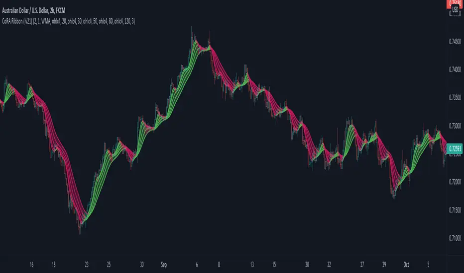
CoRA Ribbon - Multiple Compound Ratio Weighted Moving AveragesWhat distinguishes this indicator?
A Compound Ratio Weighted Moving Average ("CoRA") is a Moving Average that, regardless of its length, has very little lag and that can be relied on to accurately track price movements and fluctuations - compared to other types of Moving Averages.
By combining multiple Compound Ratio Weighted Moving Averages you can identify the trend better and more reliably . This is where "CoRA Ribbon" comes in.
The original study, which supported one CoRA Wave, comes from RedKTrader and was introduced as "RedK Compound Ratio Moving Average (CoRa_Wave)” . Thanks to him for the great work!
What was improved or added to this version of the indicator?
With this version of the indicator, up to 5 waves of Compound Ratio Moving Averages with different lengths can be combined and output to one "CoRA Ribbon".
Alerts were implemented. You can be notified e.g. in the event of
changes in direction of each single CoRA Wave
a trend change, which is determined on the basis of all 5 CoRA Waves
A CoRA Wave compared to other Moving Averages - CoRa Waves are less lagging behind
A suggestion for interpretation of “CoRA Ribbon”:
Since CoRA Ribbon can help you to identify the trend better and more reliably, this indicator provides a good baseline for your strategy, but should always be used in conjunction with other indicators or market analysis.
By adjusting the length of each individual wave, you can adapt "CoRA Ribbon" to your trading style - whether it is more aggressive or more cautious.
The following general rules can be formulated:
If the Ribbon changes its color to green, this can be interpreted as a buy signal.
If the Ribbon changes its color to red, this can be interpreted as a sell signal.
Good to know: The default settings have been selected for timeframe lower than 15 minutes. Adjust them and the indicator will do a great job on higher timeframes too. Please remember to test carefully after every change before the changes are applied to your live trading.
Background “Compound Ratio Weighted Average” - provided by "RedKTrader"
A Compound Ratio Weighted Average is a moving average where the weights increase in a "logarithmically linear" way - from the furthest point in the data to the current point.
The formula to calculate these weights work in a similar way to how "compound ratio" works: you start with an initial amount, then add a consistent "ratio of the cumulative prior sum" each period until you reach the end amount. The result is the "step ratio" between the weights is consistent - This is not the case with linear-weighted “Moving Average Weighted” (WMA) or “Exponential Moving Average” (EMA)
For example, if you consider a Weighted Moving Average ( WMA ) of length 5, the weights will be (from the furthest point towards the most current) 1, 2, 3, 4, 5 -- we can see that the ratio between these weights are inconsistent. in fact, the ratio between the 2 furthest points is 2:1, but the ratio between the most recent points is 5:4. the ratio is inconsistent, and in fact, more recent points are not getting the best weights they should get to counter-act the lag effect. Using the Compound Ratio approach addresses that point.
A key advantage here is that we can significantly reduce the "tail weight" - which is "relatively" large in other Moving Averages.
A Compound Ratio Weighted Moving Average is a moving average that has very little lag and that can be relied on to accurately track price movements and fluctuations.
Use or modify the code, invite us for a coffee, ... most importantly: have a lot of fun and success with this indicator
The code is commented - please don't hesitate to use it as needed or customize it further ... and if you are satisfied and even successful with this indicator, maybe buy us a coffee ;-)
The original developer ( RedKTrader ) and I ( consilus ) are curious to see how our indicators will develop through further ideas - so please keep us updated.
Time Wolna_2021_iun3[wozdux] Description of the Time_Wolna indicator
The indicator is designed to study the behavior of time. There are many indicators that study just the price, a little less indicators that study the volume of trading and vanishingly few indicators that study time.
This is not an oscillator, it does not have oversold or overbought levels. This indicator has an indefinite beginning and an indefinite end. Its value is not in the absolute values of the indicator, but in relative ones. This indicator calculates the time of price rise and the time of price decline. It clearly shows how long the price rises and how long the price falls.
The initial idea was to use my RSIVol indicator to study the time. Each bar is counted as a unit of time. If the price rises during the period of one bar, then one is added, if the price falls, then one is subtracted. By default, the blue line shows this time movement according to the RsiVol indicator.
The basic RsiVol indicator is shown at the bottom of the diagram. The bill goes along the blue line, which calculates the movement of the volume price. If the blue RSIVol line is above the yellow level, then the blue Time_Wolna time line is colored green. If the blue line in the base RsiVol indicator falls below the lower yellow level, then the blue time line of the Time_Wolna indicator turns red.
The result is a broken line that clearly shows the waves of rising and falling prices. In principle, the time indicator makes it easier to recognize waves.
It is known that time plays an important role in Elliott wave analysis, although in practice this is almost never done. The mention of Elliott is just a lyrical digression.
Time is very difficult to study. This indicator does not give clear buy or sell signals. This is just an analysis tool to help analysts.
In addition to the RsiVol indicator, simply the Rsi from the price and a simple moving average from the price are also used.
So, the settings of this indicator.
"switch Price == close <==> ( High+Low)/2" -- select the base price in all subsequent calculations
"Key EMA=> True=ema(Price); False=ema(Price*Volume)" --The key for switching the moving average from the price or from the volume price.
"T==> EMA(price, T)" --The period for calculating the moving average
" key red==> Yes/No Rsi")--the key turns on or off the RSI line red line
"key green==> Yes/No Orsi") --the key turns on or off the Volume RSI line green line
" key olive==> Yes/No RsiVol200 " -- the key enables or disables the Volumetric RSIVol200 olive line. This is RsiVol minus the 200-period moving average.
"keyVol blue==> Yes/No " - the key enables or disables the base blue line RSIVol
"keyVol blue==> V->tt(RsiVol) ->tt(ema(Price))"—The blue line selection will be calculated as the time from RSIVol or as the time from the moving average EMA.
"keyVol blue==> : 1=Time, 2=Time* price, 3=Time*(Ci-Ck) 4=Time*Volume, 5=Time*price*Volume")- selection for the blue baseline. By default, the time of the price rise or fall is calculated simply. Key=1. But you can investigate the joint influence of time and price and then the key is=2. If we study the combined effect of time and price changes per bar, then the key=3. If we study the joint influence of time and volume, then the key=4. If we study the joint influence of time, price and volume, then the key=5.
"key RsiO red + green==> : 1=Time, 2=Time*Price, 3=Time*(Ci-Ck) 4=Time*Volume, 5=Time*Price*Volume") - - - similar settings for the red green line. By default, the time of the price rise or fall is calculated simply. Key=1. But you can investigate the joint influence of time and price and then the key is=2. If we study the combined effect of time and price changes per bar, then the key=3. If we study the joint influence of time and volume, then the key=4. If we study the joint influence of time, price and volume, then the key=5.
"Key Color – - here you can disable changing the color of the blue line to green or red when the base indicator RsiVol exits above the upper and below the lower levels.
"Level nul ==> * Down Level Rsi - screen configuration in order to raise or lower chart
"Level nul ==> * Down Level ORsi -- beauty setup in order to raise or lower chart
"Level nul ==> * DownLevel RsiVol200 -- beauty setup in order to raise or lower chart
"blue =volume * price" – period for calculation of volumetric rates
"blue => RSIVOL(Volume*price,len) and EMA" – the period for calculating RsiVol
"blue__o1=> ema ( RSIVOL, o1)" – additional smoothing RsiVol
"red=rsi (Price,14)" – the period for calculating Rsi
"red= ema ( RSI ,3)" -- additional smoothing Rsi
"fuchsia__ => RsiVol200 (vp,200)" - the period for calculating RsiVol200
"fuchsia__o2=> ema ( RSIVOL200 , o2)" -- additional smoothing RsiVol200
To study the time between two fixed dates. Setting the start point of the calculation and the end point of the calculation
"Data(0)=Year" – the year of the start date
"Data(0)= Month" – the month of the start date
"Data (0)=Day" the day of the start date
"Data(1)=Year" – the year of the end date.
"Data(1)=Year" – month of the end date.
"Data(1)=Day" -- the day of the end date.
--------русский вариант описания ------
Описание индикатора Time_Wolna
Индикатор призван изучать поведение времени. Есть много индикаторов изучающих просто цену, немного меньше индикаторов изучающих объем торгов и исчезающе мало индикаторов, изучающих время.
Это не осциллятор у него нет уровней перепроданности или перекупленности. Данный индикатор имеет неопределенное начало и неопределенный конец. Ценность его не в абсолютных значениях индикатора, а в относительных. Этот индикатор высчитывает время подъема цены и время снижения цены. Он наглядно показывает сколько времени цена поднимается и сколько времени цена опускается.
Первоначальная идея была использовать мой индикатор RSIVol для изучения времени. Каждый бар считается за единицу времени. Если цена поднимается за период одного бара, то прибавляется единица, если цена опускается, то вычитается единица. По умолчанию голубая линия показывает такое движения времени по индикатору RsiVol.
Внизу на диаграмме показан базовый индикатор RsiVol. Счёт идет по синей линии, которая вычисляет движение объемной цены. Если синяя линия RSIVol находится выше желтого уровня, то голубая линия времени Time_Wolna окрашивается в зеленый цвет. Если синяя линия в базовом индикаторе RsiVol опускается ниже нижнего желтого уровня, то голубая линия времени индикатора Time_Wolna окрашивается в красный цвет.
В результате получается ломанная линия, четко показывающая волны восхождения и снижения цены. В принципе индикатор времени позволяет легче распознавать волны.
Известно, что время играет важную роль в волновом анализе Эллиотта, хотя на практике это почти никогда не делается. Упоминание Эллиотта это просто лирическое отступление.
Время очень трудно изучать. Этот индикатор не дает четких сигналов на покупку или продажу. Это всего лишь инструмент анализа в помощь аналитикам.
Кроме индикатора RsiVol, используются и просто Rsi от цены и простая скользящая средняя от цены.
Итак, настройки данного индикатора.
"switch Price == close <==> ( High+Low)/2" -- выбираем базовую цену во всех последующих вычислениях
"Key EMA=> True=ema(Price); False=ema(Price*Volume)" --Ключ переключения скользящей средней от цены или от объемной цены.
" T==> EMA(price,T)"--Период вычисления скользящей средней
"key red==> Yes/No Rsi")--ключ включает или выключает линию RSI красная линия
"key green==> Yes/No Orsi") --ключ включает или выключает линию Объемной RSI зеленая линия
"key olive==> Yes/No RsiVol200" -- ключ включает или выключает линию Объемной RSIVol200 оливковая линия. Это RsiVol минус 200-периодная скользящая средняя.
"keyVol blue==> Yes/No " – ключ включает или выключает базовую голубую линию RSIVol
"keyVol blue==> V->tt(RsiVol) ->tt(ema(Price))"—выбор голубая линия будет вычисляться как время от RSIVol или как время от скользящей средней EMA.
"keyVol blue==> : 1=Time, 2=Time* price, 3=Time*(Ci-Ck) 4=Time*Volume, 5=Time*price*Volume")—выбор для голубой базовой линии. По умолчанию вычисляется просто время подъема или опускания цены. Ключ=1. Но можно исследовать совместное влияние времени и цены и тогда ключ=2. Если изучаем совместное влияние времени и изменения цены за один бар, то ключ=3. Если изучаем совместное влияние времени и объема, то ключ=4. Если изучаем совместное влияние времени, цены и объема, то ключ=5.
"key RsiO red + green==> : 1=Time, 2=Time*Price, 3=Time*(Ci-Ck) 4=Time*Volume, 5=Time*Price*Volume") ---аналогичные настройки для красной зеленой линии. По умолчанию вычисляется просто время подъема или опускания цены. Ключ=1. Но можно исследовать совместное влияние времени и цены и тогда ключ=2. Если изучаем совместное влияние времени и изменения цены за один бар, то ключ=3. Если изучаем совместное влияние времени и объема, то ключ=4. Если изучаем совместное влияние времени, цены и объема, то ключ=5.
"Key Color" – здесь можно отключить изменение цвета голубой линии на зеленый или красный в моменты выхода базового индикатора RsiVol выше верхнего и ниже нижнего уровней.
"Level nul ==> * Down Level Rsi - косметическая настройка для того, чтобы поднять или опустить график
"Level nul ==> * Down Level ORsi -- косметическая настройка для того, чтобы поднять или опустить график
"Level nul ==> * DownLevel RsiVol200 -- косметическая настройка для того, чтобы поднять или опустить график
" blue =>volume * price" – период для вычисления объемной цены
" blue => RSIVOL(Volume*price,len) and EMA" – период для вычисления RsiVol
"blue__o1=> ema ( RSIVOL, o1)" – дополнительное сглаживание RsiVol
" red=rsi (Price,14)" – период для вычисления Rsi
" red= ema ( RSI ,3)" -- дополнительное сглаживание Rsi
"fuchsia__ => RsiVol200 (vp,200)" -- период для вычисления RsiVol200
"fuchsia__o2=> ema ( RSIVOL200 , o2)" -- дополнительное сглаживание RsiVol200
Для исследования времени между двумя фиксированными датами. Задаем начальную точку вычисления и конечную точку вычисления
"Data(0)=Year" – год начальной даты
"Data(0)= Month" – месяц начальной даты
"Data(0)=Day" день начальной даты
"Data(1)=Year" – год конечной даты.
"Data(1)=Year" – месяц конечной даты.
"Data(1)=Day" -- день конечной даты.

Amazing Oscillator MTF MulticolorIngles
The amazing multitemporal oscillator, allows you to see in a single graph the Waves that move the market in different temporalities, that is, you will be able to see the market trend, the impulse movement, the forced movement, and the entry and exit points, as well as also how both collide with each other, to understand why the smaller waves succumb to the impulse of the larger waves.
Elliot already described them as such, in his legacy of the Elliot waves and their different sub-waves, just as Wycoff spoke of the theory of effort and result.
Español:
El oscilador asombroso multitemporal, permite ver en una sola grafica las Ondas que mueven el mercado en diferentes temporalidades, es decir, podrás ver la tendencia del mercado, el movimiento de impulso, el movimiento de fuerza y los puntos de entrada y salida, así como también como ambos chocan entre si, para entender porque las ondas mas pequeñas sucumben al impulso de las ondas de mayor tamaño.
Ya Elliot las describía como tal, en su legado de las ondas de Elliot y sus diferentes sub-ondas, al igual que Wycoff hablaba de la teoría de esfuerzo y resultado.

Amazing Oscillator MTF plusIngles
The amazing multitemporal oscillator, allows you to see in a single graph the Waves that move the market in different temporalities, that is, you will be able to see the market trend, the impulse movement, the force movement and the entry and exit points, as well as also how both collide with each other, to understand why the smaller waves succumb to the impulse of the larger waves.
Elliot already described them as such, in his legacy of the Elliot waves and their different sub-waves, just as Wycoff spoke of the theory of effort and result.
Español:
El oscilador asombroso multitemporal, permite ver en una sola grafica las Ondas que mueven el mercado en diferentes temporalidades, es decir, podrás ver la tendencia del mercado, el movimiento de impulso, el movimiento de fuerza y los puntos de entrada y salida, así como también como ambos chocan entre si, para entender porque las ondas mas pequeñas sucumben al impulso de las ondas de mayor tamaño.
Ya Elliot las describía como tal, en su legado de las ondas de Elliot y sus diferentes sub-ondas, al igual que Wycoff hablaba de la teoría de esfuerzo y resultado.

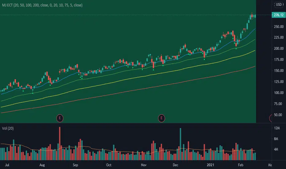
MJ ECT== One Line Introduction ==
ECT is a multi-level, trend focused technical indicator based on a three-step hierarchical approach - comprising the tide, wave, and ripple - to trend identification.
== Indicator Philosophy ==
The author believes that market trends can be understood in a three-step hierarchy, with tide at the top, wave in the middle, and ripple at the bottom, corresponding to long-, middle-, and short-term momentum in the stock price. This indicator therefore comprises three technical indicators which aims to reflect the abovementioned features of a trend. These three components are True Strength Index (TSI), Exponential Moving Averages ( EMA ), and Commodity Channel Index ( CCI ).
== Indicator Components and Breakdown ==
True Strength Index (TSI) -> Tide
A 20-period TSI is used to visualize the bullish or bearish sentiment surrounding the stock. Crossovers above the zero line are interpreted as bullish while crossovers below the zero line are interpreted as bearish . This is painted into the background where green represents bullish and red represents bearish . While the background is red ( bearish ), no bullish positions should be taken. Hence, the TSI painted background acts as a directional bias filter and going against the bias is not recommended. After understanding the directional bias, the user can delve further into the areas of value for the stock in the Wave.
Exponential Moving Averages ( EMA ) -> Wave
Four EMA are used (20, 50, 100, 200) to identify the dynamic support and resistance waves in a trending market. Stock price pullbacks into any of these EMA represent areas of value where the user can consider taking positions. The correct EMA to use depends on individual stock's behavior, with multiple bounces on a specified EMA being the priority. After understanding which wave best reflects the area of value of a stock, the user can move on to the Ripple to time their entries.
Commodity Channel Index ( CCI ) -> Ripple
A 5-period CCI is used to identify short-term oversold conditions where prices are on discount. Discount is defined by the 5-period CCI crossing below -100 as it reflects a weekly oversold condition. The indicator will display a small triangle below the candle when this condition is met.
== Ready To Deploy Field Manual ==
When background is painted red, do nothing.
When background is painted green, begin thinking of bullish opportunities.
Look for the specific EMA that has the most bounces of stock price in recent months, this is the area of value to look for buying opportunity.
For the candles that intersect the EMA you identified above, watch for the appearance of a small triangle below the candle that tells you the entry timing.
When the entry timing signal triangle appears, remember the High of that candle and buy your position when the subsequent candle breaks above this High.
If the High is not broken above in the next immediate candle, remember the newer High of the newer candle (basically follow / trail the latest High until a break above is hit).
If the background turns from green to red, stop following the High and do not enter because the market sentiment has changed to bearish .
If you are holding an existing position and the background turns red, consider exiting the position. You may consider remembering the Low of the candle and exit your position if this Low is broken below on a subsequent candle.
== Best Wishes ==
The author wishes the best success for all users of this technical indicator.
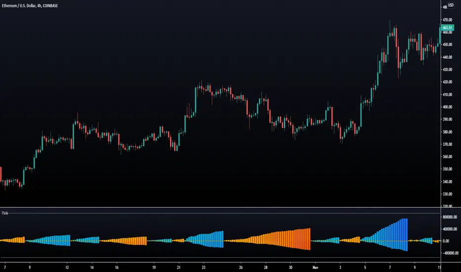
Trend Volume Accumulations [LuxAlgo]Deeply inspired by the Weiss wave indicator, the following indicator aims to return the accumulations of rising and declining volume of a specific trend. Positive waves are constructed using rising volume while negative waves are using declining volume.
The trend is determined by the sign of the rise of a rolling linear regression.
Settings
Length : Period of the indicator.
Src : Source of the indicator.
Linearity : Allows the output of the indicator to look more linear.
Mult : the multiplicative factor of both the upper and lower levels
Gradient : Use a gradient as color for the waves, true by default.
Usages
The trend volume accumulations (TVA) indicator allows determining the current price trend while taking into account volume, with blue colors representing an uptrend and red colors representing a downtrend.
The first motivation behind this indicator was to see if movements mostly made of declining volume were different from ones made of rising volume.
Waves of low amplitude represent movements with low trading activity.
Using higher values of Linearity allows giving less importance to individual volumes values, thus returning more linear waves as a result.
The indicator includes two levels, the upper one is derived from the cumulative mean of the waves based on rising volume, while the lower one is based on the cumulative mean of the waves based on declining volume, when a wave reaches a level we can expect the current trend to reverse. You can use different values of mult to control the distance from 0 of each level.
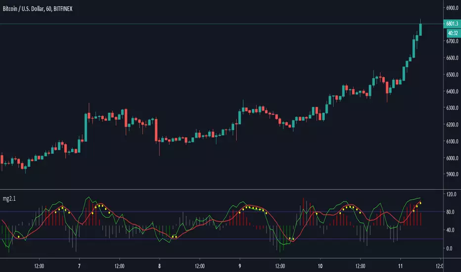
Minimal Godmode 2.1// Acknowledgments:
// Original Godmode Authors:
// @Legion, @LazyBear, @Ni6HTH4wK, @xSilas
// Drop a line if you use or modify this code.
// Godmode 3.1.4: @SNOW_CITY
// Godmode 3.2: @sco77m4r7in and @oh92
// Godmode3.2+LSMA: @scilentor
// Godmode 4.0.0-4.0.1: @chrysopoetics
// Jurik Moving Average: @everget
// Constance Brown Composite Index RSI: @LazyBear
// Wavetrend Oscillator: @fskrypt
// TTM Squeeze: @Greeny
// True TSI/RSI: @cI8DH and @chrysopoetics
// Laguerre RSI (Self-Adjusting Alpha with Fractals Energy): @everget
// RSI Shaded: @mortdiggiddy
// Minimal Godmode v2.0:
// 6 BTC pairs/exchanges (instead of 11) to reduce loading time from the pinescript security() function
// Volume Composite for engine calculation
// TTM Squeeze on Wavetrend Signal
// Constance Brown Composite Index RSI (CBCI)
// TrueTSI (Godmode 4.0.0 implementation)
// Laguerre RSI (LRSI)
// Minimal Godmode v2.1:
// Removed TTM Squeeze and Volume Composite
// EMA for Wavetrend Signal
// Multi-exchange for BTC no longer the default
// mg engine toggle for CBCI, Laguerre RSI, and TTSI
// Wavetrend Histogram component toggle
Indicator: ElliotWave Oscillator [EWO]This oscillator has to be used in conjunction with other EW tools (certainly cannot be the main indicator).
EWO has:
- Higher values during third waves' up
- Lower but still Positive values during the first and fifth waves up
- Negative values during the biggest corrections or downtrend impulse waves.
Personally, I am still trying to figure out EW, so do not use this. Just wanted to publish this for the EW masters out there who can put this to good use.
Appreciate any comments/feedback.

Bear & Bull Builder // visual strategy builderAre you a trend follower?
Trend following systems have been a cornerstone of trading since the first candlestick charts were invented in 18th-century Japan by Munehisa Homma (or Honma), a legendary rice merchant who used them to analyze market sentiment and predict price movements. Since then, legendary traders like Richard Dennis and Dr. David Paul have used technical analysis—the study of turning points and trends of candlestick charts—to develop an edge and strategy for trading equity, commodity, and forex markets.
How to Utilize the Bear & Bull Builder
This script is a way to pick and choose technical methods like SMAs and EMAs to define trend exits and entries. Additionally, you can specify an ATR (Average True Range) calculated stop loss based on your individual strategy and trading plan. Within the settings panel, you can set up this script to display only Long Position values, zones, and levels—or configure it for shorts, or both.
What Makes This Original
Unlike most trend-following indicators that lock you into a single approach, this script lets you combine different indicator types (RSI, WaveTrend, CCI, EMA, SMA) across three separate trend timeframes. The originality comes from the flexibility: you can test whether momentum-based trends (like RSI) work better than moving averages for your timeframe, or experiment with mixing them together. The script also bridges the gap between manual trading and automation by providing visual position values and fill zones that show exactly where signals generate versus where orders execute—critical information most scripts ignore.
Getting Started
For this quick and easy setup example, I built a strategy that is long-only, displays only long positional data and values, and uses a 21 & 55 period exponential moving average for the short and medium-term trend in addition to an 89 period simple moving average for my longer-term outlook. I have set my ATR-based multiplier to 0.75, and have left the fill zone display turned on to help visualize when to set up the built-in alerts for automating my strategy. I have made this the default settings of the script.
Positional Values
GREEN NUMBERS → Entry signal price
YELLOW NUMBERS → Stop loss price
BLUE NUMBERS → Exit signal price
IMPORTANT
I cannot describe how useful it is to use TradingView's built-in Long and Short position tools! The whole reason for this script is that it is as manually friendly as it is automated—especially for backtesting. You can use the long position tool to measure exact profits and losses on individual trades for the strategies you build. This can really help you see clearly if you have built a system with positive expectancy.
Tables
1. Settings Display Table
Displays the trend types that are configurable in the settings panel. Shows if positional values for longs and shorts are currently displayed.
2. Back testing Table
Displays the total amount of long and short entry signals since the first bar of the chart. Additionally, it displays the average amount of bars per trade (time in trade).
Alerts & Automation
There are 4 built-in alerts for automating your strategy to an external server:
1.Long Entries
2.Long Exits
3.Short Entries
4.Short Exits
Since this script uses confirmed bar states for alert generation (to avoid repainting), all alerts and displayed position values (the green, yellow, and blue numbers) will be sent on the closing price. Each alert has a placeholder preset for further customization.
Technical Details
How the trend detection works:
Bullish state triggers when close > all three selected trends
Bearish state triggers when close < all three selected trends
Uses barstate.isconfirmed to prevent repainting
Stop loss calculation:
Long stops: highest_trend - (ATR × multiplier)
Short stops: lowest_trend + (ATR × multiplier)
ATR period is fixed at 20 bars, multiplier is user-adjustable
Entry placement logic:
Long entries execute at the highest value among the three selected trends
Short entries execute at the lowest value among the three selected trends
This ensures entries occur near the support/resistance created by the trend lines
Why calculate all indicators upfront:
The script calculates all five indicator types (EMA, SMA, RSI, CCI, WaveTrend) for all three trend lengths on every bar, then selectively uses the ones you choose in settings. This prevents Pine Script consistency warnings while maintaining flexibility.

FX Master Confluence v41 (Smart TDI Filter)How to read your new Dashboard:
Top Row (The Boss): This is your 8-Hour WaveTrend status.
DARK GREEN: Strong Bull (Bias is Up & Above Zero). Aggressively look for buys.
LIGHT GREEN: Weak Bull (Bias is Up but Below Zero). Be cautious, could be a deep pullback.
DARK RED: Strong Bear (Bias is Down & Below Zero). Aggressively look for sells.
LTF Rows (15m - 6h):
"GOLDEN ZERO": This is the Holy Grail signal you asked for. The LTF WaveTrend just crossed the Zero line in agreement with the 8H Boss.
"REV SETUP": Standard reversal signal (useful, but lower confidence than Golden).
"TREND UP/DOWN": No signal right now, but tells you the flow of that specific timeframe.

FX Master Confluence v39 (Restored MAs) TDDHow to read your new Dashboard:
Top Row (The Boss): This is your 8-Hour WaveTrend status.
DARK GREEN: Strong Bull (Bias is Up & Above Zero). Aggressively look for buys.
LIGHT GREEN: Weak Bull (Bias is Up but Below Zero). Be cautious, could be a deep pullback.
DARK RED: Strong Bear (Bias is Down & Below Zero). Aggressively look for sells.
LTF Rows (15m - 6h):
"GOLDEN ZERO": This is the Holy Grail signal you asked for. The LTF WaveTrend just crossed the Zero line in agreement with the 8H Boss.
"REV SETUP": Standard reversal signal (useful, but lower confidence than Golden).
"TREND UP/DOWN": No signal right now, but tells you the flow of that specific timeframe.
Now you have a "Traffic Light" system. If the Top Row is RED, you ignore everything until you see a RED "GOLDEN ZERO" on your 15m or 1H chart.

A-Share Broad-Based ETF Dual-Core Timing System1. Strategy Overview
The "A-Share Broad-Based ETF Dual-Core Timing System" is a quantitative trading strategy tailored for the Chinese A-share market (specifically for broad-based ETFs like CSI 300, CSI 500, STAR 50). Recognizing the market's characteristic of "short bulls, long bears, and sharp bottoms," this strategy employs a "Left-Side Latency + Right-Side Full Position" dual-core driver. It aims to safely bottom-fish during the late stages of a bear market and maximize profits during the main ascending waves of a bull market.
2. Core Logic
A. Left-Side Latency (Rebound/Bottom Fishing)
Capital Allocation: Defaults to 50% position.
Philosophy: "Buy when others fear." Seeks opportunities in extreme panic or momentum divergence.
Entry Signals (Triggered by any of the following):
Extreme Panic: RSI Oversold (<30) + Price below Bollinger Lower Band + Bullish Candle Close (Avoid catching falling knives).
Oversold Bias: Price deviates more than 15% from the 60-day MA (Life Line), betting on mean reversion.
MACD Bullish Divergence: Price makes a new low while MACD histogram does not, accompanied by strengthening momentum.
B. Right-Side Full Position (Trend Following)
Capital Allocation: Aggressively scales up to Full Position (~99%) upon signal trigger.
Philosophy: "Follow the trend." Strike heavily once the trend is confirmed.
Entry Signals (All must be met):
Upward Trend: MACD Golden Cross + Price above 20-day MA.
Breakout Confirmation: CCI indicator breaks above 100, confirming a main ascending wave.
Volume Support: Volume MACD Golden Cross, ensuring price increase is backed by volume.
C. Smart Risk Control
Bear Market Exhaustion Exit: In a bearish trend (MA20 < MA60), the strategy does not "hold and hope." It immediately liquidates left-side positions upon signs of rebound exhaustion (breaking below MA20, touching MA60 resistance, or RSI failure).
ATR Trailing Stop: Uses Average True Range (ATR) to calculate a dynamic stop-profit line that rises with the price to lock in profits.
Hard Stop Loss: Forces a stop-loss if the left-side bottom fishing fails and losses exceed a set ATR multiple, preventing deep drawdowns.
3. Recommendations
Target Assets: High liquidity broad-based ETFs such as CSI 300 ETF (510300), CSI 500 ETF (510500), ChiNext ETF (159915), STAR 50 ETF (588000).
Timeframe: Daily Chart.

Money Flow Matrix This comprehensive indicator is a multi-faceted momentum and volume oscillator designed to identify trend strength, potential reversals, and market confluence. It combines a volume-weighted RSI (Money Flow) with a double-smoothed momentum oscillator (Hyper Wave) to filter out noise and provide high-probability signals.
Core Components
1. Money Flow (The Columns) This is the backbone of the indicator. It calculates a normalized RSI and weights it by relative volume.
Green Columns: Positive money flow (Buying pressure).
Red Columns: Negative money flow (Selling pressure).
Neon Colors (Overflow): When the columns turn bright Neon Green or Neon Red, the Money Flow has breached the dynamic Bollinger Band thresholds. This indicates an extreme overbought or oversold condition, suggesting a potential climax in the current move.
2. Hyper Wave (The Line) This is a double-smoothed Exponential Moving Average (EMA) derived from price changes. It acts as the "signal line" for the system. It is smoother than standard RSI or MACD, reducing false signals during choppy markets.
Green Line: Momentum is increasing.
Red Line: Momentum is decreasing.
3. Confluence Zones (Background) The background color changes based on the agreement between Money Flow and Hyper Wave.
Green Background: Both Money Flow and Hyper Wave are bullish. This represents a high-probability long environment.
Red Background: Both Money Flow and Hyper Wave are bearish. This represents a high-probability short environment.
Signal Guide
The Matrix provides three tiers of signals, ranging from early warnings to confirmation entries.
1. Warning Dots (Circles) These appear when the Hyper Wave crosses specific internal levels (-30/30).
Green Dot: Early warning of a bullish rotation.
Red Dot: Early warning of a bearish rotation.
Usage: These are not immediate entry signals but warnings to tighten stop-losses or prepare for a reversal.
2. Major Crosses (Triangles) These occur when Money Flow crosses the zero line, confirmed by momentum direction.
Green Triangle Up: Major Buy Signal (Money Flow crosses above 0).
Red Triangle Down: Major Sell Signal (Money Flow crosses below 0).
Usage: These are the primary trend-following entry signals.
3. Divergences (Labels "R" and "H") The script automatically detects discrepancies between Price action and the Hyper Wave oscillator.
"R" (Regular Divergence): Indicates a potential Reversal.
Bullish R: Price makes a lower low, but Oscillator makes a higher low.
Bearish R: Price makes a higher high, but Oscillator makes a lower high.
"H" (Hidden Divergence): Indicates a potential Trend Continuation.
Bullish H: Price makes a higher low, but Oscillator makes a lower low.
Bearish H: Price makes a lower high, but Oscillator makes a higher high.
Dashboard (Confluence Meter)
Located in the bottom right of the chart, the dashboard provides a snapshot of the current candle's status. It calculates a score based on three factors:
Is Money Flow positive?
Is Hyper Wave positive?
Is Hyper Wave trending up?
Readings:
STRONG BUY: All metrics are bullish.
WEAK BUY: Mixed metrics, but leaning bullish.
NEUTRAL: Metrics are conflicting.
WEAK/STRONG SELL: Bearish equivalents of the buy signals.
Trading Strategies
Strategy A: The Trend Rider
Entry: Wait for a Green Triangle (Major Buy).
Confirmation: Ensure the Background is highlighted Green (Confluence).
Exit: Exit when the background turns off or a Red Warning Dot appears.
Strategy B: The Reversal Catch
Setup: Look for a Neon Red Column (Overflow/Oversold).
Trigger: Wait for a Green "R" Label (Regular Bullish Divergence) or a Green Warning Dot.
Confirmation: Wait for the Hyper Wave line to turn green.
Strategy C: The Pullback (Continuation)
Context: The market is in a strong trend (Green Background).
Trigger: Price pulls back, but a Green "H" Label (Hidden Bullish Divergence) appears.
Action: Enter in the direction of the original trend.
Settings Configuration
The code includes tooltips for all inputs to assist with configuration.
Money Flow Length: Adjusts the sensitivity of the volume calculation. Lower numbers are faster but noisier; higher numbers are smoother.
Threshold Multiplier: Controls the "Neon" overflow bars. Increasing this (e.g., to 2.5 or 3.0) will result in fewer, more extreme signals.
Divergence Lookback: Determines how many candles back the script looks to identify pivots. Increase this number to find larger, macro divergences.
Disclaimer
This source code and the accompanying documentation are for educational and informational purposes only. They do not constitute financial, investment, or trading advice.

TradingBee Money FlowTradingBee Money Flow
Most traders make the mistake of relying on a single indicator. RSI only looks at price. OBV only looks at volume. If you only look at one, you are missing half the picture.
TradingBee Money Flow solves this by calculating a weighted consensus of 10 different technical metrics combined into a single "Flow Score." It answers the most important question in trading: "Is the money actually backing up the price move?"
If Price goes UP, but this indicator goes DOWN, it’s a trap.
How It Works: The 3-Tier Logic
This script does not just average numbers; it weights them based on importance to creating a true "Composite Score" (-100 to +100).
Tier 1: Primary Volume Flow (50% Weight) The engine of the indicator. It measures raw capital entering/exiting.
MFI (Money Flow Index)
OBV Momentum (On-Balance Volume)
Chaikin Money Flow (CMF)
Tier 2: Secondary Momentum (35% Weight) Validates if the volume is actually moving price efficiently.
VWAP Oscillation
Accumulation/Distribution (A/D) Momentum
Klinger Oscillator
Elders Force Index
Tier 3: Confirmation & Volatility (15% Weight) Filters out fake-outs using volatility metrics.
RSI
ADX (Trend Strength)
Bollinger Band Width
The "Clean Divergence" Engine (Unique Feature)
Standard divergence indicators are "noisy"—they print signals on every small pivot. The TradingBee Money Flow uses a custom Clean Wave Filter to only identify high-probability reversals.
It requires two conditions to trigger a Divergence Signal:
The "Gap" Rule (Zero Cross): The indicator must cross the Zero Line in between two peaks. This ensures we are comparing two distinct waves of buying/selling, rather than just jagged noise in a single trend.
The "Shrinkage" Rule: The second wave must be significantly smaller (by a user-defined ratio) than the first. This confirms a true collapse in momentum.
How to Use This Indicator
1. The Histogram (Trend Following)
Bright Green: Buying pressure is accelerating. Strong Trend.
Dark Green: Buying is continuing, but momentum is slowing. Warning sign.
Bright Red: Selling pressure is accelerating.
Zero Line Cross: The definitive signal of a trend change.
2. The Lines (Reversal Trading)
🔴 Red Line (Bearish Divergence): Price made a Higher High, but Money Flow made a Lower High (with a gap in between). Smart money is selling into the rally. Look for Shorts.
🟢 Green Line (Bullish Divergence): Price made a Lower Low, but Money Flow made a Higher Low. Sellers are exhausted. Look for Longs.
Settings
Lookback Period: Adjusts the sensitivity of the composite score.
Pivot Lookback: Increases or decreases the strictness of the pivot detection.
Require Zero Cross: Keep checked for "Clean" signals. Uncheck to see standard divergences.
Wave Size Ratio: Defines how much smaller the second wave must be to trigger a signal.
Disclaimer: This tool provides market analysis but does not guarantee future results. Always manage your risk.
