Fractal HelperA spinoff from a previous script I published, this configurable indicator also selects highs and lows and then plots a trend line that bounces between them. In addition, it also iterates this up to two more times in a quasi-fractal manner, on larger time scales, and plots them on the same graph.
Of course this will not spit out Elliott waves, but with adjusting, it could aid in discerning one wave from another.
I may experiment with the security function again to get a better, longer L3 plot, although charts are limited in duration anyway.
Cerca negli script per "wave"

CMYK XIAM OPEN◊ Introduction
This is project XIAM, a work in progress.
Recently i came across the repainting problem.
Since then i haven't seen any bot-code that makes > 5% profit in two weeks with 0.25% fees/trade.
People who make good bots either bluff or don't share the code.
they let you rent it.
I aim to understand, learn it, write it myself. And share my findings with whoever shares with me.
◊ Origin
Based on RMI (RSI with momentum) and SMA, and values derived from those.
◊ Usage
Currently an investigative script.
◊ Theoretical Approaches
Philosophy α :: Cleansignal
:: Cleaning up the signal, from irregularities that cause unpredictable results.
Merging available tickers of a pair into one.
Merging available tickers of different coins into one in the correct proportion. (eg. Crypto market cap)
Removing Jitter, and smoothing signal without delay.
Philosophy β :: Rythmic
:: Syncing into the rythm's, to never miss the que, and trade on every theoretical low/high
Searching Amplitude, Period, Phase Shift, Frequency's of the carrier waves.
Marking Acrivity/inactivity of the carrier waves.
Partial Fractal repetition asses-able with above data?
Philosophy γ :: consequential
:: Seeking for Indicatory events and causal relations
Probability / reward.
Confirmation and culmination.
...
◊ Community
Wanna share your findings ? or need help resolving a problem ?
CMYK :: discord.gg
AUTOTVIEW :: discordapp.com

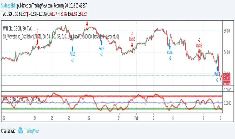
SB_Wavetrend_OscillatorA take on LazyBear's Wavetrend_Oscillator
The idea is bit modified.
Original Idea:
When the oscillator is above the overbought band (red lines) and crosses down the signal (dotted line), it is usually a good SELL signal. Similarly, when the oscillator crosses above the signal when below the Oversold band (green lines), it is a good BUY signal.
Modified Idea:
Carrying the original idea, if the oscillator crosses the overbought band (red lines) and crosses down the signal (dotted line) twice without crossing the Oversold band (green lines) and crosses above the signal (dotted line), a buy or sell signal will take place when the oscillator crosses the dotted line and the value of oscillator is >0(if sell order is to be placed) and <0(if buy order is to be placed).
For the original idea you can refer to:
Let me know if any refinements could improve the oscillator.

Noro's SILA v1.6LIn 1.6:
1) WaveTrend Oscilator (LazyBear's code)
2) Locomotive-pattern
3) A new distance for SILA lines
Noro's SILA v1.6L - the original and new system of finding of a trend.
SILA is not one trend indicator, but 8 different trend indicators in one. Therefore high precision.
For:
- any pair
- any timeframe >= H1

Fractal Quad Components8 Fractal Resonance Component indicators on a chart eats up LOTS of vertical space, so we're providing this Fractal Quad Components script to group 4 components a bit more compactly (eliminating the margin whitespace between indicator rows).
To view 8 components you'll need to add a second instance of this script to your chart and set its Base Timescale Multiplier to 16. Then grab the dividers to stretch both instances to a good viewing height.
One disadvantage of this grouping method is that to read off the x2, x4, and x8 lead and lag line values, you'll need to mentally add 200, 400 or 600 respectively.
We also replaced the "Extreme" > +-100% black crosses (+) with more subtle purple circle outlines. These extreme crosses are often (but not always) too early to be a major reversal so it's best not to overemphasize them.
Significant crosses (> +-75%) are still highlighted with black circle outlines, and are the most likely to be major reversals for buy/sell.
Note how the 30-minute oscillator (2nd row) showed the cleanest (black-outlined) reversals on the S&P for the last week of 2016, with just a bit more profit-eating lag than the 15-minute oscillator above.

MACD MultiTimeFrame 1h4h1D [Fantastic Fox]Please insert the indicator into 1h time-frame, otherwise you need to change the lengths' inputs.
When there are tops for two of the MACDs and they are near and close* to each other, there is a big opportunity of a "Major Top" for the security, and vice versa for "Major Bottom".
This indicator can be used for tracing multi time-frame divergence. Also, it could help traders to identify the waves of Elliott Wave, and as a signal for confirmation of an impulse after a correction or retracement.
* They should be on top of each others head, not crossing each other. not necessarily touching, but not so far from each other.
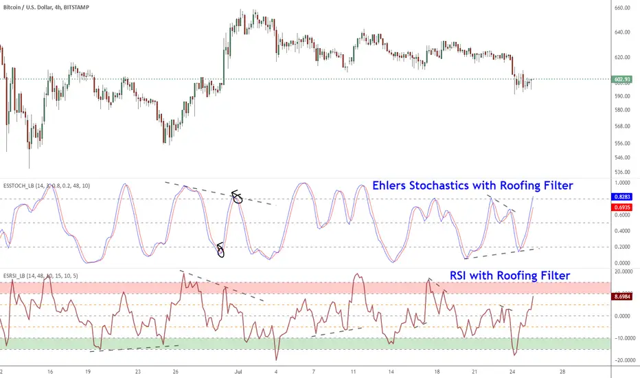
Ehlers Smoothed Stochastic & RSI with Roofing FiltersRoofing filters, first discussed by Mr.John Ehlers, act as a passband, filtering out unwanted noise from market data and accentuating turning points.
I have included 2 indicators with filters enabled. Both support double smoothing via options page. All the parameters are configurable.
Info on Roofing Filter and Ehlers Super Smoother:
----------------------------------------------------
The Ehlers' Roofing Filter is an expansion on Ehlers Super Smoother Filter, both being smoothing techniques based on analog filters. This filter aims at reducing noise in price data.
In Super Smoother Filter, regardless of the time frame used, all waves having cycles of less than 10 bars are considered noise (customizable via options page). The Roofing Filter uses this principle, however, it also creates a so-called "roof" by eliminating wave components having cycles greater than 48 bars which are perceived as "spectral dilation". Thus, the filter only passes those spectral components whose periods are between 10 and 48 bars. This technique noticeably reduces indicator lag and also helps assess turning points more accurately.
More info:
- Spectral dilation paper: www.mesasoftware.com
- John Ehlers presentation: www.youtube.com
------------------------------------------------------
If you want to use RSI %B and Bandwidth, follow this guide to "Make mine" this chart and get access to the source:
drive.google.com
For the complete list of my indicators, check this post:
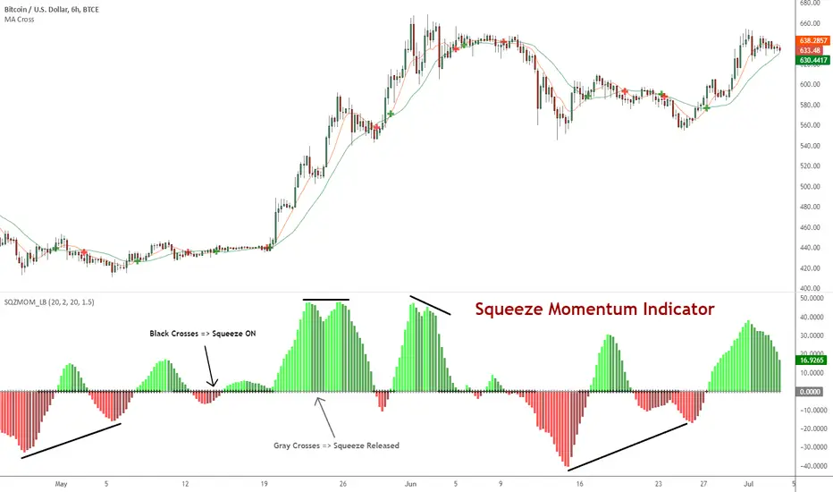
Squeeze Momentum Indicator [LazyBear]
Fixed a typo in the code where BB multiplier was stuck at 1.5. Thanks @ucsgears for bringing it to my notice.
Updated source: pastebin.com
Use the updated source instead of the what TV shows below.
This is a derivative of John Carter's "TTM Squeeze" volatility indicator, as discussed in his book "Mastering the Trade" (chapter 11).
Black crosses on the midline show that the market just entered a squeeze (Bollinger Bands are with in Keltner Channel). This signifies low volatility, market preparing itself for an explosive move (up or down). Gray crosses signify "Squeeze release".
Mr.Carter suggests waiting till the first gray after a black cross, and taking a position in the direction of the momentum (for ex., if momentum value is above zero, go long). Exit the position when the momentum changes (increase or decrease --- signified by a color change). My (limited) experience with this shows, an additional indicator like ADX / WaveTrend, is needed to not miss good entry points. Also, Mr.Carter uses simple momentum indicator, while I have used a different method (linreg based) to plot the histogram.
More info:
- Book: Mastering The Trade by John F Carter
List of all my indicators:
HOHO Oscillator Squeeze With AGAIG TurnsHOHO OSCILLATOR SQUEEZE WITH AGAIG TURN DETECTION
═════════════════════════════════════════════════════════════
OVERVIEW
This powerful indicator combines three proven trading concepts into one visually stunning, highly accurate momentum and trend analysis tool:
• HOHO (Hump Oscillator) - Multi-timeframe momentum oscillator
• Squeeze Indicator - Bollinger Bands/Keltner Channel volatility compression detector
• AGAIG (As Good As It Gets) Turn Detection - Intelligent price reversal identification
The result is a comprehensive trading system that identifies high-probability entry and exit points with exceptional visual clarity.
═════════════════════════════════════════════════════════════
KEY FEATURES
HOHO OSCILLATOR
The foundation of this indicator is the Hump Oscillator, which creates distinctive wave patterns ("humps") above and below the zero line. These colorful columns provide instant visual feedback on momentum direction and strength:
• Fast oscillator (thin columns) - Responsive to immediate price action
• Slow oscillator (wide columns) - Confirms underlying trend momentum
• Color-coded bars shift from bright (strong momentum) to dark (weakening momentum)
• Fully customizable MA types (EMA/SMA) and lengths
SQUEEZE DETECTION
Integrated Bollinger Band and Keltner Channel analysis identifies volatility compression:
• Yellow zero-line dots signal active squeeze conditions
• Optional yellow background highlights compression zones
• Anticipates explosive breakout moves
• Adjustable BB and KC parameters for different markets and timeframes
AGAIG TURN DETECTION
Intelligent price reversal identification based on the "As Good As It Gets" methodology:
• Automatically identifies significant market turning points
• Adjustable sensitivity via "Turn Detection Length" (lower = more signals, higher = fewer signals)
• Strength filter ensures only quality setups are marked (1-10 scale)
• Eliminates noise and false signals common in traditional pivot indicators
VISUAL SIGNALS
• BUY arrows (green triangles) mark bullish reversal opportunities
• SELL arrows (red triangles) mark bearish reversal opportunities
• Text labels positioned for optimal readability
• All arrows appear at actual turning points with configurable lookback offset
FLEXIBLE CUSTOMIZATION
• Choose between EMA or SMA for all moving average calculations
• Adjustable oscillator lengths for different trading styles
• Configurable turn detection sensitivity
• Optional bar coloring based on Fast or Slow momentum
• Clean, professional visual design
═════════════════════════════════════════════════════════════
HOW TO USE
ENTRY SIGNALS
Look for BUY/SELL arrows combined with:
1. Squeeze conditions (yellow markers) for highest-probability setups
2. Oscillator color confirmation (green for longs, red for shorts)
3. Turn strength that meets your minimum requirements
TREND CONFIRMATION
• Strong green humps = bullish momentum building
• Strong red humps = bearish momentum building
• Oscillator crossing zero = momentum shift
• Color transitions = momentum strengthening or weakening
VOLATILITY ANALYSIS
• Yellow zero-line dots = consolidation/squeeze active
• Expansion after squeeze = high-probability breakout opportunity
• Combine with turn arrows for precise entry timing
PARAMETER TUNING
For scalping/day trading (5m-15m charts):
• Turn Detection Length: 3-5
• Turn Strength: 2-4
For swing trading (1H-4H charts):
• Turn Detection Length: 5-8
• Turn Strength: 3-5
For position trading (Daily charts):
• Turn Detection Length: 8-15
• Turn Strength: 5-7
═════════════════════════════════════════════════════════════
CREDITS & ATTRIBUTION
This indicator builds upon the excellent work of:
• HOHO (Hump Oscillator) - Original concept from ThinkorSwim community
• Squeeze Indicator - Based on TTM Squeeze by John Carter
• AGAIG (As Good As It Gets) - Turn detection methodology by NPR21
Converted and enhanced for TradingView with permission from the trading community.
═════════════════════════════════════════════════════════════
BEST PRACTICES
✓ Use on liquid markets (major indices, forex pairs, crypto)
✓ Combine with support/resistance levels for confluence
✓ Wait for oscillator color confirmation before entry
✓ Higher turn strength settings = fewer but higher-quality signals
✓ Squeeze breakouts offer exceptional risk/reward opportunities
✓ Practice proper risk management and position sizing
✗ Don't trade every arrow - wait for confluence
✗ Don't ignore the oscillator colors - they show momentum health
✗ Don't use overly sensitive settings in choppy markets
✗ Don't trade counter to the oscillator trend without strong confirmation
═════════════════════════════════════════════════════════════
WHAT MAKES THIS INDICATOR UNIQUE
Unlike standalone momentum oscillators or simple pivot indicators, this tool synthesizes three proven methodologies into a single, coherent visual system. The combination of momentum analysis (HOHO), volatility detection (Squeeze), and intelligent turn identification (AGAIG) provides traders with a comprehensive view of market conditions and high-probability trading opportunities.
The indicator's visual design uses color psychology and positioning to make complex market analysis instantly understandable at a glance - critical for fast-moving markets and quick decision-making.
═════════════════════════════════════════════════════════════
SUITABLE FOR
• Day traders on 5m-30m timeframes
• Swing traders on 1H-Daily timeframes
• Scalpers seeking momentum confirmation
• Options traders identifying reversal points
• Futures traders (especially /ES, /NQ, /YM)
• Forex traders on major pairs
• Cryptocurrency traders

Elder Unified Strategy Final v2.1Description:
1. Philosophy & Concept
This strategy is a modern implementation of Dr. Alexander Elder’s legendary "Triple Screen Trading System" and the "Impulse System." The core philosophy is to filter every trading decision through three distinct timeframes ("Screens") to minimize risk and align with the dominant market force:
Screen 1 (The Tide): The long-term trend (Higher Timeframe).
Screen 2 (The Wave): Intermediate corrections/pullbacks on the current chart.
Screen 3 (The Ripple): The specific entry trigger when momentum realigns with the trend.
2. Why This Script Was Tuned? (The Enhancement)
In the classic Elder definition, the "Tide" is determined strictly by the slope of the Weekly MACD Histogram.
The Tuning: In strongly trending markets (like Gold or Crypto), deep pullbacks often cause the MACD Histogram on the higher timeframe to slope down temporarily. This results in valid Dip-Buying opportunities being rejected because the strict filter turns the "Traffic Light" red too early.
The Solution (v2.1 Tuning): We introduced a "Tide Filter Mode" selector:
Classic Mode: Uses MACD Slope (Very strict, fewer signals).
Trend Mode (Default): Uses the HTF EMA 200. As long as the price is above the HTF EMA 200, the trend is considered Bullish. This allows the strategy to capture high-probability pullbacks in strong trends without being filtered out prematurely.
3. Key Features
Unified Dashboard: Monitors the Tide (HTF), Wave (Stochastic), and Impulse (Momentum) status in a single, non-intrusive panel.
Dual-Signal Logic: Supports both "Swing Pullback" traders and "Momentum Breakout" traders.
Visual EMAs: Automatically displays the Tactical EMAs (13 & 26) for short-term crossovers and the Strategic EMA (200) for the major trend baseline.
Impulse Coloring: Bars are colored Green (Bullish), Red (Bearish), or Blue (Neutral) based on the combined momentum of EMA and MACD.
4. How to Use (Strategy Guide)
Select your Trading Mode in the settings menu:
A. STANDARD MODE (Triple Screen / Swing)
Best for traders who prefer buying "on sale" during a trend.
BUY Rules:
Screen 1: HTF is Bullish (Price > HTF EMA 200).
Screen 2: Stochastic drops into Oversold (<20) or crosses back up.
Screen 3: Price breaks above the previous candle's High.
Visual: "TS Buy" Label (Lime Green).
SELL Rules: The inverse of Buy (HTF Bearish + Stoch Overbought).
B. AGGRESSIVE MODE (Impulse Momentum)
Best for traders who prefer catching breakouts and strong momentum moves.
BUY Rules:
Screen 1: HTF is Bullish.
Screen 2: The candle turns GREEN (Impulse System: EMA 13 rising + MACD Hist rising).
Visual: Small "Mom" Triangle (Teal).
C. HYBRID MODE
Displays both signal types simultaneously for a complete market overview.
5. Settings
Tide Filter (Screen 1): Set to "HTF EMA Direction" for responsive trend-following (recommended), or "MACD Slope" for the strict classic method.
HTF Multiplier: The time factor for the Higher Timeframe. (e.g., Input 5 on a 15m chart = H1 Trend Data).
Show Tactical EMAs: Toggles the visibility of the EMA 13 (Blue) and EMA 26 (Purple).
Disclaimer
This indicator is for educational and analytical purposes only. Past performance does not guarantee future results. Always use proper risk management and Stop Losses.

Ultimate Gold & FX K-NN Master V95A sophisticated market analysis tool powered by K-NN.
Users have full control over MACD, STC, and SMC configurations. With integrated Elliott Wave analysis, this tool offers high-level functionality for professional trading.

Trend Speed Analyzer with Entries (Zeiierman)📈 Trend Speed Analyzer with Entry Signals (Zeiierman – Modified)
🔹 Overview
This indicator is a trend-following momentum system built around an adaptive (dynamic) moving average and a proprietary trend speed / wave strength engine.
It is designed to identify high-quality continuation entries after price confirms direction, not to predict tops or bottoms.
Best suited for:
Index futures (ES, NQ)
ETFs (SPY, QQQ)
Strongly trending stocks
Intraday or swing trading
🔹 Core Concepts
1️⃣ Dynamic Trend Line (Adaptive EMA)
Instead of using a fixed EMA length, this script dynamically adjusts:
EMA length based on normalized price movement
EMA responsiveness using an accelerator factor
Result:
Fast reaction during strong trends
Smooth behavior during choppy markets
Fewer false flips compared to traditional EMAs
This trend line acts as the primary regime filter.
2️⃣ Trend Speed & Wave Analysis
The indicator tracks trend speed, which represents cumulative directional pressure over time.
It also records:
Bullish wave sizes
Bearish wave sizes
Average vs maximum wave strength
Bull/Bear dominance
These statistics are displayed in an optional table to help assess:
Market bias
Momentum asymmetry
Whether the current move is weak, average, or exceptional
🔹 Entry Signal Logic (One Signal per Trend Shift)
Signals are not spammy.
Only one entry signal is allowed per crossover.
Long Entry Conditions
A long signal is generated when:
Price crosses above the dynamic trend line
A bullish candle forms
The candle body is at least X% of ATR (filters weak/doji candles)
The entire candle body is above the trend line
(Optional) Trend speed is positive
Short Entry Conditions
A short signal is generated when:
Price crosses below the dynamic trend line
A bearish candle forms
The candle body is at least X% of ATR
The entire candle body is below the trend line
(Optional) Trend speed is negative
📌 Once a signal fires, no additional signals will appear until a new crossover occurs.
🔹 What this indicator is NOT
❌ Not a mean-reversion system
❌ Not a prediction tool
❌ Not meant for sideways markets
This tool assumes structure → confirmation → continuation.
🔹 How to Trade It (Suggested Use)
Use higher timeframes (5m–30m) for cleaner signals
Trade in the direction of higher-timeframe bias
Combine with:
VWAP
Key levels (PDH / PDL / PMH / PML)
Market session context
🔹 Customization
Adjust Maximum Length for smoother vs faster trends
Adjust Accelerator Multiplier for sensitivity
Enable/disable speed filter for stricter momentum confirmation
ATR candle filter removes weak signals automatically
⚠️ Disclaimer
This indicator provides technical signals only and does not include trade management, stops, or targets.
Always apply proper risk management.

Cosmic Volume Analyzer [JOAT]
Cosmic Volume Analyzer - Astrophysics Edition
Overview
Cosmic Volume Analyzer is an open-source oscillator indicator that applies astrophysics-inspired concepts to volume analysis. It classifies volume into buy/sell categories, calculates volume flow, detects accumulation/distribution phases, identifies climax volume events, and uses gravitational and stellar mass analogies to visualize volume dynamics.
What This Indicator Does
The indicator calculates and displays:
Volume Classification - Categorizes each bar as CLIMAX_BUY, CLIMAX_SELL, HIGH_BUY, HIGH_SELL, NORMAL_BUY, or NORMAL_SELL
Volume Flow - Percentage showing buy vs sell pressure over a lookback period
Buy/Sell Volume - Separated volume based on candle direction
Accumulation/Distribution - Phase detection using Money Flow Multiplier
Volume Oscillator - Fast vs slow volume EMA comparison
Gravitational Pull - Volume-weighted price attraction metric
Stellar Mass Index - Volume ratio combined with price momentum
Black Hole Detection - Identifies extremely low volume periods (liquidity voids)
Supernova Events - Detects extreme volume with extreme price movement
Orbital Cycles - Sine-wave based cyclical visualization
How It Works
Volume classification uses volume ratio and candle direction:
classifyVolume(series float vol, series float close, series float open) =>
float avgVol = ta.sma(vol, 20)
float volRatio = avgVol > 0 ? vol / avgVol : 1.0
if volRatio > 1.5
if close > open
classification := "CLIMAX_BUY"
else
classification := "CLIMAX_SELL"
else if volRatio > 1.2
// HIGH_BUY or HIGH_SELL
else
// NORMAL_BUY or NORMAL_SELL
Volume flow separates buy and sell volume over a period:
calculateVolumeFlow(series float vol, series float close, simple int period) =>
float currentBuyVol = close > open ? vol : 0.0
float currentSellVol = close < open ? vol : 0.0
// Accumulate in buffers
float flow = (buyVolume - sellVolume) / totalVol * 100
Accumulation/Distribution uses the Money Flow Multiplier:
float mfm = ((close - low) - (high - close)) / (high - low)
float mfv = mfm * vol
float adLine = ta.cum(mfv)
if adLine > adEMA and ta.rising(adLine, 3)
phase := "ACCUMULATION"
else if adLine < adEMA and ta.falling(adLine, 3)
phase := "DISTRIBUTION"
Gravitational pull uses volume-weighted price distance:
gravitationalPull(series float vol, series float price, simple int period) =>
float massCenter = ta.vwma(price, period)
float distance = math.abs(price - massCenter)
float mass = vol / ta.sma(vol, period)
float gravity = distance > 0 ? mass / (distance * distance) : 0.0
Signal Generation
Signals are generated based on volume conditions:
Buy Climax: Volume exceeds 2 standard deviations above average on bullish candle
Sell Climax: Volume exceeds 2 standard deviations above average on bearish candle
Strong Buy Flow: Volume flow exceeds positive threshold (default 45%)
Strong Sell Flow: Volume flow exceeds negative threshold (default -45%)
Supernova: Volume 3x average AND price change 3x average
Black Hole: Volume 2 standard deviations below average
Dashboard Panel (Top-Right)
Volume Class - Current volume classification
Volume Flow - Buy/sell flow percentage
Buy Volume - Accumulated buy volume
Sell Volume - Accumulated sell volume
A/D Phase - ACCUMULATION/DISTRIBUTION/NEUTRAL
Volume Strength - Normalized volume strength
Gravity Pull - Current gravitational metric
Stellar Mass - Current stellar mass index
Cosmic Field - Combined cosmic field strength
Black Hole - Detection status and void strength
Signal - Current actionable status
Visual Elements
Volume Ratio Columns - Colored bars showing normalized volume
Volume Flow Line - Main oscillator showing flow direction
Flow EMA - Smoothed flow for trend reference
Volume Oscillator - Area plot showing fast/slow comparison
Gravity Field - Area plot showing gravitational pull
Orbital Cycle - Circle plots showing cyclical pattern
Stellar Mass Line - Line showing mass index
Climax Markers - Fire emoji for buy climax, snowflake for sell climax
Supernova Markers - Diamond shapes for extreme events
Black Hole Markers - X-cross for liquidity voids
A/D Phase Background - Subtle background color based on phase
Input Parameters
Volume Period (default: 20) - Period for volume calculations
Distribution Levels (default: 5) - Granularity of distribution analysis
Flow Threshold (default: 1.5) - Multiplier for flow significance
Accumulation Period (default: 14) - Period for A/D calculation
Gravitational Analysis (default: true) - Enable gravity metrics
Black Hole Detection (default: true) - Enable void detection
Stellar Mass Calculation (default: true) - Enable mass index
Orbital Cycles (default: true) - Enable cyclical visualization
Supernova Detection (default: true) - Enable extreme event detection
Suggested Use Cases
Identify accumulation phases for potential long entries
Watch for distribution phases as potential exit signals
Use climax volume as potential exhaustion indicators
Monitor volume flow for directional bias
Avoid trading during black hole (low liquidity) periods
Watch for supernova events as potential trend acceleration
Timeframe Recommendations
Best on 15m to Daily charts. Volume analysis requires sufficient trading activity for meaningful readings.
Limitations
Volume data quality varies by exchange and instrument
Buy/sell separation is based on candle direction, not actual order flow
Astrophysics concepts are analogies, not literal physics
A/D phase detection may lag during rapid transitions
Open-Source and Disclaimer
This script is published as open-source under the Mozilla Public License 2.0 for educational purposes. It does not constitute financial advice. Past performance does not guarantee future results. Always use proper risk management.
- Made with passion by officialjackofalltrades

Nexus Flow ProNexus Flow Pro is a trading tool that combines "deep trend insight" with "precise trading signals." It navigates trending waves and accurately displays reversal signals; it is one of the most logically sound and visually appealing oscillator indicators.
This indicator employs a "dual-engine" logic, isolating and layering market trends:
Primary Engine: Based on an enhanced T3 smoothing algorithm, it captures the market's medium- to long-term trends. Visually, it serves as the background of the main chart, providing clear trend guidance.
Secondary Engine: Responsible for fine-grained momentum filtering and crossover point identification. It displays intensely contested price points in a more compact and lightweight manner, combining this with the main trend guidance to identify correct trading opportunities.
Each dot represents a different voice in the market, used to observe market dynamics and identify genuine trading opportunities.
Use 【Advanced Dynamic RSI Pro】 to determine market depth and avoid making the wrong entry point.

RSI + MACD (RSI Divergence) V3.2
RSI + MACD (RSI Divergence)
This indicator combines RSI divergence detection with a scaled MACD overlay to help traders visualize momentum structure and divergence more clearly in a single pane.
Instead of using RSI and MACD as isolated signals, this script focuses on relative movement, swing structure, and divergence logic, making it especially useful for discretionary traders who analyze momentum behavior rather than fixed indicator levels.
________________________________________
Key Features
RSI Divergence Engine
• Detects Regular Bullish / Bearish Divergence
• Optional Hidden Divergence (for trend continuation)
• Uses confirmed pivot logic (left/right lookback) to avoid repainting
• Adjustable divergence range to filter weak or overly distant signals
RSI is shifted by -50 to center it around zero, allowing better visual alignment with MACD without affecting divergence logic.
________________________________________
Scaled MACD Overlay (Visual Momentum Only)
• MACD, Signal, and Histogram are rescaled dynamically to match the RSI oscillator range
• Designed for wave structure, phase comparison, and momentum timing
• Not intended as a traditional MACD signal generator
• Helps identify momentum agreement or disagreement with RSI divergence
________________________________________
Clean & Practical Design
• Single pane display (no chart clutter)
• Color warnings for RSI overbought / oversold zones
• Adjustable scaling lookback for different markets and timeframes
• Optimized for smooth performance and non-repainting behavior
________________________________________
How to Use
• Best used on indices, crypto, and liquid forex pairs
• Combine RSI divergence signals with:
o Market structure
o Support / resistance
o Trend context
• Use the MACD overlay to:
o Confirm momentum shifts
o Spot early loss of strength
o Compare oscillator phase alignment
This indicator is best suited for analysis and confirmation, not mechanical entry signals.
________________________________________
Notes
• MACD values are scaled for visualization only and do not represent real MACD values
• Divergence signals are confirmation-based, not predictive
• No repainting once pivots are confirmed
________________________________________
Who Is This For?
• Swing traders
• Momentum & divergence traders
• Traders who prefer structure-based confirmation over raw indicator signals
• Anyone who wants RSI & MACD behavior in a single, readable oscillator
Enjoy and happy trading!
DISCLAIMER
This script is intended for informational and educational purposes only. It does not constitute financial, investment, or trading advice. All trading decisions made based on its output are solely the responsibility of the user

VaRz BTC/Gold Risk MeterVaRz Risk Meter (BTC vs Risk-On & Gold Safe-Haven Proxy)
The VaRz Risk Meter is a macro sentiment oscillator designed to measure Bitcoin’s relative strength and directional bias using key risk-appetite and safe-haven flows.
Indicator Components
VIX → Market fear & volatility benchmark
NASDAQ 100 (NDX) → Primary risk-on proxy (growth/tech capital flow)
Gold (XAUUSD) → Safe-haven strength alternative to USD index
Bitcoin (BTCUSDT) → Used only for normalization reference, not bias calculation
Core Logic
All assets are normalized on a 0–100 scale using a 100-period rolling window to create a balanced comparison across markets.
The Bitcoin Macro Bias Histogram is calculated as:
NASDAQ strength − VIX fear − Gold safe-haven strength
This produces a macro directional regime for Bitcoin:
Market Regimes Interpretation
Indicator State Meaning for BTC
NASDAQ high + VIX low + Gold weak Risk-On environment → Bullish for Bitcoin
Gold strong + VIX rising + NASDAQ weak Risk-Off / flight to safety → Bearish pressure on BTC
All assets near 50 with no trend Neutral / Sideways → Macro indecision
How to Use
This is not a direct entry signal, but a macro bias filter
Best combined with:
Market Structure, Liquidity zones, Orderflow, Volume analysis, and Elliott Wave context
Bias becomes more reliable on higher timeframes (1W, 1M) but works on any chart
Key Insight
Bitcoin behaves as a hybrid risk asset. This indicator helps track when capital is:
Rotating into risk markets (favorable for BTC)
or
Seeking protection in gold and volatility hedges (unfavorable for BTC)
The histogram visually maps these shifts to give traders a clear macro regime awareness in one window.

CSA Infinity BridgeCSA Infinity Bridge - Major Update: Full Transparency + Stricter Consensus
Update Notes (December 29, 2025):
- Big improvements based on real-user feedback!
- This version eliminates the confusion that sometimes occurred when the dashboard showed near-unanimous agreement (like 13/14) but one indicator was silently disagreeing.
Key Changes:
- All 14 indicators are now fully visible in the dashboard. Added a dedicated "TTM" column for the standalone TTM Wave (previously hidden). No more guessing which indicator is the holdout—you’ll see every single Bull/Bear vote clearly.
- Stricter consensus thresholds for higher-conviction signals:
- Strong Bullish/Bearish now requires 12+ out of 14 (previously 11+)
- Trending ↑/↓ requires 9+ out of 14 (previously 8+)
- This reduces whipsaws and makes LONG/SHORT signals more reliable, especially for novice traders.
Keeps the popular OBV replacement (volume confirmation instead of basic candle color).
- Perfect for anyone who wants a clean, trustworthy consensus dashboard without hidden surprises. Ideal for futures, stocks, crypto—any market with volume.
- Test it, compare it to the previous version, and let me know what you think!

Stack Detector Stack Detector, which is showing how the ma moves as a chart goes by.
It help you the power of the waves

HMA Fibo Trend RibbonHMA Fibo Trend Ribbon - Fibonacci Trend Indicator
📊 Indicator Description
This is a trend indicator based on the harmony of Fibonacci numbers. The indicator uses seven Hull Moving Averages with periods corresponding to the Fibonacci sequence: 8, 13, 21, 34, 55, 89, 144. This mathematical harmony allows the indicator to perfectly align with natural market cycles and wave structures.
🎯 Fibonacci Philosophy in Market Analysis
The Fibonacci sequence is not just a set of numbers, but a fundamental pattern found in nature, art, and financial markets. Using these periods provides:
Natural alignment with market cycles
Multifractal analysis (covering different wave levels)
Harmonious interaction between timeframes
Universal application across all timeframes
🔧 Indicator Settings
Visual Settings:
Show Main Line - Show main line (HMA 144 - golden ratio)
Show Ribbon Lines - Show the remaining 6 Fibonacci lines
Show Trend Change Labels - Show trend change labels
Show Info (Trend %) - Show info label with trend percentage
Ribbon Opacity - Ribbon transparency (0-100%)
🎨 Visualization of Fibonacci Structure
Color Harmony:
Each HMA line corresponds to a specific Fibonacci level
Collective movement creates the "Fibonacci Ribbon"
Color differentiation based on direction
Info Label:
Displays consensus of 7 Fibonacci levels
Percentage ratio of bullish/bearish lines
Color coding of the trend
📊 Interpretation of Fibonacci Signals
Consistency Levels:
7/7 lines in one direction - Perfect Fibonacci harmony
5-6/7 lines - Strong trend
3-4/7 lines - Consolidation/transition phase
0-2/7 lines - Opposite trend
🚀 Advantages of Fibonacci Approach
Natural harmony with market cycles
Universal - works on any asset and timeframe
Predictive power - anticipates reversal zones
Period synergy - signal amplification when aligned
Minimal lag - HMA responds better than regular MAs
⚡ Implementation Features
Technical Details:
Algorithm: Hull Moving Average (optimized for speed)
Periods: Pure Fibonacci sequence
Calculation: Consensus of 7 harmonic levels
Visualization: Intuitive color scheme
Performance:
Optimized for TradingView
Minimal system load
Support for all chart types
⚠️ Usage Recommendations
Combine with other Fibonacci tools
Verify signals on different timeframes
Use for trade entry filtering
Test on historical data before live trading
✍️ Author: A-Swift
📅 Version: 1.0 Fibonacci
🔗 Code: Open Source (MPL 2.0)
🧮 Basis: Fibonacci Sequence (8, 13, 21, 34, 55, 89, 144)
Fibonacci Fact:
The number 144 in the Fibonacci sequence is the square of its ordinal number (12²) and represents perfect harmony in market cycles. This makes the HMA with period 144 particularly significant for determining the main trend.

Quantum Flow [JOAT]Quantum Flow Nexus - Advanced Multi-Dimensional Flow Analysis
Overview
Quantum Flow Nexus is an open-source overlay indicator that combines custom EMA-based flow calculations with order flow analysis, multi-timeframe correlation, and liquidity zone detection. It provides traders with a structured framework for analyzing market momentum and identifying potential entry points based on multiple confirming factors.
What This Indicator Does
The indicator calculates several analytical components:
Quantum Flow Oscillator - A custom oscillator built from multiple EMA layers at different depths
Flow Momentum - Rate of change of the flow oscillator
Order Flow Delta - Buy vs sell volume pressure estimation
Smart Money Index - Volume-weighted directional bias metric
Multi-Timeframe Entanglement - Price correlation across 15m and 60m timeframes
Liquidity Zones - Historical swing high/low levels with volume significance
Wave Function State - Momentum-based decisiveness detection
How It Works
The core quantum oscillator uses a custom EMA calculation with depth layering:
quantumOscillator(series float src, simple int len, simple int depth) =>
float osc = 0.0
for i = 1 to depth
int fastLen = len / i
int slowLen = len * i
float emaFast = quantumEMA(src, fastLen)
float emaSlow = quantumEMA(src, slowLen)
osc += (emaFast - emaSlow) / depth
osc
This creates a multi-layered view of momentum by comparing EMAs at progressively different speeds.
Signal Generation
Basic signals occur when:
Bullish: Flow crosses above lower band + positive momentum + positive order flow delta
Bearish: Flow crosses below upper band + negative momentum + negative order flow delta
Strong signals require additional confirmation:
Smart Money Index above/below threshold (50/-50)
Entanglement score above 50%
Wave function in collapsed state (decisive momentum)
Confluence Score Calculation
The indicator combines multiple factors into a single confluence percentage:
float confluenceScore = (flowStrength * 20 + entanglementScore * 0.3 + math.abs(orderFlowDelta) * 0.5) / 3
Dashboard Panel (Top-Right)
Flow Strength - Distance from center line normalized by standard deviation
Momentum - Current rate of change of flow
Trend - BULLISH/BEARISH/NEUTRAL based on flow vs EMA
Confluence Score - Combined factor percentage
Order Flow Delta - Buy/sell pressure percentage
Entanglement - Multi-timeframe correlation score
Wave State - COLLAPSED or SUPERPOSITION
Signal - Current actionable status
Visual Elements
Flow Lines - Center flow line with upper/lower bands
Quantum Zones - Filled areas between bands showing bullish/bearish zones
3D Quantum Field - Five oscillating layers creating depth visualization
Order Flow Blocks - Boxes highlighting significant order flow imbalances
Liquidity Heatmap - Dashed lines at significant historical levels
Signal Markers - Triangles for basic signals, labels for strong signals
Input Parameters
Flow Period (default: 21) - Base period for flow calculations
Quantum Depth (default: 3) - Number of EMA layers
Sensitivity (default: 1.5) - Band width multiplier
Liquidity Max Levels (default: 8) - Maximum liquidity zones displayed
Liquidity Min Strength Ratio (default: 0.10) - Minimum volume significance
Suggested Use Cases
Identify momentum direction using flow oscillator position
Confirm entries with order flow and smart money readings
Use liquidity zones as potential support/resistance areas
Wait for strong signals with multiple factor confirmation
Timeframe Recommendations
Effective on 15m to Daily charts. Lower timeframes may produce more signals with higher noise levels.
Limitations
Order flow is estimated from candle structure, not actual order book data
Multi-timeframe requests add processing time
Liquidity zones are based on historical pivots and may not reflect current market structure
Open-Source and Disclaimer
This script is published as open-source under the Mozilla Public License 2.0 for educational purposes. It does not constitute financial advice. Past performance does not guarantee future results. Always use proper risk management.
- Made with passion by officialjackofalltrades

Debye-Einstein Trend Oscillator [Dual Mode] | IkkeOmarDebye-Einstein Trend Oscillator
Indicator Settings Guide
Visual Settings View Mode: Switches the chart display. Select "Standard Flow" to see the raw physics energy bars and crossover lines. Select "Trend Diff (MACD)" to see the histogram that highlights momentum shifts and chaos spikes.
Physics Engine Trend Lookback: Defines the "Mass" of the trend. This sets the long-term baseline (default 1500 bars). Higher values filter out noise and focus only on macro-cycles; lower values make the system faster but noisier. Chaos Threshold (%): Controls the trigger for the Einstein (Chaos) state. Set to 95, only the top 5% of highest-energy volume events will trigger the vertical white spikes. Lowering this value makes the system more sensitive to volatility.
Flow Moving Averages MA Type: Choose between SMA (Simple) or EMA (Exponential) for the smoothing calculation. Fast / Slow Length: These settings determine the sensitivity of the momentum logic. The difference between these two lengths creates the histogram in "Trend Diff" mode.
1. Concept & Theoretical Basis
This script applies principles from Solid State Physics—specifically the Debye and Einstein models of specific heat capacity—to financial market trend analysis.
The core hypothesis is that market trends behave like physical lattices:
Low Energy State (Debye Model): The market moves in a coordinated, wave-like manner (phonons). Trends are sustainable and correlated.
High Energy State (Einstein Model): The market becomes chaotic. Individual participants (atoms) vibrate independently and violently. This represents capitulation or euphoria.
We model "Price" as the position of particles and "Volume × Range" as the thermal energy (Temperature) entering the system.
2. Implementation Models
We constructed the oscillator using three primary physical components:
A. The Trend Vector (Mass)
We assume the "Mass" of the market is its inertia relative to a long-term baseline.
Model: Distance from a 1500-period SMA, normalized by ATR.
Assumption: Price deviation from a deep baseline indicates the magnitude of the trend "force."
B. Thermodynamics (Temperature)
We define "Work" as Volume * True Range.
Temperature (T): The Percentile Rank of this Work over the lookback period (1500 bars).
Assumption: High volume combined with high range equals high thermal energy.
C. The Dual Regimes (Amplifiers)
This is the engine of the script. We apply a scalar multiplier to the Trend Vector based on the current Temperature (T).
Debye Regime (Sustainable): When T is below the critical threshold (95%), we use a polynomial function (T^2). This mimics the Debye T^3 law where energy scales smoothly.
Effect: Smoothly amplifies standard trends.
Einstein Regime (Chaos): When T breaches the critical threshold (95%), we switch to an exponential function derived from the Einstein Solid model.
Effect: Creates massive vertical spikes during trend exhaustions or breakouts.
3. Code Explanation
The Physics Scalars
debye_amp(t) => 1.0 + (math.pow(t, 2) * 5.0)
Defines the sustainable state multiplier. Squaring the temperature t creates a non-linear but smooth response curve that gradually increases with volatility.
einstein_amp(t) => 1.0 + ((1.0 / (math.exp(1.0 / t_safe) - 1.0)) * 15.0)
Deep Dive: This function applies the Bose-Einstein distribution formula (1 / (e^(1/T) - 1)).
The Physics: In quantum mechanics, this formula calculates the occupancy of energy states. At low temperatures, the value is effectively zero (the "frozen" state).
The Function: As our market "Temperature" (T) rises, the denominator shrinks, causing the output to grow exponentially.
The Result: This mathematically forces the system to ignore low-volatility noise but react explosively once the "Boiling Point" is reached, creating the vertical spikes seen on the chart.
is_einstein = (T * 100) >= thresh_einstein
A boolean check that determines if the current market energy (Temperature) has exceeded the user-defined chaos threshold (default 95%).
physics_scalar = is_einstein ? einstein_amp(T) : debye_amp(T)
The regime switch. If the threshold is breached, the system applies the exponential Einstein scalar; otherwise, it applies the polynomial Debye scalar.
Trend Differentiation Logic
final_flow = trend_vector * physics_scalar
Calculates the primary oscillator value by multiplying the directional Trend Vector (Mass) by the active Physics Scalar (Energy).
diff_val = ma_fast - ma_slow
Calculates the momentum of the flow itself by subtracting the Slow Moving Average from the Fast Moving Average. This creates the MACD-style histogram.
4. Visual Reporting & Chart Analysis
Referring to the generated charts (Trend Diff Mode):
The Histogram: Represents the diff_val (Fast MA - Slow MA).
Cyan/Pink: Standard trend momentum (Debye mode).
White Spikes: These represent the Einstein Threshold (Chaos). These spikes generally appear at local bottoms or explosive breakout points, confirming that "Temperature" has exceeded the 95th percentile.
Zero Line: Crossing the zero line implies the trend momentum has shifted (Fast MA crossed Slow MA).
5. Assumptions & Limitations
A. The "Always in Trend" Bias
The "Trend Diff" mode calculates the delta between two moving averages of the flow.
Risk: MAs are laggy by definition. By using a 200/500 MA combo on the oscillator, we are smoothing the data significantly.
Consequence: In a ranging market, the MAs will converge near zero. However, if a sudden burst of Volume enters (Temperature rises) without price moving much, the Einstein scalar will trigger. This may amplify a small move into a large signal, implying a trend where there is only volatility.
B. Lag
The lookback period is 1500 bars. This is a "Macro" trend system. It will not react quickly to short-term reversals unless the Volume/Range shock is massive enough to trigger the Einstein scalar immediately.
Example "physics values"
In the Standard Flow view, the vertical columns represent the raw energy of the trend—Teal and Red bars indicate normal, sustainable market movement (Debye state), while bright Lime and Fuchsia bars signal chaotic, high-volatility events (Einstein state). The height of these bars shows the combined strength of price direction and volume. Overlaying these columns are two moving averages, a fast Blue line and a slow Red line, which smooth out this data to show the underlying momentum. When the Blue line crosses the Red line, it signals a shift in the trend's direction, while the color of the bars warns you if that move is stable or nearing exhaustion.

Ocean Master [JOAT]Ocean Master QE - Advanced Oceanic Market Analysis with Quantum Flow Dynamics
Overview
Ocean Master QE is an open-source overlay indicator that combines multiple analytical techniques into a unified market analysis framework. It uses ATR-based dynamic channels, volume-weighted order flow analysis, multi-timeframe correlation (quantum entanglement concept), and harmonic oscillator calculations to provide traders with a comprehensive view of market conditions.
What This Indicator Does
The indicator calculates and displays several key components:
Dynamic Price Channels - ATR-adjusted upper, middle, and lower channels that adapt to current volatility conditions
Order Flow Analysis - Separates buying and selling volume pressure to calculate a directional delta
Smart Money Index - Volume-weighted order flow metric that highlights potential institutional activity
Harmonic Oscillator - Weighted combination of 10 Fibonacci-period EMAs (5, 8, 13, 21, 34, 55, 89, 144, 233, 377) to identify trend direction
Multi-Timeframe Correlation - Measures price correlation across 1H, 4H, and Daily timeframes
Wave Function Analysis - Momentum-based state detection that identifies when price action becomes decisive
How It Works
The core channel calculation uses ATR with a configurable quantum sensitivity factor:
float atr = ta.atr(i_atrLength)
float quantumFactor = 1.0 + (i_quantumSensitivity * 0.1)
float quantumATR = atr * quantumFactor
upperChannel := ta.highest(high, i_length) - (quantumATR * 0.5)
lowerChannel := ta.lowest(low, i_length) + (quantumATR * 0.5)
midChannel := (upperChannel + lowerChannel) * 0.5
Order flow is calculated by separating volume into buy and sell components based on candle direction:
The harmonic oscillator weights shorter EMAs more heavily using inverse weighting (1/1, 1/2, 1/3... 1/10), creating a responsive yet smooth trend indicator.
Signal Generation
Confluence signals require multiple conditions to align:
Bullish: Harmonic oscillator crosses above zero + positive Smart Money Index + positive Order Flow Delta
Bearish: Harmonic oscillator crosses below zero + negative Smart Money Index + negative Order Flow Delta
Dashboard Panel (Top-Right)
Bias - Current market direction based on price vs mid-channel
Entanglement - Multi-timeframe correlation score (0-100%)
Wave State - COLLAPSED (decisive) or SUPERPOSITION (uncertain)
Volume - Current volume relative to 20-period average
Volatility - ATR as percentage of price
Smart Money - Volume-weighted order flow reading
Visual Elements
Ocean Depth Layers - Gradient fills between channel levels representing different price zones
Channel Lines - Upper (surface), middle, and lower (seabed) dynamic levels
Divergence Markers - Triangle shapes when harmonic oscillator crosses zero
Confluence Labels - BULL/BEAR labels when multiple factors align
Suggested Use Cases
Identify trend direction using the harmonic oscillator and channel position
Monitor order flow for potential institutional activity
Use multi-timeframe correlation to confirm trade direction across timeframes
Watch for confluence signals where multiple factors align
Input Parameters
Length (default: 14) - Base period for channel and indicator calculations
ATR Length (default: 14) - Period for ATR calculation
Quantum Depth (default: 3) - Complexity factor for calculations
Quantum Sensitivity (default: 1.5) - Channel width multiplier
Timeframe Recommendations
Works on all timeframes. Higher timeframes (4H, Daily) provide smoother signals; lower timeframes require faster reaction times and may produce more noise.
Limitations
Multi-timeframe requests add processing overhead
Order flow estimation is based on candle direction, not actual order book data
Correlation calculations require sufficient historical data
Open-Source and Disclaimer
This script is published as open-source under the Mozilla Public License 2.0 for educational purposes. It does not constitute financial advice. Past performance does not guarantee future results. Always use proper risk management and conduct your own analysis before trading.
- Made with passion by officialjackofalltrades
