MAs For Loop | QuantumResearchMAs For Loop | QuantumResearch
Multi-MA Composite Momentum Scoring Engine
MAs For Loop is a unique, multi-layered moving average scoring system developed by QuantumResearch to capture persistent trend momentum through time-based strength analysis. Rather than using a single moving average or crossover, this tool evaluates the historical behavior of five different MA types simultaneously, scoring each one across a 50-bar window and generating a clean, confidence-weighted signal.
📚 How It Works:
For each selected MA (ZLEMA, DEMA, HMA, VIDYA, MEDIAN), the script applies a for-loop that compares the current value to its value over the past 50 bars.
If the MA is above its past value → +1
If it’s below → -1
These values are summed into a score for each MA, ranging from -50 to +50
These individual scores are then averaged into a final “MultiWave” score, which reflects the directional consensus of all five MAs.
🧠 What Makes This Unique?
Unlike traditional moving average signals (e.g., crossovers or price > MA), this system quantifies time-weighted directional pressure.
It doesn’t just tell you “trend or no trend”—it tells you how strong and how consistent that trend has been across multiple smoothing methods.
The composite for-loop engine captures structural momentum in a way that avoids lag and reduces noise from single-source inputs.
🔍 Included MAs & Customization:
📘 ZLEMA (Zero-Lag EMA)
📘 DEMA (Double EMA)
📘 HMA (Hull MA)
📘 VIDYA (Volatility-Adjusted MA)
📘 Median Filter (Percentile Rank 50%)
Users can:
Adjust lengths, sources, and visual color themes
Modify the bullish and bearish thresholds
Display a real-time trend scoring table
Visualize transitions with multi-layer HMA overlays and dynamic bar coloring
📊 Signals:
✅ Long → when average score > +40
🟥 Cash/Short → when average score < -10
All in-between states are neutral (gray)
🔔 Alerts:
"MAs For Loop Long" and "MAs For Loop Short" alert conditions are built-in.
📌 Use Case:
Designed for trend-following swing traders and momentum analysts who want:
Confirmation across multiple MA styles
Smoothed entries based on historical persistence
A scoring engine they can plug into larger systems
Better signal quality during consolidation or early breakout phases
⚠️ Disclaimer:
This tool is for educational and informational purposes only. It does not constitute financial advice or a recommendation to buy or sell any asset.
Past performance is not indicative of future results. Use at your own risk.
Cerca negli script per "wave"

Inter Cycle Valuation | QuantumResearchIntroducing Inter Cycle Valuation by QuantumResearch
A Multi-Factor Adaptive Z-Score System for Market Valuation & Reversal Potential
🧠 Overview
The Inter Cycle Valuation System is a sophisticated multi-factor indicator designed to evaluate the market’s cyclical valuation zones using a blend of momentum, volatility, mean-reversion, and risk-based metrics. It delivers a unified Z-Score—ranging from extremely oversold to overheated conditions—empowering traders to identify high-probability market turning points.
Rather than relying on a single indicator, Inter Cycle blends over 15 diverse Z-score factors, including RSI, ROC, VWAP deviation, Repulse, PGO, and statistical ratios like Sharpe, Sortino, and Omega. This multi-dimensional view allows traders to assess market extremes with greater confidence.
🧩 1. Key Features
📌 Multi-Factor Z-Score System
Inter Cycle integrates 16+ unique indicators into a single composite score. Each input is normalized via a Z-score to ensure balance and reduce bias, helping prevent outlier distortion.
⚙️ Indicator Diversity
Momentum: RSI, ROC, Chande Momentum, Repulse
Mean Reversion: VWAP deviation, Median rank, PGO
Volatility: BB% positioning, Intraday Momentum Index
Risk Ratios: Sharpe, Sortino, Omega
Fractal Geometry: Crosby Ratio
📈 Visually Intuitive Output
Gradient-based area plot for valuation intensity
Optional background heatmap for oversold/overbought zones
Table displaying real-time Z-score values for each component
Dynamic market suggestions: Accumulate, Do Nothing, or Distribute
📊 On-Chart Dashboard
The valuation dashboard displays key stats like Z-price, Z-rsi, Z-mfi, Z-roc, Z-crosby, and more—allowing for real-time interpretation without leaving the chart.
🔍 2. How It Works
1️⃣ Z-Score Normalization
Each indicator is transformed into a Z-score to standardize the values. This ensures that one factor does not dominate due to its scale or volatility.
2️⃣ Multi-Factor Aggregation
All Z-scores are averaged into a single score—called the "Inter Cycle Score"—giving you a reliable snapshot of market positioning.
3️⃣ Actionable Thresholds
🟩 Below -1.6 → “Accumulate Aggressively”
🟨 Between -1.5 and -0.65 → “Accumulate”
⚪ Between -0.5 and +0.5 → “Do Nothing”
🟧 Above +1.2 → “Distribute”
🟥 Above +1.55 → “Distribute Aggressively”
The system prints these labels automatically in real time.
📌 3. Valuation Zones
📉 Strongly Undervalued (< -1.6) → Prime accumulation
📉 Moderately Undervalued (-1.5 to -0.65) → Cautious entries
⚖️ Neutral/Fair (-0.5 to +0.5) → Wait-and-see
📈 Moderately Overheated (+1.2 to +1.55) → Begin reducing risk
🔥 Strongly Overheated (> +1.55) → Take profits, reduce exposure
This structure helps traders and investors clearly interpret current market cycles and position accordingly.
🔁 4. Use Cases & Applications
🔁 Cycle-Based Market Rotation
Great for timing market rotations by spotting macro tops and bottoms. Use the valuation dashboard to rotate capital across assets at optimal phases.
📈 Mean Reversion Entry Triggers
Z-Score combinations such as VWAP deviation + RSI + ROC help pinpoint high-probability mean reversion setups.
📉 Risk-Based Trend Exhaustion
With integrated Sharpe, Sortino, and Omega ratios, you can identify unsustainable moves fueled by low-quality momentum.
💼 Swing Trading & Portfolio Rebalancing
The Inter Cycle score can be used as a filter for swing setups or to rebalance holdings when conditions become extreme.
✅ Conclusion
Inter Cycle Valuation by QuantumResearch is a precision tool for any trader or investor seeking structured insights into market cycles. With its blend of valuation, risk, momentum, and reversion components—standardized via Z-scores—it offers a high-level framework to identify when markets are overheated or undervalued.
Who Should Use It?
✅ Swing Traders & Medium-Term Investors
✅ Portfolio Managers looking for capital rotation signals
✅ Quant Traders and Stat Arb enthusiasts
✅ Macro Traders monitoring cyclical inflection zones
⚠️ Disclaimer
The content provided by this indicator is for educational and informational purposes only. Nothing herein constitutes financial or investment advice. Trading and investing involve risk, including the potential loss of capital. Always backtest and apply risk management suited to your strategy.

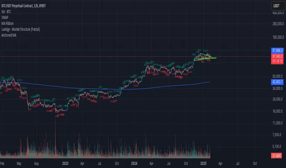
Anchored Moving AverageAn Anchored Moving Average (AMA) is a technical analysis tool that calculates the average price of an asset starting from a specific point in time. Every closing candle calculates the price.
Sweep + Cement Candle Coloring with EMA hopdcCertainly! Here's an introduction for the indicator:
---
## Introduction to the Sweep + Cement Candle Coloring with EMA Indicator
The **Sweep + Cement Candle Coloring with EMA Indicator** is a powerful tool designed to enhance your technical analysis and trading strategies. This indicator combines the unique characteristics of Sweep and Cement candle patterns with the dynamic capabilities of Exponential Moving Averages (EMAs), providing traders with insightful signals for potential market movements.
### Key Features:
1. **Candle Coloring**:
- **Sweep + Cement Bullish Candles**: Highlighted in teal when the low of the current candle is lower than the previous candle, and the close is above the previous high. This indicates potential bullish momentum.
- **Sweep + Cement Bearish Candles**: Marked in red when the high of the current candle is higher than the previous candle, and the close is below the previous low, signaling possible bearish pressure.
2. **Exponential Moving Averages (EMAs)**:
- **EMA 0 (Default Length: 9)**: Provides short-term trend direction.
- **EMA 1 (Default Length: 21)** and **EMA 2 (Default Length: 50)**: Offer insights into medium and long-term trends.
- Customizable settings allow traders to adjust EMA lengths and colors based on their preferences.
3. **Trading Signals**:
- **Buy Signal**: Triggered when a bullish Sweep + Cement candle forms, EMA 1 is above EMA 2, and the price closes above all EMAs.
- **Sell Signal**: Activated with a bearish Sweep + Cement candle, EMA 1 below EMA 2, and the price closes below all EMAs.
- Visual arrows on the chart indicate buy and sell opportunities.
4. **Alerts**:
- Configurable alerts notify traders when the price touches any of the EMAs, ensuring you never miss critical levels.
- Alerts for buy and sell signals keep you informed of potential entries and exits.
### How It Benefits Traders:
This indicator is ideal for traders looking to identify and capitalize on market reversals and trend continuations. By integrating candle patterns with EMA analysis, it provides a comprehensive view of market dynamics, making it easier to spot high-probability trading opportunities.
Whether you are a beginner or an experienced trader, the Sweep + Cement Candle Coloring with EMA Indicator can be a valuable addition to your trading toolkit, helping you make informed decisions with confidence.
---
Feel free to adjust the content to better fit your audience or specific use case!

High and Retracement Finder
This Pine Script indicator, titled "High and Retracement Finder," is designed to identify significant highs and lows on a price chart based on a user-defined starting point and retracement threshold. It begins analysis from a manually set bar index and tracks the highest high until the price retraces by a specified percentage (retracement threshold). Once this retracement occurs, it switches focus to finding the lowest low. If the price surpasses the previous high during this phase, the cycle resets, and the script resumes tracking a new highest high. The script visually marks these significant highs and lows with arrows on the chart, helping traders identify potential turning points or retracements in the market.

GEMAD | QuantumResearchIntroducing Rocheur’s Gaussian Moving Average Deviation Indicator
The Gaussian Moving Average Deviation indicator is an advanced tool that combines the smoothing power of a Gaussian filter with a moving average and ATR-based deviation system to detect trends and reversals. This innovative indicator provides traders with a refined approach to identifying long and short opportunities, making it a valuable addition to any trading toolkit.
Understanding the Gaussian Moving Average Deviation
At the core of this indicator is the Gaussian filter , a mathematical function that reduces market noise by applying a weighted average to price data. This process results in smoother signals, allowing for more accurate trend detection. The Exponential Moving Average (EMA) is applied to the filtered data, further refining the indicator's sensitivity to price movements. Additionally, the ATR-based deviation mechanism helps identify the distance between price and the smoothed average, allowing traders to detect potential long and short signals with greater precision.
Calculation Logic
The Gaussian filter is applied to the selected price source, with customizable parameters like length and sigma (standard deviation). This smoothed data is then used to calculate the EMA over multiple lengths. The ATR is incorporated to measure volatility and calculate the deviation threshold for generating signals.
Long Signals: A long signal is triggered when the price exceeds the filtered EMA plus the ATR deviation.
Short Signals: A short signal occurs when the price falls below the filtered EMA minus the ATR deviation.
Visual Representation
The Gaussian Moving Average Deviation indicator offers a customizable color palette for traders to easily identify trends at a glance:
Green Bars: Represent a bullish trend when the price is above the filtered EMA, signaling a long opportunity.
Red Bars: Indicate a bearish trend when the price falls below the filtered EMA, signaling a short opportunity.
The indicator also plots three smoothed lines (EMA with different lengths) to visualize the market’s overall direction and provide a clearer trend structure.
Filtered EMA: A single EMA is plotted for the Gaussian-filtered data.
Additional Smooth Lines: Two more smoothed averages (EMA of longer lengths) are plotted to show broader trends and deviations.
Customization & Parameters
To accommodate different trading styles, the Gaussian Moving Average Deviation allows for several customization options:
Periode: Default set to 4, it controls the length of the Gaussian filter.
EMA Length: Default set to 21, this adjusts the smoothing period for the filtered data.
ATR Length: Controls the ATR’s sensitivity to volatility, used in calculating the deviation for long and short signals.
Color Modes: A variety of color modes are available, allowing traders to customize the visual appearance of bullish and bearish trends.
Trading Applications
This indicator is versatile across various market conditions and can be adapted to different trading strategies:
Trend Following: The combination of Gaussian filtering and multiple EMA calculations helps traders follow trends with minimal lag.
Reversal Detection: By using ATR-based deviation, the indicator is adept at spotting potential reversals.
Risk Management: Clearly defined long and short signals provide traders with reliable entry and exit points, enhancing overall risk management.
Final Note
The Gaussian Moving Average Deviation is a powerful tool for traders looking to reduce market noise while maintaining sensitivity to price changes. With its customizable parameters and visual representation, it’s a flexible addition to any technical analysis strategy. As always, thorough backtesting and parameter adjustment are recommended to tailor the indicator to specific market conditions.

Boost Candle Indicator by JulianThe Boost Candle Trading Indicator is designed to identify significant price movements by calculating the average candle size for the same direction candles (green for bullish and red for bearish) over a specified number of periods. It then highlights candles that exceed a predefined multiple of this average size, indicating potential strong buying or selling pressure.
Key Features:
Directional Average Calculation: Calculates the average size of the previous candles in the same direction (green for buy signals and red for sell signals), ensuring the boost signal is contextually relevant.
Boost Multiplier: Allows customization of the multiplier to define what constitutes a boost candle, providing flexibility in detecting varying levels of price movement intensity.
Proximity to Moving Average: Integrates a proximity check to the moving average (MA), ensuring that boost candles are identified in context with the overall market trend.
Buy and Sell Signals:
Buy Signal: Triggered when a significant green boost candle appears below the moving average and closes above it, indicating a strong bullish movement.
Sell Signal: Triggered when a significant red boost candle appears above the moving average and closes below it, indicating a strong bearish movement.
Customizable Inputs:
Moving Average Length: Adjust the length of the moving average to suit different trading strategies.
Number of Periods for Average Candle Size: Define the lookback period for calculating the average candle size.
Boost Multiplier and Proximity Tolerance: Fine-tune the sensitivity of the indicator to suit different market conditions.
How to Use:
Buy Signals: Look for green labels ("B") below significant bullish candles, indicating a potential upward price movement.
Sell Signals: Look for red labels ("S") above significant bearish candles, indicating a potential downward price movement.
Proximity to Moving Average: Use the proximity tolerance setting to filter out signals that are not closely aligned with the moving average trend.
This indicator is ideal for traders looking to identify strong market movements and align their trades with significant price actions. Customize the settings to fit your trading style and enhance your market analysis.


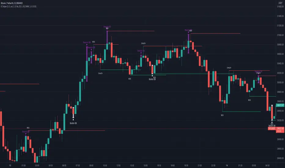
IC Sniper
Hello fellow traders,
This is a script which tries to visualise SMC /Institutional Candles.
Few of the features which are used in the script are explained below,
CAUTION, Do not enable IC Candles option (BETA). It has a lot of flaws which require solving the problem from a different angle, and I am trying my level best to figure out a solution.
Left Bars and Right Bars, used to find pivot high and lows to help us make Market Structure.
Now first thing to understand when trying to figure out SMC or institutional moves is the figure out the trend you are in. Trend is always your friend, so use higher time frame to just see the trend ( Trend lines are handy ).
I suggest using manual trend detection option, you have other two options available. Either of them have some flaws which can be worked upon if required.
Find the trend, be it manually or EMA ensures are trend support order blocks and engulfing candles are shown.
IC = Institutional Candle
How to find an IC ???
Simple things are ensured.
Below is defined for a bear market
1) Clears liquidity ( I simply see the last green candle before a minor dump ( vice-versa ) and see if the last green candle or the following red candle have huge wicks which clear recent previous highs (3 candles)
2) Next I see if the red candle after the last green candles is engulfing in nature ( yellow for bearing environment and white for bullish )
3) Then I create an order block.
4) Sometimes if imbalance after an order block is tooo big, the re test only fills the imbalance rather than reaching the IC . Imbalances are shown with grey boxes, the ones filled are automatically removed.
For successful entries please ensure that the candles succeeding engulfing candles break a market structure (BOS, ChoCh).
Any suggestion are welcome.
Please change max moves to detect to 5 from 3
Caution not all order blocks made are perfect !! Further adjustments are required but are too complicated for me to code, have to find some way around and I am sure with update I will refine the options.
Basic things to look,
IC should be followed buy a pump or a dump ( with some candles being out of the trend (I have given some scope in the code)) plus it should have a high wick which clears liquidity.
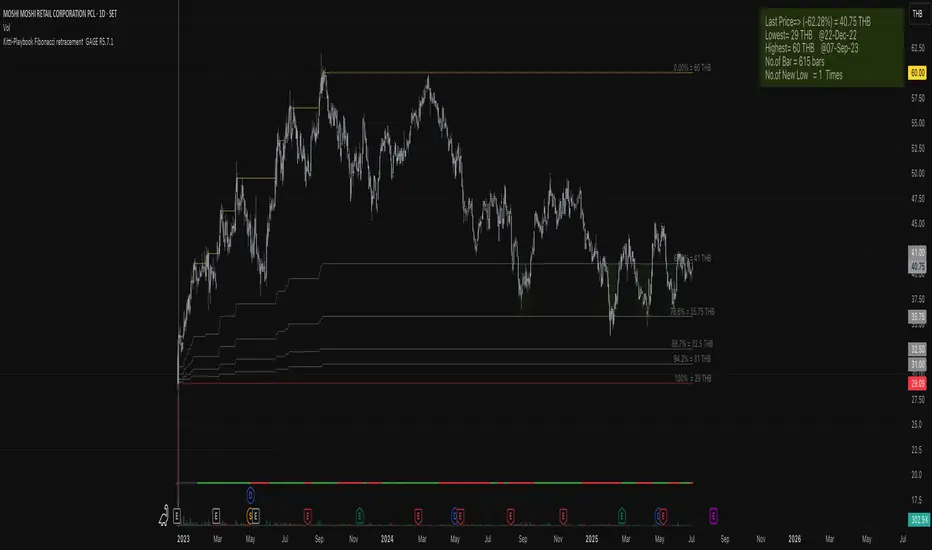
Kitti-Playbook Fibonacci retracement GAGE R0.00
Release Notes: Oct 25 2021
OVERVIEW :Kitti-Playbook Fibonacci retracement GAGE R0.00
Easy for visualize Fibonacci retracement level
CONCEPTS
1)Minimum Line = Lowest level of Source form start
2)Maximum Line = Highest level of Source form New Low
3)Calculation
a) Fibonacci Retracement of 61.8% form Maximum level
b) Fibonacci Retracement of 78.6% form Maximum level
c) Fibonacci Retracement of 88.7% form Maximum level
d) Fibonacci Retracement of 94.2% form Maximum level
4)Information Display
a) Information Bar show Number of New Low , Max level , Min Level , Last Bar No, Current Pricel
b) GAGE Scale Number
c) New Low
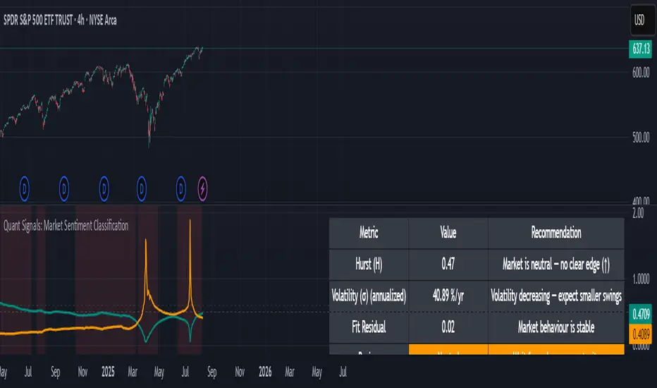
Quant Signals: Market Sentiment Monitor HUDWavelets & Scale Spectrum
This indicator is ideal for traders who adapt their strategy to market conditions — such as swing traders, intraday traders, and system developers.
Trend-followers can use it to confirm trending conditions before entering.
Mean-reversion traders can spot choppy markets where reversals are more likely.
Risk managers can monitor volatility shifts and regime changes to adjust position size or pause trading.
It works best as a market context filter — telling you the “weather” before you decide on the trade.
Wavelets are like tiny “measuring rulers” for price changes. Instead of looking at the whole chart at once, a wavelet looks at differences in price over a specific time scale — for example, 2 bars, 4 bars, 8 bars, and so on.
The scale spectrum is what you get when you measure volatility at several of these scales and then plot them against scale size.
If the spectrum forms a straight line on a log–log chart, it means price changes follow a consistent pattern across time scales (a power-law relationship).
The slope of that line gives the Hurst exponent (H) — telling you whether moves tend to persist (trend) or reverse (mean-revert).
The height of the line gives you the volatility (σ) — the average size of moves.
This approach works like a microscope, revealing whether the market’s behaviour is consistent across short-term and long-term horizons, and when that behaviour changes.
This tool applies a wavelet-based scale-spectrum analysis to price data to estimate three key market state measures inside a rolling window:
Hurst exponent (H) — measures persistence in price moves:
H > ~0.55 → market is trending (moves tend to continue).
H < ~0.45 → market is choppy/mean-reverting (moves tend to reverse).
Values near 0.5 indicate a neutral, random-walk-like regime.
Volatility (σ) — the average size of price swings at your chart’s timeframe, optionally annualized. Rising volatility means larger price moves, falling volatility means smaller moves.
Fit residual — how well the observed multi-scale volatility fits a clean power-law line. Low residual = stable behaviour; high residual = structural change (possible regime shift).
WaveTrend with Bollinger BandsPlots TTM Squeeze momentum histogram (green/red).
Plots RSI (blue) in the same pane.
Shows squeeze dots and RSI overbought/oversold lines.
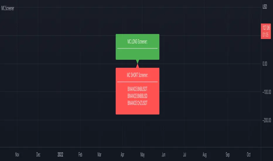
Market Cipher Screener
In recent years, the MarketCipher indicator has become more and more well-known. An expensive indicator that is suitable for trading crypto, but also stocks or Forex. The system works with already known indicators en scripts from Tradingview, but then merged into one working system. The large green and red circles play a major role in this. You can see these as buying or selling moments. I made a script that scans 40 tickers on those red and green circles, without having to buy MarketCipher. When a green or red circle is printed at MarketCipher, it also will appear in this screener. There is a green label for tickers that print a green circle and of course a red label for the tickers that print a red circle.
What's in the script?
- 40 cryptotickers are already included as standard. You can easily adjust this yourself via the wheel.
- Alerts when a new ticker meets the criteria
- The ability to move the labels so that you can load and side-by-side this script multiple times.
A few tips:
- Load the indicator multiple times to screen more tickers.
- The higher the timeframe, the more reliable the direction will be.
- Set an alert so you don't miss any opportunities.
Road map:
- Convert labels to table view.
- In the future table also implement the other components of MarketCipher.
WaveTrend MultiEMAThis is a modification of LazyBear's WaveTrend. The SMA trend has been removed and a shorter time frame EMA has been added in black. The idea is to buy when the shorter time frame starts to curl up and the longer time frame, green, has started to either flatten out or curl up too. Sell when the shorter time frame has started down and green has either flattened or bottomed out as well. The black line will generate some noise so the key is to use the two in combination. My final goal would be to have the green line looking at daily candles and the black line looking at a 2 or 4 hour candle, but I haven't figured out how to do that.
WaveTrend with Crosses and Alerts - Jab ZootaLazy bear created this script. I added alertconditions to send alerts on crossovers.


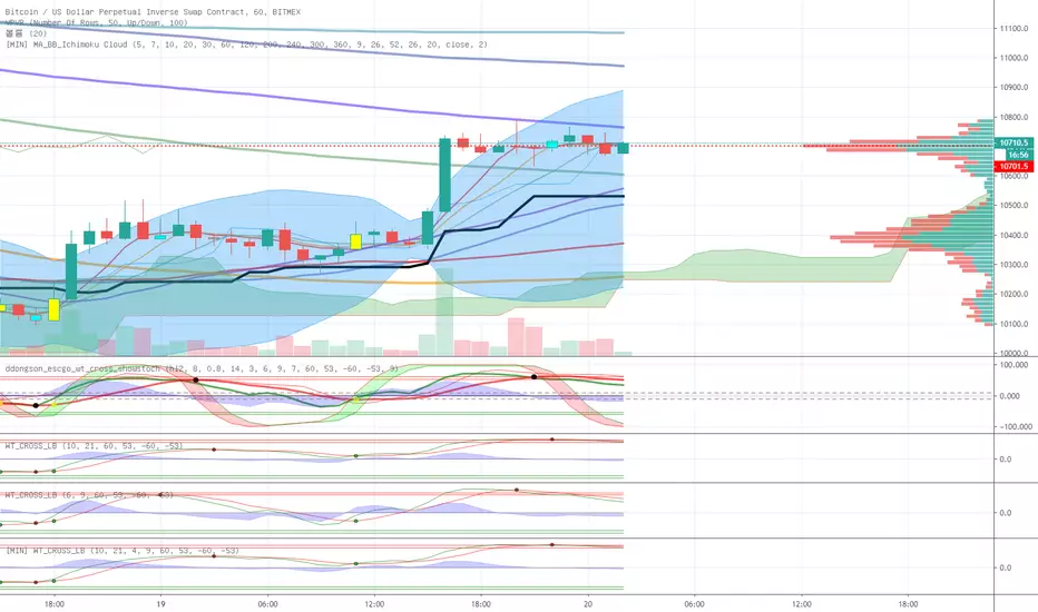
wt+ichmokuwaveTrend is very very very nice script.
and i also like ichmoku
yesterday 'nssoholik' gave me some idea that is rsi+ichmoku
and this is wt+ichmoku
easily
red to green = buy
green to red = sell
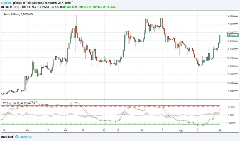
WaveTrend [DagoDias]@author LazyBear -- Modificado por Dagodias adicionado títulos às variáveis e traduzido para o Português.
Através dos títulos fica melhor para customizar o indicador e criar alertas a partir do indicador.
Para utilização em Criptomoedas acredito ser interessante suavemente levantar as linhas base; tornando a área de sobre venda antecipada.
Este indicador não é recomendado para fortes tendências.
WaveTrend [MastroFran]Great indicator to show short term price movements. 5 day moving average oscillator. When green crosses red and under the 60 mark, buy with caution. when over the 60 mark and red crosses green sell immediately for highest profits.

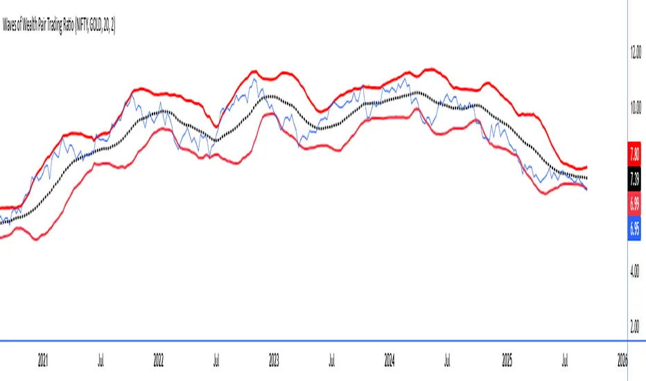
Waves of Wealth Pair Trading RatioThis versatile indicator dynamically plots the ratio between two user-selected instruments, helping traders visualize relative performance and detect potential mean-reversion or trend continuation opportunities.
Features include:
User inputs for selecting any two instrument symbols for comparison.
Adjustable moving average period to track the average ratio over time.
Customizable standard deviation multiplier to define statistical bands for overbought and oversold conditions.
Visual display of the ratio line alongside upper and lower bands for clear trading signals.
Ideal for pair traders and market analysts seeking a flexible tool to monitor inter-asset relationships and exploit deviations from historical norms.
Simply set your preferred symbols and parameters to tailor the indicator to your trading style and assets of interest.
How to Use the Custom Pair Trading Ratio Indicator
Select symbols: Use the indicator inputs to set any two instruments you want to compare—stocks, commodities, ETFs, or indices. No coding needed, just type or select from the dropdown.
Adjust parameters: Customize the moving average length to suit your trading timeframe and style. The standard deviation multiplier lets you control sensitivity—higher values mean wider bands, capturing only larger deviations.
Interpret the chart:
The ratio line shows relative strength between the two instruments.
The middle line represents the average ratio (mean).
The upper and lower bands indicate statistical extremes where price action is usually overextended.
Trading signals:
Look to enter pair trades when the ratio moves outside the bands—expecting a return to the mean.
Use the bands and mean to set stop-loss and profit targets.
Combine with other analysis or fundamental insight for best results.