Stochastic binary option styleUsing Time Frames For Trend – You can also use different time frames to determine trends with stochastic. To do this you will need to use two different time frame charts, I like to use the weekly/daily or daily/hourly combination depending on the asset. Weekly/daily works well with stocks and indices while I prefer the shorter time frame for currency and commodities. This is how it works; stochastic on the longer term chart sets trend, stochastic on the shorter term chart gives the signal. If, on the weekly chart, stochastic is pointing up then you would trade bullish signals on the daily charts. Or if using the daily/hourly combo the stochastic on the daily would set trend while signals would come from the hourly chart.
Green color bar and background means k is > d, the crowd is bullish (trend is bullish, a bullish crossover is happened), red is the contrary (bears are the leaders)
Credit to Michael Hodges
Cerca negli script per "weekly"

Ultimate Moving Average Package (17 MA's)Included is the:
VWAP
Current time frame 10 EMA
Current time frame 20 EMA
Current time frame 50 EMA
Current time frame 10 SMA
Current time frame 20 SMA
Current time frame 50 SMA
Daily 10 EMA
Daily 20 EMA
Daily 50 EMA
Daily 50 SMA
Daily 100 SMA
Daily 200 SMA
Weekly 100 SMA
Weekly 200 SMA
Monthly 100 SMA
Monthly 200 SMA
All Daily/Weekly/Monthly MA's can be seen on intraday charts. Current time frame MA's change depending on your time frame. Obviously you dont need all 17 on your chart but you can pick the ones you like and disable the rest.

Consensio Vision MA - Tribute to Late Dean Tyler JenksA wonderful mentor, fearless leader and incredibly humble man, father alike and world renowned bitcoin influencer also known for the invention of robust money management system named consensio moving averages, Tribute to Late Dean Tyler Jenks who made this possible.
Explanation
this indicator make use of three simple moving averages, idea is to incrementally invest little by little in the bull market when all moving average is moving up
A more in-depth guide for consensio is available here
How to use this indicator?
This indicator plots weekly moving average on daily and/or hourly time frame, the basic idea is to see how smaller time frame like daily and hourly trend reacts to larger time frame like weekly moving averages and what are the possible support and resistance area on these smaller time frame and also to arrive at better entry points while doing that.
The name Consensio Vision is chosen cuz.. it's a free reminder to never loose long-term vision (in this case weekly trend) of where you're going
Consensio Vision MA - Tribute to Late Dean Tyler Jenks
Lucid's Principles Of Investing - These are principles foretold by Late dean tyler jenks.. he goes on to saying that those 12 principles will keep you out of trouble or will identify trouble or will identify your human behavioral problems
1. CASH IS KING - in terms of my investing principles is very simple cash is king, I would rather be in cash than any other asset class, unless an asset class is trending to the upside (or bull market) the cash is king
2. Market doesn't move in straight line - all asset classes trimmed up and down, as tyler goes on to say he dont believe in buy and hold strategy, i'm giving you the tools to get you out of market so you dont have drive down bear events like 2009 crash, he further suggests you sould react (or make decision) before a 10% drop in market.
3. Timeframe - trends are short days or weeks intermediate weeks or months and long months or years so principle number three is don't just talk about something is in a trend be precise are you talking about a short-term trend an intermediate term trend or a long-term trend...
just saying something is in a trend is irresponsible, you've got to identify your time frame
4. Wait! Bear market is different - cash is king and unless asset class is trending up there are times that you want to take advantage of a trend that is down but it is not the equivalent of investing in a trend that is up it is far more dangerous far more difficult it can be done but that's not one of the main principles, (also check rule number 7 as both are related)
5. Only long-term trends are investments - word trading is not really an investment term trading means buying or selling it has nothing to do with what you're attempting to achieve in terms of either speculation gambling investing ... those are not opportunities for investing because they're short or they're intermediate.. that doesn't mean that you can't speculate and have that turn into a position trade and have it turn into a possible swing trade and then have it turn in to an investment however be prepared once you've made an investment where that investment in a short or an intermediate term time frame to move against you
6. Never invest in a FOMO (fear of missing out)- loss of money loss of cash loss of wealth is not equivalent to a loss of opportunity
it is 100 times more important than a loss of opportunity
7. understand the importance of Percentage - a 50% gain is not an inverse equivalence of a 50% loss that is the single most important rule or principle that Lucid uses in determining when to get into or out of an investment and it goes back to number six that a loss of money is not equivalent to a loss of opportunity
8. all long-term trends are fundamentally based, repeat all long-term trends are fundamentally based
9. number nine is a corollary but it's separate all short and intermediate term trends are not fundamentally based, long term trends are not affected by news are not affected by headlines are not affected by company announcements or country announcements they are affected in the short in the intermediate term and therefore your probability of success goes way up as your timeframe frame goes longer
10. Fundamental vs technical - technical tools are invaluable in identifying trends fundamental tools are not invaluable in identifying trends - that's why technical analysis is so important it gives you something that fundamental analysis will never give you in time so technical a pro active mechanism or money management tool and fundamental is a lagging indicator hoever its what drives the market in log term
11. Profitability based on time aka VISION- I see even very sophisticated investors doing is they let the technical tools give them a signal on the short-termer intermediate-term and they believe because it's the tool that they're using that it's giving them an equivalent probability of success and it is not!
it's probability of success at the short-term is less than at the intermediate term and is less than at the long-term
12. the last one long-term trends are more important than intermediate which are more important than short term, tyler developed a scale where he ranks
long-term trend 5,
intermediate term trend 3,
short-term with a 1
(note: if you add both 3 & 1 its still smaller then 5)
if you add together my intermediate term weighting of 3 and the short term weighting of 1 that you do not equal the long term weighting of 5 that means that both the short and the intermediate term can be going in a direction but that does not negate the direction of the long term trend it's a simple way of looking at it and I use the word in number 12 important not simply to mean importance in terms of the weighting system but the probability of success of each of those 3
so if you're using a short term 15 minute 30 minute one hour signals or probability of success drops dramatically and therefore you've got to factor in where your stops are relative to that probability when you're in a long term trend a five waiting you don't need to use stops when you're in an intermediate term trend you've got to use stops and when you're in a short term trend you've got to use closed stops
official website- lucidinvestmentstrategies.com

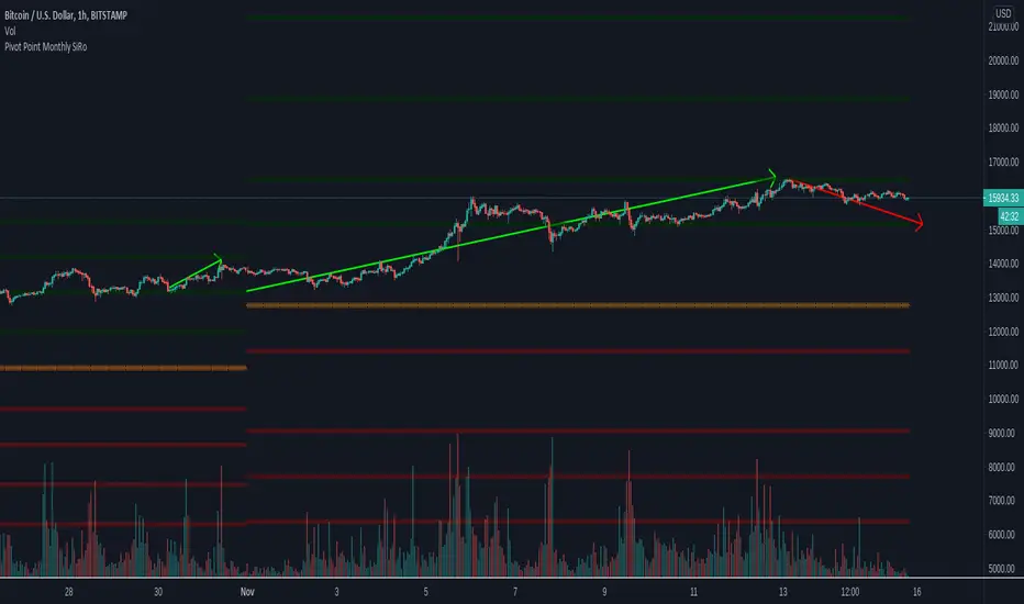
Pivot Point Monthly - bitcoin by Simon-RoseMonthly Version:
I have written 3 Indicators because i couldn't find what i was looking for in the library, so you can turn each one on and off individually for better visibility.
This are Daily, Weekly and Monthly Pivot Points with their Resistance and Support Points
and also on the Daily with the range between them.
I will also publish some Ideas to show you how to use them if you are not familiar with the traditional pivot points strategy already.
Unlike the usually 3 support & resistances i added 4 of them, specifically for trading bitcoin (on traditional markets this level of volatility usually never gets touched)
Here you can see which lines are what for reference, as the Feature to label lines is missing in Pinescript (if you have a workaround pls tell me ;) )
This is the basic calculation used :
PP = (xHigh+xLow+xClose) / 3
R1 = vPP+(vPP-Low)
R2 = vPP + (High - Low)
R3 = xHigh + 2 * (vPP - Low)
R4 = xHigh + 3 * (vPP - Low)
S1 = vPP-(High - vPP)
S2 = vPP - (High - Low)
S3 = xLow - 2 * (High - PP)
S4 = xLow - 3 * (High - PP)
If you have any questions or suggestions pls write me :)
Happy trading
Cheers
Daily Version:
Weekly Version:
Pivot Points Daily - bitcoin by Simon-RoseDaily Version:
I have written 3 Indicators because i couldn't find what i was looking for in the library, so you can turn each one on and off individually for better visibility.
This are Daily, Weekly and Monthly Pivot Points with their Resistance and Support Points
and also on the Daily with the range between them.
I will also publish some Ideas to show you how to use them if you are not familiar with the traditional pivot points strategy already.
Unlike the usually 3 support & resistances i added 4 of them, specifically for trading bitcoin (on traditional markets this level of volatility usually never gets touched)
Here you can see which lines are what for reference, as the Feature to label lines is missing in Pinescript (if you have a workaround pls tell me ;) )
This is the basic calculation used :
PP = (xHigh+xLow+xClose) / 3
R1 = vPP+(vPP-Low)
R2 = vPP + (High - Low)
R3 = xHigh + 2 * (vPP - Low)
R4 = xHigh + 3 * (vPP - Low)
S1 = vPP-(High - vPP)
S2 = vPP - (High - Low)
S3 = xLow - 2 * (High - PP)
S4 = xLow - 3 * (High - PP)
If you have any questions or suggestions pls write me :)
Happy trading
Cheers
Weekly Version:
Monthly Version:

Overlay Higher Timeframe EMA 10Plot the daily and weekly EMA 10 on any timeframe.
The Daily EMA 10 is useful for helping a trader decide whether the price is overextended without switching back to the daily timeframe and losing focus. It will change colour to indicate which order the EMA 10 and EMA 20 is in.
The Weekly EMA 10 is useful for helping a trader decide whether to take a trade based on long term momentum. If it is over the current price then the market has more momentum to the downside and if it is under then the market has more momentum to the upside. It will also change colour depending on which order the EMA 10 and EMA 20 is in. The weekly is often forgotten in trade planning.
You can switch the Daily and the Weekly on and off independently and change styles if you wish.

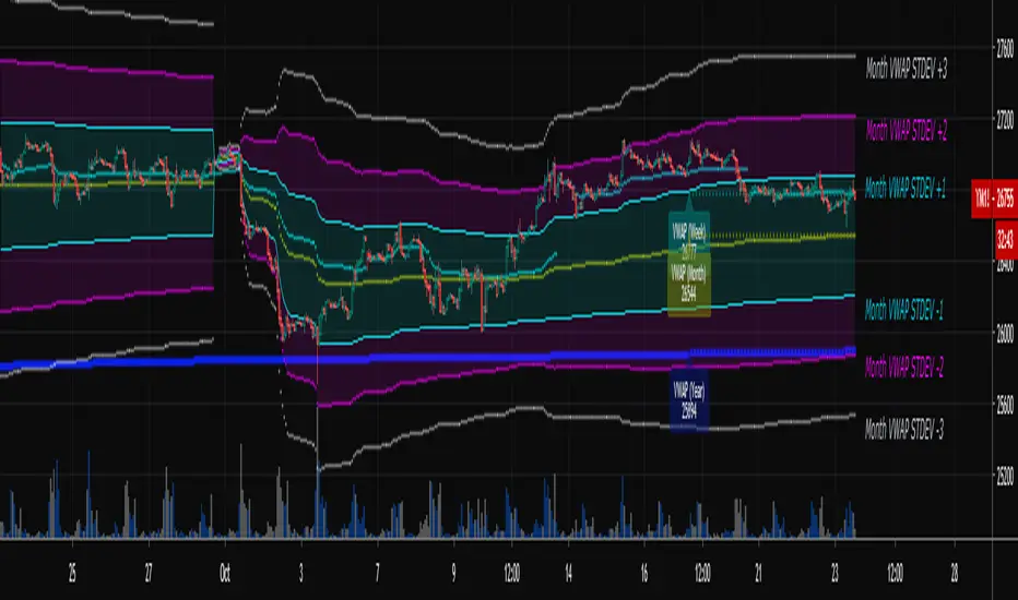
Multi-Timeframe VWAPShows the Daily, Weekly, Monthly, Quarterly, and Yearly VWAP.
Also shows the previous closing VWAP, which is usually very near the HLC3 standard pivot for the previous time frame. i.e. The previous daily VWAP closing price is usually near the current Daily Pivot. Tickers interact well with the previous Daily and Weekly closing VWAP.
Enabling the STDEV bands shows 3 separate standard deviation levels, defaulted at 1, 2, and 3. The lookback period for the bands is always changing with each new bar, since the standard deviation is calculated from the current bar to the beginning of the period. This is different from bollinger bands, as the lookback is constant (usually 20 periods is the textbook default).
The STDEV bands interval of interest can be changed from Day (D), Week (W), Month (M), Quarter (Q), Year (Y).
Tickers tend to bounce very well on Daily, Weekly, and Yearly VWAP (Yes... Year). Use this code and observe the Year VWAP on several major symbols through the past few years and eyes will be opened.
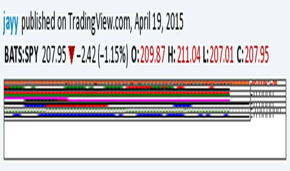
Relative Strength of 2 securities - Jayy This is an update of the Relative Strength to index as used by Leaf_West.. 4th from the top. my original RS script is 3rd from the top.
In this use of the term " Relative Strength" (RS) what is meant is a ratio of one security to another.
The RS can be inerpreted in a fashion similar to price action on a regual security chart.
If you follow his methods be aware of the different moving averages for the different time periods.
From Leaf_West: "on my weekly and monthly R/S charts, I include a 13 EMA of the R/S (brown dash line) and
an 8 SMA of the 13 EMA (pink solid line). The indicator on the bottom of the weekly/monthly charts is an
8 period momentum indicator of the R/S line. The red horizontal line is drawn at the zero line.
For daily or 130-minute time periods (or shorter), my R/S charts are slightly different
- the moving averages of the R/S line include a 20EMA (brown dash line), a 50 EMA (blue dash line) and
an 8 SMA of the20 EMA (pink solid line). The momentum indicator is also slightly different from the weekly/monthly
charts – here I use a 12 period calculation (vs 8 SMA period for the weekly/monthly charts)."
Leaf's website has gone but I if you are interested in his methods message me.
What is different from my previous RS: The RS now displays RS candles. So if you prefer to watch price action of candles to
a line chart which only plots the ratio of closes then this will be more interesting to you.
I have also thrown in a few options to have fun with.
Jayy
SuperTrend Oscillator v3Version 3: Improved aesthetically, complete turnaround for the strategy with which to use this indicator.
Once again, thanks to BlindFreddy and ChrisMoody for the bits of code that were assembled into this indicator.
Make the chart yours using the share button for the indicator with barcolors functionality.
Changes from v2 and looking forward: Indicator now uses a 14 length SuperTrend with no ATR multiplier. This my preferred use and I'd be grateful to hear your case for a different length/multiplier. Removed the Bollinger Bands and retracement dots due to these being gimmicky and marginally useful. There may be a version 4 should a similar concept using a rate of change analysis turn out to be useful. I have also tried -in vain- to plot internal trend peaks as horizontal S/R levels. Please pm if you are willing to help in that respect.
Strategy: The indicator will display the trend as a red/green area. It measures the spread between the closing price and the SuperTrend line, much like a CCI (close and ma). When the area contracts warning bars of the opposite trend color will warn of a reversal. When this happens, these areas will either be defended, reviving the trend, or will break, causing a trend flip. SuperTrend is unique in that breaks are typically large candles, and that its levels, especially on Weekly, Daily, Hourly, Minute timeframes, these levels will be defended (think similar to a 200sma or a 21ema). The STO making new highs within (internal) a trend is an overextension sign.
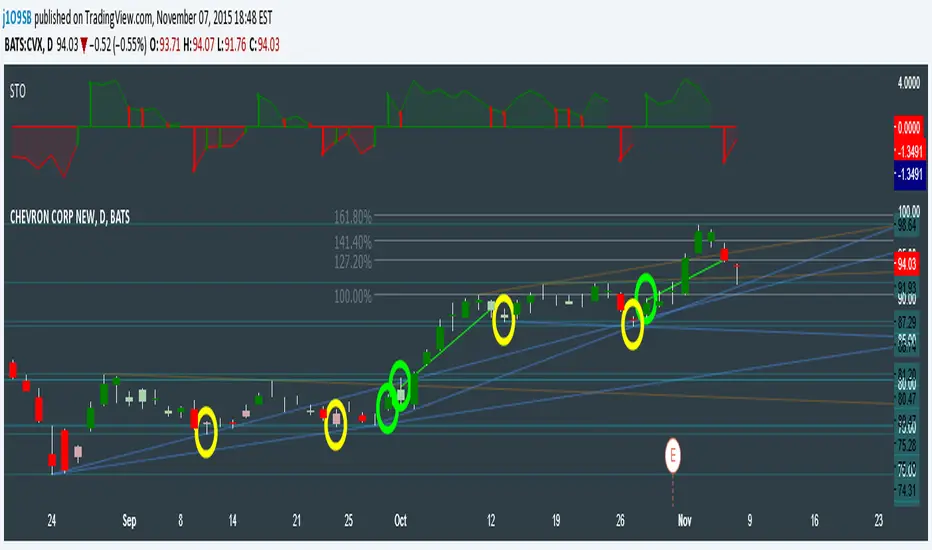
CVX Example: This is not a full analysis of CVX's stock , just an example potential trades. On the posted chart I used a weekly and a daily STO.
Long 1:The weekly showed warnings and then flipped. The daily made a double bottom, showed warnings and then flipped the daily STO at trendline support.
Long 2:The weekly still shows an uptrend, the daily made a weak break to downtrend and reversed back upwards at trendline support, forming a double bottom. Note the conservative exit when the STO made an internal new high.
Long 3: looking forward on CVX stock , the current downtrend made a weak break and is showing sings of reversal (pin bar) at horizontal support. Go long on flip of the daily (conservative) or flip of the hourly (aggressive).
SuperTrend OscillatorVersion 3: Improved aesthetically, complete turnaround for the strategy with which to use this indicator.
Once again, thanks to BlindFreddy and ChrisMoody for the bits of code that were assembled into this indicator.
Make the chart yours using the share button for the indicator with barcolors functionality.
Changes from v2 and looking forward: Indicator now uses a 14 length SuperTrend with no ATR multiplier. This my preferred use and I'd be grateful to hear your case for a different length/multiplier. Removed the Bollinger Bands and retracement dots due to these being gimmicky and marginally useful. There may be a version 4 should a similar concept using a rate of change analysis turn out to be useful. I have also tried -in vain- to plot internal trend peaks as horizontal S/R levels. Please pm if you are willing to help in that respect.
Strategy: The indicator will display the trend as a red/green area. It measures the spread between the closing price and the SuperTrend line, much like a CCI (close and ma). When the area contracts warning bars of the opposite trend color will warn of a reversal. When this happens, these areas will either be defended, reviving the trend, or will break, causing a trend flip. SuperTrend is unique in that breaks are typically large candles, and that its levels, especially on Weekly, Daily, Hourly, Minute timeframes, these levels will be defended (think similar to a 200sma or a 21ema). The STO making new highs within (internal) a trend is an overextension sign.
CVX Example: This is not a full analysis of CVX's stock, just an example potential trades. On the posted chart I used a weekly and a daily STO.
Long 1:The weekly showed warnings and then flipped. The daily made a double bottom, showed warnings and then flipped the daily STO at trendline support.
Long 2:The weekly still shows an uptrend, the daily made a weak break to downtrend and reversed back upwards at trendline support, forming a double bottom. Note the conservative exit when the STO made an internal new high.
Long 3: looking forward on CVX stock, the current downtrend made a weak break and is showing sings of reversal (pin bar) at horizontal support. Go long on flip of the daily (conservative) or flip of the hourly (aggressive).

Momentum of Relative strength to Index Leaf_West styleMomentum of Relative Strength to index as used by Leaf_West. This is to be used with the companion Relative Strength to Index indicator Leaf_West Style. Make sure you use the same index for comparison. If you follow his methods be aware of the different moving averages for the different time periods. From Leaf_West: "on my weekly and monthly R/S charts, I include a 13 EMA of the R/S (brown dash line) and an 8 SMA of the 13 EMA (pink solid line). The indicator on the bottom of the weekly/monthly charts is an 8 period momentum indicator of the R/S line. The red horizontal line is drawn at the zero line.
For daily or 130-minute time periods (or shorter), my R/S charts are slightly different - the moving averages of the R/S line include a 20EMA (brown dash line), a 50 EMA (blue dash line) and an 8 SMA of the20 EMA (pink solid line). The momentum indicator is also slightly different from the weekly/monthly charts – here I use a 12 period calculation (vs 8 SMA period for the weekly/monthly charts)." Leaf's methods do evolve and so watch for any changes to the preferred MAs etc..
Relative strength to Index set up as per Leaf_WestRelative Strength to index as used by Leaf_West. If you follow his methods be aware of the different moving averages for the different time periods. From Leaf_West: "on my weekly and monthly R/S charts, I include a 13 EMA of the R/S (brown dash line) and an 8 SMA of the 13 EMA (pink solid line). The indicator on the bottom of the weekly/monthly charts is an 8 period momentum indicator of the R/S line. The red horizontal line is drawn at the zero line.
For daily or 130-minute time periods (or shorter), my R/S charts are slightly different - the moving averages of the R/S line include a 20EMA (brown dash line), a 50 EMA (blue dash line) and an 8 SMA of the20 EMA (pink solid line). The momentum indicator is also slightly different from the weekly/monthly charts – here I use a 12 period calculation (vs 8 SMA period for the weekly/monthly charts)." Leaf's methods do evolve and so watch for any changes to the preferred MAs etc..

CM_Pivot Points Daily To IntradayNew Pivots Indicator With Options for Daily, 4 Hour, 2 Hour, 1 Hour, 30 Minute Pivot Levels!
Great for Forex Traders! - Take a Look at Chart with Weekly, Daily, and 4 Hour levels. Weekly Pivots Indicator is separate - Link is Below.
Plot one Pivot Level or Multiple at the Same Time via Check Boxes in the Inputs tab.
Defaults to 4 Hour Pivot Levels - Adjust in Inputs Tab.
S3 and R3 are turned off by Default - You can Activate Them In The Inputs Tab.
These Intraday Options were Requested By Users Using My CM_ Pivots Point Custom Indicator that Plots Daily, Weekly, Monthly, Quarterly, and Yearly Pivot Levels. Link is Below.
Now Both Longer-Term Traders and Shorter Term Traders Have All The Pivot Levels They Need. From Yearly Levels All The Way Down to 30 Minute Levels!
***The Candles On The Chart Are Custom Heikin-Ashi Paint Bars. Link is Below
CM_ Pivot Points Custom
Daily, Weekly, Monthly, Quarterly, Yearly Pivot Levels
Heikin-Ashi Paint Bars

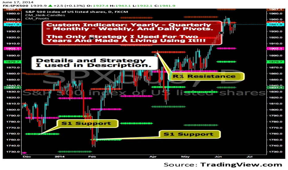
CM_Pivot Points_CustomCustom Pivots Indicator - Plots Yearly, Quarterly, Monthly, Weekly, and Daily Levels.
I created this indicator because when you have multiple Pivots on one chart (For Example The Monthly, Weekly, And Daily Pivots), the only way to know exactly what pivot level your looking at is to color ALL S1 Pivots the same color, but create the plot types to look different. For example S1 = Bright Green with Daily being small circles, weekly being bigger circles, and monthly being even bigger crosses for example. This allows you to visually know exactly what pivot levels your looking at…Instantly without thinking. This indicator allows you to Choose any clor you want for any Pivot Level, and Choose The Plot Type.
MACD Trend Count ScoreThis indicator is designed to confirm potential future trends in an asset’s price by analyzing the MACD histogram in the past. It works by counting positive and negative MACD bars within the selected chart timeframe to calculate a Strength Index, which reflects the past trend direction and intensity.
Summarizing the predominance of positive or negative bars across higher timeframes in the past such as daily, weekly, bi-weekly, and quarterly, it provides insight to anticipate how the trend may evolve in upcoming periods, according to the predetermined range scales Strong Bullish, Moderate Bullish, Neutral, Moderate Bearish and Strong Bearish.
Additionally, a dedicated module linked to the strength index is optimized for short-term charts (2-minute, 5-minute and 15-minute timeframes), making it a valuable tool for day trading strategies.

RSI-RS StrategyRSI-RS Strategy: Smart Trend Following 🚀
Overview
This strategy combines Multi-Timeframe RSI with Mansfield Relative Strength to identify high-momentum breakouts in strong stocks. Unlike standard RSI strategies, it features a "Smart Trailing Stop" that tightens when momentum weakens but respects key RSI 50 support levels to avoid shaking you out of winning trades.
Key Features ✨
1. 🎯 High-Probability Entries
Multi-Confirmations: Requires Monthly RSI > 60 and Weekly RSI > 60 (Trend is Up).
Dual Trigger: Enters on a Daily RSI Breakout (>60) OR a Weekly RSI Catch-up, ensuring you don't miss late moves.
RS Filter: Only buys stocks outperforming the Index (RS > 0).
New Listing Safe: Automatically skips Monthly checks for new IPOs lacking history.
2. 🛡️ Advanced "Hybrid" Stop Loss
This strategy solves the "Wick Out" problem:
Confirmation Exit: If price drops below the Stop Loss, it waits for the Next Candle to confirm the breakdown. It ignores intraday wicks!
Crash Protection: Includes a "Panic Button" (Default 3% buffer). If price crashes rapidly intraday, it exits immediately to save capital.
Smart Trailing: The Stop Loss moves UP when RSI shows weakness (<60), locking in profits.
3. 🧠 Smart Support Buffer
Wait for 50: Uniquely detects when RSI is resting on 50 Support (Zone 50-55).
Patience: It ignores minor weakness signals in this zone, waiting for a bounce instead of exiting prematurely.
4. 🧹 Clean Visuals
Minimalist Labels: Transparent Entry/Exit labels that don't declutter the chart.
Setup Watch: Visually signals "Watch > " before the trade triggers.
Transparency: "SL Update" diamonds prove exactly why the stop moved (showing the RSI value).
Settings Guide ⚙️
Confirmation Window: How many bars the breakout remains valid (Default: 2).
RSI Support Buffer: The "Safe Zone" range above 50 (Default: 5).
Crash Buffer %: Distance below SL for immediate emergency exit (Default: 3.0%).
Visuals: Toggle Setup Labels and SL Diamonds on/off to keep your chart clean.
How to Trade It
Green Background: You are in a trade.
Red Line: Your Hard Stop Loss (Closing Basis).
Maroon Dotted Line: Your Crash Limit (Intraday Danger Zone).
Orange Diamond: Warning! RSI Weakness detected, SL has tightened.
Disclaimer
Backtested on Indian Equities (NSE). Designed for Swing Trading on Daily Timeframe. Always manage your own risk.

Yetty Trades ORB Strat With Key Levels NQ RTHMust Have Confirmation of ORB on 5 and 15 Min chart. Follow Retracement.
Key Daily & HTF Levels
Track intraday, daily, weekly, and monthly H/L - RTH daily levels ignore pre-market
Current Day H/L (RTH Only)
Previous Day H/L (RTH Only)
2 Days Previous H/L
Pre-Market H/L (Separate)
Weekly H/L
Monthly H/L
NEW
Open Price Levels
Previous period opening prices - key mean reversion and magnet levels
Previous Day Open (PDO)
Previous Week Open (PWO)
Previous Month Open (PMO)
NY Open Line
London Open Line
Session Levels
Monitor Asian and London session highs, lows, and opens
Asian Session H/L
London Session H/L
NY Open Price
London Open Price
Customizable Times
15-Min Opening Range + Signals
Current day only OR box - resets daily + breakout signals with pullback & volume confirmation
Current Day Only
No Historical Clutter
ORB Midpoint Line
Breakout/Pullback Signals
Volume Confirmation
Adjustable Signal Size
NEW
VWAP + SD Bands
VWAP with Standard Deviation bands for institutional-grade analysis
Intraday VWAP
±1 SD Band (Green)
±2 SD Band (Orange)
±3 SD Band (Red)
Dynamic S/R
NEW
Pivot Points
Classic daily pivot points with support and resistance levels
Daily Pivot (P)
R1 & R2 Resistance
S1 & S2 Support
Based on Prior Day
NEW
Fair Value Gaps (FVG)
Smart Money / ICT concept - highlight price imbalances that tend to fill
Bullish FVGs (Green)
Bearish FVGs (Red)
Adjustable Lookback
Min Gap Size Filter
Moving Averages + Strategy
EMAs with built-in Double EMA Pullback buy/sell signal strategy
9 EMA
21 EMA
200 EMA
EMA Pullback Signals
HTF EMA Filter
NEW
200 EMA Bounce Signals
Detect when price uses 200 EMA as dynamic support or resistance
Support Bounce (Green)
Resistance Bounce (Red)
Touch Distance Filter
Confirmation Bars
NEW
Signal Filters
Filter signals by higher timeframe trend and high-volume trading hours
HTF EMA Trend Filter
Time-Based Filter
Power Hour 1 (9:30-11:30)
Power Hour 2 (2:00-4:00)
NEW
ATR-Based Stop Levels
Automatic stop loss suggestions based on ATR when signals fire
14-Period ATR
1.5x ATR Multiplier
Visual Stop Markers
Risk Management
NEW
Statistics Table
On-chart performance dashboard with customizable metrics
Win Rate Display
Total Signal Count
Buy/Sell Breakdown
Position Options
Reversal Patterns
Automatically detect bullish and bearish hammer candlestick patterns
Bullish Hammers
Bearish Hammers
Visual Labels
Fully Customizable - All New Features OFF by Default
Every level has individual controls. New features are disabled by default to keep your chart clean - enable what you need!
Toggle Any Level On/Off
Line Style Per Level
Line Width Per Level
4 Label Display Types
Custom Colors
Solid / Dashed / Dotted
VWAP Band Multipliers
FVG Size Filters
ATR Multiplier
Stats Display Options
HTF Timeframe Choice
Power Hour Times
Trading Strategy Guide
How to use this indicator for breakout trading with pullback entries
Phase 1
Identify Setup
Look for price consolidating near key levels (previous day H/L, session H/L)
Check if price is respecting EMAs (9, 21, or 200)
Note the opening range box boundaries
Watch for price approaching VWAP
Phase 2
Wait for Breakout
Wait for price to break above/below opening range
Look for breakout beyond session highs/lows
Confirm with volume and momentum
Watch for bullish/bearish hammer patterns at key levels
Phase 3
Enter on Pullback
After breakout, wait for price to pull back to EMAs
Look for price to retest the opening range boundary
Enter when price finds support/resistance at key levels
Use hammer patterns as entry confirmation signals
Grizzology-Style Clean Layout
• Daily Reset: All levels automatically reset each day - no historical clutter
• Current Day Only: Opening Range box only shows for today's session
• Clean Lines: Levels use lines instead of extending plots for cleaner charts
• Labels: CDH, CDL, PDH, PDL, PMH, PML labels for easy identification
• Pre-Market: Track pre-market high/low levels (04:00-09:30)
Trading Tips
• Risk Management: Always use stop losses below/above key levels
• Confirmation: Wait for multiple indicators to align before entering
• Time of Day: Breakouts during London/New York open tend to be more reliable
• Volume: Higher volume on breakouts increases probability of success
• False Breakouts: Opening range helps filter out early false moves
Example Trade Setup
1. Market Opens: Opening range box forms in first 15 minutes (9:30-9:45 AM)
2. Consolidation: Price trades within the OR box, respecting boundaries
3. Breakout: Price breaks above OR high with strong momentum, confirmed by volume
4. Pullback: Price pulls back to test the OR high (now support) and 21 EMA
5. Entry: Bullish hammer forms at the pullback level → Enter long
6. Target: Previous day high or session high
7. Stop Loss: Below the pullback low or below OR box

LevelsOverview
HL Marking Pro is a clean, multi-timeframe level marker designed for traders who prioritize a clutter-free workspace. Unlike standard indicators that crowd the chart area with text labels, this script utilizes native Price Scale Tags to display key historical and intraday levels directly on the Y-axis.
Key Features
Axis-Integrated Labels: Key levels are displayed as colored tags on the right-hand price scale, keeping the candle area clear for price action analysis.
Dynamic Session Tracking: Includes real-time tracking for the current Session High (SH) and Session Low (SL).
Multi-Timeframe Logic: Automatically tracks Previous Daily (PDH/L), Weekly (PWH/L), Monthly (PMH/L), Quarterly (PQH/L), and Yearly (PYH/L) levels.
Smart Visibility: To prevent "color waterfalls" on the axis, lower-tier levels (Daily/Session) are automatically hidden on higher timeframe charts (Weekly/Monthly).
Reliable ATH: The All-Time High (ATH) is calculated via security calls to ensure it remains visible and accurate even on high-timeframe charts where bar history might be limited.
No Repainting: All historical levels reference completed candles to ensure levels stay fixed and reliable throughout the trading session.
How to Use
Add the script to your chart.
To get the cleanest look (matching the screenshots), Right-click the Price Scale -> Labels -> and select "Value Only". This removes the indicator name and the colon (:) prefix.
The script will automatically adjust which levels are shown based on the timeframe you are currently viewing.

Vwap by EVThis indicator provides a complete multi-VWAP framework designed for traders who rely on price acceptance, value areas, and mean reversion across different market horizons. It plots Session, Daily, and Weekly VWAPs simultaneously, allowing users to understand short-term, intraday, and higher-timeframe value in a single, uncluttered view.
The Session VWAP supports custom trading hours and timezones, making it adaptable to equities, indices, forex, and crypto markets. All VWAP calculations are volume-weighted and non-repainting, with optional standard deviation bands based on true volume dispersion rather than fixed offsets. This ensures that each VWAP reflects genuine market participation and volatility.
Daily and Weekly VWAPs act as higher-timeframe equilibrium references, helping traders identify premium and discount zones, dynamic support and resistance, and directional bias. Optional band visibility and independent styling allow the indicator to remain clean while still providing depth when needed.

Previous Highs and Lows (M, W, D) Displays previous Monthly, Weekly, and Daily key swing highs/lows with clean , timeframe-specific coloring. Essential structure reference for multi-timeframe traders!!
Your Monthly/Weekly/Daily structural backbone in one indicator!!!!

EMA Trend Reversal (Regime Change)
EMA Trend Reversal (Regime Change)
This indicator highlights EMA slope reversals that often coincide with trend or regime shifts, using a simple two-stage visual system.
It is especially effective on higher timeframes (Daily / Weekly) for swing trading and trend-bias awareness.
Detailed User Guide
What the signals mean
Unconfirmed signals (triangles)
Yellow triangle below price
- EMA is turning up intrabar (not yet confirmed)
Yellow triangle above price
- EMA is turning down intrabar (not yet confirmed)
Unconfirmed signals may repeat at a set interval until confirmation.
Confirmed signals (dots)
Green dot below price
- EMA slope has confirmed upward (bullish regime shift)
Red dot above price
- EMA slope has confirmed downward (bearish regime shift)
Confirmed dots only appear after the candle closes.
Alerts
This script provides two alerts only:
EMA Reversal UP
EMA Reversal DOWN
Each alert can fire on:
Initial unconfirmed reversal
Reminder interval while unconfirmed
Final confirmed reversal
Alerts will NOT fire unless this indicator is active on at least one chart.
It may be kept on a chart you do not actively trade.
Settings
EMA Length (default: 21)
Reminder interval (minutes)
Show / hide unconfirmed triangles
Show / hide confirmed dots
Dot transparency
Colors (locked to preserve signal meaning)
Best use cases
Identifying trend or regime changes
Weekly swing trade entries and exits
Holding-period guidance during trends
Alert-based monitoring without watching charts
This is not a scalp or oscillator signal.
It works best when combined with structure, support/resistance, or higher-timeframe context.
Disclaimer
This indicator is provided for educational and informational purposes only.
It does not constitute financial, investment, or trading advice.
All trading involves risk. Use at your own discretion.

EMA Trend Reversal (Regime Change)EMA Trend Reversal (Regime Change)
This indicator highlights EMA slope reversals that often coincide with trend or regime shifts, using a simple two-stage visual system.
It is especially effective on higher timeframes (Daily / Weekly) for swing trading and trend-bias awareness.
Detailed User Guide
What the signals mean
Confirmed signals (dots)
Green dot below price
- EMA slope has confirmed upward (bullish regime shift)
Red dot above price
- EMA slope has confirmed downward (bearish regime shift)
Confirmed dots only appear after the candle closes.
Unconfirmed signals (triangles)
Yellow triangle below price
- EMA is turning up intrabar (not yet confirmed)
Yellow triangle above price
- EMA is turning down intrabar (not yet confirmed)
Unconfirmed signals may repeat at a set interval until confirmation.
Alerts
This script provides two alerts:
EMA Reversal UP
EMA Reversal DOWN
Each alert can fire on:
Initial unconfirmed reversal
Reminder interval while unconfirmed
Final confirmed reversal
Alerts will NOT fire unless this indicator is active on at least one chart.
It may be kept on a chart you do not actively trade.
Settings
EMA Length (default: 21)
Reminder interval (minutes)
Show / hide unconfirmed triangles
Show / hide confirmed dots
Dot transparency
Colors (locked to preserve signal meaning)
Best use cases
Identifying trend or regime changes
Weekly swing trade entries and exits
Holding-period guidance during trends
Alert-based monitoring without watching charts
This is not a scalp or oscillator signal.
It works best when combined with structure, support/resistance, or higher-timeframe context.
Disclaimer
This indicator is provided for educational and informational purposes only.
It does not constitute financial, investment, or trading advice.
All trading involves risk. Use at your own discretion.

Dynamic ATR-based Renko Overlay - Non repaintingDaily ATR-Based Renko Overlay
Overview
This Pine Script v5 indicator creates a dynamic Renko overlay on your time-based charts (optimized for 1-minute timeframes), using the previous period's ATR from a user-specified higher timeframe (default: 1-hour) to determine brick sizes. Unlike traditional Renko charts, this is an overlay that draws Renko bricks directly on top of your existing candles, allowing you to combine the noise-filtering power of Renko with the full features of time-based charts.
It's designed for traders who want Renko's trend-clarity benefits without switching chart types, especially useful for intraday trading in volatile markets like forex, stocks, or crypto.
Key Features
- Adaptive Brick Sizing: Brick size is calculated as a percentage (default 40%) of the previous period's ATR (Average True Range, default length 14) from the selected higher timeframe (default: 1-hour). This makes bricks volatility-adjusted—larger in high-vol periods to reduce noise, smaller in low-vol for more detail.
- Periodic Recalculation: Resets brick size at the start of each new period based on the user-specified reset timeframe (default: daily), using the prior period's ATR from the chosen timeframe. This ensures relevance without unwanted disruptions.
- Traditional Renko Logic: Uses 1-box reversal (a full brick against the trend to reverse). Bricks form based on closing prices, ignoring time and minor fluctuations.
- Visual Style: Stepped lines with green (up) and red (down) fills for a box-like appearance. Semi-transparent for easy overlay on candles.
- Customizable Inputs:
- ATR Length: Adjust the ATR period (default: 14).
- Percentage of ATR: Fine-tune brick sensitivity (default: 0.4 or 40%; range 0-1).
- ATR Timeframe: Specify the timeframe for ATR calculation (default: "60" for 1-hour; enter as a string like "240" for 4-hour, "D" for daily, etc.).
- Reset Timeframe: Specify the period for recalculating the brick size (default: "D" for daily; enter as a string like "W" for weekly, "M" for monthly, etc.).
How It Works
1. Fetches ATR from the user-specified timeframe via `request.security` for higher-timeframe volatility data.
2. On new periods based on the reset timeframe (or first load), sets brick size to `percent * ATR_HTF`.
3. Tracks Renko "close" and "previous close" to calculate bricks:
- Upward moves add green bricks in multiples of the size.
- Downward moves add red bricks.
- Reversals require a full brick against the direction.
4. Plots and fills create the overlay, updating on each 1-min bar close.
Add it to a 1-minute chart for best results—bricks will adapt periodically while you retain full candle visibility.
Why This Indicator is Helpful
TradingView's native Renko charts are powerful but come with limitations that can frustrate serious traders:
- No Bar Replay: Native Renko doesn't support TradingView's bar replay feature, making it hard to simulate historical trading sessions.
- Inaccurate/Repainting Strategy Testing: Strategies on native Renko can repaint or lack precision due to the non-time-based nature, leading to unreliable backtests.
- Limited Data History: Fast Renko timeframes (e.g., small bricks) often load very little historical data, restricting long-term analysis.
This overlay solves these by building Renko on a time-based chart:
- Full Bar Replay Support: Replay sessions as usual on your 1-min chart—the Renko follows along.
- Accurate, Non-Repainting Testing: Test strategies on the underlying time chart without repainting issues, as Renko is derived from closes.
- Unlimited Data Depth: Access TradingView's full historical data for 1-min charts (up to years of bars), not limited by Renko's data constraints.
- Hybrid Analysis: Overlay Renko on candles to spot trends while using volume, indicators (e.g., RSI, MAs), or drawing tools that don't work well on native Renko.
It's a game-changer for trend-following, breakout strategies, or filtering noise in short-term trades. No more switching charts—get the best of both worlds!
Usage Tips
- Best on 1-min charts for intraday precision, but experiment with others.
- Tune the percentage lower (e.g., 0.3) for more bricks/sensitivity, higher (e.g., 0.5) for fewer/false-signal reduction.
- Adjust the ATR timeframe to match your strategy—e.g., "240" for longer-term volatility or "15" for shorter.
- Customize the reset timeframe for different recalculation frequencies—e.g., "W" for weekly resets to capture broader market shifts, or "240" for every 4 hours.
- Combine with alerts: right now I am experimenting with 90 period EMA and the Renko brick pullbacks to find some EDGE
If you find this useful, give it a thumbs up or share your tweaks in the comments. Feedback welcome—happy trading! 🚀
