True Open CalculationsIndicator Description: True Open Calculations
This custom Pine Script indicator calculates and plots key "True Open" levels based on specific time intervals and trading sessions. The True Open levels represent significant price points on the chart, helping traders identify key reference points tied to various market opening times. These levels are important for understanding price action in relation to market sessions and trading cycles. The indicator is designed to plot lines corresponding to different "True Opens" on the chart and display labels with the associated information.
Key Features:
True Year Open:
This represents the opening price on the first Monday of April each year. It serves as a reference point for the yearly price level.
Plot Color: Green.
True Month Open:
This represents the opening price on the second Monday of each month. It helps in identifying monthly trends and provides a key reference for monthly price movements.
Plot Color: Blue.
True Week Open:
This represents the opening price every Monday at 6:00 PM. It gives traders a level to track weekly opening movements and can be useful for weekly trend analysis.
Plot Color: Orange.
True Day Open:
This represents the opening price at 12:00 AM (midnight) each day. It serves as a daily benchmark for price action at the start of the trading day.
Plot Color: Red.
True New York Session Open:
This represents the opening price at 7:30 AM (New York session start time). This level is crucial for traders focused on the New York trading session.
Plot Color: Purple.
Additional Features:
Labels: The indicator displays labels to the right of each plotted line to describe which "True Open" it represents (e.g., "True Year Open," "True Month Open," etc.).
Dynamic Plotting: The lines are only plotted on the current candle, and the lines are dynamically updated for each time period based on the corresponding "True Open."
Visual Cues: The colors of the plotted lines (green, blue, orange, red, purple) help quickly distinguish between different "True Open" levels, making it easy for traders to track price action and make informed decisions.
Use Cases:
Yearly, Monthly, Weekly, Daily, and Session Benchmarking: This indicator provides traders with important price levels to use as benchmarks for the current year, month, week, and day, helping to identify trends and potential reversals.
Session Awareness: It is particularly useful for traders who want to track key market sessions, such as the New York session, and their impact on price movement.
Long-term Analysis: By including the yearly open, this indicator helps traders gain a broader perspective on market trends and provides context for analyzing shorter-term price movements.
Benefits:
Helps identify important reference points for longer-term trends (yearly, monthly) as well as shorter-term moves (daily, weekly, and session).
Visually intuitive with color-coded lines and labels, allowing quick and easy identification of key market open levels.
Dynamic and real-time: The indicator plots and updates the True Open levels dynamically as the market progresses.
Cerca negli script per "weekly"

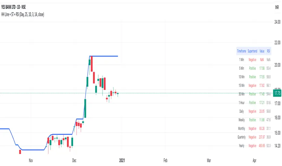
Highest High Line with Multi-Timeframe Supertrend and RSIOverview:
This powerful indicator combines three essential elements for traders:
Highest High Line – Tracks the highest price over a customizable lookback period across different timeframes.
Multi-Timeframe Supertrend – Displays Supertrend values and trend directions for multiple timeframes simultaneously.
Relative Strength Index (RSI) – Shows RSI values across different timeframes for momentum analysis.
Features:
✅ Customizable Highest High Line:
Selectable timeframes: Daily, Weekly, Monthly, Quarterly, Yearly
Adjustable lookback period
✅ Multi-Timeframe Supertrend:
Supports 1min, 5min, 10min, 15min, 30min, 1H, Daily, Weekly, Monthly, Quarterly, Yearly
ATR-based calculation with configurable ATR period and multiplier
Identifies bullish (green) & bearish (red) trends
✅ Multi-Timeframe RSI:
Calculates RSI for the same timeframes as Supertrend
Overbought (≥70) and Oversold (≤30) signals with color coding
✅ Comprehensive Table Display:
A clean, structured table in the bottom-right corner
Displays Supertrend direction, value, and RSI for all timeframes
Helps traders quickly assess trend and momentum alignment
How to Use:
Use the Highest High Line to identify key resistance zones.
Confirm trend direction with Multi-Timeframe Supertrend.
Check RSI values to avoid overbought/oversold conditions before entering trades.
Align multiple timeframes for stronger confirmation of trend shifts.
Ideal For:
✅ Scalpers (lower timeframes: 1m–30m)
✅ Swing Traders (higher timeframes: 1H–D)
✅ Position Traders (Weekly, Monthly, Quarterly)
💡 Tip: Look for Supertrend & RSI confluence across multiple timeframes for higher probability setups.
Trend Detection
#### *Description:*
This *Trend Detection* indicator is designed to help traders identify and confirm trends in the market using a combination of moving averages, volume analysis, and MACD filters. It provides clear visual signals for uptrends and downtrends, along with customizable settings to adapt to different trading styles and timeframes. The indicator is suitable for both beginners and advanced traders who want to improve their trend-following strategies.
---
#### *Key Features:*
1. *Trend Detection:*
- Uses *Moving Averages (MA)* to determine the overall trend direction.
- Supports multiple MA types: *SMA (Simple), **EMA (Exponential), **WMA (Weighted), and **HMA (Hull)*.
2. *Advanced Filters:*
- *MACD Filter:* Confirms trends using MACD crossovers.
- *Volume Filter:* Ensures trends are supported by above-average volume.
- *Multi-Timeframe Filter:* Validates trends using a higher timeframe (e.g., Daily or Weekly).
3. *Visual Signals:*
- Plots a *trend line* on the chart to indicate the current trend direction.
- Fills the background with *green* for uptrends and *red* for downtrends.
4. *Customizable Settings:*
- Adjust the *MA lengths, **MACD parameters, and **confirmation thresholds* to suit your trading strategy.
- Control the transparency of the background fill for better chart readability.
5. *Alerts:*
- Generates *buy/sell signals* when a trend is confirmed.
- Alerts can be set to trigger at the close of a candle for precise entry/exit points.
---
#### *How to Use:*
1. *Adding the Indicator:*
- Copy and paste the Pine Script code into the TradingView Pine Script editor.
- Add the indicator to your chart.
2. *Configuring the Settings:*
- *Trend Settings:*
- Choose the *MA type* (e.g., EMA for faster response, HMA for smoother trends).
- Set the *Trend MA Period* (e.g., 200 for long-term trends) and *Filter MA Period* (e.g., 100 for medium-term trends).
- *Advanced Filters:*
- Enable/disable the *MACD Filter* and adjust its parameters (Fast, Slow, Signal).
- Enable/disable the *Volume Filter* to ensure trends are supported by volume.
- *Multi-Timeframe Filter:*
- Enable this filter to validate trends using a higher timeframe (e.g., Daily or Weekly).
3. *Interpreting the Signals:*
- *Uptrend:* The trend line turns *green*, and the background is filled with a transparent green color.
- *Downtrend:* The trend line turns *red*, and the background is filled with a transparent red color.
- *Alerts:* Buy/sell signals are generated when the trend is confirmed.
4. *Using Alerts:*
- Set up alerts for *Buy Signal* (bullish reversal) and *Sell Signal* (bearish reversal).
- Alerts can be configured to trigger at the close of a candle for precise execution.
---
#### *Settings and Their Effects:*
1. *MA Type:*
- *SMA:* Smooth but lagging. Best for long-term trends.
- *EMA:* Faster response to price changes. Suitable for medium-term trends.
- *WMA:* Gives more weight to recent prices. Useful for short-term trends.
- *HMA:* Combines speed and smoothness. Ideal for all timeframes.
2. *Trend MA Period:*
- A longer period (e.g., 200) identifies long-term trends but may lag.
- A shorter period (e.g., 50) reacts faster but may produce false signals.
3. *Filter MA Period:*
- Acts as a secondary filter to confirm the trend.
- A shorter period (e.g., 50) provides tighter confirmation but may increase noise.
4. *MACD Filter:*
- Ensures trends are confirmed by MACD crossovers.
- Adjust the *Fast, **Slow, and **Signal* lengths to match your trading style.
5. *Volume Filter:*
- Ensures trends are supported by above-average volume.
- Reduces false signals during low-volume periods.
6. *Multi-Timeframe Filter:*
- Validates trends using a higher timeframe (e.g., Daily or Weekly).
- Increases reliability but may delay signals.
7. *Confirmation Value:*
- Sets the minimum percentage deviation from the trend MA required to confirm a trend.
- A higher value (e.g., 2.0%) reduces false signals but may delay trend detection.
8. *Confirmation Bars:*
- Sets the number of bars required to confirm a trend.
- A higher value (e.g., 5 bars) ensures sustained trends but may delay signals.
---
#### *Who Should Use This Indicator?*
1. *Trend Followers:*
- Traders who focus on identifying and riding long-term trends.
- Suitable for *swing traders* and *position traders*.
2. *Day Traders:*
- Can use shorter MA periods and faster filters (e.g., EMA, HMA) for intraday trends.
3. *Volume-Based Traders:*
- Traders who rely on volume confirmation to validate trends.
4. *Multi-Timeframe Traders:*
- Traders who use higher timeframes to confirm trends on lower timeframes.
5. *Beginners:*
- Easy-to-understand visual signals and alerts make it beginner-friendly.
6. *Advanced Traders:*
- Customizable settings allow for fine-tuning to match specific strategies.
---
#### *Example Use Cases:*
1. *Long-Term Investing:*
- Use a *200-period SMA* with a *Daily* higher timeframe filter to identify long-term trends.
- Enable the *Volume Filter* to ensure trends are supported by strong volume.
2. *Swing Trading:*
- Use a *50-period EMA* with a *4-hour* higher timeframe filter for medium-term trends.
- Enable the *MACD Filter* to confirm trend reversals.
3. *Day Trading:*
- Use a *20-period HMA* with a *1-hour* higher timeframe filter for short-term trends.
- Disable the *Volume Filter* for faster signals.
---
#### *Conclusion:*
The *Trend Detection* indicator is a versatile tool for traders of all levels. Its customizable settings and advanced filters make it suitable for various trading styles and timeframes. By combining moving averages, volume analysis, and MACD filters, it provides reliable trend signals with minimal lag. Whether you're a beginner or an advanced trader, this indicator can help you make better trading decisions by identifying and confirming trends in the market.
---
#### *Publishing on TradingView:*
- *Title:* Trend Detection with Advanced Filters
- *Description:* A powerful trend detection tool using moving averages, volume analysis, and MACD filters. Suitable for all trading styles and timeframes.
- *Tags:* Trend, Moving Averages, MACD, Volume, Multi-Timeframe
- *Category:* Trend-Following
- *Access:* Public or Private (depending on your preference).
---
Let me know if you need further assistance or additional features!
JL - DWM OHLCThis indicator plots the following price levels on your chart automatically AND will not show up if you are using a timeframe bigger than 60 minutes, 1 day, or 1 week.
Here are the price levels that are automatically plotted for you, and so you know the styling is different for Daily, Weekly, Monthly levels so you can easily distinguish between them:
- Prior Day: High / Low / Close
- Current Day: Open
- Prior Week: High / Low / Close
- Current Week: Open
- Prior Month: High / Low / Close
- Current Month: Open
These plots are timeframe dependent and will not plot on subsequently higher timeframes, here is how they work:
Daily Price Levels are only shown on timeframes that are smaller than 60 minutes.
Weekly Price Levels are only shown on timeframes smaller than 1 Day.
Monthly Price Levels are only shown on timeframes smaller than 1 Week.
This way, you can turn on the indicator and not have to think about turning off certain price levels if you switch to a larger / longer timeframe than what you typically use.
For example, Daily OHLC price levels will quickly clutter the 60 minute chart, and likely you don't need to know the HLC of the Prior Day if you are looking at the 60 minute chart. Therefor it may be helpful to automatically hide the Daily price level plots, and only show the Weekly and Monthly plots on the 60 minute timeframe.
I hope you find this indicator helpful, thanks for reading.

PivotSri(+) - Advanced TraditionalPivot Points Indicator
Description:
The Sri(+) Pivot Points Indicator is a powerful and customizable tool for traders looking to analyze key support and resistance levels based on Next Day CPR, Daily, Weekly, and Monthly Pivot Points. This indicator automatically calculates classic pivot levels, including support and resistance lines, providing valuable insights into market trends and potential reversal zones.
The script offers:
✅ Pivot Points Calculation - Determines key price levels using a standard pivot formula.
✅ Multi-Timeframe Support - Displays pivot points from different timeframes (Daily, Weekly, Monthly).
✅ Support & Resistance Levels (S1 to S5 / R1 to R5) - Visualizes multiple levels of support and resistance for precise market structure analysis.
✅ Customizable Colors & Styles - Allows traders to personalize pivot lines, background colors, and transparency for better visibility.
✅ Dynamic Box Display for TC & BC - Highlights the range between Top Central (TC) and Bottom Central (BC) pivot levels.
✅ Automatic Timeframe Adjustment - The script ensures pivots are aligned properly across different trading sessions.
✅ Central Pivot Range (CPR) Analysis - Identifies bullish or bearish trends based on price action relative to the Monthly CPR.
✅ No Repainting - Uses historical pivot data to ensure stable and accurate plotting.
How It Works
Pivot Calculation: The script calculates the central pivot point (P) based on the previous period’s high, low, and close prices.
Support & Resistance: The indicator derives S1-S5 and R1-R5 levels to help identify potential breakout and retracement zones.
Monthly CPR-Based Trend Bias:
If the stock is trading below the Monthly CPR, it indicates a bearish trend.
If the stock is trading above the Monthly CPR, it suggests a bullish trend.
Weekly & Monthly Adjustments: The pivot levels are updated dynamically to match the selected timeframe, ensuring traders always have relevant market data.
Pros of Using Sri(+) Pivot Indicator
🚀 Enhanced Decision Making – Identify key price zones where the market may react.
📈 Perfect for Day & Swing Traders – Get Daily, Weekly, and Monthly pivots for short and long-term analysis.
🎨 Customizable Appearance – Adjust colors, line widths, and transparency for optimal chart visibility.
⏳ Multi-Timeframe Flexibility – Works on any timeframe, from intraday scalping to long-term trend analysis.
🔄 Reliable and Accurate – No repainting; pivots remain fixed once calculated.
📊 Supports Technical Confluence – Combine with other indicators like SuperTrend, RSI, CCI, or Volume for stronger trading signals.
📉 CPR-Based Trend Confirmation – Quickly assess market bias based on price location relative to the Monthly CPR.
How to Use
1️⃣ Add the script to your TradingView chart.
2️⃣ Customize pivot settings according to your trading style.
3️⃣ Observe the Monthly CPR trend bias for directional confirmation.
4️⃣ Use the plotted levels to determine potential entry & exit points.
5️⃣ Combine with other technical indicators for improved trade confirmation.
🎯 Best Used For:
✅ Scalping & Day Trading
✅ Swing Trading
✅ Trend Reversals & Breakout Strategies
✅ Confluence with Other Indicators
Final Thoughts
The Sri(+) Pivot Indicator is an essential tool for traders looking to leverage pivot points, support, and resistance levels effectively. With its customizable settings, CPR-based trend bias, and multi-timeframe support, this script can significantly enhance your trading strategy.
📢 If you find this useful, don’t forget to give it a LIKE and SHARE with fellow traders! 🚀🎯

VWAP anchored with Previous VWAPVWAP with Persistent Previous VWAP Levels
🔹 Overview
This indicator calculates and displays Daily, Weekly, and Monthly VWAP (Volume Weighted Average Price) along with their previous period VWAP levels, helping traders analyze key price points used by institutional players. Unlike traditional VWAP indicators that reset at the start of each period, this script extends the previous VWAP levels across the current period, providing strong reference points for support and resistance.
🔹 Key Features
✅ Multiple Timeframe VWAPs – Displays Daily, Weekly, and Monthly VWAPs for better trend analysis.
✅ Persistent Previous VWAPs – Keeps and extends previous period VWAP levels as horizontal lines.
✅ Customizable Appearance – Modify colors, line widths, and visibility of each VWAP level.
✅ VWAP Labels – Optional labels for quick reference to VWAP and previous VWAP values.
✅ Efficient Calculation – Optimized for smooth performance on all chart timeframes.
🔹 How It Works
VWAP Calculation
Uses hlc3 (high + low + close) / 3 as the default VWAP price source.
Accumulates price-volume data within each time period (day, week, or month).
Previous VWAP Line Extension
When a new period begins, the final VWAP value of the previous period is stored.
A horizontal line is drawn at this level and extends across the current period.
Customizable Display
Enable/disable Daily, Weekly, and Monthly VWAPs independently.
Choose colors for VWAP and Previous VWAP lines.
Toggle labels for better visibility.
🔹 Why Use This Indicator?
📌 Identify Institutional Trading Zones – VWAP is widely used by hedge funds, banks, and algorithmic traders.
📌 Detect Key Support & Resistance Levels – Previous VWAP levels act as dynamic support and resistance.
📌 Improve Trade Entries & Exits – Use VWAP bounces and breaks for confirmation.
📌 Works on All Timeframes – Useful for scalpers, swing traders, and long-term investors.
🔹 Best Use Cases
📍 Trend Confirmation – Price above VWAP suggests an uptrend; below VWAP indicates a downtrend.
📍 Support & Resistance Trading – Use previous VWAP levels as key reaction zones.
📍 Breakout & Mean Reversion Strategies – Combine with price action for high-probability trades.
📢 Try it out and elevate your trading strategy with institutional-grade VWAP levels! 🚀

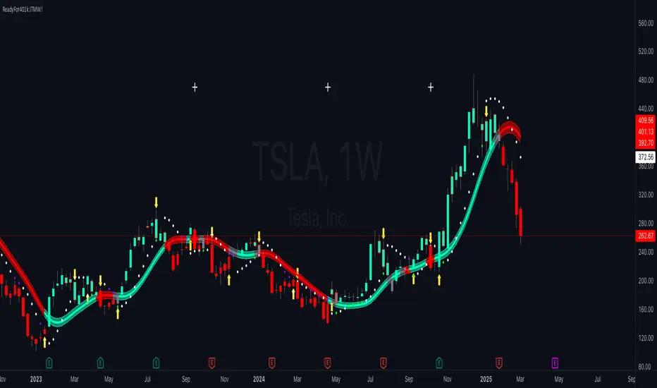
ReadyFor401ks Just Tell Me When!ReadyFor401ks Just Tell Me When!
LET ME START BY SAYING. NO INDICATOR WILL HELP YOU NAIL THE PERFECT ENTRY/EXIT ON A TRADE. YOU SHOULD ALWAYS EDUCATE YOURSELF AND HAVE A BASIC UNDERSTANDING OF INVESTING, TRADING, CHART ANALYSIS, AND THE RISKS INVOLVED WITH. THAT BEING SAID, WITH THE RIGHT ADJUSTMENTS, IT'S PRETTY D*$N CLOSE TO PERFECTION!
This indicator is designed to help traders identify t rend direction, continuation signals, and potential exits based on a dynamic blend of moving averages, ATR bands, and price action filters. Whether you’re an intraday trader scalping the 5-minute chart or a swing trader analyzing the weekly timeframe for LEAPS , this tool provides a clear, rule-based system to help guide your trading decisions.
⸻
Key Features & Benefits
🔹 Customizable Trend Power (Baseline) Calculation
• Choose from JMA, EMA, HMA, TEMA, DEMA, SMA, VAMA, and WMA for defining your baseline trend direction.
• The baseline helps confirm whether the market is in a bullish or bearish phase.
🔹 ATR-Based Trend Continuation & Volatility Measurement
• ATR bands dynamically adjust to market conditions, helping you spot breakouts and fakeouts.
• The indicator detects when price violates ATR range , which often signals impulse moves.
🔹 Clear Entry & Exit Signals
• Uses a Continuation MA (SSL2) to confirm trends.
• Includes a separate Exit MA (SSL3) that provides crossover signals to indicate when to exit trades or reverse positions .
• Plots trend continuation circles when ATR conditions align with trend signals.
🔹 Keltner Channel Baseline for Market Structure
• A modified Keltner Channel is integrated into the baseline to help filter out choppy conditions .
• If price remains inside the baseline, the market is in consolidation , while breakouts beyond the bands indicate strong trends .
🔹 Adaptive Color Coding for Market Conditions
• Bars change color based on momentum, making trend direction easy to read.
• Green = Bullish Trend, Red = Bearish Trend, Gray = Neutral/Chop.
🔹 Flexible Alerts for Trade Management
• Get real-time alerts when the Exit MA crosses price , helping you l ock in profits or switch directions .
⸻
How to Use This Indicator for Different Trading Styles
🟢 For Intraday Trading (5-Minute Chart Setup)
• Faster MA settings help react quickly to momentum shifts.
• Ideal for scalping breakouts, trend continuation setups, and intraday reversals.
• Watch for ATR violations and price interacting with the baseline/Keltner Channel for entries.
--------------------------------
My Settings for Intraday Trading on 5min Chart
ATR Period: 15
ATR Multi: 1
ATR Smoothing: WMA
Trend Power based off of: JMA
Trend Power Period: 30
Continuation Type: JMA
Continuation Length: 20
Calculate Exit of what MA?: HMA
Calculate Exit off what Period? 30
Source of Exit Calculation: close
JMA Phase *APPLIES TO JMA ONLY: 3
JMA Power *APPLIES TO JMA ONLY: 3
Volatility Lookback Period *APPLIES TO VAMA ONLY 30
Use True Range for Channel? Checked
Base Channel Multiplier: 0.4
ATR Continuation Criteria: 1.1
----------------------------------
🔵 For Swing Trading & LEAPS (Weekly Chart Setup - Default Settings)
• Slower MAs provide a broader view of trend structure.
• Helps capture multi-week trend shifts and confirm entry points for longer-term trades.
• Weekly ATR bands highlight when stocks are entering overextended conditions.
💡 Example:
Let’s say you’re looking at TSLA on a Weekly Chart using the default settings. You notice that price crosses above the continuation MA (SSL2) while remaining above the baseline (trend power MA). The bar turns green, and price breaks above ATR resistance, signaling a strong bullish continuation. This could be a great opportunity to enter a long-term swing trade or LEAPS options position.
On the flip side, if price reverses below the Exit MA (SSL3) and turns red while breaking the lower ATR band, it might signal a good time to exit longs or enter a short trade.
⸻
Final Thoughts
The ReadyFor401ks Just Tell Me When! indicator is an all-in-one trading system that simplifies trend-following, volatility measurement, and trade management. By integrating multiple moving average types, ATR filters, and clear visual cues, it allows traders to stay disciplined and remove emotions from their trading decisions.
✅ Perfect for scalpers, day traders, and swing traders alike!
🔔 Set up alerts for automated trade signals and never miss a key move!
💬 If you find this indicator useful, leave a comment and share how you use it in your trading! 🚀
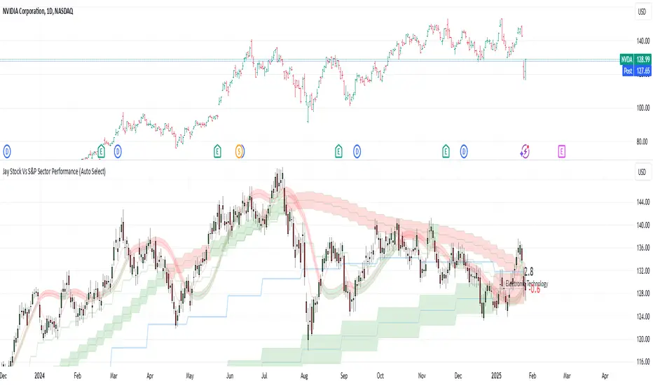
Quarterly Theory ICT 02 [TradingFinder] True Open Session 90 Min🔵 Introduction
The Quarterly Theory ICT indicator is an advanced analytical system built on ICT (Inner Circle Trader) concepts and fractal time. It divides time into four quarters (Q1, Q2, Q3, Q4), and is designed based on the consistent repetition of these phases across all trading timeframes (annual, monthly, weekly, daily, and even shorter trading sessions).
Each cycle consists of four distinct phases: the first phase (Q1) is the Accumulation phase, characterized by price consolidation; the second phase (Q2), known as Manipulation or Judas Swing, is marked by initial false movements indicating a potential shift; the third phase (Q3) is Distribution, where price volatility peaks; and the fourth phase (Q4) is Continuation/Reversal, determining whether the previous trend continues or reverses.
🔵 How to Use
The central concept of this strategy is the "True Open," which refers to the actual starting point of each time cycle. The True Open is typically defined at the beginning of the second phase (Q2) of each cycle. Prices trading above or below the True Open serve as a benchmark for predicting the market's potential direction and guiding trading decisions.
The practical application of the Quarterly Theory strategy relies on accurately identifying True Open points across various timeframes.
True Open points are defined as follows :
Yearly Cycle :
Q1: January, February, March
Q2: April, May, June (True Open: April Monthly Open)
Q3: July, August, September
Q4: October, November, December
Monthly Cycle :
Q1: First Monday of the month
Q2: Second Monday of the month (True Open: Daily Candle Open price on the second Monday)
Q3: Third Monday of the month
Q4: Fourth Monday of the month
Weekly Cycle :
Q1: Monday
Q2: Tuesday (True Open: Daily Candle Open Price on Tuesday)
Q3: Wednesday
Q4: Thursday
Daily Cycle :
Q1: 18:00 - 00:00 (Asian session)
Q2: 00:00 - 06:00 (True Open: Start of London Session)
Q3: 06:00 - 12:00 (NY AM)
Q4: 12:00 - 18:00 (NY PM)
90 Min Asian Session :
Q1: 18:00 - 19:30
Q2: 19:30 - 21:00 (True Open at 19:30)
Q3: 21:00 - 22:30
Q4: 22:30 - 00:00
90 Min London Session :
Q1: 00:00 - 01:30
Q2: 01:30 - 03:00 (True Open at 01:30)
Q3: 03:00 - 04:30
Q4: 04:30 - 06:00
90 Min New York AM Session :
Q1: 06:00 - 07:30
Q2: 07:30 - 09:00 (True Open at 07:30)
Q3: 09:00 - 10:30
Q4: 10:30 - 12:00
90 Min New York PM Session :
Q1: 12:00 - 13:30
Q2: 13:30 - 15:00 (True Open at 13:30)
Q3: 15:00 - 16:30
Q4: 16:30 - 18:00
Micro Cycle (22.5-Minute Quarters) : Each 90-minute quarter is further divided into four 22.5-minute sub-segments (Micro Sessions).
True Opens in these sessions are defined as follows :
Asian Micro Session :
True Session Open : 19:30 - 19:52:30
London Micro Session :
T rue Session Open : 01:30 - 01:52:30
New York AM Micro Session :
True Session Open : 07:30 - 07:52:30
New York PM Micro Session :
True Session Open : 13:30 - 13:52:30
By accurately identifying these True Open points across various timeframes, traders can effectively forecast the market direction, analyze price movements in detail, and optimize their trading positions. Prices trading above or below these key levels serve as critical benchmarks for determining market direction and making informed trading decisions.
🔵 Setting
Show True Range : Enable or disable the display of the True Range on the chart, including the option to customize the color.
Extend True Range Line : Choose how to extend the True Range line on the chart, with the following options:
None: No line extension
Right: Extend the line to the right
Left: Extend the line to the left
Both: Extend the line in both directions (left and right)
Show Table : Determines whether the table—which summarizes the phases (Q1 to Q4)—is displayed.
Show More Info : Adds additional details to the table, such as the name of the phase (Accumulation, Manipulation, Distribution, or Continuation/Reversal) or further specifics about each cycle.
🔵 Conclusion
The Quarterly Theory ICT, by dividing time into four distinct quarters (Q1, Q2, Q3, and Q4) and emphasizing the concept of the True Open, provides a structured and repeatable framework for analyzing price action across multiple time frames.
The consistent repetition of phases—Accumulation, Manipulation (Judas Swing), Distribution, and Continuation/Reversal—allows traders to effectively identify recurring price patterns and critical market turning points. Utilizing the True Open as a benchmark, traders can more accurately determine potential directional bias, optimize trade entries and exits, and manage risk effectively.
By incorporating principles of ICT (Inner Circle Trader) and fractal time, this strategy enhances market forecasting accuracy across annual, monthly, weekly, daily, and shorter trading sessions. This systematic approach helps traders gain deeper insight into market structure and confidently execute informed trading decisions.

Opening Price Deviations with AlertsOverview
The Timeframe Opening Price Deviations indicator helps traders visualize how price deviates from a key reference point—the opening price of a selected timeframe (Daily, Weekly, or Monthly). It calculates upper and lower deviation levels based on a percentage step and plots these levels on the chart. This can help traders identify potential areas of support and resistance.
----------------------------------------------------------------------------------------------------------------------
How It Works
Opening Price Reference:
The script retrieves the opening price of the selected timeframe (Daily, Weekly, or Monthly).
Deviation Levels Calculation:
Five upper and lower deviation levels are calculated based on a percentage step input by the user.
Each level is determined by multiplying the opening price by (1 ± step size).
Visualization
The indicator plots the calculated levels as horizontal lines above and below the opening price.
Labels appear only on the latest bar, displaying the exact price level along with its percentage deviation from the opening price.
User has the option to turn on/off or change the bar colours. If price is within the 1st deviation lines that's considered neutral coloured orange as default. If price is above/below the first deviation levels the bar colours will be green or red.
---------------------------------------------------------------------------------------------------------------------
Potential Use Cases
Support & Resistance Zones 🟢🔴
The deviation levels can act as potential areas where price may reverse or consolidate based on historical price behaviour.
Breakout & Reversion Strategies 📈📉
If price breaks above an upper deviation level, it could indicate momentum continuation.
If price rejects from a level, it might suggest a mean reversion opportunity.
Trend Strength Analysis 🔍
The distance between the price and deviation levels can help traders assess whether a trend is strong (moving away from the opening price) or weak (hovering near the opening price).
Intraday vs. Multi-Timeframe Perspective 🕒
By selecting different timeframes (Daily, Weekly, Monthly), traders can align intraday price movements with higher timeframe reference points for added confluence.
---------------------------------------------------------------------------------------------------------------------
Customization Options
Timeframe Selection: Choose between Daily, Weekly, or Monthly opening prices.
Deviation Step (%): Adjust the step size to control the spacing between deviation levels.
Colour Bars: User Is able to change the colour of the bars.
---------------------------------------------------------------------------------------------------------------------
Alerts
This Indicator also has alerts for when price crosses above/below a deviation line. It will tell you the ticker, price and time
---------------------------------------------------------------------------------------------------------------------
Final Notes
This indicator is purely for technical analysis and should not be used as a standalone trading system. It works best when combined with price action, volume analysis, or other indicators of you're choosing to refine trade decisions.
Happy Trading! 🚀📊
---------------------------------------------------------------------------------------------------------------------
This explanation is clear, informative, and compliant with TradingView’s House Rules.

Quarterly Theory ICT 01 [TradingFinder] XAMD + Q1-Q4 Sessions🔵 Introduction
The Quarterly Theory ICT indicator is an advanced analytical system based on the concepts of ICT (Inner Circle Trader) and fractal time. It divides time into quarterly periods and accurately determines entry and exit points for trades by using the True Open as the starting point of each cycle. This system is applicable across various time frames including annual, monthly, weekly, daily, and even 90-minute sessions.
Time is divided into four quarters: in the first quarter (Q1), which is dedicated to the Accumulation phase, the market is in a consolidation state, laying the groundwork for a new trend; in the second quarter (Q2), allocated to the Manipulation phase (also known as Judas Swing), sudden price changes and false moves occur, marking the true starting point of a trend change; the third quarter (Q3) is dedicated to the Distribution phase, during which prices are broadly distributed and price volatility peaks; and the fourth quarter (Q4), corresponding to the Continuation/Reversal phase, either continues or reverses the previous trend.
By leveraging smart algorithms and technical analysis, this system identifies optimal price patterns and trading positions through the precise detection of stop-run and liquidity zones.
With the division of time into Q1 through Q4 and by incorporating key terms such as Quarterly Theory ICT, True Open, Accumulation, Manipulation (Judas Swing), Distribution, Continuation/Reversal, ICT, fractal time, smart algorithms, technical analysis, price patterns, trading positions, stop-run, and liquidity, this system enables traders to identify market trends and make informed trading decisions using real data and precise analysis.
♦ Important Note :
This indicator and the "Quarterly Theory ICT" concept have been developed based on material published in primary sources, notably the articles on Daye( traderdaye ) and Joshuuu . All copyright rights are reserved.
🔵 How to Use
The Quarterly Theory ICT strategy is built on dividing time into four distinct periods across various time frames such as annual, monthly, weekly, daily, and even 90-minute sessions. In this approach, time is segmented into four quarters, during which the phases of Accumulation, Manipulation (Judas Swing), Distribution, and Continuation/Reversal appear in a systematic and recurring manner.
The first segment (Q1) functions as the Accumulation phase, where the market consolidates and lays the foundation for future movement; the second segment (Q2) represents the Manipulation phase, during which prices experience sudden initial changes, and with the aid of the True Open concept, the real starting point of the market’s movement is determined; in the third segment (Q3), the Distribution phase takes place, where prices are widely dispersed and price volatility reaches its peak; and finally, the fourth segment (Q4) is recognized as the Continuation/Reversal phase, in which the previous trend either continues or reverses.
This strategy, by harnessing the concepts of fractal time and smart algorithms, enables precise analysis of price patterns across multiple time frames and, through the identification of key points such as stop-run and liquidity zones, assists traders in optimizing their trading positions. Utilizing real market data and dividing time into Q1 through Q4 allows for a comprehensive and multi-level technical analysis in which optimal entry and exit points are identified by comparing prices to the True Open.
Thus, by focusing on keywords like Quarterly Theory ICT, True Open, Accumulation, Manipulation, Distribution, Continuation/Reversal, ICT, fractal time, smart algorithms, technical analysis, price patterns, trading positions, stop-run, and liquidity, the Quarterly Theory ICT strategy acts as a coherent framework for predicting market trends and developing trading strategies.
🔵b]Settings
Cycle Display Mode: Determines whether the cycle is displayed on the chart or on the indicator panel.
Show Cycle: Enables or disables the display of the ranges corresponding to each quarter within the micro cycles (e.g., Q1/1, Q1/2, Q1/3, Q1/4, etc.).
Show Cycle Label: Toggles the display of textual labels for identifying the micro cycle phases (for example, Q1/1 or Q2/2).
Table Display Mode: Enables or disables the ability to display cycle information in a tabular format.
Show Table: Determines whether the table—which summarizes the phases (Q1 to Q4)—is displayed.
Show More Info: Adds additional details to the table, such as the name of the phase (Accumulation, Manipulation, Distribution, or Continuation/Reversal) or further specifics about each cycle.
🔵 Conclusion
Quarterly Theory ICT provides a fractal and recurring approach to analyzing price behavior by dividing time into four quarters (Q1, Q2, Q3, and Q4) and defining the True Open at the beginning of the second phase.
The Accumulation, Manipulation (Judas Swing), Distribution, and Continuation/Reversal phases repeat in each cycle, allowing traders to identify price patterns with greater precision across annual, monthly, weekly, daily, and even micro-level time frames.
Focusing on the True Open as the primary reference point enables faster recognition of potential trend changes and facilitates optimal management of trading positions. In summary, this strategy, based on ICT principles and fractal time concepts, offers a powerful framework for predicting future market movements, identifying optimal entry and exit points, and managing risk in various trading conditions.

TrendPredator FOTrendPredator Fakeout Highlighter (FO)
The TrendPredator Fakeout Highlighter is designed to enhance multi-timeframe trend analysis by identifying key market behaviors that indicate trend strength, weakness, and potential reversals. Inspired by Stacey Burke’s trading approach, this tool focuses on trend-following, momentum shifts, and trader traps, helping traders capitalize on high-probability setups.
At its core, this indicator highlights peak formations—anchor points where price often locks in trapped traders before making decisive moves. These principles align with George Douglas Taylor’s 3-day cycle and Steve Mauro’s BTMM method, making the FO Highlighter a powerful tool for reading market structure. As markets are fractal, this analysis works on any timeframe.
How It Works
The TrendPredator FO highlights key price action signals by coloring candles based on their bias state on the current timeframe.
It tracks four major elements:
Breakout/Breakdown Bars – Did the candle close in a breakout or breakdown relative to the last candle?
Fakeout Bars (Trend Close) – Did the candle break a prior high/low and close back inside, but still in line with the trend?
Fakeout Bars (Counter-Trend Close) – Did the candle break a prior high/low, close back inside, and against the trend?
Switch Bars – Did the candle lose/ reclaim the breakout/down level of the last bar that closed in breakout/down, signalling a possible trend shift?
Reading the Trend with TrendPredator FO
The annotations in this example are added manually for illustration.
- Breakouts → Strong Trend
Multiple candles closing in breakout signal a healthy and strong trend.
- Fakeouts (Trend Close) → First Signs of Weakness
Candles that break out but close back inside suggest a potential slowdown—especially near key levels.
- Fakeouts (Counter-Trend Close) → Stronger Reversal Signal
Closing against the trend strengthens the reversal signal.
- Switch Bars → Momentum Shift
A shift in trend is confirmed when price crosses back through the last closed breakout candles breakout level, trapping traders and fuelling a move in the opposite direction.
- Breakdowns → Trend Reversal Confirmed
Once price breaks away from the peak formation, closing in breakdown, the trend shift is validated.
Customization & Settings
- Toggle individual candle types on/off
- Customize colors for each signal
- Set the number of historical candles displayed
Example Use Cases
1. Weekly Template Analysis
The weekly template is a core concept in Stacey Burke’s trading style. FO highlights individual candle states. With this the state of the trend and the developing weekly template can be evaluated precisely. The analysis is done on the daily timeframe and we are looking especially for overextended situations within a week, after multiple breakouts and for peak formations signalling potential reversals. This is helpful for thesis generation before a session and also for backtesting. The annotations in this example are added manually for illustration.
📈 Example: Weekly Template Analysis snapshot on daily timeframe
2. High Timeframe 5-Star Setup Analysis (Stacey Burke "ain't coming back" ACB Template)
This analysis identifies high-probability trade opportunities when daily breakout or down closes occur near key monthly levels mid-week, signalling overextensions and potentially large parabolic moves. Key signals for this are breakout or down closes occurring on a Wednesday. This is helpful for thesis generation before a session and also for backtesting. The annotations in this example are added manually for illustration. Also an indicator can bee seen on this chart shading every Wednesday to identify the signal.
📉 Example: High Timeframe Setup snapshot
3. Low Timeframe Entry Confirmation
FO helps confirm entry signals after a setup is identified, allowing traders to time their entries and exits more precisely. For this the highlighted Switch and/ or Fakeout bars can be highly valuable.
📊 Example (M15 Entry & Exit): Entry and Exit Confirmation snapshot
📊 Example (M5 Scale-In Strategy): Scaling Entries snapshot
The annotations in this examples are added manually for illustration.
Disclaimer
This indicator is for educational purposes only and does not guarantee profits.
None of the information provided shall be considered financial advice.
Users are fully responsible for their trading decisions and outcomes.

Auto Gannbox by BULL┃NETThe B | N GABO (Auto Gannbox by BULL | NET)
indicator helps traders to draw a Gann Box with Angles and Arches automatically. Unlike the many other Gann indictors available at TradingView B | N GABO takes an objective approach to calculate the Price/Time ratio which is the most important part of drawing a Gann Box.
█ ⚠️ DISCLAIMER – READ BEFORE YOU USE ⚠️
█ CONCEPTS
William Delbert Gann used geometric constructions to divide time and price into proportionate parts to predict price development and areas of resistance and support. If you are new to Gann theories you should read about it on the internet.
W.D. Gann never revealed all details about his theory. One of those secrets it how he determined the essential 45° degree line which denotes the 1:1 ratio between price and time. Many people believe the 45° is due to the use of graph paper on which stock prices were drawn in the past. In my opinion, this theory fails precisely because of the price. Even back in time different stocks and commodities had different prices. So what should have been specified on the Y-axis?
Others believe there was no rule of construction at all and that Gann simply drew lines between pivot points. Gann was obsessed by Geometry. It makes no sense to think he had no plan. And if this would be true the Angles would be the result of how the graph paper has been manufactured.
Long story short, we don’t know exactly how he did it, and even studying his drawings leaves us guessing. I’m deeply interested in the objective assessment of facts. If something can’t be reproduced consistently, then it was just luck or coincidence. That’s why I’ve developed my own approach, combining objectivity, geometry, and time into a system that allows us to automatically determine a 45° line on the chart for any asset in any timeframe (see limitations section).
Think about the lifecycle of a tree: it’s planted, grows, may be struck by lightning, decays, and eventually vanishes. Apply this concept to the price of an asset. It starts at a low, rises to a peak, and then decreases to the next low. If we measure the time between the first low and the high, we get a ratio between duration and growth. By applying this ratio to a line starting at the high and moving in the opposite direction, we can determine whether the price is falling faster or slower than it took to rise.
By constructing a Gann Box around this line, with the 45° line as the anchor and adding other angles and arcs, we can get a better sense of how the price might develop over time. This interpretation draws inspiration from the principles of geometry and time-based analysis, and reflects my own unique take on market behavior.
The B | N GABO indicator uses meaningful pivot points on the chart to determine cycles. This is an objective approach that takes momentum into account. Similar to a tree, there are times of slower growth or accelerated decay. The pivot levels are based on the time frame. For example, when looking at a weekly chart, a cycle lasting at least 3 months would be considered meaningful. Therefore, the indicator uses Level 10 pivot points (a high with 10 lower highs or a low with 10 higher lows on each side) on a weekly chart. Instead of doing this automatically, you can set the pivot level manually. (See limitations section)
█ FEATURES
As with all my indicators B | N GABO his highly customizable.
— PIVOPOINT OPTIONS
The most important setting is how pivot points get calculated. By default the pivot level is selected automatically according to the timeframe of the chart.
Level 12 for 1 Hour Timeframe (minimum cycle of 25 hours or round about 3 trading days at the NYSE)
Level 15 for 4 Hours Timeframe (minimum cycle of 64 hours or round about 10 trading days at the NYSE)
Level 10 for any other Timeframe below 1 Day
Level 21 for Daily Timeframe (minimum cycle of 43 Trading days or round about 9 weeks)
Level 10 for any other Timeframe below Weekly
Level 6 for Weekly Timeframe and above
● Pivot Selection
You can switch to manual selection if you want or need to use other pivot level settings.
● Manual Length
The number you enter determines the amount of higher/lower bars needed to form a pivot point form a Low or High. Keep the limitations in mind (see limitations section)
● Display Pivotpoints
By default each calculated pivot point is marked on the chart as GH (Gann High) or GL (Gann Low). You can disable the display if you prefer a clean chart.
● Label
● Active
● Removed
● Size
If you display pivot points you can set the background color of the pivot label, the text color for active and removed pivot points and the size.
A removed pivot point shows pivot points that haven been superseded by a later pivot point in the same direction. Although removed pivot points can never become an anchor for a Gann Box they can tell you something about price momentum.
— GANN BOX OPTIONS
● Enable GANN
By default the active Gann Box is displayed on the chart. If you want to work with the pivot points only i.e. while testing the combination of indicators you can disable drawing the Gann Box.
● Show Info
By default you see the following informational labels around the Gann Box:
63.75° Angle (1x2), 45° Angle, 26.25° Angle (2x1) for better orientation
The current pivot length which is the level you set in the pivot point options or which has been selected automatically.
The Price/Bar ratio which you can use in the chart settings to fix the ratio. This will give you a perfect square.
Disable the display if you don’t need it or if you want a cleaner chart.
● Label
● Size
● Text
Label background color, label size and text color are used across all available labels.
● Time/Price Line
● Style
● Width
This settings define the appearance of the price (horizontal) and time (vertical) lines which define the squares the Gann Box is built with.
— GANN ANGLE OPTIONS
● Angle Line
● Style
● Width
Like with the Price/Time lines above you can fully customize the Angle lines drawn in the Gann Box. Select a line color, style and width to your likings.
● Angle Checkboxes
By default the 1, 2, 4 and 8 relation angles are drawn. The 1 to 1 (45°) can’t be disabled. In addition you can enable the 1.5 and 3 relation angles. Relation is meant as time units per price units.
● Enable 45° Watch
By default the indicator will check whether the price is above or below the 45° angle and change its color accordingly. It is a quick way to tell you whether the rise or fall of momentum is accelerating compared to the time period (Gann Box) before.
● Above
● Below
● Style
● Width
Change the 45° line color separately for price above and below the line, style and width to your likings.
— GANN ARC OPTIONS
● Arc Line
● Style
● Width
Like with the Angle lines above you can fully customize the Arc lines drawn in the Gann Box. Select a line color, style and width to your likings.
● Enable ARC Cross Labels
By default the indicator displays the price at which the current bar would hit or cross an arc line. Disable it if you want a cleaner chart.
● Label
● Text
● Size
● Position
With this settings you customize the color of the label and text, it’s size and whether the label should be moved to the left. This settings apply to the Cross 45° Label as well.
— DISPLAY OPTIONS
● 2 Decimals
To streamline the appearance of prices they are set to display two decimals only. Numbers get rounded! However, trading currency pairs or crypto assets might need to display the full amount of decimals. In this case simply disable the setting “2 Decimals”.
● Enable TF Warning
-------------------------------------------------------
Disclaimer BullNet: The information provided in this document is for educational and informational purposes only and does not constitute financial, investment, or trading advice. Any use of the content is at your own risk. No liability is assumed for any losses or damages resulting from reliance on this information. Trading financial instruments involves significant risks, including the potential loss of all invested capital. There is no guarantee of profits or specific outcomes. Please conduct your own research and consult a professional financial advisor if needed.
Disclaimer TradingView: According to the www.tradingview.com
Copyright: 2025-BULLNET - All rights reserved.
Roadmap:
Version 1.0 03.03.2025

Exchange and Symbol by BULL┃NETThe B | N EXSY (Exchange and Symbol by BULL | NET)
indicator provides traders using CFD brokers with the most significant price and time events from the stock exchange of the underlying original index or security. For example traders are able to easily identify the price at the Daily Open and Close time of up to three additional stock exchanges. Traders can choose from a huge list of options including the values from the current and previous Day, Week, Month and Year. In addition traders can enable the display of the Expected Move by either implied or historical volatility. The indicator can show Open Gaps (gap between close and open of two trading sessions) also which traders would usually see only on the original chart of an index or security.
The B | N EXSY indicator can help traders to make better entry decisions based on the real market sessions.
█ ⚠️ DISCLAIMER – READ BEFORE YOU USE ⚠️
█ CONCEPTS
CFD Brokers allow you to trade many indices, securities and assets up to 24 hours per day and 7 days per week (24/7). Other than Crypto Assets indices and securities get the highest transaction volume during the session of a stock market. Most importantly while its “Home Stock Market” is open.
For example the NASDAQ or S&P500 will see the highest volume during the business hours of the New York Stock Exchange (NYSE) between 9:30am and 4:00pm (America New York Time). Most CFD Providers however will open their Trading session approximately 9.5 hours before the NYSE opens and even 2 hours before Japan and Australia open the markets.
The German DAX on the other hand is listed on the Deutsche Börse Xetra which is open from 9:00 to 17:00 (Europe Berlin Time). CFD Brokers will open the DAX for trading differently between 9 and 5.5 hours before the XETRA opens.
Therefore most available indicators for visualizing the day open will show different results. Traders at Broker A will tell a totally different story than traders at Broker B who opened 3 hours later.
Furthermore people trading the NASDAQ often keep an eye on the London Stock Exchange (LSE) as well and those trading the NIKKEI often watch the NYSE besides its home at the Japan Exchange Group (JPX).
Advanced traders know about the importance of those information and I have seen thousands of charts where people draw horizontal lines to mark the open and closing prices as well as the session highs and lows. They do it every day and often for different indices and securities. A time consuming job.
Here is where B | N EXSY steps in to give traders objective information for Intraday trading (Daily timeframe and below). More or less automatically. Choose your primary stock exchange (e.g. the NYSE if you trade the NASDAQ) and optionally a second and third stock exchange you are interested in. Individually select the price events you like to see or keep the defaults. Make your own cosmetic decision on how you want the data to be displayed. Save your chart and you will never have to draw a horizontal line again to see the High of the current session, the Low of last week, the monthly Open or yesterdays Close. Sharing ideas with other traders in the chat groups will be easy because everyone is relying on the same information. Even across different CFD Brokers (with slightly different prices of course). Your Technical Analysis can become much more efficient.
█ FEATURES
B | N EXSY is highly customizable. The default settings are optimized for the NASDAQ during the NYSE session. Following you get an overview of all options in the settings menu.
— LOWER TIMEFRAME
The “Lower Timeframe in Minutes” defaults to 30 minutes and should work with most CFD Brokers and stock exchanges. If not you will get a huge warning on the chart suggesting different settings. If e.g. a CFD Broker opens the Dax session at 3:15 but the XETRA opens at 9:00 you have to change the setting to 15.
— STOCK EXCHANGE
Primary is mandatory and defaults to NYSE (New York Stock Exchange) which is the home of the NASDAQ, the S&P 500, the Dow Jones and many others. Usually you select the home stock exchange of the instrument you trade. E.g. XETRA for the DAX, JPX for the NIKKEI or HKEX for the HANG SENG.
The Second and Third stock exchange is optional and defaults to NONE. If e.g. you trade Nvidia with NYSE as the primary stock exchange and you are interested in the High and Low of the European Session select LSE (London Stock Exchange) or XETRA (Deutsche Börse Xetra) as the second stock exchange. By default the indicator will show only information about the current day and week for the second and third stock exchange but you can change that later.
— VISUALIZE SESSIONS
Beginners and less advanced traders sometimes want to see the time span of a session. By default this feature is disabled because it adds more noise to the chart. You can select each of the three stock exchanges individually and select your preferred color.
— CUSTOM STOCK EXCHANGE
Whether your preferred Stock Exchange is missing in the dropdowns or you have a special purpose (see the HOW TO USE section) you can add your own ”Stock Exchange” to the chart.
Name and Country are optional and get displayed in tooltips only. Opening, Closing and Timezone are important. Enter the Open and Close time as HOUR:MINUTE in 24 hour notation (22:00 instead of 10:00pm). The timezone can be provided as time offset in GMT or UTC notation (e.g. GMT+2 or UTC-5) or as a time zone name listed in the IANA Time Zone Database ( e.g. "America/New_York" or “Europe/Berlin”). If you do it wrong the indicator will give wrong results or don’t work at all.
— EXPECTED MOVE IMPLIED VOLATILITY
With this setting you can enable the calculation and display of the Expected Move (EM). Option and Future traders should be familiar with this feature. Those who never heard about should read about it on the internet. Your favorite search engine will provide you with lots of information about it.
After enabling the feature you have to select a source to calculate the EM. The drop down menu contains popular sources and are named after the indices they are based on. It is crucial that the setting match the index, symbol or asset you are trading. If e.g. you are trading a CFD for the NASDAQ you have to select Nasdaq as source. Wrong settings will lead to wrong calculations.
If the source you need is missing you select manually and enter the implied Volatility in the field “Value for manual calculation”. If e.g. you trade the Nikkei you have to enter the current value of the JNIV manually because it is not listed at TradingView so I can’t add it.
The other settings control the Line Color and Style, the Label Color and Size as well as the Text Color.
The indicator will display the EM+ and EM- as well as the 2 and 3 Sigma EM +/-. On the Daily Chart it will display the Weekly Expected Moves. On any timeframe below you will get the Daily Expected Moves.
— EXPECTED MOVE HISTORICAL VOLATILITY
Other than the feature above, this one calculates the EM based on historical volatility.
After enabling the feature you have to enter the amount of days to look back to calculate volatility. Like you would do for a SMA, EMA or RSI. The default is 10 days. Depending on what asset you trade you might play a little with this setting.
The other settings control the Line Color and Style, the Label Color and Size as well as the Text Color.
Like with the Expected Move Implied Volatility this setting will show weekly data on the daily timeframe and daily information on intraday timeframes.
— LABEL AND LINE COSMETICS
The settings in this section control how lines and labels get positioned on the chart and which information the labels show.
● Bar Offset
The bar offset controls the horizontal distance to the last bar on the chart where lines end. By default it is “2” bars to the right. If you use other indicators which show information on the right side you can increase this value to avoid overlapping.
● Bar Anchor
The bar anchor controls where lines start. Default is “lastbar”.
Lastbar sets the start of lines to the last bar of the chart. This provides a very clean chart without lines crossing bars to the left.
Moving sets lines to start at the bar at which the price event occurred. The line for the daily open (DO) price will stay at the opening bar of the stock market and it will do so when it becomes the previous day open (PDO) the next day. The line that marks the session High (DH) will be anchored to the highest bar while the stock market is open. Therefore it might be moving with the advancing chart. The same counts for the session Low (DL). The next day these lines become the previous day high or low (PDH / PDL) and stay at the highest/lowest bar from the day before. This logic is forwarded to all other lines (weekly, monthly, yearly). This gives traders a quick orientation on which bar a price event occurred but a less clean chart.
If you choose Day as bar anchor all lines will start at the beginning of the Brokers trading session in which the price event took place. This is also true for the roll over event when e.g. the Week Open (WO) will become the Previous Week Open (PWO) next Week. Unlike the “moving” setting the new WO and PWO will be anchored to the beginning of the Week. Traders will have a box like view into the past.
● Label Distance Divisor
This setting is used to calculate the minimum vertical distance of labels in means of price points. The internal formular takes the day close price and divides it by the number entered in this field. If e.g. the daily closing price was 5000 the minimum vertical distance would become 1 price point if you enter 5000 for this setting. If the price difference of two events would then be less than 1 the labels would be positioned higher and lower to prevent overlapping. The default value is fine for the Nasdaq (~ 19000 / 5000 = 3.8 at the time of writing). For other indices, securities and assets you should change the divider to your likings or as needed to set the trigger for repositioning labels.
● Distance Modifier
This setting is used to control the vertical shift of the label. The default of Zero disables the setting and activates an internal function which makes a decision based on the used timeframe on the chart (0.1 less than m30, 0.5 from m30 to h4, 0.75 above h4 and 1 for daily). The logic takes the minimum vertical distance and multiplies it by the distance modifier.
In the example above for the label distance divider a label would shift by 1.9 price points on a 30 minute chart if two lines trigger the minimum vertical distance. On the upper line the label moves up and on the lower line it moves down. If three lines are too close to each other the label in the middle does not get moved. If more lines break the minimum distance some labels will overlap until the price is advancing. Those events happen most likely during the opening of a stock exchange.
Price events with equal price, e.g. Day and Week Open at the start of a new week or Day, Week, Month, Year High in the event of a new ATH will get lined up (stacked) horizontally.
While this cosmetic corrections have limits overlapping can be reduced to a minimum.
● Show Price
● Show Exchange
Labels can show up to three information. The price, the stock exchange and the event. The event however can’t be disabled. If you select both options you will see something like
5347.84 for the Day Close of the S&P 500 on the New York Stock Exchange
With this two settings you can disable the display of price and/or stock exchange.
If you have chosen to use more than one stock exchange the setting for “Show Exchange” will be ignored. Otherwise you would not know which Day Close (DC) or Day High (DH) belongs to which stock exchange
● Enable Tooltip
If you decide to hide the price and/or exchange on the label it can be useful to get this information in a tooltip while hovering with the mouse over the label. On the contrary it might become annoying with labels popping up if you have a nervous mouse finger. The feature is disabled by default.
● Equalize Label Size
The size of labels is one of the most discussed issues. Some say it is too small other say it is too big. Label size matters on different devices. “Normal” labels can be too large on a smartphone and too small on a 4k display. And the size is crucial for the automatic horizontal stacking of labels. You simply can’t line up a small, normal and large label in Pine Script (the programming language at TradingView). The stacking is done by prepending labels with spaces to shift them to the right.
This setting overloads all individual size settings for the price events below and activates the automatic horizontal stacking of labels with equal price. It is a convenient way to change the size of all labels with one click in case you have different layouts for different devices.
If you disable this feature you can set the label size individually but you lose the horizontal stacking. This can be useful for traders who display only a few price events or for educational purpose where you want to point out a special event.
— CURRENT DAY
This setting controls which price events of the current day (current session) get displayed and how they appear.
Primary O/C
Enable the Day Open (DO) and Close (DC) for the primary stock exchange. Enabled by default.
Primary H/L
Enable the Day High (DH) and Low (DL) for the primary stock exchange. Enabled by default.
Other O/C
Enable the Day Open (DO) and Close (DC) for the second and third stock exchange. Enabled by default.
Other H/L
Enable the Day High (DH) and Low (DL) for the second and third stock exchange. Enabled by default.
The settings below control the Line Color and Style, the Label Color and Size as well as the Text Color.
— PREVIOS DAY
This setting controls which price events of the previous day get displayed and how they appear.
Primary O/C
Enable the Previous Day Open (PDO) and Close (PDC) for the primary stock exchange. Enabled by default.
Primary H/L
Enable the Previous Day High (PDH) and Low (PDL) for the primary stock exchange. Enabled by default.
Other O/C
Enable the Previous Day Open (PDO) and Close (PDC) for the second and third stock exchange. Disabled by default.
Other H/L
Enable the Previous Day High (PDH) and Low (PDL) for the second and third stock exchange. Disabled by default.
The settings below control the Line Color and Style, the Label Color and Size as well as the Text Color.
— OPENING HOUR
This setting controls whether and how to display the famous opening hour (High and Low within the first 60 minutes after stock market opens)
Primary Cur
Display the Current Day Opening Hour High (OH) and Low (OL) for the primary stock exchange. Enabled by default.
Primary Pre
Display the Previous Day Opening Hour High (POH) and Low (POL) for the primary stock exchange. Enabled by default.
Other Cur
Display the Current Day Opening Hour High (OH) and Low (OL) for the second and third stock exchange. Disabled by default.
Other Pre
Display the Previous Day Opening Hour High (POH) and Low (POL) for the second and third stock exchange. Disabled by default.
The settings below control the Line Color and Style, the Label Color and Size as well as the Text Color.
— CURRENT WEEK
This setting controls which price events of the current week get displayed and how they appear.
Primary O/C
Enable the Week Open (WO) and Close (WC) for the primary stock exchange. Enabled by default.
Primary H/L
Enable the Week High (WH) and Low (WL) for the primary stock exchange. Enabled by default.
Other O/C
Enable the Week Open (WO) and Close (WC) for the second and third stock exchange. Enabled by default.
Other H/L
Enable the Week High (WH) and Low (WL) for the second and third stock exchange. Enabled by default.
The settings below control the Line Color and Style, the Label Color and Size as well as the Text Color.
— PREVIOUS WEEK
This setting controls which price events of the previous week get displayed and how they appear.
Primary O/C
Enable the Previous Week Open (PWO) and Close (PWC) for the primary stock exchange. Enabled by default.
Primary H/L
Enable the Previous Week High (PWH) and Low (PWL) for the primary stock exchange. Enabled by default.
Other O/C
Enable the Previous Week Open (PWO) and Close (PWC) for the second and third stock exchange. Disabled by default.
Other H/L
Enable the Previous Week High (PWH) and Low (PWL) for the second and third stock exchange. Disabled by default.
The settings below control the Line Color and Style, the Label Color and Size as well as the Text Color.
— CURRENT MONTH
This setting controls which price events of the current month get displayed and how they appear.
Primary O/C
Enable the Month Open (MO) and Close (MC) for the primary stock exchange. Enabled by default.
Primary H/L
Enable the Month High (MH) and Low (ML) for the primary stock exchange. Enabled by default.
Other O/C
Enable the Month Open (MO) and Close (MC) for the second and third stock exchange. Disabled by default.
Other H/L
Enable the Month High (MH) and Low (ML) for the second and third stock exchange. Disabled by default.
The settings below control the Line Color and Style, the Label Color and Size as well as the Text Color.
— PREVIOUS MONTH
This setting controls which price events of the previous month get displayed and how they appear.
Primary O/C
Enable the Previous Month Open (PMO) and Close (PMC) for the primary stock exchange. Enabled by default.
Primary H/L
Enable the Previous Month High (PMH) and Low (PML) for the primary stock exchange. Enabled by default.
Other O/C
Enable the Previous Month Open (PMO) and Close (PMC) for the second and third stock exchange. Disabled by default.
Other H/L
Enable the Previous Month High (PMH) and Low (PML) for the second and third stock exchange. Disabled by default.
The settings below control the Line Color and Style, the Label Color and Size as well as the Text Color.
— CURRENT YEAR
This setting controls which price events of the current year get displayed and how they appear.
Primary O/C
Enable the Year Open (YO) and Close (YC) for the primary stock exchange. Enabled by default.
Primary H/L
Enable the Year High (YH) and Low (YL) for the primary stock exchange. Enabled by default.
Other O/C
Enable the Year Open (YO) and Close (YC) for the second and third stock exchange. Disabled by default.
Other H/L
Enable the Year High (YH) and Low (YL) for the second and third stock exchange. Disabled by default.
The settings below control the Line Color and Style, the Label Color and Size as well as the Text Color.
— PREVIOUS YEAR
This setting controls which price events of the previous year get displayed and how they appear.
Primary O/C
Enable the Previous Year Open (PYO) and Close (PYC) for the primary stock exchange. Enabled by default.
Primary H/L
Enable the Previous Year High (PYH) and Low (PYL) for the primary stock exchange. Enabled by default.
Other O/C
Enable the Previous Year Open (PYO) and Close (PYC) for the second and third stock exchange. Disabled by default.
Other H/L
Enable the Previous Year High (PYH) and Low (PYL) for the second and third stock exchange. Disabled by default.
The settings below control the Line Color and Style, the Label Color and Size as well as the Text Color.
— ALL TIME HIGH
This setting controls whether the All Time High gets displayed on the daily chart and how it appears. See the limitations section (Amount of data) for details why the ATH will be displayed in the daily timeframe only.
Primary ATH
Enable the All Time High (ATH) for the primary stock exchange. Enabled by default.
OTHER ATH
Enable the All Time High (ATH) for the second and third stock exchange. Enabled by default.
The settings below control the Line Color and Style, the Label Color and Size as well as the Text Color.
— GAPFINDER
If you look at the original charts of an index (not the CFD Broker chart) you will see mostly every day a price difference between the closing price of the last session and the opening price of the current session. There are many names for those gaps. I call them Open Gaps or Kassa Gaps. Advanced traders know the market tends to close those gaps more or less quickly. Which is one more reason to know where the real previous day close was.
There are market conditions where those gaps are not closed within the new session. Those gap leftovers will usually be closed in the future. Some earlier, some later. If those gaps get more and more you quickly lose track and if the time comes to close one of the gaps you might not remember or recognize the price has reached an old gap. The charts of CFDs don’t even show such gaps due to the fact they trade nearly 24 hours per day.
The Gapfinder will display such leftovers after the end of the next session. If e.g. the previous day close was at 18000 and the market opens the next session at 18200 we have an Open Gap of 200 price points. If the Low of this session is 18100 after the session closes there would be rest gap of 100 price points. The Gapfinder then would mark it with a rectangle colored according to the direction of the Gap.
Bullish gaps result from an opening price (DO) and the current Day Low (DL) being higher than the previous day close (PDC).
Bearish gaps arise from an opening price (DO) and the current Day High (DH) being lower than the previous day closing price (PDC).
If you like you can change the color for the gaps and the text color.
— MISCELLANEOUS
To streamline the appearance of prices they are set to display two decimals only. Numbers get rounded! However, trading currency pairs or crypto assets might need to display the full amount of decimals. In that case simply disable the setting “2 Decimals”.
By default the indicator will display a small table in the lower right corner of the chart. It contains information about the current symbol, the selected primary stock exchange and the volatility. If you don’t like or need it you can disable it.
The “Unreliable Data” checkbox usually should not affect you. But if it does it can be really helpful. The B | N EXSY indicator uses Lower Timeframe Data to match CFD Broker and Stock Exchange opening times. If e.g. a CFD Broker opens at 0:00 and the stock exchange at 9:30 the script uses data from the 30 Minutes timeframe if you view the chart at any timeframe higher than 30 Minutes. Why? Because if you chose a four hours timeframe there is simply no bar that starts at 9:30 in this case. The CFD brokers h4 bars will start at 0:00, 4:00, 8:00, 12:00 and so on.
Sometimes the data stream of the Broker and TradingView get out of sync and a 4 hour bar eventually returns just 6x 30 Minutes instead of 8. During development of the indicator I came across of at least two brokers with such an issue. Only in one time frame and a specific period of time. If this happens the price information might be wrong. A Day High might be to low, a Day Close missing or the Day Open not be found. In such cases your trade might fail. To prevent such situations the indicator performs a daily consistency check at 12:00 during the session for an exchange in its time zone if this option is enabled.
In case the data are found unreliable you will see a label above the bar with further information in the tooltip of the label. You should than compare the information from this timeframe with the lower timeframe selected in the field below. Anway, it is a rare issue and if you, like me, work on multiple timeframes in parallel this bug probably won’t affect you.
— HOLIDAYS
● Holidays
If there is a holiday on a stock market the original chart of an index will simply show no bars for that day. CFD Broker charts will only show no bars if it is an international holiday or the broker itself is affected by the holiday. Take for example Memorial Day in the U.S. Although the NYSE is closed you can trade e.g. the NASDAQ until around 17:30 European Time which is the closing time of the LSE and XETRA. Unfortunately the closing time in Europe is after the opening time in the U.S. If the price goes up in the overlapping time you eventually see a new Weekly High (WH) if you rely on the chart of the CFD Broker. To avoid such misleading information the B | N EXSY indicator allows you to enter holidays for each stock market individually. If the indicator finds a holiday it will not store or add data for this day.
By default there are already the market holidays entered for the NYSE, XETRA, FSX and LSE in 2024. If you want to add your own holidays you have to follow some simple rules:
1. The entry must start in a new line below existing entries (carriage return)
2. The entry starts with the shortcut of the stock exchange exactly as you see them in the dropdown menu.
3. The stock exchange gets separated from the holidays with a colon (:)
4. Each holiday is entered as YYYY-MM-DD
5. Holidays get separated with a single whitespace
The entry for the Japan Exchange Group (JPX) in 2025 would start with:
JPX: 2025-01-01, 2025-01-02, 2025-01-03, 2025-01-08
Completed by the rest of the holiday.
If you make your own entries please keep a copy of the line you added because it will be replaced by the defaults if the indicator gets an update. Best practices would be to provide your holiday string in the comment section and I add it as a default.
● Early Close
Some stock exchanges close the market early before some holidays. In that case the indicator won’t be able to fetch the closing price for that day and the daily roll over won’t work for the day after the holiday. To prevent chaos you can enter the days with early close in this field.
By default the early closing days of the NYSE are already entered. If you want to add your own early closing days you have to follow some simple rules:
1. The entry must start in a new line below existing entries (carriage return)
2. The entry starts with the shortcut of the stock exchange exactly as you see them in the dropdown menu.
3. The stock exchange gets separated from the days with a colon (:)
4. Each early closing day is entered as YYYY-MM-DD-HH-MM where HH-MM is the closing time of this day entered in 24 hours format in the timezone of the stock exchange
5. Days get separated with a single whitespace
The entry for the day before Thanksgiving at the NYSE in 2025 would be:
NYSE:2025-11-25-13-00
This is because the market will close early at 1:00 PM on November 25, 2025, the day before Thanksgiving. The time is provided in 24-hour format as 13:00.
-------------------------------------------------------
Disclaimer BullNet: The information provided in this document is for educational and informational purposes only and does not constitute financial, investment, or trading advice. Any use of the content is at your own risk. No liability is assumed for any losses or damages resulting from reliance on this information. Trading financial instruments involves significant risks, including the potential loss of all invested capital. There is no guarantee of profits or specific outcomes. Please conduct your own research and consult a professional financial advisor if needed.
Disclaimer TradingView: According to the www.tradingview.com
Copyright: 2025-BULLNET - All rights reserved.
Roadmap:
Version 1.0 03.03.2025
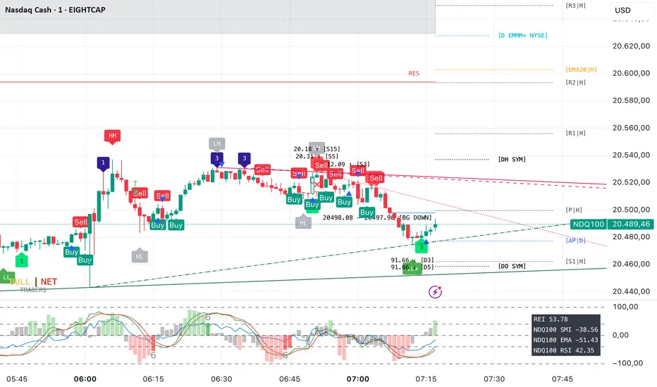
RS ScanOverview
The RS Scan indicator helps traders analyze a stock's relative strength and volatility using multiple key metrics. It provides insights into where the stock is closing within its daily and weekly ranges, how far it has moved from its 52-week high, and how its price changes compare to its Average Daily Range (ADR).
Key Features
✅ Daily Close Range% – Shows the stock’s closing position within the day’s high-low range.
✅ Weekly Close Range% – Displays the stock’s closing position within the weekly high-low range.
✅ Stock Price Change% – Measures how much the stock has moved relative to its 52-week high.
✅ ADR% (Average Daily Range) – Calculates the stock’s average daily volatility over a given period (default: 20 days).
✅ ADR off 52W High – Indicates how many ADR multiples the stock has moved from its 52-week high.
How to Use
Identify Strength: Stocks closing near the high of their daily/weekly range show strong momentum.
Measure Volatility: The ADR% helps traders understand expected price fluctuations.
Detect Weakness: A stock trading far below its 52-week high with a low close range may indicate weakness.
Compare Price Change vs. ADR: If a stock is significantly down from its 52-week high but within a small ADR range, it may be consolidating.
Screening Example: If SPY is currently less than -3 ADR from its 52-week high, we can filter for stocks that are performing stronger by selecting those above -3 ADR. This helps in identifying stocks with relative strength compared to the broader market.
This indicator is useful for momentum traders, swing traders, and those tracking relative strength.
🚀 Try it out and enhance your trading decisions!

Market Snap Shot with Pine ScreenerMarket Snap Shot
The Market Snap Shot is a comprehensive technical analysis tool designed to track and display key price metrics across multiple timeframes, including daily, weekly, monthly, quarterly, and yearly data. This script provides a range of essential calculations for traders and investors, enabling them to assess price action, volatility, and market trends at a glance.
Features:
Daily Metrics: Includes the daily percentage change, closing range relative to the daily high/low.
Weekly Metrics: Tracks weekly open, close, range, and calculates week-to-date performance for a broader market view.
Monthly Metrics: Provides similar calculations for monthly price action, offering insights into monthly performance.
Quarter-to-Date (QTD): Displays performance for the current quarter, offering insights into quarterly price movements.
Year-to-Date (YTD): Calculates year-to-date price change, helping users track performance relative to the start of the year.
52-Week High/Low: Displays the current price's distance from the 52-week high and low, giving context to long-term price levels.
Usage:
Traders can use this screener to quickly assess the current market position and make informed decisions based on short-term and long-term trends.
Investors can leverage the 52-week and YTD metrics to gauge the overall strength of an asset in the market.
The tool is versatile for both active traders looking for real-time performance data and for those focusing on longer-term market trends.
Instructions:
This script displays multiple metrics such as percentage changes and range data for daily, weekly, monthly, quarterly, and yearly timeframes. It is designed to be used as a screener tool to assess price action and monitor performance across these key time periods.
Warning:
The "Market Snap Shot" does not provide buy or sell signals but rather serves as a performance tracking tool. Users are encouraged to use this data in conjunction with other technical and fundamental analysis tools.
Anchored Powered KAMA [LuxAlgo]The Anchored Powered KAMA tool is a new flavor of the famous Kaufman's Adaptive Moving Average (KAMA).
It adds 5 different anchoring periods, a power exponent to the original KAMA calculation to increase the degree of filtering during ranging trends, and standard deviation bands calculated against the KAMA itself.
🔶 USAGE
In the image above we can see the different parts of the tool, it displays the Anchored Powered KAMA surrounded by standard deviation bands at 2x (solid) and 1x (dashed) by default.
This tool provides a simple and easy way to determine if the current market is ranging or trending and where the market extremes are in the current period.
As a rule of thumb, traders may want to trade extremes in ranges and pullbacks in trends.
When the KAMA is flat, a range is in place, so traders may want to wait for the price to reach an extreme before opening a trade in the other direction.
Conversely, if the KAMA is moving up or down, a trend is in place and traders may want to wait for the price to pull back to the KAMA before opening a trade in the direction of the trend.
🔹 Anchor Period
On the above chart, we can see different anchor periods on different chart timeframes.
This option is very useful for those traders who use multi-timeframe analysis, allowing them to see how the market behaves over different timeframes.
The valid values for this parameter are:
Hourly
Daily
Weekly
Monthly
Yearly
The tool has a built-in Auto feature for traders convenience, it automatically selects the optimal Anchor Period in function of the chart timeframe.
timeframes up to 2m: Hourly
timeframes up to 15m: Daily
timeframes up to 1H: Weekly
timeframes up to 4H: Monthly
larger timeframes: Yearly
🔹 Choosing the Right Anchor Period
In the chart above we can see the custom error message that the tool displays when the Auto feature is disabled and the Anchor Period is too large for the current chart timeframe.
Traders can select a smaller Anchor Period or a larger chart timeframe for the tool to display correctly.
🔶 DETAILS
The tool uses Welford's algorithm to calculate the KAMA's standard deviation, then plots the outer bands at the multiplier specified in the settings panel, and the inner bands at the multiplier specified minus 1.
🔹 Power Exponent
The graph above shows how different values of this parameter can affect the output.
To display the original KAMA a value of 1 must be set, by default this parameter is set to 2.
The higher the value, the better the tool's ability to detect ranges.
🔶 SETTINGS
Anchor Period: Select up to 5 different time periods from Hourly, Daily, Weekly, Monthly, and Yearly.
Source: Choose the source for all calculations.
Power Exponent: Fine-tune the KAMA calculation, a value of 1 will output the original KAMA, and is set to 2 by default.
Band Multiplier: Select the multiplier for the standard deviation bands.

Multi-Timeframe VWAP DashboardMulti-Timeframe VWAP Dashboard with Advanced Customization**
Unlock the power of **Volume-Weighted Average Price (VWAP)** across multiple timeframes with this highly customizable and feature-rich Pine Script. Designed for traders who demand precision and flexibility, this script provides a **comprehensive VWAP dashboard** that adapts to your trading style and strategy. Whether you're a day trader, swing trader, or long-term investor, this tool offers unparalleled insights into market trends and price levels.
---
### **Key Features:**
1. **Multi-Timeframe VWAP Calculation:**
- Calculate VWAP across **12-minute, 48-minute, 96-minute, 192-minute, daily, weekly, monthly, and even yearly timeframes**.
- Supports **custom timeframes** for tailored analysis.
2. **Price Source Selection:**
- Choose from multiple price sources for VWAP calculation, including **Open, High, Low, Close, HL2, HLC3, HLCC4, and All**.
- Optimize VWAP for **uptrends and downtrends** by selecting the most relevant price source.
3. **Customizable Labels:**
- Add **dynamic labels** to each VWAP line for quick reference.
- Customize label **colors, sizes, and offsets** to suit your chart setup.
- Display **price values** and **session types** (e.g., "12 Min", "Daily", "Weekly") directly on the chart.
4. **Advanced Session Detection:**
- Automatically detect new sessions for **intraday, daily, weekly, monthly, and yearly timeframes**.
- Ensures accurate VWAP calculations for each session.
5. **Plot Visibility Control:**
- Toggle the visibility of individual VWAP plots to **reduce clutter** and focus on the most relevant timeframes.
- Includes options for **short-term, medium-term, and long-term VWAPs**.
6. **Comprehensive Timeframe Coverage:**
- From **12-minute intervals** to **12-month intervals**, this script covers all major timeframes.
- Perfect for traders who analyze markets across multiple horizons.
7. **User-Friendly Inputs:**
- Intuitive input options for **timeframes, colors, labels, and offsets**.
- Easily customize the script to match your trading preferences.
8. **Dynamic Label Positioning:**
- Labels adjust automatically based on price movements and session changes.
- Choose from **multiple offset options** to position labels precisely.
9. **Miscellaneous Customization:**
- Adjust **text color, label size, and price display settings**.
- Enable or disable **price values** and **session type labels** for a cleaner chart.
---
### **Why Use This Script?**
- **Versatility:** Suitable for all trading styles, including scalping, day trading, swing trading, and long-term investing.
- **Precision:** Accurate VWAP calculations across multiple timeframes ensure you never miss key price levels.
- **Customization:** Tailor the script to your specific needs with a wide range of input options.
- **Clarity:** Dynamic labels and customizable plots make it easy to interpret market trends at a glance.
---
### **How It Works:**
1. **Select Your Price Source:**
- Choose the price source (e.g., Open, Close, HL2) for VWAP calculation based on your trading strategy.
2. **Choose Timeframes:**
- Define the timeframes for VWAP calculation, from intraday to yearly intervals.
3. **Customize Labels and Plots:**
- Enable or disable labels and plots for each timeframe.
- Adjust colors, sizes, and offsets to match your chart setup.
4. **Analyze Market Trends:**
- Use the VWAP lines and labels to identify **support/resistance levels**, **trend direction**, and **potential reversal points**.
5. **Adapt to Market Conditions:**
- Switch between timeframes and price sources to adapt to changing market conditions.
---
### **Ideal For:**
- **Day Traders:** Use short-term VWAPs (e.g., 12-minute, 48-minute) to identify intraday trends and key levels.
- **Swing Traders:** Leverage medium-term VWAPs (e.g., 96-minute, daily) to spot swing opportunities.
- **Long-Term Investors:** Analyze long-term VWAPs (e.g., weekly, monthly) to gauge overall market direction.
---
### **How to Get Started:**
1. Add the script to your TradingView chart.
2. Customize the inputs to match your trading preferences.
3. Analyze the VWAP lines and labels to make informed trading decisions.
---
### **Pro Tip:**
Combine this script with other technical indicators (e.g., moving averages, RSI) for a **holistic view** of the market. Use the VWAP lines as dynamic support/resistance levels to enhance your entry and exit strategies.
This script is a must-have tool for traders who value precision, flexibility, and clarity. Share it with your audience to help them elevate their trading game. Whether they're beginners or seasoned professionals, this **Multi-Timeframe VWAP Dashboard** will become an essential part of their toolkit.
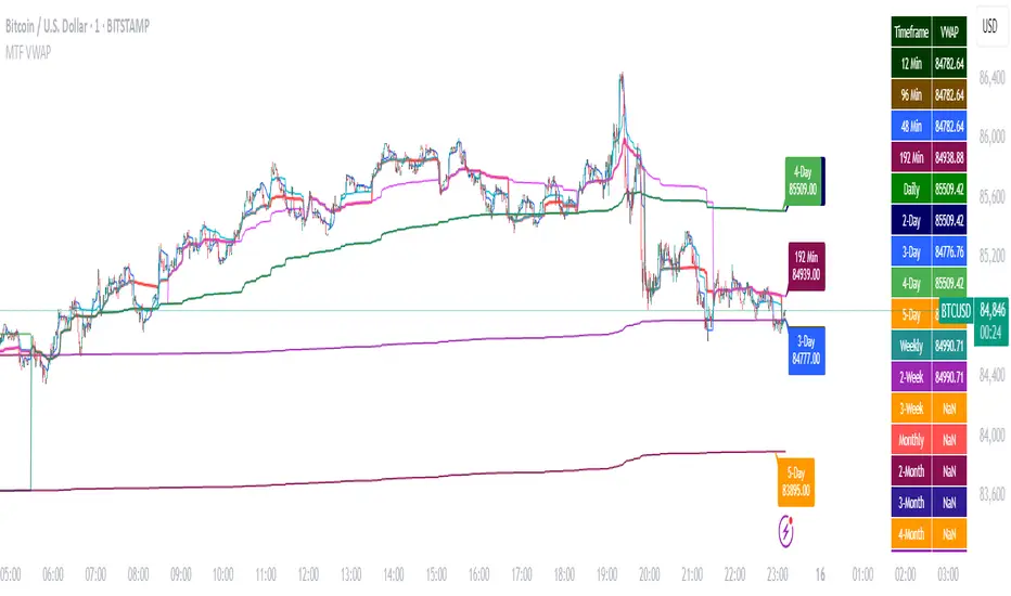
Multi-Timeframe VWAP Master ProThe Multi-Timeframe VWAP Suite is a comprehensive and highly customizable indicator designed for traders who rely on Volume-Weighted Average Price (VWAP) across multiple timeframes and periods. This tool provides a complete suite of VWAP calculations, including daily, weekly, monthly, quarterly, yearly, and custom VWAPs, allowing traders to analyze price action and volume trends with precision. Whether you're a day trader, swing trader, or long-term investor, this indicator offers unparalleled flexibility and depth for your trading strategy.
Multi-Timeframe VWAPs:
Daily, Weekly, Monthly, Quarterly, and Yearly VWAPs: Track VWAP across various timeframes to identify key support and resistance levels.
Customizable Timeframes: Use the SMA timeframe input to adjust the period for moving averages and other calculations.
Previous Period VWAPs:
Previous Daily, Weekly, Monthly, and Quarterly VWAPs: Analyze historical VWAP levels to understand past price behavior and identify potential reversal zones.
Previous Year Quarterly VWAPs: Compare current price action to VWAP levels from specific quarters of the previous year.
Custom VWAPs:
Custom Start Date and Timeframe: Define your own VWAP periods by specifying a start date and timeframe, allowing for tailored analysis.
Dynamic Custom VWAP Calculation: Automatically calculates VWAP based on your custom inputs, ensuring flexibility for unique trading strategies.
Seasonal and Yearly VWAPs:
April, July, and October VWAPs: Analyze seasonal trends by tracking VWAP levels for specific months.
Yearly VWAP: Get a broader perspective on long-term price trends with the yearly VWAP.
SMA Integration:
SMA Overlay: Combine VWAP analysis with a Simple Moving Average (SMA) for additional confirmation of trends and reversals.
Customizable SMA Length and Timeframe: Adjust the SMA settings to match your trading style and preferences.
User-Friendly Customization:
Toggle Visibility and Labels: Easily enable or disable the display of specific VWAPs and their labels to keep your chart clean and focused.
Color Customization: Each VWAP line and label is color-coded for easy identification and can be customized to suit your preferences.
Dynamic Labeling:
Automatic Labels: Labels are dynamically placed on the last bar, providing clear and concise information about each VWAP level.
Customizable Label Text: Labels include detailed information, such as the timeframe or custom period, for quick reference.
Flexible Timeframe Detection:
Automatic Timeframe Detection: The indicator automatically detects new days, weeks, months, and quarters, ensuring accurate VWAP calculations.
Support for Intraday and Higher Timeframes: Works seamlessly on all chart timeframes, from 1-minute to monthly charts.
Previous Year Quarterly VWAPs:
Q1, Q2, Q3, Q4 VWAPs: Compare current price action to VWAP levels from specific quarters of the previous year.
User-Selectable Year: Choose the year for which you want to calculate previous quarterly VWAPs.
Persistent Monthly VWAPs:
Option to Persist Monthly VWAPs Year-Round: Keep monthly VWAP levels visible even after the month ends for ongoing analysis.
Comprehensive Analysis: Combines multiple VWAP timeframes and periods into a single tool, eliminating the need for multiple indicators.
Customizable and Flexible: Tailor the indicator to your specific trading strategy with customizable timeframes, periods, and settings.
Enhanced Decision-Making: Gain deeper insights into price action and volume trends across different timeframes, helping you make more informed trading decisions.
Clean and Organized Charts: Toggle visibility and labels to keep your chart clutter-free while still accessing all the information you need.
Ideal For:
Day Traders: Use daily and intraday VWAPs to identify intraday support and resistance levels.
Swing Traders: Analyze weekly and monthly VWAPs to spot medium-term trends and reversals.
Long-Term Investors: Leverage quarterly and yearly VWAPs to understand long-term price behavior and key levels.
Seasonal Traders: Track April, July, and October VWAPs to capitalize on seasonal trends.
The Multi-Timeframe VWAP Suite is a powerful and versatile tool for traders of all styles and timeframes. With its comprehensive suite of VWAP calculations, customizable settings, and user-friendly design, it provides everything you need to analyze price action and volume trends with precision and confidence. Whether you're looking to fine-tune your intraday strategy or gain a broader perspective on long-term trends, this indicator has you covered.
CandelaCharts - Liquidity Key Zones (LKZ)📝 Overview
The Liquidity Key Zones indicator displays the previous high and low levels for daily, weekly, monthly, quarterly, and yearly timeframes. These levels serve as crucial price zones for trading any market or instrument. They are also high-probability reaction zones, ideal for trading using straightforward confirmation patterns.
Each of these levels plays a significant role in determining whether the market continues its momentum or reverses its bias. I like to think of these levels as dual magnets—they simultaneously attract and repel price. You might wonder how having opposing views can be useful. The key is to remain neutral about direction and establish your own rules to identify when these zones are likely to attract or repel price. I have my own set of rules, and you can develop yours.
📦 Features
MTF
Styling
⚙️ Settings
Day: Shows previous day levels
Week: Shows previous week levels
Month: Shows previous month levels
Quarter: Shows previous quarter levels
Year: Shows previous year levels
Show Average: Shows previous level average price
Show Open: Shows previous level open price
⚡️ Showcase
Daily
Weekly
Monthly
Quarterly
Yearly
Average
Open
📒 Usage
When the price breaks through a significant level, such as a daily, weekly, or monthly high or low, it often signals a potential reversal in market direction. This occurs because these levels represent key areas of support or resistance, where traders anticipate heightened activity, including profit-taking, stop-loss orders, or new positions being initiated.
Once the price breaches these levels, it may trigger a sharp reaction as market participants adjust their strategies, leading to a reversal. Monitoring price action and volume around these levels can provide valuable confirmation of such reversals.
Another effective approach to utilizing these pivot points is by incorporating them into a structured trading strategy, such as the X Model, which leverages multiple timeframes and technical tools to refine trade entries and exits.
X Model conditions:
(D1) Previous Day High (ERL)
(H1) Bullish FVG/IFVG/OB (IRL)
(m15) MSS / SMT
Only Short Above 00:00
By combining these elements, the X Model offers a comprehensive framework for leveraging pivot levels effectively, emphasizing confluence between liquidity zones, time-based rules, and multi-timeframe analysis to enhance trading accuracy and consistency.
🚨 Alerts
This script provides alert options for all signals.
Bearish Signal
A bearish signal is generated when the price breaks below the previous low level.
Bullish Signal
A bullish signal is generated when the price breaks above the previous low level.
⚠️ Disclaimer
Trading involves significant risk, and many participants may incur losses. The content on this site is not intended as financial advice and should not be interpreted as such. Decisions to buy, sell, hold, or trade securities, commodities, or other financial instruments carry inherent risks and are best made with guidance from qualified financial professionals. Past performance is not indicative of future results.
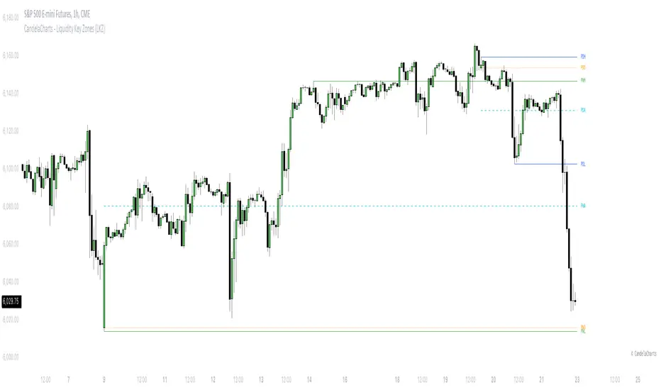
Multi Timeframe 8x MA Support Resistance Zones [SiDec]Multi-Timeframe Moving Average Support/Resistance Zones: The Ultimate Trading Power Tool
Indicator Overview
Get ready to elevate your trading game with the Multi-Timeframe Moving Average Support/Resistance Zones indicator. This advanced tool is engineered for traders who want to maximize efficiency without constantly switching between timeframes. By dynamically plotting support and resistance zones using the 21 SMA and 21 EMA, it reveals crucial price levels where trends may pause, reverse, or accelerate—giving you actionable insights in a fraction of the time.
Imagine seeing all the relevant timeframe zones on one chart, without ever needing to flip between timeframes—saving you time and allowing you to focus on what really matters.
Core Features
Dynamic Zones That Adjust in Real-Time:
The area between the 21 EMA and 21 SMA is shaded, forming a "zone" on your chart. This dynamic zone adjusts live as price moves, keeping you in sync with current market behavior across multiple timeframes.
By showing these zones across all your selected timeframes, you can view everything you need at a glance—no time wasted jumping between charts.
All Timeframes, One View:
With the ability to view multiple timeframe zones simultaneously (from 5-minute to Monthly), this tool helps you spot key levels quickly without switching between timeframes. You’ll see how price interacts with these levels across different timeframes without ever having to change charts.
Higher timeframes show broader, more significant zones—giving you the market's big picture—while intraday zones help you fine-tune your entries.
Customisable Like Never Before:
Toggle Timeframes: Only activate the timeframes you care about—no distractions, just pure focus.
Color Your World: Assign different colors to each timeframe for instant visual cues (e.g., blue for Daily, gold for Weekly). This makes it easy to identify key zones across all timeframes at a glance.
Why You Need This Tool
Instant Trend Confirmation: Track how price interacts with multiple timeframe zones to confirm bullish or bearish momentum in real-time.
Confluence = High Confidence: When zones from multiple timeframes overlap, you’ve found a high-probability reversal area. This is where the market is likely to turn, and where your edge lies.
Efficiency at Its Best: No more switching between timeframes—everything you need is in one place, giving you more time to trade and less time spent on analysis.
Configuration Instructions
1.) Timeframe Selection:
Choose which timeframes to display using the Timeframe Selection panel.
Intraday Focus: 5m, 15m, 1H.
Swing/Long-Term Focus: 4H, 12H, Daily, Weekly, Monthly.
Color Coding: Assign a distinct color to each timeframe for instant identification—like having a personal color-coded trading roadmap.
2.) MA Settings:
MA Types:
21 EMA: Perfect for capturing short-term trends and fast price action.
21 SMA: The smooth operator for spotting longer-term trends with more consistency.
Recommended Periods: The 21-period MA works wonders for trend detection across various timeframes. You can also integrate Fibonacci-based MAs (e.g., 55, 233) for enhanced confluence.
3.) Visual Tweaks:
Opacity: Adjust the zone transparency (80-90% opacity keeps it visible yet non-intrusive).
Zone Extensions: Customize how far zones extend backward and forward, capturing the full impact of support/resistance levels.
Labels: Show real-time MA values and timeframe-specific details for further clarity.
Trading Strategies That Pack a Punch
1.) Trend Confirmation:
Uptrend: Price staying above the 21 EMA and 21 SMA suggests a bullish trend.
Downtrend: Price holding below these MAs signals a bearish market.
2.) Zone-Based Reversals:
Entry: Look for price to retrace to a higher timeframe support zone (e.g., Daily 21 SMA) with confirmation from oversold/overbought indicators like RSI.
Exit: Time to sell when price breaks through a critical zone, like the 4H 21 EMA.
3.) Confluence Trading:
Combine the zones with other indicators to amplify your trade setups:
Fibonacci Levels: When a 61.8% retracement lines up with an MA zone, you’ve found a high-confluence area.
Volume Profile: High-volume nodes near key zones strengthen their significance.
Best Practices for Maximum Profit
Focus on Higher Timeframes: Weekly and Monthly zones carry more weight, making them more significant in decision-making.
Avoid Clutter: If you’re trading higher timeframes, disable intraday timeframes like 5m and 15m to keep your chart clear and focused.
Risk Management: Zones are probabilities, not guarantees. Always use stop-loss orders to protect your trades.
Example of a Winning Setup
Scenario:
Price retraces to the 1H 21 EMA zone.
The Daily 21 SMA zone is nearby—talk about confluence!
RSI shows oversold conditions, indicating a potential reversal.
Action:
Enter long on a bullish candlestick pattern (e.g., bullish engulfing).
Set your stop-loss just below the Daily 21 SMA zone.
Target the next higher timeframe resistance.
Performance Considerations
Repainting Risk: Zones might slightly adjust with the formation of new bars, but the changes will typically be minimal.
Enhance with Oscillators: Use momentum indicators like MACD or Stochastic and volume analysis for even more confirmation.
Conclusion
The Multi-Timeframe Moving Average Support/Resistance Zones indicator isn’t just a tool—it’s a game-changer. With the ability to view all relevant timeframe zones on one chart, you can make decisions faster, spot high-confluence areas, and trade with greater precision. The time you save by not switching between timeframes can make all the difference in your trading success.
Maximise your trading edge—harness the power of multi-timeframe analysis, gain more time to trade, and dominate the market like never before. 📊🔍

Sadosi Gap SelecterThis indicator is designed to be used on daily charts. Please note that it will not work with weekly or hourly data.
The Sadosi Gap Selecter is a powerful indicator designed to identify price gaps that occur between specific dates on the chart. It allows users to easily analyze price movements between selected weeks and days, highlighting these periods with visual boxes. This helps traders spot potential trend reversals and key price levels more effectively. It’s particularly valuable for those utilizing gap trading strategies to identify market inefficiencies.
The core functionality of this indicator is based on detecting price differences between two selected days within a defined date range. With the Start Day (day1) and End Day (day2) options, you can choose the exact days of the week you’d like to analyze. For instance, if you want to focus on price movements from Friday to Monday, simply select those days. Additionally, the Start Week (week1) and End Week (week2) settings allow you to narrow down the time frame on a weekly basis, making it easy to analyze price behavior during specific periods of the year.
For visual customization, several options are available. The Color (renk) setting lets you choose between red and yellow for the highlighted boxes. The Transparency (op) control adjusts the background opacity from 0% (fully opaque) to 100% (completely transparent), allowing you to manage how prominently the boxes appear on your chart. Furthermore, the Border (hat) option enables you to add or remove borders around the boxes, helping reduce visual clutter or emphasize certain areas depending on your preference.
Once applied to the chart, the indicator automatically generates boxes for the specified date ranges. The upper and lower bounds of each box are determined based on the price movement within that period, providing insights into the direction and strength of the trend. However, this tool does not generate definitive buy or sell signals on its own. It is recommended to use it alongside other technical analysis tools to make more informed trading decisions.
With the Sadosi Gap Selecter, you can gain clearer insights into price behavior, strengthen your trend analyses using historical data, and fully customize the settings to match your trading style for more effective results.
This indicator is designed to be used on daily charts. Please note that it will not work with weekly or hourly data
COT Index and OI IndexCOT Index and OI Index
It calculates COT Index for Commercials and Open Interest Index. Both for a custom period depending of the asset nature. These periods can be adjusted. You can also choose to have signals drawn on the chart when the following conditions are met
If "Extreme Positions" option is chosen:
* COT Index for Commercials > Extreme Long (adjustable parameter in %) and COT Index for Large Speculators and Small Speculators < Extreme Short (adjustable parameter in %). This will show a green triangle up in the last weekly bar/candle
* COT Index for Commercials < Extreme Short (adjustable parameter in %) and COT Index for Large Speculators and Small Speculators > Extreme Long (adjustable parameter in %). This will show a red triangle down in the last weekly bar/candle
If "Extreme Commercials and OI Index" option is chosen:
* COT Index for Commercials > Extreme Long (adjustable parameter in %) and OI Index < Extreme Short (adjustable parameter in %). This will show a green triangle up in the last weekly bar/candle
* COT Index for Commercials < Extreme Short (adjustable parameter in %) and OI Index > Extreme Long (adjustable parameter in %). This will show a red triangle down in the last weekly bar/candle

Jay Stock Vs S&P Sector Performance
This indicator facilitates stock comparison with an S&P sector while also identifying sector trends and potential trend beginnings, continuations, and conclusions by integrating moving averages with trend lines.
Its unique trend curves also assist in pinpointing key support and resistance levels for the sector. The sector grouping and market cap are calculated within the indicator using a curated list of stocks.
Multi-timeframe plots provide valuable insights by displaying short-term and long-term trends on the same chart, making it suitable for both intraday and swing trading analysis.
Multiple sector charts and trends can be visualized at the same time by adding multiple instances of same indicator to compare different sectors for portfolio rebalancing between sectors.
Another distinctive and essential feature is performance lines, which allow for visualizing S&P sector performance relative to the SPX market and stock performance relative to the S&P sector. Using the performance lines, one can identify top-performing sectors and then pinpoint the best stocks within those sectors.
How to read multi-timeframe charts?
The first timeframe, such as daily, is represented by a red EMA8 line (labeled DE) and a corresponding thin trend line (labeled DT). The second timeframe, such as weekly, uses a green EMA8 line (labeled WE) and a medium trend line (labeled WT). The third timeframe, such as monthly, is depicted with a blue EMA8 line (labeled ME) and a thick trend line (labeled MT).
As the timeframe increases, the true range increases and hence trend curve thickness increases.
How do EMA and Trend Line Work Together?
In the Electronic Tech sector daily chart screenshot below, trend initiation is highlighted with a green circle, trend continuation is marked by arrow, and trend completion is indicated with a red circle. A total of two trends are identified on the chart.
When the EMA crosses above the corresponding trend line, it signals the start of a trend, while a cross below the trend line marks its end. The period between the trend start and end represents trend continuation.
How do Trend Lines Serve as Support or Resistance?
In the Electronics Sector daily chart screenshot below, the monthly green trend line serves as support when the price declines toward it, while the red trend line acts as resistance when the price rises from below.
Green circles on the chart highlight instances where the monthly trend provided support, while red circles indicate points where the weekly trend acted as resistance.
How Multi-Timeframe Trends Assist in Stock Analysis?
In the Transportation sector daily chart screenshot below, the monthly trend is rising, and the weekly trend is also moving upward, indicating a favorable outlook for both long-term (monthly) and medium-term (weekly) trends. While, the daily chart suggests a up trend starting.
How to use performance lines to pick outperforming sectors and stocks?
In the screenshot below, the sector candles and trendlines have been disabled in the settings for better clarity, while the performance lines remain enabled. The chart displays META's performance lines, comparing its performance against the Technology Services sector.
The upward movement of the red lines indicates that META is performing well relative to its sector, while the rising blue lines suggest that the sector itself is gaining strength. This trend signals a potential improvement in both the sector’s overall performance and META’s standing within it.
Inputs and customization:
The combination of ema and trend plots will be plotted for 4 different time frames all at once. The first three timeframes(60, 240, D, W, M, etc) can be chosen in the settings while the fourth one is for current chart timeframe.
One can manually select the sector for comparison in the settings or choose to have it automatically selected for most of S&P 500 stocks. At what price to plot the sector chart can be set in the settings.
The sector candles, trend lines, performance lines and labels, can all be shown or hidden by adjusting settings.
How is Trend Line and EMA calculated?
The Trend line is calculated using an arithmetic equation based on the last 8 data points, which are themselves a combination of weighted moving averages of varying lengths. A 14-period true range of the price is calculated and plotted as a buffer zone around the trend lines.
Trend curves appear green when the price is above the trend line and red when it is below. Trend lines are labeled using the timeframe followed by 'T' (e.g., DT, WT, MT).
The EMA represents the weighted moving average of the most recent eight candles and is labeled with the timeframe followed by 'E' (e.g., DE, WE, ME).
How is sector data(representational) Calculated ?
The representational sector data (market cap) is calculated by summing each stock's price, weighted by its market cap percentage within the selected group, and then scaling the result to display at the desired price point on the chart.
The sector plot data shown here is the representation(not actual) of total market value of a few chosen stocks (list shown on chart) in the S&P 500. Large-cap stocks are excluded from the calculation to mitigate bias. Therefore, the displayed chart offers an approximate representation of the sector movement.
How is performance Calculated ?
The stock vs. sector performance, shown in red, is calculated as the stock's market cap movement divided by the sector's market cap movement. If the stock is doing much better than the rest of its sector group, this line will go up. Similarly, sector Vs SPX performance, shown in blue, is calculated as sector movement divide by SPX movement. When a sector outperforms the broader(SPX) market, the blue line trends upward.
Pro Tip: For optimal visibility, apply this indicator to a separate pane below the stock chart.
Caution: This indicator is intended solely for educational and analytical purposes, assisting traders in studying stock movements relative to their sector group. Stocks selected for sector market cap calculations are curated and hence these plots should only be taken for comparison study purposes. Exercise caution when using it for investment decisions.