The Final Countdown//Credit to ©SamRecio for the original indicator that this is based on, which is called, "HTF Bar Close Countdown".
Here are the key differences between the two indicators (That a user would care about):
1.) 10 timeframe slots (double the original number).
2.) Many more timeframe options ('1', '3', '5', '10', '15', '30', '45', '1H', '2H', '4H', '6H', '8H', '12H', 'D', 'W').
3.) Ability to structure timeframes however you want (Higher up top descending, vice versa, or just randomly.).
4.) Support for hour-based timeframes (1H, 2H, etc.).
5.) Displays minutes as numbers, hours with a number followed by H (ex. 1H), and anything above with a letter (D for day, W for week).
6.) Dynamic colors based on remaining time percentage (green->yellow->red) with two user-defined thresholds.
7.) Alerts for when timeframes are close to closing (yellow->red).
8.) More granular timeframe selection options.
9.) Background colors for an additional visual alert.
------Colors background the selected color for each timeframe (Default is all timeframes are blue with 80% transparency).
------This does not repaint, so the color will persist once the red condition is over.
------As soon as you leave the timeframe though, it will be erased and the new timeframe will begin tracking red conditions.
------It always starts from the current bar, so it is not applicable to historical bars unless you leave it running for an extended period of time.
------Do note that since this is not actual paint or colored pencils, the colors do not blend.
------The most recent timeframe to enter a red condition will be the background that you see unless you leave the timeframe and return.
--------------------------------------------------------------------------------------------------------------------
Now for the description and instructions....
IT'S THE FINAL COUNTDOWN!
This indicator helps shorter-timeframe traders track multiple timeframe closings simultaneously, providing visual, audio and notification alerts when bars are nearing their close. It's particularly useful for traders who want to prepare for potential price action around bar closings across different timeframes. If you're a HODL till you're broke kind of trader, you don't need this.
-------------------------------
Multi-Timeframe Tracking
-------------------------------
- Monitors up to 10 different timeframes simultaneously
- Supports various timeframes from 1 minute to weekly (1m, 3m, 5m, 10m, 15m, 30m, 45m, 1H, 2H, 4H, 6H, 8H, 12H, Daily, Weekly)
- Timeframes can be arranged in any order (ascending, descending, or custom)
-----------------
Visual Display
-----------------
- Shows a countdown timer for each selected timeframe
- Dynamic color changes based on time remaining:
Green: More than 15% of bar time remaining
Yellow: Between 15% and 5% remaining
Red: Less than 5% remaining
- Customizable background colors appear when timeframes enter their red zone
----------------
Alert System
----------------
- Built-in alerts trigger when any timeframe enters its red zone
- Each timeframe can have its alerts toggled independently
------
-------------
--------------------------
- Setup Instructions -
--------------------------
-------------
------
-------------------------
Timeframe Selection
-------------------------
- Choose up to 10 timeframes to monitor
- Each timeframe has its own toggle switch to turn it on/off
- Default configuration starts from 5m and goes up to 12H
-------------------------
Visual Customization
-------------------------
- Adjust the table size, position
- Customize frame and border colors
- Modify the yellow and red threshold percentages
--------------------------------
Background Color Settings
--------------------------------
- Enable/disable background colors for each timeframe
- Choose custom colors for each timeframe's background
- Default setting is blue (with a fixed 80% transparency)
-------------
Usage Tips
-------------
- Use the countdown table to prepare for multiple timeframe closes as big moves (especially reversals) tend to begin come after higher timeframe changes (sometimes to the second).
- Watch for color changes to anticipate important closing periods to avoid getting trapped in bad trade (please always use stop losses if trading, in general).
- Set up alerts for critical timeframes that require immediate attention (2H, 4H, etc.).
- Use background colors as an additional visual cue for timeframe closes.
- Position the table where it won't interfere with your chart analysis.
Cerca negli script per "weekly"
Working HoursWorking Hours Visualization
Description:
This script is designed to visually highlight specific "Working Hours" sessions on the chart using background colors. It is tailored and optimized for the 15-minute timeframe, ensuring accurate session representation and proper functionality. If you choose to use this script on other timeframes, adjustments may be necessary to maintain its effectiveness.
Key Features:
Working Hours Highlighting: Displays background colors to mark predefined working hours, helping you focus on specific trading sessions.
Future Session Projection: Highlights working hours for future candles, providing a clear visual guide for planning trades.
Customizable Appearance: Offers adjustable colors, transparency, and session timings to suit individual preferences.
Weekly Separators: Includes optional weekly separators to visually distinguish trading weeks.
Important Notes:
Timeframe Compatibility:
This script is optimized for the 15-minute timeframe.
Using it on other timeframes may require optimization of session inputs and related logic.
Please feel free to reach out if you need assistance with adjustments for different timeframes.
Customization:
You can customize session timings, colors, and transparency levels through the input settings.
Support:
If you encounter any issues or need help optimizing the script for your specific needs, don't hesitate to contact me.

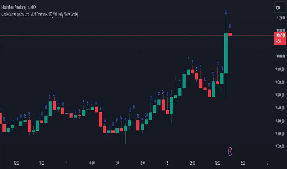
Candle Counter by ComLucro - Multi-Timefram - 2025_V01Candle Counter by ComLucro - Multi-Timeframe - 2025_V01
The Candle Counter by ComLucro - Multi-Timeframe is a highly customizable tool designed to help traders monitor the number of candles across various timeframes directly on their charts. Whether you're analyzing trends or tracking specific market behaviors, this indicator provides a seamless and efficient way to enhance your technical analysis.
Key Features:
Flexible Timeframe Selection: Track candle counts on yearly, monthly, weekly, daily, or hourly intervals to suit your trading style.
Dynamic Label Positioning: Choose to display labels above or below candles, offering greater control over your chart layout.
Customizable Colors: Adjust label text colors to match your chart's aesthetics and improve visibility.
Clean and Organized Visualization: Automatically generates labels for each candle without overcrowding your chart.
How It Works:
Select a Timeframe: Choose from yearly, monthly, weekly, daily, or hourly intervals based on your analysis needs.
Automatic Counting: The indicator calculates and displays the number of candles for the selected period directly on your chart.
Label Customization: Adjust the position (above or below the candles) and color of the labels to align with your preferences.
Why Use This Indicator?
This script is perfect for traders who need a clear and visual representation of candle counts in specific timeframes. Whether you're monitoring trends, evaluating price action, or developing strategies, the Candle Counter by ComLucro adapts to your needs and helps you make informed decisions.
Disclaimer:
This script is intended for educational and informational purposes only. It does not constitute financial advice. Always practice responsible trading and ensure this tool aligns with your strategies and risk management practices.
About ComLucro:
ComLucro is dedicated to providing traders with practical tools and educational resources to improve decision-making in the financial markets. Discover other scripts and strategies developed to enhance your trading experience.
OCM Quarter Point Autopilot - A Multi-Timeframe Quarter TheoryDescription:
The OCM Quarter Point Autopilot indicator automates the application of Quarters Theory across multiple timeframes and instruments. It creates a comprehensive grid of support and resistance levels based on two user-defined price points (Monthly QTPs).
Key Features:
- Automatically calculates and displays quarter points across 5 timeframes:
• Monthly (Black lines)
• Weekly (Blue lines)
• Daily (Green lines)
• 4-Hour (Red lines)
• 1-Hour (Purple lines)
- Shows both upper and lower ranges, which can be toggled on/off
- Visual hierarchy through color-coding for easy timeframe identification
- Extends lines 2 years into the past and 6 months into the future
Usage:
1. Enter two Monthly Quarter Trading Points (QTPs)
2. The indicator automatically:
- Calculates midpoints (weekly)
- Quarter points (daily)
- Eighth points (4-hour)
- Further subdivisions (1-hour)
Benefits:
- Identifies potential support/resistance levels
- Helps spot key price targets
- Works on any instrument where psychological levels matter
- Provides multiple timeframe analysis in one view
Best suited for traders who:
- Follow multi-timeframe analysis
- Trade using support/resistance levels
- Want to identify potential price targets
- Need structured price levels for entries/exits
The indicator combines the systematic approach of Quarters Theory with automated calculation and visualization, making it easier to identify key price levels across multiple timeframes.

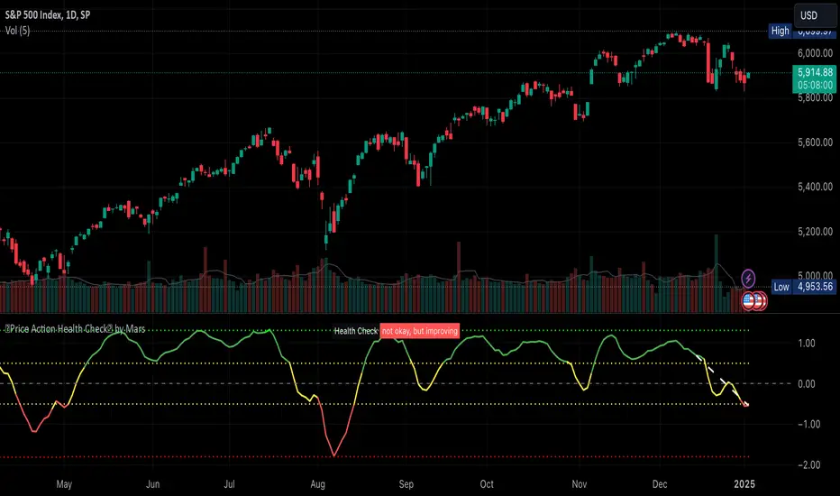
Price Action Health CheckThis is a price action indicator that measures market health by comparing EMAs, adapting automatically to different timeframes (Weekly/Daily more reliable) and providing context-aware health status.
Key features:
Automatically adjusts EMA periods based on timeframe
Measures price action health through EMA separation and historical context
Provides visual health status with clear improvement/deterioration signals
Projects a 13-period trend line for directional context
Trading applications:
Identify shifts in market health before major trend changes
Validate trend strength by comparing current readings to historical averages
Time entries/exits based on health status transitions
Filter trades using timeframe-specific health readings
I like to use it to keep SPX in check before deciding the market is going down.
Note: For optimal analysis, use primarily on Weekly and Daily timeframes where price action patterns are more significant.
Edufx AMD~Accumulation, Manipulation, DistributionEdufx AMD Indicator
This indicator visualizes the market cycles using distinct phases: Accumulation, Manipulation, Distribution, and Reversal. It is designed to assist traders in identifying potential entry points and understanding price behavior during these phases.
Key Features:
1. Phases and Logic:
-Accumulation Phase: Highlights the price range where market accumulation occurs.
-Manipulation Phase:
- If the price sweeps below the accumulation low, it signals a potential "Buy Zone."
- If the price sweeps above the accumulation high, it signals a potential "Sell Zone."
-Distribution Phase: Highlights where price is expected to expand and establish trends.
-Reversal Phase: Marks areas where the price may either continue or reverse.
2. Weekly and Daily Cycles:
- Toggle the visibility of Weekly Cycles and Daily Cycles independently through the settings.
- These cycles are predefined with precise timings for each phase, based on your selected on UTC-5 timezone.
3. Customizable Appearance:
- Adjust the colors for each phase directly in the settings to suit your preferences.
- The indicator uses semi-transparent boxes to represent the phases, allowing easy visualization without obstructing the chart.
4. Static Boxes:
- Boxes representing the phases are drawn only once for the visible chart range and do not dynamically delete, ensuring important consistent reference points.

BK MA Horizontal Lines
Indicator Description:
I am incredibly proud and excited to share my first indicator with the TradingView community! This tool has been instrumental in helping me optimize my positioning and maximize my trades.
Moving Averages (MAs) are among the top three most crucial indicators for trading, and I believe that the Daily, Weekly, and Monthly MAs are especially critical. The way I’ve designed this indicator allows you to combine MAs from your Daily timeframe with one or two from the Weekly or Monthly timeframes, depending on what is most relevant for the specific product or timeframe you’re analyzing.
For optimal use, I recommend:
Spacing your chart about 11 spaces from the right side.
Setting the Labels at 10 in the indicator configuration.
Keeping the line thickness at size 1, while using size 2 for my other indicator, "BK BB Horizontal Lines", which follows a similar concept but applies to Bollinger Bands.
If you find success with this indicator, I kindly ask that you give back in some way through acts of philanthropy, helping others in the best way you see fit.
Good luck to everyone, and always remember: God gives us everything. May all the glory go to the Almighty!

Real-Time HTF Volume Footprint [BigBeluga]Real-time HTF Volume Footprint Profile is designed to provide a comprehensive view of higher timeframe volume profiles on your current chart. It overlays critical volume information from larger timeframes (like daily, weekly, or monthly) onto lower timeframe charts, helping you spot significant levels where volume is concentrated, acting as potential support or resistance.
🔵 Key Features:
HTF High and Low Zones: The indicator highlights the high and low of the chosen higher timeframe with clear zones, marking them with boxes. These zones help you see the broader market structure at a glance.
Volume Profile within HTF Range: Each higher timeframe range displays a volume profile, showing the distribution of volume at each price level. The most-traded price is highlighted in blue, known as the Point of Control (POC), indicating the price level with the highest activity.
Dynamic POC Option: Activate Dynamic POC to observe how the Point of Control shifts over time, giving insight into changing market interests and potential price direction.
Timeframe Flexibility: Select from daily, weekly, and monthly ranges (and more) to overlay their footprint profiles on your lower timeframe chart. This helps you tailor the indicator to the trading horizon that suits your strategy.
Info Table: Table shows a traders which timeframe is selected with last high and low of the selected timeframe
Visual Clarity with Custom Colors: The indicator uses subtle fills and distinct colors to ensure volume profile data integrates seamlessly into your chart without overwhelming other indicators or price data.
🔵 When to Use:
The HTF Volume Footprint Profile is essential for traders who want to bridge the gap between high-timeframe and intraday analysis. By visualizing HTF volume distribution on lower timeframes, this tool helps you:
Spot potential liquidity zones where price might react.
Identify support and resistance levels within HTF ranges.
Monitor PoC shifts that indicate changes in market behavior.
Track how current price aligns with significant volume clusters, providing a clear edge for volume-based strategies.
This indicator empowers traders to analyze lower timeframes with the context of higher timeframe volume profiles, providing a solid basis for identifying critical support and resistance levels shaped by large volume clusters. Whether you’re looking to spot liquidity zones or align your trades with broader market trends, HTF Volume Footprint Profile equips you with a strategic view.

Crypto Market Cap Momentum Analyzer (AiBitcoinTrend)The Crypto Market Cap Momentum Analyzer (AiBitcoinTrend) is a robust tool designed to uncover trading opportunities by blending market cap analysis and momentum dynamics. Inspired by research-backed quantitative strategies, this indicator helps traders identify trend-following and mean-reversion setups in the cryptocurrency market by evaluating recent performance and market cap size.
This indicator classifies cryptocurrencies into market cap quintiles and ranks them based on their 2-week momentum. It then suggests potential trades—whether to go long, anticipate reversals, or simply hold—based on the crypto's market cap group and momentum trends.
👽 How the Indicator Works
👾 Market Cap Classification
The indicator categorizes cryptocurrencies into one of five market cap groups based on user-defined inputs:
Large Cap: Highest market cap tier
Upper Mid Cap: Second highest group
Mid Cap: Middle-tier market caps
Lower Mid Cap: Slightly below the mid-tier
Small Cap: Lowest market cap tier
This classification dynamically adjusts based on the provided market cap data, ensuring that you’re always working with a representative market structure.
👾 Momentum Calculation
By default, the indicator uses a 2-week momentum measure (e.g., a 14-day lookback when set to daily). It compares a cryptocurrency’s current price to its price 14 bars ago, thereby quantifying its short-term performance. Users can adjust the momentum period and rebalance period to capture shorter or longer-term trends depending on their trading style.
👾 Dynamic Ranking and Trade Suggestions
After assigning cryptos to size quintiles, the indicator sorts them by their momentum within each quintile. This two-step process results in:
Long Trade: For smaller market cap groups (Small, Lower Mid, Mid Cap) that have low (bottom-quintile) momentum, anticipating a trend continuation or breakout.
Reversal Trade: For the largest market cap group (Large Cap) that shows low momentum, expecting a mean-reversion back to equilibrium.
Hold: In scenarios where the coin’s momentum doesn’t present a strong contrarian or trend-following signal.
👽 Applications
👾 Trend-Following in Smaller Caps: Identify small or mid-cap cryptos with low momentum that might be poised for a breakout or sustained trend.
👾 Mean-Reversion in Large Caps: Pinpoint large-cap cryptocurrencies experiencing a temporary lull in performance, potentially ripe for a rebound.
👽 Why It Works in Crypto
The cryptocurrency market is heavily driven by retail investor sentiment and volatility. Research shows that:
Small-Cap Cryptos: Tend to experience higher volatility and speculative trends, making them ideal for momentum trades.
Large-Cap Cryptos: Exhibit more predictable behavior, making them suitable for mean-reversion strategies when momentum is low.
This indicator captures these dynamics to give traders a strategic edge in identifying both momentum and reversal opportunities.
👽 Indicator Settings
👾 Rebalance Period: The frequency at which momentum and trade suggestions are recalculated (Daily, Weekly, Monthly).
Shorter Periods (Daily): Fast updates, suitable for short-term trades, but more noise.
Longer Periods (Weekly/Monthly): Smoother signals, ideal for swing trading and more stable trends.
👾 Momentum Period: The lookback period for momentum calculation (default is 14 bars).
Shorter Periods: More responsive but prone to noise.
Longer Periods : Reflects broader trends, reducing sensitivity to short-term fluctuations.
Disclaimer: This information is for entertainment purposes only and does not constitute financial advice. Please consult with a qualified financial advisor before making any investment decisions.

ATT + Key Levels with SessionsKey Features:
ATT Turning Point Numbers:
This input allows the user to define specific numbers (e.g., "3,11,17,29,41,47,53,59") that mark turning points in price action, which are checked using the bar_index modulo 60. If the current bar index matches one of these turning points, it triggers potential buy or sell signals.
RSI (Relative Strength Index):
The RSI is calculated based on a user-defined period (rsi_period), typically 14, and used to indicate overbought or oversold conditions. The script defines overbought (70) and oversold (30) levels, which are used to filter buy or sell signals.
Session Times:
The script includes predefined session times for major trading markets:
New York: From 9:30 AM EST to 4:00 PM EST.
London: From 8:00 AM GMT to 4:30 PM GMT.
Asia: From 12:00 AM GMT to 9:00 AM GMT.
These session times are used to restrict the buy and sell signals to specific market sessions.
Key Levels:
The script calculates and plots key market levels for the current day and week:
Daily High and Low: The highest and lowest prices of the current day.
Weekly High and Low: The highest and lowest prices of the current week.
These levels are plotted with different colors for visual reference.
Signal Logic:
Buy Signal: Triggered when the current bar is a turning point (according to the ATT model), the RSI is below the oversold threshold, and the current time is within the active session times (New York, London, or Asia).
Sell Signal: Triggered when the current bar is a turning point, the RSI is above the overbought threshold, and the current time is within the active session times.
Signal Limitations:
A user-defined limit (max_signals_per_session) controls the maximum number of signals that can be plotted within each session. This prevents excessive signal generation.
Plotting and Background Highlights:
Buy and Sell Signals: The script plots shapes (labels) above or below the bars to indicate buy or sell signals when the conditions are met.
Background Highlight: The background color is highlighted in yellow when the current bar matches one of the defined ATT turning points.
In Summary:
The indicator combines multiple technical factors to generate trading signals:
Turning points in price action (based on custom ATT numbers),
RSI levels (overbought/oversold),
Market session times (New York, London, Asia),
Key price levels (daily and weekly highs and lows).
This combination helps traders identify potential buying and selling opportunities while considering broader market dynamics and limiting the number of signals during each session.

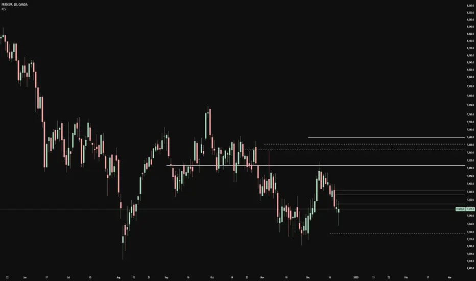
Key LevelsKey Levels Indicator
In the world of trading, manually identifying and plotting key levels for every close can be a tedious and error-prone task. This indicator stands out by automatically detecting and plotting only those levels where a significant shift in market sentiment has occurred. Unlike traditional indicators that plot lines for every open or close, this tool focuses on levels where liquidity has changed hands, indicating a potential shift in momentum.
How It Works:
- The indicator identifies Higher Timeframe (HTF) reversals, plotting levels only when a bearish candle is followed by a bullish one, or vice versa.
- Weekly levels are represented by dashed lines, while monthly levels are solid, providing clear visual differentiation.
- Levels are drawn at the open price of the reversal candle, starting precisely at the beginning of the new HTF bar.
Why It's Different:
- Focuses on genuine shifts in market sentiment rather than arbitrary price points.
- Automatically manages the number of visible levels to prevent chart clutter.
- Ideal for range traders and mean reversion strategies, offering insights into potential support and resistance zones where market participants have shown a change in behavior.
Usage Note:
While this indicator provides valuable insights, it should not be used in isolation. Always consider the broader market context and combine it with other analysis techniques for optimal results.
Settings:
- Toggle weekly/monthly levels
- Adjust the number of visible levels (1-20)
- Customize level colors
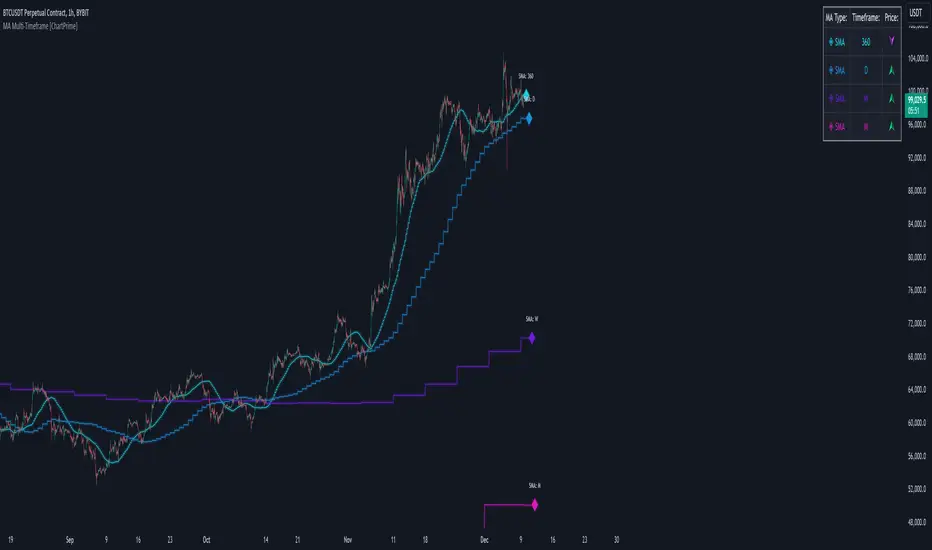
MA Multi-Timeframe [ChartPrime]The MA Multi-Timeframe indicator is designed to provide multi-timeframe moving averages (MAs) for better trend analysis across different periods. This tool allows traders to monitor up to four different MAs on a single chart, each coming from a selectable timeframe and type (SMA, EMA, SMMA, WMA, VWMA). The indicator helps traders gauge both short-term and long-term price trends, allowing for a clearer understanding of market dynamics.
⯁ KEY FEATURES AND HOW TO USE
⯌ Multi-Timeframe Moving Averages :
The indicator allows traders to select up to four MAs, each from different timeframes. These timeframes can be set in the input settings (e.g., Daily, Weekly, Monthly), and each moving average can be displayed with its corresponding timeframe label directly on the chart.
Example of different timeframes for MAs:
⯌ Moving Average Types :
Users can choose from several types of moving averages, including SMA, EMA, SMMA, WMA, and VWMA, making the indicator adaptable to different strategies and market conditions. This flexibility allows traders to tailor the MAs to their preference.
Example of different types of MAs:
⯌ Dashboard Display :
The indicator includes a built-in dashboard that shows each MA, its timeframe, and whether the price is currently above or below that MA. This dashboard provides a quick overview of the trend across different timeframes, allowing traders to determine whether the overall trend is up or down.
Example of trend overview via the dashboard:
⯌ Polyline Representation :
Each MA is plotted using polylines to avoid plot functions and create a curves across up to 4000 bars back, ensuring that historical data is visualized clearly for a deeper analysis of how the price interacts with these levels over time.
if barstate.islast
for i = 0 to 4000
cp.push(chart.point.from_index(bar_index , ma ))
polyline.delete(polyline.new(cp, curved = false, line_color = color, line_style = style) )
Example of polylines for moving averages:
⯌ Customization Options :
Traders can customize the length of the MAs for all timeframes using a single input. The color, style (solid, dashed, dotted) of each moving average are also customizable, giving users full control over the visual appearance of the indicator on their chart.
Example of custom MA styles:
⯁ USER INPUTS
MA Type : Select the type of moving average for each timeframe (SMA, EMA, SMMA, WMA, VWMA).
Timeframe : Choose the timeframe for each moving average (e.g., Daily, Weekly, Monthly).
MA Length : Set the length for the moving averages, which will be applied to all four MAs.
Line Style : Customize the style of each MA line (solid, dashed, or dotted).
Colors : Set the color for each MA for better visual distinction.
⯁ CONCLUSION
The MA Multi-Timeframe indicator is a versatile and powerful tool for traders looking to monitor price trends across multiple timeframes with different types of moving averages. The dashboard simplifies trend identification, while the customizable options make it easy to adapt to individual trading strategies. Whether you're analyzing short-term price movements or long-term trends, this indicator offers a comprehensive solution for tracking market direction.
COT Report Indicator with Selectable Data TypeOverview
The COT Report Indicator with Selectable Data Types is a powerful tool for traders who want to gain deeper insights into market sentiment using the Commitment of Traders (COT) data. This indicator allows you to visualize the net positions of different participant categories—Commercial, Noncommercial, and Nonreportable—directly on your chart.
The indicator is fully customizable, allowing you to select the type of data to display, sync with your chart's timeframe, or choose a custom timeframe. Whether you're analyzing gold, crude oil, indices, or forex pairs, this indicator adapts seamlessly to your trading needs.
Features
Dynamic Data Selection:
Choose between Commercial, Noncommercial, or Nonreportable data types.
Analyze the net positions of market participants for more informed decision-making.
Flexible Timeframes:
Sync with the chart's timeframe for quick analysis.
Select a custom timeframe to view COT data at your preferred granularity.
Wide Asset Coverage:
Supports various assets, including gold, silver, crude oil, indices, and forex pairs.
Automatically adjusts to the ticker you're analyzing.
Clear Visual Representation:
Displays Net Long, Net Short, and Net Difference (Long - Short) positions with distinct colors for easy interpretation.
Error Handling:
Alerts you if the symbol is unsupported, ensuring you know when COT data isn't available for a specific asset.
How to Use
Add the Indicator:
Click "Indicators" in TradingView and search for "COT Report Indicator with Selectable Data Types."
Add it to your chart.
Customize the Settings:
Data Type: Choose between Commercial, Noncommercial, or Nonreportable positions.
Data Source: Select "Futures Only" or "Futures and Options."
Timeframe: Sync with the chart's timeframe or specify a custom one (e.g., weekly, monthly).
Interpret the Data:
Green Line: Net Long Positions.
Red Line: Net Short Positions.
Black Line: Net Difference (Long - Short).
Supported Symbols:
Gold, Silver, Crude Oil, Natural Gas, Forex Pairs, S&P 500, US30, NAS100, and more.
Who Can Benefit
Trend Followers: Identify the buying/selling trends of Commercial and Noncommercial participants.
Sentiment Analysts: Understand shifts in sentiment among major market players.
Long-Term Traders: Use COT data to confirm or contradict your fundamental analysis.
Example Use Case
For example, if you're trading gold (XAUUSD) and select Noncommercial Positions, you’ll see the long and short positions of speculators. An increase in net long positions may signal bullish sentiment, while an increase in net short positions may indicate bearish sentiment.
If you switch to Commercial Positions, you'll get insights into how hedgers and institutions are positioning themselves, helping you confirm or counterbalance your current trading strategy.
Limitations
The indicator only works with supported symbols (COT data availability is limited to specific assets).
The COT data is updated weekly, so it is not suitable for short-term intraday trading.

Heiken Ashi MTF Monitor - Better Formula - EMA, AMA, KAFA, T3Heiken Ashi MTF Monitor - Better Formula - EMA, AMA, KAFA, T3
This indicator is based on the works of Loxx & Smart_Money-Trader, without their initial codes, none of this will be possible.
This Pine Script indicator provides a multi-timeframe (MTF) analysis of Heiken Ashi trends, designed to enhance the traditional Heiken Ashi method with advanced smoothing techniques such as the Exponential Moving Average (EMA), Adaptive Moving Average (AMA), Kaufman’s Adaptive Moving Average (KAMA), and the Triple Exponential Moving Average (T3). The indicator offers a flexible approach to identify bullish, bearish, and neutral trends across six customizable timeframes and various Heiken Ashi calculation methods.
Key Features:
Multi-Timeframe (MTF) Support: The indicator allows you to monitor trends across six timeframes (e.g., 2-hour, 4-hour, daily, weekly, monthly), giving a holistic view of market conditions at different scales.
Heiken Ashi Calculation Methods: Choose between traditional Heiken Ashi or an enhanced "Better HA" method for more refined trend analysis.
Smoothing Options: Apply different smoothing techniques, including EMA, T3, KAMA, or AMA, to the Heiken Ashi values for smoother, more reliable trend signals.
Non-Repaint Option: This feature ensures that the values do not repaint after the bar closes, providing a more reliable historical view.
Customizable Plotting: The indicator offers full customization of which timeframes to display and whether to show labels for each timeframe.
Inputs and Settings:
Timeframe Inputs:
Users can set up to six different timeframes, ranging from intraday (2-hour, 4-hour) to higher timeframes (daily, weekly, monthly).
Timeframes can be enabled or disabled individually for each analysis.
Label Visibility:
Labels indicating the trend direction (bullish, bearish, neutral) can be shown for each timeframe. This helps with clarity when monitoring multiple timeframes simultaneously.
Smoothing Options:
EMA: Exponential Moving Average for standard smoothing.
AMA: Adaptive Moving Average, which adapts its smoothing based on market volatility.
KAMA: Kaufman’s Adaptive Moving Average, which adjusts its sensitivity to price fluctuations.
T3: Triple Exponential Moving Average, providing a smoother and more responsive moving average.
None: No smoothing applied (for raw Heiken Ashi calculations).
Non-Repaint Setting:
Enabling this ensures the trend values do not change after the bar closes, offering a stable historical view of trends.
Core Functions:
Heiken Ashi Calculations:
Traditional HA: The classic Heiken Ashi calculation is used here, where each bar's open, close, high, and low are computed based on the average price of the previous bar.
Better HA: A refined calculation method, where the raw Heiken Ashi close is adjusted by considering the price range. This smoother value is then optionally processed through a moving average function for further smoothing.
Heiken Ashi Trend Calculation:
Based on the selected Heiken Ashi method (Traditional or Better HA), the indicator checks whether the trend is bullish (upward movement), bearish (downward movement), or neutral (sideways movement).
For the "Better HA" method, the trend determination uses the difference between the smoothed Heiken Ashi close and open.
Moving Averages:
The moving averages applied to the Heiken Ashi values are configurable:
EMA: Standard smoothing with an exponential weighting.
T3: A triple exponential smoothing technique that provides a smoother moving average.
KAMA: An adaptive smoothing technique that adjusts to market noise.
AMA: An adaptive moving average that reacts to market volatility, making it more flexible.
None: For raw, unsmoothed Heiken Ashi data.
Trend Detection:
The indicator evaluates the direction of the trend for each timeframe and assigns a color-coded value (bearish, bullish, or neutral).
The trend values are plotted as circles, and their color reflects the detected trend: red for bearish, green for bullish, and white for neutral.
Multi-Timeframe (MTF) Support:
The indicator can be used to analyze up to six different timeframes simultaneously.
The trend for each timeframe is calculated and displayed as circles on the chart.
Users can enable or disable individual timeframes, allowing for a customizable view based on which timeframes they are interested in monitoring.
Plotting:
The indicator plots circles at specific levels based on the detected trend (Level 1 for the 2-hour timeframe, Level 2 for the 4-hour timeframe, etc.). The size and color of these circles represent the trend direction.
These plotted values provide a quick visual reference for trend direction across multiple timeframes.
Usage:
Trend Confirmation: By monitoring trends across multiple timeframes, traders can use this indicator to confirm trends and avoid false signals.
Customizable Timeframe Analysis: Traders can focus on shorter timeframes for intraday trades or look at longer timeframes for a broader market perspective.
Smoothing for Clarity: By applying various moving average techniques, traders can reduce noise and get a clearer view of the trend.
Non-Repainting: The non-repaint option ensures the indicator values remain consistent even after the bar closes, providing more reliable signals for backtesting or live trading.
This Heiken Ashi MTF Monitor indicator with better formulas and smoothing options is designed for traders who want to analyze trends across multiple timeframes while benefiting from advanced moving averages and more refined Heiken Ashi calculations. The customizable settings for smoothing, timeframe selection, and label visibility allow users to tailor the indicator to their specific needs and trading style.

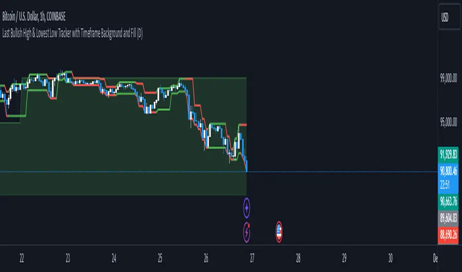
Richs Market StructureThis Pine Script indicator, "Last Bullish High & Lowest Low Tracker with Timeframe Background and Fill", is designed to visually track bullish and bearish trends based on price action on the current chart and a user-defined timeframe. It provides dynamic line plotting, area fills, and background coloring to represent trend alignment between the current chart and the selected timeframe.
Features and Functionalities
Tracks Bullish Highs and Bearish Lows:
The script identifies:
Bullish High: The highest price reached after a bullish (green) candle.
Bearish Low: The lowest price reached after a bearish (red) candle.
It dynamically updates these levels based on the price movements.
Line Plotting:
Current Chart Lines:
The Plotted Bullish High line (green/red) indicates the last bullish high.
The Lowest Low line (green/red) indicates the last bearish low.
Selected Timeframe Lines:
A separate set of lines is plotted for the user-defined timeframe (e.g., daily, weekly):
A Bullish High Line for the selected timeframe (lighter green).
A Lowest Low Line for the selected timeframe (lighter red).
Dynamic Area Fills:
The area between the Plotted Bullish High and Lowest Low is filled:
Green Fill: When both lines are green (indicating a bullish alignment).
Red Fill: When both lines are red (indicating a bearish alignment).
For the selected timeframe:
The area between the timeframe-specific Bullish High and Lowest Low is similarly filled with lighter colors.
Background Color Based on Timeframe Alignment:
The background color represents the trend alignment on the selected timeframe:
Green Background: When the timeframe’s Bullish High is rising and Lowest Low is rising (bullish trend).
Red Background: When the timeframe’s Bullish High is falling and Lowest Low is falling (bearish trend).
What It’s For
This indicator is designed for traders who want to:
Visualize Trends Across Timeframes:
It helps identify when the current chart’s trend aligns with a higher timeframe trend (e.g., daily, weekly).
Useful for multi-timeframe analysis.
Spot Bullish and Bearish Trends:
The color-coded lines and fills clearly show the dominant trend on both the current chart and the selected timeframe.
Plan Trades Based on Trend Alignment:
When the current chart and selected timeframe show the same trend:
Both lines and fills turn green (bullish).
Both lines and fills turn red (bearish).
This alignment is a potential signal for entering long or short trades.
Identify Reversals and Divergences:
Divergence between the current chart and timeframe trends (e.g., green on one, red on the other) may indicate trend weakening or reversal.
Visual Elements
Lines:
Solid lines (current chart): Represent the Plotted Bullish High and Lowest Low.
Dashed/lighter lines (selected timeframe): Represent the timeframe-specific Bullish High and Lowest Low.
Fills:
Green/Red fills highlight trend zones:
On the current chart (darker).
On the selected timeframe (lighter).
Background:
The entire chart background turns green or red based on the selected timeframe’s trend alignment.
Summary
This indicator is ideal for traders who want a clear visual representation of price trends and multi-timeframe alignment. It simplifies trend-following strategies by providing:
Easy-to-interpret fills and background colors.
Clear bullish and bearish zones.
Multi-timeframe trend confirmation.
DB369 - Directional Bias 369
DB369 - Directional Bias 369 Indicator
The **DB369** indicator helps traders identify key market levels and trends by combining multiple timeframes' price action analysis. It highlights important **pivot points** on the chart and provides visual cues to help you make more informed buy and sell decisions based on the overall market direction.
Key Features
1. Pivot Points Across Multiple Timeframes**:
- The indicator calculates and displays pivot points for the **Monthly**, **Weekly**, **Daily**, **4-Hour**, and **1-Hour** timeframes (or 30-minute equivalent if desired). These pivots represent significant price levels where the market may retest.
2. **Trend Detection**:
- The indicator evaluates the relationship between the current price and the pivot point for each timeframe. Based on this comparison, it classifies the market as **Bullish**, **Bearish**, or **Neutral** on each timeframe.
3. **Pivot Lines**:
- Horizontal lines are drawn to mark the key pivot points for each selected timeframe. These lines extend into the future and adjust dynamically as the market moves in real time.
- **Customizable**: You can choose which timeframes to display pivot points by enabling/disabling them in the settings.
4. **Trend Table**:
- A **table** is displayed at the top-right of the chart to show the trend for the **Daily**, **4-Hour**, and **30-Minute** timeframes. It provides an easy-to-read view of the trend direction across these timeframes.
5. **Buy/Sell Arrows**:
- **Buy Arrow**: A green arrow will appear when the **Daily**, **4-Hour**, and **30-Minute** trends are all **Bullish** (aligned in the same direction).
- **Sell Arrow**: A red arrow will appear when all three timeframes show a **Bearish** trend.
- These arrows appear only once per alignment change and can be enabled or disabled for alerts. This helps avoid clutter on the chart and ensures that you only see a signal when the alignment occurs or changes.
### **How to Use the DB369 Indicator**:
1. **Pivot Points**:
- The pivot points represent significant price levels where the market might retest in the future. For instance:
- **Bullish Market**: If the price is above the pivot point, the market is considered bullish.
- **Bearish Market**: If the price is below the pivot point, the market is considered bearish.
- **Neutral Market**: When the price is near the pivot point, the market is neither strongly bullish nor bearish.
2. **Trend Alignment**:
- When the **Daily**, **4-Hour**, and **30-Minute** timeframes all show the same trend direction (either **Bullish** or **Bearish**), this alignment signifies a stronger trend.
- You will receive a **Buy Arrow** when all three timeframes are aligned bullish, and a **Sell Arrow** when they are aligned bearish.
- These arrows are displayed at the point when the alignment is first detected and can also trigger **alerts**.
3. **Alerts**:
- You can choose to enable alerts for when a **Buy** or **Sell** arrow appears on the chart. This allows you to be notified in real-time when the alignment conditions are met.
4. **Using the Pivot Points for Entry**:
- **Buy Trade**: Look for a buy trade when the price is near the **pivot line** of the higher timeframes, particularly when the trend across all three timeframes is **Bullish**.
- **Sell Trade**: Similarly, look for a sell trade when the price is near a **pivot line** and the trend is **Bearish**.
5. **Customization**:
- You can customize which timeframes' pivots are shown on the chart by toggling the visibility of the **Monthly**, **Weekly**, **Daily**, **4-Hour**, and **1-Hour** pivots in the settings.
- The indicator automatically adjusts the pivot levels in real-time as the market progresses.
**Important Notes**:
- This indicator does not guarantee successful trades; it is intended to assist in identifying potential trade opportunities based on the alignment of higher timeframe trends.
- Always combine the information from the DB369 indicator with other technical analysis tools and risk management strategies to ensure more accurate trade decisions.

Comprehensive Time Chain Indicator - AYNETFeatures and Enhancements
Dynamic Timeframe Handling:
The script monitors new intervals of a user-defined timeframe (e.g., daily, weekly, monthly).
Flexible interval selection allows skipping intermediate time periods (e.g., every 2 days).
Custom Marker Placement:
Markers can be placed at:
High, Low, or Close prices of the bar.
A custom offset above or below the close price.
Special Highlights:
Automatically detects the start of a week (Monday) and the start of a month.
Highlights these periods with a different marker color.
Connecting Lines:
Markers are connected with lines to visually link the events.
Line properties (color, width) are fully customizable.
Dynamic Labels:
Optional labels display the timestamp of the event, formatted as per user preferences (e.g., yyyy-MM-dd HH:mm).
How It Works:
Timeframe Event Detection:
The is_new_interval flag identifies when a new interval begins in the selected timeframe.
Special flags (is_new_week, is_new_month) detect key calendar periods.
Dynamic Marker Drawing:
Markers are drawn using label.new at the specified price levels.
Colors dynamically adjust based on the type of event (interval vs. special highlight).
Connecting Lines:
The script dynamically connects markers with line.new, creating a time chain.
Previous lines are updated for styling consistency.
Customization Options:
Timeframe (main_timeframe):
Adjust the timeframe for detecting new intervals, such as daily, weekly, or hourly.
Interval (interval):
Skip intermediate events (e.g., draw a marker every 2 days).
Visualization:
Enable or disable markers and labels independently.
Customize colors, line width, and marker positions.
Special Periods:
Highlight the start of a week or month with distinct markers.
Applications:
Event Tracking:
Highlight and connect key time intervals for easier analysis of patterns or trends.
Custom Time Chains:
Visualize periodic data, such as specific trading hours or cycles.
Market Session Analysis:
Highlight market opens, closes, or other critical time-based events.
Usage Instructions:
Copy and paste the code into the Pine Script editor on TradingView.
Adjust the input settings for your desired timeframe, visualization preferences, and special highlights.
Apply the script to a chart to see the time chain visualized.
This implementation provides robust functionality while remaining easy to customize. Let me know if further enhancements are required! 😊
Bewakoof stock indicator**Title**: "Bewakoof Stock Indicator: Multi-Timeframe RSI and SuperTrend Entry-Exit System"
---
### Description
The **Bewakoof Stock Indicator** is an original trading tool that combines multi-timeframe RSI analysis with the SuperTrend indicator to create reliable entry and exit signals for trending markets. This indicator is designed for traders looking to follow strong trends with built-in risk management. By filtering entries through short- and long-term momentum and utilizing dynamic trailing exits, this indicator provides a structured approach to trading.
#### Indicator Components
1. **Multi-Timeframe RSI Analysis**:
- The Relative Strength Index (RSI) is calculated across three timeframes: Daily, Weekly, and Monthly.
- By examining multiple timeframes, the indicator confirms that trends align over short, medium, and long-term intervals, making buy signals more reliable.
- **Buy Condition**: All three RSI values must meet these thresholds:
- **Daily RSI > 50** – indicates short-term upward momentum,
- **Weekly RSI > 60** – signals medium-term strength,
- **Monthly RSI > 60** – confirms long-term trend alignment.
- This filtering process ensures that buy signals are generated only in stable, upward-trending markets.
2. **SuperTrend Confirmation**:
- The SuperTrend (20-period ATR with a multiplier of 2) acts as a trend filter and trailing stop mechanism.
- For a buy condition to be valid, the closing price must be above the SuperTrend level, verifying that the market is trending up.
- The combination of RSI and SuperTrend helps to avoid false signals, focusing only on well-established trends.
#### Trade Signals
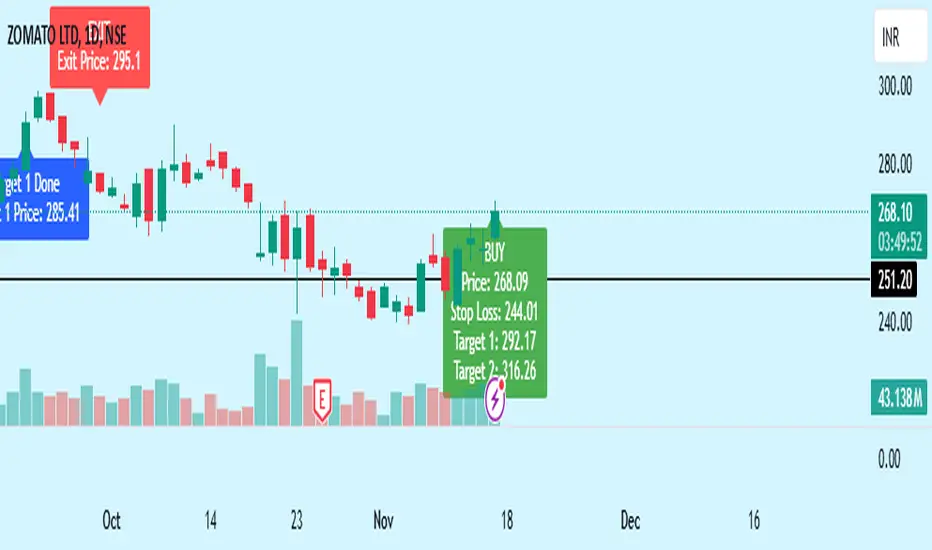
- **Buy Signal**: When both the multi-timeframe RSI and SuperTrend conditions are met, a buy signal is triggered, indicated by a “BUY” label on the chart with details:
- **Entry Price**,
- **Initial Stop-Loss** (set at the SuperTrend level for risk control),
- **Target 1** – calculated with a 1:1 risk-reward ratio based on the initial stop-loss,
- **Target 2** – calculated with a 1:2 risk-reward ratio based on the initial stop-loss.
- **Exit Signals**: This indicator provides two exit strategies to protect profits:
1. **Fixed Stop-Loss**: Automatically set at the SuperTrend level at the time of entry to limit risk.
2. **Trailing Exit**: Exits are triggered if the price crosses below the SuperTrend level, adapting to potential trend reversals.
#### Labeling & Alerts
The **Bewakoof Stock Indicator** offers intuitive labeling and alert options:
- **Labels**: Buy and exit points are clearly marked, showing entry, stop-loss, and targets directly on the chart.
- **Alerts**: Custom alerts can be set for:
- **Buy signals** when both conditions are met, and
- **Exit signals** triggered by the stop-loss or trailing exit.
#### Use Case and Benefits
This indicator is ideal for trend-following traders who value risk control and trend confirmation:
- **Stronger Trend Signals**: By requiring RSI alignment across multiple timeframes, this indicator focuses only on trades with strong trend momentum.
- **Dynamic Risk Management**: Using both fixed and trailing exits enables flexible trade management, balancing risk and potential reward.
- **Simple Trade Execution**: The chart labels and alerts simplify trade decisions, making it easy to enter, manage, and exit trades.
#### How to Use
1. **Add** the Bewakoof Stock Indicator to your chart.
2. **Watch** for the "BUY" label as your entry point.
3. **Manage the trade** using the labeled stop-loss and target levels.
4. **Exit** on either a stop-loss hit or when the price crosses below the SuperTrend for a trailing exit.
The **Bewakoof Stock Indicator** is a complete solution for trend-following traders, combining the strength of multi-timeframe RSI with the SuperTrend’s trend-following capabilities. This systematic approach aims to provide high-confidence entries and effective risk management, empowering traders to follow trends with precision and control.
Salman Indicator: Multi-Purpose Price ActionSalman Indicator: Multi-Purpose Price Action Tool for Pin Bars, Breakouts, and VWAP Anchoring
This indicator provides a comprehensive suite of price action insights, designed for active traders looking to identify key market structures and potential reversals. The script incorporates a Quarterly VWAP for trend bias, marks pin bars for possible reversal points, highlights outside bars for volatility signals, and indicates simple breakouts and pivot-level breaks. Customizable settings allow for flexibility in various trading styles, with default settings optimized for daily charts.
Outside Bars : Represented by an ⤬ symbol on the chart, these indicate bars where the current high is greater than the previous bar’s high, and the low is lower than the previous bar’s low, signaling high volatility and potential market reversals.
Pin Bars : Denoted by a small dot at the top or bottom of a candle’s wick, these are crucial signals of potential reversal areas. Pin bars are identified based on the percentage length of their shadows, with adjustable strictness in settings.
Quarterly VWAP : The light blue line on the chart represents the VWAP (Volume-Weighted Average Price), which is anchored to the Quarterly period by default. The VWAP acts as a directional bias filter, helping you to determine underlying market trends. This period, source, and offset are fully adjustable in the script’s settings.
Simple Breaks : Hollow candles on the chart indicate "simple breaks," defined when the current bar closes above the previous high or below the previous low. This is an effective way to highlight directional momentum in the market.
Bonus Pivot Breaks : The tilde symbol ~ appears when the price closes above or below prior pivot high/low levels, helping traders spot significant breakout or breakdown points relative to recent pivots.
Alerts
Simple Breaks : Alerts you when a breakout occurs beyond the previous bar’s high or low. Pin Bars : Notifies you of potential reversal points as indicated by bullish or bearish pin bars. Outside Bars : Triggers an alert whenever an outside bar is detected, indicating possible volatility changes.
How to Use
VWAP for Trend Bias : Use the Quarterly VWAP line to gauge overall market trend, with settings that allow adjustment to daily, weekly, monthly, or even larger time frames.
Pin Bars for Reversal Potential : Look for the dot markers on candle wicks, where the strictness of the pin bar detection can be adjusted via settings to match your trading preference.
Simple and Pivot Breaks for Momentum : Watch for hollow candles and the tilde symbol ~ as indicators of potential breakout momentum and pivot break levels, respectively.
This script can serve traders on multiple timeframes, from daily to weekly and beyond. The flexible configuration allows for adjustments in VWAP anchoring and pin bar criteria, providing a tailored fit for individual trading strategies.
Volume TableDisplays a table of volume and short volume.
When chart timeframe is intraday or daily, table will show daily values. If chart is on weekly, table will show weekly values. If chart is on monthly, table will show monthly values.
If a ticker doesn’t have short volume, uncheck “Show Short Volume” in settings for table to work.
Table rows:
Date row (Day/Week/Month) text:
Green when close > open
Red when close < open
White when close equals open
Volume (Vol) row text:
Default: Black
If “Check for inside candles” is checked, when the high and low (or open and close if “Use H/L not O/C” is unchecked) is within the previous time period (day/week/month), text will be white
Volume (Vol) row background:
Default: Gray
Colored based on values and colors set in settings:
>= Very High Volume
>= High Volume
<= Low Volume
<= Very Low Volume
Short Volume (SV) row cell background color:
SV < “Lower Threshold”: Black
“Lower Threshold” <= SV < “Low Threshold”: Gray
“Low Threshold” < SV < First “Short Volume Color Increment”: Silver
“Short Volume Color Increment's (5 million increments by default): purple, blue, teal, green, lime, yellow, orange, red, maroon, white
Short Volume text color is just colored to be visible based on SV cell background.
There are labels that can be displayed to look back at data further back than the table goes (recommend being on the daily timeframe).

UDC - Local TrendsUDC - Local Trends Indicator
Overview:
The UDC - Local Trends Indicator combines multiple moving averages to provide a clear visualization of both local and high timeframe (HTF) trends. This indicator helps traders make informed decisions by highlighting key moving averages and trend zones, making it easier to determine whether the current trend is likely to continue or reverse.
Features:
Local Trend Zone: Displays the range between the 13 and 34 EMAs, with an average line in the middle. This zone is plotted close to the price candles, offering a clear visual guide for the immediate trend on the timeframe you’re viewing.
Usage: Observe the strength of the local trend within this zone. Breaks from this zone may indicate potential moves toward the 200 moving averages, providing early signals for trend continuation or potential reversals.
Current Trend Indicators:
Tracks the broader trend using the 200 EMA and 200 SMA on the active timeframe. Choose a timeframe where these trend lines hold significance and use them alongside support and resistance for precise entries and exits.
Cross-Timeframe Trend Reference:
On all sub-daily timeframes, the daily 200 moving average is overlaid, ensuring this essential trend line is visible even on shorter timeframes, like 4H, where reclaims or rejections of the daily 200 can signal strong trading setups.
The weekly 50 moving average, a critical HTF trend line, is also displayed consistently, guiding higher timeframe swing trade setups.
Trading Strategy:
Local Timeframe Trading:
Monitor the 200 moving averages in your active timeframe to identify bounces or breakdowns. If the local trend zone (13-34 EMA range) is lost, expect a possible pullback to the 200 moving averages, offering a chance for re-entry or confirmation of trend reversal.
High Timeframe Trading (HTF):
For swing trades, observe the daily 200 and weekly 50 moving averages. Reclaiming these lines often triggers long setups, while losing them may signal further downside until they’re regained.
This indicator offers a powerful combination of localized trend tracking and high timeframe support, enabling traders to align their entries with both immediate and overarching market

Custom Time Frame BackgroundThis indicator allows you to highlight custom time frames on your chart with alternating background colors. It's particularly useful for visualizing specific intervals that are not standard on TradingView, such as 4-hour, 6-hour, or any other custom duration you choose. Features:
Customizable time frames: Set any combination of minutes, hours, and days
Fallback to daily/weekly coloring if no custom time frame is set
User-defined colors for alternating backgrounds
How to use:
Add the indicator to your chart
In the settings, input your desired custom time frame:
Set 'Custom Minutes' for intervals less than an hour
Use 'Custom Hours' for hourly intervals
Use 'Custom Days' for daily intervals
Adjust 'Color 1' and 'Color 2' to your preferred background colors
Examples:
For a 4-hour time frame: Set Custom Hours to 4
For a 6-hour time frame: Set Custom Hours to 6
For a 2-day time frame: Set Custom Days to 2
If all inputs are set to 0, the indicator will default to daily coloring for intraday charts and weekly coloring for higher timeframes. This indicator helps traders visually segment their charts into custom intervals, making it easier to identify patterns and trends over specific time periods.

LV Stock QualityCritical financial and technical values are listed in the table.
PIOTROSKI_F_SCORE (expect. >5) -> The Piotroski score is a discrete score between zero and nine that reflects nine criteria used to determine the strength of a firm's financial position. The Piotroski score is used to determine the best value stocks, with nine being the best and zero being the worst. Having a score bigger than 5 is a good sign for the strength of a firm's financial position
ROE (expect. >11) --> Return on equity (ROE) is a measure of a company's financial performance. It is calculated by dividing net income by shareholders' equity. Because shareholders' equity is equal to a company’s assets minus its debt, ROE is a way of showing a company's return on net assets. A “good” ROE will depend on the company’s industry and competitors.
EPS_GROWTH (expect. >11) --> This indicator is calculated as the percentage change in Basic earnings per share for one year. This indicator reflects the growth rate of a company's basic profit per share outstanding for one year. It is calculated based using only common shares. An increase in EPS growth may signal that a company is becoming more profitable and efficient in its operations. A decline in EPS growth may signal that a company is spending more or losing business share. EPS growth should be viewed alongside other metrics like revenue and costs.
CURRENT_RATIO (expect. >1.25) --> The current ratio measures a company’s ability to pay current, or short-term, liabilities (debt and payables) with its current, or short-term, assets (cash, inventory, and receivables). Current ratios over 1.00 indicate that a company's current assets are greater than its current liabilities, meaning it could more easily pay of short-term debts.
OPERATING_MARGIN(expect. >11) --> The operating margin measures how much profit a company makes on a dollar of sales after paying for variable costs of production, such as wages and raw materials, but before paying interest or tax.
RETURN_CAPITAL (expect. >11) --> Return of capital (ROC) is a payment that an investor receives as a portion of their original investment and that is not considered income or capital gains from the investment.
ALTMAN_Z_SCORE (expect. >1.8) --> The Altman Z-score is the output of a credit-strength test that gauges a publicly traded manufacturing company's likelihood of bankruptcy. An Altman Z-score close to 0 suggests a company might be headed for bankruptcy, while a score closer to 3 suggests a company is in solid financial positioning.
REVENUE_GROWTH (expect. >11) --> Quarterly revenue growth is an increase in a company's sales in one quarter compared to sales of a different quarter. Comparing a company's financials from one period to another gives a clear picture of its revenue growth rate and can help investors identify the catalyst for such growth.
SUSTAINABLE_GROWTH (expect. >11) --> The sustainable growth rate (SGR) is the maximum rate of growth that a company or social enterprise can sustain without having to finance growth with additional equity or debt. In other words, it is the rate at which the company can grow while using its own internal revenue without borrowing from outside sources.
DEBT TO INCOME (expect. <0.4) --> A debt-to-income (DTI) ratio is a financial metric used by lenders to determine your borrowing risk. Your DTI ratio represents the total amount of debt you owe compared to the total amount of money you earn each month.
NORMALIZED ATR (expect. <8, W) --> The Normalized Average True Range (Normalized ATR) is an indicator used to measure market volatility by normalizing the average true range values. It does this by dividing the Average True Range (ATR) by the asset's closing price, converting it into a percentage. This normalization allows for the comparison of volatility levels across different securities or market conditions, regardless of the asset's price levels. The Normalized ATR helps traders to adjust their strategies based on relative volatility, rather than absolute price movements.
INDEX expect. EMA10>EMA20 --> it is expected to have EMA 10 > EMA 20 in weekly basis graph. It is known that having a strong trend in index will also increases chance of strong trend on stock levels. You need to select INDEX Market of stock via settings.
M. RELATIVE STRENGTH expect. MRS>1 --> Stan Weinstein uses the Mansfield RS indicator as another relative strength indicator. The indicator measures the variation in the 52-week ratio of stock and market.
VOLUME CHANGE (expect. >30) --> Having an increase on volume comparing to previous week can be a good sign if it occurs at the same time of breakout.
PRICE CHANGE (expect. >5 and <20) --> Having an increase on price comparing to previous week can be a good sign if it occurs at the same time of breakout.
It is better to look on weekly basis graphs.