Pivot Points Weekly - bitcoin by Simon-RoseWeekly Version:
I have written 3 Indicators because i couldn't find what i was looking for in the library, so you can turn each one on and off individually for better visibility.
This are Daily, Weekly and Monthly Pivot Points with their Resistance and Support Points
and also on the Daily with the range between them.
I will also publish some Ideas to show you how to use them if you are not familiar with the traditional pivot points strategy already.
Unlike the usually 3 support & resistances i added 4 of them, specifically for trading bitcoin (on traditional markets this level of volatility usually never gets touched)
Here you can see which lines are what for reference, as the Feature to label lines is missing in Pinescript (if you have a workaround pls tell me ;) )
This is the basic calculation used :
PP = (xHigh+xLow+xClose) / 3
R1 = vPP+(vPP-Low)
R2 = vPP + (High - Low)
R3 = xHigh + 2 * (vPP - Low)
R4 = xHigh + 3 * (vPP - Low)
S1 = vPP-(High - vPP)
S2 = vPP - (High - Low)
S3 = xLow - 2 * (High - PP)
S4 = xLow - 3 * (High - PP)
If you have any questions or suggestions pls write me :)
Happy trading
Cheers
Daily Version:
Monthly Version:
Cerca negli script per "weekly"

Weekly Swing Trading Signals - DP V1.0This script generates swing trading signals on weekly charts based on 200 SMA and RSI values.

Weekly Bullish Engulfing ScreenerThis is a weekly Bullish engulfing screener to find the stocks ready to breakout

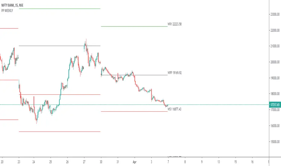
Weekly Institutional Fib Pivots v1These Fibonacci levels act as institutional order zones, meaning price reacts more powerfully when it originates from them. Use them as a weekly roadmap to anticipate where price is likely to travel each day, including during overnight or automated trading sessions.
How to trade them:
• Take the previous weeks levels and use those levels to trade the current week.
• Enter and exit around the major fib levels
• Use the 50% midpoint between levels as your first take-profit or stop-loss zone
These levels provide structure, targets, and precision for both intraday and multi-session trading.
Strategy:
Place your order at one level, and exit before it reaches the next level or at the 50% area of the zone

Weekly expansion (CRT) This indicator is designed to be used primarily on the daily chart,to aid in spotting weekly expansions, its a blend of CRT Theory and some ICT concepts.

Weekly Fibonacci Pivot Signals (4H) - S1/R1 & S3/R3 rulesThis Indicator used weekly price range to calculate the pivot R1,R3,S1 and S3 ,when price crossed and closed below R3 in 4H timeframe the indicator gives sell signal, when the price crossed and close above the S3 the indicator gives buy signal. This indicator can give approximately 50% win Rate .

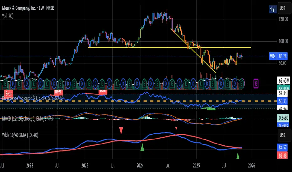
Weekly 10W / 40W SMA CrossoverSMA cross over for the Weekly Chart
The 10 week and 40 Week cross over has been found to be the better judge of buy/sell signals over the last 5 years
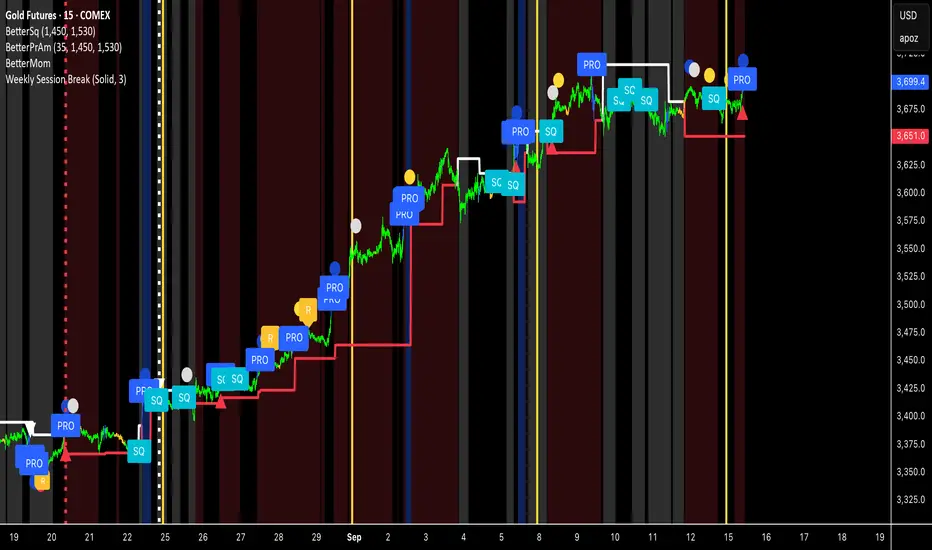
Weekly Session BreakThis indicator plots a vertical line at the end of the trading week (Friday) to mark the weekly session break. It is designed to be used on intraday charts (sub-1 hour timeframes).
The line's appearance is fully customizable via the Inputs tab, allowing you to change its color, style (solid, dotted, or dashed), and thickness.
Key Features:
End-of-Week Marker: Accurately draws a vertical line on the last bar of the trading week.
Timeframe Specific: Lines are only visible on intraday charts (1-minute to 59-minute timeframes) to prevent clutter on higher timeframes.
Customizable: Adjust the line's color, style, and thickness from the Inputs menu.
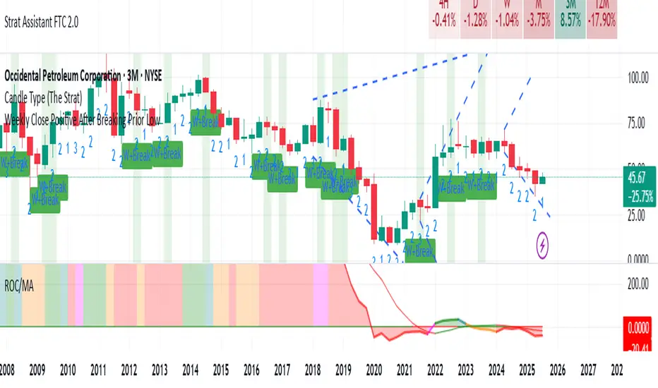
Weekly Close Positive After Breaking Prior LowClosing positive after breaking prior low on weekly basis

Weekly % Change Screener (5% Sell Threshold)This is a weekly screener for a 5% change in the stock value. If it increases by 5%, we sell and if it decreases by 5% we buy the stock. Good for stable high value stocks. Buy before testing.
Weekly Range PlotterThe Weekly Range Plotter is a dynamic market structure tool designed to help traders visualize critical high and low levels from specific days of the week and the previous week's range. It provides key visual anchors to support analysis of market behavior, including range compression/expansion and directional bias.

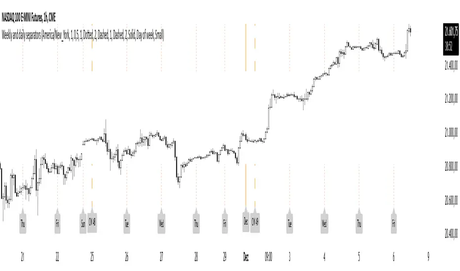
Weekly and daily separatorsThis script plots vertical line between each trading week (thick, solid) and smaller lines (dotted) between each trading day. This helps kepping a better overview on the aspect of time on the higher timeframes below 1D. The distance of the lines to the top and bottom of the chart is controlled by your chart settings menu under Appearance -> Margins.
Weekly Volume HeatmapThis tool is designed to visualize how the trading volume of each asset changes during the week.
How to use
This tool can help us better understand the market and answer many questions, such as:
◽ How to avoid getting stop hunted?
Typically, trading volume decreases at certain times of the week, which is the best time for large holders to manipulate the market. Low volume means there is less liquidity in the market. Large transactions in an illiquid market can cause large price changes.
Large holders (whales) have enough capital to push the price in the desired direction to trigger a cascade of stop-loss orders which can move the price further.
After a stop hunt, the market typically reverses, leaving stop hunted traders behind.
It is best to avoid using stop-loss orders and leveraged trading during these hours of the week.
◽ When’s the best time to make decisions
During some hours of the week the trading volume usually decreases; at these times, most traders are inactive and do not participate in transactions.
Therefore, the price changes that occur during these times lack conviction.
It is better to make decisions when there are more active traders in the market. At these periods, a relatively high trading volume is usually observed.
How it works
First, it calculates the average traded volume of each period (for example Monday 9:00 AM) from the first bar to the last bar. It then calculates the ratio of the average traded volume in each period to the average traded volume per week. Finally, the result is displayed as a percentage in each cell.
Different values are distinguished by different background colors. Light colors are used for low values and dark colors are used for high values.
Limits
It only works in the 1 hour time frame.
Samples
Stock => AAPL
Futures => ES1!
Forex => EURUSD

weekly MapThis indicator shows the highest and lowest level of the previous week in the current week. This area is also divided into 4 sections that can be controlled from the settings section.

Weekly MM200 distance ratioThis indicator is used to calculate the ratio from the current price and the weekly 200 moving average.

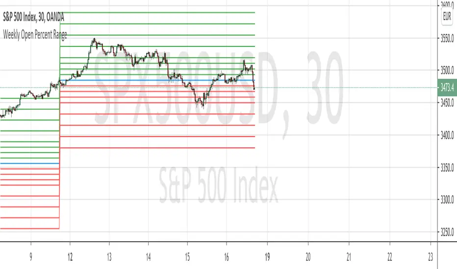
Weekly Open Percent RangeA simple take on finding percentage gain/drop range in a week for ranging or trending market instrument.
This script is hard coded to plot 0 to 3%, -3% range for the week base on instrument weekly open price.
Best to use with measured volatility indicator to gauge the movement of price. Anytime the price goes above the range level then it is likely to be trending. Highly volatile instruments will not find this indicator useful. It is best for heavy instruments like Forex or Indices where range % in a week in a non-volatile move is really quite small that these act as resistances and support.
Range Levels:
3%
2.5%
2%
1.5%
1%
0.75%
0.5%
0.25%
0%
-.25%
-.5%
-.75%
-1%
-1.5%
-2%
-2.5%
-3%
The next step for this indicator is to consider volatility range of instrument and to include this in the percentage zone levels instead of hard coding these.
Weekly VWAP - Starts Monday 12AMThere are a number of VWAP indicators out there, but it's difficult to find VWAP calculations that take the entire week into account. This helps with analyzing longer-term trends on daily and intraday charts. As with all VWAP indicators, this one is also more sensitive to price starting at the open of trading at the beginning of the week.

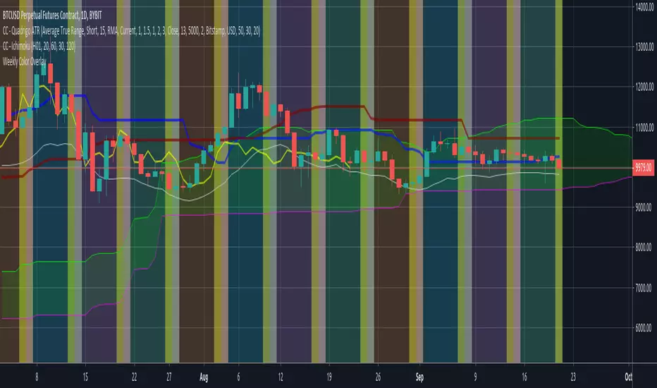
Weekly Color OverlayThis script facilitates visualization of week-of-the-month breaks with Sunday highlighting the beginning of a new week. Code breaks at the monthly time-period and since I don't ever look at that time period i'm not inclined to fix it unless someone sends me a 'push' via message.

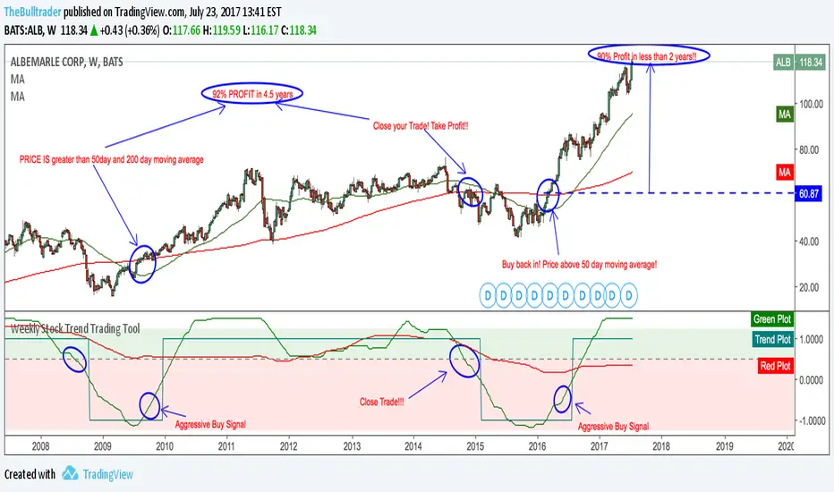
Weekly Stock Trend Trading Tool// Created by TheBullTrader, 2017.
// Hi everyone, welcome to my Weekly Trend Trading Tool with the 50 day and 200 day moving averages
// This indicator scores each stock/ index individually and scores them on a simple scale -1.5 to +1.5
// This indicator has 2 zones: green zone = bullish, and red zone = bearish
// There are 3 plots: green = 50 day sma, red = 200 day sma, and trend signal= teal
// Buying Signal is when the green plot crosses teal plot or AGGRESSIVE Buy = green plot beginning to curve up from bearish zone.
// Sell Signal is when the green plot enters the RED ZONE
// By using this indicator as described, it will help you pick stock bottoms and COULD GET YOU OUT OF A STOCK CRASH!
// Recommendations is to scan this indicator against the top 100 US stocks with a long stock history greater than 10 years.
// I usually find 5-10 really good deals every few months. Slow and Easy way to build wealth. **Thanks for reading**
Weekly closeIt turned out not to be that easy to plot the close of the previous week in hourly or daily charts. In my first experiments things went wrong on Friday or intraday if you simply use the security function. So here is the thing with an algorithm that guaranties the correct value.
