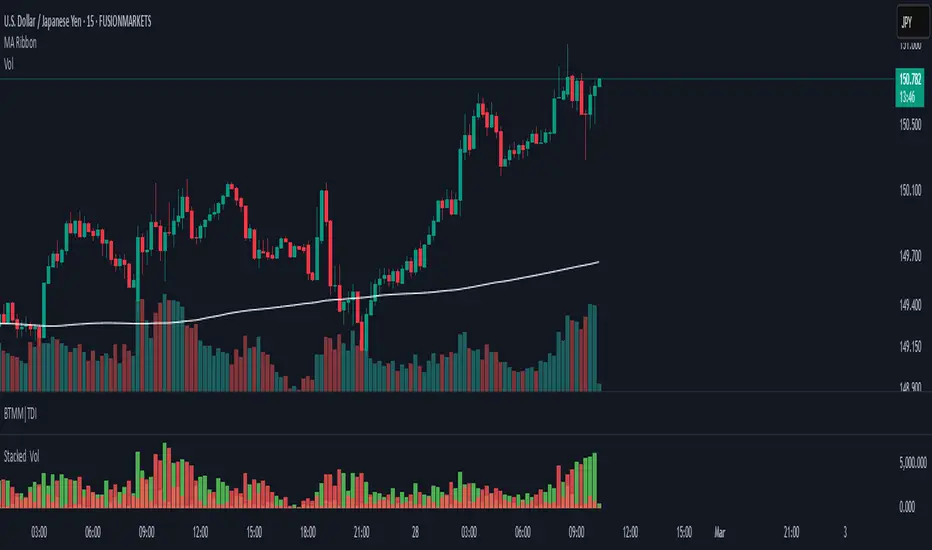
Stacked Bullish vs Bearish VolumeThis indicator visually represents buying (bullish) and selling (bearish) pressure within each candle by stacking both portions inside a single volume bar. Unlike traditional volume indicators that use only one color per bar, this script splits each volume bar into two segments:
Green portion (Bullish Volume) → Represents the buying pressure when the price moves up.
Red portion (Bearish Volume) → Represents the selling pressure when the price moves down.
By stacking buy and sell volume inside the same column, traders can easily assess the balance of buying vs selling activity within each trading session.
Stacking the Bars:
The bullish portion (green) is plotted first.
The bearish portion (red) is plotted slightly offset to create a stacked effect.
Cerca negli script per "乌德勒支+VS+赫拉克勒斯"
Multi-Ticker RS vs SPYThis Pine Script, titled "Multi-Ticker RS vs SPY," is a clean and efficient indicator designed for TradingView, enabling traders to monitor the relative strength (RS) of up to 10 ticker symbols compared to the S&P 500 ETF (SPY) on a single chart. Ideal for options traders, such as those managing a $1,400 account, it provides a simple way to assess which stocks are outperforming or underperforming the broader market. As of February 26, 2025, the script supports any chart timeframe, such as 5-minute or daily intervals, and calculates RS based on a user-defined lookback period, defaulting to 1 bar for real-time insights.
Users can input ticker symbols via customizable settings, with defaults set to popular stocks like AAPL, TSLA, NVDA, GOOGL, AMZN, MSFT, FB, NFLX, INTC, and PYPL. The script fetches closing prices for each ticker and SPY, computes their percentage changes over the lookback period, and determines RS as the ratio of each ticker’s change to SPY’s change, handling division by zero gracefully. It displays each ticker’s current RS score in a vertical column of labels on the chart’s top-left corner, updated on the last bar to avoid clutter. Users can adjust label size (tiny, small, normal, large) and text color for visibility, ensuring a tailored, error-free experience for quick market analysis.

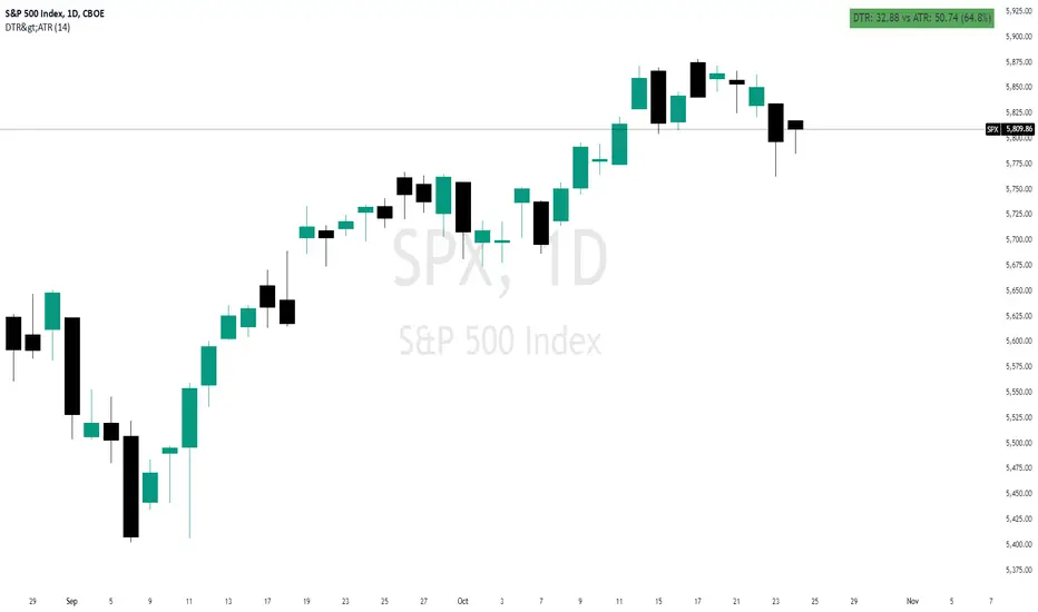
Daily True Range (DTR) vs Average True Range (ATR)Overview
The "DTR vs ATR with Color-Coded Percentage" indicator is a powerful volatility analysis tool designed for traders who want to understand daily price movements in the context of historical volatility. It calculates the Daily True Range (DTR)—the raw measure of a single day’s volatility—and compares it to the Average True Range (ATR), which smooths volatility over a user-defined period (default 14 days). The indicator presents this data in an intuitive table, featuring a color-coded percentage that visually represents how the current day’s move (DTR) stacks up against the average volatility (ATR). This helps traders quickly assess whether the current day’s price action is unusually volatile, average, or subdued relative to recent history.
Purpose
Volatility Comparison: Visualize how the current day’s price range (DTR) relates to the average range (ATR) over a specified period.
Decision Support: Identify days with exceptional movement (e.g., breakouts or reversals) versus normal or quiet days, aiding in trade entry/exit decisions.
Risk Management: Gauge daily volatility to adjust position sizing or stop-loss levels based on whether the market is exceeding or falling short of typical movement.
Features
Daily True Range (DTR) Calculation:
Computes the True Range for the current day as the greatest of:
Current day’s High - Low
High - Previous Close
Low - Previous Close
Aggregates data on any timeframe to ensure accurate daily values.
Average True Range (ATR):
Calculates the smoothed average of DTR over a customizable period (default 14 days) using Wilder’s smoothing method.
Updates in real-time as the day progresses.
Timeframe Flexibility: Works on any chart timeframe (e.g., 1-minute, 1-hour) while always calculating DTR and ATR based on daily data.
Color-Coded Display in either compact or table mode
The percentage value is color-coded in the table based on configurable thresholds:
Safe (default 75): Normal range, within typical volatility
Warning: (default 75-125): Above-average volatility.
Danger (default 125): Exceptionally high volatility
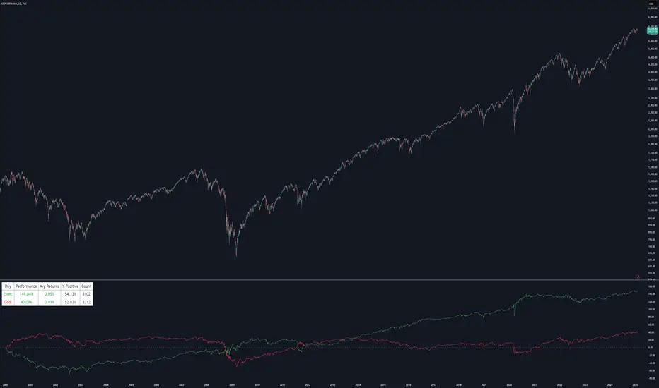
Even vs Odd Days Performance█ OVERVIEW
The Even vs Odd Days Performance indicator is designed to visualise and compare the performance of even-numbered days versus odd-numbered days. This indicator explores one of the many calendar based anomalies that exist in financial markets.
In the context of financial analysis, a calendar based anomaly refers to patterns or tendencies that are linked to specific time periods, such as days of the week, weeks of the month, or months of the year. This indicator helps explore whether such a calendar based anomaly exists between even and odd days.
By calculating cumulative daily performance and counting the number of days with positive returns, it provides a clear snapshot of whether one set of days tends to outperform the other, potentially highlighting a calendar based anomaly if a significant difference is observed.
█ FEATURES
Customisable time window through input settings.
Tracks cumulative returns for even and odd days separately.
Easily adjust table settings like position and font size via input options.
Clear visual distinction between even and odd day performance using different colours.
Built-in error checks to ensure the indicator is applied to the correct timeframe.
█ HOW TO USE
Add the indicator to a chart with a Daily timeframe.
Choose your start and end dates in the Time Settings.
Enable or disable the performance table in the Table Settings as needed.
View the cumulative performance, with even days in green and odd days in red.
Even vs Odd Weeks Performance█ OVERVIEW
The Even vs Odd Weeks Performance indicator is designed to visualise and compare the performance of even-numbered weeks versus odd-numbered weeks. This indicator explores one of the many calendar based anomalies that exist in financial markets.
In the context of financial analysis, a calendar based anomaly refers to patterns or tendencies that are linked to specific time periods, such as days of the week, weeks of the month, or months of the year. This indicator helps explore whether such a calendar based anomaly exists between even and odd weeks.
By calculating cumulative weekly performance and counting the number of weeks with positive returns, it provides a clear snapshot of whether one set of weeks tends to outperform the other, potentially highlighting a calendar based anomaly if a significant difference is observed.
█ FEATURES
Customisable time window through input settings.
Tracks cumulative returns for even and odd weeks separately.
Easily adjust table settings like position and font size via input options.
Clear visual distinction between even and odd week performance using different colours.
Built-in error checks to ensure the indicator is applied to the correct timeframe.
█ HOW TO USE
Add the indicator to a chart with a Weekly timeframe.
Choose your start and end dates in the Time Settings.
Enable or disable the performance table in the Table Settings as needed.
View the cumulative performance, with even weeks in green and odd weeks in red.

Bull vs Bear CandlesThe Bull vs Bear Candles indicator helps you analyze market sentiment by counting and comparing bullish and bearish candles. It tracks the number of bullish candles and calculates their percentage, then does the same for bearish candles. Based on this data, the indicator determines whether bulls or bears are in control. Additionally, it counts the total number of candles within the selected range, giving you a clearer picture of price action. Use this tool to quickly assess market trends and make more informed trading decisions. 🚀

Buyers vs SellersBuyers vs Sellers is an indicator which essentially weighs the strength of the buyers against the strength of the sellers. It defines the current relationship between the buyers and the sellers as well as the way that that relationship is changing over time.
User Inputs:
1. Number of Bars To Include In The Calculation - this is the look back period. The amount of past data that is being processed.
2. Length of The ATR - higher values are recommended. This ATR is used as a unit in which the price changes are expressed.
3. Bullish/Bearish Bias Threshold - the minimum value to consider the buyers or the sellers having control of the price.
4. Net Move Average Length - the moving average of the sum of bullish and bearish price changes.
The Calculation Process:
This indicator measures the difference between the opening and the closing prices of each bar in the look back period.
After that it sums together the sizes of the bodies of all the bullish bars and also the sizes of all the bearish bars to create the total bullish price change and total bearish price change for the look back period.
After that it converts the total price changes into percentages of the ATR and divides them by the look back period to get the price change per bar - it is a way of getting the price change values down to less ridiculous numbers regardless of the look back period and while still keeping the proportions intact.
After that it sums the two price changes together to get the net move and performs a simple moving average calculation on it in order to smooth out the values. This is a numerical representation of the relationship between the strength of the bullish and the bearish moves, which is easily readable from the chart.
After that the indicator performs a natural logarithm of the bullish price change divided by the bearish price change. This calculation gives a relationship between the two values which is not tied to the volatility of the instrument, but is expressed purely as a relationship between the strength of one value against the other. The idea is that this would allow for easier comparison across different instruments as the same numbers would represent exactly the same distribution of the strength difference.
The Plotting Logic:
The ATR is plotted as just a number as a reference.
The natural logarithm is presented in two ways.
One way is numerical, to be able to precisely read the value and the colour of the number changes depending if it is positive and above the bias threshold or negative and below the bias threshold.
The other way is in the form of a background colour. It only visualises the bias that can be interpreted based on the logarithm value in relation to the set bias threshold.
The total bullish price change and the total bearish price change are both plotted as a line with the fill between that line and the zero line. This helps visualise the bullish and the bearish moves individually.
The moving average of the sum of the bullish and the bearish moves is added as a line to represent the relationship between the two on a graph and not just as a logarithm.
I hope this indicator will serve you well and help with defining the relationship between the buyers and sellers more objectively, hopefully leading to more profitable trades.

Option vs Index Performance**Indicator Name:** Option vs Index Performance
**Description:**
This indicator helps traders analyze the relative performance of options compared to their underlying index (e.g., Nifty 50). It evaluates and highlights zones based on two key metrics:
1. **Bar-to-Bar Performance:** Compares the percentage movement of the option price against the index movement on a bar-by-bar basis.
- **Green Zone**: Option outperforms the index.
- **Yellow Zone**: Option moves in sync with the index.
- **Red Zone**: Option underperforms the index.
2. **Swing Alignment:** Tracks the swing structure of the index (higher highs, higher lows) and compares it with the option chart. The indicator checks if the option's swings align with or deviate from the index's swing pattern.
The final output combines both conditions, providing clear visual zones below the chart:
- **Green**: Overperformance and alignment with the index.
- **Yellow**: Neutral performance or partial alignment.
- **Red**: Underperformance or misalignment with the index.
Use this tool on option charts to quickly identify opportunities and assess whether the option's movement is in line with the broader market trend.

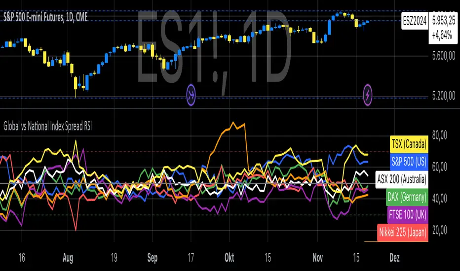
Global vs National Index Spread RSIThe Global vs National Index Spread RSI indicator visualizes the relative strength of national stock indices compared to a global benchmark (e.g., AMEX). It calculates the percentage spread between the closing prices of each national index and the global index, applying the Relative Strength Index (RSI) to each spread.
How It Works
Spread Calculation: The spread represents the percentage difference between a national index and the global index.
RSI Application: RSI is applied to these spreads to identify overbought or oversold conditions in the relative performance of the national indices.
Reference Lines: Overbought (70), oversold (30), and neutral (50) levels help guide interpretation.
Insights from Research
The correlation between global and national indices provides insights into market integration and interdependence. Studies such as Forbes & Rigobon (2002) emphasize the importance of understanding these linkages during periods of financial contagion. Observing spread trends with RSI can aid in identifying shifts in investor sentiment and regional performance anomalies.
Use Cases
- Detect divergences between national and global markets.
- Identify overbought or oversold conditions for specific indices.
- Complement portfolio management strategies by monitoring geographic performance.
References
Forbes, K. J., & Rigobon, R. (2002). "No contagion, only interdependence: Measuring stock market co-movements." Journal of Finance.
Eun, C. S., & Shim, S. (1989). "International transmission of stock market movements." Journal of Financial and Quantitative Analysis.
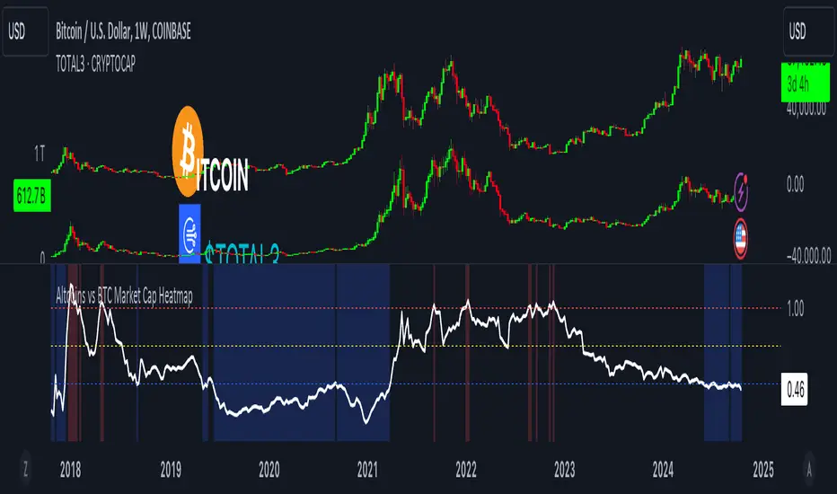
Altcoins vs BTC Market Cap HeatmapAltcoins vs BTC Market Cap Heatmap
"Ground control to major Tom" 🌙 👨🚀 🚀
This indicator provides a visual heatmap for tracking the relationship between the market cap of altcoins (TOTAL3) and Bitcoin (BTC). The primary goal is to identify potential market cycle tops and bottoms by analyzing how the TOTAL3 market cap (all cryptocurrencies excluding Bitcoin and Ethereum) compares to Bitcoin’s market cap.
Key Features:
• Market Cap Ratio: Plots the ratio of TOTAL3 to BTC market caps to give a clear visual representation of altcoin strength versus Bitcoin.
• Heatmap: Colors the background red when altcoins are overheating (TOTAL3 market cap equals or exceeds BTC) and blue when altcoins are cooling (TOTAL3 market cap is half or less than BTC).
• Threshold Levels: Includes horizontal lines at 1 (Overheated), 0.75 (Median), and 0.5 (Cooling) for easy reference.
• Alerts: Set alert conditions for when the ratio crosses key levels (1.0, 0.75, and 0.5), enabling timely notifications for potential market shifts.
How It Works:
• Overheated (Ratio ≥ 1): Indicates that the altcoin market cap is on par or larger than Bitcoin's, which could signal a top in the cycle.
• Cooling (Ratio < 0.5): Suggests that the altcoin market cap is half or less than Bitcoin's, potentially signaling a market bottom or cooling phase.
• Median (Ratio ≈ 0.75): A midpoint that provides insight into the market's neutral zone.
Use this tool to monitor market extremes and adjust your strategy accordingly when the altcoin market enters overheated or cooling phases.
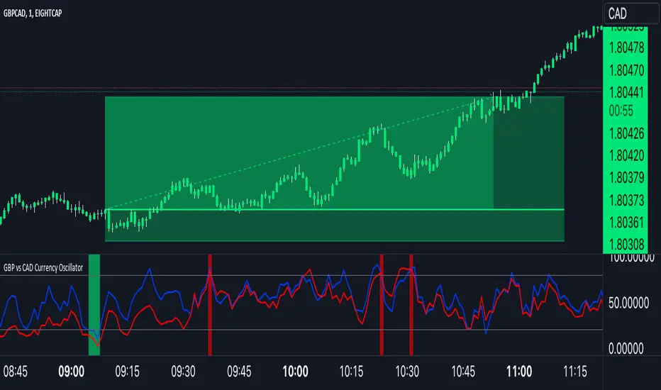
GBP Index vs CAD Index Currency OscillatorGBP vs CAD Currency Oscillator
This custom oscillator compares the relative strength of GBP (British Pound) and CAD (Canadian Dollar) against a basket of other currencies to determine potential overbought and oversold conditions. The indicator is designed to help traders evaluate momentum shifts and identify possible trend reversals between these two currencies, not just the GBPCAD pair.
How it Works:
Currency Index Calculation:
The oscillator calculates the average percentage change in 7 key GBP pairs (GBPUSD, EURGBP, GBPJPY, GBPAUD, GBPNZD, GBPCAD, and GBPCHF).
Similarly, it calculates the average percentage change for 7 key CAD pairs (USDCAD, EURCAD, CADJPY, AUDCAD, NZDCAD, GBPCAD, and CADCHF).
Stochastic Oscillator:
The indicator calculates a 0-100 oscillator for both the GBP and CAD currency indices based on the highest high and lowest low over a user-defined lookback period (default is 14 anlthough 60 works great on 1m chart).
The oscillator is smoothed using a simple moving average (default smoothing period is 3) to reduce noise and improve visual clarity.
Overbought/Oversold Conditions:
Overbought: When both the GBP and CAD oscillators exceed 80, the background turns red, indicating potential overbought conditions.
Oversold: When both oscillators fall below 20, the background turns green, signaling possible oversold conditions.
Crossovers:
When the GBP oscillator crosses above the CAD oscillator, a green dot appears at the bottom of the chart, signaling potential GBP strength.
When the GBP oscillator crosses below the CAD oscillator, a red dot appears, signaling potential CAD strength.
How to Use:
Overbought/Oversold Conditions: Use the red and green background highlights to spot potential overbought or oversold market conditions, helping you identify possible turning points.
Customization Options:
Lookback Period: You can adjust the lookback period for the stochastic calculation, allowing for sensitivity tuning (default: 14).
Smoothing Period: Control the degree of smoothing applied to the oscillators (default: 3).
This oscillator is ideal for traders focused on trading GBP and CAD pairs, offering a comparative analysis that can assist in better decision-making based on relative currency strength.
Stock vs Custom Symbol OutperformanceStock vs Custom Symbol Outperformance" is a powerful technical analysis indicator designed to help traders and investors gauge the relative performance of a stock against a selected benchmark symbol. This tool enables users to easily visualize how a stock is performing in comparison to another asset, such as an index or another stock.
Key Features:
Custom Symbol Comparison: Input any symbol to compare against the stock of interest, allowing for flexible analysis tailored to specific market conditions.
Outperformance Calculation: The indicator calculates the percentage change in price for both the stock and the selected benchmark, providing a clear view of relative performance.
Moving Average Smoothing: A customizable moving average smooths the outperformance data, helping to identify trends and reduce noise in the signals.
Threshold Lines: Set upper and lower threshold lines to visualize significant levels of outperformance or underperformance, aiding in decision-making.
Dynamic Color Coding: The outperformance bars are color-coded—green indicates that the stock is outperforming the benchmark, while red indicates underperformance.
How to Use:
Select a Benchmark: Use the input field to choose the symbol against which you want to compare the stock.
Adjust Parameters: Modify the moving average length and set your desired thresholds for easier identification of performance metrics.
Interpret Results: Analyze the plot for insights into the stock's performance relative to the benchmark, with the moving average providing additional context for trends.
This indicator is ideal for traders looking to refine their strategies by understanding how individual stocks measure up against key benchmarks in the market.

SP500 Earnings Yield Spread: SP500 vs 3 Month & 10 Year TreasuryAdd the SP500 ttm Earnings Yield Spreads vs the 3 Month and 10 Year Treasury Rates.
Short Spread = SP500 E/P ttm - 3 Month Treasury Rate
Long Spread = SP500 E/P ttm - 10 Year Treasury Rate
Symbol "SP500_EARNINGS_YIELD_MONTH" as the SP500 Earnings Yield
Symbol "US03MY" as the 3 Month Treasury Rate
Symbol "US10Y" as the 10 Year Treasury Rate
Based on research suggesting Earnings Yield and Interest Rates may have predictive power of future returns:
- Market-Timing Strategies That Worked? - Pu Shen
- Valuation Ratios and the Long-Run Stock Market Outlook - Campbell and Shiller
Inputs:
Short Term Spread - Line for Short Term Spread
Long Term Spread - Line for Long Term Spread
Zero Line - Horizontal line at 0
Color Lines Based on Spread - Color the spreads green/red if spread is positive/negative
Short 10th PCT - Line for Short Term Spread 10th percentile of historical values
Long 10th PCT - Line for Long Term Spread 10th percentile of historical values
Shade Below 10 PCT: Spread Must be Negative - Requirement the spread is negative to shade background
Shade Background Below Short 10th Percentile - Shade the background if the Short Term Spread is below its 10th percentile. (and spread is negative if input above chosen)
Shade Background Below Long 10th Percentile - Shade the background if the Long Term Spread is below its 10th percentile. (and spread is negative if input above chosen)

Price vs VWAP PerformancePrice vs VWAP Performance (PvVWAP)
This indicator visually displays the deviation between the current price and VWAP (Volume Weighted Average Price), helping you to determine the strength of a trend.
How it Works
VWAP Calculation: Calculates the Volume Weighted Average Price (VWAP) over a specified period.
Standard Deviation Calculation: Calculates the standard deviation of closing prices over the past 20 periods.
Deviation Calculation: Calculates the difference between the current price and VWAP, expressed as a multiple of the standard deviation.
Color Assignment: Changes the color of bars and background based on the magnitude of the deviation.
Green: Very strong uptrend
Light Green: Strong uptrend
Light Gray: No trend
Pinkish Red: Weak downtrend
Red: Very strong downtrend
How to Use
Trend Strength Assessment:
The greater the deviation of the price from VWAP, the stronger the trend is considered to be.
The color of the bars and background provides a visual indication of trend strength.
Entry/Exit Point Reference:
You can enter/exit by aiming for the movement of the price returning to VWAP after a large deviation from VWAP.
Notes
Parameter Settings:
The standard deviation period is 20 periods by default, but can be adjusted as needed.
Avoid Using Alone:
It is recommended to use this indicator in combination with other technical indicators.
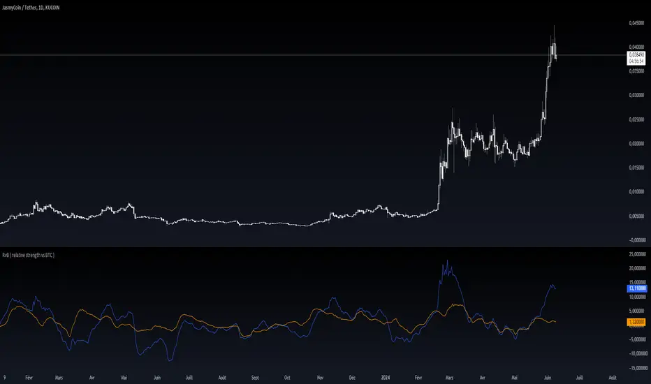
RvB ( relative strength vs BTC ) Overview
The "Coin vs BTC" indicator is designed to compare the performance of a selected cryptocurrency against Bitcoin (BTC) using Exponential Moving Averages (EMAs). By plotting the difference in EMA values as a percentage, this indicator helps traders visualize the relative strength of a cryptocurrency compared to Bitcoin over specified periods.
How It Works
EMA Calculation: The indicator calculates two EMAs (lengths specified by the user) for both the selected cryptocurrency and Bitcoin (BTC).
Length 1: Fast EMA (default: 9)
Length 2: Slow EMA (default: 21)
Score Calculation:
For both the selected coin and Bitcoin, it computes a score representing the percentage difference between the fast and slow EMAs relative to the previous closing price. This is done using the following steps:
Calculate the difference between the fast and slow EMAs.
Compute the percentage of this difference relative to the previous closing price.
Round the percentage to two decimal places for clarity.
Plotting: The scores for both the selected cryptocurrency and Bitcoin are plotted on the same chart:
Coin Score: Displayed in blue.
BTC Score: Displayed in orange.
Potential Uses
Relative Strength Analysis:
This indicator helps traders compare the strength of a cryptocurrency against Bitcoin. A higher score for the selected coin compared to Bitcoin indicates it is performing better relative to its moving averages.
Trend Confirmation:
By observing the EMA differences, traders can confirm trends and potential reversals. Consistently higher scores may indicate a strong upward trend, while lower scores could suggest a weakening trend.
Market Comparison:
This tool is particularly useful for those looking to understand how their selected cryptocurrency is performing in the broader market context, especially in relation to Bitcoin, which is often considered a market benchmark.
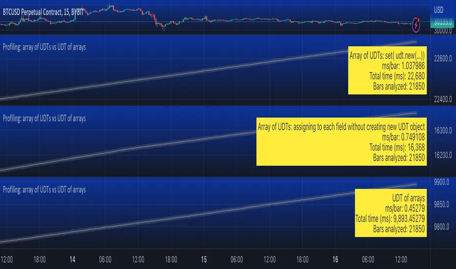
Profiling: array of UDTs vs UDT of arraysUsing Stopwatch Library by PineCoders, I am trying to test which is faster, an array of user-defined type (UDT) objects vs an object with many child arrays.
The task is to store and manipulate array of objects having total 9 values: 4 floats, 4 strings and 1 int.
Option 1: create a UDT with 9 fields and store an array of such UDT objects.
Option 2: create a UDT with 9 arrays individually for each value.
The test task is of three stages:
Populate array(s) with some (timenow) values - in the options you can choose how many values to push into the array/arrays. Note that max size of array(s) is set independently, so you can push 1000 of elements into an array capped at 100 max size and as new elements will be pushed (added to the end) the old exceeding elements will be shifted (removed from the beginning)
Write - write to random elements of the array. Two options for writing to a UDT object: (1) assign to each field independently, (2) create a UDT object and use array.set() function.
Read - read from random elements of the array.
In the options you can how many times per bar to run each of the steps (same number for each step).
I tested by adding three indicators to the chart and choosing different options for each:
1. Array of UDT's where writing is done by creating a new UDT from the values and then using set(udt)
2. Array of UDT's where writing is done by assigning the value of each of the properties of the UDT individually (saving time on creating of a new object).
3. UDT of arrays.
As of 16 Arpil 2023 the UDT of arrays seems about 20-30% faster than the array of UDT's with setting each property without creating new UDT object.
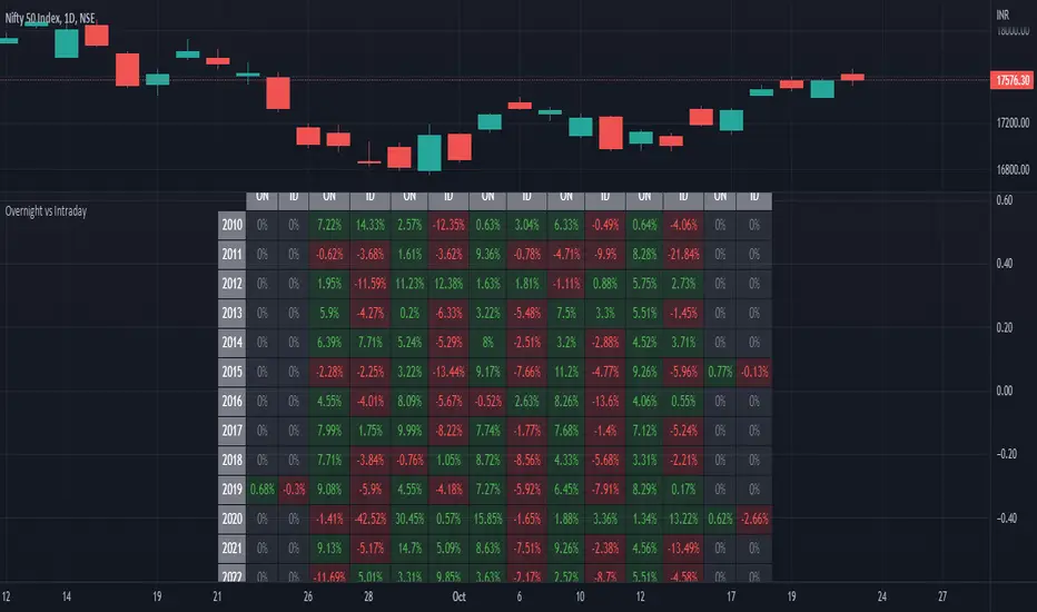
ILM Overnight vs Intraday Performance - Tabular FormUse this indicator on Daily Timeframe
This script compares Overnight vs Intraday Performance based on the Day of the Week (DOW) - Sun - Sat of index/stock/currency/commodity symbols.
ON column indicates Overnight performance = open/close -1
ID column indicates Intraday performance = close-open/1
The calculations are detailed in the tooltips of the individual table cells.
Perp vs SpotJust a basic comparison of perps price vs spot price, you can select which exchanges for comparison

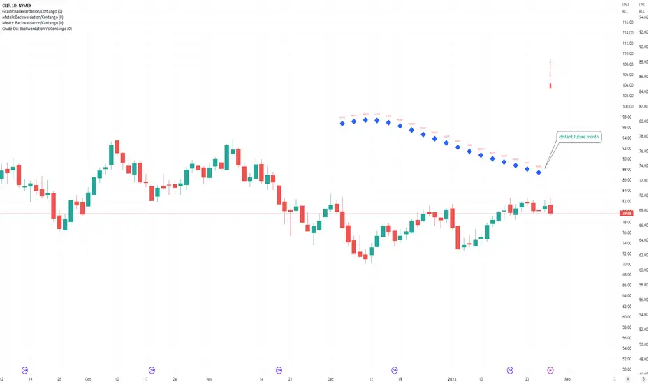
Crude Oil: Backwardation Vs ContangoCrude Oil, CL
Plots Futures Curve: Futures contract prices over the next 3.5 years; to easily visualize Backwardation Vs Contango(carrying charge) markets.
Carrying charge (contract prices increasing into the future) = normal, representing the costs of carrying/storage of a commodity. When this is flipped to Backwardation(As the above; contract prices decreasing into the future): it's a bullish sign: Buyers want this commodity, and they want it NOW.
Note: indicator does not map to time axis in the same way as price; it simply plots the progression of contract months out into the future; left to right; so timeframe DOESN'T MATTER for this plot
TO UPDATE (every year or so): in REQUEST CONTRACTS section, delete old contracts (top) and add new ones (bottom). Then in PLOTTING section, Delete old contract labels (bottom); add new contract labels (top); adjust the X in 'bar_index-(X+_historical)' numbers accordingly
This is one of several similar Futures Curve indicators: Meats | Metals | Grains | VIX | Crude Oil
If you want to build from this; to work on other commodities; be aware that Tradingview limits the number of contract calls to 40 (hence the multiple indicators)
Tips:
-Right click and reset chart if you can't see the plot; or if you have trouble with the scaling.
-Right click and add to new scale if you prefer this not to overlay directly on price. Or move to new pane below.
-If this takes too long to load (due to so many security calls); comment out the more distant future half of the contracts; and their respective labels. Or comment out every other contract and every other label if you prefer.
--Added historical input: input days back in time; to see the historical shape of the Futures curve via selecting 'days back' snapshot
updated 20th June 2022
© twingall
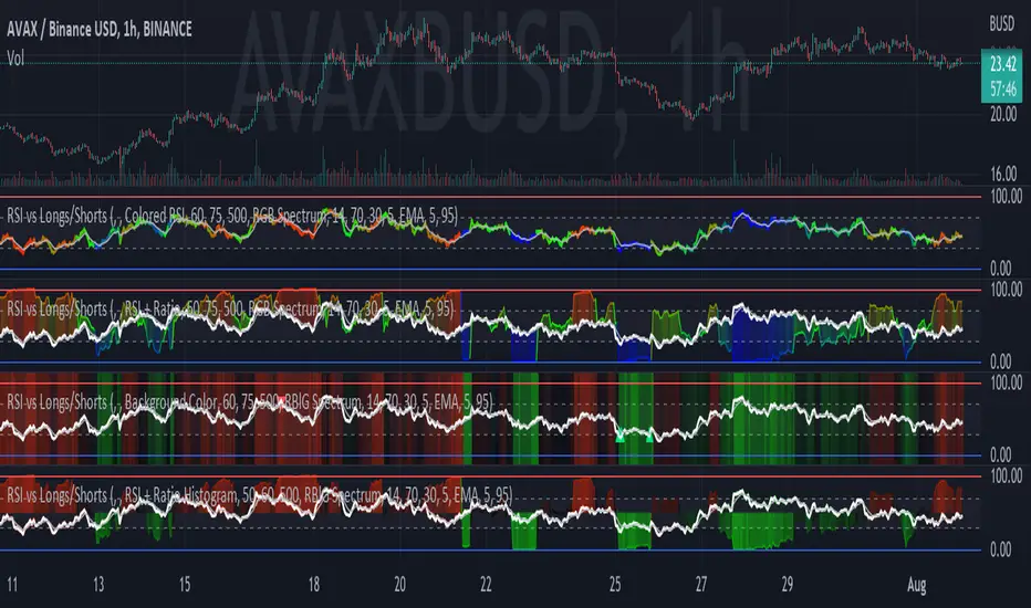
RSI vs Longs/Shorts Margin Ratio Percentage RankThis indicator plots the RSI of the current token and the percentage rank, of the RSI, of the ratio of a long margined token to a short margined token.
By default it plots the RSI of the current token with a color based on percentage rank the RSI of BITFINEX:BTCUSDLONGS divided by BITFINEX:BTCUSDSHORTS, so the assumption is that you are using it on a BTC chart. While you can select any Tradingview symbol for your Long and Short tokens I don't think you will get meaningful results unless you select a long and short margined token that matches your chart symbol, such as BITFINEX:ETHUSDLONGS and BITFINEX:ETHUSDSHORTS if you're trading ETHUSD. Even using margined tokens the results may not be meaningful, if there is not enough trade volume in the token, or if they are being manipulated, so you must backtest everything.
The three plot options are:
• Colored RSI - RSI plotted with colors based on the Longs/Shorts ratio
• Background Color - White RSI plot with Longs/Shorts ratio as background color
• RSI + Ratio - White RSI with Longs/Shorts ratio plotted in color
The chart shows all three options on an hourly BITFINEX:SOLUSD chart with BITFINEX:SOLUSDSHORTS and BITFINEX:SOLUSDLONGS.
By default it also plots a short term moving average and it can also plot the raw ratio rather than the percentage rank if selected.
This script started out as "RSI vs BITFINEX BTC Longs/Shorts Margin Ratio Percentage Rank" by me. I was interested in the ratio of BITFINEX:BTCUSDLONGS to BITFINEX:BTCUSDSHORTS as a measure of market sentiment and how that sentiment would magnify RSI changes. The volatility of the BTCUSDLONGS : BTCUSDSHORTS ratio was too low to get a good read, using a percent rank of the RSI of the ratio made the results more visible. After a discussion with @jason5480 I saw how opening it up to all margined Long / Short pairs was the best way forward. Unfortunately the name no longer matched the script, so I had to publish a new script.
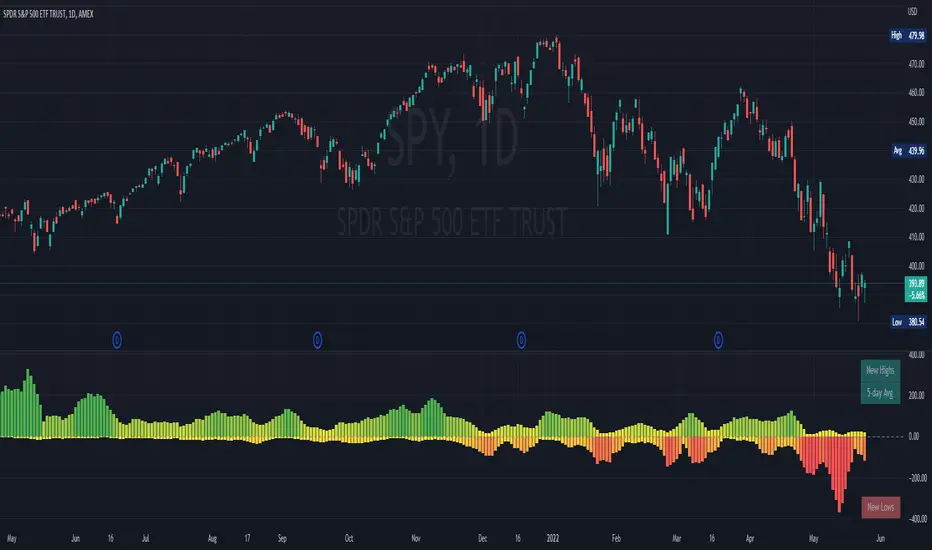
NYSE New Highs vs New LowsNYSE New Highs vs New Lows is a simple market breadth indicator that compares HIGN, the number of new highs during that day, and LOWN, the number of new lows. The new highs are on top and lows are appropriately on bottom. Without averaging, it's a little chaotic so you can smooth them out as much as you want, and the top-right label shows how much you're smoothing.
Interpretation:
Essentially, we use $SPY or $QQQ as a proxy for what's going on in the market, but because the FAANG stocks are so heavily weighted, it's not always representative. If SPY is flat/down, but there are 200 new highs today, then one of the big boys is weighing down an otherwise very bullish market. It's like looking at one of those heatmap charts, but in a single number.
Bullish Trend
- Lots of new highs
- Very few new lows
Bearish Trend
- Lots of new lows
- Very few new highs
Potential Reversal
- Too high, 250+
- Too low, 150+
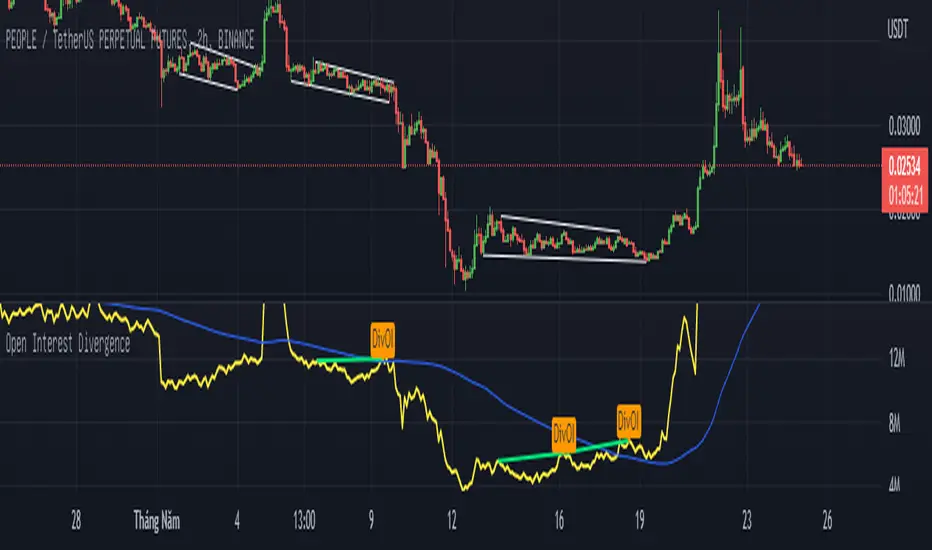
Open Interest Divergence (OI vs Price)This indicator show having increasing Open Interest but price still move in a range (Open Interest Divergence vs price).
It is same with Divergence of indicators as RSI Divergence, Macd Divergence, .... It is easy to understand.
Additional, with MA line OI, you can see the change of OI.
Up Volume vs Down VolumeCalculating NYSE Up Volume (UPVOL.NY) vs NYSE Down Volume (DNVOL.NY). The triangles appear when the ratio exceeds 90% in either direction.
Also has the option to switch to NQ, US, DJ, AM, or AX tickers.
Credit to @MagicEins for the original script:
