Blackrock Spot ETF Premium BTCUSD (COINBASE) V1I created an indicator that takes the spot BTC/USD pair from major exchanges and compares it to the Spot BTC/USD pair on Coinbase that institutions will use for their Spot ETFs.
Blackrock Spot ETF Premium BTCUSD (COINBASE)
I suspect we will see a new "Kimchi Premium" where the Spot ETF pressures from institutions will raise the Coinbase Bitcoin price by a factor of 10-50% premium to the other exchanges.
Naturally excess coins from other exchanges will flow into Coinbase to capture this.
This indicator should be good for some time until one of the other exchanges delist or stop using BTCUSD "spot" If it breaks it I will update it if I remember.
FederalXBT,
Cerca negli script per "博时黄金ETF联接C基金同类基金的最大回撤率、波动率、夏普比率对比数据"

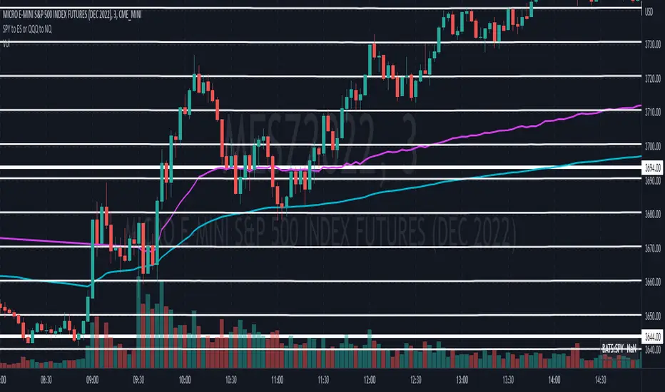
Convert ETF to Futures/IndexThis indicator is used to automatically map an ETF's VWAP and 10 levels above and below the strike of your choice, to the futures or index instrument currently being viewed/traded. This works very well when using both SPY to ES/MES/SPX or QQQ to NQ/MNQ/NDX to plot the ETF strikes and can lead to some incredible trades, especially when trading level to level. Since SPY, QQQ, IWM, and DIA have the same price action as their futures iteration, there seems to be a direct correlation between their levels and VWAP . This indicator is made to easily map these key levels to the appropriate futures instrument. If you have a way to measure GEX centered around a certain level, I recommend color coding the lines to help indicate whether the level will have strong positive or negative gamma hedging associated with it.
NIFTY / BANKNIFTY ETF SIP NOTIFIERNIFTY / BANKNIFTY - ETF SIP NOTIFIER
STUDY concept -
- As a market investor, one cannot time the market.
- Specailly, working professionals and job holders don't have time for market tracking.
- The idea of the script is - When Nifty closes below 2% previous day high, market has corrected and it's available at a discount w.r.t. previous day
- One can then invest in NIFTY / BANKNIFTY via ETF option on same or next day.
- If you like this idea, Save this script and add alert condition of this script in NIFTY / BANKNIFTY chart.
- One can get notification on TradingView mobile app or via email when the criteria is met.
- Logic can be applied to investing in INDEXES , NIFTY, BANKNIFTY.
Logic may be improved later.
NOTE - Investing is a serious and risky business. Profit / Loss from this investing idea is sole responsibility of the investor. This script is for education and learning purpose.
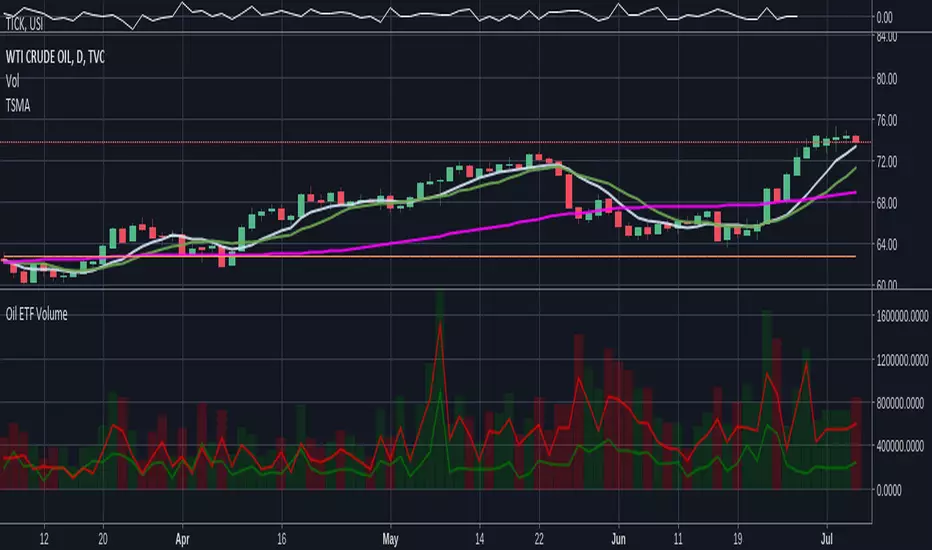
Oil ETF VolumeDirexxion Daily has both 'bear' and 'bull' oil ETFs. This tracks the volume in both combined. It also tracks them individually: the bear ETF is the red line, and bull the green.
NOTE: the color of the volume bars is determined by whatever ticker you're currently looking at, and whether current close is gt/lt previous close. It is intended to be used while looking at the USOIL chart. The colors will be inverted if you're looking at the 'bear' ETF! as the higher closes will actually mean price is going down :D
Leveraged ETF Volume Ratio3x/2x Long/short etf pairs for popular tickers, including TSLA, QQQ, META, PLTR... Extreme values indicate bullish/bearish sentiment.

Standardized Leveraged ETF Fund of FlowsThis indicator tracks and standardizes the 3-month fund flows of major leveraged ETFs across different asset classes, including equities, gold, and bonds.
The fund flows are summed over a 3-month period (63 trading days) and then standardized using a 500-day rolling mean and standard deviation.
The resulting normalized fund flow values are plotted in three distinct colors:
Blue for Equities Fund Flows
Yellow for Gold Fund Flows
Green for Bond Fund Flows

CE - 42MACRO Fixed Income and Macro This is Part 2 of 2 from the 42MACRO Recreation Series
However, there will be a bonus Indicator coming soon!
The CE - 42MACRO Fixed Income and Macro Table is a next level Macroeconomic and market analysis indicator.
It aims to provide a probabilistic insight into the market realized GRID Macro regimes,
track a multiplex of important Assets, Indices, Bonds and ETF's to derive extra market insights by showing the most important aggregates and their performance over multiple timeframes... and what that might mean for the whole market direction.
For traders and especially investors, the unique functionalities will be of high value.
Quick guide on how to use it:
docs.google.com
WARNING
By the nature of the macro regimes, the outcomes are more accurate over longer Chart Timeframes (Week to Months).
However, it is also a valuable tool to form an advanced,
market realized, short to medium term bias.
NOTE
This Indicator is intended to be used alongside the 1nd part "CE - 42MACRO Equity Factor"
for a more wholistic approach and higher accuracy.
Methodology:
The Equity Factor Table tracks specifically chosen Assets to identify their performance and add the combined performances together to visualize 42MACRO's GRID Equity Model.
For this it uses the below Assets:
Convertibles ( AMEX:CWB )
Leveraged Loans ( AMEX:BKLN )
High Yield Credit ( AMEX:HYG )
Preferreds ( NASDAQ:PFF )
Emerging Market US$ Bonds ( NASDAQ:EMB )
Long Bond ( NASDAQ:TLT )
5-10yr Treasurys ( NASDAQ:IEF )
5-10yr TIPS ( AMEX:TIP )
0-5yr TIPS ( AMEX:STIP )
EM Local Currency Bonds ( AMEX:EMLC )
BDCs ( AMEX:BIZD )
Barclays Agg ( AMEX:AGG )
Investment Grade Credit ( AMEX:LQD )
MBS ( NASDAQ:MBB )
1-3yr Treasurys ( NASDAQ:SHY )
Bitcoin ( AMEX:BITO )
Industrial Metals ( AMEX:DBB )
Commodities ( AMEX:DBC )
Gold ( AMEX:GLD )
Equity Volatility ( AMEX:VIXM )
Interest Rate Volatility ( AMEX:PFIX )
Energy ( AMEX:USO )
Precious Metals ( AMEX:DBP )
Agriculture ( AMEX:DBA )
US Dollar ( AMEX:UUP )
Inverse US Dollar ( AMEX:UDN )
Functionalities:
Fixed Income and Macro Table
Shows relative market Asset performance
Comes with different Calculation options like RoC,
Sharpe ratio, Sortino ratio, Omega ratio and Normalization
Allows for advanced market (health) performance
Provides the calculated, realized GRID market regimes
Informs about "Risk ON" and "Risk OFF" market states
Visuals - for your best experience only use one (+ BarColoring) at a time:
You can visualize all important metrics:
- GRID regimes of the currently chosen calculation type
- Risk On/Risk Off with background colouring and additional +1/-1 values
- a smoother GRID model
- a smoother Risk On/ Risk Off metric
- Barcoloring for enabled metric of the above
If you have more suggestions, please write me
Fixed Income and Macro:
The visualisation of the relative performance of the different assets provides valuable information about the current market environment and the actual market performance.
It furthermore makes it possible to obtain a deeper understanding of how the interconnected market works and makes it simple to identify the actual market direction,
thus also providing all the information to derive overall market health, market strength or weakness.
Utility:
The Fixed Income and Macro Table is divided in 4 Columns which are the GRID regimes:
Economic Growth:
Goldilocks
Reflation
Economic Contraction:
Inflation
Deflation
Top 5 Fixed Income/ Macro Factors:
Are the values green for a specific Column?
If so then the market reflects the corresponding GRID behavior.
Bottom 5 Fixed Income/ Macro Factors:
Are the values red for a specific Column?
If so then the market reflects the corresponding GRID behavior.
So if we have Goldilocks as current regime we would see green values in the Top 5 Goldilocks Cells and red values in the Bottom 5 Goldilocks Cells.
You will find that Reflation will look similar, as it is also a sign of Economic Growth.
Same is the case for the two Contraction regimes.
******
This Indicator again is based to a majority on 42MACRO's models.
I only brought them into TV and added things on top of it.
If you have questions or need a more in-depth guide DM me.
GM

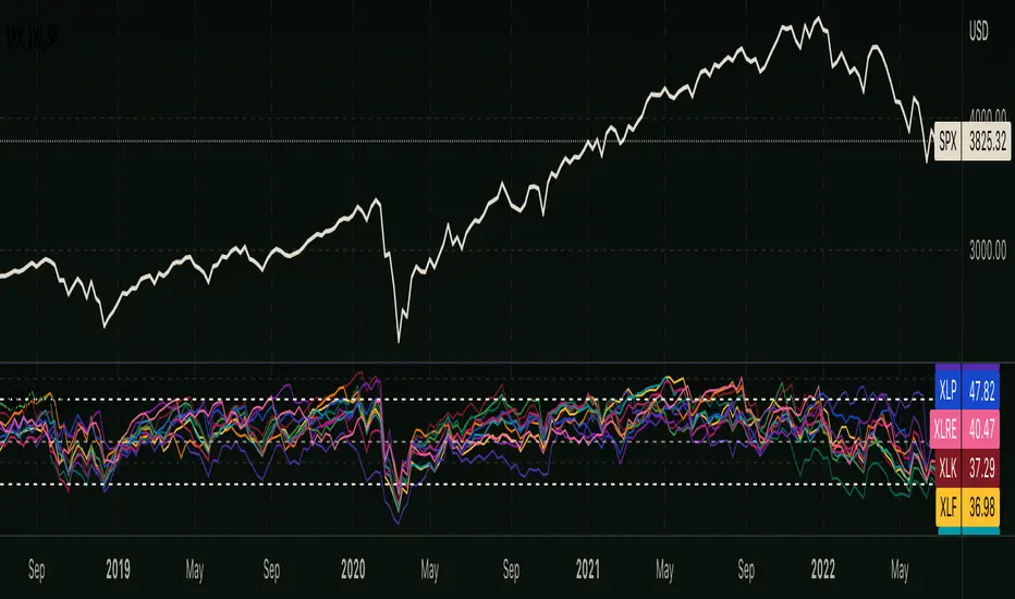
RSI - S&P Sector ETFsThe script displays RSI of each S&P SPDR Sector ETF
XLB - Materials
XLC - Communications
XLE - Energy
XLF - Financials
XLI - Industrials
XLK - Technology
XLP - Consumer Staples
XLRE - Real Estate
XLU - Utilities
XLV - Healthcare
XLY - Consumer Discretionary
It is meant to identify changes in sector rotation, compare oversold/overbought signals of each sector, and/or any price momentum trading strategy applicable to a trader.
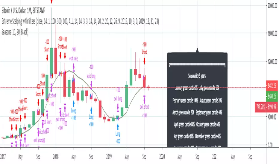
InfoPanel - SeasonalityThis panel will show which is the best month to buy a stock, index or ETF or even a cryptocurrency in the past 5 years.
Script to use only with MONTHLY timeframe.
Thanks to: RicardoSantos for his hard work.
Please use comment section for any feedback.
ZERO LANG Nube EMA 18-36 + Volumen EstrictoThis indicator is designed to show market trends using a cloud pattern. When the price retests the cloud and bounces back across it with high volume, it generates a buy signal, and vice versa when the price falls.
It uses the 18-period EMA and the 36-period EMA.

QuantLabs MASM Correlation TableThe Market is a graph. See the flows:
The QuantLabs MASM is not a standard correlation table. It is an Alpha-Grade Scanner architected to reveal the hidden "hydraulic" relationships between global macro assets in real-time.
Rebuilt from the ground up for Version 3, this engine pushes the absolute limits of the Pine Script™ runtime. It utilizes a proprietary Logarithmic Math Engine, Symmetric Compute Optimization, and a futuristic "Ghost Mode" interface to deliver a 15x15 real-time correlation matrix with zero lag.
Under the Hood: The Quant Architecture
We stripped away standard libraries to build a lean, high-performance engine designed for institutional-grade accuracy.
1. Alpha Math Engine (Logarithmic Returns) Most tools calculate correlation based on Price, which generates spurious signals (e.g., "Everything is correlated in a bull run").
The Solution: Our engine computes Logarithmic Returns (log(close/close )) by default. This measures the correlation of change (Velocity & Vector), not price levels.
The Result: A mathematically rigorous view of statistical relationships that filters out the noise of general market drift.
Dual-Core: Toggle seamlessly between "Alpha Mode" (Log Returns) for verified stats and "Visual Mode" (Price) for trend alignment.
Calculation Modes: Pearson (Standard), Euclidean (Distance), Cosine (Vector), Manhattan (Grid).
2. Symmetric Compute Optimization Calculating a 15x15 matrix requires evaluating 225 unique relationships per bar, which often crashes memory limits.
The Fix: The V3 Engine utilizes Symmetric Logic, recognizing that Correlation(A, B) == Correlation(B, A).
The Gain: By computing only the lower triangle of the matrix and mirroring pointers to the upper triangle, we reduced computational load by 50%, ensuring a lightning-fast data feed even on lower timeframes.
3. Context-Aware "Ghost Mode" The UI is designed for professional traders who need focus, not clutter.
Smart Detection: The matrix automatically detects your current chart's Ticker ID. If you are trading QQQ, the matrix will visually highlight the Nas100 row and column, making them opaque and bright while dimming the rest.
Dynamic Transparency: Irrelevant data ("Noise" < 0.3 correlation) fades into the background. Only significant "Alpha Signals" (> 0.7) glow with full Neon Saturation.
Key Features
Dominant Flow Scanner: The matrix scans all 105 unique pairs every tick and prints the #1 Strongest Correlation at the bottom of the pane (e.g., DOMINANT FLOW: Bitcoin ↔ Nas100 ).
Streak Counter: A "Stubbornness" metric that tracks how many consecutive days a strong correlation has persisted. Instantly identify if a move is a "flash event" or a "structural trend."
Neon Palette: Proprietary color mapping using Electric Blue (+1.0) for lockstep correlation and Deep Red (-1.0) for inverse hedging.
Usage Guide
Placement: Best viewed in a bottom pane (Footer).
Assets: Pre-loaded with the Essential 15 Macro Drivers (Indices, BTC, Gold, Oil, Rates, FX, Key Sectors). Fully editable via settings (Ticker|Name).
Reading the Grid:
🔵 Bright Blue: Assets moving in lockstep (Risk-On).
🔴 Bright Red: Assets moving perfectly opposite (Hedge/Risk-Off).
⚫ Faded/Black: No statistical relationship (Decoupled).
Key Improvements Made:
Formatting: Added clear bullet points and bolding to make it scannable.
Clarity: Clarified the "Logarithmic Returns" section to explain why it matters (Velocity vs. Price Levels).
Tone: Maintained the "high-tech/quant" vibe but removed slightly clunky phrases like "spurious signals" (unless you prefer that academic tone, in which case I left it in as it fits the persona).
Structure: Grouped the "Modes" under the Math Engine for better logic.
Created and designed by QuantLabs

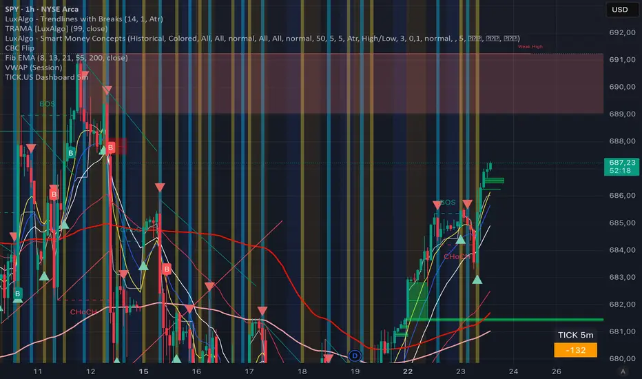
TICK.US Dashboard 5mIt's a very simple script, It displays the TICK.US Timeframe 5 mn on your template
RSI WVF Multi-StageRSI + WVF Confluence
Overview
The RSI + WVF Confluence is a sophisticated reversal indicator that merges momentum analysis with market volatility. By combining a "hooking" Relative Strength Index (RSI) with a synthetic Williams VIX Fix (WVF), this tool identifies high-probability turning points where market "panic" meets a recovery in price action.
Unlike standard RSI indicators that fire signals based on a single threshold, this script uses a Multi-Stage Exhaustion System to categorize the depth of a reversal, helping traders distinguish between a minor bounce and a major market bottom.
How It Works
The indicator looks for a specific "Dual-Confirmation" setup:
Volatility Peak (The WVF): The script detects when price has dropped significantly relative to recent highs, creating a "Fear Peak" (indicated by the gray background).
Momentum Pivot (The RSI): It then waits for the RSI to "pivot" or curl upward, confirming that the downward pressure has exhausted and buyers are stepping back in.
The Multi-Stage Signal System
Signals are color-coded based on the severity of the oversold condition at the time of the pivot:
🟣 Magenta (Extreme): RSI below 15. A rare, high-conviction "blow-off" bottom.
🔴 Red (High): RSI between 15–20. Deep exhaustion usually seen in major corrections.
🟠 Orange (Moderate): RSI between 20–25. A strong, reliable reversal zone.
🟡 Gold (Standard): RSI between 25–30. The classic oversold bounce.
💎 Cyan (Early Warning): A tactical signal that fires during high-volatility spikes even if the RSI hasn't touched 30. Perfect for catching "V-Bottoms" and sharp pullbacks in strong uptrends.
Key Features
Volatility Memory: Includes a "WVF Memory" lookback, ensuring signals are captured even if the momentum shift happens a few bars after the peak of market fear.
ATR-Adjusted Labels: Arrows are mathematically positioned below the candles using Average True Range (ATR) to ensure a clean, overlap-free chart regardless of the asset's price.
Modern Pine Script v6: Optimized for performance and high-speed calculation on any timeframe.
Trading Instructions
For Bottom Fishing: Look for Magenta or Red arrows. These indicate the market is severely overextended.
For Trend Following: Use the Cyan (Early Warning) arrows to buy the dip during a bull market when the RSI stays relatively high but volatility spikes briefly.
Confluence: The gray background indicates "Peak Fear." The best signals often occur when an arrow appears while the background is active or immediately after it fades.

RSI + WVF Confluence [Multi-Stage]Overview
The RSI + WVF Confluence is a sophisticated reversal indicator that merges momentum analysis with market volatility. By combining a "hooking" Relative Strength Index (RSI) with a synthetic Williams VIX Fix (WVF), this tool identifies high-probability turning points where market "panic" meets a recovery in price action.
Unlike standard RSI indicators that fire signals based on a single threshold, this script uses a Multi-Stage Exhaustion System to categorize the depth of a reversal, helping traders distinguish between a minor bounce and a major market bottom.
How It Works
The indicator looks for a specific "Dual-Confirmation" setup:
Volatility Peak (The WVF): The script detects when price has dropped significantly relative to recent highs, creating a "Fear Peak" (indicated by the gray background).
Momentum Pivot (The RSI): It then waits for the RSI to "pivot" or curl upward, confirming that the downward pressure has exhausted and buyers are stepping back in.
The Multi-Stage Signal System
Signals are color-coded based on the severity of the oversold condition at the time of the pivot:
🟣 Magenta (Extreme): RSI below 15. A rare, high-conviction "blow-off" bottom.
🔴 Red (High): RSI between 15–20. Deep exhaustion usually seen in major corrections.
🟠 Orange (Moderate): RSI between 20–25. A strong, reliable reversal zone.
🟡 Gold (Standard): RSI between 25–30. The classic oversold bounce.
💎 Cyan (Early Warning): A tactical signal that fires during high-volatility spikes even if the RSI hasn't touched 30. Perfect for catching "V-Bottoms" and sharp pullbacks in strong uptrends.
Key Features
Volatility Memory: Includes a "WVF Memory" lookback, ensuring signals are captured even if the momentum shift happens a few bars after the peak of market fear.
ATR-Adjusted Labels: Arrows are mathematically positioned below the candles using Average True Range (ATR) to ensure a clean, overlap-free chart regardless of the asset's price.
Modern Pine Script v6: Optimized for performance and high-speed calculation on any timeframe.
Trading Instructions
For Bottom Fishing: Look for Magenta or Red arrows. These indicate the market is severely overextended.
For Trend Following: Use the Cyan (Early Warning) arrows to buy the dip during a bull market when the RSI stays relatively high but volatility spikes briefly.
Confluence: The gray background indicates "Peak Fear." The best signals often occur when an arrow appears while the background is active or immediately after it fades.

Multi-Level RSI Pivot ArrowsRSI Multi-Level Pivot Arrows
This indicator identifies high-probability long entries by detecting RSI "Hooks" at four distinct stages of exhaustion. Unlike standard RSI signals that trigger simply for being low, this script confirms a momentum pivot—firing only when the RSI has bottomed out and begun to tick upward.
How it Works
The script monitors the Relative Strength Index (RSI) for a specific "pivot" pattern: the previous bar must be oversold, and the current bar must show rising momentum. To help you gauge the severity of the oversold condition, the arrows are color-coded by intensity:
🟡 Gold (RSI 30): Standard oversold bounce.
🟠 Orange (RSI 25): Strong exhaustion.
🔴 Red (RSI 20): Extreme exhaustion.
🟣 Magenta (RSI 15): Maximum intensity/Rare "blow-off" bottom.
Key Features
Momentum Confirmation: Avoids "catching a falling knife" by waiting for the RSI to curl upward.
ATR-Based Positioning: Arrows automatically adjust their distance from the candle based on market volatility, keeping your chart clean and readable.
Modern Pine Script v6: Optimized for the latest TradingView engine for high performance and accuracy.
How to Trade
Look for Color Clusters: A Magenta arrow followed by a Gold arrow often confirms a strong base is forming.
Trend Alignment: This indicator works best in ranging markets or as a tool to catch deep pullbacks in an overall uptrend.
Risk Management: Use the deeper levels (Red/Magenta) to identify high-consequence reversal zones.

UVOL Thrust TrackerUVOL Thrust Tracker identifies institutional breadth thrusts using NYSE up-volume as a percentage of total volume (USI:UVOL / USI:TVOL), plotted directly on price.
The indicator highlights:
TRUE 90% UVOL thrusts (rare, high-conviction breadth events)
Surrogate thrust clusters (multi-day 80–89% participation)
Cluster failures (momentum that fails to expand)
Structural thrust failures (2022-style false starts)
A regime filter based on the chart symbol’s moving averages separates bull vs bear environments, dynamically adjusting thresholds and failure logic.
This tool is designed for regime confirmation and risk management, not short-term entries. TRUE thrusts typically confirm trend continuation, while failures warn when breadth support breaks down.
Note: This indicator is intended for regime and risk assessment, not precise entries or exits.


Weekly Bullish Engulfing ScreenerThis is a weekly Bullish engulfing screener to find the stocks ready to breakout

ORB 5 Min Break & Retest + Alerts By Khan 0.1 verORB 5-Minute Break & Retest Indicator
This indicator plots the high and low of the first 5-minute candle of the trading session (Opening Range). It then monitors price for a breakout above or below the ORB levels and triggers an alert when price retests the broken level and holds.
Designed to help identify high-probability ORB continuation setups with clear visual levels and TradingView alerts.

Anurag Institutional Swing Trader Pro [Robust]nstitutional Swing Flow is a comprehensive, multi-timeframe system designed for swing traders who want to align with "Smart Money" rather than fight against it.
Unlike standard indicators that rely solely on price crossovers, this script analyzes the underlying order flow—tracking stealth accumulation, volume anomalies, and institutional footprints—to generate high-probability swing setups.
Key Features (The "Smart Money" Logic)
1. Institutional Footprints
Stealth Accumulation/Distribution: Detects when price is held in a tight range despite high volume (a classic sign of institutions building a position).
Smart Money Divergence: Identifies when price makes a lower low but Money Flow (OBV/Accumulation-Distribution) makes a higher high.
Fair Value Gaps (FVG): Automatically plots Bullish and Bearish imbalance zones where price is likely to retrace before continuing the trend.
2. Safety First (Risk Management)
Real Earnings Detection: Automatically checks upcoming earnings dates. If an earnings report is within 5 days (adjustable), the script blocks new signals to prevent gambling on binary events.
Visual Exits: Plots dynamic Stop Loss and Take Profit levels on the chart the moment a trade is taken, along with "SL Hit" or "TP Hit" markers for visual backtesting.
3. The "Confluence Score" Dashboard A sophisticated dashboard in the top-right corner rates every setup on a scale of 0 to 100 based on:
Multi-Timeframe Trend: Is the Weekly, Daily, and 4H trend aligned?
Relative Strength: Is the asset outperforming the SPY benchmark?
Volatility: Is the asset in a "Squeeze" (Bollinger Band compression)?
Momentum: RSI, MACD, and CMF confirmation.
Only setups with a score > 65 (adjustable) trigger a BUY or SELL signal.
How to Use
Timeframe: Optimized for 4-Hour (4H) and Daily (D) charts. (Avoid using on <15m charts due to multi-timeframe calculations).
The Signal: Wait for a large "CALL" or "PUT" label.
The Confirmation: Check the Dashboard. Ideally, look for a "Squeeze: YES" combined with a high Institutional Buy Score.
The Exit: Follow the Red (Stop Loss) and Green (Take Profit) lines plotted automatically.
Disclaimer
This tool is for educational purposes only. Swing trading involves risk. Always confirm signals with your own analysis and risk management rules.

Options Volume IndicatorShows the RSI volume based on options volume. Useful for comparing against asset buy and sell signals to see strength of demand for recent options.
