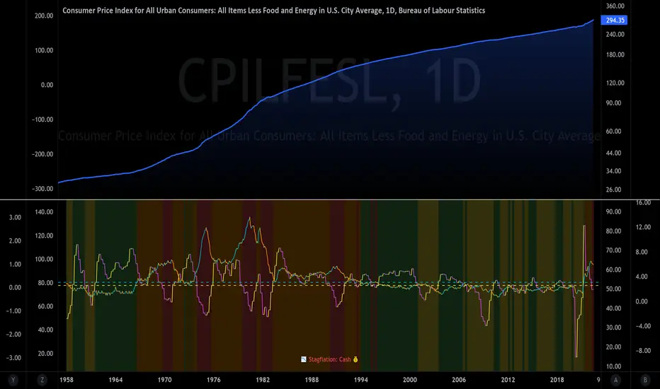
The Investment ClockThe Investment Clock was most likely introduced to the general public in a research paper distributed by Merrill Lynch. It’s a simple yet useful framework for understanding the various stages of the US economic cycle and which asset classes perform best in each stage.
The Investment Clock splits the business cycle into four phases, where each phase is comprised of the orientation of growth and inflation relative to their sustainable levels:
Reflation phase (6:01 to 8:59): Growth is sluggish and inflation is low. This phase occurs during the heart of a bear market. The economy is plagued by excess capacity and falling demand. This keeps commodity prices low and pulls down inflation. The yield curve steepens as the central bank lowers short-term rates in an attempt to stimulate growth and inflation. Bonds are the best asset class in this phase.
Recovery phase (9:01 to 11:59): The central bank’s easing takes effect and begins driving growth to above the trend rate. Though growth picks up, inflation remains low because there’s still excess capacity. Rising growth and low inflation are the Goldilocks phase of every cycle. Stocks are the best asset class in this phase.
Overheat phase(12:01 to 2:59): Productivity growth slows and the GDP gap closes causing the economy to bump up against supply constraints. This causes inflation to rise. Rising inflation spurs the central banks to hike rates. As a result, the yield curve begins flattening. With high growth and high inflation, stocks still perform but not as well as in recovery. Volatility returns as bond yields rise and stocks compete with higher yields for capital flows. In this phase, commodities are the best asset class.
Stagflation phase (3:01 to 5:59): GDP growth slows but inflation remains high (sidenote: most bear markets are preceded by a 100%+ increase in the price of oil which drives inflation up and causes central banks to tighten). Productivity dives and a wage-price spiral develops as companies raise prices to protect compressing margins. This goes on until there’s a steep rise in unemployment which breaks the cycle. Central banks keep rates high until they reign in inflation. This causes the yield curve to invert. During this phase, cash is the best asset.
Additional notes from Merrill Lynch:
Cyclicality: When growth is accelerating (12 o'clock), Stocks and Commodities do well. Cyclical sectors like Tech or Steel outperform. When growth is slowing (6 o'clock), Bonds, Cash, and defensives outperform.
Duration: When inflation is falling (9 o'clock), discount rates drop and financial assets do well. Investors pay up for long duration Growth stocks. When inflation is rising (3 o'clock), real assets like Commodities and Cash do best. Pricing power is plentiful and short-duration Value stocks outperform.
Interest Rate-Sensitives: Banks and Consumer Discretionary stocks are interest-rate sensitive “early cycle” performers, doing best in Reflation and Recovery when central banks are easing and growth is starting to recover.
Asset Plays: Some sectors are linked to the performance of an underlying asset. Insurance stocks and Investment Banks are often bond or equity price sensitive, doing well in the Reflation or Recovery phases. Mining stocks are metal price-sensitive, doing well during an Overheat.
About the indicator:
This indicator suggests iShares ETFs for sector rotation analysis. There are likely other ETFs to consider which have lower fees and are outperforming their sector peers.
You may get errors if your chart is set to a different timeframe & ticker other than 1d for symbol/tickers GDPC1 or CPILFESL.
Investment Clock settings are based on a "sustainable level" of growth and inflation, which are each slightly subjective depending on the economist and probably have changed since the last time this indicator was updated. Hence, the sustainable levels are customizable in the settings. When I was formally educated I was trained to use average CPI of 3.1% for financial planning purposes, the default for the indicator is 2.5%, and the Medium article backtested and optimized a 2% sustainable inflation rate. Again, user-defined sustainable growth and rates are slightly subjective and will affect results.
I have not been trained or even had much experience with MetaTrader code, which is how this indicator was originally coded. See the original Medium article that inspired this indicator if you want to audit & compare code.
Hover over info panel for detailed information.
Features: Advanced info panel that performs Investment Clock analysis and offers additional hover info such as sector rotation suggestions. Customizable sustainable levels, growth input, and inflation input. Phase background coloring.
⚠ DISCLAIMER: Not financial advice. Not a trading system. DYOR. I am not affiliated with Medium, Macro Ops, iShares, or Merrill Lynch.
About the Author: I am a patent-holding inventor, a futures trader, a hobby PineScripter, and a former FINRA Registered Representative.
Cerca negli script per "美国cpi公布时间"
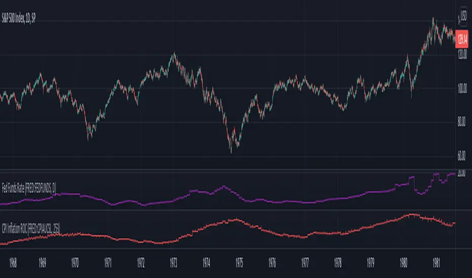
Inflation Rate of ChangeInflation and the Fed interest rate impacts all corners of the economy. Today I am releasing to the community an indicator that measures the rate of change of inflation with historical data back to ~1950. I built this to study the historical market impacts of inflation and changes to the Fed rate (see separate indicator I published for Fed Funds Rate here ).
What this indicator does:
This indicator pulls in Consumer Price Index data and applies a rate of change formula to it. The output is measured as a percentage. I.e. 7 would mean a 7% rate of change over the look-back period.
Options in the indicator:
You can change the amount of bars back it uses to calculate rate of change. By default it is set to 253, which would be looking 1 year back on a normal stock market day chart. If you are on a month chart, you would input 12 there to look 1 year back, etc.
There are also different versions of the CPI that you can select with a drop-down input to pull in different inflation measures:
FRED:CPIAUCSL = Urban Consumers, All Items (this is the default data it pulls, and is a common way to measure inflation)
FRED:CPIUFDNS = Food
FRED:CPIHOSNS = Housing
FRED:CPIENGSL = Energy
Disclaimer: Open-source scripts I publish in the community are largely meant to spark ideas that can be used as building blocks for part of a more robust trade management strategy. If you would like to implement a version of any script, I would recommend making significant additions/modifications to the strategy & risk management functions. If you don’t know how to program in Pine, then hire a Pine-coder. We can help!
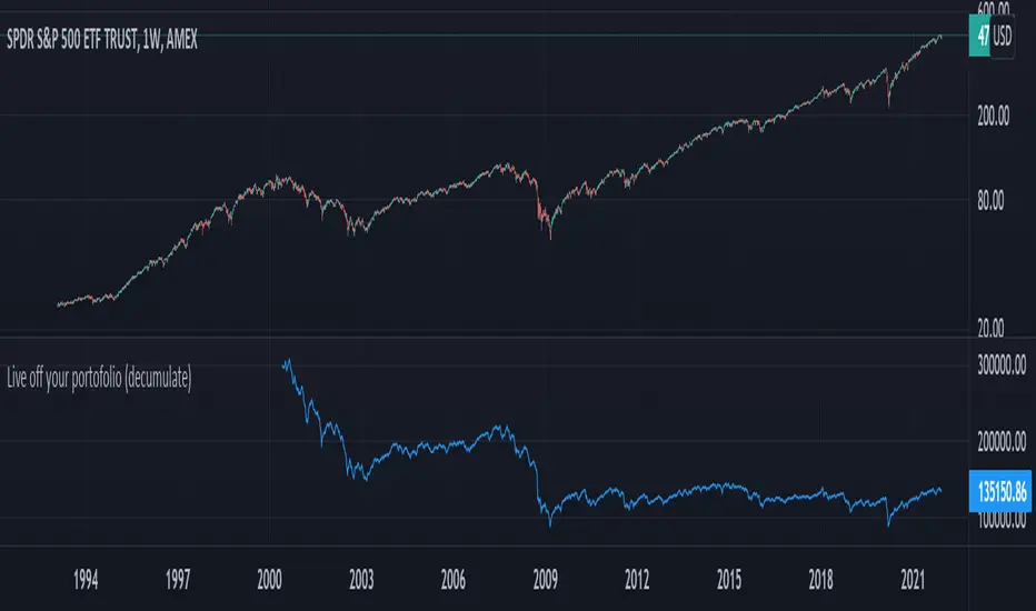
Live off your portofolio (decumulate)This indicator simulates living off your portofolio consisting of a single security or stock such as the SPY etf or even Bitcoin. The simulation starts at a certain point on the chart (which you input as year and month).
Withrawals from the portofolio are made each month according to the yearly withdrawal rate you enter, such as the 4% SWR. The monthly withdrawal income is calculated in USD at the beginning of the retirement period and then adjusted according to the US inflation (CPI) on 01/01 of each year.
The blue graph represents the USD value of the remaining portofolio.
This indicator is meant to be used on daily, weekly or monthly time frame. It may not work properly (and makes little sense to use) on intraday timeframe or larger time frames such as quarterly (3M).
When withdrawing, the indicator considers that fractional stock values can be used (the portofolio value is kept as a float). This may not be true, as most stock brokers currently don't allow this.
It does not explicitly take into account dividends. In order to do this you will have to enable "Adjust for dividends" by clicking on "adj" in the lower right corner of the screen, or by using the indicator on a Total Return (TR) index such as DAX. Unfortunately SPX does not have dividend data, you will have to use the SPY etf (which doesn't have a long history)
Deflated - ValShow Deflated values
Using for $ Quote :
Red line is Deflated by US CPI (Consumer Price Index)
Ticker : QUANDL:ECB/RTD_M_S0_N_P_C_OV_X
Using for € Quote :
Blue line is Deflated by EU HICP (Harmonised Index of Consumer Prices)
Ticker : QUANDL:RATEINF/CPI_USA

CAPE (Shiller PE) RatioCalculating the Shiller PE Ratio (aka cyclically adjusted price to earnings ratio). The calculation is similar to the traditional PE ratio, however uses the simple average of the earnings over past 5 years (default is 5, can choose different) adjusted for inflation (default is the Australian CPI index however a different index can be used in the input).
Total Inflation ModelMeasure of the total economy wide inflation of the US Dollar.
Total Inflation = growth rate of money supply / economic output

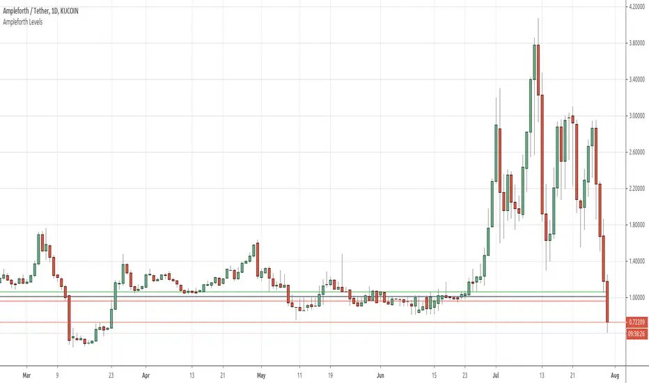
Ampleforth LevelsDisplays relevant Ampleforth (AMPL) levels:
- Target price, based on CPI (PCE)
- Equilibrium levels between which there is no rebase
Inflation Rate HistogramThis script is designed to show a histogram of the inflation rate, based on FRED's CPI data. It shows the yearly change in cpiaucsl. As of right now, this script only works correctly on the yearly timeframe (12M). I'm currently looking into a solution to make this script work on all time frames. This script can be useful for comparing growth to inflation, or just if you want to see how inflation was for a certain year. This script really puts the stagflation into perspective.

Alpha-Sutte ModelThe Alpha-Sutte model is an ongoing project run by Ansari Saleh Ahmar, a lecturer and researcher at Universitas Negeri Makassar in Indonesia, that attempts to make forecasts for time series like how Arima and Holt-Winters models do. Currently Ahmar and his team have conducted research and published papers comparing the efficacy of the Alpha-Sutte and other models, such as Arima and Holt-Winters, on topics ranging from forecasting Turkey's CPI data, Bitcoin prices, Apple's stock prices, primary energy supply of Indonesia, to infant mortality rates in China.
The Alpha-Sutte model in comparison to the other two models listed above shows promise in providing a more accurate forecast, and the project has been able to receive some of its funding from organizations such as the US Agency for International Development, which is a part of the US Federal Government, so maybe the project has some actual merit.
How it works:
In this model there are four values presented at the top of the window.
1) The first value in blue is the value of the Alpha-Sutte model whose purpose is to forecast the price of the current bar.
2) The second value in yellow is an adaptive version of the Alpha-Sutte model that I made. The purpose of the adaptive Alpha-Sutte model is to expand upon the Alpha-Sutte by allowing new information to be introduced, causing the value to change during the current period, hence the adaptiveness of it.
3) The third value in aqua is the moving average of the low% Sutte line which is a predictive line that is based off of the close and low of the current and previous periods.
4) The fourth value in red is the moving average of the high% Sutte line which is a predictive line that is based off of the close and high of the current and previous periods.
Trend signals:
If low% Sutte (aqua value/line) is greater than high% Sutte (red value/line) then this is a buy signal.
If high% Sutte (red value/line) is greater than low% Sutte (aqua value/line) then this is a sell signal.
Caveat:
Even though this model's purpose is to forecast the future, will it be able to predict periods of large movements? No, of course not, but it will adjust quickly to try to make more accurate forecasts for the next period. This was also a reason why I made an adaptive version of this model to try to reduce some of the discrepancies between the Alpha Sutte and price when there is a large unexpected move.
*WARNING before using this I would highly recommend that you look up "Sutte Indicator" online and read some of the papers about this model before you use this , even though this model has shown merit when compared to Arima and Holt-Winter models this is still an ongoing project.*
Hopefully this project will actually come to something in the near future as the calculation for this time series predictive model is much easier to calculate and program in pine editor than something like an Arima model.
*Also, if you know how to use R language there is a package for the "Alpha-Sutte model".*
