RSI Candle (Tommy)This indicator is the open(free) version of TTT_Crack_RSI_Ver_2.1.0 we have published a while ago.
Hello dear traders from all over the world!
It has been a while since our team started concentrating on the technical indicators that apply sources not only on the closed price but also on the high/low prices of the candlestick to overcome the limitations of existing indicators. As mentioned repeatedly before, most of widely adapted indicators in technical chart these days are generated only with the closed prices, not taking in consideration of the wicks or tails of the candlesticks. This crucially leads to a rapid decrease in the reliability especially in current financial market, where ignoring other portions within a candlestick structure and putting weights just on candle body often causes fatal trading outcome. Since phenomenons such as wide price fluctuation and non-ideal price momentum occur more frequently compared to the old days when TA used to perfectly work just as the images in a textbook, sourcing OHLC (Open, High, Low, Closed) prices from a candle structure is becoming more essential and practical.
Such revolutionary perceptions and insights could be easily acquired: by just adding high/low prices of the candlesticks when computing technical indicators, many more meaningful signals were observed. One of the popular indicators we have recently attempted to reflect this very idea was RSI (Relative Strength Index) that was published by the name of “RSI Cloud” months ago. As shown below, this groundbreaking index was to be comprehended as a band or a cloud rather than a single line. In fact, many unexpected methodologies, techniques, and insights were discovered through countless applications as our team went through series of experiments and back/forward tests. The results were quite shocking: Little did we know that drawing trendlines, parallel channels, and previous highs/lows etc. just like we do on the regular candlestick chart would also work decisively. Not only divergences were efficiently captured, but ‘SR Flip’ techniques also functioned as well.
Anyway, validation and verification process has been successful, ensuring that taking all of the candlestick into an account within the indicators provides much more meaningful signals than the indicators with ‘closed source’, the default setting. During thousands of our trials, we questioned to ourselves: If we are going to transform candlestick structure into an equation utilizing all of the prices, why don’t we just express the index with the same format, as another candlestick? The initial intention of the clouds or bands were to adapt the tails of the candle and to smooth them out. And this radical idea changed the whole game. By applying this candlestick format insights, even more significant signals were brought up on to the surface that surprised all of us.
Without a doubt, just like the cloud version, the candlestick version even works better when applying trendlines, pivots, channels, divergences and SR Flips, etc. As we were studying behaviors of the RSI candlestick indicator, a determinant and significant signal was detected that can be usefully referred to traders and this core element is why this update extremely so innovative. We spotted that the emergence of consecutive tails could be a valuable signal that could be weighted. Especially when the tails appeared in sequence in overbought and oversold zone, a strong preference of trend reversal was observed. It was only matter of time to search for the proper parameters and values that fits the market!
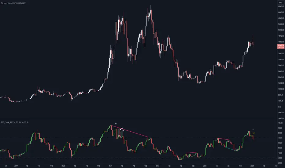
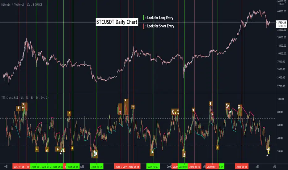
And here we are, presenting our newest indicator, “TTT_Crack_RSI_2.1.0” Just like the previous version, it catches regular and hidden divergences automatically and furthermore, we made it to detect appearance of sequential candle wicks in overbought/sold zone (70 and 30 as default) signaling some possibility of trend reversal. The default setting for the consecutive wick counting (Wick Count) is 4, meaning if candle wicks are formed (Top tail in the overbought zone and bottom tail in the oversold zone) four times in a row, a triangle will appear signaling potential trend reversal. As traders’ preferences, the settings can be customized. “Wick Length” setting let users to decide the minimum size of the wick that are to be considered as the proper criteria of candlestick wick. If one wishes to only imply candle wick that are longer than certain length, he or she can increase the “Wick Length” value. We recommend 30~40 for this parameter value. Moreover, if one wants the minimum number of consecutive wicks to that are to be counted to be greater or less, he or she can put in the minimum counting number value at “Wick Count”. For example, if more conservative trader wishes to consider minimum number of consecutive wicks as 6, then the logic will signal only if the wicks appear 6 times in a row in overbought/sold zone. Overbought and oversold zone can also be modified in the settings just like the regular RSI indicator.
How to effectively use this indicator to search for a decent entry point? First of all, do not just enter position only because a single signal has been appeared. The most reliable and strong entry sign would be when the trendline/channel breaks below/above at the overbought/sold zone and at the same time, consecutive wicks and divergence signals appear as well. If all of those signals have been observed, aim for the spot when RSI escape the overbought/sold zone. That would be a proper time to enter a position. As we emphasized many times, it is very reckless to make trading decisions only with technical indicator. It might defer a little bit depending on traders’ tendency, but indicators are to be considered as a side tool to identify macro level trends and signals of possible trend reversal. Always remember, traders that rely on TA must look for the confluent zone and thus the more technical factors that overlap price-wise and time-wise, the more reliability can be given.
If you wish to try our work, please comment below or send message to this account.
Thank you very much.
본 지표는 예전 업로딩했던 TTT_Crack_RSI_Ver_2.1.0의 무료 버전입니다.
안녕하세요 트레이더 여러분. 토미 트레이딩 팀의 토미입니다.
최근 저희 개발팀은 캔들차트의 종가만으로 산출되는 기술적 지표들의 한계점을 극복하고자 캔들 고/저가까지 적용을 시켜 ‘요즘 장에 더 맞는’ 지표들을 만들기 위해 많은 노력을 해왔습니다. 저희 시장 분석/시황, 강의자료, 그리고 지표 개발 문서에서 누누이 언급 드렸듯, 근래 많은 트레이더 분들에게 널리 사용되고 있는 대부분의 지표들은 캔들의 종가만 고려하는 경우가 많습니다. 비상식적이고 두 눈으로 보고도 믿기지 않을 가격 모멘텀 및 변동성이 난무하는 요즘 21세기 금융시장에서는 예전처럼 교과서에나 볼 법한 뻔하고 예측 가능한 패턴 및 형국들을 찾아보기 힘들어졌습니다. 이렇게 급변하는 최근 시장 성향 상 기술적 분석에 캔들 꼬리를 배제하고 몸통만 고려하기에는 너무 치명적인 리스크가 뒤따라오기 마련입니다.
이런 궁극적인 목표로 개발에 착수한 저희 팀은 캔들의 OHLC(시, 고, 저, 종가)를 지표에 내포시켜 더 유의미한 신호들을 도출할 수 있다는 이론을 검증하였고 이를 반영해 몇 달 전 "RSI 클라우드"를 트레이딩뷰에 출시한 바 있습니다. 아래의 링크(이미지)에서 시사하는 바와 같이 RSI 역시 주가를 하나의 라인이 아닌 구조로 해석하여 밴드나 클라우드 형태로 표현해보니 실제로 더 높은 실용성과 활용성을 입증할 수 있었습니다. 또한 수많은 실험과 백/포워드 테스팅을 거치면서 사전에 전혀 예상치 못한 방법론 및 기법들을 응용시킬 수 있다는 사실까지 밝혀냈습니다. 일반 캔들 차트처럼 추세선, 평행채널, 피봇, 그리고 전 매물대 등의 작도법을 적용시킬 수 있을뿐더러 캔들의 종가가 아닌 고/저가를 활용해보니 더 효과적인 일반/히든 다이버전스 시그널을 찾아낼 수 있었습니다. 게다가 SR Flip (지지와 저항이 뚫리면 바뀌는 현상) 이론마저 잘 먹히는 현상을 인지한 저희는 개발 방향을 이쪽으로 더 깊고 세밀하게 발전시키는 쪽으로 잡았습니다.
여러 시행착오를 통해 이것저것 될 만한 건 다 시도해보던 와중, 저희는 어느 날 문득 이런 질문을 던지게 됩니다. ‘어차피 이왕 캔들의 OHLC 값을 지표화 시키는 거 차라리 지표마저 동일하게 캔들화시키는 게 낫지 않을까?’ 결과는 매우 충격적이면서도 동시에 저희에게 허탈감을 안겨줬습니다. 곰곰이 생각해보니 클라우드/밴드 형태의 지표는 적용시킨 캔들의 고/저가를 일련의 Smoothing out 프로세싱 작업을 입힌 거고 그럴 바엔 오히려 동일한 캔들 형태로 표현해버리면 더 직관적인 경향성과 규칙성을 파악할 수 있을 거란 저희의 예상은 적중했습니다. 클라우드/밴드 지표 형식의 모든 차별성과 장점은 그대로 유지하고 심지어 더 유의미한 신호들을 포착할 수 있었습니다.
해당 산출물에 추세선, 평행채널, 피봇, 전 매물대, 그리고 SR FLIP과 같은 작도법과 다이버전스 시그널 등을 더 세밀하고 효율적으로 적용시킬 수 있는 건 물론이고, 그 외 저희는 또 한가지 결정적이고 획기적인 시그널을 탐지했습니다. 사실 이 부분이 이번 업데이트의 가장 핵심 요소라고 볼 수 있습니다. 캔들스틱화된 RSI 지표의 경향성 및 규칙성 고찰 과정 중 캔들 꼬리가 연속적으로 출현하는 현상에 심상치 않은 기운을 감지한 저희 팀은 정말 소름이 돋을 정도로 용이한 추세 전환 시그널을 발견했습니다. 바로 과매도 구간에서는 아래꼬리, 과매수 구간에서는 위꼬리가 연달아 나올 경우 상당히 높은 확률로 변곡점이 출현하고 추세가 전환되는 경향성에 가중치를 부여해 이에 최적화된 파라미터 및 설정 값들을 찾아 로직화 시켜봤습니다. 결과는 아주 만족스러웠습니다.
이름하여 저희의 최신 지표인 "TTT_Crack_RSI_2.1.0"를 여러분께 소개 드립니다. 이전 버전인 “RSI Cloud”와 마찬가지로, 종가가 아닌 고/저가의 일반/히든 다이버전스 시그널을 알아서 포착해주고, 더 나아가 과매매 구간(기본 값은 30/70이며 설정 변경 가능)에서 RSI 캔들 꼬리의 연속성을 자동으로 감지해 표시(삼각형)를 해주게 끔 만들었습니다. 과매매 구간에서 연이어 출현하는 캔들 꼬리 카운팅의 최소 값은 4으로 디폴트 값 설정을 해 놨습니다. 더 보수적/공격적으로 접근하고 싶으신 분들은, 즉 최소 카운팅 값을 4이 아닌 다른 값으로 변경하고 싶으신 분들은 설정에 들어가셔서 “Wick Count” 항목에 원하는 값을 기재하시면 됩니다.
캔들 꼬리라는 게 어떻게 보면 상대적이고 주관적인 개념일 수 있습니다. 캔들꼬리가 조금만 나와도 의미 부여를 할 수 있는가 하면 특정 이상 길이 아니면 의미 부여를 하지 않을 수 있습니다. 저희는 유저들에게 최대한 높은 유동성을 제공하고자 본 메커니즘이 정의하는 캔들 꼬리 길이를 변경할 수 있도록 만들어 놨습니다. ‘Wick Length” 설정 값을 통해 해당 로직이 간주하는 최소 캔들꼬리 길이를 정할 수 있습니다. 기본 설정 값은 30으로 되어 있고, 경험상 30~40 정도가 적당하다고 보고 있습니다.
마지막으로 해당 지표로 효과적인 진입 타점을 찾는 법을 간략히 알려드리겠습니다. 우선 절대로 아무 시그널 하나 툭 떴다고 무조건 바로 진입하는 건 절대 삼가해주세요. 가급적이면 과매매 구간에서 추세선/채널 이탈, 연속 캔들 꼬리 신호, 그리고 다이버전스가 동시에 떴을 상황을 예의주시하시면 됩니다. 이렇게 비교적 비슷한 시간에 유의미한 신호들이 포착되었다면 또 바로 진입하지 마시고 조금 더 기다리셨다가 과매매 구간을 벗어나는 타이밍을 노리시면 됩니다. 항상 강조드리지만 기술적 지표 하나만 가지고 트레이딩 의사결정을 하는 건 정말 무모한 행위입니다. 개인의 매매성향 마다 다르겠지만 기술적 지표는 항상 큰 추세와 변곡 출현 가능성을 파악하는데 참고하는 용도로 사용 하셔야지 그렇지 않으면 캔들차트는 아예 꺼버리고 지표만 보고 매매하는 꼴이 됩니다.
Tommytradingtv
TOMMAR#TOMMAR #MultiMovingAverages #MMAR
Dear fellow traders, this is Tommy, and today I'd like to introduce you to the Multi-Moving Averages Ribbon (MMAR) indicator, which I believe to be one of the best MMAR indicators available on TradingView. Moving Averages is a popular technical analysis tool used to smooth out price data by creating an average of past price data points over a specified time period. They can be used to identify trends and provide a clearer view of price action, as well as generate buy and sell signals by observing crossovers between different moving average lines.
In the MMAR indicator, we have incorporated 12 different types of Moving Averages, including Simple Moving Averages (SMA), Exponential Moving Averages (EMA), Weighted Moving Averages (WMA), Hull Moving Averages (HMA), and Smoothed Moving Averages (SMMA), among others. This allows traders to choose the optimal type for their preferred trading commodities.
One common technique in technical analysis is using multiple Moving Averages with varying lengths, which provides a more comprehensive view of price action. By analyzing multiple Moving Averages with different timeframes, traders can better understand both short- and long-term trends and make more informed trading decisions. Some of the well-known combinations of multiple moving averages used by traders are (5, 9, 14, 21, 45), (6, 11, 16, 22, 51), [8, 13, 21, 55), (50, 100, 200), and (60, 120, 240).
Another way to gauge the strength of the market trend is to look for the arrangement of the Moving Averages. If they are in a sequential order, with the shortest on top and the longest on the bottom, it is most likely a bullish trend. On the other hand, if they are arranged in reverse order, with the shortest on the bottom and the longest on top, it is most likely a bearish trend. The 'Trend Light' in the indicator settings will automatically signal when the Moving Averages are in either an orderly or reverse arrangement.
Lastly, I have added a useful feature to the indicator: the 'MA Projection'. This feature projects and forecasts the Moving Averages in the future, allowing traders to easily identify confluence zones in future candlesticks. Please note that the projection levels may change in the case of extreme price action that significantly affects the Moving Averages.
This is free so any Tradingview users can use this indicator. Just search TOMMAR in the indicator section located on top of the chart.
#TOMMAR #MultiMovingAverages #MMAR
안녕하세요 트레이더 여러분, 토미입니다. 오늘 여러분들에게 소개드릴 지표는 다양한 길이의 이동평균선 조합을 사용할 수 있는 MMAR (Multiple Moving Averages Ribbon)입니다. 아마 제가 만든 MMAR 지표가 트레이딩뷰에서 가장 쓸만할 겁니다. 이동평균선, 줄여서 이평선은 말 그대로 특정 기간 범위 내의 주가들을 평균한 값들로 이루어진 선입니다. 제가 이평선 관련된 강의 자료는 예전에 올려드린 바 있으니 더 자세한 내용이 궁금하신 분들은 아래 링크/이미지 클릭하시길 바랍니다.
본 지표는 Simple Moving Averages (SMA), Exponential Moving Averages (EMA), Weighted Moving Averages (WMA), Hull Moving Averages (HMA), 그리고 Smoothed Moving Averages (SMMA) 등을 포함해 총 12개 종류의 이평선 지표를 사용할 수 있습니다. 또한 각 이평선의 길이들도 하나하나 일일이 설정하실 수 있습니다. 예를 들어 요즘에 자주 보이는 이평선들의 조합이 , , , , 그리고 등등이 존재하는데 여러분의 취향에 맞게 설정하여 사용하시면 됩니다.
몇 가지 주요 기능에 대해서 설명 드리겠습니다. 설정에서 ‘Trend Light’를 키면 이평선들의 정배열 혹은 역배열 여부를 쉽게 볼 수 있습니다. 이평선이 정배열일때는 맨 아래의 이평선에 초록불이, 역배열일때는 맨 위의 이평선에 빨간불이 켜지며 둘 다 아닐 땐 아무 불도 켜지지 않습니다. 또한 ‘MA Projection’을 키면 이평선들의 미래 예측 값들을 확장해줍니다. 당연히 가격 변동이 갑자기 크게 나오면 이평선 예측 확장 레벨들이 확 바뀌겠죠.
지표창에 TOMMAR 검색하시거나 아래 즐겨찾기 인디케이터에 넣기 클릭하시면 누구나 사용하실 수 있습니다~ 여러분의 구독, 좋아요, 댓글은 저에게 큰 힘이 됩니다.

I Stochastic#Istoch #Version_2.0.3 #Stochastic
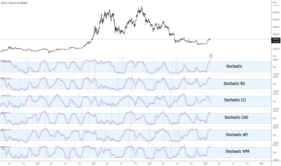
Hello traders from all over the world! Following my last publish on I MACD indicator, today I brought up another powerful customizing tool. This time, it might be good news for those traders with blind faiths on Stochastic and any other related indicators like Stochastic RSI. Stochastic is renowned for its usefulness of identifying market cycle turns that alternate pressure of bulls and bears. Accordingly, along with RSI and MACD, Stochastic is also known as one of the popular technical indicators in recent market regardless of asset and commodity types.
Developed by George Lane in the late 1950s, Stochastic is computed by dividing difference between current and minimum value, by the difference between the maximum and minimum value within a specific range (%K Length, default = 14) as shown in the formula below. Generally, a MA(Moving Average) is used in combination with the Stochastic line whereas the %D smoothing (Default = 3) refers to the length of this MA. Keep in mind that the crosses of these two lines are considered as significantly signals particularly when they appear on the overbought/oversold zone.
Stoch = (Current Price – Min Price) / (Max Price – Min Price)
Stochastic RSI is pretty much the same concept except that it derives its value from the RSI instead of the actual price as shown in the formula below. In other words, StochRSI is basically Stochastic of the RSI. Recently, it seems that many traders prefer StochRSI over classic Stochastic considering the virtue of StochRSI that it reflects proper degree of wave. Furthermore, StochRSI filters out many false signals by smoothing out the noises and outliers, compared to the regular Stochastic.
StochRSI = (Current RSI – Min RSI) / (Max RSI – Min RSI)
Anyhow, it surely has been verified that “Stochastic-fying” the RSI is technically beneficial when comprehending the market trends and spotting the potential trend reversal points. But what if other indicators instead of RSI was combined with the Stochastic? There are countless cutting-edge technical indicators developed by many traders in contemporary markets that are better fitted to the recent markets. This idea inspired me to create this tool that we can test other combinations of different parameters and indicators used within the Stochastic.
I Stoch provides traders the perfect back-testing environment for Stochastic indicator. Why not Stochastic CCI, ATR, CMO, MFI, and ROC? There might be better combinations of setups that are more optimal within the Stochastic. With this, you can design and test various types of indicators to “Stochastic-fy” also with different settings, lengths or sensitivities just fitted for your own trading style. For example, I found 14, 14, 60, 60, EMA(instead of SMA), and RSI parameters useful for myself which is the default setting.
Furthermore, for your convenience I added a few extra side features in setting as listed below. You can turn these on and off accordingly to your preferences and circumstances.
1. Crossovers of Stochastic line and MA: Death-crosses on overbought and golden-crosses on oversold area are signaled with vertical lines.
2. Histogram: Just like the MACD oscillator, this feature visualizes the distance between the Stochastic line and the MA. The greater histogram bar is the wider the distance is between these two lines.
3. Divergence Sensitivity: This feature spots both the regular and hidden divergences of Stochastic line. Higher sensitivity searches for the divergences within the waves of the larger degree and vice versa for the lower sensitivity.
Please let me know if you get to find out some insightful combinations of parameters. Thank you. Your subscriptions, likes, and comments inspire me a lot!
#Istoch #스토캐스틱
안녕하세요 트레이더 여러분. 토미입니다.
지난번 I MACD라는 커스터마이징 지표에 이어 제가 최근에 오랜 공을 들인 I Stochastic 지표에 대해 소개도 드릴 겸 간단한 강의를 준비해봤습니다.
1950년대 George Lane이라는 사람에 의해 개발된 스토캐스틱은 RSI 그리고 MACD와 더불어 요즘 차트 세계에서 가장 대중적으로 이용되는 보조지표입니다. 아래 공식과 같이 본 지표는 주어진 기간 동안의 가격 변동폭과 현재 가격의 상대적 관계를 통해 현 추세의 정도와 잠재적 변곡점을 알려줍니다. 다른 지표들에 비해 노이즈 빈도는 조금 높지만 추세 반전 신호를 꽤 빨리 알려준다는 점과 해석이 직관적이라는 점에서 요즘 많은 트레이더분들의 최애 지표 중 하나로 뽑힙니다.
스토캐스틱 = (현재가 - K길이 중 최저가) / (K길이 중 최고가 – K길이 중 최저가)
한편 스토캐스틱 RSI는 주가가 아닌 RSI에서 도출한 값을 스토캐스틱화 시켜놓은 보조지표이며 아래 공식에서 보실 수 있듯 다른 말로 RSI의 스토캐스틱이라고 보시면 됩니다. 최근에는 일반 스토캐스틱보다 파동의 사이클을 더 잘 반영하고 노이즈 및 Outlier들을 잘 처리해준다는 장점들 때문에 스토캐스틱 RSI를 더 선호하는 트레이더분들이 많아졌습니다.
스토캐스틱 RSI = (현재 RSI – K길이 중 최저 RSI) / (K길이 중 최고 RSI – K길이 중 최저 RSI)
이렇듯 RSI를 스토캐스틱화한 지표는 존재하는데 왜 CCI, MFO, 그리고 CMO 등 다른 지표를 스토캐스틱화한 지표는 없을까요? 왜 스토캐스틱 CCI, 스토캐스틱 MFO, 그리고 스토캐스틱 CMO는 안쓸까요? 요즘 모두 다 비슷한 지표들을 보는 마당에 더 좋은 조합의 스토캐스틱 지표가 존재하지 않을까요? 이러한 발상을 시작으로 이것저것 테스팅도 해볼 겸 해당 지표의 최적화 테스팅 툴을 만들어봤습니다. RSI가 아닌 다른 보조지표들도 클릭 하나로 쉽게 스토캐스틱화 시킬 수 있게끔 디자인해봤습니다.
오늘날 보편적으로 사용되고 있는 스토캐스틱 RSI 기본 설정 값은 3, 3, 14, 14 SMA입니다. RSI 보다 스토캐스틱에 더 잘 맞는 지표 종류뿐만 아니라 더 최적화된 파라미터 값들이 분명 존재할 겁니다. 여러 조합의 테스트를 통해 주가를 더 잘 반영하는 설정 값을 찾아보면 좋을 듯 싶습니다. 제가 찾은 스토캐스틱 RSI 설정 값은 14, 14, 60, 60 EMA로 기존보다 조금 더 큰 추세를 반영해주는 나쁘지 않은 조합인듯 싶어 디폴트 값으로 설정해 두었습니다. 여러분들도 괜찮은 지표 종류 및 설정 값들 찾으면 치사하게 혼자 쓰지 말고 꼭 공유 부탁드립니다!
또한 주요 시그널들을 쉽게 잡아낼 수 있게 아래와 같이 몇가지 자동 기능들을 추가했습니다. 여러분들의 편의와 상황에 따라 사용하셔도 되고 거슬리면 끄셔도 됩니다.
1. 스토캐스틱 두 선들의 크로스: 과매수 구간에서 데드크로스, 과매도 구간에서 골든크로스가 발생하면 세로줄이 떠서 알려줍니다. 이 줄이 뜨면 어느정도 추세의 변환의 시그널로 볼 수 있습니다.
2. 히스토그램: MACD처럼 두 선들의 이격도 혹은 간격을 히스토그램 오실레이터처럼 표시해주는 기능입니다. 혹시 몰라서 넣었습니다.
3. 다이버전스 및 민감도: 스토캐스틱 선의 다이버전스를 표시해줍니다. 민감도를 키울수록 더 큰 단위의 파동 사이클을 기반으로 다이버전스를 잡아냅니다.
트레이딩뷰 차트 상단 지표 창에 I Stoch 검색하시거나 밑에 즐겨찾기 인디케이터 넣기 클릭하시면 사용하실 수 있습니다. 그럼 이만 마치겠습니다. 감사합니다.
여러분의 구독, 좋아요, 그리고 댓글은 저에게 큰 동기부여가 됩니다.
[Tommy's Inflation Index]#Inflation #FEDWATCH #FA
Hello dear beloved Traders and Investors around the world! As you are aware, the world is on a fierce battle against the inflation caused by the massive QE (Quantitative Easing) after the pandemic. All we see on the news is about this very world-wide fiscal phenomenon and how central bank of each nation are controlling it with their monetary policies. Consequently, FED’s hawkish stance to maintain tightening position has suppressed our market. The interest rates have spiked more rapidly than ever absorbing all the cash in the market.
The confrontation between Inflation Vs. Recession currently is the most integral and yet complex issue that needs to be wisely dealt with. Anyhow, whether we want it or not, the markets are being directly impacted by the tension of this inflation war. Hence, traders and investors should keep our eyes on the circumstances and trends of macro-economy to possibly comprehend, forecast, and prepare for the upcoming events. Economic indexes and data are always to be regularly monitored. Especially, inflation related indexes such as CPI (Consumer Price Index), PCE (Personal Consumption Expenditure), PPI (Produce Price Index) and Michigan inflation have stronger interrelation with the market these days.
Tradingview provides many economic indexes and data as you can see in the economy sector of the symbol search. I have found it quite useful to track the macro economy analyzing these data. As globally, people generally refer to the YoY (Year over year) and MoM (Month over month) since the relative percentage change rate is the key factor. There are raw data of CPI, PCE, PPI as well as the core of all these etc. on Tradingview. But unfortunately, there are no YoY and MoM (Only a few) data. Don’t worry. Today is your lucky day because I made them myself for you.
Today I wish to share the “Inflation Index” that I have been working during the Korean’s New Year Holidays. It automatically computes and visualizes the CPI, core CPI, PCE, core PCE, PPI, and core PPI both YoY and MoM. It might show you wrong values or errors if your chart is not on Monthly timeframe. By the way core inflation is goods and services sectors, excluding food and energy. If you check ‘Core or not?’ box, it distinguishes the regular and core indexes. I am going to regularly update this inflation index on pine script, so go ahead. It’s all yours!
Your subscription, likes, and comments inspire me a lot!
#인플레이션 #연준 #FA
안녕하세요 트레이더 여러분 토미입니다!
과도한 양적완화 여파로 생긴 인플레이션 사태를 잡기 위해 미국 연준을 포함한 각국의 중앙은행은 이례적으로 강력한 긴축정책을 펼치고 있습니다. 특히 그 어느때보다 연준의 FOMC 회의 및 기준 금리 변경 사안에 영향을 미칠 만한 여러 경제 지표들에 시장이 민감하게 반응하는 실정입니다. 여기 계신 분이라면 요즘 CPI(소비자물가지수), PCE(개인소비지출물가지수), PPI(생산자물가지수), 그리고 미시간 물가지수 등 미국 인플레이션 관련 지수들이 얼마나 중요한지 알고 계시리라 생각합니다. 코인, 주식, 선물 등 종목을 불문하고 우리가 원하던 원하지 않던 애네들 발표될 때마다 시장이 미친듯이 요동치는 사실은 부정할 수 없습니다.
최근 트레이딩뷰도 많은 경제 지표들을 제공해주고 있습니다. 우리가 자주 보는 CPI, PCE, 그리고 PPI도 있지만 우리가 통상적으로 참고하는 인플레이션 수치는 해당 지표들의 YoY(전년대비)와 MoM(전월대비)입니다. 아쉽게 트레이딩뷰에는 YoY와 MoM 수치가 없어서 대부분 뭐 인베스팅닷컴이나 구글 이런 곳에서 보셨을 겁니다. 그래서 그냥 제가 트레이딩뷰에서도 쉽게 열람할 수 있게 만들어버렸습니다. CPI, PCE, PPI, 근원 CPI, 근원 PCE, 그리고 근원 PPI의 YoY와 MoM 지수를 쉽게 볼 수 있게 디자인했습니다. 설날에 집에 짱박혀서 코딩만 했네요. 차트 상단 지표(Indicator)에 Tommy’s Inflation Index 검색 후 클릭하시면 사용하실 수 있습니다. 참고로 차트가 월봉으로 되어있지 않으면 오류가 발생할 가능성이 높으니 이 점 양해바랍니다. 지표 즐겨찾기에 추가 해놓고 중간중간 필요할 때 켜서 보시면 될 것 같습니다. 이 지표는 제가 주기적으로 업데이트 할 예정이니 앞으로도 많은 관심 부탁드립니다.
여러분의 구독, 좋아요, 댓글은 저에게 큰 동기부여가 된답니다~

I_MACD#I_MACD #Version_1_0_3
Hello Traders from all over the world! Today I would like to share a cool customizing tool our team recently has made. If you have ever used MACD or any other seemingly indicators that visualize the degree of converging/diverging of any two values, you are very lucky today. This one should be one of the most optimal tools for you guys that enables you to customize your own CD indicator perfectly fitted for your trading styles. Moreover, you can even set up optimized parameters for each different trading commodities or products.
There is no doubt that MACD (Moving Average Convergence Divergence) is one of the most popular indicators currently in trading world along with RSI and Stochastic. Google and old textbooks say that MACD is a technical indicator that helps you identify market trends and potential trend reversal point. Well, which existing indicators doesn’t? The problem is, how well the indicator reflects the market trends with least amount of lagging. We want to use an indicator that can provide best-fitted trend data as early as possible.
Anyway, this indicator is made of 3 different components: MACD line, a signal line, and an oscillator, which is usually plotted with histogram. MACD line is basically the level of difference between two EMAs, 12 and 26 (default settings). In other words, MACD Line visualizes the amount of gap between 12 and 26 EMA.
- When bullish, 12 EMA would be above 26 EMA and as the trend becomes more bullish, they will diverge more and MACD line would be positive (above the base line).
- When bearish, 12 EMA would be below 26 EMA and as the trend becomes more bearish, they will diverge more and MACD line would be negative (below the base line).
MACD Line = (Faster, sensitive) EMA – (Slower, dull) EMA = 12 EMA – 26 EMA
Then you add another EMA on the MACD line itself which then becomes a signal line. The default length of the signal line is 9. In other words, Signal line is a 9 EMA of the difference level between 26 and 12 EMA. Now the difference between Signal line and MACD line are called oscillator usually plotted with histograms.
- When MACD line is above the Signal Line, histogram would face upward (Positive Side)
- When MACD line is below the Signal Line, histogram would face downward (Negative Side)
Signal Line = 9 EMA of MACD Line
Two meaningful signals should be monitored to effectively spot the trend reversal point.
1. Pay attention to the crossover made by the two lines. Higher the golden-cross and the lower the death-cross is located, more weights added on the possibility of trend reverse. I personally ignore most of the crossovers signaled near the base line.
2. Search for the histogram peak outs. When two lines start to converge (heading towards each other), histogram will leave a significant peak and approach towards baseline meaning that the oscillator started to lose its strength.
Remember, both the signals (lines’ crossovers and histogram peak outs) are more reliable and meaningful as they are located farther away from the baseline.
As mentioned, the default parameters for MACD are 12, 26, and 9. The first two numbers are the lengths of prices’ moving averages that are used to compute MACD line. 9 is length of signal line. Furthermore, the types of moving averages and signal line used in this setting provided by Tradingview are EMAs (Exponential moving averages). Therefore, the proper way to express the default setting of MACD would be 12, 26, 9, EMA, EMA.
I have a question for you MACD users. How is MACD doing lately? Are you fully satisfied with the performance? Some might say yes, but most wouldn’t. Well, I personally believe that the default parameters are bit outdated. It surely was a powerful weapon 50 years ago when MACD was just created by Gerald Appel and only few knew how to use it. Things are different now. We have witnessed so many cases where everyone starts to all use the same types and parameters of indicators, techniques, and theories which eventually drops accuracy and preciseness. Come on, we are not living in fairy tales, instead in an extremely competitive world called capitalism where only a few survives.
As we are already aware, this market keeps changing over time. Encountering various patterns, price actions, wave structures, and trend flows that are unfamiliar and untraditional, traders easily get frustrated. Market is not like it used to be in the old days where trading was much easier. What worked yesterday doesn’t anymore work today and not even tomorrow. Such evidences we see every day are broadening channel, stoploss hunting, Bart Simpson, whipsaw, and bull/bear trap were once considered as rare phenomenon.
I_MACD might be useful tool for you to back/forward test to find the optimized types and parameters of the CD indicator just fitted for your unique trading styles and preferences. There are infinite number of combinations of types and parameters within this indicator you can try. For example, not only the lengths of the moving averages, but different types of technical indicators to compute the CD lines can also be tested. Try all the possible combinations of parameters and if you find a good one, please share it with us on the comment section below! I will also let you guys know if I do. In fact, the default settings, ohlc4, 60, 140, 30 EMA, EMA, are one of many that I have found useful.
Furthermore, for your convenience when testing, we added a few side features as listed below. You can turn these on and off according to your preferences and circumstances.
1. Crossovers of MACD and Signal line: Death-crosses above the baseline and golden-crosses below the baseline will be spotted with a vertical line.
2. Divergence Sensitivity: This feature finds out both the regular and hidden divergences of MACD line. Higher sensitivity searches for the divergences within the waves of the larger degree and vice versa for the lower sensitivity.
3. Histogram Peak out: Triangle signals will appear when oscillator peak outs are possibility assumed in advance. Similarly, as the first feature positive peak outs are searched only when MACD line is positive and vice versa for the negative peak outs.
We all know there is no ‘Perfect’ method in this industry other than becoming Elon Musk, but there surely are ‘Better’ methods. Contemporary traders should track and reflect trends of the latest market on developing their methods. In order to process that task, testing and experimenting new and different techniques through insightful ways is required. I_MACD might be the ‘Perfect’ tool for you to be a ‘Better’ trader. Thanks for reading.
#아이맥디 #I_MACD #Version_1_0_3
안녕하세요. 트레이더 여러분. 토미입니다.
오늘은 MACD와 같은 CD(Convergence Divergence)류의 보조지표를 써 보신 분들이 정말 좋아하실 만한 지표 툴 하나를 소개 드리겠습니다. 이름하여 I_MACD! 아무나 자유롭게 사용하실 수 있습니다. 여러분의 트레이딩 성향, 종목 특성, 타임 프레임, 현대 시장 상황, 그리고 요즘 여러분이 생각하는 차트 흐름에 딱 맞는 지표를 만들고 사용해보세요.
MACD는 딱 두가지 신호만 주목하시면 됩니다. 첫번째 신호는 MACD선과 Signal선, 이 두 곡선이 서로 크로스 할 때, 즉 오실레이터가 양에서 음으로 혹은 음에서 양으로 변환되는 시점입니다. 두번째 신호는 오실레이터가 고/저점(Peak out)을 찍고 변곡이 시작되는 시점입니다. 이 외에 제가 전 다이버전스 강의에서 언급 드렸듯 두 곡선과 히스토그램의 다이버전스 역시 참고해볼 수 있습니다.
흔히 쓰이는 MACD의 기본(디폴트) 설정 값은 12, 26, 9이며 현재 트레이딩뷰에서 제공하는 MACD의 두 이평선, 즉 MACD선을 도출할 때 사용되는 주가의 12와 26 이평선의 종류는 EMA(Exponential Moving Average)입니다. 또한 저 설정 값에서 9는 Signal선의 길이를 의미하며 본 이평선 종류 역시 EMA입니다.
MACD는 제럴드 아펠이라는 아저씨가 1970년대에 개발한 지표입니다. 하지만 여러분들도 알다시피 현대 금융 시장은 50년 전과 많이 다릅니다. 세상은 점점 더 빠르고 예측불가하게 변하고 있으며 금융 시장도 예외는 아닙니다. 기술적분석 관점으로도 이전에는 흔히 나오지 않았던 패턴, 경향성, 규칙, 그리고 흐름들이 지금은 비일비재하게 나오고 있습니다. 이쪽 시장은 정해진 답안지가 없으며 시시각각 변하는 시장에 맞게 우리가 참고하는 기법과 전략들을 항상 업데이트해줄 필요가 있습니다.
MACD 역시 모든 사람들이 사용하는 12, 26, 9, EMA, EMA 보다 더 나은 설정 값이 분명 존재할 겁니다. 그래서 저희 팀은 여러분들이 CD지표의 파라미터 값과 곡선 산출법을 변경하여 더 요즘 시장에 그리고 여러분 트레이딩 성향에 최적화된 지표로 만들어 사용할 수 있는 툴을 만들어봤습니다. 두 곡선과 Signal 선의 길이는 물론이고 타 이평선들을 포함 RSI, OBV, CCI, MFI 등과 같은 다른 종류의 지표로도 CD선을 구할 수 있게끔 해 놨습니다.
예를 들어 조금 더 장기적인 추세를 반영하는 MACD를 만들고 싶다면 12, 26이 아니라 50, 100의 길이를 사용해볼 수도 있고 이평선의 민감도를 조절하고 싶다면 EMA가 아닌 HMA나 RMA 같은 종류로 설정해볼 수도 있습니다. 또한 이평선이 아니라 아예 다른 지표들을 가지고 MACD화(정확히 말하면 CD화죠) 시켜볼 수도 있습니다. 저도 이것저것 시도 중인데 꽤 흥미로운 셋팅 값들이 보이네요. 참고로 디폴트로 설정해 놓은 시고저종/4, 60, 140, 30, EMA, EMA 조합도 제가 현재 테스트하고 있는 나쁘지 않은 값입니다. 여러분들도 괜찮은 설정 값들을 찾으면 혼자만 쓰지 마시고 댓글에 공유 좀 부탁드립니다~
또한 주요 시그널들을 쉽게 잡아낼 수 있게 아래와 같이 몇 가지 자동 기능들을 추가했습니다. 여러분들의 편의와 상황에 따라 사용하셔도 되고 거슬리면 끄셔도 됩니다.
1. MACD선과 Signal선의 크로스: 기준선 위에선 데드크로스, 아래에선 골든크로스를 표시해줍니다.
2. 다이버전스 민감도: MACD선의 다이버전스 출현 여부를 알려줍니다. 다이버전스 민감도를 내릴수록 더 작은 (단기) 단위 파동들의, 올릴수록 더 큰 (장기) 단위의 파동들의 다이버전스를 잡습니다.
3. 히스토그램 피크 아웃: MACD선이 기준선 위에 있을 때는 양, 아래에 있을 때는 음 히스토그램의 변곡점으로 의심되는 곳을 표기해줍니다.
제가 매번 강조 드리지만 지표는 보조로만 참고하는 도구이며 절대적으로 다 맞는 지표, 이론, 그리고 방법론은 세상에 존재하지 않습니다. 시장 상황에 따라 적절히 활용하고 본인이 사용하는 기술적분석 기법들 조합의 일부로 참고만 하시는 게 좋습니다.

TTT_Crack_RSI_Ver_2.1.0Hello dear traders from all over the world!
It has been a while since our team started concentrating on the technical indicators that apply sources not only on the closed price but also on the high/low prices of the candlestick to overcome the limitations of existing indicators. As mentioned repeatedly before, most of widely adapted indicators in technical chart these days are generated only with the closed prices, not taking in consideration of the wicks or tails of the candlesticks. This crucially leads to a rapid decrease in the reliability especially in current financial market, where ignoring other portions within a candlestick structure and putting weights just on candle body often causes fatal trading outcome. Since phenomenons such as wide price fluctuation and non-ideal price momentum occur more frequently compared to the old days when TA used to perfectly work just as the images in a textbook, sourcing OHLC (Open, High, Low, Closed) prices from a candle structure is becoming more essential and practical.
Such revolutionary perceptions and insights could be easily acquired: by just adding high/low prices of the candlesticks when computing technical indicators, many more meaningful signals were observed. One of the popular indicators we have recently attempted to reflect this very idea was RSI (Relative Strength Index) that was published by the name of “RSI Cloud” months ago. As shown below, this groundbreaking index was to be comprehended as a band or a cloud rather than a single line. In fact, many unexpected methodologies, techniques, and insights were discovered through countless applications as our team went through series of experiments and back/forward tests. The results were quite shocking: Little did we know that drawing trendlines, parallel channels, and previous highs/lows etc. just like we do on the regular candlestick chart would also work decisively. Not only divergences were efficiently captured, but ‘SR Flip’ techniques also functioned as well.
Anyway, validation and verification process has been successful, ensuring that taking all of the candlestick into an account within the indicators provides much more meaningful signals than the indicators with ‘closed source’, the default setting. During thousands of our trials, we questioned to ourselves: If we are going to transform candlestick structure into an equation utilizing all of the prices, why don’t we just express the index with the same format, as another candlestick? The initial intention of the clouds or bands were to adapt the tails of the candle and to smooth them out. And this radical idea changed the whole game. By applying this candlestick format insights, even more significant signals were brought up on to the surface that surprised all of us.
Without a doubt, just like the cloud version, the candlestick version even works better when applying trendlines, pivots, channels, divergences and SR Flips, etc. As we were studying behaviors of the RSI candlestick indicator, a determinant and significant signal was detected that can be usefully referred to traders and this core element is why this update extremely so innovative. We spotted that the emergence of consecutive tails could be a valuable signal that could be weighted. Especially when the tails appeared in sequence in overbought and oversold zone, a strong preference of trend reversal was observed. It was only matter of time to search for the proper parameters and values that fits the market!
And here we are, presenting our newest indicator, “TTT_Crack_RSI_2.1.0” Just like the previous version, it catches regular and hidden divergences automatically and furthermore, we made it to detect appearance of sequential candle wicks in overbought/sold zone (70 and 30 as default) signaling some possibility of trend reversal. The default setting for the consecutive wick counting (Wick Count) is 4, meaning if candle wicks are formed (Top tail in the overbought zone and bottom tail in the oversold zone) four times in a row, a triangle will appear signaling potential trend reversal. As traders’ preferences, the settings can be customized. “Wick Length” setting let users to decide the minimum size of the wick that are to be considered as the proper criteria of candlestick wick. If one wishes to only imply candle wick that are longer than certain length, he or she can increase the “Wick Length” value. We recommend 30~40 for this parameter value. Moreover, if one wants the minimum number of consecutive wicks to that are to be counted to be greater or less, he or she can put in the minimum counting number value at “Wick Count”. For example, if more conservative trader wishes to consider minimum number of consecutive wicks as 6, then the logic will signal only if the wicks appear 6 times in a row in overbought/sold zone. Overbought and oversold zone can also be modified in the settings just like the regular RSI indicator.
How to effectively use this indicator to search for a decent entry point? First of all, do not just enter position only because a single signal has been appeared. The most reliable and strong entry sign would be when the trendline/channel breaks below/above at the overbought/sold zone and at the same time, consecutive wicks and divergence signals appear as well. If all of those signals have been observed, aim for the spot when RSI escape the overbought/sold zone. That would be a proper time to enter a position. As we emphasized many times, it is very reckless to make trading decisions only with technical indicator. It might defer a little bit depending on traders’ tendency, but indicators are to be considered as a side tool to identify macro level trends and signals of possible trend reversal. Always remember, traders that rely on TA must look for the confluent zone and thus the more technical factors that overlap price-wise and time-wise, the more reliability can be given.
If you wish to try our work, please comment below or send message to this account.
Thank you very much.
안녕하세요 트레이더 여러분. 토미 트레이딩 팀의 토미입니다.
최근 저희 개발팀은 캔들차트의 종가만으로 산출되는 기술적 지표들의 한계점을 극복하고자 캔들 고/저가까지 적용을 시켜 ‘요즘 장에 더 맞는’ 지표들을 만들기 위해 많은 노력을 해왔습니다. 저희 시장 분석/시황, 강의자료, 그리고 지표 개발 문서에서 누누이 언급 드렸듯, 근래 많은 트레이더 분들에게 널리 사용되고 있는 대부분의 지표들은 캔들의 종가만 고려하는 경우가 많습니다. 비상식적이고 두 눈으로 보고도 믿기지 않을 가격 모멘텀 및 변동성이 난무하는 요즘 21세기 금융시장에서는 예전처럼 교과서에나 볼 법한 뻔하고 예측 가능한 패턴 및 형국들을 찾아보기 힘들어졌습니다. 이렇게 급변하는 최근 시장 성향 상 기술적 분석에 캔들 꼬리를 배제하고 몸통만 고려하기에는 너무 치명적인 리스크가 뒤따라오기 마련입니다.
이런 궁극적인 목표로 개발에 착수한 저희 팀은 캔들의 OHLC(시, 고, 저, 종가)를 지표에 내포시켜 더 유의미한 신호들을 도출할 수 있다는 이론을 검증하였고 이를 반영해 몇 달 전 "RSI 클라우드"를 트레이딩뷰에 출시한 바 있습니다. 아래의 링크(이미지)에서 시사하는 바와 같이 RSI 역시 주가를 하나의 라인이 아닌 구조로 해석하여 밴드나 클라우드 형태로 표현해보니 실제로 더 높은 실용성과 활용성을 입증할 수 있었습니다. 또한 수많은 실험과 백/포워드 테스팅을 거치면서 사전에 전혀 예상치 못한 방법론 및 기법들을 응용시킬 수 있다는 사실까지 밝혀냈습니다. 일반 캔들 차트처럼 추세선, 평행채널, 피봇, 그리고 전 매물대 등의 작도법을 적용시킬 수 있을뿐더러 캔들의 종가가 아닌 고/저가를 활용해보니 더 효과적인 일반/히든 다이버전스 시그널을 찾아낼 수 있었습니다. 게다가 SR Flip (지지와 저항이 뚫리면 바뀌는 현상) 이론마저 잘 먹히는 현상을 인지한 저희는 개발 방향을 이쪽으로 더 깊고 세밀하게 발전시키는 쪽으로 잡았습니다.
여러 시행착오를 통해 이것저것 될 만한 건 다 시도해보던 와중, 저희는 어느 날 문득 이런 질문을 던지게 됩니다. ‘어차피 이왕 캔들의 OHLC 값을 지표화 시키는 거 차라리 지표마저 동일하게 캔들화시키는 게 낫지 않을까?’ 결과는 매우 충격적이면서도 동시에 저희에게 허탈감을 안겨줬습니다. 곰곰이 생각해보니 클라우드/밴드 형태의 지표는 적용시킨 캔들의 고/저가를 일련의 Smoothing out 프로세싱 작업을 입힌 거고 그럴 바엔 오히려 동일한 캔들 형태로 표현해버리면 더 직관적인 경향성과 규칙성을 파악할 수 있을 거란 저희의 예상은 적중했습니다. 클라우드/밴드 지표 형식의 모든 차별성과 장점은 그대로 유지하고 심지어 더 유의미한 신호들을 포착할 수 있었습니다.
해당 산출물에 추세선, 평행채널, 피봇, 전 매물대, 그리고 SR FLIP과 같은 작도법과 다이버전스 시그널 등을 더 세밀하고 효율적으로 적용시킬 수 있는 건 물론이고, 그 외 저희는 또 한가지 결정적이고 획기적인 시그널을 탐지했습니다. 사실 이 부분이 이번 업데이트의 가장 핵심 요소라고 볼 수 있습니다. 캔들스틱화된 RSI 지표의 경향성 및 규칙성 고찰 과정 중 캔들 꼬리가 연속적으로 출현하는 현상에 심상치 않은 기운을 감지한 저희 팀은 정말 소름이 돋을 정도로 용이한 추세 전환 시그널을 발견했습니다. 바로 과매도 구간에서는 아래꼬리, 과매수 구간에서는 위꼬리가 연달아 나올 경우 상당히 높은 확률로 변곡점이 출현하고 추세가 전환되는 경향성에 가중치를 부여해 이에 최적화된 파라미터 및 설정 값들을 찾아 로직화 시켜봤습니다. 결과는 아주 만족스러웠습니다.
이름하여 저희의 최신 지표인 "TTT_Crack_RSI_2.1.0"를 여러분께 소개 드립니다. 이전 버전인 “RSI Cloud”와 마찬가지로, 종가가 아닌 고/저가의 일반/히든 다이버전스 시그널을 알아서 포착해주고, 더 나아가 과매매 구간(기본 값은 30/70이며 설정 변경 가능)에서 RSI 캔들 꼬리의 연속성을 자동으로 감지해 표시(삼각형)를 해주게 끔 만들었습니다. 과매매 구간에서 연이어 출현하는 캔들 꼬리 카운팅의 최소 값은 4으로 디폴트 값 설정을 해 놨습니다. 더 보수적/공격적으로 접근하고 싶으신 분들은, 즉 최소 카운팅 값을 4이 아닌 다른 값으로 변경하고 싶으신 분들은 설정에 들어가셔서 “Wick Count” 항목에 원하는 값을 기재하시면 됩니다.
캔들 꼬리라는 게 어떻게 보면 상대적이고 주관적인 개념일 수 있습니다. 캔들꼬리가 조금만 나와도 의미 부여를 할 수 있는가 하면 특정 이상 길이 아니면 의미 부여를 하지 않을 수 있습니다. 저희는 유저들에게 최대한 높은 유동성을 제공하고자 본 메커니즘이 정의하는 캔들 꼬리 길이를 변경할 수 있도록 만들어 놨습니다. ‘Wick Length” 설정 값을 통해 해당 로직이 간주하는 최소 캔들꼬리 길이를 정할 수 있습니다. 기본 설정 값은 30으로 되어 있고, 경험상 30~40 정도가 적당하다고 보고 있습니다.
마지막으로 해당 지표로 효과적인 진입 타점을 찾는 법을 간략히 알려드리겠습니다. 우선 절대로 아무 시그널 하나 툭 떴다고 무조건 바로 진입하는 건 절대 삼가해주세요. 가급적이면 과매매 구간에서 추세선/채널 이탈, 연속 캔들 꼬리 신호, 그리고 다이버전스가 동시에 떴을 상황을 예의주시하시면 됩니다. 이렇게 비교적 비슷한 시간에 유의미한 신호들이 포착되었다면 또 바로 진입하지 마시고 조금 더 기다리셨다가 과매매 구간을 벗어나는 타이밍을 노리시면 됩니다. 항상 강조드리지만 기술적 지표 하나만 가지고 트레이딩 의사결정을 하는 건 정말 무모한 행위입니다. 개인의 매매성향 마다 다르겠지만 기술적 지표는 항상 큰 추세와 변곡 출현 가능성을 파악하는데 참고하는 용도로 사용 하셔야지 그렇지 않으면 캔들차트는 아예 꺼버리고 지표만 보고 매매하는 꼴이 됩니다.
해당 지표를 사용하고 싶으신 분들은 아래에 댓글 혹은 본 계정으로 메시지(DM) 보내주시면 감사하겠습니다.
감사합니다. 여러분들의 구독, 좋아요, 댓글은 저희에게 정말 큰 힘이 됩니다^^
Crack_Heiken_Open_Ver_1.0.0
Hello dear traders from all over the world!
Our team recently have explored deeply in Heikin-Ashi Candlestick techniques and some of the benefits utilizing it. After multiple test phases figuring out the pros and cons, we derived some of the insightful strategies and developed it into an technical indicator that visualizes some of the major pivot levels deducted from Heikin-Ashi.
Unlike the common and conventional candlestick chart used widely by many traders these days, Heikin-Ashi candle chart applies different equations for computing the candle body (gap between open and close price). In fact, the close price is determined considering the open, high, low, and close prices of the original candlestick. This very method smooths out the price momentum by averaging out significant prices forming a candlestick. Many suggest one of the advantages of using Heikin-Ashi for traders as an efficient tool to filter out market noises during a liquidation.
These are the default formulas for Heikin-Ashi candlestick formation, where CO, CH, CL, and CC denote open, high, low and close price of the conventional candlestick, respectively. Similarly, HO, HH, HL, and HC denotes open, high, low and close price of the Heikin-Ashi candlestick.
HO = (Previous_HC + Previous_HO) / 2
HC = (CO + CH + CL + CC) / 4
HH = CH
HL = CL
Similar to the common technical chart, the Heikin-Ashi candlesticks are also to be observed and precepted as a complex structure, rather than a simple dimensional price movement. While this very methodology enables traders to objectively identify the strength of the market trends and trend reversal signals, it is yet quite weak during consolidation or accumulation phases. In other words, it is not so reliable when the market shows sideway moves usually before a big trend appears. Furthermore, the market noises in these days (especially in the post-COVID era) are not exactly like those in years ago. Unlike the old days, the liquidation cycle often happens so fast with wider range which led to certain unconventional phenomenon such as long candle wicks, whipsaws, stoploss hunting, and V-shaped patterns, etc. Therefore, we strongly recommend retail traders to not entirely depend only on the Heikin-Ashi when trading, but rather to consider it as one of the technical indicators that function as a side-aid to comprehend the trends.
This directly leads to introduction of the core logic of our new indicator that are assembled extracting useful strategies. This state-of-the-art mechanism shows multiple integral signals from the Heikin-Ashi. The color and the open price of the Heikin-Ashi candlesticks appear as dots on the regular chart. For those who are familiar using Heikin-Ashi will definitely find this useful
One of the important factors in Heikin-Ashi technique is to observe if the colors of the candle appear consecutively. Appearance of an opposite candle that breaks the continuity can be interpreted that the current trend is being weakened. Our indicator shows whether the Heikin-Ashi candles are formed as bullish or bearish and thus the traders can refer the trend signals given by the Heikin-Ashi candles. Series of consecutive colors means the trend is still progressing, until an opposite color appears. The default color for emergence of an opposite candle is orange. Hence, if an orange dot appears after series of the same color of dots, it can be signaled as a trend reversal.
Another efficient strategy is to search for the ‘Shaved Head(Bearish candle with no wick on top)’ and ‘Shaved Bottom(Bullish candle with no wick on bottom)’ patterns. Series of the shaved bottom candles indicates that the trend is bearish while that of shaved head indicates vice versa. In order for the candles to become shaved, the open price should not be broken (below for bullish candles and above for the bearish candles) during the formation of that very candle. This implies that the open price of the Heikin-Ashi candle (the middle of the previous candle body) acts as an important support or resistance.
Some of the decent strategies are summarized as below.
1. When the same color appears consecutively in a series, it means that the trend has started and the distances between the following dots represent the strength of the trend.
2. Similar to Parabolic SAR, the dots work as support and resistance. If the price breaks the dot, in other word if the dot fails to support or reject, be alerted as a weak signal for a trend reversal. (This implies that the Heikin-Ashi candle has failed to construct a shaved head or bottom)
3. If the orange dot appears after a clear and distinctive trend, interpret it as a medium signal for trend reversal. (This implies that the Heikin-Ashi candle has changed the color during on-going trend)
Weight more if one of these signals appear during a longer maintained trend. As mentioned, reliability highly drops when the market is in contraction and consolidation zone, when price is relatively moving sideways without a clear trend.
If you are interested in trying this indicator out, please comment or send direct message to this account.
안녕하세요. 트레이더 여러분 =)
예전과는 성향이 많이 변한 현대 금융 시장에서 하이킨 아시 차트의 적합성, 실용성, 그리고 응용성을 연구 및 고찰하던 저희 팀이 아주 유용한 지표를 개발했습니다. 하이킨 아시 캔들 차트를 보는 방법은 제가 어제 교육 자료로 정리해서 업로딩 해드렸으니 그 부분은 생략하겠습니다.
링크:
간략하게 정리를 해드리자면 하이킨 아시 차트는 진행중인 추세의 강도를 파악하거나 변곡점을 더 명확하게 보여주지만 횡보장에서는 신뢰성이 떨어진다는 치명적인 단점이 있습니다. 따라서 해당 차트를 일반 차트에서 효율적으로 참고할 수 있도록 저희가 하이킨 아시 기법을 활용해 도출한 주요 피봇 레벨들을 차트에 시각화해주는 지표를 개발했습니다.
지표를 매매전략에 활용할 수 있는 전략들은 다음과 같이 간추려볼 수 있겠습니다.
1. 동일한 색의 지표(점)들이 연속으로 형성이 된다면 (양봉 -> 양봉, 음봉 -> 음봉), 어느정도 추세가 시작되었다는 의미로 해석할 수 있고 각 점들 사이의 거리가 추세의 강도를 나타냅니다.
2. Parabolic SAR 지표와 유사하게 해당 지표는 지지와 저항의 역할을 합니다. 가격이 점을 돌파 및 이탈하면, 즉 지표가 가격을 지지/저항을 실패해 뚫리면 추세 변곡의 출현 여부를 처음으로 의심해볼 수 있는 시그널입니다. (점이 뚫렸다는 건 하이킨 아시 차트에서 캔들이 Shaved Candle을 형성하지 못했음을 뜻합니다.)
3. 명확한 추세가 어느정도 진행된 이후 주황색 점이 뜨면 추세 반전에 신호로 볼 수 있습니다. (하이킨 아시 캔들 색깔이 바뀐 상황입니다.)
더 오랜 기간 동안 유지되어온 추세일수록 중간에 위 시그널이 나타날 때 더 큰 의미를 부여할 수 있습니다. 앞서 언급했듯이 횡보장일 때, 명확한 추세가 나오지 않거나 횡보 변동폭이 크면 클수록 신뢰성이 크게 떨어질 수 있다는 점 항상 명심하세요.
해당 지표를 사용해보고 싶으신 분들은 댓글 혹은 메시지 보내주시면 되겠습니다~
다들 감사합니다. 성투하세요 =)

TTT_Swing_and_Orderblock_Ver_1.0.2Hello, dear traders from all over the world! This is Tommy from Tommy Trading Team.
Many inquires were delivered to us from traders recently wishing to use one of our cutting-edge technologies that was developed days ago and was only used by us. We have edited and supplemented this indicator both logically and visually. Accordingly, our team is officially launching with a new brought up name, which is “SOB(Version1.0.2), shorten for “Swing & OB(Orderblock).”
This technical indicator is quite straightforward and effective to utilize since it shows traders the essential variables that are considered by many recently developed theories and state-of-the-art methodologies. And they are ‘Dow’ and ‘Orderblock’.
Swing High and Low (Dow Theory) has been applied fundamentally by many other theories and methodologies such as Elliott wave theory and SR Flip techniques. A swing can be interpreted as a wave with a trend composed of a high and a low each. After succeeding on making significant highs/lows, in any existing wave theories, it is essential to monitor and spot when the next waves make HH(Higher high), LH(Lower high), HL(Higher low), or LL(Lower low).
OB(Orderblock) technique is a very advanced methodology that captures the contraction, consolidation, and attraction zone. This so called ‘zone’ is interpreted differently by various stakeholders, such as institutional(whales) average entry/exit price range or peak price range with higher traded volumes. In TA perspective, it’s just a major support/resistance to consider and when this zone fails to support/resist, the price momentum tends to boost up towards the direction it failed. To give you a little tip, look for the spots usually forming horizontal parallel channel, before a big wave with a clear trend (whether up or down) appears. There are numerous ways to identify OB and we have concluded that signaling the double engulfing candles is one of the highly effective one.
As just mentioned, comprehending a trend utilizing ‘Swing HL’ is fundamental and yet definite TA concept and strategy. Furthermore, OB can also be useful to spot major support and resistance area. SOB automatically identify and captures major Highs, Lows, and OBs. In addition, SOB can let traders know when the highs and lows are being replaced by higher/lower highs/lows by changing pivots color. If you are familiar with SR(Support and Resistance) Flip concept, this can be a helpful tool for you since it can signal when highs/lows are being broken above/below and by planning a retest entry trading setup.
If you would like to try SOB_ver1.0.2, please let us know through comments, DM, or Telegram in English/Korean. I assure you that our SOB won’t disappoint you on your trading chart.
Thank you.
안녕하세요. 트레이더 여러분!
토미 트레이딩 팀입니다~
최근에 저희 팀이 개인적으로 사용했던 지표에 관해서 많은 분들이 문의를 주셨습니다. 약간의 보안 및 개선 작업 이후에 SOB(Version1.0.2)이라는 이름으로 정식 출시합니다.
해당 알고리즘은 기존의 여러 이론 및 방법론들에게 원천적으로 기반이 되는 다우이론(스윙 고/저점)과 오더블럭(OB)을 바로바로 잡아주기 때문에 주요 고/저점과 매물대 지지/저항 컨펌하는 용도로 활용하기 매우 유용합니다.
변동하는 가격의 흐름, 즉 추세를 파악하는 방법은 수만가지가 있습니다. 단 하나의 방법, 지표, 혹은 이론만 가지고 추세를 파악하는 건 당연히 바보 같은 짓이겠죠. 여러가지의 요소들을 복합적으로 봐야하는데 그 중에 가장 근본적이면서 중요한 게 바로 다우이론이라고 생각합니다. 이름만 거창하지 정말 별거 없습니다. 한문장으로 “전 고/저점에 비해서 이번에 나오는 고/저점이 높아졌냐 낮아졌냐”입니다. 다우 이론은 엘리엇 파동 이론 및 SR Flip 전략 등 대부분들의 기법들에 적용된 만큼 차트 보시려면 꼭 알아야 되는 개념입니다. 스윙이란 변곡이 나오기 전까지의 가격 흐름, 즉 하나의 파동이라고 생각하시면 되겠습니다. 주요 고/저점은 통상적으로 하나의 파동을 규명하기 위해 참고하는 기준들입니다. 고/저점 혹은 변곡점이 출현하고 나서 후행적으로 우리는 전 상승/하락 파동이었다고 인지를 합니다. 여기서 중요한 건 다음 파동이 전 파동보다 고/저점을 높였냐/낮추었냐입니다. 고/저점을 높여가는 파동이 나오면 상승, 낮추어가는 파동이 나오면 하락 추세에 가중을 더 두고, 고/저점을 높이다가 내리기 시작하면 혹은 내리다가 높이기 시작하면 추세가 어느정도 전환될 수 있는 시그널로 해석할 수 있습니다.
OB(오더블럭) 기법은 요즘 장에 그나마 잘 먹히는 가격매물대를 찾는 방법론 중 하나입니다. 매물대란 다양한 시장참여자들에 따라 시시각각 해석될 수 있습니다. 기관(세력)들의 매집구간, 많은 참여자들의 평균 진입/청산/평단 가격 범위, 혹은 시체 쌓인 구간으로도 해석해볼 수 있습니다. 더 쉽게 설명해드리자면 거래량이 상대적으로 많은 가격 범위대라고 보시면 되겠습니다. 기술적분석 관점에서는 매물대를 주요 지지/저항구간대라고 고려하실 수 있으며 지지/저항을 실패하면, 그 실패한 방향으로 추세가 터질 가능성을 두고 전략 설계에 활용합니다. 매물대를 효과적으로 찾을 수 있는 팁 하나를 드리자면, 어느정도 명확하고 큰 추세가 나오기 전에 형성된 수평 평행 채널들을 먼저 의심해보세요. 만약에 해당 가격범위 내에 OB가 많이 내포되어 있다면 신빙성을 더 부여하실 수 있습니다. 이렇게 OB는 매물대를 식별하고 컨펌하는 용도로 매우 용이하게 활용될 수 있으며, 요즘에 유행하는 기법인 마스터패턴에도 찰떡궁합입니다. OB를 정의하는 여러가지 기법들 중 캔들봉을 활용한 방법이 그나마 가장 효과적이며 저희 개발팀은 장악형(Engulfing) 패턴이 두번 이상 출현하는 캔들봉들의 몸통들을 기준으로 OB를 찾는 로직을 지표화했습니다.
언급 드렸듯, 다우이론은 기술적 분석 기법 중 가장 근본적이면서도 동시에 실용도가 높아 차트 보시려면 무조건 숙지해야하는 개념 및 전략입니다. 또한 상대적으로 최근 시장에 효율적인 매물대 색출 전략 중 하나인 OB기법으로 주요 지지/저항으로 해석될 수 있는 메이저 매물대들의 가격 범위를 더 세분화시킬 수 있습니다. 저희 SOB 지표는 주요 고점, 저점, 그리고 OB들을 자동으로 피봇으로 잡아줄뿐더러 주요 고/저점이 뚫렸을 때, 해당 피봇의 색깔들이 변경됩니다. SR Flip (저항선이 뚫리면 지지선, 지지선이 뚫리면 저항선)개념 및 전략을 자주 활용하시는 트레이더분들은 고/저점 뚫릴 때, 즉 더 높은/낮은 고/저점이 출현하고 나서 전 고/저점을 활용해 리테스트 진입 자리 찾으실 때 유용하게 사용하실 수 있습니다.
저희 SOB_Version1.0.2 지표를 사용하고 싶으신 분들은 댓글, DM, 또는 저희 개인 채널에 문의 주십시오. 차트와 캔들 위에서만큼은 우리 SOB이 여러분들을 실망시키지 않을 것입니다.
감사합니다. 성투하세요.

Crack_RSI_Cloud_Ver_1.0.0
(주식/Stocks) 삼성전자 Samsung Electronics
(선물/Futures) 나스닥 NASDAQ
(코인/Cryptocurrency) 비트코인 BTCKRW
Hello my dear traders.
My team has recently developed a technical indicator that surprises ourselves every time we observe a price action caused by this very indicator.
Relative Strength Index has been developed by a scholar named Welles Wilder. Just like me, he turned himself into a technical analyst from a mechanical engineer after realizing how powerful and beautiful technical analysis is. As most of you know, RSI is a technical indicator that measures and visualizes the strength of bulls or bears objectively, in a percentage unit. This index, which oscillates between 0~100, is useful when identifying the general trend of the market
Here is the equation that computes RSI.
RSI(%) = (Average of Upward Price Change within N /( Average of Upward Price Change within N + Average of Downward Price Change within N))*100
* N = Time period/length or the number of candlesticks that are being considered
RSI is one of the most popular indicators used by daily traders these days. However, since default setting of the RSI only considers the closed price of candles, many limitations and weak points have been spotted recently. Since current financial market (such as crypto, stocks, futures, and forex) is heavily volatile and unstable, candle’s tails are not being considered properly on RSI (and also any other indicators that are computed using closed price).
To handle this problem, our team has worked very hard to achieve applying candle’s tails on our indicators.
After numerous tries and updates, we have finally come up with a very decent one that plots RSI that reflects both the candle's wick and body. This indicator can be interpreted as a cloud of RSI just like Ichimoku.
Traders can consider this indicator as overbought/oversold only if all of the RSI lines, (or the whold cloud) enters to the zones. Moreover, plotting channels and trendline on this cloud works very well.
We have also made it to show divergence signals so that traders can refer when the relative strength of bulls/bears starts to resolve.
If you wish to obtain access to this indicator, please comment or DM to this account.
We will give you guys an update soon for a newer version!
Thanks.
안녕하세요 트레이더 여러분. 토미 트레이딩 팀입니다.
오늘은 요즘 많은 트레이더들이 유용하게 사용하는 RSI와 해당 지표의 한계점에 대해서 알려드리겠습니다. 또한 본 한계점을 극복하기 위해 저희 개발팀이 최근에 개발한 RSI 클라우드 지표에 대해서 소개해드리겠습니다.
RSI , Relative Strength Index (상대강도지수)는 1978년에 웰레스 월더라는, 저처럼 원래 공학자였지만 기술적분석이라는 학문에 푹 빠져 이쪽 분야로 발을 돌린 한 학자에 의해 개발됐습니다. 해당 지수는 주가의 상승/하락 압력 간의 상대적인 강도를 보여주는 보조지표로 추세의 강도세를 백분율로 표기해줍니다.
RSI를 산출하는 공식은 다음과 같습니다.
RSI (%) = (N의 상승폭 합계/(N의 상승폭 합계 + N의 하락폭 합계))*100
* N = Time period/length, 시간(캔들봉) 단위
본 공식에서 N은 RSI의 민감도를 조절하는 Parameter(설정값)로 보편적으로 Default(기본)값인 14, 조금 덜 민감한 값으로는 25가 사용됩니다. RSI의 단위는 %로 과매수 구간은 70~80%, 과매도 구간은 20~30%으로 사용됩니다. 즉 RSI가 70~80% 이상일 때 강세 혹은 과매수, 20~30%일 때 약세 혹은 과매도라고 판단할 수 있습니다.
정말로 직관적이면서도 참으로 쉽고 유용한 지표이죠.
하지만 아쉽게도 이 RSI도 크나 큰 한계점이 존재합니다. 해당 지수가 산정될 때 사용하는 소스값은 Closed, 즉 캔들의 종가로, 고가와 저가가 지수에 반영되지 않습니다. 즉 캔들의 꼬리는 해당 지수에 고려되지 않는다는 점입니다. 요즘에 누가 캔들 종가만 보고, 혹은 라인차트로만 매매하나요? 허구한날 미친 스캠무빙이 툭하면 나오는 현대 장에 종가만 가지고 매매하면 골로간다는건 다들 아실 거라 생각합니다. 요즘처럼 고변동성의, 툭하면 길고 뾰족한 꼬리들이 난무하는 현대 금융 시장에 적용시키기엔 문제가 너무 많습니다.
게다가 요즘에 너무나도 많은 개인투자자들이 RSI 지표를 사용합니다. 모두가 같은 자리, 같은 기법, 혹은 같은 지표를 쓰면 어떻게 된다고 했죠? 제가 매번 강조 드렸듯이 3~5% 개미 생종률은 불변의 법칙입니다. 모두가 롱을 외치면 숏자리를, 모두가 숏을 외치면 롱자리를 찾아야하는 금융시장. 높은 통찰력과 안목을 지닌 소수의 현명한 투자자들만 살아남는다고 제가 누누이 강조 드렸습니다.
이 문제를 해결하고자 최근 저희 팀은 캔들의 모든 가격들을 RSI지표에 반영시키기 위해, 그리고 종가를 기준이 아닌 다른 기준으로 다이버전스를 모색하는 매우 다양한 시도들을 해왔습니다.
수많은 연구, 실험 및 고찰 끝에 마침내 캔들의 모든 가격을 반영하는 RSI 지표를 만들고 말았습니다. 이름하여 RSI 클라우드! RSI를 하나의 라인이 아닌 범위로 표기를 함으로써 조금 더 보수적이고 정확하게 강도지수를 파악할 수 있게 되었습니다. 본 지표는 일목구름과 마찬가지로 RSI를 하나의 선이 아닌 구름대로 해석하시면 됩니다.
다수의 라인(라인들의 범주를 구름으로 표기함)으로 구성된 이 지표는 고려하는 모든 선들이 과매수/과매도 구역에 진입해야 과열로 간주함으로써 더 보수적으로 확실한 과열 상황들을 포착할 수 있습니다. 그리고 해당 지표에 평행 채널 및 추세선들이 기가 막히게 잘 들어맞습니다. 주가에 추세선/채널 작도하는 것처럼 활용하시면 됩니다. 이탈 방향 나올 때, 그리고 심지어 이탈 이후 리테스트도 나옵니다.
또한 다이버전스 역시 종가가 아닌 캔들의 평균값을 사용하여 시그널이 나오게끔 했습니다. 때문에 중간중간에 긴 꼬리들 혹은 말도 안되는 무빙이나 노이즈들로 발생되는 주가 <-> 지표 다이버전스의 괴리감을 최소화시켰습니다. 이 또한 자동으로 다이버전스를 잡도록 로직을 짰으니 상승/하락세의 과열이 점차 해소되기 시작할 때, 즉 변곡 잡으실 때 매우 유용하게 사용하실 수 있습니다.
물론 당연한 말이지만 이 지표 하나만 가지고 매매를 하면 안되겠죠? 본인만의 여러 기법 및 지표들의 튼튼한 조합을 구성할 때 하나의 기준으로써 참고를 해야합니다.
아래는 비트코인이 아닌 선물과 주식 차트입니다. 해당 차트들은 예전 차트도 아닌 최근 차트입니다. 이와 같이 종목/상품과 타임프레임을 불문하고 다 잘 맞습니다.
그러면 이상, 급변하는 21세기 현대 금융시장에 최적화된 기법, 지표 및 전략들을 꾸준히 연구하고 개발하는 토미 트레이딩 팀이었습니다.
감사합니다.

Crack_RACD_Divergence_Ver_1.0.1Hello my dear traders. This is Tommy.
This time our team spent so much time and effort developing a technical indicator that catches the trend reversal signal relatively earlier than any other existing indicators.
Two RSIs (which quantify the relative strength of the price momentum using closed price of a candle) with certain parameters that we have found were exponentially smoothed using our very own equations.
We have programmed it to be signaled when golden and death crosses appear above and below certain area that we have concluded it as an overbought and oversold zone.
Similar to MACD (Moving Average Convergence Divergence) trading strategy, the histogram represents the distance between two RSIs.
When the histograms are trending towards the centerline, this means that the RSIs are converging and vice versa when histograms are going away from the centerline.
Moreover, when this logic confirms swing highs/lows using highs and lows of the candles (instead of closed), it automatically shows both the bullish and bearish divergences.
Thank you.
안녕하세요 트레이더 여러분. 토미입니다.
최근에 저희가 연구 및 개발한 지표는 단기와 중기 추세를 반영하는 두개의 선(RSI를 특정 로직으로 exponentially smoothed한)의 크로스오버가 저희가 정한 과매수/과매도 구간에서 발생할 시 변곡으로 해석해서 시그널을 주는 괴물 같은 녀석입니다.
히스토그램은 MACD 지표 비슷하게 두 선의 이격도를 나타냅니다. 센터라인으로 방향으로 히스토그램이 줄어들면 두 선의 차이가 줄어들고 있는 뜻이고, 히스토그램이 음/양의 방향으로 더 높아지면 두 선의 차이가 늘어나고 있는 뜻입니다.
게다가 자동으로 다이버전스도 잡아줍니다.
지표 사용을 원하시는 분들은 저희 채널에 문의 주시면 됩니다~
감사합니다.
