Oheiya MFI + MWThis is a combination of Money Flow Index and Momentum wave with refined values and logic.
Analisi onde

CAT FLD SmoothWhat is an FLD?
The FLD stands for Future Line of Demarcation, introduced by J.M. Hurst in his Cyclic Analysis work.
It is constructed by shifting the price forward in time by half the length of a given cycle. For example, if you want to analyze a 40-bar cycle, you would plot price shifted forward by 20 bars. This creates a projected line that acts as a dynamic reference for where the cycle rhythm should align.
In practice, each cycle has its own FLD (20, 40, 80 bars, etc.), and when price interacts with those FLDs, it often reveals the underlying rhythm of market waves.
How Traders Use the FLD
1. Cycle Detection
When price crosses its FLD, it is often the signal that a cycle trough or peak has recently formed. This allows the trader to recognize where one wave ends and the next begins.
Upward cross → suggests a new upward cycle has started.
Downward cross → suggests a downward cycle is unfolding.
2. Projection of Price Targets
One of Hurst’s key insights is that after crossing an FLD, price often travels a distance roughly equal to the recent cycle’s amplitude. This makes the FLD a tool not only for timing but also for projecting targets.
Example:
If price rises through the 40-bar FLD after a cycle trough, the expected move is often the same height as the move off the last trough to the point of a break through the FLD.
3. Support and Resistance
FLDs can act like invisible levels of support and resistance, but unlike static horizontal levels, they are dynamic and cycle-based. Price often hesitates, bounces, or accelerates when touching its FLD.
4. Multi-Cycle Confluence
Markets rarely move in just one cycle length. By plotting multiple FLDs (for example, 20-bar, 40-bar, and 80-bar), traders can see where several FLDs line up. These confluences are particularly powerful—they highlight high-probability turning points.
Why FLDs Matter?
They help separate noise from structure by focusing on repeating time rhythms.
They provide early signals of where cycles invert.
They give price targets that are not arbitrary, but cycle-derived.
They can be combined with other tools (trendlines, oscillators, volume) for confirmation.
👉 With this indicator, you can visualize Hurst’s FLDs directly on your TradingView charts, making it easier to detect cycles, project targets, and anticipate turning points before they become obvious to everyone else.
CastAway Trader LLC, the publisher of this indicator is not registered as an investment adviser nor a broker/dealer with either the U. S. Securities & Exchange Commission or any state securities regulatory authority.
CastAway Trader LLC reserves the right to un-publish this indicator or change it without any written notice.
Past results are not indicative of future profits.
Better Pivot Points [LuminoAlgo]Overview
The Better Pivot Points indicator is an advanced trend analysis tool that combines Supertrend methodology with automated pivot point identification and zigzag visualization. This indicator helps traders identify significant price turning points and visualize market structure through dynamic pivot labeling and connecting lines.
How It Works
This indicator utilizes a Supertrend-based algorithm to detect meaningful pivot points in price action. Unlike traditional pivot point indicators that rely on fixed time periods, this tool dynamically identifies pivots based on trend changes, providing more relevant and timely signals.
The algorithm tracks trend changes using ATR-based Supertrend crossovers to determine when significant highs and lows have formed. When a trend reversal is detected, the indicator marks the pivot point and draws connecting lines to visualize price flow and market structure progression.
Key Features
• Dynamic Pivot Detection: Automatically identifies high and low pivot points using Supertrend crossovers
• Market Structure Labeling: Labels pivots as HH (Higher High), LH (Lower High), HL (Higher Low), or LL (Lower Low)
• Zigzag Visualization: Connects pivot points with customizable lines to clearly show price flow and market structure
• Color-Coded Analysis: Uses distinct colors to indicate bullish trends (green), bearish trends (red), and neutral conditions (yellow)
• Customizable Parameters: Adjustable ATR period, factor, line width, and line style
Input Settings
• ATR Length: Controls the sensitivity of the Supertrend calculation (default: 21)
• Factor: Multiplier for the ATR-based Supertrend bands (default: 2.0)
• Zigzag Line Width: Customize the thickness of connecting lines (1-4)
• Zigzag Line Style: Choose between Solid, Dashed, or Dotted line styles
What Makes This Original
This indicator combines several analytical concepts into a cohesive tool that differentiates it from standard pivot point indicators:
1. Uses Supertrend crossovers as the trigger for pivot detection rather than traditional high/low lookback periods
2. Automatically categorizes market structure using HH/LH/HL/LL labeling system based on pivot relationships
3. Provides real-time zigzag visualization with intelligent color coding that reflects trend direction
4. Integrates trend direction analysis with structural pivot identification in a single comprehensive tool
The underlying calculations use custom logic for tracking trend states, validating pivot points, and determining appropriate color coding based on market structure analysis.
How to Use
1. Trend Identification: Green lines indicate bullish market structure, red lines show bearish structure, yellow indicates transitional periods
2. Support/Resistance: Pivot points often act as future support and resistance levels for price action
3. Market Structure Analysis: HH and HL patterns suggest uptrends, while LH and LL patterns indicate downtrends
4. Entry/Exit Planning: Use pivot points and trend changes to plan potential trade entries and exits
Important Limitations and Warnings
• This indicator is a technical analysis tool and should not be used as the sole basis for trading decisions
• Pivot points are identified after price moves occur, meaning this indicator has inherent lag and cannot predict future pivots
• False signals can occur during ranging or choppy market conditions where trends are unclear
• Past performance of any indicator does not guarantee future results or trading success
• The indicator works best in clearly trending markets and may produce less reliable signals in sideways price action
• This tool requires interpretation and should be combined with other forms of analysis
• Always use proper risk management and position sizing strategies when trading
Why This Script Is Protected
This indicator uses proprietary algorithms for pivot detection timing, trend state management, and market structure analysis that represent original research and development. The specific logic for pivot validation, color-coding methodology, and structural relationship calculations contains unique approaches that differentiate it from standard pivot point indicators available in the public library.
Disclaimer
This indicator is for educational and analysis purposes only and does not constitute investment advice. Trading involves substantial risk and is not suitable for all investors. Past results are not indicative of future performance. The future is fundamentally unknowable and past results in no way guarantee future performance. Always conduct your own research and consider your risk tolerance before making any trading decisions.

EMA Range OscillatorEMA Range Oscillator (ERO) - User Guide
Overview
The EMA Range Oscillator (ERO) is a technical indicator that measures the distance between two Exponential Moving Averages (EMAs) and the distance between price and EMA. It normalizes these distances into a 0-100 range, helping traders identify trend strength, market momentum, and potential reversal points.
Components
Main Line
Green Line: EMA20 > EMA50 (Uptrend)
Red Line: EMA20 < EMA50 (Downtrend)
Histogram
White Histogram: Price distance from EMA20
Key Levels
Upper Level (80): High divergence zone
Middle Level (50): Neutral zone
Lower Level (20): Low divergence zone
Parameters
ParameterDefaultDescriptionFast EMA20Short-term EMA periodSlow EMA50Long-term EMA periodNormalization Period100Lookback period for scalingUpper80Upper threshold levelLower20Lower threshold level
How to Read the Indicator
High Values (Above 80)
Strong trend in progress
EMAs are widely separated
High momentum
Potential overbought/oversold conditions
Watch for possible trend exhaustion
Low Values (Below 20)
Consolidation phase
EMAs are close together
Low volatility
Potential breakout setup
Range-bound market conditions
Middle Zone (20-80)
Normal market conditions
Moderate trend strength
Balanced momentum
Look for directional clues from color changes

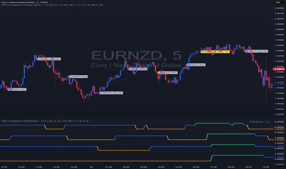
EW Convergence HUD (Pane) — v2.2.5📖 Description
The EW Convergence Suite is a dual-component Elliott-Wave inspired tool designed to help traders spot multi-timeframe convergence points — the places where waves across different timeframes terminate together and trend changes often ignite.
It contains two parts:
🔹 HUD (Pane)
Lives in the lower pane, one horizontal row per timeframe (1m → 1M).
Colors represent phase classification:
Lime = Impulse Up (+2)
Red = Impulse Down (−2)
Teal = Corrective Up (+1)
Orange = Corrective Down (−1)
Gray = Neutral/Unclear
Rows shift slightly up/down depending on impulse vs. corrective, so you can see transitions as diagonal “jumps.”
HUD ticker (top-right) shows current convergence state:
Example: IMP▲ = impulse up alignment on 3 TFs.
Example: ★ COR▼ = 4 TF corrective down alignment (special event).
🔹 Overlay Labels (on price chart)
Prints labels directly on the chart when convergence events meet your thresholds.
Shows which phases and which TFs are aligned at that moment.
Optional pivot confirmation:
Early mode → labels fire as soon as TFs align (onlyOnPivot=false).
Confirmed mode → labels fire only when convergence + a fresh pivot confirmation occur (onlyOnPivot=true + pivot lines on).
Can also draw multi-TF pivot lines to visually connect swing highs/lows across your chosen timeframes.
⚙️ Inputs & Customization
Timeframe Toggles → select which TFs to include in the convergence counts.
EMA Trend Stack (9/21/55/233/987 by default) → defines trend alignment for impulse vs. corrective classification.
Pivot left/right → sensitivity of swing highs/lows (2/2 = fast, 5/5 = smoother, 10/10+ = major swings).
MinN / SpecialN → thresholds for convergence events (regular vs. ★ special highlight).
Label Controls →
Only on pivot confirmations
Only on confirmed bars
Only when content changes
Minimum bar gap between labels
Wave Line Controls → toggle pivot-connecting lines per TF, with adjustable opacity and max lines stored.
🎯 How to Use
Scan the HUD for clusters of rows with the same color/phase. Flat plateaus across multiple TFs = strong alignment.
Wait for convergence counts (MinN or SpecialN) to be reached. HUD ticker will show IMP▲ or COR▼ with the TF list.
Watch the Overlay Labels on the price chart for where that convergence “hits” — optionally tied to fresh pivot confirmations.
Best practice:
Use lower TFs (1m/5m/15m) as entry triggers.
Use higher TFs (1h/4h/1D) as bias anchors.
Look for termination zones where both HUD alignment and Overlay labels agree.
🔑 Why it works
This indicator combines objective pivot detection with EMA-based trend structure to classify legs as impulsive or corrective. By watching multiple TFs simultaneously, it highlights the rare and powerful moments where waves across scales converge. These are often the cleanest points for entry, exit, or scaling.
Impulse convergence → continuation or breakout potential.
Corrective convergence → likely end of a pullback and resumption of higher-TF trend.
Pivot-gated mode → confirmation that the move is not just alignment, but a structural turn.
✅ Notes
This script does not attempt to count Elliott Waves strictly (1-2-3-4-5, A-B-C). Instead it provides a framework for convergence and context, letting you apply your own EW interpretation on top.
Works best when combined with your own risk management rules (stops, partials, capital buffer).
Default EMAs (9/21/55/233/987) and pivot lookbacks (3/3) are optimized for intraday trading; adjust for your style (scalp, swing, position).
⚡ Bottom line:
The EW Convergence Suite is like having a multi-timeframe radar + price-level marker that alerts you when Elliott-style phases across several TFs line up. It cuts through noise and helps you focus on the moments of real structural confluence.

Relative Weighted Rate of Change (WROC) vs Nifty 50Relative Weighted Rate of Change (WROC) vs Nifty 50

Trend Display Table (with Change Alerts)📌 Indicator: Trend Display Table (with Change Alerts)
This indicator helps identify trend direction based on a 15-minute 20 SMA compared against a 10 EMA applied to that SMA.
Trend Logic:
Bullish → 20 SMA crosses above 10 EMA (on SMA values)
Bearish → 20 SMA crosses below 10 EMA (on SMA values)
Neutral → No crossover (trend continues from previous state)
Display:
A compact trend table appears on the chart (top-right), showing the current trend with customizable colors, font size, and background.
Alerts:
Alerts are triggered only when the trend changes (from Bullish → Bearish or Bearish → Bullish).
This prevents repeated alerts on every bar.
✅ Useful for:
Confirming higher timeframe trend bias
Filtering trades in choppy markets
Getting notified instantly when the trend flips

Elliott Wave Universal PRO ImpulseElliott Wave Universal PRO Impulse
Elliott Wave Universal PRO Impulse is a powerful and versatile Pine Script indicator designed for traders who utilize Elliott Wave theory to analyze market trends and forecast price movements. This indicator automates the plotting of various impulse wave patterns, enabling users to visualize and analyze market structures with precision and ease.
Key Features
Multiple Impulse Patterns: Choose from a wide range of impulse wave patterns, including Classic Impulse, Leading and Ending Diagonals, Extended Waves, Truncated Waves, and more, catering to diverse market scenarios.
Customizable Ratios: Supports Standard, Minimal, and Maximal Fibonacci-based ratios for wave projections, allowing traders to adapt to different market conditions.
Interactive Inputs: Define key points (0 and A) by selecting time and price directly on the chart, ensuring accurate wave construction tailored to your analysis.
Visual Customization: Adjust line styles (Solid/Dotted) and colors for Standard, Minimal, and Maximal patterns to enhance chart clarity and align with your trading preferences.
Overlay Display: Plots wave patterns directly on the price chart with labeled points and color-coded lines, making it easy to interpret wave structures.
How It Works
Select an impulse pattern from the dropdown menu (e.g., "Classic Impulse (5-3-5)", "Extended 3rd Wave Impulse").
Set the starting point (0) and wave 1 endpoint (A) using time and price inputs.
The indicator calculates and plots the subsequent waves (2, 3, 4, and 5) based on Fibonacci ratios and the selected pattern.
Toggle Standard, Minimal, and Maximal projections to visualize potential wave targets with distinct styles and colors.
Use Cases
Trend Analysis: Identify and confirm impulse wave structures to anticipate market trends and reversals.
Trade Planning: Use projected wave targets to set entry, exit, and stop-loss levels.
Risk Management: Assess wave validity and potential failure points (e.g., Truncated or Failed Waves) to refine trading strategies.
Settings
Impulse Pattern: Select from over 30 predefined Elliott Wave patterns.
Build Points: Input time and price for points 0 and A to anchor the wave structure.
Display Options: Enable/disable Standard, Minimal, and Maximal projections.
Style Options: Customize line styles (Solid/Dotted) and colors for each projection type.
Notes
Ensure proper placement of points 0 and A to align with significant market highs/lows for accurate projections.
Best used in conjunction with other technical tools to confirm wave patterns and market signals.
Optimized for all timeframes and asset classes, including stocks, forex, crypto, and commodities.
Elevate your Elliott Wave analysis with Elliott Wave Universal PRO Impulse and gain a deeper understanding of market dynamics!
Complete catalog of Elliott impulse patterns:
Classic Impulse (5-3-5) - Sequential - Классический импульс с последовательной структурой.
Classic Impulse (5-3-5) - Template - Классический импульс с шаблонными пропорциями.
Extended 1st Wave Impulse - Импульс с удлиненной первой волной.
Extended 3rd Wave Impulse - Импульс с удлиненной третьей волной.
Extended 5th Wave Impulse - Импульс с удлиненной пятой волной.
Symmetrical Impulse - Симметричный импульс.
Leading Diagonal (5-3-5-3-5) - Ведущая диагональ с подволнами 5-3-5-3-5.
Leading Diagonal (3-3-3-3-3) - Ведущая диагональ с подволнами 3-3-3-3-3.
Ending Diagonal (3-3-3-3-3) - Завершающая диагональ с подволнами 3-3-3-3-3.
Expanding Diagonal (3-3-3-3-3) - Расширяющаяся диагональ.
Expanding Impulse - Расширяющийся импульс.
Truncated Impulse - Усеченный импульс.
Failed 5th Wave Impulse - Импульс с неудачной пятой волной.
Extended 1st and 3rd Waves Impulse - Импульс с удлиненными первой и третьей волнами.
Running Correction Wave 2 Impulse - Импульс с бегущей коррекцией во второй волне.
Running Correction Wave 4 Impulse - Импульс с бегущей коррекцией в четвертой волне.
Extended 1st and 5th Waves Impulse - Импульс с удлиненными первой и пятой волнами.
Extended 2nd Wave Impulse - Импульс с удлиненной второй волной.
Double Truncated 5th Wave Impulse - Импульс с дважды усеченной пятой волной.
Converging Diagonal - Сходящаяся диагональ.
Running Flat Wave 2 Impulse - Импульс с плоской бегущей коррекцией во второй волне.
Running Flat Wave 4 Impulse - Импульс с плоской бегущей коррекцией в четвертой волне.
Double Extended 1st and 3rd Waves Impulse - Импульс с двойным удлинением первой и третьей волн.
Double Extended 3rd and 5th Waves Impulse - Импульс с двойным удлинением третьей и пятой волн.
Leading Diagonal with Failed 5th Wave - Ведущая диагональ с неудачной пятой волной.
Complex Correction Wave 2 (Double Zigzag) Impulse - Импульс с комплексной коррекцией во второй волне (двойной зигзаг).
Complex Correction Wave 4 (Triangle) Impulse - Импульс с комплексной коррекцией в четвертой волне (треугольник).
Terminal Impulse - Терминальный импульс.
Extended 4th Wave Impulse - Импульс с удлиненной четвертой волной.
Diagonal with Overlap - Диагональ с перекрытием.
Nested Extension Wave 3 Impulse - Импульс с вложенным удлинением третьей волны.
Failed Wave 1 Impulse - Импульс с неудачной первой волной.
Double Running Correction Impulse - Импульс с двойной бегущей коррекцией.
Converging Impulse - Сходящийся импульс.
Expanding Leading Diagonal - Расширяющаяся ведущая диагональ.
Truncated Ending Diagonal - Усеченная завершающая диагональ.
Irregular Wave 2 Impulse - Импульс с нерегулярной второй волной.
Sharp Wave 4 Impulse - Импульс с резкой четвертой волной.
Diagonal Impulse Variant - Вариант диагонального импульса.
Extended Symmetrical Impulse - Удлиненный симметричный импульс.

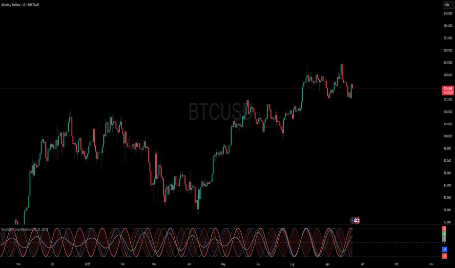
Sinusoidal Cycles OscillatorTitle: Sinusoidal Cycles Oscillator – Multi-Cycle Market Indicator
Description:
Discover market rhythm with the Sinusoidal Cycles Oscillator, a powerful tool for technical analysis and cyclical trading.
Three customizable cycles track short, medium, and long-term market oscillations.
Cycle 1 serves as the main reference wave with an optional mirror envelope.
Cycles 2 & 3 provide supporting harmonics for deeper insight.
Composite wave averages all cycles to reveal overall market phase.
Features:
Fully adjustable periods and amplitude.
Visualize tops, bottoms, and turning points at a glance.
Oscillator ranges from -1 to +1 with clear threshold guides.
Ideal for traders using cycle analysis, harmonic trading, or market timing.
Easy-to-read visual overlay and separate panel option.
Use it to:
Identify potential price reversals.
Compare market cycles across multiple timeframes.
Enhance timing and entry/exit decisions.
Day Decider- ArpitjainforexThis Setup Helps you identify if the Day is Trending Or Choppy. (Keeps you away from the Screen 20 days a month: As you are aware, there is a 1:4 Ratio between Trending Vs Choppy.
Learn more to use at its best potential
Contact www.arpitjainforex.com

Intellxis Premium InsightUnderstanding the Intellxis - Premium Insight Indicator
This guide provides a way to understand the output of the Premium Insight plugin for TradingView. Its core feature is the "Premium Status" column, which analyzes how an option's premium behaves relative to the underlying asset's price. Use the below guide to decode every status message and leverage this powerful plugin in your trading.
Call Option Statuses
Strong (Spot 🡅): The Call premium is increasing as the underlying asset price rises. This confirms a bullish trend and indicates the option is behaving as expected.
Down (Spot 🡇): The Call premium is decreasing as the underlying asset price falls. This is the normal, expected behavior for a call option in a downtrend.
Down (Spot ⟷): The Call premium is decreasing while the underlying asset price is flat. This erosion of value is due to the passage of time and is an expected behavior.
Weak (Spot 🡅): The Call premium is decreasing slightly even though the underlying asset price is rising. This is an anomaly and suggests weakness in the bullish move.
Flat (Spot 🡅): The Call premium is not changing despite a rise in the underlying asset price. This indicates the premium is not responding to a favorable move, which is a sign of weakness.
Strong (Spot 🡇): The Call premium is increasing even though the underlying asset price is falling. This is a highly counter-intuitive signal and could point to a sharp increase in implied volatility.
MELTDOWN (Spot 🡅): The Call premium is collapsing significantly while the underlying asset price is RISING. This contradicts normal option behavior and may signal an imminent reversal or volatility crush.
MELTDOWN (Spot ⟷): The Call premium is collapsing significantly while the underlying is flat. This suggests a massive drop in implied volatility or other strong selling pressure not related to price direction.
Down Significantly (Spot 🡇): The Call premium is dropping significantly as the underlying spot price is moving down.
Up (Spot ⟷): The Call premium is increasing while the underlying spot price is flat. This is likely due to a sudden increase in volatility.
Flat (Spot ⟷): Normal: The Call premium is flat and the underlying spot price is also flat.
Put Option Statuses
Strong (Spot 🡇): The Put premium is increasing as the underlying asset price falls. This confirms a bearish trend and indicates the option is behaving as expected.
Down (Spot 🡅): The Put premium is decreasing as the underlying asset price rises. This is the normal, expected behavior for a put option in an uptrend.
Down (Spot ⟷): The Put premium is decreasing while the underlying asset price is flat. This erosion of value is due to the passage of time and is an expected behavior.
Weak (Spot 🡇): The Put premium is dropping slightly even though the underlying asset price is falling. This is an anomaly and suggests weakness in the bearish move.
Flat (Spot 🡇): The Put premium is not changing despite a fall in the underlying asset price. This indicates the premium is not responding to a favorable move, which is a sign of weakness.
Strong (Spot 🡅): The Put premium is increasing even though the underlying asset price is rising. This is a highly counter-intuitive signal and could point to a sharp increase in implied volatility.
MELTDOWN (Spot 🡇): The Put premium is collapsing significantly while the underlying asset price is FALLING. This contradicts normal option behavior and may signal an imminent reversal or volatility crush.
MELTDOWN (Spot ⟷): The Put premium is collapsing significantly while the underlying is flat. This suggests a massive drop in implied volatility or other strong selling pressure not related to price direction.
Down Significantly (Spot 🡅): The Put premium is dropping significantly as the underlying spot price is moving up.
Up (Spot ⟷): The Put premium is increasing while the underlying spot price is flat. This is likely due to a sudden increase in volatility.
Flat (Spot ⟷): The Put premium is flat and the underlying spot price is also flat.

Malama's Quantum Swing Modulator# Multi-Indicator Swing Analysis with Probability Scoring
## What Makes This Script Original
This script combines pivot point detection with a **weighted scoring system** that dynamically adjusts indicator weights based on market regime (trending vs. ranging). Unlike standard multi-indicator approaches that use fixed weightings, this implementation uses ADX to detect market conditions and automatically rebalances the influence of RSI, MFI, and price deviation components accordingly.
## Core Methodology
**Dynamic Weight Allocation System:**
- **Trending Markets (ADX > 25):** Prioritizes momentum (50% weight) with reduced oscillator influence (20% each for RSI/MFI)
- **Ranging Markets (ADX < 25):** Emphasizes mean reversion signals (40% each for RSI/MFI) with no momentum bias
- **Price Wave Component:** Uses EMA deviation normalized by ATR to measure distance from central tendency
**Pivot-Based Level Analysis:**
- Detects swing highs/lows using configurable left/right lookback periods
- Maintains the most recent pivot levels as key reference points
- Calculates proximity scores based on current price distance from these levels
**Volume Confirmation Logic:**
- Defines "volume entanglement" when current volume exceeds SMA by user-defined factor
- Integrates volume confirmation into confidence scoring rather than signal generation
## Technical Implementation Details
**Scoring Algorithm:**
The script calculates separate bullish and bearish "superposition" scores using:
```
Bullish Score = (RSI_bull × weight) + (MFI_bull × weight) + (price_wave × weight × position_filter) + (momentum × weight)
```
Where:
- RSI_bull = 100 - RSI (inverted for oversold bias)
- MFI_bull = 100 - MFI (inverted for oversold bias)
- Position_filter = Only applies when price is below EMA for bullish signals
- Momentum component = Only active in trending markets
**Confidence Calculation:**
Base confidence starts at 25% and increases based on:
- Market regime alignment (trending/ranging appropriate conditions)
- Volume confirmation presence
- Oscillator extreme readings (RSI < 30 or > 70 in ranging markets)
- Price position relative to wave function (EMA)
**Probability Output:**
Final probability = (Base Score × 0.6) + (Proximity Score × 0.4)
This balances indicator confluence with proximity to identified levels.
## Key Differentiators
**vs. Standard Multi-Indicator Scripts:** Uses regime-based dynamic weighting instead of fixed combinations
**vs. Simple Pivot Indicators:** Adds quantified probability and confidence scoring to pivot levels
**vs. Basic Oscillator Combinations:** Incorporates market structure analysis through ADX regime detection
## Visual Components
**Wave Function Display:** EMA with ATR-based uncertainty bands for trend context
**Pivot Markers:** Clear visualization of detected swing highs and lows
**Analysis Table:** Real-time probability, confidence, and action recommendations for current pivot levels
## Practical Application
The dynamic weighting system helps avoid common pitfalls of multi-indicator analysis:
- Reduces oscillator noise during strong trends by emphasizing momentum
- Increases mean reversion sensitivity during sideways markets
- Provides quantified probability rather than subjective signal interpretation
## Important Limitations
- Requires sufficient historical data for pivot detection and volume calculations
- Probability scores are based on current market regime and may change as conditions evolve
- The scoring system is designed for confluence analysis, not standalone trading decisions
- Past probability accuracy does not guarantee future performance
## Technical Requirements
- Works on all timeframes but requires adequate lookback history
- Volume data required for entanglement calculations
- Best suited for liquid instruments where volume patterns are meaningful
This approach provides a systematic framework for evaluating swing trading opportunities while acknowledging the probabilistic nature of technical analysis.

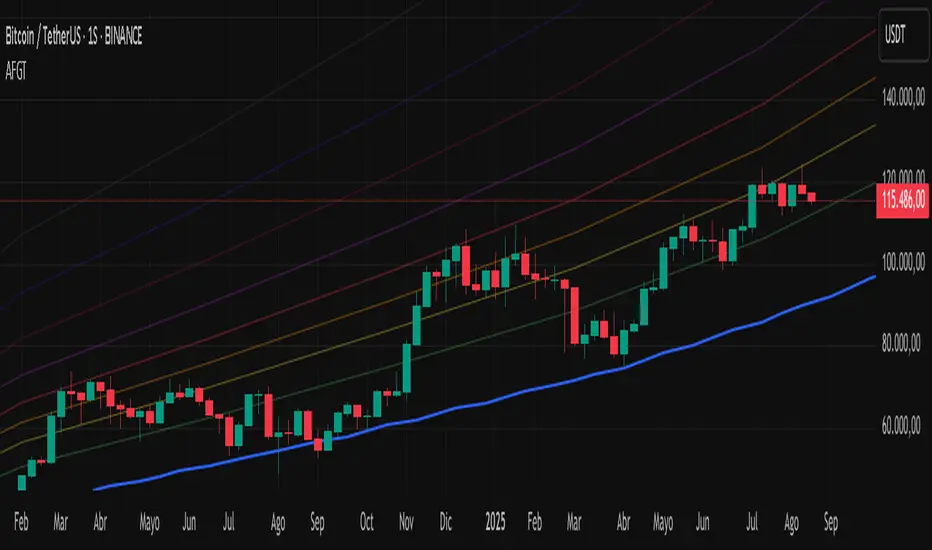
Auto-Fit Growth Trendline# **Theoretical Algorithmic Principles of the Auto-Fit Growth Trendline (AFGT)**
## **🎯 What Does This Algorithm Do?**
The Auto-Fit Growth Trendline is an advanced technical analysis system that **automates the identification of long-term growth trends** and **projects future price levels** based on historical cyclical patterns.
### **Primary Functionality:**
- **Automatically detects** the most significant lows in regular periods (monthly, quarterly, semi-annually, annually)
- **Constructs a dynamic trendline** that connects these historical lows
- **Projects the trend into the future** with high mathematical precision
- **Generates Fibonacci bands** that act as dynamic support and resistance levels
- **Automatically adapts** to different timeframes and market conditions
### **Strategic Purpose:**
The algorithm is designed to identify **fundamental value zones** where price has historically found support, enabling traders to:
- Identify optimal entry points for long positions
- Establish realistic price targets based on mathematical projections
- Recognize dynamic support and resistance levels
- Anticipate long-term price movements
---
## **🧮 Core Mathematical Foundations**
### **Adaptive Temporal Segmentation Theory**
The algorithm is based on **dynamic temporal partition theory**, where time is divided into mathematically coherent uniform intervals. It uses modular transformations to create bijective mappings between continuous timestamps and discrete periods, ensuring each temporal point belongs uniquely to a specific period.
**What does this achieve?** It allows the algorithm to automatically identify natural market cycles (annual, quarterly, etc.) without manual intervention, adapting to the inherent periodicity of each asset.
The temporal mapping function implements a **discrete affine transformation** that normalizes different frequencies (monthly, quarterly, semi-annual, annual) to a space of unique identifiers, enabling consistent cross-temporal comparative analysis.
---
## **📊 Local Extrema Detection Theory**
### **Multi-Point Retrospective Validation Principle**
Local minima detection is founded on **relative extrema theory with sliding window**. Instead of using a simple minimum finder, it implements a cross-validation system that examines the persistence of the extremum across multiple historical periods.
**What problem does this solve?** It eliminates false minima caused by temporal volatility, identifying only those points that represent true historical support levels with statistical significance.
This approach is based on the **statistical confirmation principle**, where a minimum is only considered valid if it maintains its extremum condition during a defined observation period, significantly reducing false positives caused by transitory volatility.
---
## **🔬 Robust Interpolation Theory with Outlier Control**
### **Contextual Adaptive Interpolation Model**
The mathematical core uses **piecewise linear interpolation with adaptive outlier correction**. The key innovation lies in implementing a **contextual anomaly detector** that identifies not only absolute extreme values, but relative deviations to the local context.
**Why is this important?** Financial markets contain extreme events (crashes, bubbles) that can distort projections. This system identifies and appropriately weights them without completely eliminating them, preserving directional information while attenuating distortions.
### **Implicit Bayesian Smoothing Algorithm**
When an outlier is detected (deviation >300% of local average), the system applies a **simplified Kalman filter** that combines the current observation with a local trend estimation, using a weight factor that preserves directional information while attenuating extreme fluctuations.
---
## **📈 Stabilized Extrapolation Theory**
### **Exponential Growth Model with Dampening**
Extrapolation is based on a **modified exponential growth model with progressive dampening**. It uses multiple historical points to calculate local growth ratios, implements statistical filtering to eliminate outliers, and applies a dampening factor that increases with extrapolation distance.
**What advantage does this offer?** Long-term projections in finance tend to be exponentially unrealistic. This system maintains short-to-medium term accuracy while converging toward realistic long-term projections, avoiding the typical "exponential explosions" of other methods.
### **Asymptotic Convergence Principle**
For long-term projections, the algorithm implements **controlled asymptotic convergence**, where growth ratios gradually converge toward pre-established limits, avoiding unrealistic exponential projections while preserving short-to-medium term accuracy.
---
## **🌟 Dynamic Fibonacci Projection Theory**
### **Continuous Proportional Scaling Model**
Fibonacci bands are constructed through **uniform proportional scaling** of the base curve, where each level represents a linear transformation of the main curve by a constant factor derived from the Fibonacci sequence.
**What is its practical utility?** It provides dynamic resistance and support levels that move with the trend, offering price targets and profit-taking points that automatically adapt to market evolution.
### **Topological Preservation Principle**
The system maintains the **topological properties** of the base curve in all Fibonacci projections, ensuring that spatial and temporal relationships are consistently preserved across all resistance/support levels.
---
## **⚡ Adaptive Computational Optimization**
### **Multi-Scale Resolution Theory**
It implements **automatic multi-resolution analysis** where data granularity is dynamically adjusted according to the analysis timeframe. It uses the **adaptive Nyquist principle** to optimize the signal-to-noise ratio according to the temporal observation scale.
**Why is this necessary?** Different timeframes require different levels of detail. A 1-minute chart needs more granularity than a monthly one. This system automatically optimizes resolution for each case.
### **Adaptive Density Algorithm**
Calculation point density is optimized through **adaptive sampling theory**, where calculation frequency is adjusted according to local trend curvature and analysis timeframe, balancing visual precision with computational efficiency.
---
## **🛡️ Robustness and Fault Tolerance**
### **Graceful Degradation Theory**
The system implements **multi-level graceful degradation**, where under error conditions or insufficient data, the algorithm progressively falls back to simpler but reliable methods, maintaining basic functionality under any condition.
**What does this guarantee?** That the indicator functions consistently even with incomplete data, new symbols with limited history, or extreme market conditions.
### **State Consistency Principle**
It uses **mathematical invariants** to guarantee that the algorithm's internal state remains consistent between executions, implementing consistency checks that validate data structure integrity in each iteration.
---
## **🔍 Key Theoretical Innovations**
### **A. Contextual vs. Absolute Outlier Detection**
It revolutionizes traditional outlier detection by considering not only the absolute magnitude of deviations, but their relative significance within the local context of the time series.
**Practical impact:** It distinguishes between legitimate market movements and technical anomalies, preserving important events like breakouts while filtering noise.
### **B. Extrapolation with Weighted Historical Memory**
It implements a memory system that weights different historical periods according to their relevance for current prediction, creating projections more adaptable to market regime changes.
**Competitive advantage:** It automatically adapts to fundamental changes in asset dynamics without requiring manual recalibration.
### **C. Automatic Multi-Timeframe Adaptation**
It develops an automatic temporal resolution selection system that optimizes signal extraction according to the intrinsic characteristics of the analysis timeframe.
**Result:** A single indicator that functions optimally from 1-minute to monthly charts without manual adjustments.
### **D. Intelligent Asymptotic Convergence**
It introduces the concept of controlled asymptotic convergence in financial extrapolations, where long-term projections converge toward realistic limits based on historical fundamentals.
**Added value:** Mathematically sound long-term projections that avoid the unrealistic extremes typical of other extrapolation methods.
---
## **📊 Complexity and Scalability Theory**
### **Optimized Linear Complexity Model**
The algorithm maintains **linear computational complexity** O(n) in the number of historical data points, guaranteeing scalability for extensive time series analysis without performance degradation.
### **Temporal Locality Principle**
It implements **temporal locality**, where the most expensive operations are concentrated in the most relevant temporal regions (recent periods and near projections), optimizing computational resource usage.
---
## **🎯 Convergence and Stability**
### **Probabilistic Convergence Theory**
The system guarantees **probabilistic convergence** toward the real underlying trend, where projection accuracy increases with the amount of available historical data, following **law of large numbers** principles.
**Practical implication:** The more history an asset has, the more accurate the algorithm's projections will be.
### **Guaranteed Numerical Stability**
It implements **intrinsic numerical stability** through the use of robust floating-point arithmetic and validations that prevent overflow, underflow, and numerical error propagation.
**Result:** Reliable operation even with extreme-priced assets (from satoshis to thousand-dollar stocks).
---
## **💼 Comprehensive Practical Application**
**The algorithm functions as a "financial GPS"** that:
1. **Identifies where we've been** (significant historical lows)
2. **Determines where we are** (current position relative to the trend)
3. **Projects where we're going** (future trend with specific price levels)
4. **Provides alternative routes** (Fibonacci bands as alternative targets)
This theoretical framework represents an innovative synthesis of time series analysis, approximation theory, and computational optimization, specifically designed for long-term financial trend analysis with robust and mathematically grounded projections.
Capiba Directional Momentum Oscillator (ADX-based)
🇬🇧 English
Summary
The Capiba ADX is a momentum oscillator that transforms the classic ADX (Average Directional Index) into a much more intuitive visual tool. Instead of analyzing three separate lines (ADX, DI+, DI-), this indicator consolidates the strength and direction of the trend into a single histogram that oscillates around the zero line.
The result is a clear and immediate reading of market sentiment, allowing traders to quickly identify who is in control—buyers or sellers—and with what intensity.
How to Interpret and Use the Indicator
The operation of the Capiba ADX is straightforward:
Green Histogram (Above Zero): Indicates that buying pressure (DI+) is in control. The height of the bar represents the magnitude of the bullish momentum. Taller green bars suggest a stronger uptrend.
Red Histogram (Below Zero): Indicates that selling pressure (DI-) is in control. The "depth" of the bar represents the magnitude of the bearish momentum. Lower (more negative) red bars suggest a stronger downtrend.
Zero Line (White): This is the equilibrium point. Crossovers through the zero line signal a potential shift in trend control.
Crossover Above: Buyers are taking control.
Crossover Below: Sellers are taking control.
Reference Levels (Momentum Strength)
The indicator plots three fixed reference levels to help gauge the intensity of the move:
0 Line: Equilibrium.
100 Line: Signals significant directional momentum. When the histogram surpasses this level, the trend (whether bullish or bearish) is gaining considerable strength.
200 Line: Signals very strong directional momentum, or even potential exhaustion conditions. Moves that reach this level are powerful but may also precede a consolidation or reversal.
Usage Strategy
Trend Confirmation: Use the indicator to confirm the direction of your analysis. If you are looking for long positions, the Capiba ADX should ideally be green and, preferably, rising.
Strength Identification: Watch for the histogram to cross the 100 and 200 levels to validate the strength of a breakout or an established trend.
Entry/Exit Signals: A zero-line crossover can be used as a primary entry or exit signal, especially when confirmed by other technical analysis tools.
Acknowledgements
This indicator is the result of adapting knowledge and open-source codes shared by the vibrant TradingView community.
Chaos Theory : public release
What is Chaos Theory?
Chaos theory is the study of complex systems that appear random but actually follow deterministic mathematical laws. Discovered by meteorologist Edward Lorenz in the 1960s, it revealed that seemingly chaotic behavior often hides precise mathematical patterns.
Key Concepts:
The Butterfly Effect
The famous principle that tiny changes in initial conditions can lead to vastly different outcomes. In markets, this means a small price movement at a critical juncture can cascade into major trend changes. Named after Lorenz's discovery that a butterfly flapping its wings in Brazil could theoretically cause a tornado in Texas.
Sensitive Dependence on Initial Conditions
Chaotic systems are extremely sensitive to their starting state. While we cannot predict exact long-term outcomes, we can identify probability zones where the system is likely to evolve. This is why weather forecasts work for days, not months - and why our indicator predicts price destinations, not timing.
Strange Attractors
In chaos theory, systems tend to evolve toward certain states called attractors. Price doesn't move randomly - it's drawn toward these mathematical attractors that we identify as probability zones.
Fractals and Self-Similarity
Chaotic systems display similar patterns at different scales. This is why price charts look similar whether viewing 1-minute or daily timeframes - the same mathematical forces operate across all time scales.
Deterministic Chaos
The paradox at the heart of chaos theory: systems that are completely deterministic (following precise mathematical rules) can produce behavior that appears random. Markets aren't random - they're chaotic, which means they're predictable within probability bounds.
Why This Matters for Trading
Traditional technical analysis assumes markets are either random (efficient market hypothesis) or follow simple patterns (support/resistance). Chaos theory reveals a third truth: markets are complex dynamical systems that follow mathematical laws we can model and predict - not with certainty, but with probability.
This is the foundation of our indicator: applying the same mathematics that predicts weather patterns and planetary orbits to identify where price is mathematically likely to travel next.
🌟 Welcome to the World of Chaos Theory
We hope to provide our clients with a program that will define future points to which we believe price will expand to, based on a given probability % of one event occurring rather than another. In this case, the other event = price not expanding to our predicted area and reaching an invalidation state. This entire theory and the work done assumes that price behaves like a complex dynamical system that is highly sensitive to initial conditions.
🔮 Predictive vs. Reactive Systems
Pay special attention to the language used. Our belief is that we can provide you a tool that is predictive, not reactive - the latter of which falls into the class of descriptive systems. Although the term of price action study is referred to as time-series forecasting, most if not all of the works done under this umbrella do not forecast anything. They only describe the current or recent past state of affairs using averages, volume, volatility, and other concepts.
📊 Understanding Probability-Based Prediction
A predictive system conjured from the world of chaos theory is not a final solution to the mystery of price. In reality, we only can give you probabilities of where price may end up - this would be a point in space, not time, which we believe would be more likely than another, depending on the analysis of the initial conditions.
To make the point of the last paragraph crystal clear: while we can tell you, with respect to the probabilities, where price will end up in terms of a price point, we don't know WHEN. That is another part of the mystery that perhaps only clairvoyance can hope to uncover.
📈 Performance Statistics
For the question of what the probabilities are, meaning the success of the follow through of price, the answer is given in a stats panel, which measures the success of promises made by the indicator - that price would reach a certain point before being invalidated by moving too far in the opposing direction. It's not helpful to advertise or make false claims, therefore one should take advantage that we offer a free version, and using a pre-defined lookback window, confirm the probability calculations and determine the follow through rate with respect to the specific symbol and timeframe that the user decides to use.
⚠️ What This Is Not
What this is not → Descriptive. We have zero interest in describing what price is doing. In fact, the entire industry of price forecasting is dedicated to this task, therefore you can rest assured that any coincidence with an RSI or any type of moving average etc. is simply that - coincidence. We do not use any known pre-made indicators or formulas.
It has been our belief that price has an underlying mathematical pattern that can be predicted within probability bounds. If you read that carefully, we are predicting the pattern, not looking to find and describe some sort of underlying structure.
🧩 Understanding Market Complexity
It should be understood that price is a complex system, even if our initial assessment of the conditions are correct. We have to remember that price is a fractal structure - there are always different initial conditions clashing, as well as forming. This is without taking into account the manipulation of the system, as well as external intervention in the natural progression of the system by news or other significant events.
---
📋 To Summarize:
🔬 1. Chaos Theory Application to Markets
- Novel Concept: Treating price as a chaotic particle rather than random movement
- What This Means: Chaotic systems have underlying mathematical patterns that can be predicted within probability bounds
- Your Benefit: Access to predictive mathematics previously used only in physics and meteorology
🧮 2. Complex Systems Mathematics
- Novel Concept: Applying non-linear dynamical systems theory to financial markets
- What This Means: Markets behave like complex adaptive systems with emergent properties
- Your Benefit: Understanding market behavior at a fundamental mathematical level
🎯 3. Probability Field Mapping
- Novel Concept: Creating mathematical probability fields for future price locations
- What This Means: Each zone represents a calculated probability destination, not arbitrary support/resistance
- Your Benefit: Trade toward mathematically-derived targets instead of guessing
---
💡 Why This is Fundamentally Different from All Other Indicators
📉 Traditional Indicators:
- Use historical price data to create lagging signals
- Based on statistical averages and linear mathematics
- Assume markets are random or follow simple patterns
- React to what already happened
🚀 This Chaos Theory Approach:
- Uses mathematical modeling to predict future probability zones
- Based on non-linear complex systems mathematics
- Treats markets as chaotic but predictable systems
- Proactively identifies where price is likely to go
No Curve Fitting: Unlike indicators optimized for specific timeframes or instruments, chaos theory principles are universal mathematical laws that apply consistently across all markets.
---
🎁 Concrete Benefits You Receive
💫 1. Predictive Intelligence
- Know probable price destinations before they're reached
- Eliminate guesswork in setting profit targets
- Make informed decisions about trade direction
🎯 2. Mathematical Precision
- Every zone placement has mathematical justification
- No subjective interpretation required
- Consistent application across all market conditions
🌍 3. Universal Market Application
- Works identically on forex, stocks, crypto, commodities
- No need to adjust parameters for different instruments
- Mathematical principles transcend market types
🏆 4. Professional-Grade Analysis
- Access to institutional-level mathematical modeling
- Same complexity as quantitative hedge fund systems
- Simplified visual output for practical trading
✅ 5. Real-Time Performance Validation
- Built-in statistics track actual prediction accuracy
- Transparent performance measurement
- Data-driven confidence in signal quality
🛡️ 6. Risk Management Precision
- Mathematically-defined probable targets of desired and undesired price locations
- Systematic approach eliminates emotional decisions
⏱️ 7. Multi-Timeframe Consistency
- Zones maintain mathematical validity across timeframes
- Higher timeframe bias with lower timeframe precision
- Coherent analysis from scalping to position trading
---
🌟 Novel Trading Advantages
Probability-Based Targeting: Instead of hoping price reaches your target, you're trading toward mathematically-calculated probability zones.
Chaos Pattern Recognition: Probability-based predictions of the underlying chaotic patterns that govern price movement gives you an edge other traders don't possess.
Dynamic Adaptation: Unlike static indicators, this system continuously recalculates based on evolving market mathematics.
---
🔄 Why This Represents a Trading Evolution
From Reactive to Predictive: Traditional analysis tells you what happened. Chaos theory mathematics tells you what's likely to happen.
From Subjective to Objective: No more debating support and resistance levels. Mathematics determines probable price destinations.
From Curve-Fitted to Universal: Based on fundamental mathematical principles that work consistently across all markets and timeframes.
From Emotional to Systematic: Clear mathematical signals eliminate the psychological challenges that destroy most traders.
This indicator doesn't just give you another way to analyze markets - it gives you access to an entirely different mathematical framework for understanding price behavior. You're not getting a variation of existing concepts; you're getting a completely novel approach based on advanced mathematical principles that treat markets as the complex systems they actually are.
---
📚 How to Use the Indicator
🎨 Zone Mechanics
• Orange Zones: Target areas for price expansion
• Activation Trigger: Price must close outside any zone (full candle body, not just wicks)
• Primary Rule: Price travels to the next zone before closing back behind the originating zone border
🔴 Understanding the Red Dots
• Red dots on chart: Represent areas where we had valid zone sets available for trading
• Empty spaces indicate: Areas where price closed past the highest/lowest zone or where zone invalidation occurred
• Important note: We cannot always identify zones. Simply wait or switch timeframe/symbol

EMA Sunset WavesThis script displays a set of Exponential Moving Averages (EMAs) (20, 50, 100, and 200) with a clean and immersive design:
Lines automatically change color based on trend direction (uptrend or downtrend).
Dynamic fill zones highlight whether the price is trading above or below each EMA.
Full color customization (bullish/bearish lines, fill zones, transparency).
Adjustable line thickness for better chart readability.
🎨 The idea is to make trend reading visual, intuitive, and aesthetic at first glance.
⚙️ Configurable settings:
EMA lengths (default 20/50/100/200).
Colors for bullish and bearish EMAs.
Fill colors (above/below price).
Transparency and line thickness.

KhoiHV - Bollinger Bands Buy/Sell Area ProBollinger Bands Buy/Sell Area Pro is a professional-grade indicator designed to identify potential trading opportunities based on Bollinger Bands. It highlights dynamic buy and sell areas by combining price action with volatility, helping traders quickly visualize market conditions.
✨ Key Features
Automatically plots upper, middle, and lower Bollinger Bands.
Marks Buy Areas when price enters oversold zones near the lower band.
Marks Sell Areas when price enters overbought zones near the upper band.
Configurable inputs for length, source, and multiplier to fit any trading style.
Easy-to-read chart visuals with colored zones for instant recognition.
💡 How to Use
Look for Buy Areas near the lower band in trending markets to catch potential rebounds.
Watch for Sell Areas near the upper band to anticipate possible pullbacks.
Combine with volume, momentum, or trend indicators for stronger confirmation.
This tool is especially useful for traders who want a clear, visual edge in spotting volatility-based entries and exits without constantly recalculating signals.
Trading bot gridsGuide: Price Lines – Arithmetic vs. Geometric
This script draws horizontal price lines (grids) between a start price and an end price.
You can choose whether the lines are distributed evenly (arithmetic) or by percentage (geometric).
🔧 Inputs
Start Price → Lower or upper boundary of the price range.
End Price → Opposite boundary of the price range.
Number of Lines → Total number of lines to be drawn between the start and end prices.
Distribution →
Arithmetic: Fixed USDT distance between each line.
Geometric: Fixed percentage distance between each line.
Grid Color → Color of the drawn lines.
📈 How it Works
The script calculates the lower (lo) and upper (hi) boundaries, regardless of which is entered first.
Arithmetic distribution: Each line is spaced by a fixed amount in USDT.
Geometric distribution: Each line is spaced by the same percentage difference from the previous one.
Lines are created only once at the first bar and remain on the chart.
All lines are extended across the entire visible chart.
💡 Tips
Useful for Grid Bot backtesting or visualizing price zones.
Works for both long and short price ranges.
In geometric mode, lines appear closer together near the lower price range and farther apart toward the upper range.

Liquidity Sweep Scanner [TradingFinder]🔵 Introduction
Recognizing how liquidity develops and how price reacts at key structural levels is critical for spotting precise, low-risk trade entries. The Liquidity Sweep Scanner is an advanced tool built to track market activity in real time, pinpoint liquidity sweeps, define reaction zones, and identify confirmation candles across multiple instruments and timeframes.
Key Advantages :
Detects high-probability reversal points with precision.
Combines liquidity analysis, market structure, and candle confirmation.
Works seamlessly across multiple symbols and timeframes.
This screener can scan a broad watchlist or analyze every timeframe of a single asset to find optimal reversal zones. It starts by identifying a clear swing point either a swing high or swing low and marking a reaction zone between that point and the candle’s highest or lowest open/close value.
If price revisits the zone, performs a liquidity grab, and forms an indecision candle such as a doji or narrow-bodied bar that closes inside the zone, this may indicate rejection of the level and a failed breakout attempt. Based on the surrounding market context, the screener then flags a potential bullish or bearish reversal and generates the appropriate Long or Short signal.
By focusing on precise entry timing, institutional order flow alignment, and filtering out false breakouts, the Liquidity Sweep Scanner zeroes in on the market areas where liquidity engineering, reversal potential, and inefficiency overlap. This makes it an indispensable tool for price action traders who rely on clear, high-quality setups without the distraction of market noise.
🔵 How to Use
The Liquidity Sweep Scanner continuously evaluates market structure, issuing alerts when a potential reversal setup emerges. It merges liquidity behavior, swing point analysis, and candle confirmation within predefined reaction zones.
To illustrate, imagine price forms a swing high or low, then later returns to that level. If it sweeps the prior extreme and produces a qualifying candle inside the reaction zone, the tool signals a possible reversal.
🟣 Long Setup
For a bullish scenario, the screener first spots a valid swing low a level often packed with sell-side liquidity. From there, it defines a reaction zone stretching from the swing low to the candle’s lowest open/close point.
If price retests this area with a wick dipping below the swing low but then closes back inside the zone, it signals absorption of selling pressure and rejection of further downside. The screener then awaits a confirmation candle commonly a doji or small-bodied bar closing inside the zone. Once these conditions align, a Long signal is logged and, if alerts are active, the trader receives a notification.
🟣 Short Setup
For bearish opportunities, the process begins by locating a valid swing high typically an area dense with buy-side liquidity. The reaction zone is drawn from the swing high to the candle’s highest open/close value.
When price retests this zone, sweeps above the swing high, and fails to close higher, it suggests a bull trap and waning upward momentum. The screener then requires a confirmation candle often a doji or rejection bar that closes back within the zone before confirming a Short signal.
These bearish setups help traders pinpoint likely institutional sell zones, offering a clear view of where price may reverse following a liquidity event.
🔵 Settings
🟣 Logical settings
Liquidity Swing period : You can set the swing detection period.
Market Structure Period :You can set the Pivot Period to determine the detection direction.
Max Swing Back Method : It is in two modes "All" and "Custom". If it is in "All" mode, it will check all swings, and if it is in "Custom" mode, it will check the swings to the extent you determine.
Max Swing Back : You can set the number of swings that will go back for checking.
Maximum Distance Between Swing and Signal : The maximum number of candles allowed between the swing point and the potential signal. The default value is 50, ensuring that only recent and relevant price reactions are considered valid.
🟣 Display Settings
Table on Chart : Allows users to choose the position of the signal dashboard either directly on the chart or below it, depending on their layout preference.
Number of Symbols : Enables users to control how many symbols are displayed in the screener table, from 10 to 20, adjustable in increments of 2 symbols for flexible screening depth.
Table Mode : This setting offers two layout styles for the signal table :
Basic : Mode displays symbols in a single column, using more vertical space.
Extended : Mode arranges symbols in pairs side-by-side, optimizing screen space with a more compact view.
Table Size : Lets you adjust the table’s visual size with options such as: auto, tiny, small, normal, large, huge.
Table Position : Sets the screen location of the table. Choose from 9 possible positions, combining vertical (top, middle, bottom) and horizontal (left, center, right) alignments.
🟣 Symbol Settings
Each of the 10 symbol slots comes with a full set of customizable parameters :
Symbol : Define or select the asset (e.g., XAUUSD, BTCUSD, EURUSD, etc.).
Timeframe : Set your desired timeframe for each symbol (e.g., 15, 60, 240, 1D).
🟣 Alert Settings
Alert : Enables alerts for LSS.
Message Frequency : Determines the frequency of alerts. Options include 'All' (every function call), 'Once Per Bar' (first call within the bar), and 'Once Per Bar Close' (final script execution of the real-time bar). Default is 'Once per Bar'.
Show Alert Time by Time Zone : Configures the time zone for alert messages. Default is 'UTC'.
🔵 Conclusion
The Liquidity Sweep Scanner equips traders with a precise, structured method for spotting high-probability reversals by merging liquidity sweeps, reaction zone mapping, and candle confirmation.
It not only filters out market noise but also highlights price areas where inefficiency and reversal potential align. Beyond identifying clean entry points, the tool includes a market direction detection feature allowing traders to quickly determine the prevailing trend and align their trades accordingly.
With adjustable settings such as the Pivot Period for fine-tuning detection direction, it adapts to various trading styles and timeframes, making it a powerful and versatile addition to any trader’s strategy.
Script a pagamento

zSph x Larry Waves Wave Zone ForecastElliott Waves and Fibonacci Ratio Lengths have a strong correlated relationship when observing the general strength and termination of both Impulse (Motive) Waves and Corrective Waves.
There are certain Fibonacci levels that are highly reactive when applying it from a Wave Analysis perspective and being aware of the current wave sequence is required.
Often, those beginning their Elliott Wave journey and studies are unsure what Fibonacci levels are relevant and how to apply it to the wave structure that is being observed – this tool removes that ambiguity on placement.
Being aware of the predisposed levels that have a high rate of reaction can assist in managing trades from a scalp intra-day approach, a day trading approach, and a swing trading approach.
# Concept
This tool helps with identifying zones that are relevant to the wave that is currently in progression upon the market and visualize important Fibonacci levels where reactions often occur from an Elliott Wave perspective such as:
Wave 2
Wave 3
Wave 4
Wave 5
Wave B Zigzag
Wave B Flat
Wave X Zigzag
Wave X Flat
Wave C
Wave Y
This helps remove almost all the manual labor of updating fib levels, selecting certain fib levels, and manually moving the fib levels as price continues to print while autonomously providing the levels visually.
# Correct Usage
Wave 3 / Wave C / Wave Y
Once a clear impulse/motive structure has been identified for a Wave 1, Wave A or Wave W, apply the indicator to the structure.
Anchor 1 is the beginning of the impulse for Wave 1 or A or W.
Anchor 2 is the end of the impulse for Wave 1 or A or W.
The result is the standard zones for Wave 3, Wave C and Wave Y.
BINANCE:LINKUSD
Wave 4
Once a clear impulse/motive structure has been identified for Wave 3, apply the indicator to the structure.
Anchor 1 is the beginning of Wave 3 (or the end of Wave 2)
Anchor 2 is the end of Wave 3 (or the beginning of Wave 4)
The result is the standard zone for Wave 4.
LINKUSD
Wave B / Wave X / Wave C / Wave Y
Once a clear 3-wave corrective has been identified for a potential Corrective pattern, apply the indicator to the structure.
- Anchor 1 is the end of beginning of Wave A or Wave W
- Anchor 2 is the end of Wave A or Wave W
The result is the standard zones Waves B / X and Waves C / Y for Zigzags, Flats and Combos.
BINANCE:LINKUSD
# Settings
"Show Labels" will toggle on and off the labels for each fib zone, each fib line, and invalidation ticks that are in the 2/3 – B/C option to help with calculating risk management quickly.
"Use Log Scale" will allow you to toggle on/off the log scale for log fibs
"Extend Lines" will allow you to extend the fib lines to current price action from the Elliott Wave Zones to see reactions off the fib levels.
“Extend Zones” will allow you to extend the overall zone for the fibs to current price action from the Elliott Wave Zones to see reactions off the zone. There is also user customization of color use for the zones/.
“Fib Levels” will allow you to customize the lines and colors of the fibs lines.
“X-Axis Offset” will increase or decrease the position of the fibs of the zones (not the extension boxes)..

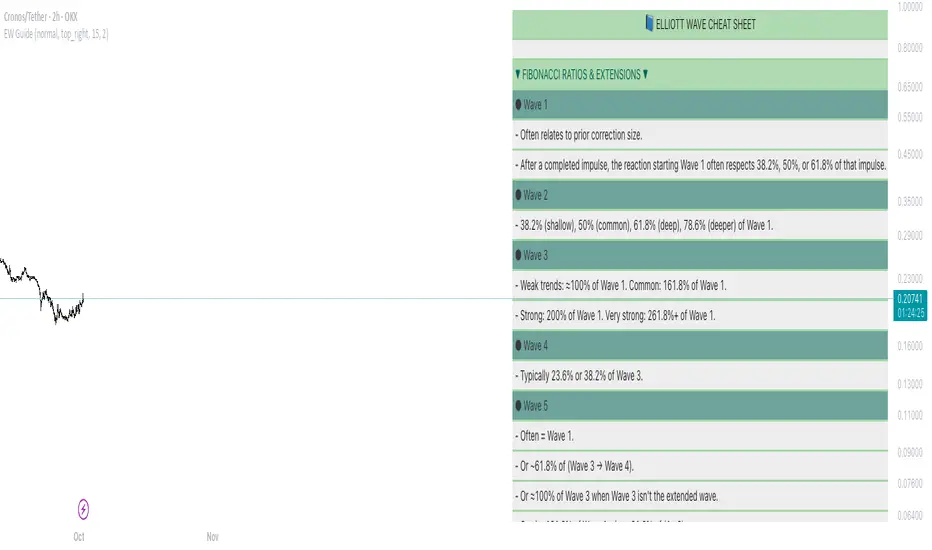
Elliot Wave Cheat SheetThis tool provides a visual cheat sheet summarizing:
Core Impulse Wave Rules
Essential Fibonacci Ratios & Guidelines
Leading and Ending Diagonals
Expanding and Contractive Diagonals
Common Corrective Patterns (Zigzag, Flats, Triangles, WXY)
Key Best Practices & Mistakes to Avoid
You can customize:
Font Size & Color
Background Color & Transparency
Show/Hide individual sections (Rules, Ratios, Corrections, etc.)
SmartWave ProA SmartWave Pro egy prémium kereskedési indikátor, amely a legfejlettebb piaci elemzési módszereket ötvözi egyetlen rendszerben. A jelzéseket a Smart Money Concepts (SMC), ICT (Inner Circle Trader), Pivot zónák, Elliott-hullám elmélet, Engulfing gyertyák, valamint a belső trend- és volatilitásszűrés kombinációja adja.
