[AlbaTherium] Wabi-Sabi Wyckoff Flow Structure Map MTF[1.0.42] Wabi-Sabi Wyckoff Flow Structure Map
Master the Hidden Geometry of Market Campaigns – Accumulation, Distribution, and the Laws That Govern Them
Introduction
The Wabi-Sabi Wyckoff Flow Structure Map is a software-engineered analytical framework that visualizes the flow of institutional market behavior through the lens of the Wyckoff Method. This tool automates the detection of trading ranges, maps the phases of accumulation/distribution, and extrapolates price objectives .
The Wabi-Sabi Wyckoff Flow Structure Map is a meticulous implementation of the principles of Richard D. Wyckoff , interpreted through the lens of market structure and volume dynamics. This tool aims to identify, contextualize, and map out accumulation and distribution zones by interpreting the composite operator's intended path in financial markets.
It is not merely an indicator-it is a structural compass, guiding you through the architecture of smart money campaigns.
Chapter 1: The Architecture of Market Campaigns
1.1 From Noise to Narrative
Markets do not move randomly. They are orchestrated campaigns-methodically executed by informed operators. The identifies these campaigns as they unfold across:
Accumulation
Markup
Distribution
Markdown
Each is grounded in Wyckoff’s structural logic and revealed in real time.
1.2 Who Is the Composite Operator, Composite Man?
The Composite Operator (CO), Composite Man (CM) represents dominant market participants-institutions with the capacity to engineer price movement. By dissecting trading ranges, the script deciphers their behavior through:
Event-based mapping (SC, ST, Spring, AR, UTAD, etc.)
Phase progression (Phase A to E)
PnF-based directional forecasting
The CO leaves footprints. This script reads them.
Chapter 2: Wyckoff’s Core Laws, Brought to Life
2.1 The Law of Supply and Demand
Every price bar reflects this law. The tool highlights where supply is absorbed and demand emerges, revealing the true balance of power behind the chart.
2.2 The Law of Cause and Effect
Accumulation and distribution ranges are not noise-they are preparation. By measuring their width, the script calculates PnF-based targets for the post-breakout phase, offering traders quantified projections rooted in structure.
2.3 The Law of Effort vs. Result
Effort = volume.
Result = price movement.
Discrepancies between the two-expose market turning points.
This script captures those moments within Wyckoff's structural context, not isolated volume spikes.
Chapter 3: Real-Time Interpretation of Trading Ranges
3.1 Automatic Schematic Mapping
The tool auto-generates Wyckoff structures:
Detects and maps Trading Ranges dynamically
Labels Wyckoff events (SC, ST, AR, Spring, UT, LPS, etc.)
Identifies current phase (Phase B, C, D, E) via real-time bias detection
3.1.1.Core Components
a. Structural Framing
The script autonomously detects the boundaries of a trading range (TR), guided by pivot highs and lows derived from Volume Spread Analysis (VSA) dynamics and price behavior.
b. Automatic Rally (AR) & Selling Climax (SC)
These foundational events are systematically computed and highlighted using volume-weighted price interaction. The Selling Climax defines the lower bound of the TR, while the Automatic Rally sets the resistance zone.
c. Secondary Tests (ST)
The algorithm traces the STs to validate demand/supply balance and the structural integrity of the TR. These are tagged with precision to avoid false positives.
d. Spring / Upthrust Actions
Wyckoffian springs and upthrusts are flagged using deviations below support (spring) or above resistance (upthrust) coupled with volume exhaustion or climax events.
e. Creek & Ice Visualization
Inspired by Wyckoff’s narrative metaphor, the script maps the 'Creek' (High of the Range flow) and 'Ice' (Low of the Range flow), guiding the observer through breakout or breakdown conditions.
f. Sign of Strength (SOS) / Sign of Weakness (SOW)
These turning points are confirmed via expansion in spread and volume. SOS is a bullish confirmation of accumulation resolution, while SOW indicates bearish continuation.
g. LPS & LPSY
The Last Point of Support (LPS) and Last Point of Supply (LPSY) are precisely mapped post-confirmation of breakout or breakdown. Their presence strengthens the bias of the ongoing structural phase.
h. Phase Annotation
Each zone within the TR is annotated based on Wyckoff’s five-phase logic (A to E). This includes climactic action in Phase A, testing in Phase B, spring/UTAD in Phase C, confirmation in Phase D, and exit in Phase E.
3.2 Multi-Timeframe Tracking
Observe the interplay of nested structures across several timeframes. Whether you’re tracking a micro accumulation on 1-min or macro distribution on the 1H, the script integrates both for a full-spectrum view.
3.3 Point-and-Figure Price Targeting
Using Wyckoff’s Law of Cause and Effect, the tool projects price targets based on the range width. Outputs are displayed directly on the chart, aiding in:
Profit-taking zones
Invalidations
R/R planning with structure-based confidence
Chapter 4: Applying Like a Wyckoffian
4.1 Configuration Best Practices
Timeframes: 1–5min for tactical intraday, 15min–4H for swing campaigns
Detection Radius: Control how deep the script searches for structural pivots
Modes: Choose between Delta (volume shifts) and Normal (price formations)
4.2 Dashboard & Event Tracker
The Bias Dashboard displays:
The current dominant phase (e.g. “Phase C Test” or “Late Phase D”)
Key events (AR, ST, Spring, LPS)
Whether current price action supports a continuation or Climax
4.3 Alerts and Customization
Configure alerts to monitor:
New TR detection across up to 6 timeframes
Key structural events like Spring, UTAD, or SOS
Completion of cause zones with target projection triggered
Chapter 5: Use Cases and Strategic Implementation
5.1 Spotting Reversals Before the Breakout
Use the script to:
Enter near Springs (accumulation) or UTADs (distribution)
Identify retests as Last Points of Support/Resistance
Confirm or invalidate breakout attempts using the schematic context
5.2 Confirming Institutional Engagement
Recognize institutional footprints through:
Multiple STs (Testing for supply)
Strong SOS, SOW / LPS combinations
Absence of follow-through = Absorption
The Flow Map helps distinguish retail chase from professional intent.
Conclusion
The Wabi-Sabi Wyckoff Flow Structure Map is an elite market structure decoder for traders who operate on logic, not emotion. Grounded in Wyckoff’s time-tested methodology and enhanced with modern automation, it transforms the invisible structure of price action into a readable, tradeable roadmap.
“Structure precedes movement. Those who read structure, anticipate motion. Those who chase motion, miss the meaning .
”
- A Wyckoffian Principle
This tool is for traders who understand that preparation is where profits are born-not during the move, but before it."
Wyckoffaccumulation

Wyckoff Schematic - Accumulation [TrendX_]Wyckoff Schematic 1 - Accumulation is an advanced Wyckoff method tool on TradingView, designed to automate the identification of critical phases and price structures within the Wyckoff Accumulation Schematic. By detecting key events such as SC (Selling Climax), AR (Automatic Rally), Spring, and SOS (Sign of Strength), this tool helps traders visualize institutional accumulation patterns, anticipate trend reversals, and identify potential entry points aligned with the Wyckoff model—all without requiring hours of manual monitoring. The indicator dynamically labels key points, draws accumulation zones, and triggers alerts upon phase confirmations, reducing manual analysis and emotional bias.
💎 FEATURES
▶ Phase A: Bottom Identification
Auto-detects Selling Climax (SC), Automatic Rally (AR), and Secondary Test (ST).
Customizable initial trend detection: FTD (Follow-Through Day), Market Structure Shift, Triple MA Crossover, or Ichimoku Cloud.
▶ Phase B: Accumulation Range Formation
Identifies SOS(b) and ST(b) in Phase B
Customizable sweep levels for ST detection: previous SC / ST(a) / Fibonacci retracement levels of AR & SC.
▶ Phase C: Accumulation Confirmation
Flags Spring (false breakdown) and Test (confirmation of false breakdown).
▶ Phase D: Breakout Preparation
Detects SOS and BU/LPS for breakout confirmation.
▶ Visual Tools
Auto-draws accumulation range SC, AR, SOS(b) with real-time extensions.
Labels all critical events (SC, AR, ST, SOS, Spring, LPS) with text and markers.
Draws colored boxes for confirmed phases A, B and C, and triggers alerts for start of Markup with SOS and BU/LPS.
🔎 BREAKOUT
Phase A: Halting the Downtrend
▶ Key Events: SC, AR, ST(a).
▶ Functions:
SC: Marks panic selling, often with high volume.
AR: Sharp rebound after SC, reflecting short-term demand.
ST(a): Retest of SC lows to confirm weakening supply.
▶ Importance:
Phase A signals the end of a downtrend. The SC shows exhaustion, while the AR and ST confirm that sellers are losing control. Customizable trend detection (e.g., Ichimoku Cloud or FTD) ensures alignment with broader market context or your preference.
Phase B: Building the Accumulation Range
▶ Key events: SOS (Pha B), ST (Pha B).
▶ Functions:
SOS(b): A rally breaking above the AR, indicating strong demand.
ST(b): Retests of SC / ST(a) / Fib level to sweep liquidity (trap late sellers).
▶ Importance:
Phase B confirms the sideways range. SOS reflects institutional buying, while ST(b) traps sellers. Sweeping SC / ST(a) / Fib level would help identify false breakdowns.
Phase C: Spring & Test
▶ Key events: Spring (false breakdown), Test (confirmation).
▶ Functions:
Spring: A deliberate drop below Phase B support to eliminate weak traders.
Test: Retest of the Spring low to confirm sustained demand.
▶ Importance:
Phase C is the final "shakeout" to confirm accumulation. The Spring traps weak hands, while the Test validates support, confirming the institution has bought enough, signaling readiness for Markup.
Phase D: Breakout / Start of Markup
▶ Key events: SOS, BU/LPS.
▶ Functions:
SOS: A strong rally breaking above the accumulation range.
BU/LPS: Pullback after SOS to retest the breakout level.
▶ Importance:
Phase D confirms the start of a Markup. SOS shows demand overpowering supply, while BU/LPS offers low-risk entry points.
Accumulation Range & Visual Tools
▶ Accumulation Range: Drawn between SC (low) and AR (high), reflecting institutional buying activity.
▶ Labels/Boxes: Clear labels (SC, AR, ST, SOS, Spring, …) track each phase.
▶ Alerts: Notifies users when SOS or BU/LPS appears.
🛠️ USAGE
▶ Configuration
Phase A: Select trend detection method based on your preference and trading style (FTD, Market Structure, Triple MA, Mây Ichimoku).
Phase B: Adjust sweep levels (SC, ST(a), Fibonacci 61.8% của AR & SC).
▶ Interpretation
Bullish Trend: Confirmed Phase C (Spring + Test) followed by SOS in Phase D.
▶ Trading Strategy
Enter long positions at BU/LPS (Phase D) with volume or momentum confirmation.
Uses other Break-out strategy after SOS appear for Long Entry.
DISCLAIMER
This indicator is not financial advice, it can only help traders make better decisions. There are many factors and uncertainties that can affect the outcome of any endeavor, and no one can guarantee or predict with certainty what will occur. Therefore, one should always exercise caution and judgment when making decisions based on past performance.

Wyckoff Springs [QuantVue]The Wyckoff Springs indicator is designed to identify potential bullish reversal patterns known as "springs" in the Wyckoff Method. A Wyckoff spring occurs when the price temporarily dips below a support level, then quickly rebounds, suggesting a false breakdown and a
potential buying opportunity.
How it works:
Pivot detection:
The indicator identifies pivot lows based on the specified pivot length.
These pivot points are stored and analyzed for potential spring patterns.
Volume and Range Checks:
If volume confirmation is enabled, the indicator checks if the current volume exceeds a threshold based on the average volume over the specified period.
The indicator ensures that the price undercuts the defined trading range before confirming a spring pattern.
Spring Identification
The indicator checks for price conditions indicative of a Wyckoff spring: a temporary dip below a pivot low followed by a close above it. The recovery must take place within 3 bars.
If these conditions are met, a spring label is placed below the bar.
Features:
Pivot Length:
The user can set the pivot length to match any style of trading.
Volume Confirmation:
An optional feature where the user can specify if volume confirmation is required for a spring signal.
Volume threshold can be set to determine what constitutes significant volume compared to the average volume over a specified period. By default it is set to 1.5
How to Trade a Spring:
Give this indicator a BOOST and COMMENT your thoughts below!
We hope you enjoy.
Cheers!

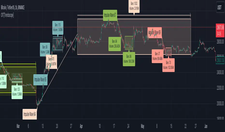
Consolidation Range Tracker[Trendoscope]🎲 Introducing Consolidation Range Tracker: Visualising Price Consolidation after Impulsive Moves
ConsolidationRangeTracker is an innovative indicator designed to assist traders in identifying and tracking price consolidation zones following impulsive market moves. This indicator is built on Auto Motive Wave indicator and Interactive Motive Wave indicator. This is also an attempt to plot Wyckoff Distribution pattern. But, instead of implying the price movement after consolidation, we are just leaving it to the interpretation of the users.
🎲 Process
Find impulse wave using the methods defined in Auto Motive Wave indicator and Interactive Motive Wave indicator
Define the range of consolidation based on predefined ratio (available as input settings)
Track the price movement within range along with number of bars and cumulative volume.
When price breaks out of the range, check if price ranged long enough to consider it as consolidation.
Retain the drawings and visualisation if the consolidation is confirmed before the breakout. Or else, remove them from the chart to keep it clean.
Overall output can be visualised as
Note : Patterns will not be there on the chart every time. It is normal for indicator not to show any drawings or patterns on the chart.
🎲 Stages of the Indicator
🎯 When an Impulse is formed
When an impulse wave is detected, wave is drawn on the chart along with details such as number of bars and volume spawning the impulse wave and the calculated range based on the input value. An alert of new impulse is also triggered if configured for alerts.
🎯 When an Impulse is updated
When price extends further without consolidating, the impulse wave is also updated to consider the latest values. This repaint is expected and as designed. We will also trigger an alert related to update of an impulse wave.
🎯 Update of range as and when it happens
Range is not bound and it keeps moving based on the highest and lowest price. Value of range is constant and it is calculated based on certain ratio of impulse as configured in settings. But, this range can move up and down based on which direction the price moves.
For example, this is the initial range when the impulse wave is formed.
But, after certain bars, we can see that the range shift slightly up because, price has more upward movement than downward.
No alerts are triggered during this phase.
🎯 Confirmed consolidation
Consolidation range is confirmed after price range through certain bars with respect to number of bars involved in the impulse wave. The default setting of 1 for range bar ratio means that range is confirmed when price ranges for same number of bars as that of impulse.
An alert is triggered when consolidation range is confirmed.
🎯 Breakout
Breakout happen if the price exceeds the range bracket. Breakout may happen either before or after confirmation of consolidation. In either case, an alert is triggered.
Patterns are removed from the chart if the consolidation is not confirmed. In other words, the price did not stay in range for long time.
🎲 Settings
Simple settings to define the zigzag base and few pattern related configuration.
🎲 Alerts
Alerts are configured using alert function and are triggered in following scenarios.
A new impulse created
An impulse wave is updated
Consolidation range confirmed
Breakout with/without confirmed consolidation.
🎲 Use Cases
Indicator can be used for identifying few types of patterns on the chart. But, they may involve user's discretion. Major patterns that can be identified are:
🎯 Flag Formation Consolidation after an impulse can be termed as flag and is a sign of trend continuation after consolidation.
🎯 Wyckoff Distribution Long consolidation with high volume after an impulse can be a sign of wyckoff distribution formation. This pattern is trend reversal pattern.
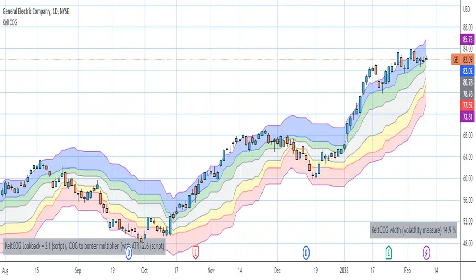
Keltner Center Of Gravity Channel ( KeltCOG )I have the ambition to create a ‘landscape’ which enables the user to see the ‘mood’ of the market about the price of an instrument, simply by looking where the candles go. Prices are a simple phenomenon , they go up or down or stay the same. This is represented quite well for the short term by a candle. I recommend to study candle patterns. Prices not only fluctuate but also trend up, down or go sideways. The user should analyze this by determining the COG (Center Of Gravity) and the ‘normal’ current range by using the historical data in a lookback period.
As a COG the center line of a Donchian Channel is often used. I.m.o. a COG should be a zone, in this channel I use the gray zone of my Donchian Fibonacci Channel, The ‘normal’ range is a multiple of Average True Range, as used in a Keltner Channel. Combining the two can give a cumbersome result, as one can see in my Keltner Fibonacci Channel. In this KeltCOG channel I solved this by not using all Fibonacci levels and by making the Keltner lines strictly parallel to the nearest COG line. To do this, I use the fact that the COG lines have horizontal stretches, there I make the Keltner lines horizontal too. Only where the COG lines change value, the Keltner lines are recalculated. This way the channel gets a very regular shape with three clear zones.
Interpretation of a chart by using the KeltCOG channel.
Overbought: If the candles go higher then the blue zone, the market is hyper enthusiast, creating an overbought situation. This is often followed by a reversion to the COG.
Uptrend: If the candles form in the blue zone, the market is enthusiast and willing to pay more.
Hopeful: If the candles form in or near the upper uncolored zone, the market is hopeful and is thinking about paying more. Sometimes prices go a little up.
Content: If the candles form in the gray zone, which represents COG, the market is happy with the current prices, so these move sideways
Disappointed: If the candles form in or near the lower uncolored zone, the market is disappointed and contemplates paying less, sometimes prices go a little down.
Downtrend: If the candles form in red zone, the market doesn’t like the instrument at all, rejects the current price and is only prepared to pay less.
Oversold: If the candles form below the red zone, the market overdoes its disgust, creating an oversold situation, often followed by a reversion to the COG.