ZenAlgo - Golden Vein
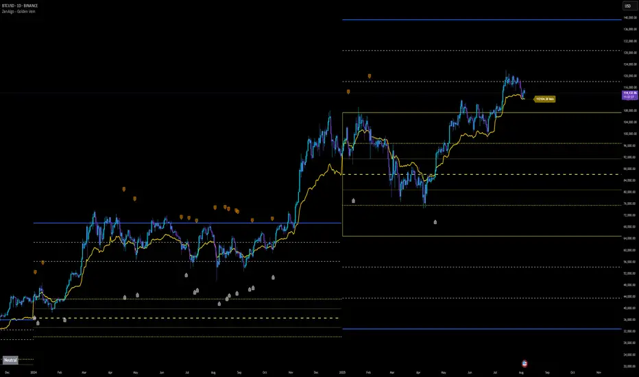
This indicator combines multiple volume-weighted average price (VWAP) calculations from different timeframes and then merges them into a single composite line called “the Vein”. It begins by pulling a user-defined source (for instance, a typical price) and then anchors a VWAP on daily, weekly, monthly, quarterly, semiannual, and yearly intervals. By viewing all these timeframes together, the script captures multi-period trends in a way that stands apart from simpler, single-timeframe VWAP indicators. This comprehensive perspective is designed to offer practical benefits to those who monitor both short- and long-term VWAP behavior within a single tool.
Because it tracks many timeframes simultaneously, it can highlight instances when short-term and long-term VWAPs converge or diverge. Traders who need multi-timeframe validation may find this approach particularly helpful. Other free indicators typically restrict themselves to one or two timeframes, so the built-in multi-timeframe data in this script can save effort for those who rely heavily on VWAP analysis.
Core Inputs and Offsets
At the start, the script takes a single price input (e.g., the average of high, low, and close) and uses it to compute multiple VWAP lines. Users can also choose a distance factor (based on an ATR calculation) to control how far labels are placed from any crossover events. This distance sets how clearly the chart will display labels without overcrowding.
Beyond giving a cleaner visual, having a user-defined distance for labels means the script can adapt to any ticker’s volatility. If one trades assets with large intraday swings, the script leaves enough space for labels to remain readable. This flexibility is something that simpler free VWAP scripts might lack.
Multi-Timeframe VWAP Computations
The script calculates distinct VWAP lines: Daily, Weekly, Monthly, Quarterly (3-Month), Semiannual (6-Month), and Yearly (12-Month). Each line resets whenever it detects a new period has started, ensuring that each timeframe’s VWAP properly anchors to its own session window. This allows the indicator to track how the market perceives fair value (through VWAP) on multiple horizons, all at once.
Simultaneously checking these various intervals can offer added clarity to traders who want to compare immediate market conditions (e.g., daily) to broader contexts (e.g., quarterly or yearly). Tools that only show one or two timeframes may miss the nuances that arise when, say, daily VWAP aligns with monthly VWAP at a turning point.
Crossover Detection and Labeling
Whenever two different VWAP lines intersect, the script generates an internal crossover signal. It then draws small labels (e.g., D↑W or M↓Q) to highlight that a lower timeframe VWAP has moved above or below a higher timeframe VWAP. These labels use color-coding and an ATR-based offset to remain visible.
An additional subtle feature is how daily VWAP crossovers can optionally be displayed only on a specific weekday and hour. That allows users who only want to track daily crossovers under certain conditions (for example, a fixed point in the weekly cycle) to filter out other signals. This adaptability can be worth paying for if one needs advanced filtering—an area where simpler free VWAP cross indicators typically do not offer such granular control.
The “Golden VWAP” (Composite Calculation)
All six VWAP lines (daily, weekly, monthly, quarterly, semiannual, yearly) feed into a central average called “the Vein”. The script takes the midpoint of these six values on each bar, effectively combining short-, medium-, and long-term VWAP data into one. This composite serves as a reference line for overall market direction.
A volatility band (either a standard-deviation-based range or a user-defined percentage) wraps around this composite. The script thereby creates an upper and a lower boundary around the Golden VWAP, called “Resistance” and “Support.” Traders may interpret price moves beyond these levels as higher-probability expansions or contractions, but there is no guarantee of outcome. In choppier markets, breakouts above or below these bands might not lead to follow-through, so interpretation should always be combined with other evidence.
Simplified Market State Logic
By checking how price and the Golden VWAP behave from one bar to the next, the script tags the market state with labels like Bullish, Bearish, Super Bullish, or Super Bearish. These classifications hinge on whether the Golden VWAP is rising or falling, and whether price has crossed above or below the composite band. An optional table in the lower-left corner of the chart displays this label.
While such classification is convenient for scanning changing conditions quickly, it should be interpreted with caution. If the market is sideways or if volume patterns are erratic, the script can produce signals that do not align with real momentum. Treat these states as indications of potential bias rather than automatic buy or sell triggers.
Added Value
By gathering VWAP lines across multiple timeframes, generating alerts on all possible combinations of crossovers, and overlaying a composite VWAP with adjustable volatility bands, this script goes beyond typical single-timeframe VWAP indicators. It aims to let users track short-term shifts (e.g., daily crossing weekly) in the context of longer-term trends (e.g., yearly). This granularity and automation can reduce the need for multiple charts or manual recalculations of different VWAP windows.
Why It Can Be Worth Paying For
The capability to simultaneously anchor VWAP to multiple timeframes, detect crossovers, filter out daily signals by weekday/hour, and visualize a composite “Vein” with adjustable ranges represents a comprehensive feature set that free scripts often do not bundle together. For those who rely on multi-timeframe VWAP analysis, the time saved and clarity gained may justify a paid solution.
Interpreting Values
- Crossover labels: Identify points where one timeframe’s VWAP moves above or below another. The direction (up or down) suggests potential momentum shifts.
- Golden VWAP line: Treat it as the average “fair value” across all anchored periods. Large price moves above or below this line’s surrounding band might signal increased directional conviction—or false breakouts if volume is deceptive.
- Market states: Use the Bullish/Super Bullish/Bearish/Super Bearish labels to gauge how price interacts with the composite’s slope and band.
How to Use It Best
- Combine these signals with other risk-management methods.
- Monitor multiple crossovers in tandem: for example, daily crossing weekly plus monthly crossing quarterly may offer stronger confluence.
- Use the optional daily-label toggle to stay focused on selected higher-confidence signals if you find too many crossovers distracting.
- Remember that every alert or label should be evaluated in broader market context and your own trading strategy.
Potential Shortcomings
As with any technical study, VWAP lines and crossovers are not foolproof predictors. The script can be less reliable in low-volume or fast-moving conditions. Large price shocks can cause abrupt changes that do not fit the typical patterns this indicator looks for.
In short, this script’s distinct advantage is showing multiple anchored VWAPs and a composite perspective in one place, offering fine control of alerts and appearance settings. Those who benefit most are chartists who want deeper VWAP insights across various timescales without juggling multiple separate indicators. However, like any technical tool, it should be understood as an aid rather than a guarantee of outcomes.
Users can now enable optional visual bands for ±2 and ±3 standard deviations above and below the Golden VWAP.
What It Means:
- These new bands appear as additional lines and shaded zones around the central Golden VWAP.
- They provide a clearer view of price extremes beyond the default ±1 standard deviation range.
How It Works:
- Each band can be toggled individually via new input settings: Show range of std. dev 2? and Show range of std. dev 3?
- These levels are calculated as 2× and 3× the selected base band (either standard deviation or percentage of the Golden VWAP).
Labeling of Standard Deviation Levels
Optional labels and connector lines are now available for each standard deviation band.
What It Means:
- If enabled, each active band is marked with a labeled value (e.g., “43500.0 (std. dev 1)”).
- These labels help users identify exact values of the support/resistance levels derived from the Golden VWAP.
How It Works:
- Labels and dotted lines appear to the right of the chart near each level.
- Ability to use option Show labels for std. dev 1 to display labels for ±1 std. dev
- Bands for ±2 and ±3 std. dev will automatically display their labels if their bands are enabled.
Improved Configuration for Bands and Labels
More control over what is displayed via four new inputs:
- Toggle for ±3 std. dev band
- Toggle for ±2 std. dev band
- Toggle for ±1 std. dev labels
- Refactored layout for label offsets to improve alignment
What It Means:
You can declutter or enrich your chart based on your preference and how much context you want.
Conditional Cleanup of Labels
Labels for each deviation level are now automatically removed when their corresponding toggles are turned off.
What It Means:
- Users won’t see outdated labels after disabling a band, keeping the chart consistent with active settings.
How It Works:
- When a toggle is set to false, the script deletes the label and line for that level, if previously created.
What changed visually:
Users can now display an extensive range of deviation levels around the Golden Vein, including not only standard ±1, ±2, ±3 but also up to ±20 deviations, with additional support for half-step (e.g., ±0.5, ±1.5...) and quarter-step (e.g., ±0.25, ±0.75...) increments. These bands appear as horizontal lines drawn across the chart with user-defined visibility.
What this means for the user:
Traders can now precisely observe how price interacts with a significantly wider set of deviation thresholds, which may support their interpretation of market expansion and compression areas based on the aggregated Vein structure.
How it is calculated:
Each deviation band is derived by multiplying the standard deviation of the six anchored VWAPs (daily to yearly) by the chosen factor (e.g., 0.5, 1, 2, ..., 20), and then offsetting the Golden Vein by this amount in both directions.
New Feature: Annual Locking and "Vein Box"
What changed visually:
At the beginning of each calendar year, a transparent rectangular box is drawn around the Golden Vein ±2 standard deviations from that time. All selected deviation lines (±1 to ±20, including halves and quarters) are anchored from that year's first bar and extend across the full year using solid, dashed, or dotted lines.
What this means for the user:
This allows users to visually lock and reference the yearly VWAP structure as a static framework throughout the year. The lines and bands serve as consistent reference levels regardless of market drift or short-term volatility.
How it is calculated:
Once the year changes, the Golden Vein and its standard deviation are stored (i.e., "locked") and used as anchors to draw all selected deviation lines and the bounding box. These locked values remain unchanged for the rest of the year.
New Customization Options for Band Appearance
What changed visually:
Users can now define individual visibility toggles for every deviation line up to ±20, across three groups: whole (±1, ±2...), half (±0.5, ±1.5...), and quarter (±0.25, ±0.75...) steps. Selected deviations are plotted using a combination of color, line style (dashed, dotted, solid), and thickness based on their importance.
What this means for the user:
Granular control over which bands are shown allows traders to declutter the chart or focus only on specific key levels. For instance, they can choose to highlight only ±5 and ±10 with solid lines while using lighter dotted styles for intermediate steps.
How it is calculated:
These options are purely user interface toggles and affect which precomputed deviation lines are actually plotted on the chart during the current session.
Simplified Input Structure and Grouping
What changed visually:
Inputs in the settings panel are now grouped under clearly labeled categories like “Whole Deviations,” “Half Deviations,” and “Quarter Deviations,” with inline layout for easier overview.
What this means for the user:
This improves user experience when configuring the script, especially when enabling or disabling many levels at once. It's now easier to find and adjust specific bands.
How it is handled technically:
All deviation visibility settings are grouped under common labels which reorganize the UI layout.
Summary of Removed or Disabled Elements
- All logic related to VWAP crossovers, labels, and alerts from the original version has been removed or disabled in the addon version.
- Daily, weekly, monthly crossover labels (e.g., “D↑W”, “W↓M”, etc.) and their corresponding conditions are no longer present.
- Alerts tied to VWAP crossovers are no longer available.
- Deviation labels and lines dynamically updated on every bar (in the original version) are replaced by a single locked annual snapshot.
What this means for the user:
The new version is focused exclusively on static reference levels, rather than on dynamic detection of crossover events. It provides a year-long stable framework for market context.
Script su invito
Solo gli utenti approvati dall'autore possono accedere a questo script. È necessario richiedere e ottenere l'autorizzazione per utilizzarlo. Tale autorizzazione viene solitamente concessa dopo il pagamento. Per ulteriori dettagli, seguire le istruzioni dell'autore riportate di seguito o contattare direttamente ZenAlgo_Official.
TradingView NON consiglia di acquistare o utilizzare uno script a meno che non si abbia piena fiducia nel suo autore e se ne comprenda il funzionamento. È inoltre possibile trovare alternative gratuite e open source nei nostri script della community.
Istruzioni dell'autore
zenalgo.io
discord.zenalgo.io
Declinazione di responsabilità
Script su invito
Solo gli utenti approvati dall'autore possono accedere a questo script. È necessario richiedere e ottenere l'autorizzazione per utilizzarlo. Tale autorizzazione viene solitamente concessa dopo il pagamento. Per ulteriori dettagli, seguire le istruzioni dell'autore riportate di seguito o contattare direttamente ZenAlgo_Official.
TradingView NON consiglia di acquistare o utilizzare uno script a meno che non si abbia piena fiducia nel suo autore e se ne comprenda il funzionamento. È inoltre possibile trovare alternative gratuite e open source nei nostri script della community.
Istruzioni dell'autore
zenalgo.io
discord.zenalgo.io