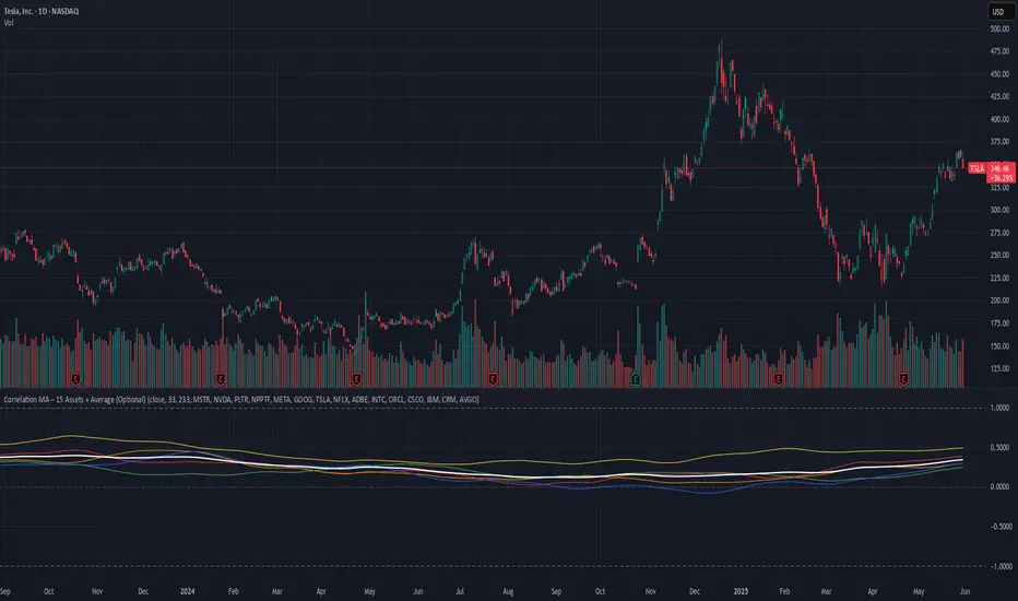
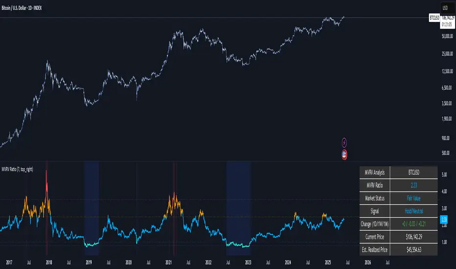
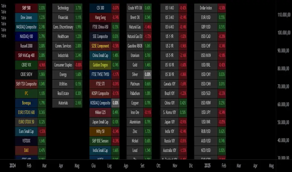
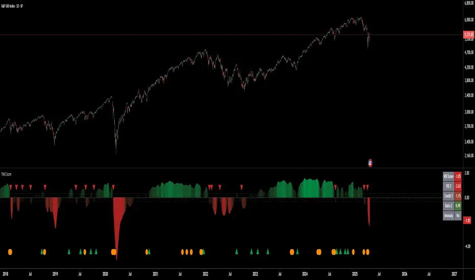
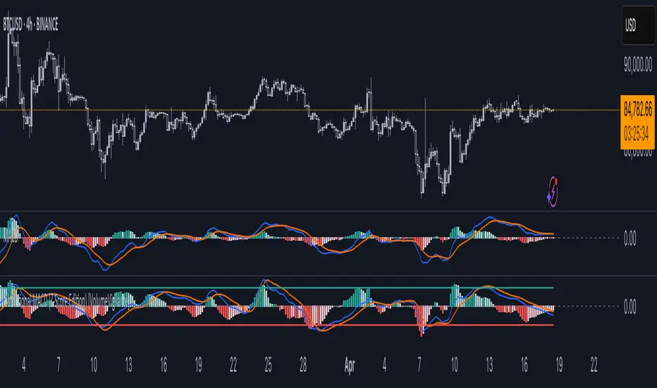
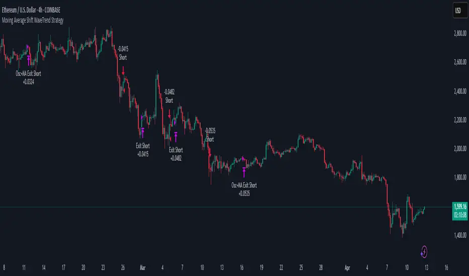
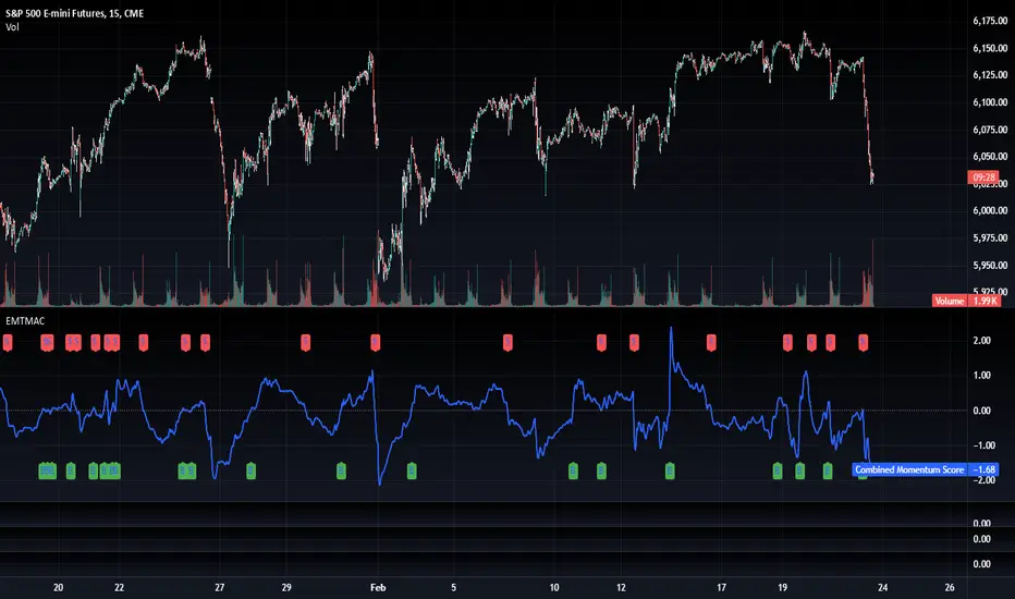
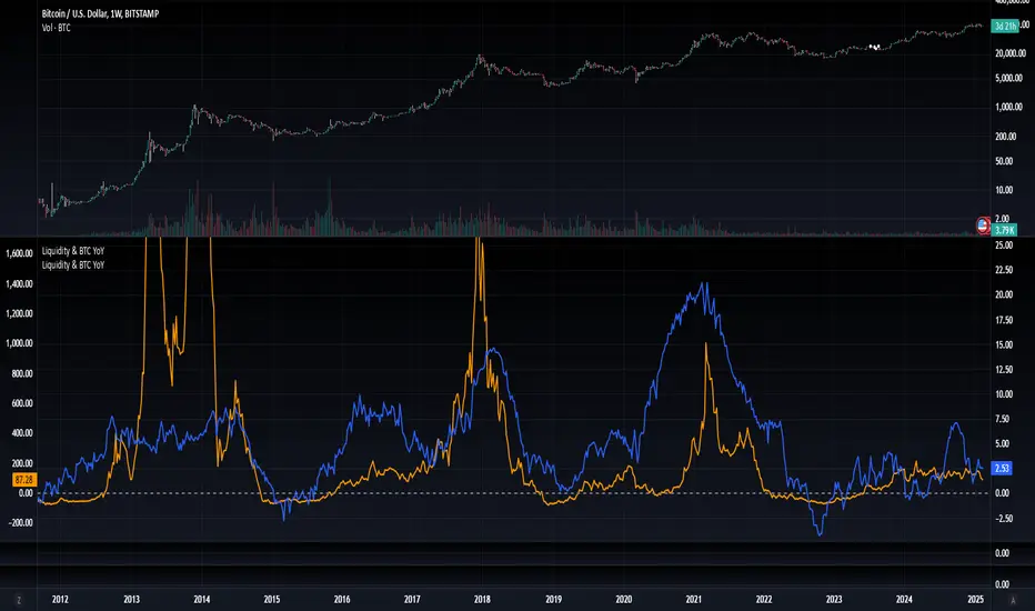
Ultimate SMC & Liquidity ToolkitUltimate SMC & Liquidity ToolkitDescription
The Ultimate SMC & Liquidity Toolkit is an all-in-one Pine Script v6 indicator designed for traders who utilize Smart Money Concepts (SMC) and Inner Circle Trader (ICT) methodologies.
Instead of cluttering your chart with five different indicators, this script combines the most essential price action and liquidity tools into a single, highly customizable script. Whether you are day trading indices or swinging forex, this toolkit dynamically tracks liquidity pools, structural shifts, and critical institutional price levels.
🌟 Key Features
Extending Fair Value Gaps (FVGs): Automatically detects Bullish and Bearish Fair Value Gaps. The script projects a horizontal shadow for each FVG until price fully mitigates (fills) the zone, leaving mitigated gaps on the chart as historical context.
Liquidity Sweeps: Identifies when price wicks through a recent fractal pivot (5-bar highs/lows) but fails to close beyond it, tagging it on the chart as a "Sweep". Excellent for spotting stop hunts and false breakouts.
Session Killzones: Highlights the Highs and Lows of the Asian (18:00–02:00), London (02:00–08:00), and New York (08:00–17:00) sessions.
Higher Timeframe (HTF) Levels: Automatically tracks and projects crucial HTF structural levels, including the Previous Day, Week, and Month Highs/Lows. It also tracks the Daily Open (DO) and Previous Day Close (PDC).
Auto Fibonacci Extensions: Automatically draws a Fibonacci sequence (0, 1, and the 1.618 extension) based on the most recent major swing high and swing low.
Clean Chart Dynamics: Labels and lines (using dotted styles) are coded to project slightly ahead of the current price action, deleting historical line trails to keep your screen completely free of clutter as time progresses.
⚙️ Full Customization Every trader’s eye is different. The settings menu includes a Feature Toggles section, allowing you to independently turn every single feature on or off. Additionally, all color settings use carefully selected transparency levels to ensure they look equally pristine on both Dark Mode and Light Mode backgrounds. Indicatore

Mbedaiwi - Market Structure and Price Action mbedaiwi - Market Structure & Price Action
Overview
This Pine Script v6 overlay brings market structure, liquidity events, order blocks, volume estimates, price imbalances, and chart-pattern candidates into one configurable workspace. It helps users examine where price has broken structure, where earlier zones remain active, and how several observations align on the same chart.
The indicator is intended for discretionary analysis and chart study. It is not an automated execution system or a backtested TradingView strategy.
Purpose and benefits
Compare short-term internal structure with broader swing structure.
Organize potential reaction areas using order blocks, imbalances, liquidity levels, and range bands.
Compare the volume associated with visible order blocks through an overlay or a separate right-side display.
Select the modules and labels needed for a particular workflow, reducing chart clutter.
Use alerts to monitor defined events without continuously watching the chart.
The integration follows a practical sequence: establish structure, locate relevant areas, observe price interaction, and optionally evaluate a rule-based setup. The components provide context for one another; agreement between them does not establish a probability of success.
1. Market structure
Internal and swing structure can be configured separately. The script supports SMC leg-transition detection and symmetric pivot detection, with adjustable lengths.
BOS: a break classified as continuation of the current structural direction.
CHoCH: a break against the previous structural direction.
CHoCH+: a CHoCH supported by an intervening higher low for a bullish change, or lower high for a bearish change, under this script's pivot and sequence rules.
HH, HL, LH, and LL: higher highs, higher lows, lower highs, and lower lows.
Strong/Weak High-Low: structural classifications based on the current directional state, not forecasts of whether a level will hold.
Each structure selector offers All, BOS, CHoCH (All), CHoCH, CHoCH+, and None. CHoCH (All) includes both ordinary and supported changes; CHoCH and CHoCH+ select their respective classifications. The separate Show BOS and Show CHoCH switches also affect visibility.
Historical and Present display modes, candle coloring, label sizes, and colored or monochrome themes provide additional control.
2. Order blocks and volume display
The script includes independent swing-break, volume-pivot, and legacy structure-break order-block engines. Available controls include zone boundaries, mitigation rules, retained-zone counts, overlap suppression, midlines, and breaker display.
Volume information can appear on the price-chart overlay, in a right-side chart, or in both locations. Users can choose the volume accumulation interval, including the interval between a broken pivot and its break, an origin window, or an origin-based interval.
How to read the volume numbers
The displayed volume belongs to the selected calculation interval. The percentage is that block's share of the summed volume of currently displayed non-breaker blocks. Changing visible blocks, filters, or retention settings can therefore change the percentages. They are not win rates or percentages of the instrument's entire trading volume.
Internal buy/sell activity is an OHLCV-based estimate. Close-location mode allocates volume according to the close's position within each candle's range; candle-direction mode allocates it according to candle direction. These estimates do not measure actual bid/ask transactions, institutional orders, or order-book liquidity. Volume-dependent outputs rely on the data supplied for the symbol.
3. Liquidity tools
Equal Highs and Equal Lows use an adjustable ATR-based tolerance. Liquidity Grabs identify excursions beyond tracked levels followed by a return inside those levels, subject to the detection rules.
Grabs are displayed as hollow frames around the relevant candle wick: blue for bullish lower-wick grabs and red for bearish upper-wick grabs by default. Optional text can be enabled. Detection sensitivity and retained history are adjustable.
Live previews can change or disappear before the candle closes. Liquidity Grab alerts require a confirmed bar. Separate trendline tools and trendline-break alerts are also available.
4. Price imbalances
The imbalance selector displays one of five types:
FVG: a three-candle gap between the first and third candles' price ranges.
Inverse FVG: a tracked FVG that is breached and reclassified in the opposite direction.
Double FVG: an overlapping area between a new FVG and a tracked opposite-direction FVG.
Volume Imbalance: a gap between adjacent candle bodies while their wick ranges overlap. Despite the name, this detection is price-based.
Opening Gap: a gap between adjacent candle ranges.
Controls include source timeframe, volatility threshold, extension, mitigation method, and maximum retained zones. The imbalance timeframe must be the chart timeframe or higher. Higher-timeframe imbalance detection uses completed source candles, so it becomes available after source-bar confirmation.
To hide only the FVG/type text while retaining the shaded zones, disable Show Imbalance Type on Zones. Re-enable it at any time from Inputs.
5. Premium, equilibrium, and discount
Optional bands divide a selected Swing, Internal, or Impulse range into upper, middle, and lower reference areas. Band width and colors are adjustable. These areas describe relative position within the selected range; they do not measure fundamental fair value or guarantee a reversal.
6. Chart-pattern candidates
The pattern module classifies recent pivot geometry and can display pattern boundaries, shaded zones, and a Detected Pattern table. Candidate types include triangles, wedges, broadening wedges, double tops/bottoms, and head-and-shoulders formations.
Pattern drawings are separate from the trendline module. Detection depends on pivot length, available history, and tolerance settings. In this release, a displayed pattern can remain after price has moved outside its boundaries until the detection state updates. Treat the pattern name as a geometric candidate, not confirmation that a formation remains valid or that a breakout will succeed.
7. Additional context and optional setup planning
Optional Fibonacci retracements, an OTE region, extension levels, and previous daily/weekly/monthly/quarterly highs and lows provide additional reference points.
The optional setup layer combines structural events with configurable checks such as liquidity sweeps, order-block or imbalance interaction, displacement, higher-timeframe direction, EMA alignment, volume, and RSI. Score and Strict modes control how these conditions are evaluated.
When enabled, the trade layer can display a hypothetical entry, stop, and up to three targets using configurable zone, structure, ATR, or risk-multiple methods. These are rule-based planning levels, not executed orders or verified performance results. The default mbedaiwi profile suppresses the trade layer.
How to use
Add the indicator to a standard candlestick chart and choose an analysis profile. The default mbedaiwi profile uses internal length 5, swing length 50, and close-based structural breaks. Select Custom or enable Override profile lengths when you want the manual lengths to take effect.
Choose the internal and swing events you want to see. Start with structure and a small number of zones before enabling additional modules.
Enable order-block metrics if you want volume comparisons. Select the accumulation method and overlay/side-chart layout appropriate for your analysis.
Enable Liquidity Grabs and select detection sensitivity. Distinguish a live preview from a completed event.
Choose an imbalance type and its mitigation method. Add premium/discount bands or prior-period levels if they help define context.
Enable Patterns only when studying pivot-based formations, and check the actual candles against the displayed boundaries.
Use Clean chart mode, individual visibility switches, label sizes, and zone-count controls to manage clutter. The Show tables switch controls on-chart tables.
If using the optional setup layer, choose a compatible profile, review all filters and risk settings, and evaluate its behavior before relying on the planning levels.
Reading entries, stops, targets, and exits
Use the indicator as a sequence of observations: structural direction, an area to monitor, confirmation, and a predefined risk/target plan. A BOS, CHoCH, or Liquidity Grab on its own is not an automatic instruction to buy or sell.
Step 1 - Read the structural context
Start with Swing Structure for the broader context, then use Internal Structure to examine shorter movements. Higher highs and higher lows describe an upward structure; lower highs and lower lows describe a downward structure. A bullish BOS is classified as continuation, while a bullish CHoCH marks a potential change from the preceding bearish structure. CHoCH+ adds the script's supporting pivot-sequence condition; it does not guarantee a reversal.
An internal bullish change can occur while swing structure remains bearish. Always identify which structure level produced the label. Pivot confirmations can arrive after the turning point and be drawn back at the earlier pivot bar.
Step 2 - Identify an area to monitor
A bullish order block, bullish FVG, discount band, previous low, or Equal Lows can provide a reference area for studying a possible bullish reaction. Price entering an area only establishes an interaction; it does not confirm that a rebound has started. Order-block volume percentages are calculated volume shares, not probabilities that the area will hold.
Step 3 - Observe confirmation
The following is an illustrative manual reading sequence, not the mandatory algorithm behind every setup generated by the script:
Price reaches a previously identified reference area.
Price moves below a tracked low and closes back above it, producing a confirmed bullish Liquidity Grab if the detection conditions are met.
Price subsequently breaks an internal structural level upward, producing a bullish CHoCH or CHoCH+ under the script's rules.
The user evaluates the completed confirmation candle or a later retest of the broken level, together with the broader structure and the planned invalidation level.
A retest may never occur, and confirmation can still fail. Do not assume that a marker anchored to an earlier candle was available in real time on that candle.
Step 4 - Understand the optional planning layer
The planning layer displays hypothetical levels when its setup conditions are satisfied:
Entry method: Market, Fibonacci, or Zone determines the entry-reference calculation.
Stop method: Structure, ATR, or Zone determines the stop-reference calculation. The selected invalidation level defines where the planned idea no longer applies.
Target method: Risk multiple, Smart money, or Hybrid determines how target references are calculated.
TP1, TP2, and TP3: up to three target references, according to the selected method.
Move stop to breakeven after TP1: updates the hypothetical stop to the entry reference after the first-target condition is met.
These are chart calculations. They do not send orders to a broker, establish actual fills, or move a real stop order.
To make this layer available, choose a profile such as Custom, enable Show trade layer (entry / SL / TP), and disable Structure only. The default mbedaiwi profile suppresses the trade layer. Enabling the display does not guarantee that levels appear immediately: the selected signal conditions and filters must also be satisfied.
Step 5 - Read risk multiples: a numerical example
Consider a hypothetical entry at 100 and a stop at 98. The distance between them is 2 per share, so 1R equals 2. In Risk multiple target mode:
Entry reference: 100.
Stop reference: 98.
1R target: 102.
2R target: 104.
3R target: 106.
This example explains arithmetic only. It is not a trade recommendation, a prediction, or a result produced by a backtest. It excludes fees and slippage. A real fill can differ from the plotted reference, and an actual exit can differ from the stop price. If the hypothetical breakeven option is enabled, a qualifying TP1 event changes the plotted stop reference to 100; this does not guarantee a cost-free exit in actual trading.
Step 6 - Interpret exits and changes in structure
A TP reached alert means that the script's target condition has been met. A Stop-loss reached alert means that its stop condition has been met. Neither confirms that a broker executed an order.
A bearish CHoCH during an upward move provides information about a structural change. It does not automatically mean that the planning layer closed a position, nor that every internal change requires the same response. Target exits, invalidation exits, and any discretionary response to opposing structure should be defined before acting on a setup. The script does not automatically carry out partial sales or discretionary exits described by a user's plan.
Manual analysis versus calculated setups
The manual sequence above explains how the visual components can be read together. The optional planning layer instead evaluates its configured rules, filters, and calculation methods. It does not necessarily require that exact sequence. Neither workflow supplies verified profitability or guarantees that a displayed setup will succeed.
Alerts
Available conditions cover internal and swing BOS/CHoCH/CHoCH+, liquidity grabs and sweeps, equal highs/lows, imbalance formation, zone interactions, order-block breaks, trendline breaks, detected patterns, and optional setup/target/stop events.
Select this indicator in TradingView's Create Alert dialog, then choose the event. Use Once Per Bar Close when you want close-confirmed notifications. General CHoCH alerts also include supported changes; separate CHoCH+ conditions are available. Some touch conditions can remain true across consecutive bars, so they should not be interpreted as one notification per zone for its entire lifetime.
Timing, historical drawings, and limitations
Pivot-based features require later bars to confirm earlier turning points. Labels and zones may be anchored back to those earlier bars, although the information was not available at that time.
Live candles and enabled previews can change before close. This indicator is not presented as universally non-repainting.
Zone removal depends on mitigation, age, overlap, and retention settings. Older drawings can disappear as new observations replace them.
Results depend on the symbol, timeframe, session, available history, and settings. Different indicators can use different definitions and produce different results.
The confluence score is a rule-based score, not a calibrated probability. Volume percentages and Strong/Weak labels are not measures of signal accuracy.
The planning layer does not provide a broker execution model, Strategy Tester results, or verified profitability. No accuracy, return, or future-performance claim is made.
Source acknowledgment
The hierarchical pivot-detection logic used in the Liquidity Grabs module is adapted from LuxAlgo's open-source "Pure Price Action Liquidity Sweeps", licensed under CC BY-NC-SA 4.0. Modifications include wick-frame rendering, display controls, and alert handling. Credit for the adapted source logic belongs to LuxAlgo.
This acknowledgment concerns the identified open-source component and does not imply access to LuxAlgo's closed-source Price Action Concepts indicator. This publication is not affiliated with or endorsed by LuxAlgo.
Intended use
For educational chart analysis and discretionary decision support. Users remain responsible for validating the settings, interpreting signals, and managing risk. No displayed zone, pattern, or setup guarantees a particular market outcome.
Indicatore

Signal Follow-Through Ledger [MQLSoftware]OVERVIEW
Signal Follow-Through Ledger measures what price actually did after a signal you already have. You point it at any numeric plot on your chart — a built-in price source, your own indicator, or a third-party one — tell it what counts as an event on that series, and it keeps an audit trail of how each event turned out. It owns no signal of its own and creates no entries, stops, targets or position sizing. It answers one question about a signal you already use: when this fired before on this chart, what usually happened next?
CONCEPTS
Each event opens a sample. The reference price is the close of the confirmed signal bar, and the favourable and adverse distances come from an ATR snapshot taken on that same bar and then frozen for the life of that sample. Rescaling old samples by today's volatility is the usual way this measurement goes wrong, so each sample is judged by the volatility that existed when it was taken.
Evaluation starts on the bar after the signal and runs for a configurable horizon, twenty bars by default. The signal bar's own high and low were printed partly before its close, so testing them would read its past as the signal's future.
When one later bar contains both thresholds, OHLC data cannot say which came first. That sample is recorded as ambiguous and kept out of the headline rate rather than guessed either way, which is the largest single source of overstated numbers here. A sample that reaches neither threshold inside the horizon is a real answer and stays in the denominator.
MFE and MAE keep accumulating for the whole horizon even after a sample resolves; stopping them at resolution would floor MFE at your own favourable multiple and describe your setting rather than the market.
FEATURES
Seven event types: cross up or down through a level, cross up or down through a reference (a moving average of the source, or a second plot), a new N-bar high or low, and a first non-blank value for sources that are blank except when they signal. Direction follows the event or can be forced. The panel reports the share of samples that reached the favourable target before the adverse one, the sample size, the favourable / adverse / neither split, median MFE and MAE in ATR, median bars to the peak, and the ambiguous, still-open and declined counts. Signal markers, outcome markers and the measurement corridor are drawn on the chart. Two confirmed-bar alerts: a sample recorded, and a sample resolved.
HOW TO USE
Open Settings and set Signal source to the plot you want audited; the dropdown lists the indicators already on your chart. Choose the event, and for level modes type the level in the units of that source — 30 or 70 for RSI, 0 for a zero-centred oscillator. Out of the box it audits price crossing above its own fifty-bar average, so it produces numbers before you configure anything.
Read the headline with the sample size beside it, never alone. Rates stay behind a minimum-sample gate and read "collecting" until enough samples complete. One sample runs at a time by default, so events arriving inside an open horizon are declined and counted separately: that declined figure tells you the signal fires more often than the ledger samples it.
Everything in the ledger is written on confirmed bars and is never revised. The single live figure is the raw source readout in the panel footer, so you can confirm the source is wired up.
CONCLUSION
This is a measurement tool, not a strategy tester. It models no fills, spread, commission, slippage, position sizing or intrabar sequencing, so nothing here is a profitability result. The figures describe what this chart's loaded bars did after these events, on this symbol, timeframe and source, shown with the sample size that produced them. And it cannot make a repainting source stable: if the indicator you point it at rewrites its own history, the events change and this audit changes with them. Indicatore

Volume Profile - Pivot Anchored Pro [JPT]🔷 OVERVIEW
Volume Profile – Pivot Anchored Pro is an educational volume analysis indicator that automatically creates volume profiles between confirmed swing highs and swing lows. It helps traders visualize where significant trading activity occurred throughout each market swing.
The indicator displays important volume-based levels including the Point of Control (POC) and Value Area High/Low (VAH/VAL), allowing traders to study areas where price may have experienced strong acceptance or rejection.
The indicator is designed to help traders analyze market structure, volume distribution, and key price areas. It does not predict future price movement or guarantee profitable trades.
🔷 FEATURES
• Automatic pivot high and pivot low detection
• Pivot-to-pivot volume profile generation
• Bullish and bearish volume visualization
• POC (Point of Control) level
• VAH (Value Area High) level
• VAL (Value Area Low) level
• High and Low labels for each profile
• Multiple historical volume profiles
• Customizable profile rows
• Adjustable Value Area percentage
• Adjustable profile width
• Customizable colors and display settings
• Clean chart layout with minimal clutter
🔷 HOW IT WORKS
• Detects confirmed swing highs and swing lows.
• Identifies completed price swings between pivot points.
• Calculates the volume distribution across different price levels within each swing.
• Identifies the POC, representing the price level with the highest traded volume.
• Calculates the Value Area, based on the selected Value Area percentage.
• Displays VAH and VAL to define the upper and lower boundaries of the Value Area.
• Draws the volume profile directly on the chart for easy market analysis.
🔷 HOW TO USE
Look for newly completed pivot-to-pivot volume profiles.
Use the POC to identify important high-volume price levels that may act as areas of support, resistance, or price acceptance.
Use VAH and VAL to understand the boundaries of the Value Area and observe how price reacts around these levels.
Compare multiple profiles to study how volume distribution changes from one market swing to another.
Consider combining the indicator with your own price action, market structure, support/resistance, liquidity, and risk management techniques.
🔷 IMPORTANT NOTE
This indicator is intended for educational and analytical purposes only. Volume Profile levels should be treated as reference areas rather than guaranteed support or resistance.
Always perform your own analysis and use appropriate risk management before making any trading decisions.
Volume Profile – Pivot Anchored Pro helps you see not only where price moved, but also where the market traded the most volume during each major swing. Indicatore

Eaglizer RSI CloudMost RSI indicators plot one line that whips around and tells you very little on its own. This plots two moving averages of the RSI instead, and fills the space between them, so you can see the momentum regime rather than the momentum noise.
WHAT IT DOES
It takes RSI 14, then builds two moving averages on top of it. A fast one at 9 and a slow one at 50. The space between them is filled as a cloud.
When the fast average is above the slow one, the cloud is green and momentum is in a bullish regime.
When the fast average is below the slow one, the cloud is red and momentum is in a bearish regime.
A small triangle marks the bar where the cloud flips.
WHY AVERAGE THE RSI AT ALL
Raw RSI reacts to every bar. That is useful for spotting an extreme reading, and useless for telling you what the underlying momentum is actually doing. Averaging the RSI strips out the single bar reactions and leaves the shape of the move.
The 9 and the 50 do different jobs. The fast average is what momentum is doing right now. The slow average is the regime you are trading inside. The gap between them is the part that matters: a wide cloud means momentum is running, a narrow one means it is stalling, and a flip means the regime changed.
HOW I USE IT
I use this as a filter, not as a trigger. I want the cloud on my side before I take a setup in that direction. If I am looking for longs and the cloud is red, I wait.
I trade this mostly on the 4 hour and the daily. On very low timeframes the slow average becomes slow enough to be behind the move.
A flip on its own is not an entry. It is a reason to go look at the chart.
SETTINGS
RSI length, default 14. Fast RSI MA, default 9. Slow RSI MA, default 50. Both averages can be set to SMA or EMA, and SMA is the default because it is steadier.
You can turn on the raw RSI line if you want to see it underneath the cloud. It is off by default because the whole point is to stop staring at it.
Reference levels sit at 70, 50, and 30.
ALERTS
Two alert conditions are included, one for the cloud flipping bullish and one for it flipping bearish. Both carry the ticker and the close price.
WHAT THIS IS NOT
This is not a complete trading system and I am not presenting it as one. It has no entry price, no stop, and no target. It tells you what momentum regime you are in. Everything after that is on you.
The full system I trade adds pivot breakout boxes, an EMA 89, a higher timeframe EMA 34, a volume filter, and defined stop and target rules. If you want it, the link is on my profile.
DISCLAIMER
This is a technical analysis tool for education and research. It is not financial advice, it is not a recommendation to buy or sell anything, and past behavior of any indicator does not predict future results. Trading involves risk of loss. Size your positions accordingly and do your own work. Indicatore

Tail Range Percentile Radar [Pineify]Tail Range Percentile Radar
Overview
Tail Range Percentile Radar separates candle rarity from candle shape. Four aligned scan lanes compare true range, real body, upper wick and lower wick with their own recent histories. It describes anatomy, not the next move.
Problem Definition
An ATR multiple measures distance from an average, but the same multiple can occur in very different distributions. A long range may also be mostly gap, body or wick. A wick-to-body ratio alone is unstable near a doji and says nothing about historical rarity. Ask two questions: is this component unusual, and does it occupy enough of this candle to matter?
Design Rationale
Separate ranks preserve anatomy hidden by one volatility score. The candidate is excluded from its reference window so an extreme cannot alter its own baseline. Half-weight ties avoid treating repeated tick sizes as distinct observations. A minimum high-low share rejects historically rare but visually trivial parts. Averaging all four ranks was rejected because a large body could mask an exceptional wick; retaining four lanes costs screen space but preserves the reason for each event.
Key Features
Four prior-only percentile populations with explicit zero handling.
Independent range and share-qualified body or wick flags.
A confirmed anatomy strip, three close-only alerts and optional statistics.
How It Works
TR is the largest of high-low, the distance from high to the previous close, and the distance from low to the previous close. Body is absolute close-open; wicks are the distances from the body edges to high and low. Each magnitude is rounded to the symbol's tick size. Its rank is 100 times the count of smaller prior values plus half the equal values, divided by N. Zero parts receive zero. All N preceding bars must have valid OHLC and previous-close data; invalid coverage leaves every lane blank.
A flag needs rank at or above Q. Body and wick flags additionally need their configured share of high-low; a zero high-low gives zero shares. Tail flags do not require extreme TR. The displayed type prioritizes dual tail, upper tail, lower tail, directional body, gap-led range, then range only. Gap-led requires extreme TR and at least 35% of TR outside high-low. Component flags remain independent of this display priority.
How Multiple Indicators Work Together
The four measurements are one candle decomposition, not unrelated trading signals. Rank supplies historical context; share supplies geometric relevance; their conjunction supplies body and tail flags. TR retains total movement, including movement beyond high-low relative to the previous close. Without share, tiny parts can be highlighted; without separate ranks, unusual anatomy disappears inside a single range score.
Trading Ideas and Insights
An upper-tail event identifies an unusually large upper wick, not proven selling pressure or a short entry. A lower tail is equally descriptive. Compare a tail inside ordinary TR with a range event dominated by a body: the patterns answer different anatomy questions. Clusters invite chart review but do not establish reversal odds.
Unique Aspects
Relative to an ATR threshold or candle ratio, the added mechanism is a prior-only, tie-aware four-population comparison with geometric qualification and explicit mixed-tail precedence. It preserves tail rarity even when total range is ordinary. Zero suppression prevents absent wicks from becoming exceptional merely because a reference sample contains many zeros.
How to Use
Read the lanes from top to bottom: gold TR, purple body, orange upper wick, teal lower wick. Each uses its own zero baseline and equal height for 0-100; stacked positions are not a shared numeric axis. Dashed rails mark Q, vivid columns show qualifying components and dots confirm them at close. Use the table or Data Window for actual ranks and anatomy codes. The diamond strip marks the selected closed-bar type.
Customization
Start with N=200, Q=95, wick share=20% and body share=55%; these are design starting points, not optimized settings. Shorter N responds sooner but uses fewer comparisons; higher Q or shares rejects more bars. The statistics window defaults to 100 chart bars. Its rates use eligible closed bars, with sample coverage shown; overlapping flags can sum above 100%. Guides, tips, strip, table and four colors are configurable.
Assumptions and Limitations
Use standard OHLC charts; synthetic candles change the meaning of anatomy. Price scale changes, splits, session gaps, stale bars and regime shifts can distort the raw-size reference. No volume or order-flow data is used. Rank 95 is a sample comparison, not a 5% future probability; it also does not measure how far beyond history a new maximum lies. At least N valid prior observations plus previous-close coverage are needed. Live ranks, shading and table type can change intrabar; tips, strip and alerts require close. Alerts apply to every qualifying closed bar, so consecutive bars can each alert and dual tails can trigger both tail alerts. Choose once per bar close. Parameters, chart history and feed revisions can change results. There is no entry, exit, profitability or reversal model.
Conclusion
The range percentile radar distinguishes unusual total movement from unusual candle parts while keeping rarity and shape separate. Use it as a compact explanation of observed tail volatility, with independent decision rules.
Indicatore

SMC EngineSMC Engine
Overview
SMC Engine is a market-context indicator designed to identify potential liquidity sweeps and directional pressure around a selected session range.
The indicator combines an open-based NY range, candle spread analysis, and lower-timeframe volume pressure to classify market conditions such as Stop Hunts, directional aggression, and breakouts.
The default session is 09:30–10:30 New York time, but the session and timezone can be adjusted from the settings.
Key Features
Open-based NY session range
Automatic range box visualization
Projected range levels after the session
Candle spread anomaly detection
Lower-timeframe volume pressure
Stop Hunt High detection
Stop Hunt Low detection
Bullish Aggression detection
Bearish Aggression detection
Breakout Up/Down classification
Real-time sentiment dashboard
How It Works
1. Open-Based NY Range
During the selected session, the indicator tracks the highest and lowest candle opening prices.
These levels form the open-based range used by the sentiment engine.
Note: This is an open-based range, not a conventional opening range calculated from candle highs and lows.
2. Spread Analysis
The indicator compares the current candle's spread (High - Low) with its average spread over the selected baseline period.
Default settings:
Spread Baseline: 50 bars
Spread Anomaly Multiplier: 2.0
When the current spread exceeds the baseline multiplied by the anomaly multiplier, it is classified as a spread anomaly.
3. Volume Pressure
The indicator uses lower-timeframe candle data to estimate directional volume pressure.
Lower-timeframe close > open → volume is counted as positive
Lower-timeframe close < open → volume is counted as negative
Lower-timeframe close = open → volume is ignored
The resulting value is used as a volume-pressure proxy.
This is not true bid/ask volume delta.
Sentiment Conditions
Stop Hunt High
A Stop Hunt High is identified when:
The candle has an unusually large spread
Price trades above the open-based range high
The candle closes back at or below that level
Lower-timeframe volume pressure is negative
The signal is displayed with an orange downward triangle.
This can be viewed as a potential bearish liquidity-sweep setup.
Stop Hunt Low
A Stop Hunt Low is identified when:
The candle has an unusually large spread
Price trades below the open-based range low
The candle closes back at or above that level
Lower-timeframe volume pressure is positive
The signal is displayed with an orange upward triangle.
This can be viewed as a potential bullish liquidity-sweep setup.
Bullish / Bearish Aggression
When a spread anomaly occurs without meeting the Stop Hunt conditions, the indicator evaluates candle direction and volume pressure to identify:
Bullish Aggression
Bearish Aggression
Air Pocket/Uncertain
Breakouts
When the spread is not classified as an anomaly, the indicator can identify:
Breakout Up
Breakout Down
These classifications are based on price closing beyond the open-based range together with corresponding volume pressure.
How to Use It
The indicator is primarily intended as a market-context and confirmation tool, rather than a standalone buy/sell system
A simple way to use the Stop Hunt signals is:
Bullish Setup
Stop Hunt Low → wait for confirmation → consider long
When an orange Stop Hunt Low appears, avoid entering immediately. Observe the following price action and look for bullish confirmation before considering a long trade.
Bearish Setup
Stop Hunt High → wait for confirmation → consider short
When an orange Stop Hunt High appears, avoid entering immediately. Observe the following price action and look for bearish confirmation before considering a short trade.
The Stop Hunt signal should therefore be treated as a setup/area of interest, not an automatic entry signal.
Traders can combine the signal with their own market structure, price action, risk management, and higher-timeframe analysis.
Dashboard
The dashboard displays:
VSA Price Spread — current candle spread in ticks
Baseline Spread — average spread used for anomaly detection
Volume Pressure — calculated lower-timeframe directional volume pressure
Current Sentiment — current classification produced by the engine
Recommended Usage
The default configuration is designed around using a lower timeframe for volume-pressure analysis, such as a 1-minute lower timeframe on a 5-minute chart.
The appropriate settings can vary by market, symbol, and timeframe, so traders should test the indicator under the conditions in which they intend to use it.
Important Limitations
The range is based on candle opens, not highs and lows.
Volume Pressure is a directional-volume proxy and should not be interpreted as true bid/ask delta.
A Stop Hunt signal does not guarantee a reversal or profitable trade.
Breakout classifications do not guarantee that a breakout will continue.
The indicator does not determine stop-loss placement, take-profit levels, or position sizing.
Market conditions, liquidity, and data-feed characteristics can affect the behavior of lower-timeframe calculations.
Traders should independently test and validate the indicator before using it in live trading.
SMC Engine is intended for market analysis and educational purposes and should be used together with appropriate risk management. Indicatore

Pattern Atlas : Geometric [AxeAlgo]Pattern Atlas : Geometric Patterns
WHAT THIS LIBRARY IS
This is a Pine Script v6 library of 17 classical chart pattern detectors — Head and Shoulders, Double/Triple Tops and Bottoms, triangles, wedges, flags, and the rest of the standard technical-analysis catalog built from swing highs and lows rather than single-candle shape. Unlike candlestick patterns, which read one to a handful of fixed bars, chart patterns span a variable, often large number of bars, so this library carries one small piece of state — a rolling history of confirmed swing pivots — that every pattern function reads from. Beyond that, the same philosophy as Library #1 applies: no plotting, no alerts, and no inputs in this script by design, since a library's job is to hand other scripts a clean, reusable, well-documented API, not to draw on a chart itself (Pine doesn't allow a library to plot anything anyway). If you're looking for a ready-to-use indicator built on top of this library, see the companion "Pattern Atlas : Geometric Indicator " script, which imports every function here and turns it into on-chart signals, measured-move price targets, a live scanner table, and alerts.
Chart pattern analysis is one of the foundational tools of classical technical analysis, going back to Edwards and Magee's original work and refined since by researchers like Thomas Bulkowski, whose statistical studies of pattern behavior are the closest thing this field has to an industry-standard reference. The patterns in this library follow that standard catalog, so anyone who already knows what a Head and Shoulders top or an Ascending Triangle looks like will recognize exactly what each function is checking for.
WHY A LIBRARY INSTEAD OF ONE MONOLITHIC INDICATOR
Splitting detection logic out as an importable library means:
- Any Pine coder building their own strategy, indicator, or screener can pull in exactly the pattern checks they need without copy-pasting swing-pivot and trendline math into every new script.
- The detection logic is tested and maintained in one place. When a threshold gets refined, everything importing this library benefits from the update by bumping one version number.
- It keeps the math separate from presentation — how a pattern gets drawn, colored, or alerted on is a completely separate decision from whether the pattern is actually present, and different users want different presentations.
HOW TO IMPORT AND USE IT
Add this line near the top of your script (adjust the version number to whatever the current published version is):
import AxeAlgo/Pattern_Atlas_Geometric/1 as geo
Unlike Library #1, most of the functions here need a shared pivot history to work from. Call trackPivots() exactly once per bar, then pass its result into every detect*() function that needs it:
pivots = geo.trackPivots()
match = geo.detectDoubleTopBottom(pivots)
if match.found
label.new(bar_index, high, match.patternName)
Four functions — detectSpike(), detectFlag(), detectPennant(), and detectIslandReversal() — read directly off recent price action instead of the shared pivot history, so they're called without a pivots argument: geo.detectSpike().
trackPivots() takes three optional parameters: leftBars and rightBars (how many less-extreme bars must surround a candidate swing point before it confirms as a pivot — higher values mean fewer, more significant pivots, at the cost of a longer confirmation lag), and maxPivots (how much pivot history to retain). All three have sensible defaults.
Every detect*() function returns the same structure, called ChartPatternMatch, so the calling pattern is identical no matter which of the 17 you use. It has nine fields:
- found — true if the pattern matched at the evaluated bar, false otherwise.
- patternName — the specific name of what matched (e.g. "Ascending Triangle"), na when not found.
- direction — "bullish" or "bearish".
- pivotBars — bar_index of each pivot the match was built from, in chronological order.
- pivotPrices — price of each pivot, in the same order as pivotBars.
- breakoutLevel — the support, resistance, or neckline level price broke through to confirm the pattern.
- necklineSlope — slope (price per bar) of the breakout line, na when the pattern's breakout level isn't a sloped line.
- barIndex — the bar_index the pattern completes (breaks out) on.
- description — a full sentence naming the pattern and the actual measured price levels that triggered it — genuinely useful for a tooltip or an alert message, not just a repeat of the pattern name.
Two additional exported functions turn that raw match into something more actionable, and both work on any ChartPatternMatch regardless of which detect*() function produced it:
- patternStrength(match) — a 0-100 score for how decisively the confirmation close broke through breakoutLevel, relative to the pattern's own price range. A breakout that clears the level by a meaningful fraction of the pattern's own size scores higher than a one-tick poke through it.
- patternTarget(match) — a classical measured-move price target, projecting the pattern's own height from the breakout point. Returns na for patterns without a reliable height to project from (V-Top/V-Bottom Spike, Island Reversal, Bump-and-Run Reversal).
Every detect*() function also exposes its own set of tunable threshold parameters — how flat a "flat top" has to be, how much two shoulders can differ and still count as equal, and so on — all with sensible defaults so you don't have to touch them unless you want to tighten or loosen a specific pattern's sensitivity for a particular instrument or timeframe.
THE 17 PATTERNS
Reversal patterns (7) — signal a potential change in the prevailing trend:
- Head and Shoulders / Inverse Head and Shoulders — detectHeadAndShoulders(). Three swing extremes with the middle one more extreme than the two roughly-equal outer ones, confirmed when price breaks the neckline connecting the two points between them.
- Double Top / Double Bottom — detectDoubleTopBottom(). Two roughly equal peaks (or troughs) with a retracement between them, confirmed when price breaks back through that retracement level.
- Triple Top / Triple Bottom — detectTripleTopBottom(). The same idea as a Double Top/Bottom with a third roughly-equal touch, confirmed on the break of the support or resistance formed between the touches.
- Rounding Top / Rounding Bottom — detectRoundingTopBottom(). A gradual, curved advance-and-rollover (or decline-and-recovery) between two similar edge levels. Approximate: read from three swing pivots rather than fitting a true curve.
- Diamond Top / Diamond Bottom — detectDiamondTopBottom(). Swing range that widens and then narrows again, confirmed on a break of the resulting support or resistance. Rare and approximate: read from three pivot pairs rather than a clean diamond outline.
- Broadening Formation — detectBroadeningTopBottom(). Diverging highs and lows forming an increasingly volatile range, confirmed on a break of either edge. Approximate: read from two pivot pairs rather than a hand-fitted diverging channel.
- V-Top / V-Bottom (Spike) — detectSpike(). A single sharp extreme with no rounding — a large move into the pivot and an equally large move away from it, both measured against the recent average bar range, within a handful of bars. Self-contained, no pivots argument needed.
Continuation patterns (8) — typically resolve in the direction of the move that preceded them:
- Ascending Triangle — detectTriangleAscending(). Flat resistance with rising support, confirmed on a break above resistance.
- Descending Triangle — detectTriangleDescending(). Flat support with falling resistance, confirmed on a break below support.
- Symmetrical Triangle — detectTriangleSymmetrical(). Converging highs and rising lows, confirmed (bullish or bearish) whichever side the price actually breaks.
- Rising Wedge / Falling Wedge — detectWedge(). Both trendlines slope the same direction and converge; breaks the opposite way from the slope, since the shared-direction move was already losing momentum.
- Bull Flag / Bear Flag — detectFlag(). A strong directional move (the pole), followed by a tight, roughly parallel pullback, confirmed on a break back out in the pole's direction. Self-contained, no pivots argument needed.
- Bull Pennant / Bear Pennant — detectPennant(). The same pole-and-consolidation structure as a Flag, but the consolidation narrows and converges rather than staying parallel. Self-contained, no pivots argument needed.
- Rectangle — detectRectangle(). Price boxed between flat support and flat resistance, confirmed on a break of either edge.
- Cup and Handle / Inverted Cup and Handle — detectCupAndHandle(). A rounded recovery (or decline) back to its starting rim, then a shallow pullback (the handle), confirmed on a break through the rim.
Structural / gap-based patterns (2):
- Bullish / Bearish Island Reversal — detectIslandReversal(). A bar (or small cluster) isolated by a gap on both sides, then abandoned by a gap the other way — an abrupt reversal. Self-contained, pure gap logic, no pivots argument needed.
- Bump-and-Run Reversal — detectBumpAndRun(). A lead-in trendline, then a "bump" phase accelerating well beyond it, then a "run" breaking back through the lead-in line. Approximate: the lead-in line is read from just two pivots rather than a hand-drawn trendline.
WHAT THIS LIBRARY DELIBERATELY DOES NOT DO
No plotting, no drawing, no alertcondition() calls, and no inputs — Pine doesn't allow any of those inside a library in the first place, since a library can never be added to a chart on its own. If you want signals, price targets, a scanner table, or alerts, import this library into your own script (or use the companion "Pattern Atlas : Chart Pattern Scanner " indicator, which does exactly that) rather than expecting this script to render anything by itself.
This library also does not evaluate multi-timeframe data, volume, or broader market structure — it's swing-pivot and trendline geometry only, on purpose, so its behavior is easy to reason about and easy to reuse as one building block among several.
Four of the seventeen patterns are explicitly noted above as approximate: Rounding Top/Bottom, Diamond Top/Bottom, Broadening Formation, and Bump-and-Run Reversal are read from a small, fixed number of swing pivots rather than fitting a true curve or hand-drawn trendline to the data. They will not catch every textbook-perfect example of these shapes, and they may occasionally flag a looser approximation of one. Treat them as a starting point for further chart review, not a final word.
PART OF A LARGER SERIES
This is Library #2 in the AxeAlgo Pattern Atlas — a planned set of Pine libraries splitting pattern detection by the method actually used to find each kind of pattern: candlestick shape (Library #1, already published), classical chart/geometric patterns (this library), harmonic patterns (Fibonacci-ratio XABCD structures), and market-structure concepts (order blocks, liquidity, Wyckoff-style events). Each library is independent and useful on its own; together they're meant to cover technical pattern analysis without forcing unrelated detection methods into the same function.
A NOTE ON REPAINTING
trackPivots() only confirms a swing pivot once rightBars bars have passed since it happened — the same confirmation lag ta.pivothigh()/ta.pivotlow() use, just written out as plain comparisons so it works safely inside a library's exported functions. That means a pivot never moves or disappears once confirmed; it just takes rightBars bars to become known, which is a normal and unavoidable part of swing-pivot detection, not a defect in this library. On the currently-forming bar, a pattern's found status can still change tick to tick as that bar's own high, low, and close move — that's inherent to reading live price action. If you're building persisted signals, drawings, alerts, or price targets on top of these functions (rather than a live "what's happening right now" readout), gate your usage on barstate.isconfirmed so a signal only fires once the bar it describes has actually closed, exactly like the companion scanner indicator does.
DISCLAIMER
This library is a technical analysis tool for identifying classical chart pattern shapes in historical and live price data. It does not predict future price movement, and a detected pattern — including any projected price target — is a description of past price action, not a signal guaranteed to repeat. Nothing in this script constitutes financial advice. Always combine pattern recognition with your own risk management and broader analysis before making any trading decision.
Libreria

Structure Participation Matrix [MQLSoftware]OVERVIEW
Structure Participation Matrix turns confirmed structure breaks into auditable records. It shows price-travel and chart-feed participation context, then compares endpoints across frozen score buckets. Each record has four readings, a score, and one delayed observation. It is research, not entries, stops, targets, sizing, execution, or forecasts.
Its distinct contribution is the complete frozen event ledger: strict delayed pivots, four disclosed measurements fixed at the break close, explicit UNSCORED handling, and one outcome check aggregated by frozen bucket. It links structure, participation, and later observation rather than merely combining standard indicators.
CONCEPTS
Strict symmetric pivots require a unique extreme on both sides; ties are rejected. A pivot becomes eligible only after its full right-side delay. A break requires a confirmed close beyond the armed level plus the ATR buffer; a wick alone is not an event.
Four 0-100 components freeze at that close. PATH measures displacement against the leg's total path. CLOSE averages directional close location over its final bars. REL VOL compares average leg volume with a rolling median. BALANCE weights volume by close location. The fixed score is 30% EFF/PATH, 25% CLOSE, 25% RVOL/REL VOL, and 20% BAL/BALANCE, normalized once for displays, buckets, and alerts.
RVOL uses reported or tick volume; BAL is an OHLCV proxy. They are not bid/ask delta, order flow, or a footprint; neither proves participant identity or predicts future behavior. Missing leg volume or bounded history makes an event UNSCORED and excludes it from bucket statistics.
After exactly N confirmed bars, the close is checked once. HELD N means the endpoint is beyond the broken level; FAILED N means it is not. HELD does not mean price stayed beyond the level throughout. The result is fixed.
FEATURES
Confirmed BREAK UP and BREAK DOWN events
Latest-event PATH, CLOSE, VOL, BAL rail
LOW, MODERATE, HIGH, and VERY HIGH score bands
HELD N or FAILED N endpoint checks
Sample-aware count and held-at-N rate by bucket
Break, direction, score-60+, and outcome alerts
HOW TO USE
Start with defaults. Higher Strict Swing Strength gives fewer pivots and a longer delay. Break Buffer sets the required closing distance in ATR units. Maximum Measured Leg Bars bounds history; an older leg remains a visible UNSCORED break.
Read the latest label first. In the rail, PATH describes travel efficiency; CLOSE, final-bar commitment; VOL, relative chart activity versus baseline; and BAL, a directional OHLCV proxy. The score summarizes a frozen event, not an instruction or probability.
The newest event keeps its expanded label and rail. Older events become compact labels; Historical Detailed Rails restores detail. Visual switches and retention affect drawings only, not calculations, counts, or alerts.
The matrix uses events recalculated from the history currently loaded on the chart. Counts and rates change with symbol, timeframe, inputs, or the history boundary. Small buckets remain collecting. HELD N rates are historical endpoint observations, not future estimates.
CONCLUSION
The result is an inspectable break record with transparent measurements, compact history, one timed outcome, and visible data limits. Indicatore

COT Pulse Cloud TrendCOT Pulse Cloud Trend — Script Description
What it does
COT Cloud plots a translucent price cloud whose color and intensity reflect CFTC Commitment of Traders positioning for the chart's own market — large speculators (Non-Commercial) and/or hedgers (Commercial). It auto-detects the market from the chart symbol and pulls the matching weekly CFTC data automatically; no per-chart setup needed for covered markets.
Data source
Pulls straight from TradingView's own CFTC feed via request.security() — the Legacy report's Non-Commercial/Commercial Long and Short symbols (_F_NCP_L/S, _F_CP_L/S), no exchange prefix. This is the same report definition (noncomm_positions_long_all, comm_positions_long_all, etc.) used by CFTC's own Socrata dataset, so it lines up with the official weekly COT report.
Auto-detection
Reads syminfo.basecurrency/syminfo.currency/syminfo.root to identify the market and looks up its CFTC contract code. Covered: EUR, GBP, JPY, AUD, NZD, CAD, CHF; Gold, Silver, Copper, Palladium, Platinum; Wheat, Cotton, Corn, Soybeans, Sugar, Coffee, Cocoa, Live Cattle; WTI Crude Oil, Natural Gas; 2-Year and 10-Year Treasury Notes; Nikkei 225, S&P; 500, Nasdaq-100, Dow, Russell 2000, VIX, US Dollar Index, Bitcoin. For USDCAD/USDCHF/USDJPY-style charts (USD as the base currency) and the corresponding CAD/CHF/JPY futures, long and short are swapped so a positive net always means "bullish USD" — CFTC quotes those three the other way round.
If the chart's market isn't in this table, the script does not silently fall back to whatever is in the manual-symbol fields (that would plot a different market's COT data without warning) — it shows a gray "no COT match" label instead. Turn auto-detect off and enter symbols manually to use it on an uncovered market.
Position (what feeds the cloud)
Non-Commercial — large speculators' net (Long − Short)
Commercial — hedgers' net
Difference — Non-Commercial net minus Commercial net
Color by (how it's colored)
Auto (default) — picks the mode a backtest found works best per market: Absolute for Gold, Trend everywhere else, Excel for Difference.
Excel — a 3-point color scale anchored at of the value over a configurable history window: red at the low anchor, white at the median, green at the high anchor, plus a sign-colored border.
Trend — white at the position's own 13-week average, fading to green (more long than usual) or red (more short than usual) with distance from it; blue when both legs are below their own 13-week average ("cooling" interest on both sides).
Absolute — %Long of the current week's total (Long + Short).
Relative — where net positioning sits within its own trailing lookback window (0–100 percentile).
Extreme-reading marker
A small orange triangle appears below the cloud, plus an alert condition, whenever the active reading is in the top or bottom 20% of its scale. A backtest (COT signal vs. forward price return, 1/4/13/26 weeks ahead, across five markets back to 2007) found this is where the spread between the best- and worst-performing readings was consistently widest — i.e. where whatever edge COT positioning carries actually concentrates. It flags "pay attention," not a direction: the same extreme reading preceded further trend continuation in Gold/EUR but reversals in GBP/S&P; 500, so read it in the context of the specific market, not as a universal buy/sell signal.
Honest limitations
The backtest behind Auto mode and the extreme marker covered 5 of the many markets this script auto-detects (EUR, GBP, USDJPY, Gold, S&P; 500), not all of them — treat the defaults as a reasonable starting point, not a validated rule for every market.
Even where tested, the edge was weak (correlation ~0.1–0.25, hit rate ~50–62%) and only showed up at 13–26 week horizons; a single week's change in positioning carried essentially no signal.
CFTC codes beyond EUR and Gold's Non-Commercial/Commercial symbols were cross-checked across public sources but not individually re-verified live on TradingView — if a market's cloud looks off, search _F_N in TradingView's symbol search to confirm.
This is a slow, structural positioning indicator meant to add context to other analysis — not a standalone timing signal. Indicatore

Indicatore

Seasonality Calculation & StatisticsSeasonality Calculation & Statistics
The Seasonality Calculation & Statistics indicator is a quantitative tool designed to backtest, track, and visually analyze specific seasonal recurring calendar patterns across historical data directly on the daily timeframe
It eliminates guesswork by isolating user-defined date windows (e.g., May 1 to May 15), calculating historical performance metrics, projecting upcoming seasonal cycles, and providing detailed table dashboards
Key Features
Custom Seasonal Windows: Define exact start and end dates (Day/Month) and evaluate both Long and Short seasonal directions
Smart Vertical Timeline Markers: Clean visual boundaries marking every historical cycle and projecting upcoming future opportunities
Shifted Exit Boundary for Visual Clarity: The vertical exit line is deliberately placed one trading day to the right ($t + 1$), cleanly enclosing the entire holding period so you can analyze every historical price bar inside the pattern without overlapping visual obstruction
Three Built-in Statistical Tables: Comprehensive performance summaries, year-by-year logs, and multi-period lookback comparisons
SQN & Risk Metrics: Real-time calculation of System Quality Number (SQN), Win Rate, Average Return, Average Profit, and Maximum/Average Drawdown
Visual Chart Elements
Entry Line & Label: A vertical line (default lime) placed on the entry candle close
Shifted Exit Line & Label: A vertical boundary line (default red) shifted one trading day to the right of the exit candle, framing the trade window perfectly for post-trade review
Result Badges: Clean floating labels displaying the percentage return and maximum intra-trade drawdown for each individual year
Future Projections: Forward-projected dashed lines plotted into empty chart space to highlight when the next seasonal window opens and closes
Dashboard Tables
1. Summary Table: Displays overall strategy performance across the entire selected backtest horizon
Direction (Long / Short)
Calendar Window & Trade Duration
Winning Trades ratio and Win Rate percentage
Average Return and Average Winning Trade Profit
Average Drawdown and Maximum Intra-trade Drawdown
System Quality Number (SQN) to evaluate statistical edge
2. Yearly Table: Provides a granular, year-by-year historical audit containing
Specific trading cycle year
Executed start and end dates
Trade Return (%)
Trade Maximum Drawdown (%)
3. Period Summary Table: Breaks down win rates across customizable historical segments (e.g., last 3, 5, 10, or 15 years) to help identify if a seasonal pattern is strengthening, decaying, or completely cooked in modern market regime
How to Use
Apply the indicator to any asset on the Daily (1D) timeframe
Set your desired seasonal window via Start Day / Start Month and End Day / End Month
Select Long or Short bias
Adjust the lookback starting years to focus on specific economic cycles
Use the projected lines to prepare for upcoming seasonal setups ahead of time
Indicatore

Volume DNA [StrixEDGE]📊 WHAT IT DOES
StrixEDGE Volume DNA produces a single score from 0-100 that reveals whether the current price movement has genuine volume support. It synthesizes four independent volume metrics — OBV slope, Chaikin Money Flow, Relative Volume, and Volume-Price Alignment — into one easy-to-read composite. Think of it as a health check for any price move.
🔬 WHY IT'S DIFFERENT
Individual volume indicators each tell part of the story. OBV shows cumulative flow. CMF shows bounded pressure. RVOL shows participation levels. None alone gives the full picture. Volume DNA combines all four with equal weighting into a normalized 0-100 score — something no existing public indicator does. The optional breakdown mode lets you see exactly which component is driving the overall score.
⚙️ HOW IT WORKS
Four components, each scored 0-25 points:
• OBV Slope (0-25): Linear regression slope of On-Balance Volume, normalized by ATR. Rising OBV = accumulation = high score.
• CMF Score (0-25): Chaikin Money Flow mapped to 0-25 range. Positive CMF = buying pressure.
• RVOL Score (0-25): Current volume vs 20-period average. Above-average volume = higher conviction.
• Volume-Price Alignment (0-25): Are price and volume moving together? Rising price + rising volume = healthy. Rising price + falling volume = dangerous divergence.
The composite is smoothed with a 3-period EMA to reduce noise.
📈 HOW TO USE
• Score 80-100 (GREEN): Price move is well-supported — hold positions, trail stops
• Score 60-80: Adequate support — normal trading
• Score 40-60 (YELLOW): Mixed signals — reduce position size, tighten stops
• Score 20-40 (ORANGE): Weak support — avoid new entries in move direction
• Score 0-20 (RED): Critical — the move is unsupported and likely to reverse
• Enable "Show Breakdown" to identify which specific component is weak
🎛️ INPUTS & DEFAULTS
OBV Regression: 14 | CMF Period: 20 | RVOL Baseline: 20
Price Alignment LB: 5 | Smoothing: 3 | Breakdown: OFF
═══════════════════════════════════════════════════════
🔧 CUSTOMIZATION
All parameters are fully adjustable through the indicator settings panel. Inputs are grouped logically:
• ⚙️ Core Parameters — main calculation settings
• 📊 Table Settings — table size (Tiny to Huge), position (4 corners), visibility toggle
• 🎨 Visual Settings — colors, show/hide elements
• 🔔 Alert Settings — threshold values for notifications
📊 DATA TABLE
A built-in data table displays all key metrics in real-time. Adjust the table size from Tiny to Huge to match your chart layout. Position it in any corner. Toggle visibility on/off.
🔔 ALERTS
Pre-built alert conditions for all major signals. Set up alerts via TradingView's alert dialog — select this indicator and choose from the available conditions.
⏱️ RECOMMENDED TIMEFRAMES
Works on all timeframes. Recommended: 1H, 4H, Daily for best signal quality. Lower timeframes produce more signals but with higher noise. Weekly/Monthly for position trading context.
✅ COMPLIANCE
• No repainting — all signals based on confirmed bar close data
• No future data references
• Open-source code — verify the logic yourself
⚠️ DISCLAIMER
This indicator is a technical analysis tool, not financial advice. It does not predict future price movements. Past patterns and signals do not guarantee future results. Trading involves substantial risk of loss. Always use proper risk management, including stop losses and appropriate position sizing. Never risk more than you can afford to lose. Indicatore

Weinstein Human-Like Stage Layout [v6]This indicator automates the classic Stan Weinstein 4-Stage Market Cycle Analysis (from his legendary book “Secrets for Profiting in Bull and Bear Markets” ) using a custom context-aware layout engine.
Most automated stage analysis scripts create immense visual clutter, resetting indicators and stacking labels on every minor bar cross. This script uses a human-like design philosophy, relying on multi-week absolute price structures to print exactly one clean, dynamic tracking label per macro phase.
Human-Centric Visual Design
The indicator adapts its graphics engine based on the style of phase the market is currently experiencing:
Stage 1 (Accumulation) : Draws a clean, horizontal Dashed Blue Box around the absolute support/resistance boundary floor, with a floating blue label centered over the base.
Stage 2 (Markup) : Strips away consolidation frames and softly tints the entire chart vertical background Green to signify a clean, institutional buying regime.
Stage 3 (Distribution) : Places a precise, horizontal Dashed Orange Box around the macro topping range to track turning points.
Stage 4 (Markdown) : Softly tints the chart vertical background Red to warn traders away from catching a falling knife.
How the Boundary Engine Works
Instead of calculating mathematical slope percentages (which shift falsely on volatile weeks), the engine operates via a shifted Donchian Price Channel Model:
Breakout Tracking : It evaluates the asset's closing price against the Highest High / Lowest Low of the prior 20 weeks (using a lookback offset to remove current bar skew).
Expansion Filtering : A true Stage 2 or Stage 4 regime shift will only trigger when price completely bursts out of the historical multi-month ceiling or floor line while confirming its position relative to the 30-Week Simple Moving Average.
Automatic Clean-Up : The script natively tracks historical nodes. The moment a new cycle phase is mathematically confirmed, it deletes overlapping data to keep your screen spotless.
Best Practices for Setup
Timeframe : To stay true to Weinstein's original methodology, always run this indicator on a Weekly (1W) chart.
Customization : Open the settings gear panel to adjust the Consolidation Range Lookback (Weeks) up or down depending on whether you want to focus on intermediate market movements or structural multi-year cycles.
⚠️ Disclaimer & Risk Disclosure
Educational Purpose Only : This script is an automated open-source visual aid designed solely for educational, historical analysis, and charting convenience. It does not constitute investment advice, financial advice, or a recommendation to buy, sell, or hold any financial asset or security.
No Guarantees of Accuracy : Market conditions are subject to rapid change. Past performance, channel breakouts, or historical bounding boxes generated by this script are not indicative of future market results.
Backtesting & Verification : Systems using algorithmic filters can generate false breakouts or delayed lag-signals during highly volatile or macroeconomic events. Users should always cross-reference these automated stages with their own fundamental analysis, independent price action charting, and volume verification.
Risk of Loss : Trading financial markets involves a high degree of financial risk. The author of this script assumes absolutely no liability or responsibility for any direct or indirect financial losses, trading errors, or damages resulting from the use or interpretation of this indicator.
Indicatore

Universal Trend Continuation ProbabilityTradingView publication description
Universal Trend Continuation Probability
This open-source indicator estimates whether the chart's **current structural
direction state** is likely to remain active after a completed bar. It is a
trend-survival model, not a price-target or profit-probability model.
The dashboard provides two coherent forecasts:
- **Next 1 bar (P1):** probability that the active UP or DOWN state remains
active on the next completed bar.
- **Next 2 bars (P2):** probability that the same state remains active on both
next completed bars.
P2 is calculated with the probability chain rule:
`P2 = P1 × P(second bar survives | first bar survives)`
Therefore `0 ≤ P2 ≤ P1 ≤ 1` by construction. The dashboard's main score is
`+100 × P2` for UP, `−100 × P2` for DOWN, and `0` when the direction engine is
neutral.
How the model works
The direction engine combines normalized HMA20 slope, DMI balance, and
regression slope. A fixed regularized logistic ensemble then evaluates 33
completed-bar, direction-relative features covering direction strength,
momentum change, MACD histogram, RSI state, regression quality, price pressure,
ATR regime, range expansion, pullback clustering, and episode age.
The model does not use the symbol name, absolute price, clock, session,
timezone, or chart timeframe as an input. It uses no future bar, future label,
or `request.security` look-ahead. On an unfinished real-time bar, the displayed
values stay frozen at the previous completed bar and update only at bar close.
Interface
- English is the default language.
- Choose `Türkçe` under `Language / Dil` for the Turkish dashboard.
- Blue/orange/gray colors are chosen for color-blind accessibility.
- Only a centered dashboard is drawn on the main price chart. The indicator
creates no separate pane, plotted score line, horizontal levels, or chart
shading.
- The limitation warning is displayed in a readable row below the dashboard.
- The dashboard shows direction, P1, P2, the `CONTINUES / DOES NOT CONTINUE`
decision, and the signed main score.
- The fixed decision threshold is 50%.
- Optional alerts fire on completed-bar decision-state changes.
Reference historical cross-market evaluation
The frozen V5 selection and calibration process used chronological XU030
development blocks. A historical cross-market evaluation contained 112,590
completed directional events across these standard time-based OHLC series:
| Series | Timeframe | Data range (UTC dates) |
|---|---:|---:|
| FDXM | 1D | 2015-10-26 to 2026-08-10 |
| ES | 1D | 2013-11-27 to 2026-08-10 |
| RTY | 1D | 2017-07-10 to 2026-08-10 |
| FESX | 1D | 2014-03-25 to 2026-08-10 |
| NK225M | 1D | 2013-01-16 to 2026-08-10 |
| NQ | 15m | 2024-10-31 to 2026-07-31 |
| RTY | 15m | 2024-10-31 to 2026-08-10 |
| RTY | 3m | 2026-04-05 to 2026-08-10 |
| ES | 3m | 2026-04-05 to 2026-08-10 |
| Horizon | Correct / total | Accuracy | Error rate |
|---|---:|---:|---:|
| 1 bar | 106,458 / 112,590 | 94.55% | 5.45% |
| 2 bars | 99,752 / 112,590 | 88.60% | 11.40% |
“Correct” means that the model's 50% `CONTINUES / DOES NOT CONTINUE` decision
matched whether the existing direction engine remained active over the stated
horizon. It does **not** mean that price moved favorably or that a trade was
profitable.
In a separate NQ 15-minute diagnostic with 25,808 forecasts, most errors were
neutralization-timing errors rather than direct reversals. Of 1,396 one-bar
errors, 934 (66.9%) were `CONTINUES → NEUTRAL`, 456 (32.7%) were early
`DOES NOT CONTINUE` warnings followed by continuation, and only 6 (0.4%) were
direct reversals of the direction engine.
These figures are historical Python research results, not current-chart
performance. They do not guarantee future performance or exact results on
another symbol, timeframe, session, or data feed. Some foreign instruments had
been reviewed in earlier V1–V4 research; the results are therefore presented as
a historical cross-market evaluation relative to the frozen V5 selection
process, not as a permanently untouched blind universe.
Important limitations
- The foreign-market price-only AUC was approximately 0.49. A high survival
score is not evidence of positive return, favorable MFE, or a safe new entry.
- `DOES NOT CONTINUE` means the current state may neutralize or reverse; it does
not specifically predict the opposite direction.
- A low probability is better treated as structural end-risk information. It
has not been validated as an automatic exit rule.
- V6's analogue catalogue could rank neutralization risk, but its direct
probability override reduced correct forecasts in locked/blind tests and is
intentionally excluded from this Pine decision engine.
- Data differences in continuous futures adjustment, sessions, or bar
construction can change results.
- Use standard time-based OHLC candles. Heikin Ashi, Renko, Kagi, Point &
Figure, and Range chart results have not been validated.
Before public publication, the source should be compiled as a private
TradingView draft and checked against the included NQ reference using a
TradingView CSV export. This hosted-runtime parity step is separate from the
completed Python/formula validation.
Research indicator only. Not an execution strategy or investment advice.
Historical results do not guarantee future performance.
---
Universal Trend Continuation Probability
Bu açık kaynak indikatör, kapanmış bir bardan sonra grafikteki **mevcut yapısal
yön durumunun** aktif kalıp kalmayacağını tahmin eder. Fiyat hedefi veya kâr
olasılığı modeli değil, trend/yön devam modelidir.
Tablo birbiriyle tutarlı iki tahmin gösterir:
- **Sonraki 1 bar (P1):** aktif YUKARI veya AŞAĞI durumunun sonraki kapanmış
barda devam etme olasılığı.
- **Sonraki 2 bar (P2):** aynı durumun sonraki iki kapanmış barın ikisinde de
devam etme olasılığı.
P2, olasılık zinciriyle hesaplanır:
`P2 = P1 × P(ilk bar sürdüyse ikinci barın da sürmesi)`
Bu nedenle yapı gereği `0 ≤ P2 ≤ P1 ≤ 1` olur. Tablodaki ana skor YUKARI
durumda `+100 × P2`, AŞAĞI durumda `−100 × P2`, yön motoru nötrken `0`dır.
Modelin çalışma biçimi
Yön motoru normalize HMA20 eğimi, DMI dengesi ve regresyon eğimini birleştirir.
Sabitlenmiş düzenlileştirilmiş lojistik topluluk modeli daha sonra yalnız
kapanmış barlardan üretilen 33 yön-göreli özelliği değerlendirir. Bu özellikler
yön gücü, momentum değişimi, MACD histogramı, RSI durumu, regresyon kalitesi,
fiyat baskısı, ATR rejimi, range genişlemesi, geri çekilme kümelenmesi ve yön
yaşını kapsar.
Model; sembol adı, mutlak fiyat, saat, seans, saat dilimi veya grafik zaman
dilimini girdi olarak kullanmaz. Gelecek bar, gelecek hedef etiketi veya
`request.security` look-ahead kullanılmaz. Açık gerçek zamanlı barda görünen
değerler önceki kapanmış barda sabit kalır ve yalnız bar kapanınca güncellenir.
Arayüz
- Varsayılan dil İngilizcedir.
- Türkçe tablo için `Language / Dil` ayarından `Türkçe` seçilir.
- Mavi/turuncu/gri renkler renk körlüğüne uygun seçilmiştir.
- Ana fiyat grafiğinin ortasında yalnız bilgi tablosu çizilir. Gösterge ayrı alt
panel, skor çizgisi, yatay seviye veya grafik gölgelemesi oluşturmaz.
- Sınırlama uyarısı tablonun altında okunaklı bir satırda gösterilir.
- Tablo; yönü, P1 ve P2 olasılıklarını, `SÜRER / SÜRMEZ` tahminini ve ana
işaretli skoru gösterir.
- Karar eşiği %50 olarak sabittir.
- İsteğe bağlı alarmlar yalnız kapanmış barlarda karar durumu değiştiğinde
çalışır.
Referans tarihsel çapraz-piyasa değerlendirmesi
Sabitlenmiş V5 seçim ve kalibrasyon sürecinde kronolojik XU030 geliştirme
blokları kullanılmıştır. Tarihsel çapraz-piyasa değerlendirmesi, aşağıdaki
standart zaman bazlı OHLC serilerinde 112.590 kapanmış yönlü olay içerir:
| Seri | Zaman dilimi | Veri aralığı (UTC tarihleri) |
|---|---:|---:|
| FDXM | 1G | 2015-10-26 – 2026-08-10 |
| ES | 1G | 2013-11-27 – 2026-08-10 |
| RTY | 1G | 2017-07-10 – 2026-08-10 |
| FESX | 1G | 2014-03-25 – 2026-08-10 |
| NK225M | 1G | 2013-01-16 – 2026-08-10 |
| NQ | 15 dk | 2024-10-31 – 2026-07-31 |
| RTY | 15 dk | 2024-10-31 – 2026-08-10 |
| RTY | 3 dk | 2026-04-05 – 2026-08-10 |
| ES | 3 dk | 2026-04-05 – 2026-08-10 |
| Ufuk | Doğru / toplam | Doğruluk | Hata oranı |
|---|---:|---:|---:|
| 1 bar | 106.458 / 112.590 | %94,55 | %5,45 |
| 2 bar | 99.752 / 112.590 | %88,60 | %11,40 |
“Doğru”; modelin %50 eşiğindeki `SÜRER / SÜRMEZ` kararının mevcut yön motorunun
belirtilen ufukta aktif kalıp kalmamasıyla eşleşmesi demektir. Fiyatın olumlu
yönde hareket ettiği veya işlemin kârlı olduğu anlamına gelmez.
25.808 tahmin içeren ayrı NQ 15 dakika tanı testinde hataların çoğu doğrudan
ters dönüş değil, nötrleşme zamanlaması hatasıdır. 1.396 bir barlık hatanın
934'ü (%66,9) `SÜRER → NÖTR`, 456'sı (%32,7) erken `SÜRMEZ` uyarısından sonra
devam, yalnız 6'sı (%0,4) yön motorunun doğrudan ters yöne dönmesidir.
Bu rakamlar tarihsel Python araştırma sonuçlarıdır; mevcut grafiğin performansı
değildir. Gelecekteki performansı veya başka sembol, zaman dilimi, seans ya da
veri akışında aynı sonucu garanti etmez. Bazı yabancı araçlar V1–V4
araştırmasında daha önce incelenmiştir; bu nedenle rakamlar tamamen
dokunulmamış kör evren değil, sabit V5 seçim sürecine göre tarihsel
çapraz-piyasa değerlendirmesi olarak sunulmaktadır.
Önemli sınırlamalar
- Yabancı piyasalarda fiyat-only AUC yaklaşık 0,49'dur. Yüksek devam skoru;
pozitif getiri, olumlu MFE veya güvenli yeni giriş kanıtı değildir.
- `SÜRMEZ`, mevcut durumun nötrleşebileceği veya tersine dönebileceği anlamına
gelir; özellikle karşı yönü tahmin etmez.
- Düşük olasılık yapısal bitiş riski bilgisi olarak ele alınmalıdır. Otomatik
çıkış kuralı olarak doğrulanmamıştır.
- V6 analog kataloğu nötrleşme riskini sıralayabilmiştir; fakat doğrudan
olasılık düzeltmesi kilitli/kör testlerde doğru tahmin sayısını düşürdüğü için
Pine karar motoruna bilerek eklenmemiştir.
- Sürekli vade düzeltmesi, seans veya bar üretimindeki veri farkları sonucu
değiştirebilir.
- Standart zaman bazlı OHLC mumları kullanılmalıdır. Heikin Ashi, Renko, Kagi,
Point & Figure ve Range grafik sonuçları doğrulanmamıştır.
Public yayından önce kaynak private TradingView taslağında derlenmeli ve
TradingView CSV ihracıyla paketteki NQ referansına karşı kontrol edilmelidir.
Bu gerçek platform paritesi adımı, tamamlanmış Python/formül doğrulamasından
ayrıdır.
Yalnız araştırma indikatörüdür. İşlem stratejisi veya yatırım tavsiyesi
değildir. Geçmiş sonuçlar gelecekteki performansı garanti etmez.
Indicatore

Multi-Timeframe MA & VWAP FrameworkOverview
The Multi-Timeframe MA & VWAP Framework is a highly customizable, all-in-one trend and volume tracking tool. Designed for professional and minimalist traders, this framework allows you to build the ultimate moving average ribbon without cluttering your charts.
Instead of stacking multiple indicators, this single script gives you access to 10 fully customizable moving averages, 3 true time-based Rolling VWAPs, and integrated SSL Hybrid baselines—all controllable via clean master toggles and right-edge labels.
🔑 Core Features
1. 10 Fully Customizable Moving Averages
Configure up to 10 independent MAs. For each line, you can select:
Type: SMA, EMA, WMA, VWMA, RMA, HMA, ALMA, DEMA, TEMA, and standard VWAP.
Timeframe: Native Multi-Timeframe (MTF) support. Plot 1H, 4H, 1D, or 1W MAs directly on your intraday chart.
Style: Line, Circles, Crosses, Stepline, or Area.
Color & Visibility: Individual toggles for every single MA.
2. Group Master Toggles
To keep your chart perfectly clean, MAs are grouped into three categories (1-4, 5-8, 9-10). Use the Master Toggles to instantly show or hide entire groups without changing individual settings.
3. True Rolling VWAP Engine
Standard VWAPs reset every session. This framework includes a custom-built True Rolling VWAP engine that uses arrays to track exact time windows.
Set a Multiplier and a Timeframe (e.g., 7x 1D for a 7-day Rolling VWAP, or 2x 4H for an 8-hour Rolling VWAP).
The engine dynamically prunes old volume data, ignoring weekends and chart gaps for mathematically accurate institutional volume tracking.
4. Integrated SSL Hybrid Baselines (MAs 9 & 10)
By selecting "SSL1" or "SSL2" for MA 9 and 10, you activate the SSL Hybrid baseline logic. This plots a Hull Moving Average (HMA) baseline with Keltner Channel bands. The baseline dynamically changes color (Bullish, Bearish, Neutral) based on price location, providing instant trend confirmation.
5. Smart Right-Edge Labels
Keep track of your MAs without guessing. The framework places tiny, clean labels on the right edge of the chart detailing the MA Type, Length, and Timeframe (e.g., EMA 50 4H). Label sizes are adjustable (Tiny, Small, Normal).
6. Optional Pair Fills
Enable translucent fills between paired MAs (1-2, 3-4, 5-6, etc.). The fill color dynamically changes based on which MA is currently higher, acting as a subtle visual cue for trend shifts and volume divergence.
🛠 How to Use This Framework
Start Clean: By default, MAs 1-4 are active. Use these for your primary trend (e.g., VWMA/SMA 50 combinations).
Add MTF Anchors: Enable MAs 5-8 and set their timeframes to higher periods (e.g., 4H, 1D, 1W) to see where higher-timeframe price action is respecting moving averages.
Activate SSL for Trend Confirmation: Turn on MA 9 or 10, set the type to SSL1/SSL2, and watch the baseline dynamically shift colors to confirm your trade direction.
Add Institutional Volume: Enable the Rolling VWAPs. A 1x 1D RVWAP gives you the standard daily anchor, while a 30x 1D RVWAP gives you a macro 30-day institutional average.
Declutter: If you only want to look at the SSL and a single EMA, uncheck the Master Toggles for the groups you don't need.
📌 Credits & Inspirations
This framework is an open-source compilation heavily modified and custom-coded into a unified suite. Special thanks to the original concepts:
Rolling VWAP concept: TradingView Official Rolling VWAP
VWMA/SMA Divergence logic: VWMA/SMA Breakout and Divergence Detector
SSL Hybrid baseline: SSL Hybrid by KivancOzbilgic
⚠️ Disclaimer
This script is provided for educational and analytical purposes only. It is not financial advice. Always test indicators on a paper trading account before incorporating them into a live trading strategy. Indicatore

Echo Vector PVSRA Volume### Credits and licence
The starting point for the relative-volume and volume-spread classification framework was the open-source “Traders Reality PVSRA Volume Suite,” originally created by infernix with library integration by peshocore, under the Mozilla Public License 2.0.
This derivative is independently named and does not use the Traders Reality or Pattern Watchers names as its branding.
The imported library calculation has been replaced with script-level calculations. This implementation adds configurable volume tiers, price-extension filters, volume divergence, optional divergence lines, extreme-volume event detection, body-recovery measurements, expanded alerts, and simplified historical outcome tables.
### Overview
Echo Volume Structure is a volume-analysis indicator that classifies candles according to:
* reported volume;
* candle direction;
* candle range;
* volume multiplied by candle range;
* body size;
* price extension from a configurable EMA.
The classifications are displayed as colour-coded volume columns in a separate pane.
Users can optionally apply the same classification colours to the candles on the main price chart.
The script also includes:
* regular bullish and bearish volume divergence;
* divergence markers and configurable lines;
* extreme-volume event diamonds;
* body-recovery tracking;
* simplified divergence target/stop outcomes;
* recovery statistics;
* configurable alerts.
The indicator identifies when its mathematical conditions are present. It does not establish why the activity occurred and does not predict what price will do afterward.
### Data source
By default, the indicator uses OHLC and volume data from the active chart symbol and timeframe.
The requested values include:
* open;
* high;
* low;
* close;
* volume.
The data is requested with lookahead disabled.
### Symbol override
Users can optionally analyze data from a different symbol instead of the active chart symbol.
The override can also contain a combination of compatible feeds, such as multiple exchange symbols added together.
Adding several data feeds can increase processing requirements.
When symbol override is enabled, users should confirm that the selected source is meaningfully related to the active chart.
Differences in exchange activity, trading hours, price scale, market structure, and volume reporting can cause the classifications to differ from those produced by the chart symbol.
### Volume-spread calculation
The script calculates a volume-spread value by multiplying candle volume by the candle’s high-to-low range.
This allows the classification process to consider both:
* the amount of reported volume;
* the price range produced during that volume.
A candle may qualify for an elevated classification because its volume is unusually high, its volume-spread value is unusually large, or it meets a combination of volume, body-size, and price-extension conditions.
### Candle-classification hierarchy
The script applies a fixed priority hierarchy.
When a candle qualifies for more than one classification, the highest active tier determines its colour.
The hierarchy from highest to lowest is:
1. Echo Peak Up or Echo Valley Down;
2. Ultra Up or Ultra Down;
3. Echo Surge Up or Echo Surge Down;
4. Echo Pulse Up or Echo Pulse Down;
5. Normal Up or Normal Down.
The classifications are internal analytical categories. They are not measurements of trade quality and do not guarantee reversal or continuation.
### Default colour key
The default candle classifications and colours are:
* Echo Peak Up — bright green;
* Echo Valley Down — bright red;
* Ultra Up — dark green;
* Ultra Down — dark red;
* Echo Surge Up — lime green;
* Echo Surge Down — light red;
* Echo Pulse Up — blue;
* Echo Pulse Down — fuchsia;
* Normal Up — light grey;
* Normal Down — dark grey;
* Extreme Volume Event — yellow diamond;
* Bullish Volume Divergence — turquoise upward triangle;
* Bearish Volume Divergence — coral-red downward triangle.
All classification, divergence, and line colours can be adjusted in the indicator settings.
### Echo Peak Up — bright green
An Echo Peak Up candle is bright green by default.
It requires:
* an up candle;
* volume at or above the selected multiple of the longer-term average volume;
* a candle body above the selected multiple of its average body size;
* price above the selected EMA by more than the configured standard-deviation distance.
The longer-term volume, body, EMA, and deviation settings are independently configurable.
Echo Peak Up identifies an unusually large bullish candle occurring while price is extended above its recent mean.
It may be examined as possible climactic or blow-off activity, but it does not prove that a market top has formed.
Price may continue rising after an Echo Peak Up candle.
### Echo Valley Down — bright red
An Echo Valley Down candle is bright red by default.
It requires:
* a down candle;
* volume at or above the selected multiple of the longer-term average volume;
* a candle body above the selected multiple of its average body size;
* price below the selected EMA by more than the configured standard-deviation distance.
Echo Valley Down identifies an unusually large bearish candle occurring while price is extended below its recent mean.
It may be examined as possible climactic or exhaustion activity, but it does not prove that a market bottom has formed.
Price may continue falling after an Echo Valley Down candle.
### Ultra Up — dark green
An Ultra Up candle is dark green by default.
It occurs when:
* the candle closes above its open;
* volume reaches the selected Ultra multiple of the longer-term average;
* the candle does not meet all the additional body-size and price-extension requirements of Echo Peak Up.
Ultra Up identifies exceptionally high reported volume on an up candle relative to the selected baseline.
It does not determine whether the activity represents accumulation, distribution, continuation, short covering, or reversal.
### Ultra Down — dark red
An Ultra Down candle is dark red by default.
It occurs when:
* the candle closes at or below its open;
* volume reaches the selected Ultra multiple of the longer-term average;
* the candle does not meet all the additional body-size and price-extension requirements of Echo Valley Down.
Ultra Down identifies exceptionally high reported volume on a down candle relative to the selected baseline.
It does not determine whether the activity represents accumulation, distribution, liquidation, continuation, or reversal.
### Echo Surge Up — lime green
An Echo Surge Up candle is lime green by default.
It is an up candle that meets at least one of the following conditions:
* volume reaches the selected Surge multiple of the recent average volume;
* the candle’s volume-spread value reaches or exceeds the highest previous volume-spread value within the selected lookback.
The candle must not already qualify for Echo Peak Up or Ultra Up.
Echo Surge Up identifies elevated volume or volume-spread activity on an up candle.
It is not an automatic bullish entry signal and does not guarantee that price will continue rising.
### Echo Surge Down — light red
An Echo Surge Down candle is light red by default.
It is a down candle that meets at least one of the following conditions:
* volume reaches the selected Surge multiple of the recent average volume;
* the candle’s volume-spread value reaches or exceeds the highest previous volume-spread value within the selected lookback.
The candle must not already qualify for Echo Valley Down or Ultra Down.
Echo Surge Down identifies elevated volume or volume-spread activity on a down candle.
It is not an automatic bearish entry signal and does not guarantee that price will continue falling.
### Echo Pulse Up — blue
An Echo Pulse Up candle is blue by default.
It occurs when:
* the candle closes above its open;
* volume reaches the selected Pulse multiple of the recent average;
* the candle does not qualify for Echo Peak Up, Ultra Up, or Echo Surge Up.
Echo Pulse Up represents moderately elevated volume on an up candle relative to the selected lookback.
It does not guarantee that upward movement will continue.
### Echo Pulse Down — fuchsia
An Echo Pulse Down candle is fuchsia by default.
It occurs when:
* the candle closes at or below its open;
* volume reaches the selected Pulse multiple of the recent average;
* the candle does not qualify for Echo Valley Down, Ultra Down, or Echo Surge Down.
Echo Pulse Down represents moderately elevated volume on a down candle relative to the selected lookback.
It does not guarantee that downward movement will continue.
### Normal Up — light grey
A Normal Up candle is light grey by default.
It closes above its open but does not meet any enabled elevated-volume classification.
A normal classification does not mean that the candle is unimportant. It means only that the selected relative-volume and volume-spread thresholds were not reached.
### Normal Down — dark grey
A Normal Down candle is dark grey by default.
It closes at or below its open but does not meet any enabled elevated-volume classification.
A normal classification does not mean that the candle is unimportant. It means only that the selected relative-volume and volume-spread thresholds were not reached.
### How to interpret the colours
The colour describes the candle’s direction and the relative-volume tier detected by the script.
For example:
* bright green identifies Echo Peak Up;
* bright red identifies Echo Valley Down;
* dark green identifies Ultra Up;
* dark red identifies Ultra Down;
* lime green identifies Echo Surge Up;
* light red identifies Echo Surge Down;
* blue identifies Echo Pulse Up;
* fuchsia identifies Echo Pulse Down;
* light grey identifies Normal Up;
* dark grey identifies Normal Down.
The colour should be interpreted together with price location and market structure.
An elevated-volume up candle near resistance may have a different context from the same classification during a breakout.
An elevated-volume down candle near support may have a different context from the same classification during an established decline.
The colour identifies the configured mathematical condition. It does not identify the intent of market participants and is not an instruction to buy or sell.
### How to use the indicator
Apply the indicator to a liquid symbol with usable volume data.
A practical workflow is:
1. Review the broader price trend and market structure.
2. Observe the normal volume behaviour of the selected symbol and timeframe.
3. Identify where elevated-volume colours appear relative to support, resistance, breakouts, failed breakouts, and extended price movement.
4. Compare the direction of each classified candle with subsequent price behaviour.
5. Note whether the event is isolated or part of a sequence of elevated-volume candles.
6. Review any bullish or bearish divergence marker while accounting for its pivot-confirmation delay.
7. Inspect yellow extreme-volume diamonds and whether price later crosses their recovery level.
8. Use the historical tables only as simplified chart-based measurements.
9. Test alerts on the intended symbol and timeframe.
10. Combine the indicator with independent price, volatility, liquidity, and risk analysis.
Do not treat an individual colour, triangle, diamond, ratio, or alert as an automatic trade instruction.
### Example use of an Echo Peak Up candle
When a bright-green Echo Peak Up candle appears, consider:
* whether price is already extended above its recent mean;
* whether the candle appears near established resistance;
* whether the candle closes strongly or leaves a large wick;
* whether subsequent candles continue higher or fail to maintain progress;
* whether similar high-volume activity appeared earlier;
* whether a bearish divergence is also present.
The condition identifies unusual volume, body size, and price extension. It does not prove a reversal.
### Example use of an Echo Valley Down candle
When a bright-red Echo Valley Down candle appears, consider:
* whether price is already extended below its recent mean;
* whether the candle appears near established support;
* whether the candle closes strongly or leaves a large wick;
* whether subsequent candles continue lower or recover;
* whether similar high-volume activity appeared earlier;
* whether a bullish divergence is also present.
The condition identifies unusual volume, body size, and price extension. It does not prove a reversal.
### Example use of Surge and Pulse candles
Echo Surge and Echo Pulse candles identify lower relative-volume tiers than Echo Peak, Echo Valley, and Ultra candles.
A sequence of lime-green or blue up candles during a breakout can show repeated elevated activity.
A sequence of light-red or fuchsia down candles during a decline can show repeated elevated activity.
The same colours near failed breakouts or important support and resistance may have a different context.
The classifications describe relative volume and direction, not future price outcomes.
### Main-chart candle colouring
When main-chart candle colouring is enabled, the script applies the classification colour to the corresponding candles on the price chart.
When disabled, the original price-chart colours remain unchanged while the classified volume columns continue to appear in the indicator pane.
### Background preset
The Dark Background and Light Background options adjust the table text colour for visibility.
The preset does not change the candle-classification colour palette.
Individual candle and line colours can be changed separately.
### Volume moving average
An optional simple moving average can be displayed over the volume columns.
The moving-average period is configurable.
The visible moving average provides an additional reference for current volume, but it is separate from some of the internal classification averages.
Changing the visible moving-average period does not automatically change the internal Peak, Valley, Ultra, Surge, or Pulse thresholds.
### Regular volume divergence
The divergence module compares confirmed pivots in price with confirmed pivots in volume.
It identifies two regular divergence conditions:
* bullish volume divergence;
* bearish volume divergence.
The conditions show structural disagreement between price pivots and volume pivots.
They do not guarantee that price will reverse.
### Bullish volume divergence — turquoise upward triangle
A turquoise upward triangle marks a confirmed bullish volume divergence.
The condition requires:
* price to form a lower confirmed low;
* volume to form a higher confirmed low.
This means price reached a lower pivot while the volume pivot did not form a corresponding lower low.
Users may examine the condition together with:
* nearby support;
* reduced downward progress;
* candle structure;
* broader trend;
* subsequent volume classifications.
Price can continue lower after bullish volume divergence is confirmed.
### Bearish volume divergence — coral-red downward triangle
A coral-red downward triangle marks a confirmed bearish volume divergence.
The condition requires:
* price to form a higher confirmed high;
* volume to form a lower confirmed high.
This means price reached a higher pivot while the volume pivot did not form a corresponding higher high.
Users may examine the condition together with:
* nearby resistance;
* reduced upward progress;
* candle structure;
* broader trend;
* subsequent volume classifications.
Price can continue higher after bearish volume divergence is confirmed.
### Divergence pivot strength
The Divergence Pivot Strength setting is applied to both the left and right sides of each pivot.
Higher values generally produce:
* fewer pivots;
* broader pivot structures;
* later confirmation;
* fewer divergence markers.
Lower values generally produce:
* more pivots;
* narrower structures;
* earlier confirmation;
* greater sensitivity to short-term noise.
There is no universal pivot value that is suitable for every symbol and timeframe.
### Divergence confirmation delay
A divergence is not known on the exact historical pivot bar.
The script must wait for the selected number of right-side bars before the pivot can be confirmed.
Once confirmed, the triangle is displayed on the earlier pivot bar.
For example, a pivot strength of 5 requires five later bars before confirmation.
The marker therefore appears earlier on the historical chart than the time at which the condition became available.
### Divergence lines in the indicator pane
Optional panel lines connect the previous and current volume pivots associated with the divergence structure.
Users can configure:
* bullish line colour;
* bearish line colour;
* line width;
* solid, dashed, or dotted style.
These lines help users inspect the change in volume pivots.
They do not project future movement.
### Divergence lines on the price chart
Optional price-chart lines provide a visual reference between price points associated with the volume-pivot locations.
Users can configure their colour, width, and style independently from the panel lines.
These lines are visual aids and should not be interpreted as projected support, resistance, or a forecast of future price movement.
### Extreme Volume Event — yellow diamond
A yellow diamond identifies an Extreme Volume Event.
The condition requires a combination of:
* an already elevated-volume classification;
* volume at least four times the rolling average of recent qualifying elevated-volume candles;
* the highest volume within the recent 50-bar period;
* a candle range above the recent average range.
The rolling event-volume average becomes available only after the script has collected 30 qualifying elevated-volume observations.
The diamond identifies an unusually large volume-and-range event under the selected rules.
It does not prove:
* manipulation;
* institutional activity;
* accumulation;
* distribution;
* liquidation;
* an imminent reversal.
### Extreme-event recovery level
When an Extreme Volume Event occurs, the script calculates a configurable level inside the candle’s body.
At the default 50% setting, the recovery level is the midpoint between the candle’s open and close.
It is not the midpoint of the full high-to-low candle range.
A recovery is counted when closing price crosses the body-based level within the selected recovery lookback.
A wick touching the level without a qualifying close-to-close crossing does not count as a recovery.
A recorded recovery does not guarantee continued movement beyond the level.
### Recovery lookback
The Recovery Lookback setting controls how many bars are allowed for price to cross the active recovery level.
If the level is not crossed within the selected number of bars, that event is no longer tracked as unresolved.
The script tracks only one unresolved recovery event at a time.
If a new yellow-diamond event appears before the earlier event is resolved, the active recovery level is replaced by the newer event.
### Historical divergence outcome table
The left table displays:
* Wins;
* Losses;
* Ratio.
When no earlier hypothetical outcome is active, a confirmed bullish or bearish divergence creates a new measurement.
The script records the confirmation-bar closing price and calculates:
* a fixed percentage target;
* a fixed percentage stop.
For a bullish divergence:
* the target is above the recorded close;
* the stop is below the recorded close.
For a bearish divergence:
* the target is below the recorded close;
* the stop is above the recorded close.
The script records which threshold is detected first.
Only one hypothetical divergence outcome is tracked at a time.
A new divergence is ignored while an earlier outcome remains unresolved.
### Same-bar target and stop behaviour
The target is checked before the stop.
If both the target and stop are reached during the same chart bar, the script records the case as a win.
The script does not reconstruct the lower-timeframe path within that candle, so it cannot determine which level was actually reached first.
This is a material limitation of the table.
### Meaning of the win ratio
The displayed ratio is the number of recorded wins divided by the total number of recorded wins and losses.
It is a simplified historical chart measurement.
It is not equivalent to TradingView Strategy Tester results and does not model:
* commissions;
* slippage;
* spread;
* realistic order execution;
* position sizing;
* portfolio equity;
* liquidity;
* overlapping trades;
* all intrabar sequencing possibilities.
The ratio depends on:
* the symbol;
* timeframe;
* available chart history;
* divergence pivot strength;
* target percentage;
* stop percentage.
The displayed results do not imply future performance.
### Extreme-event recovery table
The right table displays:
* Recovered;
* Ratio.
Recovered is the number of yellow-diamond events for which closing price crossed the configured body-recovery level within the selected lookback.
The ratio is the number of recovered events divided by the total number of detected yellow-diamond events.
This is a simplified event measurement.
It is not:
* a reversal probability;
* an accuracy score;
* a trading win rate;
* evidence that future events will behave similarly.
### Alerts
Alerts are available for:
* any elevated-volume candle;
* Echo Peak Up;
* Echo Valley Down;
* Ultra Up or Ultra Down;
* Echo Surge Up or Echo Surge Down;
* Echo Pulse Up or Echo Pulse Down;
* bullish volume divergence;
* bearish volume divergence.
The general elevated-volume alert activates when any non-normal classification is detected.
### Current-bar behaviour
Volume, high, low, and close can continue changing while the current chart candle remains open.
As a result, candle classifications may appear, change tier, change colour, or disappear before the candle closes.
Extreme Volume Event conditions may also change while the current candle remains open.
Pivot divergence requires right-side confirmation, but the confirmation bar itself may still be open when the condition first becomes true.
Users seeking stable alerts should generally configure TradingView alerts for bar-close execution.
### Suggested starting settings
A practical starting process is:
1. Begin with the default settings on a liquid symbol.
2. Observe how frequently each colour appears.
3. Review the relationship between elevated-volume candles and nearby price structure.
4. Keep the default volume multiples until several historical examples have been inspected.
5. Enable chart-candle colouring only if it improves readability.
6. Enable the volume moving average for additional context.
7. Review divergence triangles while accounting for their confirmation delay.
8. Treat yellow diamonds as extreme-volume markers rather than proof of manipulation.
9. Treat both tables as simplified research measurements.
10. Test alerts before relying on them.
### Adjusting the volume tiers
Increase a tier’s volume multiple to make that classification less frequent.
Decrease the multiple to make it more frequent.
Changing the Echo Peak and Echo Valley body, EMA, or deviation settings affects how strictly the script defines price extension and candle size.
More restrictive values generally produce fewer classifications.
Less restrictive values generally produce more classifications.
Settings should be reviewed separately for each market and timeframe.
### What this implementation adds
Compared with the referenced open-source starting framework, this implementation adds or replaces:
* script-level volume calculations;
* script-level volume-spread calculations;
* configurable multi-tier candle classifications;
* longer-term extreme-volume thresholds;
* candle-body filters;
* EMA-extension filters;
* standard-deviation extension measurements;
* independently configurable classification colours;
* dark- and light-background table presets;
* optional main-chart candle colouring;
* regular price-versus-volume divergence;
* configurable divergence markers and lines;
* optional price-chart divergence references;
* Extreme Volume Event diamonds;
* body-based recovery measurements;
* recovery statistics;
* simplified divergence target/stop outcomes;
* expanded alert conditions.
These modules are combined to study relative volume, price response, divergence, and subsequent recovery within one indicator.
### Limitations
* Reported volume differs between exchanges, brokers, markets, and symbols.
* Some markets provide tick volume rather than centralized transaction volume.
* Combined or overridden data feeds can produce different results from the active chart.
* The classification tiers depend on configurable averages, lookbacks, and thresholds.
* An elevated-volume candle does not reveal the identity or intent of market participants.
* Echo Peak Up does not confirm a market top.
* Echo Valley Down does not confirm a market bottom.
* Ultra, Surge, and Pulse classifications are relative-volume categories, not trade-quality grades.
* Candle classifications may change before the current candle closes.
* Pivot divergence is delayed by the selected right-side confirmation length.
* Confirmed divergence markers are displayed on earlier pivot bars.
* Price-chart divergence lines are visual references and not projections.
* Extreme volume does not prove manipulation.
* Extreme-event detection requires sufficient qualifying historical samples.
* The recovery calculation uses body-based levels and closing-price crossings.
* Only one unresolved recovery event is tracked at a time.
* The historical tables are simplified measurements and not full strategy backtests.
* Only one unresolved divergence outcome is tracked at a time.
* Same-bar target and stop sequencing is not reconstructed.
* The outcome tracker checks the target before the stop.
* The indicator does not account for commissions, slippage, spread, liquidity, position sizing, or realistic execution.
* The indicator should not be used as the sole basis for a trading decision.
This indicator is an analytical tool and does not provide financial advice or guaranteed trading outcomes.
Indicatore

Market Compass - Dynamic Range FrameworkHello English readers, the English version is provided below. Please scroll down to view it.
Market Compass - Dynamic Range Framework
市场指南针 · 动态区间框架
版本:1.0 | 类型:非预测性价格结构定位工具 | 作者:
绝大多数交易亏损,根源并非方向判断错误,而是 “位置感”的缺失 。本指标旨在为您解决这一核心痛点——它不告诉您涨跌,但它告诉您 “此时此刻,价格在地图上的精确坐标” 。
---
本指标并非传统的均线或动量振荡器,而是一个 基于固定回溯周期的价格百分位区间定位系统 。它以最近 N 根 K 线(默认 252 根,对应约 1 个交易年度)的最高价与最低价为天然边界,构建出一个覆盖 0% 至 100% 的 动态箱体网格 。
该网格并非平均分割,而是采用 非对称的黄金分割与极值锚定法 ,精确定制了 9 条关键水平轨道。这些轨道以彩色矩形色带和右侧实时浮动标签的形式,干净利落地叠加于主图 K 线之上:
100% 顶部极值轨 (红色):回溯周期内的绝对天花板。
89% 超买警戒轨 (橙色):情绪极度亢奋区,多头衰竭高发带。
75% 强势分界轨 (黄色):牛熊分水岭,站上此线意味中期趋势转强。
62.5% 强界枢轴轨 (紫色):多头趋势中的次级回踩支撑位。
50% 多空中轴轨 (白色):价值均衡线,长线资金的成本密集区。
37.5% 弱界枢轴轨 (青色):空头趋势中的次级反弹阻力位。
25% 弱势分界轨 (亮蓝):跌破此线意味中期趋势正式转入空头。
11% 超卖警戒轨 (浅绿):情绪极度恐慌区,空头衰竭高发带。
0% 底部极值轨 (深蓝):回溯周期内的绝对地板。
随着新 K 线的生成,整个框架会 滚动迭代 ,始终锚定最新的价格活动范围,确保参考坐标永不失效。
---
传统价格图表存在严重的 视角局限性 ,导致交易者频繁陷入误判:
“绝对值幻觉”与锚定效应 :股价 100 元是高是低?脱离近期波动区间谈绝对价格毫无意义。本指标将价格转化为 0~100 的相对百分位数 ,消除了价格基数的干扰,让您客观评判当前价格是“相对高位”还是“相对低位”。
“区间失忆症”与近因偏好 :人类大脑天然对最近 5~10 根 K 线赋予过高权重,极易遗忘前期关键的支撑与阻力结构。本指标通过固定窗口的滚动计算,强制将 过去 N 根 K 线的价格极值 醒目地绘制在当前图表上,纠正了这种认知偏差。
均值回归与极端磁吸理论 :金融市场价格长期遵循 “极端值向中轴(50% 均衡线)回归” 的统计规律。当价格进入 89% 以上或 11% 以下的极端尾部区域时,统计概率上必然面临向 50% 中轴的牵引力。本框架为这种“牵引力”提供了精确的量化刻度。
---
本指标是 趋势过滤、盈亏比评估与动态止盈止损 的绝佳辅助工具。请勿将其视为独立入场信号,而应作为 “价格行为决策的量化底座” 。
3.1 基于市场环境的三种经典战法
【趋势跟踪战法】—— 适用于强势单边行情
当价格经过充分调整后,以放量大阳线有效突破 75% 强势分界轨 时,视为中期趋势由震荡转强的关键确认点。若后续价格回踩 75% 轨并获得支撑(收出长下影线),则为绝佳的 顺大势、逆小势 加仓机会。此时可将止损设于 62.5% 强界枢轴轨下方。
【均值回归战法】—— 适用于宽幅震荡行情
当价格快速冲高至 89% 超买轨 上方,且 K 线出现明显滞涨形态(如射击之星、看跌吞没)时,可视为短线高空机会,第一目标位看向 75% 轨,第二目标位看向 50% 中轴。反之,价格急跌至 11% 超卖轨 下方并出现止跌反转形态时,可视为短线低吸机会。
【突破回踩确认战法】—— 适用于关键阻力支撑转换
任何一条百分比轨道都具备动态支撑/阻力的属性。当价格自下而上突破某一轨道(如 62.5% 轨)后,若随后缩量回踩该轨道且未跌破,则说明该轨道已由阻力转换为支撑,此处是风险收益比极高的 “0 级入场点” (止损极小,空间极大)。
3.2 动态止盈与止损设置指南
波段多头持仓 :可将 37.5% 弱界枢轴轨 设为最终的硬性离场线。只要价格在此轨之上,多头头寸便可安心持有,避免被早期震荡洗出。
短线空头持仓 :可将 62.5% 强界枢轴轨 设为硬性止损线。一旦价格强势反抽并站上此轨,则空头逻辑被证伪,需果断离场。
3.3 参数动态调整建议(针对不同交易周期)
日线级别(中长线 / 波段) :建议保持默认 252 (约 1 年交易日),用于捕捉年度大箱体的牛熊转换。
周线级别(大趋势 / 仓位布局) :建议调整为 52 (约 1 年周线),用于识别超大周期的价格百分位极值。
小时 / 分钟级别(日内短线 / 剥头皮) :建议调整为 50 ~ 100 ,过长的周期在分钟图上会导致框架钝化,失去短线参考意义。
---
4.1 最佳适用场景
流动性充裕的权益市场 :沪深 300、中证 500、标普 500 等主流指数及成分股。
高流动性大宗商品与外汇 :黄金、原油、欧元/美元等主要交易对。
高市值加密货币 :比特币(BTC)、以太坊(ETH)等。
4.2 禁用与慎用场景(风控红线)
严禁用于上市不足 N 根 K 线的新股/次新股 :尽管代码内置了自适应缩窄逻辑,但新股价格极不稳定,高低点极易被操纵,百分位框架参考价值极低。
慎用于连续无量涨跌停的极端行情 :在极强的单边轧空或流动性枯竭的踩踏中,价格可能长期粘合在 100% 轨之上或 0% 轨之下,此时指标出现 “钝化” 现象,需立即切换至趋势跟踪指标(如 SAR 抛物线或均线系统)进行二次印证。
慎用于高度控盘的“庄股”或低成交量仙股 :稀疏的成交导致价格跳跃性极大,计算出的区间极易失真。
---
本指标严格遵循 TradingView 最佳实践, 完全不包含未来函数 ,所有信号均基于确定性的历史数据实时滚动计算。
5.1 自适应周期核心算法
系统优先读取用户设定的 `lookbackLength`(默认 252)。然而,当图表加载的品种上市天数不足时,引擎会自动触发保护机制:
effectiveLookback = math.min(i_lookbackLength, bar_index + 1)
该行代码确保指标在上市首日即能工作,且随着新 K 线增加,窗口期自然增长,直至达到用户设定的标准周期。
5.2 九宫格线性映射(百分位分割数学)
首先确定箱体极值与范围:
periodLow = ta.lowest(low, effectiveLookback) // 底部 0%
periodHigh = ta.highest(high, effectiveLookback) // 顶部 100%
priceRange = periodHigh - periodLow
随后基于 斐波那契数列与统计学标准差启发式阈值 进行非均匀切割:
priceL89 = periodLow + priceRange * 0.89 // 极值警戒
priceL75 = periodLow + priceRange * 0.75 // 强市分界
priceL625 = periodLow + priceRange * 0.625 // 黄金分割枢轴
priceL50 = periodLow + priceRange * 0.50 // 均衡中轴
// ... 下方对称切割同理
注:62.5% 与 37.5% 的选取来源于对 0.618 黄金分割率的整数微调,旨在提供比传统 61.8% 更为清晰且易于记忆的刻度。
5.3 图形渲染引擎优化(内存与性能管理)
为了避免在大量历史 K 线上重复绘制矩形和线条导致图表卡顿,引擎采用 “惰性删除与单次实例化” 策略:
if barstate.islast
// 仅当加载完成且运行至图表最右侧时触发绘制
box.delete(boxMain) // 先销毁旧句柄
line.delete(lineL100) // 清理旧线
// ... 重新创建新对象
所有标签采用 label.style_label_left 右对齐样式,确保在图表最右侧整齐排列,绝不遮挡最新的 K 线实体,同时提供精确至交易所最小报价单位(`format.mintick`)的实时读数。
---
它不是占卜未来的水晶球,而是衡量当下的卡尺。
在充满不确定性的金融市场中, “位置感” 是纪律执行的基石。`Market Compass` 为您提供的不是圣杯,而是一张永远保持更新的 战场态势感知地图 。请将它融入您现有的交易系统中,作为过滤低质量交易机会的第一道关卡。
---
本指标及此说明文件仅供教育及技术分析参考之用,绝不构成任何形式的买入、卖出或持仓建议。金融衍生品及证券交易蕴含巨大风险,过往价格结构及百分位分布不构成对未来走势的绝对保证。您必须结合自身财务状况、风险承受能力及独立研判做出交易决策,盈亏自负。作者不承担任何因使用本指标而产生的直接或间接损失。
---
如果您认可这套价格定位逻辑,欢迎点赞、收藏并关注!
期待您在评论区分享将该框架融入实战交易后的心得体会。
Market Compass - Dynamic Range Framework
Version: 1.0 | Type: Non-Predictive Price Structure Positioning Tool | Author:
The vast majority of trading losses stem not from incorrect directional judgment, but from a lack of "positional awareness" . This indicator addresses this core pain point — it does not tell you whether price will go up or down, but it does tell you "the precise coordinates of price on the map, at this very moment" .
---
This indicator is not a traditional moving average or momentum oscillator. Instead, it is a price percentile range positioning system based on a fixed lookback period . It uses the highest high and lowest low over the most recent N bars (default 252, corresponding to approximately one trading year) as natural boundaries, constructing a dynamic box grid spanning from 0% to 100%.
The grid is not evenly divided. It employs an asymmetric golden ratio and extreme-value anchoring methodology to precisely define 9 key horizontal threshold levels. These levels are cleanly overlaid on the main price chart using colored rectangular bands and real-time right-aligned floating labels:
100% Peak Threshold (Red): The absolute ceiling within the lookback period.
89% Overbought Warning Zone (Orange): Extreme euphoria zone; high probability of bullish exhaustion.
75% Bullish Boundary (Yellow): The bull-bear dividing line; breaking above signals medium-term strength.
62.5% Bull Pivot Threshold (Purple): Secondary retracement support level within an uptrend.
50% Equilibrium Axis (White): The value equilibrium line; a dense area of long-term capital cost.
37.5% Bear Pivot Threshold (Cyan): Secondary retracement resistance level within a downtrend.
25% Bearish Boundary (Light Blue): Breaking below signals a confirmed medium-term bearish trend.
11% Oversold Warning Zone (Light Green): Extreme panic zone; high probability of bearish exhaustion.
0% Floor Threshold (Dark Blue): The absolute floor within the lookback period.
As new bars are generated, the entire framework rolls forward iteratively , always anchored to the most recent price activity range, ensuring the reference coordinates never become obsolete.
---
Traditional price charts suffer from severe perspective limitations , leading traders into frequent misjudgments:
"Absolute Value Illusion" and Anchoring Bias : Is a price of $100 high or low? Discussing absolute price without reference to the recent trading range is meaningless. This indicator converts price into a relative percentile from 0 to 100 , eliminating the distortion of price magnitude and allowing you to objectively assess whether the current price is "relatively high" or "relatively low."
"Range Amnesia" and Recency Bias : The human brain naturally assigns excessive weight to the most recent 5–10 bars, easily forgetting key prior support and resistance structures. Through rolling window calculations, this indicator forcibly and prominently plots the price extremes of the past N bars on the current chart, correcting this cognitive bias.
Mean Reversion and Extreme Magnetic Attraction Theory : Financial market prices have long exhibited a statistical tendency to "revert from extreme values toward the center (50% equilibrium line)" . When price enters the extreme tail regions above 89% or below 11%, statistical probability dictates an inevitable gravitational pull toward the 50% axis. This framework provides precise quantitative刻度 for this "magnetic force."
---
This indicator serves as an excellent auxiliary tool for trend filtering, risk-reward assessment, and dynamic stop-loss/take-profit placement . Do not treat it as an independent entry signal; instead, regard it as a "quantitative foundation for price-action decision-making."
3.1 Three Classic Strategies Based on Market Context
【Trend Following Strategy】— For Strong Directional Markets
When price, after sufficient consolidation, breaks decisively above the 75% Bullish Boundary with a high-volume bullish candle, this serves as a key confirmation that the medium-term trend is shifting from consolidation to strength. If price subsequently retests the 75% level and finds support (forming a long lower wick), it represents an excellent "go with the macro trend, counter the micro pullback" add-on opportunity. In such cases, place your stop-loss below the 62.5% Bull Pivot Threshold.
【Mean Reversion Strategy】— For Range-Bound Markets
When price spikes rapidly above the 89% Overbought Warning Zone and simultaneously exhibits clear exhaustion patterns (such as shooting stars or bearish engulfing), this can be viewed as a short-term selling opportunity. The first target is the 75% level, and the second target is the 50% Equilibrium Axis. Conversely, when price plummets below the 11% Oversold Warning Zone and shows reversal signals, a short-term buying opportunity emerges.
【Breakout-Pullback Confirmation Strategy】— For Key Support/Resistance Transitions
Every percentage threshold possesses dynamic support/resistance properties. When price breaks upward through a given level (e.g., the 62.5% level) and subsequently retests that level on diminishing volume without breaking back below, this confirms that the level has successfully transitioned from resistance to support. This represents a highly favorable "Grade-A Entry Point" (minimal stop-loss, substantial upside potential).
3.2 Dynamic Stop-Loss and Take-Profit Placement Guide
Swing Long Positions : Use the 37.5% Bear Pivot Threshold as your ultimate hard exit line. As long as price remains above this level, you can confidently hold your long position, avoiding premature exits caused by early-stage volatility.
Short-Term Short Positions : Use the 62.5% Bull Pivot Threshold as your hard stop-loss line. Should price stage a strong rally and close above this level, the bearish thesis is invalidated, and you must exit decisively.
3.3 Parameter Adjustment Recommendations (By Trading Timeframe)
Daily Chart (Swing / Medium-to-Long Term) : Keep the default 252 (approximately one trading year), ideal for capturing annual bull-bear transitions.
Weekly Chart (Macro Trend / Position Sizing) : Consider adjusting to 52 (approximately one year of weekly bars) for identifying extreme percentiles within broader cycles.
Hourly / Minute Charts (Intraday / Scalping) : Consider adjusting to 50–100 . Longer lookbacks on lower timeframes cause the framework to become overly rigid, diminishing its short-term relevance.
---
4.1 Optimal Use Cases
Highly Liquid Equity Markets : CSI 300, S&P 500, major index constituents, and liquid individual stocks.
High-Liquidity Commodities and FX : Gold, Crude Oil, EUR/USD, and other major pairs.
Large-Cap Cryptocurrencies : Bitcoin (BTC), Ethereum (ETH), and similar assets.
4.2 Scenarios to Avoid or Use with Caution (Risk Red Lines)
Strictly avoid newly listed stocks with fewer than N bars of history : Although the code includes a built-in adaptive shortening mechanism, new issues are extremely unstable, and their highs/lows are vulnerable to manipulation, rendering the percentile framework nearly worthless.
Use with caution during continuous limit-up/limit-down extreme conditions : In powerful short squeezes or liquidity-driven crashes, price may remain persistently glued above the 100% level or below the 0% level. In such cases, the indicator becomes "blunted" , and you must immediately switch to trend-following tools (such as SAR or moving average systems) for secondary confirmation.
Avoid low-float "pump-and-dump" penny stocks : Sparse trading volume leads to erratic price jumps, causing the computed range to become highly distorted.
---
This indicator strictly adheres to TradingView best practices and contains absolutely no future functions . All signals are computed in real time based on deterministic historical data.
5.1 Adaptive Lookback Core Algorithm
The system first reads the user-defined `lookbackLength` (default 252). However, when the loaded instrument has fewer total bars on the chart than the configured period, the engine automatically triggers a protective mechanism:
effectiveLookback = math.min(i_lookbackLength, bar_index + 1)
This single line ensures the indicator functions from the very first trading day, and the window gradually expands as new bars are added until it reaches the user's desired standard period.
5.2 Nine-Level Linear Mapping (Percentile Segmentation Mathematics)
The process begins by determining the box extremes and range:
periodLow = ta.lowest(low, effectiveLookback) // Floor at 0%
periodHigh = ta.highest(high, effectiveLookback) // Peak at 100%
priceRange = periodHigh - periodLow
The range is then divided using a heuristic blend of Fibonacci ratios and statistically inspired thresholds :
priceL89 = periodLow + priceRange * 0.89 // Extreme warning
priceL75 = periodLow + priceRange * 0.75 // Bullish boundary
priceL625 = periodLow + priceRange * 0.625 // Golden ratio pivot
priceL50 = periodLow + priceRange * 0.50 // Equilibrium axis
// ... Symmetrical lower-level calculations follow the same logic
Note: The selection of 62.5% and 37.5% is derived from a slight integer adjustment to the 0.618 golden ratio, intended to provide cleaner and more memorable reference刻度 than the traditional 61.8%.
5.3 Rendering Engine Optimization (Memory & Performance Management)
To prevent chart lag caused by repeatedly drawing rectangles and lines across numerous historical bars, the engine employs a "lazy deletion with single-instantiation" strategy:
if barstate.islast
// Only triggered when loaded and running at the rightmost edge of the chart
box.delete(boxMain) // Destroy old handles first
line.delete(lineL100) // Clean up old lines
// ... Then create new objects
All labels use the label.style_label_left right-aligned format, ensuring they line up neatly on the far right of the chart without ever obscuring the most recent price bars. Prices are displayed with precision down to the exchange's minimum tick size (`format.mintick`).
---
It is not a crystal ball for predicting the future; it is a caliper for measuring the present.
In the inherently uncertain financial markets, "positional awareness" is the cornerstone of disciplined execution. `Market Compass` does not offer you a holy grail; it offers you an ever-updating situational awareness map of the battlefield . Integrate it into your existing trading system and use it as the first filter to eliminate low-probability trade setups.
---
This indicator and its accompanying description are provided for educational and technical analysis purposes only. They do not constitute, and should not be construed as, any form of investment advice or recommendation to buy, sell, or hold any financial instrument. Trading securities and derivatives involves substantial risk of loss. Past price structures and percentile distributions do not guarantee future results. You are solely responsible for your own trading decisions, taking into account your financial situation, risk tolerance, and independent judgment. Neither the author nor the hosting platform accepts any liability for losses arising from the use of this indicator.
---
If you find this price-positioning logic valuable, please like, bookmark, and follow!
I look forward to hearing how you integrate this framework into your live trading. Feel free to share your experiences and feedback in the comments section below.
Indicatore

EGADE Research-Based RSI Threshold ConfigurationEGADE Research-Based RSI Threshold Configuration is an empirical RSI decision-support indicator based on the findings of research by Hatem Mabrouk , Federico Trigos , and Francisco Valderrey , Tecnologico de Monterrey, EGADE Business School, Mexico
The underlying study systematically evaluated nine RSI threshold configurations across nine major cryptocurrencies and the S&P 500 using weekly RSI(14) data. The findings challenge the conventional assumption that the standard 30/70 configuration is universally optimal and identify asset-specific dominant threshold configurations based on win rate, geometric weekly return, and average holding period.
This indicator operationalizes those empirical findings directly within TradingView. For assets included in the study, it automatically displays the research-based RSI threshold configuration identified by the empirical analysis.
The indicator provides three display modes:
• Research-Based: Displays the empirically identified threshold configuration for the selected asset.
• Conventional 30/70: Displays the traditional RSI 30/70 configuration.
• Compare Both: Displays the research-based and conventional configurations simultaneously for direct comparison.
The indicator uses weekly RSI(14) regardless of the chart timeframe and provides visual entry and exit zones, threshold-entry markers, alerts, and an information dashboard.
Assets currently supported by the empirical research: BTC, ETH, ADA, AVAX, BNB, DOGE, SOL, TRX, XRP, and the S&P 500.
Disclaimer: The findings and information presented through this indicator are intended exclusively for academic, research, educational, and decision-support purposes. Nothing contained in the underlying study or this indicator constitutes financial or investment advice, an investment recommendation, or a solicitation to buy or sell any financial instrument. Historical empirical performance does not guarantee future results. Users should conduct their own analysis and exercise independent judgment when making financial or investment decisions. Indicatore

Median Cascade Trend [BackQuant]Median Cascade Trend
Overview
Median Cascade Trend is a noise-resistant trend-following indicator that combines multiple causal median filters , an Ehlers-style two-pole Super Smoother , and a configurable chop-gating system .
Its purpose is to identify meaningful directional structure while rejecting the types of price movement that frequently cause conventional moving averages to whipsaw:
Single-bar spikes
Short-lived price shocks
Irregular wicks
Low-efficiency sideways movement
Weak slopes that do not represent genuine directional progress
The indicator processes price in three distinct stages:
A median-filter cascade removes impulsive and short-duration noise.
A two-pole low-pass filter smooths the remaining structural signal.
A chop gate decides whether a change in direction is strong enough to update the active trend state.
This creates a trend line that is intentionally more selective than a standard moving average. The line itself can continue evolving, but trend-state changes are only accepted when the underlying movement passes the chosen quality tests.
The result is a system that separates:
The estimated trend line
The raw direction of that line
The confirmed trend regime
That distinction is important. The indicator does not assume that every small turn in a smoothed line represents a valid trend reversal.
Core idea
Most trend filters are built around linear averaging. They combine historical prices using fixed or exponentially decaying weights.
Examples include:
SMA
EMA
WMA
HMA
DEMA
These filters are effective for general smoothing, but they have a weakness: a single extreme observation can influence the output immediately.
If one bar produces a large wick or temporary price shock, a moving average will usually be pulled toward that value because it includes the magnitude of every observation.
A median filter behaves differently.
Instead of averaging the values inside a window, it sorts them and selects the middle observation. This makes it highly resistant to isolated extremes.
Median Cascade Trend uses this property repeatedly before applying traditional low-pass smoothing.
The central idea is:
Remove impulsive noise first.
Smooth the cleaned signal second.
Confirm direction only when the movement is efficient or sufficiently steep.
This ordering is deliberate. Smoothing a noisy series and filtering noise before smoothing are not the same thing.
Where median filtering comes from
Median filters are widely used in digital signal processing, image processing, and engineering.
One of their best-known applications is the removal of impulse noise , sometimes called salt-and-pepper noise in image processing.
Impulse noise consists of isolated extreme observations that are not representative of the surrounding signal.
In market data, comparable events include:
Temporary liquidity gaps
Single-bar stop runs
Erroneous prints
Sharp wick reversals
News spikes that immediately retrace
A linear smoother such as an SMA or EMA cannot distinguish between an important sustained move and an isolated outlier. Both are included according to their numerical magnitude.
A median filter is nonlinear. It selects the central-ranked value rather than calculating an arithmetic mean.
For example, consider five observations:
100
101
102
103
140
The average is:
109.2
The median is:
102
The isolated value at 140 significantly distorts the average but has almost no effect on the median.
This is why median filtering is especially useful when the objective is to preserve structural turns while rejecting isolated noise.
What makes a median filter nonlinear
A normal moving average can be represented as a weighted sum of its inputs.
A median filter cannot.
Its output depends on the ordering of observations, not their arithmetic combination. This makes it a nonlinear filter.
That has several important consequences:
Outliers have limited influence.
Edges and structural shifts can be preserved more cleanly.
The response is not equivalent to ordinary low-pass averaging.
The filter may hold a value until enough observations confirm a change.
In trading terms, the median filter often behaves more like a structural selector than a conventional average.
What “causal” means
The median stages in this indicator are causal.
A causal filter uses:
The current bar
Past bars
It does not use future observations.
This matters because many visually smooth filtering methods can only produce their best result by centering the calculation around the current point, which requires future data.
This script does not do that.
Every value is calculated from information available at that bar, making the filter suitable for live use.
Why use a cascade of median filters
A single median filter can remove isolated spikes, but noise does not always occur as one extreme bar.
It can appear as:
Two-bar shocks
Short bursts of alternating movement
Small clusters of irregular candles
Residual distortion left after the first filtering pass
A cascade applies multiple median stages sequentially:
Stage 1 processes the original source.
Stage 2 processes the output of Stage 1.
Stage 3 processes the output of Stage 2.
Each stage removes a different layer of short-duration instability.
The process is similar to progressively cleaning a signal:
The first stage removes obvious impulse noise.
The second stage removes remaining short-term irregularity.
The third stage produces a more stable structural series before low-pass smoothing.
Median Stage 1
The first median stage is intended to reject isolated one-bar disturbances.
With a short setting such as 3:
The filter remains responsive.
Single-bar spikes are strongly suppressed.
Most genuine multi-bar movement remains visible.
This is the most tactical stage.
Median Stage 2
The second stage receives an already-cleaned input.
Its role is to remove:
Short-duration residual noise
Small alternating movements
Irregularity that survived the first stage
A slightly longer setting such as 5 creates stronger structural consistency.
Median Stage 3
The third stage provides the final nonlinear cleaning pass.
With a longer setting such as 7:
The output becomes more stable.
Short-lived reversals are reduced.
Only more persistent changes are passed into the low-pass stage.
This is the most conservative median stage.
Cascade Stages input
The user can select how many median stages are active:
1 stage: fastest and most responsive
2 stages: balanced noise rejection
3 stages: strongest impulse-noise suppression
The unused stages are still calculated internally, but the selected stage determines which output is sent into the Super Smoother.
Why cascade instead of one very long median
Applying several shorter filters is not always equivalent to applying one very long median filter.
A long median window can:
Delay structural changes heavily
Flatten shorter trend legs
Become insensitive to local turns
A cascade allows the filtering process to be distributed across stages.
This provides greater control over:
How aggressively isolated noise is removed
How much short-duration movement survives
How smooth the final structural input becomes
It also lets users build a progression such as 3, 5, and 7 rather than applying one blunt window.
The low-pass stage
After the median cascade, the signal is passed into a two-pole Super Smoother .
The median cascade removes nonlinear impulse noise, but its output can still contain:
Small step changes
Residual high-frequency movement
Sharp transitions caused by median replacement
The Super Smoother converts that cleaned but potentially stepped series into a smoother trend line.
This creates a hybrid filtering system:
Nonlinear median filtering for outlier rejection
Recursive low-pass filtering for smooth trend extraction
These components solve different problems.
Where the Super Smoother comes from
The Super Smoother is associated with John F. Ehlers’ application of digital signal processing techniques to financial markets.
It is based on the behavior of a two-pole low-pass filter and is designed to suppress high-frequency components more effectively than many conventional moving averages.
Traditional moving averages are simple smoothers, but they are not necessarily optimized as frequency-selective filters.
The Super Smoother uses recursively calculated coefficients derived from:
Exponential decay
Trigonometric terms
A selected cutoff period
The objective is to reduce high-frequency market noise while retaining lower-frequency directional structure.
What a low-pass filter does
A low-pass filter allows slow-moving components of a signal to pass while reducing fast-moving components.
In market terms:
Slow components represent broader trend structure.
Fast components represent short-term noise, rapid oscillation, and microstructure disturbance.
The Low-Pass Length determines the separation.
Lower values:
Allow more short-term movement through.
React faster.
Produce more turns.
Higher values:
Reject more high-frequency movement.
Produce a smoother trend line.
Respond later to structural changes.
Why use a two-pole filter
The number of poles broadly describes the order and steepness of a filter.
A two-pole filter generally provides:
Stronger attenuation of high-frequency noise than a one-pole filter.
A smoother output.
A more defined frequency response.
It also uses prior filter outputs recursively, allowing substantial smoothing without requiring an extremely long direct averaging window.
The full signal-processing chain
The calculation can be understood as:
Raw price source
Median Stage 1
Optional Median Stage 2
Optional Median Stage 3
Two-pole Super Smoother
Direction measurement
Chop-quality validation
Persistent trend state
Each layer has a distinct purpose.
Median cascade
Rejects isolated and short-lived noise.
Super Smoother
Reduces the remaining high-frequency variation.
Direction logic
Determines whether the final line is rising or falling.
Chop gate
Determines whether that directional change is trustworthy enough to update the confirmed trend.
Trend direction calculation
The raw direction is determined by comparing the current trend line with its value several bars ago:
Bullish if trendLine > trendLine
Bearish if trendLine < trendLine
Neutral if equal
The Direction Lookback controls how much movement is required before the line is classified as rising or falling.
A one-bar comparison is extremely responsive but can detect tiny slope changes.
A longer comparison:
Measures movement across a wider interval.
Reduces sensitivity to one-bar flattening.
Produces more stable raw direction.
Raw trend versus confirmed trend
One of the most important design choices is that the script separates:
Raw trend
Confirmed trend
The raw trend reflects the current direction of the filtered line.
The confirmed trend is persistent and changes only when:
The raw trend points in a new direction.
The chop gate is open.
If the line turns but the gate is closed:
The active trend state remains unchanged.
The attempted flip can optionally be displayed as blocked.
This prevents every small line turn from immediately becoming a regime reversal.
Why a chop filter is needed
Even an advanced smoother can turn repeatedly during sideways markets.
Smoothing reduces noise, but it does not determine whether movement is:
Directional
Efficient
Large enough relative to volatility
A line can move upward and downward in a range while making almost no net progress.
The chop gate addresses this by evaluating two separate properties:
Directional efficiency
ATR-normalized slope
Efficiency Ratio
The first gate component measures how efficiently the trend line has moved over a selected window.
The calculation compares:
Net movement
Total movement
Net movement is:
|trendLine - trendLine |
Total movement is:
Sum of |bar-to-bar changes in trendLine|
The Efficiency Ratio is:
Efficiency = Net Movement / Total Movement
The result ranges approximately from 0 to 1.
Efficiency near 1
The line has moved mostly in one direction.
Example:
It advanced 10 units.
Its total path was approximately 11 units.
This indicates a clean directional move.
Efficiency near 0
The line has moved back and forth without achieving much net progress.
Example:
It travelled 20 units in total.
But ended only 1 unit from where it started.
This indicates chop.
Where the Efficiency Ratio comes from
The Efficiency Ratio is commonly associated with Perry Kaufman’s work on adaptive market analysis and the Kaufman Adaptive Moving Average.
Its purpose is to distinguish directional movement from noisy movement.
It does not measure the size of a move alone.
It measures the quality of the path.
This makes it highly suitable as a trend gate.
A market can be volatile but inefficient. It can move aggressively in both directions and still make little progress.
The Efficiency Ratio helps identify that distinction.
Minimum Efficiency
The Minimum Efficiency input determines the directional quality required for the efficiency condition to pass.
Lower values:
Allow more irregular movement.
Open the gate more frequently.
Produce earlier but noisier trend changes.
Higher values:
Require cleaner directional travel.
Block more sideways flips.
Produce fewer but more selective regime changes.
ATR-Normalized Slope
The second gate component measures how large the trend-line movement is relative to current market volatility.
It calculates:
|trendLine - trendLine | / ATR
This converts the line’s movement into ATR units.
Without normalization, a slope of 10 points could be:
Large for one instrument
Negligible for another
Large in a quiet regime
Small during extreme volatility
ATR normalization makes the slope more comparable across assets and regimes.
What normalized slope measures
The Efficiency Ratio asks:
Was the movement directionally clean?
ATR-normalized slope asks:
Was the movement large enough to matter?
These are different questions.
A move can be highly efficient but extremely small.
For example:
A perfectly smooth drift of only 0.02 ATR may not justify a new trend regime.
A move can also be large but inefficient:
A violent range may travel several ATRs while repeatedly reversing.
Using both filters gives a more complete view of trend quality.
Minimum ATR-Normalized Slope
The Minimum ATR-Normalized Slope defines the movement threshold.
Lower values:
Accept weaker slopes.
React sooner.
Allow more low-energy flips.
Higher values:
Require stronger displacement.
Reduce weak trend transitions.
Delay signals until movement becomes more meaningful.
Gate modes
The indicator provides four chop-gate modes.
Efficiency Ratio
Only directional efficiency is required.
Best suited for users who care primarily about whether movement is clean, regardless of its exact magnitude.
ATR-Normalized Slope
Only slope strength is required.
Best suited for users who want movement to exceed a volatility-adjusted threshold, even if the path is not perfectly efficient.
Both
Both conditions must pass:
Efficiency must be high enough.
Slope must be strong enough.
This is the strictest mode and generally provides the strongest chop rejection.
Either
Only one condition must pass.
This is more permissive:
A very clean slow trend may pass through efficiency.
A powerful but less orderly move may pass through slope.
It provides a balance between responsiveness and filtering.
Gate behavior
When the gate is open:
A new raw direction can update the trend state.
Bullish and bearish flips can be confirmed.
When the gate is closed:
The previous confirmed trend persists.
Attempted changes are blocked.
The display can dim, turn neutral, or hide.
This means the indicator behaves like a regime-holding system during chop.
It does not constantly reset to neutral. It retains the last confirmed direction until sufficient evidence supports a new one.
Blocked flips
A blocked flip occurs when:
The filtered line attempts to change direction.
The attempted direction differs from the confirmed trend.
The chop gate is closed.
The raw direction has just changed.
These can optionally be displayed as small X markers.
Blocked flips are useful because they show:
Where a basic slope indicator would have reversed.
Where the chop filter rejected that reversal.
How much signal noise the gate is removing.
They are not trade signals. They are diagnostic information.
Trend persistence
The trend variable is persistent.
Once bullish:
It remains bullish until a valid bearish change passes the gate.
Once bearish:
It remains bearish until a valid bullish change passes the gate.
This persistence is central to the design.
The indicator is not merely coloring every local slope. It is maintaining a confirmed market regime.
Display modes when the gate is closed
The indicator offers three ways to display gated conditions.
Dim
The current trend color remains visible but becomes transparent.
This communicates:
The last confirmed trend is still active.
Current conditions are not strong enough to confirm a new direction.
This is useful when you want regime continuity without overstating conviction.
Neutral
The trend line and candles switch to the selected gate color.
This communicates:
The directional regime is being withheld.
Current conditions are considered non-trending or uncertain.
Hide
The trend line disappears while the gate is closed.
This is the strictest visual mode.
It communicates:
No actionable trend state should be displayed during the gated condition.
Trend line coloring
The base color is determined by the confirmed trend:
Bullish trend uses the long color.
Bearish trend uses the short color.
Uninitialized state uses gray.
The gate display can then modify the final presentation.
This allows the chart to show:
Direction
Confirmation status
Chop-filter activity
without needing a separate panel.
Gradient fill
The indicator fills the area between price and the trend line.
When price is above the trend line:
A bullish gradient is displayed.
When price is below the trend line:
A bearish gradient is displayed.
The fill is stronger near the trend line and fades toward price.
This emphasizes the trend line as the structural reference.
The fill color follows the gate display state:
Full trend color when active
Dimmed during a closed gate in Dim mode
Neutral when configured
Hidden when the trend line is hidden
Trend glow
A soft glow is created around the filtered line using a small ATR-scaled distance.
The glow width is:
ATR(14) × 0.06
Using ATR ensures the glow remains visually proportional across assets and price scales.
The glow does not affect the calculation. It improves readability and reinforces the line as the central structural output.
Candle coloring
Candles can be colored using the confirmed trend state.
When the gate is open:
Bull trend produces bullish candles.
Bear trend produces bearish candles.
When the gate is closed:
Dim mode fades the existing trend color.
Neutral mode uses the gate color.
Hide mode removes the candle override.
This gives an immediate full-chart view of both trend and gate status.
Signal logic
Signals only occur when the confirmed trend changes.
Bullish flip
A bullish signal requires:
The active trend becomes bullish.
The previous trend was bearish.
The gate accepted the change.
Bearish flip
A bearish signal requires:
The active trend becomes bearish.
The previous trend was bullish.
The gate accepted the change.
This is more selective than simply detecting a change in line slope.
How to interpret the indicator
Bullish confirmed regime
A bullish regime means:
The median-filtered and low-pass-smoothed trend line is rising.
The move satisfied the selected chop-filter conditions when the regime changed.
The last accepted direction remains bullish.
Bearish confirmed regime
A bearish regime means:
The final trend line is falling.
The bearish change passed the selected quality gate.
The last accepted direction remains bearish.
Gate closed in an existing trend
This means:
The market is no longer moving with sufficient efficiency or slope.
A new reversal cannot currently be confirmed.
The previous regime remains stored.
This often occurs during:
Consolidation
Pullbacks
Low-volatility drift
Transition phases
Repeated blocked flips
Repeated blocked changes suggest:
The filtered line is oscillating.
Directional quality is weak.
A normal trend-following system would likely be whipsawing.
This is exactly the environment the gate is designed to avoid.
How to use it in practice
1. Directional regime filter
Use the confirmed trend to filter other setups:
Favor long trades during bullish regimes.
Favor short trades during bearish regimes.
Reduce activity when the gate is closed.
2. Trend-following entries
Bullish and bearish flips can be used as directional entry triggers, especially when confirmed by:
Price structure
Breakouts
Volume expansion
Higher-timeframe alignment
3. Pullback framework
During an established trend:
Price returning toward the trend line may represent a pullback.
If the gate remains closed but the trend does not flip, the move may be consolidation rather than reversal.
If the opposite direction eventually passes the gate, the regime has changed more meaningfully.
4. Chop avoidance
The most direct use is avoiding repeated entries during low-quality conditions.
When the display is dim, neutral, or hidden:
Reduce confidence in new trend signals.
Wait for efficiency or slope to recover.
5. Diagnostic comparison
Enable blocked flips to see how often the raw trend attempts to reverse without confirmation.
This helps tune:
Efficiency threshold
Slope threshold
Gate mode
Input guide
Source
Selects the price series used by the median cascade.
Close is the standard choice.
Alternatives such as hl2 or hlc3 may produce a slightly smoother structural input.
Cascade Stages
Controls how many median filters are used.
1: responsive
2: balanced
3: strongest noise rejection
Median Stage Lengths
Control the window used at each stage.
Shorter values:
Preserve responsiveness.
Remove only very short-duration noise.
Longer values:
Produce stronger structural filtering.
Delay shorter turns.
Low-Pass Length
Controls the two-pole Super Smoother.
Lower:
Faster
More reactive
Higher:
Smoother
More conservative
Direction Lookback
Controls how far back the current line is compared when determining raw direction.
Lower:
Faster slope changes
Higher:
More stable directional measurement
Efficiency Length
Controls the window used to measure net movement versus total path movement.
Shorter:
More responsive efficiency reading
More sensitive to recent chop
Longer:
More stable directional-quality assessment
Minimum Efficiency
Controls how clean the directional path must be.
Higher values make the gate stricter.
Slope Length
Controls the interval across which trend-line movement is measured.
Slope ATR Length
Controls the ATR baseline used to normalize slope.
Minimum ATR-Normalized Slope
Controls the minimum volatility-adjusted displacement required.
Higher values require stronger movement.
Tuning examples
Faster trend configuration
1 or 2 median stages
Short median windows
Lower Super Smoother length
Direction Lookback of 1 or 2
Either gate mode
Lower efficiency and slope thresholds
Balanced configuration
2 or 3 median stages
Progressive windows such as 3, 5, 7
Moderate Super Smoother length
Both gate mode
Moderate thresholds
Conservative configuration
3 stages
Longer median windows
Higher Super Smoother length
Longer Direction Lookback
Both gate mode
Higher minimum efficiency and slope
How this differs from a normal moving average
A standard moving average:
Uses linear averaging.
Responds directly to outlier magnitude.
Changes direction whenever its slope changes.
Median Cascade Trend:
Uses nonlinear outlier-resistant preprocessing.
Applies a proper recursive low-pass stage.
Separates raw direction from confirmed regime.
Blocks changes during inefficient or weak movement.
How this differs from a normal median filter
A basic median filter only removes impulse noise.
This indicator extends the idea by adding:
Multiple median stages
Low-pass smoothing
Direction measurement
Efficiency gating
Volatility-normalized slope gating
Persistent trend states
Signals and alerts
It is not simply a median-smoothed line. It is a complete trend-regime system built on median preprocessing.
How this differs from a Supertrend
A Supertrend uses ATR bands around price and changes state when price crosses the trailing boundary.
Median Cascade Trend does not use a volatility band to define direction.
Instead:
Direction comes from the slope of the filtered trend line.
ATR is used only to normalize slope and scale visuals.
Trend changes are controlled by movement quality rather than price crossing a stop band.
Strengths
Strong rejection of isolated price spikes
Preserves broader structural movement
Combines nonlinear and linear filtering
Separates raw turns from confirmed trend changes
Configurable chop rejection
Volatility-normalized slope testing
Persistent directional regimes
Blocked-flip diagnostics
Fully causal calculation
Limitations
Strong filtering can delay genuine reversals.
Long median windows may suppress shorter trend legs.
Strict gate settings can hold the previous regime too long.
Loose gate settings reduce the benefit of chop filtering.
Median filters can produce stepped transitions before low-pass smoothing.
The indicator remains reactive rather than predictive.
Best use cases
Median Cascade Trend is particularly suited for:
Trend filtering in noisy markets
Reducing false reversals caused by wicks
Swing-trading regime identification
Filtering entries from faster systems
Dynamic trend-structure visualization
Avoiding sideways-market whipsaws
It can be applied across:
Equities
Indices
Futures
Forex
Cryptocurrency
Commodities
Alerts
The indicator provides alerts for:
Confirmed bullish trend changes
Confirmed bearish trend changes
Trend changes blocked by the chop filter
The blocked-flip alert is especially useful for monitoring when the line attempts to reverse but market quality remains insufficient.
Summary
Median Cascade Trend is a multi-stage trend extraction system designed to reject impulsive market noise before determining direction. It first applies up to three causal median filters, progressively removing isolated spikes and short-duration disturbances. The cleaned series is then passed through a two-pole Super Smoother to extract a stable low-frequency trend line.
Rather than accepting every change in slope, the indicator evaluates the quality of the movement using directional efficiency and ATR-normalized slope. Depending on the selected gate mode, trend changes can require clean directional travel, sufficient volatility-adjusted displacement, or both.
This produces a persistent trend state that changes only when the filtered line turns and the surrounding movement is strong enough to justify the reversal. The final result is a robust trend-following framework that combines outlier rejection, low-pass smoothing, directional-quality measurement, and chop suppression into a single overlay.
Indicatore

GMS Session Rays (Sydney/Asia/London/NY)A lightweight Pine v6 indicator that plots the previous completed session’s High and Low for the four major sessions—Sydney, Asia, London, New York—so you always see the most actionable structure levels without chart clutter. Lines auto-update at the end of each session and extend right as horizontal rays. Labels are clean, stack automatically to avoid overlap, and can be placed on the left or right side of the chart.
What it shows
Previous session High/Low for each enabled session (not the current live session).
Right-extended rays at those prices, updated when the session closes.
Optional labels per session (e.g., “sydney high”, “london low”), with auto-stacking to prevent overlaps.
Customization
Per-session toggles: show/hide each session; show/hide labels per session.
Style controls: color, width, and line style (Solid/Dotted/Dashed) per session.
Label controls: global on/off, Left/Right placement, bars offset, Y-offset (in ticks), size (Tiny/Small/Normal), auto-stacking with adjustable step.
Session windows: editable HHMM-HHMM for Sydney/Asia/London/NY.
Timezone: set a single indicator timezone (default America/New_York).
Only Today mode: clears older rays daily to keep charts minimal.
How it works (under the hood)
Tracks High/Low only while a session is active; when it ends, those values are frozen and plotted as the previous session levels. Indicatore

Relative Strength (RS) - Mansfield StyleRelative Strength (RS) measures how a symbol performs against a chosen
benchmark. Instead of plotting the raw price ratio — whose scale differs
from one symbol to another and makes comparison difficult — this script
normalizes the ratio (symbol close / benchmark close) against its own
simple moving average over a configurable lookback "Period". The result
is a zero-centered line that reads the same way on any symbol:
- RS above 0 and rising → the asset is outperforming the benchmark
- RS below 0 and falling → the asset is underperforming
- Zero-line crossings → shifts in relative leadership
Only the direction and the position relative to zero matter, not the
absolute value.
█ HOW IT WORKS
1. The script requests the benchmark's close on the selected timeframe.
2. It computes the raw ratio: symbol close / benchmark close.
3. The ratio is divided by its SMA over the "Period" lookback, minus 1 —
expressing how far the current relative strength stands above or
below its recent average.
4. An optional moving average of RS can be displayed as a signal line.
█ INPUTS
- Comparative Symbol: the benchmark (an index such as SPX, a sector
index, or any peer symbol — e.g. compare gold against silver).
- Period (default 50): normalization lookback. Shorter = more reactive,
longer = smoother and slower.
- Show Moving Average / Moving Average Period: optional smoothing line.
- Timeframe: leave empty to use the chart's timeframe, or select a
higher timeframe for multi-timeframe analysis.
█ HOW TO USE
Apply the indicator to any symbol. When RS holds above zero, the asset
is leading its benchmark — favor it for relative-strength strategies
(buy strength). When RS holds below zero, the asset is lagging — avoid
it or rotate out. Zero-line crossovers flag early changes in relative
leadership, and two built-in alerts fire on these crossings.
RS is a relative tool, not a timing tool: an asset can outperform a
falling benchmark while still declining in absolute terms. Combine it
with your own trend or entry criteria.
█ CREDITS
The normalization method follows the Mansfield Relative Strength
concept popularized by Stan Weinstein in "Secrets for Profiting in
Bull and Bear Markets".
█ NOTE ON HIGHER TIMEFRAMES
When a higher timeframe is selected in the Timeframe input, the value
of the current forming bar updates until that bar closes. Historical
values do not repaint. Indicatore

Indicatore