Moving Average CandlesInspired by Ricardo Santos's " Multiple Moving Average Candle System V0" ()
This script plots 6 moving averages using the plotcandle function rather than the normal plot function. Result is a stylish indicator that shows moving average crossovers in a more visual way. Moving average type options available are , or Simple, Exponential, Hull, Relative, Volume Weighted, and Arnaud Legoux Moving Averages, Linear Regression Curve, and Median. Lengths for each can be set in settings along with selection specific parameters. Good for plotting/visualizing potential entry/exit points based on your preferred moving averages crossing over, or just as some eye candy.
Candles

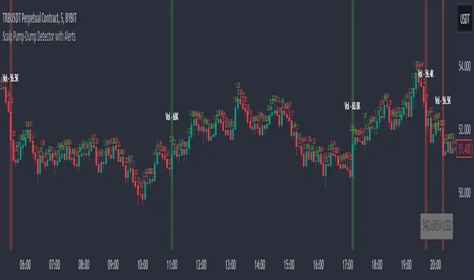
Scalp Pump-Dump Detector with AlertsThis script displays the percentage of movement of all candles on the chart, as well as identifying abnormal movements to which you can attach alerts. An abnormal movement is considered a rise or fall that exceeds the parameter set in the settings (by default, 1% per 1 bar).
Added a function to display the volume on abnormal candlesticks.
CG Gap Filling Invisible CandleThis script is used to Fill the GAP between two candles close price and next candle close price if there is GAP in the OPENING price of new candle.
This helps in identifying whether the GAP Candle is LEG candle (Big candles) or BASE candle (small accumulation candles) that can be used in marking the Demand and Supply zones based on LEG-IN, BASE and LEG-OUT candles.
LEG candles are formed by Imbalance between Buy Price (buyers) and Sell Price (sellers), that will lead to Demand and Supplies zones. This shows the aggression of institution in either BUY or SELL at certain price range.
Importance will be given to LEG-OUT candle.
If you see BIG Green LEG-OUT Candle, institutions are aggressive in BUYING (Bullish).
If it is RED LEG-OUT Candle, institutions are aggressive in SELLING (Bearish)
Bullish scenario:
LEG IN -- BASE -- LEG OUT
----------------------------------
Rally -- Base -- Rally
Drop -- Base -- Rally
Bearish scenario:
LEG IN -- BASE -- LEG OUT
----------------------------------
Drop -- Base -- Drop
Rally -- Base -- Drop
HK Percentile Interpolation One
This script is designed to execute a trading strategy based on Heikin Ashi candlesticks, moving averages, and percentile levels.
Please note that you should keep your original chart in normal candlestick mode and not switch it to Heikin Ashi mode. The script itself calculates Heikin Ashi values from regular candlesticks. If your chart is already in Heikin Ashi mode, the script would be calculating Heikin Ashi values based on Heikin Ashi values, which would produce incorrect results.
The strategy begins trading from a start date that you can specify by modifying the `startDate` parameter. The format of the date is "YYYY MM DD". So, for example, to start the strategy from January 1, 2022, you would set `startDate = timestamp("2022 01 01")`.
The script uses Heikin Ashi candlesticks, which are plotted in the chart. This approach can be useful for spotting trends and reversals more easily than with regular candlestick charts. This is particularly useful when backtesting in TradingView's "Rewind" mode, as you can see how the Heikin Ashi candles behaved at each step of the strategy.
Buy and sell signals are generated based on two factors:
1. The crossing over or under of the Heikin Ashi close price and the 75th percentile price level.
2. The Heikin Ashi close price being above certain moving averages.
You have the flexibility to adjust several parameters in the script, including:
1. The stop loss and trailing stop percentages (`stopLossPercentage` and `trailStopPercentage`). These parameters allow the strategy to exit trades if the price moves against you by a certain percentage.
2. The lookback period (`lookback`) used to calculate percentile levels. This determines the range of past bars used in the percentile calculation.
3. The lengths of the two moving averages (`yellowLine_length` and `purplLine_length`). These determine how sensitive the moving averages are to recent price changes.
4. The minimum holding period (`holdPeriod`). This sets the minimum number of bars that a trade must be kept open before it can be closed.
Please adjust these parameters according to your trading preferences and risk tolerance. Happy trading!
SPX-Sectors % PMO Above Zero [bluesky]█ OVERVIEW
The "Subsector-11 % PMO Above Zero" script analyzes market breadth based on the percentage of 11 user-adjustable subsector ETFs of the S&P 500 with a Positive Momentum Oscillator (PMO) value greater than or equal to zero. It provides insights into the strength and breadth of positive momentum signals within specific subsectors, aiding traders in making informed decisions.
█ CONCEPTS
This script utilizes the PMO values of the 11 user-adjustable subsector ETFs of the S&P 500 to assess market breadth. By calculating the percentage of subsector ETFs with a PMO value above zero, it identifies periods of broad positive momentum and potential trading opportunities within those specific sectors.
█ PMO (Positive Momentum Oscillator)
Developed by Carl Swenlin, the PMO is an oscillator based on a Rate of Change (ROC) calculation that is smoothed twice with exponential moving averages using a custom smoothing process. The PMO is normalized, allowing it to be used as a relative strength tool. Traders can rank subsector ETFs based on their PMO values as an expression of relative strength.
█ CALCULATION
The script calculates the percentage of subsector ETFs with a PMO value above zero based on the provided PMO values of the 11 user-adjustable subsector ETFs. It uses custom smoothing functions similar to Exponential Moving Averages (EMAs) to derive the PMO values.
█ HOW TO USE IT
- Timeframe: Optimize the script for different timeframes to analyze market breadth effectively within specific subsectors.
- Subsector Analysis: The script displays the percentage of subsector ETFs within the 11 user-adjustable subsectors of the S&P 500 with a PMO value above zero, indicating the strength of positive momentum signals within those subsectors.
- Trend Identification: Monitor changes in the percentage of subsector ETFs above zero to identify shifts in market breadth and trends.
- Risk Management: Consider the breadth of positive momentum signals within specific subsectors when setting stop-loss levels or evaluating overall market conditions.
█ ADDITIONAL OPTIONS
This script offers additional options to enhance analysis and customization:
- Candle Style: Choose from different candle styles such as Heikin Ashi, Three Line Break, Candles, or Line for chart visualization.
- PMO Settings: Adjust the lengths of the PMO calculation and signal length according to your trading preferences.
- Moving Average Settings: Incorporate the usage of fast and slow exponential moving averages (EMAs) for additional insights into momentum trends.
█ FLEXIBILITY AND ADAPTABILITY
The script allows traders to adjust the subsector ETF names according to their specific requirements. Please review and update the list of subsector ETFs periodically to reflect the desired sectors for analysis and ensure the script's relevance and accuracy.
█ DISCLAIMER
Trading involves risks, and past performance is not indicative of future results. The "Subsector-11 % PMO Above Zero" script is a tool designed to assist traders in analyzing market breadth and positive momentum signals within specific subsectors. It should be used in conjunction with sound risk management practices and a comprehensive trading strategy. Traders are encouraged to perform their due diligence, exercise caution, and adapt the script to their individual trading preferences and requirements.
Please note that this script does not make any claims of guaranteed profitability or provide investment advice. Always consult with a qualified financial professional before making any investment decisions.

The Golden Candlestick PatternThe Golden pattern is a three-candlestick configuration based on a variation of the golden ratio (2.618) from the Fibonacci sequence.
The bullish Golden pattern is composed of a normal bullish candlestick with any type of body, followed by a bigger bullish candlestick with a close price that is at least 2.618 times the size of the first candlestick (high to low). Finally, there must be an important condition that is, a third candlestick that comes back to test the open of the second candlestick from where the entry is given.
The bearish Golden pattern is composed of a normal bearish candlestick with any type of body, followed by a bigger bearish candlestick with a close price that is at least 2.618 times the size of the first candlestick (high to low). Finally, there must be an important condition that is, a third candlestick that comes back to test the open of the second candlestick from where the entry is given.

MyCandleLibraryLibrary "MyCandleLibrary"
TODO: Candle Pattern Library
IsEngulfingCandle(n, trendRule)
TODO: Identify Bullish Engulfing Candle
Parameters:
n (int) : TODO: Candle Number
trendRule (string)
Returns: TODO: If Identify Bullish Engulfing candle return True otherwise False

CandlesticksIndicator that identifies the classical candlestick patterns for markets that are open 24/7 like the crypto market.
Why? because those markets don't gap, so many patterns won't need to gap to be valid.
Also, the theoretical rules about the patterns are very strict but it is to the discretion of the trader or technical analyst to decide if the patterns are yet valid. This is how Steve Nison uses candlesticks, i.e. a hammer is still valid if it has a small upper shadow, a marubozu is still valid if it has tiny shadows, etc.
So, for each candlestick pattern there are tolerance parameters so you can decide what is an acceptable upper shadow size for a hammer etc. I have set them to my liking but you might want to adjust them which is totally fine.
Additional features:
-to avoid the clutter, decide how many candles have to be analyzed
-use a trend filter based on the ema 5 (you can change the value) so you only see reversal patterns relevant to the trend
-plot pivots (swings HL)
-volume confirmation: bearish signals don't need volume confirmation as prices fall off their own weight. But volume confirmation for bullish price action can serve as added confluence. You have a setting that allows you to decide how many times the volume needs to be bigger than the previous candle's volume : if you have a bullish candlestick pattern printed, if the volume is1.5 times bigger than the previous candle then you will have a shape plotted at the bottom of your chart
-there is a cheap vs expensive feature that colors the bars
-you can also color the background so you see the oversold/overbought RSI
-finally, there are a couple of custom signals
"RULES" ABOUT CANDLESTICKS
-this is not a system in itself, but combined with other candlesticks (cluster of candlesticks), volume, oscillators, trend lines, support and resistances, bollinger bands can give amazing results and that is where the magic is
-most candlesticks can establish a support or resistance or confirm one
-a reversal candlestick doesn't mean that market will shoot the other direction right away, trend changes occur usually slowly and the trend might not reverse but convert in a period of sideways. It shouldn't actually be named reversal patterns but rather trend change patterns.
-reversal patterns need a trend to reverse (or change), in ranging markets you should ignore the signals
-you might think that there are many false signals, you need to understand that they are early warnings and the next candle's close is of major importance. A hammer at the end of a downtrend isn't enough to enter a position, you will have to wait for the next candle to close above the high of the hammer to validate the bullish reversal and vice versa.
-some signals are based on 1 candle only (like the hammer) others on 2 candles (like the engulfing pattern), others on 3 and more (tower top, morning star, etc). Patterns based on multiple candles have more probability.
-you might want to wait for price to revisit the support created by the pattern (read below) to get a better entry
-candles do not provide price targets
-long lower shadows is bullish, long upper shadows is bearish, small bodies (spinning tops, stars, dojis) means indecision and market is vulnerable to a trend change and the color of the body is irrelevant, declining size of bodies means trend strength weakening
HAMMER
stop-loss under the lower shadow
lower shadow can become a potential support or confirm an existing support
ENGULFING
with bearish engulfing pattern use the highest high of the 2 candles as a resistance, and with bullish engulfing pattern use the lowest low as support
DARK CLOUD COVER
use the highest high of the 2 candles as resistance
PIERCING PATTERN
use the lowest low of the 2 candles as support
MORNING STAR
use the lowest low of the 3 candles as support
the smaller the body of the 2nd candle the more potent the signal
for traditional markets, an ideal morning star would have a gap between 2nd and 3rd candles' bodies
EVENING STAR
use the highest high of the 3 candles as resistance
the smaller the body of the 2nd candle the more potent the signal
HARAMI
the smaller the size of the candle the more potent the signal
TWEEZERS
very important signals by themselves on weekly and monthly charts
for daily and intraday signals, it is potent only if it meets additional criterias (1st candle long, 2nd short, a candle pattern with with same highs or lows)
BELT-HOLD
they are more important if they confirm a support or resistance or another belt-hold or if they have not appeared for a while.
3 BLACK CROWS AND 3 WHITE SOLDIERS
candles 1 and 2 should act as support for the 3WS and as resistance for the 3BC
RISING AND FALLING 3 METHODS
stop-loss is the low of the 1st candle that started the rising 3 methods
stop-loss is the high of the 1st candle that started the falling 3 methods
ideally 1st and last candles have the strongest volume
DOJI
signal is reinforced by subsequent candles, if market is oversold or overbought, if the market doesn't have many doji on the chart, if market is at an important junction, if there are other technical alerts
doji after a tall candle are especially potent, the highest high of the 2 candles is the resistance
doji are especially potent after an uptrend, less so after a downtrend
gavestone doji is a bearish signal
dragonfly doji is a bullish signal
long-legged doji is a confused market
CUSTOM
*1st signal is a continuation pattern based on the progression of bodies' sizes and/or shadows' sizes
*following ones are reversal patterns based on the progression of bodies' sizes and/or shadows' sizes
*early reversal is based on a "secret" excess signal
reversal confirmed is when the early reversal's excess resolves and price reintegrates the non-excess area + prints a custom reversal pattern
for both early reversal and reversal confirmed the same rule applies as with any candlestick signal: we wait for the next candle's close above the previous upper shadow (bullish reversal) or below the previous lower shadow (bearish reversal)
*swings are 3 candles fractals, they are not reversal or continuation patterns but serve to mark swing highs and lows
this is all based on Steve Nison's book Japanese candlestick charting techniques
and
Thomas N. Bulkowski's Encyclopedia of candlestick charts
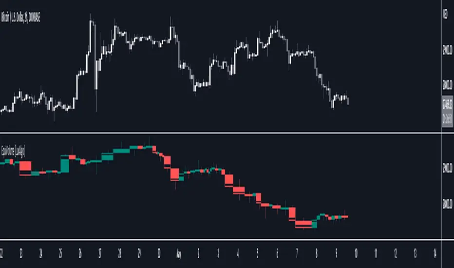
EquiVolume [LuxAlgo]EquiVolume is a charting method that aims to incorporate volume information to a candlestick chart. Volume is highlighted through the candle body width, with wider candles suggesting more significant volume.
Our script shows an EquiVolume chart for the visible chart range. Additionally regular volume can be plotted as a column plot with the column's width controlled by volume.
🔶 SETTINGS
🔹 Options
Chart: Shows candles with volume adjusted width.
Volume: Shows volume with volume adjusted width.
🔹 Intrabar Analysis
Enable/disable: When LTF is enabled, the script will calculate the % volume/candles in the same direction than current timeframe.
You can choose a LTF between 1 and 240 minutes.
Type %:
- Volume: sum of volume of all LTF candles, which are in the same direction.
- #bars: sum of all LTF candles, which are in the same direction.
🔹 Width Boxes (bars)
Minimum width: sets the minimum width of a box (candle/volume)
Maximum width: sets the maximum width of a box (candle/volume)
🔶 USAGE
This charting method makes it easier to spot large volume candles, against comparing candles to volume.
Another example:
Additionally, users can make the script perform an intrabar analysis on the chart candles, allowing to highlight bullish/bearish activity within a candle. The script can estimate bullish/bearish trading activity within a candle or simply use intrabar candle signs.
Example
- 15-minute candle is green
- 10 1-minute candles (LTF) IN that 15-minute candle are green -> 10/15 = 66,667%
-> The current 15-minute candle will be 66,667% filled with green color.
Note that the script will draw everything from last visible bar at the right to left, as such you can scroll backwards, and the script will show you the data of the visible chart.
Scrolling back will return the following result:
🔶 REMARKS
When the LTF is too far apart from current timeframe, you should get an error. To prevent this, the LTF will automatically rise, giving no error.
When this happens, the adjusted LTF will be displayed. Do note, due to a maximum available LTF data, sometimes boxes won't always be visible (since there is no LTF data anymore)
To solve this, just elevate your LTF:
When the set LTF is higher than current TF, you would normally get an error as well.
This script will automatically adjust the LTF to current TF, together with a visible warning (no error though).
Due to the inability to draw a line in the space between bars, sometimes a wick won't be placed exactly in the middle.
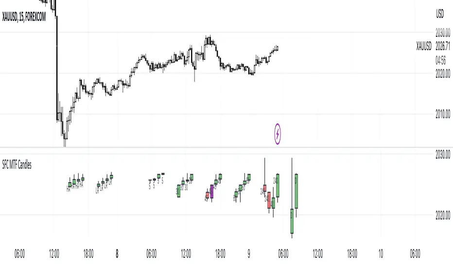
SFC MTF CandlesMost technical traders in the foreign exchange market, whether they are novices or seasoned pros, have come across the concept of multiple time frame analysis in their market educations.
Multiple time-frame analysis involves monitoring the same currency pair across different frequencies (or time compressions). While there is no real limit as to how many frequencies can be monitored or which specific ones to choose, there are general guidelines that most practitioners will follow.
Typically, using three different periods gives a broad enough reading on the market, while using fewer than this can result in a considerable loss of data, and using more typically provides redundant analysis.
This indicator helps traders to visualise the last few candles on many time frames.
For manipulation traders I have added the ability to see the current manipulation on different time frames. When such a candle is created, its colour changes to purple.
The Heikin-Ashi technique averages price data to create a Japanese candlestick chart that filters out market noise.
Heikin-Ashi charts, developed by Munehisa Homma in the 1700s, share some characteristics with standard candlestick charts but differ based on the values used to create each candle. Instead of using the open, high, low, and close like standard candlestick charts, the Heikin-Ashi technique uses a modified formula based on two-period averages. This gives the chart a smoother appearance, making it easier to spots trends and reversals, but also obscures gaps and some price data.
Linear regression attempts to model the relationship between two variables, with a given collection of data values.
Linear regression is a very common and useful technique for following the trend. This technique is applied to candles in order to filter out false movements.
Heikin Ashi and Linear Regression candles are helpful for more conservative traders. If they are not sure about the direction, they can wait for these candles to change colour (direction) as an extra confirmation.
Features:
- Up to 6 time frames
- Up to 4 MTF bars
- Heikin Ashi candles (current time frame) - x4
- Linear Regression candles (current time frame) - x4
Settings
- Time frames on/off
- Selection how many bars to display from each time frame (max 4)
- Adjustment of distance between candles
- Adjusting the position of the candles
- Heikin Ashi candles on/off
- TLinear regression candles on/off
- Linear regression candle length adjustment
How to use the indicator:
Traders can visualise different candles in order to observe the chart better and faster.
All they have to do is activate the group of candles they want and set it up according to their preferences.
Due to the complexity of the code, there is a 1s delay when all features are enabled. To eliminate the lag, deactivate some of the features
It is recommended to have a maximum of 3 time frames activated during the high impact news, as the price changes very quickly.
Uptrend Downtrend Loopback Candle Identification LibThis library is for identifying uptrends and downtrends using a loopback candle analysis method. Which contains two functions:
uptrendLoopbackCandleIdentification() and downtrendLoopbackCandleIdentification() . These functions check if the current candle is part of an uptrend or downtrend, respectively, based on the specified lookback period.
The uptrendLoopbackCandleIdentification() takes two arguments: index , which is the index of the current bar, and lookbackPeriod , which is the number of previous candles to check for an uptrend. The function returns false if the index is less than the lookback period. Otherwise, it initializes a boolean variable isHigherHigh as true and loops through the previous candles. If any of the previous candles have a higher high than the current candle, isHigherHigh is set to false , and the loop breaks. Finally, the function returns the value of isHigherHigh .
The downtrendLoopbackCandleIdentification() takes the same arguments and returns false if the index is less than the lookback period. The function initializes a boolean variable isHigherLow as true and loops through the previous candles. If any of the previous candles have a higher low than the current candle, isHigherLow is set to false , and the loop breaks. The function returns the value of isHigherLow .

ICT HTF Candles (fadi)Plotting a configurable higher timeframe on current chart's timeframe helps visualize price movement without changing timeframes. It also plots FVG and Volume Imbalance on the higher timeframe for easier visualization.
With ICT concepts, we usually wait for HTF break of structure and then find an entry on a lower timeframe. With this indicator, we can set it to the HTF and watch the develop of price action until the break of structure happens. We can then take an entry on the current timeframe.
Settings
HTF Higher timeframe to plot
Number of candles to display The number of higher timeframe candles to display to the right of current price action
Body/Border/Wick The candle colors for the body, border, and wick
Padding from current candles The distance from current timeframe's candles
Space between candles Increase / decrease the candle spacing
Candle width The size of the candles
Imbalance
Fair Value Gap Show / Hide FVG on the higher timeframe
Volume Imbalance Show / Hide Volume Imbalance on the higher timeframe
Trace
Trace lines Extend the OHLC lines of the higher timeframe and the source of each
Label Show/Hide the price levels of the OHLC

NSDT Regular CandlesWhen using Range charts on TradingView, the only candle appearance option is "Range Bars", which are those little thin ones that can be hard to see.
So I made this candle indicator that can be used to plot Regular Candles over the Range Bars for a standard view.
Here is the same chart - only showing the original Range Bars

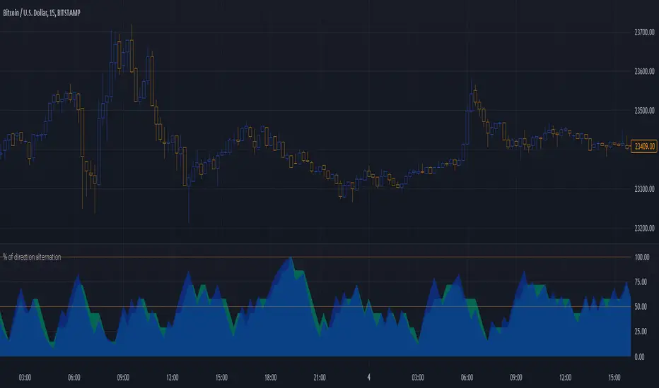
Percentage of direction alternationThis is just an idea I had and I have no idea whether it will be useful but I thought I would “toss it out into the wild” because if someone finds it of benefit then all the better.
How it works is really simple. It looks at a number of bars/candles back and if two bars next two each other close where one is higher than its open and the other closes lower (a bullish and bearish candle next to each other) then it adds one to the count of alternations. So, if you are looking 10 (adjustable of course) bars back then you can have 9 compares (number of bars subtract one).
If all nine compares are opposite closes of each other then you get a 100% alternation.
I’m not sure if this is useful for anyone but my original thought was the more alternation the more likely you are in ranging and the less you should consider entering a trade or the more you should consider exiting a trade. It might also reflect choppiness to some extent as well.
I also noticed in a couple of spots when I was looking at the results that good trends came just after the alternation peaked around 100% so it might be a bit of an indicator to enter a trade before the move happens.
It shows the alternation percentage but also the “weighted alternation” percentage which I think looks more useful as it give more credence to the alternations closer the live trading.
For visual usefulness you can invert the output so that maximum alternation is 0 instead of 100.
I’ve set it up as being displayed as area but as normal lines is also good.
Let me know if you find a way that it shows something useful for entering or exiting your trades. The more feedback I get the more I’ll throw my crazy notions out there!
The code is structured to easily drop into a bigger system so use it as a lone indicator or add the code to some bigger project you are creating. If you do integrate it into something else then send me a note as it would be nice to know it's being well used.
Enjoy and good luck!
NET BSP NET BSP derived from Buying & Selling Pressure which is a volatility indicator that monitors average metrics of green and red candles separately.
We could navigate more confidently through market with projected market balance.
BSP allowed us to track and analyze the ongoing performance of bullish and bearish impulsive waves and their corrections.
Due to unintuitive way of measuring decline with SP going up, I decided to remake it into more intuitive version with better precision.
When we encounter the fall it's better to have declining values of tool to be able to cover it visually with ease.
One of the solutions was to create a sense of balance of Buying Pressure against Selling Pressure.
Since we are oriented by growth, it'd be more logical to summarize the market balance with BP - SP
Comparison:
When Buying and Selling Pressure are equal, NET BSP would be at 0.
NETBSP > 0 and NETBSP > NETBSP = 🟢
NETBSP > 0 and NETBSP < NETBSP = 🟡
NETBSP < 0 and NETBSP < NETBSP = 🔴
NETBSP < 0 and NETBSP > NETBSP = 🟡
Hence, we get visualized stages of uptrends and downtrends which allows to evaluate chances and estimations of upcoming counter-waves.
Also, it is worth to note that output clearly shows how one wave is derived from another in terms of sizing.
Feel free to adjust NET BSP arguments to adapt sensitivity to the timeframe you're working on.

LNL Keltner CandlesLNL Keltner Candles
This indicator plots mean reversion (reversal) arrows with custom painted candles based on the price touch or close above or below keltner channel limits (upper & lower bands). This study was created primarily for swing trading & higher time frames such as daily and weekly. Lower time frames might result in more false signals.
Mean Reversal Arrows:
1. Reversal Arrow Up - If the price drops below the lower band extremes, reversal up is the trigger for a bullish mean reversion.
2. Reversal Arrow Down - Once the price reach the higher band extremes, reversal down is the trigger for a bearish mean reversion.
The Concept of Mean Reversion:
There are just two types of moves in any market: The market is either expanding from the mean or retracing back to the mean. These reversions & epxansions are happening across all types of markets. The goal of this study is to catch the powerful mean reversion from extremes back to the mean. Once the candles light up green / red, it is time to look for the reversal (purple) arrow which triggers the mean reversion setup. Mean reversion is not about catching the next big swing turn to new highs or lows. It is all about the base hits = the mean. So the target here is always the average price. The idea here is to catch the average market ebbs & flows, not the next home run.
What Do I Mean by Mean?
Mean is usually the average price from the last 20-30 bars. Basically something like a 20 MA or Keltner Channel or Bollinger Band midline are really good visual representators of the mean (average price).
Hope it helps.

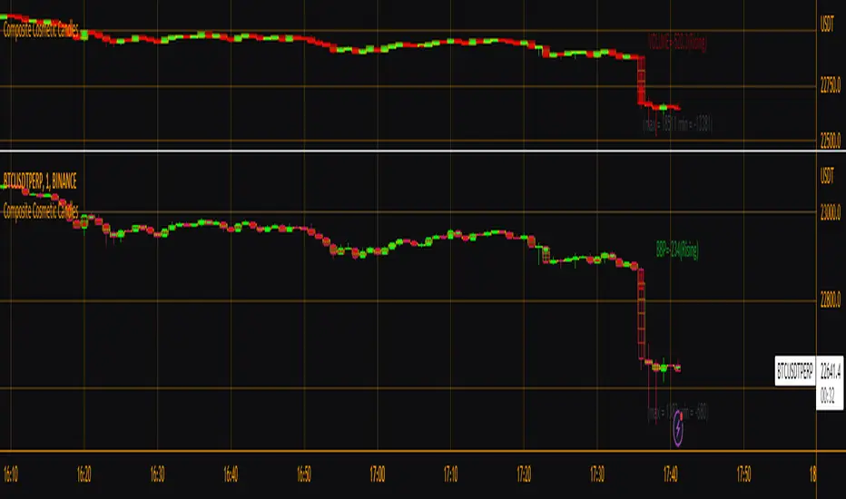
Composite Cosmetic CandlesThis is effectively version 2 of my script "Candle Fill % Meter", with a few different/more options available in a more compact form. Choose between multiple oscillator sources, # of dividing lines, and solid or gradient candle fill. Once again this script is intended for use with hollow candles! This script enables you to see more information with less screen space taken up, not to mention it looks nice. Labels by last bar also toggleable in the settings.
Real Price Line + Dots (for Heikin Ashi)Real Price Line + Dots (for Heikin Ashi)
This indicator is designed for use on Heikin Ashi charts. Its purpose is to enable traders to benefit from price averaging and smoothing effects of Heikin Ashi candles whilst also enabling them to see the current real price line, and optionally, real price close dots on the Heikin Ashi candlesticks.
Features include:
- Optional real price line
- Optional real price close dots
- Customisable colours
- Customisable line style
- Customisable line width
What are Heikin Ashi candles?
Heikin Ashi means 'average bar' in Japanese, Heikin Ashi charts do not show real price as standard, due to the way the Open, High, Low and Close values are calculated using averages, This is done in order to create a smoother appearance and reduce the market 'noise'.
You can read more about Heikin Ashi candlesticks here.
NOTE:
- If real price dots appear behind the candles, you may need to select the triple dot menu on the indicator then select "Visual order" > "Bring to front" , so that the dots are shown above the candles.
- When using this indicator on a Heikin Ashi chart, the standard Tradingview price line will not show accurate real price. Therefore when using the price line in this indicator, the standard price line should be disabled within the Tradingview 'Chart settings' dialog > 'Symbol' tab > uncheck 'Last', under the 'Price line' section.

OHMLC Candles LevelsPlot Open / High / Middle / Low / Close Lines of current and previous candles.
The indicator is Multi-Timeframe.
Choose the line style and the type of extension.

heikin ashi calculation call with higher timeframe
Hello, guys
This indicater displays the previous value of higher timeframe without request.security() function.
You can change the candle style ( heikinashi or normal) on the set box.
you can choose the higher timeframe also.
I made this to avoid the repainting.
Without Box() function, i only used plotcandle and fill.
It was good fun.
Good luck !!

Candlestick - Kicker PatternNot many candlestick patterns hurt traders on the other side of the trade more than this signal, when it happens, think of it as kicking in the teeth, the pain is real.
An upwards signal is painted when you have a two-bar formation, the one on the left is a bearish one whereas the successive one is bullish, when you have fat bodies in both candles, meaning the open is close to the high and the close is close to the low for the first candle, while the open is close to the low and the close is close to the high for the adjacent candle, the pain is ever more excruciating, the other important condition is the open of the first candle must be lower than the open of the latter one.
The downwards signal is vice versa of the upwards signal.
Breakout Candles + RSIHello!
This is my firt script :)
This indicator looks for candles that are significantly larger than the previous X candle.
It is possible to set the following:
Multiplier: deviation from the size of the previous X candle (if set to 3 the size of the actual candle's body /abs(open - close)/ must be larger than the size of the bigger candle from the prevous X candles)
Previous candles: the number of previous candles to size check
Upper RSI limit: if the RSI14 close higher than the specified number, the candle will ignore
Lower RSI limit: if the RSI14 close lower than the specified number, the candle will ignore
Without dojis: if checked, watches candles only that do not have a bottom spike (bullish) or top spike (bearish). Useful for Heikin-Ashi candles
Feel free to left any suggestion!
Thank You!
