XAUUSD 240m Pivot PointsThis Indicator helps you to automatically find pivot point S1 S2 S3 R1 R2 and R3 for each and every candle that occurs in 4 hr tf
Concept

Open Probability + Avg Move (Daily/Weekly)Open probability (EVALS) Used for fullporting evals on gold

Delirium Liquidity Failure ModelDelirium is a rule-based trading strategy designed to track liquidity behavior and market structure across multiple timeframes.
The strategy is built around Fair Value Gaps (FVGs), market structure confirmation, and liquidity objectives. A key feature is the detection of Higher Timeframe Fair Value Gap failures. When a HTF FVG is not respected and price breaks through it, Delirium assumes that liquidity will be sought elsewhere, either on the buy-side or sell-side, depending on context.
Entries are aligned using lower timeframe confirmation, structure validation, and optional break & retest logic. Risk management is handled automatically using structure-based stop losses and liquidity-based take profit targets.
The strategy is fully automated and can be used for systematic backtesting and execution. All conditions, entries, exits, and risk parameters are pre-defined within the script, allowing Delirium to operate without manual intervention once configured.
Delirium is designed for traders who focus on price action, liquidity concepts, and multi-timeframe analysis rather than simple buy/sell signals.

Conditions GateNon-directional indicator gating risk and permissions based purely on seasonal calendar patterns and mechanical event window detection without price analysis.
---
Key Insights from HUD
What to watch:
- State: Primary output for permission decisions
- SeasonPrior vs State: Difference shows event impact
- EventWindow + ActiveEvent: Explains why State changed (seasonal vs event-driven)
- RiskMult: Direct risk cap applicable to position sizing
- Runner / MarketMaker: Binary permission gates (green = allowed, red = blocked)
- ForcedState: If not "—", an override is active (useful for manual testing)
Color Logic:
- Green: FAVOURABLE state or allowed (1.0 risk, YES permissions)
- Orange: NEUTRAL state or event window active (0.5 risk, NO permissions)
- Red: UNFAVOURABLE state or blocked (0.25 risk, NO permissions)
- Gray: Neutral info (inactive event, no override)

Gold Level Lines V1.0ตัวช่วยสร้างเส้นแนวนอนระดับตัวเลข 0 และ 5 สำหรับกราฟทองคำ
A tool to generate horizontal lines at levels 0 and 5 for the gold price chart.

E6 Framework Stock Selection only6 Framework – Business Quality Overlay (Market-Derived)
E6 is not a trading indicator.
It is a market-derived business quality framework designed to objectively shortlist structurally strong companies using price, volume, and volatility behavior over long horizons.
This script translates six core pillars of long-term business strength into observable market evidence, without relying on financial statements, analyst opinions, or subjective narratives.
What E6 Measures
E6 evaluates companies across six independent quality pillars, each inferred strictly from market behavior:
Total Addressable Market (TAM)
Identifies businesses demonstrating sustained long-term price expansion and broad participation, indicating room for scalable growth.
Consistent Growth
Confirms structural uptrends using long-term trend alignment rather than short-term momentum.
Positive Cash-Flow Behavior
Approximates institutional accumulation through volume-supported advances versus declines.
Capable Management
Assessed via controlled volatility—rewarding businesses that compound steadily rather than erratically.
Skin in the Game
Filters out distribution-like behavior often seen when insiders or institutions are exiting.
Reasonable Valuation
Excludes excessively extended price structures to avoid late-cycle participation.
Each satisfied pillar contributes 1 point, producing an objective Score from 0 to 6.
How to Interpret the Score
Score ≥ 5 (E6 ELITE)
Indicates rare alignment of multiple long-term quality factors.
These are shortlisting candidates, not buy signals.
Score 3–4 (WATCHLIST)
Partial strength present; requires deeper fundamental and management evaluation.
Score < 3 (AVOID)
Structural weaknesses outweigh strengths.
A Score of 6 is intentionally rare and requires persistence across multiple bars to confirm durability, avoiding false positives.
Built-In Risk Awareness
Structural Deterioration Alerts
Triggered when business quality meaningfully degrades, not on minor fluctuations.
Early Pillar Failure Alerts
Provide advance warning when core growth or cash-flow behavior weakens.
These alerts are designed for review and reassessment, not for trading execution.
Best Practices & Usage Guidelines
Designed for Daily and Weekly charts only
Intended for equities with sufficient liquidity
Avoid intraday usage, low-liquidity stocks, and fresh IPOs
Use strictly as a filtering and research aid
Always combine with:
Fundamental analysis
Management quality assessment
Industry and competitive research
Important Disclaimer
This tool does not provide buy/sell signals, price targets , or timing guidance.
It is not financial advice.
E6 is built to answer one question only:
“Does the market treat this business like a high-quality compounder?”
Final investment decisions remain entirely the responsibility of the user.

Master Strategy: BTC W1 Mean Reversion [Institutional SOP]Overview This is an institutional-grade Mean Reversion and Range Rotation strategy designed specifically for Bitcoin (BTC/USDT) Perpetual Futures. It operates on the philosophy that liquidity resides at the extremes of the previous week's range (Previous Week High/Low). The strategy looks for false breakouts (Sweeps) followed by a confirmed return to the range (Reclaim), targeting the weekly equilibrium (EQ).
Core Logic: The Deviation Play Unlike standard breakout strategies, this indicator hunts for trapped liquidity.
Weekly Levels (Fixed): It calculates PWH (Previous Week High) and PWL (Previous Week Low) based on confirmed, closed weekly data. These levels act as the "Box" for the current week.
The Sweep: We wait for price to pierce the PWH or PWL (taking liquidity/stops). The script uses a dynamic ATR-based threshold to filter out noise (micro-pokes).
The Reclaim (4H Close): A signal is generated ONLY if a 4H candle closes back inside the weekly range shortly after the sweep. This confirms rejection of higher/lower prices.
The Entry: The script suggests a Limit Order at the retested level (PWH/PWL) to maximize R:R.
Institutional Quality Filters ("Kill Switches") To prevent trading in unfavorable conditions, the script includes strict SOP (Standard Operating Procedure) filters:
Trend Filter (ADX): Blocks mean reversion signals if the daily trend is too strong (ADX > 25).
Expansion Filter: Blocks signals if price accepted levels outside the range for too long (prevents fighting a true breakout).
Weekly Range Filter: Filters out weeks that are statistically too tight (chop) or too wide (expansion).
Time Filter: A reclaim must happen within a set number of 4H bars after the sweep (default: 3).
Key Features
Zero Repainting: Logic is based strictly on closed candles ( , , ).
State Machine Logic: Uses internal memory to track sweeps regardless of chart timeframe glitches.
Operational Dashboard: Displays current status, countdown to next decision candle (4H close), and exact parameters for the last valid signal (Entry, SL, TP).
Unified Alerting: A single "Any function call" alert handles both Long and Short scenarios dynamically.
Clean Visuals: Levels are plotted with line breaks to avoid visual clutter between weeks.
How to Use
Timeframe: Set your chart to 4H. This is crucial as the logic relies on 4H closes.
Signals: Wait for the "4H RECLAIM" label.
Execution: Place a Limit Order at the suggested Level (PWH/PWL).
Stop Loss: Use the calculated SL provided by the indicator (Swing extreme + ATR buffer).
Target: TP1 is always the EQ (Equilibrium/Mid-range).

SMC/PA Ultimate V27SMC Ultimate Strategy: Automated Structure & Performance Dashboard
This strategy is designed based on Smart Money Concepts (SMC) principles, utilizing market structure breaks (Zigzag Swings) to identify high-probability reversal setups. It features a fully automated execution engine, dynamic risk management, and a comprehensive real-time performance dashboard.
1. Core Logic & Entry Mechanism
Market Structure: The script uses a Zigzag algorithm (Length = 8 default) to detect significant Swing Highs and Swing Lows.
Entry Trigger:
SHORT: Triggered when the price breaks below the recent Swing Low. The entry order is placed at the 50% Fibonacci retracement of the breakout range.
LONG: Triggered when the price breaks above the recent Swing High. The entry order is placed at the 50% Fibonacci retracement.
Stop Loss (SL): Automatically set at the recent Swing High (for Shorts) or Swing Low (for Longs).
2. Advanced Exit Strategies
Users can choose between two exit modes in the settings:
Fixed Risk:Reward (R:R): Targets a static Reward-to-Risk ratio (e.g., 1:2).
Trailing Stop (%): A dynamic trailing stop that follows price movement (e.g., 3%) to maximize profits during strong trends.
3. Visual Visualization
Red Box: Represents the Risk Zone (Entry to Stop Loss).
Orange/Blue Box: Represents the projected Reward Zone (Entry to TP).
Purple Overlay Box: Appears upon trade closure to show the Realized Profit/Loss Path, giving you a clear visual of how much of the move was captured compared to the theoretical setup.
W/L Labels: Clearly marks trades as W (Win) or L (Loss) on the chart.
4. Professional Risk Management
Integrated position sizing logic inspired by professional capital management:
Position Size: Calculated based on a percentage of Account Equity (Input: Vốn vào lệnh %).
Leverage: Built-in leverage multiplier (Input: Đòn Bẩy x) to simulate futures/margin trading volume.
5. Real-time Monthly Performance Table
A detailed Dashboard located at the bottom-right corner provides instant statistical analysis without needing to open the Strategy Tester panel:
Monthly Breakdown: Displays P/L ($ and %), Winrate, and Win/Loss count for every month in the selected range.
Instant Update: The table updates immediately when a trade closes or on the last bar, ensuring zero lag.
Summary: Shows total Capital used, Leverage, and overall Winrate at the top.
6. Backtest Date Range Filter
Includes a strict date filter (From Year/Month to To Year/Month). The strategy will only execute and calculate statistics within this specific time window, allowing for precise backtesting of specific market conditions.
How to Use
Zigzag Length: Adjust to 5 for scalping or 14+ for swing trading to change sensitivity.
Exit Mode: Select "Trailing Stop %" for trending markets or "Fixed R:R" for ranging markets.
Backtest Range: Ensure the From Year and To Year match the data available on your chart.
Disclaimer: This script is for educational and backtesting purposes only. Past performance does not guarantee future results.

C2 HTF Detection CRT [MarioLeb]What This Indicator Does:
1. Detects "C2 Sweeps" - Price retesting previous highs/lows then closing back inside the range.
2. Shows HTF Structure - Marks High Timeframe support/resistance zones (C1 ranges).
3. Finds Multi-Timeframe Confluence - When HTF and LTF C2 signals align at same levels.
4. Highlights CRT Cycles - Complete market cycles (C1→C2→C3 pattern).
Visual Output:
Horizontal lines = C2 sweep levels
Colored zones = C1 ranges (key areas)
Yellow line = 50% level of C1 range
Boxes = CRT cycles (if enabled)
CISD lines = Change in supply/demand confirmation
Purpose:
Identify where higher timeframe structure meets lower timeframe precision - shows where big moves often start.
Alert Features:
Automated Alerts trigger when:
HTF C2 Detected - "Bullish/Bearish HTF C2 Detected on "
CRT Cycle Complete - "Bullish/Bearish CRT Cycle Detected on "
CISD Confirmed - "HTF CISD Confirmed on "
LTF C2 Detected - "Bullish/Bearish LTF C2 vs HTF C1 Detected"
Key Alert:
Once C2 candle closes inside C1 range after sweeping high/low → Alert fires immediately.
Each alert includes:
Direction (Bullish/Bearish)
Timeframe
Mode (Strict/Easy)
Pattern type (C2/CRT/CISD)
Alert frequency: Once per bar (no spam).

Delta Maker Price EnergyThis indicator helps you identify key support and resistance levels, updated daily.

SB A / A++ ALERT ENGINE (Alerts Only)SB A / A++ Alert Engine
Session-Based Level Rejection Strategy (Automation-Ready)
Overview
The SB A / A++ Alert Engine is a rules-based TradingView indicator designed to identify high-probability institutional-style reversal trades using Stacey Burke–inspired concepts such as previous day levels, session structure, opening ranges, and round numbers.
This tool is alerts-only by design, making it ideal for:
TradingView alerts
Webhook automation
Telegram / Discord signal delivery
External trade execution systems
It does not repaint and evaluates signals on confirmed bar close only.
---
Core Trading Idea
Price frequently reacts at important reference levels during active trading sessions.
This script looks for rejection + confirmation at those levels and grades setups based on confluence and candle quality.
Only A-grade and A++-grade setups are alerted.
---
What the Script Detects
📌 Key Levels (Confluence Engine)
Previous Day High / Low
Initial Balance (Mon–Tue range, active Wed–Fri)
Session Opening Range (first hour of London / NY)
Round Numbers (configurable tick spacing)
Each level touched contributes to confluence — without double-counting the same zone.
---
🕒 Session Control
Signals are only allowed during:
London Session
New York Session
Includes:
Session resets
Max alerts per session
Cooldown between signals
---
🔎 Candle Confirmation
Valid signals require clear rejection behavior, such as:
Bullish / Bearish Engulfing candle
Strong Pin Bar (wick ≥ 2× body)
---
🧠 Trade Grades
A Trade
Valid session
ATR percentile filter passed
≥ 1 level of confluence
Directional rejection
A++ Trade
All A-Trade rules
Strong confirmation candle (engulf or pin)
≥ 2 independent confluence zones
Grades are displayed visually and included in alert payloads.
---
📊 Volatility Filter (ATR Percentile)
Instead of fixed ATR thresholds, the script uses an ATR percentile rank, ensuring trades only trigger when volatility is above normal for that market.
This adapts automatically across:
Forex
Indices
Futures
Crypto
---
Visual Output
▲ Green / Lime triangles → LONG (A / A++)
▼ Orange / Red triangles → SHORT (A / A++)
Color intensity reflects trade grade
Optional session shading (if enabled)
---
Alerts & Automation
All alerts are webhook-ready and structured for automation.
Each alert includes:
Symbol
Timeframe
Direction (LONG / SHORT)
Trade grade (A or A++)
Confluence count
Entry price (close of signal bar)
Designed to integrate with:
Telegram bots
Trade execution bridges
Risk management engines
---
What This Script Is (and Is Not)
✅ IS
A high-quality signal engine
Non-repainting
Automation-friendly
Institutional level-based logic
❌ IS NOT
A scalping indicator
A prediction tool
A “trade every candle” system
This tool favors patience, structure, and quality over frequency.
---
Recommended Usage
Timeframes: M5 – M15
Best markets: FX majors, indices, liquid crypto
Combine with your own execution, risk, and trade management rules
---
⚠️ Disclaimer
This script is for educational and informational purposes only. It does not constitute financial advice. Always test on demo or paper trading before using live capital.

Order Blocks & ImbalanceThis indicator automatically identifies and plots Order Blocks (also known as Fair Value Gaps or Imbalances) based on Smart Money Concepts (SMC) and ICT methodology. It detects significant price inefficiencies (gaps between candles) that often act as institutional supply or demand zones.
How It Works (Technical Methodology)
1. Fair Value Gap (FVG) Detection
The indicator identifies classic 3-candle imbalances:
- Bullish Order Block (Demand): When the low of the current candle is significantly below the high of the candle two bars ago (low - high ).
- Bearish Order Block (Supply): When the high of the current candle is significantly above the low of the candle two bars ago (low - high ).
A minimum size threshold is enforced using ATR(14) × user-defined multiplier (default 0.5) to filter out minor gaps and focus on meaningful inefficiencies.
2. Zone Creation
- Bullish zones are created at the candle two bars ago (the "origin" candle where inefficiency occurred).
- Bearish zones use the same origin candle.
- Zone boundaries:
Top = high of origin candle
Bottom = low of origin candle
This captures the full range where price moved aggressively, leaving an imbalance that institutions may later revisit.
3. Mitigation Detection
Zones can be mitigated in two ways (user-selectable):
- "Close": Zone is considered touched only if the close price enters the zone.
- "Wick": Zone is touched if any wick (high/low) enters the zone (more sensitive).
When mitigated:
- Background becomes more transparent
- Border turns dotted
- Label changes to "Mitigated"
Broken zones (price fully closes beyond the opposite side) are automatically deleted.
4. Zone Lifecycle Management
- Active Zone: Strong color fill (green for demand, red for supply) with solid border.
- Mitigated Zone: Faded color, dotted border – indicates partial fill or reduced strength.
- Broken Zone: Automatically removed from chart to reduce clutter.
Old zones are also pruned when exceeding 450 total to maintain performance.
5. Smart Visibility Engine (Optional)
When enabled:
- All zones are initially hidden.
- Only the closest relevant zones are shown:
- Up to user-defined limit (default 10) highest bullish zones (closest below price)
- Up to user-defined limit (default 10) lowest bearish zones (closest above price)
- Visible zones are automatically extended to the right and styled appropriately.
This keeps the chart clean while highlighting the most actionable zones near current price.
6. Visual Elements
- Demand Zones: Green fill, labeled "OB Demand"
- Supply Zones: Red fill, labeled "OB Supply"
- Tiny text size to minimize chart clutter
- Zones drawn as boxes using bar_index positioning
How to Use
Order Blocks represent areas of price inefficiency where smart money likely entered/exited positions aggressively.
- Demand Zones (Green): Potential long entry areas when price returns. Expect buying pressure to defend these levels. Best setups when price retests an active (non-mitigated) zone.
- Supply Zones (Red): Potential short entry areas when price returns. Expect selling pressure to emerge.
- Mitigated Zones: Lower probability – may act as weaker support/resistance.
- Smart Visibility: Highly recommended for cleaner charts. Focuses attention on zones most likely to be tested soon.
- Combine with:
- Break of Structure (BOS)/Change of Character (CHOCH)
- Liquidity grabs
- Higher timeframe confluence
- Volume or momentum confirmation
Use higher FVG threshold (e.g., 0.8–1.0) for fewer, higher-quality zones. Lower threshold for more aggressive detection.
Disclaimer
This indicator is a technical analysis tool and should be used in conjunction with other forms of analysis. Past performance does not guarantee future results. Always use proper risk management.

True Session Opens [TakingProphets]True Session Opens
- Description
- True Session Opens plots “true” session open levels (horizontal) for major trading windows
- Optional vertical session boundary markers and bottom session labels
- Built to keep charts clean with a timeframe visibility filter and lookback pruning
- What This Is (In Plain English)
- When a session starts (New York time), the script captures that candle’s open price
- A horizontal line is drawn from the session start and extended bar-by-bar to the current bar
- Optional vertical lines mark session start and end boundaries
- Optional bottom labels show ASIA, LONDON, NY.AM, and NY.PM near the midpoint of each session
-----------------------------------------------------------------------------------------------
Sessions Tracked (New York Time)
-----------------------------------------------------------------------------------------------
- ASIA - 20:00 to 00:00
- LONDON - 02:00 to 05:00
- NY.AM - 09:00 to 11:30
- NY.PM - 13:00 to 16:00
- IMPORTANT
- Session detection is anchored to America/New_York
- Adjust session windows in Session Definitions if your instrument requires different killzones
-----------------------------------------------------------------------------------------------
How To Use
-----------------------------------------------------------------------------------------------
- Add this indicator to intraday charts for clean session reference levels
- Use session opens as reaction levels, anchors, or confluence with your model
- Enable verticals for timing context, disable them for a minimal chart
- Recommended Workflow
- Keep ASIA and LONDON enabled during London / NY overlap
- Keep NY.AM and NY.PM enabled for New York session context
- Lower timeframes (1m–15m) are recommended for best clarity
-----------------------------------------------------------------------------------------------
Settings Guide
-----------------------------------------------------------------------------------------------
- General
- Lookback
- Controls how far back session verticals remain visible
- Options: 1 Day, 3 Days, 5 Days, 1 Week, 1 Month
- Older session markers are pruned automatically for performance and cleanliness
- Highest Timeframe Visibility
- Prevents session visuals from displaying on higher timeframes
- Example: if set to 15m, sessions will not appear on 30m, 1H, or higher
- When exceeded, existing visuals are removed to keep the chart clean
- Session Definitions
- Defines session time windows (New York time)
- Modify these inputs if you want custom session ranges
- Session Opens
- Individual toggles for ASIA, LONDON, NY.AM, and NY.PM
- Custom color per session
- Adjustable line style and line width
- Configurable open label size
- Session Verticals
- Toggle vertical lines at session start and end
- Customize vertical line color and style
- Toggle bottom session name labels
-----------------------------------------------------------------------------------------------
Visual Output
-----------------------------------------------------------------------------------------------
- Horizontal Open Lines
- Plotted at the opening price of each session
- Right-pinned labels using short codes
- asia.open
- lo.open
- nyam.open
- nypm.open
- Vertical Session Lines (Optional)
- Vertical markers at session start and end
- Managed by lookback pruning
- Bottom Session Labels (Optional)
- Session names printed at the bottom of the chart
- Positioned near the midpoint of each session window
-----------------------------------------------------------------------------------------------
Best Practices
-----------------------------------------------------------------------------------------------
- Use 1m–15m for clean intraday session structure
- Disable verticals if you only want


V3 Valentini Pro Scalper [Dashboard]Gemini 3.0 pro's take on Fabio Valentini's world #1 strategy scalp 12/19/2025

EV Algo SMT 15m on 1mEV Algo SMT is a multi-timeframe SMT divergence indicator that compares price action between two correlated markets.
It uses higher timeframe pivots while plotting signals on a lower timeframe chart, helping identify potential bullish and bearish divergences with confirmation on candle close.

First Candle Range (FCR) Gold Strategy - EtubersThe 18:00 (6:00 PM) candle is widely used by traders in the Forex and Futures markets because it marks the New York market rollover and the start of the Asian session.
How the Strategy Works:
- The Range: The High and Low prices of the 1-hour candle (18:00–19:00) create a "Supply and Demand" zone.
- The Breakout: A candle closing above the high signals a bullish breakout; a candle closing below the low signals a bearish breakout.
- Institutional Memory: By extending this zone forward for 4 days, traders can identify where "old" 18:00 levels act as support or resistance in the future.
- Execution: Traders often wait for a breakout followed by a "retest" of the box boundary to enter a high-probability trade.


Nau Pro CheckListMy strategy
1 : Preia lichiditate 1h si intra intrun fvg pe 1h
2 Inchide un fvg, deci formeaza un IFVG
3 Creaza un fvg + confluenta CISD 5 min
4 Entry pe IFVG sau FVG
5 SL deasupra FVGUL creat sau swingului
6 TP pe urmatorul Swing ( tre sa fie minim 2 RR)

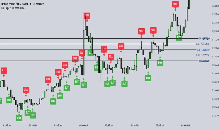
QX Expert Imtiazz 3.0.4 PROQX Expert Imtiazz 3.0.4 (qx_expert_imtiaz)
is a high-precision 1-minute binary scalping indicator, built using a hybrid trading strategy that combines momentum, structure, volume, and zone-based logic.
This indicator is specially designed for fast decision-making and short expiry trades in volatile market conditions.
---
🔹 Core Concepts Used
This indicator integrates multiple professional trading concepts into a single system:
QQE (Quantitative Qualitative Estimation)
Identifies momentum shifts and trend strength with reduced noise.
EMA Trend Filter
Confirms market direction and avoids counter-trend entries.
Smart Zones (Base & Reaction Zones)
Detects key price areas where reversals or continuations are most likely.
Volume Confirmation
Filters weak signals and confirms real market participation.
Footprint Logic (Price Acceptance / Rejection)
Analyzes candle behavior to validate buy/sell pressure.
---
Wavelet Candle Constructor (Inc. Morlet) 2Here is the detailed description of the **Wavelet Candle** construction principles based on the code provided.
This indicator is not a simple smoothing mechanism (like a Moving Average). It utilizes the **Discrete Wavelet Transform (DWT)**, specifically the Stationary variant (SWT / à Trous Algorithm), to separate "noise" (high frequencies) from the "trend" (low frequencies).
Here is how it works step-by-step:
###1. The Wavelet Kernel (Coefficients)The heart of the algorithm lies in the coefficients (the `h` array in the `get_coeffs` function). Each wavelet type represents a different set of mathematical weights that define how price data is analyzed:
* **Haar:** The simplest wavelet. It acts like a simple average of neighboring candles. It reacts quickly but produces a "boxy" or "jagged" output.
* **Daubechies 4:** An asymmetric wavelet. It is better at detecting sudden trend changes and the fractal structure of the market, though it introduces a slight phase shift.
* **Symlet / Coiflet:** More symmetric than Daubechies. They attempt to minimize lag (phase shift) while maintaining smoothness.
* **Morlet (Gaussian):** Implemented in this code as a Gaussian approximation (bell curve). It provides the smoothest, most "organic" effect, ideal for filtering noise without jagged edges.
###2. The Convolution EngineInstead of a simple average, the code performs a mathematical operation called **convolution**:
For every candle on the chart, the algorithm takes past prices, multiplies them by the Wavelet Kernel weights, and sums them up. This acts as a **digital low-pass filter**—it allows the main price movements to pass through while cutting out the noise.
###3. The "à Trous" Algorithm (Stationary Wavelet Transform)This is the key difference between this indicator and standard data compression.
In a classic wavelet transform, every second data point is usually discarded (downsampling). Here, the **Stationary** approach is used:
* **Level 1:** Convolution every **1** candle.
* **Level 2:** Convolution every **2** candles (skipping one in between).
* **Level 3:** Convolution every **4** candles.
* **Level 4:** Convolution every **8** candles.
Because of this, **we do not lose time resolution**. The Wavelet Candle is drawn exactly where the original candle is, but it represents the trend structure from a broader perspective. The higher the `Decomposition Level`, the deeper the denoising (looking at a wider context).
###4. Independent OHLC ProcessingThe algorithm processes each component of the candle separately:
1. Filters the **Open** series.
2. Filters the **High** series.
3. Filters the **Low** series.
4. Filters the **Close** series.
This results in four smoothed curves: `w_open`, `w_high`, `w_low`, `w_close`.
###5. Geometric Reconstruction (Logic Repair)Since each price series is filtered independently, the mathematics can sometimes lead to physically impossible situations (e.g., the smoothed `Low` being higher than the smoothed `High`).
The code includes a repair section:
```pinescript
real_high = math.max(w_high, w_low)
real_high := math.max(real_high, math.max(w_open, w_close))
// Same logic for Low (math.min)
```
This guarantees that the final Wavelet Candle always has a valid construction: wicks encapsulate the body, and the `High` is strictly the highest point.
---
###Summary of ApplicationThis construction makes the Wavelet Candle an **excellent trend-following tool**.
* If the candle is **green**, it means that after filtering the noise (according to the selected wavelet), the market energy is bullish.
* If it is **red**, the energy is bearish.
* The wicks show volatility that exists within the bounds of the selected decomposition level.
Here is a descriptive comparison of **Wavelet Candles** against other popular chart types. As requested, this is a narrative explanation focusing on the differences in mechanics, interpretation philosophy, and the specific pros and cons of each approach.
---
###1. Wavelet Candles vs. Standard (Japanese) CandlesThis is a clash between "the raw truth" and "mathematical interpretation." Standard Japanese candles display raw market data—exactly what happened on the exchange. Wavelet Candles are a synthetic image created by a signal processor.
**Differences and Philosophy:**
A standard candle is full of emotion and noise. Every single price tick impacts its shape. The Wavelet Candle treats this noise as interference that must be removed to reveal the true energy of the trend. Wavelets decompose the price, reject high frequencies (noise), and reconstruct the candle using only low frequencies (the trend).
* **Wavelet Advantages:** The main advantage is clarity. Where a standard chart shows a series of confusing candles (e.g., a long green one, followed by a short red one, then a doji), the Wavelet Candle often draws a smooth, uniform wave in a single color. This makes it psychologically easier to hold a position and ignore temporary pullbacks.
* **Wavelet Disadvantages:** The biggest drawback is the loss of price precision. The Open, Close, High, and Low values on a Wavelet candle are calculated, not real. You **cannot** place Stop Loss orders or enter trades based on these levels, as the actual market price might be in a completely different place than the smoothed candle suggests. They also introduce lag, which depends on the chosen wavelet—whereas a standard candle reacts instantly.
###2. Wavelet Candles vs. Heikin AshiThese are close cousins, but they share very different "DNA." Both methods aim to smooth the trend, but they achieve it differently.
**Differences and Philosophy:**
Heikin Ashi (HA) is based on a simple recursive arithmetic average. The current HA candle depends on the previous one, making it react linearly.
The Wavelet Candle uses **convolution**. This means the shape of the current candle depends on a "window" (group) of past candles multiplied by weights (Gaussian curve, Daubechies, etc.). This results in a more "organic" and elastic reaction.
* **Wavelet Advantages:** Wavelets are highly customizable. With Heikin Ashi, you are stuck with one algorithm. With Wavelet Candles, you can change the kernel to "Haar" for a fast (boxy) reaction or "Morlet" for an ultra-smooth, wave-like effect. Wavelets handle the separation of market cycles better than simple HA averaging, which can generate many false color flips during consolidation.
* **Wavelet Disadvantages:** They are computationally much more complex and harder to understand intuitively ("Why is this candle red if the price is going up?"). In strong, vertical breakouts (pumps), Heikin Ashi often "chases" the price faster, whereas deep wavelet decomposition (High Level) may show more inertia and change color more slowly.
###3. Wavelet Candles vs. RenkoThis compares two different dimensions: Time vs. Price.
**Differences and Philosophy:**
Renko completely ignores time. A new brick is formed only when the price moves by a specific amount. If the market stands still for 5 hours, nothing happens on a Renko chart.
The Wavelet Candle is **time-synchronous**. If the market stands still for 5 hours, the Wavelet algorithm will draw a series of flat, small candles (the "wavelet decays").
* **Wavelet Advantages:** They preserve the context of time, which is crucial for traders who consider trading sessions (London/New York) or macroeconomic data releases. On a wavelet chart, you can see when volatility drops (candles become small), whereas Renko hides periods of stagnation, which can be misleading for options traders or intraday strategies.
* **Wavelet Disadvantages:** In sideways trends (chop), Wavelet Candles—despite the smoothing—will still draw a "snake" that flips colors (unless you set a very high decomposition level). Renko can remain perfectly clean and static during the same period, not drawing any new bricks, which for many traders is the ultimate filter against overtrading in a flat market.
###Summary**Wavelet Candles** are a tool for the analyst who wants to visualize the **structure of the wave and market cycle**, accepting some lag in exchange for noise reduction, but without giving up the time axis (like in Renko) or relying on simple averaging (like in Heikin Ashi). It serves best as a "roadmap" for the trend rather than a "sniper scope" for precise entries.

Hybrid Trend-Following Inside Bar BreakoutHybrid Trend-Following Inside Bar Breakout Strategy
The Hybrid Trend-Following Inside Bar Breakout Strategy is a rule-based trading system designed to capture strong directional moves while controlling risk during uncertain market conditions. It combines trend-following, price action, and volatility-based risk management into a single robust framework.
Core Concept
The strategy trades inside bar breakouts only in the direction of the dominant market trend. Inside bars represent periods of consolidation, and when price breaks out of this consolidation in a trending market, it often leads to impulsive moves with favorable risk–reward characteristics.
Key Components
1. Trend Filter
Uses 50 EMA and 200 EMA to define the market trend.
Bullish bias: 50 EMA above 200 EMA
Bearish bias: 50 EMA below 200 EMA
This filter prevents counter-trend trades and improves trade quality.
2. Volatility Filter
Compares fast ATR (14) with slow ATR (50).
Trades are taken only when volatility is expanding or above a minimum threshold.
This avoids low-volatility, choppy market conditions.
3. Inside Bar Breakout
An inside bar forms when the current candle’s high is lower than the previous candle’s high and the low is higher than the previous candle’s low.
A trade is triggered only when price breaks above or below the inside bar range in the direction of the trend.
4. Candle Quality Filter
Requires a minimum body-to-range ratio, ensuring that the breakout candle has strong momentum and is not driven by weak wicks.
Risk Management & Trade Management
Stop Loss (SL)
Placed using ATR-based dynamic stops, adapting to current market volatility.
Prevents tight stops in volatile conditions and wide stops in calm markets.
Partial Profit Taking
50% of the position is exited at 1.5R, locking in profits early.
This reduces psychological pressure and improves equity stability.
Trailing Stop
After partial profit is taken, the remaining position is managed with an ATR-based trailing stop.
Allows the strategy to capture large trend moves while protecting gains.
Cooldown Mechanism
After a losing trade, the system enters a cooldown period and skips a fixed number of bars.
This helps avoid revenge trading and overtrading during unfavorable market phases.
Why This Strategy Works
Trades only high-probability breakouts in trending markets
Adapts automatically to changing volatility
Combines price action precision with systematic risk control
Designed for consistent performance over long historical periods
