Indicators


Indicator 03 GXthis is 3rd indicator by GX we use that to predict market long and short
this is 3rd indicator by GX we use that to predict market long and short
this is 3rd indicator by GX we use that to predict market long and short
Indicator 02 GXthis is 2nd indicator we use to predict the long and short market
this is 2nd indicator we use to predict the long and short market
this is 2nd indicator we use to predict the long and short market
Indicator 01 GXinvite only by GX this is the first indicator we published we use this to catch up the long or short predictions
invite only by GX this is the first indicator we published we use this to catch up the long or short predictions
invite only by GX this is the first indicator we published we use this to catch up the long or short predictions
invite only by GX this is the first indicator we published we use this to catch up the long or short predictions

ATR Dynamic Stop (Table + Plot + ATR %)📊 This script displays dynamic stop levels based on ATR, designed for active traders.
Features:
- Shows long and short stop levels (price ± ATR × multiplier).
- Displays values as a floating table on the top-right corner.
- Optional plot lines directly on the chart.
- Option to calculate based on realtime price or last close.
- Displays the ATR value both in price units and as a percentage of the selected price.
- Fully customizable table: text size, text color, background color.
Inputs:
- ATR Multiplier and Length.
- Show/hide stop lines on the chart.
- Select price source (realtime or last close).
- Table appearance options.
Ideal for:
- Traders who want a clear visual stop guide.
- Combining volatility with risk management.

Directional Market Efficiency [QuantAlgo]🟢 Overview
The Directional Market Efficiency indicator is an advanced trend analysis tool that measures how efficiently price moves in a given direction relative to the total price movement over a specified period. Unlike traditional momentum oscillators that only measure price change magnitude, this indicator combines efficiency measurement with directional bias to provide a comprehensive view of market behavior ranging from -1 (perfectly efficient downward movement) to +1 (perfectly efficient upward movement).
The indicator transforms the classic Efficiency Ratio concept by incorporating directional bias, creating a normalized oscillator that simultaneously reveals trend strength, direction, and market regime (trending vs. ranging). This dual-purpose functionality helps traders and investors identify high-probability trend continuation opportunities while filtering out choppy, inefficient price movements that often lead to false signals and whipsaws.
🟢 How It Works
The indicator employs a sophisticated two-step calculation process that first measures pure efficiency, then applies directional weighting to create the final signal. The efficiency calculation compares the absolute net price change over a lookback period to the sum of all individual bar-to-bar price movements during that same period. This ratio reveals how much of the total price movement contributed to actual progress in a specific direction.
The directional component applies the mathematical sign of the net price change (positive for upward movement, negative for downward movement) to the efficiency ratio, creating values between -1 and +1. The resulting Directional Efficiency is then smoothed using an Exponential Moving Average to reduce noise while maintaining responsiveness. Additionally, the system incorporates a configurable threshold level that distinguishes between trending markets (high efficiency) and ranging markets (low efficiency), enabling regime-based analysis and strategy adaptation.
🟢 How to Use
1. Signal Interpretation and Market Regime Analysis
Positive Territory (Above Zero): Indicates efficient upward price movement with bullish directional bias and favorable conditions for long positions
Negative Territory (Below Zero): Signals efficient downward price movement with bearish directional bias and favorable conditions for short positions
High Absolute Values (±0.4 to ±1.0): Represent highly efficient trending conditions with strong directional conviction and reduced noise
Low Absolute Values (±0.1 to ±0.3): Suggest ranging or consolidating markets with inefficient price movement and increased whipsaw risk
Zero Line Crosses: Mark critical directional shifts and provide primary entry/exit signals for trend-following strategies
2. Threshold-Based Market Regime Classification
Above Threshold (Trending Markets): When efficiency exceeds the threshold level, markets are classified as trending, favoring momentum strategies
Below Threshold (Ranging Markets): When efficiency falls below the threshold, markets are classified as ranging, favoring mean reversion approaches
3. Preset Configurations for Different Trading Styles
Default
Universally applicable configuration optimized for medium-term analysis across multiple timeframes and asset classes, providing balanced sensitivity and noise filtering.
Scalping
Highly responsive setup for ultra-short-term trades with increased sensitivity to quick efficiency changes. Best suited for 1-15 minute charts and rapid-fire trading approaches.
Swing Trading
Designed for multi-day position holding with enhanced noise filtering and focus on sustained efficiency trends. Optimal for 1-4 hour and daily timeframe analysis.
🟢 Pro Tips for Trading and Investing
→ Trend Continuation Filter: Enter long positions when Directional Efficiency crosses above zero in trending markets (above threshold) and short positions when crossing below zero, ensuring alignment with efficient price movement.
→ Range Trading Optimization: In ranging markets (below threshold), take profits on extreme readings and enter mean reversion trades when efficiency approaches zero from either direction.
→ Multi-Timeframe Confluence: Combine higher timeframe trend direction with lower timeframe efficiency signals for optimal entry timing.
→ Risk Management Enhancement: Reduce position sizes or avoid new entries when efficiency readings are weak (near zero), as these conditions indicate higher probability of choppy, unpredictable price movement.
→ Signal Strength Assessment: Prioritize trades with high absolute efficiency values (±0.4 or higher) as these represent the most reliable directional moves with reduced likelihood of immediate reversal.
→ Regime Transition Trading: Watch for efficiency threshold breaks combined with directional changes as these often mark significant trend initiation or termination points requiring strategic position adjustments.
→ Alert Integration: Utilize the built-in alert system for real time notifications of zero-line crosses, threshold breaks, and regime changes to maintain constant market awareness without continuous chart monitoring.

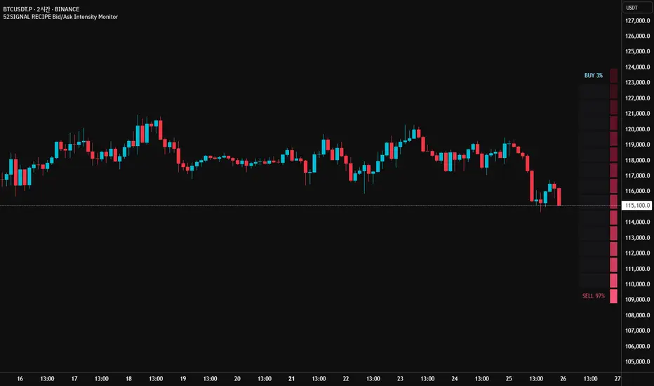
52SIGNAL RECIPE Bid/Ask Intensity Monitor═══ 52SIGNAL RECIPE Bid/Ask Intensity Monitor ═══
◆ Overview
52SIGNAL RECIPE Bid/Ask Intensity Monitor is a technical indicator that visualizes the balance of buying and selling forces in the market in real-time. Based on candle structure, this indicator calculates the relative strength of buying and selling pressure, displaying it through an intuitive color gradient gauge that allows traders to instantly grasp short-term market psychology and trading activity.
─────────────────────────────────────
◆ Key Features
• Intuitive Visualization: Instantly recognize buy/sell ratios through color gradient gauges
• Real-time Force Balance: Accurately display the buy/sell force ratio as a percentage in the current candle
• Candle Structure Analysis: Interpret market participant behavior through relationships between high, low, and close prices
• Chart Overlay: Displayed on the chart to observe changes in force balance alongside price movements
• Color Psychology: Provides intuitive psychological understanding through blue series (buy) and red series (sell) colors
─────────────────────────────────────
◆ Technical Foundation
■ Buy/Sell Ratio Calculation
• Basic Principle: Measure the relative strength of buyers and sellers by analyzing candle structure
• Buy Ratio Calculation: (Close - Low) ÷ (High - Low)
• Sell Ratio Calculation: 1 - Buy Ratio
• Interpretation Logic: The closer the closing price is to the high, the stronger the buying force; the closer to the low, the stronger the selling force
■ Visualization Mechanism
• Gradient Color Map: Express buy/sell intensity through 12-level color gradients
• Buy Color Range: Gradual change from light sky blue (#8be2ff) to deep navy blue (#103c60)
• Sell Color Range: Gradual change from light pink (#f65575) to deep burgundy (#3d101a)
• Gauge Structure: Vertical table positioned in the middle right of the chart for enhanced visual focus
─────────────────────────────────────
◆ Practical Applications
■ Market Psychology Identification
• Strong Buying Pressure Signals:
▶ When buy ratio is displayed as 70% or higher
▶ When the gauge is filled with bright blue shades
• Strong Selling Pressure Signals:
▶ When sell ratio is displayed as 70% or higher
▶ When the gauge is filled with bright red shades
• Force Balance State:
▶ When buy/sell ratio is in the 40-60% range
▶ When the color distribution in the gauge is even
■ Trading Strategy Application
• Trend Confirmation Strategy:
▶ Consecutive high buy ratios (70% or more) signal uptrend confirmation
▶ Consecutive high sell ratios (70% or more) signal downtrend confirmation
• Reversal Detection Strategy:
▶ Decreasing sell ratio during a downtrend suggests potential rebound
▶ Decreasing buy ratio during an uptrend suggests potential correction
• Volatility Breakout Strategy:
▶ Rapid changes in buy/sell ratio from a balanced state (50%) provide breakout signals
▶ Dramatic shifts in the opposite direction after extreme ratios signal trend reversals
─────────────────────────────────────
◆ Advanced Setting Options
■ Gauge Settings
• Gauge Width: Default value 15 (can be adjusted narrower or wider)
• Position Adjustment: Can be positioned at various locations on the chart (default is middle right)
• Border Thickness: Adjust border thickness for gauge visibility (default is 4)
■ Color Customization
• Buy Gradient: Color range can be modified according to personal preference
• Sell Gradient: Color range can be modified according to personal preference
• Transparency Settings: Optimize chart readability by adjusting background color transparency
■ Display Frequency Settings
• Update Cycle: Can be set to update every bar or at specific intervals
• History Length: Set display range for historical data
─────────────────────────────────────
◆ Synergy with Other Indicators
• Volume Profile: Analyze the Bid/Ask Intensity Monitor together with volume distribution to confirm buying/selling pressure at key price levels
• RSI: Improve signal reliability by checking extreme values of the Bid/Ask Intensity Monitor alongside RSI's overbought/oversold levels
• Moving Averages: Observe changes in the Bid/Ask Intensity Monitor when price is near key moving averages to assess support/resistance strength
• Bollinger Bands: Observe the Bid/Ask Intensity Monitor's reaction at band boundaries to evaluate potential reversals or trend continuation
─────────────────────────────────────
◆ Conclusion
52SIGNAL RECIPE Bid/Ask Intensity Monitor is a powerful tool that visualizes market participants' psychology and behavior in real-time based on candle structure. Through intuitive color gradients and percentage displays, it allows for immediate understanding of the balance between buying and selling forces, greatly aiding in predicting short-term market direction and momentum. When used in conjunction with other technical indicators, it provides a comprehensive understanding of market conditions, contributing to more accurate entry and exit timing decisions. This indicator, particularly useful in scalping and short-term trading, will enhance the chart analysis capabilities of all traders.
─────────────────────────────────────
※ Disclaimer: Past performance does not guarantee future results. Always use appropriate risk management strategies.
═══ 52SIGNAL RECIPE Bid/Ask Intensity Monitor ═══
◆ 개요
52SIGNAL RECIPE Bid/Ask Intensity Monitor는 실시간으로 시장의 매수/매도 세력 균형을 시각화하는 기술적 지표입니다. 이 지표는 캔들 구조를 기반으로 매수와 매도 압력의 상대적 강도를 계산하고, 직관적인 그라데이션 색상 게이지를 통해 표시함으로써 시장 참여자들의 단기 심리와 거래 활동을 한눈에 파악할 수 있게 합니다.
─────────────────────────────────────
◆ 주요 특징
• 직관적인 시각화: 매수/매도 비율을 색상 그라데이션 게이지로 즉각적으로 인식
• 실시간 세력 균형: 현재 봉에서의 매수/매도 세력 비율을 백분율로 정확히 표시
• 캔들 구조 기반 분석: 고가, 저가, 종가의 관계를 통해 시장 참여자 행동 해석
• 차트 오버레이: 차트 위에 표시되어 가격 움직임과 함께 세력 균형 변화 관찰 가능
• 색상 심리학 활용: 파란색 계열(매수)과 붉은색 계열(매도)로 직관적인 심리적 이해 제공
─────────────────────────────────────
◆ 기술적 기반
■ 매수/매도 비율 계산
• 기본 원리: 캔들의 구조를 분석하여 매수자와 매도자의 상대적 강도 측정
• 매수 비율 계산: (종가 - 저가) ÷ (고가 - 저가)
• 매도 비율 계산: 1 - 매수 비율
• 해석 논리: 종가가 고가에 가까울수록 매수 세력이 강하고, 저가에 가까울수록 매도 세력이 강함
■ 시각화 메커니즘
• 그라데이션 컬러 맵: 12단계 색상 그라데이션으로 매수/매도 강도 표현
• 매수 색상 범위: 밝은 하늘색(#8be2ff)에서 짙은 남색(#103c60)까지 점진적 변화
• 매도 색상 범위: 밝은 분홍색(#f65575)에서 짙은 적갈색(#3d101a)까지 점진적 변화
• 게이지 구조: 세로형 테이블로 우측 중앙에 배치되어 시각적 주목도 향상
─────────────────────────────────────
◆ 실용적 응용
■ 시장 심리 파악
• 강한 매수 압력 신호:
▶ 매수 비율이 70% 이상으로 표시될 때
▶ 게이지가 밝은 청색 계열로 채워질 때
• 강한 매도 압력 신호:
▶ 매도 비율이 70% 이상으로 표시될 때
▶ 게이지가 밝은 적색 계열로 채워질 때
• 세력 균형 상태:
▶ 매수/매도 비율이 40-60% 범위에 있을 때
▶ 게이지의 색상 분포가 균등할 때
■ 트레이딩 전략 적용
• 추세 확인 전략:
▶ 연속적인 높은 매수 비율(70% 이상)은 상승 추세 확인 신호
▶ 연속적인 높은 매도 비율(70% 이상)은 하락 추세 확인 신호
• 반전 탐색 전략:
▶ 하락 추세 중 매도 비율 감소는 반등 가능성 시사
▶ 상승 추세 중 매수 비율 감소는 조정 가능성 시사
• 변동성 돌파 전략:
▶ 균형 상태(50%)에서 급격한 매수/매도 비율 변화는 돌파 신호 제공
▶ 극단적 비율 후 반대 방향으로의 급격한 변화는 추세 전환 신호
─────────────────────────────────────
◆ 고급 설정 옵션
■ 게이지 설정
• 게이지 너비: 기본값 15 (좁게 또는 넓게 조정 가능)
• 위치 조정: 차트의 다양한 위치에 배치 가능 (우측 중앙 기본값)
• 테두리 두께: 게이지 가시성을 위한 테두리 굵기 조절 (기본값 4)
■ 색상 커스터마이징
• 매수 그라데이션: 개인 선호에 따라 색상 범위 수정 가능
• 매도 그라데이션: 개인 선호에 따라 색상 범위 수정 가능
• 투명도 설정: 배경색 투명도 조절로 차트 가독성 최적화
■ 표시 빈도 설정
• 업데이트 주기: 모든 봉마다 또는 특정 간격으로 업데이트 설정 가능
• 히스토리 길이: 과거 데이터에 대한 표시 범위 설정
─────────────────────────────────────
◆ 다른 지표와의 시너지
• 볼륨 프로파일: Bid/Ask Intensity Monitor와 볼륨 분포를 함께 분석하여 주요 가격대의 매수/매도 압력 확인
• RSI: Bid/Ask Intensity Monitor의 극단치와 RSI의 과매수/과매도 수준을 함께 확인하여 신호 신뢰도 향상
• 이동평균선: 가격이 주요 이동평균선 근처에서 Bid/Ask Intensity Monitor 변화를 관찰하여 지지/저항 강도 판단
• 볼린저 밴드: 밴드 경계에서의 Bid/Ask Intensity Monitor 반응을 관찰하여 반전 또는 추세 지속 가능성 평가
─────────────────────────────────────
◆ 결론
52SIGNAL RECIPE Bid/Ask Intensity Monitor는 캔들 구조를 기반으로 시장 참여자들의 심리와 행동을 실시간으로 시각화하는 강력한 도구입니다. 직관적인 색상 그라데이션과 백분율 표시를 통해 매수/매도 세력의 균형을 즉각적으로 파악할 수 있어, 시장의 단기적 방향성과 모멘텀을 예측하는 데 큰 도움이 됩니다. 다른 기술적 지표와 함께 사용하면 시장 상황에 대한 종합적인 이해를 얻을 수 있으며, 이는 더 정확한 진입 및 퇴출 타이밍을 결정하는 데 기여합니다. 특히 스캘핑과 단기 트레이딩에서 유용하게 활용될 수 있는 이 지표는 모든 트레이더의 차트 분석 능력을 한 단계 향상시켜 줄 것입니다.
─────────────────────────────────────
※ 면책 조항: 과거 성과가 미래 결과를 보장하지 않습니다. 항상 적절한 리스크 관리 전략을 사용하세요.
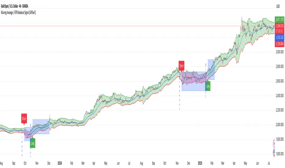
Moving Average / ATR Breakout Signal [ARTech]Moving Average / ATR Breakout Signal
This indicator generates trend-following signals based on price breaking above or below a user-defined Moving Average (MA). It supports various MA types and lengths, while offering optional filters like ATR bands and breakout thresholds to enhance signal quality. The tool is designed to help traders detect momentum shifts with configurable confirmation logic and offers visual enhancements to help traders better interpret market conditions at a glance.
Key Features:
• Multi-Type Moving Average Support: Choose from various Moving Average types including EMA, SMA, Hull MA, VWMA, RMA, TEMA, and more — fully customizable with source and length options.
• Flexible Signal Logic: Signals are generated when price breaks above or below the selected MA. You can define the number of confirmation candles and choose between wick-based or close-based break logic.
• ATR-Based Filtering: Enable ATR filtering to create dynamic upper and lower breakout bands around the MA. This helps reduce noise and validate true breakouts with volatility-adjusted thresholds.
• Breakout Threshold Filtering: Add an optional breakout condition where the price must first move a minimum percentage away from the previous signal level before a new opposite signal is allowed. Prevents choppy back-to-back signals.
• Visual Enhancements: Color-coded backgrounds highlight long and short zones, adapting dynamically to signal context. Optional MA slope coloring further supports trend visualization.
• Signal Alerts: Customizable alerts for long and short signals, including user-defined messages, to keep you notified in real-time.
Why use this indicator?
• Helps you identify clear trend shifts by focusing on price action relative to a customizable moving average.
• Improves signal reliability with optional ATR filtering and breakout confirmation, reducing false signals.
• Flexible MA types and lengths let you tailor the indicator to your trading style.
• Suitable for traders of all levels looking for a straightforward, yet powerful trend-following tool.
How to Use
███████ Alerts ███████
• Custom Alerts: To enable Custom Alerts, you need to activate the fx alert() function call option in TradingView’s alert creation dialog. Then, select the desired alert type (Long or Short) from the indicator's settings under the "Alerts" section, you can customize messages and enable notifications for Long and Short signals.
Using Custom Alerts allows you to set up one alert that covers both Long and Short signals, simplifying your alert management.
• Long and Short Alerts: To create Long or Short alerts, open the alert dialog, select this indicator as the condition, then choose “Long” or “Short” from the list and click Create.
You need to set up two separate alerts: one for Long signals and one for Short signals.
███████ Moving Average ███████
This is the core component of the signal system. You can customize:
Moving Average Type: Choose from SMA, EMA, WMA, Hull MA, VWMA, RMA, or TEMA
Length: Adjust the length to suit your strategy.
Source: Select which price data (e.g., Close, Open, HL2) is used to calculate the MA.
Show Slope Color: Colors the MA line based on its direction: upward slopes are shown in the selected "Up" color, while downward slopes use the "Down" color. This helps you visually confirm trend direction at a glance.
Show Background Color: When enabled, highlights the area between the MA and price to enhance signal zones:
– If ATR filter is on, the space between ATR bands is shaded.
– If ATR filter is off, the area between the MA line and bar closes is colored.
This helps emphasize potential breakout or trend-following zones visually.
███████ Break Options ███████
Confirm Candles: Defines the number of consecutive candles that must break the selected level to confirm a signal.
– If ATR filter is enabled, this level is the ATR bands.
– If ATR is disabled, the Moving Average line is used.
This helps filter out noise and avoid premature signals.
Break Type: Specifies how the candle must break the level:
– Close: The candle must close beyond the level.
– Wick: A wick touching or exceeding the level is enough.
Choose based on how strict you want the breakout condition to be.
███████ Filters ███████
This section provides optional filters to improve signal accuracy:
ATR
When enabled, breakout confirmation requires the price to cross above the upper breakout line or below the lower breakout line by a specified percentage from the last signal price.
• Multiplier: Adjusts the width of ATR bands by multiplying the ATR value.
• Length: Sets the period for ATR calculation.
• Smoothing: Selects the smoothing method applied to the ATR (RMA, SMA, EMA, WMA).
• Upper and Lower Line Colors: Customize the colors of the ATR bands.
Breakout Filter
When enabled, breakout confirmation requires the price to cross above the upper breakout line or below the lower breakout line by a specified percentage from the last signal price.
• Threshold (%): Defines the minimum percentage price movement required to validate a breakout.
• Show Breakout Levels: Toggle to display or hide breakout threshold area on the chart.
Signalgo S&DSignalgo S&D
Signalgo S&D is a next-generation indicator designed for traders who want to harness the true power of supply and demand (S&D) in their trading decisions. Unlike traditional S&D indicators, it leverages proprietary multi-timeframe net volume analysis, trend confirmation, and adaptive trade management.
How Signalgo S&D Works
Multi-Timeframe Net Volume Analysis
Net Volume Calculation: At the heart of Signalgo S&D is a unique net volume engine. It doesn’t just look at price or raw volume, but calculates a net volume value for each bar, factoring in both price movement and the true range of the candle. This is done across multiple timeframes—from 1 minute to 3 months—giving a layered, real-time view of market pressure.
Trend Measurement: The indicator tracks changes in net volume over a customizable trend length, identifying when buying or selling pressure is truly shifting.
Intelligent Signal Generation
Directional Shifts: Buy and sell signals are only considered when net volume flips from negative to positive (or vice versa) and the net volume trend confirms the move.
Multi-Timeframe Confirmation: Strong signals require agreement across several timeframes, filtering out noise and dramatically increasing reliability.
Volume & Momentum Filters: Each signal is further filtered using volume spikes, EMA alignment, and RSI momentum, ensuring that only high-quality, high-probability setups are flagged.
One-Time Event Detection: Signals are triggered only once per event, preventing repeated entries on the same move.
Adaptive Trade Management
Automated Entry/Exit Logic: Every trade signal is paired with a fully automated take-profit (TP), stop-loss (SL), and trailing stop system, all dynamically adjusted to current volatility.
Risk-Reward Scaling: Three profit targets (TP1, TP2, TP3) allow for scaling out or partial exits, while trailing stops lock in gains as the trade progresses.
Visual Feedback: All trade events—entries, exits, TPs, SLs—are clearly marked on the chart for transparency and review.
Inputs & User Controls
Preset Parameters:
Trend Length: Controls how sensitive net volume trend detection is.
Show Labels/Table: Visual toggles for displaying signal and trade management information.
Trade Management:
Show TP/SL Logic: Toggle to display or hide trade management levels.
ATR Length & Multipliers: Fine-tune how SL and TP levels adapt to market volatility.
Enable Trailing Stop: Activate or deactivate dynamic stop movement after TP1.
Entry & Exit Strategy
Entry Logic
Long (Buy) Entry: Triggered when net volume flips positive across multiple timeframes, the trend confirms, and all momentum/volume filters align.
Short (Sell) Entry: Triggered when net volume flips negative across multiple timeframes, with trend and momentum confirmation.
Exit & Trade Management
Stop Loss (SL): Automatically set based on recent volatility (ATR), adapting to the current market environment.
Take Profits (TP1, TP2, TP3): Three profit targets at increasing reward multiples, allowing for flexible trade management.
Trailing Stop: After TP1 is hit, the stop loss moves to breakeven and a trailing stop is activated to lock in further gains.
Event Markers: Each time a TP or SL is hit, a visual label is placed on the chart for full transparency.
Multi-Timeframe Synchronization: Instead of focusing on a single timeframe, this indicator requires confirmation across several, providing a market-wide perspective and filtering out false signals.
Dynamic, Adaptive Management: The built-in TP/SL and trailing logic is not static—it adapts to volatility and market conditions, providing a disciplined, automated approach to exits and risk.
Event-Driven, Not Static: Signals are only generated when all conditions align, and each event is marked only once, eliminating repetitive or redundant signals.
Advanced Filtering: Signals are filtered by volume spikes, EMA and RSI momentum, and trend alignment, ensuring only the highest-quality trades are considered.
Visual & Alert Integration: Every signal and trade event is visually marked and can trigger TradingView alerts, keeping you informed in real time.
Trading Strategy Application
Versatility: Suitable for scalping, day trading, swing trading, and even longer-term positions thanks to its multi-timeframe logic.
Systematic Execution: By automating entries, exits, and risk management, Signalgo S&D helps you trade with discipline and confidence, minimizing emotional bias.
Noise Reduction: The advanced, layered filtering logic means you only see the highest-probability setups, helping you avoid common S&D “fakeouts” and overtrading.

Signalgo S/RSignalgo S/R
Signalgo S/R is a cutting-edge TradingView indicator engineered for traders who want to leverage support and resistance (S/R) in a way that goes far beyond traditional methods. This overview will help you understand its unique approach, inputs, entry and exit strategies, and what truly sets it apart.
How Signalgo S/R Works
Multi-Timeframe S/R Detection
Layered Analysis: Signalgo S/R continuously scans price action across a wide spectrum of timeframes, from 1 minute up to 3 months. This multi-layered approach ensures that both short-term and long-term S/R levels are dynamically tracked and updated.
Advanced Pivot Recognition: Instead of simply plotting static lines, the indicator uses a sophisticated pivot recognition system to identify only the most relevant and recent S/R levels, adapting as the market evolves.
Synchronized Structure: By aligning S/R levels across timeframes, it builds a robust market structure that highlights truly significant zones—areas where price is most likely to react.
Intelligent Breakout & Reversal Signals
Close Confirmation: The indicator only triggers a breakout or breakdown signal when price not just touches, but closes beyond a key S/R level, dramatically reducing false signals.
Multi-Timeframe Confirmation: True buy or sell signals require agreement across several timeframes, filtering out noise and improving reliability.
One-Time Event Detection: Each breakout or breakdown is recognized only once per occurrence, eliminating repetitive signals from the same event.
Inputs & User Controls
Preset Parameters:
Pivot Length: Adjusts how sensitive the S/R detection is to price swings.
Label Offset: Fine-tunes the placement of visual labels for clarity.
Trade Management Controls:
Show TP/SL Logic: Toggle to display or hide take-profit (TP) and stop-loss (SL) levels.
ATR Length & Multipliers: Adapt SL and TP distances to current volatility.
Enable Trailing Stop: Option to activate dynamic stop movement after TP1 is reached.
Entry & Exit Strategy
Entry Logic
Long (Buy) Entry: Triggered when multiple timeframes confirm a breakout above resistance, signaling strong upward momentum.
Short (Sell) Entry: Triggered when multiple timeframes confirm a breakdown below support, indicating strong downward momentum.
Exit & Trade Management
Stop Loss (SL): Automatically set based on recent volatility, always adapting to current market conditions.
Take Profits (TP1, TP2, TP3): Three profit targets are set at increasing reward multiples, allowing for partial exits or scaling out.
Trailing Stop: After the first profit target is reached, the stop loss moves to breakeven and a trailing stop is activated, locking in gains as the trade continues.
Event Markers: Each time a TP or SL is hit, a visual label is placed on the chart for full transparency.
What Separates Signalgo S/R from Traditional S/R Indicators?
True Multi-Timeframe Synchronization: Most S/R tools only look at a single timeframe or plot static levels. Signalgo S/R dynamically aligns levels across all relevant timeframes, providing a comprehensive market map.
Event-Driven, Not Static: Instead of plotting every minor swing, it intelligently filters for only the most actionable S/R levels and signals—reducing chart clutter and focusing attention on what matters.
Breakout Confirmation Logic: Requires a close beyond S/R, not just a wick, to validate breakouts or breakdowns. This greatly reduces false positives.
Automated, Adaptive Trade Management: Built-in TP/SL and trailing logic mean you get not just signals, but a full trade management suite—something rarely found in standard S/R indicators.
Visual & Alert Integration: Every signal, TP/SL event, and trailing stop is visually marked and can trigger TradingView alerts, keeping you informed in real time.
Trading Strategy Application
Scalping to Swing Trading: The multi-timeframe logic makes it suitable for all trading styles, from fast intraday moves to longer-term position trades.
Systematic, Disciplined Execution: By automating entries, exits, and risk management, Signalgo S/R helps you trade with confidence and consistency, removing emotion from the process.
Noise Reduction: The advanced filtering logic means you only see the highest-probability setups, helping you avoid common S/R “fakeouts.”

Signalgo XSignalgo X
Signalgo X is a sophisticated indicator crafted for traders who demand a disciplined, multi-layered approach to market analysis and trade management. This overview will help you understand its capabilities, logic, and how it can elevate your trading.
Core Concept
Signalgo X is built to:
Scan multiple timeframes simultaneously for price, volume, and volatility patterns.
Filter out unreliable signals during periods of market hype or manipulation.
Automate trade management with dynamic take-profit (TP), stop-loss (SL), and trailing logic.
Deliver actionable, visual signals and alerts for timely, confident decisions.
Inputs & Controls
Preset System Parameters:
News Sensitivity: Determines how responsive the indicator is to price moves.
Hype Filter Strength: Sets how aggressively the system avoids volatile, manipulated, or news-driven periods.
User-Configurable:
Show TP/SL Logic: Turn on/off the display of take-profit and stop-loss levels directly on your chart.
How Signalgo X Works
1. Multi-Timeframe Market Analysis
Signalgo X continuously monitors:
Closing price
Trading volume
Volatility (ATR)
across six distinct timeframes, from 1 hour to 3 months. This layered approach ensures that signals are validated by both short-term momentum and long-term trends.
2. Price, Volume, and Volatility Synthesis
Price Change: The system tracks percentage changes over each timeframe to gauge momentum.
Volume Ratio: By comparing current volume to a moving average, it detects unusual spikes that may signal institutional activity or manipulation.
Volatility: Measures the intensity of price movements relative to average ranges, helping to identify breakout or exhaustion scenarios.
3. Proprietary Anti-Hype Filter
A unique scoring mechanism evaluates:
Volume spikes without corresponding price action
Sudden jumps in volatility
Conflicting signals across timeframes
Social hype proxies (e.g., sharp moves on low volume)
If the market is deemed “hyped,” all trading signals are suppressed and a clear warning is shown, keeping you out of unpredictable conditions.
4. Signal Classification & Mapping
Significant Moves: Only price actions that exceed a sensitivity threshold and are confirmed by volume/volatility are considered.
Bullish/Bearish Signals: Generated for each timeframe.
Signal Strength: Categorized as regular, or strong based on multi-timeframe agreement.
Entry & Exit Strategy
Entry Logic
Long (Buy) Entry: Triggered when bullish signals are detected (of any strength) and no hype is present.
Short (Sell) Entry: Triggered when bearish signals are detected and no hype is present.
Exit & Trade Management
Stop Loss (SL): Placed at a calculated distance from entry, adapting to recent volatility.
Take Profits (TP1, TP2, TP3): Three profit targets, each at a greater reward multiple.
Trailing Stop: After the first take-profit is hit, the stop-loss moves to breakeven and a trailing stop is activated to protect further gains.
Event Tracking: The indicator visually marks when each TP or SL is hit, providing real-time feedback.
Chart Plots: All relevant SL, TP, and trailing stop levels are clearly marked for both long and short trades.
Labels: Entry, exit, and signal strength events are color-coded and visually prominent.
Alerts: Built-in alert conditions allow you to set up TradingView notifications for strong/regular buy/sell signals and hype warnings.
Trading Strategy Application
Multi-Timeframe Confirmation: Only strong signals confirmed by several timeframes are acted upon, reducing false positives.
Volume & Volatility Awareness: The indicator avoids low-quality, “fakeout” signals by requiring confirmation from both price and volume/volatility.
Hype Avoidance: Keeps you out of the market during news-driven or manipulated periods, helping to protect your capital.
Automated Discipline: The TP/SL logic enforces a rules-based exit strategy, helping you lock in profits and limit losses without emotional interference.
Who Should Use Signalgo X?
Signalgo X is ideal for traders who want:
Systematic, high-confidence signals
Automated and disciplined trade management
Protection against unpredictable market events
Clear, actionable visuals and alerts

Automated Scalping Signals with TP/SL Indicator [QuantAlgo]🟢 Overview
The Automated Scalping Signals with Take Profit & Stop Loss Indicator is a multi-timeframe trading system that combines market structure analysis with directional bias filtering to identify potential scalping opportunities. It detects Points of Interest (POI) including Fair Value Gaps (FVG) and Order Blocks (OB) while cross-referencing entries with higher timeframe exponential moving average positioning to create systematic entry conditions.
The indicator features adaptive timeframe calculations that automatically scale analysis periods based on your chart timeframe, maintaining consistent analytical relationships across different trading sessions. It provides integrated trade management with stop loss calculation methods, configurable risk-reward ratios, and real-time performance tracking through dashboard displays showing trade statistics, bias direction, and active position status.
This advanced system is designed for low timeframe trading, typically performing optimally on 1 to 15-minute charts across popular instruments such as OANDA:XAUUSD , CME_MINI:MES1! , CME_MINI:ES1! , CME_MINI:MNQ1! , CBOT_MINI:YM1! , CBOT_MINI:MYM1! , BYBIT:BTCUSDT.P , BYBIT:ETHUSDT.P , or any asset and timeframe of your preference.
🟢 How It Works
The indicator operates using a dual-timeframe mathematical framework where higher timeframe exponential moving averages establish directional bias through cross-over analysis, while simultaneously scanning for specific market structure patterns on the POI timeframe. The timeframe calculation engine uses multiplication factors to determine analysis periods, ensuring the bias timeframe provides trend context while the POI timeframe captures structural formations.
The structural analysis begins with FVG detection, which systematically scans price action to identify imbalances where gaps exist between consecutive candle ranges with no overlapping wicks. When such gaps are detected, the algorithm measures their size against minimum thresholds to filter out insignificant formations. Concurrently, OB recognition analyzes three-candle sequences, examining specific open/close relationships that indicate potential institutional accumulation zones. Once these structural patterns are identified, the algorithm cross-references them against the higher timeframe bias direction, creating a validation filter that only permits entries aligned with the prevailing EMA cross-over state. When price subsequently intersects these validated POI zones, entry signals generate with the system calculating entry levels at zone midpoints, then applying the selected stop loss methodology combined with the configured risk-reward ratio to determine take profit placement.
To mirror realistic trading conditions, the indicator incorporates configurable slippage calculations that account for execution differences between intended and actual fill prices. When trades reach their take profit or stop loss levels, the algorithm applies slippage adjustments that worsen the exit prices in a conservative manner - reducing take profit fills and increasing stop loss impact. This approach ensures backtesting results reflect more realistic performance expectations by accounting for spread costs, market volatility during execution, and liquidity constraints that occur in live trading environments.
It also has a performance dashboard that continuously tracks and displays comprehensive trading metrics:
1/ Bias TF / POI TF: Displays the calculated timeframes used for bias analysis and POI detection, showing the actual periods (e.g., "15m / 5m") that result from the multiplier settings to confirm proper adaptive timeframe selection
2/ Bias Direction: Shows current market trend assessment (Bullish, Bearish, or Sideways) derived from EMA cross-over analysis to indicate which trade directions align with prevailing momentum
3/ Data Processing: Indicates how many price bars have been analyzed by the system, helping users verify if complete historical data has been processed for comprehensive strategy validation
4/ Total Trades: Displays the cumulative number of completed trades plus any active positions, providing volume assessment for statistical significance of other metrics
5/ Wins/Losses: Shows the raw count of profitable versus unprofitable trades, offering immediate insight into strategy effectiveness frequency
6/ Win Rate: Reveals the percentage of successful trades, where values above 50% generally indicate effective entry timing and values below suggest strategy refinement needs
7/ Total R-Multiple: Displays cumulative risk-reward performance across all trades, with positive values demonstrating profitable system operation and negative values indicating net losses requiring analysis
8/ Average R Win/Loss: Shows average risk-reward ratios for winning and losing trades separately, where winning averages approaching the configured take profit ratio indicate minimal slippage impact while losing averages near -1.0 suggest effective stop loss execution
9/ TP Ratio / Slippage: Displays the configured take profit ratio and slippage settings with calculated performance impact, showing how execution costs affect actual versus theoretical returns
10/ Profit Factor: Calculates the ratio of total winning amounts to total losing amounts, where values above 1.5 suggest robust profitability, values between 1.0-1.5 indicate modest success, and values below 1.0 show net losses
11/ Maximum Drawdown: Tracks the largest peak-to-trough decline in R-multiple terms, with smaller negative values indicating better capital preservation and risk control during losing streaks
🟢 How to Use
Start by applying the indicator to your chart and observe its performance across different market conditions to understand how it identifies bias direction and POI formations. Then navigate to the settings panel to configure the Bias Timeframe Multiplier for trend context sensitivity and POI Timeframe Multiplier for structural analysis frequency according to your trading preference and objectives.
Next, fine-tune the EMA periods in Bias Settings to control trend detection sensitivity and select your preferred POI types based on your analytical preference. Proceed to configure your Risk Management approach by selecting from the available stop loss calculation methods and setting the Take Profit ratio that aligns with your risk tolerance and profit objectives. Complete the setup by customizing Display Settings to control table visibility and trade visualization elements, adjusting UI positioning and colors for optimal chart readability, then activate Alert Conditions for automated notifications on trade entries, exits, and bias direction changes to support systematic trade management.
🟢 Examples
OANDA:XAUUSD
CME_MINI:MES1!
CME_MINI:ES1!
CME_MINI:MNQ1!
CBOT_MINI:YM1!
BYBIT:BTCUSDT.P
BINANCE:SOLUSD
*Disclaimer: Past performance is not indicative of future results. None of our statements, claims, or signals from our indicators are intended to be financial advice. All trading involves substantial risk of loss, not just upside potential. Users are highly recommended to carefully consider their financial situation and risk tolerance before trading.
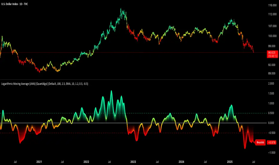
Logarithmic Moving Average (LMA) [QuantAlgo]🟢 Overview
The Logarithmic Moving Average (LMA) uses advanced logarithmic weighting to create a dynamic trend-following indicator that prioritizes recent price action while maintaining statistical significance. Unlike traditional moving averages that use linear or exponential weights, this indicator employs logarithmic decay functions to create a more sophisticated price averaging system that adapts to market volatility and momentum conditions.
The indicator displays a smoothed signal line that oscillates around zero, with positive values indicating bullish momentum and negative values indicating bearish momentum. The signal incorporates trend quality assessment, momentum confirmation, and multiple filtering mechanisms to help traders and investors identify trend continuation and reversal opportunities across different timeframes and asset classes.
🟢 How It Works
The indicator's core innovation lies in its logarithmic weighting system, where weights are calculated using the formula: w = 1.0 / math.pow(math.log(i + steepness), 2) The steepness parameter controls how aggressively recent data is prioritized over historical data, creating a dynamic weight decay that can be fine-tuned for different trading styles. This logarithmic approach provides more nuanced weight distribution compared to exponential moving averages, offering better responsiveness while maintaining stability.
The LMA calculation combines multiple sophisticated components. First, it calculates the logarithmic weighted average of closing prices. Then it measures the slope of this average over a 10-period lookback: lmaSlope = (lma - lma ) / lma * 100 The system also incorporates trend quality assessment using R-squared correlation analysis of log-transformed prices, measuring how well the price data fits a linear trend model over the specified period.
The final signal generation uses the formula: signal = lmaSlope * (0.5 + rSquared * 0.5) which combines the LMA slope with trend quality weighting. When momentum confirmation is enabled, the indicator calculates annualized log-return momentum and applies a multiplier when the momentum direction aligns with the signal direction, strengthening confirmed signals while filtering out weak or counter-trend movements.
🟢 How to Use
1. Signal Interpretation and Threshold Zones
Positive Values (Above Zero): LMA slope indicating bullish momentum with upward price trajectory relative to logarithmic baseline
Negative Values (Below Zero): LMA slope indicating bearish momentum with downward price trajectory relative to logarithmic baseline
Zero Line Crosses: Signal transitions between bullish and bearish regimes, indicating potential trend changes
Long Entry Threshold Zone: Area above positive threshold (default 0.5) indicating confirmed bullish signals suitable for long positions
Short Entry Threshold Zone: Area below negative threshold (default -0.5) indicating confirmed bearish signals suitable for short positions
Extreme Values: Signals exceeding ±1.0 represent strong momentum conditions with higher probability of continuation
2. Momentum Confirmation and Visual Analysis
Signal Color Intensity: Gradient coloring shows signal strength, with brighter colors indicating stronger momentum
Bar Coloring: Optional price bar coloring matches signal direction for quick visual trend identification
Position Labels: Real-time position classification (Bullish/Bearish/Neutral) displayed on the latest bar
Momentum Weight Factor: When short-term log-return momentum aligns with LMA signal direction, the signal receives additional weight confirmation
Trend Quality Component: R-squared values weight the signal strength, with higher correlation indicating more reliable trend conditions
3. Examples: Preconfigured Settings
Default: Universally applicable configuration balanced for medium-term investing and general trading across multiple timeframes and asset classes.
Scalping: Highly responsive setup with shorter period and higher steepness for ultra-short-term trades on 1-15 minute charts, optimized for quick momentum shifts.
Swing Trading: Extended period with moderate steepness and increased smoothing for multi-day positions, designed to filter noise while capturing larger price swings on 1-4 hour and daily charts.
Trend Following: Maximum smoothing with lower steepness for established trend identification, generating fewer but more reliable signals optimal for daily and weekly timeframes.
Mean Reversion: Shorter period with high steepness for counter-trend strategies, more sensitive to extreme moves and reversal opportunities in ranging market conditions.
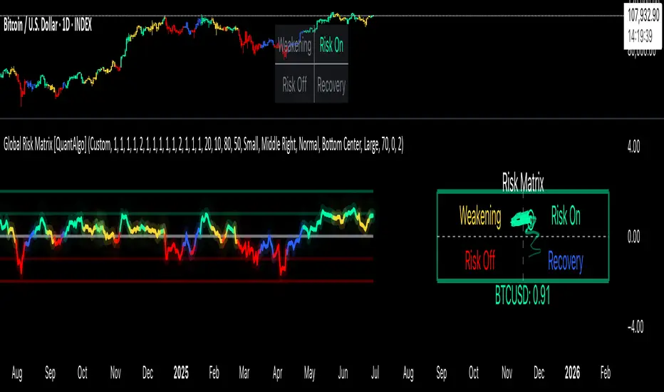
Global Risk Matrix [QuantAlgo]🟢 Overview
The Global Risk Matrix is a comprehensive macro risk assessment tool that aggregates multiple global financial indicators into a unified risk sentiment framework. It transforms diverse economic data streams (from currency strength and liquidity measures to volatility indices and commodity prices) into standardized Z-Score readings to identify market regime shifts across risk-on and risk-off conditions.
The indicator displays both a risk oscillator showing weighted average sentiment and a dynamic 2D matrix visualization that plots signal strength against momentum to reveal current market phase and historical evolution. This helps traders and investors understand broad market conditions, identify regime transitions, and align their strategies with prevailing macro risk environments across all asset classes.
🟢 How It Works
The indicator employs Z-Score normalization across various global macro components, each representing distinct aspects of market liquidity, sentiment, and economic health. Raw data from sources like DXY, S&P 500, Fed liquidity, global M2 money supply, VIX, and commodities undergoes statistical standardization. Several components are inverted (USDT.D, DXY, VIX, credit spreads, treasury bonds, gold) to align with risk-on interpretation, where positive values indicate bullish conditions.
This unique system applies configurable weights to each component based on selected asset class presets (Crypto Investor/Trader, Stock Trader, Commodity Trader, Forex Trader, Risk Parity, or Custom), creating a weighted average Z-Score. It then analyzes both signal strength and momentum direction to classify market conditions into four distinct phases: Risk-On (positive signal, rising momentum), Risk-Off (negative signal, falling momentum), Recovery (negative signal, rising momentum), and Weakening (positive signal, falling momentum). The 2D matrix visualization plots these dimensions with historical trail tracking to show regime evolution over time.
🟢 How to Use
1. Risk Oscillator Interpretation and Phase Analysis
Positive Territory (Above Zero) : Indicates risk-on conditions with capital flowing toward growth assets and higher risk tolerance
Negative Territory (Below Zero) : Signals risk-off sentiment with capital seeking safety and defensive positioning
Extreme Levels (±2.0) : Represent statistically significant deviations that often precede regime reversals or trend exhaustion
Zero Line Crosses : Mark critical transitions between risk regimes, providing early signals for portfolio rebalancing
Phase Color Coding : Green (Risk-On), Red (Risk-Off), Blue (Recovery), Yellow (Weakening) for immediate regime identification
2. Risk Matrix Visualization and Trail Analysis
Current Position Marker (⌾) : Shows real-time location in the risk/momentum space for immediate situational awareness
Historical Trail : Connected path showing recent market evolution and regime transition patterns
Quadrant Analysis : Risk-On (upper right), Risk-Off (lower left), Recovery (lower right), Weakening (upper left)
Trail Patterns : Clockwise rotation typically indicates healthy regime cycles, while erratic movement suggests uncertainty
3. Pro Tips for Trading and Investing
→ Portfolio Allocation Filter : Use Risk-On phases to increase exposure to growth assets, small caps, and emerging markets while reducing defensive positions during confirmed green phases
→ Entry Timing Enhancement : Combine Recovery phase signals with your technical analysis for optimal long entry points when macro headwinds are clearing but prices haven't fully recovered
→ Risk Management Overlay : Treat Weakening phase transitions as early warning systems to tighten stop losses, reduce position sizes, or hedge existing positions before full Risk-Off conditions develop
→ Sector Rotation Strategy : During Risk-On periods, favor cyclical sectors (technology, consumer discretionary, financials) while Risk-Off phases favor defensive sectors (utilities, consumer staples, healthcare)
→ Multi-Timeframe Confluence : Use daily matrix readings for strategic positioning while applying your regular technical analysis on lower timeframes for precise entry and exit execution
→ Divergence Detection : Watch for situations where your asset shows bullish technical patterns while the matrix shows Risk-Off conditions—these often provide the highest probability short opportunities and vice versa
Strategy Builder With IndicatorsThis strategy script is designed for traders who enjoy building systems using multiple indicators.
Please note: This script does not include any built-in indicators. Instead, it works by referencing the plot outputs of the indicators you’ve already added to your chart.
For example, if you add a MACD and an ATR indicator to your chart, you can assign their plot values as inputs in the settings panel of this strategy.
• MACD as a trigger
• ATR as a filter
How Filters Work
Filters check whether certain conditions are met before a trade can be opened. For instance, if you set a filter like ATR > 30, then no trade will be executed unless that condition is true — even if the trigger fires.
All filters are linked, meaning every active filter must be satisfied for a trade to occur.
How Triggers Work
Triggers are what actually fire a trade signal — such as a moving average crossover or RSI breaking above a specific level. Unlike filters, triggers are independent. Only one active trigger needs to be true for the trade to execute.
Thanks to its modular structure, this strategy can be used with any indicator of your choice.
⸻
Risk Management Features
In the settings, you’ll find flexible options for:
• Stop Loss (SL)
• Trailing Stop Loss (TSL)
• Multi Take-Profit (TP)
These features enhance trade safety and let you tailor your risk management.
SL types available:
• Tick-based SL
• Percent-based SL
• ATR-based SL
Once you select your preferred SL type, you can fine-tune its distance using the offset field.
Trailing SL allows your stop to follow price as it moves in your favor — helping to lock in profits.
Multi-TP lets you take profits at two different levels, helping you secure gains while leaving room for extended moves.
Breakeven option is also available to automatically move your SL to entry after reaching a profit threshold.
⸻
How to Build a Solid Strategy
Let’s break down a good setup into three key components:
1. Trend Filter
Avoid trading against the trend — that’s like swimming against the current.
Use a filter like:
• Supertrend
• Momentum indicators
• Candlestick bias, etc.
Example: In this case, I used Supertrend and filtered for trades only if the price is above the uptrend line.
2. Trigger Condition
Once we confirm the trend is on our side, we need a trigger to execute at the right moment. This can be:
• RSI cross
• Candlestick patterns
• Trendline breaks
• Moving average crossovers, etc.
Example: I used RSI crossing above 50 as the entry trigger.
3. Risk Management
Even in the right trend at the right time — anything can happen. That’s why you should always define Stop Loss and Take Profit levels.
⸻
And there you have it! Your strategy is ready to backtest, refine, and deploy with alerts for live trading.
Questions or suggestions? Feel free to reach out

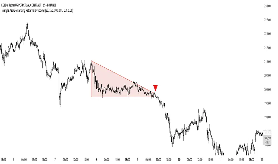
Triangle Asc/Descending Patterns [Drobode]█ DESCRIPTION
The script automatically tracks the descending or ascending triangle pattern. The script provides advanced settings, allowing you to adjust the pattern accuracy from high to low depending on your needs and technical analysis style. The main goal of the script is to facilitate the routine work of a trader in identifying certain trading situations (patterns). However, you should understand that the script is not a full-fledged self-sufficient strategy, in case of receiving a signal, it is recommended that you additionally conduct a comprehensive thorough analysis before taking trading actions. The script can be useful for traders of all levels, both beginners and experienced analysts. This variation of the script, in case of identifying a pattern, draws a contour triangle with the background color of the figure. The ascending triangle has a blue color, the descending triangle has a red color. The logic of the script provides that one of the legs (one side) of the triangle is always a horizontal line, simultaneously being a line of resistance or support, other variations of triangle patterns are not tracked. According to generally defined beliefs and observations of pattern formation, a descending and ascending triangle may indicate a possible breakdown of the conditional horizontal level to which the price of the instrument has approached, however, at the same time it is necessary to deeply analyze many other factors at this point, in particular, such as volumes, consolidation, volatility, and so on.
█ SCRIPT SETTINGS
By default, the script was pre-developed and tested on the M15 timeframe with the USDT.P crypto futures instruments.
Alert
The Alert function in the script is enabled by default, you just need to activate the Alert in the TradingView window and select the signal source - Triangle Asc/Descending Patterns .
The notification provides the following information (example):
Triangle_Ascending
Ticker- EGLDUSDT.P
Price-19.754
Timeframe- 15
Period length-160
Periods length
The script allows you to set the period length (number) of bars on which the calculation will be performed. Different periods make it possible to cover more timeframes (in particular, larger timeframes). The calculation is performed simultaneously on all periods, but you can turn off "Period length 3" and "Period length 4" by clicking on the check mark, this can speed up the script. The following period values are set by default: "Period length 1" – 80,
"Period length 2" – 160, "Period length 3" – 300, "Period length 4" – 681.
Percentage deviation of extremes
The next settings are the percentage deviation from the hypotenuse and horizontal leg, which creates the zone in which the extremes of the bars that will form the triangle shape should be. The smaller the deviation, the greater the accuracy and the closer to the hypotenuse and leg the bar extrema should be, however, in this case the number of pattern identifications will be smaller. By default, the deviation zone from the hypotenuse "Deflection zone of tangents to the hypotenuse" is - 0.4%, the deviation zone from the horizontal leg "Tangent deviation zone horizontal leg" is - 0.08%.
The presence of extrema at certain points on the sides of a triangle
The last block of settings are the conditions that increase the accuracy of the proportions of the pattern figure. These settings are aimed at confirming the presence of extrema in certain areas along the hypotenuse and horizontal leg. Thus, enabling "Extrema on the horizontal leg almost along the entire length" means that only those triangles will be tracked in which the horizontal leg zone has extrema almost along the entire length of this leg, this increases the accuracy but reduces the number of detected patterns. "Extremes present on second half of horizontal leg (more than 50%)" assumes that only those triangles will be tracked in which the extrema are present on the second half of the length of the given leg (more than 50%) in the zone of the horizontal leg. "Presence of an extrema in the middle region of the hypotenuse" assumes that only those triangles will be tracked in which the extrema are present on a certain segment of length in the central region of the hypotenuse.
TCP | Money Management indicator | Crypto Version📌 TCP | Money Management Indicator | Crypto Version
A robust, multi-target risk and capital management indicator tailored for crypto traders. Whether you're trading spot, perpetual futures, or leverage tokens, this tool empowers you with precise control over risk, reward, and position sizing—directly on your chart. Eliminate guesswork and trade with confidence.
🔰 Introduction: Master Your Capital, Master Your Trades
Poor money management is the number one reason traders lose their accounts, even with solid strategies. The TCP Money Management Indicator, built by Trade City Pro (TCP), solves this problem by providing a structured, rule-based approach to capital allocation.
Want to dive deeper into the concept of money management? Check out our comprehensive tutorial on TradingView, " TradeCityPro Academy: Money Management ", to understand the principles that power this indicator and transform your trading mindset.
This indicator equips you to:
• Calculate optimal position sizes based on your capital, risk percentage, and leverage
• Set up to 5 customizable take-profit targets with partial close percentages
• Access real-time metrics like Risk-to-Reward (R/R), USD profit, and margin usage
• Trade with discipline, avoiding emotional or inconsistent decisions
💸 Money Management Formula
The indicator uses a professional capital allocation model:
Position Size = (Capital × Risk %) ÷ (Stop Loss % × Leverage)
From this, it calculates:
• Total risk amount in USD
• Optimal position size for your trade
• Margin required for each take-profit target
• Adjusted R/R for each target, accounting for partial position closures
🛠 How to Use
Enter Trade Parameters: Input your capital, risk %, leverage, entry price, and stop-loss price.
Set Take-Profit Targets: Enable 1 to 5 take-profit levels and specify the percentage of the position to close at each.
Real-Time Calculations: The indicator automatically computes:
• R/R ratio for each target
• Profit in USD for each partial close
• Margin used per target (in % and USD)
Visualize Your Trade:
• Price levels for entry, stop-loss, and take-profits are plotted on the chart.
• A dynamic info panel on the left side displays all key metrics.
🔄 Dynamic Adjustments: As each take-profit target is hit and a portion of the position is closed, the indicator recalculates the remaining position size, expected profit, R/R, and margin for subsequent targets. This ensures accuracy and reflects real-world trade behavior.
📊 Table Overview
The left-side panel provides a clear snapshot:
• Trade Setup: Capital, entry price, stop-loss, risk amount, and position size
• Per Target: Percentage closed, R/R, profit in USD, and margin used
• Summary: Total expected profit across all targets
⚙️ Settings Panel
• Total Capital ($): Your account size for the trade
• Risk per Trade (%): The percentage of capital you’re willing to risk
• Leverage: The leverage applied to the trade
• Entry/Stop-Loss Prices: Define your trade’s risk zone
• Take-Profit Targets (1–5): Set price levels and percentage to close at each
🔍 Use Case Example
Imagine you have $1,000 capital, risking 1%, using 10x leverage:
• Entry: $100 | Stop-Loss: $95
• TP1: $110 (close 50%) | TP2: $115 (close 50%)
The indicator calculates the exact position size, profit at each target, and margin allocation in real time, with all metrics displayed on the chart.
✅ Why Traders Love It
• Precision: No more manual calculations or guesswork
• Versatility: Works on all crypto pairs (BTC, ETH, altcoins, etc.)
• Flexibility: Perfect for scalping, swing trading, or futures strategies
• Universal: Compatible with all timeframes
• Transparency: Fully manual, with clear and reliable outputs
🧩 Built by Trade City Pro (TCP)
Developed by TCP, a trusted name in trading tools, used by over 150,000 traders worldwide. This indicator is coded in Pine Script v5, ensuring compatibility with TradingView’s platform.
🧾 Final Notes
• No Auto-Trading: This is a manual tool for disciplined traders
• No Repainting: All calculations are accurate and non-repainting
• Tested: Rigorously validated across major crypto pairs
• Publish-Ready: Built for seamless use on TradingView
🔗 Resources
• Money Management Tutorial: Learn the fundamentals of capital management with our detailed guide: TradeCityPro Academy: Money Management
• TradingView Profile: Explore more tools by TCP on TradingView

SBC ProtfoSBC Portfo PNL Indicator
Description
The SBC Portfo PNL Indicator is a user-friendly tool designed for Hebrew-speaking traders to track the Profit and Loss (PNL) of their stock portfolios on TradingView charts. It supports up to 5 distinct portfolios, each capable of holding an unlimited number of stocks with unlimited buy commands, allowing real-time monitoring of portfolio performance.
Key Features
- Multi-Portfolio Support: Track up to 5 separate portfolios for different trading strategies or accounts.
- Unlimited Stock Entries: Add unlimited stocks and buy commands per portfolio.
- Detailed Buy Commands: Input for each stock:
- Stock Ticker (e.g., AAPL, TSLA).
- Buy Price (e.g., 150.25).
- Buy Amount (e.g., 10).
- Hebrew-Friendly Interface: Intuitive settings dialog with clear instructions in Hebrew.
- Customizable PNL Tracking: Visualize PNL on charts with real-time updates based on market data.
How to Use
1. Add the Indicator:
- Go to the Indicators menu in TradingView and add the "SBC Portfo" PNL Indicator.
2. Configure Portfolios:
- Open the indicator’s settings dialog.
- For each portfolio (up to 5), enter data in the provided input fields using this format:
PortfolioName:StockTicker:BuyPricexBuyAmount;StockTicker:BuyPricexBuyAmount
Example:
Portfolio1:AAPL:150.25x10;TSLA:266.72x5
- This represents a portfolio named "Portfolio1" with:
- 10 shares of AAPL bought at $150.25.
- 5 shares of TSLA bought at $266.72.
- Repeat for additional portfolios (e.g., Portfolio2, Portfolio3).
- Add multiple buy commands for the same stock if needed (e.g., AAPL:160.50x20).
3. Apply Settings:
- Save settings to display PNL based on current market prices.
4. Monitor PNL:
- View PNL for each portfolio on the chart via tables, labels, or graphical overlays (based on settings).
Input Format
Enter portfolio data manually in the settings dialog, one input field per portfolio:
PortfolioName:StockTicker:BuyPricexBuyAmount;StockTicker:BuyPricexBuyAmount
- PortfolioName: Unique name (e.g., Portfolio1, Growth).
- StockTicker: Stock symbol (e.g., AAPL).
- BuyPrice: Purchase price per share (e.g., 150.25).
- BuyAmount: Number of shares (e.g., 10).
- Use
: to separate portfolio name, ticker, and buy data
x to separate price and amount
; for multiple stocks in the portfolio
Example:
- Portfolio 1: GrowthPortfolio:AAPL:150.25x10;TSLA:266.72x5
- Portfolio 2: DividendPortfolio:KO:55.20x50;PG:145.30x30
Notes
- Hebrew Support: Settings and labels are optimized for Hebrew users.
- Manual Input: Enter portfolio data manually in the settings dialog using the correct format.
- Compatibility: Works with any stock ticker supported by TradingView.
תיאור אינדיקטור SBC Portfo PNL הוא כלי ידידותי למשתמש שתוכנן במיוחד עבור סוחרים דוברי עברית למעקב אחר רווח והפסד (PNL) של תיקי המניות שלהם ישירות בגרפים של TradingView. הוא תומך בעד 5 תיקים נפרדים, כאשר כל תיק יכול להכיל מספר בלתי מוגבל של מניות עם פקודות קנייה בלתי מוגבלות, ומאפשר מעקב בזמן אמת אחר ביצועי התיק.
תכונות עיקריות
- תמיכה בריבוי תיקים: מעקב אחר עד 5 תיקים נפרדים עבור אסטרטגיות מסחר או חשבונות שונים.
- רישום מניות ללא הגבלה: הוספת מספר בלתי מוגבל של מניות ופקודות קנייה לכל תיק.
- פקודות קנייה מפורטות: הזנת נתונים עבור כל מניה:
- סימול המניה (למשל, AAPL, TSLA).
- מחיר קנייה (למשל, 150.25).
- כמות קנייה (למשל, 10).
- ממשק ידידותי לעברית: חלונית הגדרות אינטואיטיבית עם הוראות ברורות בעברית.
- מעקב PNL הניתן להתאמה: הצגת רווח והפסד בגרפים עם עדכונים בזמן אמת בהתבסס על נתוני השוק.
כיצד להשתמש
1. הוספת האינדיקטור:
- נווט לתפריט האינדיקטורים ב-TradingView והוסף את "SBC Portfo PNL Indicator".
2. הגדרת תיקים:
- פתח את חלונית ההגדרות של האינדיקטור.
- עבור כל תיק (עד 5), הזן נתונים בשדות המסופקים בפורמט הבא:
PortfolioName:StockTicker:BuyPricexBuyAmount;StockTicker:BuyPricexBuyAmount
לדוגמה:
Portfolio1:AAPL:150.25x10;TSLA:266.72x5
שורה זו מייצגת תיק בשם "Portfolio1" עם:
- 10 מניות של AAPL שנקנו ב-$150.25.
- 5 מניות של TSLA שנקנו ב-$266.72.
- חזור על התהליך עבור תיקים נוספים (למשל, Portfolio2, Portfolio3).
- ניתן להוסיף פקודות קנייה מרובות לאותה מניה לפי הצורך (למשל, AAPL:160.50x20).
3. החלת ההגדרות:
- שמור את ההגדרות להצגת ה-PNL בהתבסס על מחירי השוק הנוכחיים.
4. מעקב אחר PNL:
- צפה ב-PNL עבור כל תיק בגרף באמצעות טבלאות, תוויות או שכבות גרפיות (בהתאם להגדרות).
פורמט קלט הזן נתוני תיק ידנית בחלונית ההגדרות, שדה קלט אחד לכל תיק: PortfolioName:StockTicker:BuyPricexBuyAmount;StockTicker:BuyPricexBuyAmount
PortfolioName: שם ייחודי (למשל, Portfolio1, Growth).
StockTicker: סימול המניה (למשל, AAPL).
BuyPrice: מחיר רכישה למניה (למשל, 150.25).
BuyAmount: מספר המניות (למשל, 10).
השתמש ב-
: להפרדה בין שם התיק, סימול ונתוני קנייה
x להפרדה בין מחיר וכמות
; להפרדה בין מניות מרובות
דוגמה:
- תיק 1: GrowthPortfolio:AAPL:150.25x10;TSLA:266.72x5
- תיק 2: DividendPortfolio:KO:55.20x50;PG:145.30x30
Release Notes
Version 1.1 includes:
- Calculations for extended hours (Pre-Market & After-Hours).
- Option to display portfolio summary data for stocks not in the portfolio (enable via settings checkbox).
- Table background for better visibility; click to bring table to the front.
- Updated text strings (names, titles, tooltips).
הערות
תמיכה בעברית: ההגדרות והתוויות מותאמות למשתמשים דוברי עברית.
הזנה ידנית: הזן נתוני תיק ידנית בחלונית ההגדרות תוך שימוש בפורמט הנכון.
תאימות: עובד עם כל סימול מניה הנתמך על ידי TradingView.
גרסה 1.1 מכילה:
1. חישובים כוללים שעות מסחר מורחבות (Pre-Market ו-After-Hours).
2. אפשרות להציג נתוני תיק כוללים עבור מניות שאינן בתיק (הפעל באמצעות תיבת סימון בהגדרות).
3. צבע רקע לטבלה לשיפור הנראות; לחיצה על הטבלה מביאה אותה לחזית.
4. תיקון נוסחים (שמות, כותרות, וטולטיפים).
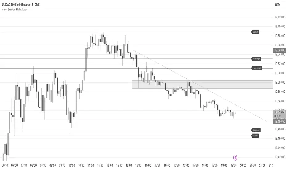
Major Session Highs/LowsThis indicator creates horizontal lines at major session high/lows (US, London, and Asian). The script updates the lines automatically, on session close.
For instance, when viewing during the US session, after the London overlap, horizontal lines will be displayed at the following levels.
The high/low of the most recent London session.
The high/low of the most recent Asian session.
The high/low of the last full US session, i.e. the session of the day prior.
When the current US session closes, the US levels automatically update.
PivotBox by Nadeem Al-QahwiPivotBox by Nadeem Al-Qahwi
General Idea of the Indicator: The PivotBox indicator is an advanced technical analysis tool designed to identify key reversal points in the market based on pivot highs and pivot lows. The indicator helps traders to detect breakout and breakdown opportunities based on past price movements, guiding informed trading decisions.
Indicator Functions:
Key Reversal Points (Pivot Points):
The indicator identifies pivot highs and pivot lows over a user-defined period, helping traders spot significant price levels in the market.
These points are plotted on the chart, showing where market reversals may occur.
Breakouts and Breakdowns:
The indicator identifies breakouts when the price moves above a pivot high or breakdowns when the price falls below a pivot low.
Once these breakouts or breakdowns are detected, the indicator draws lines indicating the critical price levels for visual reference.
Trend Levels using Zero-Lag MA:
The indicator includes an option to add a Zero-Lag Moving Average (Zero-Lag MA) to display the overall trend in the market. This moving average helps filter out noise and identify the general market direction, improving trade decision-making.
Line Styles:
The pivot points (highs and lows) are displayed using different line styles, such as solid, dashed, or dotted lines. The user can customize the style based on their preference.
These lines represent the breakouts or breakdown levels in the market.
Alerts:
The indicator can activate alerts when a breakout or breakdown occurs. Users can customize the alerts to notify them when specific conditions are met, ensuring that they do not miss significant price movements.
Input Variables:
Period (prd): The time period over which the pivot highs and lows are calculated. The user can define this period based on their trading strategy.
Max Breakout Length (bo_len): The maximum time duration for a breakout or breakdown to occur. This variable helps determine the relevance of the price movement.
Threshold Rate (cwidthu): The width percentage that helps to define the price area for breakouts and breakdowns.
Line Style (lstyle): Allows the user to choose the style of lines used to display the pivot points (solid, dashed, or dotted).
Minimum Number of Tests (mintest): The minimum number of tests required before a breakout or breakdown is considered valid.
How the Indicator Works:
The indicator first calculates the pivot highs and lows based on the user-defined period (Period).
It then tracks price movements to detect if a breakout or breakdown occurs.
When a breakout or breakdown is confirmed, the indicator draws lines at these levels and shows the user the new price direction.
Alerts can be triggered based on predefined conditions such as when a breakout or breakdown occurs.
The Zero-Lag MA helps the user visualize the trend, adding another layer of analysis to the market movements.
Key Benefits:
Accurate Reversal Point Analysis: Helps traders identify key entry and exit points based on precise technical analysis.
Breakout and Breakdown Detection: Allows traders to spot breakout and breakdown opportunities in real-time.
Customizable Alerts: Users can set up alerts to notify them when a breakout or breakdown happens, ensuring they don't miss important market moves.
Flexible Customization: The indicator offers various options to customize the display (line styles, alerts, trendlines), catering to different trading strategies.

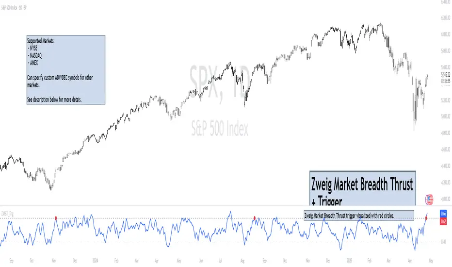
Zweig Market Breadth Thrust Indicator+Trigger [LazyBear x rwak]The Breadth Thrust (BT) indicator is a market momentum indicator developed by Dr. Martin Zweig. According to Dr. Zweig, a Breadth Thrust occurs when, during a 10-day period, the Breadth Thrust indicator rises from below 40 percent to above 61.5 percent.
A "Thrust" indicates that the stock market has rapidly changed from an oversold condition to one of strength, but has not yet become overbought. This is very rare and has happened only a few times. Dr. Zweig also points out that most bull markets begin with a Breadth Thrust.
This version of the Breadth Thrust indicator includes a trigger visualized with red circles, making it easier to spot when the indicator crosses the critical 61.5% level, signaling potential bullish momentum.
All parameters are configurable. You can draw BT for NYSE, NASDAQ, AMEX, or based on combined data (i.e., AMEX+NYSE+NASD). There is also a "CUSTOM" mode supported, so you can enter your own ADV/DEC symbols.
Credit: The original Breadth Thrust logic was created by LazyBear, whose public indicators can be found here , and app-store indicators here .
More info:
Definition of Breadth Thrust
A Breadth Thrust Signal
A Rare "Zweig" Buy Signal
Zweig Breadth Thrust: Redux