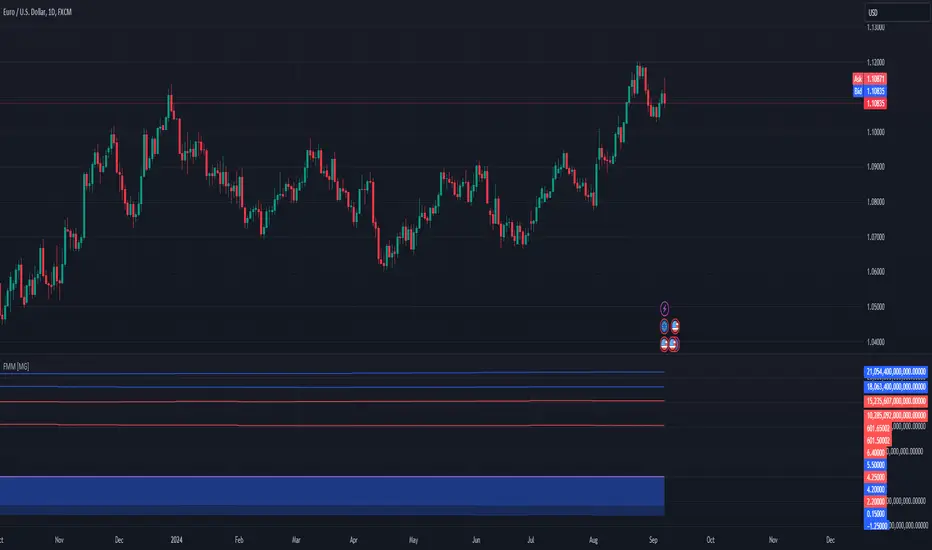
BTC Regime Phase [HY|YC|GLI]The correlation between global liquidity and INDEX:BTCUSD has attracted a lot of attention. Building on this insight, I developed an indicator that not only tracks global liquidity but also integrates the high‑yield spread and yield‑curve slope to capture credit risk and growth expectations.
Essence and Logic
At its core, the Risk‑On Composite Z‑Score converts three macro factors global liquidity momentum, the US high‑yield spread and the slope of the US yield curve into standardized Z‑scores, weights them, and tracks moving‑average crossovers. Each factor has a rationale: high‑yield spreads are powerful business‑cycle indicators and often outperform other financial variables (Gertler & Lown, 2000). Yield‑curve steepness reflects investor optimism and prompts shifts toward riskier assets global liquidity drives cross‑border flows and risk sentiment (Goldberg, 2023; Lee, 2024). Combining these measures gives a composite signal that has historically aligned well with Bitcoin’s tops and bottoms. Usable also for other crypto coins: INDEX:ETHUSD CRYPTO:SOLUSD CRYPTO:LINKUSD
Limitations and My Current Model Outlook
I want to be transparent: the three model sections are highly correlated. Currently, the high‑yield spread and yield curve data come only from the US; I may add Euro or Japanese spreads later. I’m also aware that macro dynamics are evolving. Fiscal policy and political choices could shorten bear markets and make the current sell signals less relevant. In a stagflationary world, inflation‑adjusted liquidity may swing more violently and require an asset‑inflation adjustment. Yet, the model has captured Bitcoin’s tops and bottoms almost to the week—future patterns may rhyme, not repeat.
Questions and Ideas:
Do you think this model will still be useful as fiscal and monetary regimes shift?
Should I add a stagnation modulation perhaps real yields or inflation‑adjusted liquidity—to better capture a stagflation scenario?
Are there high‑yield spreads on TV beyond the US that I should include? (Euro and Japan indices do exist.)
Would it make sense to incorporate Bitcoin halving events or a stock‑to‑flow module?
The indicator is free to use. If it brings you value, you’re welcome to follow for updates. I appreciate your support and feedback. When you are interested in the source code, feel free to contact me for more details. When you feel like supporting me with some sats, contact me and I will give you a Lightning address. I am a student and that would help a lot – but please only if you can afford it!
♡ Thanks to everyone who contributes insight on TradingView ♡
© Robinhodl21
Features: Users can enable or disable each component, adjust weights and choose a short‑tenor (1‑year or 2‑year) for the yield curve. The script automatically scales lookback windows based on the chart timeframe (daily, weekly or monthly). It offers visual plots of each Z‑score, the composite score, and smoothed moving averages, with background colours highlighting regimes and markers for entries and exits. Trade logic includes optional dip‑buy triggers when the composite falls below a threshold, Friday‑only execution on daily charts to reduce whipsaws. A trend table summarises current Z‑scores and their trends. Settings are tuned for BTC weekly data but should be adjusted for other assets or timeframes. Because some inputs (e.g., GLI weights) have limited historical data, long backtests may be less reliable when using on other Risk On Assets like NASDAQ:NDX NCDEX:COPPER
‼ Disclaimer: This indicator is for educational purposes and does not constitute investment advice. Markets involve risk; past performance is not indicative of future results. Users should not rely solely on this script for trading decisions. Always test and adapt settings to your asset, timeframe and risk tolerance. The author assumes no liability for any trading losses.
Literature:
Gertler, M., & Lown, C. S. (2000). The information in the high yield bond spread for the business cycle: Evidence and some implications. NBER Working Paper 7549.
Lee, B. (2024). Staying ahead of the yield curve. CME Group.
McCauley, R. N. (2012). Risk‑on/risk‑off, capital flows, leverage and safe assets. BIS Working Paper 382.
Goldberg, L. (2023). Global liquidity: Drivers, volatility and toolkits. Federal Reserve Bank of New York Staff Report 1064.
FRED (2025). ICE BofA Euro High Yield Index Option‑Adjusted Spread (BAMLHE00EHYIOAS). St. Louis Fed Data.
Office of Financial Research (2025). Financial Stress Index sources: High yield indices..
Tashev, T. (2025). The Bitcoin Stock‑to‑Flow Model: A comprehensive guide. Webopedia.
Macro

Macro Times by OutOfOptionsThis indicator highlights macro times on the chart and provides visual and system alerts before a macro begins.
Unlike other macro indicators, this one supports unlimited macro configurations using the format 'HH:mm-HH:mm : Description' . By default, it includes a mix of ICT and Hydra macro times. Incorrect formatting in settings triggers an error, and clicking the "!" error message identifies the problematic configuration line.
You can customize all visual elements, including whether to display Top, Bottom, or 50% lines, highlight the macro zone, or label the macro.
To reduce chart clutter, you can also limit the number of past macros displayed.
For alerts, you can set the advance warning time in minutes and customize the visual alert style (e.g., a vertical line) if enabled.
The indicator is compatible with timeframes of 5 minutes or less; higher timeframes will generate an error.
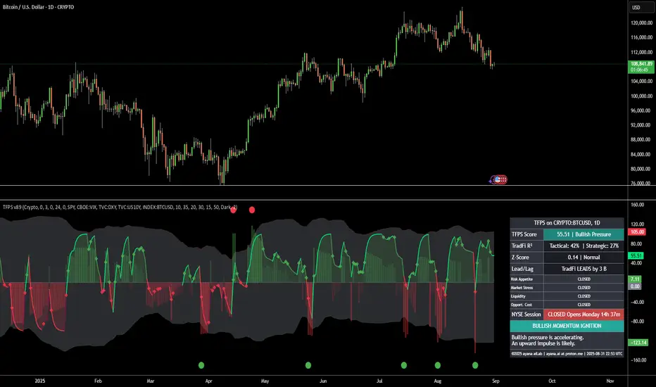
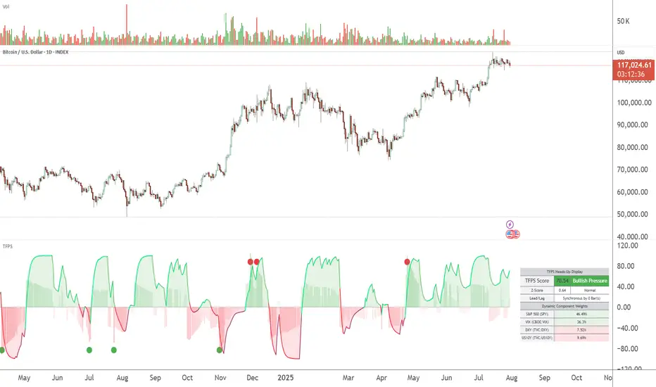
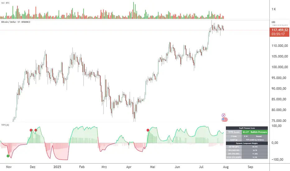
[ayana] TFPS - TradFi Pressure ScoreTFPS - TradFi Pressure Score: Your Market Pressure Barometer
Understand what moves Wall Street, before it moves Crypto.
This indicator is your real-time barometer for the influence of traditional financial markets (TradFi) on Crypto. It measures the combined pressure from four key quadrants—Risk Appetite (S&P 500), Market Stress (VIX), Liquidity (DXY), and Macro Expectations (US10Y)—to answer one question: "Do I have a tailwind or a headwind from the global markets?"
How to Read Your "Cockpit" in 60 Seconds
The Main Line (Overall Market Pressure)
GREEN / ABOVE 0: Bullish Tailwind. The macro environment is supportive for Crypto.
RED / BELOW 0: Bearish Headwind. The macro environment is creating pressure on Crypto.
BRIGHT Color: Pressure is ACCELERATING.
DARK Color: Pressure is DECELERATING (losing momentum).
The Dashboard (Your Command Center)
Lead/Lag Analysis: The game-changer. Tells you if TradFi is currently leading the price or vice-versa. This is your key to knowing whether to watch macro news or focus on crypto-specifics.
TradFi Influence (R²): Shows you HOW RELEVANT the macro pressure is right now. High R² means Wall Street's influence is dominant. Low R² means crypto is moving on its own narrative.
Dynamic Weights: Reveals the market's primary NARRATIVE. Is the pressure coming from Fear (VIX), Liquidity (DXY), or general Risk Appetite (SPX)?
Extreme Signals (Reversal Zones)
Stress Cloud (Z-Score): Large, opaque bars warn of statistically EXTREME greed or fear levels.
Extreme Dots: Pinpoint the moments when pressure has likely reached an unsustainable peak, often preceding turning points.
Key Strategies & Use Cases
As a Trend Filter: Simply avoid fighting the color. Don't force long trades when the TFPS shows a strong red headwind.
For Precision Entry/Exits: Use the Extreme Dots and a decelerating color on the Main Line to time your entries in confluence with your own strategy.
For Strategic Decisions: Use the Lead/Lag and R² metrics to decide where to focus your attention and how to manage portfolio risk based on the current macro regime.
Configuration
For best results, leave the engine settings on their default (auto-adaptive) mode. The indicator's core intelligence lies in its ability to adapt to changing market dynamics automatically. You can adjust the visual theme to match your chart.
TFPS_EngineLibrary "TFPS_Engine"
f_calculate_lead_lag(series1, series2, length, max_lag)
Parameters:
series1 (float)
series2 (float)
length (int)
max_lag (int)
f_calculate_pressure_score(spx_ticker, vix_ticker, dxy_ticker, us10y_ticker, benchmark_source, trend_lookback, score_smoothing, use_dynamic_weights, corr_lookback, w_spx, w_vix, w_dxy, w_us10y, zscore_lookback, max_lag)
Parameters:
spx_ticker (string)
vix_ticker (string)
dxy_ticker (string)
us10y_ticker (string)
benchmark_source (float)
trend_lookback (int)
score_smoothing (simple int)
use_dynamic_weights (bool)
corr_lookback (int)
w_spx (float)
w_vix (float)
w_dxy (float)
w_us10y (float)
zscore_lookback (int)
max_lag (int)
LeadLagOutput
Fields:
best_lag (series int)
max_corr (series float)
TFPS_Output
Fields:
historical_score (series float)
smoothed_score (series float)
z_score (series float)
regime_signal (series int)
lead_lag_bars (series int)
lead_lag_corr (series float)
weight_spx (series float)
weight_vix (series float)
weight_dxy (series float)
weight_us10y (series float)

TFPS - TradFi Pressure ScoreThe Data-Driven Answer to a New Market Reality.
This indicator quantifies the pressure exerted by Wall Street on the crypto market across four critical dimensions: Risk Appetite, Fear, Liquidity Flows, and the Opportunity Cost of Capital. Our research has found that the correlation between this 4-dimensional pressure vector and crypto price action reaches peak values of 0.87. This is your decisive macro edge, delivered in real-time.
The Irreversible Transformation
A fundamental analysis of the last five years of market data proves an irreversible transformation: The crypto market has matured into a high-beta risk asset, its fate now inextricably linked to Traditional Finance (TradFi).
The empirical data is clear:
Bitcoin increasingly behaves like a leveraged version of the S&P 500.
The correlation to major stock indices is statistically significant and persistent.
The "digital gold" narrative is refuted by the data; the correlation to gold is virtually non-existent.
This means standard technical indicators are no longer sufficient. Tools like RSI or MACD are blind to the powerful, external macro context that now dominates price action. They see the effect, but not the cause.
The Solution: A 4-Dimensional Macro-Lens
The TradFi Pressure Score (TFPS) is the answer. It is an institutional-grade dashboard that aggregates the four most dominant external forces into a single, actionable score:
S&P 500 (SPY): The Pulse of Risk Appetite. A rising S&P signals a "risk-on" environment, fueling capital flows into crypto.
VIX: The Market's Fear Gauge. A rising VIX signals a "risk-off" flight to safety, draining liquidity from crypto.
DXY (US-Dollar Index): The Anchor of Global Liquidity. A strong Dollar (rising DXY) tightens financial conditions, creating powerful headwinds for risk assets like Bitcoin.
US 10Y Yield: The Opportunity Cost of Capital. Rising yields make risk-free assets more attractive, pulling capital away from non-yielding assets like crypto.
What makes the TFPS truly unique?
1. Dynamic Weighting (The Secret Weapon):
Which macro factor matters most right now? Is it a surging Dollar or a collapsing stock market? The TFPS answers this automatically. It continuously analyzes the correlation of all four components to your chosen asset (e.g., Bitcoin) and adjusts their influence in real-time. The dashboard shows you the exact live weights, ensuring you are always focused on the factor that is currently driving the market.
2. Adaptive Engine:
The forces driving a 15-minute chart are different from those driving a daily chart. The TFPS engine automatically recalibrates its internal lookback periods to your chosen timeframe. This ensures the score is always optimally relevant, whether you are a day trader or a swing trader.
3. Designed for Actionable Insights
The Pressure Line: The indicator's core output. Is its value > 0 (tailwind) or < 0 (headwind)? This provides an instant, unambiguous read on the macro environment for your trade.
The Z-Score (The Contrarian Signal): The background "Stress Cloud" and the discrete dots provide early warnings of extreme macro greed or fear. Readings above +2 or below -2 have historically pinpointed moments of market exhaustion that often precede major trend reversals.
Lead/Lag Status: Gain a critical edge by knowing who is in the driver's seat. The dashboard tells you if TradFi is leading the price action or if crypto is moving independently, allowing you to validate your trade thesis against the dominant market force.
This is a public indicator with protected source code
Access is now available for traders who understand the new market reality at the intersection of crypto and traditional finance.
You are among the first to leverage what is a new standard for macro analysis in crypto trading. Your feedback is highly valued as I continue to refine this tool.
Follow for updates and trade with the full context!
TFPS - TradFi-Pressure-Score (Adaptive)The data-driven answer to an irreversible market reality.
This indicator quantifies the combined pressure from the S&P 500, VIX, DXY, and US10Y, whose correlation to crypto has reached peak values of 0.87. Your decisive macro edge, in real-time.
This indicator is built on a fundamental analysis of market data from the last five years. The analysis proves an irreversible transformation: The crypto market has evolved into a high-beta risk asset, its fate inextricably linked to Traditional Finance (TradFi).
The empirical data is clear:
Bitcoin increasingly behaves like a leveraged version of the S&P 500.
The correlation to stock indices, with peak values of up to 0.87, is statistically highly significant.
The "digital gold" safe-haven narrative is refuted by the data; the correlation to gold (0.04) is virtually non-existent and statistically insignificant.
This means: Standard indicators like RSI or MACD are insufficient for today's market conditions. They only see price, ignoring the powerful external context that now dominates price action.
The TradFi Pressure Score (TFPS) is the answer to this data-driven reality. It's your institutional-grade macro dashboard, aggregating the four most dominant external forces into a single, actionable score:
S&P 500 (SPY): The pulse of global risk appetite. A rising S&P signals a "risk-on" environment, fueling capital flows into crypto.
VIX: The market's "Fear Gauge". A rising VIX signals a "risk-off" flight to safety, draining liquidity from crypto.
DXY (US-Dollar Index): The counter-pole to risk assets. A strong Dollar (rising DXY) tightens global liquidity, creating significant headwinds for Bitcoin.
US 10Y Yield: The opportunity cost of capital. Rising yields make risk-free assets more attractive, pulling capital away from non-yielding assets like crypto.
What makes TFPS truly unique?
Dynamic Weighting (its secret weapon): Which factor matters most today? The DXY or the VIX? TFPS continuously analyzes the correlation of all four factors to your chosen asset (e.g., Bitcoin) and automatically adjusts their weight in real-time. This ensures you're always focused on what's currently driving the market.
Adaptive Engine : What drives a 15-minute chart is different from a daily chart. The TFPS engine automatically adapts its lookback periods and calculations to your chosen timeframe for optimal relevance.
Clear, Actionable Signals Designed for Traders:
Pressure Line (>0 or <0): Instantly see if the world's largest financial forces are providing a tailwind or a headwind for your trade.
Z-Score (Extreme Readings) : Get early warnings of extreme macro "Greed" or "Fear". Readings above +2 or below -2 have historically pinpointed moments of market exhaustion that often precede major trend reversals.
Regime Change : A fundamental shift in the nature of TradFi pressure is visualized with a clear signal, providing unambiguous macro insights.
Lead/Lag Status : Gain a critical edge by knowing who's in the driver's seat. The dashboard tells you if TradFi is LEADING the price action or if crypto is moving independently, allowing you to focus on the right information source.
This is a private beta. I am granting exclusive access to a limited number of traders who understand this new market reality. In exchange for your valuable feedback, you will be among the first to leverage what I believe is the new standard for macro analysis in crypto trading.
Request access to trade with the full context.
Central Bank Divergence IndexCentral Bank Divergence Index (CBDiv) by CWRP blends foreign exchange (FX) market behavior and short-term interest rate (STIR) spreads to detect monetary policy divergence or convergence among major economies.
It calculates a composite Z-score index that tracks divergence between the US and other major economies using FX pairs USDJPY, EURUSD, GBPUSD, AUDUSD (With AUD acting as a proxy to the RMB) and short-term bond ETFs (SHY = U.S. 1–3Y Treasury, EWJ = Japan, IEUR = Europe).
SHY/EWJ and SHY/IEUR: If SHY outperforms, it means US short-term rates are rising relative to Japan/Europe.
How to Read:
Highlighting
Yellow = Diverging central bank policy (US > others) ; Hawkish
Blue = Converging policy (US < others) ; Dovish/Lagging
Gray = Neutral
Table
FX Divergence:
Positive (> +1) -> USD is strengthening unusually fast -> Fed is likely tighter than others
Negative (< -1) -> USD is weakening -> Other central banks might be tightening relative to the Fed
Rate Spread Divergence (Which acts as a proxy for interest rate divergence):
Positive -> U.S. rates are rising faster than Japan/Europe
Negative -> Foreign short-term rates outperforming U.S.
Composite:
Positive (> +1) -> Strong U.S. policy divergence (hawkish Fed)
Negative (< -1) -> Converging or dovish Fed
Neutral (Between -1 and +1) -> Neutral policy stance
Thank you for using the Central Bank Divergence Index by CWRP!
I'm open to all critiques and discussion around macroeconomics and hope you find use in this model!

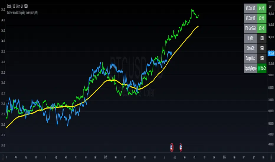
Durdens Global M2 Liquidity Tracker🧠 Durdens Global M2 Liquidity Tracker | Bitcoin vs Liquidity, Visualized
If you’re not watching global liquidity, you’re not really trading macro.
This indicator tracks FX-adjusted M2 money supply across 20+ countries, aggregated into a single global liquidity signal. It can then be used to overlay against Bitcoin for timing macro shifts with precision.
🔍 Core Features:
🌐 USD-adjusted M2 from the US, China, Eurozone, UK, Japan, and more
📊 Normalization modes: None (raw), Index (Based to 100), Z-Score
⏳ Offset input to shift liquidity data forward — aligns with Bitcoin's delayed reaction (84–107 days common)
🧠 BTC correlation matrix: 30D, 90D, 365D correlation values
🧪 Top 3 M2 delta signals: Tracks 90-day % change for US, China, EU
🧮 Fibonacci SMAs: 13 / 34 / 89 for structural macro context
🟢🔴 Liquidity regime engine: EMA 89 defines "Risk-On" vs "Risk-Off" states
🧩 How It Works:
Each country’s M2 is multiplied by its FX rate (to USD) and summed into a single global M2 line. This ensures comparability across nations. The user can choose to:
Normalize the output (raw, indexed, or z-scored)
Shift the global M2 forward in time (offset), simulating the lag effect liquidity has on Bitcoin
Visualize macro risk conditions using EMA 89 as a liquidity regime filter
Analyze BTC correlation across 3 windows and track key regions’ M2 delta
❓ FAQ:
Why does this matter?
M2 is the monetary fuel behind asset bubbles. When liquidity rises, Bitcoin follows; with a delay. This tracker helps you front-run macro flows before they hit the chart.
Why use Index or Z-Score modes?
Raw values skew long-term visual analysis. Index mode rebases data for comparative trend tracking. Z-Score shows when liquidity is overheated or suppressed (mean reversion).
What does the offset input do?
Liquidity doesn’t hit Bitcoin instantly. Many traders use an 84–107 day forward shift to align M2 changes with BTC price action. The offset helps you visualize this.
Why track top 3 M2 regions?
US, China, and Eurozone are the heavyweights in global liquidity. Tracking their offset-day % change gives immediate insight into capital expansion or contraction.
Can I use this to trade?
Absolutely; but it’s best used as a macro filter. Combine with price structure, funding, or on-chain data to optimize timing and conviction.
⚡ Use Cases:
Spot early pivots in liquidity regimes (Risk-Off to Risk-On)
Quantify macro backdrop for Bitcoin or altcoin cycles
Understand when the Fed or PBOC are tightening or easing
Ditch the hopium. Trade with context.
—
Built by: @DurdensBitcoinLedger
Follow for updates — future upgrades include:
• Regional toggles
• Custom M2 baskets
• Alert conditions
• Continued revisions & updates
Stay liquid, not wrecked.
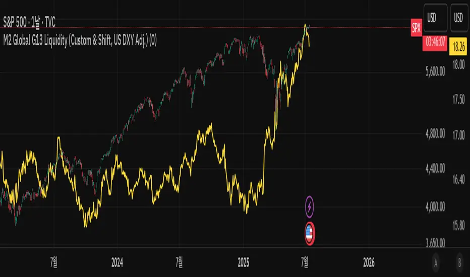
M2 Global G13 Liquidity (Custom & Shift, US DXY Adj.)🌎 M2 Global G13 Liquidity index (Custom & Shift, US DXY Adj.)
💡 Indicator Overview
The M2 Global G13 Liquidity indicator combines the M2 liquidity of 13 major countries, allowing users to selectively include or exclude each country to visualize global capital flows and potential investment liquidity at a glance.
Each country's M2 data is converted to USD using real-time exchange rates, and the US M2 is further adjusted using the Dollar Index (DXY) to reflect the impact of dollar strength or weakness on US liquidity.
✅ What is M2?
M2 is a broad measure of money supply that includes cash, demand deposits, savings deposits, and certain financial products.
It represents a country's overall liquidity and capital supply and is often interpreted as "dry powder" ready to be deployed into various assets such as equities, real estate, and bonds.
Therefore, M2 serves as a crucial benchmark for assessing a country's potential investment capacity that can flow into markets at any time.
💰 Exchange Rate & Dollar Index Adjustment
- All country M2 data is converted from local currencies to USD.
- The US M2 is further adjusted using the Dollar Index (DXY) to better reflect its real global power:
- DXY > 100 → Liquidity contraction (strong dollar effect)
- DXY < 100 → Liquidity expansion (weak dollar effect)
🗺️ Country Selection Options
- Default selection: United States
- Major selections: China, Eurozone, Japan, United Kingdom (core G5 economies)
- Additional selections: Switzerland, Canada, India, Russia, Brazil, South Korea, Mexico, South Africa
- Users can freely add or remove countries to customize the indicator to match their analytical needs.
📈 Example Use Cases
- Monitor global capital flows: Track worldwide liquidity trends and detect potential market risk signals.
- Analyze exchange rate and monetary policy trends: Compare dollar strength with major central bank policies.
- Benchmark against equity indices: Evaluate correlations with MSCI World, KOSPI, NASDAQ, etc.
- Valuation analysis: Compare overall liquidity levels to equity index prices or market capitalization to assess relative valuation and identify potential overvaluation or undervaluation.
- Crisis response strategy: Identify liquidity contraction during global credit crises or deleveraging phases.
==================================================
🌎 M2 글로벌 G13 유동성 지수 (Custom & Shift, US DXY Adj.)
💡 지표 소개
M2 Global G13 Liquidity 지표는 세계 13개 주요국의 M2 유동성을 선택적으로 결합하여, 글로벌 자금 흐름과 잠재 투자 자금을 한눈에 시각화할 수 있도록 설계된 종합 유동성 지표입니다.
국가별 M2 데이터를 환율과 결합해 달러 기준으로 표준화하며, 특히 미국 M2는 달러지수(DXY)로 보정하여 달러 강약에 따른 파급력을 반영합니다.
✅ M2란?
M2는 광의 통화지표로, 현금 + 요구불 예금 + 저축성 예금 + 일부 금융상품을 포함합니다.
이는 한 국가의 유동성 수준과 자금 공급 상태를 나타내는 핵심 거시경제 지표이며, **주식·부동산·채권 등 다양한 자산에 투자될 준비가 된 '대기자금'**으로도 해석됩니다.
따라서 M2는 투자시장으로 언제든지 흘러들어갈 수 있는 잠재적 투자 역량을 평가할 때 중요한 기준입니다.
💰 환율 및 달러지수 보정
- 모든 국가 M2는 자국 통화에서 **달러(USD)**로 환산됩니다.
- 특히 미국 M2는 달러 가치의 글로벌 실질 파워를 평가하기 위해 DXY 보정을 적용합니다.
- DXY > 100 → 유동성 축소 (강달러 효과)
- DXY < 100 → 유동성 확대 (약달러 효과)
🗺️ 국가별 선택 옵션
- 기본 선택: 미국
- 주요 선택: 중국, 유로존, 일본, 영국 (주요 G5)
- 추가 선택: 스위스, 캐나다, 인도, 러시아, 브라질, 한국, 멕시코, 남아공
- 사용자는 각 국가를 자유롭게 더하거나 빼면서 커스터마이즈할 수 있습니다.
📈 활용 예시
- 글로벌 자금 흐름 모니터링: 전세계 유동성 추세 및 시장 리스크 신호 분석
- 환율/금리 정책 분석: 달러 강약과 주요국 정책 변화 비교
- 주가지수 벤치마크 비교: MSCI World, 코스피, 나스닥 등과 상관관계 확인
- 밸류에이션 분석: 전체 유동성 수준을 주가지수나 시가총액과 비교하여, 시장의 상대적 고평가·저평가 여부를 평가
- 위기 대응 전략: 글로벌 신용위기·자금 긴축 국면 대비
Macro+ ExtMacros+ (Time Sessions & Alerts)
Macros+ is a powerful and highly customizable tool designed to highlight specific time windows—often referred to as "macros"—directly on your chart. It is built for traders who operate on time-based strategies, such as those targeting specific liquidity periods like the ICT Silver Bullet or other institutional timeframes.
By visualizing these key sessions historically and in real-time, traders can better anticipate market volatility, identify potential trade setups, and maintain discipline. The script is clean, efficient, and built with flexibility in mind.
Key Features
This indicator goes beyond simple time boxes and includes several advanced features to fit your specific trading style:
1. Historical & Real-Time Display
The script is designed to plot all selected macro sessions across the entire historical data loaded on your chart, not just the current day. This allows for comprehensive backtesting and analysis of how price behaves during these specific time windows.
2. Fully Customizable Macro Sessions
You have full control over which time sessions you want to display. The indicator includes 14 pre-configured 20-minute sessions, which you can easily toggle on or off from the settings menu. This allows you to focus only on the timeframes that are relevant to your strategy.
3. Adjustable "Extended Macro" Time
Flexible Time Extension: Instead of a fixed session duration, you can now dynamically extend the start and end times of all macros.
Numerical Input: In the settings, under "Time Settings," you'll find an "Extend Minutes" input. This number lets you add minutes to both the beginning and the end of each session.
Example: A standard macro from 09:50 - 10:10 with an "Extend Minutes" value of 5 will be automatically adjusted to 09:45 - 10:15. Setting it to 0 will keep the default 20-minute sessions.
4. Multiple Display Styles
Adapt the indicator's appearance to your preference for a clean and readable chart. All styles are designed to span the full vertical height of the chart for maximum visibility.
Solid Line: Clear, solid vertical lines marking the start and end of a session.
Dashed Line: A more subtle, dashed-line alternative.
Dotted Line: The most subtle line style for a minimalist chart.
Background: Fills the entire session window with a semi-transparent color.
Outline: Draws a colored border around the session window without filling it.
5. Real-Time Alerts
Never miss the start of a key session again. You can enable an alert that will trigger once at the beginning of any active macro session. This is perfect for traders who may not be watching the charts constantly.
6. Timezone Correction
All times are calculated based on the timezone you select in the settings (default is "America/New_York"). This ensures the sessions are always plotted accurately according to the market you are trading (e.g., New York session times).
How to Use
Add to Chart: Add the "Macros+" indicator to your chart.
Open Settings:
General Settings: Choose your preferred Timezone, Display Style, and Color.
Active Macro Sessions: Check the boxes for the time sessions you wish to monitor.
Time Settings: Enter a value in Extend Minutes if you want to widen the time windows. A value of 5 will create 30-minute sessions.
Alert Settings: Enable the Alert On Macro Start option if you wish to receive alerts.
Create Alert: To activate the pop-up alert, click the clock icon on the TradingView right-hand panel, select "Macros+" in the "Condition" dropdown, choose "Sesi Makro Dimulai," and set it to trigger "Once Per Bar."
This tool was designed to be both powerful and user-friendly. I hope it becomes a valuable part of your trading toolkit. Happy trading!

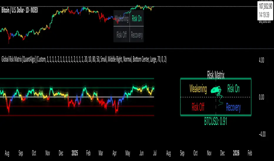
Global Risk Matrix [QuantAlgo]🟢 Overview
The Global Risk Matrix is a comprehensive macro risk assessment tool that aggregates multiple global financial indicators into a unified risk sentiment framework. It transforms diverse economic data streams (from currency strength and liquidity measures to volatility indices and commodity prices) into standardized Z-Score readings to identify market regime shifts across risk-on and risk-off conditions.
The indicator displays both a risk oscillator showing weighted average sentiment and a dynamic 2D matrix visualization that plots signal strength against momentum to reveal current market phase and historical evolution. This helps traders and investors understand broad market conditions, identify regime transitions, and align their strategies with prevailing macro risk environments across all asset classes.
🟢 How It Works
The indicator employs Z-Score normalization across various global macro components, each representing distinct aspects of market liquidity, sentiment, and economic health. Raw data from sources like DXY, S&P 500, Fed liquidity, global M2 money supply, VIX, and commodities undergoes statistical standardization. Several components are inverted (USDT.D, DXY, VIX, credit spreads, treasury bonds, gold) to align with risk-on interpretation, where positive values indicate bullish conditions.
This unique system applies configurable weights to each component based on selected asset class presets (Crypto Investor/Trader, Stock Trader, Commodity Trader, Forex Trader, Risk Parity, or Custom), creating a weighted average Z-Score. It then analyzes both signal strength and momentum direction to classify market conditions into four distinct phases: Risk-On (positive signal, rising momentum), Risk-Off (negative signal, falling momentum), Recovery (negative signal, rising momentum), and Weakening (positive signal, falling momentum). The 2D matrix visualization plots these dimensions with historical trail tracking to show regime evolution over time.
🟢 How to Use
1. Risk Oscillator Interpretation and Phase Analysis
Positive Territory (Above Zero) : Indicates risk-on conditions with capital flowing toward growth assets and higher risk tolerance
Negative Territory (Below Zero) : Signals risk-off sentiment with capital seeking safety and defensive positioning
Extreme Levels (±2.0) : Represent statistically significant deviations that often precede regime reversals or trend exhaustion
Zero Line Crosses : Mark critical transitions between risk regimes, providing early signals for portfolio rebalancing
Phase Color Coding : Green (Risk-On), Red (Risk-Off), Blue (Recovery), Yellow (Weakening) for immediate regime identification
2. Risk Matrix Visualization and Trail Analysis
Current Position Marker (⌾) : Shows real-time location in the risk/momentum space for immediate situational awareness
Historical Trail : Connected path showing recent market evolution and regime transition patterns
Quadrant Analysis : Risk-On (upper right), Risk-Off (lower left), Recovery (lower right), Weakening (upper left)
Trail Patterns : Clockwise rotation typically indicates healthy regime cycles, while erratic movement suggests uncertainty
3. Pro Tips for Trading and Investing
→ Portfolio Allocation Filter : Use Risk-On phases to increase exposure to growth assets, small caps, and emerging markets while reducing defensive positions during confirmed green phases
→ Entry Timing Enhancement : Combine Recovery phase signals with your technical analysis for optimal long entry points when macro headwinds are clearing but prices haven't fully recovered
→ Risk Management Overlay : Treat Weakening phase transitions as early warning systems to tighten stop losses, reduce position sizes, or hedge existing positions before full Risk-Off conditions develop
→ Sector Rotation Strategy : During Risk-On periods, favor cyclical sectors (technology, consumer discretionary, financials) while Risk-Off phases favor defensive sectors (utilities, consumer staples, healthcare)
→ Multi-Timeframe Confluence : Use daily matrix readings for strategic positioning while applying your regular technical analysis on lower timeframes for precise entry and exit execution
→ Divergence Detection : Watch for situations where your asset shows bullish technical patterns while the matrix shows Risk-Off conditions—these often provide the highest probability short opportunities and vice versa
BBS – Bond Breadth Signal"When bonds scream, breadth collapses, and fear spikes — BBS listens."
🧠 BBS – Bond Breadth Signal
A reversal timing tool built on macro conviction, not price noise.
The Bond Breadth Signal (BBS) was developed to identify major market inflection points by combining four key market stress indicators:
1) 10-Year Yield ROC – Measures sharp moves in the bond market
2) Z-Score of the 10Y – Captures statistical extremes
3) NSHF (Net Highs–Lows) – Signals internal market strength or weakness
4) TLT ROC + VIX – Confirmations of flight to safety and volatility-driven fear
When all conditions align, BBS marks either a For-Sure Buy or For-Sure Sell — these are rare, high-confidence signals designed to cut through noise and focus on true market dislocations.
🔧 Features:
-Background color and signal arrows on confirmation days
-Signals remain visually active for 3 days for added clarity
-Fully adjustable thresholds and alert toggles
-Plot panel for yield, TLT, NSHF, VIX, and Z-score visuals
This tool isn’t designed to fire every day. It’s meant to wait for those moments when the market truly bends — not just wiggles.
Best used on major indices (SPY, QQQ, IWM) to assess macro turning points.
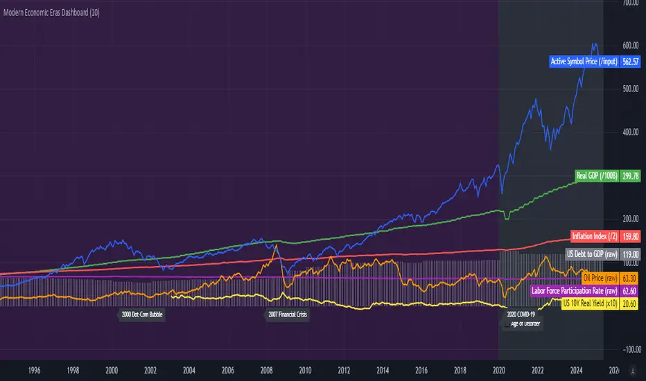
Modern Economic Eras DashboardOverview
This script provides a historical macroeconomic visualization of U.S. markets, highlighting long-term structural "eras" such as the Bretton Woods period, the inflationary 1970s, and the post-2020 "Age of Disorder." It overlays key economic indicators sourced from FRED (Federal Reserve Economic Data) and displays notable market crashes, all in a clean and rescaled format for easy comparison.
Data Sources & Indicators
All data is loaded monthly from official FRED series and rescaled to improve readability:
🔵 Real GDP (FRED:GDP): Total output of the U.S. economy.
🔴 Inflation Index (FRED:CPIAUCSL): Consumer price index as a proxy for inflation.
⚪ Debt to GDP (FRED:GFDGDPA188S): Federal debt as % of GDP.
🟣 Labor Force Participation (FRED:CIVPART): % of population in the labor force.
🟠 Oil Prices (FRED:DCOILWTICO): Monthly WTI crude oil prices.
🟡 10Y Real Yield (FRED:DFII10): Inflation-adjusted yield on 10-year Treasuries.
🔵 Symbol Price: Optionally overlays the charted asset’s price, rescaled.
Historical Crashes
The dashboard highlights 10 major U.S. market crashes, including 1929, 2000, and 2008, with labeled time spans for quick context.
Era Classification
Six macroeconomic eras based on Deutsche Bank’s Long-Term Asset Return Study (2020) are shaded with background color. Each era reflects dominant economic regimes—globalization, wars, monetary systems, inflationary cycles, and current geopolitical disorder.
Best Use Cases
✅ Long-term macro investors studying structural market behavior
✅ Educators and analysts explaining economic transitions
✅ Portfolio managers aligning strategy with macroeconomic phases
✅ Traders using history for cycle timing and risk assessment
Technical Notes
Designed for monthly timeframe, though it works on weekly.
Uses close price and standard request.security calls for consistency.
Max labels/lines configured for broader history (from 1860s to present).
All plotted series are rescaled manually for better visibility.
Originality
This indicator is original and not derived from built-in or boilerplate code. It combines multiple economic dimensions and market history into one interactive chart, helping users frame today's markets in a broader structural context.
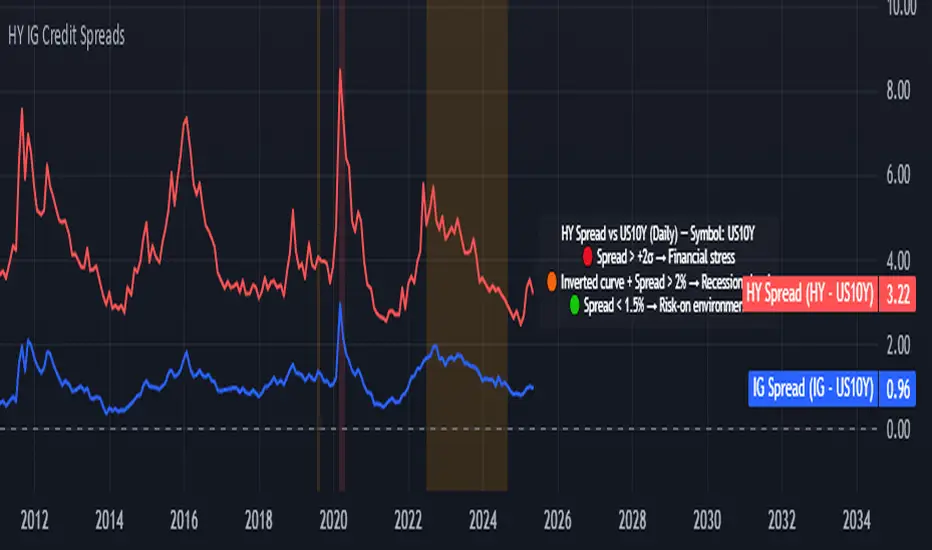
Credit Spread Monitor: HY & IG vs US10Y📉 Credit Spread Monitor: HY & IG vs US10Y
This indicator provides a dynamic and visual way to monitor credit spreads relative to the US Treasury benchmark. By comparing High Yield (HY) and Investment Grade (IG) corporate bond yields to the 10-Year US Treasury Yield (US10Y), it helps assess market stress, investor risk appetite, and potential macro turning points.
🔍 What It Does
-Calculates credit spreads:
HY Spread = BAMLH0A0HYM2EY − US10Y
IG Spread = BAMLC0A0CMEY − US10Y
-Detects macro risk regimes using statistical thresholds and yield curve signals:
🔴 HY Spread > +2σ → Potential financial stress
🟠 Inverted Yield Curve + HY Spread > 2% → Recession risk
🟢 HY Spread < 1.5% → Risk-on environment
-Visually highlights conditions with intuitive background colors for fast decision-making.
📊 Data Sources Explained
🔴 High Yield (HY): BAMLH0A0HYM2EY → ICE BofA US High Yield Index Effective Yield
🔵 Investment Grade (IG): BAMLC0A0CMEY → ICE BofA US Corporate Index Effective Yield
⚪ Treasury 10Y: US10Y → 10-Year US Treasury Yield
⚪ Treasury 2Y: US02Y → 2-Year US Treasury Yield (used to detect curve inversion)
✅ This Indicator Is Ideal For:
Macro traders looking to anticipate economic inflection points
Portfolio managers monitoring systemic risk or credit cycles
Fixed-income analysts tracking the cost of corporate borrowing
ETF/Asset allocators identifying shifts between risk-on and risk-off environments
🧠 Why It's Useful
This script helps visualize how tight or loose credit conditions are relative to government benchmarks. Since HY spreads typically widen before major downturns, this tool can provide early warning signals. Similarly, compressed spreads may indicate overheating or complacency in risk markets.
🛠️ Practical Use Case:
You’re managing a multi-asset portfolio. The HY spread jumps above +2σ while the yield curve remains inverted. You decide to reduce exposure to equities and high-yield bonds and rotate into cash or Treasuries as recession risk rises.
📎 Additional Notes
Sourced from FRED (Federal Reserve Economic Data) and TradingView’s bond feeds.
Designed to work best on daily resolution, using open prices to ensure consistency across series with different update timings.
This script is original, not based on built-in or public templates, and intended to offer educational, statistical, and visual insights for serious market participants.
Leonid's Bitcoin Macro & Liquidity Regime Tracker🧠 Macro Overlay Score (Bitcoin Liquidity Regime Tracker)
This indicator combines the most important macroeconomic and on-chain inputs into a single unified score to help investors identify Bitcoin’s long-term cycle phases. Each input is normalized into a 0–100 score and blended using configurable weights to generate a dynamic, forward-looking macro regime tracker.
✅ Best used on the **Bitcoin All Time History Index with Weekly resolution** (`INDEX:BTCUSD`) for maximum historical context and signal clarity.
---
📈 Why Macro?
Macro liquidity conditions — interest rates, monetary expansion, dollar strength, credit risk — drive Bitcoin cycles . Risk assets like BTC thrive during periods of:
Monetary easing
Liquidity injections
Expansionary central bank policy
This overlay surfaces those periods *before* price follows. It captures cycle shifts in the business cycle, monetary policy, and investor sentiment — making it ideal for long-term allocators, macro-aligned investors, and cycle-focused BTC holders.
🔔 This is **not** designed for short-term or swing trading. It is optimized for **macro trend confirmation and regime awareness** — not fast entry/exit signals.
---
🔍 What It Tracks
Macro Inputs:
- 🏭 ISM 3M Trend (Business Cycle)
- 💹 CPI YoY (Inverted Inflation)
- 💵 M2 YoY + M2 Acceleration
- 🇨🇳 China M2 (Global Liquidity)
- 💱 DXY 3M Trend (USD Strength)
- 🏦 TGA & RRP YoY (Treasury / MMF Flows)
- 🏛 Fed Balance Sheet (WALCL)
- 💳 High Yield Spread (Credit Conditions)
- 💧 Net Liquidity Composite = WALCL – TGA – RRP
On-Chain Inputs:
- ⚠️ MVRV Ratio (Valuation Cycles)
- 🚀 Mayer Multiple Acceleration (200DMA Momentum)
---
🧩 How It Works
Each input is:
Normalized to a 0–100 score
Weighted by importance (fully configurable)
Combined into a **composite Macro Score**, then normalized across history
The chart will display:
🔷 A 0–100 **Macro Score Line**
🧭 **Cycle Phase classification**: Accumulation, Expansion, Distribution, Capitulation
📊 Optional **debug table** with all sub-scores
---
🧠 Interpreting the Signal
| Signal Type | Meaning |
|-------------------|---------------------------------------------|
| Macro Score ↑ | Liquidity improving → Bullish regime forming |
| Macro Score ↓ | Liquidity deteriorating → Caution warranted |
| Score < 40 & Rising | 🔵 Accumulation cycle likely beginning |
| Score > 70 & Falling | 🟡 Distribution / Macro exhaustion |
| Net Liquidity ↑ | Strong driver of BTC upside historically |
---
❓ FAQ
Q: Why did the Macro Score peak in March 2021, but Bitcoin topped in November?
> The indicator reflects **macro liquidity**, not price momentum. M2 growth slowed, DXY bottomed, and the Fed stopped expanding WALCL by Q1 2021 — all signs of macro exhaustion. BTC continued on **residual momentum**, but the smart money began exiting months earlier.
Q: What does the score range mean?
- 0–25 : Tight liquidity, unfavorable conditions
- 50 : Neutral environment
- 75–100 : Strong easing, liquidity surge
Q: Is this good for short-term signals?
> No. This is a **macro-level overlay**, best used for 3–12 month context shifts, not day trades.
Q: Can I adjust the weights?
> Yes. You can tune the influence of each input to match your thesis (e.g., overweight on-chain, or global liquidity).
Q: Do I need special data access?
> No. All symbols are public TradingView datasets (FRED, CryptoCap, etc.). Just use this on a BTC chart like `BTCUSD`.
---
✅ How to Use
- Load on **`INDEX:BTCUSD`**, set to **Weekly timeframe**
- Confirm long-term bottoms when score is low and rising (Accumulation → Expansion)
- Watch for tops when score is high and falling (Distribution → Capitulation)
- Combine with price structure, realized profit/loss, and market sentiment
---
🚀 If you're serious about understanding Bitcoin's macro regime, this is your alpha map. Share it, clone it, and build on it.

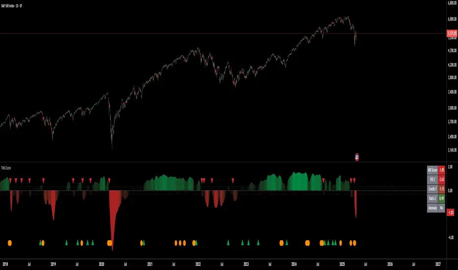
Triad Macro Gauge__________________________________________________________________________________
Introduction
__________________________________________________________________________________
The Triad Macro Gauge (TMG) is designed to provide traders with a comprehensive view of the macroeconomic environment impacting financial markets. By synthesizing three critical market signals— VIX (volatility) , Credit Spreads (credit risk) , and the Stocks/Bonds Ratio (SPY/TLT) —this indicator offers a probabilistic assessment of market sentiment, helping traders identify bullish or bearish macro conditions.
Holistic Macro Analysis: Combines three distinct macroeconomic indicators for multi-dimensional insights.
Customization & Flexibility: Adjust weights, thresholds, lookback periods, and visualization styles.
Visual Clarity: Dynamic table, color-coded plots, and anomaly markers for quick interpretation.
Fully Consistent Scores: Identical values across all timeframes (4H, daily, weekly).
Actionable Signals: Clear bull/bear thresholds and volatility spike detection.
Optimized for timeframes ranging from 4 hour to 1 week , the TMG equips swing traders and long-term investors with a robust tool to navigate macroeconomic trends.
__________________________________________________________________________________
Key Indicators
__________________________________________________________________________________
VIX (CBOE:VIX): Measures market volatility (negatively weighted for bearish signals).
Credit Spreads (FRED:BAMLH0A0HYM2EY): Tracks high-yield bond spreads (negatively weighted).
Stocks/Bonds Ratio (SPY/TLT): Evaluates equity sentiment relative to treasuries (positively weighted).
__________________________________________________________________________________
Originality and Purpose
__________________________________________________________________________________
The TMG stands out by combining VIX, Credit Spreads, and SPY/TLT into a single, cohesive indicator. Its unique strength lies in its fully consistent scores across all timeframes, a critical feature for multi-timeframe analysis.
Purpose: To empower traders with a clear, actionable tool to:
Assess macro conditions
Spot market extremes
Anticipate reversals
__________________________________________________________________________________
How It Works
__________________________________________________________________________________
VIX Z-Score: Measures volatility deviations (inverted for bearish signals).
Credit Z-Score: Tracks credit spread deviations (inverted for bearish signals).
Ratio Z-Score: Assesses SPY/TLT strength (positively weighted for bullish signals).
TMG Score: Weighted composite of z-scores (bullish > +0.30, bearish < -0.30).
Anomaly Detection: Identifies extreme volatility spikes (z-score > 3.0).
All calculations are performed using daily data, ensuring that scores remain consistent across all chart timeframes.
__________________________________________________________________________________
Visualization & Interpretation
__________________________________________________________________________________
The script visualizes data through:
A dynamic table displaying TMG Score , VIX Z, Credit Z, Ratio Z, and Anomaly status, with color gradients (green for positive, red for negative, gray for neutral/N/A).
A plotted TMG Score in Area, Histogram, or Line mode , with adaptive opacity for clarity.
Bull/Bear thresholds as horizontal lines (+0.30/-0.30) to signal market conditions.
Anomaly markers (orange circles) for volatility spikes.
Crossover signals (triangles) for bull/bear threshold crossings.
The table provides an immediate snapshot of macro conditions, while the plot offers a visual trend analysis. All values are consistent across timeframes, simplifying multi-timeframe analysis.
__________________________________________________________________________________
Script Parameters
__________________________________________________________________________________
Extensive customization options:
Symbol Selection: Customize VIX, Credit Spreads, SPY, TLT symbols
Core Parameters: Adjust lookback periods, weights, smoothing
Anomaly Detection: Enable/disable with custom thresholds
Visual Style: Choose display modes and colors
__________________________________________________________________________________
Conclusion
__________________________________________________________________________________
The Triad Macro Gauge by Ox_kali is a cutting-edge tool for analyzing macroeconomic trends. By integrating VIX, Credit Spreads, and SPY/TLT, TMG provides traders with a clear, consistent, and actionable gauge of market sentiment.
Recommended for: Swing traders and long-term investors seeking to navigate macro-driven markets.
__________________________________________________________________________________
Credit & Inspiration
__________________________________________________________________________________
Special thanks to Caleb Franzen for his pioneering work on macroeconomic indicator blends – his research directly inspired the core framework of this tool.
__________________________________________________________________________________
Notes & Disclaimer
__________________________________________________________________________________
This is the initial public release (v2.5.9). Future updates may include additional features based on user feedback.
Please note that the Triad Macro Gauge is not a guarantee of future market performance and should be used with proper risk management. Past performance is not indicative of future results.
Liquidity Stress Index SOFR - IORBLiquidity Stress Index (SOFR - IORB)
This indicator tracks the spread between the Secured Overnight Financing Rate (SOFR) and the Interest on Reserve Balances (IORB) set by the Federal Reserve.
A persistently positive spread may indicate funding stress or liquidity shortages in the repo market, as it suggests overnight lending rates exceed the risk-free rate banks earn at the Fed.
Useful for monitoring monetary policy transmission or market/liquidity stress.

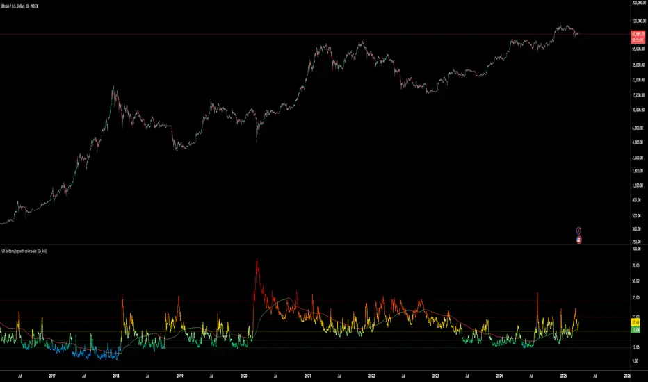
VIX bottom/top with color scale [Ox_kali]📊 Introduction
━━━━━━━━━━━━━━━━━━━━━━━━━━━━━━━━━━━━━━━━━━━
The “VIX Bottom/Top with Color Scale” script is designed to provide an intuitive, color-coded visualization of the VIX (Volatility Index), helping traders interpret market sentiment and volatility extremes in real time.
It segments the VIX into clear threshold zones, each associated with a specific market condition—ranging from fear to calm—using a dynamic color-coded system.
This script offers significant value for the following reasons:
Intuitive Risk Interpretation: Color-coded zones make it easy to interpret market sentiment at a glance.
Dynamic Trend Detection: A 200-period SMA of the VIX is plotted and dynamically colored based on trend direction.
Customization and Flexibility: All colors are editable in the parameters panel, grouped under “## Color parameters ##”.
Visual Clarity: Key thresholds are marked with horizontal lines for quick reference.
Practical Trading Tool: Helps identify high-risk and low-risk environments based on volatility levels.
🔍 Key Indicators
━━━━━━━━━━━━━━━━━━━━━━━━━━━━━━━━━━━━━━━━━━━
VIX (CBOE Volatility Index) : Measures market volatility and investor fear.
SMA 200 : Long-term trendline of the VIX, with color-coded direction (green = uptrend, red = downtrend).
Color-coded VIX Levels:
🔴 33+ → Something bad just happened
🟠 23–33 → Something bad is happening
🟡 17–23 → Something bad might happen
🟢 14–17 → Nothing bad is happening
✅ 12–14 → Nothing bad will ever happen
🔵 <12 → Something bad is going to happen
🧠 Originality and Purpose
━━━━━━━━━━━━━━━━━━━━━━━━━━━━━━━━━━━━━━━━━━━
Unlike traditional VIX indicators that only plot a line, this script enhances interpretation through visual segmentation and dynamic trend tracking.
It serves as a risk-awareness tool that transforms the VIX into a simple, emotional market map.
This is the first version of the script, and future updates may include alerts, background fills, and more advanced features.
⚙️ How It Works
━━━━━━━━━━━━━━━━━━━━━━━━━━━━━━━━━━━━━━━━━━━
The script maps the current VIX value to a range and applies the corresponding color.
It calculates a SMA 200 and colors it green or red depending on its slope.
It displays horizontal dotted lines at key thresholds (12, 14, 17, 23, 33).
All colors are configurable via input parameters under the group: "## Color parameters ##".
🧭 Indicator Visualization and Interpretation
━━━━━━━━━━━━━━━━━━━━━━━━━━━━━━━━━━━━━━━━━━━
The VIX line changes color based on market condition zones.
The SMA line shows long-term direction with dynamic color.
Horizontal threshold lines visually mark the transitions between volatility zones.
Ideal for quickly identifying periods of fear, caution, or stability.
🛠️ Script Parameters
━━━━━━━━━━━━━━━━━━━━━━━━━━━━━━━━━━━━━━━━━━━
Grouped under “## Color parameters ##”, the following elements are customizable:
🎨 VIX Zone Colors:
33+ → Red
23–33 → Orange
17–23 → Yellow
14–17 → Light Green
12–14 → Dark Green
<12 → Blue
📈 SMA Colors:
Uptrend → Green
Downtrend → Red
These settings allow users to match the script’s visuals to their preferred chart style or theme.
✅ Conclusion
━━━━━━━━━━━━━━━━━━━━━━━━━━━━━━━━━━━━━━━━━━━
The “VIX Bottom/Top with Color Scale” is a clean, powerful script designed to simplify how traders view volatility.
By combining long-term trend data with real-time color-coded sentiment analysis, this script becomes a go-to reference for managing risk, timing trades, or simply staying in tune with market mood.
🧪 Notes
━━━━━━━━━━━━━━━━━━━━━━━━━━━━━━━━━━━━━━━━━━━
This is version 1 of the script. More features such as alert conditions, background fill, and dashboard elements may be added soon. Feedback is welcome!
💡 Color code concept inspired by the original VIX interpretation chart by @nsquaredvalue on Twitter. Big thanks for the visual clarity! 💡
⚠️ Disclaimer
━━━━━━━━━━━━━━━━━━━━━━━━━━━━━━━━━━━━━━━━━━━
This script is a visual tool designed to assist in market analysis. It does not guarantee future performance and should be used in conjunction with proper risk management. Past performance is not indicative of future results.
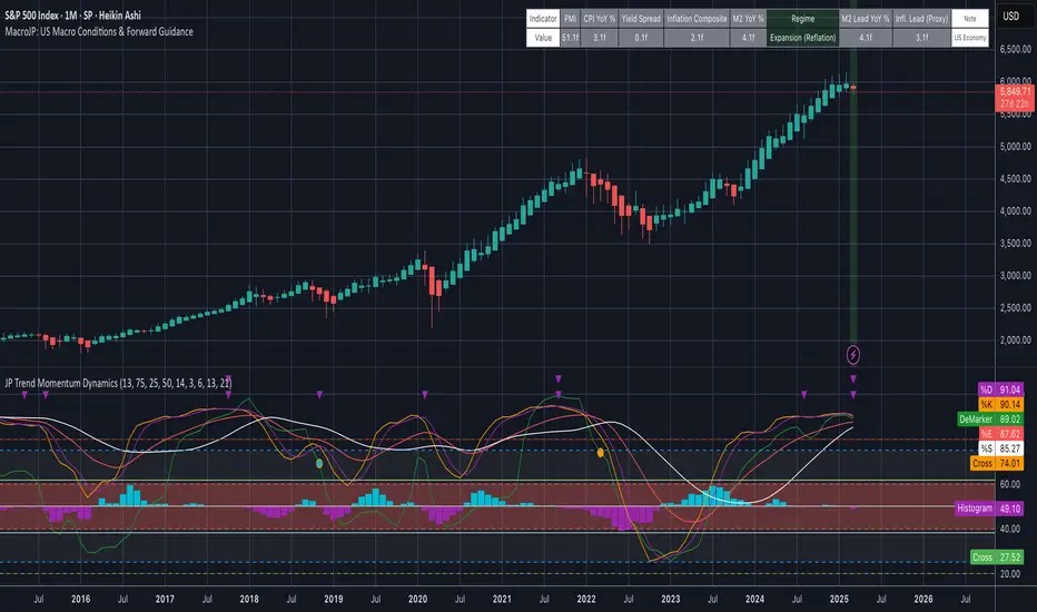
MacroJP: US Macro Conditions & Forward GuidanceMacroJP is a comprehensive, free-to-use TradingView indicator designed to provide a clear snapshot of the US macroeconomic environment. It consolidates key economic metrics into a single, interactive dashboard, allowing traders and investors to quickly assess current conditions and adjust their portfolio biases accordingly.
How It Works:
• Data Aggregation:
The indicator pulls monthly data from reputable free economic sources—specifically, ISM Manufacturing PMI, US CPI YoY, US M2 Money Supply, and US Treasury yields (10-year and 2-year). This robust dataset forms the backbone of the analysis.
• Composite Calculations:
By calculating a Composite Inflation Indicator (the average of CPI YoY and the yield spread) and evaluating the year-over-year change in M2, MacroJP gauges both the inflationary pressures and liquidity trends in the economy. These composite metrics offer a nuanced view that goes beyond single-indicator analysis.
Regime Classification:
The core strength of MacroJP lies in its quadrant classification system. It categorises the macro environment into four distinct regimes based on the direction of economic growth (derived from PMI) and inflation (from the Composite Inflation Indicator):
• Expansion (Reflation): Indicative of a recovering economy with rising production and moderate inflation—ideal for a bullish equity bias.
• Stagflation Risk: A scenario of weak growth coupled with high inflation, where a defensive posture is recommended.
• Slowdown (Deflationary): Characterised by contracting economic activity and falling prices, suggesting a move towards cash or high-quality bonds.
• Disinflationary Boom: Reflects strong growth with stable or falling inflation—an optimal environment for equities with some bond diversification.
Forward Guidance:
To enhance its predictive capability, MacroJP incorporates leading indicators by shifting key data points. For instance, it uses a forward-shifted M2 YoY value and a one-month shifted CPI proxy to offer insights into near-term trends. This approach helps in anticipating changes, providing a sort of “forward guidance” that can inform strategic asset allocation.
User Education:
The indicator features an intuitive table with on-hover tooltips that explain each metric, its relevance, and recommended investment biases. This educational layer is designed to empower users to not only monitor the economic pulse but also to understand the ‘why’ behind each reading, making it a valuable tool for both novice and experienced investors.
MacroJP brings clarity to complex macroeconomic dynamics, allowing users to make more informed decisions in volatile markets. Its seamless integration of free public data and detailed on-chart annotations makes it an indispensable tool for anyone looking to understand the broader economic context impacting their investments.
— Jaroslav
Interest Rate & CPI Differential By King OsamaINTEREST RATE & CPI Differential Indicator By King Osama
A must-have tool for forex traders and macro analysts, this indicator tracks interest rate differentials, real interest rate gaps, and CPI (inflation) differences to provide a fundamental edge in trading.
Key Features:
✅ Interest Rate Differential (Rate Diff) – Measures the gap between base and quote currency interest rates. Higher rates attract capital, influencing currency strength. Ideal for carry trade opportunities.
✅ Real Interest Rate Differential (Real Rate Diff) – Adjusts interest rates for inflation (CPI) to reflect the true return on holding a currency. A more accurate indicator of long-term strength.
✅ CPI Differential (CPI Diff) – Compares inflation rates between two economies, helping traders anticipate central bank actions (rate hikes/cuts) based on inflation trends.
✅ Dynamic Table & Bias Signals – Clear LONG/SHORT indications, historical tracking, and real-time updates for macro-driven forex decisions.
🔹 Perfect for swing traders combining fundamentals with technicals! 🚀

Macros ICT KillZones [TradingFinder] Times & Price Trading Setup🔵 Introduction
ICT Macros, developed by Michael Huddleston, also known as ICT (Inner Circle Trader), is a powerful trading tool designed to help traders identify the best trading opportunities during key time intervals like the London and New York trading sessions.
For traders aiming to capitalize on market volatility, liquidity shifts, and Fair Value Gaps (FVG), understanding and using these critical time zones can significantly improve trading outcomes.
In today’s highly competitive financial markets, identifying the moments when the market is seeking buy-side or sell-side liquidity, or filling price imbalances, is essential for maximizing profitability.
The ICT Macros indicator is built on the renowned ICT time and price theory, which enables traders to track and leverage key market dynamics such as breaks of highs and lows, imbalances, and liquidity hunts.
This indicator automatically detects crucial market times and optimizes strategies for traders by highlighting the specific moments when price movements are most likely to occur. A standout feature of ICT Macros is its automatic adjustment for Daylight Saving Time (DST), ensuring that traders remain synced with the correct session times.
This means you can rely on accurate market timing without the need for manual updates, allowing you to focus on capturing profitable trades during critical timeframes.
🔵 How to Use
The ICT Macros indicator helps you capitalize on trading opportunities during key market moments, particularly when the market is breaking highs or lows, filling Fair Value Gaps (FVG), or addressing imbalances. This indicator is particularly beneficial for traders who seek to identify liquidity, market volatility, and price imbalances.
🟣 Sessions
London Sessions
London Macro 1 :
UTC Time : 06:33 to 07:00
New York Time : 02:33 to 03:00
London Macro 2 :
UTC Time : 08:03 to 08:30
New York Time : 04:03 to 04:30
New York Sessions
New York Macro AM 1 :
UTC Time : 12:50 to 13:10
New York Time : 08:50 to 09:10
New York Macro AM 2 :
UTC Time : 13:50 to 14:10
New York Time : 09:50 to 10:10
New York Macro AM 3 :
UTC Time : 14:50 to 15:10
New York Time : 10:50 to 11:10
New York Lunch Macro :
UTC Time : 15:50 to 16:10
New York Time : 11:50 to 12:10
New York PM Macro :
UTC Time : 17:10 to 17:40
New York Time : 13:10 to 13:40
New York Last Hour Macro :
UTC Time : 19:15 to 19:45
New York Time : 15:15 to 15:45
These time intervals adjust automatically based on Daylight Saving Time (DST), helping traders to enter or exit trades during key market moments when price volatility is high.
Below are the main applications of this tool and how to incorporate it into your trading strategies :
🟣 Combining ICT Macros with Trading Strategies
The ICT Macros indicator can easily be used in conjunction with various trading strategies. Two well-known strategies that can be combined with this indicator include:
ICT 2022 Trading Model : This model is designed based on identifying market liquidity, structural price changes, and Fair Value Gaps (FVG). By using ICT Macros, you can identify the key time intervals when the market is seeking liquidity, filling imbalances, or breaking through important highs and lows, allowing you to enter or exit trades at the right moment.
Silver Bullet Strategy : This strategy, which is built around liquidity hunting and rapid price movements, can work more accurately with the help of ICT Macros. The indicator pinpoints precise liquidity times, helping traders take advantage of market shifts caused by filling Fair Value Gaps or correcting imbalances.
🟣 Capitalizing on Price Volatility During Key Times
Large market algorithms often seek liquidity or fill Fair Value Gaps (FVG) during the intervals marked by ICT Macros. These periods are when price volatility increases, and traders can use these moments to enter or exit trades.
For example, if sell-side liquidity is drained and the market fills an imbalance, the price might move toward buy-side liquidity. By identifying these moments, which may also involve breaking a previous high or low, you can leverage rapid market fluctuations to your advantage.
🟣 Identifying Liquidity and Price Imbalances
One of the important uses of ICT Macros is identifying points where the market is seeking liquidity and correcting imbalances. You can determine high or low liquidity levels in the market before each ICT Macro, as well as Fair Value Gaps (FVG) and price imbalances that need to be filled, using them to adjust your trading strategy. This capability allows you to manage trades based on liquidity shifts or imbalance corrections without needing a bias toward a specific direction.
🔵 Settings
The ICT Macros indicator offers various customization options, allowing users to tailor it to their specific needs. Below are the main settings:
Time Zone Mode : You can select one of the following options to define how time is displayed:
UTC : For traders who need to work with Universal Time.
Session Local Time : The local time corresponding to the London or New York markets.
Your Time Zone : You can specify your own time zone (e.g., "UTC-4:00").
Your Time Zone : If you choose "Your Time Zone," you can set your specific time zone. By default, this is set to UTC-4:00.
Show Range Time : This option allows you to display the time range of each session on the chart. If enabled, the exact start and end times of each interval are shown.
Show or Hide Time Ranges : Toggle on/off for visual clarity depending on user preference.
Custom Colors : Set distinct colors for each session, allowing users to personalize their chart based on their trading style.These settings allow you to adjust the key time intervals of each trading session to your preference and customize the time format according to your own needs.
🔵 Conclusion
The ICT Macros indicator is a powerful tool for traders, helping them to identify key time intervals where the market seeks liquidity or fills Fair Value Gaps (FVG), corrects imbalances, and breaks highs or lows. This tool is especially valuable for traders using liquidity-based strategies such as ICT 2022 or Silver Bullet.
One of the key features of this indicator is its support for Daylight Saving Time (DST), ensuring you are always in sync with the correct trading session timings without manual adjustments. This is particularly beneficial for traders operating across different time zones.
With ICT Macros, you can capitalize on crucial market opportunities during sensitive times, take advantage of imbalances, and enhance your trading strategies based on market volatility, liquidity shifts, and Fair Value Gaps.

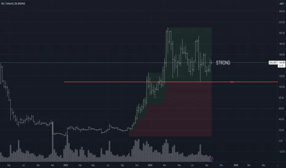
Strength/Weakness IndicatorThe Strength/Weakness Indicator is a customisable tool designed to help traders identify key areas of market strength and weakness based on the 50% Fibonacci retracement level .
█ Underlying Concept:
The concept behind this indicator draws heavily on the principles of Fibonacci retracement and WD Gann’s market theories , particularly the importance of the 50% level in signalling critical psychological areas of support and resistance. Historically, the 50% retracement level has been regarded as a key marker where markets either find new buyers/sellers or continue a trend. Gann himself placed significant emphasis on the halfway point of a previous market move as a critical level for market strength and reversal.
Strength : When an asset is trading above the 50% retracement level, it suggests that buyers are in control and that the market is showing strength. This is particularly useful for traders aiming to ride the continuation of an uptrend.
Weakness : Conversely, when the price falls below the 50% retracement level, it indicates that sellers are dominating, and the market is showing signs of weakness. This can be an early indication of a potential reversal or further decline.
█ Key Features:
1 — Multi-Timeframe Fibonacci Analysis :
This indicator supports up to two distinct retracement levels, allowing traders to analyse multiple timeframes simultaneously. Customise the look-back periods for each level to track the highest high and lowest low over your chosen period.
The tool is adaptable to short-term, swing trading, and long-term investing, making it useful across different trading styles.
2 — Dynamic Strength/Weakness Labelling :
The script dynamically calculates and displays whether the asset is “STRONG” or “WEAK” based on its position relative to the 50% retracement levels. If the price is above both levels, it is considered "VERY STRONG." Conversely, trading below both levels signals "VERY WEAK" conditions. This real-time feedback helps traders gauge market sentiment with ease.
3 — Customizable Visual Representation :
Both retracement levels are fully customisable, including line colours, styles, and thicknesses. The script offers custom background fills—highlighting areas of strength (green) and weakness (red)—to provide a clear visual aid for identifying key price zones.
Traders can modify the appearance of text labels (size, colour, position) and choose whether to extend lines left, right, both directions, or not at all.
4 — Cross-Timeframe Validation :
Traders can cross-reference price action between two timeframes to confirm trends. If both levels signal strength or weakness, it validates market momentum, increasing confidence in trade decisions.
5 — Strategic Decision-Making Aid :
The indicator aids in identifying support and resistance zones based on the 50% retracement level. Use it to time entries and exits effectively: price above the 50% level suggests potential trend continuation, while falling below may indicate reversal.
█ How It Works:
1 — Defining Custom Timeframes :
The trader selects custom time periods (days, weeks, months, or years) to calculate the highest high and lowest low, allowing precise control over the analysis.
2 — Calculating Strength/Weakness :
Once the 50% retracement level is calculated, the price’s position relative to it determines the market’s condition. Above 50% signals strength, below signals weakness.
3 — Comparing Multiple Timeframes :
Enable a second retracement level to compare different time periods. This feature is useful for spotting divergences between short-term and long-term trends or validating strength across timeframes.
█ How to Use:
1 — Assess Market Conditions :
If price trades above both 50% retracement levels, it indicates strong bullish momentum. Conversely, trading below both levels signals bearish conditions.
2 — Plan Entries/Exits :
Use the 50% level as a reference for support and resistance. Plan to enter when the price bounces off the 50% level, or exit if it breaks down below this critical level.
3 — Cross-Timeframe Analysis :
Validate the market trend by comparing retracement levels across different timeframes. This helps in confirming whether the trend is strong enough to justify holding a position.
█ Why This Indicator is Unique:
Comprehensive Multi-Timeframe Analysis : While most Fibonacci indicators focus on a single period, this tool provides a deeper understanding by allowing traders to compare price action across multiple timeframes.
Customizable and Dynamic : The real-time strength/weakness labeling, customizable background fills, and the ability to analyze two retracement levels simultaneously make this tool adaptable to any trading strategy.
Valuable for All Traders : Whether you are day trading, swing trading, or investing long-term, the Strength/Weakness Indicator offers clarity on key market levels and sentiment, improving decision-making for entries and exits.
Disclaimer : This script is for educational purposes and is not financial advice. Trading involves significant risk, so please consult a professional advisor before making investment decisions. For the best results, use this indicator alongside other technical analysis methods like trend lines or moving averages to help you confirm signals and make more informed decisions.
Forex Macro Metrics [MacroGlide]"Forex Macro Metrics " is a powerful tool for analyzing macroeconomic metrics, designed to help traders make more informed decisions in the forex market. This indicator displays key economic indicators such as interest rates, money supply (M1 and M2), unemployment rate, and government debt for various currencies and their pairs, allowing users to assess the macroeconomic differences between the base and quote currencies.
Key Features:
• Interest Rates Display: Includes interest rates for major world currencies with the ability to show the differential between the base and quote currencies.
• Money Supply Analysis (M1 and M2): Displays the money supply for both the base and quote currencies, including differential calculations.
• Unemployment Rate: Compares the unemployment rates between currencies, showing the differences on the chart.
• Government Debt: Shows government debt levels for the base and quote currencies with differential calculations.
• Customizable Options: Enable/disable specific metrics and adjust colors for better visual clarity.
How to Use:
• Select a Currency Pair: Apply the indicator to your chart and choose the desired currency pair. The indicator will automatically load the relevant data for the base and quote currencies.
• Adjust Display Settings: Use the indicator settings to enable or disable specific metrics and their differentials.
• Analyze the Data: Compare the economic conditions of the two currencies through the charts and identify potential trading opportunities based on macroeconomic differences.
Methodology:
The indicator uses economic data available through TradingView tickers to calculate the values of the base and quote currencies. Differentials are calculated by subtracting the values of the quote currency from the base currency, allowing for a visual assessment of their differences. The displayed data includes historical changes, helping to identify trends and potential reversal points.
Originality and Usefulness:
"Forex Macro Metrics " is a unique tool that combines several key macroeconomic indicators into one comprehensive indicator. This simplifies the analysis process for traders looking to understand the fundamental differences between currencies. Using this approach provides an advantage in assessing long-term trends and potential shifts in currency pairs driven by changes in macroeconomic conditions.
Charts:
The indicator displays data in the form of lines and areas on the chart, with interest rates shown as lines for the base and quote currencies, accompanied by an area representing the differential. For money supply (M1 and M2), lines are drawn for each currency, with areas highlighting the differences. Similarly, the unemployment rate and government debt are displayed with clear visual separation of the data and their differentials, making it easy to compare and analyze the macroeconomic conditions of the currencies involved.
Enjoy the game!